published by golden artist colors, inc. / issue 26 · pdf filepublished by golden artist...
TRANSCRIPT
JUST PAINTPublished by Golden Artist Colors, Inc. / Issue 26
Issue 26 page 1 ©2012 Golden Artist Colors, Inc.
From Mark Golden Twenty-six issues of this technical newsletter and I am delighted to share we are still continuing the dialogue on color! After the success of Sarah Sands’ article on the ‘Subtleties of Color’ (JP 21), we recognized the value of continuing to provide more color resources for artists. The Tint & Glaze Poster was the first significant new tool for artists to come from this research. Following up on this work to create a printed color chart trying to represent real paint colors, Chris Farrell, our Creative Director and person in charge of putting together this chart, is our principle advocate that printing, no matter how carefully it’s done, cannot be a substitute for paint. In this issue, Chris shares the significant differences in ranges possible with commercial printing processes and real paint. Our Director of the GOLDEN Certified Working Artist Program and author, Patti Brady, shares her painterly insights into a new Modern Theory Color Mixing Set for artists, which takes just the opposite tact from Chris, in working with a limited set of colors to produce an enormous range of mixing colors. Continuing the color theme, Amy McKinnon, from our Technical Support team, uncovers the 18 new colors being added to the Williamsburg Handmade Oils line. It’s exciting to be able to share that the legacy of Carl’s paints are being expanded to even more options for artists working with the materials. Ulysses Jackson, from our Technical Support and Research & Development groups describes the new experimental acrylic products which have always been an exciting jumping off point for artists to test and play. Finally, we get to meet yet another colleague from our Technical Support team, Lori Wilson. Lori is a home grown talent who has taken her skills to artists around the world. There are few people who meet Lori who don’t find themselves wishing they could spend more time with her. As we greet yet another new year, we welcome you to our “Just Paint 26”. Thank you for your support and we look forward to your comments.
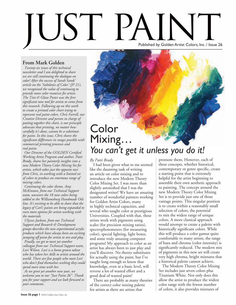
By Patti Brady I had been given what to me seemed like the daunting task of writing an article on color mixing and to introduce the new Modern Theory Color Mixing Set. I was more than slightly astonished that I was the designated writer! We have an amazing number of wonderful painters working for Golden Artist Colors, many in highly technical capacities, and several who taught color at prestigious Universities. Coupled with that, these artists work with pigments using scales (for precision mixing ratios), spectrophotometers (for measuring color), special lighting, light boxes, and some truly amazing computer programs! My approach to color as an artist has always been to just play and you’ll discover. No theory substitutes for actually using the paint, but I’ve taught long enough to know that knowledge, even at a basic level, will reverse a lot of wasted effort and a good deal of wasted paint! There are probably as many theories of the correct color mixing palette for artists as there are artists that
promote them. However, each of these concepts, whether historical, contemporary or genre specific, create a starting point that is extremely helpful for the artist beginning to assemble their own aesthetic approach to painting. The concept around the new Modern Theory Color Mixing Set is to provide just one of those vantage points. This singular position is to create within a reasonably small selection of colors, the potential to mix the widest range of unique colors. A more classical approach would attempt to create a palette with historically significant colors. While this will produce a color gamut quite comfortable to many artists, the range of hues and chroma (color intensity) is significantly reduced. The modern mix of pigments in this new set will create very high chroma, bright mixtures that a historical palette cannot achieve. The Modern Theory Color Mixing Set includes just seven colors plus Titanium White. Not only does this allow the artist to produce the widest color range with the fewest number of colors, it also provides mixtures of
Color Mixing…You can’t get it unless you do it!
Issue 26 page 2 ©2012 Golden Artist Colors, Inc.
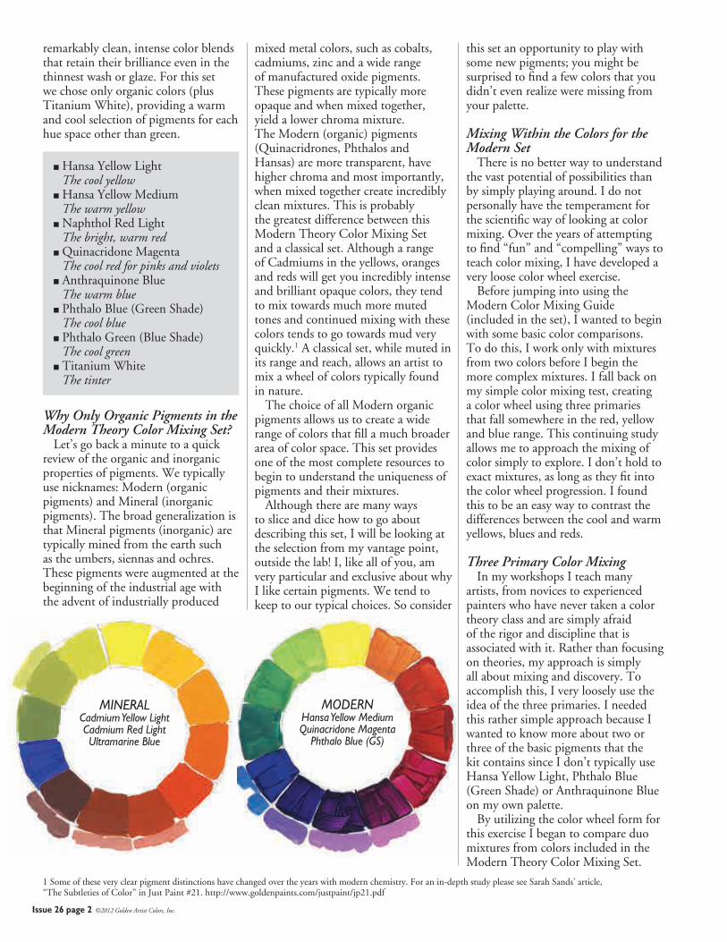
remarkably clean, intense color blends that retain their brilliance even in the thinnest wash or glaze. For this set we chose only organic colors (plus Titanium White), providing a warm and cool selection of pigments for each hue space other than green.
� Hansa Yellow LightThe cool yellow
� Hansa Yellow MediumThe warm yellow
� Naphthol Red LightThe bright, warm red
� Quinacridone MagentaThe cool red for pinks and violets
� Anthraquinone BlueThe warm blue
� Phthalo Blue (Green Shade)The cool blue
� Phthalo Green (Blue Shade)The cool green
� Titanium WhiteThe tinter
Why Only Organic Pigments in the Modern Theory Color Mixing Set? Let’s go back a minute to a quick review of the organic and inorganic properties of pigments. We typically use nicknames: Modern (organic pigments) and Mineral (inorganic pigments). The broad generalization is that Mineral pigments (inorganic) are typically mined from the earth such as the umbers, siennas and ochres. These pigments were augmented at the beginning of the industrial age with the advent of industrially produced
mixed metal colors, such as cobalts, cadmiums, zinc and a wide range of manufactured oxide pigments. These pigments are typically more opaque and when mixed together, yield a lower chroma mixture. The Modern (organic) pigments (Quinacridrones, Phthalos and Hansas) are more transparent, have higher chroma and most importantly, when mixed together create incredibly clean mixtures. This is probably the greatest difference between this Modern Theory Color Mixing Set and a classical set. Although a range of Cadmiums in the yellows, oranges and reds will get you incredibly intense and brilliant opaque colors, they tend to mix towards much more muted tones and continued mixing with these colors tends to go towards mud very quickly.1 A classical set, while muted in its range and reach, allows an artist to mix a wheel of colors typically found in nature. The choice of all Modern organic pigments allows us to create a wide range of colors that fill a much broader area of color space. This set provides one of the most complete resources to begin to understand the uniqueness of pigments and their mixtures. Although there are many ways to slice and dice how to go about describing this set, I will be looking at the selection from my vantage point, outside the lab! I, like all of you, am very particular and exclusive about why I like certain pigments. We tend to keep to our typical choices. So consider
1 Some of these very clear pigment distinctions have changed over the years with modern chemistry. For an in-depth study please see Sarah Sands’ article, “The Subtleties of Color” in Just Paint #21. http://www.goldenpaints.com/justpaint/jp21.pdf
MODERNHansa Yellow MediumQuinacridone Magenta
Phthalo Blue (GS)
MINERALCadmium Yellow LightCadmium Red LightUltramarine Blue
this set an opportunity to play with some new pigments; you might be surprised to find a few colors that you didn’t even realize were missing from your palette.
Mixing Within the Colors for the Modern Set There is no better way to understand the vast potential of possibilities than by simply playing around. I do not personally have the temperament for the scientific way of looking at color mixing. Over the years of attempting to find “fun” and “compelling” ways to teach color mixing, I have developed a very loose color wheel exercise. Before jumping into using the Modern Color Mixing Guide (included in the set), I wanted to begin with some basic color comparisons. To do this, I work only with mixtures from two colors before I begin the more complex mixtures. I fall back on my simple color mixing test, creating a color wheel using three primaries that fall somewhere in the red, yellow and blue range. This continuing study allows me to approach the mixing of color simply to explore. I don’t hold to exact mixtures, as long as they fit into the color wheel progression. I found this to be an easy way to contrast the differences between the cool and warm yellows, blues and reds.
Three Primary Color Mixing In my workshops I teach many artists, from novices to experienced painters who have never taken a color theory class and are simply afraid of the rigor and discipline that is associated with it. Rather than focusing on theories, my approach is simply all about mixing and discovery. To accomplish this, I very loosely use the idea of the three primaries. I needed this rather simple approach because I wanted to know more about two or three of the basic pigments that the kit contains since I don’t typically use Hansa Yellow Light, Phthalo Blue (Green Shade) or Anthraquinone Blue on my own palette. By utilizing the color wheel form for this exercise I began to compare duo mixtures from colors included in the Modern Theory Color Mixing Set.
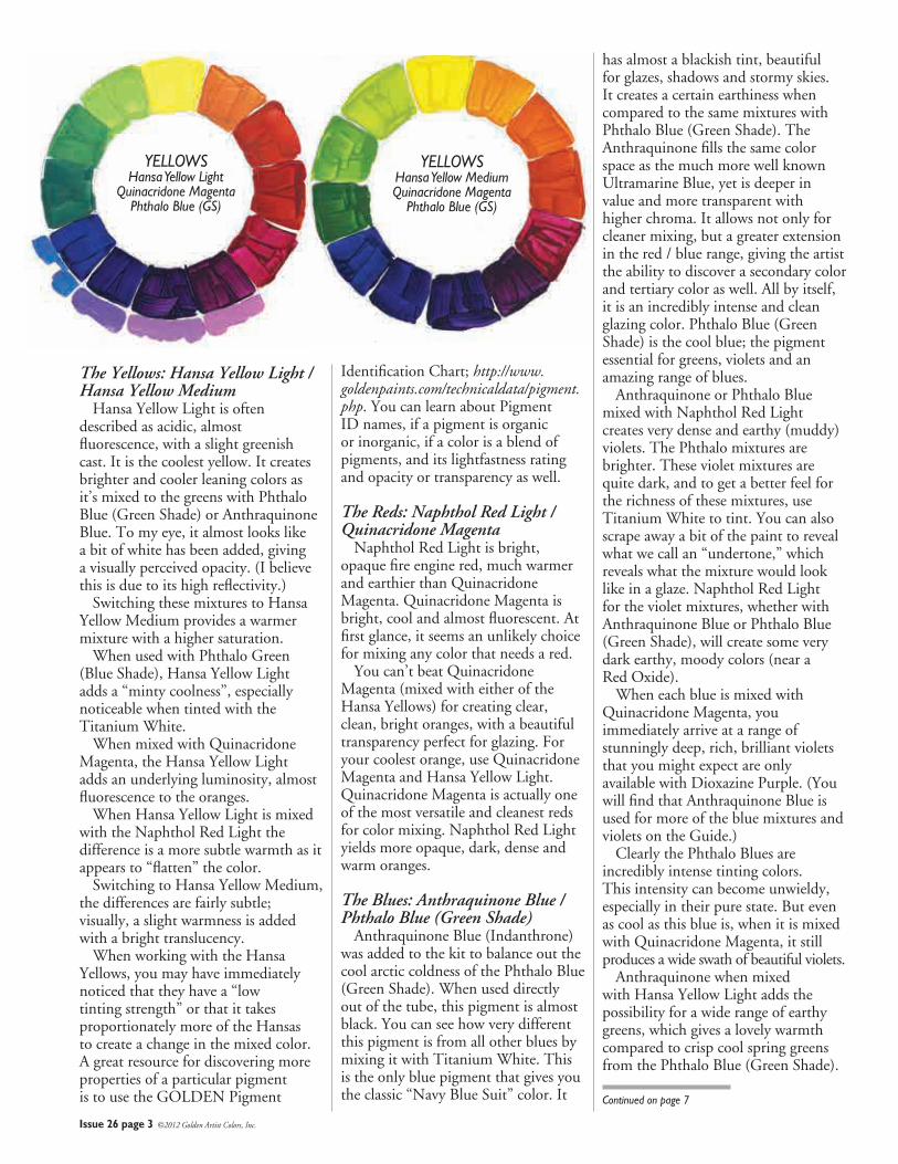
YELLOWSHansa Yellow Light
Quinacridone MagentaPhthalo Blue (GS)
YELLOWSHansa Yellow MediumQuinacridone Magenta
Phthalo Blue (GS)
Issue 26 page 3 ©2012 Golden Artist Colors, Inc.
The Yellows: Hansa Yellow Light / Hansa Yellow Medium Hansa Yellow Light is often described as acidic, almost fluorescence, with a slight greenish cast. It is the coolest yellow. It creates brighter and cooler leaning colors as it’s mixed to the greens with Phthalo Blue (Green Shade) or Anthraquinone Blue. To my eye, it almost looks like a bit of white has been added, giving a visually perceived opacity. (I believe this is due to its high reflectivity.) Switching these mixtures to Hansa Yellow Medium provides a warmer mixture with a higher saturation. When used with Phthalo Green (Blue Shade), Hansa Yellow Light adds a “minty coolness”, especially noticeable when tinted with the Titanium White. When mixed with Quinacridone Magenta, the Hansa Yellow Light adds an underlying luminosity, almost fluorescence to the oranges. When Hansa Yellow Light is mixed with the Naphthol Red Light the difference is a more subtle warmth as it appears to “flatten” the color. Switching to Hansa Yellow Medium, the differences are fairly subtle; visually, a slight warmness is added with a bright translucency. When working with the Hansa Yellows, you may have immediately noticed that they have a “low tinting strength” or that it takes proportionately more of the Hansas to create a change in the mixed color. A great resource for discovering more properties of a particular pigment is to use the GOLDEN Pigment
Identification Chart; http://www.goldenpaints.com/technicaldata/pigment.php. You can learn about Pigment ID names, if a pigment is organic or inorganic, if a color is a blend of pigments, and its lightfastness rating and opacity or transparency as well.
The Reds: Naphthol Red Light / Quinacridone Magenta Naphthol Red Light is bright, opaque fire engine red, much warmer and earthier than Quinacridone Magenta. Quinacridone Magenta is bright, cool and almost fluorescent. At first glance, it seems an unlikely choice for mixing any color that needs a red. You can’t beat Quinacridone Magenta (mixed with either of the Hansa Yellows) for creating clear, clean, bright oranges, with a beautiful transparency perfect for glazing. For your coolest orange, use Quinacridone Magenta and Hansa Yellow Light. Quinacridone Magenta is actually one of the most versatile and cleanest reds for color mixing. Naphthol Red Light yields more opaque, dark, dense and warm oranges.
The Blues: Anthraquinone Blue / Phthalo Blue (Green Shade) Anthraquinone Blue (Indanthrone) was added to the kit to balance out the cool arctic coldness of the Phthalo Blue (Green Shade). When used directly out of the tube, this pigment is almost black. You can see how very different this pigment is from all other blues by mixing it with Titanium White. This is the only blue pigment that gives you the classic “Navy Blue Suit” color. It
has almost a blackish tint, beautiful for glazes, shadows and stormy skies. It creates a certain earthiness when compared to the same mixtures with Phthalo Blue (Green Shade). The Anthraquinone fills the same color space as the much more well known Ultramarine Blue, yet is deeper in value and more transparent with higher chroma. It allows not only for cleaner mixing, but a greater extension in the red / blue range, giving the artist the ability to discover a secondary color and tertiary color as well. All by itself, it is an incredibly intense and clean glazing color. Phthalo Blue (Green Shade) is the cool blue; the pigment essential for greens, violets and an amazing range of blues. Anthraquinone or Phthalo Blue mixed with Naphthol Red Light creates very dense and earthy (muddy) violets. The Phthalo mixtures are brighter. These violet mixtures are quite dark, and to get a better feel for the richness of these mixtures, use Titanium White to tint. You can also scrape away a bit of the paint to reveal what we call an “undertone,” which reveals what the mixture would look like in a glaze. Naphthol Red Light for the violet mixtures, whether with Anthraquinone Blue or Phthalo Blue (Green Shade), will create some very dark earthy, moody colors (near a Red Oxide). When each blue is mixed with Quinacridone Magenta, you immediately arrive at a range of stunningly deep, rich, brilliant violets that you might expect are only available with Dioxazine Purple. (You will find that Anthraquinone Blue is used for more of the blue mixtures and violets on the Guide.) Clearly the Phthalo Blues are incredibly intense tinting colors. This intensity can become unwieldy, especially in their pure state. But even as cool as this blue is, when it is mixed with Quinacridone Magenta, it still produces a wide swath of beautiful violets. Anthraquinone when mixed with Hansa Yellow Light adds the possibility for a wide range of earthy greens, which gives a lovely warmth compared to crisp cool spring greens from the Phthalo Blue (Green Shade).
Continued on page 7
Issue 26 page 4 ©2012 Golden Artist Colors, Inc.
By Christopher Farrell Although it will be my intention to present a stand-alone essay relating to the perception, use and technology of color and color reproduction, it is inevitable that references will be made to the Just Paint 22 article “The Subtleties of Color” as it serves as not only the conceptual starting point for this article, but as the catalyst for an odyssey of color exploration that continues to this day. It should not be required reading for the comprehension of what I am about to share, but I believe it will be helpful to read this article as well.
Sarah Sands’ article set off a series of events that led to the printing of the Tint & Glaze Poster that was first made available to GOLDEN customers in February of 2010. The second edition of this poster began appearing in stores late in the summer of 2010. Beyond the Tint & Glaze Poster, other ideas and applications of the color exploration that started with this article have been in the works.
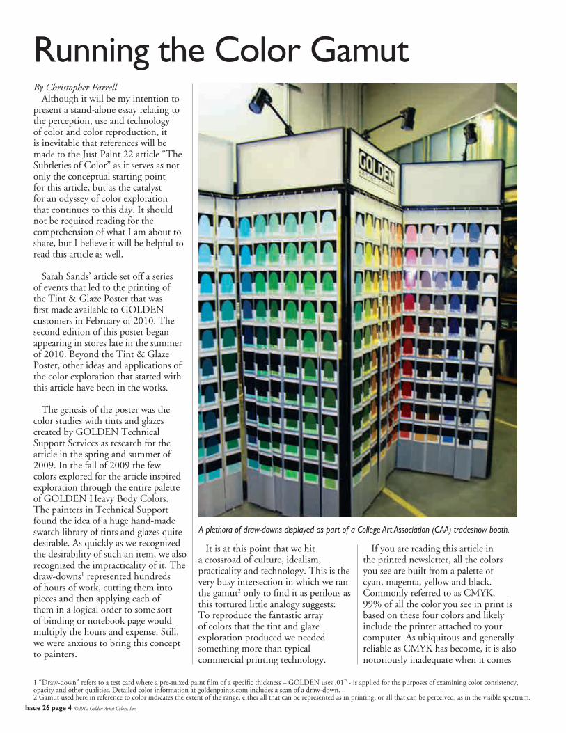
The genesis of the poster was the color studies with tints and glazes created by GOLDEN Technical Support Services as research for the article in the spring and summer of 2009. In the fall of 2009 the few colors explored for the article inspired exploration through the entire palette of GOLDEN Heavy Body Colors. The painters in Technical Support found the idea of a huge hand-made swatch library of tints and glazes quite desirable. As quickly as we recognized the desirability of such an item, we also recognized the impracticality of it. The draw-downs1 represented hundreds of hours of work, cutting them into pieces and then applying each of them in a logical order to some sort of binding or notebook page would multiply the hours and expense. Still, we were anxious to bring this concept to painters.
It is at this point that we hit a crossroad of culture, idealism, practicality and technology. This is the very busy intersection in which we ran the gamut2 only to find it as perilous as this tortured little analogy suggests: To reproduce the fantastic array of colors that the tint and glaze exploration produced we needed something more than typical commercial printing technology.
If you are reading this article in the printed newsletter, all the colors you see are built from a palette of cyan, magenta, yellow and black. Commonly referred to as CMYK, 99% of all the color you see in print is based on these four colors and likely include the printer attached to your computer. As ubiquitous and generally reliable as CMYK has become, it is also notoriously inadequate when it comes
Running the Color Gamut
1 “Draw-down” refers to a test card where a pre-mixed paint film of a specific thickness – GOLDEN uses .01” - is applied for the purposes of examining color consistency, opacity and other qualities. Detailed color information at goldenpaints.com includes a scan of a draw-down.2 Gamut used here in reference to color indicates the extent of the range, either all that can be represented as in printing, or all that can be perceived, as in the visible spectrum.
A plethora of draw-downs displayed as part of a College Art Association (CAA) tradeshow booth.
Issue 26 page 5 ©2012 Golden Artist Colors, Inc.
to representing the full spectrum of colors available to artists.
With CMYK the “subtleties of color” are bound to be lost. Orange, most greens and deep blues suffer the most because these colors fall between the three primary colors (cyan, magenta and yellow) into areas of compromise and mingling that never satisfies the true nature of these colors. For this reason a more advanced “hexachrome”3 color system inserts an orange between yellow and magenta and a green between cyan and yellow. You might refer to this as “CMOYGK” color, or more easily remember it as SIX color process.
This six-color process solves some of the problems normally experienced when reproducing the orange and green spectrum in print. Even a casual observer would notice a significant difference in a color represented by CMYK compared to one represented in six colors. While typically 50% more expensive to print than CMYK, we hoped this six-color process would deliver an acceptable representation of the colors coming out of the draw-down research.
Unfortunately the challenge of faithfully representing colors from paint on a printed page is not solved with a single technology. The process of developing the Tint & Glaze Poster exposed some gaps in the perception of color and how it is reported on computer screens and in print.
Before going into a few technical details, we should make it clear that there is no way to sufficiently imitate all the colors on a painter’s palette. There is much more to a pigment than where it falls within the visible spectrum and even the best color measurement tools available only capture certain dimensions or characteristics of paint. The bottom line is: to see what a specific pigment looks like in paint, one must look at the paint. Similarly, looking at a lithograph or a jpeg image of a painting is not the same as seeing a painting in person.
So, we set out to explore exactly what the paints would look like by mixing each color precisely into five tints and four glazes, and then drawing them out onto test cards. The next step was to translate colors into data using a spectrophotometer, a scientifically calibrated digital device that measured each color as it appeared over white and black. Numerous color indexes were applied to the readings, like RGB (broadly, how color is reported on a computer, mobile or TV screen), sRGB, and L*a*b.
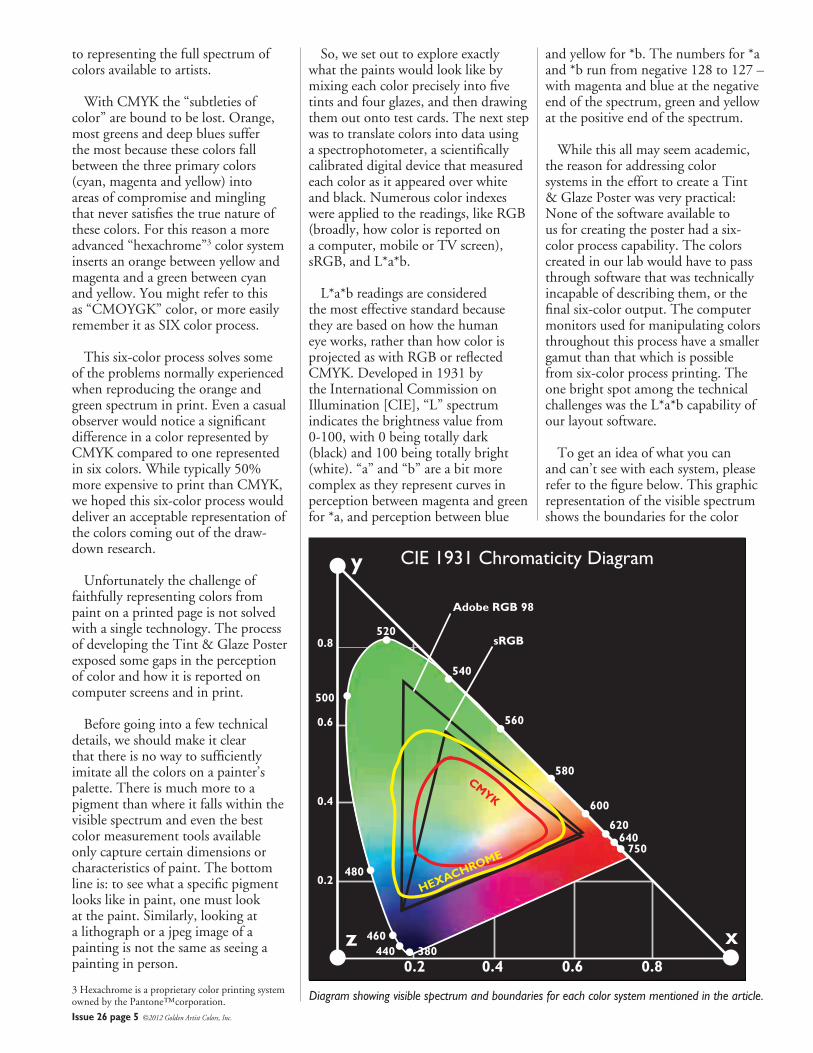
L*a*b readings are considered the most effective standard because they are based on how the human eye works, rather than how color is projected as with RGB or reflected CMYK. Developed in 1931 by the International Commission on Illumination [CIE], “L” spectrum indicates the brightness value from 0-100, with 0 being totally dark (black) and 100 being totally bright (white). “a” and “b” are a bit more complex as they represent curves in perception between magenta and green for *a, and perception between blue
and yellow for *b. The numbers for *a and *b run from negative 128 to 127 – with magenta and blue at the negative end of the spectrum, green and yellow at the positive end of the spectrum.
While this all may seem academic, the reason for addressing color systems in the effort to create a Tint & Glaze Poster was very practical: None of the software available to us for creating the poster had a six-color process capability. The colors created in our lab would have to pass through software that was technically incapable of describing them, or the final six-color output. The computer monitors used for manipulating colors throughout this process have a smaller gamut than that which is possible from six-color process printing. The one bright spot among the technical challenges was the L*a*b capability of our layout software.
To get an idea of what you can and can’t see with each system, please refer to the figure below. This graphic representation of the visible spectrum shows the boundaries for the color
CIE 1931 Chromaticity Diagramy
xz0.2 0.4
Adobe RGB 98
sRGB0.8
0.6
0.4
0.2
0.6 0.8
500
520
540
560
580
600
620640
750
480
460440 380
CMYK
HEXACHROME
3 Hexachrome is a proprietary color printing system owned by the Pantone™corporation. Diagram showing visible spectrum and boundaries for each color system mentioned in the article.
Issue 26 page 6 ©2012 Golden Artist Colors, Inc.
systems referenced so far in this article. The L*a*b system covers the entire visible spectrum, it is not dependent on any device. However, as this chart shows, CMYK and RGB have limitations that force the exclusion of portions of the visible spectrum. Six color process, or Hexachrome, has a range that exceeds RGB in some places.
This meant that we had to manipulate colors beyond the color range of the computer monitor. Because of that, we depended on six-color proofs created using a specialized digital proofing system for each step of the process. Color was manipulated as data within the layout software, then processed by the imaging systems at the printing company. Each adjustment of color had to be validated with a digital proof to see how the color would be represented in the six process colors on press. This probably sounds very time consuming and expensive, because it is.
One benefit of working with a commercial printer is the color-controlled environment. Booths, more like large desks, with specialized lighting ensured that the six-color proofs and the original draw-downs were viewed in a consistent, balanced, neutral-color light. The walls of the booth are a photo gray and there are no windows to the viewing area, so comparisons could be made accurately.
Most people assume that “daylight” is somehow consistent, but as any artist knows, the color of daylight changes according to the conditions of the weather, atmosphere and time of day and year. Add to all those inconsistencies the influence of the colors reflected off the walls, floors, and ceiling, and any tinting in windows through which sunlight is passing, and you can see the need for the consistency created with these color-balanced lights and viewing booths.
With all of these tools and processes in place, we chipped away at the translation of colors to the Tint & Glaze Poster. Very few were accurate
on the first pass. Most of the work involved preserving the nuance of the colors through minor adjustments. Colors were proofed, nudged, proofed and nudged again. The blue colors presented the greatest challenge, and we attribute this to the fact that the augmentation of CMYK with a process orange and green is less helpful within the blue space as most of the colors rely on cyan, magenta and black.
Very light and very dark colors had their challenges as seemingly minute shifts in color made dramatic differences. One has to develop a feel for the sort of “curve” of influence created by the various colors within the process. As with paint, dark colors more quickly influence mixtures than light colors, so adjustments in yellow and orange required a heavier hand than adjustments in cyan or black.
Even with the best color system we could find, compromises are inevitable. The luminosity and brilliance that define pigments like Cobalt Blue or Cadmium Red defy even the best printing processes, so you must accept the best approximation and find the best place for these colors relative to colors for which six-color process has a better approximation. The highest hope for the process we engaged in, and the tool produced, is to have a useful two-dimensional guide, a map to the luscious terrain of actual color
brought forth by artists with our paint.
Ultimately, the Tint & Glaze Poster is an experiment in reference materials. The Technical Support Services Team and others within GOLDEN found the methodical extension of colors into a system of tints and glazes fascinating as each color demonstrated unique qualities and attributes. A red that tints to a soft pink produced fiery glazes. Colors that appear nearly black from the tube, like Dioxazine Purple, reveal exceptional color range and strength. Colors one might never consider using based on a simple swatch, show surprising versatility or unique qualities when presented this way.
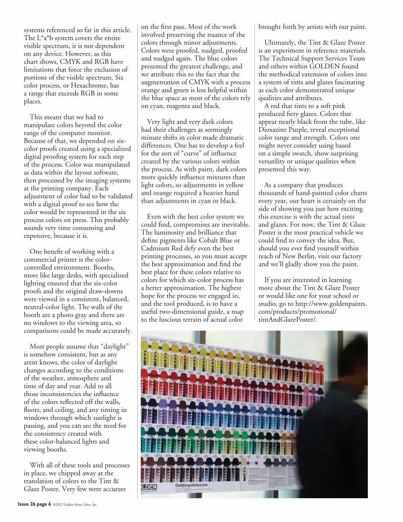
As a company that produces thousands of hand-painted color charts every year, our heart is certainly on the side of showing you just how exciting this exercise is with the actual tints and glazes. For now, the Tint & Glaze Poster is the most practical vehicle we could find to convey the idea. But, should you ever find yourself within reach of New Berlin, visit our factory and we’ll gladly show you the paint.
If you are interested in learning more about the Tint & Glaze Poster or would like one for your school or studio, go to http://www.goldenpaints.com/products/promotional/tintAndGlazePoster/.
Issue 26 page 7 ©2012 Golden Artist Colors, Inc.
Continued from page 3
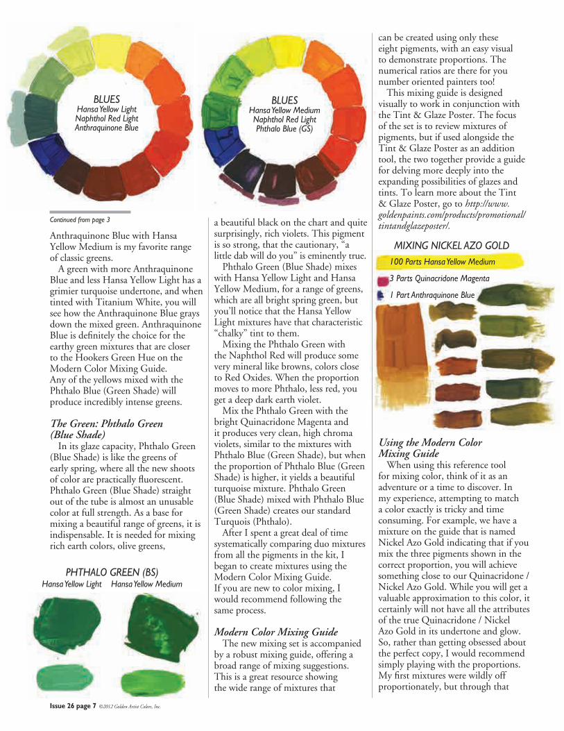
Anthraquinone Blue with Hansa Yellow Medium is my favorite range of classic greens. A green with more Anthraquinone Blue and less Hansa Yellow Light has a grimier turquoise undertone, and when tinted with Titanium White, you will see how the Anthraquinone Blue grays down the mixed green. Anthraquinone Blue is definitely the choice for the earthy green mixtures that are closer to the Hookers Green Hue on the Modern Color Mixing Guide. Any of the yellows mixed with the Phthalo Blue (Green Shade) will produce incredibly intense greens.
The Green: Phthalo Green (Blue Shade) In its glaze capacity, Phthalo Green (Blue Shade) is like the greens of early spring, where all the new shoots of color are practically fluorescent. Phthalo Green (Blue Shade) straight out of the tube is almost an unusable color at full strength. As a base for mixing a beautiful range of greens, it is indispensable. It is needed for mixing rich earth colors, olive greens,
a beautiful black on the chart and quite surprisingly, rich violets. This pigment is so strong, that the cautionary, “a little dab will do you” is eminently true. Phthalo Green (Blue Shade) mixes with Hansa Yellow Light and Hansa Yellow Medium, for a range of greens, which are all bright spring green, but you’ll notice that the Hansa Yellow Light mixtures have that characteristic “chalky” tint to them. Mixing the Phthalo Green with the Naphthol Red will produce some very mineral like browns, colors close to Red Oxides. When the proportion moves to more Phthalo, less red, you get a deep dark earth violet. Mix the Phthalo Green with the bright Quinacridone Magenta and it produces very clean, high chroma violets, similar to the mixtures with Phthalo Blue (Green Shade), but when the proportion of Phthalo Blue (Green Shade) is higher, it yields a beautiful turquoise mixture. Phthalo Green (Blue Shade) mixed with Phthalo Blue (Green Shade) creates our standard Turquois (Phthalo). After I spent a great deal of time systematically comparing duo mixtures from all the pigments in the kit, I began to create mixtures using the Modern Color Mixing Guide. If you are new to color mixing, I would recommend following the same process.
Modern Color Mixing Guide The new mixing set is accompanied by a robust mixing guide, offering a broad range of mixing suggestions. This is a great resource showing the wide range of mixtures that
can be created using only these eight pigments, with an easy visual to demonstrate proportions. The numerical ratios are there for you number oriented painters too! This mixing guide is designed visually to work in conjunction with the Tint & Glaze Poster. The focus of the set is to review mixtures of pigments, but if used alongside the Tint & Glaze Poster as an addition tool, the two together provide a guide for delving more deeply into the expanding possibilities of glazes and tints. To learn more about the Tint & Glaze Poster, go to http://www.goldenpaints.com/products/promotional/tintandglazeposter/.
Using the Modern Color Mixing Guide When using this reference tool for mixing color, think of it as an adventure or a time to discover. In my experience, attempting to match a color exactly is tricky and time consuming. For example, we have a mixture on the guide that is named Nickel Azo Gold indicating that if you mix the three pigments shown in the correct proportion, you will achieve something close to our Quinacridone / Nickel Azo Gold. While you will get a valuable approximation to this color, it certainly will not have all the attributes of the true Quinacridone / Nickel Azo Gold in its undertone and glow. So, rather than getting obsessed about the perfect copy, I would recommend simply playing with the proportions. My first mixtures were wildly off proportionately, but through that
BLUESHansa Yellow LightNaphthol Red LightAnthraquinone Blue
BLUESHansa Yellow MediumNaphthol Red LightPhthalo Blue (GS)
PHTHALO GREEN (BS) Hansa Yellow Light Hansa Yellow Medium
MIXING NICKEL AZO GOLD100 Parts Hansa Yellow Medium
3 Parts Quinacridone Magenta
1 Part Anthraquinone Blue
Alizarin CrimsonHue
Naples YellowHue
Yellow Ochre
Van Dyke Brown Hue
Cadmium Red Medium Hue
Ultramarine Blue
Cobalt Blue
Issue 26 page 8 ©2012 Golden Artist Colors, Inc.
effort, I discovered a range of beautiful olive hues. (I’m keeping my slightly “off” formula for the future with too much Anthraquinone Blue and too much Hansa Yellow Medium.) When mixing from this guide, I actually dispensed the paint in long horizontal strips, making it easier to see the ratios. One other tip: for any Phthalo, start with a smaller portion than you think you see! You can always add more, but once you have a mixture obliterated by a powerful Phthalo, you generally need to start over! Another interesting experiment is to mix the color designated as Quinacridone Red Light (one of my favorite pigments) by using Hansa Yellow Light and Quinacridone Magenta. When placed next to the original Quinacridone Red Light, you can definitely see a difference. The Hansa Yellow Light adds a slight salmon undertone to the mixture. I tested the mixed Quinacridone Red Light against the “real” Quinacridone Red Light (PR 207), by mixing both with Titanium White. The mixed Quinacridone Red Light does not have the ability to mix to the incredibly bright pink that the single pigment will give you. This example doesn’t detract from the guide, but helps us to appreciate all the nuances of a pure pigment, and the range of color that can be achieved by subtle mixtures of numerous pigments. Many painters come to know intimately how these
unique single pigments will behave, and have need for that.
Modern Color Mixing Guide Mixes While I was exploring several other mixtures on the guide, more discoveries evolved. Take a look at the second yellow- orange on the guide (next to Indian Yellow Hue). It contains 30 parts Hansa Yellow Medium and 3 parts Naphthol Red Light. Find the next yellow-orange, which is made of Hansa Yellow Light and 1 part Quinacridone Magenta. When each of these mixtures is tinted with Titanium White, you can see obvious warmth in the mixture that comes from the Hansa Yellow Medium. You can also detect that cool salmon tint from the Hansa Yellow Light. Observing the same comparison in a glaze or undertone reveals that a brighter, richer tone comes with the Hansa Yellow Medium.
Range of Skin Tones The new Modern Theory Color Mixing Set was developed as a starting point for creating a range of color for all types of painters, including more traditional painting styles, such as portraiture and landscape. Portraiture in particular demands a wide range of color to create the gamut needed to achieve an international range of flesh tones and shadows. If you research “achieving flesh tones,” you will find a plethora of ideas, but generally artists work with a palette of yellow, blue, red, umber and white.
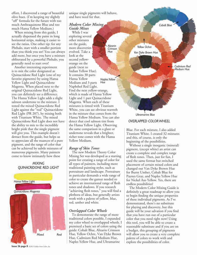
Overlapped Color Wheels To demonstrate the range of more traditional colors possible, I expanded my color wheel to overlapped wheels. I premixed a basic set of colors using the guide: Cobalt Blue, Alizarin Crimson Hue, Yellow Ochre, Van Dyke Brown Hue, Cadmium Red Medium Hue, Naples Yellow Hue, and Ultramarine
Blue. For each mixture, I also added Titanium White. I created 32 mixtures and this, of course, is only the beginning of the possibilities. Without a single inorganic (mineral) pigment, (except white) an artist can create a complete and complex range of flesh tones. Then, just for fun, I used the same format but switched placement of certain mixed colors and changed out Van Dyke Brown Hue for Burnt Umber, Cobalt Blue for Paynes Gray, and Naples Yellow Hue for Nickel Azo Yellow. Yes, there are endless possibilities! The Modern Color Mixing Guide is definitely a great roadmap to allow you to begin finding the unique properties of these individual pigments. As I’ve demonstrated, there’s no substitute for playing and discovery, but this guide will be your salvation if you find that you have run out of a particular color that you need right now! Using this tool, you will be able to create a reasonable substitute and if you are on a budget, this grouping of pigments will allow you to create a very complete palette of colors to work with and explore the possibilities of color.
MIXING QUINACRIDONE RED LIGHT
Mixed Real
Hansa Yellow Light
Quinacrdione Magenta
OVERLAPPED COLOR WHEEL
Issue 26 page 9 ©2012 Golden Artist Colors, Inc.
By Amy McKinnon Carl Plansky’s excitement around the discovery of unique colors had expressed itself in the incredibly wide range of pigments within the Williamsburg Handmade Oil Colors line. Included are many of the standard colors, interesting and unique blends and families of pigments like Cadmium and Cobalt that excel far beyond most manufacturer’s ranges. The Williamsburg Oils also include significant historical colors that are becoming more scarce and rare, iridescents, interference colors, and some of the most exciting and interesting earth colors that our natural geology across our planet could produce. For us, once that pigment or color space has been selected, our dedication lies in achieving an expression of that paint that is unique to each color. While first formulating to obtain the highest pigment load, and a consistency that tunes the working property of the color, our attention is given to achieving the specific grind for each pigment. Pigment grind has much more to do with thresholds and undertones than texture and grit. Texture and grit may at first seem like quirky traits that give the brand a much more handmade quality but once the paint is brushed out and more specifically mixed and glazed with, these colors reveal that the texture and grit are the bearers of the paint’s individuality and eloquence. Pigment grind informs undertones, what lies beneath, it is what draws you closer and imparts a veil of color removed from the opacity that comes out of the tube and onto your palette. Every pigment excels at its own certain grind and each pigment has its own limit or sweet spot. Go too far, grind too hard or too fine and one gets a plain and good pigment but that is all. It can even exhibit itself as dull when the particles are too small and too close together. Grind the pigments to their own individual threshold and one introduces its secret and allows it to reveal its true nature in the spaces in between the particles. It has been an exciting journey
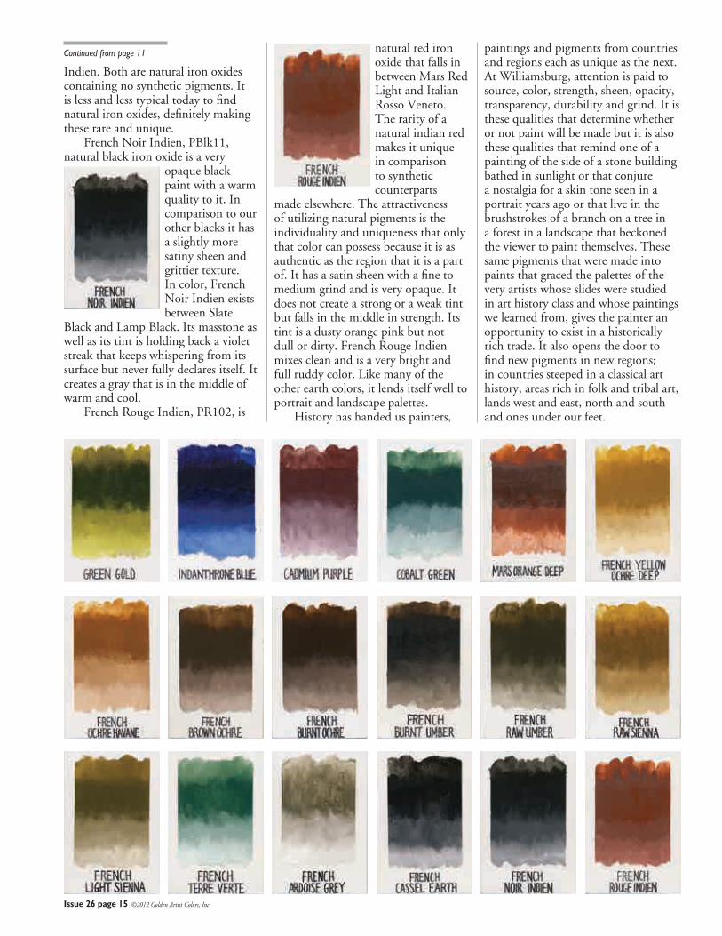
18 New Williamsburg Oil Colorsto both maintain the high standards of quality of the Williamsburg brand as well as to continue its tradition of actively searching for new and unique pigments. The mission of Williamsburg is to provide painters with the best quality pigments that serve as a connection to the past while continually expanding the depth and scope of the colors painters depend on. In keeping with that tradition we are very proud to introduce 18 new colors. Two of the 18 are old favorites that had been discontinued in the past, 3 are additions to families of pigments that help round out their spectrum of hues and the remaining 13 are earth colors from the oldest operating mine and pigment supplier in France.
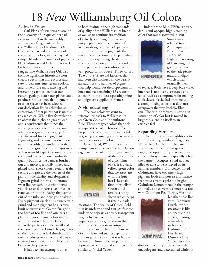
A Homecoming The two colors we want to reintroduce back to Williamsburg are Green Gold and Indanthrone Blue. These are great colors that help to expand the color choices, offer properties that are unique, are useful in glazing and mixing and were greatly missed as awesome colors. Green Gold, PY129, is a semi-transparent Copper Azomethine Green pigment. The color of this green out
of the tube is that of a picholine olive. It is a dark yellow-green color that we associate with the fruit but is less pale than most olives. Green Gold retains a satiny sheen which helps it retain a dark
masstone. The beauty of Green Gold is in its undertone and tint. At first the undertone appears as a very transparent virgin olive oil color but then it imparts an amber glow within that almost contradicts its masstone and stuns the viewer. The tint of Green Gold is clean and such a departure from its parent color that it is hard to believe it is from the same paint and if pressed to compare, the tint color is similar to Nickel Yellow.
Indanthrone Blue, PB60, is a very dark, semi-opaque, highly staining color that was discovered in 1901.
Sometimes referred to as Anthraquinone Blue, it has an ASTM Lighfastness rating of I, making it a good alternative to the fade prone natural Indigo which it was originally meant
to replace. Both have a deep blue violet hue that is not overly-saturated and lends itself as a component for making a ‘blackless’ black. Indanthrone is a strong mixing color that does not overpower the way Phthalo Blue can. The tint it produces is strong in saturation of color but is muted in brightness lending itself to an earthier feel.
Expanding Families The next 3 colors are additions to currently strong families of pigments. While these familiar families are already expansive in their spectral range, the opportunity to widen that space is always invited, especially when the pigment occupies a void not yet filled or able to be achieved by its familial members. Our concentrated Cadmiums have extremely high pigment loads and possess a brilliance that travels from a pale but bright Cadmium Lemon through the oranges and reds, and currently comes to a rest with Cadmium Red Purple. We now
lengthen that line with Cadmium Purple, whose masstone is like an opaque bing cherry, existing somewhere in between Cadmium Red Purple and Quinacridone Violet. Its color
does exhibit an opaque richness that is unapologetic and determined while its
Issue 26 page 10 ©2012 Golden Artist Colors, Inc.
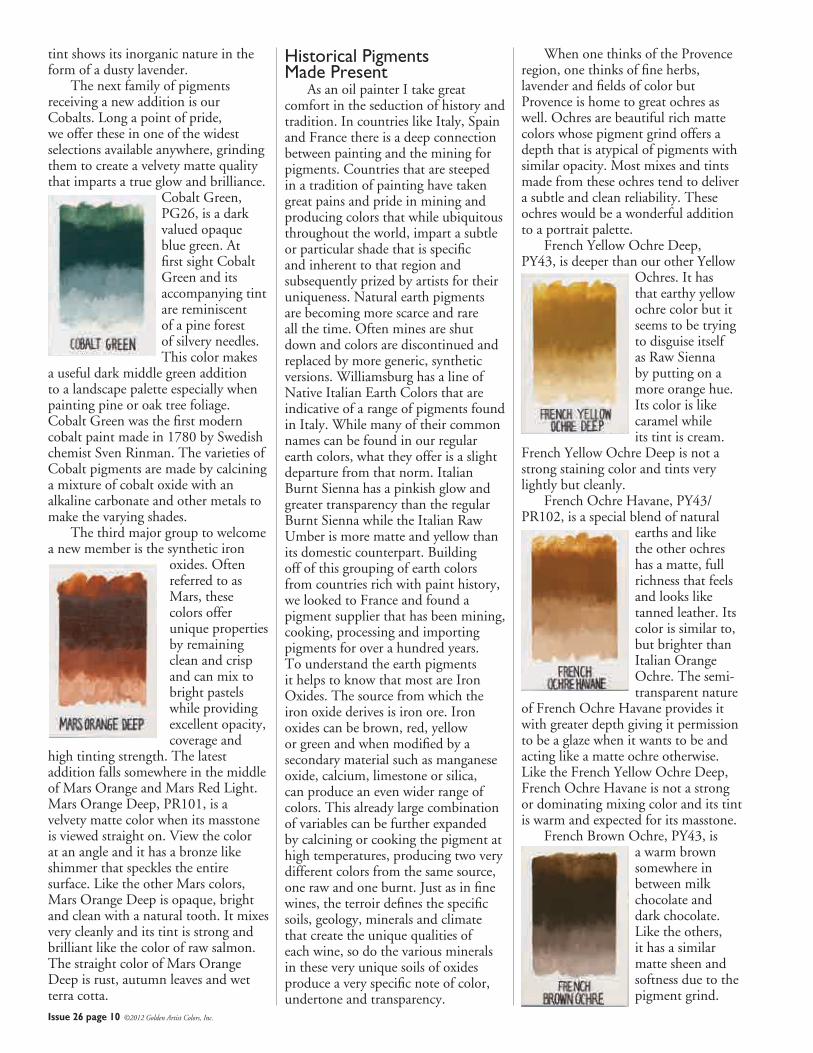
tint shows its inorganic nature in the form of a dusty lavender. The next family of pigments receiving a new addition is our Cobalts. Long a point of pride, we offer these in one of the widest selections available anywhere, grinding them to create a velvety matte quality that imparts a true glow and brilliance.
Cobalt Green, PG26, is a dark valued opaque blue green. At first sight Cobalt Green and its accompanying tint are reminiscent of a pine forest of silvery needles. This color makes
a useful dark middle green addition to a landscape palette especially when painting pine or oak tree foliage. Cobalt Green was the first modern cobalt paint made in 1780 by Swedish chemist Sven Rinman. The varieties of Cobalt pigments are made by calcining a mixture of cobalt oxide with an alkaline carbonate and other metals to make the varying shades. The third major group to welcome a new member is the synthetic iron
oxides. Often referred to as Mars, these colors offer unique properties by remaining clean and crisp and can mix to bright pastels while providing excellent opacity, coverage and
high tinting strength. The latest addition falls somewhere in the middle of Mars Orange and Mars Red Light. Mars Orange Deep, PR101, is a velvety matte color when its masstone is viewed straight on. View the color at an angle and it has a bronze like shimmer that speckles the entire surface. Like the other Mars colors, Mars Orange Deep is opaque, bright and clean with a natural tooth. It mixes very cleanly and its tint is strong and brilliant like the color of raw salmon. The straight color of Mars Orange Deep is rust, autumn leaves and wet terra cotta.
Historical Pigments Made Present As an oil painter I take great comfort in the seduction of history and tradition. In countries like Italy, Spain and France there is a deep connection between painting and the mining for pigments. Countries that are steeped in a tradition of painting have taken great pains and pride in mining and producing colors that while ubiquitous throughout the world, impart a subtle or particular shade that is specific and inherent to that region and subsequently prized by artists for their uniqueness. Natural earth pigments are becoming more scarce and rare all the time. Often mines are shut down and colors are discontinued and replaced by more generic, synthetic versions. Williamsburg has a line of Native Italian Earth Colors that are indicative of a range of pigments found in Italy. While many of their common names can be found in our regular earth colors, what they offer is a slight departure from that norm. Italian Burnt Sienna has a pinkish glow and greater transparency than the regular Burnt Sienna while the Italian Raw Umber is more matte and yellow than its domestic counterpart. Building off of this grouping of earth colors from countries rich with paint history, we looked to France and found a pigment supplier that has been mining, cooking, processing and importing pigments for over a hundred years. To understand the earth pigments it helps to know that most are Iron Oxides. The source from which the iron oxide derives is iron ore. Iron oxides can be brown, red, yellow or green and when modified by a secondary material such as manganese oxide, calcium, limestone or silica, can produce an even wider range of colors. This already large combination of variables can be further expanded by calcining or cooking the pigment at high temperatures, producing two very different colors from the same source, one raw and one burnt. Just as in fine wines, the terroir defines the specific soils, geology, minerals and climate that create the unique qualities of each wine, so do the various minerals in these very unique soils of oxides produce a very specific note of color, undertone and transparency.
When one thinks of the Provence region, one thinks of fine herbs, lavender and fields of color but Provence is home to great ochres as well. Ochres are beautiful rich matte colors whose pigment grind offers a depth that is atypical of pigments with similar opacity. Most mixes and tints made from these ochres tend to deliver a subtle and clean reliability. These ochres would be a wonderful addition to a portrait palette. French Yellow Ochre Deep, PY43, is deeper than our other Yellow
Ochres. It has that earthy yellow ochre color but it seems to be trying to disguise itself as Raw Sienna by putting on a more orange hue. Its color is like caramel while its tint is cream.
French Yellow Ochre Deep is not a strong staining color and tints very lightly but cleanly. French Ochre Havane, PY43/PR102, is a special blend of natural
earths and like the other ochres has a matte, full richness that feels and looks like tanned leather. Its color is similar to, but brighter than Italian Orange Ochre. The semi-transparent nature
of French Ochre Havane provides it with greater depth giving it permission to be a glaze when it wants to be and acting like a matte ochre otherwise. Like the French Yellow Ochre Deep, French Ochre Havane is not a strong or dominating mixing color and its tint is warm and expected for its masstone. French Brown Ochre, PY43, is
a warm brown somewhere in between milk chocolate and dark chocolate. Like the others, it has a similar matte sheen and softness due to the pigment grind.
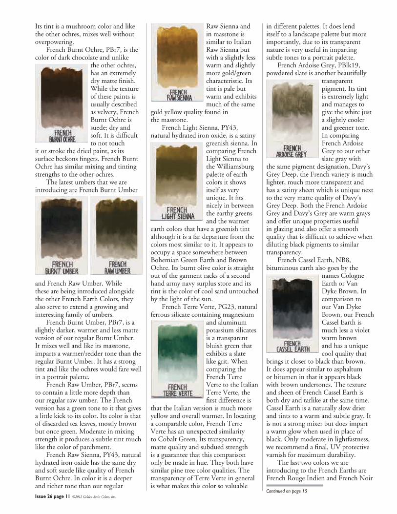
Raw Sienna and in masstone is similar to Italian Raw Sienna but with a slightly less warm and slightly more gold/green characteristic. Its tint is pale but warm and exhibits much of the same
gold yellow quality found in the masstone. French Light Sienna, PY43, natural hydrated iron oxide, is a satiny
greenish sienna. In comparing French Light Sienna to the Williamsburg palette of earth colors it shows itself as very unique. It fits nicely in between the earthy greens and the warmer
earth colors that have a greenish tint although it is a far departure from the colors most similar to it. It appears to occupy a space somewhere between Bohemian Green Earth and Brown Ochre. Its burnt olive color is straight out of the garment racks of a second hand army navy surplus store and its tint is the color of cool sand untouched by the light of the sun. French Terre Verte, PG23, natural ferrous silicate containing magnesium
and aluminum potassium silicates is a transparent bluish green that exhibits a slate like grit. When comparing the French Terre Verte to the Italian Terre Verte, the first difference is
that the Italian version is much more yellow and overall warmer. In locating a comparable color, French Terre Verte has an unexpected similarity to Cobalt Green. Its transparency, matte quality and subdued strength is a guarantee that this comparison only be made in hue. They both have similar pine tree color qualities. The transparency of Terre Verte in general is what makes this color so valuable
Issue 26 page 11 ©2012 Golden Artist Colors, Inc.
Its tint is a mushroom color and like the other ochres, mixes well without overpowering. French Burnt Ochre, PBr7, is the color of dark chocolate and unlike
the other ochres, has an extremely dry matte finish. While the texture of these paints is usually described as velvety, French Burnt Ochre is suede; dry and soft. It is difficult to not touch
it or stroke the dried paint, as its surface beckons fingers. French Burnt Ochre has similar mixing and tinting strengths to the other ochres. The latest umbers that we are introducing are French Burnt Umber
and French Raw Umber. While these are being introduced alongside the other French Earth Colors, they also serve to extend a growing and interesting family of umbers. French Burnt Umber, PBr7, is a slightly darker, warmer and less matte version of our regular Burnt Umber. It mixes well and like its masstone, imparts a warmer/redder tone than the regular Burnt Umber. It has a strong tint and like the ochres would fare well in a portrait palette. French Raw Umber, PBr7, seems to contain a little more depth than our regular raw umber. The French version has a green tone to it that gives a little kick to its color. Its color is that of discarded tea leaves, mostly brown but once green. Moderate in mixing strength it produces a subtle tint much like the color of parchment. French Raw Sienna, PY43, natural hydrated iron oxide has the same dry and soft suede like quality of French Burnt Ochre. In color it is a deeper and richer tone than our regular
in different palettes. It does lend itself to a landscape palette but more importantly, due to its transparent nature is very useful in imparting subtle tones to a portrait palette. French Ardoise Grey, PBlk19, powdered slate is another beautifully
transparent pigment. Its tint is extremely light and manages to give the white just a slightly cooler and greener tone. In comparing French Ardoise Grey to our other slate gray with
the same pigment designation, Davy’s Grey Deep, the French variety is much lighter, much more transparent and has a satiny sheen which is unique next to the very matte quality of Davy’s Grey Deep. Both the French Ardoise Grey and Davy’s Grey are warm grays and offer unique properties useful in glazing and also offer a smooth quality that is difficult to achieve when diluting black pigments to similar transparency. French Cassel Earth, NB8, bituminous earth also goes by the
names Cologne Earth or Van Dyke Brown. In comparison to our Van Dyke Brown, our French Cassel Earth is much less a violet warm brown and has a unique cool quality that
brings it closer to black than brown. It does appear similar to asphaltum or bitumen in that it appears black with brown undertones. The texture and sheen of French Cassel Earth is both dry and tarlike at the same time. Cassel Earth is a naturally slow drier and tints to a warm and subtle gray. It is not a strong mixer but does impart a warm glow when used in place of black. Only moderate in lightfastness, we recommend a final, UV protective varnish for maximum durability. The last two colors we are introducing to the French Earths are French Rouge Indien and French Noir
Continued on page 15
Issue 26 page 12 ©2012 Golden Artist Colors, Inc.
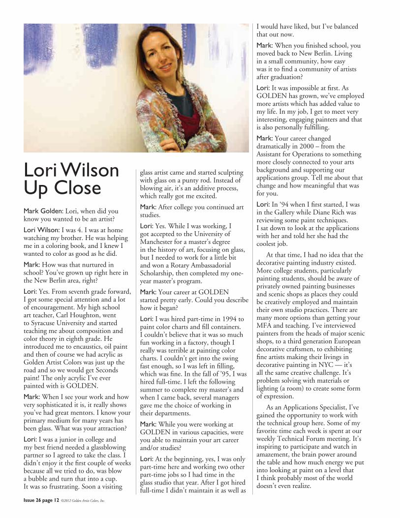
Mark Golden: Lori, when did you know you wanted to be an artist?
Lori Wilson: I was 4. I was at home watching my brother. He was helping me in a coloring book, and I knew I wanted to color as good as he did.
Mark: How was that nurtured in school? You’ve grown up right here in the New Berlin area, right?
Lori: Yes. From seventh grade forward, I got some special attention and a lot of encouragement. My high school art teacher, Carl Houghton, went to Syracuse University and started teaching me about composition and color theory in eighth grade. He introduced me to encaustics, oil paint and then of course we had acrylic as Golden Artist Colors was just up the road and so we would get Seconds paint! The only acrylic I’ve ever painted with is GOLDEN.
Mark: When I see your work and how very sophisticated it is, it really shows you’ve had great mentors. I know your primary medium for many years has been glass. What was your attraction?
Lori: I was a junior in college and my best friend needed a glassblowing partner so I agreed to take the class. I didn’t enjoy it the first couple of weeks because all we tried to do, was blow a bubble and turn that into a cup. It was so frustrating. Soon a visiting
glass artist came and started sculpting with glass on a punty rod. Instead of blowing air, it’s an additive process, which really got me excited.
Mark: After college you continued art studies.
Lori: Yes. While I was working, I got accepted to the University of Manchester for a master’s degree in the history of art, focusing on glass, but I needed to work for a little bit and won a Rotary Ambassadorial Scholarship, then completed my one-year master’s program.
Mark: Your career at GOLDEN started pretty early. Could you describe how it began?
Lori: I was hired part-time in 1994 to paint color charts and fill containers. I couldn’t believe that it was so much fun working in a factory, though I really was terrible at painting color charts. I couldn’t get into the swing fast enough, so I was left in filling, which was fine. In the fall of ’95, I was hired full-time. I left the following summer to complete my master’s and when I came back, several managers gave me the choice of working in their departments.
Mark: While you were working at GOLDEN in various capacities, were you able to maintain your art career and/or studies?
Lori: At the beginning, yes, I was only part-time here and working two other part-time jobs so I had time in the glass studio that year. After I got hired full-time I didn’t maintain it as well as
I would have liked, but I’ve balanced that out now.
Mark: When you finished school, you moved back to New Berlin. Living in a small community, how easy was it to find a community of artists after graduation?
Lori: It was impossible at first. As GOLDEN has grown, we’ve employed more artists which has added value to my life. In my job, I get to meet very interesting, engaging painters and that is also personally fulfilling.
Mark: Your career changed dramatically in 2000 – from the Assistant for Operations to something more closely connected to your arts background and supporting our applications group. Tell me about that change and how meaningful that was for you.
Lori: In ‘94 when I first started, I was in the Gallery while Diane Rich was reviewing some paint techniques. I sat down to look at the applications with her and told her she had the coolest job.
At that time, I had no idea that the decorative painting industry existed. More college students, particularly painting students, should be aware of privately owned painting businesses and scenic shops as places they could be creatively employed and maintain their own studio practices. There are many more options than getting your MFA and teaching. I’ve interviewed painters from the heads of major scenic shops, to a third generation European decorative craftsmen, to exhibiting fine artists making their livings in decorative painting in NYC — it’s all the same creative challenge. It’s problem solving with materials or lighting (a room) to create some form of expression.
As an Applications Specialist, I’ve gained the opportunity to work with the technical group here. Some of my favorite time each week is spent at our weekly Technical Forum meeting. It’s inspiring to participate and watch in amazement, the brain power around the table and how much energy we put into looking at paint on a level that I think probably most of the world doesn’t even realize.
Lori Wilson Up Close
Issue 26 page 13 ©2012 Golden Artist Colors, Inc.
Mark: It is an inspiring group. Lori, share a bit about the projects you’ve been involved with at GOLDEN since joining the Applications group.
Lori: One of my favorite weeks of the year is when I get to work on the Color Trends presentation. It’s the “Olympics of the Mind” in paint. It’s thinking beyond yourself, your knowledge of the materials, and discovering what future capabilities may be possible.
Mark: It’s an exhausting time for you.
Lori: It is. I have to close the doors, cocoon myself. I need to get lost in thought without interruption.
Mark: One of the things you’ve done in being able to support artists calling up for either fine arts or decorative arts, is you’ve actually gone out into the field and provided assistance or worked alongside some of these incredible artists. Can you share some of those?
Lori: Those experiences are when I also appreciate what I’ve gained and what GOLDEN is about, putting into practice how we help painters. Each of those projects was career and life altering, for example, being on Pierre Finkelstein’s team.
Mark: Where was that?
Lori: Pierre had a job in London, England painting a palace down the street from Kensington Palace. It sounds glamorous, but it was painter’s boot camp. It was like a Marine Corps class for decorative painters, and for me, it was another production job. We met at 7:15 am and were on the job at 7:30. You had a ten-minute break and a half-hour lunch, and then you worked until you had to stop. We painted and prepped and sanded and taped and cleaned and repaired. The third wealthiest family in the world had just purchased it. Pierre designed some techniques like dragging (striae) and French patina, and it was actually part of the project where we were finalizing formulas for our new Proceed line. It was on-the-job application testing.
Mark: So a lot of that has been incredibly meaningful in your ability to then support other artists in the field. One of these jobs had you going to China.
Lori: Yes. That came after working with Pierre and it was because of my experience with him that I saw how to set up an onsite studio. I replicated that in China. When I was in Shanghai I worked with a company to create a decorative painting market in China because they don’t have it. What they have in their tradition is very, very different than Western culture. The Chinese are looking to the West for inspiration.
They want it now, but need training, so we started with color mixing, understanding the tools and basic materials and then moved into more technical questions about higher quality materials. They actually got a job while I was there and needed me to stay an extra week. It was great! My career has built itself one block of experience after another.
Mark: I know that folks who call you are so appreciative that not only do you have technical knowledge of the materials, but also real experience working professionally with the materials. I also didn’t want to miss an opportunity to talk about your support of the community. I want to give you a chance to talk about your other passion, about giving back.
Lori: There are many, many great organizations from Relay for Life to the American Red Cross. I think I have connected most significantly with the United Way. It’s a great organization that supports a broad spectrum of individuals who are our neighbors.
Mark: Lori, you’ve also been involved in seminars instructing both college students and young women looking to careers in the future, Can you talk about some of those initiatives that you’ve been a part of?
Lori: I participated in an event, Women Helping Girls Make Decisions, where local schools offer 12-year-olds the chance to visit someone locally in a career they’re interested in (bankers, artists, vets) to participate in a hands-on activity and talk about the different areas that they will have to study.
Math is always emphasized. I’ve given exercises to demonstrate a day in the life of Tech Support at GOLDEN
and it’s really fun. Obviously, they’re interested people at the age of 12 to give up a Saturday to get on a bus and go to a local college and meet with these strangers. I think if I had that opportunity when I was 12, I would have made different choices.
Mark: Lori, you’ve also made it an objective of yours to conduct classes and workshops for staff to understand some of the things that excite you about decorative painting materials. Can you talk about that?
Lori: I think it’s important for the rest of the staff, and they’ve said this, to know what these materials they make – actually do. I’ve organized hands-on events so people could touch the paint. Some of the most enjoyable conversations were with paint makers. They had never seen Crackle Paste cracking – they only see it in the wet state. They never understood why it’s so cool and they shared with me how it’s different from the formula side. It was a great exchange of information.
Mark: Lori, you’ve almost always been teaching art in various capacities. You support professional artists and decorative artists. You’re an application specialist now for GOLDEN, but beyond teaching art, you’ve also personally made it your goal to teach about the work environment. In 2009, you were selected as ESOP Employee Owner of the Year for all of New York and Pennsylvania.
You’ve also been involved in many community groups, serving on boards and participating in volunteer functions both here, in the local community and for the arts community. Just reading about these activities, I’m exhausted, but for you it all seems to be incredibly invigorating. With all that you are doing, knowing that your art career has had to be put to the side, how do all these things seem to be so uplifting to you?
Lori: I think it’s about energy and I get charged by it. It’s doing good things. I get to interact with people in really fun ways, gaining knowledge and experience. I have a creative career and I get to have my own studio practice. Everything feeds into everything else, I feel blessed!
Issue 26 page 14 ©2012 Golden Artist Colors, Inc.
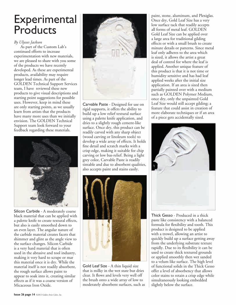
Experimental Products By Ulysses Jackson As part of the Custom Lab’s continued efforts to increase experimentation with new materials, we are pleased to share with you some of the products we have recently developed. As these are experimental products, availability may require longer lead times. As part of the GOLDEN Technical Support Services team, I have reviewed these new products to give visual descriptions and starting point suggestions for possible uses. However, keep in mind these are only starting points, as we usually learn from artists that the products have many more uses than we initially envision. The GOLDEN Technical Support team look forward to your feedback regarding these materials.
Silicon Carbide - A moderately coarse black material that can be applied with a palette knife to create textural effects, but also is easily smoothed down to an even layer. The angular nature of the carbide material creates facets that shimmer and glint as the angle view to the surface changes. Silicon Carbide is a very hard material that is often used in the abrasive and tool industry, making it very hard to scrape or mar this material once it is dry. While the material itself is not readily absorbent, the rough surface allows paint to appear to soak into it, creating similar effects as if it was a coarse version of Micaceous Iron Oxide.
Carvable Paste - Designed for use on rigid supports, it offers the ability to build up a low relief textural surface using a palette knife application, and dries to a slightly rough cement-like surface. Once dry, this product can be readily carved with any sharp object (wood carving or linoleum tools) to develop a wide array of effects. It holds fine detail and scratch marks with a crisp edge, making it suitable for chip carving or low bas-relief. Being a light grey color, Carvable Paste is readily tintable and due to absorbent qualities, also accepts paint and stains easily.
Gold Leaf Size - A thin liquid size that is milky in the wet state but dries clear. It flows and levels very well off the brush onto a wide array of low to moderately absorbent surfaces, such as
paint, stone, aluminum, and Plexiglas. Once dry, Gold Leaf Size has a very low surface tack that readily accepts all forms of metal leaf. GOLDEN Gold Leaf Size can be applied over a large area for traditional gilding effects or with a small brush to create minute details or patterns. Since metal leaf only adheres to the area which is sized, it allows the artist a great deal of control for where the leaf is applied. Another unique feature of this product is that it is not time or humidity sensitive and has had leaf applied weeks after the initial size application. If an area is sized then partially painted over with a medium such as GOLDEN Polymer Medium, once dry, only the unpainted Gold Leaf Size would still accept gilding; a feature that could assist in creation of more elaborate techniques or if an area of a piece gets accidentally sized.
Thick Gesso - Produced in a thick paste like consistency with a balanced formula for flexibility and tooth. This product is designed to be applied with a trowel, allowing an artist to quickly build up a surface getting away from the underlying substrate texture rapidly. Due to its flexibility it can be used to create thick textured grounds or applied smoothly then wet sanded to a velum like surface. The high level of functional solids in the Thick Gesso offer a level of absorbency that allows color stains to retain a crisp edge while simultaneously looking embedded slightly below the surface.
Issue 26 page 15 ©2012 Golden Artist Colors, Inc.
Indien. Both are natural iron oxides containing no synthetic pigments. It is less and less typical today to find natural iron oxides, definitely making these rare and unique. French Noir Indien, PBlk11, natural black iron oxide is a very
opaque black paint with a warm quality to it. In comparison to our other blacks it has a slightly more satiny sheen and grittier texture. In color, French Noir Indien exists between Slate
Black and Lamp Black. Its masstone as well as its tint is holding back a violet streak that keeps whispering from its surface but never fully declares itself. It creates a gray that is in the middle of warm and cool. French Rouge Indien, PR102, is
natural red iron oxide that falls in between Mars Red Light and Italian Rosso Veneto. The rarity of a natural indian red makes it unique in comparison to synthetic counterparts
made elsewhere. The attractiveness of utilizing natural pigments is the individuality and uniqueness that only that color can possess because it is as authentic as the region that it is a part of. It has a satin sheen with a fine to medium grind and is very opaque. It does not create a strong or a weak tint but falls in the middle in strength. Its tint is a dusty orange pink but not dull or dirty. French Rouge Indien mixes clean and is a very bright and full ruddy color. Like many of the other earth colors, it lends itself well to portrait and landscape palettes. History has handed us painters,
paintings and pigments from countries and regions each as unique as the next. At Williamsburg, attention is paid to source, color, strength, sheen, opacity, transparency, durability and grind. It is these qualities that determine whether or not paint will be made but it is also these qualities that remind one of a painting of the side of a stone building bathed in sunlight or that conjure a nostalgia for a skin tone seen in a portrait years ago or that live in the brushstrokes of a branch on a tree in a forest in a landscape that beckoned the viewer to paint themselves. These same pigments that were made into paints that graced the palettes of the very artists whose slides were studied in art history class and whose paintings we learned from, gives the painter an opportunity to exist in a historically rich trade. It also opens the door to find new pigments in new regions; in countries steeped in a classical art history, areas rich in folk and tribal art, lands west and east, north and south and ones under our feet.
Continued from page 11
JUST PAINTGolden Artist Colors, Inc.188 Bell RoadNew Berlin, NY 13411-3616 USA
PRSRT STDU.S. Postage
PAIDIthaca, NY
Permit #780
Return service requested
Issue 26 January 2012
Articles: Mark Golden, Patti Brady, Christopher Farrell, Amy McKinnon,
Ulysses Jackson, Sarah Sands, Jodi O’Dell
Editor: Jodi O’Dell
Publisher: Golden Artist Colors, Inc.
188 Bell Road, New Berlin, NY 13411-3616
607-847-6154 800-959-6543
Fax: 607-847-6767
Email: [email protected]
Web: goldenpaints.com
WilliamsburgOils.com
© 2012 Golden Artist Colors, Inc. All rights reserved. The contents of this publication may not be reproduced either in whole, or in part, without the consent of Golden Artist Colors, Inc. Golden Artist Colors is an Employee Owned Company.13626
By Sarah Sands From the beginning Williamsburg was always known as a ‘painter’s paint.’ Partly it was because the founder of the company, Carl Plansky, was first and foremost a painter by both temperament and training. Everything he made was infused with a painter’s sense of touch and passion for color. The hours spent over a mill or mixer were in constant dialog with the hours spent in the studio. As any painter knows, at the end of the day the paint always has to ‘work’, the color has to be beautiful, the overall sense.....well, sensuous. And those criteria never came from cold concepts or rigid recipes, but from the lived experience of the paint being pushed and attended to in the studio. As the company grew, the dialog continued to expand far beyond Carl’s own paintings and practice to include the constant conversations and feedback painters provided when calling or visiting the
The Launching ofwww.WilliamsburgOils.com/blog
factory and eventually to the thousands of emails and other contacts with artists that Williamsburg has had over the years. The launching of this blog is another step in that ongoing tradition - an invitation to a dialog and discussion about the deep traditions and new discoveries that inform our craft and underlie our shared love for the materials of painting. Let us know what you think and what you are thinking about. And if you are ever in upstate New York, please visit our factory where the same mills and mixers that made Carl’s paints many decades ago are still in operation. We are always eager to hear your thoughts over a cup of coffee or, better yet, while pushing around some paint in our applications area. In the meantime, however, we want to invite you into this new space as well and to let those conversations begin to take shape.
GOLDEN Introduces Uncommon BluesAvailable for this winter season only, this set of three fantastic blues is sure to pique your curiosity, especially if you’re looking for the fundamentals of blue, with a slight twist. Included in the set:• Anthraquinone Blue• Smalt Hue• Cerulean Blue Deep Available at your favorite art supply retailer. For more information about the Uncommon Blues in this set, go to:
www.goldenpaints.com/trycolor