prototyping sketches, storyboards, and other prototypes
Post on 19-Dec-2015
225 views
TRANSCRIPT
Prototyping
Sketches, storyboards, and other prototypes
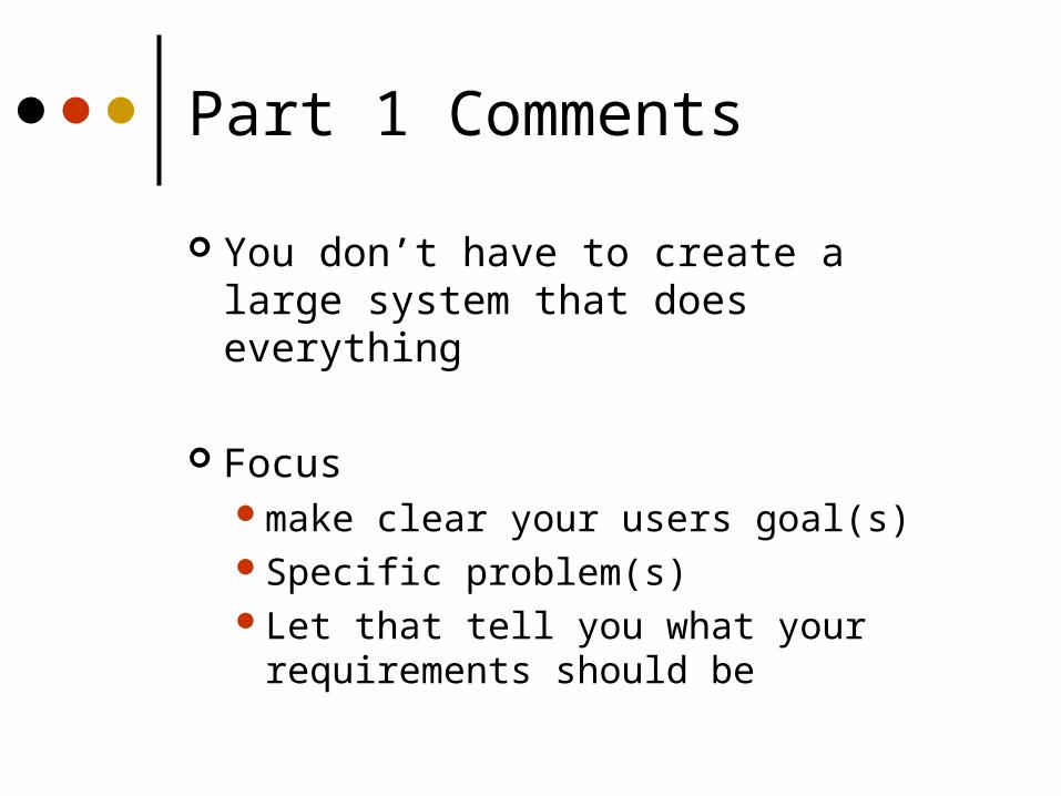
Part 1 Comments
You don’t have to create a large system that does everything
Focus make clear your users goal(s)Specific problem(s)Let that tell you what your
requirements should be
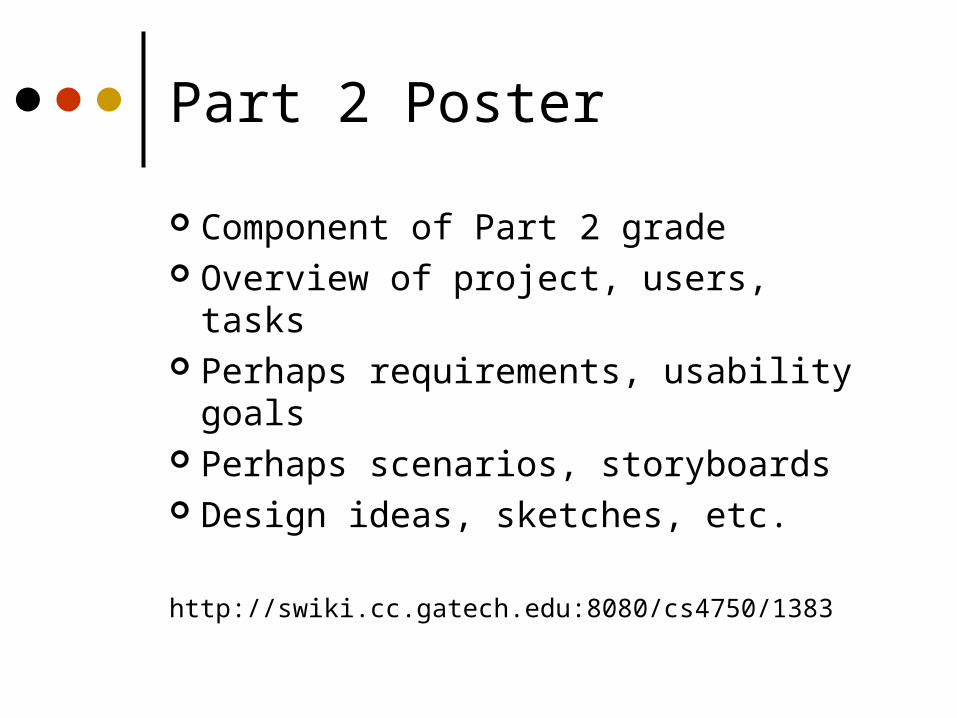
Part 2 Poster
Component of Part 2 grade Overview of project, users, tasks Perhaps requirements, usability goals Perhaps scenarios, storyboards Design ideas, sketches, etc.
http://swiki.cc.gatech.edu:8080/cs4750/1383

Design Artifacts
Expressing design ideas:Make it fast!!!Allow lots of flexibility for radically
different designsMake it cheapPromote valuable feedback
Facilitate iterative design and evaluation
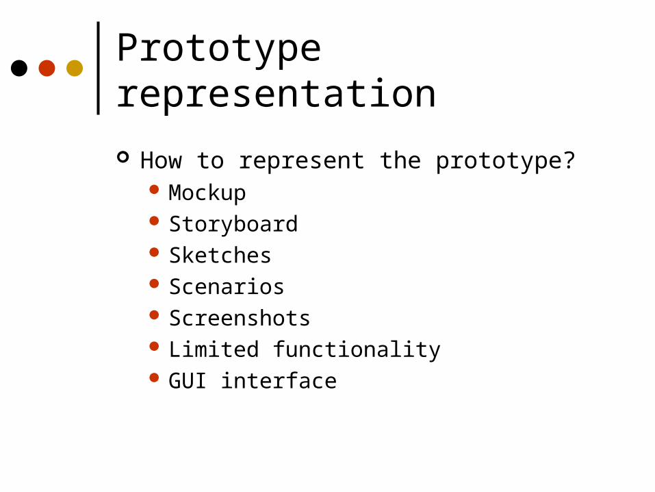
Prototype representation
How to represent the prototype? Mockup Storyboard Sketches Scenarios Screenshots Limited functionality GUI interface
Prototype scope
How much to represent?Vertical - “Deep” prototyping
• Show much of the interface, but in a shallow manner
Horizontal - “Broad” prototyping• Show only portion of interface, but large
amount of those portions
Prototype maturation
Low fidelity vs. High fidelity
Amount of polish should reflect maturity of the prototype
Why?
Scenarios
Typically narratives, but can be videos, simulations
Use to explore errors or exceptions Good for accompanying storyboard or
sketches
Jane likes to take walks every morning. This morning, as she places her hand on the door, she hears “75% chance of rain, better bring your umbrella.” Thankful for the notice, she grabs her umbrella and heads out for her morning walk.
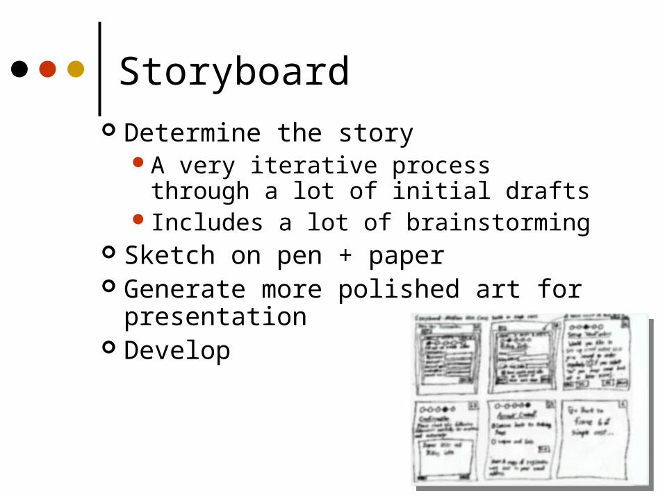
Storyboard Determine the story
A very iterative process through a lot of initial drafts
Includes a lot of brainstorming Sketch on pen + paper Generate more polished art for
presentation Develop
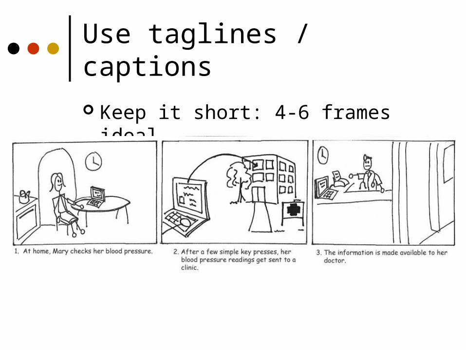
Use taglines / captions
Keep it short: 4-6 frames ideal
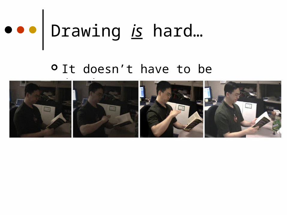
Drawing is hard…
It doesn’t have to be drawings..
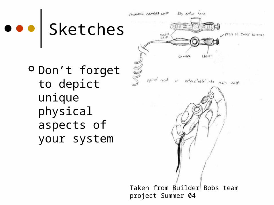
Sketches
Don’t forget to depict unique physical aspects of your system
Taken from Builder Bobs team project Summer 04
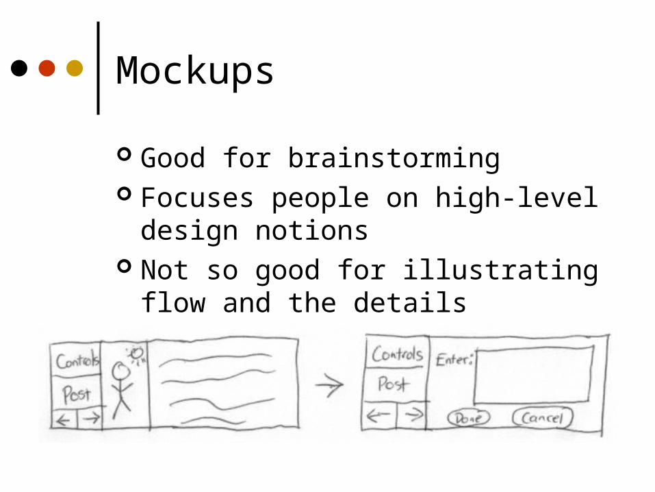
Mockups
Good for brainstorming Focuses people on high-level design
notions Not so good for illustrating flow and
the details
Paper prototyping
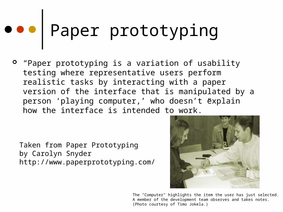
“Paper prototyping is a variation of usability testing where representative users perform realistic tasks by interacting with a paper version of the interface that is manipulated by a person ‘playing computer,’ who doesn’t explain how the interface is intended to work.”
The "Computer" highlights the item the user has just selected. A member of the development team observes and takes notes. (Photo courtesy of Timo Jokela.)
Taken from Paper Prototyping by Carolyn Snyderhttp://www.paperprototyping.com/
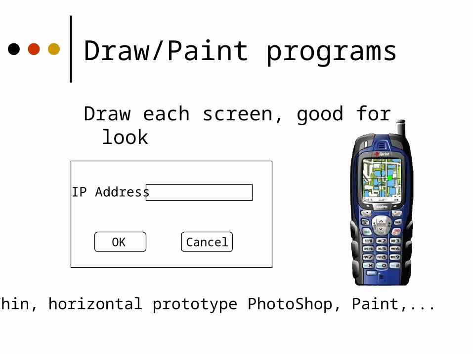
Draw/Paint programs
Draw each screen, good for look
Thin, horizontal prototype PhotoShop, Paint,...
IP Address
CancelOK

Simulations
Put storyboard-like views down with (animated) transitions between them
Can give user very specific script to follow
Often called chauffeured prototyping
Examples: PowerPoint, Hypercard, Macromedia Director, HTML
Interface Builders
Tools for laying out windows, controls, etc. of interface Easy to develop & modify screens Supports type of interface you are
developing Good look and feel Can add back-end functionality
Examples: Visual Basic, .NET, many apps for various languages

Specialized
SILK (Sketching Interfaces Like Krazy) / DENIM
Sketch-based GUI builder http://www.open-video.org/details.php?videoid=5018
by James Landay and his former group at UC Berkeley
Tutorials & Manuals
Create ahead of time to flesh out functionality
If it’s difficult to describe, it’s probably difficult to use!
Forces designer to be explicit about decisions
Putting it on paper is valuable
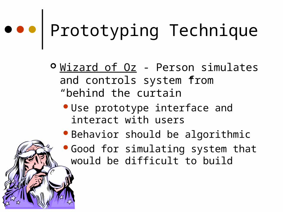
Prototyping Technique
Wizard of Oz - Person simulates and controls system from “behind the curtain”Use prototype interface and interact
with usersBehavior should be algorithmicGood for simulating system that would
be difficult to build
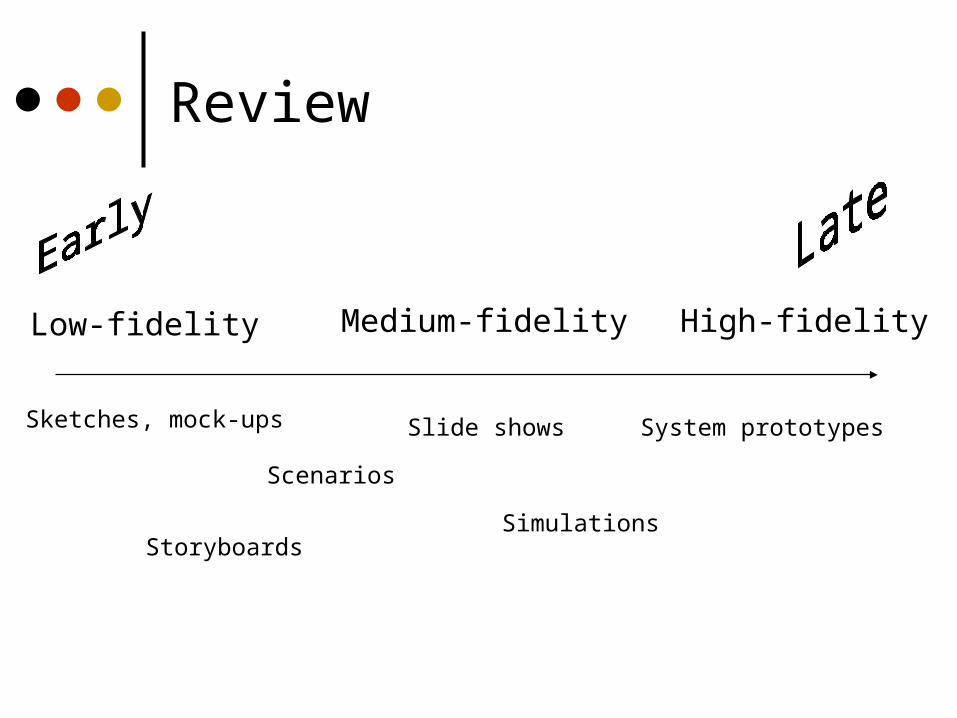
Review
Low-fidelity Medium-fidelity High-fidelity
Sketches, mock-ups Slide shows
Simulations
System prototypes
Scenarios
Storyboards
Visual design
The “look” of your interface
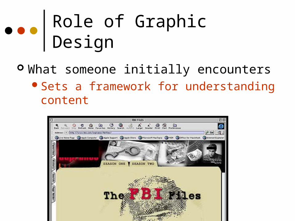
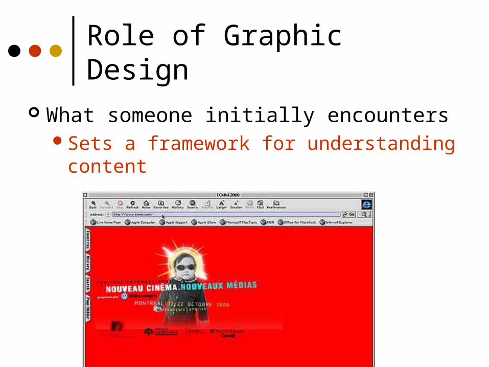
Role of Graphic Design
What someone initially encountersSets a framework for understanding content
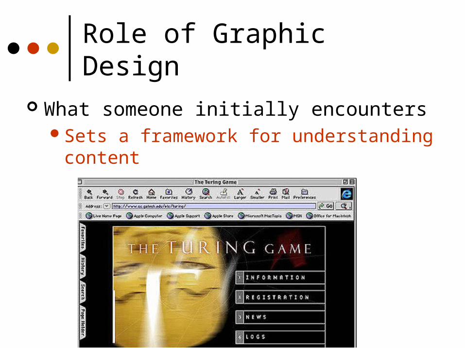
Role of Graphic Design
What someone initially encountersSets a framework for understanding content
Role of Graphic Design
What someone initially encountersSets a framework for understanding content
Graphic Design
A comprehensible mental image Appropriate organization of data, functions,
tasks and roles High-quality appearances
• The “look” Effective interaction sequencing
• The “feel”
Classes at UNCC:http://www.uncc.edu/schedule/subject/artg.html
Graphic Design
Involves knowledge of:SequencingOrganizationLayoutImageryColorTypography
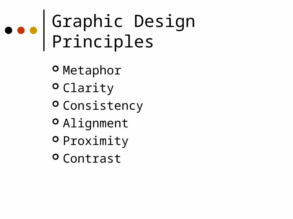
Graphic Design Principles
Metaphor Clarity Consistency Alignment Proximity Contrast
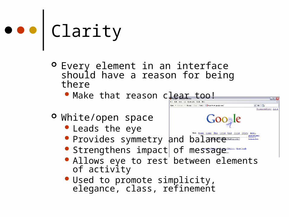
Clarity
Every element in an interface should have a reason for being there Make that reason clear too!
White/open space Leads the eye Provides symmetry and balance Strengthens impact of message Allows eye to rest between elements of
activity Used to promote simplicity, elegance, class,
refinement
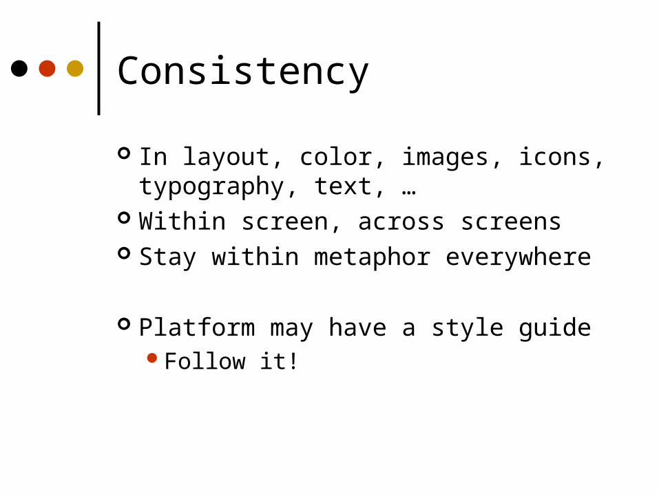
Consistency
In layout, color, images, icons, typography, text, …
Within screen, across screens Stay within metaphor everywhere
Platform may have a style guideFollow it!
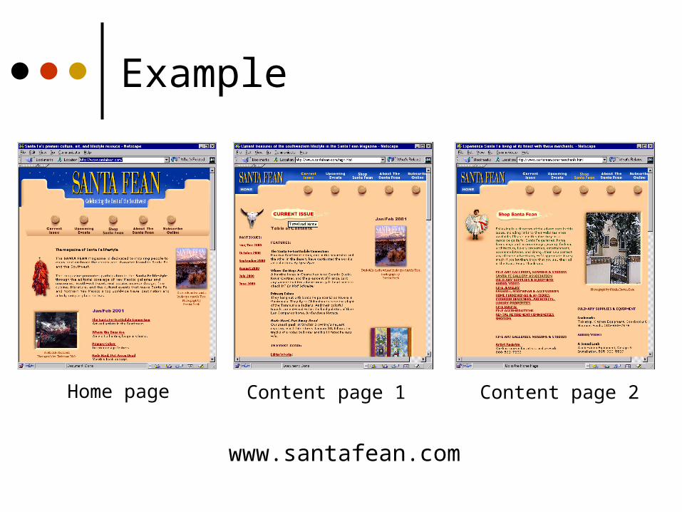
Example
Home page Content page 1 Content page 2
www.santafean.com
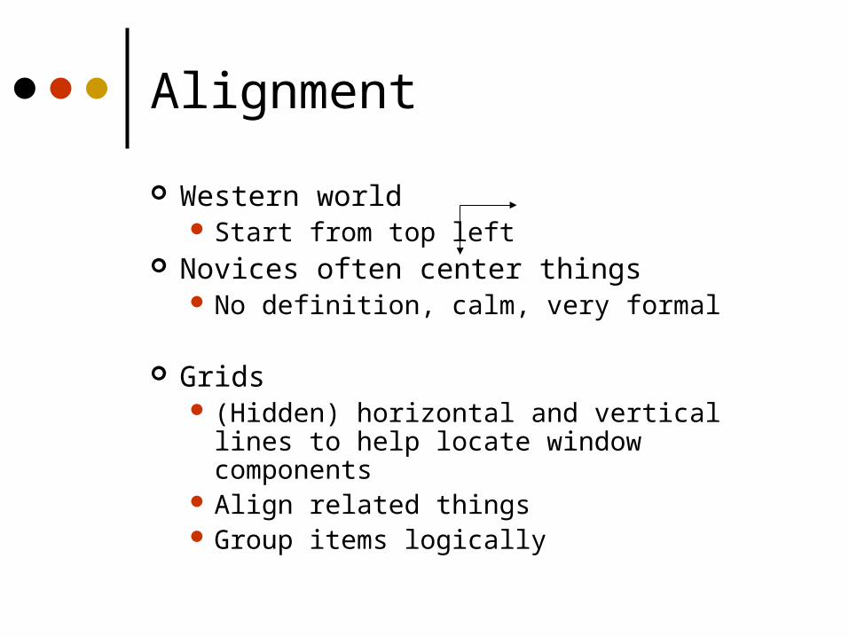
Alignment
Western world Start from top left
Novices often center things No definition, calm, very formal
Grids (Hidden) horizontal and vertical lines to help
locate window components Align related things Group items logically

Grids – use them
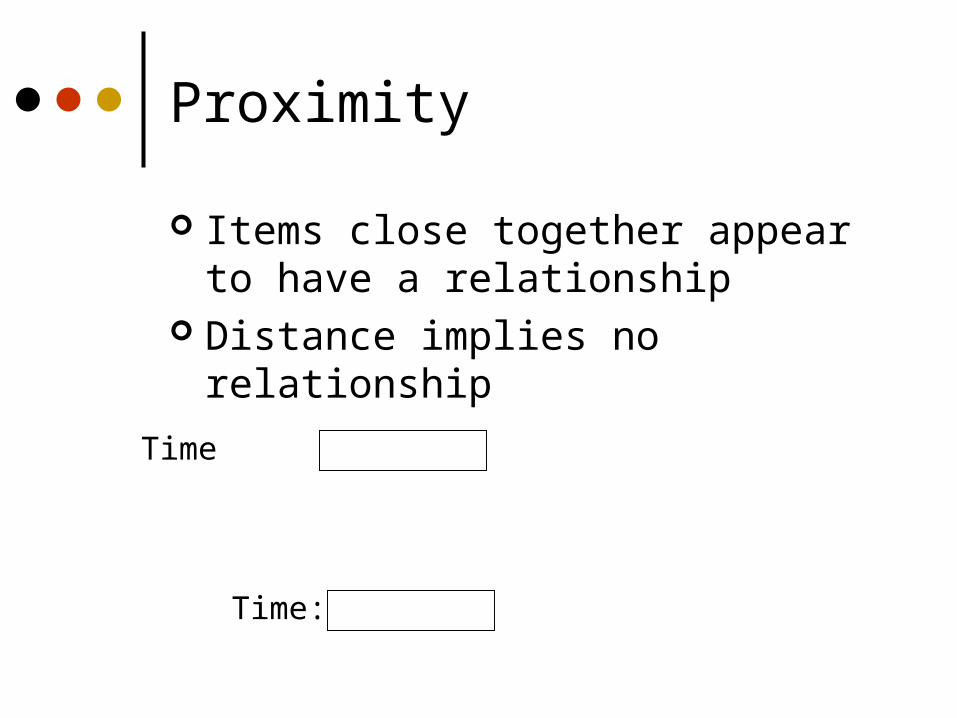
Proximity
Items close together appear to have a relationship
Distance implies no relationship
Time:
Time
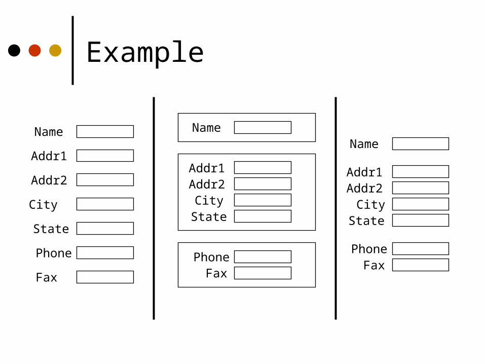
Example
Name
Addr1
Addr2
City
State
Phone
Fax
Name
Addr1Addr2
CityState
PhoneFax
Name
Addr1Addr2
CityState
PhoneFax
Contrast
Pulls you in – set off most important item Guides your eyes around the interface Supports skimming Add focus
Example
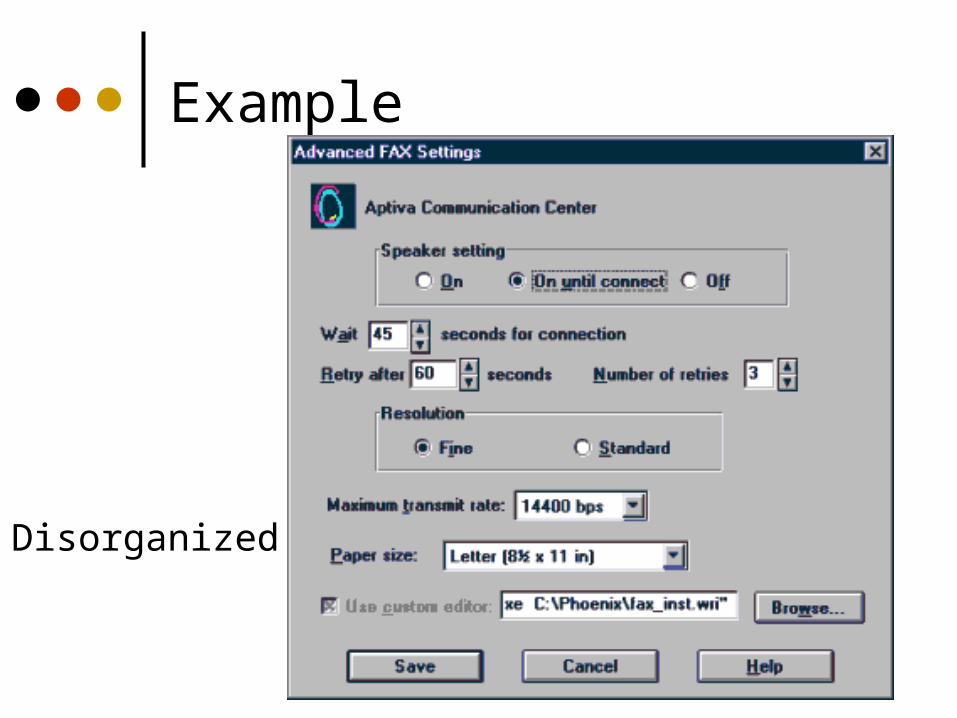
Disorganized
Example
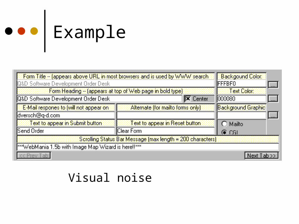
Visual noise
Example
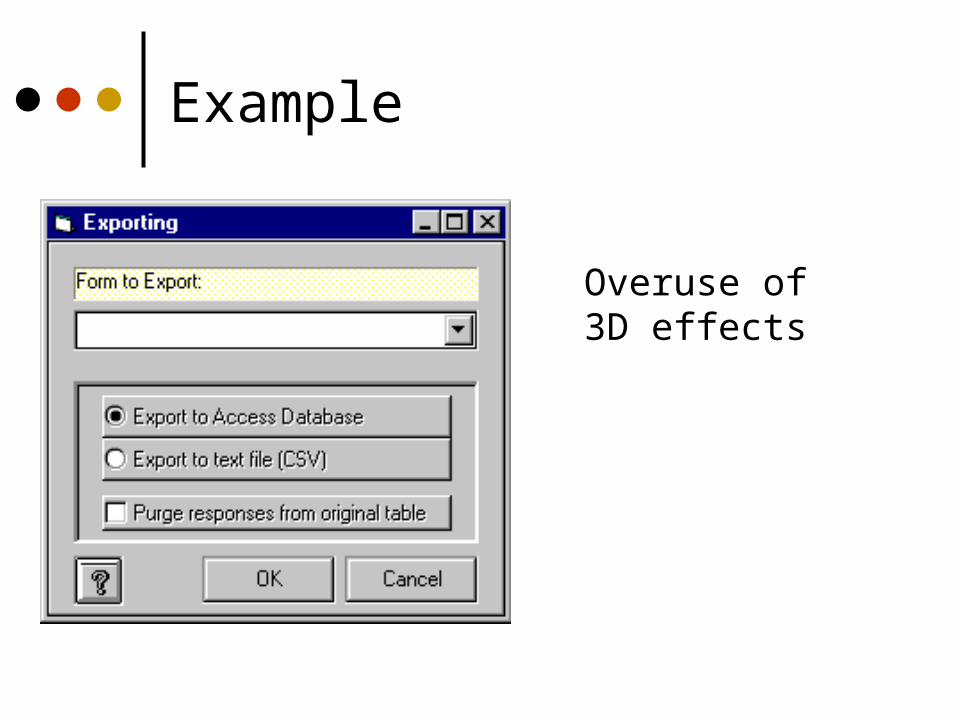
Overuse of3D effects
Color
Use for a purpose and sparingly Draw attention, communicate organization,
to indicate status, to establish relationships, aid search
Use redundant cues Color-blindness Enhances performance
Be consistent with color associations from jobs and cultures
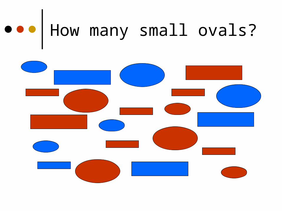
How many small ovals?
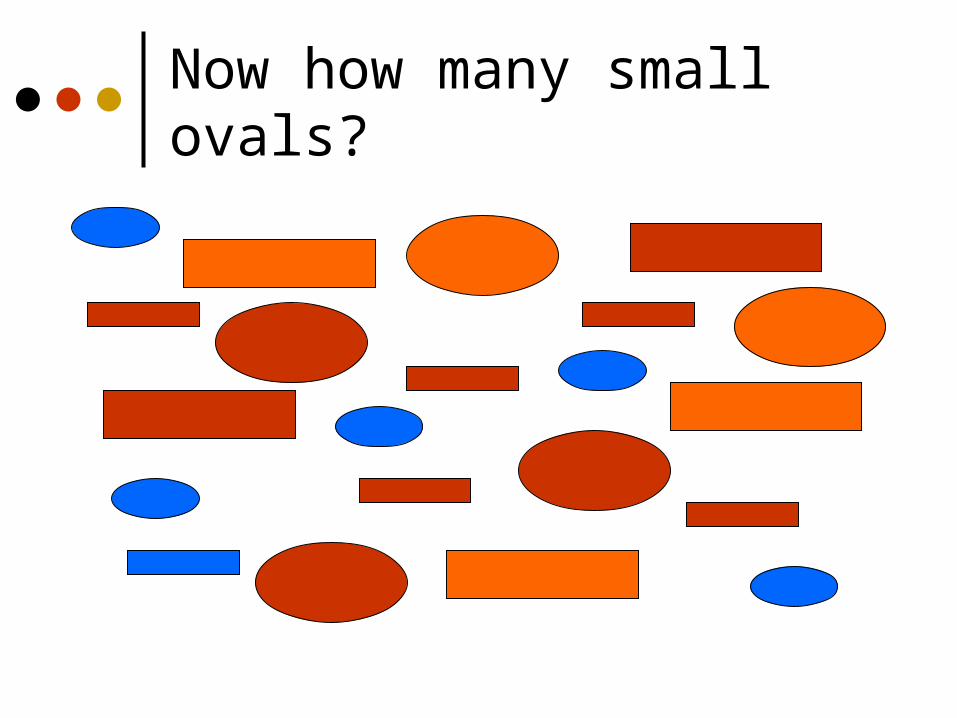
Now how many small ovals?
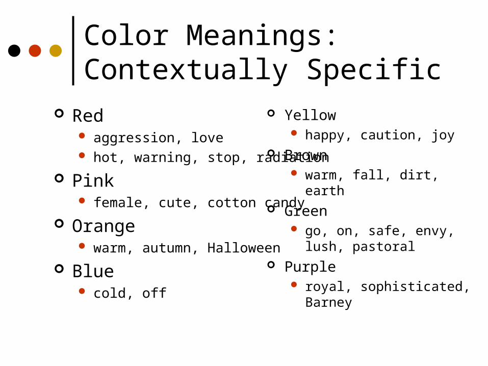
Yellow happy, caution, joy
Brown warm, fall, dirt, earth
Green go, on, safe, envy, lush,
pastoral Purple
royal, sophisticated, Barney
Color Meanings: Contextually Specific
Red aggression, love hot, warning, stop, radiation
Pink female, cute, cotton candy
Orange warm, autumn, Halloween
Blue cold, off
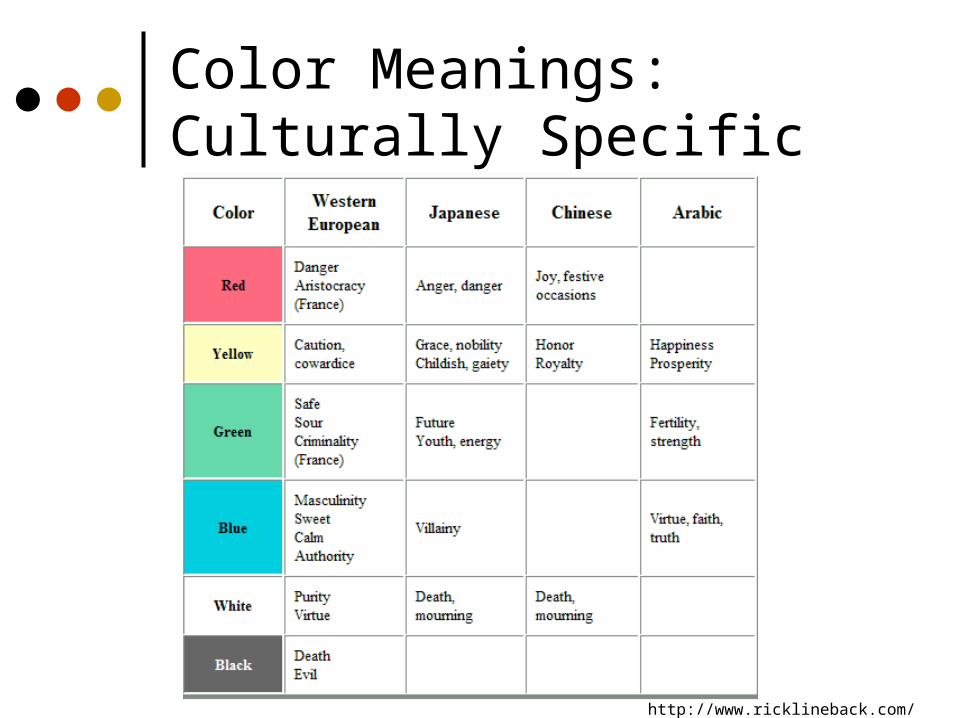
Color Meanings: Culturally Specific
http://www.ricklineback.com/culture2.htm
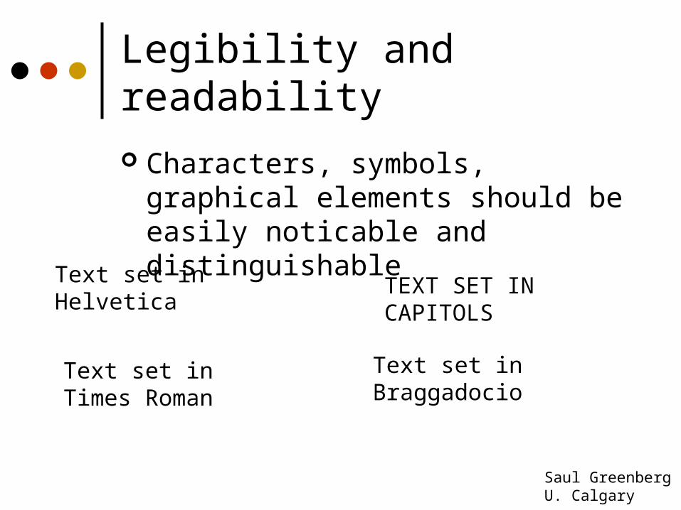
Legibility and readability
Characters, symbols, graphical elements should be easily noticable and distinguishable
Text set in Braggadocio
Text set in Helvetica
TEXT SET INCAPITOLS
Text set in Times Roman
Saul GreenbergU. Calgary
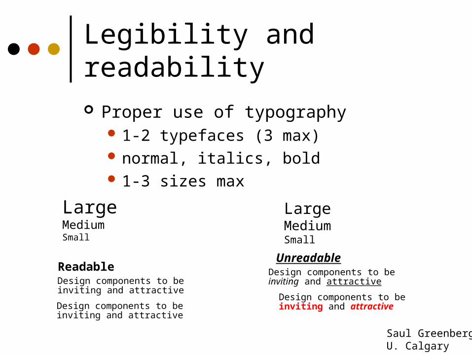
Legibility and readability
Proper use of typography 1-2 typefaces (3 max) normal, italics, bold 1-3 sizes max
LargeMediumSmall
LargeMediumSmall
Readable
Design components to be inviting and attractive
Design components to be inviting and attractive
Unreadable
Design components to be inviting and attractive
Design components to be inviting and attractive
Saul GreenbergU. Calgary
Web Design
Creating Effective Sites and Pages
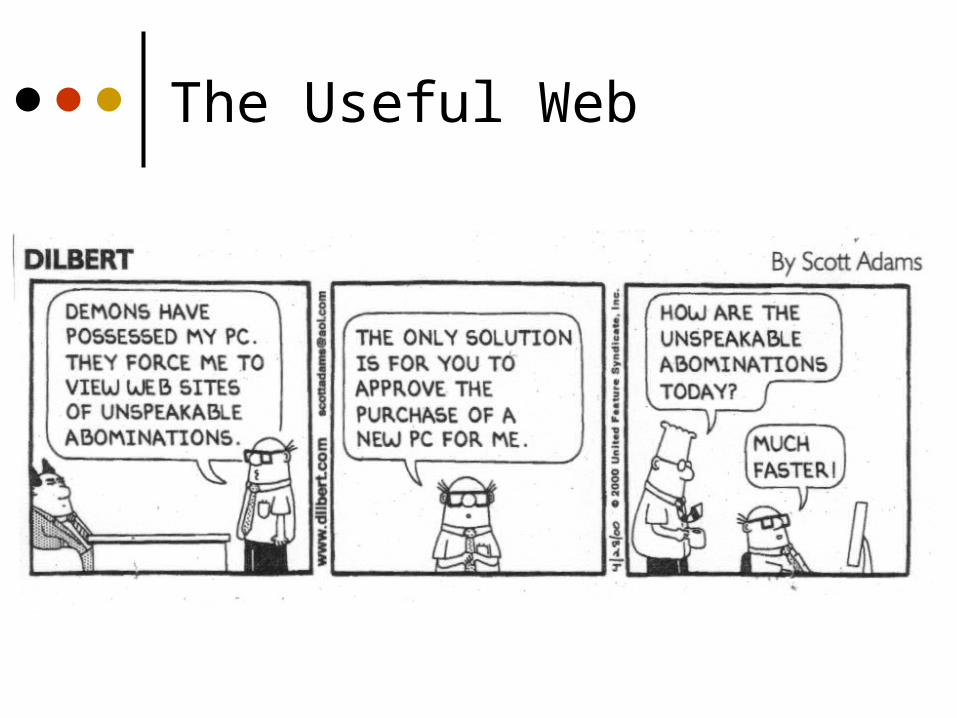
The Useful Web
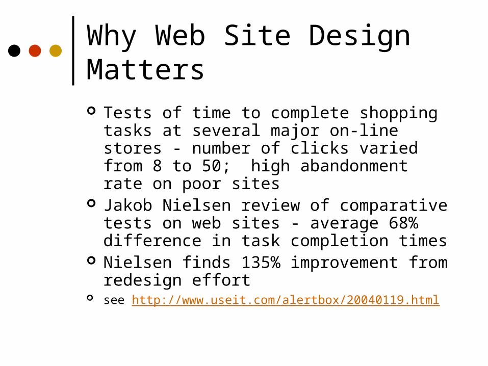
Why Web Site Design Matters Tests of time to complete shopping tasks at
several major on-line stores - number of clicks varied from 8 to 50; high abandonment rate on poor sites
Jakob Nielsen review of comparative tests on web sites - average 68% difference in task completion times
Nielsen finds 135% improvement from redesign effort
see http://www.useit.com/alertbox/20040119.html
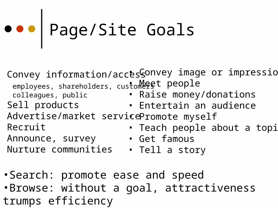
Page/Site Goals
• Convey information/access employees, shareholders, customers colleagues, public
• Sell products• Advertise/market service• Recruit• Announce, survey• Nurture communities
• Convey image or impression• Meet people• Raise money/donations• Entertain an audience• Promote myself• Teach people about a topic• Get famous• Tell a story
•Search: promote ease and speed•Browse: without a goal, attractiveness trumps efficiency
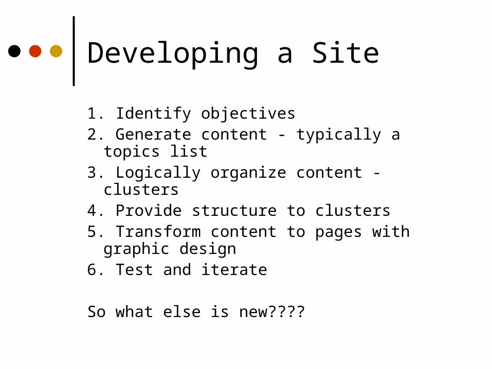
Developing a Site
1. Identify objectives2. Generate content - typically a topics list3. Logically organize content - clusters4. Provide structure to clusters5. Transform content to pages with graphic
design6. Test and iterate
So what else is new????
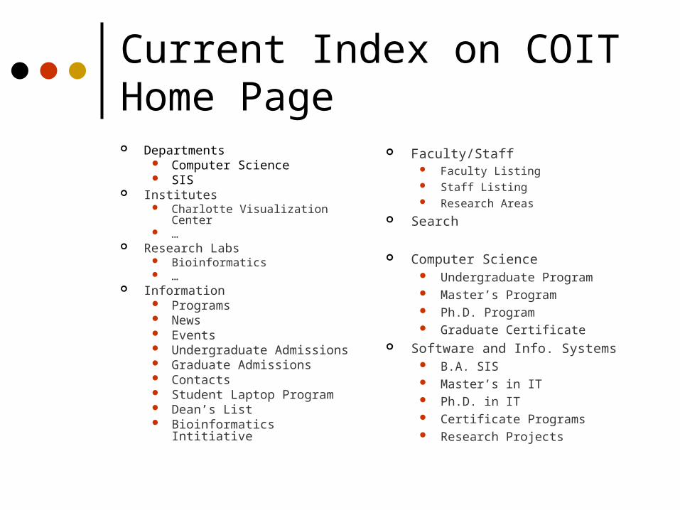
Current Index on COIT Home Page Departments
Computer Science SIS
Institutes Charlotte Visualization Center …
Research Labs Bioinformatics …
Information Programs News Events Undergraduate Admissions Graduate Admissions Contacts Student Laptop Program Dean’s List Bioinformatics Intitiative
Faculty/Staff Faculty Listing Staff Listing Research Areas
Search
Computer Science Undergraduate Program Master’s Program Ph.D. Program Graduate Certificate
Software and Info. Systems B.A. SIS Master’s in IT Ph.D. in IT Certificate Programs Research Projects
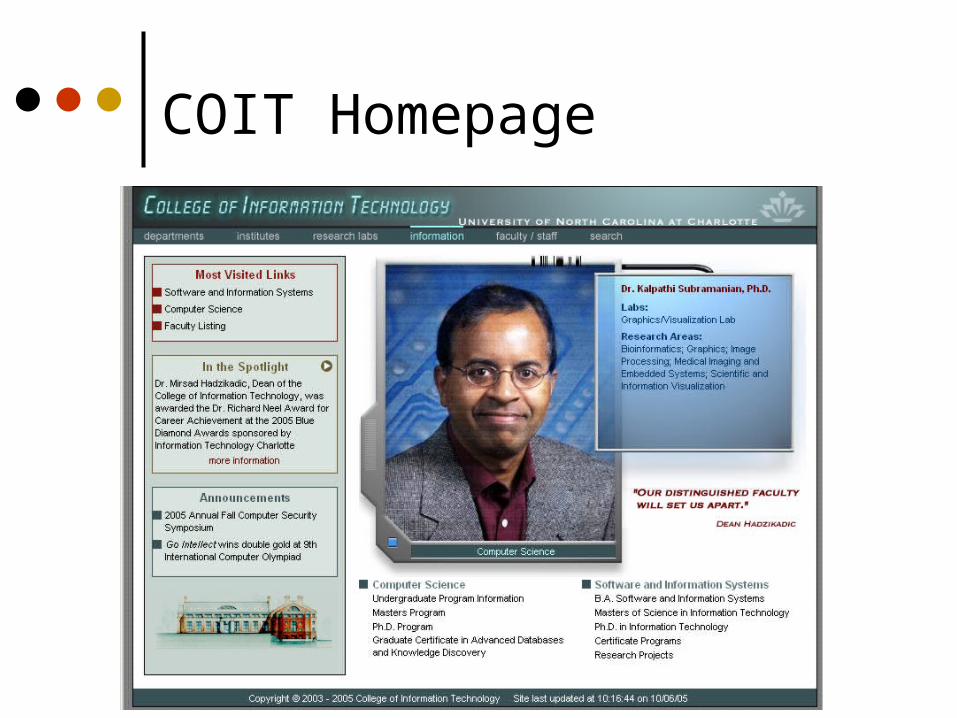
COIT Homepage
Text Content
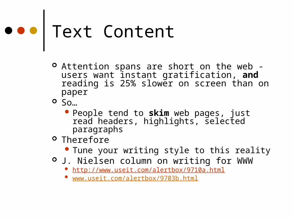
Attention spans are short on the web - users want instant gratification, and reading is 25% slower on screen than on paper
So… People tend to skim web pages, just read
headers, highlights, selected paragraphs Therefore
Tune your writing style to this reality J. Nielsen column on writing for WWW
http://www.useit.com/alertbox/9710a.html www.useit.com/alertbox/9703b.html
This is the short blurb describing the article
This is some nonsensical text This is some nonsensical text This is some nonsensical text To see how well this thing w This is some nonsensical text This is some nonsensical text This is some nonsensical text This is some nonsensical text This is some nonsensical text
To see how well this thing works This is some nonsensical text This is some nonsensical text This is some nonsensical text Does this work at all? I don’t know. I am in love with XXX To see how well this thing works This is some nonsensical text This is some nonsensical text This is some nonsensical text This is some nonsensical text This is some nonsensical text Does this work at all? I don’t
know. This is some nonsensical text This is some the dog is barking nonsensical text This is some nonsensical text Does this work at all? I don’t know. What is love? What is the good life? What is, and is not? That which
is, is. The world is all that exists. Nothing unreal exists, metaphysics law #1. This is some the the the the nonsensical text This is some nonsensical text Does this work at all? I don’t know. This is Is there a god? Are we a quantum accident? Will we ever know? Are there questions that should never be asked? What is the nature of goodness? Why are we so mean to each other? How can we be so cruel to one another?
This is some nonsensical text This is some nonsensical text This is some nonsensical text To see how well this thing works This is some nonsensical text This is some nonsensical text This is some nonsensical text This is some nonsensical text This is some nonsensical textTo see how well this thing works
This is some nonsensical text This is some nonsensical text This is some nonsensical text This is some nonsensical text This is some nonsensical text This is some nonsensical What is good in life, he asks? That is a question we may never have an answer to. is some nonsensical text This is some nonsensical text This is some
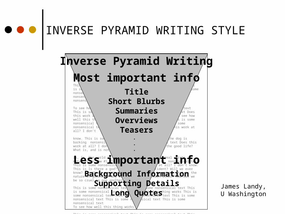
Most important info
Less important info
.
.
.
TitleShort BlurbsSummariesOverviews
Teasers
Background InformationSupporting Details
Long Quotes
Inverse Pyramid Writing
James Landy,U Washington
INVERSE PYRAMID WRITING STYLE
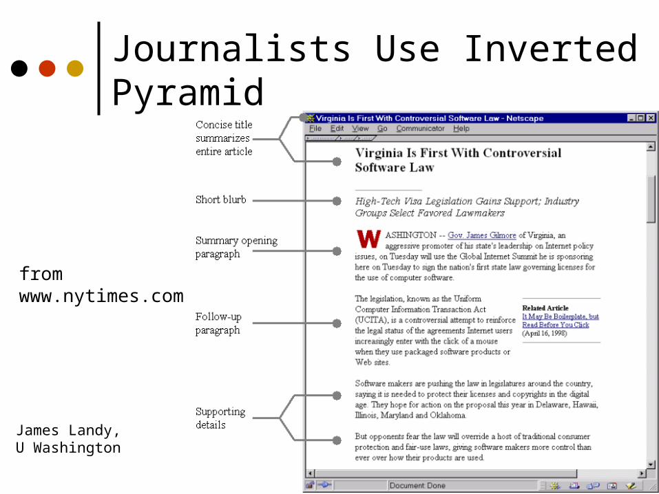
Journalists Use Inverted Pyramid
fromwww.nytimes.com
James Landy,U Washington
Navigation
Often the most critical element Often the weakest part of a web site Problems due to
Users don’t have domain knowledgeSite structures don’t meet expectations
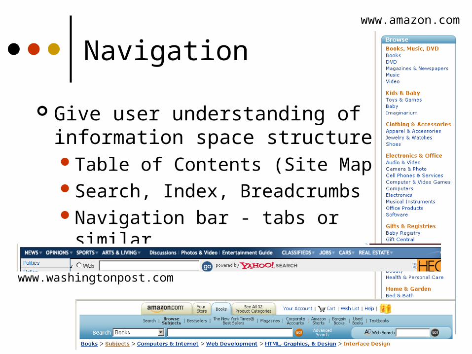
Navigation
Give user understanding of information space structureTable of Contents (Site Map)Search, Index, BreadcrumbsNavigation bar - tabs or similar
www.washingtonpost.com
www.amazon.com
Home Page
Most important page at your site Critical for image Entices viewer to look at more
Give viewer a good idea of what can be found at the site
Make sure vital content is “above the fold” Place real content on home page How much graphics do you use? If links are in images, have parallel text
labels near page bottom
Home Page Design Has Evolved
From graphics-rich with few links – mostly to top-level pages of major subsections
To link-rich pages that give access to real content in one click, plus have some content

Ancienthome page
Old home page
Home Page Evolution
Recenthome page
Georgia Tech College of Computing
Newhome page
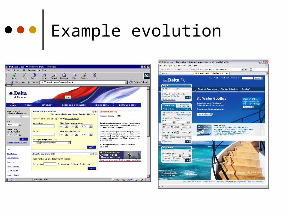
Example evolution
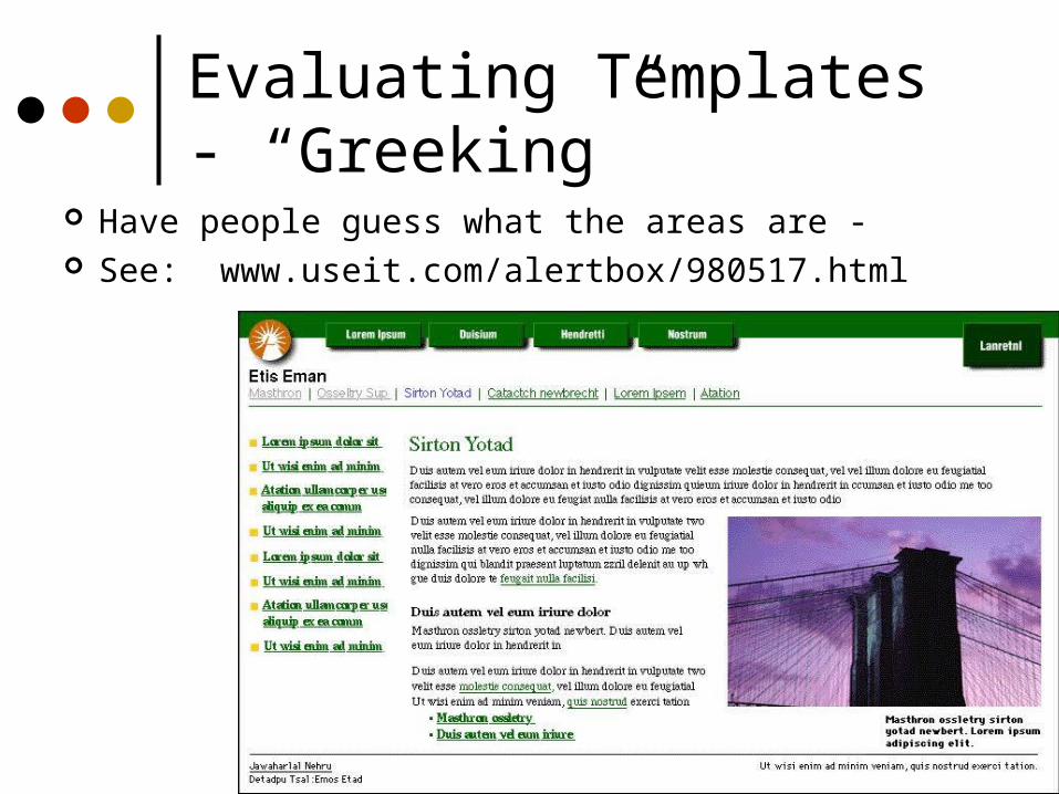
Evaluating Templates - “Greeking”
Have people guess what the areas are - See: www.useit.com/alertbox/980517.html
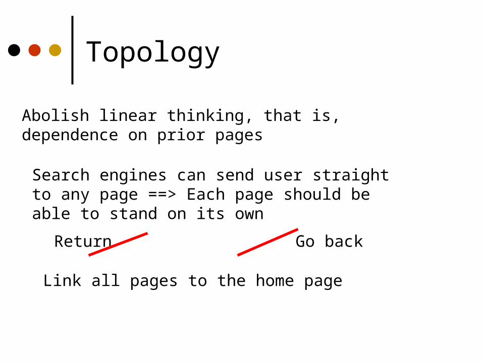
Abolish linear thinking, that is,dependence on prior pages
Search engines can send user straightto any page ==> Each page should beable to stand on its own
Return Go back
Link all pages to the home page
Topology
Links
Success of link depends onHow well user can predict where link
will leadHow well user can differentiate one
link from other nearby onesUseful content at other end of link

Link Wording
Beware the famous “here”Click here to learn about my BMW Z3 vs.I drive fast in my BMW Z3
When a link will take someone a good distance, use word “jump”For more on iguanas, jump to Fred’s iguana
page. Say explicitly where link is
Check out the tax calculator by Money Magazine.
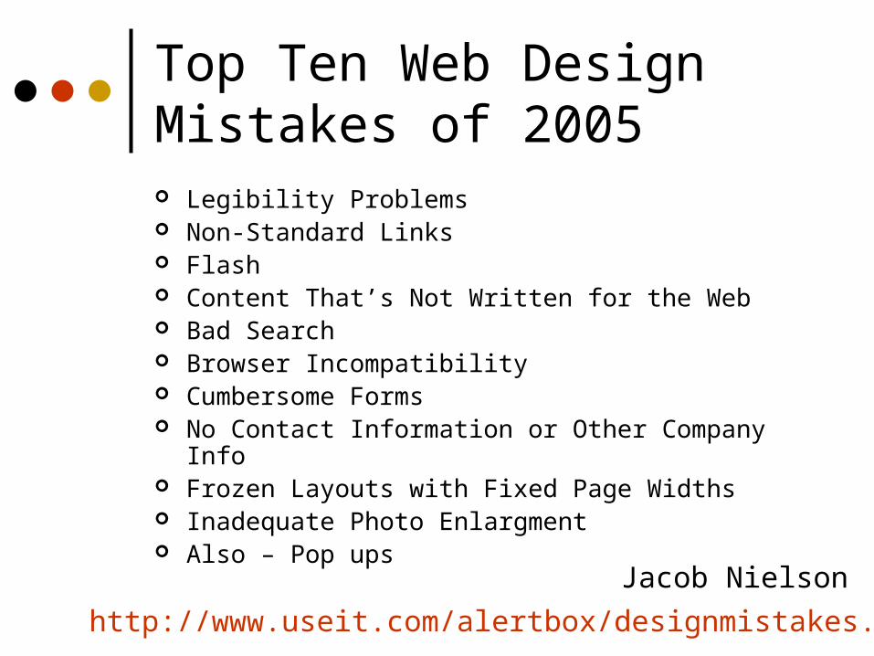
Top Ten Web Design Mistakes of 2005 Legibility Problems Non-Standard Links Flash Content That’s Not Written for the Web Bad Search Browser Incompatibility Cumbersome Forms No Contact Information or Other Company Info Frozen Layouts with Fixed Page Widths Inadequate Photo Enlargment Also – Pop ups
http://www.useit.com/alertbox/designmistakes.html
Jacob Nielson
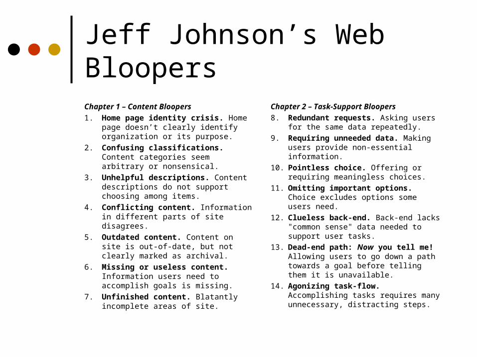
Jeff Johnson’s Web BloopersChapter 1 – Content Bloopers
1. Home page identity crisis. Home page doesn’t clearly identify organization or its purpose.
2. Confusing classifications. Content categories seem arbitrary or nonsensical.
3. Unhelpful descriptions. Content descriptions do not support choosing among items.
4. Conflicting content. Information in different parts of site disagrees.
5. Outdated content. Content on site is out-of-date, but not clearly marked as archival.
6. Missing or useless content. Information users need to accomplish goals is missing.
7. Unfinished content. Blatantly incomplete areas of site.
Chapter 2 – Task-Support Bloopers
8. Redundant requests. Asking users for the same data repeatedly.
9. Requiring unneeded data. Making users provide non-essential information.
10. Pointless choice. Offering or requiring meaningless choices.
11. Omitting important options. Choice excludes options some users need.
12. Clueless back-end. Back-end lacks "common sense" data needed to support user tasks.
13. Dead-end path: Now you tell me! Allowing users to go down a path towards a goal before telling them it is unavailable.
14. Agonizing task-flow. Accomplishing tasks requires many unnecessary, distracting steps.
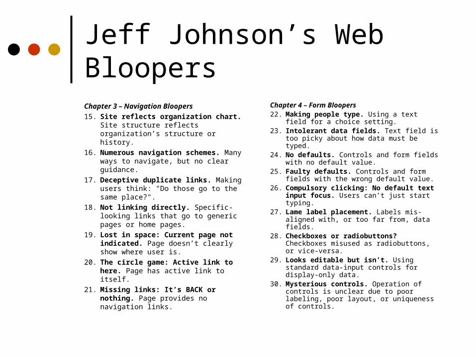
Jeff Johnson’s Web BloopersChapter 3 – Navigation Bloopers
15. Site reflects organization chart. Site structure reflects organization’s structure or history.
16. Numerous navigation schemes. Many ways to navigate, but no clear guidance.
17. Deceptive duplicate links. Making users think: "Do those go to the same place?".
18. Not linking directly. Specific-looking links that go to generic pages or home pages.
19. Lost in space: Current page not indicated. Page doesn’t clearly show where user is.
20. The circle game: Active link to here. Page has active link to itself.
21. Missing links: It’s BACK or nothing. Page provides no navigation links.
Chapter 4 – Form Bloopers22. Making people type. Using a text field for
a choice setting.23. Intolerant data fields. Text field is too
picky about how data must be typed.24. No defaults. Controls and form fields with
no default value.25. Faulty defaults. Controls and form fields
with the wrong default value.26. Compulsory clicking: No default text
input focus. Users can’t just start typing.27. Lame label placement. Labels mis-
aligned with, or too far from, data fields.28. Checkboxes or radiobuttons?
Checkboxes misused as radiobuttons, or vice-versa.
29. Looks editable but isn’t. Using standard data-input controls for display-only data.
30. Mysterious controls. Operation of controls is unclear due to poor labeling, poor layout, or uniqueness of controls.
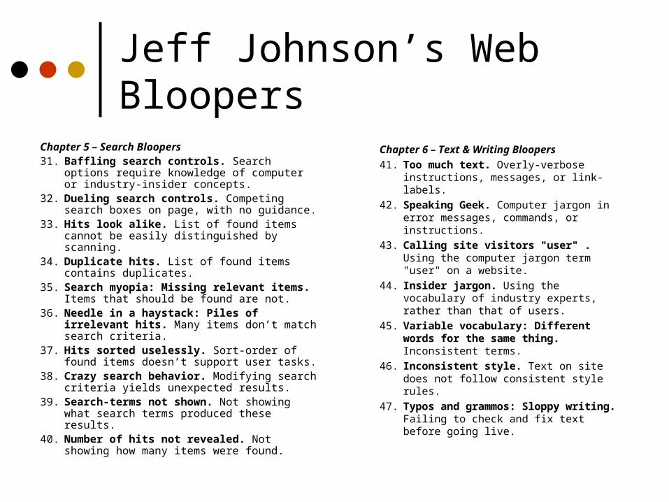
Jeff Johnson’s Web Bloopers
Chapter 5 – Search Bloopers31. Baffling search controls. Search options require
knowledge of computer or industry-insider concepts.
32. Dueling search controls. Competing search boxes on page, with no guidance.
33. Hits look alike. List of found items cannot be easily distinguished by scanning.
34. Duplicate hits. List of found items contains duplicates.
35. Search myopia: Missing relevant items. Items that should be found are not.
36. Needle in a haystack: Piles of irrelevant hits. Many items don’t match search criteria.
37. Hits sorted uselessly. Sort-order of found items doesn’t support user tasks.
38. Crazy search behavior. Modifying search criteria yields unexpected results.
39. Search-terms not shown. Not showing what search terms produced these results.
40. Number of hits not revealed. Not showing how many items were found.
Chapter 6 – Text & Writing Bloopers
41. Too much text. Overly-verbose instructions, messages, or link-labels.
42. Speaking Geek. Computer jargon in error messages, commands, or instructions.
43. Calling site visitors "user" . Using the computer jargon term "user" on a website.
44. Insider jargon. Using the vocabulary of industry experts, rather than that of users.
45. Variable vocabulary: Different words for the same thing. Inconsistent terms.
46. Inconsistent style. Text on site does not follow consistent style rules.
47. Typos and grammos: Sloppy writing. Failing to check and fix text before going live.
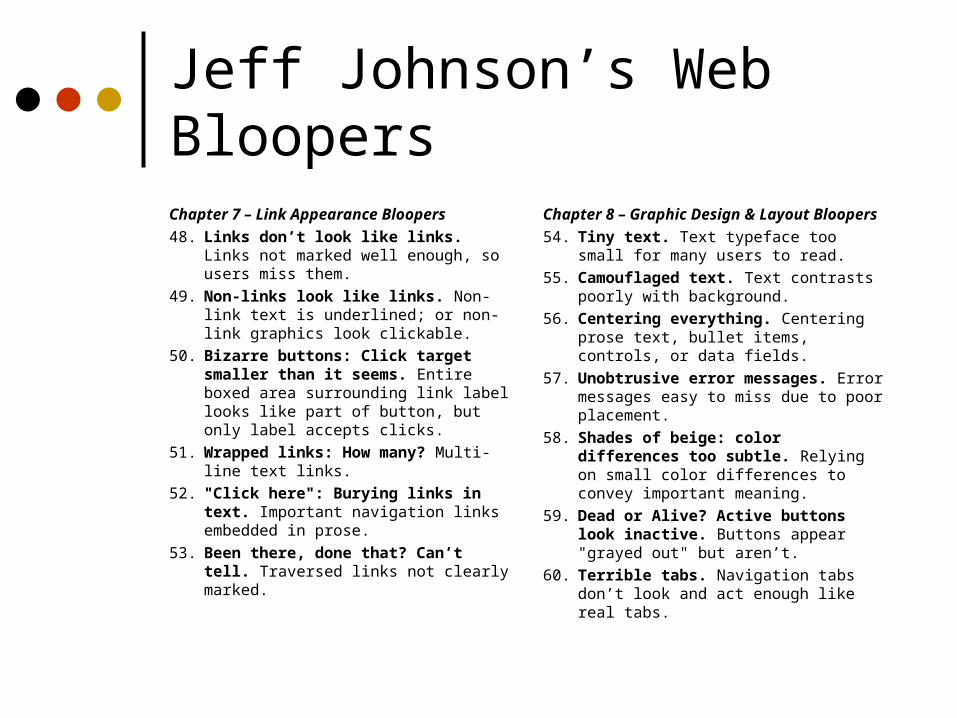
Jeff Johnson’s Web BloopersChapter 7 – Link Appearance Bloopers
48. Links don’t look like links. Links not marked well enough, so users miss them.
49. Non-links look like links. Non-link text is underlined; or non-link graphics look clickable.
50. Bizarre buttons: Click target smaller than it seems. Entire boxed area surrounding link label looks like part of button, but only label accepts clicks.
51. Wrapped links: How many? Multi-line text links.
52. "Click here": Burying links in text. Important navigation links embedded in prose.
53. Been there, done that? Can’t tell. Traversed links not clearly marked.
Chapter 8 – Graphic Design & Layout Bloopers
54. Tiny text. Text typeface too small for many users to read.
55. Camouflaged text. Text contrasts poorly with background.
56. Centering everything. Centering prose text, bullet items, controls, or data fields.
57. Unobtrusive error messages. Error messages easy to miss due to poor placement.
58. Shades of beige: color differences too subtle. Relying on small color differences to convey important meaning.
59. Dead or Alive? Active buttons look inactive. Buttons appear "grayed out" but aren’t.
60. Terrible tabs. Navigation tabs don’t look and act enough like real tabs.

• Designing Web Usability, J. Nielsen, New Riders, 2000.
•Web Bloopers, J. Johnson, Morgan Kaufmann, 2003.
•The Non-Designer’s Web Book, R. Williams and J. Tollett, Peachpit Press, 1998.
• Web Style Guide, P. Lynch and S. Horton, Yale Univ. Press, 1999.
• Creating Killer Web Sites, 2nd edition, D. Siegel, Hayden Books, 1997.
• Web Site Usability: A Designer’s Guide, User Interface Engineering, North Andover, MA, 1997.
• Web by Design, The Complete Guide, M. Holzschlag, Sybex, 1998.
• Web Concept & Design, C. Waters, New Riders, 1996.
• Hot Wired Style, Principles for Building Smart Web Sites, J. Veen, Wired Books, 1997.
• The Web Design Wow! Book, J. Davis and S. Merritt, Peachpit Press, 1998.
• How to Set Up and Maintain a Web Site, L. Stein, Addison Wesley 1997.
Sources
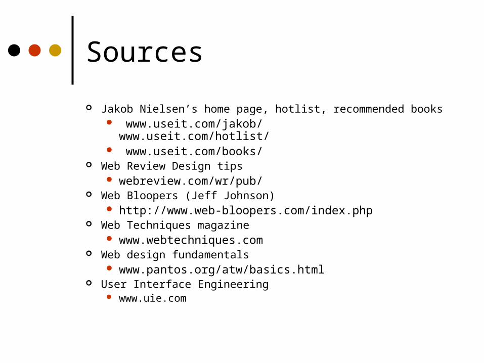
Sources
Jakob Nielsen’s home page, hotlist, recommended books www.useit.com/jakob/ www.useit.com/hotlist/ www.useit.com/books/
Web Review Design tips webreview.com/wr/pub/
Web Bloopers (Jeff Johnson) http://www.web-bloopers.com/index.php
Web Techniques magazine www.webtechniques.com
Web design fundamentals www.pantos.org/atw/basics.html
User Interface Engineering www.uie.com
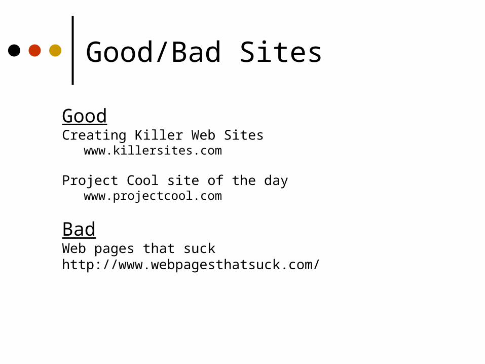
Good/Bad Sites
GoodCreating Killer Web Sites www.killersites.com
Project Cool site of the day www.projectcool.com
BadWeb pages that suckhttp://www.webpagesthatsuck.com/
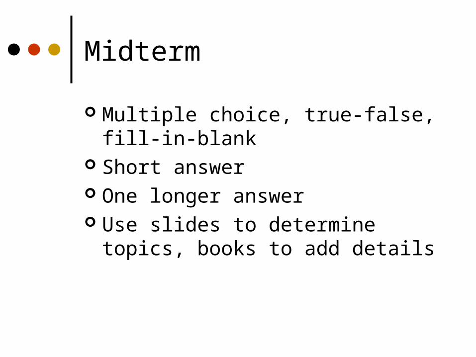
Midterm
Multiple choice, true-false, fill-in-blank Short answer One longer answer Use slides to determine topics, books
to add details
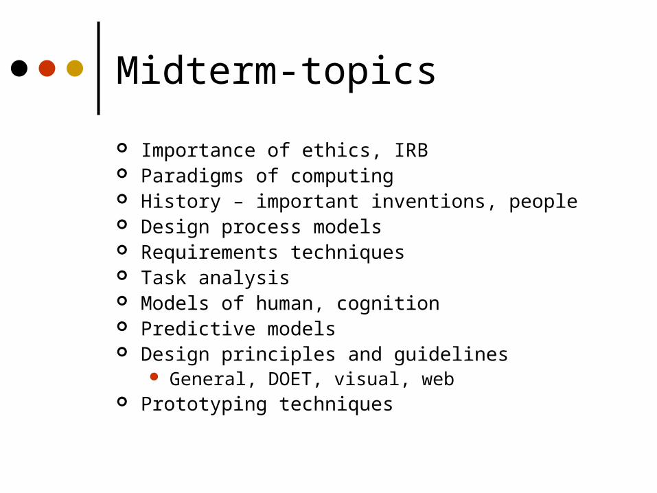
Midterm-topics
Importance of ethics, IRB Paradigms of computing History – important inventions, people Design process models Requirements techniques Task analysis Models of human, cognition Predictive models Design principles and guidelines
General, DOET, visual, web Prototyping techniques