project final report - world wide web … · mobile data volume consumed by users of the popular...
TRANSCRIPT
D5.3 FINAL REPORT PUBLISHABLE REPORT
Page 1 of 88
PROJECT FINAL REPORT
Deliverable N° D5.3
PROJECT FINAL REPORT - SECTION ONE
“PUBLISHABLE REPORT”
Grant Agreement number: 212430
Project acronym: MOBIWEB2.0
Project title: Mobile Web 2.0
Funding Scheme: Coordination and Support Action
Period covered: from 1.1.2008 to 31.12.2009
Name of the scientific representative of the projec t's co-ordinator, Title and Organisation:
Dr. Philipp Hoschka, Deputy Director, W3C
Tel: +33-4-92385077
Fax: +33-4-92385011
E-mail: [email protected]
Project website address: http://www.w3.org/2008/Mob iWeb20
D5.3 FINAL REPORT PUBLISHABLE REPORT
Page 2 of 88
Mobile Web 2.0: The Web on the Move
Summary of Results
The research leading to these results has received funding from the European Community’s Seventh Framework Programme (FP7/2007-2011) under grant agreement Nr. 212430
D5.3 FINAL REPORT PUBLISHABLE REPORT
Page 3 of 88
Table of Contents
Chapter 1: Executive Summary........................................................................................................5
1.1 Objectives ..............................................................................................................................5
1.2 mobileOK Checker ................................................................................................................5
1.3 Mobile Web Best Practices Training.....................................................................................6
1.4 Test Suites Working Group....................................................................................................6
1.5 mobileOK Authoring Tools....................................................................................................7
1.6 Outreach................................................................................................................................7
Chapter 2: Introduction ....................................................................................................................8
2.1 Project Description ...............................................................................................................8
2.2 Socio-Economic Impact and Societal Implications ...............................................................8
2.3 Overview................................................................................................................................9
Chapter 3: The W3C mobileOK Checker......................................................................................10
3.1 Introduction.........................................................................................................................10
3.2 Example mobileOK sites......................................................................................................10
3.3 Background .........................................................................................................................11
3.4 User Interface......................................................................................................................13
3.5 Adoption ..............................................................................................................................19
3.6 Future Work ........................................................................................................................21
Chapter 4: Training Web Developers ............................................................................................24
4.1 Summary..............................................................................................................................24
4.2 Course Content....................................................................................................................24
4.3 Requirements for Passing....................................................................................................26
4.4 Feedback on Course............................................................................................................26
4.5 Student work........................................................................................................................28
4.6 Future Courses....................................................................................................................34
Chapter 5: Test Suites......................................................................................................................35
5.1 Summary..............................................................................................................................35
5.2 Introduction.........................................................................................................................36
5.3 Web Compatibility Test for Mobile Browsers .....................................................................38
5.4 Collaboration with OMA.....................................................................................................44
5.5 New test suite for CSS Media Types ....................................................................................45
5.6 Automatic Extraction of Test Assertions..............................................................................45
5.7 Test Suites for Widgets ........................................................................................................47
5.8 Device Independence Testing Guidelines............................................................................50
D5.3 FINAL REPORT PUBLISHABLE REPORT
Page 4 of 88
5.9 Encouraging sharing of test suites across vendors .............................................................52
5.10 JavaScript Tests...................................................................................................................52
5.11 Conclusion...........................................................................................................................54
Chapter 6: Authoring Tools ............................................................................................................55
6.1 Summary..............................................................................................................................55
6.2 Introduction.........................................................................................................................55
6.3 mobileOK Pythia Plugins: WordPress, Joomla!, Moodle...................................................56
6.4 AskPythia Device Description Repository API....................................................................67
6.5 TransPythia Transcoding Library .......................................................................................71
6.6 Conclusion...........................................................................................................................75
Chapter 7: Outreach........................................................................................................................77
7.1 Summary..............................................................................................................................77
7.2 Presentations.......................................................................................................................78
7.3 Developer Outreach ............................................................................................................79
7.4 Participation at Mobile World Congress, Barcelona..........................................................81
7.5 Press Releases and Press Clippings....................................................................................81
7.6 Outreach Material ...............................................................................................................82
Appendix: List of Beneficiaries, Project Website, Contact Details ..................................................88
D5.3 FINAL REPORT PUBLISHABLE REPORT
Page 5 of 88
Chapter 1: Executive Summary
1.1 Objectives
The overall objective of the Mobile Web 2.0 project is addressed the usability and interoperability issues that are still holding back mobile Web access.
Mobile Web 2.0 had the following key goals:
• Improve W3C mobileOK checker tool for Web content
• Increase number of developers capable of developing Mobile Web 2.0 content through training
• Provide more test suites for Mobile Web 2.0 standards
• Increase number of available authoring tools for creating mobileOK content
• Increase awareness of W3C Mobile Web Initiative in Europe through outreach
1.2 mobileOK Checker
The “mobileOK checker” is a web application developed within MobiWeb2.0 allowing web developers to check whether their content follows W3C-developed "Best Practices" to improve the user experience on mobile devices. The checker is based on an open-source library written in Java that can be integrated into other, similar tools. W3C is offering the checker as a free service at the following address:
http://validator.w3.org/mobile/
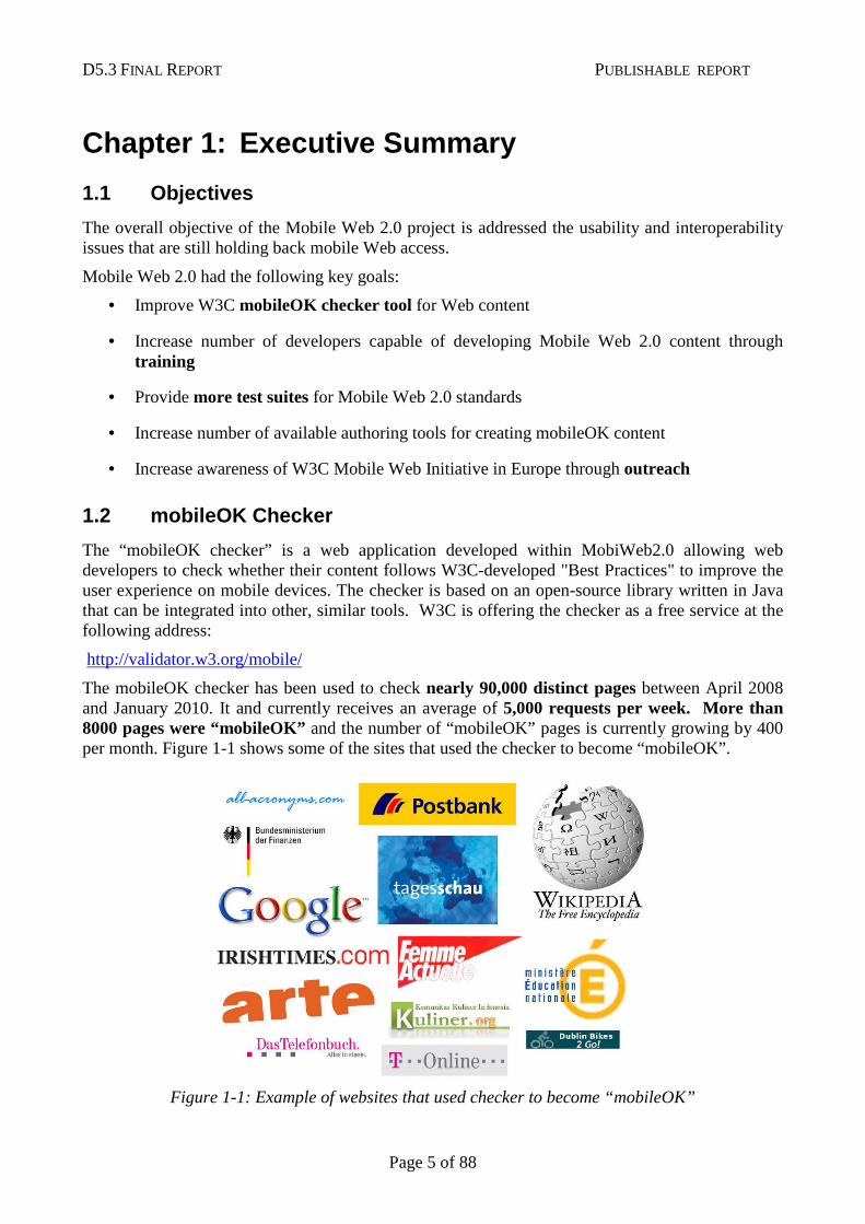
The mobileOK checker has been used to check nearly 90,000 distinct pages between April 2008 and January 2010. It and currently receives an average of 5,000 requests per week. More than 8000 pages were “mobileOK” and the number of “mobileOK” pages is currently growing by 400 per month. Figure 1-1 shows some of the sites that used the checker to become “mobileOK”.
Figure 1-1: Example of websites that used checker to become “mobileOK”
D5.3 FINAL REPORT PUBLISHABLE REPORT
Page 6 of 88
1.3 Mobile Web Best Practices Training
MobiWeb2.0 has organized multiple training events for Web content developers, explaining the importance of taking mobile access into account when developing Web content and educating developers in the production of "mobileOK" content.
Work included developing the content for a nine-week online course as well as successfully testing the concept of “pay for” courses (for self-sustainability) and the marketing strategies required. The course was held five times, and more than 500 developers have been trained on mobile Web best practices in the course of the project. The successful students went on to create mobileOK sites, the most visible being mobile content site of the German internet provider T-Online. More information about training events is available at the following address:
http://www.w3.org/Mobile/training/
1.4 Test Suites Working Group
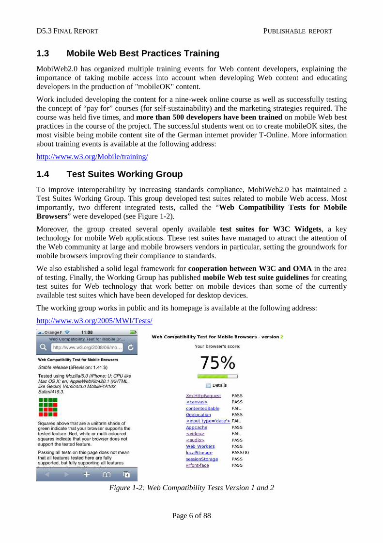
To improve interoperability by increasing standards compliance, MobiWeb2.0 has maintained a Test Suites Working Group. This group developed test suites related to mobile Web access. Most importantly, two different integrated tests, called the “Web Compatibility Tests for Mobile Browsers” were developed (see Figure 1-2).
Moreover, the group created several openly available test suites for W3C Widgets, a key technology for mobile Web applications. These test suites have managed to attract the attention of the Web community at large and mobile browsers vendors in particular, setting the groundwork for mobile browsers improving their compliance to standards.
We also established a solid legal framework for cooperation between W3C and OMA in the area of testing. Finally, the Working Group has published mobile Web test suite guidelines for creating test suites for Web technology that work better on mobile devices than some of the currently available test suites which have been developed for desktop devices.
The working group works in public and its homepage is available at the following address:
http://www.w3.org/2005/MWI/Tests/
Figure 1-2: Web Compatibility Tests Version 1 and 2
D5.3 FINAL REPORT PUBLISHABLE REPORT
Page 7 of 88
1.5 mobileOK Authoring Tools
The goal of this work was to facilitate the authoring of mobileOK content through contribution to open-source authoring tools. To achieve this goal, MobiWeb2.0 developed plug-ins for mobileOK authoring for the WordPress, Joomla!, and Moodle tools (the latter is an alpha version).
The plugins are based on two open-source libraries which can be used independently by other developers: AskPythia is the first PHP-based implementation of the Device Description Simple API W3C standard and TransPythia is a library for transcoding Web content into a mobileOK version.
The plug-ins and the libraries are available at the following address:
http://www.w3.org/2009/11/mobileOKPythia/
1.6 Outreach
The goal of the outreach work within MobiWeb2.0 was to disseminate the results of W3C’s “Mobile Web Initiative” to a European audience.
The following results have been achieved:
• Four press releases describing the achievements of W3C's mobile web work have been issued and over 200 press articles have been collected.
• MobiWeb2.0-funded W3C team members gave 22 presentations on W3C's mobile-related activities at high-profile events, increasing the visibility of W3C's mobile work in Europe, and leading to valuable contacts for future collaboration.
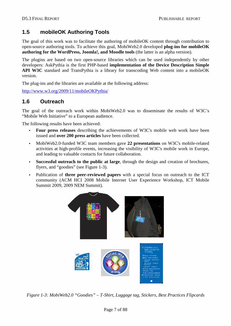
• Successful outreach to the public at large, through the design and creation of brochures, flyers, and “goodies” (see Figure 1-3).
• Publication of three peer-reviewed papers with a special focus on outreach to the ICT community (ACM HCI 2008 Mobile Internet User Experience Workshop, ICT Mobile Summit 2009, 2009 NEM Summit).
Figure 1-3: MobiWeb2.0 “Goodies” – T-Shirt, Luggage tag, Stickers, Best Practices Flipcards
D5.3 FINAL REPORT PUBLISHABLE REPORT
Page 8 of 88
Chapter 2: Introduction
2.1 Project Description
The European-commission funded FP7 project “Mobile Web 2.0” addressed usability and interoperability issues that are holding back mobile Web access today.
For a long time now, mobile Web access has been a frustrating experience for both users and developers. Users often find their favorite web site unusable on a mobile phone since it has not been designed taking into account the limitations of mobile devices such as the small screen, difficulties with input or slow networks. Developers find it hard to create web content that works well on a critical mass of the web-enabled mobile phones in the market since there are significant interoperability problems in the Web software deployed on these phones.
Mobile Web 2.0 had the following key goals:
• Improve W3C mobileOK checker tool for Web content
• Increase number of developers capable of developing Mobile Web 2.0 content through training
• Provide more test suites for Mobile Web 2.0 standards
• Increase number of available authoring tools for creating mobileOK content
• Increase awareness of W3C Mobile Web Initiative in Europe through outreach
2.2 Socio-Economic Impact and Societal Implications
2.2.1 Increasing Demand for Mobile Data Services
Increasing the use of mobile Web access through projects such as MobiWeb2.0 has a significant impact on the success of European research on the Network of the Future by growing demand for high speed mobile data traffic.
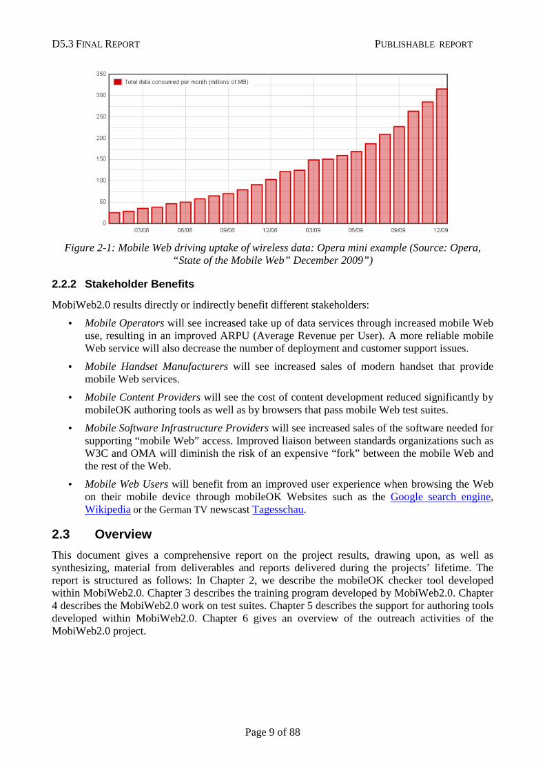
Wired Web access has been the key driver in widespread uptake of new network technologies (ISDN, ADSL). Today, mobile Web access is playing the same role for new research results in wireless data networks. An example can be seen in Figure 2-1, showing the explosive growth in mobile data volume consumed by users of the popular Opera Mini browser since 2008. Between December 2008 and December 2009 alone, mobile data volume grew by 206%. Similar growth rates for mobile Web access are reported by other vendors and independent sources.
D5.3 FINAL REPORT PUBLISHABLE REPORT
Page 9 of 88
Figure 2-1: Mobile Web driving uptake of wireless data: Opera mini example (Source: Opera, “State of the Mobile Web” December 2009”)
2.2.2 Stakeholder Benefits
MobiWeb2.0 results directly or indirectly benefit different stakeholders:
• Mobile Operators will see increased take up of data services through increased mobile Web use, resulting in an improved ARPU (Average Revenue per User). A more reliable mobile Web service will also decrease the number of deployment and customer support issues.
• Mobile Handset Manufacturers will see increased sales of modern handset that provide mobile Web services.
• Mobile Content Providers will see the cost of content development reduced significantly by mobileOK authoring tools as well as by browsers that pass mobile Web test suites.
• Mobile Software Infrastructure Providers will see increased sales of the software needed for supporting “mobile Web” access. Improved liaison between standards organizations such as W3C and OMA will diminish the risk of an expensive “fork” between the mobile Web and the rest of the Web.
• Mobile Web Users will benefit from an improved user experience when browsing the Web on their mobile device through mobileOK Websites such as the Google search engine, Wikipedia or the German TV newscast Tagesschau.
2.3 Overview
This document gives a comprehensive report on the project results, drawing upon, as well as synthesizing, material from deliverables and reports delivered during the projects’ lifetime. The report is structured as follows: In Chapter 2, we describe the mobileOK checker tool developed within MobiWeb2.0. Chapter 3 describes the training program developed by MobiWeb2.0. Chapter 4 describes the MobiWeb2.0 work on test suites. Chapter 5 describes the support for authoring tools developed within MobiWeb2.0. Chapter 6 gives an overview of the outreach activities of the MobiWeb2.0 project.
D5.3 FINAL REPORT PUBLISHABLE REPORT
Page 10 of 88
Chapter 3: The W3C mobileOK Checker
3.1 Introduction
This Chapter describes the design, functionality and usage of the W3C mobileOK checker service, a tool geared towards facilitating the creation of mobile-friendly Web content. Statistics collected by this service provide an important insight into the degree of compliance to the mobileOK standard.
Creating Web content that works well on mobile devices is challenging for the majority of today’s Web content creators, since most of them are more accustomed to creating content for desktop devices. The goal of W3C’s mobileOK checker is to help Web content creators in developing content for mobile devices by automatically checking content for interoperability with W3C’s mobileOK standard [1] developed as part of W3C’s Mobile Web Initiative [2].
This Chapter is structured as follows: In Section 3.2, we give examples of highly visible mobileOK Web Sites. In Section 3.3, we give more background on the relationship between the W3C mobile Web best practices and the mobileOK checker. Section 3.4 motivates the design of the mobileOK checker user interface. Section 2.5 provides usage data gathered with the mobileOK checker service available at the W3C website.
3.2 Example mobileOK sites
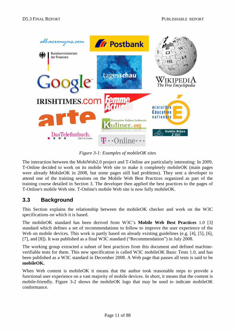
Analyzing the log files of the MobileOK checker in 2008, we were able to detect that a number of mainstream Web sites that were mobileOK, including
1. google.com (check) 2. Tagesschau.de (check) 3. T-Online (check) 4. Das Telefon Buch (check) 5. PostBank.de (check) 6. mobile.wikipedia.org (official version) (check)
(click on the “check” link to verify that a site is “mobileOK” – note that some sites may not be “mobileOK” when you check them, e.g. because of temporary issues with their content management system).
Here is a number of interesting sites that became mobileOK in 2009: 1. The Irish Times (check) 2. Femme Actuelle (check): French magazine 3. Arte (check): TV channel 4. German ministry of finance (check) 5. Ministère de l'éducation nationale (check): ministry of education in France 6. Chambres d'hôtes (check) (bed&breakfast reservation site) 7. Dublin bikes to go (check) 8. Kuliner (check): recipes Web site 9. All Acronyms (check): acronyms definitions
Figure 3-1 shows a sample of sites that are mobileOK at the time of writing.
D5.3 FINAL REPORT PUBLISHABLE REPORT
Page 11 of 88
Figure 3-1: Examples of mobileOK sites
The interaction between the MobiWeb2.0 project and T-Online are particularly interesting: In 2009, T-Online decided to work on its mobile Web site to make it completely mobileOK (main pages were already MobileOK in 2008, but some pages still had problems). They sent a developer to attend one of the training sessions on the Mobile Web Best Practices organized as part of the training course detailed in Section 3. The developer then applied the best practices to the pages of T-Online's mobile Web site. T-Online's mobile Web site is now fully mobileOK.
3.3 Background
This Section explains the relationship between the mobileOK checker and work on the W3C specifications on which it is based.
The mobileOK standard has been derived from W3C’s Mobile Web Best Practices 1.0 [3] standard which defines a set of recommendations to follow to improve the user experience of the Web on mobile devices. This work is partly based on already existing guidelines (e.g. [4], [5], [6], [7], and [8]). It was published as a final W3C standard (“Recommendation”) in July 2008.
The working group extracted a subset of best practices from this document and defined machine-verifiable tests for them. This new specification is called W3C mobileOK Basic Tests 1.0, and has been published as a W3C standard in December 2008. A Web page that passes all tests is said to be mobileOK.
When Web content is mobileOK it means that the author took reasonable steps to provide a functional user experience on a vast majority of mobile devices. In short, it means that the content is mobile-friendly. Figure 3-2 shows the mobileOK logo that may be used to indicate mobileOK conformance.
D5.3 FINAL REPORT PUBLISHABLE REPORT
Page 12 of 88
Figure 3-2: The mobileOK logo
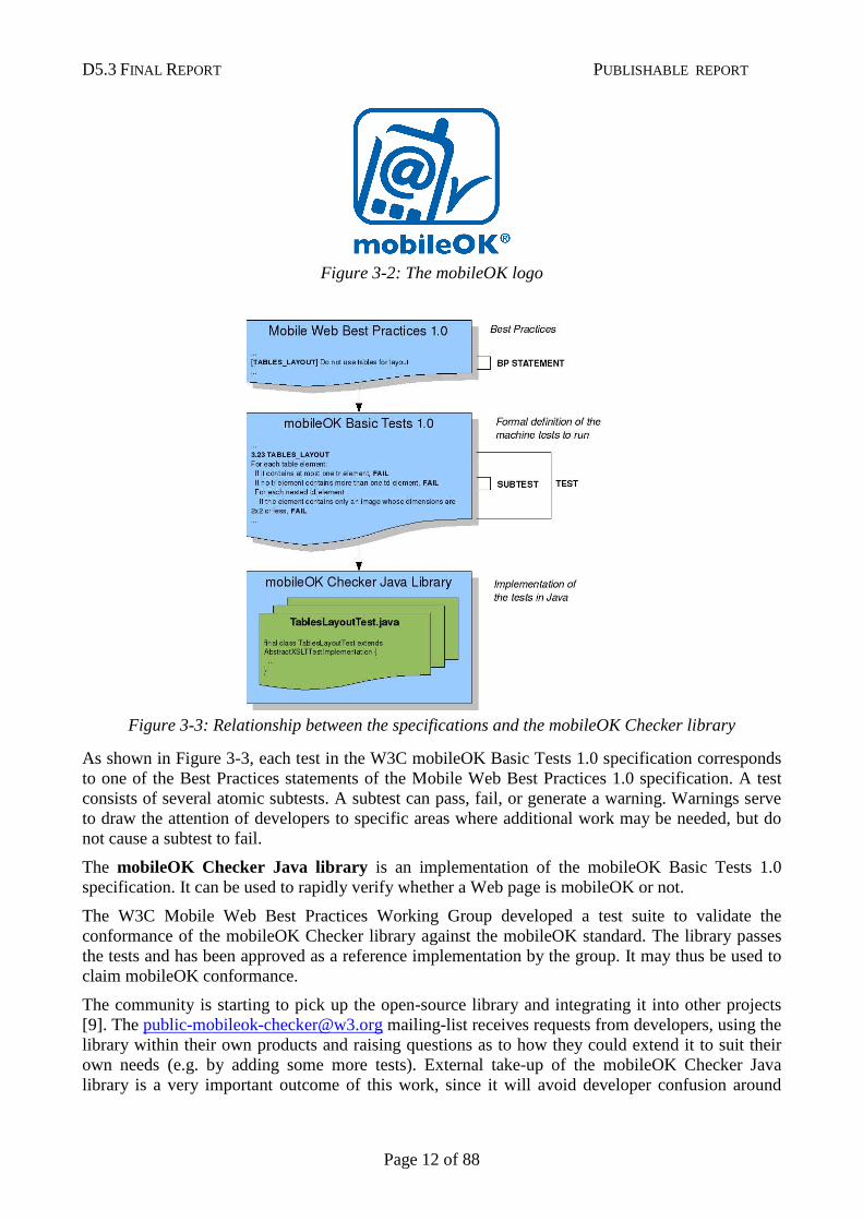
Figure 3-3: Relationship between the specifications and the mobileOK Checker library
As shown in Figure 3-3, each test in the W3C mobileOK Basic Tests 1.0 specification corresponds to one of the Best Practices statements of the Mobile Web Best Practices 1.0 specification. A test consists of several atomic subtests. A subtest can pass, fail, or generate a warning. Warnings serve to draw the attention of developers to specific areas where additional work may be needed, but do not cause a subtest to fail.
The mobileOK Checker Java library is an implementation of the mobileOK Basic Tests 1.0 specification. It can be used to rapidly verify whether a Web page is mobileOK or not.
The W3C Mobile Web Best Practices Working Group developed a test suite to validate the conformance of the mobileOK Checker library against the mobileOK standard. The library passes the tests and has been approved as a reference implementation by the group. It may thus be used to claim mobileOK conformance.
The community is starting to pick up the open-source library and integrating it into other projects [9]. The [email protected] mailing-list receives requests from developers, using the library within their own products and raising questions as to how they could extend it to suit their own needs (e.g. by adding some more tests). External take-up of the mobileOK Checker Java library is a very important outcome of this work, since it will avoid developer confusion around
D5.3 FINAL REPORT PUBLISHABLE REPORT
Page 13 of 88
mobileOK due to inconsistent implementations of independently developed checker tools; the library underwent a major overhaul early 2009 focused on extensibility [10].
The source code of the library is available at:
http://dev.w3.org/cvsweb/2007/mobileok-ref/
3.4 User Interface
3.4.1 General Overview
The Java library is a low-level tool, intended for developers. Consequently, the failure messages returned by the library are rather technical and do not explain why the failure is important and how it may be fixed.
In order to address a larger community of Web content developers, a higher level view is required that is comprehensible by users who are not necessarily used to developing (mobile) Web content. Experience gathered running the very popular W3C Markup validator [11] helped design the new interface.
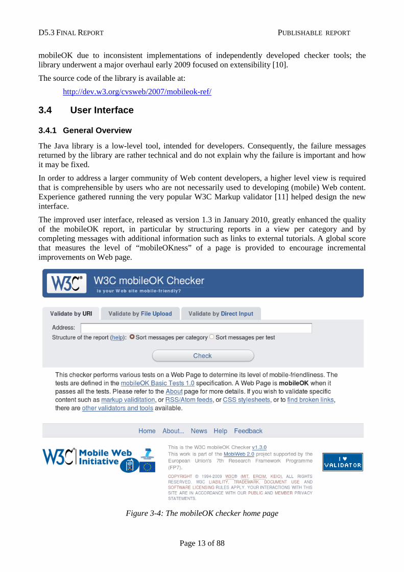
The improved user interface, released as version 1.3 in January 2010, greatly enhanced the quality of the mobileOK report, in particular by structuring reports in a view per category and by completing messages with additional information such as links to external tutorials. A global score that measures the level of “mobileOKness” of a page is provided to encourage incremental improvements on Web page.
Figure 3-4: The mobileOK checker home page
D5.3 FINAL REPORT PUBLISHABLE REPORT
Page 14 of 88
Figure 3-4 shows the home page of the version 1.0 of the on-line mobileOK checker. The live version of the checker installed at the W3C site is available at:
http://validator.w3.org/mobile
The source code of the mobileOK checker user interface is available at:
http://dev.w3.org/cvsweb/2009/mobileok-servlet/
3.4.2 Failure Reports
The users of the mobileOK checker can choose to view failure reports either by category or by test. Moreover, expandable sections increase the usability of the reports generated.
View Failures by Category
The default view is a view per category. Its aim is to group the subtest messages using the different categories relevant to Web content creators such as markup errors, mistakes in the structure of the page, stylesheet errors, HTTP errors and others. Each category is described by some introductory text that explains what the subtests in the category intend to check.
View Failures by Test
When developers become more familiar with the Mobile Web Best Practices, they may want to ensure that a particular test is respected, and directly view that information. For this reason, it is also possible to view the report per test. This additional view follows the structure of the mobileOK Basic Tests 1.0 specification, and thus of the Mobile Web Best Practices 1.0.
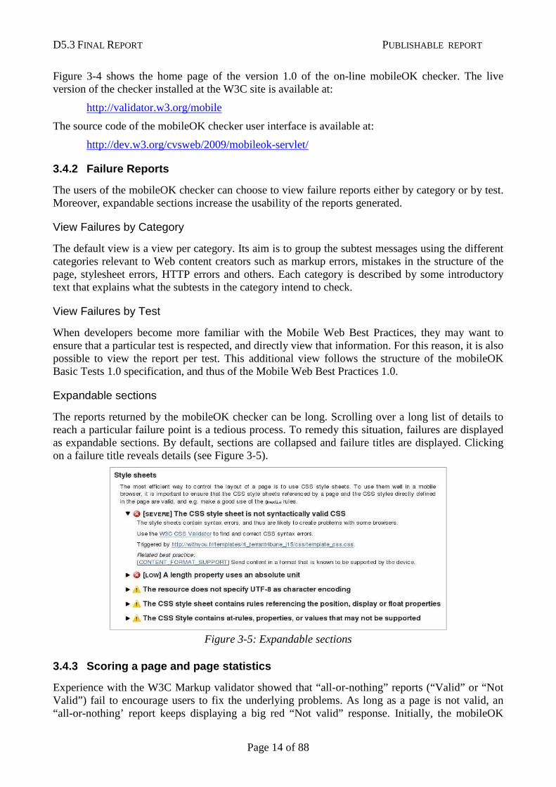
Expandable sections
The reports returned by the mobileOK checker can be long. Scrolling over a long list of details to reach a particular failure point is a tedious process. To remedy this situation, failures are displayed as expandable sections. By default, sections are collapsed and failure titles are displayed. Clicking on a failure title reveals details (see Figure 3-5).
Figure 3-5: Expandable sections
3.4.3 Scoring a page and page statistics
Experience with the W3C Markup validator showed that “all-or-nothing” reports (“Valid” or “Not Valid”) fail to encourage users to fix the underlying problems. As long as a page is not valid, an “all-or-nothing’ report keeps displaying a big red “Not valid” response. Initially, the mobileOK
D5.3 FINAL REPORT PUBLISHABLE REPORT
Page 15 of 88
Checker followed the same approach. No matter how many failures an author would fix, the tool would not give a more encouraging report until the author reached full mobileOK status.
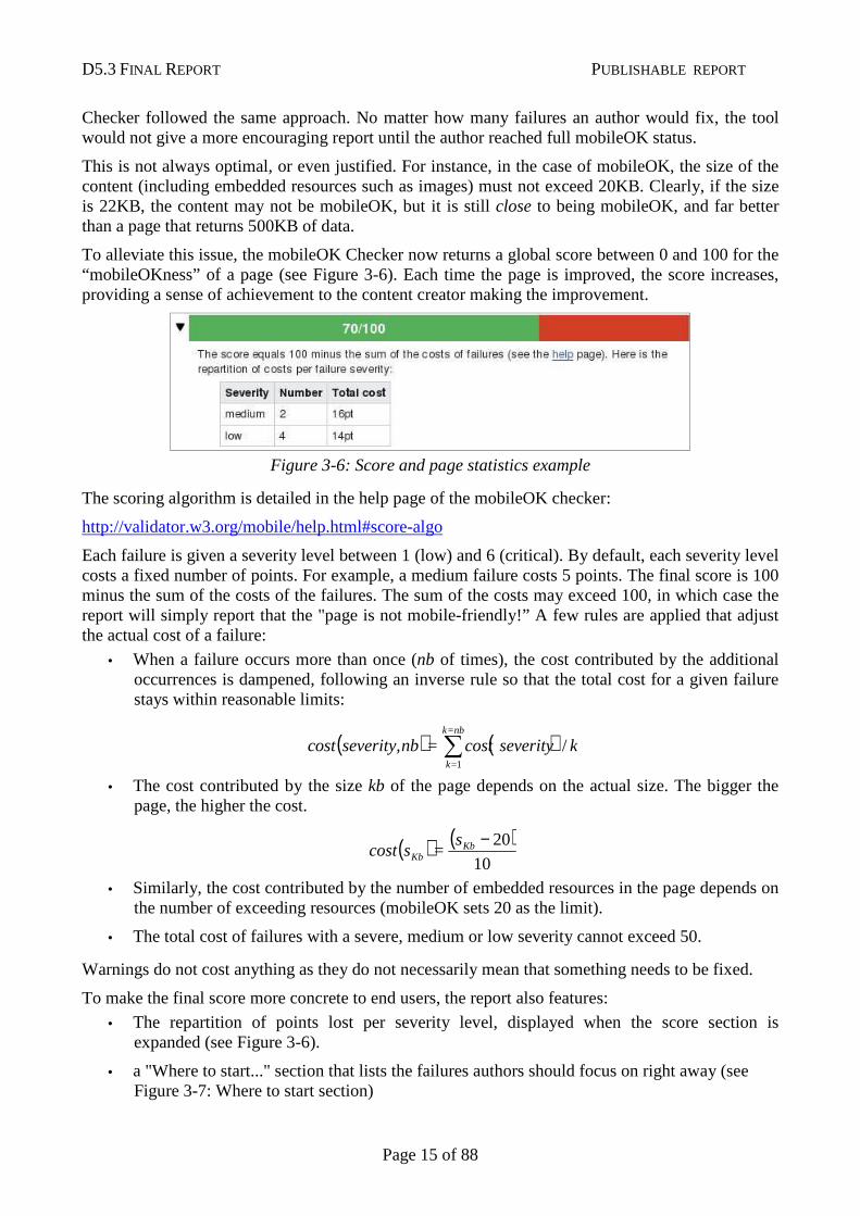
This is not always optimal, or even justified. For instance, in the case of mobileOK, the size of the content (including embedded resources such as images) must not exceed 20KB. Clearly, if the size is 22KB, the content may not be mobileOK, but it is still close to being mobileOK, and far better than a page that returns 500KB of data.
To alleviate this issue, the mobileOK Checker now returns a global score between 0 and 100 for the “mobileOKness” of a page (see Figure 3-6). Each time the page is improved, the score increases, providing a sense of achievement to the content creator making the improvement.
Figure 3-6: Score and page statistics example
The scoring algorithm is detailed in the help page of the mobileOK checker:
http://validator.w3.org/mobile/help.html#score-algo
Each failure is given a severity level between 1 (low) and 6 (critical). By default, each severity level costs a fixed number of points. For example, a medium failure costs 5 points. The final score is 100 minus the sum of the costs of the failures. The sum of the costs may exceed 100, in which case the report will simply report that the "page is not mobile-friendly!” A few rules are applied that adjust the actual cost of a failure:
• When a failure occurs more than once (nb of times), the cost contributed by the additional occurrences is dampened, following an inverse rule so that the total cost for a given failure stays within reasonable limits:
( ) ( ) kseveritycost=nbseverity,costnb=k
=k
/1∑
• The cost contributed by the size kb of the page depends on the actual size. The bigger the page, the higher the cost.
( ) ( )10
20−KbKb
s=scost
• Similarly, the cost contributed by the number of embedded resources in the page depends on the number of exceeding resources (mobileOK sets 20 as the limit).
• The total cost of failures with a severe, medium or low severity cannot exceed 50.
Warnings do not cost anything as they do not necessarily mean that something needs to be fixed.
To make the final score more concrete to end users, the report also features:
• The repartition of points lost per severity level, displayed when the score section is expanded (see Figure 3-6).
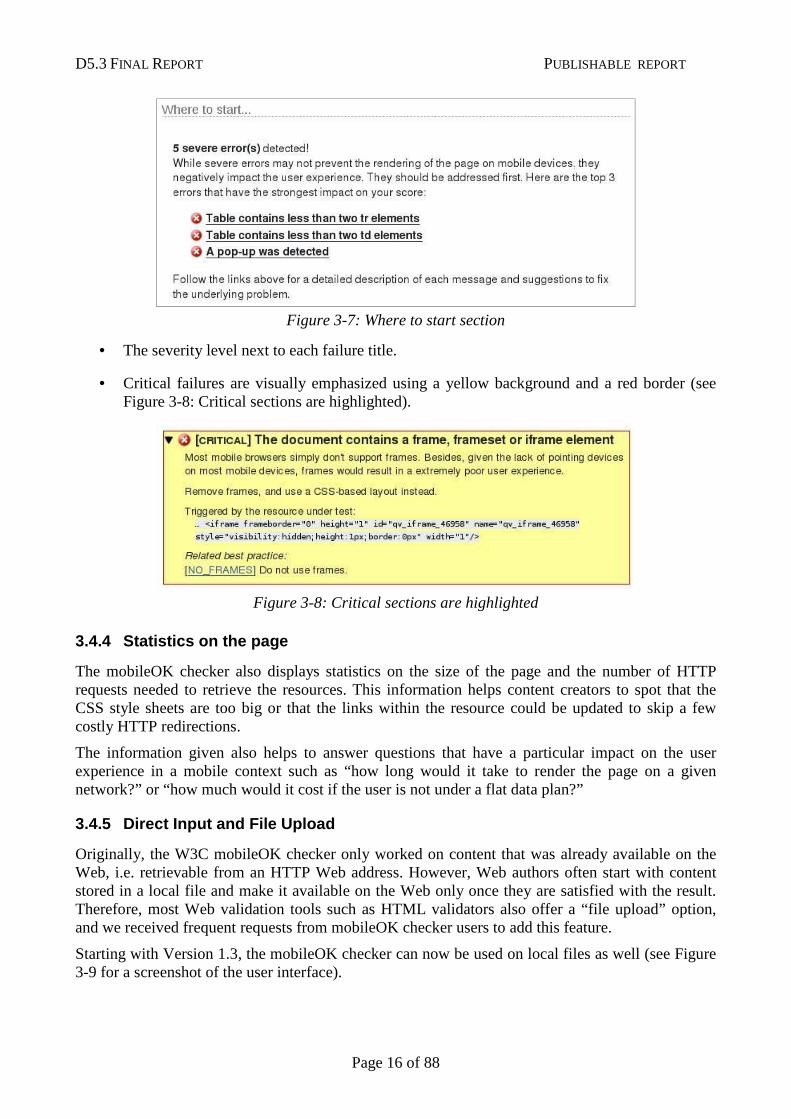
• a "Where to start..." section that lists the failures authors should focus on right away (see Figure 3-7: Where to start section)
D5.3 FINAL REPORT PUBLISHABLE REPORT
Page 16 of 88
Figure 3-7: Where to start section
• The severity level next to each failure title.
• Critical failures are visually emphasized using a yellow background and a red border (see Figure 3-8: Critical sections are highlighted).
Figure 3-8: Critical sections are highlighted
3.4.4 Statistics on the page
The mobileOK checker also displays statistics on the size of the page and the number of HTTP requests needed to retrieve the resources. This information helps content creators to spot that the CSS style sheets are too big or that the links within the resource could be updated to skip a few costly HTTP redirections.
The information given also helps to answer questions that have a particular impact on the user experience in a mobile context such as “how long would it take to render the page on a given network?” or “how much would it cost if the user is not under a flat data plan?”
3.4.5 Direct Input and File Upload
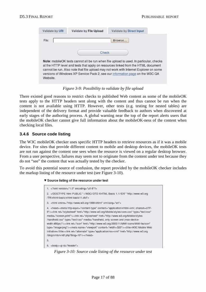
Originally, the W3C mobileOK checker only worked on content that was already available on the Web, i.e. retrievable from an HTTP Web address. However, Web authors often start with content stored in a local file and make it available on the Web only once they are satisfied with the result. Therefore, most Web validation tools such as HTML validators also offer a “file upload” option, and we received frequent requests from mobileOK checker users to add this feature.
Starting with Version 1.3, the mobileOK checker can now be used on local files as well (see Figure 3-9 for a screenshot of the user interface).
D5.3 FINAL REPORT PUBLISHABLE REPORT
Page 17 of 88
Figure 3-9: Possibility to validate by file upload
There existed good reasons to restrict checks to published Web content as some of the mobileOK tests apply to the HTTP headers sent along with the content and thus cannot be run when the content is not available using HTTP. However, other tests (e.g. testing for nested tables) are independent of the delivery format and provide valuable feedback to authors when discovered at early stages of the authoring process. A global warning near the top of the report alerts users that the mobileOK checker cannot give full information about the mobileOK-ness of the content when checking local files.
3.4.6 Source code listing
The W3C mobileOK checker uses specific HTTP headers to retrieve resources as if it was a mobile device. For sites that provide different content to mobile and desktop devices, the mobileOK tests are not run against the content one sees when the resource is viewed on a regular desktop browser. From a user perspective, failures may seem not to originate from the content under test because they do not “see” the content that was actually tested by the checker.
To avoid this potential source of confusion, the report provided by the mobileOK checker includes the markup listing of the resource under test (see Figure 3-10).
Figure 3-10: Source code listing of the resource under test
D5.3 FINAL REPORT PUBLISHABLE REPORT
Page 18 of 88
3.4.7 Ongoing Complete User Interface Redesign
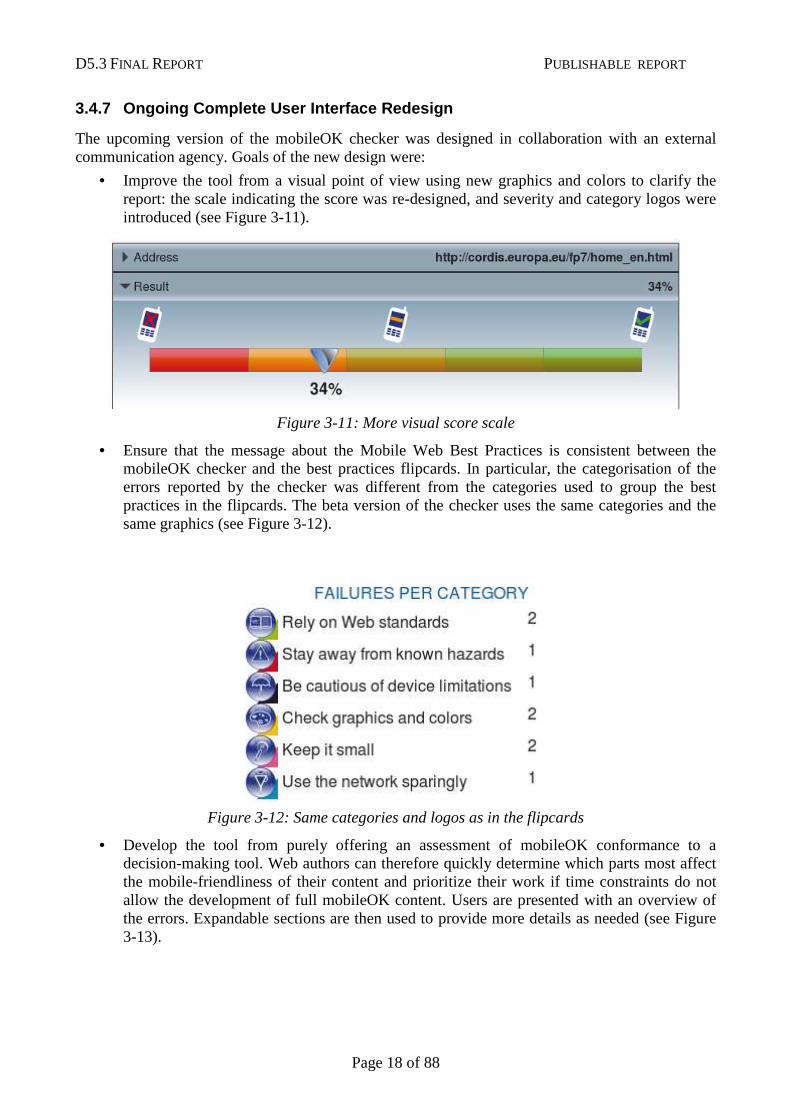
The upcoming version of the mobileOK checker was designed in collaboration with an external communication agency. Goals of the new design were:
• Improve the tool from a visual point of view using new graphics and colors to clarify the report: the scale indicating the score was re-designed, and severity and category logos were introduced (see Figure 3-11).
Figure 3-11: More visual score scale
• Ensure that the message about the Mobile Web Best Practices is consistent between the mobileOK checker and the best practices flipcards. In particular, the categorisation of the errors reported by the checker was different from the categories used to group the best practices in the flipcards. The beta version of the checker uses the same categories and the same graphics (see Figure 3-12).
Figure 3-12: Same categories and logos as in the flipcards
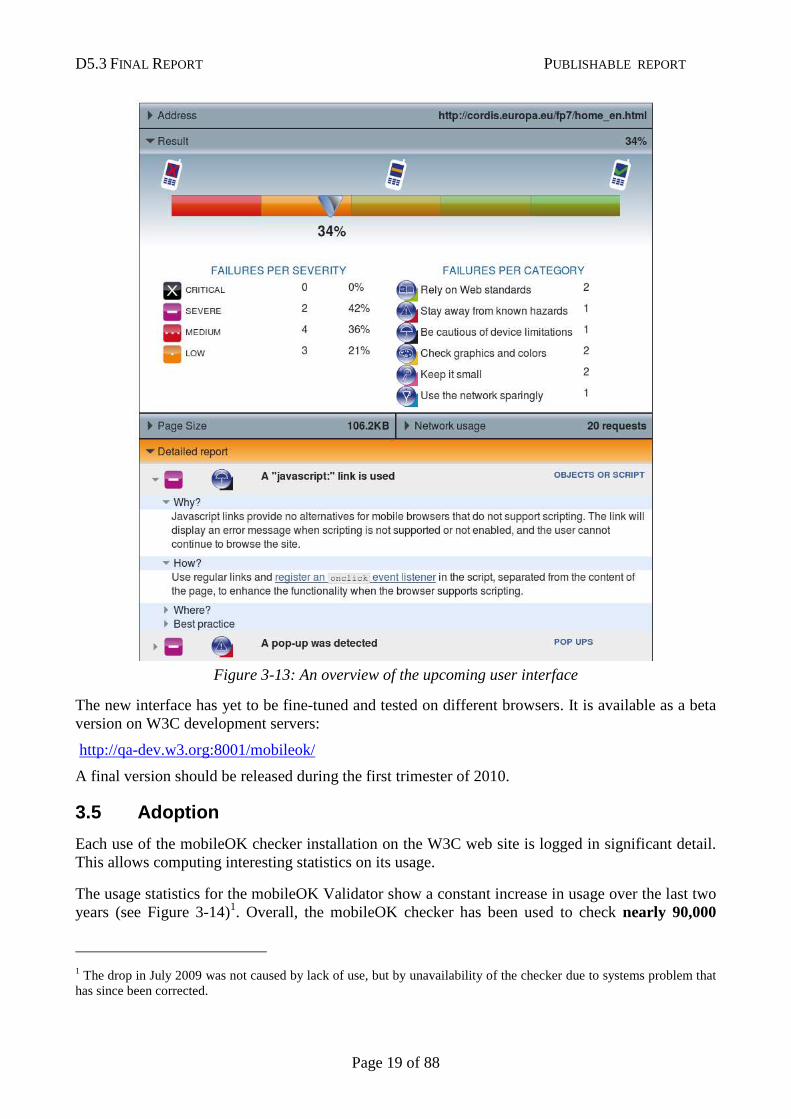
• Develop the tool from purely offering an assessment of mobileOK conformance to a decision-making tool. Web authors can therefore quickly determine which parts most affect the mobile-friendliness of their content and prioritize their work if time constraints do not allow the development of full mobileOK content. Users are presented with an overview of the errors. Expandable sections are then used to provide more details as needed (see Figure 3-13).
D5.3 FINAL REPORT PUBLISHABLE REPORT
Page 19 of 88
Figure 3-13: An overview of the upcoming user interface
The new interface has yet to be fine-tuned and tested on different browsers. It is available as a beta version on W3C development servers:
http://qa-dev.w3.org:8001/mobileok/
A final version should be released during the first trimester of 2010.
3.5 Adoption
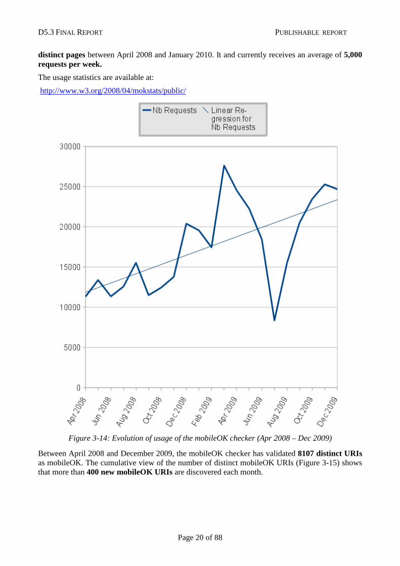
Each use of the mobileOK checker installation on the W3C web site is logged in significant detail. This allows computing interesting statistics on its usage.
The usage statistics for the mobileOK Validator show a constant increase in usage over the last two years (see Figure 3-14)1. Overall, the mobileOK checker has been used to check nearly 90,000
1 The drop in July 2009 was not caused by lack of use, but by unavailability of the checker due to systems problem that has since been corrected.
D5.3 FINAL REPORT PUBLISHABLE REPORT
Page 20 of 88
distinct pages between April 2008 and January 2010. It and currently receives an average of 5,000 requests per week.
The usage statistics are available at:
http://www.w3.org/2008/04/mokstats/public/
Figure 3-14: Evolution of usage of the mobileOK checker (Apr 2008 – Dec 2009)
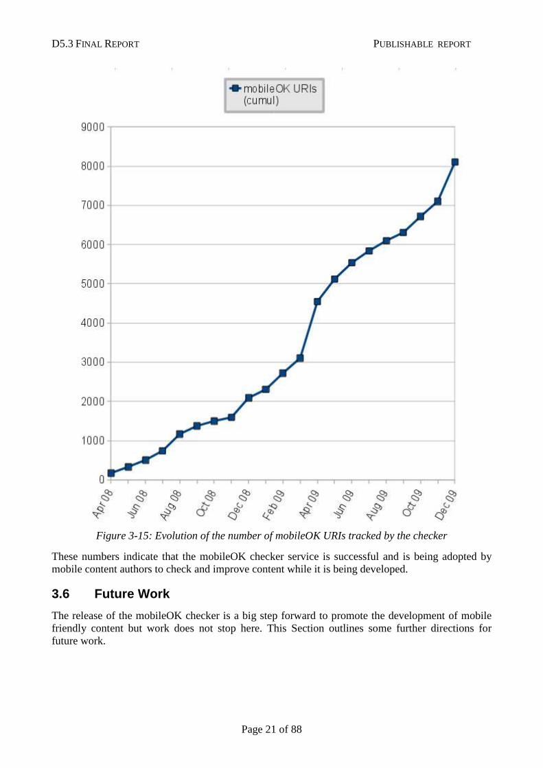
Between April 2008 and December 2009, the mobileOK checker has validated 8107 distinct URIs as mobileOK. The cumulative view of the number of distinct mobileOK URIs (Figure 3-15) shows that more than 400 new mobileOK URIs are discovered each month.
D5.3 FINAL REPORT PUBLISHABLE REPORT
Page 21 of 88
Figure 3-15: Evolution of the number of mobileOK URIs tracked by the checker
These numbers indicate that the mobileOK checker service is successful and is being adopted by mobile content authors to check and improve content while it is being developed.
3.6 Future Work
The release of the mobileOK checker is a big step forward to promote the development of mobile friendly content but work does not stop here. This Section outlines some further directions for future work.
D5.3 FINAL REPORT PUBLISHABLE REPORT
Page 22 of 88
Web site batch processing
The mobileOK checker can be used to check a single page, but there is currently no way to process all pages in a Web site. One way to do that could be to give a seed page to the Checker along with a maximum depth to check. The Checker would then follow the links and check the resulting pages.
“Not applicable” outcome
At the moment, the outcome of a test can only be PASS or FAIL, but some of the tests are not applicable for some of the Web pages that are being checked by the tool. For instance, checking whether the height and width attributes are set on images only applies when images are actually used in the page. An additional NOT_APPLICABLE outcome (rather than PASS) would help improve the way the score for the page is computed, and help generate even more meaningful statistics.
Completion of Widget Package Checker
The mobileOK Checker library features a generic testing framework of which mobileOK is but a specific profile. Other profiles may be specified, and an alpha version of a Widget Checker was developed [14] that checks conformance to the Widgets packaging specification [15]. This new Checker should be released as a stable v1.0 once the Widgets specification itself has stabilized.
Since the widget specification is still a draft, tests will be completed and/or modified appropriately to follow the changes brought to the specification. The messages returned by the checker will be completed to provide more details and explain how errors can be fixed. The Widget checker was released as an unstable alpha version on W3C development servers in mid-June 2009:
http://qa-dev.w3.org:8001/widget/
References [1] mobileOK Basic Tests 1.0, Sean Owen, Jo Rabin, W3C Recommendation, 8 December 2008, http://www.w3.org/TR/2008/REC-mobileOK-basic10-tests-20081208/ [2] About the Mobile Web Initiative, Dominique Hazael-Massieux, http://www.w3.org/Mobile/About [3] Mobile Web Best Practices 1.0, Jo Rabin, Charles McCathieNevile, W3C Recommendation, 29 July 2008, http://www.w3.org/TR/2008/REC-mobile-bp-20080729/ [4] Web Content Accessibility Guidelines 1.0, W Chisholm, I. Jacobs, G Vanderheiden, Editors, W3C Recommendation, 5 May 1999, http://www.w3.org/TR/1999/WAI-WEBCONTENT-19990505/ [5] Making Small Devices Look Great, Opera Software, 14 March 2007, http://my.opera.com/community/dev/device/ [6] Best Practices in XHTML Design, Openwave, http://developer.openwave.com/dvl/support/documentation/guides_and_references/best_practices_in_xhtml_design/index.htm [7] S60 Platform: Designing XHTML Mobile Profile Content, Nokia, 24 May 2005, http://sw.nokia.com/id/4f7b6805-47d7-4914-885c-6ef2b487adf6/Series_60_Platform_Designing_XHTML_MP_Content_v1_4_en.pdf [8] Browsing on Mobile Phones, Virpi Roto, MobEA III workshop on Customer Focused Mobile Services, in conjunction with WWW2005 conference. May 10, 2005, Chiba, Japan. (2005), http://www.research.att.com/~rjana/WF12_Paper1.pdf [9] W3C MobileOK Basic Tests 1.0 Checker Extension Supporting file URI Scheme, Human Centred Web Lab, http://hcw-eprints.cs.man.ac.uk/87/ [10] Extensibility of the mobileOK Checker Java library, W3C, http://dev.w3.org/2007/mobileok-ref/docs/org/w3c/mwi/mobileok/basic/package-summary.html#extensibility [11] About the W3C Markup Validation Service, W3C http://validator.w3.org/about.html [12] Remember The Milk: Online to do list and task management, http://www.rememberthemilk.com/ [13] MAMA: “What is the Web made of?”, Brian Wilson (Opera), 15 October 2008, http://dev.opera.com/articles/view/mama/ [14] W3C Widget Checker (Alpha Version), W3C, http://qa-dev.w3.org:8001/widget/ [15] Widgets 1.0: Packaging and Configuration, Marcos Cáceres, W3C Candidate Recommendation, 23 July 2009, http://www.w3.org/TR/2009/CR-widgets-20090723/
D5.3 FINAL REPORT PUBLISHABLE REPORT
Page 23 of 88
D5.3 FINAL REPORT PUBLISHABLE REPORT
Page 24 of 88
Chapter 4: Training Web Developers
4.1 Summary
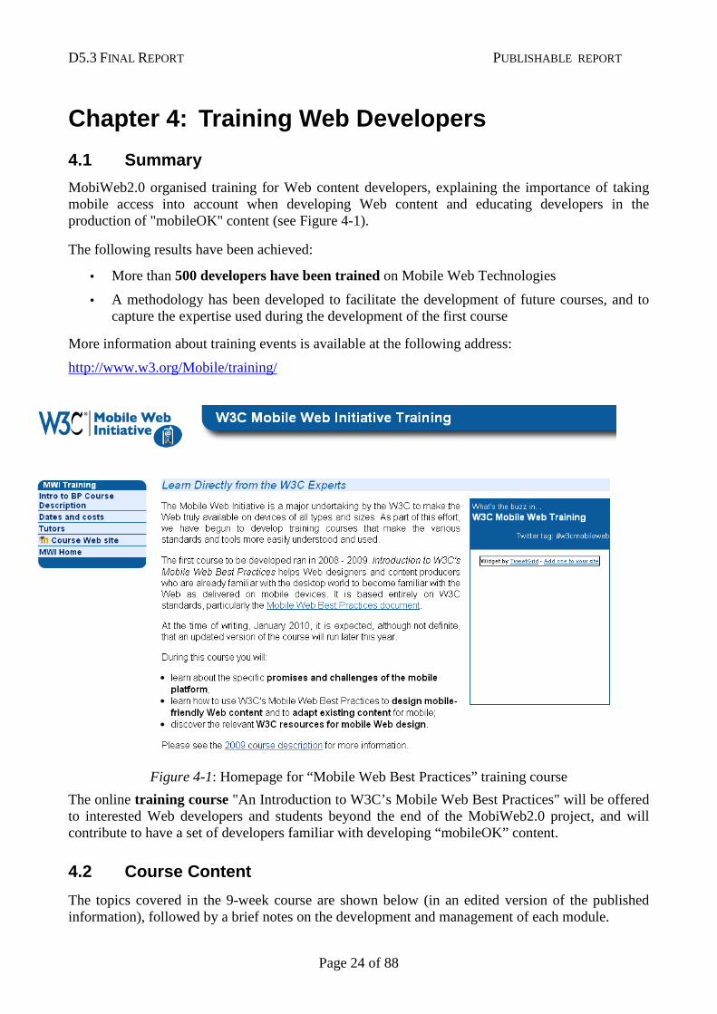
MobiWeb2.0 organised training for Web content developers, explaining the importance of taking mobile access into account when developing Web content and educating developers in the production of "mobileOK" content (see Figure 4-1).
The following results have been achieved:
• More than 500 developers have been trained on Mobile Web Technologies
• A methodology has been developed to facilitate the development of future courses, and to capture the expertise used during the development of the first course
More information about training events is available at the following address:
http://www.w3.org/Mobile/training/
Figure 4-1: Homepage for “Mobile Web Best Practices” training course
The online training course "An Introduction to W3C’s Mobile Web Best Practices" will be offered to interested Web developers and students beyond the end of the MobiWeb2.0 project, and will contribute to have a set of developers familiar with developing “mobileOK” content.
4.2 Course Content
The topics covered in the 9-week course are shown below (in an edited version of the published information), followed by a brief notes on the development and management of each module.
D5.3 FINAL REPORT PUBLISHABLE REPORT
Page 25 of 88
Week 1 Mobile Web: Opportunities and Challenges
This week introduces students to the subject and to their fellow students. Elements include:
• Getting to know other students through the discussion forum.
• A quiz designed to present interesting facts about the Web on mobile.
• The mobile Web: opportunities and challenges. This lecture shows the huge potential of the Web on mobile and introduces many of the various challenges that content providers face.
A simple assignment asks students to practice browsing the Web on their mobile device.
Week 2 Coding for the Mobile Web: You shall not use …
This week provides details of why you should not use certain techniques and how to achieve the same aims using different techniques. The 'do not use techniques' include popups, tables, frames and more.
The assignment at the end of the module asks students to remove all the 'do not use' techniques from a given page. This page is available at: http://tinyurl.com/5ponwn.
Week 3 Coding: Use with caution …
After the previous week's 'do not', this week's message is 'you can and probably should, but be careful.' Several techniques can be used to give users an enhanced experience but these do not work on all devices. Therefore when using such techniques you should do so in a way that they fail gracefully and do not prevent access to content and features on devices that don't support the relevant technique.
There is no assignment this week but there is a quiz that will help to reinforce the content of the module.
Week 4 W3C Standards and Resources about the Mobile Web
A week devoted to getting to know about the different resources that W3C makes available: not just the standards but the blogs, the mailing lists and the tools that are there to help developers create great content for mobile.
Weeks 5 & 6 Understanding Basic Design Principles of a Mobile Web Page
These two weeks are at the heart of the course and give students more direct hands-on experience of creating content for mobile. A four-part assignment examines several mobile-specific design issues.
Starting with a page that is designed for a desktop presentation and work towards one that presents the same content but that works well on mobile. As a taster, take a look at the sample page on your desktop. Now look at the same page on your mobile (it's also available at http://tinyurl.com/2ypphd).
Week 7 Small is Beautiful
This week looks at the specific differences between the Web as accessed on desktop and mobile devices, including: the limitations of mobile networks, techniques for reducing the page weight (i.e. the amount of markup and number of external elements), avoiding useless network usage and the limitations imposed by battery life.
Week 8 One Web to Rule them All!
The World Wide Web works because content providers and software developers agree on a remarkably small number of simple things. One fundamental property of the Web that is
D5.3 FINAL REPORT PUBLISHABLE REPORT
Page 26 of 88
particularly important in this context is the relationship between identifiers and resources. This is what lies behind the 'One Web' philosophy which states that an identifier is associated with a particular resource, such as a Web page. Week 8 explores the theory behind the One Web philosophy and sees it working in practice.
Week 9 Learning to use the W3C MobileOK Checker
The course ends with a detailed look at one of the key tools available to those wishing to provide content through the mobile channel. The mobileOK Checker runs a set of tests derived from the Mobile Web Best Practices document and gives useful feedback to help improve coding so that it conforms to the mobileOK mark.
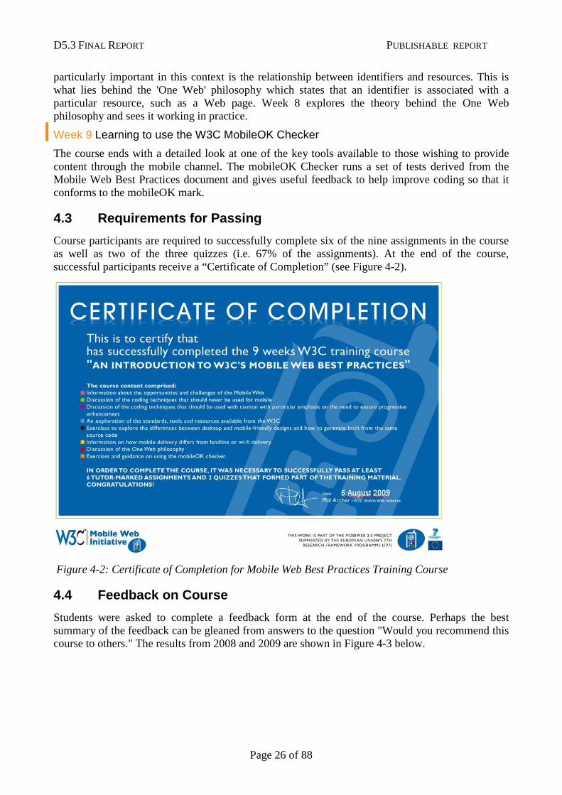
4.3 Requirements for Passing
Course participants are required to successfully complete six of the nine assignments in the course as well as two of the three quizzes (i.e. 67% of the assignments). At the end of the course, successful participants receive a “Certificate of Completion” (see Figure 4-2).
Figure 4-2: Certificate of Completion for Mobile Web Best Practices Training Course
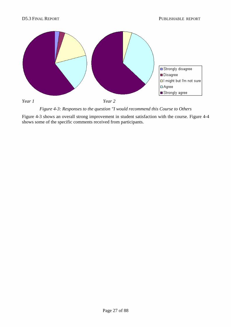
4.4 Feedback on Course
Students were asked to complete a feedback form at the end of the course. Perhaps the best summary of the feedback can be gleaned from answers to the question "Would you recommend this course to others." The results from 2008 and 2009 are shown in Figure 4-3 below.
D5.3 FINAL REPORT PUBLISHABLE REPORT
Page 27 of 88
Year 1 Year 2
Figure 4-3: Responses to the question "I would recommend this Course to Others
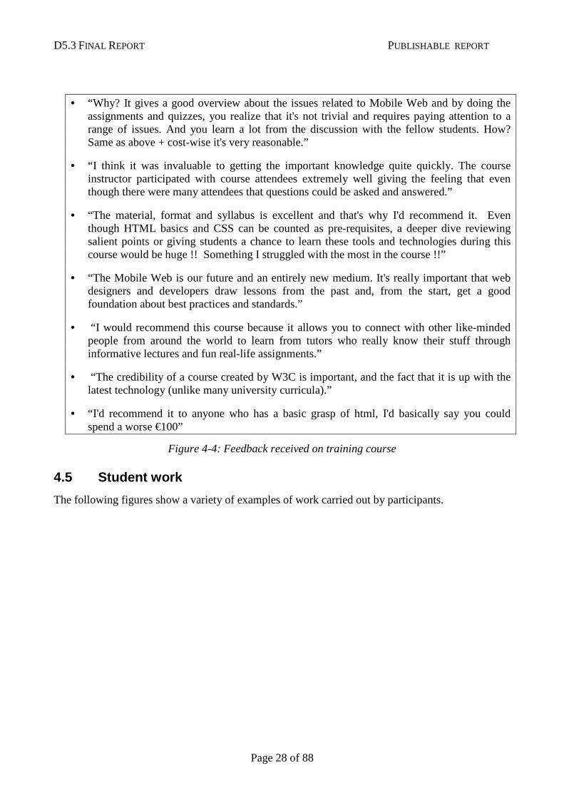
Figure 4-3 shows an overall strong improvement in student satisfaction with the course. Figure 4-4 shows some of the specific comments received from participants.
D5.3 FINAL REPORT PUBLISHABLE REPORT
Page 28 of 88
• “Why? It gives a good overview about the issues related to Mobile Web and by doing the assignments and quizzes, you realize that it's not trivial and requires paying attention to a range of issues. And you learn a lot from the discussion with the fellow students. How? Same as above + cost-wise it's very reasonable.”
• “I think it was invaluable to getting the important knowledge quite quickly. The course instructor participated with course attendees extremely well giving the feeling that even though there were many attendees that questions could be asked and answered.”
• “The material, format and syllabus is excellent and that's why I'd recommend it. Even though HTML basics and CSS can be counted as pre-requisites, a deeper dive reviewing salient points or giving students a chance to learn these tools and technologies during this course would be huge !! Something I struggled with the most in the course !!”
• “The Mobile Web is our future and an entirely new medium. It's really important that web designers and developers draw lessons from the past and, from the start, get a good foundation about best practices and standards.”
• “I would recommend this course because it allows you to connect with other like-minded people from around the world to learn from tutors who really know their stuff through informative lectures and fun real-life assignments.”
• “The credibility of a course created by W3C is important, and the fact that it is up with the latest technology (unlike many university curricula).”
• “I'd recommend it to anyone who has a basic grasp of html, I'd basically say you could spend a worse €100”
Figure 4-4: Feedback received on training course
4.5 Student work
The following figures show a variety of examples of work carried out by participants.
D5.3 FINAL REPORT PUBLISHABLE REPORT
Page 29 of 88
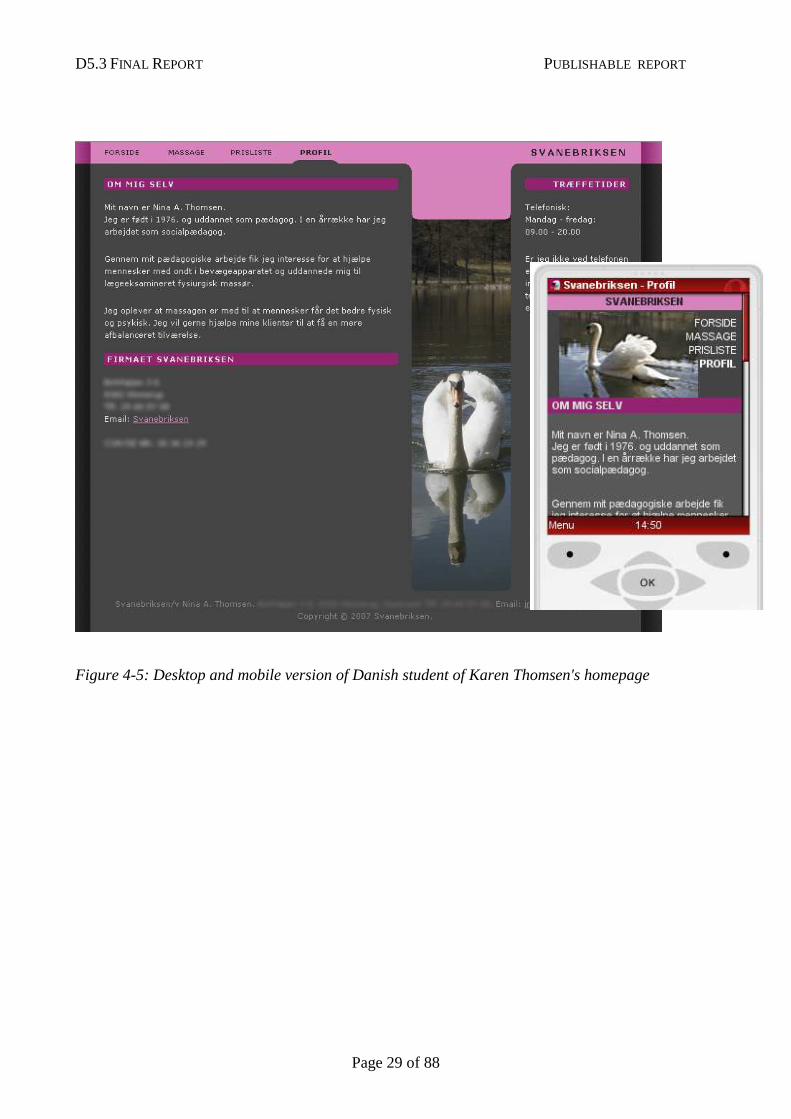
Figure 4-5: Desktop and mobile version of Danish student of Karen Thomsen's homepage
D5.3 FINAL REPORT PUBLISHABLE REPORT
Page 30 of 88
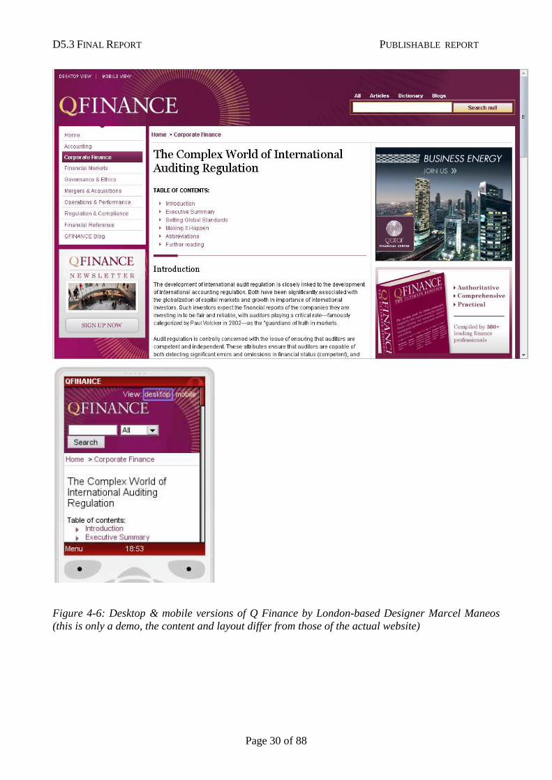
Figure 4-6: Desktop & mobile versions of Q Finance by London-based Designer Marcel Maneos (this is only a demo, the content and layout differ from those of the actual website)
D5.3 FINAL REPORT PUBLISHABLE REPORT
Page 31 of 88
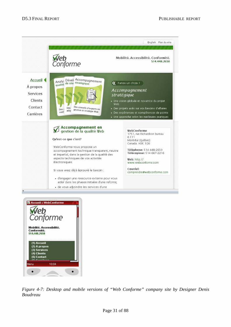
Figure 4-7: Desktop and mobile versions of “Web Conforme” company site by Designer Denis Boudreau
D5.3 FINAL REPORT PUBLISHABLE REPORT
Page 32 of 88
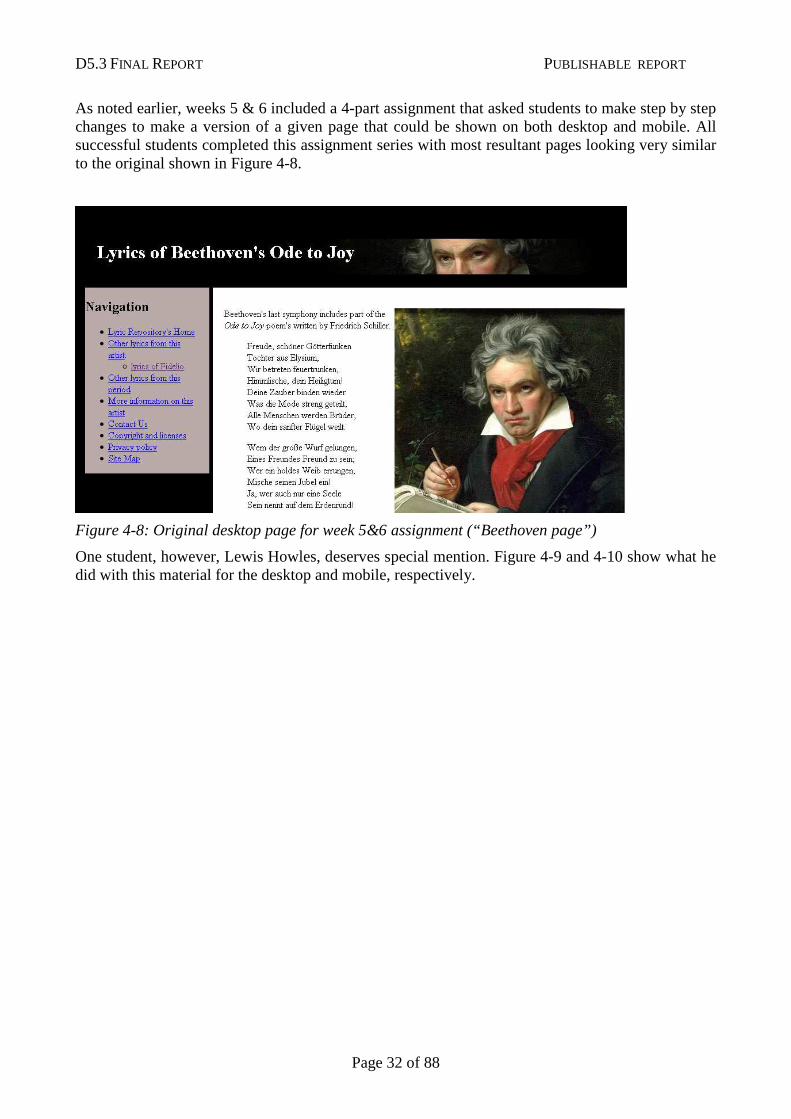
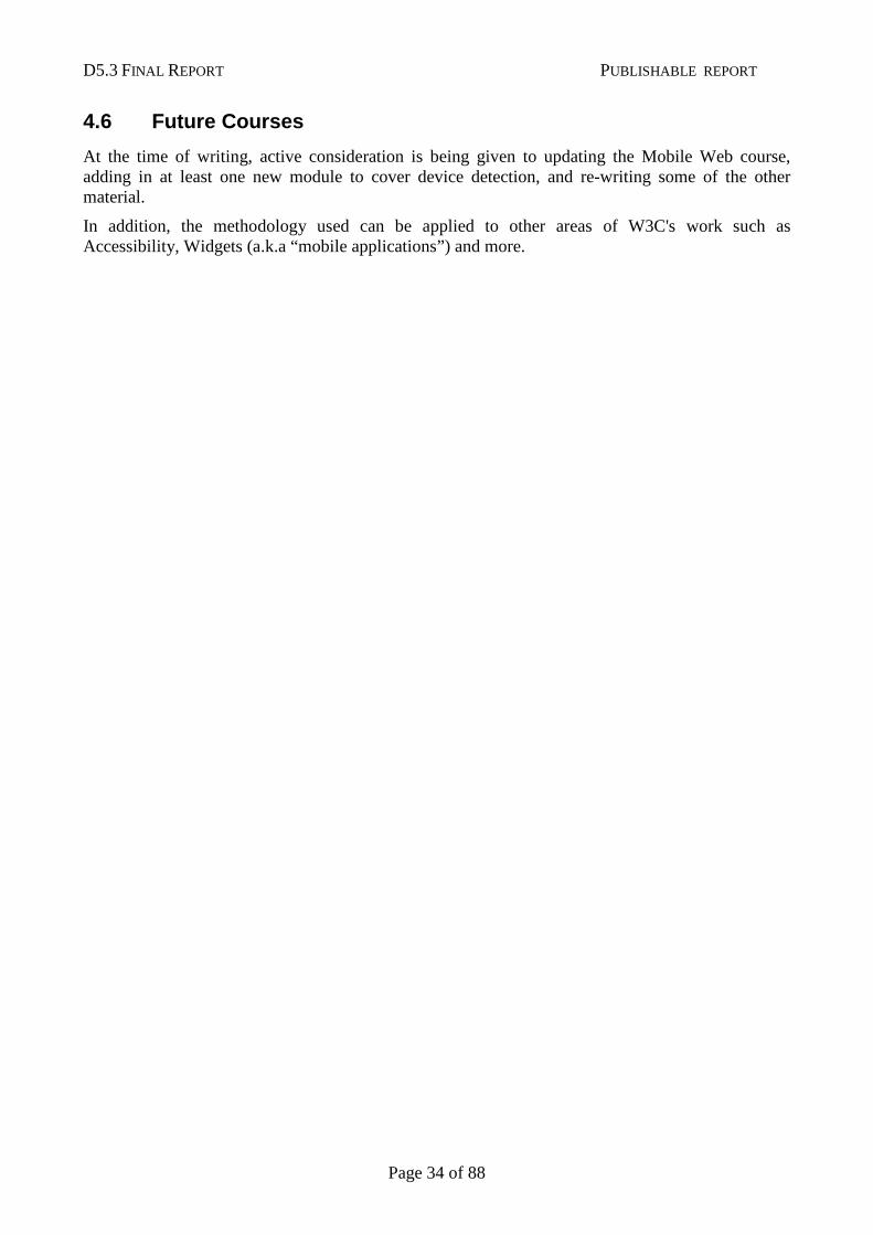
As noted earlier, weeks 5 & 6 included a 4-part assignment that asked students to make step by step changes to make a version of a given page that could be shown on both desktop and mobile. All successful students completed this assignment series with most resultant pages looking very similar to the original shown in Figure 4-8.
Figure 4-8: Original desktop page for week 5&6 assignment (“Beethoven page”)
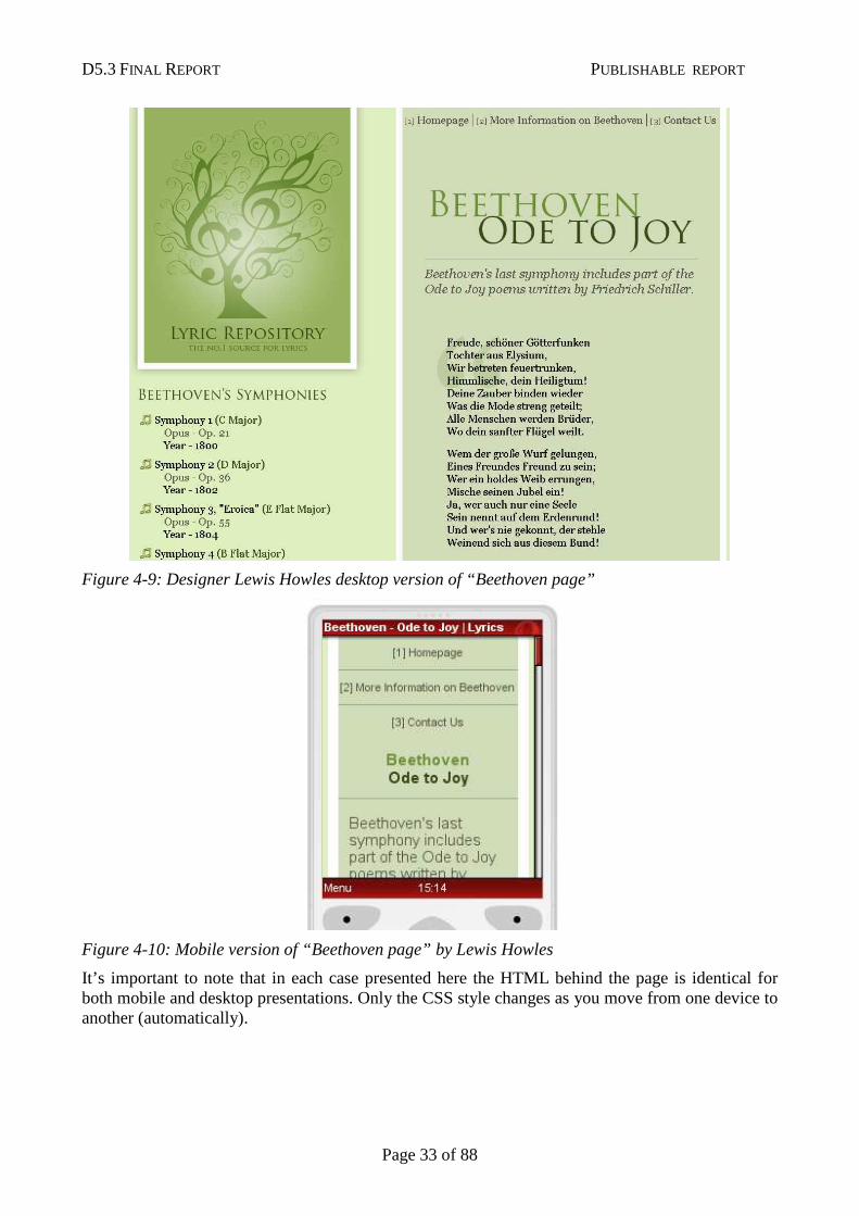
One student, however, Lewis Howles, deserves special mention. Figure 4-9 and 4-10 show what he did with this material for the desktop and mobile, respectively.
D5.3 FINAL REPORT PUBLISHABLE REPORT
Page 33 of 88
Figure 4-9: Designer Lewis Howles desktop version of “Beethoven page”
Figure 4-10: Mobile version of “Beethoven page” by Lewis Howles
It’s important to note that in each case presented here the HTML behind the page is identical for both mobile and desktop presentations. Only the CSS style changes as you move from one device to another (automatically).
D5.3 FINAL REPORT PUBLISHABLE REPORT
Page 34 of 88
4.6 Future Courses
At the time of writing, active consideration is being given to updating the Mobile Web course, adding in at least one new module to cover device detection, and re-writing some of the other material.
In addition, the methodology used can be applied to other areas of W3C's work such as Accessibility, Widgets (a.k.a “mobile applications”) and more.
D5.3 FINAL REPORT PUBLISHABLE REPORT
Page 35 of 88
Chapter 5: Test Suites
5.1 Summary
The W3C Mobile Web Test Suites Working Group was funded by the MobiWeb 2.0 project to increase the support of “Mobile Web 2.0” technologies on browsers installed on mobile devices. The group had the following goals:
• provide tools and test suites,
• work in collaboration with other groups in W3C and elsewhere,
• collect data on the current state of interoperability and standards conformance of products on the market,
• Bring visibility to the needs of greater interoperability across browsers.
In the course of the MobiWeb2.0 project, the Mobile Web Test Suites Working Group made significant progress in the following areas:
• Definition and publication of several versions of a Web Compatibility Test for Mobile Browsers that identify at a glance the shortcomings of mobile browsers with regard to the most relevant Web technologies;
• Finalization of the agreement with the Open Mobile Alliance on sharing test suites between W3C and OMA;
• Creation of new test cases on the use of CSS Media Types;
• Extensive work on testing conformance of Widgets engines in collaboration with the W3C Web Applications Working Group, with the co-production of a test suite covering 100% of the core Widgets specification, and the establishment of a successful testing methodology;
• Finalization and publication of guidelines for other Working Groups to create test suites that will work well across a variety of devices;
• Tools to help test JavaScript-based technologies;
This chapter is structured as follows:
• In the introduction (Section 5.2), the importance of interoperability to fulfil the promises of the “Mobile Web 2.0”, and the role and past actions of the Mobile Web Test Suites Working Group are presented;
• In Section 5.3-5.10, the various achievements of the Working Group are detailed;
• The conclusion (Section 5.11) puts the various achievements in perspective to the overall goal of the MobiWeb2.0 project, explains lasting impacts on the mobile Web ecosystem.
D5.3 FINAL REPORT PUBLISHABLE REPORT
Page 36 of 88
5.2 Introduction
5.2.1 Promises of Mobile Web 2.0
Combining the advantages of increasingly powerful Web technologies with the ubiquity of mobile devices holds a lot of promises for what has been called “Mobile Web 2.0”.
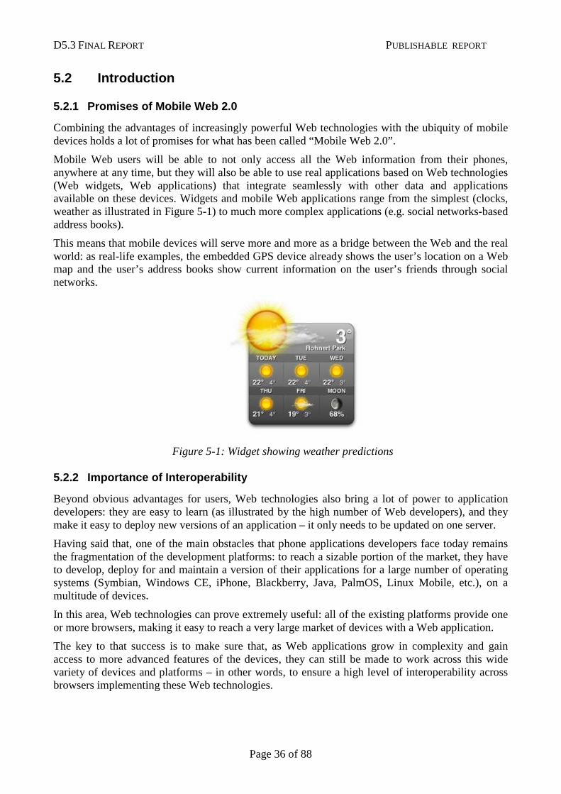
Mobile Web users will be able to not only access all the Web information from their phones, anywhere at any time, but they will also be able to use real applications based on Web technologies (Web widgets, Web applications) that integrate seamlessly with other data and applications available on these devices. Widgets and mobile Web applications range from the simplest (clocks, weather as illustrated in Figure 5-1) to much more complex applications (e.g. social networks-based address books).
This means that mobile devices will serve more and more as a bridge between the Web and the real world: as real-life examples, the embedded GPS device already shows the user’s location on a Web map and the user’s address books show current information on the user’s friends through social networks.
5.2.2 Importance of Interoperability
Beyond obvious advantages for users, Web technologies also bring a lot of power to application developers: they are easy to learn (as illustrated by the high number of Web developers), and they make it easy to deploy new versions of an application – it only needs to be updated on one server.
Having said that, one of the main obstacles that phone applications developers face today remains the fragmentation of the development platforms: to reach a sizable portion of the market, they have to develop, deploy for and maintain a version of their applications for a large number of operating systems (Symbian, Windows CE, iPhone, Blackberry, Java, PalmOS, Linux Mobile, etc.), on a multitude of devices.
In this area, Web technologies can prove extremely useful: all of the existing platforms provide one or more browsers, making it easy to reach a very large market of devices with a Web application.
The key to that success is to make sure that, as Web applications grow in complexity and gain access to more advanced features of the devices, they can still be made to work across this wide variety of devices and platforms – in other words, to ensure a high level of interoperability across browsers implementing these Web technologies.
Figure 5-1: Widget showing weather predictions
D5.3 FINAL REPORT PUBLISHABLE REPORT
Page 37 of 88
5.2.3 Role of the W3C Mobile Web Test Suites Workin g Group
W3C, the leading standards organization for Web technologies, where in particular Web applications and widgets technologies are being developed, has chartered a Working Group, the Mobile Web Test Suites Working Group with the goal of increasing interoperability by developing test suites targeted at browsers on mobile devices.
These test suites are collections of targeted examples of the technologies that make it easy to assess whether a given browser correctly implements a specific Web technology.
While some of the other W3C Working Groups that develop these Web technologies create test suites on their own as part of the standardization process, these test suites are often not well suited to browsers on mobile devices, or are not easy to integrate with the browser development workflow, limiting their impact on the improvement of mobile web browsers.
The Mobile Web Test Suites Working Group (initially funded by the EU-FP6 3GWeb project, and funded by the EU-FP7 MobiWeb2.0 since January 2008) is working on specialised tests for the mobile Web environment.
5.2.4 Charter and History of the Mobile Web Test Su ites Working Group
The Mobile Web Test Suites Working Group charter was developed in 2006, with funding from the FP6-3GWeb project, during which the involved W3C staff gathered input from W3C Members, from the W3C Mobile Web Initiative Steering Council, and from other organizations already active in the field of testing around Web technologies used on mobile devices, in particular the OMA (Open Mobile Alliance) Interoperability Group.
The resulting charter focused on the inventory and development of test suites targeted at Web browsers running on mobile user agents, with strong focus on coordination with other W3C Working groups, and with the relevant OMA Interoperability Group.
In 2007, the group focused on reviewing existing conformance test suites for Web technologies relevant to mobile devices (XHTML, CSS, SVG, DOM), integrating them into a mobile-friendly environment (called the Mobile Web Test Harness), developing new test suites and adapting existing test suites to the mobile devices constraints, and cooperating with OMA on the development of test suites common to the two organizations.
In January 2008, the MobiWeb2.0 project started funding the time of the staff contact and co-chair of the renewed Working Group, with a focus on more advanced features of mobile Web browsers, including AJAX/Javascript support, Web applications and widgets.
The following W3C Members nominated participants to the working group:
• NIST, the US National Institute of Standards and Technology, bringing their expertise on testing;
• Opera Software, a Web browser vendor particularly popular on mobile devices, who provided the other co-chair for the group;
• SUN Microsystems, bringing their expertise in conformance testing for mobile devices through their Java ME testing experience;
• FSTC (Financial Services Technology Consortium);
• Aplix Corporation , a Japanese mobile solutions provider.
D5.3 FINAL REPORT PUBLISHABLE REPORT
Page 38 of 88
In addition to these formal participants, representatives from Vodafone, Telecom Italia, T-Mobile, OMTP, Uxebu and ACCESS were also involved in part of the group’s work.
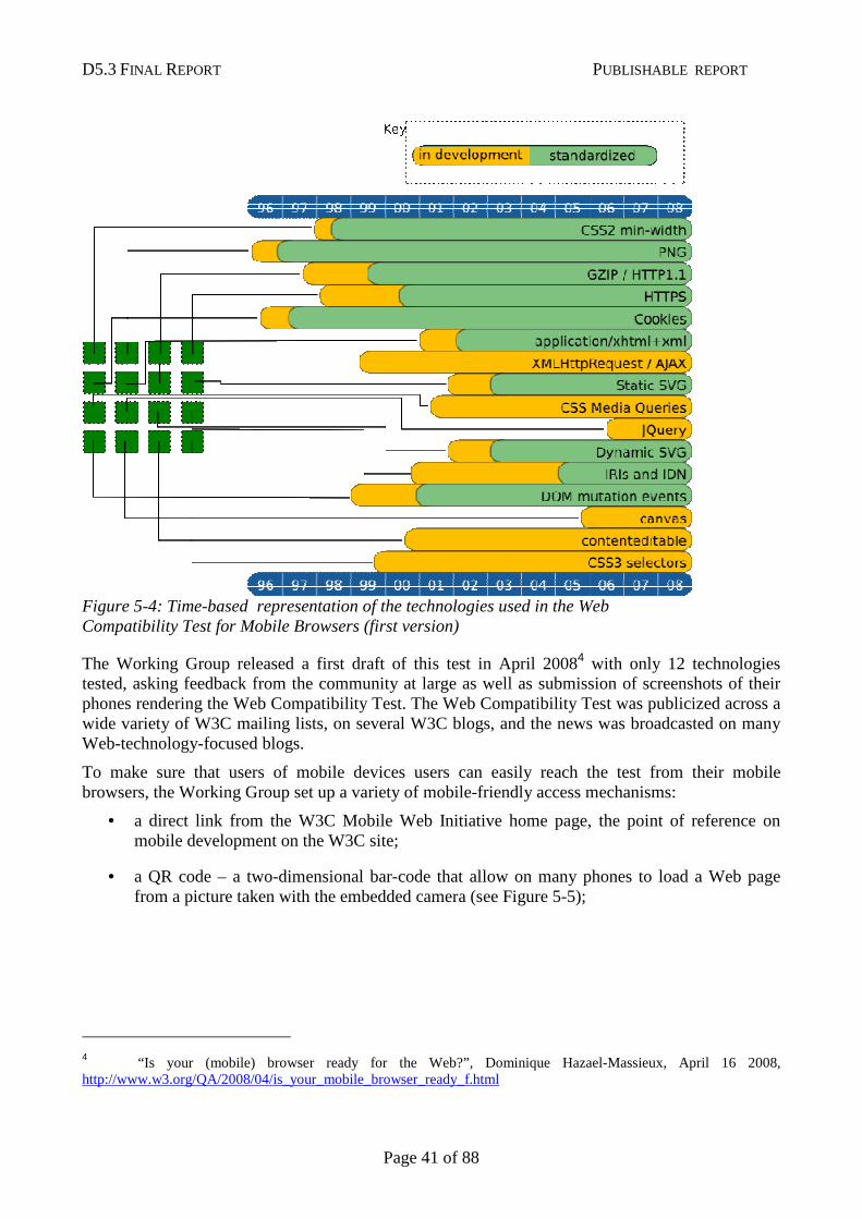
5.3 Web Compatibility Test for Mobile Browsers
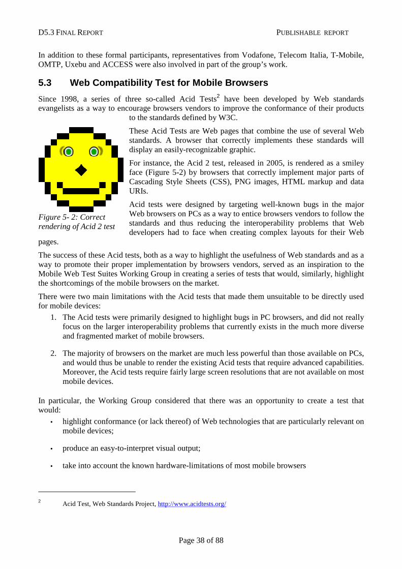
Since 1998, a series of three so-called Acid Tests2 have been developed by Web standards evangelists as a way to encourage browsers vendors to improve the conformance of their products
to the standards defined by W3C.
These Acid Tests are Web pages that combine the use of several Web standards. A browser that correctly implements these standards will display an easily-recognizable graphic.
For instance, the Acid 2 test, released in 2005, is rendered as a smiley face (Figure 5-2) by browsers that correctly implement major parts of Cascading Style Sheets (CSS), PNG images, HTML markup and data URIs.
Acid tests were designed by targeting well-known bugs in the major Web browsers on PCs as a way to entice browsers vendors to follow the standards and thus reducing the interoperability problems that Web developers had to face when creating complex layouts for their Web
pages.
The success of these Acid tests, both as a way to highlight the usefulness of Web standards and as a way to promote their proper implementation by browsers vendors, served as an inspiration to the Mobile Web Test Suites Working Group in creating a series of tests that would, similarly, highlight the shortcomings of the mobile browsers on the market.
There were two main limitations with the Acid tests that made them unsuitable to be directly used for mobile devices:
1. The Acid tests were primarily designed to highlight bugs in PC browsers, and did not really focus on the larger interoperability problems that currently exists in the much more diverse and fragmented market of mobile browsers.
2. The majority of browsers on the market are much less powerful than those available on PCs, and would thus be unable to render the existing Acid tests that require advanced capabilities. Moreover, the Acid tests require fairly large screen resolutions that are not available on most mobile devices.
In particular, the Working Group considered that there was an opportunity to create a test that would:
• highlight conformance (or lack thereof) of Web technologies that are particularly relevant on mobile devices;
• produce an easy-to-interpret visual output;
• take into account the known hardware-limitations of most mobile browsers
2 Acid Test, Web Standards Project, http://www.acidtests.org/
Figure 5- 2: Correct rendering of Acid 2 test
D5.3 FINAL REPORT PUBLISHABLE REPORT
Page 39 of 88
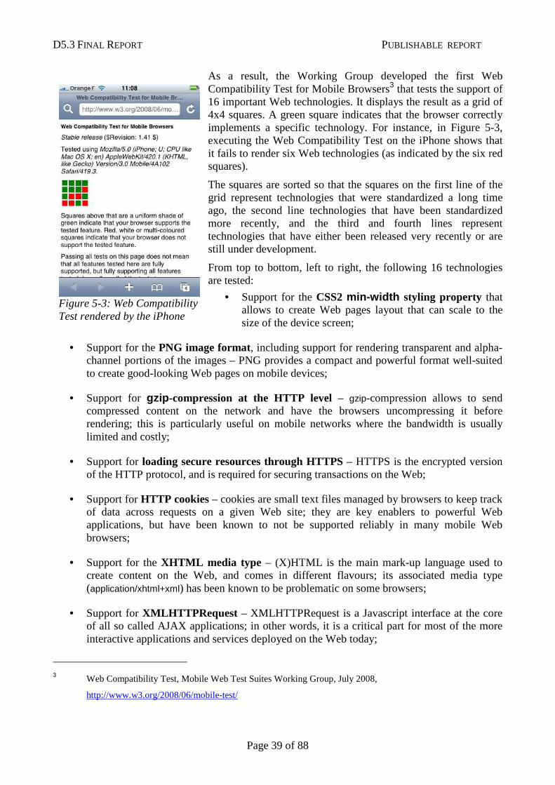
As a result, the Working Group developed the first Web Compatibility Test for Mobile Browsers3 that tests the support of 16 important Web technologies. It displays the result as a grid of 4x4 squares. A green square indicates that the browser correctly implements a specific technology. For instance, in Figure 5-3, executing the Web Compatibility Test on the iPhone shows that it fails to render six Web technologies (as indicated by the six red squares).
The squares are sorted so that the squares on the first line of the grid represent technologies that were standardized a long time ago, the second line technologies that have been standardized more recently, and the third and fourth lines represent technologies that have either been released very recently or are still under development.
From top to bottom, left to right, the following 16 technologies are tested:
• Support for the CSS2 min-width styling property that allows to create Web pages layout that can scale to the size of the device screen;
• Support for the PNG image format, including support for rendering transparent and alpha-channel portions of the images – PNG provides a compact and powerful format well-suited to create good-looking Web pages on mobile devices;
• Support for gzip -compression at the HTTP level – gzip-compression allows to send compressed content on the network and have the browsers uncompressing it before rendering; this is particularly useful on mobile networks where the bandwidth is usually limited and costly;
• Support for loading secure resources through HTTPS – HTTPS is the encrypted version of the HTTP protocol, and is required for securing transactions on the Web;
• Support for HTTP cookies – cookies are small text files managed by browsers to keep track of data across requests on a given Web site; they are key enablers to powerful Web applications, but have been known to not be supported reliably in many mobile Web browsers;
• Support for the XHTML media type – (X)HTML is the main mark-up language used to create content on the Web, and comes in different flavours; its associated media type (application/xhtml+xml) has been known to be problematic on some browsers;
• Support for XMLHTTPRequest – XMLHTTPRequest is a Javascript interface at the core of all so called AJAX applications; in other words, it is a critical part for most of the more interactive applications and services deployed on the Web today;
3 Web Compatibility Test, Mobile Web Test Suites Working Group, July 2008,
http://www.w3.org/2008/06/mobile-test/
Figure 5-3: Web Compatibility Test rendered by the iPhone
D5.3 FINAL REPORT PUBLISHABLE REPORT
Page 40 of 88
• Support for static SVG; SVG (Scalable Vector Graphics) allows to create images that can be scaled up and down, and is particularly well suited for small screens. “Static” SVG refers to SVG images that are not animated;
• Support for CSS Media Queries – CSS Media queries offer a mechanism to apply subset of styling properties on a page depending on hardware characteristics of the devices that render it – typically the screen size;
• Support for the JQuery Javascript Framework (this test replaced an earlier test for support for the inputmode attribute in XTML) ;
• Support for dynamic SVG – SVG also allows the creation of animated scalable images in a particularly compact format well-suited to constraints of mobile devices hardware and networks;
• Support for internationalized DNS domain names and Web addresses (IDNs and IRIs) – as mobile devices are bringing Web access to developing countries, it is particularly important to ensure they will work with every character set;
• Support for mutation events in the Document Object Model (DOM) – these mutation events allows to alert users when a non-visible part of a Web page is modified by Javascript – this is particularly relevant to mobile devices where the user rarely sees the entirety of the screen;
• Support for the canvas element in HTML5, making it possible to build graphics through Javascript on Web pages;
• Support for the contenteditable attribute in HTML 5 , allowing users to create and edit Web content from their Web browser;
• Support for CSS3 selectors, which allow creating more advanced styling for Web pages.
Figure 5-4 shows a time-based perspective on the development of the tested technologies.
D5.3 FINAL REPORT PUBLISHABLE REPORT
Page 41 of 88
The Working Group released a first draft of this test in April 20084 with only 12 technologies tested, asking feedback from the community at large as well as submission of screenshots of their phones rendering the Web Compatibility Test. The Web Compatibility Test was publicized across a wide variety of W3C mailing lists, on several W3C blogs, and the news was broadcasted on many Web-technology-focused blogs.
To make sure that users of mobile devices users can easily reach the test from their mobile browsers, the Working Group set up a variety of mobile-friendly access mechanisms:
• a direct link from the W3C Mobile Web Initiative home page, the point of reference on mobile development on the W3C site;
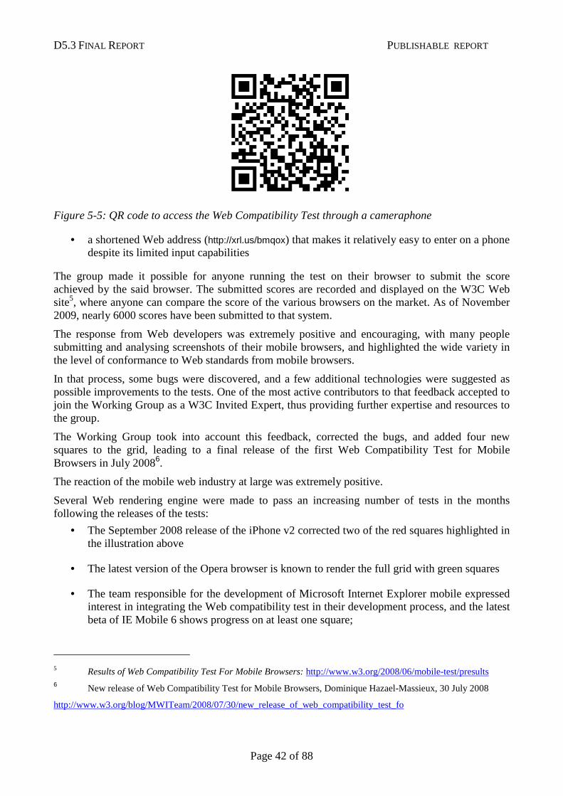
• a QR code – a two-dimensional bar-code that allow on many phones to load a Web page from a picture taken with the embedded camera (see Figure 5-5);
4 “Is your (mobile) browser ready for the Web?”, Dominique Hazael-Massieux, April 16 2008, http://www.w3.org/QA/2008/04/is_your_mobile_browser_ready_f.html
Figure 5-4: Time-based representation of the technologies used in the Web Compatibility Test for Mobile Browsers (first version)
D5.3 FINAL REPORT PUBLISHABLE REPORT
Page 42 of 88
Figure 5-5: QR code to access the Web Compatibility Test through a cameraphone
• a shortened Web address (http://xrl.us/bmqox) that makes it relatively easy to enter on a phone despite its limited input capabilities
The group made it possible for anyone running the test on their browser to submit the score achieved by the said browser. The submitted scores are recorded and displayed on the W3C Web site5, where anyone can compare the score of the various browsers on the market. As of November 2009, nearly 6000 scores have been submitted to that system.
The response from Web developers was extremely positive and encouraging, with many people submitting and analysing screenshots of their mobile browsers, and highlighted the wide variety in the level of conformance to Web standards from mobile browsers.
In that process, some bugs were discovered, and a few additional technologies were suggested as possible improvements to the tests. One of the most active contributors to that feedback accepted to join the Working Group as a W3C Invited Expert, thus providing further expertise and resources to the group.
The Working Group took into account this feedback, corrected the bugs, and added four new squares to the grid, leading to a final release of the first Web Compatibility Test for Mobile Browsers in July 20086.
The reaction of the mobile web industry at large was extremely positive.
Several Web rendering engine were made to pass an increasing number of tests in the months following the releases of the tests:
• The September 2008 release of the iPhone v2 corrected two of the red squares highlighted in the illustration above
• The latest version of the Opera browser is known to render the full grid with green squares
• The team responsible for the development of Microsoft Internet Explorer mobile expressed interest in integrating the Web compatibility test in their development process, and the latest beta of IE Mobile 6 shows progress on at least one square;
5 Results of Web Compatibility Test For Mobile Browsers: http://www.w3.org/2008/06/mobile-test/presults 6 New release of Web Compatibility Test for Mobile Browsers, Dominique Hazael-Massieux, 30 July 2008
http://www.w3.org/blog/MWITeam/2008/07/30/new_release_of_web_compatibility_test_fo
D5.3 FINAL REPORT PUBLISHABLE REPORT
Page 43 of 88
• At least two mobile operators (Vodafone, T-Mobile) expressed interest in bringing this Web Compatibility Test in their selection process of mobile handsets.
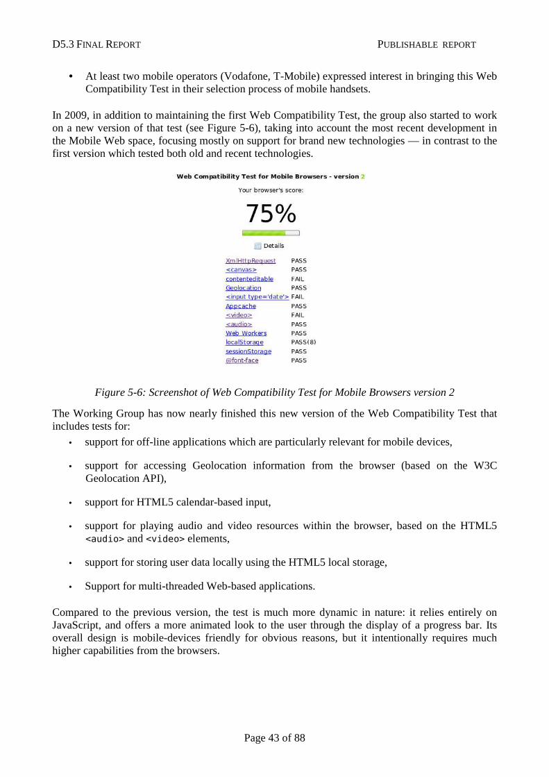
In 2009, in addition to maintaining the first Web Compatibility Test, the group also started to work on a new version of that test (see Figure 5-6), taking into account the most recent development in the Mobile Web space, focusing mostly on support for brand new technologies — in contrast to the first version which tested both old and recent technologies.
Figure 5-6: Screenshot of Web Compatibility Test for Mobile Browsers version 2
The Working Group has now nearly finished this new version of the Web Compatibility Test that includes tests for:
• support for off-line applications which are particularly relevant for mobile devices,
• support for accessing Geolocation information from the browser (based on the W3C Geolocation API),
• support for HTML5 calendar-based input,
• support for playing audio and video resources within the browser, based on the HTML5 <audio> and <video> elements,
• support for storing user data locally using the HTML5 local storage,
• Support for multi-threaded Web-based applications.
Compared to the previous version, the test is much more dynamic in nature: it relies entirely on JavaScript, and offers a more animated look to the user through the display of a progress bar. Its overall design is mobile-devices friendly for obvious reasons, but it intentionally requires much higher capabilities from the browsers.
D5.3 FINAL REPORT PUBLISHABLE REPORT
Page 44 of 88
5.4 Collaboration with OMA
The Open Mobile Alliance (OMA) develops and packages specifications targeted at mobile devices in so-called “Enabler Releases”; some of these enablers target sets of technologies used for Web access.
While the OMA had initially developed a parallel set of Web technologies to the W3C, in 2004, the OMA and W3C signed a Memorandum of Understanding (MoU) that ensured that OMA would re-use the specifications from W3C as-is, thus reducing the risk of fragmentation created by diverging standards.
Both OMA and W3C groups are required to develop test suites in their standardization process. During the definition of the charter of the Mobile Web Test Suites Working Group in 2006, the relevant OMA group noted they had ongoing work on test suites for mobile-relevant Web technologies, and asked that the new W3C Working Group coordinate with them on testing matters.
As a result, in 2007, the two groups organized a series of joint teleconferences and agreed on an action plan to reduce the overlap of work on test suites across the two organizations, in particular for XHTML, CSS and SVG.
While the coordination of the two groups facilitated the coordination between OMA and W3C on testing, it appeared at the end of 2007 that the rules defined in the Memorandum of Understanding between the two organizations were not specific enough to handle the IPR questions around the sharing of test suites. Furthermore, the Memorandum of Understanding between the two organizations had expired and needed to be renewed.
In 2008, as a first step, the Staff Contact of the Mobile Web Test Suites Working Group started the renewal process of the Memorandum of Understanding between the two organizations, leading to the signature of the renewed MoU in July 2008.
In parallel, and in coordination with the W3C Legal counsel, the Staff Contact of the Mobile Web Test Suites Working Group participated in several teleconferences with OMA leaders and legal counsels to set up a separate agreement on test suites, taking into account the specificities of test development.
In September 2008, these meetings led to the signature of a formal agreement between OMA and W3C allowing the two organizations to collaborate and share test suites developed around Web technologies. This agreement will thus reduce the cost for the industry as a whole in the development of test suites, while also permitting a more streamlined process for the standardization of Web technologies in both organizations.
In addition to the improved collaboration framework with OMA, the Mobile Web Test Suites Working Group also made progress on technical projects that are part of this collaboration.
The collaboration with OMA on the XHTML MP Test suite concluded successfully, with the production of very detailed bug reports and a set of concrete modified test cases that led to the correction of a third of the 120 test cases in the reviewed test suite.
Moreover, at the request of the OMA Interoperability group, and in close cooperation with the W3C SVG Working Group, the Mobile Web Test Suites Working Group provided a mapping between the SVG Enabler specification developed by the OMA group and the SVG test suite developed by the SVG Working Group. This mapping has allowed the OMA group to streamline the integration of the W3C test suite in the OMA release process.
D5.3 FINAL REPORT PUBLISHABLE REPORT
Page 45 of 88
5.5 New test suite for CSS Media Types
CSS (Cascading Style Sheets), a W3C standard, is used to define layout and styling for Web pages. Among the various powerful mechanisms provided by this technology, CSS Media Types allow to enable different style sheets in a given Web page depending on the type of devices that is used to render the page. CSS Media Types are typically used to have a single Web page render differently on screen and on printed paper.
However, CSS Media Types can also be used to specifically target mobile devices, and thus, to have a single Web page rendered differently on a PC screen and on a phone screen – for instance to use three-columns layout a on wide PC screen and to use a more adapted single-column layout on mobile devices.
Despite the high interest of this feature for mobile Web content authors, many mobile web browsers implement it only partially or inconsistently. To help identify browsers that do not implement it correctly and thus to help content authors to know which devices react properly, the Mobile Web Test Suites Working Group developed a set of 13 test cases that specifically target this feature and illustrate the different ways in which mobile web content authors can use CSS Media Types.
This brand new test suite was then added to the Mobile Web Test Harness7, the system developed in 2007 and maintained by the Mobile Web Test Suites Working Group to facilitate the access and recording of tests for mobile browsers.
At the time of writing, these test cases have permitted to collect complete data on the support of this feature on more than 70 mobile browsers (over different versions and platforms).
These results have served as the basis for an article pending publication in A List Apart in January 2009, a very popular on-line magazine for Web designers.
5.6 Automatic Extraction of Test Assertions
In 2009, and based on the initial efforts in 2008 described in the following section, the Test Suites Working Group significantly increased its focus on the production of test materials for the widgets specifications.
The creation of the first set of test cases highlighted the need for a more formal approach in identifying the aspects of the specifications that needed testing, and in building the relevant test cases.
The Working Group organized several teleconferences with the main editor of the W3C Widgets specifications to establish a methodology and a plan that would allow creating a test suite as useful and complete as possible.
As a result of these meetings, and based on the principles highlighted in the W3C Quality Assurance Framework8, a detailed methodology was agreed upon and put in application. The Test Suites Working Group is planning to publish that methodology as a W3C Working Group Note.
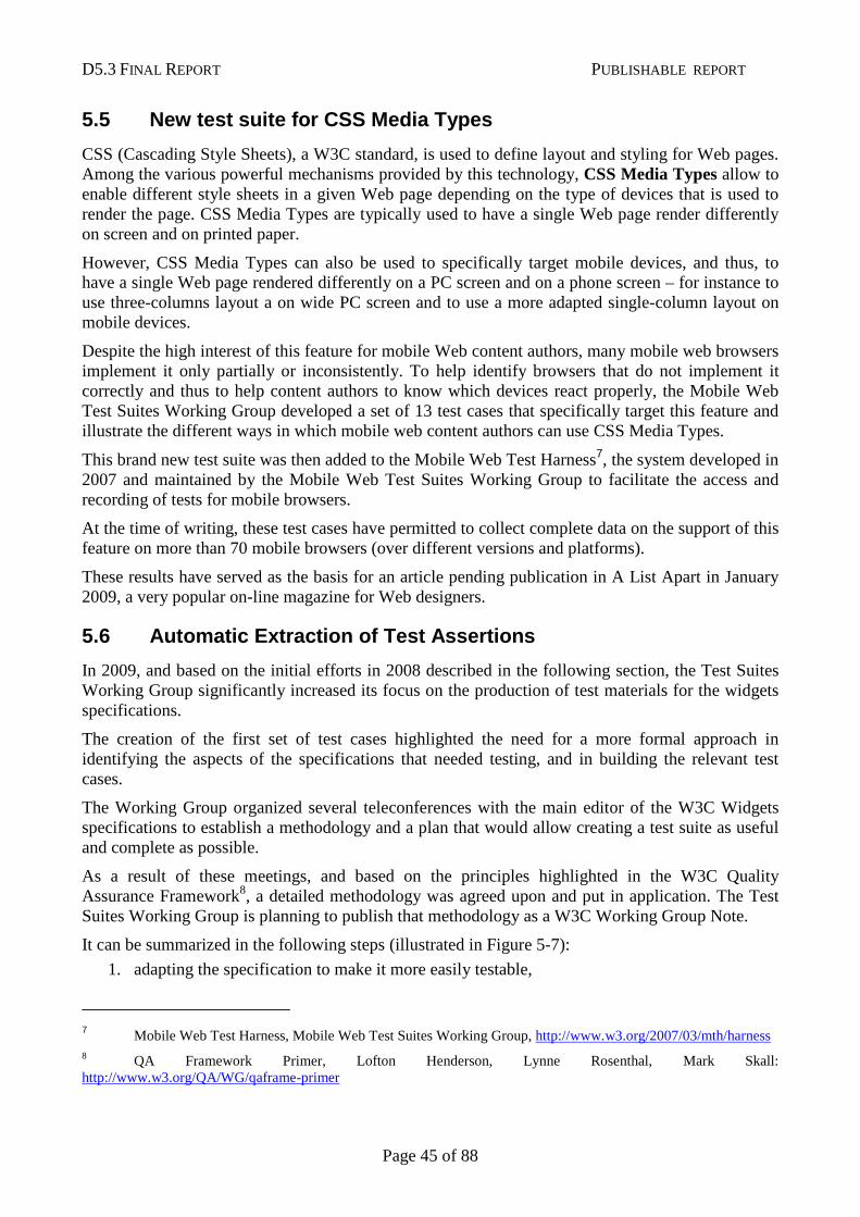
It can be summarized in the following steps (illustrated in Figure 5-7):
1. adapting the specification to make it more easily testable,
7 Mobile Web Test Harness, Mobile Web Test Suites Working Group, http://www.w3.org/2007/03/mth/harness 8 QA Framework Primer, Lofton Henderson, Lynne Rosenthal, Mark Skall: http://www.w3.org/QA/WG/qaframe-primer
D5.3 FINAL REPORT PUBLISHABLE REPORT
Page 46 of 88
2. extracting the set of test assertions that needs to be tested and binding them to a stable identifier,
3. providing a set of tools, templates, and methods explaining how to build useful test cases for the said specification,
4. building at least one test case for each of the test assertion,
5. setting up a Quality Assurance process on the built test cases,
6. and comparing the results of running these test cases on existing implementations to find bugs in the specification, in the test suite or in the implementations.
The work needed to adapt the specification to make it more testable highlighted the following simple but important principles:
• each conformance requirement needs to be identified and marked up in the specifications, to allow automatic retrieval of testable assertions directly from the text of the document;
• each conformance requirement needs to identify as its subject what kind of software or product needs to conform; the set of software and products for which the specification defines conformance is known as “conformance products”;
• Each conformance requirement needs to define a way to operate on a given input.
Despite their simplicity, these three principles proved to involve an almost complete rewrite of the first specification to which they were applied, Widgets 1.0: Packaging and Configuration9. Even before their impact on the creation of the test suite, they proved to be a very effective way to find bugs and gaps in the specification.
9 Widgets 1.0: Packaging and Configuration, Marcos Caceres: http://www.w3.org/TR/widgets/
Figure 5-7: Testing Methodology
D5.3 FINAL REPORT PUBLISHABLE REPORT
Page 47 of 88
In practice, they implied the following modifications to the specification:
• Each conformance requirement was assigned a stable HTML id, and was wrapped up in a <em class='ct'>.
• Two previously identified “conformance products” (the configuration document, the widget package) were removed since they could not be considered as software that needed to interoperate; this implied re-assigning the conformance requirements that were previously bound to these products to be rewritten as conformance requirement for one of the two other conformance products — a widget user agent or a widget conformance checker.
• Each conformance requirement was annotated with a <span class='product-'> to identify to which of the conformance products it applied.
Once these changes were applied to the specification, the Test Suites Working Group was able to build a tool to automatically extract and categorize test assertions. Appendix A gives an example of these mark-up conventions and additional details on how they were used to build the list of test assertions.
This methodology has proved immensely successful for the Widgets Packaging and Configuration specification, and is now being applied to the other Widgets specifications developed by the Web Applications Working Group.
5.7 Test Suites for Widgets
Web Widgets are small applications written using Web technologies, and run within widget engines based on Web browsers. Widgets are increasingly popular since they allow interacting with a user's favourite Web services without having to run a full browser, and with a dedicated interface to that particular service. In particular, widgets are expected to play a very important role on mobile devices where they have the potential to replace existing native phone applications since they surpass them in terms of ease of development, deployment, and interfacing with existing on-line services.
One of the current limitations is the fragmentation among widgets engines that make it difficult to write widgets that will work across a wide variety of systems. W3C has chartered the Web Applications Working Group10 to address this problem by developing a set of specifications to standardize a unique set of formats and APIs that can be used by any of these widgets engines11.
Given how promising this technology appears to be for the development of the mobile web, the Mobile Web Test Suites Working Group offered the Web Applications Working Group to help with planning, setting up and starting the work to create test suites for these specifications.
The Test Suites Working Group first reviewed the existing working drafts of the relevant specifications and offered some advice on how to make them more easily testable by highlighting testable assertions and conformance requirements.
The Test Suites Working Group reviewed the existing working drafts of the relevant specifications, offered some advice on how to make them more easily testable by highlighting testable assertions
10 W3C Web Applications Working Group: http://www.w3.org/2008/webapps/ 11 Widgets specifications: http://www.w3.org/2008/webapps/wiki/Main_Page#Widgets
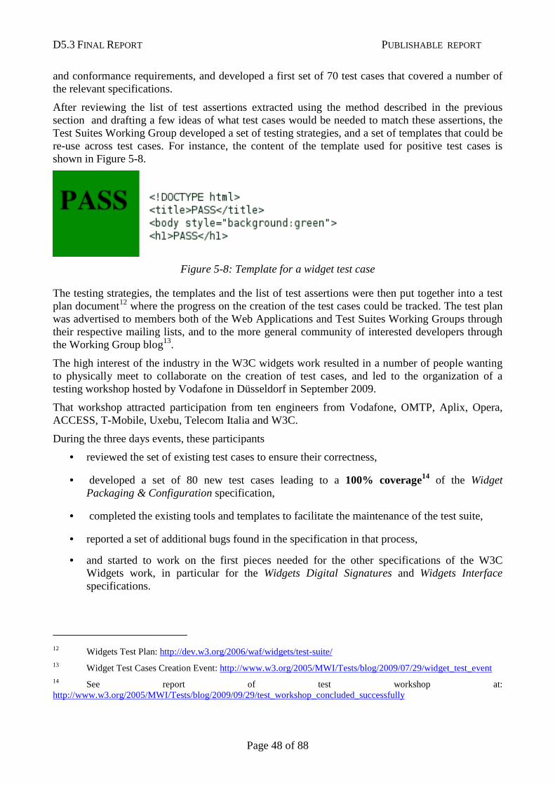
D5.3 FINAL REPORT PUBLISHABLE REPORT
Page 48 of 88
and conformance requirements, and developed a first set of 70 test cases that covered a number of the relevant specifications.
After reviewing the list of test assertions extracted using the method described in the previous section and drafting a few ideas of what test cases would be needed to match these assertions, the Test Suites Working Group developed a set of testing strategies, and a set of templates that could be re-use across test cases. For instance, the content of the template used for positive test cases is shown in Figure 5-8.
Figure 5-8: Template for a widget test case
The testing strategies, the templates and the list of test assertions were then put together into a test plan document12 where the progress on the creation of the test cases could be tracked. The test plan was advertised to members both of the Web Applications and Test Suites Working Groups through their respective mailing lists, and to the more general community of interested developers through the Working Group blog13.
The high interest of the industry in the W3C widgets work resulted in a number of people wanting to physically meet to collaborate on the creation of test cases, and led to the organization of a testing workshop hosted by Vodafone in Düsseldorf in September 2009.
That workshop attracted participation from ten engineers from Vodafone, OMTP, Aplix, Opera, ACCESS, T-Mobile, Uxebu, Telecom Italia and W3C.
During the three days events, these participants
• reviewed the set of existing test cases to ensure their correctness,
• developed a set of 80 new test cases leading to a 100% coverage14 of the Widget Packaging & Configuration specification,
• completed the existing tools and templates to facilitate the maintenance of the test suite,
• reported a set of additional bugs found in the specification in that process,
• and started to work on the first pieces needed for the other specifications of the W3C Widgets work, in particular for the Widgets Digital Signatures and Widgets Interface specifications.
12 Widgets Test Plan: http://dev.w3.org/2006/waf/widgets/test-suite/ 13 Widget Test Cases Creation Event: http://www.w3.org/2005/MWI/Tests/blog/2009/07/29/widget_test_event 14 See report of test workshop at: http://www.w3.org/2005/MWI/Tests/blog/2009/09/29/test_workshop_concluded_successfully
D5.3 FINAL REPORT PUBLISHABLE REPORT
Page 49 of 88
After that fruitful workshop, the editor of the specification continued to work on double-checking the set of delivered test cases, and added new test cases for test assertions where additional testing proved useful.
The resulting 165 test cases15 were then run against a set of seven existing implementations of the W3C widgets, namely:
• Opera
• Windows Mobile
• LG, Blackberry
• Samsung
• BONDI
• Apache Wookie
These tests runs allowed to provide a first glance of the current state of interoperability between these early implementations with an interoperability matrix16 (partial screenshot in Figure 5-9), as well as finding bugs in the test suite and in the specification.
15 Widgets test suite: http://dev.w3.org/cvsweb/2006/waf/widgets/test-suite/test-cases/ 16 Conformance Matrix for Widgets Packaging and Configuration: http://samaxes.svn.beanstalkapp.com/widgets_compatibility_matrix/trunk/index.html
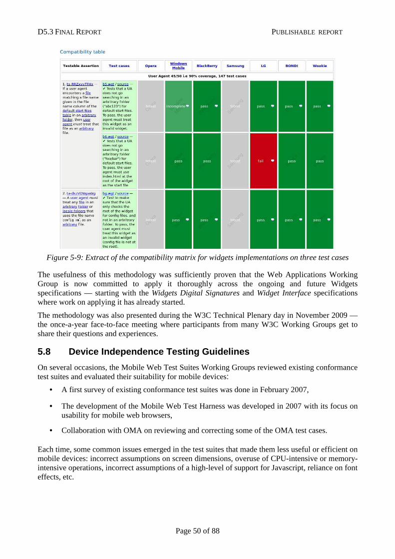
D5.3 FINAL REPORT PUBLISHABLE REPORT
Page 50 of 88
Figure 5-9: Extract of the compatibility matrix for widgets implementations on three test cases
The usefulness of this methodology was sufficiently proven that the Web Applications Working Group is now committed to apply it thoroughly across the ongoing and future Widgets specifications — starting with the Widgets Digital Signatures and Widget Interface specifications where work on applying it has already started.
The methodology was also presented during the W3C Technical Plenary day in November 2009 — the once-a-year face-to-face meeting where participants from many W3C Working Groups get to share their questions and experiences.
5.8 Device Independence Testing Guidelines
On several occasions, the Mobile Web Test Suites Working Groups reviewed existing conformance test suites and evaluated their suitability for mobile devices:
• A first survey of existing conformance test suites was done in February 2007,
• The development of the Mobile Web Test Harness was developed in 2007 with its focus on usability for mobile web browsers,
• Collaboration with OMA on reviewing and correcting some of the OMA test cases.
Each time, some common issues emerged in the test suites that made them less useful or efficient on mobile devices: incorrect assumptions on screen dimensions, overuse of CPU-intensive or memory-intensive operations, incorrect assumptions of a high-level of support for Javascript, reliance on font effects, etc.

D5.3 FINAL REPORT PUBLISHABLE REPORT
Page 51 of 88
As a way to ensure that test suites that get developed in the future in W3C and elsewhere do not run into the same issues when used on mobile devices, the Mobile Web Test Suites Working Group has gathered and summarized a set of guidelines called the Device Independence Testing Guidelines17.
Inspired by existing guidance gathered by other Working Groups, the group identified a set of typical limitations that need to be taken into account when writing device-independent test cases, and the specific challenges that they involve:
• The screen limitations matter when designing visual test cases — e.g. where the tester needs to assess whether the rendering of a test cases matches a reference rendering;
• Memory limitations can make some heavy tests harness impossible to run;
• Variation in network bandwidth and latency can impact the way a test case will run; the possible cost involved on some networks (esp. mobile networks) can be important, in particular in situations where the public at large is invited to contribute test results;
• CPU intensive operations are likely to take longer and to drain the battery on CPU-constrained devices;
• Many devices have very limited extensibility capabilities, and thus tests that rely on plug-ins or specific fonts are likely to be problematic;
• Many devices do not provide access to a keyboard or to a pointing device, or make their usage more difficult than on a computer, which is likely to impact the usability of tests that require user interactions.
For each of these challenges, the Working Group defined a set of simple guidelines that allow to avoid or to reduce their impacts on the usability of test cases on mobile devices.
Examples of these guidelines include:
• Avoiding tests based on absolute dimensions;
• Keeping the number of network requests originated from scripts to a minimum to speed up data transfer;
• Avoiding relying on effects based on specific fonts;
• Provide simple navigation among test cases.
The group published these guidelines as a W3C Working Group Note called Guidelines for writing device independent tests18 in May 2009. These guidelines were announced on the W3C home page, on the group blog as well as advertised to the Chairs of all W3C Working Groups, where these guidelines are the most likely to have an impact on the long run.
17 Device Independence Testing Guidelines, Carmelo Montanez (NIST),
http://dev.w3.org/2008/dev-ind-testing/guidelines.html 18 Guidelines for writing device independent tests, Dominique Hazaël-Massieux, Carmelo Montanez: http://www.w3.org/TR/di-testing/
D5.3 FINAL REPORT PUBLISHABLE REPORT
Page 52 of 88
5.9 Encouraging sharing of test suites across vendo rs
During the development of the Web Compatibility Test, and while reviewing existing conformance test suites available today for mobile browsers, the Working Group identified several areas of Web technologies that lacked good test suites, including cookies, HTTP optimizations and PNG support.
While the Working Group originally planned on filling these gaps by developing new test cases, these discussions lead the representative of Opera Software (and Head of Quality Assurance for their browser) to offer to share their test suites with the community to avoid duplication of effort.
These test suites were released in the first weeks of 2009. This move has also triggered discussions among W3C Members in general on ways to better share their testing resources across vendors to benefit the industry as a whole. Representatives from the Mozilla project in particular expressed interest in setting up an automated harness system that would work across browsers.
The discussions with various browsers vendors on increasing collaboration on the development of automated test suites are now continuing in W3C in a broader context, based on these first trials made in the context of the MobiWeb2.0 project.
5.10 JavaScript Tests
JavaScript is increasingly used in mobile Web applications to create more powerful, more integrated and more usable interfaces. Given the importance of this technology and its future to the proper development of “mobile Web 2.0”, the Working Group looked further into two aspects of JavaScript deployment in browsers.
JavaScript Memory Test
First, and as a follow-up to the reviews of JavaScript performances tests the group conducted in 200819, the group explored the limitations of mobile browsers in their capacity to allocate large amount of memory to JavaScript operations.
Indeed, most mobile devices still have a much more limited amount of memory than what is usually available on computers. In addition to that hardware limitation, their operating system or the mobile browsers themselves often impose a cap on the amount of memory that scripts can allocate.
Unfortunately, in many cases that information is either not communicated or difficult to find. To help Web developers better understand that specific limitation of JavaScript on mobile browsers, the Mobile Web Initiative Test Suites Working Group developed and released a memory test20 that helps finding the maximum amount of memory that a script can allocate.
To do so, the test attempts to load in memory a certain amount of data; on success, it tries to load a greater amount, and on failure, it offers to try loading a smaller amount. The amounts of data are calculated following a binary search algorithm that guarantees to find the amount of allocable memory in only a few steps. This algorithm is not entirely failure-proof, since some operating systems react more or less well to large memory allocations requests.
19 Performance tests and mobile browsers, D. Hazaël-Massieux, Oct 6 2008: http://www.w3.org/blog/MWITeam/2008/10/06/performance_tests_and_mobile_browsers 20 Memory Limit tester: http://qa-dev.w3.org/2009/memory-test/
D5.3 FINAL REPORT PUBLISHABLE REPORT
Page 53 of 88
The test and its source code were released and announced publicly in June 200921.
WebIDL-based Testing
The second aspect of JavaScript testing that the group investigated is the automation of test cases development for new JavaScript APIs.
Indeed, browsers give access to a growing number of features through the JavaScript APIs they expose for Web developers: asynchronous loading of data (AJAX), access to the device’s location, access to the device local files, local storage of data and applications. A number of additional APIs are being considered in the W3C Web Applications Working Group, as well as in the recently started W3C Device APIs and Policy Working Group22.
All of these new APIs define their interfaces using an Interface Definition Language (IDL) called WebIDL23, also developed at W3C. This language defines a set of common attributes and patterns that have shown to be useful in describing APIs for JavaScript.
Beyond its usefulness in creating a common definition framework for JavaScript APIs, WebIDL showed some promises in assisting in the creation of test cases that would verify the proper implementation of these APIs in browsers. Since that aspect of WebIDL had not yet been exploited in W3C, the Mobile Web Initiative Test Suites Working Group explored how the abstract interfaces definitions could be re-used in a testing context.
This research led to the identification24 of an existing open source project called WTTJS25 that implemented exactly what the Working Group needed: provided with an API defined in WebIDL and an initialization script that describes how to exercise the said API, the tool generates an extensive set of test cases that can be run in a browser to assess if the said browser implements the API correctly.
As a verification of the potential of the tool, the group produced test cases for two existing W3C JavaScript APIs:
• for the Geolocation API where the tests helped identify misuse of WebIDL in the definition of the interfaces26,
• For the Widgets Interface API27 — thus providing the first set of concrete test cases for this specification.
21 Memory test for mobile browsers, D. Hazaël-Massieux, June 1st 2009: http://www.w3.org/2005/MWI/Tests/blog/2009/06/01/memory_test_for_mobile_browsers 22 W3C Device APIs and Policy Working Group: http://www.w3.org/2009/dap/ 23 WebIDL, Editors Draft, Sep 30 2009: http://dev.w3.org/2006/webapi/WebIDL/ 24 Automated tests creation for WebIDL-based specifications, D Hazaël-Massieux, Nov 30 2009: http://www.w3.org/2005/MWI/Tests/blog/2009/11/30/automated_tests_creation_for_webidl_base 25 Wttjs — WebIDL ECMAScript Binding Test Suite Generator: http://suika.fam.cx/www/webidl2tests/readme#instantiate 26 Using wttjs to generate test cases, D Hazaël-Massieux, Oct 28 2009: http://lists.w3.org/Archives/Public/public-geolocation/2009Oct/0007.html 27 [widgets interface] Tests generated from WebIDL, D Hazaeël-Massieux, Oct 28 2009:
http://lists.w3.org/Archives/Public/public-webapps/2009OctDec/0405.html
D5.3 FINAL REPORT PUBLISHABLE REPORT
Page 54 of 88
Based on the positive results of these two experiments, the Working Group advertised its usefulness to the W3C groups that are standardizing JavaScript APIs, namely the Web Applications, Device API and Policy, Geolocation and HTML Working Groups to help them both creating test cases for their specifications as well as finding gaps and mistakes in the interfaces definitions.
The Working Group is committed to provide assistance to other groups in using this tool, as well as to continue its promotion as new groups and new APIs emerge.
5.11 Conclusion
The Mobile Web Test Suites Working Group created by MobiWeb2.0 has had significant impact on bringing more interoperability in the fragmented mobile browsers market through various complementary approaches:
• The adaptation of existing test suites to mobile device constraints, and the documentation of these constraints to remove the need for this adaptation in the long run
• Increasing the visibility of deficiencies of existing mobile browsers to encourage browsers vendors to target the highest level of conformance – with a highly visible impact on the industry through the Web Compatibility Test for Mobile Browsers
• Recording data on the details of the actual implementations of Web technologies in deployed mobile Web browsers, thus allowing mobile Web content authors to better understand the limitations of browsers available on the market today
• Collaborating with the Open Mobile Alliance on sharing testing resources regarding mobile Web technologies across the two organizations, including the establishment of a solid legal framework for cooperating with the OMA on testing efforts
• Encouraging browser vendors to share their testing resources, thereby lowering the cost of creating interoperable and conformant implementations
• Building test suites to fill gaps in the available testing resources, and to facilitate the standardization process of relevant technologies
• Completing test suites for some of the major Web 2.0 technologies, in particular for the important Widgets specifications.
• Documenting methods to develop test suites to facilitate the emergence of more test suites for Web technology.
The mobile specific test suites (including the “Web Compatibility Test”), test harness and test results will be available beyond the end of the project, and help Web developers and browser developers alike to review and improve interoperability of mobile Web software. The cooperation between OMA and W3C in the area of testing established during MobiWeb2.0 will also continue.
The working group works in public and its homepage is available at the following address:
http://www.w3.org/2005/MWI/Tests/
D5.3 FINAL REPORT PUBLISHABLE REPORT
Page 55 of 88
Chapter 6: Authoring Tools
6.1 Summary
This chapter focuses on MobiWeb2.0 contributions to open-source authoring projects (blogging tools, content managements systems) so that they can generate mobileOK content.
The main achievement of this work is the creation of mobileOK plug-ins for WordPress, Joomla! and Moodle (alpha version). The tools were chosen among popular open-source authoring tools to represent a variety of use cases (blogging tool, content management system, and learning management system).
The plug-ins are based on a clean and well-documented open-source library written in PHP. The library is independent of any particular authoring tool and consists of two components: AskPythia and TransPythia.
AskPythia is an implementation of the Device Description Repository Simple API [DDR] standard on top of an open-source device database called WURFL [WURFL] . It is used to identify the requesting device and retrieve its properties.
TransPythia is a transcoding library that adapts content to fit the identified properties of the requesting device.
Going beyond the original plan for mobileOK-ness only, the plug-ins and libraries were designed to also adapt content based on the capabilities of the device that requests the content.
Extending tools to generate mobileOK content has intrinsic limits, mostly due to the fact that these tools leave a great deal of freedom to their users and may be extended in a great number of ways. Authoring tools extended with a mobileOK Pythia plug-in may produce mobileOK content, but it cannot be guaranteed as the quality of the generated content also depends on factors such as the theme or template that is being used and other design choices made by the user.
The plug-ins have been released to the public in November 2009 (see online documentation [PYTHIA] ). They will increase the visibility of mobileOK and the Mobile Web Best Practices among Web content authoring tools developers and thereby achieve a deeper integration of mobile constraints within authoring tools.
6.2 Introduction
In many situations, authors do not have direct control over the tool they use to author Web content. Content Management System (CMS) tools are often used to generate Web sites. Authors who use such tools only control parts of the resulting page as the rest is automatically generated by the tool itself. For example, when the W3C mobileOK Checker reports that pop-ups should not be used, but the pop-up is generated by the CMS, there is hardly anything authors can do to improve the content they wrote.
CMS tools today do not usually generate mobile-friendly content and need to be extended to provide that functionality. This work focused on the development of plug-ins that generate mobileOK content, to increase the number of available tools for creating mobileOK content.
The software developed is as tool-agnostic as possible to make it easier for the community to take up the work, extend it and adapt it for other authoring tools. This will in turn increase the number of available tools for creating mobileOK content.
D5.3 FINAL REPORT PUBLISHABLE REPORT
Page 56 of 88
The plug-ins that were developed are available under the name mobileOK Pythia.
Pythia was the priestess presiding over the Oracle of Apollo. An oracle is a source of wise counsel, where knowledge, supposedly inspired by deities, is distilled through prophecies. Authored content acts as the source of inspiration in the metaphor and the plug-ins relay that information, translating it to a language that can be understood by the requesting device.
The remainder of this section is structured as follows:
• Section 6.3 provides an overview of the mobileOK Pythia plug-ins for WordPress, Joomla and Moodle.
• Section 6.4 describes AskPythia, the first implementation of the Device Description Repository Simple API standard in PHP.
• Section 6.5 describes TransPythia, a generic transcoding library based on AskPythia that helps generate mobileOK content.
6.3 mobileOK Pythia Plugins: WordPress, Joomla!, Mo odle
6.3.1 Overview
Most CMS tools provide an extension mechanism whereby plug-ins can be developed and installed without requiring any modification to the tool's code base. This work followed the plug-in approach as it is the easiest way to extend the tools. This approach has drawbacks: not all functionalities are exposed to plug-ins and users need to install and activate the plug-ins before they may be used. A deeper integration within the tools might be useful in a future version.
Once the plug-in is activated, mobileOK content is generated when the requesting device is identified as mobile. The content is left untouched when the requesting device is a well-known desktop browser.
The following plug-ins were developed:
• A plug-in for WordPress [WORDPRESS], a popular blog tool and publishing platform. There are over 15 million websites using WordPress today [WPSTATS].
• A plug-in for Joomla! [JOOMLA], a content management system. Joomla crossed the 10 million downloads threshold in June 2009 [JOOMSTATS].
• A plug-in for Moodle [MOODLE], a learning management system popular among universities and used within the MobiWeb2.0 project to develop an online training course on the Mobile Web Best Practices.
The source code for the plug-ins is available at:
http://dev.w3.org/cvsweb/2009/mobileok-authoring/plugins/
The source code of the plug-ins is either distributed under a open-source W3C Software License or under a GNU GPL v3 license when the first license was not possible (Wordpress, Joomla! and Moodle are distributed under a GNU GPL license, and Joomla! requires that extensions be distributed under a GNU GPL license if they are to enter the official Joomla! Extension Directory).
A reproduction of the prologue and the first five chapters of the first book of Gargantua and Pantagruel, by François Rabelais, is used throughout this section as an illustration of the
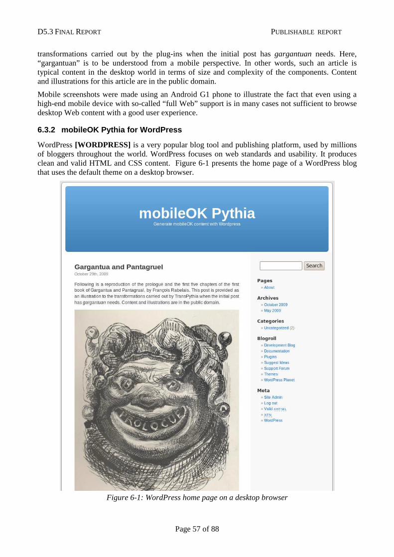
D5.3 FINAL REPORT PUBLISHABLE REPORT
Page 57 of 88
transformations carried out by the plug-ins when the initial post has gargantuan needs. Here, “gargantuan” is to be understood from a mobile perspective. In other words, such an article is typical content in the desktop world in terms of size and complexity of the components. Content and illustrations for this article are in the public domain.
Mobile screenshots were made using an Android G1 phone to illustrate the fact that even using a high-end mobile device with so-called “full Web” support is in many cases not sufficient to browse desktop Web content with a good user experience.
6.3.2 mobileOK Pythia for WordPress
WordPress [WORDPRESS] is a very popular blog tool and publishing platform, used by millions of bloggers throughout the world. WordPress focuses on web standards and usability. It produces clean and valid HTML and CSS content. Figure 6-1 presents the home page of a WordPress blog that uses the default theme on a desktop browser.
Figure 6-1: WordPress home page on a desktop browser
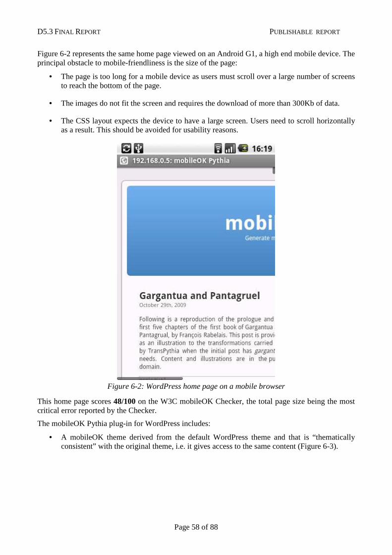
D5.3 FINAL REPORT PUBLISHABLE REPORT
Page 58 of 88
Figure 6-2 represents the same home page viewed on an Android G1, a high end mobile device. The principal obstacle to mobile-friendliness is the size of the page:
• The page is too long for a mobile device as users must scroll over a large number of screens to reach the bottom of the page.
• The images do not fit the screen and requires the download of more than 300Kb of data.
• The CSS layout expects the device to have a large screen. Users need to scroll horizontally as a result. This should be avoided for usability reasons.
Figure 6-2: WordPress home page on a mobile browser
This home page scores 48/100 on the W3C mobileOK Checker, the total page size being the most critical error reported by the Checker.
The mobileOK Pythia plug-in for WordPress includes:
• A mobileOK theme derived from the default WordPress theme and that is “thematically consistent” with the original theme, i.e. it gives access to the same content (Figure 6-3).
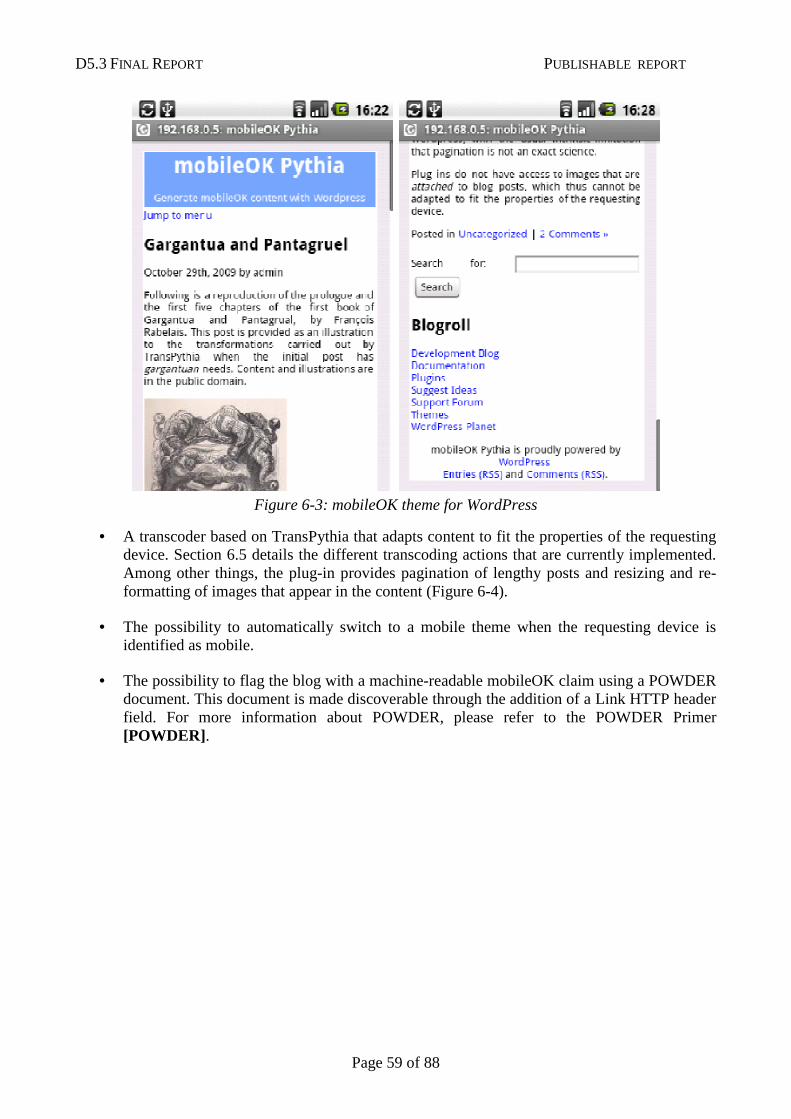
D5.3 FINAL REPORT PUBLISHABLE REPORT
Page 59 of 88
Figure 6-3: mobileOK theme for WordPress
• A transcoder based on TransPythia that adapts content to fit the properties of the requesting device. Section 6.5 details the different transcoding actions that are currently implemented. Among other things, the plug-in provides pagination of lengthy posts and resizing and re-formatting of images that appear in the content (Figure 6-4).
• The possibility to automatically switch to a mobile theme when the requesting device is identified as mobile.
• The possibility to flag the blog with a machine-readable mobileOK claim using a POWDER document. This document is made discoverable through the addition of a Link HTTP header field. For more information about POWDER, please refer to the POWDER Primer [POWDER] .
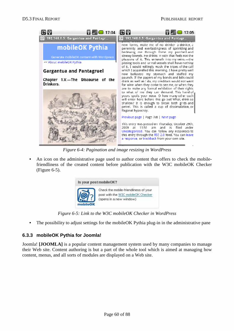
D5.3 FINAL REPORT PUBLISHABLE REPORT
Page 60 of 88
Figure 6-4: Pagination and image resizing in WordPress
• An icon on the administrative page used to author content that offers to check the mobile-friendliness of the created content before publication with the W3C mobileOK Checker (Figure 6-5).
Figure 6-5: Link to the W3C mobileOK Checker in WordPress
• The possibility to adjust settings for the mobileOK Pythia plug-in in the administrative pane
6.3.3 mobileOK Pythia for Joomla!
Joomla! [JOOMLA] is a popular content management system used by many companies to manage their Web site. Content authoring is but a part of the whole tool which is aimed at managing how content, menus, and all sorts of modules are displayed on a Web site.
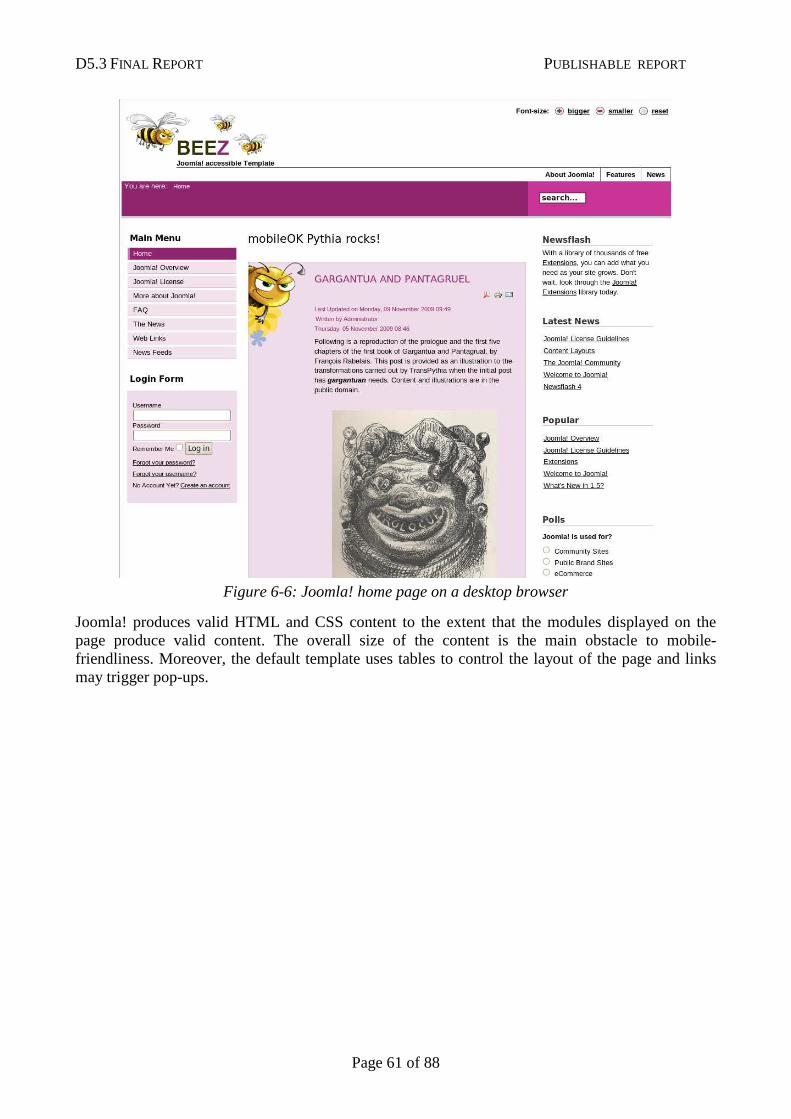
D5.3 FINAL REPORT PUBLISHABLE REPORT
Page 61 of 88
Figure 6-6: Joomla! home page on a desktop browser
Joomla! produces valid HTML and CSS content to the extent that the modules displayed on the page produce valid content. The overall size of the content is the main obstacle to mobile-friendliness. Moreover, the default template uses tables to control the layout of the page and links may trigger pop-ups.
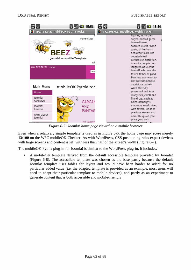
D5.3 FINAL REPORT PUBLISHABLE REPORT
Page 62 of 88
Figure 6-7: Joomla! home page viewed on a mobile browser
Even when a relatively simple template is used as in Figure 6-6, the home page may score merely 13/100 on the W3C mobileOK Checker. As with WordPress, CSS positioning rules expect devices with large screens and content is left with less than half of the screen's width (Figure 6-7).
The mobileOK Pythia plug-in for Joomla! is similar to the WordPress plug-in. It includes:
• A mobileOK template derived from the default accessible template provided by Joomla! (Figure 6-8). The accessible template was chosen as the base partly because the default Joomla! template uses tables for layout and would have been harder to adapt for no particular added value (i.e. the adapted template is provided as an example, most users will need to adapt their particular template to mobile devices), and partly as an experiment to generate content that is both accessible and mobile-friendly.
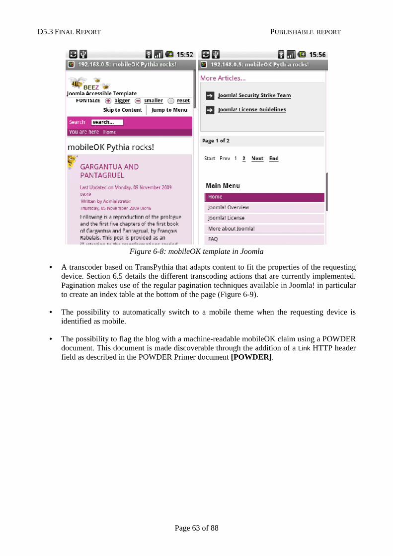
D5.3 FINAL REPORT PUBLISHABLE REPORT
Page 63 of 88
Figure 6-8: mobileOK template in Joomla
• A transcoder based on TransPythia that adapts content to fit the properties of the requesting device. Section 6.5 details the different transcoding actions that are currently implemented. Pagination makes use of the regular pagination techniques available in Joomla! in particular to create an index table at the bottom of the page (Figure 6-9).
• The possibility to automatically switch to a mobile theme when the requesting device is identified as mobile.
• The possibility to flag the blog with a machine-readable mobileOK claim using a POWDER document. This document is made discoverable through the addition of a Link HTTP header field as described in the POWDER Primer document [POWDER] .
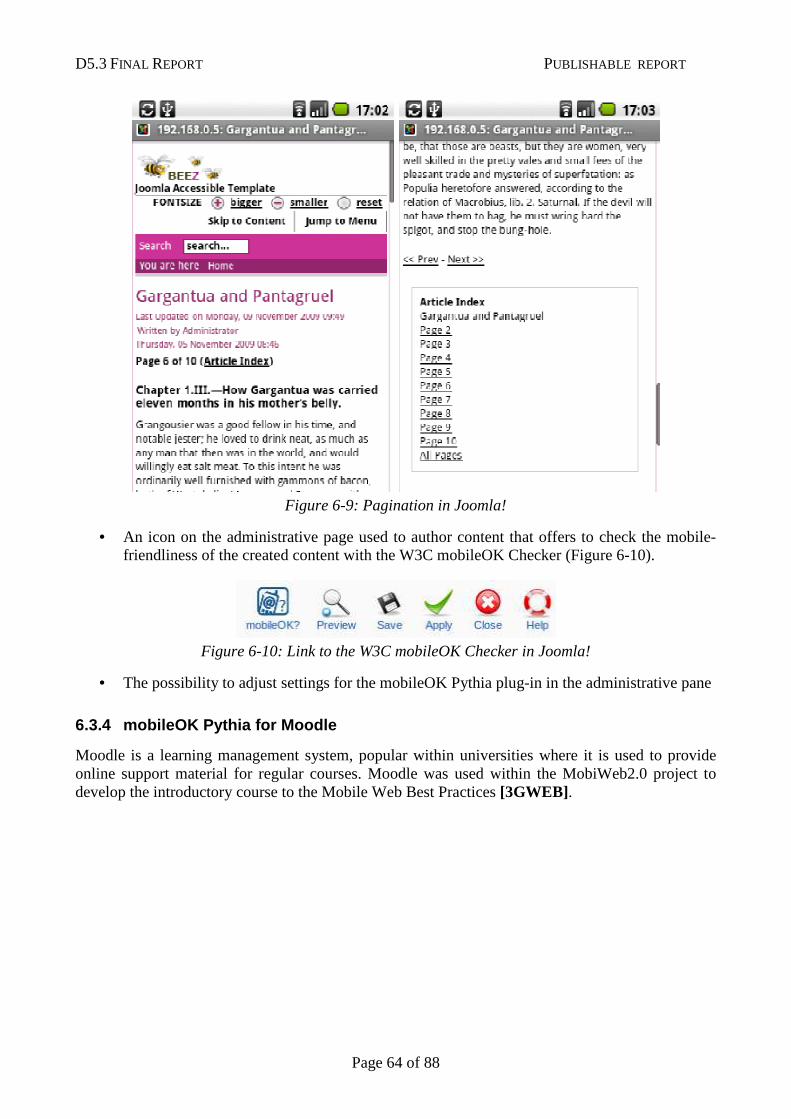
D5.3 FINAL REPORT PUBLISHABLE REPORT
Page 64 of 88
Figure 6-9: Pagination in Joomla!
• An icon on the administrative page used to author content that offers to check the mobile-friendliness of the created content with the W3C mobileOK Checker (Figure 6-10).
Figure 6-10: Link to the W3C mobileOK Checker in Joomla!
• The possibility to adjust settings for the mobileOK Pythia plug-in in the administrative pane
6.3.4 mobileOK Pythia for Moodle
Moodle is a learning management system, popular within universities where it is used to provide online support material for regular courses. Moodle was used within the MobiWeb2.0 project to develop the introductory course to the Mobile Web Best Practices [3GWEB] .
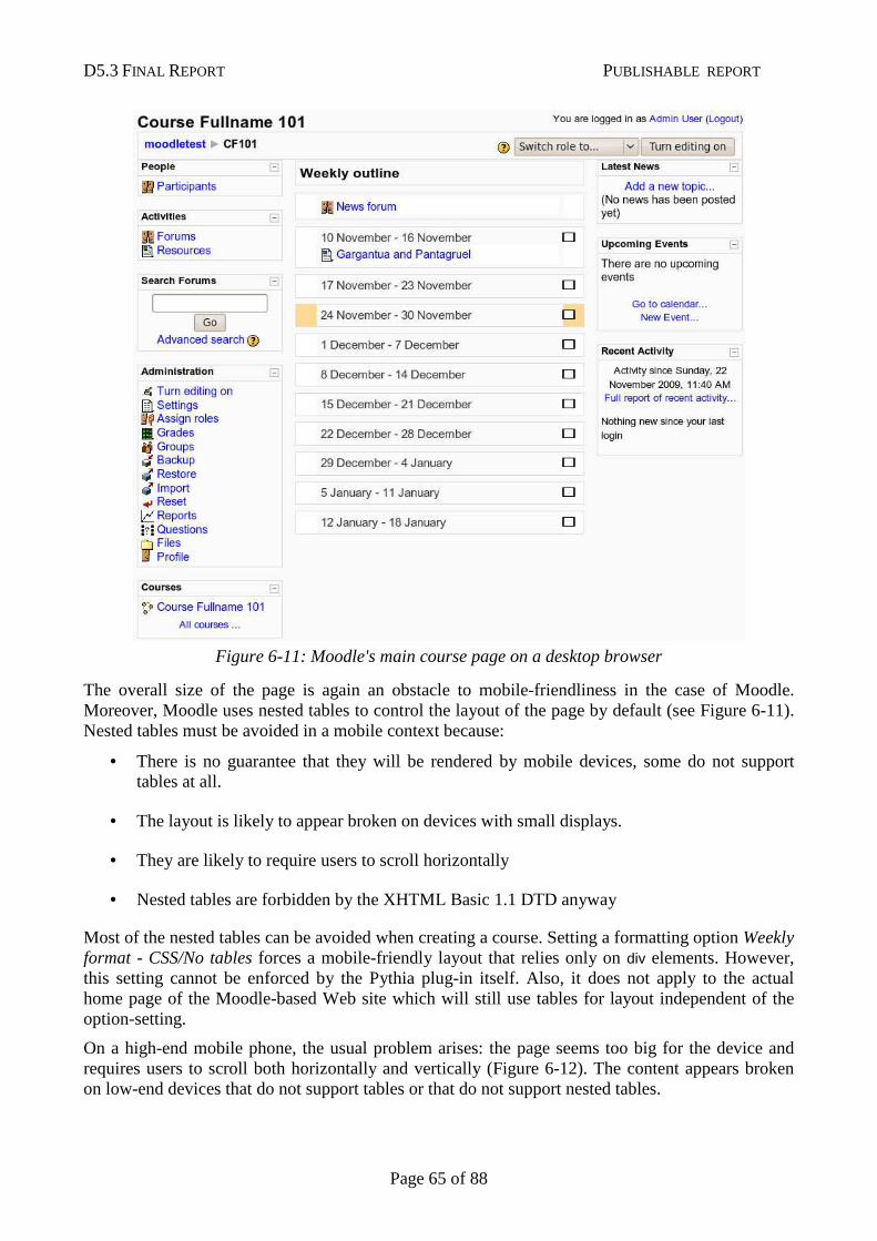
D5.3 FINAL REPORT PUBLISHABLE REPORT
Page 65 of 88
Figure 6-11: Moodle's main course page on a desktop browser
The overall size of the page is again an obstacle to mobile-friendliness in the case of Moodle. Moreover, Moodle uses nested tables to control the layout of the page by default (see Figure 6-11). Nested tables must be avoided in a mobile context because:
• There is no guarantee that they will be rendered by mobile devices, some do not support tables at all.
• The layout is likely to appear broken on devices with small displays.
• They are likely to require users to scroll horizontally
• Nested tables are forbidden by the XHTML Basic 1.1 DTD anyway
Most of the nested tables can be avoided when creating a course. Setting a formatting option Weekly format - CSS/No tables forces a mobile-friendly layout that relies only on div elements. However, this setting cannot be enforced by the Pythia plug-in itself. Also, it does not apply to the actual home page of the Moodle-based Web site which will still use tables for layout independent of the option-setting.
On a high-end mobile phone, the usual problem arises: the page seems too big for the device and requires users to scroll both horizontally and vertically (Figure 6-12). The content appears broken on low-end devices that do not support tables or that do not support nested tables.
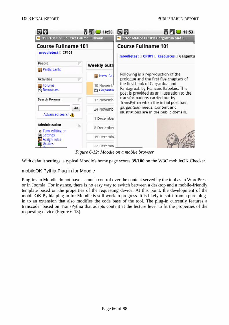
D5.3 FINAL REPORT PUBLISHABLE REPORT
Page 66 of 88
Figure 6-12: Moodle on a mobile browser
With default settings, a typical Moodle's home page scores 39/100 on the W3C mobileOK Checker.
mobileOK Pythia Plug-in for Moodle
Plug-ins in Moodle do not have as much control over the content served by the tool as in WordPress or in Joomla! For instance, there is no easy way to switch between a desktop and a mobile-friendly template based on the properties of the requesting device. At this point, the development of the mobileOK Pythia plug-in for Moodle is still work in progress. It is likely to shift from a pure plug-in to an extension that also modifies the code base of the tool. The plug-in currently features a transcoder based on TransPythia that adapts content at the lecture level to fit the properties of the requesting device (Figure 6-13).
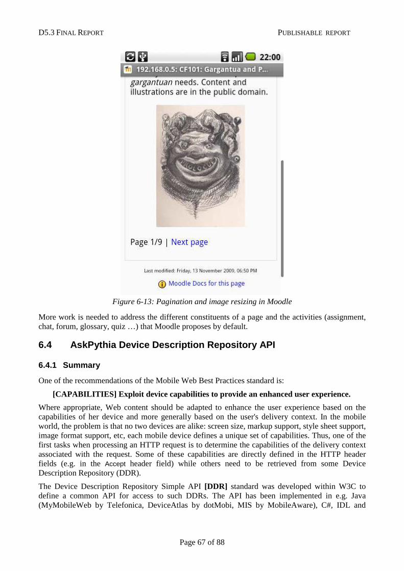
D5.3 FINAL REPORT PUBLISHABLE REPORT
Page 67 of 88
Figure 6-13: Pagination and image resizing in Moodle
More work is needed to address the different constituents of a page and the activities (assignment, chat, forum, glossary, quiz …) that Moodle proposes by default.
6.4 AskPythia Device Description Repository API
6.4.1 Summary
One of the recommendations of the Mobile Web Best Practices standard is:
[CAPABILITIES] Exploit device capabilities to provi de an enhanced user experience.
Where appropriate, Web content should be adapted to enhance the user experience based on the capabilities of her device and more generally based on the user's delivery context. In the mobile world, the problem is that no two devices are alike: screen size, markup support, style sheet support, image format support, etc, each mobile device defines a unique set of capabilities. Thus, one of the first tasks when processing an HTTP request is to determine the capabilities of the delivery context associated with the request. Some of these capabilities are directly defined in the HTTP header fields (e.g. in the Accept header field) while others need to be retrieved from some Device Description Repository (DDR).
The Device Description Repository Simple API [DDR] standard was developed within W3C to define a common API for access to such DDRs. The API has been implemented in e.g. Java (MyMobileWeb by Telefonica, DeviceAtlas by dotMobi, MIS by MobileAware), C#, IDL and
D5.3 FINAL REPORT PUBLISHABLE REPORT
Page 68 of 88
WSDL (the last three implementations by Fundación CTIC), but there was no implementation of the API in PHP so far.
AskPythia is an open-source conformant implementation of the DDR Simple API written in PHP. AskPythia does not contain any device description database per se. It should be used as a wrapper to an existing DDR. An implementation on top of the popular and widely used open-source WURFL database is provided.
AskPythia is a stand-alone library. It makes no assumptions on the architecture of the back-end that runs it. For instance, the library does not assume that a database can be used e.g. to speed up device lookup. Similarly, the library does not take for granted that it is executed in the context of an HTTP exchange. This approach ensures generality and flexibility of the library.
6.4.2 Overview
AskPythia is divided into three components:
• The actual DDR Simple API interfaces definitions.
• A generic and abstract implementation of the DDR Simple API aimed at facilitating the extension of the library.
• An implementation of the DDR Simple API on top of WURFL that re-uses the abstract implementation.
6.4.3 The DDR Simple API
The Device description Simple API standard defines a Service interface that provides read-only functionality to retrieve the properties of a device. The device is uniquely identified by some evidence, typically extracted from the HTTP request header.
Properties are defined in vocabularies. A DDR may contain properties that belong to various vocabularies. The DDR Simple API recommends that implementations of the DDR Simple API support the Device Description Repository Core [DDR] that identifies properties that are considered essential for adaptation of content in the Mobile Web.
Interfaces and classes of the DDR Simple API standard are named using the terms defined above. Figure 6-14 represents the class diagram of the API.
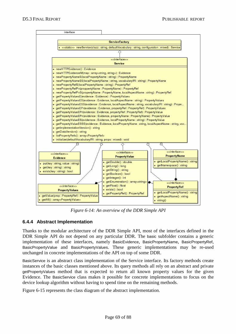
D5.3 FINAL REPORT PUBLISHABLE REPORT
Page 69 of 88
Figure 6-14: An overview of the DDR Simple API
6.4.4 Abstract Implementation
Thanks to the modular architecture of the DDR Simple API, most of the interfaces defined in the DDR Simple API do not depend on any particular DDR. The basic subfolder contains a generic implementation of these interfaces, namely BasicEvidence, BasicPropertyName, BasicPropertyRef, BasicPropertyValue and BasicPropertyValues. These generic implementations may be re-used unchanged in concrete implementations of the API on top of some DDR.
BasicService is an abstract class implementation of the Service interface. Its factory methods create instances of the basic classes mentioned above. Its query methods all rely on an abstract and private getPropertyValues method that is expected to return all known property values for the given Evidence. The BasicService class makes it possible for concrete implementations to focus on the device lookup algorithm without having to spend time on the remaining methods.
Figure 6-15 represents the class diagram of the abstract implementation.
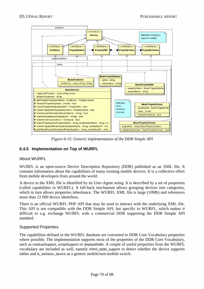
D5.3 FINAL REPORT PUBLISHABLE REPORT
Page 70 of 88
Figure 6-15: Generic implementation of the DDR Simple API
6.4.5 Implementation on Top of WURFL
About WURFL
WURFL is an open-source Device Description Repository (DDR) published as an XML file. It contains information about the capabilities of many existing mobile devices. It is a collective effort from mobile developers from around the world.
A device in the XML file is identified by its User-Agent string. It is described by a set of properties (called capabilities in WURFL). A fall-back mechanism allows grouping devices into categories, which in turn allows properties inheritance. The WURFL XML file is large (10Mb) and references more than 12 000 device identifiers.
There is an official WURFL PHP API that may be used to interact with the underlying XML file. This API is not compatible with the DDR Simple API, but specific to WURFL, which makes it difficult to e.g. exchange WURFL with a commercial DDR supporting the DDR Simple API standard.
Supported Properties
The capabilities defined in the WURFL database are converted to DDR Core Vocabulary properties where possible. The implementation supports most of the properties of the DDR Core Vocabulary, such as markupSupport, scriptSupport or displayWidth. A couple of useful properties from the WURFL vocabulary are included as well, namely xhtml_table_support to detect whether the device supports tables and is_wireless_device as a generic mobile/non-mobile switch.
D5.3 FINAL REPORT PUBLISHABLE REPORT
Page 71 of 88
Device Lookup Algorithm
Two problems make identification problematic:
• The value of the User-Agent field varies for the same model of device based on the revision of the browser used, the network that the device is connected to, the current language of the browser, and/or the mobile network operator that provided the device.
• The User-Agent string does not follow any defined syntax that could be relied upon to discard the parts that are not relevant to the identification of the device. The model may appear at the beginning of the string or be hidden “somewhere” in the string.
The WURFL database contains more than 12 000 device identifiers but cannot contain all the possible combinations (e.g. the same device for different languages and different networks). As a consequence, an exact match is not possible in the generic case and the lookup algorithm must either pre-process the User-Agent with a set of empirical rules to extract relevant tokens or use approximation techniques.
Our implementation retrieves the device id in the database that is the most similar to the User-Agent string being parsed. This approach removes the need to maintain an empirical set of rules with the drawback that it may generate false positives in some rare cases.
6.5 TransPythia Transcoding Library
6.5.1 Summary of Achievements
TransPythia is an open-source transcoding library written in PHP that automatically adapts content (HTML, CSS, images) to fit the properties of a given device. The main goal of TransPythia is to generate mobileOK content at least and in addition offering the possibility to enhance the user experience based on the capabilities of the requesting device.
Transcoding is useful to adapt content that would otherwise not be understood by the requesting device, e.g. to shrink images to fit the device's screen, to paginate content where appropriate, to linearize tables when the device does not support them or to remove scripts and save bandwidth when the device has no support for scripting. In short, transcoding is useful to let an author write content without having to worry about the limitations of the requesting device.
Transcoding has limits because it is impossible to tell for sure what an author meant and thus hard to determine whether a transformation is appropriate. Mobile-friendliness has to be addressed at different levels. Transcoding is one of them, but it cannot substitute for an "appropriate design" of Web content. The Mobile Web Best Practices standard specifies best practices for delivering "properly designed" Web content to mobile devices.
TransPythia depends on AskPythia to detect the properties of the requesting device.
6.5.2 Overview
Transcoding is divided into atomic transcoding actions that are applied sequentially to the content. Most transcoding actions need to retrieve specific properties of the requesting device. TransPythia provides helper methods to interact with AskPythia and to determine e.g. whether the requesting device is identified as “mobile”.
The library consists of a Transcoder container class that manages a set of TranscodingAction. Most of the implemented transcoding actions operate on HTML content, but transcoding may apply on other
D5.3 FINAL REPORT PUBLISHABLE REPORT
Page 72 of 88
types of content (e.g. CSS, JPEG images). A given transcoder operates on one and only one type of content.
This section details the transcoding actions that are implemented in TransPythia and explains how they relate to the Mobile Web Best Practices where applicable. Note that the library may be extended through the implementation of additional transcoding actions.
6.5.3 HTML Content Transcoding: Design Consideratio ns
Most authoring tools generate valid HTML content but there is no guarantee that the content written by authors or by external components is valid. Transcoding actions that operate on HTML content would best be applied to a DOM tree representation of the content, but the generation of the DOM tree itself is a problem as it relies on “tag-soup” parsing in the most generic case, i.e. the implementation of a number of non-trivial algorithms to correct for invalid HTML syntax and structure.
The transcoding implemented in TransPythia assumes as little well-formedness as possible and use regular expressions to select and replace portions of HTML content. In theory, this may have side effects on very invalid content. Tools such as WordPress provide the option to tidy up content before it is served. If usage shows that side effects are not negligible in practice, it might be necessary to implement content tidying as a transcoding action in a future version of the library.
Pagination
Pagination follows the recommendations of the Mobile Web Best Practices on page size ([MWBP] , section 5.3.2):
[PAGE_SIZE_USABLE] Divide pages into usable but limited size portions.
Pagination is a core constituent of the transcoding library as the main obstacle to mobile-friendliness is often the size of the page.
This action accommodates the 20Kb limit defined by the mobileOK standard.
Pagination works well with textual content but is not always possible. For instance, forms cannot easily be split across pages, and automatic pagination may yield a poor user experience when navigation bars clutter the content. Moreover, CSS selectors may not work well on the resulting fragment, and the layout may appear broken if the initial page heavily relies on CSS positioning properties.
Images Conversion and Adaptation
Images in Web pages are often too large for mobile consumption because they are expected to be displayed on desktops connected to a large-bandwidth network. This transcoding action automatically:
• adapts the images contained in an HTML page to fit the screen size of the requesting device
• Converts the images to a format that is supported by the requesting device when the initial format is not supported, or replaces the image by its alternative text description when no supported format is found.
• Removes the images whose sizes (in bytes) still exceed a given maximum after conversion (10Kb by default).
D5.3 FINAL REPORT PUBLISHABLE REPORT
Page 73 of 88
• Completes the markup definition of the images in the HTML content to include the width and height of the image.
This transcoding action follows the recommendations of the Mobile Web Best Practices on image size ([MWBP] , section 5.4.6):
[IMAGES_SPECIFY_SIZE] Specify the size of images in markup, if they have an intrinsic size.
[IMAGES_RESIZING] Resize images at the server, if they have an intrinsic size.
One specific problem with images resizing is that the size of the screen also depends on its orientation (portrait or landscape), which cannot be detected server-side. Portrait mode is supposed to be used in this implementation.
The transcoding action relies on the GD library extension for PHP (also required by most authoring tools) and requires write access to a file cache where converted images are stored.
Pop-up Windows Suppression
Pop-up windows are confusing on small screens and may not work at all on some mobile devices. This action searches occurrences of the target attribute in the HTML content and removes them when the requesting device is identified as a mobile device.
It follows the recommendations of the Mobile Web Best Practices on pop-up windows ([MWBP] , section 5.2.8):
[POP_UPS] Do not cause pop-ups or other windows to appear and do not change the current window without informing the user.
Scripts Suppression
Web content should not rely on scripts, i.e. the content should still provide a functional user experience without scripts. This transcoding action suppresses scripts when the requesting device does not support scripting, to save bandwidth. Obviously, it cannot fix content that relies on scripts.
Inline scripts, links to external scripts and event attributes on markup elements are removed.
Tables Linearization
Tables should be used to convey tabular data but have historically been misused on the Web to control the layout of the page. Most mobile devices do not support nested tables, which are forbidden in the XHTML Basic 1.1 markup language. This transcoding action:
• Linearizes tables when the requesting device does not support them.
• Linearizes nested tables when the requesting device is identified as a mobile device.
• Linearizes tables used to control the layout of the page when the requesting device is identified as a mobile device. The action uses the same tests as those defined in the mobileOK Basic Tests 1.0 standard ([MOK], section 3.23) to identify whether a given table is used for layout purposes. It cannot catch all the possible cases where tables are used for layout purposes. In the context of Web content authoring tools, the use of tables to control the layout of the Page is a design choice made when the theme followed by all the pages of the site is selected. The real solution is to select another theme.
D5.3 FINAL REPORT PUBLISHABLE REPORT
Page 74 of 88
Table linearization may yield poor results if CSS is applied to the content of the initial table as it is unlikely to still apply to the resulting content. Work on automatic CSS adjustments could help address this issue.
This transcoding action follows the recommendations of the Mobile Web Best Practices on tables ([MWBP] , section 5.4.4):
[TABLES_SUPPORT] Do not use tables unless the device is known to support them.
[TABLES_NESTED] Do not use nested tables.
[TABLES_LAYOUT] Do not use tables for layout.
[TABLES_ALTERNATIVES] Where possible, use an alternative to tabular presentation.
6.5.4 Transcoding Actions for Other Types of Conten t
Template Switching
The template switching action returns the name of the template to use depending on the requesting device. It makes it possible to use a dedicated mobile theme that does not affect desktop users.
Template switching is not a real transcoding action as it does not apply to content. However, it relies on the identification of the requesting device as a mobile device and could be extended in the future to handle more than two classes of devices.
CSS Conversion
When adapting a theme for mobile-friendliness, the CSS style is one of the areas to address. The Mobile Web Best Practices recommends to ensure that the content flows and fit the display no matter if CSS styles are applied or not, e.g. by avoiding floating blocks or absolute positioning rules ([MWBP] , sections 5.4.8 and 5.4.9):
[MEASURES] Do not use pixel measures and do not use absolute units in markup language attribute values and style sheet property values.
[STYLE_SHEETS_SUPPORT] Organize documents so that if necessary they may be read without style sheets.
This action tries to adapt the CSS to better fit mobile devices limitations, but CSS may be processed automatically only to a certain extent. Therefore, this action should not be used on an automated basis, and should rather be used when one tries to adapt a given theme for mobile-friendliness.
6.5.5 More Transcoding Actions
New transcoding actions could complete the list of existing transcoding actions, e.g.:
• To move navigation bars to the bottom of the page so that the central content appears first
• To tidy up markup content
• To remove non-significant spaces in content.
• To adapt CSS content on a more automated basis and thus limit the need to maintain two versions of the same theme or template.
D5.3 FINAL REPORT PUBLISHABLE REPORT
Page 75 of 88
6.6 Conclusion
The main achievement of this work is the creation of the PHP plug-ins that generate mobileOK content for two popular Web content authoring tools: WordPress and Joomla!. The development of a third plug-in for Moodle has started.
The plug-ins are based on a common mobileOK authoring library that includes AskPythia, the first conforming PHP implementation of the Device Description Repository Simple API standard, and TransPythia, a generic mobile transcoding library. These sub-libraries were developed with extensibility in mind in order to enable the community to build on top of them and to integrate them into other tools.
The plug-ins approach has limits. When the plug-ins are installed, the three authoring tools may generate mobileOK content, but this cannot be guaranteed in the general case as mobile-friendliness has to be addressed at different levels, in particular when design choices are made. Education of content authors about the constraints of the mobile environment is required. At the technical level, the solution to this problem is a deeper integration with the authoring tools so that content adaptation takes a central role.
In a nutshell, the plug-ins cannot substitute for appropriate design of either the content or authoring tools, but can still very much simplify mobile-friendly design.
References
[MWBP] Mobile Web Best Practices 1.0, Jo Rabin, Charles McCathieNevile, W3C Recommendation, 29 July 2008, http://www.w3.org/TR/2008/REC-mobile-bp-20080729/
[MOK] mobileOK Basic Tests 1.0, Sean Owen, Jo Rabin, W3C Recommendation, 8 December 2008, http://www.w3.org/TR/2008/REC-mobileOK-basic10-tests-20081208/
[CHECK] W3C mobileOK Checker, http://validator.w3.org/mobile/
[PYTHIA] mobileOK Pythia, a PHP suite of tools to help generate mobileOK content, http://www.w3.org/2009/11/mobileOKPythia/
[3GWEB] W3C Mobile Web Initiative Training courses, an Introduction to W3C Mobile Web Best Practices, http://www.3gwebtrain.com/moodle/
[DDR] Device Description Repository Simple API, Jo Rabin, José Manuel Cantera Fonseca, Rotan Hanrahan, Ignacio Marin, W3C Recommendation, 5 December 2008, http://www.w3.org/TR/2008/REC-DDR-Simple-API-20081205/
[DDRVOC] Device Description Repository Core Vocabulary, Jo Rabin, Andrea Trasatti, Rotan Hanrahan, W3C Working Group Note, 14 April 2008, http://www.w3.org/TR/2008/NOTE-ddr-core-vocabulary-20080414/
[POWDER] Protocol for Web Description Resources (POWDER): Description Resources, Phil Archer, Kevin Smith, Andrea Perego, W3C Recommendation, 1 September 2009, http://www.w3.org/TR/2009/REC-powder-dr-20090901/
[WURFL] Wireless Universal Resource File Web site, Luca Passani, http://wurfl.sourceforge.net/
[WORDPRESS] WordPress > Blog Tool and Publishing Platform, http://wordpress.org/
[JOOMLA] Joomla! - Content Management System, http://joomla.org/
[MOODLE] Moodle – Course Management System, http://moodle.org/
[WPSTATS] WordPress – Stats, September 2009, http://en.wordpress.com/stats/
D5.3 FINAL REPORT PUBLISHABLE REPORT
Page 76 of 88
[JOOMSTATS] Joomla! – Ten Million Thank Yous, 07 June 2009, http://www.joomla.org/announcements/general-news/5236-10-million-thank-yous.html
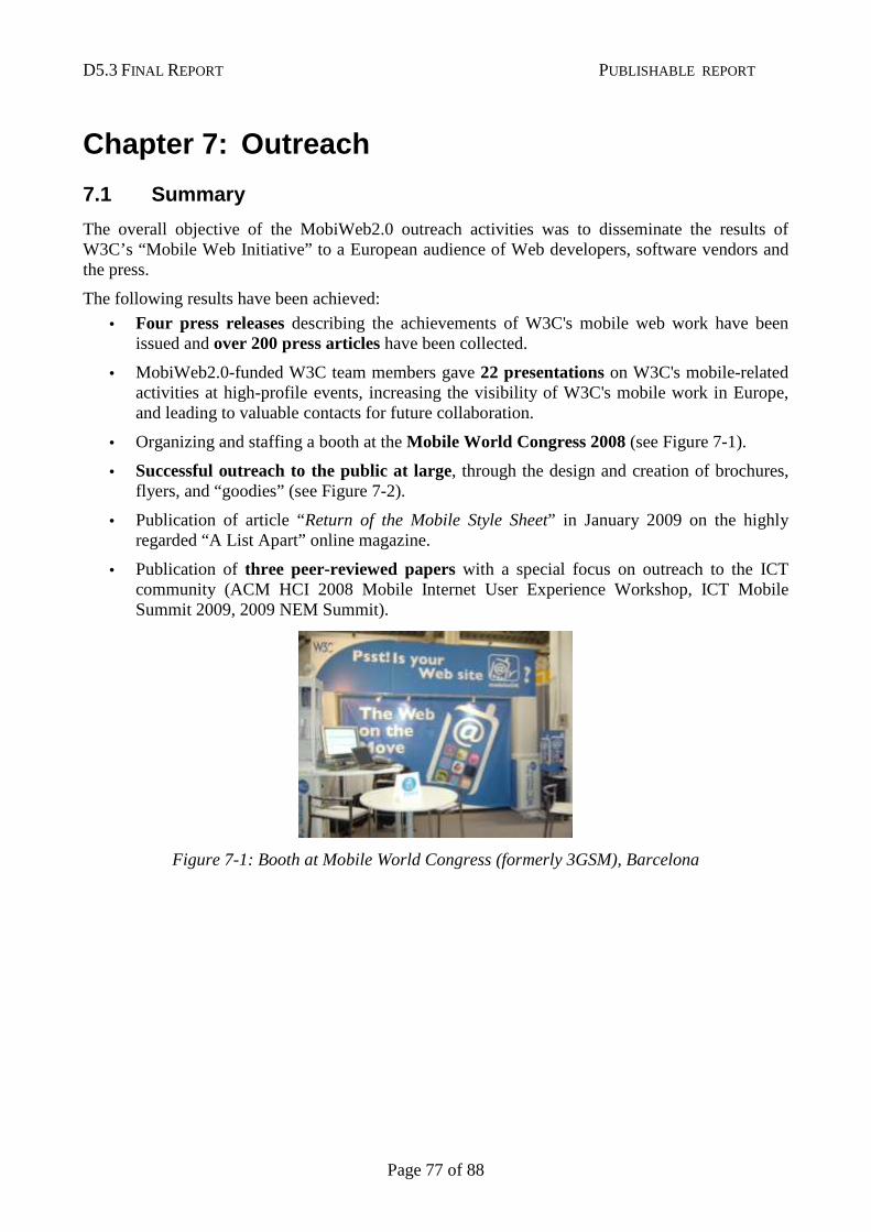
D5.3 FINAL REPORT PUBLISHABLE REPORT
Page 77 of 88
Chapter 7: Outreach
7.1 Summary
The overall objective of the MobiWeb2.0 outreach activities was to disseminate the results of W3C’s “Mobile Web Initiative” to a European audience of Web developers, software vendors and the press.
The following results have been achieved:
• Four press releases describing the achievements of W3C's mobile web work have been issued and over 200 press articles have been collected.
• MobiWeb2.0-funded W3C team members gave 22 presentations on W3C's mobile-related activities at high-profile events, increasing the visibility of W3C's mobile work in Europe, and leading to valuable contacts for future collaboration.
• Organizing and staffing a booth at the Mobile World Congress 2008 (see Figure 7-1).
• Successful outreach to the public at large, through the design and creation of brochures, flyers, and “goodies” (see Figure 7-2).
• Publication of article “Return of the Mobile Style Sheet” in January 2009 on the highly regarded “A List Apart” online magazine.
• Publication of three peer-reviewed papers with a special focus on outreach to the ICT community (ACM HCI 2008 Mobile Internet User Experience Workshop, ICT Mobile Summit 2009, 2009 NEM Summit).
Figure 7-1: Booth at Mobile World Congress (formerly 3GSM), Barcelona
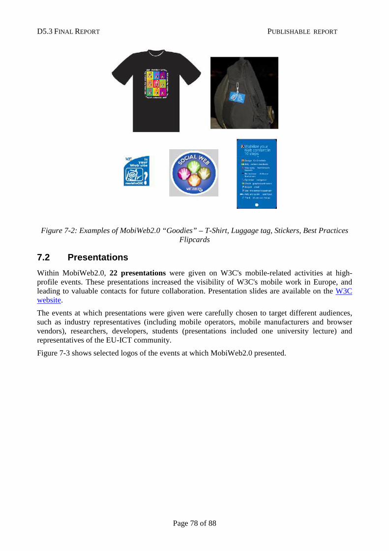
D5.3 FINAL REPORT PUBLISHABLE REPORT
Page 78 of 88
Figure 7-2: Examples of MobiWeb2.0 “Goodies” – T-Shirt, Luggage tag, Stickers, Best Practices Flipcards
7.2 Presentations
Within MobiWeb2.0, 22 presentations were given on W3C's mobile-related activities at high-profile events. These presentations increased the visibility of W3C's mobile work in Europe, and leading to valuable contacts for future collaboration. Presentation slides are available on the W3C website.
The events at which presentations were given were carefully chosen to target different audiences, such as industry representatives (including mobile operators, mobile manufacturers and browser vendors), researchers, developers, students (presentations included one university lecture) and representatives of the EU-ICT community.
Figure 7-3 shows selected logos of the events at which MobiWeb2.0 presented.
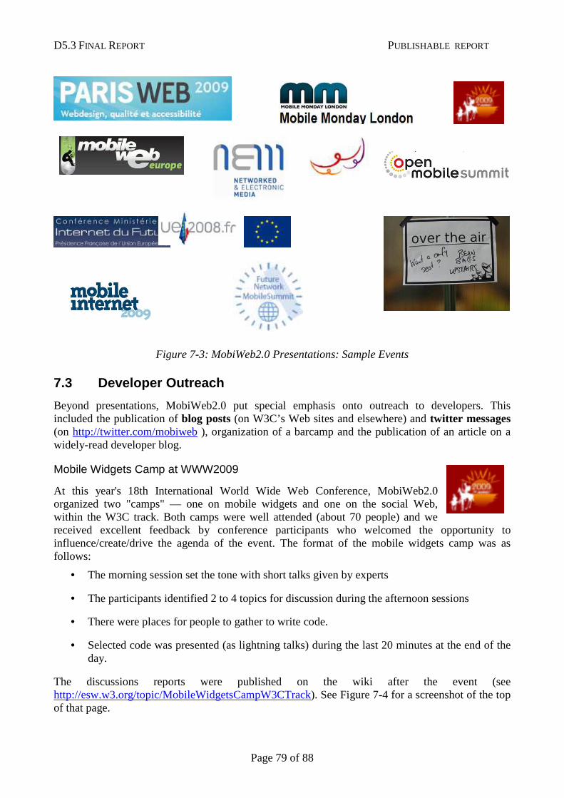
D5.3 FINAL REPORT PUBLISHABLE REPORT
Page 79 of 88
Figure 7-3: MobiWeb2.0 Presentations: Sample Events
7.3 Developer Outreach
Beyond presentations, MobiWeb2.0 put special emphasis onto outreach to developers. This included the publication of blog posts (on W3C’s Web sites and elsewhere) and twitter messages (on http://twitter.com/mobiweb ), organization of a barcamp and the publication of an article on a widely-read developer blog.
Mobile Widgets Camp at WWW2009
At this year's 18th International World Wide Web Conference, MobiWeb2.0 organized two "camps" — one on mobile widgets and one on the social Web, within the W3C track. Both camps were well attended (about 70 people) and we received excellent feedback by conference participants who welcomed the opportunity to influence/create/drive the agenda of the event. The format of the mobile widgets camp was as follows:
• The morning session set the tone with short talks given by experts
• The participants identified 2 to 4 topics for discussion during the afternoon sessions
• There were places for people to gather to write code.
• Selected code was presented (as lightning talks) during the last 20 minutes at the end of the day.
The discussions reports were published on the wiki after the event (see http://esw.w3.org/topic/MobileWidgetsCampW3CTrack). See Figure 7-4 for a screenshot of the top of that page.
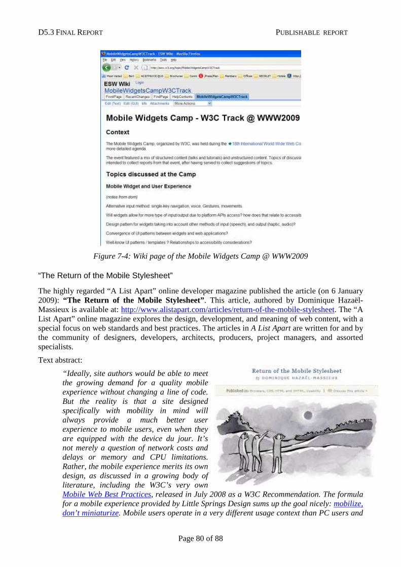
D5.3 FINAL REPORT PUBLISHABLE REPORT
Page 80 of 88
Figure 7-4: Wiki page of the Mobile Widgets Camp @ WWW2009
“The Return of the Mobile Stylesheet”
The highly regarded “A List Apart” online developer magazine published the article (on 6 January 2009): “The Return of the Mobile Stylesheet”. This article, authored by Dominique Hazaël-Massieux is available at: http://www.alistapart.com/articles/return-of-the-mobile-stylesheet. The “A List Apart” online magazine explores the design, development, and meaning of web content, with a special focus on web standards and best practices. The articles in A List Apart are written for and by the community of designers, developers, architects, producers, project managers, and assorted specialists.
Text abstract:
“Ideally, site authors would be able to meet the growing demand for a quality mobile experience without changing a line of code. But the reality is that a site designed specifically with mobility in mind will always provide a much better user experience to mobile users, even when they are equipped with the device du jour. It’s not merely a question of network costs and delays or memory and CPU limitations. Rather, the mobile experience merits its own design, as discussed in a growing body of literature, including the W3C’s very own Mobile Web Best Practices, released in July 2008 as a W3C Recommendation. The formula for a mobile experience provided by Little Springs Design sums up the goal nicely: mobilize, don’t miniaturize. Mobile users operate in a very different usage context than PC users and
D5.3 FINAL REPORT PUBLISHABLE REPORT
Page 81 of 88
providing them with an experience customized to their needs is likely to be the best service you can offer to them.”
7.4 Participation at Mobile World Congress, Barcelo na
The MobiWeb2.0 team organized an exhibition booth at "The Mobile World Congress" from 11 February to 14 February 2008, in Barcelona, Spain.
The Mobile World Congress (formerly 3GSM) is the largest and most influential mobile industry in the world.
The MobiWeb 2.0 staff also participated in developer oriented side events during the Mobile World Congress:
• "Mobile Web Development Frameworks – Widgets/Ajax" panel moderated by Dominique Hazaël-Massieux at the Barcelona mobile jam session during the Mobile World Congress (MWC'08), on 12 February 2008, Barcelona, Spain. This event, co-located with MWC’09, targeted a developers’ audience. The MobiWeb 2.0 staff provided useful insights on mobile Web site development as well as on mobile Web applications (such as widgets) development. Participants were from mobile industry companies (including established companies as well as start-ups). Over 100 people attended this event.
• Dominique Hazaël-Massieux presented the W3C work on mobile Ajax at the MobileAjax workshop on 13 February 2008, at the Vodafone pavilion during MWC'09, Barcelona, Spain. Attendance to this event was on invitation only. Organized by Vodafone, it was a brainstorming afternoon on developments around the mobile Ajax technologies. Key leaders of the mobile industry were present, including Vodafone, Google, and OMTP. This meeting laid the foundation for the organization of a W3C workshop on secure access to device APIs in December 2008.
7.5 Press Releases and Press Clippings
The outreach to the media is an essential part of a European project’s life. Results, events, etc. make good content to produce press releases or media advisories. The MobiWeb2.0 project issued four press releases:
• 29 July 2008: W3C Standards Make Mobile Web Experience More Inviting
• 8 December 2008: W3C Helps Authors Go Mobile
• 3 February 2009: Social Networking Challenges Identified by Industry Leaders in W3C Workshop
• 7 April 2009: W3C Welcomes Developer Community at WWW2009 in Madrid
All press releases are listed at http://www.w3.org/Mobile/Press
These W3C MWI press announcements received a high level of attention from the media. The impact of those is measured in terms of press clippings collected and of mobile Web community building (many blog posts and twitter messages, etc.).
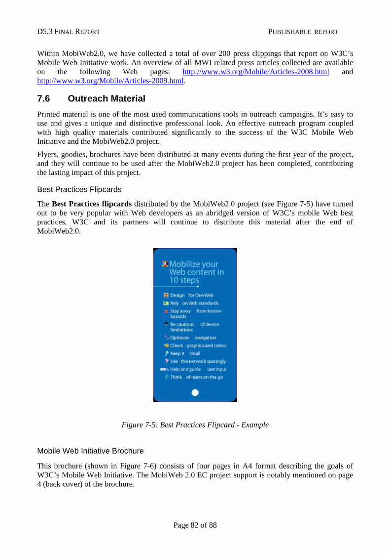
D5.3 FINAL REPORT PUBLISHABLE REPORT
Page 82 of 88
Within MobiWeb2.0, we have collected a total of over 200 press clippings that report on W3C’s Mobile Web Initiative work. An overview of all MWI related press articles collected are available on the following Web pages: http://www.w3.org/Mobile/Articles-2008.html and http://www.w3.org/Mobile/Articles-2009.html.
7.6 Outreach Material
Printed material is one of the most used communications tools in outreach campaigns. It’s easy to use and gives a unique and distinctive professional look. An effective outreach program coupled with high quality materials contributed significantly to the success of the W3C Mobile Web Initiative and the MobiWeb2.0 project.
Flyers, goodies, brochures have been distributed at many events during the first year of the project, and they will continue to be used after the MobiWeb2.0 project has been completed, contributing the lasting impact of this project.
Best Practices Flipcards
The Best Practices flipcards distributed by the MobiWeb2.0 project (see Figure 7-5) have turned out to be very popular with Web developers as an abridged version of W3C’s mobile Web best practices. W3C and its partners will continue to distribute this material after the end of MobiWeb2.0.
Figure 7-5: Best Practices Flipcard - Example
Mobile Web Initiative Brochure
This brochure (shown in Figure 7-6) consists of four pages in A4 format describing the goals of W3C’s Mobile Web Initiative. The MobiWeb 2.0 EC project support is notably mentioned on page 4 (back cover) of the brochure.
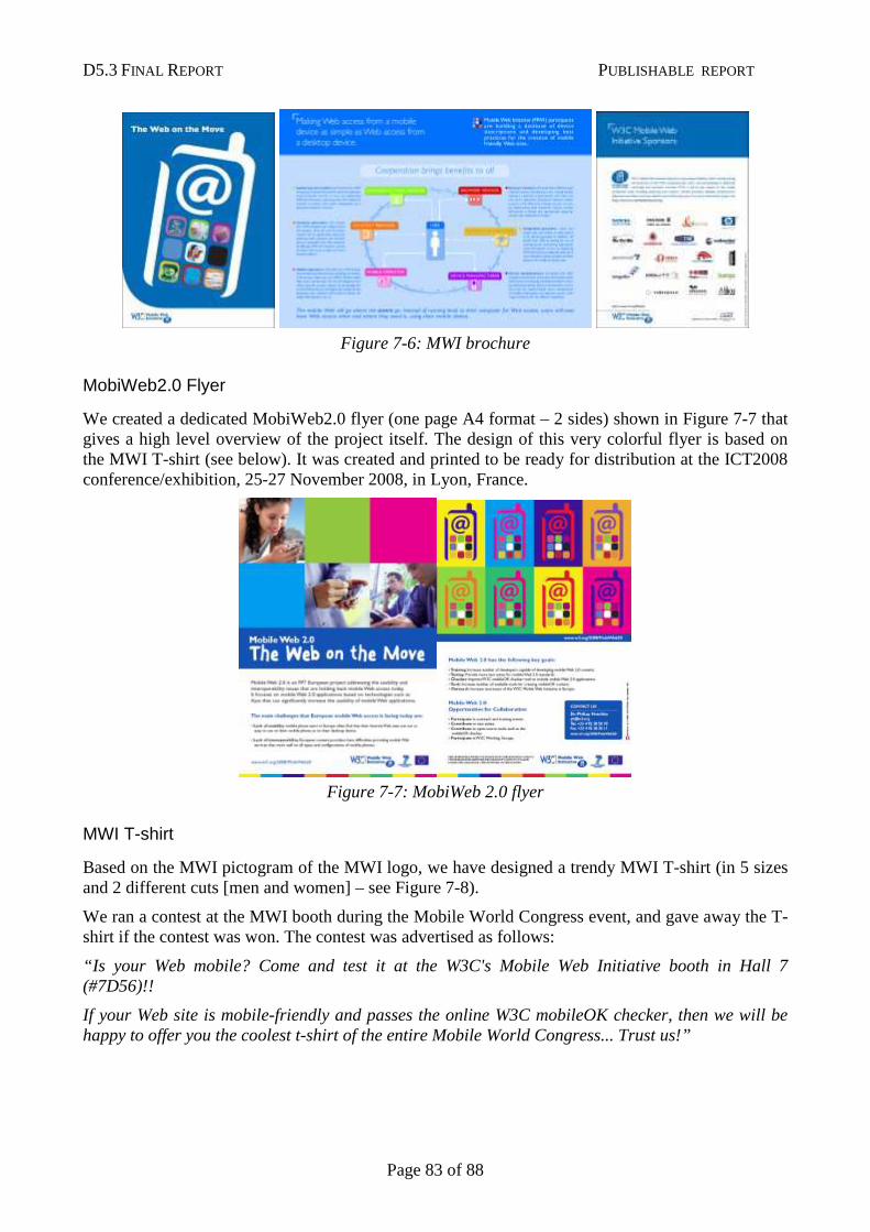
D5.3 FINAL REPORT PUBLISHABLE REPORT
Page 83 of 88
Figure 7-6: MWI brochure
MobiWeb2.0 Flyer
We created a dedicated MobiWeb2.0 flyer (one page A4 format – 2 sides) shown in Figure 7-7 that gives a high level overview of the project itself. The design of this very colorful flyer is based on the MWI T-shirt (see below). It was created and printed to be ready for distribution at the ICT2008 conference/exhibition, 25-27 November 2008, in Lyon, France.
Figure 7-7: MobiWeb 2.0 flyer
MWI T-shirt
Based on the MWI pictogram of the MWI logo, we have designed a trendy MWI T-shirt (in 5 sizes and 2 different cuts [men and women] – see Figure 7-8).
We ran a contest at the MWI booth during the Mobile World Congress event, and gave away the T-shirt if the contest was won. The contest was advertised as follows:
“Is your Web mobile? Come and test it at the W3C's Mobile Web Initiative booth in Hall 7 (#7D56)!!
If your Web site is mobile-friendly and passes the online W3C mobileOK checker, then we will be happy to offer you the coolest t-shirt of the entire Mobile World Congress... Trust us!”
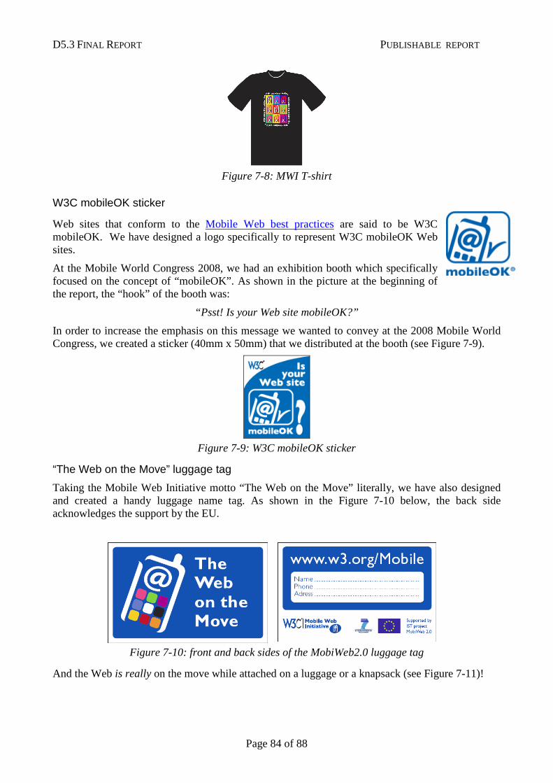
D5.3 FINAL REPORT PUBLISHABLE REPORT
Page 84 of 88
Figure 7-8: MWI T-shirt
W3C mobileOK sticker
Web sites that conform to the Mobile Web best practices are said to be W3C mobileOK. We have designed a logo specifically to represent W3C mobileOK Web sites.
At the Mobile World Congress 2008, we had an exhibition booth which specifically focused on the concept of “mobileOK”. As shown in the picture at the beginning of the report, the “hook” of the booth was:
“Psst! Is your Web site mobileOK?”
In order to increase the emphasis on this message we wanted to convey at the 2008 Mobile World Congress, we created a sticker (40mm x 50mm) that we distributed at the booth (see Figure 7-9).
Figure 7-9: W3C mobileOK sticker
“The Web on the Move” luggage tag
Taking the Mobile Web Initiative motto “The Web on the Move” literally, we have also designed and created a handy luggage name tag. As shown in the Figure 7-10 below, the back side acknowledges the support by the EU.
Figure 7-10: front and back sides of the MobiWeb2.0 luggage tag
And the Web is really on the move while attached on a luggage or a knapsack (see Figure 7-11)!
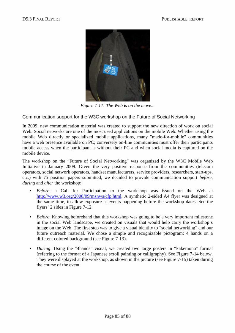
D5.3 FINAL REPORT PUBLISHABLE REPORT
Page 85 of 88
Figure 7-11: The Web is on the move...
Communication support for the W3C workshop on the Future of Social Networking
In 2009, new communication material was created to support the new direction of work on social Web. Social networks are one of the most used applications on the mobile Web. Whether using the mobile Web directly or specialized mobile applications, many "made-for-mobile" communities have a web presence available on PC; conversely on-line communities must offer their participants mobile access when the participant is without their PC and when social media is captured on the mobile device.
The workshop on the “Future of Social Networking” was organized by the W3C Mobile Web Initiative in January 2009. Given the very positive response from the communities (telecom operators, social network operators, handset manufacturers, service providers, researchers, start-ups, etc.) with 75 position papers submitted, we decided to provide communication support before, during and after the workshop:
• Before: a Call for Participation to the workshop was issued on the Web at http://www.w3.org/2008/09/msnws/cfp.html. A synthetic 2-sided A4 flyer was designed at the same time, to allow exposure at events happening before the workshop dates. See the flyers’ 2 sides in Figure 7-12
• Before: Knowing beforehand that this workshop was going to be a very important milestone in the social Web landscape, we created on visuals that would help carry the workshop’s image on the Web. The first step was to give a visual identity to “social networking” and our future outreach material. We chose a simple and recognizable pictogram: 4 hands on a different colored background (see Figure 7-13).
• During: Using the “4hands” visual, we created two large posters in “kakemono” format (referring to the format of a Japanese scroll painting or calligraphy). See Figure 7-14 below. They were displayed at the workshop, as shown in the picture (see Figure 7-15) taken during the course of the event.
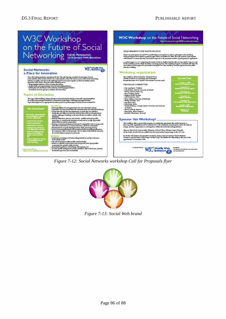
D5.3 FINAL REPORT PUBLISHABLE REPORT
Page 86 of 88
Figure 7-12: Social Networks workshop Call for Proposals flyer
Figure 7-13: Social Web brand
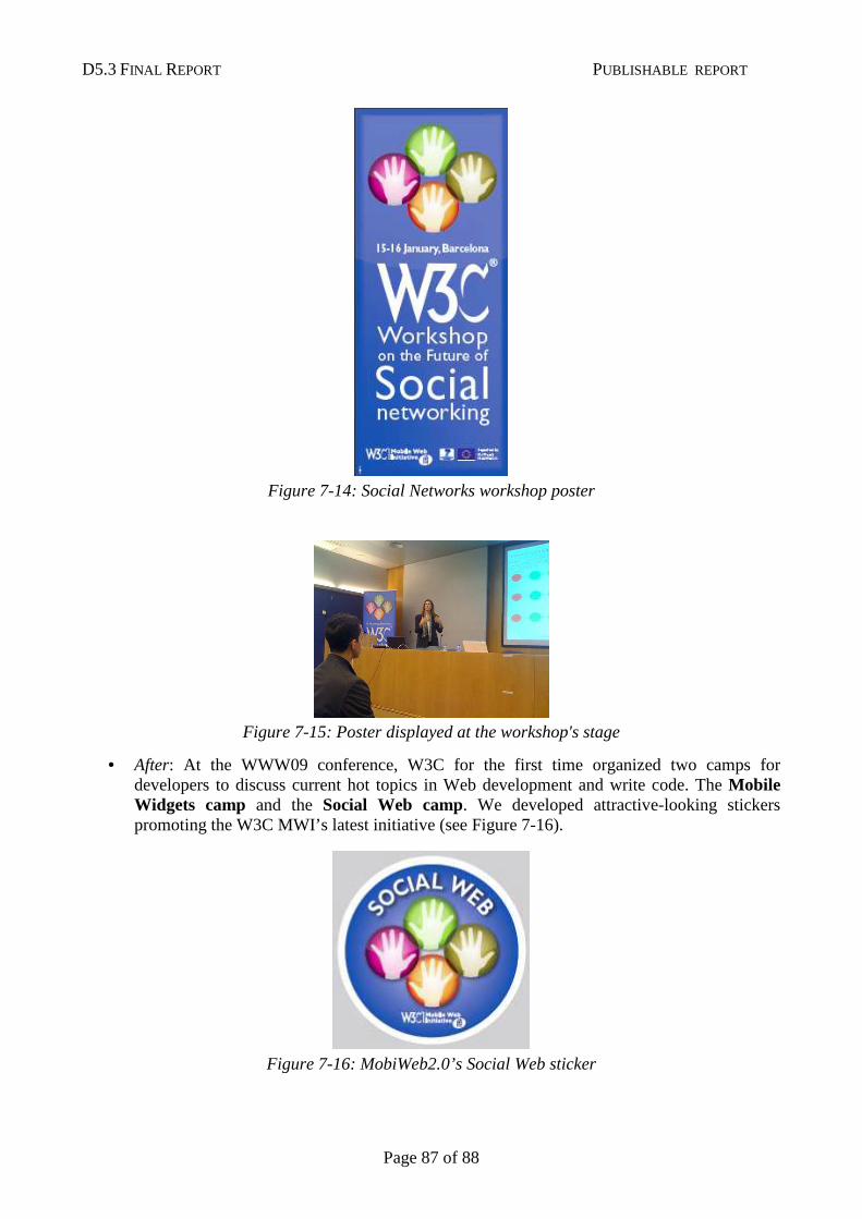
D5.3 FINAL REPORT PUBLISHABLE REPORT
Page 87 of 88
Figure 7-14: Social Networks workshop poster
Figure 7-15: Poster displayed at the workshop's stage
• After: At the WWW09 conference, W3C for the first time organized two camps for developers to discuss current hot topics in Web development and write code. The Mobile Widgets camp and the Social Web camp. We developed attractive-looking stickers promoting the W3C MWI’s latest initiative (see Figure 7-16).
Figure 7-16: MobiWeb2.0’s Social Web sticker
D5.3 FINAL REPORT PUBLISHABLE REPORT
Page 88 of 88
Appendix: List of Beneficiaries, Project Website, Contact Details
List of Beneficiaries GEIE ERCIM 2004 r d Lucioles 06410 Biot France
Project Website
http://www.w3.org/2008/MobiWeb20/
Contact Details Dr. Philipp Hoschka ERCIM/W3C 2004, route des Lucioles 06902 Sophia-Antipolis
E-mail: [email protected]