producing a music magazine
TRANSCRIPT
Producing a music magazine
Emma Parker

Hand written plans
The starting point for my magazine begins with shot plans, these plans show me the basic layout of how I’d like the front cover and contents page to look, this reminds me of how much detail I need to include, how I should prepare my shot plans to ensure I have enough space for the amount of text and reminds me of what technology I may need to use to get the product I desire.
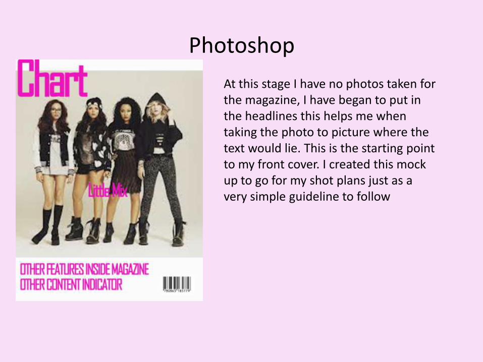
Photoshop
At this stage I have no photos taken for the magazine, I have began to put in the headlines this helps me when taking the photo to picture where the text would lie. This is the starting point to my front cover. I created this mock up to go for my shot plans just as a very simple guideline to follow

Research• I find it important to get feedback for what I should be including in the pop
magazine, a survey monkey that I created therefore should provide with me with answers, this method of research is fast to do and very useful if feedback is given from a range of people.
Also, with an age calculator I can copy text from my DPS and calculate the age range using a Microsoft programme, indicating if I need to re-write my DPS to keep it suited for my reader genre
Front cover photo
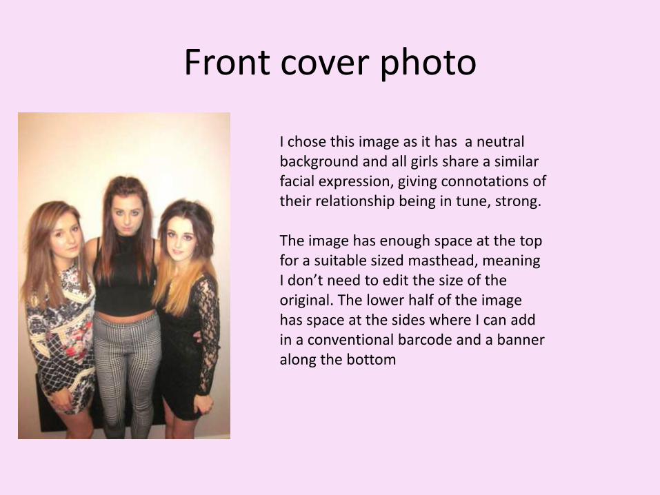
I chose this image as it has a neutral background and all girls share a similar facial expression, giving connotations of their relationship being in tune, strong.
The image has enough space at the top for a suitable sized masthead, meaning I don’t need to edit the size of the original. The lower half of the image has space at the sides where I can add in a conventional barcode and a banner along the bottom

Making my front cover..
As mentioned in the previous slide, when placing my layout of the text on to this image there is enough room. However some colours do not stand out against the girls patterned clothes, this is where I will need to make adjustments.

Adjustments
Noticeably I changed back to the to the typical three coloured conventions. The red emphasises the band name, I find this to be eye catching, essential for the front cover
Also the use of textboxes means I can use light shades, like the grey, against a complicated background (the floral patterned clothes)
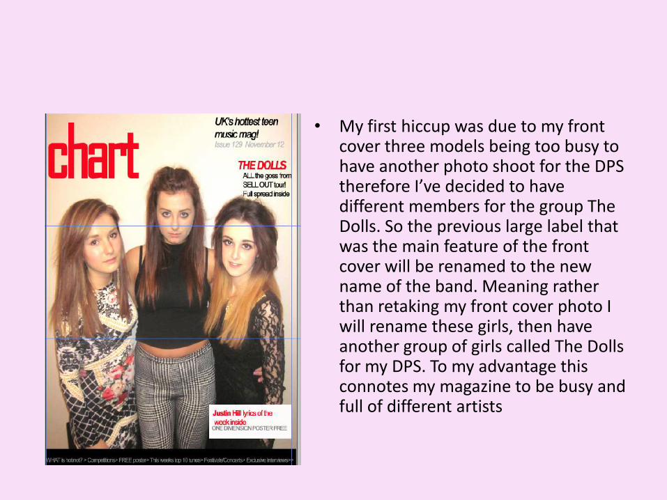
• My first hiccup was due to my front cover three models being too busy to have another photo shoot for the DPS therefore I’ve decided to have different members for the group The Dolls. So the previous large label that was the main feature of the front cover will be renamed to the new name of the band. Meaning rather than retaking my front cover photo I will rename these girls, then have another group of girls called The Dolls for my DPS. To my advantage this connotes my magazine to be busy and full of different artists

The new name lays across the middle ‘Sugarmix’ where the previous band name was, this has now moved to the side but still remains in a bold red to alert the readers of the double page spread inside. The Extra pictures added to connote the magazine to be busy
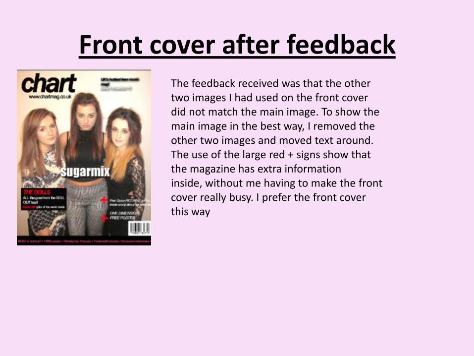
Front cover after feedbackThe feedback received was that the other two images I had used on the front cover did not match the main image. To show the main image in the best way, I removed the other two images and moved text around. The use of the large red + signs show that the magazine has extra information inside, without me having to make the front cover really busy. I prefer the front cover this way

Contents Page mock up
The mock up of a contents page of how I hope to have the columns set noticeably this is bare at this stage but it gives an indication to the layout in mind. The colours once again similar to the front cover, I also used the same text styles, the style for ‘features’ being the same as ‘The Dolls’ on the front page, as I’d like these to be more eye catching.

• The black boxes to the left highlight the importance of the contents page as they indicate which pages to go to. The pictures show variation, these are images of the same ‘artists’ from the front cover therefore keeping the magazine consistent, below these in the large space I would like a photo of The Dolls and then I plan to add in ‘behind the scenes’ information. Near the bottom are too large black boxes these will be replaced with actual photos of the editor and of the artist for the competition.

• The contents page is now fuller with detail, still lacking 3-4 images however I’m pleased to have put down the written part first as I now know how to prepare for shot plans that will look realistic on the page.
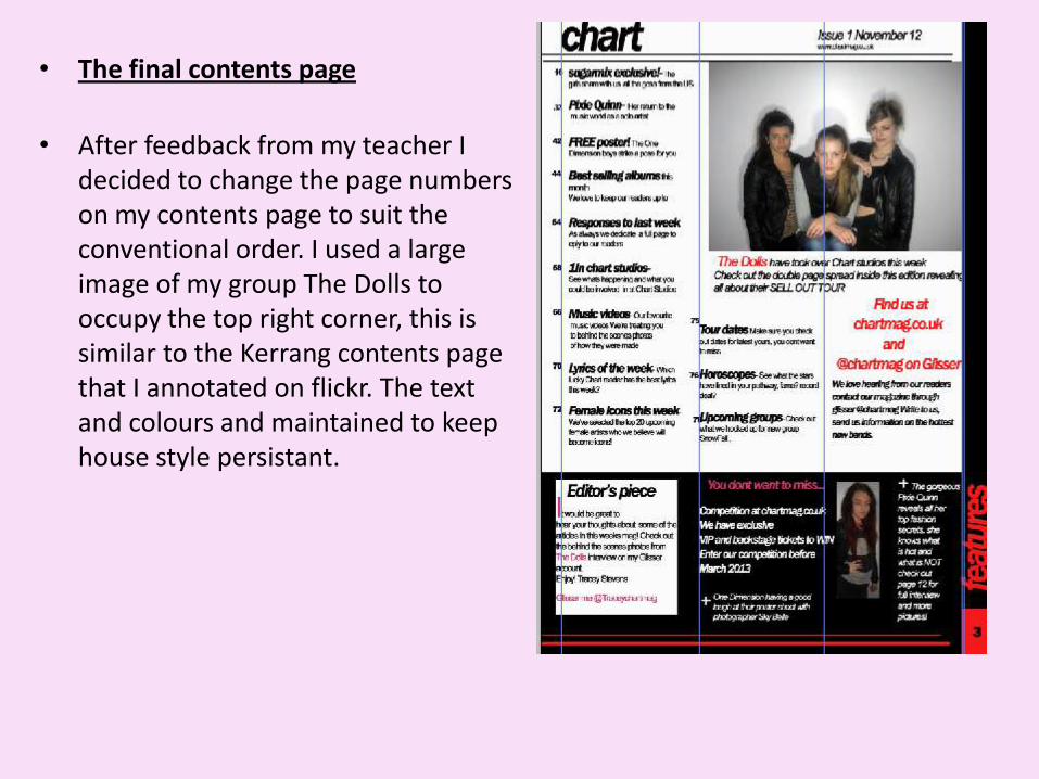
• The final contents page
• After feedback from my teacher I decided to change the page numbers on my contents page to suit the conventional order. I used a large image of my group The Dolls to occupy the top right corner, this is similar to the Kerrang contents page that I annotated on flickr. The text and colours and maintained to keep house style persistant.

Double page spreadThis is a very brief look of how I would like the layout to be for the double page spread, this mock up will guide me for when I actually take my final shot. To ensure the image is bold enough to cover one full page.
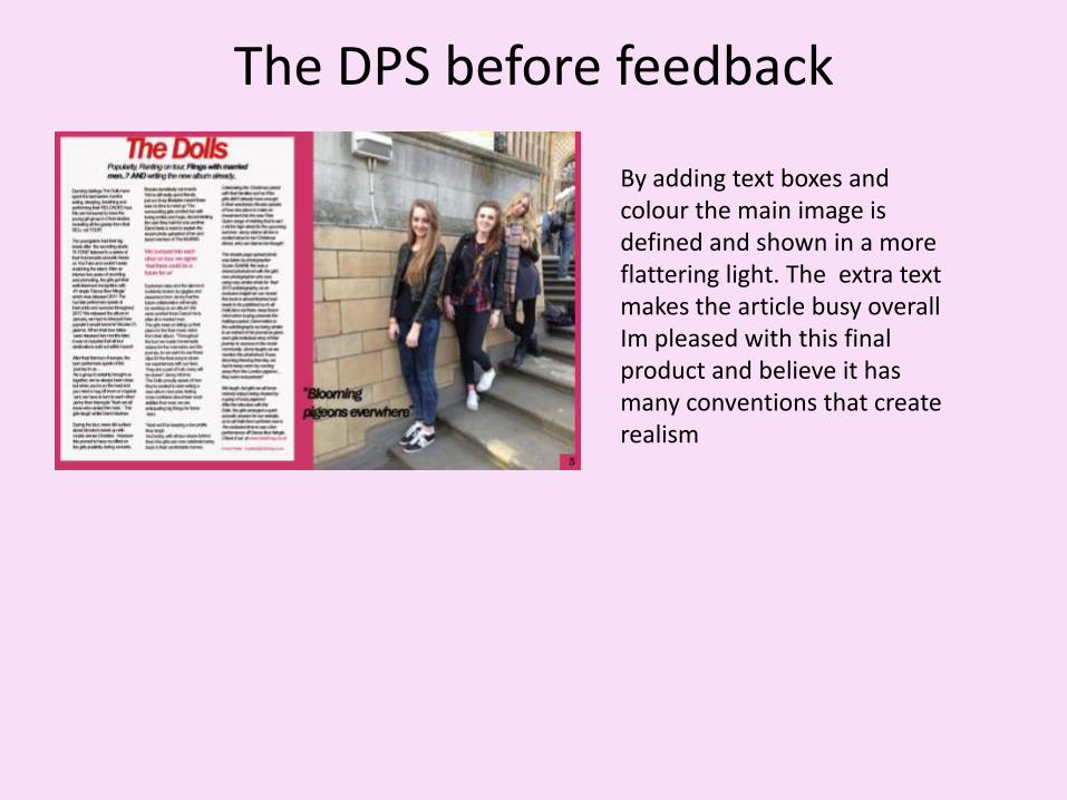
The DPS before feedback
By adding text boxes and colour the main image is defined and shown in a more flattering light. The extra text makes the article busy overall Im pleased with this final product and believe it has many conventions that create realism

The final DPSAfter feedback from the previous DPS I realised my main photo was out of focus, although I liked the location in London I decided it would be worthwhile to do another photo-shoot. This photo is certainly in focus and I feel it addresses the target audience a lot better.