previous campaigns analysis
DESCRIPTION
TRANSCRIPT
Social Action and Community Media
Existing Product Research
2
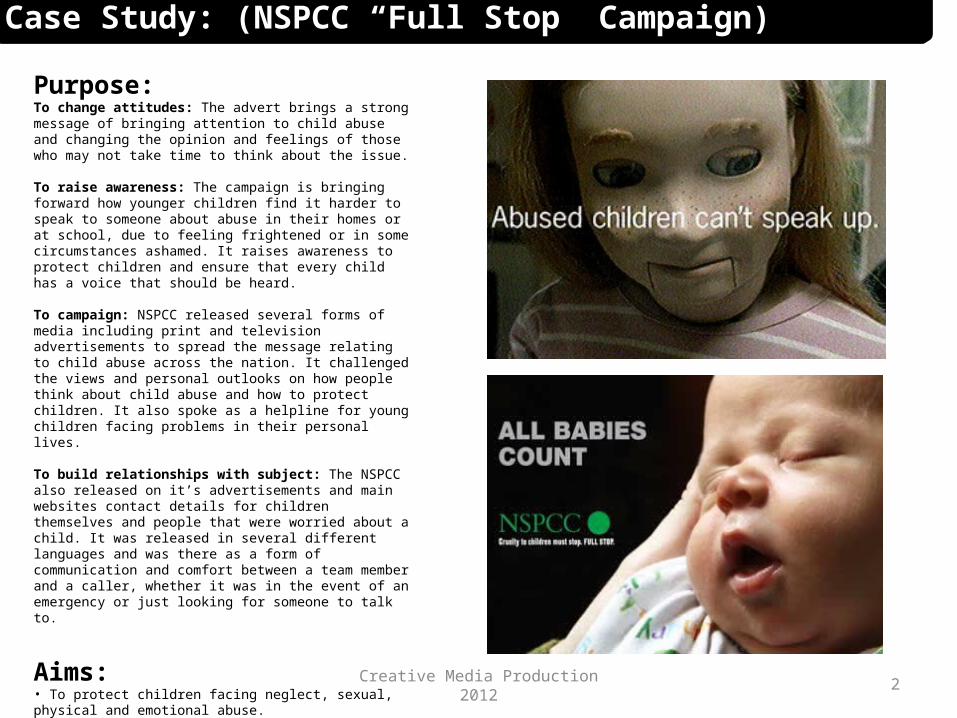
Case Study: (NSPCC “Full Stop” Campaign)
Purpose: To change attitudes: The advert brings a strong message of bringing attention to child abuse and changing the opinion and feelings of those who may not take time to think about the issue.
To raise awareness: The campaign is bringing forward how younger children find it harder to speak to someone about abuse in their homes or at school, due to feeling frightened or in some circumstances ashamed. It raises awareness to protect children and ensure that every child has a voice that should be heard.
To campaign: NSPCC released several forms of media including print and television advertisements to spread the message relating to child abuse across the nation. It challenged the views and personal outlooks on how people think about child abuse and how to protect children. It also spoke as a helpline for young children facing problems in their personal lives.
To build relationships with subject: The NSPCC also released on it’s advertisements and main websites contact details for children themselves and people that were worried about a child. It was released in several different languages and was there as a form of communication and comfort between a team member and a caller, whether it was in the event of an emergency or just looking for someone to talk to.
Aims:• To protect children facing neglect, sexual, physical and emotional abuse.• To protect children with disabilities.• To provide a helpline to people worried about a child and children themselves.• To provide advice and information regarding child abuse.• To create a change in the way society views child abuse and raise a national awareness surrounding.
Creative Media Production 2012

3
Techniques:The message: The first large quote can be interpreted in two ways, a double entendre – the first being that the child is meaning their dad beats them at the game, hence the image of the tennis ball. But the more deeper meaning surrounding the sentence relates to child abuse, demonstrating a physical representation with the tennis ball being badly beaten, that relates to the child. It is a deep, emotional message that works as a metaphor describing visually as an object representing the child.
Target audience:For the ChildLine campaign the NSPCC aimed to target children from around 4-18 years old, this meant that they were speaking directly to the children rather than to other around them – creating a more personal relationship between the viewer of the campaign and the charity. The “Full Stop” campaign targeted a mass audience, but focused more initially on creating awareness – through doing this they used a series of imagery and context that could be interpreted in several ways, yet all related back to the main subject.
This advert in particular, can be read in two ways – a younger audience member may read it as the father beats the child at a game of tennis, relating to the ball. An older audience member with a wider knowledge could interpret this message as meaning that the child is being beaten physically, relating to the battered tennis ball.
Colours & LayoutThe colour palette here are fairly neutral so that no attention is really taken away from the simple text and the main initial imagery. The natural light coming through the window helps illuminate the foreground of the image, creating more of an overall tendency to direct the eyes to the text. The layout is off centre in terms of imagery so is placed so that the text sits on the table, similar to the ball. The room in the image is quite contemporary which can relate to the feeling of loneliness and isolation that a child may feel when suffering abuse.
Creative Media Production 2012
Case Study: (NSPCC “Full Stop” Campaign)

4
Impact:
Target ActualFund Raisers 83,000 100,000Donors 75,000 103,000Campaigners 43,000 141,000Total 201,000 344,000
When the campaign was first release, the effectiveness was then measured by tracking the response to the advertisements and how much PR was generated. Marion Rose described the results portrayed that the “Full Stop” campaign was the “most ambitious and effective awareness company the charity has ever run”.
Television viewers reached an estimate of 85% of a population of 7.2 opportunities to view the advert. The print advert was seen around 55% at 21 public areas, with PR exceeding it’s expectations after the campaign had being released. It feature on 230 radio and 71 television programs, this left very few people across the nation that had not seen or heard of the campaign, due to it’s mass spend across the media sector.
The campaign went on to with CIM & Marketing Week’s “Campaign of The Year” and for the printed versions, winning “Campaigning Poster of the Year”. Finally it won two Direct Marketing awards and a Gold Lion in Cannes 1999.
In terms of the number of new supporters generated by the campaign, it exceeded 70% above it’s estimated target.
Creative Media Production 2012
Case Study: (NSPCC “Full Stop” Campaign)

Case Study: (NSPCC “Full Stop” Campaign)
Over the past 10 years, lobbying has helped…
• Create the Child Exploitation and Online Protection Centre (CEOP) to keep children save online.• Increased the penalties for sexually abusing children.• Establish local safeguarding children boards (LSCBs) to help local agencies, like the police and children’s services, work together better.• Create the new offence of “causing or allowing the death of a child or vulnerable adult”, first used to successfully convict someone in 2006• Make courts more friendly for children giving evidence in abuse trials.• Government to pledge £13 million more to help support victims of sexual and domestic violence.•Government to pledge £30 million over five years to the NSPCC to expand our help lines, the NSPCC Helpline and ChildLine, so that we are able to answer more call for help.

Case Study: (Save The Children Campaign)
Purpose: To change attitudes: This advert provides a deep message demonstrating the connection during unplanned pregnancies in teenage girls. Studies conducted by the charity showed that globally, one in five girls will have a child by the age of 18. The campaign significantly changes the opinion of a viewer by showing a substantial comparison and emotional state that an unborn baby has, as well as it’s mother.
To raise awareness: This advert raises social awareness on the public’s attitude to teenage pregnancy and abortion. It is a very intense poster that although is fairly simple, portrays a deep representation of the connection between a mother and baby. The quotes show the importance of contraception in a physiological manor.
To challenge dominant representations or agendas: This particular advert tests the views on society and abortion, in society often contraception goes ignored and young people are not fully aware of the various methods of contraception available to them, abortion appears as just a way out if pregnancy was to occur – this advert shows a stronger significance to abortion and pregnancy in young girls.
Aims:• To show the significance and importance of condoms and other forms of contraception to represent “Saving both lives.”• Relating to young people in a sense of making them think about the circumstances of getting pregnant.• To prevent the occurrence of teenage and unplanned pregnancies.•To campaign to raise awareness of condoms and contraception available to young people.

Case Study: (Save The Children Campaign)
Techniques:The message: The message illustrates the importance of contraception the physical and physiological effects of abortion. It shows the strong connection and similarities between the thoughts of a young girl and an unborn baby, and how both of them appear to be the same situation – even though the circumstances and very different. Save The Child portrays that valid necessity for contraception and information on contraception for children and young adults.
Target audience:The target audience for this campaign has not being announced via the website or any links, but personally I think this campaign targets specifically young adults and more importantly, young girls. This does this by including an illustration of a young girl looking down at her stomach, indicating she is pregnant. It shows next to the head, referring to her thoughts – that her mum is going to “kill her”. Although this isn’t specifically referring to physical harm, it is relating the young girl to the baby, by using the same quote – which demonstrates a strong connection between both subjects.
Colours & LayoutThere are not many colours used in this campaign, as the main focal point is the text surrounding the imagery, rather than the image and layout itself. The only colours used and the colours in the girl’s skin, hair and clothing – that shows visually stronger against a white background, along with the text. The text is only minimal and small and is warped to fit sections of the image, only one font is used throughout other than the logo and the terminology is American based by using “Mom” instead of “Mum”. The quotes have been placed on the girl’s head to symbolise thoughts and girl’s stomach to represent the baby. Using a central composition allows the eye to follow the image from top to bottom, as it has being laid out to read – so that the poster is easy to understand.

Impact:In 2010 the Mail released an article shows the controversy and personal views caused by the campaign in Wisconsin near a local high school, where the poster had been placed on a billboard. Onlookers found the poster to be “shocking” and a misrepresentation of young girls and abortion.
Marinette High School sophomore Samantha Bosch said: 'It's a little awkward and offensive.’
Mixed reviews were brought forward by the public, some saying that the terminology used related to teenagers with “My mom is going to kill me.” used if they stay out too late or break something valuable in the house etc.
Another member of the public added to that statement with “If a child is old enough to understand reproduction, they’re old enough to understand abortion.”
Along with this advert, several blogs, reviews and forums were spread across the internet about society’s reviews on the campaign. This allowed members of the public to add their personal opinions on the poster and whether they thought it was successful or a misrepresentation of abortion and contraception. Several social groups that do not believe in abortion due to their religion, found the poster offensive and “graphic” – coming to an overall conclusion that the poster could of being phrased differently to show the importance of contraception.
Other members of the public believed the poster was effective and “powerful” through it’s strong context because it indeed “Got the message across.” Some believed that people often need the harsh truth to be able to digest the initial message given by the campaign, even though it may be unpleasant. Overall, it was a mixed decision on the impact of the campaign and whether or not it had proved successful in society about raising awareness and changing the dominant representation on how we view abortion and contraception.
Case Study: (Save The Children Campaign)

Case Study: (Barnardo’s “Stolen Childhood” Campaign)
Stolen Childhood (2002)Stolen Childhood was launched in an attempt to change the public’s perceptions regarding children who are victims of sexual exploitation.We used five press advertisements, one TV advertisement and a poster campaign in order to communicate our message.The imagery showed children with aged faces to capture the concept that abuse through prostitution steal’s lives.
Purpose: To bring about local, national and global change: This campaign was launched worldwide due to the nature of the issue, trafficking and prostitution happens worldwide. There are so significant features in this campaign that relates it to one specific country, apart for the language being English. It relates to everyone in hindsight, with or without children – as everyone was once a child, and to think of having you’re childhood taken away.
To change attitudes: The campaign reached out to the public by placing the face of an old woman on the body of a young child, showing that her childhood had being taken from her and she had being forced into prostitution with men much older than her, represented by the man laid behind her. It fights to change the attitudes of the viewers by relating this to perhaps if it were their children, or themselves when they were a young child. The expression on the girl’s face gives a strong physiological impact on the effects of abuse through prostitution in society.
To provide information: This particular poster in the campaign provides a bold link to the charity and a contact number in small font after the slogan “Help end this obscenity.” As if it is asking the public to aid the charity and giving them the tools to do so. No information as to what the charity actually does to help prevent the issue is available on the poster, but at the website linked below.
Aims:• To change the dominant representation of child abuse through prostitution and trafficking in children on a global mass.• To give information and details into donating and being part of the campaign and charity.• To relate to the public through a visual representation of their own children or themselves as a child.• To prevent abuse through prostitution and to give child their childhood back.

Case Study: (Barnardo’s “Stolen Childhood” Campaign)
Techniques:The message: The message in this campaign is to stop abuse through prostitution and give children back their childhood. This is visually demonstrated through editing on the face of an older woman onto the body of a clearly, very young girl – representing the physiological damage caused by her abuser taking away her childhood. The campaign’s purpose is to change the minds and views of how the public perceive trafficking and prostitution in society on a global mass.
Target audience:The target audience for this campaign is people roughly above the age of 18 that understand on a intermediate basis the effects and circumstances of trafficking and prostitution in young child. It targets specifically people that may have children of their own, as if to see their own child looking physically drained and unhappy – or people looking back on their own personal childhoods, and the feeling of having that taken away from you. What springs to mind here when viewing this poster is how issues like this will effect as child, not just as they are now – but in the future, being stricken of their chance to be young and carefree.
Colours & LayoutThe colour palette here is mainly green based, featuring a range of dark and olive tones that illuminate the image of the girl on the bed. Her skin isn’t necessarily pale but stands out against a dark background, the face and hairline is dark to symbolize her being emotionally older than what she is and her body language and facial expression shows she is scared and unhappy. The composition of the image is central with the young girl in the foreground and her abuse laying in the middle ground, this gives a strong impact on the overall poster as to what relationship the abuser has with the young girl.
The text is block white and sits at shoulder height with the young girl so that they eye travels from her facial expression to the message, which work in strong correspondence with one another – relating her appearance of being an old woman to the term “Steals children’s lives.”
Tone & MoodThe tone and overall mood to this particular poster in the campaign is dark and fairly graphic in terms of the abuser being laid on the bed behind the child. The colours, body language and facial expression of the child give the feeling on angst and guilt to protect the child that should be happy and carefree during her childhood years. The neutral colour tones restrict the eye from looking anywhere else but the facial expression of the girl, you instantly feel unhappy after looking at her face and surroundings.

Case Study: (Barnardo’s “Stolen Childhood” Campaign)
Impact
Stolen ChildhoodsThe current Barnardo's campaign also alters the appearance of children, digitally aging their faces to force home the horrors of child prostitution.
The young victimsBarnardo's defended its decision to use such shocking images in the campaign, arguing that there was public and governmental complacency about child prostitution that needed to be shook up. Shock posters break taboo to fight child prostitution
http://www.theguardian.com/pictures/image/0,8543,-10704513621,00.html
The campaign was controversial when launched in terms of the imagery used in the posters, some members of the public found the poster very graphic and upsetting, more of the fact that the abuser was visible either partially undressed or undressing in front of the child. Other people found the imagery to be shocking yet effective in getting the message across to the public in such a nature that makes you take a step back and really understand the message given. Several articles, forums and reviews were published upon release of the campaign given personal opinions and overall reflection on whether the campaign proved successful or unsuccessful.
'Making technology safe’The judges recognised the ‘huge impact in publicity and awareness terms’ that Barnardo’s’ Just One Click initiative has generated. When it published a report in 2002 entitled Stolen Childhood on children and young people abused through prostitution, the organisation highlighted a worrying new trend. It seemed the internet was increasingly being used to pimp children, photograph child abuse, and to broadcast such abuse live.In February 2004, Barnardo’s held the first UK-wide conference solely dedicated to the needs of the child victims. The media coverage was extensive, with all the major radio and TV news programmes covering the issue. Just One Click, also published in February 2004, was the title of the charity’s follow-up report, in which radical reforms were outlined.Tink Palmer is Barnardo’s principal policy and practice officer for the campaign. ‘It has helped to concentrate attention on the child victims,’ she says. ‘That’s what we need to be doing. In the past, attention has been on preventing the abuse and the abusers themselves. The child victims were ignored.’Since the Just One Click conference and report, the impacton public awareness and on government departments has been palpable. There is now collaborative planning between Barnardo’s and the principal police officers leading on this issue to, together, try to establish the very first national unit for children and their families who have been affected by abuse through the new technology.
http://www.civilsociety.co.uk/charityawards/winners/2004_winners/winners/research_advice_and_support/content/9441/barnardos?topic=&print=1

Case Study: (Surrey Crimestoppers’ “Illegal Tobacco”)
Purpose: To change attitudes: This poster’s purpose is to change how people visually respond to sales of illegal tobacco, it does this by providing a list of brief bullet point information as to the risks and circumstances of the sales of tobacco not on the market. It’s main factor is how sales of illegal tobacco can attract higher levels of crime in the community, and Crimestoppers’ are campaigning to prevent this.
To create or strengthen community ties: The campaign focuses on the effects of illegal tobacco on the community as a whole rather than just a single individual. It targets people within the community to call Crimestoppers to act on behalf of the community in preventing illegal tobacco, providing contact details below. Using the term “Fight for a cleaner community.” as one of it’s main subheadings adds to vitally of the community to Crimestoppers.
To provide information: This poster in the campaign in particular adds a short section of brief facts on the results of illegal tobacco. It doesn’t necessarily give facts on the bodily effects of illegal tobacco but more the social effects, such as it encouraging “playground” smokers that expose the use of illegal tobacco to younger children with the community.
To build relationships with subjects: This campaign was set up by the Surrey council, as speaks out to the community on a whole rather than on a more national mass. It allows the community to feel a sense of communication and protection from their city council and in the sense that there is help available to them.
.Aims:• To bring awareness to effects of illegal tobacco on the community. E.g. encouraging children, attracts crime.• To provide information to others about the circumstances revolving around illegal tobacco and also details and contacts for members of the public to get in touch with the charity.• To stand out to an individual and change the attitudes of how society responds to illegal tobacco.

Techniques:The message: The message on this campaign is projected visually in writing and through imagery to stop the use and sales of illegal tobacco within the community. The poster demonstrates this message by using aggressive, bold font and large imagery so that the overall message is clear. It provides a short list of facts of the effects of illegal tobacco and on the whole, the terminology used in this poster portrays illegal tobacco in a negative mannerism.
Target audience:The target audience for this campaign is specifically smokers but also members of the community against illegal tobacco. The ad speaks negatively on the substance and encourages people to stop or get in touch if they witness the use or sale of illegal tobacco. This poster could also be targeting younger members of the community e.g. 13years and over – that may socialize in public parks with illegal tobacco, stating that it “encourages” infants and younger children to smoke in the future. It could also be targeting them by the terminology used, some forms of slang such as “drag” and “dodgy fag” relate to what cigarettes are called within the younger generation – so that a viewer can relate to the campaign.
Colours & LayoutThe colour palette for this poster is built of a heavily grey and black ratio, to mimic the look of smoke coming from a cigarette. The siren red is used to stand out dramatically against the monotone background so that eye shoots to the source of information. The colour palette also matches the colours of the Crimestoppers’ logo, this allows the poster to flow well along the page.
The font is quite aggressive and jagged, it has being warped to fit along the lines of the cigarette and a shadow had being added to draw attention against the white background. Smaller, sans-serif font has being used in the red text box to prevent the poster feeling cluttered and allowing the eye to follow the page downwards in corresponding order. There is little negative space caused by the extensive size of the imagery which appears of be a man’s hand holding a cigarette, this relates visually to the message portrayed by the campaign.
Case Study: (Surrey Crimestoppers’ “Illegal Tobacco”)
Tone & MoodThe tone of this poster is fairly dark and conservative but the reds give the sense of alarm and in these circumstances, blood – with relates to the bodily effects tobacco effects on our health. The mood of the most is informative and strict, it speaks in a persuasive mannerism that shows the potentials risks to an individual and others surrounding when illegal tobacco is introduced.
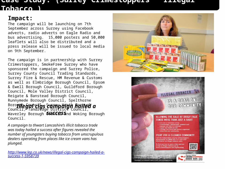
Impact: The campaign will be launching on 7th September across Surrey using Facebook adverts, radio adverts on Eagle Radio and bus advertising. 15,000 posters and 50,000 leaflets will also be distributed and a press release will be issued to local media on 9th September.
The campaign is in partnership with Surrey Crimestoppers, SmokeFree Surrey who have sponsored the campaign and Surrey Police, Surrey County Council Trading Standards, Surrey Fire & Rescue, HM Revenue & Customs as well as Elmbridge Borough Council, Epsom & Ewell Borough Council, Guildford Borough Council, Mole Valley District Council, Reigate & Banstead Borough Council, Runnymede Borough Council, Spelthorne Borough Council, Surrey Heath Borough Council, Tandridge District Council, Waverley Borough Council and Woking Borough Council.
Illegal cigs campaign hailed a success
A campaign to thwart Lancashire’s illicit tobacco trade was today hailed a success after figures revealed the number of youngsters buying tobacco from unscrupulous dealers operating from places like ice cream vans has plunged.
http://www.lep.co.uk/news/illegal-cigs-campaign-hailed-a-success-1-5958739
Case Study: (Surrey Crimestoppers’ “Illegal Tobacco”)

Case Study: (Deaffest : Film & Art Festival)
Purpose: To change attitudes: Deaffest is not specifically a campaign but more of an annual event. It’s aims at changing the views and opinions of how society respond to the deaf community, the dynamic festival brings normality to non-traditional groups by demonstrating and taking part in film and art design media by using sign language to communicate and explain. Often it is speculated that people who suffer from being deaf could not experience film, art and music to it’s full advantage – this festival challenges that belief.
To create access to media production for non-traditional groups: Deaffest includes several exhibitions, seminars and workshops based around traditional media aspects. Members of the community can take part or just come to watch dance shows, short films, galleries and much more. Guides are available at every section for support and guidance and to make the event enjoyable and interesting for the guests that come along. It gives talented members of the community who suffered with being deaf to perform and show their work in front of a vast audience.
To infiltrate main stream media: Non-traditional groups can join in on different segments of media or just come along and watch. Deaffest was originally created by Italian Giuseppe Giuranna who founded the festival and created a sense of community within the group. He encouraged competitions and effective seminars, communicating in sign language to strengthen the relationships within the community by introducing film and art as a main visual for creativity.
Aims:• To encourage a change of attitude to how deaf people are perceived in society.• To involve non-traditional groups in elements of media and creativity to broadcast new talents and skills.• To strengthen the community and bring a stronger relationship with non-traditional groups.• To stand out and be unique and incorporate all the elements of a traditional festival.

Techniques:The message: The message and meaning behind the festival is to represent equality in society and involve non-traditional groups in media and elements surrounding. It’s purpose is to build a sense of community within the festival and broadcast local talent and skills within the group. Using film, art, design and music to encourage creativity and gaining skills within the sector for people suffering with being deaf.
Target audience:The target audience for this festival is non-traditional groups, being deaf people – and also members of the community that support the campaign in preventing and learning to encourage community with non-traditional groups.
Impact:Deaffest is supported by the National Lottery through the BFI and Creative England. Deaffest is supported by Light House, Wolverhampton City Council, Zebra Uno, University of Wolverhampton.
“Deaffest isn’t just about films: this year’s festival celebrated the 10th anniversary of the company behind it Zebra Uno, set up by Marilyn Willrich and Nikki Stratton and paid tribute to Richard Griffiths who died last March. He had
become patron of Deaffest in February 2012. Deaffest was lucky enough to meet him last summer and showed a video of a wonderful interview in which the actor whose parents were deaf had an interpreter but barely needed it as his rusty BSL
clearly returned to him during its course. He finished it by encouraging deaf actors and filmmakers to never give up because “if you do, the world will be
denied what you can do”.
Case Study: (Deaffest : Film & Art Festival)
“A profoundly deaf film student from York College has won a prestigious film award at Deaffest, the UK’s leading film and arts festival for the deaf. His film, titled ‘I won’t do that again’, about an amateur scientist who invents a control panel to clone people, won the ‘Young Deaffest Award 2013’.”

Case Study: (David Cameron Poster: Social Action)
Purpose: To change attitudes: The posters were a social action rebelling against Conservative and David Cameron’s apparent promise to change Britain. Poster’s during David Cameron’s campaign for prime minister were defaced by members of the public and changed to witty slogans or changing the sentence to fit their social beliefs on the prime ministers. People following this action uploaded photographs of the posters to the web which creating a nation wide fanzine and the action grew, this changed peoples attitudes dramatically about how they felt about David Cameron’s campaign.
To change voting behaviour: Graffiti was used to demonstrate visually the faults in David Cameron’s campaign. It challenged how members of public involved in voting thought about David Cameron on a whole and if he was that good of prime minister, why was his campaign being ignored and defaced.
To infiltrate main stream media: Due to photographs of the posters being shared across the web on several social networking sites and forums, it speculated websites being created where others could create their own versions of the poster without having to deface public property. The humorous spoofs of the campaign created several versions of the media campaign in different formats to challenge the way people voted.
Aims:• To change the way the public viewed David Cameron’s campaign.• To visually show the errors in his campaign on a nationwide level.• To add an element of humour and wit to a traditional campaign to spread across a wider audience rather than those who followed the campaign• To infiltrate and take part in the media by creating virtual versions of the posters as well as defacing them in public sectors.• To challenge David Cameron in how he approached his campaign and to perhaps change the ways he worked with society.
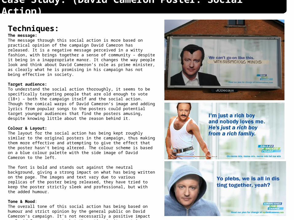
Techniques:The message: The message through this social action is more based on practical opinion of the campaign David Cameron has released. It is a negative message perceived in a witty fashion, with brings together a sense of community – despite it being in a inappropriate manor. It changes the way people look and think about David Cameron’s role as prime minister, as clearly what he is promising in his campaign has not being effective in society.
Target audience: To understand the social action thoroughly, it seems to be specifically targeting people that are old enough to vote (18+) – both the campaign itself and the social action. Though the comical warps of David Cameron’s image and adding lyrics from popular songs to the posters could potential target younger audiences that find the posters amusing, despite knowing little about the reason behind it.
Colour & Layout: The layout for the social action has being kept roughly similar to the original posters in the campaign, thus making them more effective and attempting to give the effect that the poster hasn’t being altered. The colour scheme is based on a blue colour palette with the side image of David Cameron to the left.
The font is bold and stands out against the neutral background, giving a strong impact on what has being written on the page. The images and text vary due to various replicas of the poster being released, they have tried to keep the poster strictly sleek and professional, but with the added humour.
Tone & Mood:The overall tone of this social action has being based on humour and strict opinion by the general public on David Cameron’s campaign. It’s not necessarily a positive impact on David Cameron’s part, but the action isn’t meant in a purpose to upset or pose a negative impact on society as a whole. It is a joining of the nation’s community in a witty manor to show their opinions on political events in a creative and unique way.
Case Study: (David Cameron Poster: Social Action)

Case Study: (David Cameron Poster: Social Action)
Impact:The follow up from the first acknowledgement of the social
action went on to grow bigger when photographs of the posters were uploaded to the web. Several pages and
forums were created on networking sites so that members of the public could discuss, comment and review the acts of the
political parties and the social actions surrounding.
“Make your own…” sites were created so that members of the public could create their own virtual mimics of the
posters, without defacing public property. The most popular one was created by Andy Barefoot.
www.andybarefoot.com/politics/cameron.php
The poster campaign caught so many peoples attention, that others went out to target more posters made by the Tory
party – and thus creating more of a speculation as to political voting and did we really trust the people running the nation?