presenting outcomes data clearly and effectively presenting... · presenting outcomes data clearly...
TRANSCRIPT

Presenting Outcomes Data Clearly and Effectively
Paul Chandler, Volunteer Data Analyst,
ASTT, Baltimore Maryland

Depictions of data help us tell a story…What message do you want to convey?
What do you want your audience to remember?
What are your strengths that you want to highlight?
Start by sketching some ideas…

Sketch some of your ideas…
”this” ”that”led to..
Before After

“Outcomes” and “Outputs”Outcomes show change over time for a client after experiencing some program or intervention.
Achieve some change in therapeutic measures.Changes in personal lives (access to medical care, access to food, legal support / status). Changes in quality of life (housing status, employment status).
Outputs are short term achievements of the overall program or the Center.
Number of clients served.Number of services provided.Number of people trained, by profession.Number of community trainings.Number of hours of pro-bono services.

levels of outcomesWhat do you want to show your audience?Do you want to show immediate, short-term, or long-term changes and benefits?
Four main types of outcomes:Initial reactionsImmediate – learning outcomesIntermediate – behavioral outcomesLong term – situational outcomes
General principles for depictions of data…

Depictions of data help us:
Provide a “quick view” of information.We live in a visually oriented society…
Condense information.People want information quickly…
Capture attention.do not overload your audience…
Reveal important points.Draw attention to your key message.

Graphs should be:Self-contained
Your audience should be able to understand your graph independently of reading any of the document text.
ReliableThe data should be reliable and consistent with other presentations of data.
AccurateThe information conveyed by the graph should be statistically accurate.

Depictions of data should show….Show the Facts…
for example: clients “improved” in terms of a specific measure. Showing “change” vs. showing “improvement”
Show the “Power”…for example: how much did they improve…
Use proper scale identify units of measure

Some things to Avoid:Avoid 3D effects
Avoid clutter…
Avoid background/ design effects
Filling shapes with patterns (use sparingly)Sometimes patterns are clear on your computer screen, but are not distinguishable once they are printed on a page or in a poster.
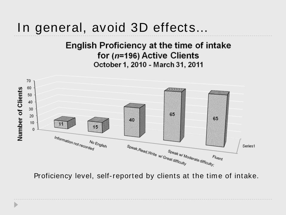
In general, avoid 3D effects…
Proficiency level, self-reported by clients at the time of intake.

Graph formatting and examples.

Use the appropriate scaleConvey message accurately.
Be true to the integrity of the data.
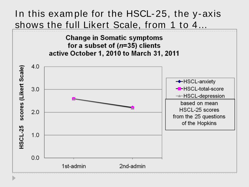
In this example for the HSCL-25, the y-axis shows the full Likert Scale, from 1 to 4…

A sample Graphic to discuss the Likert Scale:
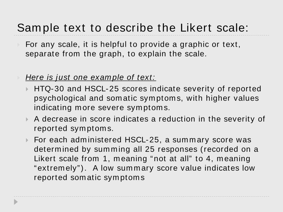
Sample text to describe the Likert scale:For any scale, it is helpful to provide a graphic or text, separate from the graph, to explain the scale.
Here is just one example of text:HTQ-30 and HSCL-25 scores indicate severity of reported psychological and somatic symptoms, with higher values indicating more severe symptoms. A decrease in score indicates a reduction in the severity of reported symptoms. For each administered HSCL-25, a summary score was determined by summing all 25 responses (recorded on a Likert scale from 1, meaning “not at all” to 4, meaning “extremely”). A low summary score value indicates low reported somatic symptoms

Here is the same chart, but showing only the detail of the change in scores…

The title of a graph should:Convey the message you want
…but do not try to tell the whole story.
Not be misleadingintentional/ unintentional
Convey the Units of measureYou can also use axis title to indicate units of measure.
Include a number for easy reference (if the graph is part of an article or text)All images (photos, diagrams, tables) should be in the same numbering series.
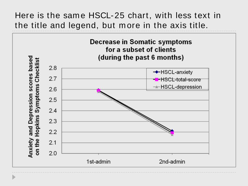
Here is the same HSCL-25 chart, with less text in the title and legend, but more in the axis title.

Axis TitlesThe axis titles can help explain the data, but should not try to convey too much information.
The x-axis is generally used: to indicate change over time.To list categories
The y-axis generally shows:The extent or degree of the measure

This example shows change in HTQ30 scores during six months…

Here is the same chart, with less text in the title, but more text in the axis titles…

Baseline measures and change over time
Showing the baseline measure (before showing the change) can help clarify the message.

This sample shows Employment status measures at the time of intake…

This example shows the Employment status at intake and 6 months later…

Another example - showing the baseline measures for Housing Status at time of intake…

Here the title indicates that this is the change in housing status during the first six months of care…

To show “progress” or improvement, a horizontal bar chart may be more effective.
The horizontal depictions highlight whether something increased or decreased.
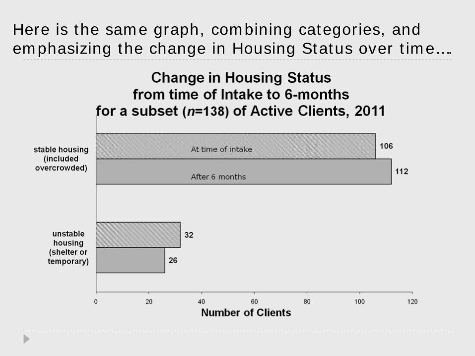
Here is the same graph, combining categories, and emphasizing the change in Housing Status over time….
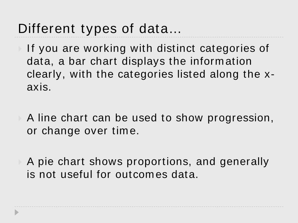
Different types of data…If you are working with distinct categories of data, a bar chart displays the information clearly, with the categories listed along the x-axis.
A line chart can be used to show progression, or change over time.
A pie chart shows proportions, and generally is not useful for outcomes data.

Here, a line graph is not appropriate, because these are distinct
categories and not meant to show change over time…

Displaying outputs…A pie chart shows proportions, and generally is not useful for outcomes data.
A pie chart might be useful to show the proportion of outputs, such as the number of services provided, or the number of referrals.

Sample showing number of referrals (outputs) in bar chart form…
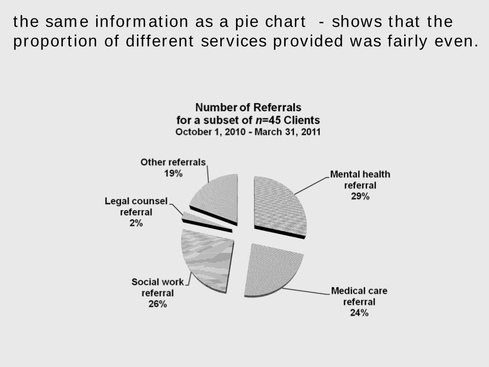
the same information as a pie chart - shows that the proportion of different services provided was fairly even.

Order of information in a Bar chart…The order of the categories does not need to be arranged alphabetically or numerically; instead, it should show convey some logical order or information.
Data labels are generally discouraged; most textbooks assert that data labels confuse the audience. In some cases, however, they can help clarify the data.
The legend should have minimal text, and in the same logical order as the data.

In this example of Client Goals, the categories are ordered numerically..

Can your audience understand a graph showing the comparison of two means…
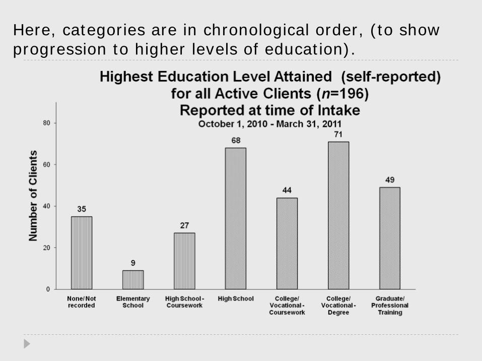
Here, categories are in chronological order, (to show progression to higher levels of education).

Here is the same chart, drawing attention to the education levels most frequently attained…

This sample is listed in order to highlight which services were most needed…
Clarifying your chart…Ask others to give you feedback on your chart: what is clear to you may not be clear to others. This will require several iterations.
Try skimming your poster or document “backwards” – if someone begins by looking at graphics near the middle or end, will they be able to understand the message.
Keep the message simple. More detail can always be provided in your document.

Some References:Hay, I., Bochner, D. & Dungey, C., Making the Grade: a Guide to successful communication and study. 2nd ed., Oxford University Press. (2002).
Edward Frees & Robert Miller, Designing Effective Graphs, North American Actuarial Journal, Vol. 2, Num. 2, (1998).
Larry Gonick, The Cartoon Guide to Statistics, Collins Reference, (1990).
Darrell Huff and Irving Geis, How to Lie with Statistics, WW Norton & Co., New York. (1993).
Contact info:Please contact me if you would like to discuss these topics or if you would like additional examples.
You can reach me via email at:[email protected]