presentation
DESCRIPTION
Postmodernism in Design and Paula ScherTRANSCRIPT

POSTMODERNISM IN DESIGN& PAULA SCHER

PO
ST
MO
DE
RN
ISM
Postmodernism began in 1972, Modernism had failed or atleast that is what post mod-ernist believed.
Postmodernism is a late-20th-century style and concept in the arts, architecture, and criticism that represents a depar-ture from modernism and has at its heart a general distrust of grand theories and ideologies as well as a problematical relationship with any notion of “art.”.Typical features include a deliberate mixing of different ar-tistic styles and media, the self-conscious use of earlier styles and conventions, and often the incorporation of imag-es relating to the consumerism and mass communication of late-20th-century postindustrial society.


Modern architecture developed during the early 20th century but gained pop-ularity only after the Second World War. For decades, modernism became the dominant structure for institutions and corporate buildings even up to the recent period. Architectures of this type exhibit functionalism and rationalism in its structure.
Characteristics of modern architecture include the functional requirements of the structure, lesser ornaments used and eliminations of dispensable details, and the application of the concept of “form follows function”.

Postmodern architecture is a style developed during the 1950s that contin-ues to inspire the architecture of today. It manifests of structures with elabo-rate ornamentation that includes fascinating lines and curves. It is basically focused on creating a unique exterior that is aesthetically pleasing to the viewer. It usually contains the elements of surprise and irony, contradiction and of course, originality. It combines the physical characteristics of using sculptural forms and ornaments to blend with its conceptual characteristics. The structures usually have high ceilings, flying buttresses and extrava-gant facades. Generally, postmodern structures are noted of its extravagant forms and the meaning conveyed in the building.
INFLU
EN
CE
IN A
RC
HIT
EC
TU
RE

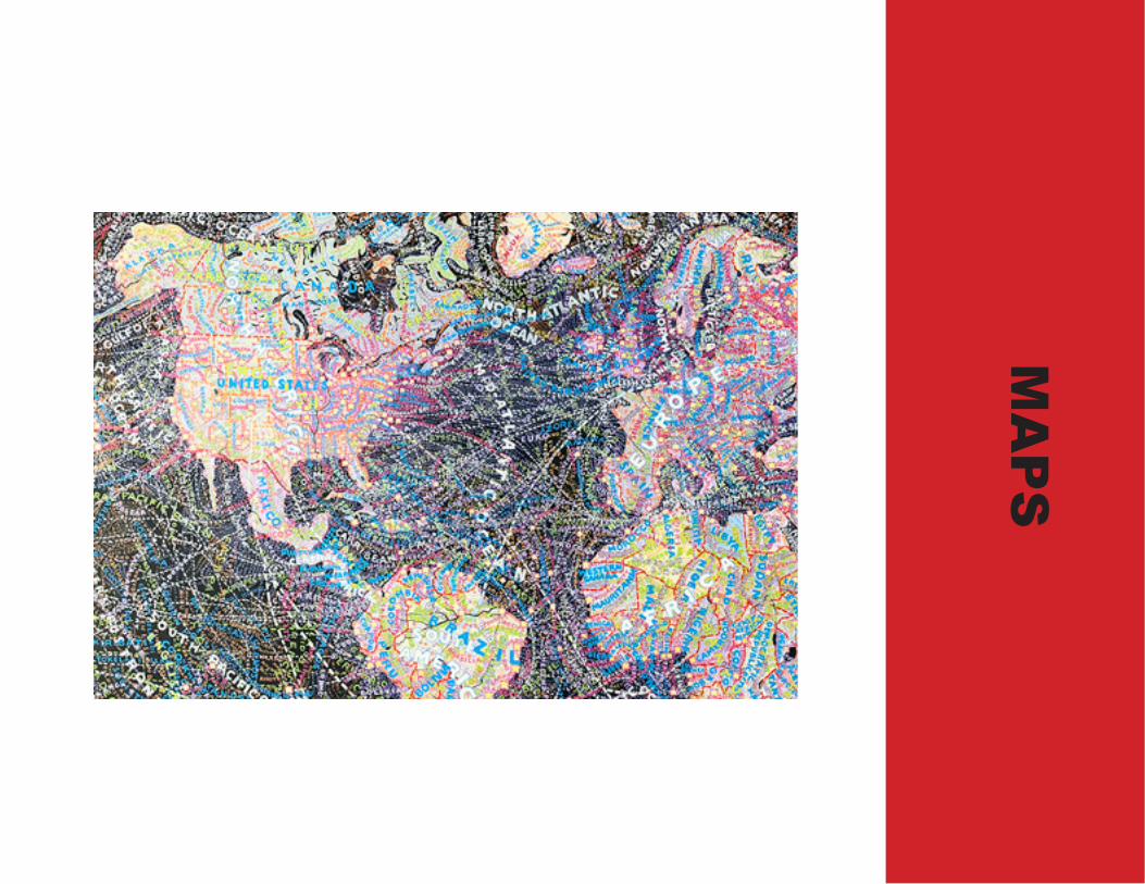
The tag “rock star” is recklessly applied to everyone from bloggers to bio-chemists, but in Paula Scher’s case it couldn’t be more appropriate. As a rock star designer, she’s cooked up everything from Boston album covers to Elvis Costello posters, pausing somewhere in between to trash the ubiquitous visual authoritarianism of Helvetica. She’s also created some of design’s most iconic images, like the Citibank logo. She is a partner in the renowned design firm Pentagram, and in 2001 received the distinguished AIGA medal.As a fine artist, Scher has also become increasingly well known for her micro-scopically detailed map paintings, densely latticed with hand-lettered text, that evoke not only place but the varied political, historical and cultural meanings (and preconceptions) brought to the world by the viewer.
PAU
LA S
CH
ER

“Find out what the next thing is that you can push, that you can invent, that you can be ignorant about, that you can be arrogant about, that you can fail with, and that you can be a fool with. Because in the end, that’s how you grow.”
“The best way to accomplish serious design … is to be totally and completely unqualified for the job.”

“best of jazz”IN S
TOR
E P
OS
TE
RS
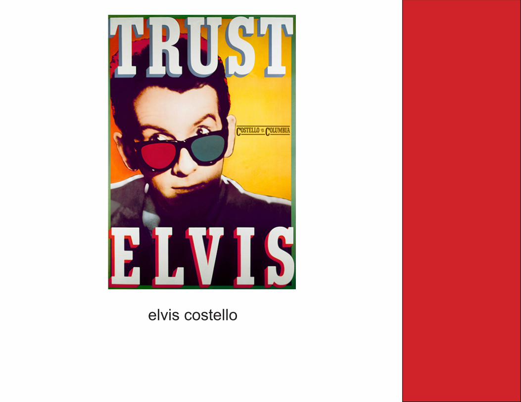
elvis costello

Good design is serious not solemn.
Serious design is spontaneous, careless, new, innovative and makes no sense.
Solemn design is more common, correct, per-fect and socially correct.
SO
LEM
N V
S S
ER
IOU
SDO YOU WHAT YOU’VE NEVER DONE BEFORE!

TH
E P
UB
LIC T
HE
AT
ER

DE
SIG
N I
N A
RC
HIT
EC
TU
RE

CO
RP
OR
AT
E ID
EN
TIO
TIE
S

UN
DE
RPA
SS
ES
IN
PIT
TS
BU
RG
MA
PS

DA
VID
CA
RS
ON
David Carson broke the traditional mold of type on a page. His work demands fresh eyes from the reader. Squishing, smashing, slanting and enchanting the words on a layout, Carson made the point, over and over, that letters on a page are art. You can see the repercussions of his work to this day.

“You have to utilize who you are in your work. Nobody else can do that: nobody else can pull from your background, from your parents, your upbringing, your whole life experience.”
AR
IAL
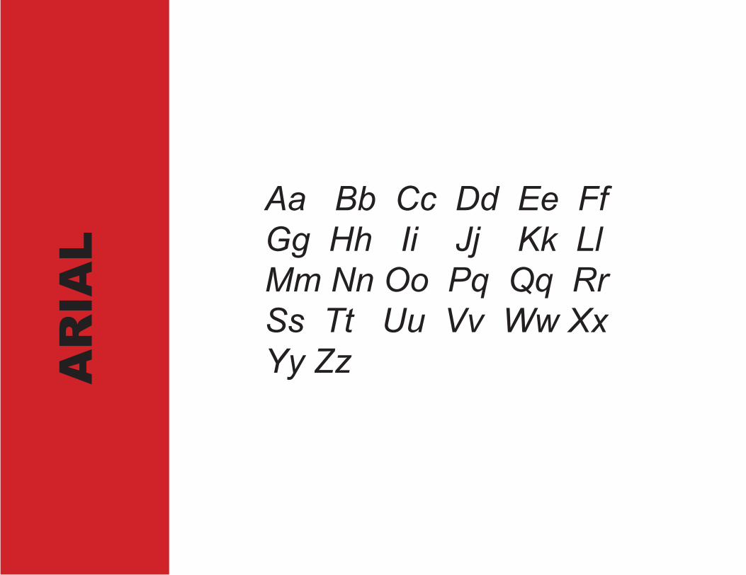
Aa Bb Cc Dd Ee FfGg Hh Ii Jj Kk Ll Mm Nn Oo Pq Qq Rr Ss Tt Uu Vv Ww XxYy Zz

The Arial typeface is one of the most widely used designs of the last 30 years. Drawn in 1982 by Monotype Imaging designers Robin Nicholas and Patricia Saunders for use in an early IBM laser printer, Arial has become a staple for textual con-tent. While some believe Arial has its design roots in the Helvetica typeface, its foundation is actually in the Monotype Grotesque design, drawn at the turn of the last century.