preliminary task v
TRANSCRIPT

Preliminary Task v. Full Product

College Magazine Front Cover
PROS• everything inside
advertised on the cover applies to college students – would appeal to target audience
• Bright colours attract attention
• Use of a college student as model – readers can identify
• Cheap price appeals to students – not in full time work

College Magazine Front Cover
CONS• None of the colours
or text match – no house style
• Photo is not edited very well
• Bright colours and 3D shapes make it look childish – would not appeal to target audience of age 16+
• Looks very unprofessional

Music Magazine Front Cover
PROS• Graffiti-looking text
symbolises rebellion – appeals to target audience
• Red colour theme represents danger and aggression – associated with metal genre
• Eye-line match makes readers feel equal – appeals to audience
• Advertisements are linked to genre – appeals to dedicated fans
• Tone is informal but not colloquial – friendly but not assuming a young audience – contrasts with existing magazines of the same genre

Music Magazine Front Cover
CONS• Writing on cover is all
black and white – does not fit with red colour scheme – also may not be very attention catching
• More expensive than college mag although both target audiences are of student age
• 3D button still looks childish
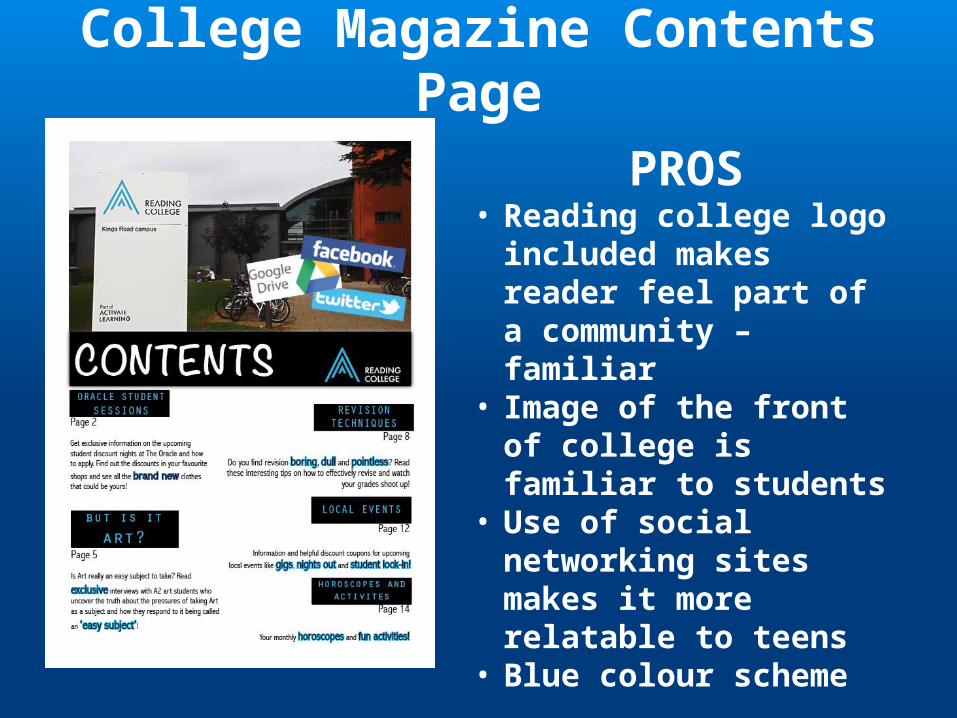
College Magazine Contents Page
PROS• Reading college logo
included makes reader feel part of a community – familiar
• Image of the front of college is familiar to students
• Use of social networking sites makes it more relatable to teens
• Blue colour scheme
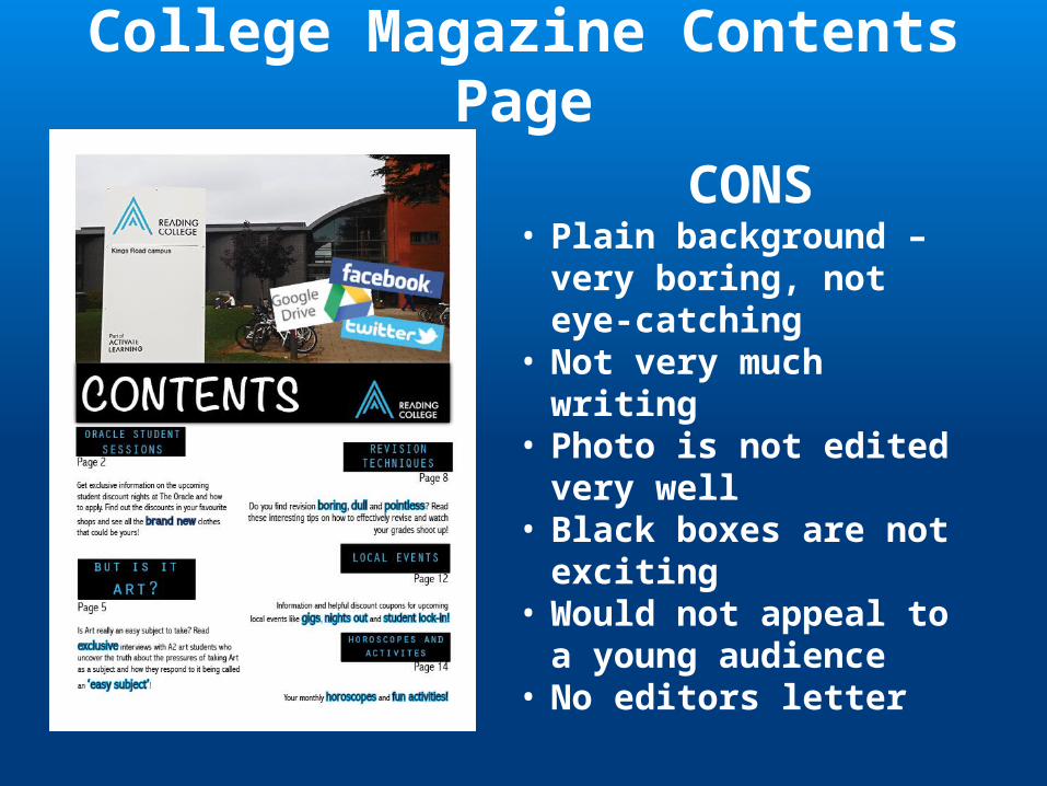
College Magazine Contents Page
CONS• Plain background –
very boring, not eye-catching
• Not very much writing
• Photo is not edited very well
• Black boxes are not exciting
• Would not appeal to a young audience
• No editors letter

Music Magazine Contents Page
PROS• Busy background makes
page look more dynamic and exciting
• Red colour scheme continues• Subjective images makes
readers feel part of the metal community
• Repetition of mag title on contents page reinforces house style and importance of mag
• Female editor challenges stereotypes of mainly metal genre
• Editors letter makes mag more personal
• Same fonts used throughout mag – house style
• Bold italics for band and song names emphasises music over everything else
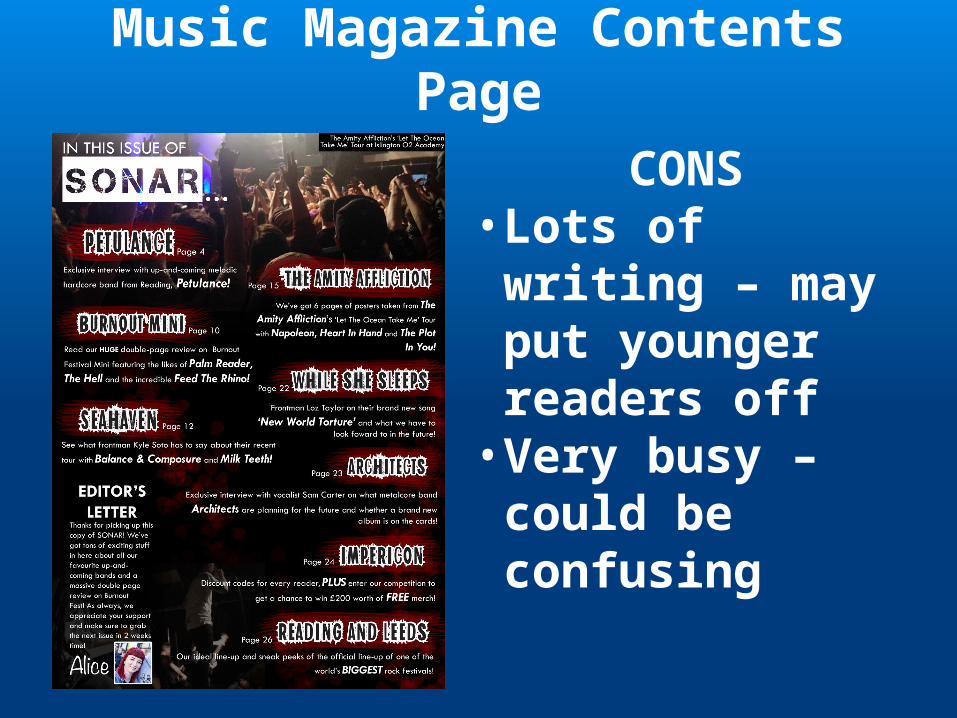
Music Magazine Contents Page
CONS• Lots of writing – may put younger readers off• Very busy – could be confusing