predictive analysis for network data storm
TRANSCRIPT

Predictive Analysis for Network Data Storm
Major Qualifying Project Report
Submitted to the Faculty of
WORCESTER POLYTECHNIC INSTITUTE
In fulfillment of the requirements for the
Degree of Bachelor of Science
Muyeedul Hoque
Mauricio Ledesma
Submitted: January 23, 2014
Advisors:
Arthur Gerstenfeld
Kevin Sweeney

i
Abstract
The project ‘Predictive Analysis for Network Data Storm’ involves the analysis of big data in
Splunk, which indexes machine-generated big data and allows efficient querying and
visualization, to develop a set of thresholds to predict a network meltdown, or commonly
known as a data storm. The WPI team analyzed multiple datasets to spot patterns and
determine the major differences between the normal state and the storm state of the network.
A set of rules and thresholds were fully developed for the Fixed Income Transversal Tools team
in BNP Paribas, who implemented the model in their internal real-time monitoring tool ‘SCADA’
to predict and prevent network data storms.
ii
Executive Summary
Network data storms created in BNP Paribas’ IT infrastructure was causing delays to the work of
traders in the bank. Managers in the Fixed Income Transversal Tools (FITT) department realized
that such network storms were potentially losing the bank essential revenue and thus needed
to be prevented. The FI Transversal Tools department started working on building a monitoring
platform, SCADA, which would act as an early warning system whenever the network reached a
critical stage.
SCADA is still a work in progress; it interprets and analyses large amounts of unstructured data,
and monitors multiple systems, applications and environments. Before the inception of the
project, SCADA was designed to monitor traffic data, e.g. retransmission rates, and visualize the
data. However, the goal of the project was to develop a predictive model which, when designed
into SCADA, would raise alerts prior to processes or applications failing in the network.
The goals of the project were to identify differences and similarities between the ‘normal’ state
and the ‘storm’ state of the network, before developing a comprehensive predictive model
which, when implemented into SCADA, would raise alerts in critical situations to allow the FITT
team to prevent data storms.
The project consisted of five main stages: defining the ‘normal’ state of network traffic data,
comparing the ‘normal’ data with the Storm data, learning to use SPLUNK in order to analyze
big data efficiently, developing thresholds to test the model, and revising thresholds after
testing to define the complete model. The WPI team (from this point on referred as “the team”)
computed ratios (in Excel) of change in units over time for key attributes to form a base for

iii
analysis across all data sets. These ratios allowed the team to differentiate ‘normal’ state of
data to Storm data. As Excel was slow in processing large amounts of data, the team imported
all large data sets into Splunk. Splunk is a log indexer and is useful for querying and visualizing
machine data. After the team was familiarized with Splunk, most of the analysis in the latter
half of the project was completed in Splunk. After completing the analysis, the team developed
thresholds for the predictive model. These thresholds were then tested on a 24 hour sample of
the ‘normal’ data, only to find they were not effective. Therefore, the team devised a new
methodology for prediction with adjusted thresholds. When the new model was tested, the
results were as desired. The final product of the project was the final model with thresholds for
key attributes. When these thresholds will be breached in the network, SCADA will raise alerts
warning the entire team for a potential storm. The team has already started working on
updating SCADA to monitor the network based on the proposed model.
The major challenges faced during the project were related to data collection and cleansing of
raw data collected from log files. Conclusions regarding the storm were also difficult to make
since the team only analyzed data from one storm, and had no knowledge of how other storms
may behave. The hardest challenge for the team, however, was overcoming the learning curve
of Splunk. Splunk is a powerful software package and requires extensive training to use it to its
fullest potential. Moreover, as Splunk licenses were bought around the time the WPI team
started working, no one in the department was then proficient in using Splunk. Reading through
Splunk documentation turned out be a tedious task that employed significant time for the
team. However, all these challenges were overcome with the assistance of the SCADA team and
the project goals were delivered in a timely manner.

iv
Acknowledgements
We appreciate the contributions and efforts of all the people who contributed in helping the
WPI team succeed in this project. The following is a list of people who provided guidance and
support to complete the project:
Wells Powell
Guy Coleman-Cooke
Evans Thereska
Brett Hutley
Martin Gittins
Rafael Castro
FI Transversal Tools Team
John Di Mascio
RV Team
Professor Arthur Gerstenfeld
Professor Kevin Sweeney
Professor John Abraham
Professor Micha Hofri
v
Table of Contents
Introduction .......................................................................................................................... 1
Background Information ........................................................................................................ 3
BNP Paribas ...................................................................................................................................3
SCADA ...........................................................................................................................................4
Splunk ...........................................................................................................................................6
Collectors and Real-Time Event Processors .....................................................................................8
PlatformOne ..................................................................................................................................9
Rendezvous ................................................................................................................................. 11
Spotting Patterns ......................................................................................................................... 14
Machine Learning ........................................................................................................................ 15
Methodology ....................................................................................................................... 18
PlatformOne and RV Storm Data .................................................................................................. 18
Data Cleansing from Log Files ....................................................................................................... 23
ServiceNow Data ......................................................................................................................... 26
Project Timeline .................................................................................................................. 28
Results ................................................................................................................................ 29
Comparison between PlatformOne Data and RV Storm Data ......................................................... 29
Patterns in RV Storm .................................................................................................................... 45
Analysis of Critical Transports ....................................................................................................... 53
RV Storm Data Distribution .......................................................................................................... 56
Threshold Development and Testing ............................................................................................ 61
ServiceNow Data Analysis ............................................................................................................ 73
Conclusions ......................................................................................................................... 75
Recommendations .............................................................................................................. 78
Reflection on the Project ..................................................................................................... 80
Design Component ....................................................................................................................... 80
Constraints and Alternatives ........................................................................................................ 81
Need for Life-Long Learning .......................................................................................................... 82
Appendices ......................................................................................................................... 85
Reference List ...................................................................................................................... 92
vi
Table of Figures Figure 1: Example of PlatformOne Log Data ......................................................................... 11
Figure 2: RV System ............................................................................................................. 13
Figure 3: Project Timeline .................................................................................................... 28
Figure 4: PlatformOne Sample Average Retransmissions Ratio ............................................. 30
Figure 5: RV Storm Average Retransmissions Ratio .............................................................. 30
Figure 6: PlatformOne Sample Maximum Retransmissions Ratio .......................................... 31
Figure 7: RV Storm Maximum Retransmissions Ratio ........................................................... 32
Figure 8: PlatformOne Sample Maximum Outbound Data Loss Ratio .................................... 33
Figure 9: RV Storm Maximum Outbound Data Loss Ratio ..................................................... 33
Figure 10: PlatformOne Sample Maximum Inbound Data Loss Ratio ..................................... 34
Figure 11: RV Storm Maximum Inbound Data Loss Ratio ...................................................... 34
Figure 12: PlatformOne Sample Maximum Packets Missed Ratio ......................................... 35
Figure 13: RV Storm Maximum Packets Missed Ratio ........................................................... 35
Figure 14: PlatformOne Maximum Sample Packets Sent Ratio.............................................. 36
Figure 15: RV Storm Maximum Packets Sent Ratio ............................................................... 37
Figure 16: PlatformOne Sample Maximum Retransmission Ratio by Transport ..................... 38
Figure 17: RV Storm Maximum Retransmissions Ratio by Transport ..................................... 38
Figure 18: PlatformOne Sample Maximum Packets Missed Ratio by Transport ..................... 39
Figure 19: RV Storm Maximum Packets Missed Ratio by Transport....................................... 40
Figure 20: PlatformOne Sample Maximum Outbound Data Loss by Transport ...................... 41
Figure 21: RV Storm Maximum Outbound Data Loss Ratio by Transport ............................... 41
Figure 22: PlatformOne Sample Maximum Retransmissions Ratio by Service ....................... 42
Figure 23: RV Storm Maximum Retransmissions Ratio by Service ......................................... 43
Figure 24: PlatformOne Sample Maximum Packets Missed Ratio by Service ......................... 44
Figure 25: RV Storm Maximum Packets Missed by Service ................................................... 44
Figure 26: PlatformOne Sample Maximum Packets Sent Ratio by Service ............................. 45
Figure 27: RV Storm Maximum Packets Sent Ratio by Service ............................................... 45
Figure 28: RV Storm Retransmissions Deltas ........................................................................ 47
Figure 29: RV Storm Packets Sent Deltas .............................................................................. 48
vii
Figure 30: RV Storm Peak Time Averages Compared to Overall Average ............................... 50
Figure 31: RV Storm Retransmissions Correlations ............................................................... 51
Figure 32: RV Storm Retransmissions and Packets Missed For 4 Min Peak Period ................. 52
Figure 33: RV Storm Peak Time Averages for Top 10 Transports with Highest Retransmissions
Compared to Overall Average .............................................................................................. 54
Figure 34: RV Storm Data Distribution.................................................................................. 57
Figure 35: RV Storm Top 10 Most Frequent Services ............................................................. 58
Figure 36: RV Storm Data Distribution by Services ................................................................ 59
Figure 37: RV Storm Data Distribution for Number of Hosts Running a Service ..................... 60
Figure 38: PlatformOne Sample Maximum Retransmissions Ratio by Transport ................... 63
Figure 39: PlatformOne Sample Maximum Packets Received Ratio by Transport .................. 64
Figure 40: PlatformOne Sample Maximum Packets Missed Ratio by Transport ..................... 65
Figure 41: PlatformOne Sample Maximum Packets Sent by Transport .................................. 65
Figure 42: PlatformOne Sample Maximum Inbound Data Loss Ratio by Transport ................ 66
Figure 43: PlatformOne Sample Maximum Outbound Data Loss Ratio by Transport ............. 67
Figure 44: PlatformOne Sample 10:00-10:30 AM Maximum Retransmissions Ratio............... 69
Figure 45: PlatformOne Sample 10:00-10:30 AM Maximum Packets Missed Ratio ................ 70
Figure 46: PlatformOne Sample 11:00-11:30 AM Maximum Retransmissions Ratio............... 70
Figure 47: PlatformOne Sample 11:00-11:30 AM Maximum Packets Missed Ratio ................ 71
Figure 48: PlatformOne Sample 11:30 A.M. - 12:00 P.M. Maximum Retransmissions Ratio ... 71
Figure 49: PlatformOne Sample 11:30 A.M. - 12:00 P.M. Maximum Packets Missed Ratio .... 72
Figure 50: SQuirreL SQL Client User Interface ....................................................................... 85
Figure 51: Splunk Web Home User Interface ........................................................................ 86
Figure 52: Splunk Web Dashboard ....................................................................................... 87
Figure 53: Sample of PlatformOne Raw Data from Log Collector ........................................... 88
Figure 54: Example of Sorted PlatformOne Data (in Excel) .................................................... 88
Figure 55: Latest Proposed Solution Conceptual Information Flow for SCADA ....................... 89
Figure 56: SCADA Architecture Design .................................................................................. 90
Figure 57: Screenshot of SCADA Wiki Page for Splunk Information ....................................... 91

viii
Table of Tables Table 1: Summary of Financial Results ................................................................................... 4
Table 2: Overall Storm Data Statistics .................................................................................. 46
Table 3: Two Hour PlatformOne Sample Statistics ................................................................ 46
Table 4: Overall RV Storm Data Statistics Without Peak 4 Minutes ....................................... 48
Table 5: Peak 4 Minute RV Storm Statistics .......................................................................... 49
Table 6: Legend Displaying Service Names for Top 10 Transports during Peak Period ........... 55
Table 7: Total Number of Transports Up per 5-Minute Period in RV Storm ........................... 57
Table 8: Initial Thresholds .................................................................................................... 61
Table 9: Number of Times the Initial Thresholds Breached ................................................... 67
Table 10: Final Thresholds ................................................................................................... 68
Table 11: Number of Incidents by Priority in Service Now Database ..................................... 74

1
Introduction The project at BNP Paribas was sponsored by the Fixed Income Transversal Tools department.
The project was centered on the internal monitoring tool SCADA, which acts as an early warning
system for application problems and automatically provides support personnel the appropriate
information needed to resolve issues quickly. SCADA was designed to monitor major
applications running in the network, since network crashes could results in huge delays to all
the systems connected to the network. Therefore, it was essential to prevent network
meltdowns in order to keep all systems running efficiently at all times.
SCADA is a work-in-process project at BNP Paribas. Once completed, it will organize and
process large amounts of data related to each system it monitors. It can also be used for
capacity management, in addition to analyzing network traffic data from all applications. The
tool processes information from various other applications and data sources. If there are
problems within the firm’s infrastructure, the support staff will be able to drill down the likely
root-cause via the web interface and will have access to the knowledge base. The knowledge
base may be updated through the web interface by the support or development teams as new
procedures for resolving issues are developed.
The project primarily involved understanding data about internal application states, and
examining data collected from network traffic. The main objective of this project was to obtain
a thorough understanding of how SCADA works and processes data in order to combine
different statistical analysis, data mining, and pattern spotting techniques to develop a model
to predict an “RV Storm” – a network data storm in which one or many components of the
network crash. It was easy to realize the incidence of a storm in SCADA once it had already

2
occurred; however, fixing the system once the failures had occurred was time consuming,
especially as the damage to the network would already have been done. A storm materializes
and completes its entire cycle within a few minutes, and a full network data storm can cause
huge delays to all transports that experience the storm. The goal of the project was to be able
to predict when a storm is about to occur in order to take action and prevent it from happening
(for more information on the BNP Paribas team’s proposed solution and the SCADA
architecture design see Appendix F and G). The WPI team planned to develop a model, which,
when implemented into SCADA, would raise alerts whenever the network reached a critical
stage and would provide the SCADA team ample time to take preventive action.

3
Background Information
BNP Paribas BNP Paribas is one of the largest financial institutions in the world, with a presence in 78
countries and almost 190,000 employees. The firm has more than 145,000 employees in Europe
and is a leading financial institution in the Eurozone.1 According to a report by Relbanks, BNP
Paribas is the fifth largest bank in the world by total assets, with total assets of €1,907,290
million euros, based on their balance sheet as of December 31, 2012. 2
The BNP Paribas group was founded in 2000 from the merger of BNP and Paribas. The group
inherited the banking traditions of the two banks: BNP, the first French with origins dating back
to 1848, and of Paribas, an investment bank founded in 1872. The group was ranked as the
leading bank in the Eurozone by Forbes in 2011, and also has a strong presence in the
international market. In the last decade, the group has had two important mergers and
acquisitions that helped it strengthen its presence in the European market. BNP Paribas
acquired the Italian bank BNL Banca Commerciale in 2006 and the Belgian bank Fortis joined
the Group in 2009.3
According the 2012 annual report, the BNP Paribas Group (‘the firm”) demonstrated robust
results during this continuously difficult economic environment, by sticking to their solid
business model. The group went through an adjustment plan that significantly enhanced their
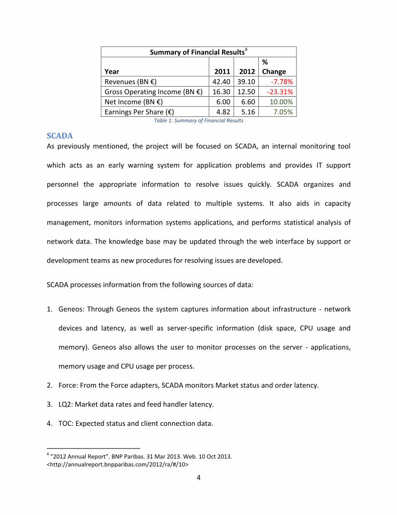
financial ratios. Table 1 shows a summary of the firm’s financial results.
1 “About us | La banque d’un monde qui change”. BNP Paribas. n.d. Web.10 Oct 2013.
<http://www.bnpparibas.com/en/about-us> 2 “Top Banks in the World 2013”. RelBanks. 31 Mar 2013. Web. 11 Oct 2013. <http://www.relbanks.com/worlds-
top-banks/assets> 3 “A Group with Global Reach”. BNP Paribas. n.d. Web. 11 Oct 2013. <http://www.bnpparibas.com/en/about-
us/corporate-culture/history>
4
Summary of Financial Results4
Year 2011 2012 % Change
Revenues (BN €) 42.40 39.10 -7.78%
Gross Operating Income (BN €) 16.30 12.50 -23.31%
Net Income (BN €) 6.00 6.60 10.00%
Earnings Per Share (€) 4.82 5.16 7.05% Table 1: Summary of Financial Results
SCADA As previously mentioned, the project will be focused on SCADA, an internal monitoring tool
which acts as an early warning system for application problems and provides IT support
personnel the appropriate information to resolve issues quickly. SCADA organizes and
processes large amounts of data related to multiple systems. It also aids in capacity
management, monitors information systems applications, and performs statistical analysis of
network data. The knowledge base may be updated through the web interface by support or
development teams as new procedures for resolving issues are developed.
SCADA processes information from the following sources of data:
1. Geneos: Through Geneos the system captures information about infrastructure - network
devices and latency, as well as server-specific information (disk space, CPU usage and
memory). Geneos also allows the user to monitor processes on the server - applications,
memory usage and CPU usage per process.
2. Force: From the Force adapters, SCADA monitors Market status and order latency.
3. LQ2: Market data rates and feed handler latency.
4. TOC: Expected status and client connection data.
4 “2012 Annual Report”. BNP Paribas. 31 Mar 2013. Web. 10 Oct 2013.
<http://annualreport.bnpparibas.com/2012/ra/#/10>

5
5. SAM: Process Status, static Data, TCP connections, and SAMSon connectivity.
6. Qpasa: Message Broker Performance.
7. Log Files: Application Specific.
8. Databases: Monitor the status and disk usage of various databases - Oracle and SQL Server.
Monitor GFIT status and the status of the TOC database.
9. Blackbird / DSC
10. Coherence: Turbo Booking Latency.
11. Data Warehouse: Quote Latency.
12. RV: Data loss, message Rates, and slow consumers.
13. ION: Service State and market status.
14. MQ: Message Queue Data
15. MF Heartbeats
16. MF Alerts
17. Blade Logic Deployment Events
18. Depot Deployment Events
Operating SCADA to monitor and support applications can become an expensive project. BNP
Paribas has been researching a number of technologies to improve the quality of the project
and reduce the cost. The issue is that many solutions have been found that solve the problem
partially, but there does not seem to be a suitable unique product to the complex problem
requirements. The group that was in charge of looking for a solution suggested that the firm
should adopt a hybrid solution utilizing the following four tools:

6
Splunk Splunk is an application that was designed to make machine data accessible, usable and
valuable to everyone. Machine data is one of the fastest growing kinds of big data, since it is
being generated by multiple sources such as websites, servers, networks, applications and
mobile devices among others. The objective of Splunk is to turn machine data into valuable
information across any industry.5 The product overview states that, Splunk Enterprise collects
and indexes any machine data from any source in real time. This software allows the user to
search, monitor, analyze and visualize big data. Splunk has many built in options that allow the
user to create different charts, tables, statistics and dashboards in order to provide a better
understanding of the machine data.
Challenges with Splunk
The following section describes some of the most important challenges that the WPI team
(from this point on referred as “the team”) faced while using Splunk. The project managers
wanted the WPI team to use Splunk since they had recently purchased it and they wanted to
test the capabilities of the software package. Since the Bank purchased Splunk a few months
before the WPI Project’s inception, there was no one in the company who had expertise in
using the program. Therefore whenever there was a problem, the team had to look through
Splunk documentation and online forums to find a possible solution.
Tedious documentation, no interactive help or videos
A major challenge when learning to use Splunk was that even though some sections of the
documentation are quite useful, they were still tedious to navigate through. The
5 "Splunk | A Different Kind of Software Company." Splunk. n.d. Web. 1 Dec. 2013.
<http://www.splunk.com/company>

7
documentation for users is not well organized since each document redirects to several other
links. After going through the steep learning curve of Splunk, it is easy for any user to realize
that interactive video tutorials would make the learning process much simpler and more user-
friendly.
Setting up Fields
One problem that the team encountered when adding data to Splunk was that the platform
was not as user friendly as it was initially expected. Splunk’s promotions make it seem as if it
can index and analyze any kind of data; however, even though this might be true, the format in
which different machines log their data may vastly differ from one another. This is why it is
highly unlikely that when data is imported the first time, it would be indexed correctly by
Splunk. In order to make Splunk index data accurately, the team formatted the raw data as
required, as well as set up the platform to correctly read each field which turned out to be a
lengthy and tedious process.
Order Data by Transport
As previously mentioned, the data that was analyzed was quite complicated as the source
adapters logged more than four thousand different transports in the same time period. Since
there is a vast amount of data from different transports, it is very hard for Splunk to understand
how the data is organized and grouped together. In order to efficiently analyze the data, the
team cleaned the data manually, sorted it correctly and then computed necessary calculations
using Microsoft Excel. The process to manually clean the data covered a major portion of the
time designated for analysis. The process is described later in detail.

8
Inability to Plot Exact Points
One weak aspect of Splunk is the fact that it cannot graph exact data values. For instance, if the
user wants to create a time chart plotting the values of the last ten logs, Splunk cannot
compute this command. The only way that Splunk computes time charts is by using aggregate
functions such as minimum, maximum and average commands. For multiple kinds of data, it
may be quite necessary to plot exact values over time. As mentioned in one of the Splunk
tutorial books, “Time is always ‘bucketed’, meaning that there is no way to draw a point per
event.”6 Furthermore, some users try to get around this limitation by creating very small
buckets, in order to only have on value per bucket; however, the problem with this method is
that if the timespan for each buckets is too small, Splunk creates too many buckets and the
charts are truncated – without allowing the user to scroll sideways on the plot, which
eliminates essential data from the graph7.
Collectors and Real-Time Event Processors The firm has expressed that the major application modules for the SCADA project will be
collectors and real-time event processors. Collectors are nodes that gather information from
various sources, including indexed application log data. On the other hand, real-time event
processors analyze raw data from the collectors and have the ability to merge the data from
different sources. This system contains a rules engine to detect trends and anomalies. The real-
time event processors store persistent model states in a database and reports the results to the
user interface.
6 Bumgarner, Vincent. “Implementing Splunk: Big Data Reporting and Development for Operational Intelligence”.
Jan 2013, Page 63 7 Bumgarner, Vincent. “Implementing Splunk: Big Data Reporting and Development for Operational Intelligence”.
Jan 2013, Page 71
9
PlatformOne PlatformOne is a comprehensive product founded mainly around the Real Time Market Data
arena and has a flexible architecture which allows easy integration with a vast number of
environments. PlatformOne components may be provided on different platforms; at BNP
Paribas, it is being deployed in Windows, Solaris and HP UNIX variants, many of which have
been installed and in use since the beginning of 2000.
PlatformOne is a communication infrastructure based on TCP/IP point-2-point protocol. This
communication infrastructure requires at least two PlatformOne components. All of the
platform’s components rely on the protocol to communicate and fall in the following two
categories:
PlatformOne based only: the component connects only via PlatformOne and is
considered to be a client application.
PlatformOne and third party based: The component connects to both a third party
infrastructure and PlatformOne and is considered to be a Gateway or Agent.
The two core components of PlatformOne are Gateways/Agents and Client Applications.
Gateways or Agents allow the platform to communicate in a smooth manner with non-
PlatformOne environments. Some of the common agents used at BNP Paribas are the TIBCO/RV
and TIBCO/CiServer versions. On the other hand, Client Applications communicate only with
PlatformOne and are PlatformOne clients. It is important to take into account that these are
not necessarily desktop applications. An essential aspect of this project was analyzing large

10
amounts of data logs from PlatformOne to establish a base scenario. The team would then use
the base scenario to compare the RV Storm data. 8
Attributes of Data
The raw data collected from PlatformOne had multiple attributes. The following section will
describe how the data looks and what each attribute represents. When the raw data is
collected, it is stored in a ‘.txt’ file format and every event represents one line in that file. Data
is logged almost every millisecond; however, it is important to take into account that the data
that was collected from PlatformOne was a conglomerate of around four thousand different
transports. One transport can be defined as a combination of a Host IP and a Service. The data
needed to be analyzed by each transport since data from different transport cannot be
compared to each other. The most important attributes from PlatformOne data were identified
after thorough meetings with both the SCADA and RV teams, and are described as follows:
Bytes Received: the number of RV message bytes received by the daemon on that
transport.
Bytes Sent: the number of bytes that have been poured into the network.
Host IP: the address of the host containing the daemon.
Messages Received: the number of messages that have been received.
Messages Sent: the number of messages that have been sent.
Outbound Data Loss: the amount of data that has been lost by the emitter.
Inbound Data Loss: the amount of data that has been lost by the listener.
8 “PlatformOne”. BNP Paribas. n.d. Web. 25 Nov. 2013. BNP Paribas Internal Wiki Page.

11
Packets Missed: the number of packets that have been missed (multiple packets can make
up a single message, and, in contrast, multiple messages can make up one packet too).
Packets Received: the number of packets that have been received.
Packets Sent: the number of packets that have been sent.
Retransmissions: the number of times a message or packet needed to be retransmitted to
reach the listeners.
Uptime: how long the transport has been up (recorded in seconds).
Figure 1 shows an example of how the PlatformOne logs look. As it was previously mentioned,
each unique combination of Host IP and Service represent a different transport. It is important
to take into account that the numbers the logs display are the sum of each attribute for the
current uptime period, since all values are recorded in a cumulative manner.
Figure 1: Example of PlatformOne Log Data
Rendezvous Rendezvous (RV) is a messaging system widely used among many banks. RV allows easy
distribution of data across different applications in a network. It supports many hardware and
software platforms, so many programs running simultaneously can communicate with the

12
network efficiently. The RV software includes two prime components – the RV programming
language interface (API) and the RV daemons.
All the information that passes through the network is first processed through the RV daemon.
RV daemons exists on each computer that is active in the network and processes information
every time it enters and exits host computers, and even for processes that run on the same
host. There are many advantages of using RV APIs. Some of these are the following:
RV eliminates the need for programs to locate clients or determine a network address.
RV programs can use multicast messaging which allows distribution of information quickly
and reliably to customers.
RV distributed application systems are easily scalable and have longer lifetimes compared to
traditional network application systems.
RV software manages the segmenting of large messages, recognizing packet receipt,
retransmitting whenever packets are lost, and arranging packets in queue in the correct
order.
The RV software is also fault tolerant – the software ensures that critical programs continue
to function even during network failures such as process termination, hardware failure or
network disconnection. RV software achieves fault tolerance by coordinating a set of
redundant processes. Each time one process fails, another process is readily available to
carry on the task.

13
Figure 2 illustrates the role of an RV daemon in the network. Although Computer 1 only runs
Program A and Computer 2 runs Programs B and C, they can all communicate with each other
in the network through the RV daemon.9
Figure 2: RV System
RV Storm
RV software is essentially a messaging platform where various applications across all active
hosts in the network send messages to each other. As far as an RV daemon is concerned, all
applications are senders and receivers of messages in the system. When a receiver in the
network misses inbound packets either through hardware, traffic, configuration issue, or for
some other reason, it asks for retransmissions for the missed packets from the sender. The
9 “TIBCO Rendezvous Concepts”. TIBCO Software Inc. July 2010. Page 7
14
sender usually stops sending current data to satisfy the retransmission request. As the
retransmissions are of high priority, they are sent as fast as possible which cause a peak in
traffic volumes, and the effect magnifies when this process involves multiple receivers and
senders. The minor peak in traffic might cause the receivers not just to miss the new data but
also the re-transmitted data. The daemon also usually has a Reliability-duration of 20 or 60
seconds, which means that it holds packets which are being processed for not more than 20 or
60 seconds. The Reliability time means that packets which were held in queue to pass after the
re-transmitted data may also be lost (the daemon processes all packets sequentially, and so it
will hold packets which are of a later sequence in comparison to the packets that were missed
until the missed packets are re-transmitted successfully). In addition, duplicate re-transmission
requests for the same packet within a similar time frame are aggregated. The receiver may
therefore miss the re-transmitted data, and in that case continue to miss further packets. The
effect amplifies and other receivers may start to miss data due to large retransmission volumes
and this eventually leads to a network meltdown, which is commonly known as an RV Storm.
Certain best practices can be followed in order to avoid storms. These are as follows:
Redistribution of data through multiple transports or asymmetrical multicast groups.
Initiate retransmission control at both the Sender and the Receiver ends.
More efficient management of the RV messages within the applications.
Spotting Patterns Spotting Patterns is the ability to grasp complicated phenomena and detect trends from large
data sets. This has been possible at the operational level in recent years as the ability for most

15
companies to collect and store huge amounts of data has rapidly improved. Pattern recognition
is a new skill and there are no strict methodologies or techniques in place that will assist
managers to do this conveniently. Essentially, pattern recognition dives down to finding
meaningful and necessary information from a chaotic masses of data. Data mining techniques
are used heavily to dive into large data sets in order to find meaningful information. It is almost
like making numerous hypotheses at the same time and testing for them. Therefore, one of the
initial goals of pattern recognition is to narrow down the set of possibilities, which makes the
ultimate goal closer to the reach. One of the mistakes that beginners make during the pattern
recognition process is that they latch onto pre-existing hypothesis in the data and look for
similarities that will confirm their hypothesis. This must be avoided to extract the most
interesting signals from the data, and thus ignoring the noise.10
Machine Learning Machine Learning is essentially a branch of Artificial Intelligence. It aims to intelligently mirror
human abilities through machines. The key factor is to make machines ‘learn’. Learning in this
context refers to inductive inference, where one observes current examples about a
phenomenon, uses probabilistic models, and instead of remembering, it forms predictions of
unseen events.
An important aspect to Machine Learning is classification, which is also referred to as pattern
recognition. One develops algorithms to construct methods for detecting different patterns.
Pattern classification tasks are broken down into three tasks: data collection and
10
Sibley, David. Coutu, Diane L. “Spotting Patterns on the Fly: A Conversation with Biders David Sibley and Julia Yoshida”. Harvard Business Review. Nov 2012. Web. 13 Oct 2013. <http://hbr.org/2002/11/spotting-patterns-on-the-fly-a-conversation-with-birders-david-sibley-and-julia-yoshida/ar/1>

16
representation, feature selection (characteristics of the examples), and classification. Some
traditional machine learning techniques are as follows11:
1. K-Nearest Neighbor Classification: k points of the training data closest to the test point
are found, and a label is given to the test point by a majority vote between the k points.
This is a common and simple method, gives low classification errors, but is expensive.
2. Linear Discriminant Analysis: Computes a hyper plane in the input space that minimizes
the within-class variance and maximizes the between class distance. It can be efficiently
used in linear cases, but can also be applied to non-linear cases.
3. Decision Trees: These algorithms solve the classification problem by repeatedly
partitioning the input space, to build a tree with as many pure nodes as possible, i.e.
containing points of a single class. However, large data sets results in complicated errors
when these algorithms are used.
4. Support Vector Machines: This is a large margin classification technique. It works by
mapping the training data into a feature space by the aid of a so-called kernel function
and then separating the data using a large margin hyper plane. They are primarily used
in multi-dimensional data sets.
5. Boosting: This is another large margin classification technique. The basic idea of
boosting and ensemble learning algorithms is to iteratively combine relatively simple
base hypotheses – sometimes called rules of thumb – for the final prediction. A base
learner to define the base hypothesis and then that hypothesis is linearly combined. In
11
Ratsch, Gunnar. “A Brief Introduction Into Machine Learning”. 2004. Web. 13 Oct 2013. <http://events.ccc.de/congress/2004/fahrplan/files/105-machine-learning-paper.pdf>

17
the case of two-class classification, the final prediction is reached by weighing the
majority of the votes.
18
Methodology Before arriving to BNP Paribas, the goal of the project was to build a model to predict RV
Storms before they occurred. The team studied background material to gain an understanding
of machine learning, data mining, and spotting pattern techniques before arriving on site.
The team, therefore, needed to develop techniques to spot issues prior to failure. In order to
achieve this, the team began the project with the mindset of utilizing data mining techniques to
transform and analyze current data, and provide visualizations of big data. The following
sections describe in detail how data was collected and analyzed and the processes which were
followed to deliver the final results.
PlatformOne and RV Storm Data One of the first tasks of the project was to analyze data collected from one of the platforms –
PlatformOne– monitored by SCADA. This data was received in log file form, which captured
network activity over a period of two days. The goal of analyzing this data set was to find
patterns and inconsistencies in the data to understand how most processes behave in a normal
state. Once the “normal” behavior of data was analyzed, it would give the grounds to draw
comparisons with the RV Storm data which would be analyzed later. Differences in the two
different data sets would indicate how and why a storm occurs, which would allow the team to
accomplish the final goal of developing a model to predict storms. Although PlatformOne data
and the storm data (which came from the RV system) are not exactly the same kinds of data,
they are close enough for comparing the normal state with the storm state.

19
The tools that captured the PlatformOne and RV data recorded two different types of entries –
one which defines the service, network and host addresses, and the other which records
network traffic flow. The first task was to extract all the log files to Microsoft Excel, and then
separate the two types of records, since only the values from the second entry type needed to
be analyzed. Once the entries were separated, the team started to graph all values across the
entire period of time for each attribute (the list of attributes for the PlatformOne and RV log
files and their respective meanings can be found in the PlatformOne Attributes of Data section).
It was found that all attributes follow cyclical patterns when emitting data. The correlations
amongst the related attributes (especially with retransmissions) were computed. Some
graphing techniques were used such as scatter plots and box-and-whisker plots to find out the
range and the existence of mild and extreme outliers. It turned out that all attributes had a
significant number of extreme outliers, but after a thorough meeting with the head of the RV
team, John Di Mascio, the reasons behind such large ranges in the data sets were understood.
John explained that the reason for the cyclical data is because each process or transport only
emits new feeds of data every 90 seconds. However, since there are thousands of transports
running at the same time, the tool that was used to collect the PlatformOne sample captured
data almost every millisecond, so the data is a mixture of thousands of transports that cannot
be compared between each other. It was also discovered that each unique transport or process
in the network was defined by the unique combination of the service number and the host
address, as one host could operate through separate services. This meant that it is not correct
to analyze the data by every host to detect patterns, but rather by each unique process or
transport in the network. In addition, all data was gathered in a cumulative manner over time,
20
i.e. all values for all attributes for a particular process increased with time. So outliers in the
data set came from processes that were running for a long period of time.
Some formulas were used in Excel to group all distinct entries per process, with entries
separated by approximately 90 seconds. In certain occasions, a process would run
simultaneously in two different ways emitting and receiving different bytes of information. This
is probably due to a process running two different transports on the same system at the same
time. At times, a process running on a particular system would die out and restart on the same
system, adding further noise to the data. The team had to sort the data set by taking these
anomalies into account. Once all the data set was sorted in the correct sequence, it was
possible calculate the change in key attributes for every approximate 90 second period. It was
decided to compute the difference across time as all data from PlatformOne and RV was
gathered in a cumulative manner. So essentially it was not significant to analyze absolute
numbers to study trends and patterns in the data; the change in values for each process over
time was needed to be analyzed to discover interesting correlations. Sorting out the data for
every distinct process for the period of time in which it was active took majority of the time
during the analysis for both the data sets of PlatformOne and RV Storm. As it was the first time
anyone analyzed these data sets from the SCADA team, there was not a comprehensive process
in place to organize this data before.
John explained how the transports communicated with each other by sending and receiving
messages though the RV network. He mentioned that the most crucial attributes were Inbound
Data Loss, Outbound Data Loss, Packets Missed and Retransmissions. During a storm, or the
period leading up to a storm, one or more transports are expected to lose data and miss
21
packets at a rate significantly greater than usual. Apart from these attributes, it was also
computed the difference for every distinct time period for the attributes Packets Received and
Packets Sent. One of the reasons behind this was because during a storm, an influx of messages
or packets is likely to circulate in the network. From all the meetings with the SCADA and the RV
team, the conclusion that the best indicator to an RV Storm is high retransmissions was
reached. Therefore, the overall trends of all the key attributes were analyzed, and the team
also dived further into each of their relationships with retransmission changes.
Once the change in each attribute for each approximate 90 second period was computed, the
team moved on to compute the change per second. This is because the data was not consistent
in providing new feeds of data exactly every 90 seconds. Some data points were either slightly
less than 90 or slightly more than 90 seconds apart, while some rare points were off by a larger
time frame. Comparing all attributes on a ratio of change per second standardized the process
and allowed to draw conclusions from the analysis. In this way the rate of change per second
for every distinct process was computed (when a process restarted, it was treated like a new
process) for the attributes – Inbound Data Loss, Outbound Data Loss, Packets Received, Packets
Sent, Packets Missed and Retransmissions.
The average ratios for all the key attributes over the 36 hour period from the PlatformOne data
set were analyzed. The team also looked at the maximum ratio (which gave a better indication
if certain transports were acting bizarre at certain periods) over the entire time frame. Later, a
time frame of 30 minutes on a Thursday was selected to compute graphs as the storm data
from RV was for a 30 minute period on a Thursday between 3:40 PM to 4:06 PM. This ensured
to remove as much bias as possible from the comparisons. The team also made similar graphs
22
for the ratios of all attributes for the RV Storm data and generated similarities and differences
between the two data sets. After looking at the graphs for the 30 minute period, it was noticed
that most of the high fluctuations were occurring during a 4 minute period close to the end of
the time frame in the RV Storm data set. The differences in ratios (changes in values per
second) were significantly higher in that 4 minute period compared to the average values in the
30 minute period. As John mentioned that a complete storm happens within a few minutes, it
was decided to further analyze that specific time frame keeping in mind that the storm most
likely happened there. Multiple correlations between changes in values of key attributes and
changes in retransmissions were drawn, as retransmission changes was the best indicator for a
storm. Once the team dived further down into the 4 minute period, the transports with the
highest retransmission ratios for that time frame were spotted as they were skewing most of
the data, and probably causing the storm to start. Through the analysis, the team tried to
compare the normal state and RV Storm state as definitively as possible to develop a model of
how a storm can be spotted before it goes through its entire cycle.
Following the data analysis, the team developed initial thresholds to predict storms. These
thresholds were based on the six attributes previously deemed as the most important ones.
Once the thresholds were developed, they had to be tested in order to assess their validity. The
thresholds were then tested against a 24 hour PlatformOne data sample. Following the results
of testing, Packets Received was eliminated from the key attributes list and the rest of the
thresholds were adjusted. As the thresholds were being breached more times than desired, the
team devised a new model for prediction – monitoring RV by using a combination of thresholds
with the Retransmissions threshold staying constant. Therefore, the Retransmissions threshold,
23
in addition to another key attribute threshold, would have to be breached within a specific time
period to raise an alert. After further analysis, the team fixed the timeframe between the two
breaches to three minutes. The new model was tested again on the same PlatformOne data
sample and the results were in line with desire expectations. The final model was then
presented to the SCADA team for effective use in SCADA.
Data Cleansing from Log Files All the data used in this project was collected from log files. Splunk is programmed to read all
kinds of log files, and therefore whenever it was possible to use the raw data for analysis, the
log files were just imported directly to Splunk. Splunk prefers the data to be in key-value pairs,
and luckily most of the data was in this format. Although the data was in the correct format,
sometimes the team faced some difficulties making Splunk read and understand the data in the
desired manner. To successfully import raw data into Splunk, the team first created an index
and imported a directory of files into that index, with usually a source type of ‘comma
separated values’. All the log files from a particular collector can also be zipped together, and
then be imported to Splunk as a zip file.
In occasions, the team has had to remove certain brackets from the log files in order for Splunk
to read the timestamps correctly. The timestamp also needed to be the first key-value pair in
each row of the data set. In some cases, the log files were not in comma separated value
format, which would occasionally create problems. Those files were imported to excel and then
saved as a ‘.csv’ file. When this was imported to Splunk, Splunk could easily discern all the
fields.

24
However, in spite of Splunk being a powerful log indexing software, separating each transport
by the unique host IP address and service number combination and then computing the
difference in values for each attribute from successive values seemed an impossible task in
Splunk. A Splunk specialist may have been able to do this with several complicated queries, but
that level was beyond the expertise of the team. More importantly, it would be extremely
difficult to account for situations when two transports were running different tasks
simultaneously, or when a transport would die out and restart on the same service. In fact, the
team had great difficulty sorting that out even in Excel.
Once everything is imported correctly into Excel, the fields which are actually headings needed
to be turned into column names. For the PlatformOne and RV data, the next step would be to
sort all the data in terms of unique transports and in order of increasing uptime, so that the
difference in values could be calculates before computing the ratio of change per second.
Following are the first set of steps taken to accomplish that:
1. Sort the data in the following order –
a. Unique Transport (combination of host IP address and service number)
b. Date (oldest to newest)
c. Uptime (smallest to largest)
2. Use Algorithm –
a. If successive unique transports are the same and the difference in successive
uptime is greater or equal to zero, then return current attribute value minus
previous attribute value.

25
b. Else, if successive unique transports are the same and the difference in
successive uptime is less than zero, then return ‘Transport Restart’ (as that
shows the transport has restarted).
c. Otherwise, return ‘New transport’ (as otherwise the successive unique
transports will not be the same).
3. The previous algorithm will work for almost all records apart from the times when a
transport is running two different processes at the same time, emitting different sets of
values for each attribute in specific intervals. To find these anomalies, one needs to
filter the results and look for negative values for differences in one or more attributes.
Once the ranges are found for all these anomalies, each set will have to be sorted
separately using the following rules:
a. Sort the range in the following order –
i. Unique Transport
ii. Bytes Received
iii. Date (oldest to newest)
4. The algorithm in Step 2 will also fails in cases when a transport restarts after being up
for only 90 seconds (or for a period of time in which there is only one log in the system).
In such a case, the next log for that particular transport will state that that it has been
up for 90 seconds since it restarted. As the algorithm defines a Transport Restart when
an uptime is lower than the previous uptime, it does take this scenario into
consideration. For such cases, one has to manually change the results to ‘Transport
Restart’ (an easy way to do this would be to filter all Uptime Diff values by zero).
26
5. Once all the differences are calculated properly for each transport, ratios should be
calculated for each attribute. The ratio computes the rate of change per second. The
formula to calculate the ratios is to divide the change in an attribute by the change to its
respective uptime (which is in seconds). This will give the change per second for each
attribute to a particular transport.
Once all the ratios are calculated in Excel, descriptive statistics can be computed using these
values. As the rate of change is a better indicator of the true nature of network traffic over
time, computing the changes per second, or at least the changes per period of time, is essential
for analysis. These ratios can be easily analyzed for further discoveries in Splunk, so once they
are all computed, the Excel file can be saves as a ‘.csv’ file and then imported to Splunk. Splunk
can then be able to read all the data appropriately, including all the respective ratios.
ServiceNow Data In order to access the ServiceNow database, the team first installed SQuirreL SQL Client and
mapped the program to the correct driver in the bank network. After setting up the SQL
software, two queries were used in order to retrieve all the data from the ServiceNow
database. The ServiceNow data comprised of assistance requests and the goal for its analysis
was to determine if the ServiceNow data correlated to the RV Storm data from May 23, 2013
(for an example of the SQuirreL user interface, see Appendix A). After retrieving all the data
from the database, the information was extracted to a spreadsheet in order to be able to easily
manipulate it and compute statistics. Once the information was on a spreadsheet, the mean,
standard deviation, and the maximum number of incidents per day were computed. The

27
approach behind this methodology was to determine if there were any irregularities in the data
for the day of the RV Storm (May 23, 2013). The results from this analysis are shown in the
Results section under ServiceNow Data Analysis.

28
Project Timeline The seven weeks that the team was in London was divided into 11 different tasks:
1. Integration to the team and compliance.
2. Gathered data for the project.
3. Analyzed PlatformOne data to define the “normal state” of the system.
4. Learned to use Splunk.
5. Analyzed RV Storm data to discover patterns during system failures.
6. Utilized Splunk to compare and contrast “normal” state with RV Storm.
7. Developed thresholds to predict storms.
8. Evaluated PlatformOne and RV Storm data analysis by service and host distribution.
9. Updated thresholds and tested them on available data.
10. Analyzed ServiceNow data to draw correlations.
11. Prepared and delivered final presentation.
Figure 3 shows a timeline for how each task of the project was distributed.
Figure 3: Project Timeline
29
Results
Comparison between PlatformOne Data and RV Storm Data Two sample datasets were compared in order to be able to draw a line between the “normal”
state of data and its form during an RV Storm. For the PlatformOne data, a thirty six hour
period was analyzed and used as a base of how data from a normal state should look like. On
the other hand, a thirty minute sample taken from an actual RV Storm was also analyzed in
order to be able to compare and contrast it to the normal PlatformOne data, with the goal of
identifying which patterns differentiate each sample.
Ratio Statistics
One of the most important statistics calculated during this study was the ratios for multiple
attributes. As previously mentioned in the PlatformOne background information, an analysis of
the raw data from the logs would not be too significant since all the numbers were cumulative.
For example, if a transport had ten retransmissions and had been up for six minutes, its
retransmission per second is equivalent to that of a transport with one thousand
retransmissions which has been up for ten hours. Moreover, it was more significant to analyze
the rate of change at which an attribute changes. In the following section, where multiple
different ratios will be analyzed, it is important to take into account that all of the ratios
represent the rate of change per second in units of each attribute. The graphs in the following
section use all the RV Storm sample data and a sample from the PlatformOne data on the same
time and day of the week in which the RV Storm occurred in order to eliminate as much bias as
possible. Splunk automatically changes the scales of the graphs so the data can easily be
analyzed – if PlatformOne and RV Storm graphs used the same scale, it would not be possible to
detect the patterns in most PlatformOne plots.

30
Retransmissions Ratios
The retransmissions ratios are one of the key attributes of this study. Figure 4, Figure 5, Figure 6
and Figure 7 are charts plotted on Splunk that represent the average and maximum values for
all the transports running during the RV Storm and the representative PlatformOne sample. As
the charts were analyzed, it was interesting to realize that the charts for the averages of the
attributes for both the RV Storm and PlatformOne sample were not too different from each
other. As it can be seen on Figure 4 and Figure 5, the averages for retransmissions ratios
between the PlatformOne sample and the RV Storm sample are quite similar; they have
different variations and range between 0 and 0.5 retransmissions per second.
Figure 4: PlatformOne Sample Average Retransmissions Ratio
Figure 5: RV Storm Average Retransmissions Ratio

31
However, by looking at Figure 6 and Figure 7, which plot the maximum retransmissions ratios
for the two samples, it is clear to see how much these two differ. At a simple glance, the
variation on both cases look very similar; however, it is important to consider the scale of each
graph. For the control data shown in Figure 6, PlatformOne sample, there is not a great
variation, and it only ranges between 0 and 40 retransmissions per second. Figure 7 shows the
maximum retransmissions ratios for the RV Storm data and it is clear to see that although the
variation at the beginning is very similar to that of PlatformOne, it increases in the last four
minutes. There is great volatility in a four minute range at the end. The overall data ranges
between 0 and 300 retransmissions per second –around seven times the maximum of the
“normal state” data. The drastic change in volatility during that four minute period led the team
to believe that the actual storm occurred during this final time period.
Figure 6: PlatformOne Sample Maximum Retransmissions Ratio

32
Figure 7: RV Storm Maximum Retransmissions Ratio
Outbound Data Loss Ratios
Outbound data loss is an interesting attribute to analyze since at first sight the PlatformOne
data looks as if it has a much higher variation than the RV Storm data. However, as shown in
Figure 8, even though the maximum PlatformOne outbound data loss ratio has a high volatility,
the range of its variation is very low. Figure 9 shows a different case, the maximum RV Storm
outbound data loss is very steady, staying at 0 units per second during the first twenty-five
minutes; however, during the last four critical minutes, the maximum outbound data loss ratio
shoots up to 76 units per second.

33
Figure 8: PlatformOne Sample Maximum Outbound Data Loss Ratio
Figure 9: RV Storm Maximum Outbound Data Loss Ratio
Inbound Data Loss Ratios
Figure 10 and Figure 11 show the maximum inbound data loss ratio for the PlatformOne sample
and for the RV Storm sample respectively. It is interesting to see that the PlatformOne sample
graph is constantly zero throughout the thirty minute period. However, by taking a look at
Figure 10, it can be seen that there is a resemblance with the RV Storm graph for outbound
data loss in Figure 11 as both graphs are constantly at zero throughout the first twenty minutes,
but after 4:00 PM – the time at which the critical part of the RV Storm started – both graphs
have an aggressive peak. This pattern leads to the belief that inbound data loss and outbound

34
data loss are correlated since both are approximately zero until the storm starts to occur, and
both their peaks start at the same time and form the same shape; for the RV Storm sample, the
inbound data loss ratio peaked at 127 units per second, while the outbound data loss ratio
reached 76 units per second.
Figure 10: PlatformOne Sample Maximum Inbound Data Loss Ratio
Figure 11: RV Storm Maximum Inbound Data Loss Ratio
Packets Missed Ratios
Maximum Packets Missed ratios are an interesting statistic to analyze given the large variation
present in the PlatformOne sample and in the RV Storm sample. Figure 12 shows the maximum
packets missed for the PlatformOne sample; by looking at this graph it is clear to see how vastly

35
packets missed vary in the control dataset of this study. Even though there is great variation,
the range of this variation is between zero and fifty-one. However, for the maximum packets
missed ratio of the RV Storm (Figure 13), there is a “stable” period between 3:40 PM and 3:55
PM, during which the variation is very similar to the PlatformOne sample and the variation
boundaries are also between zero and fifty-one. After 3:55 PM, the variation in the data
increases drastically and the packets missed ratio reaches a maximum of 243 packets missed
per second.
Figure 12: PlatformOne Sample Maximum Packets Missed Ratio
Figure 13: RV Storm Maximum Packets Missed Ratio

36
Packets Sent Ratios
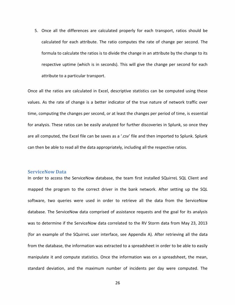
Figure 14 and Figure 15 illustrate that the variation of the Packets Sent rate of change on both
the PlatformOne dataset and the RV Storm dataset have a similar pattern. Even though the
patterns are consistent, the range of the data is the most important thing to consider. The
PlatformOne data, sown in Figure 14, constantly varies between approximately 800 to 3000
packets sent per second. For the RV Storm sample, shown in Figure 15, the range of the
variation is much wider, showing a much higher volatility. The range of the variation of the
storm data is between 50 and 6800 messages sent per second, more than double that of
PlatformOne’s maximum range.
Figure 14: PlatformOne Maximum Sample Packets Sent Ratio
37
Figure 15: RV Storm Maximum Packets Sent Ratio
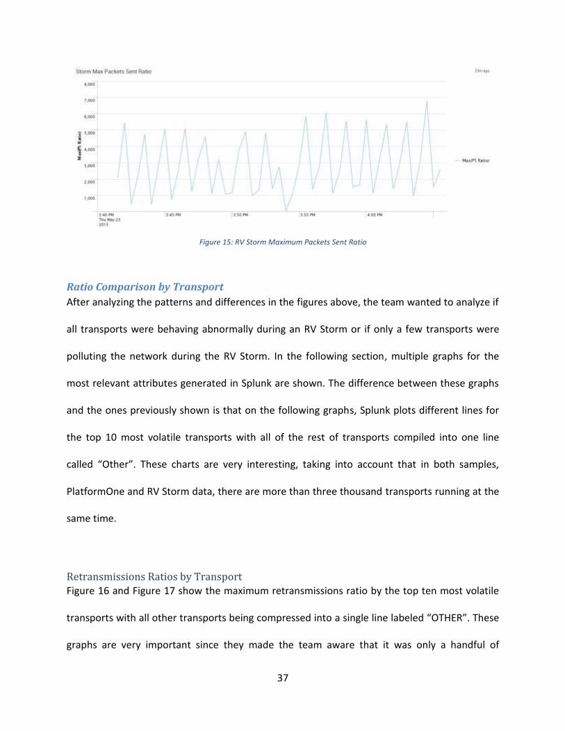
Ratio Comparison by Transport
After analyzing the patterns and differences in the figures above, the team wanted to analyze if
all transports were behaving abnormally during an RV Storm or if only a few transports were
polluting the network during the RV Storm. In the following section, multiple graphs for the
most relevant attributes generated in Splunk are shown. The difference between these graphs
and the ones previously shown is that on the following graphs, Splunk plots different lines for
the top 10 most volatile transports with all of the rest of transports compiled into one line
called “Other”. These charts are very interesting, taking into account that in both samples,
PlatformOne and RV Storm data, there are more than three thousand transports running at the
same time.
Retransmissions Ratios by Transport
Figure 16 and Figure 17 show the maximum retransmissions ratio by the top ten most volatile
transports with all other transports being compressed into a single line labeled “OTHER”. These
graphs are very important since they made the team aware that it was only a handful of
38
transports which had large variations, and most likely, were the transports that increased the
traffic in the network and produced the storm. Figure 17 shows how, even during the last 4
critical minutes of the storm, only three transports surpassed one hundred retransmissions per
second. The most volatile transports will be further analyzed in the section ‘Analysis of Critical
Transports’.
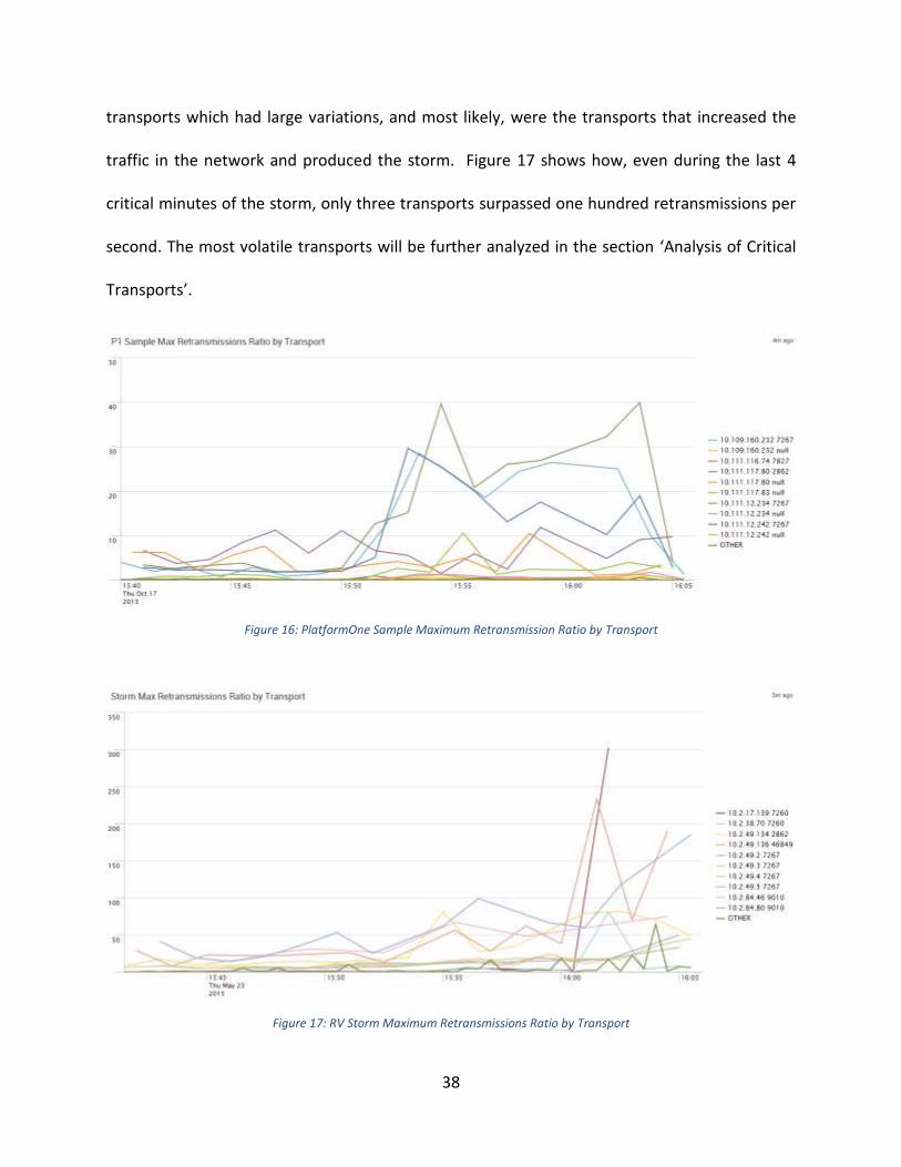
Figure 16: PlatformOne Sample Maximum Retransmission Ratio by Transport
Figure 17: RV Storm Maximum Retransmissions Ratio by Transport
39
Packets Missed Ratios by Transport
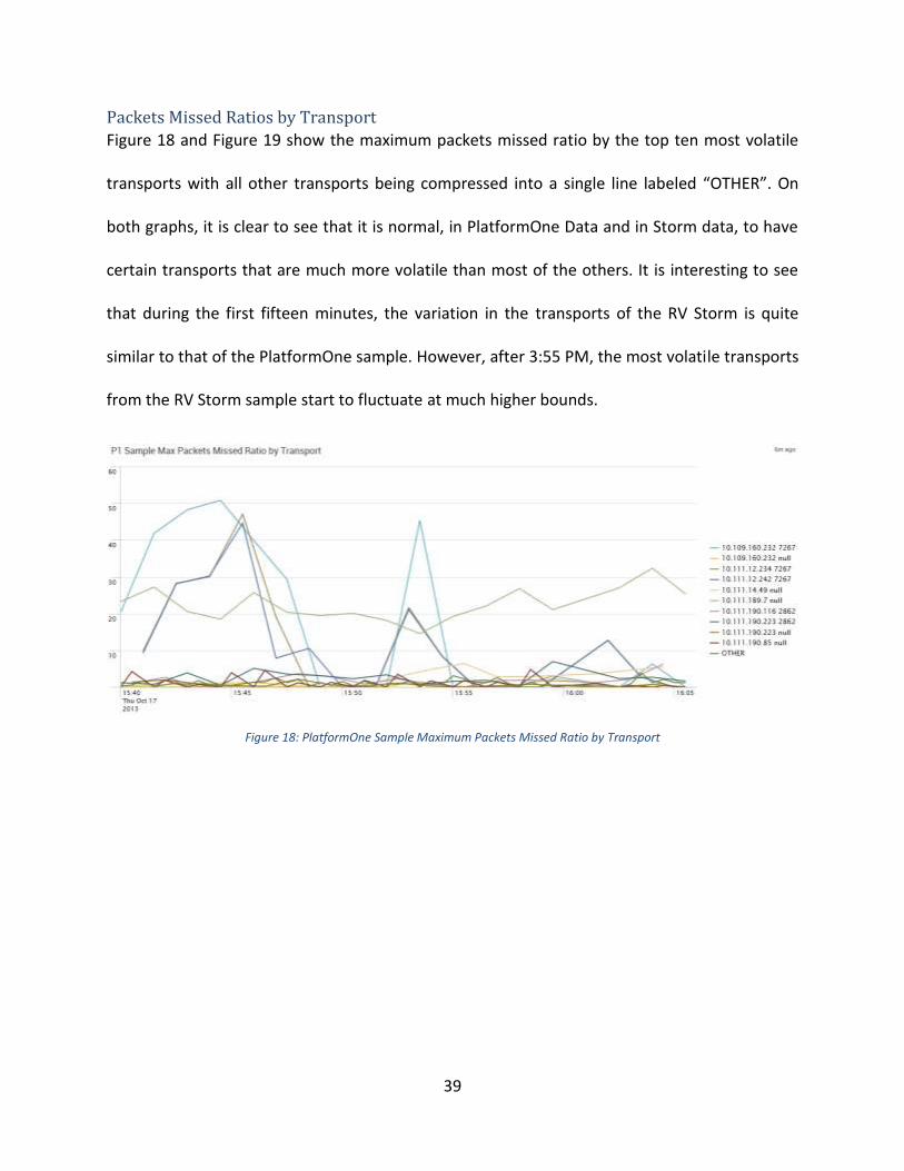
Figure 18 and Figure 19 show the maximum packets missed ratio by the top ten most volatile
transports with all other transports being compressed into a single line labeled “OTHER”. On
both graphs, it is clear to see that it is normal, in PlatformOne Data and in Storm data, to have
certain transports that are much more volatile than most of the others. It is interesting to see
that during the first fifteen minutes, the variation in the transports of the RV Storm is quite
similar to that of the PlatformOne sample. However, after 3:55 PM, the most volatile transports
from the RV Storm sample start to fluctuate at much higher bounds.
Figure 18: PlatformOne Sample Maximum Packets Missed Ratio by Transport
40
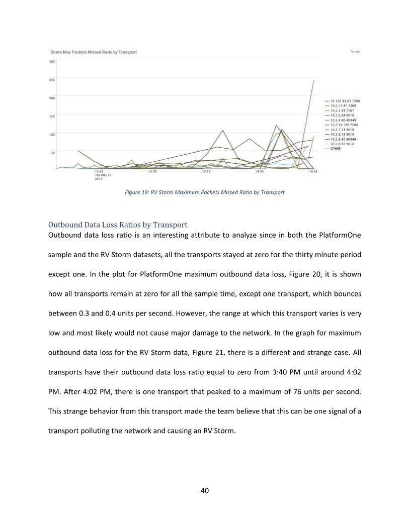
Figure 19: RV Storm Maximum Packets Missed Ratio by Transport
Outbound Data Loss Ratios by Transport
Outbound data loss ratio is an interesting attribute to analyze since in both the PlatformOne
sample and the RV Storm datasets, all the transports stayed at zero for the thirty minute period
except one. In the plot for PlatformOne maximum outbound data loss, Figure 20, it is shown
how all transports remain at zero for all the sample time, except one transport, which bounces
between 0.3 and 0.4 units per second. However, the range at which this transport varies is very
low and most likely would not cause major damage to the network. In the graph for maximum
outbound data loss for the RV Storm data, Figure 21, there is a different and strange case. All
transports have their outbound data loss ratio equal to zero from 3:40 PM until around 4:02
PM. After 4:02 PM, there is one transport that peaked to a maximum of 76 units per second.
This strange behavior from this transport made the team believe that this can be one signal of a
transport polluting the network and causing an RV Storm.

41
Figure 20: PlatformOne Sample Maximum Outbound Data Loss by Transport
Figure 21: RV Storm Maximum Outbound Data Loss Ratio by Transport
Ratio Comparison by Service
After carefully analyzing the previous charts that show an examination of certain key attributes
by transport, the team realized that in most of the cases there were a group of services that
played the most important roles. Just to recap, the service is the last four or five digits after the
space shown in the previous graphs, and the host IP is the digits that come before (e.g. for
transport “10.101.118.217 7560”, 10.101.118.217 is the host IP address while 7560 is the
service number). Due to the frequency that some services were repeated, the group decided to

42
analyze some of the key attributes of the data by service in order to determine if there were
certain services causing most of the traffic in the network.
Retransmissions Ratios by Service
Figure 22 and Figure 23 show the maximum retransmissions ratios by service. The patterns
found in these two graphs are very similar to those that plot the maximum retransmissions by
transport, in which a few transports had peaked much higher than the rest. In this case, the
ratios for retransmissions, for both the PlatformOne sample and the RV Storm data, have a few
services that are peaking at much larger values than most of the other services. For the RV
Storm data, Figure 23 shows that during the critical storm period –the last four minutes– there
are three services which drastically peak to values larger than 150, 200 and even 300
retransmissions per second. These three services are 7260 (Config Manager), 9010 (Market
Data) and 46849 (Intercessor Client Throttled).
Figure 22: PlatformOne Sample Maximum Retransmissions Ratio by Service

43
Figure 23: RV Storm Maximum Retransmissions Ratio by Service
Packets Missed Ratios by Service
Packets missed ratios, by service, is an interesting attribute to analyze since it shows two
different scenarios between PlatformOne (Figure 24) and the data from the RV Storm (Figure
25). In Figure 24, the packets missed ratios by service for the PlatformOne sample is shown. It is
interesting to see that service 7267 (Ramp Client) has a very large variation during the first
fifteen minutes, reaching a maximum of 51 packets missed per second; however, after 3:55 PM,
the variation of service 7267 is drastically reduced. Figure 25 shows the maximum packets
missed ratios by service for the RV Storm. In this graph it is clear to see that the pattern is
reversed from PlatformOne graph (Figure 24). In the storm data, between 3:40 PM and 3:55
PM, all of the services look as if they were behaving normally, with service 9010 (Market Data)
only reaching 50 missed per second as a maximum. However, after 3:55 PM, service 9010 and
service 7260 (Config Manager) both break 100 packets missed per second, and on the last
minutes of the data, service 9010 reaches a maximum of 243 packets missed per second. Figure
25 is a good example showing how packets missed behave during the normal state (3:40 PM –
3:55 PM), the “pre-storm” period (3:55 PM – 4:02 PM) and the critical part of the storm (after
4:02 PM).

44
Figure 24: PlatformOne Sample Maximum Packets Missed Ratio by Service
Figure 25: RV Storm Maximum Packets Missed by Service
Packets Sent Ratios by Service
Packets sent ratios by service have the most similar patterns between the sample from
PlatformOne and the data from the RV Storm. Figure 26 shows the maximum packets sent
ratios for the PlatformOne sample. On this graph it can be seen that this attribute tends to vary
greatly between zero and 3000, with service 7827 being the service with the most variation and
the highest maximums. Figure 27 shows the same attribute, maximum packets sent ratios, for
the RV Storm data. Overall, it could be said that the pattern of variation is very similar;
however, the range of the variation is widely different. This plot ranges between zero and 6800,
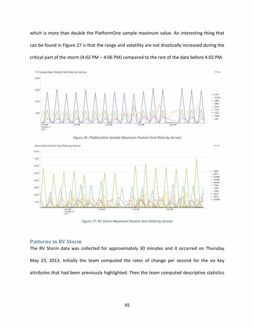
45
which is more than double the PlatformOne sample maximum value. An interesting thing that
can be found in Figure 27 is that the range and volatility are not drastically increased during the
critical part of the storm (4:02 PM – 4:06 PM) compared to the rest of the data before 4:02 PM.
Figure 26: PlatformOne Sample Maximum Packets Sent Ratio by Service
Figure 27: RV Storm Maximum Packets Sent Ratio by Service
Patterns in RV Storm The RV Storm data was collected for approximately 30 minutes and it occurred on Thursday
May 23, 2013. Initially the team computed the rates of change per second for the six key
attributes that had been previously highlighted. Then the team computed descriptive statistics
46
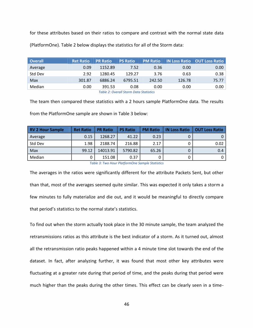
for these attributes based on their ratios to compare and contrast with the normal state data
(PlatformOne). Table 2 below displays the statistics for all of the Storm data:
Overall Ret Ratio PR Ratio PS Ratio PM Ratio IN Loss Ratio OUT Loss Ratio
Average 0.09 1152.89 7.52 0.36 0.00 0.00
Std Dev 2.92 1280.45 129.27 3.76 0.63 0.38
Max 301.87 6886.24 6795.51 242.50 126.78 75.77
Median 0.00 391.53 0.08 0.00 0.00 0.00 Table 2: Overall Storm Data Statistics
The team then compared these statistics with a 2 hours sample PlatformOne data. The results
from the PlatformOne sample are shown in Table 3 below:
RV 2 Hour Sample Ret Ratio PR Ratio PS Ratio PM Ratio IN Loss Ratio OUT Loss Ratio
Average 0.15 1268.27 41.22 0.23 0 0
Std Dev 1.98 2188.74 216.88 2.17 0 0.02
Max 99.12 14013.91 5790.82 65.26 0 0.4
Median 0 151.08 0.37 0 0 0 Table 3: Two Hour PlatformOne Sample Statistics
The averages in the ratios were significantly different for the attribute Packets Sent, but other
than that, most of the averages seemed quite similar. This was expected it only takes a storm a
few minutes to fully materialize and die out, and it would be meaningful to directly compare
that period’s statistics to the normal state’s statistics.
To find out when the storm actually took place in the 30 minute sample, the team analyzed the
retransmissions ratios as this attribute is the best indicator of a storm. As it turned out, almost
all the retransmission ratio peaks happened within a 4 minute time slot towards the end of the
dataset. In fact, after analyzing further, it was found that most other key attributes were
fluctuating at a greater rate during that period of time, and the peaks during that period were
much higher than the peaks during the other times. This effect can be clearly seen in a time-
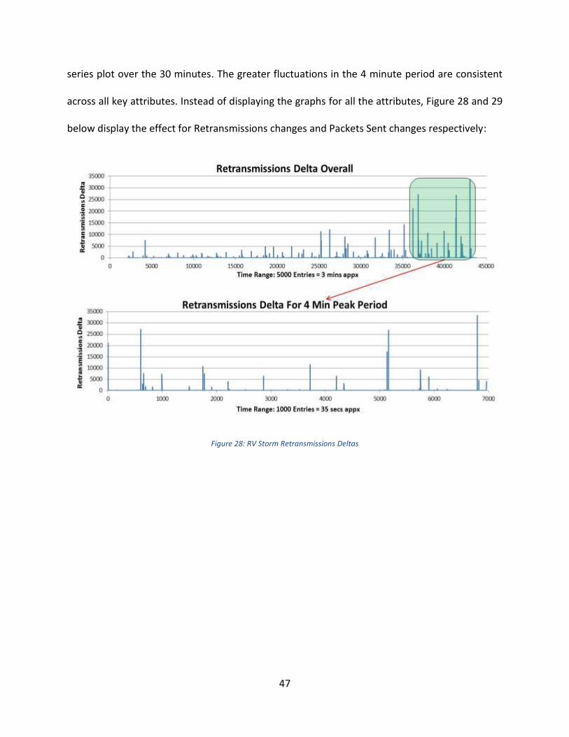
47
series plot over the 30 minutes. The greater fluctuations in the 4 minute period are consistent
across all key attributes. Instead of displaying the graphs for all the attributes, Figure 28 and 29
below display the effect for Retransmissions changes and Packets Sent changes respectively:
Figure 28: RV Storm Retransmissions Deltas

48
Figure 29: RV Storm Packets Sent Deltas
The 4 minute period definitely skewed descriptive statistics, which is why it was important to
analyze the data without that period. When the 4 minute period was take out from the analysis
and the descriptive statistics were computed, the results were even more similar to the
PlatformOne data compared to the overall 30 minute analysis. The Table 4 below shows the
analysis for the storm data excluding the 4 minute period:
Overall Without 4 Mins Ret Ratio PR Ratio PS Ratio PM Ratio IN Loss Ratio OUT Loss Ratio
Average 0.06 1115.34 7.19 0.12 0.00 0.00
Std Dev 1.47 1253.19 123.77 1.41 0.00 0.00
Max 98.66 6433.58 6098.59 105.69 0.00 0.00
Median 0.00 371.83 0.08 0.00 0.00 0.00 Table 4: Overall RV Storm Data Statistics Without Peak 4 Minutes
The maximum peaks for this period is much closer to the 2 hour PlatformOne data. For
instance, the peak for this period in Retransmissions is 98.66 unit changes per second which is

49
almost the same as 99.12 unit change per second in PlatformOne data. Overall, the storm data
set without the 4 minute period is a good representative of the normal state of the network,
which is also represented by the PlatformOne data set.
The statistics for the 4 minute period in the storm data portrayed a different picture. This can
be seen through Table 5 below:
Storm 4 Min Period Ret Ratio PR Ratio PS Ratio PM Ratio IN Loss Ratio OUT Loss Ratio
Average 0.27 1334.53 9.14 1.51 0.03 0.01
Std Dev 6.28 1390.72 153.10 8.44 1.53 0.91
Max 301.87 6886.24 6795.51 242.50 126.78 75.77
Median 0.00 719.60 0.09 0.00 0.00 0.00 Table 5: Peak 4 Minute RV Storm Statistics
The static averages do not portray a comprehensive picture for either data set, as hundreds of
transports are running simultaneously in the network with varying network activity. When a
storm occurs, the increase in the key attributes should be significantly higher and more
frequent. The statistics for the 4 minute period shows that that maximum change per second
for each attribute takes place within that period. All the standard deviations and averages are
also higher in comparison to the other 26 minutes. This was the first indication that the storm
actually occurred during that 4 minute phase and the team dived deeper into the time period to
understand the behavior of the storm.
Once the team computed the differences in each attribute per time period (which was usually
approximately 90 or a multiple of 90 seconds), it was then interesting to look at the percentage
of average differences in the 4 minute peak-period compared to the overall average. Figure 30
shows the results below:

50
Figure 30: RV Storm Peak Time Averages Compared to Overall Average
Apart from Packets Sent and Packets Received, values for all other attributes are significantly
larger during the 4 minute period compared to the overall average. Attributes such as Inbound
Data Loss and Outbound Data Loss are in fact more than 450% greater than the overall average.
Four of the six key attributes were more than 150% greater in the 4 minute period than the
overall average. After looking into these results, the team was assured that the actual storm
took place within the 4 minute period.
It was also essential to look into the correlations of all the key attributes with retransmissions
changes as retransmissions was the driving factor in a storm. Attributes with strong correlations
with retransmissions changes would need to be monitored carefully too. Figure 31 below
displays the results of the correlation coefficient between each of the five other key attributes

51
and retransmissions during the overall 30 minute period (in blue) and only during the 4 minute
peak period too (in red):
Figure 31: RV Storm Retransmissions Correlations
From the figure above, it is apparent that the strongest correlations with Retransmissions exist
with Packets Sent and Outbound Data Loss, with correlation coefficients over 0.6 and 0.4
respectively for the overall period and over 0.75 and 0.5 respectively for the 4 minute peak
period. As stated, the two highest correlations rise even further during the 4 minute peak
period. This indicates a crucial need to monitor these attributes. The correlation between
Retransmissions and Packets Missed is quite weak, which is unexpected. The amplified effect
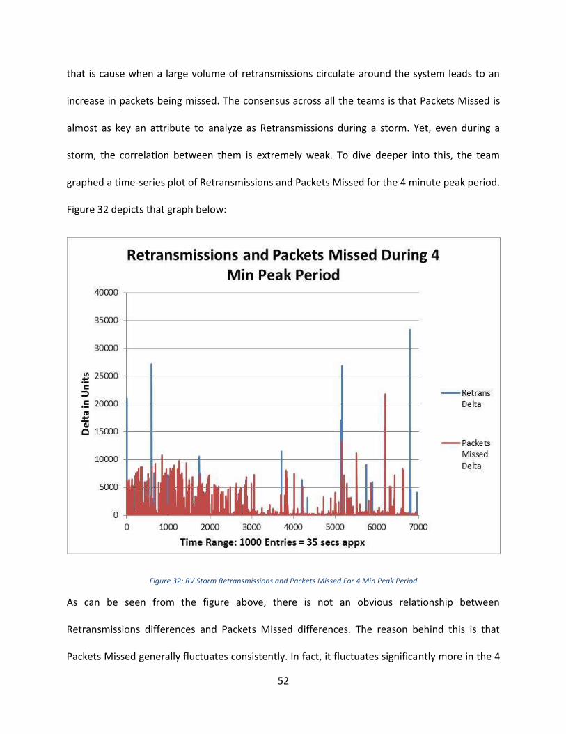
52
that is cause when a large volume of retransmissions circulate around the system leads to an
increase in packets being missed. The consensus across all the teams is that Packets Missed is
almost as key an attribute to analyze as Retransmissions during a storm. Yet, even during a
storm, the correlation between them is extremely weak. To dive deeper into this, the team
graphed a time-series plot of Retransmissions and Packets Missed for the 4 minute peak period.
Figure 32 depicts that graph below:
Figure 32: RV Storm Retransmissions and Packets Missed For 4 Min Peak Period
As can be seen from the figure above, there is not an obvious relationship between
Retransmissions differences and Packets Missed differences. The reason behind this is that
Packets Missed generally fluctuates consistently. In fact, it fluctuates significantly more in the 4
53
minute peak period in comparison to the times leading up to it (similar to the trend of all
attributes). As it fluctuates regularly, it is not a suitable indicator for a storm although its peak
during the 4 minute period is higher than its highest peak otherwise. Since it oscillates
throughout the 30 minute period, statistically there is not a correlation between it and
Retransmissions, which peaks at certain periods. However, when analyzed further, it appears
that when Retransmissions peak, Packets Missed has a peak at the exact same time or very
close to that time period. Therefore the relationship that exists between these two attributes is
interesting in the sense that it is a one-way relationship – Packets Missed can be expected to
peak when Retransmissions are peaking (packets are being missed due to the large volume of
retransmissions that are being ordered in the network), but the opposite effect cannot be
expected. It is still essential to monitor Packets Missed as it points out irregularities in the
network but it cannot be relied upon to indicate an upcoming storm.
Analysis of Critical Transports The team went further to analyze the specific transports that were causing the peaks in the
storm. It turned out that not all the transports were behaving abnormally during the storm, but
rather a few transports that started behaving out of bounds creating an amplified effect. The
team found the top 10 transports with the highest retransmission ratios in the 4 minute period
and then compared the averages for that period with the overall average. These transports
were clearly the outliers and identifying the causes behind their peaks would provide key
insight into how the storm actually started. It is essential to concentrate on transports that
exceed normal bounds when monitoring for potential storms, rather than monitoring the

54
thousands of active transports simultaneously. The team graphed the top 10 transports with
the highest retransmission ratios in the 4 minute period with all the key attributes to analyze
whether other attributes were behaving abnormally for each transport during the same time
too. Figure 33 depicts the results below:
Figure 33: RV Storm Peak Time Averages for Top 10 Transports with Highest Retransmissions Compared to Overall Average
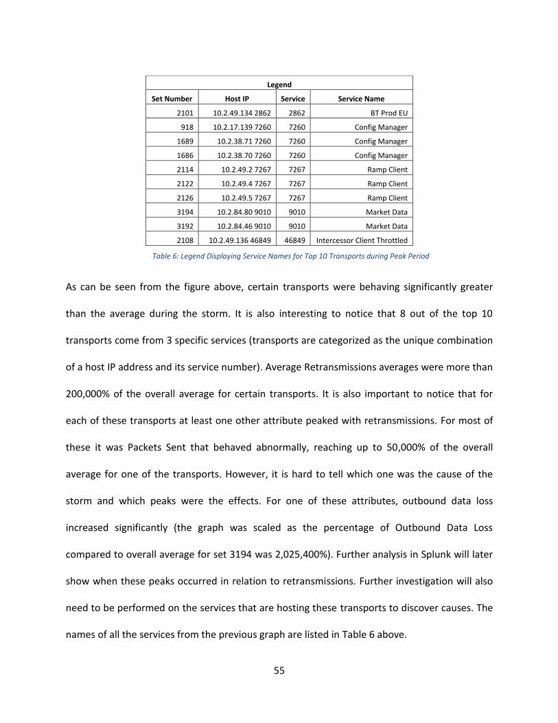
55
As can be seen from the figure above, certain transports were behaving significantly greater
than the average during the storm. It is also interesting to notice that 8 out of the top 10
transports come from 3 specific services (transports are categorized as the unique combination
of a host IP address and its service number). Average Retransmissions averages were more than
200,000% of the overall average for certain transports. It is also important to notice that for
each of these transports at least one other attribute peaked with retransmissions. For most of
these it was Packets Sent that behaved abnormally, reaching up to 50,000% of the overall
average for one of the transports. However, it is hard to tell which one was the cause of the
storm and which peaks were the effects. For one of these attributes, outbound data loss
increased significantly (the graph was scaled as the percentage of Outbound Data Loss
compared to overall average for set 3194 was 2,025,400%). Further analysis in Splunk will later
show when these peaks occurred in relation to retransmissions. Further investigation will also
need to be performed on the services that are hosting these transports to discover causes. The
names of all the services from the previous graph are listed in Table 6 above.
Legend
Set Number Host IP Service Service Name
2101 10.2.49.134 2862 2862 BT Prod EU
918 10.2.17.139 7260 7260 Config Manager
1689 10.2.38.71 7260 7260 Config Manager
1686 10.2.38.70 7260 7260 Config Manager
2114 10.2.49.2 7267 7267 Ramp Client
2122 10.2.49.4 7267 7267 Ramp Client
2126 10.2.49.5 7267 7267 Ramp Client
3194 10.2.84.80 9010 9010 Market Data
3192 10.2.84.46 9010 9010 Market Data
2108 10.2.49.136 46849 46849 Intercessor Client Throttled
Table 6: Legend Displaying Service Names for Top 10 Transports during Peak Period
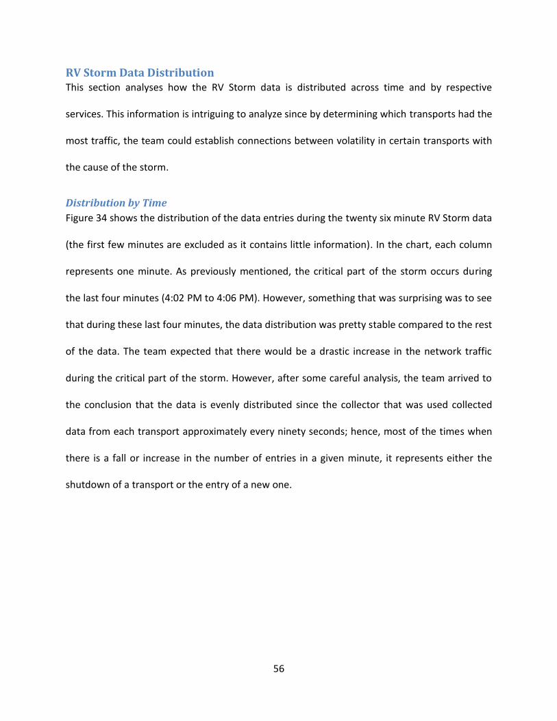
56
RV Storm Data Distribution This section analyses how the RV Storm data is distributed across time and by respective
services. This information is intriguing to analyze since by determining which transports had the
most traffic, the team could establish connections between volatility in certain transports with
the cause of the storm.
Distribution by Time
Figure 34 shows the distribution of the data entries during the twenty six minute RV Storm data
(the first few minutes are excluded as it contains little information). In the chart, each column
represents one minute. As previously mentioned, the critical part of the storm occurs during
the last four minutes (4:02 PM to 4:06 PM). However, something that was surprising was to see
that during these last four minutes, the data distribution was pretty stable compared to the rest
of the data. The team expected that there would be a drastic increase in the network traffic
during the critical part of the storm. However, after some careful analysis, the team arrived to
the conclusion that the data is evenly distributed since the collector that was used collected
data from each transport approximately every ninety seconds; hence, most of the times when
there is a fall or increase in the number of entries in a given minute, it represents either the
shutdown of a transport or the entry of a new one.
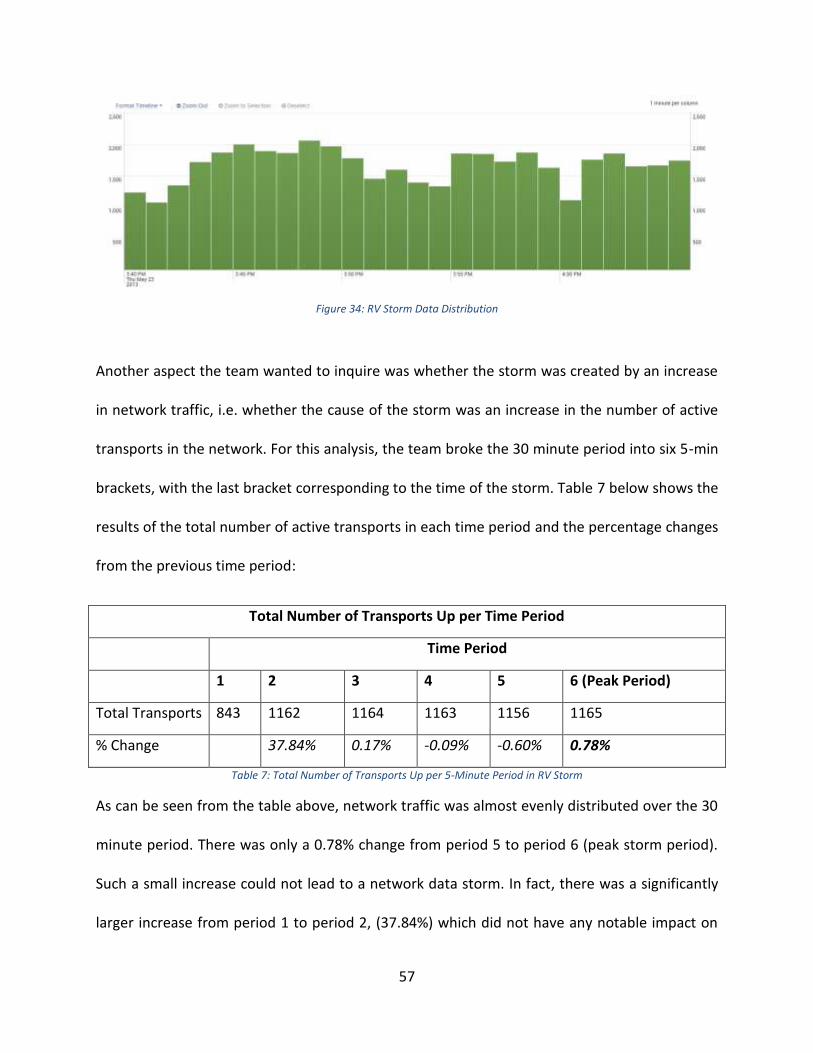
57
Figure 34: RV Storm Data Distribution
Another aspect the team wanted to inquire was whether the storm was created by an increase
in network traffic, i.e. whether the cause of the storm was an increase in the number of active
transports in the network. For this analysis, the team broke the 30 minute period into six 5-min
brackets, with the last bracket corresponding to the time of the storm. Table 7 below shows the
results of the total number of active transports in each time period and the percentage changes
from the previous time period:
Total Number of Transports Up per Time Period
Time Period
1 2 3 4 5 6 (Peak Period)
Total Transports 843 1162 1164 1163 1156 1165
% Change 37.84% 0.17% -0.09% -0.60% 0.78%
Table 7: Total Number of Transports Up per 5-Minute Period in RV Storm
As can be seen from the table above, network traffic was almost evenly distributed over the 30
minute period. There was only a 0.78% change from period 5 to period 6 (peak storm period).
Such a small increase could not lead to a network data storm. In fact, there was a significantly
larger increase from period 1 to period 2, (37.84%) which did not have any notable impact on

58
the network. Therefore, this analysis shows that the network data storm was not caused by an
increase in network traffic.
Distribution by Service
Figure 35 and Figure 36 show the distribution by service of the RV Storm. It is interesting to see
that the top three services with the highest frequency (7260, 7267, and 9010), which account
for 64% of all the RV Storm data, are also the services that host most of the critical transports,
found in the ‘Analysis of Critical Transports’ section. One thing that can be inferred from this
data is the fact that the three services – 7260, 7267, and 9010 – are part of the most volatile
services that may produce an RV Storm, since they create huge amounts of traffic in the
network.
Figure 35: RV Storm Top 10 Most Frequent Services

59
Figure 36: RV Storm Data Distribution by Services
Distribution of Hosts Running Each Service:
It was important to analyze the distribution of the number of hosts running each service in the
Storm data set, and whether that had any relevance to the actual storm. In total there were
3297 unique transports during the 30 minute period. Figure 37 below represents the
distribution of number of hosts running each of the 42 services:

60
Figure 37: RV Storm Data Distribution for Number of Hosts Running a Service
As the results from the figure above display, the three busiest services are 7260 (with more
than 850 hosts), 7267 (with more than 750 hosts) and 9010 (with more than 450 hosts)
respectively. Interestingly, these were the three most common services in the top 10 highest
Retransmissions ratios in the 4-minute storm period. There were 5 separate services grouping
the transports with the top 10 highest Retransmissions ratios. All of those 5 services – 7260,
7270, 9010, 46849, and 2862 – exist in the top 10 busiest transports as shown in the figure
above. This comparison shows that there is a strong relationship with the number of hosts
running each service and the services that can lead to large retransmissions ratios and could
potentially cause an RV storm. However, through this analysis it is not possible to determine
the threshold of the number of hosts that can run a service before retransmissions start to go
off limits. Even without such a threshold, it is necessary to monitor the services that
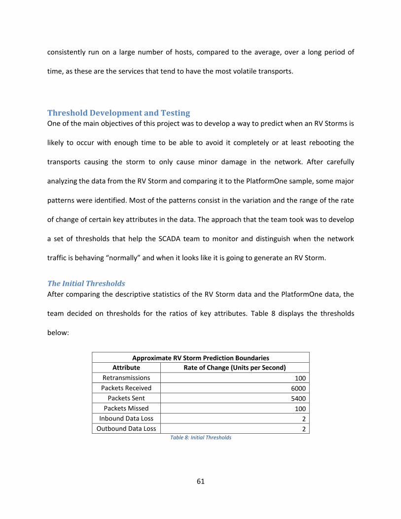
61
consistently run on a large number of hosts, compared to the average, over a long period of
time, as these are the services that tend to have the most volatile transports.
Threshold Development and Testing One of the main objectives of this project was to develop a way to predict when an RV Storms is
likely to occur with enough time to be able to avoid it completely or at least rebooting the
transports causing the storm to only cause minor damage in the network. After carefully
analyzing the data from the RV Storm and comparing it to the PlatformOne sample, some major
patterns were identified. Most of the patterns consist in the variation and the range of the rate
of change of certain key attributes in the data. The approach that the team took was to develop
a set of thresholds that help the SCADA team to monitor and distinguish when the network
traffic is behaving “normally” and when it looks like it is going to generate an RV Storm.
The Initial Thresholds
After comparing the descriptive statistics of the RV Storm data and the PlatformOne data, the
team decided on thresholds for the ratios of key attributes. Table 8 displays the thresholds
below:
Approximate RV Storm Prediction Boundaries
Attribute Rate of Change (Units per Second)
Retransmissions 100
Packets Received 6000
Packets Sent 5400
Packets Missed 100
Inbound Data Loss 2
Outbound Data Loss 2 Table 8: Initial Thresholds
62
The initial thresholds could predict the one storm sample that was available; however they
were still not perfect. Firstly, the SCADA team would have liked the thresholds to have been
breached a few minutes prior to the storm in order to take action to avoid it. More importantly,
after testing the thresholds on the 24 hour PlatformOne sample, the team had expected far
fewer breaches than the actual results. Ideally, the team would have like one or two false
alarms on a single day rather than several, to be able to distinguish storms. The testing on the
PlatformOne and its results are presented on the following section.
Important Assumptions
There are several key assumptions that need to be considered when monitoring the traffic in
the network using the previously shown thresholds. One of the most important things to take
into account is the fact that the data for only one RV Storm was analyzed. Since the group had
no more information collected from other RV Storms to analyze, it had to be assumed that all
RV Storms behave fairly similar. With this said so, a second important assumption was made.
The team only received data from PlatformOne, which is one of the various platforms that run
together with the RV network. The data from PlatformOne that was received had to be treated
as the control of the experiment, to establish a baseline representing how the traffic in the
network looks in a “normal state”. Hence, there was one important assumption made
generalizing that the PlatformOne data sample was representative for all the other platforms
running with the RV network. One last assumption was made by generalizing that no matter on
how many transports are up on RV, the system should behave the same. This was an important
assumption since the team only received data for one sample of PlatformOne data and the data
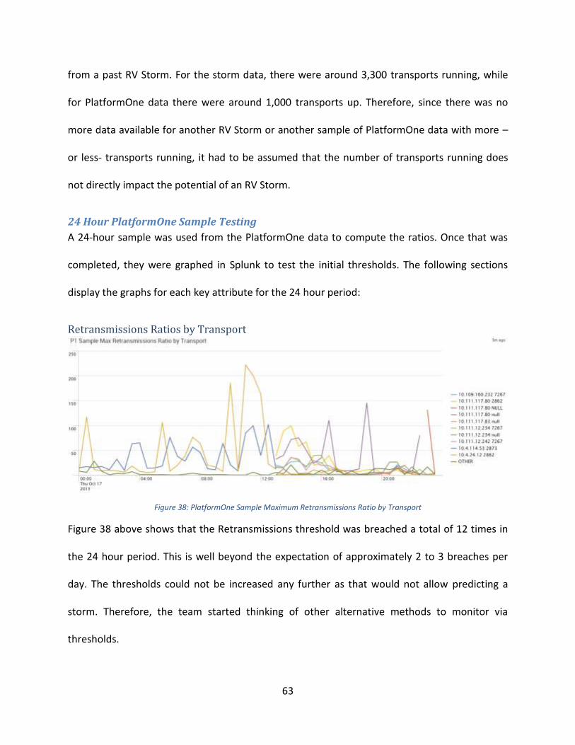
63
from a past RV Storm. For the storm data, there were around 3,300 transports running, while
for PlatformOne data there were around 1,000 transports up. Therefore, since there was no
more data available for another RV Storm or another sample of PlatformOne data with more –
or less- transports running, it had to be assumed that the number of transports running does
not directly impact the potential of an RV Storm.
24 Hour PlatformOne Sample Testing
A 24-hour sample was used from the PlatformOne data to compute the ratios. Once that was
completed, they were graphed in Splunk to test the initial thresholds. The following sections
display the graphs for each key attribute for the 24 hour period:
Retransmissions Ratios by Transport
Figure 38: PlatformOne Sample Maximum Retransmissions Ratio by Transport
Figure 38 above shows that the Retransmissions threshold was breached a total of 12 times in
the 24 hour period. This is well beyond the expectation of approximately 2 to 3 breaches per
day. The thresholds could not be increased any further as that would not allow predicting a
storm. Therefore, the team started thinking of other alternative methods to monitor via
thresholds.
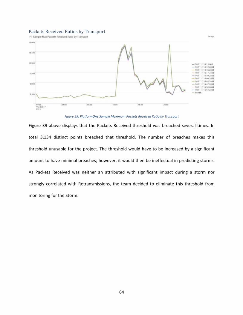
64
Packets Received Ratios by Transport
Figure 39: PlatformOne Sample Maximum Packets Received Ratio by Transport
Figure 39 above displays that the Packets Received threshold was breached several times. In
total 3,134 distinct points breached that threshold. The number of breaches makes this
threshold unusable for the project. The threshold would have to be increased by a significant
amount to have minimal breaches; however, it would then be ineffectual in predicting storms.
As Packets Received was neither an attributed with significant impact during a storm nor
strongly correlated with Retransmissions, the team decided to eliminate this threshold from
monitoring for the Storm.

65
Packets Missed Ratios by Transport
Figure 40: PlatformOne Sample Maximum Packets Missed Ratio by Transport
Figure 40 above shows that the Packets Missed threshold was breached by 110 distinct points.
This was again well above expectations and provided the team with even more grounds to
device an alternative method.
Packets Sent Ratios by Transport
Figure 41: PlatformOne Sample Maximum Packets Sent by Transport
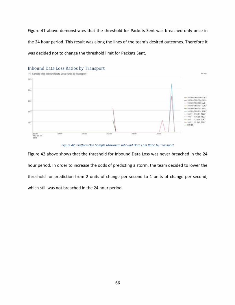
66
Figure 41 above demonstrates that the threshold for Packets Sent was breached only once in
the 24 hour period. This result was along the lines of the team’s desired outcomes. Therefore it
was decided not to change the threshold limit for Packets Sent.
Inbound Data Loss Ratios by Transport
Figure 42: PlatformOne Sample Maximum Inbound Data Loss Ratio by Transport
Figure 42 above shows that the threshold for Inbound Data Loss was never breached in the 24
hour period. In order to increase the odds of predicting a storm, the team decided to lower the
threshold for prediction from 2 units of change per second to 1 units of change per second,
which still was not breached in the 24 hour period.
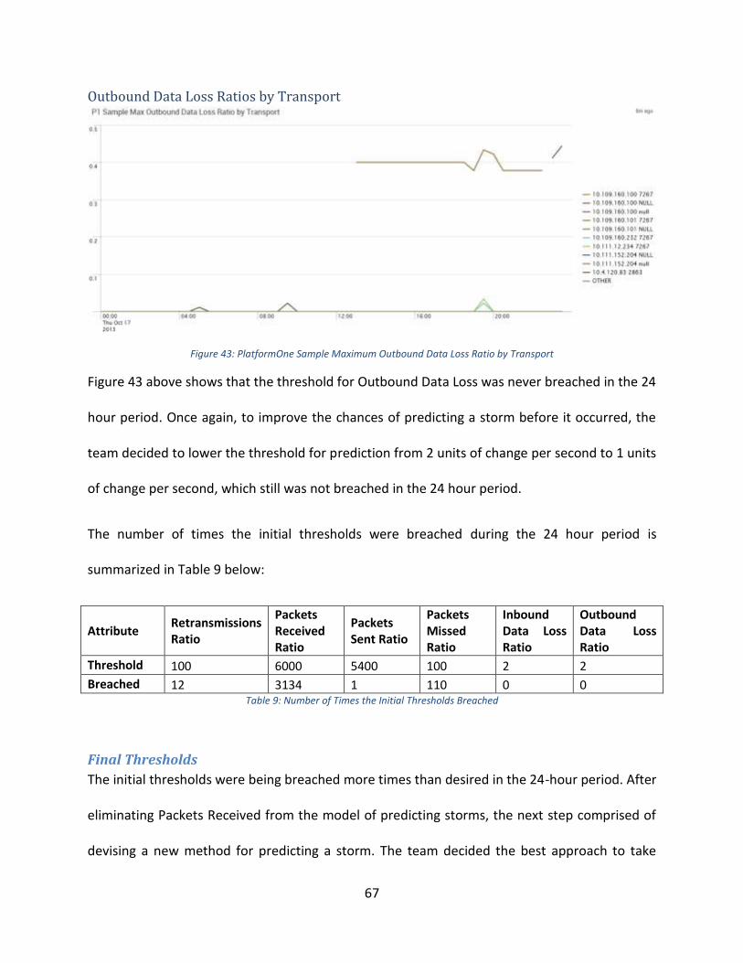
67
Outbound Data Loss Ratios by Transport
Figure 43: PlatformOne Sample Maximum Outbound Data Loss Ratio by Transport
Figure 43 above shows that the threshold for Outbound Data Loss was never breached in the 24
hour period. Once again, to improve the chances of predicting a storm before it occurred, the
team decided to lower the threshold for prediction from 2 units of change per second to 1 units
of change per second, which still was not breached in the 24 hour period.
The number of times the initial thresholds were breached during the 24 hour period is
summarized in Table 9 below:
Attribute Retransmissions Ratio
Packets Received Ratio
Packets Sent Ratio
Packets Missed Ratio
Inbound Data Loss Ratio
Outbound Data Loss Ratio
Threshold 100 6000 5400 100 2 2
Breached 12 3134 1 110 0 0 Table 9: Number of Times the Initial Thresholds Breached
Final Thresholds
The initial thresholds were being breached more times than desired in the 24-hour period. After
eliminating Packets Received from the model of predicting storms, the next step comprised of
devising a new method for predicting a storm. The team decided the best approach to take

68
would be to monitor a combination of two attributes with Retransmissions staying constant.
Therefore, the Retransmissions thresholds has to be breached in addition to the threshold of
one other key attribute, including the Retransmissions threshold from a different transport,
within a specified time period for an alert to be raised. The alert will still be raised even if two
thresholds are breached by different transports in the network. As Retransmissions peaks were
the best indicator of a storm, the team decided to always monitor Retransmissions. A
combination of another attribute with Retransmissions would lead to fewer false alerts. The
team also adjusted the Retransmissions threshold in order to raise alerts a few minutes prior to
the storm (the initial thresholds would only be breached during a storm, but ideally the SCADA
team would want to be notified of issues leading up to a storm).
The timeframe between which both the attributes needed to be breached in order to raise an
alert needed to be fixed. The team decided to fix the timeframe to 3 minutes since this would
give the SCADA team at least two data points for each attribute (since with the collector used,
entries were recorded every 90 seconds). The timeframe also could not be too long since a
storm materializes and completes within a few minutes. The revised thresholds are shown in
Table 10 below.
Attribute Retransmissions
Ratio Packets Sent
Ratio Packets
Missed Ratio Inbound Data
Loss Ratio Outbound Data
Loss Ratio
Threshold 80 5400 100 1 1 Table 10: Final Thresholds
The thresholds mentioned above were primarily developed by analyzing the patterns in the
Storm. The final thresholds were adjusted to raise alerts prior to the storm as mentioned
earlier. In fact, the threshold model is breached four times just in the 5 minute period leading
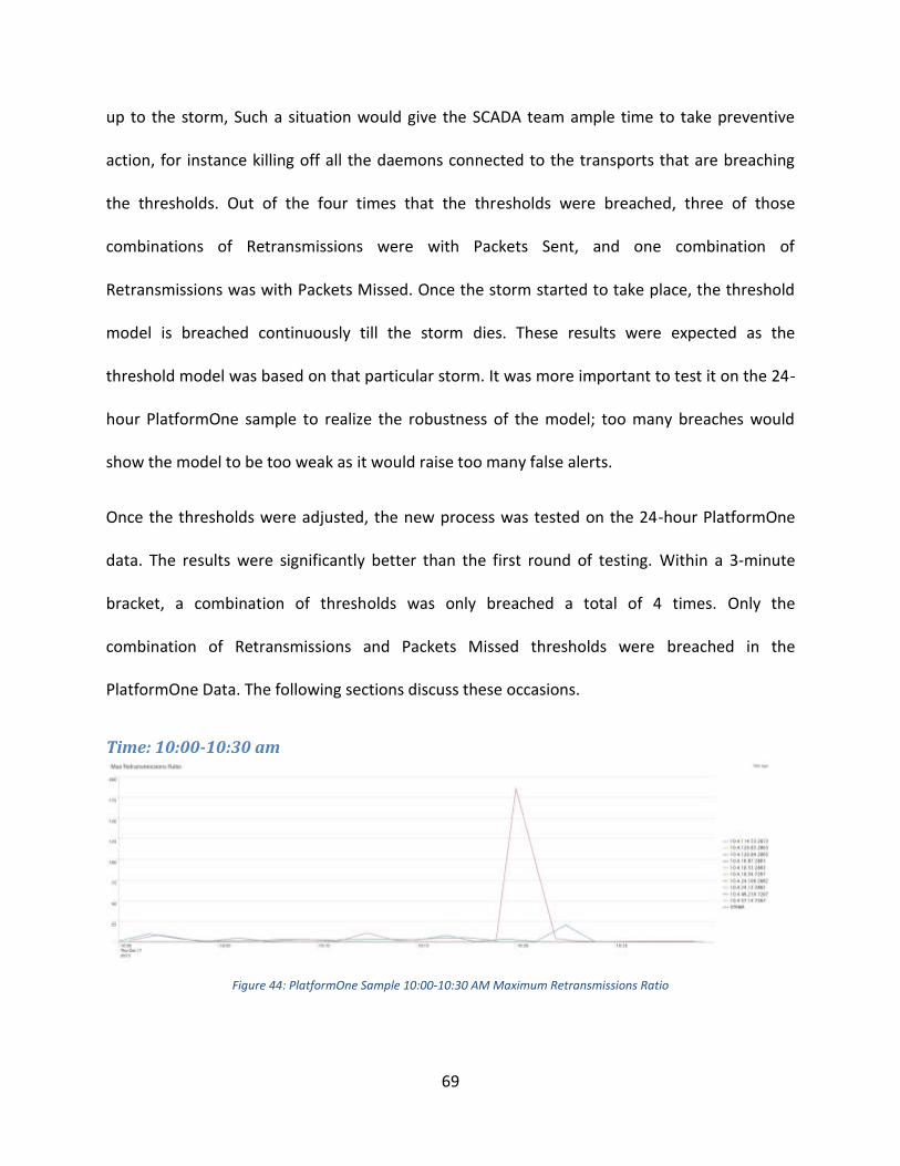
69
up to the storm, Such a situation would give the SCADA team ample time to take preventive
action, for instance killing off all the daemons connected to the transports that are breaching
the thresholds. Out of the four times that the thresholds were breached, three of those
combinations of Retransmissions were with Packets Sent, and one combination of
Retransmissions was with Packets Missed. Once the storm started to take place, the threshold
model is breached continuously till the storm dies. These results were expected as the
threshold model was based on that particular storm. It was more important to test it on the 24-
hour PlatformOne sample to realize the robustness of the model; too many breaches would
show the model to be too weak as it would raise too many false alerts.
Once the thresholds were adjusted, the new process was tested on the 24-hour PlatformOne
data. The results were significantly better than the first round of testing. Within a 3-minute
bracket, a combination of thresholds was only breached a total of 4 times. Only the
combination of Retransmissions and Packets Missed thresholds were breached in the
PlatformOne Data. The following sections discuss these occasions.
Time: 10:00-10:30 am
Figure 44: PlatformOne Sample 10:00-10:30 AM Maximum Retransmissions Ratio
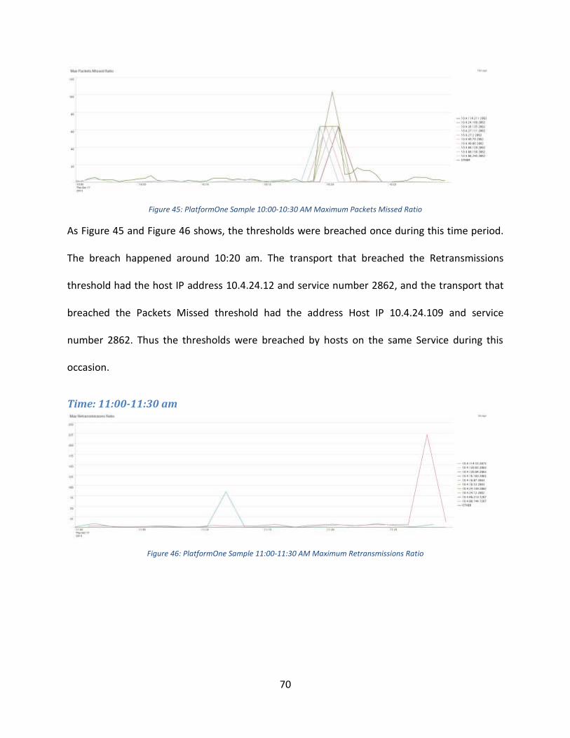
70
Figure 45: PlatformOne Sample 10:00-10:30 AM Maximum Packets Missed Ratio
As Figure 45 and Figure 46 shows, the thresholds were breached once during this time period.
The breach happened around 10:20 am. The transport that breached the Retransmissions
threshold had the host IP address 10.4.24.12 and service number 2862, and the transport that
breached the Packets Missed threshold had the address Host IP 10.4.24.109 and service
number 2862. Thus the thresholds were breached by hosts on the same Service during this
occasion.
Time: 11:00-11:30 am
Figure 46: PlatformOne Sample 11:00-11:30 AM Maximum Retransmissions Ratio

71
Figure 47: PlatformOne Sample 11:00-11:30 AM Maximum Packets Missed Ratio
As Figure 46 and Figure 47 shows, the thresholds were breached once during this time period.
The breach happened around 11:28 am. The transport that breached the Retransmissions
threshold had the host IP address 10.4.24.12 and service number 2862, and the transport that
breached the Packets Missed threshold had the host IP address 10.4.24.109 and service
number 2862. Thus the thresholds were not only breached by hosts on the same Service during
this occasion, the transports which breached thresholds in this period are the same one which
breached the thresholds the previous time period showing consistency in behaviour. However,
these patterns did not lead up to a storm.
Time: 11:30 am – 12:00 pm
Figure 48: PlatformOne Sample 11:30 A.M. - 12:00 P.M. Maximum Retransmissions Ratio

72
Figure 49: PlatformOne Sample 11:30 A.M. - 12:00 P.M. Maximum Packets Missed Ratio
Figure 48 and Figure 49 combined together show that the thresholds were breached twice. The
first breach was by the transport with the host IP address 10.4.24.109 and service number 2862
on the Packets Missed attribute at 11:55:27 am. Then the transport with the host IP address
10.4.114.53 and service number 2873 breaches the Retransmissions threshold at 11:55:51. As
the timeline is within the defined window of 3 minutes, these breaches count as one complete
breach and pose a warning sign (although obviously this was a false alarm as this is from the
PlatformOne data set and there was no storm). Soon after, there’s another Retransmissions
breach by another transport with the host IP address 10.4.24.12 and service number 2862 at
11:56:29. As 11:56:29 is less than 3 minutes of the first Packets Missed breach at 11:55:27, the
combination of breaches counts as one complete breach too. Fortunately, these breaches did
not lead to a storm. But when SCADA starts to monitor all transports, such breaches will be
analyzed real time for possible impacts.
All the five attributes which were finalized should be monitored real-time by the SCADA team in
order to have the greatest probability to predict a storm. Whenever Retransmissions and a
separate attribute breach the threshold within a 3-minute bracket, the SCADA team should
immediately look further into the transport(s) which breached the thresholds and decide the
73
next best course of action depending on the cause of the problem. If there are two different
transports with each breaching one threshold, the SCADA team can decide to restart the
daemons for both the transports. Real time analysis will allow the SCADA team to detect the
cause of the breaches and react to the problems immediately.
ServiceNow Data Analysis One final task of the project was analyzing the ServiceNow (SN) database in order to determine
if there was a correlation between the SN production incidents, that different members of the
bank reported, and the RV Storm. The ServiceNow database stores all the tickets from service
requests from different members of the Fixed Income department of the Bank. These users are
team members who request assistance or report any particular issue with the system. The main
approach was to check whether during the day of the RV Storm there was an increase in
production incidents that may correlate to the cause of the storm.
Number of Tickets
The approach of the analysis was to determine if there was a higher than expected number of
production incidents in the ServiceNow database. Table 11 is an excerpt from the data obtained
from the ServiceNow database. This table shows the number or production incidents and how
critical they are. The table contains only partial parts of the complete dataset to fit the page.
The dates shown in the table are from May 20 to May 25, 2013 (since the RV Storm was on May
23, 2013, highlighted in red) and from October 15 to October 20, 2013 (since the PlatformOne
sample was collected on October 17, 2013, highlighted in green). The complete database
ranges from March 2012 to December 2013.

74
By analyzing the ServiceNow database, it can be said that there is no evidence supporting that
the production incidents were a major cause of the RV Storm on May 23rd. Table 11 shows that
the average number of ServiceNow Incidents per day is 15, and it also shows that there were 23
incidents on the day of the storm. From these 23 incidents, three were critical, three were high
priority, 13 were moderate and four were low priority. Even though the total number of
incidents is higher than the average, there is no significant evidence to suggest that the RV
Storm was caused by an increase in the number of ServiceNow incidents on that day. By
analyzing some of the other values for other days in the table (including the day that
PlatformOne data was collected), it can be seen that there are several other days with much
higher values of total incidents and of critical incidents, and yet there were no RV Storms
reported on these days. After such an analysis, it can be concluded that the RV Storm was not
caused by a change in production incidents recorded in the ServiceNow database.
Number of Incidents by Priority (SNIncidents)
Date 1 - Critical 2 - High 3 - Moderate 4 - Low Grand Total
20/05/2013 1 2 13 5 21
21/05/2013 0 2 19 5 26
22/05/2013 5 2 17 3 27
23/05/2013 3 3 13 4 23
24/05/2013 1 1 10 2 14
25/05/2013 0 0 1 0 1
15/10/2013 0 3 13 3 19
16/10/2013 1 1 17 3 22
17/10/2013 1 3 17 6 27
18/10/2013 1 1 11 0 13
19/10/2013 0 0 0 0 0
20/10/2013 0 0 2 5 7
Grand Total 154 537 3463 1693 5847
Avg 1.439 2.256 9.923 4.922 15.427
Std Dev 0.815 1.389 6.894 3.169 10.514
Max 5 9 33 17 54 Table 11: Number of Incidents by Priority in Service Now Database
75
Conclusions This Major Qualifying Project allowed the team the opportunity of working in one of the world’s
most respected banks – BNP Paribas – and to be part of a great team in the Fixed Income
Transversal Tools department. During the course of eight weeks, the team analyzed different
sets of log data to determine the main differences between the normal state of data
(PlatformOne sample) and the RV Storm. Furthermore, the team also analyzed the data in the
ServiceNow production incident reports looking for a correlation between incidents and the
cause of the storm. Finally the team developed a model of thresholds to predict RV Storms, for
the FI Transversal Tools team to implement in their internal real-time monitoring tool SCADA.
Based on the analysis and comparison between PlatformOne and RV Storm data, it can be
concluded that the most impacted parameters during a storm are: retransmissions, outbound
data loss, inbound data loss, and packets missed. On the other hand, the least impacted
parameters during an RV Storm are packets sent and packets received. The attributes with the
highest correlation to retransmissions are packets sent and outbound data loss. As previously
stated, retransmissions are the most important attribute to determine and RV Storm, and that
is the main reason behind the strong emphasis it received in this study. Despite the fact that
packets sent is one of the least impacted parameters during a storm, it was still part of the final
threshold model since it is one of the attributes with the highest correlation with
retransmissions during an RV Storm.
The SCADA team should take into account that the RV Storm preventive action should be
focused on the specific transports breaching the threshold model, rather than the whole
network. This is due to the fact that during this study, it was found that only a few transports

76
were behaving in a chaotic manner during an RV Storm. It can also be said that the most volatile
transports, especially the ones breaching the threshold model, will most likely be from a small
group of services. Finally, one other finding that needs to be taken into account regarding
transports from the analysis is that there is no evidence to indicate that the RV Storm was
caused by an increase in network traffic; this essentially means that the number of active
transports in the network did not increase significantly during the time of the storm to have
contributed to the cause of the network meltdown.
The final aspect of this project was analyzing the relationship between production incidents
from the ServiceNow database and the cause of the RV Storm. From the data that was
analyzed, there was no evidence to support that the RV Storm was correlated or caused by the
production incidents reported during that day. Even though the number of incidents (23) was
slightly higher than the overall average (15 incidents) during the day of the RV Storm, the
evidence shows there were greater number of critical incidents during many other days that did
not lead to a network storm.
The main takeaway from this project is the threshold model that was developed. The model
provides thresholds for five key attributes: retransmissions, packets sent, packets missed,
inbound data loss, and outbound data loss. The thresholds were computed in units change per
second for each transport. The model asks SCADA to raise alerts whenever a combination of
thresholds is breached within a 3-minute window. Out of the two thresholds that need to be
breached within a 3-minute difference, one of them has to be the retransmissions threshold,
but both breaches can be the Retransmissions threshold too. An alert into SCADA will also be
raised even if the two thresholds breached are from different transports in the network.

77
The final conclusion from this project is that an RV Storm can be predicted once the model is
correctly implemented in SCADA, allowing the FI Transversal Tools team to perform the best
practices needed to prevent a network data storm.
78
Recommendations Once the project was successfully completed, the WPI team outlined the following
recommendations to the SCADA team in the following order:
1. Monitor real-time RV data in SCADA to test the threshold model. The WPI team was
pleased to know that the implementation of the model was already initiated before the
team finished the project. The model was already coded into SCADA to raise alerts
whenever the thresholds would be breached.
2. The next recommendation would be to collect future RV Storm data. One of the
constraints of the project was that the team analyzed only one RV Storm sample (since
it was all the data available), which is statistically insignificant to form comprehensive
results. This is why the team believes future RV Storm data will add perspective on the
robustness of the threshold model. This could be a good opportunity for BNP Paribas to
obtain help from WPI students for a follow-on project. WPI has good computer science
and electrical and computer engineering students who, with their technical knowledge,
could help not only with the gathering and studying of future RV Storms, but also with
the actual implementation of the threshold model in SCADA.
3. Based on future RV Storm data, the SCADA team can compare and contrast the behavior
of different RV Storms and finally update the threshold model accordingly, if required.
4. As Storms do not occur frequently in the network, the best route for the SCADA team
would be to create simulated RV Storms in a controlled environment, in order to
determine the best-practices to prevent an RV Storm. There are some implementation
issues involved with this since the SCADA team could not generate a simulated storm
79
during regular production days (since the simulated storm could transform into a real
storm in the whole network). There are two options available:
a. The simulated storm could be organized during the weekends, which would
require extra labor costs for certain employees to work certain Saturdays and
Sundays.
b. The SCADA team could build an isolated test lab, isolating a part of the network
to conduct the tests. This would also include extra costs for labor hours setting
up the lab, new equipment, and network space.
Either way, the threshold model can be tested and updated in a simulated environment.
Once the thresholds are breached, manual actions can be tested to determine the best-
practices for preventive action. Even though this will require additional resources and
costs, the benefits will be significant for the team. The SCADA team believes that the
additional costs are minimal compared to the significance of implementing a preventive
model.
5. Finally, once the best-practices to prevent a storm have been established, the last
suggestion for the SCADA team is to automate the process preventive action future.
Automating –and monitoring– the best-practices to prevent a network meltdown would
ensure no human error and make the process more efficient.
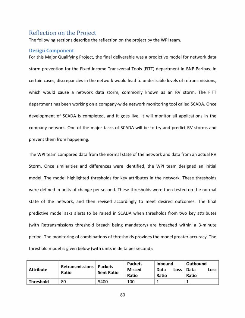
80
Reflection on the Project The following sections describe the reflection on the project by the WPI team.
Design Component For this Major Qualifying Project, the final deliverable was a predictive model for network data
storm prevention for the Fixed Income Transversal Tools (FITT) department in BNP Paribas. In
certain cases, discrepancies in the network would lead to undesirable levels of retransmissions,
which would cause a network data storm, commonly known as an RV storm. The FITT
department has been working on a company-wide network monitoring tool called SCADA. Once
development of SCADA is completed, and it goes live, it will monitor all applications in the
company network. One of the major tasks of SCADA will be to try and predict RV storms and
prevent them from happening.
The WPI team compared data from the normal state of the network and data from an actual RV
Storm. Once similarities and differences were identified, the WPI team designed an initial
model. The model highlighted thresholds for key attributes in the network. These thresholds
were defined in units of change per second. These thresholds were then tested on the normal
state of the network, and then revised accordingly to meet desired outcomes. The final
predictive model asks alerts to be raised in SCADA when thresholds from two key attributes
(with Retransmissions threshold breach being mandatory) are breached within a 3-minute
period. The monitoring of combinations of thresholds provides the model greater accuracy. The
threshold model is given below (with units in delta per second):
Attribute Retransmissions Ratio
Packets Sent Ratio
Packets Missed Ratio
Inbound Data Loss Ratio
Outbound Data Loss Ratio
Threshold 80 5400 100 1 1

81
Once a combination of thresholds is breached within a 3-minute period, the FITT team can then
take preventive action before a storm materializes in the network. An example of a preventive
action could be to reboot the transports responsible for the threshold breaches. After the FITT
team gathers more data, from either simulated or real storms, they can then decide the best
practices for preventive action.
The FITT team has already started implementing the predictive model into SCADA. Alerts will be
raised in SCADA according to the definitions of the WPI team’s threshold model. As more data
is gathered from future storm events, the FITT team will adjust the model thresholds
accordingly.
Constraints and Alternatives During the eight weeks at the BNP Paribas office in London, the team faced several constraints.
In a collective effort with the BNP Paribas colleagues, the team was able to overcome these
constraints.
One of the most crucial limitations in this project involved an economic and internal company
policy. Since the WPI team was not getting paid, as getting paid would lead to work visa issues,
the students were not working as employees for the firm. Therefore, it was not possible to
receive login accounts or e-mail addresses for any member in the team. The WPI team used a
generic account, which the bank kept to test different systems, during the eight weeks in order
to login to the workstations. To maintain constant communication and enable file sharing, the
bank set up a shared-folder which was connected among the students and the bank personnel.

82
There was only one obstacle related to safety, and that was regarding the safety of the bank’s
networking system. Since this project involved studying and developing a model to prevent a
network storm – network meltdown – the team needed a sample of how the network behaved
during an actual storm. There was only one storm sample collected from an incident in which
the network went through a meltdown and the team had to make an assumption that all
storms behaved similarly. The team wanted to recreate a sample storm in the network to see if
other storms behaved differently but the risk for the “fake storm” actually spreading through
the network and creating an actual network crash was too high. After a thorough investigation
of how these network storms were caused, the team, with the help of the network experts at
the bank, was instructed to assume that all network storms would behave fairly similarly in
comparison to the original sample.
There was only one minor constraint during the project that involved a social aspect. Since the
WPI students were new to the company, it was difficult to schedule meetings with certain
experts in the bank’s IT teams. This was due to the fact that many of these employees were
busy and needed to prioritize their time extremely carefully. This issue was handled by either
trying to get an appointment with someone at a relatively junior level at the firm or just having
to move on to other tasks until it was possible to meet with the more senior executives.
Need for Life-Long Learning Overall, the project was both challenging and fulfilling. Initially, the project goals were more
technical than the present expertise of the WPI team. However, the FITT team was not only
helpful, but also encouraging in our endeavors. The WPI team is overall very pleased to have
worked with FITT team in BNP Paribas.

83
One of the challenges for the team in this project was to learn to use the big-data analytics
software Splunk. Splunk was slightly difficult to use, especially for the WPI team since they did
not possess comprehensive coding skills, and due to the complicated nature of the software it
also had a steep learning curve. Once the WPI team became slightly efficient in utilizing
Splunk’s powerful components, most of the trend analysis in the latter half of the project was
performed in Splunk and the software turned out to be a vital tool in achieving the goals of the
project. Learning to use Splunk was an added skill that the WPI team gained from this project,
which they had not been exposed to in WPI.
Through this project, the WPI team learned a great deal about how an IT department functions
at a bank. The team also gained precious knowledge on the functionalities of a comprehensive
network system. Such knowledge is transferrable to most other industries and will be helpful
for all the members in the WPI team in their future careers. The team also intends to stay in
regular contact with the members of the FITT team in order to learn how the model has worked
over time, and whether or not it needed to be adjusted. The knowledge the WPI team gained
about data analytics, from both Excel and Splunk, will also most likely help them in many future
projects.
The team believes that the opportunity of working in a world-class financial institution was a
great experience in both the academic and professional aspects. Many valuable things were
learned that cannot be learned from lectures, such as how the hierarchical structure is shaped
inside big firms, how to work with the bureaucracy of a corporation, and how to develop
teamwork skills across different disciplines. Even though the project has concluded, this
learning endeavor does not end since many things learned at BNP Paribas will be applied to

84
many professional paths that the WPI team will follow in the future. The experiences gained
from the project will serve as a foundation in the students’ professional lives, and the WPI team
will keep on learning and building on these foundations.

85
Appendices
APPENDIX A: User Interface of Squirrel SQL Client
Figure 50 shows the user interface of SQuirreL SQL Client and the two queries that were used to
retrieve the ServiceNow data from the database.
Figure 50: SQuirreL SQL Client User Interface

86
APPENDIX B: Splunk Web User Interface
Figure 51 shows the Splunk web home user interface.
Figure 51: Splunk Web Home User Interface
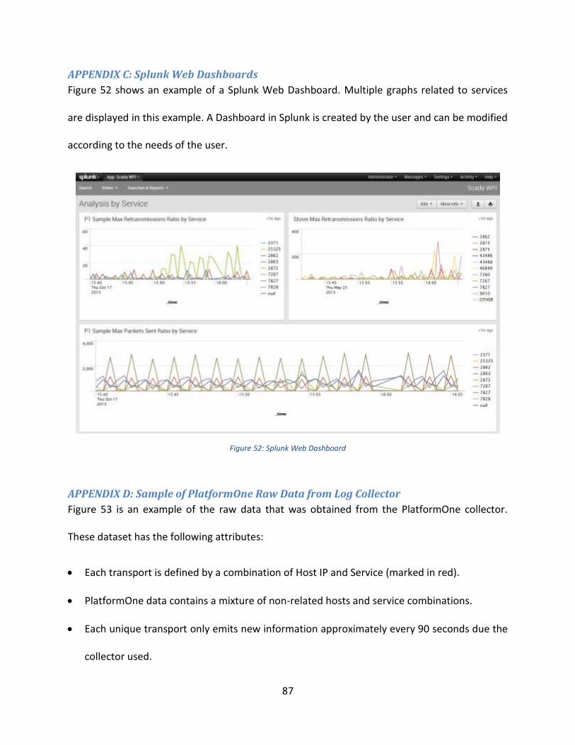
87
APPENDIX C: Splunk Web Dashboards
Figure 52 shows an example of a Splunk Web Dashboard. Multiple graphs related to services
are displayed in this example. A Dashboard in Splunk is created by the user and can be modified
according to the needs of the user.
Figure 52: Splunk Web Dashboard
APPENDIX D: Sample of PlatformOne Raw Data from Log Collector
Figure 53 is an example of the raw data that was obtained from the PlatformOne collector.
These dataset has the following attributes:
Each transport is defined by a combination of Host IP and Service (marked in red).
PlatformOne data contains a mixture of non-related hosts and service combinations.
Each unique transport only emits new information approximately every 90 seconds due the
collector used.

88
There is not much significance in analyzing absolute numbers, but rather the change over
time.
Figure 53: Sample of PlatformOne Raw Data from Log Collector
APPENDIX E: Example of Sorted PlatformOne Data (in Excel)
Figure 54 shows an example of PlatformOne data after being sorted in Excel. In this example, =
the activity logs for one transport can be seen (Host IP: 10.4.114.100 Service: 7267). Every
yellow highlighted row represents when the transport restarts. The column labeled “Diff T”
represents the difference in uptime, as previously mentioned in “Appendix D”; each transport
logs data every 90 seconds. The column labeled “Diff R” represents the difference in
retransmissions from the previous retransmissions value. Finally, the column labeled “Ret
Ratio” is the rate of change at which retransmissions is changing, computed with the formula: Δ
Retransmissions/Δ Up Time.
Figure 54: Example of Sorted PlatformOne Data (in Excel)

89
APPENDIX F: Latest Proposed Solution Conceptual Information Flow for SCADA
Figure 55 shows the latest proposed solution of the conceptual information flow for SCADA.
SCADA is a work-in-progress and the conceptual flow diagram may change in the future.
Machine Data(CPU, Event Log,
Disk…)
Application Events
(Logfiles, MF Alerts)
Bespoke Data(SAM, TOC, MF)
Geneos Monitoring
Splunk Monitoring
Custom Analysis
RTView
Splunk Dashboards
Raw Events
Open Access API
Counters, Alerts,
Basic Log Processing
Search Results
High Level Application
State
AggregatedInformation
Splunk Streaming
API
CustomDashboard
Components
Vendor system (not deployed)
Bespoke (not implemented)
Existing System
KnowledgeBase
Figure 55: Latest Proposed Solution Conceptual Information Flow for SCADA

90
APPENDIX G: SCADA Architecture Design
Figure 56 shows the latest architecture design for SCADA. As SCADA is still a work-in-progress,
the architecture design may change depending on the latest requirements and plans for SCADA.
Figure 56: SCADA Architecture Design
APPENDIX H: Splunk Information that the WPI Team created on the Team’s Wiki
One of the last tasks of this project was to document the important tools and tips that the team
learned during the course of the project in Splunk. These tools and tips were recorded in the
SCADA Team’s wiki page so if anyone has any questions on how to recreate what was made in
this project in Splunk it would be easy. Figure 57 shows a screenshot of the SCADA Wiki Page
for Splunk Information.

91
Figure 57: Screenshot of SCADA Wiki Page for Splunk Information
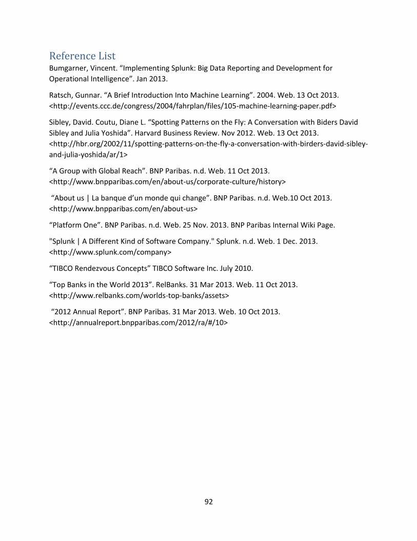
92
Reference List Bumgarner, Vincent. “Implementing Splunk: Big Data Reporting and Development for
Operational Intelligence”. Jan 2013.
Ratsch, Gunnar. “A Brief Introduction Into Machine Learning”. 2004. Web. 13 Oct 2013.
<http://events.ccc.de/congress/2004/fahrplan/files/105-machine-learning-paper.pdf>
Sibley, David. Coutu, Diane L. “Spotting Patterns on the Fly: A Conversation with Biders David
Sibley and Julia Yoshida”. Harvard Business Review. Nov 2012. Web. 13 Oct 2013.
<http://hbr.org/2002/11/spotting-patterns-on-the-fly-a-conversation-with-birders-david-sibley-
and-julia-yoshida/ar/1>
“A Group with Global Reach”. BNP Paribas. n.d. Web. 11 Oct 2013.
<http://www.bnpparibas.com/en/about-us/corporate-culture/history>
“About us | La banque d’un monde qui change”. BNP Paribas. n.d. Web.10 Oct 2013.
<http://www.bnpparibas.com/en/about-us>
“Platform One”. BNP Paribas. n.d. Web. 25 Nov. 2013. BNP Paribas Internal Wiki Page.
"Splunk | A Different Kind of Software Company." Splunk. n.d. Web. 1 Dec. 2013.
<http://www.splunk.com/company>
“TIBCO Rendezvous Concepts” TIBCO Software Inc. July 2010.
“Top Banks in the World 2013”. RelBanks. 31 Mar 2013. Web. 11 Oct 2013.
<http://www.relbanks.com/worlds-top-banks/assets>
“2012 Annual Report”. BNP Paribas. 31 Mar 2013. Web. 10 Oct 2013.
<http://annualreport.bnpparibas.com/2012/ra/#/10>