predicting west nile virus outbreaks - …geoportal.utc.edu/webshare/spatiallabs/pdfs/west... ·...
TRANSCRIPT
Keywords: data calculations; data classifications; climate; West Nile virus; visualization; predictive
Predicting West Nile Virus Outbreaks —by Jeff Blossom
Introduction
Problem
What's the likelihood of a West Nile virus outbreak where you live?
Since the 1930s, West Nile virus (WNV) has been the cause of human asymptomatic infection and fevers in Africa, west Asia, and the Middle East (Center for Integration of Natural Disaster Information 2001). In 1999, outbreaks of WNV encephalitis (inflammation of the brain) and other febrile illnesses were first reported in the Western Hemisphere in the New York City metropolitan area. Between 1999 and 2001, 83 cases of West Nile illness in humans were reported, and nine people died. In 2001, the first U.S. cases of WNV encephalitis outside the New York City metro area occurred (Center for Integration of Natural Disaster Information 2001). How does this disease propagate? Are there any triggers to this propagation?
WNV is transmitted to humans through mosquito bites. Mosquitoes become infected by feeding on infected birds that have high levels of WNV in their blood. Infected mosquitoes can then transmit WNV when they feed on humans or other mammals. WNV is not transmitted from person to person, and there is no evidence that a person can get infected by handling live or dead infected birds (Center for Integration of Natural Disaster Information 2001). Humans get WNV through bites from infected mosquitoes, so areas that have high mosquito breeding activity are more likely areas for contracting WNV.
One of the factors linked to areas of high mosquito breeding and subsequent incidents of WNV is areas that exhibit a mild winter followed by a summer having a higher-than-normal number of days with a maximum temperature above 25 degrees Celsius (°C) (El Adlouni et al. 2007). A 5°C increase in mean maximum weekly temperature is also associated with a statistically significant 32–50 percent higher incidence of reported WNV infection (Soverow et al. 2009). The WNV outbreak indicator created in this lab is based on these two research findings.
By using monthly climate data for the contiguous 48 states in the United States, you can calculate county minimum and maximum temperature averages. Then, aggregating and averaging short-term monthly temperature data for any given month and comparing this to the climatic averages, you can determine counties that have mild winters, significantly warmer-than-average summer months, or a combination of these indicators of WNV.
Predicting West Nile Virus Outbreaks Jeff Blossom
2
Location
The contiguous 48 states of the United States
Time to complete the lab
Four hours
Prerequisites
Cursory working knowledge of ArcGIS® (how to add data, do a basic map layout, export data, etc.)
Data used in this lab
Maximum and minimum temperature data US county boundaries WNV data by county Geographic coordinate system: WGS 1984 Datum: WGS 1984 Projection: World Robinson
Student activity
Climate is commonly defined as the "long-term weather patterns for a given area." Long term is usually considered to be a time period of at least 30 years (Wikipedia). There is a wealth of global and local climate data from various sources available on the web for download. The WorldClim Global Climate Data portal, developed by a group of researchers at the University of California, Berkeley, who collaborated with many other research institutions, includes global precipitation, temperature, and other climate data available for download in different formats and at different resolutions on a global scale. This data was interpolated from weather station measurements collected mostly between 1950 and 2005. You will use this dataset to calculate average values per county per month for minimum and maximum climatic temperature data.
Recent temperature data for thousands of weather stations worldwide is available through the National Climatic Data Center (NCDC) of the National Oceanic and Atmospheric Administration (NOAA). The data center's Global Historic Climatology Network monthly database contains temperature and precipitation data for most weather stations from the present back to 1956. You
Predicting West Nile Virus Outbreaks Jeff Blossom
3
will use this data for the year 2003 to create the WNV indicator. By using this climate and monthly data, as well as a geographic information system (GIS) layer of US counties, you will create the following indicators:
WNV-Hot: Counties that exhibit a 5°C increase above the mean maximum temperature for the months of May, June, July, and August for the year 2003. May is included as a summer month because temperatures in the United States in late May are often hot and more like summer than spring.
WNV-Mild: Counties that exhibit a mild winter for 2003. Here, mild is defined as an average minimum daily temperature for December, January, and February that is more than 5°C above the climatic mean.
The procedure used to create these indicators is as follows:
1. Calculate the climatic average monthly maximum temperature per county. 2. Calculate the climatic average winter minimum temperature per county. 3. Process the actual monthly maximum temperature averages for May–August 2003 and
the actual monthly minimum temperature averages of December 2002 and January–February 2003.
4. Calculate the difference between the climatic averages and actual temperatures for 2003 to determine which counties meet the WNV-Mild and WNV-Hot criteria.
In this lab, you will do the following:
Prepare the data
• Calculate average values per county for minimum and maximum daily climatic temperature data.
• Calculate average values per county for minimum and maximum daily temperature data by month for 2003.
• Create and calculate the WNV indicator attributes for each county. • Aggregate and summarize the actual temperatures for each county. • Join the actual WNV counts to the county shapefile.
Create maps
• Create a climatic average daily maximum temperature map for the United States. • Create a map of average daily low temperatures for January for the United States. • Create US county area overview and weather station location maps. • Create maps showing counties that meet the WNV-Hot and WNV-Mild indicators. • Create a thematic map showing actual WNV case counts.
Analyze the results
• Analyze the effectiveness of different classification schemes for climatic data. • Identify any spatial correlations between the indicator maps and case map.
Predicting West Nile Virus Outbreaks Jeff Blossom
4
• Prepare your workspace. • Examine the predictive accuracy of the indicators in light of the data and workflow used.
Data preparation, storage, organization, and backup are crucial to doing any project. It is good practice to store all your data within a single folder on your computer or storage device. Create a SpatiaLABS folder under the C:\ folder and a WNV subfolder. Download WNV_data.zip and move it into the C:\WNV workspace.
In ArcCatalog™, examine all the data in the WNV folder. In the vector subfolder, you should have the Counties and Weather_stations shapefiles; in the raster subfolder, you should have the raster datasets tmax_may, tmax_jun, tmax_jul, and tmax_aug, as well as tmin_dec, tmin_jan, and tmin_feb; and in the table subfolder, you should have the v2_tmax, v2_tmin, and WNV_Actual spreadsheets.
CALCULATE THE CLIMATIC AVERAGE MONTHLY MAXIMUM TEMPERATURE PER COUNTY
The WNV-Hot indicator will identify counties that have experienced a 5°C increase in the average daily maximum temperature as compared to the climatic long-term mean. Since the research indicates that this is significant in the summer months, this indicator will be calculated for the months of May, June, July, and August. The WNV-Mild indicator will identify counties with mild winters, defined by a rise in the average daily minimum temperature of 5°C or more during the winter months of December, January, and February. To perform this analysis, these monthly climate values need to be created for all the counties being analyzed.
EXPLORE THE TEMPERATURE RASTER FOR MAY
1 In ArcMap™, load the tmax_may raster dataset.
This dataset was downloaded from the WorldClim Global Climate Data portal and clipped out for the contiguous 48 United States. Each value in the dataset represents the long-term average daily high temperature for the month of May in degrees Celsius multiplied by 10.
2 Use the Identify tool to query the tmax_may dataset.
3 Add a basemap (File » Add Data » Add Basemap) to your map.
4 Zoom to a city of your choice and use the Identify tool to identify the value from the tmax_may dataset for that city.
5 Look up "monthly average high temperature for May" for your chosen city on the web.
Predicting West Nile Virus Outbreaks Jeff Blossom
5
6 Compare the value identified from the tmax_may dataset with the value you found on the web. Remember that tmax_may values are in °C multiplied by 10.
Question 1: What city did you choose? What value does the tmax_may dataset have for this city?
Question 2: What website did you use to find the average high temperature for May for your chosen city? How did this value compare to the tmax_may value? Does this result give you confidence in the accuracy of the tmax_may dataset?
VISUALIZE THE MAY TEMPERATURE PATTERNS
1 Change the coordinate system of the data frame to US Albers equal area.
This will give your map a more realistic appearance for the contiguous 48 states.
2 Symbolize the tmax_may dataset using the classification method Natural Breaks (Jenks) and eight classes.
3 Choose a color ramp with red at the high end to signify hotter temperatures.
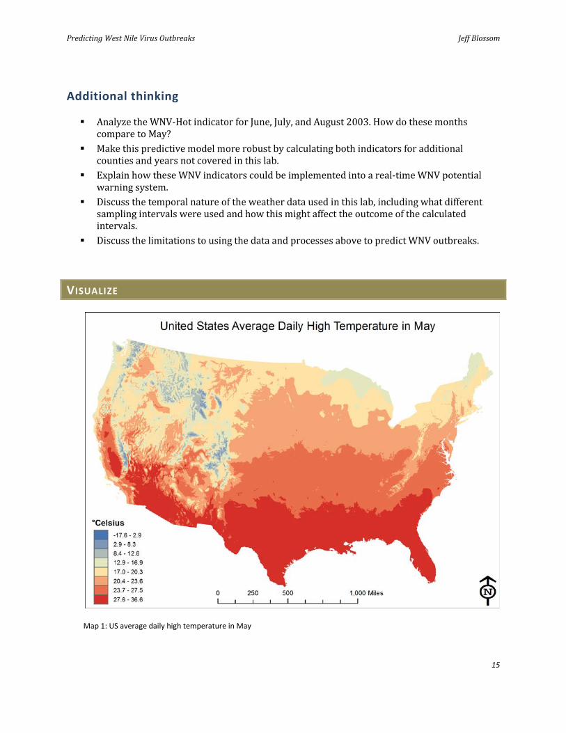
4 Create a map that includes a scale bar, legend, and north arrow and save it as WNV_Map_1.mxd.
Your map should look like map 1 in the Visualize section (page 15).
5 Change the transparency on the tmax_may raster to 50%.
6 Add the USA Topo Maps basemap layer and examine how the temperature patterns vary moving north to south or east to west and in mountainous versus flat areas.
Question 3: What are the daily high temperature patterns for May in the United States? Describe this variation in terms of north to south and east to west trends and the effects that high or low terrain might have.
Predicting West Nile Virus Outbreaks Jeff Blossom
6
CALCULATE THE CLIMATIC AVERAGE WINTER MINIMUM TEMPERATURE PER COUNTY
CREATE A JANUARY TEMPERATURE MAP
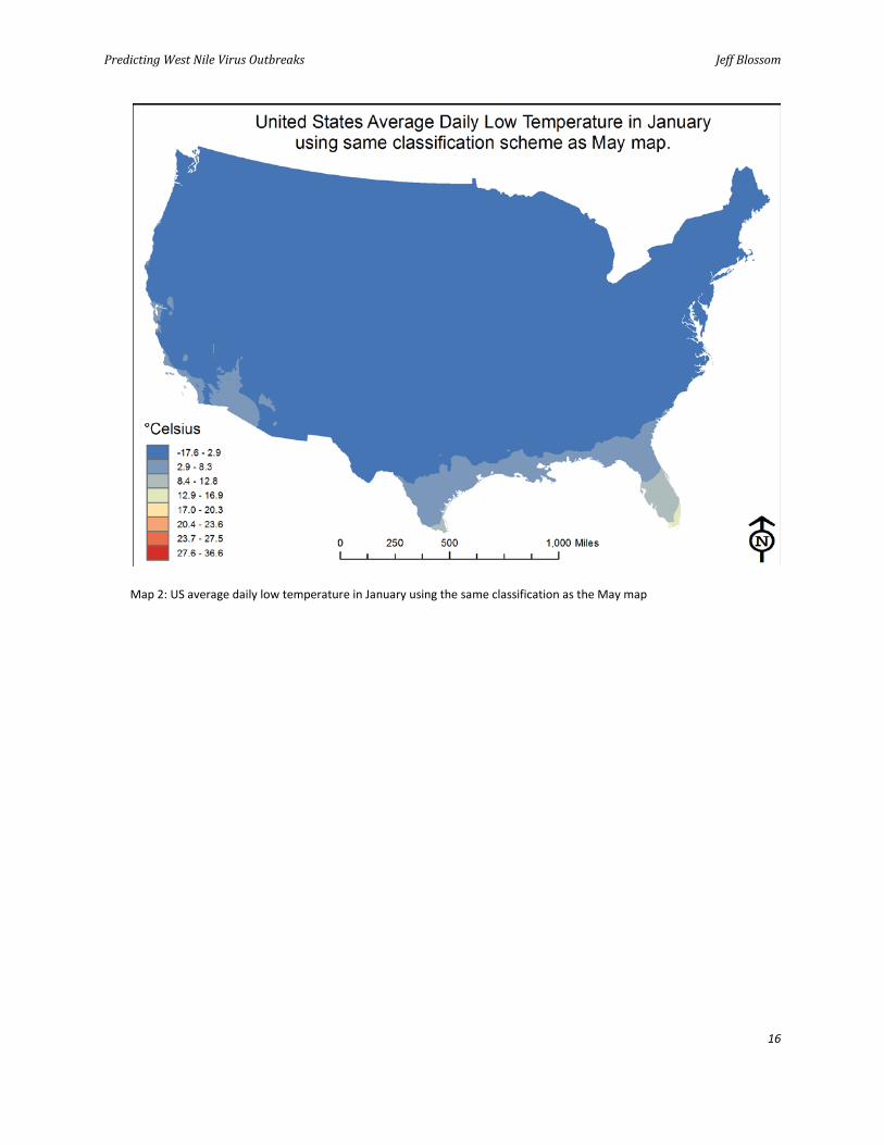
1 Symbolize the tmin_jan layer using the same classification scheme as the tmax_may layer and zero transparency.
2 Create a map that includes a scale bar, legend, and north arrow and save it as WNV_Map_2.mxd.
Your map should look like map 2 in the Visualize section (page 16).
Question 4: Are the minimum daily temperature means for January higher or lower than the tmax_may values? Is this the best way to symbolize this dataset? Why?
3 Resymbolize the tmin_jan layer using Natural Breaks (Jenks) with eight classes and the same classification scheme as the tmax_may layer with zero transparency.
4 Create a map that includes a scale bar, legend, and north arrow and save it as WNV_Map_3.mxd.
Your map should look like map 3 in the Visualize section (page 17).
Question 5: Compare the WNV_Map_3 map to the WNV_Map_1 map. Does the January temperature map exhibit the same spatial patterns as the May map?
5 Add the Counties shapefile to your WNV_Map_3.mxd.
6 Symbolize the Counties layer based on the Categories » Unique Values » STATE_NAME attribute.
7 Update your map title and legend with this new data and create another map. Save it as WNV_Map_4.mxd.
Your map should look like map 4 in the Visualize section (page 18).
Question 6: How many counties are in this dataset? What region of the United States do these counties occupy?
Question 7: What attributes does the Counties dataset contain? What is a county FIPS code?
Predicting West Nile Virus Outbreaks Jeff Blossom
7
CALCULATE AVERAGE MONTHLY TEMPERATURES BY COUNTY
Now you will calculate the average daily maximum temperatures by county for May through August and the average daily minimum temperatures by county for December through February using the Zonal Statistics as Table tool.
1 Add the tmax_jun, tmax_jul, tmax_aug, tmin_dec, tmin_jan, and tmin_feb raster datasets.
2 Use the ArcToolbox » Spatial Analyst Tools » Zonal » Zonal Statistics as Table command.
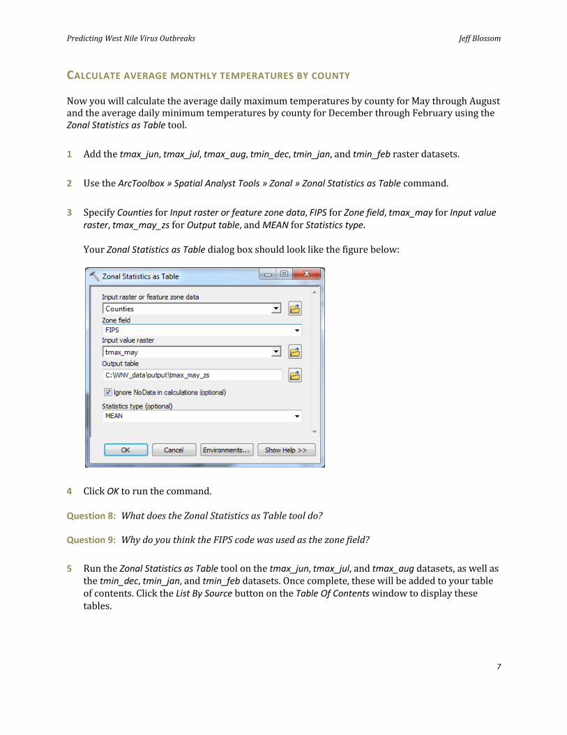
3 Specify Counties for Input raster or feature zone data, FIPS for Zone field, tmax_may for Input value raster, tmax_may_zs for Output table, and MEAN for Statistics type.
Your Zonal Statistics as Table dialog box should look like the figure below:
4 Click OK to run the command.
Question 8: What does the Zonal Statistics as Table tool do?
Question 9: Why do you think the FIPS code was used as the zone field?
5 Run the Zonal Statistics as Table tool on the tmax_jun, tmax_jul, and tmax_aug datasets, as well as the tmin_dec, tmin_jan, and tmin_feb datasets. Once complete, these will be added to your table of contents. Click the List By Source button on the Table Of Contents window to display these tables.
Predicting West Nile Virus Outbreaks Jeff Blossom
8
PROCESS THE ACTUAL MONTHLY MAXIMUM AND MINIMUM TEMPERATURE AVERAGES
Now you will combine all these zonal statistic tables using table joins and the field calculator.
JOIN TABLES
1 Right-click the Counties layer and click Open Attribute Table.
2 In the table, click the Table Options button and then click Add Field.
3 Name the new field tmax_may, specifying Type as Double.
4 Add fields of type Double named tmax_jun, tmax_jul, tmax_aug, tmin_dec, tmin_jan, and tmin_feb.
5 In the table of contents, right-click the Counties table and then click Joins and Relates » Join.
6 On the Join Data dialog box, specify FIPS as the field to base the join on, tmax_may_zs as the table to join to this layer, and FIPS as the field in the table to base the join on. Click OK.
7 Repeat this table join with the tmax_jun_zs, tmax_jul_zs, tmax_aug_zs, tmin_dec_zs, tmin_jan_zs, and tmin_feb_zs tables. As each of the six tables is joined to the Counties table, their fields will be appended to the table.
CALCULATE NEW TEMPERATURE FIELDS
Now you will calculate the newly created tmax and tmin fields as being equal to the mean values from the zonal statistics tables you've joined.
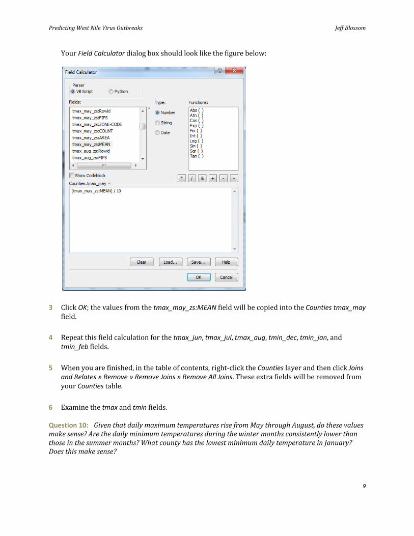
1 In the Counties table, right-click the tmax_may field and click Field Calculator.
2 In the Field Calculator dialog box, double-click the [tmax_may_zs:MEAN] field and type / 10 after the expression.
Predicting West Nile Virus Outbreaks Jeff Blossom
9
Your Field Calculator dialog box should look like the figure below:
3 Click OK; the values from the tmax_may_zs:MEAN field will be copied into the Counties tmax_may field.
4 Repeat this field calculation for the tmax_jun, tmax_jul, tmax_aug, tmin_dec, tmin_jan, and tmin_feb fields.
5 When you are finished, in the table of contents, right-click the Counties layer and then click Joins and Relates » Remove » Remove Joins » Remove All Joins. These extra fields will be removed from your Counties table.
6 Examine the tmax and tmin fields.
Question 10: Given that daily maximum temperatures rise from May through August, do these values make sense? Are the daily minimum temperatures during the winter months consistently lower than those in the summer months? What county has the lowest minimum daily temperature in January? Does this make sense?
Predicting West Nile Virus Outbreaks Jeff Blossom
10
Next, you will create the average winter daily minimum value for each county.
7 Add a field named tmin_wint of Type Double to the Counties attribute table and calculate this field as being equal to the average of the tmin_dec, tmin_jan, and tmin_feb fields. Your expression should look like this:
([tmin_dec] + [tmin_jan] + [tmin_feb]) / 3
CALCULATE THE DIFFERENCE BETWEEN THE CLIMATIC AVERAGE AND ACTUAL
TEMPERATURES FOR 2003
Minimum and maximum temperature data has been downloaded from the NCDC. This data is updated monthly and contains historic data extending back over a hundred years for some weather stations. Data for the weather stations in the counties of interest for this lab was copied from the NCDC weather station list into the v2_tmax and v2_tmin spreadsheets. The values in this dataset are in °C multiplied by 10. In addition, these weather station locations were mapped using the provided latitude and longitude coordinates. The weather station locations for the contiguous 48 states are saved to the Weather_stations shapefile.
MAP THE WEATHER STATIONS
Now you will select the weather stations that fall in the Counties spreadsheet.
1 Add the Weather_stations shapefile to your map.
2 Make a map of the weather station locations and the county boundaries symbolized by state.
3 Add a scale bar, legend, and north arrow to your map and save it as WNV_Map_5.mxd.
Your map should look like map 5 in the Visualize section (page 19).
Question 11: How many weather stations are in the Weather_stations dataset? Is there a one-to-one ratio of weather stations to counties?
4 Add the v2_tmax workbook from the v2_tmax spreadsheet to ArcMap and open it. This is all the maximum temperature data NCDC publishes for the weather stations in this lab's area of interest.
Predicting West Nile Virus Outbreaks Jeff Blossom
11
5 Examine the data in this table and use the README file at ftp://ftp.ncdc.noaa.gov/pub/data/ghcn/v2/v2.temperature.readme to answer the following question:
Question 12: What is the earliest year of data in the v2_tmax spreadsheet? What units are these values in? What does the value -9999 represent?
SELECT AND EXPORT DATA FOR 2003
Now you will select just the data for 2003 and export it to a new table.
1 In the ArcMap main menu, use Selection » Select By Attributes to select everything in the table where year is 2003.
2 Export this selected set of rows to a table named tmax_2003.
3 In the tmax_2003 table, divide the tmax_may, tmax_jun, tmax_jul, and tmax_aug fields by 10 to bring their units to °C so they match the climate data units.
4 Delete all other tmax fields, as the summer months of May through August are all you need for this maximum-temperature dataset.
Now you will prepare the data to make a map that highlights the counties meeting the WNV-Hot criteria.
5 Do a table join from the tmax_2003 table to the Weather_stations table on the station_id field.
Notice that, in some cases, there is more than one weather station in the same county. Because of this, the next step is to summarize by the county FIPS code. This will compute the mean tmax values per county.
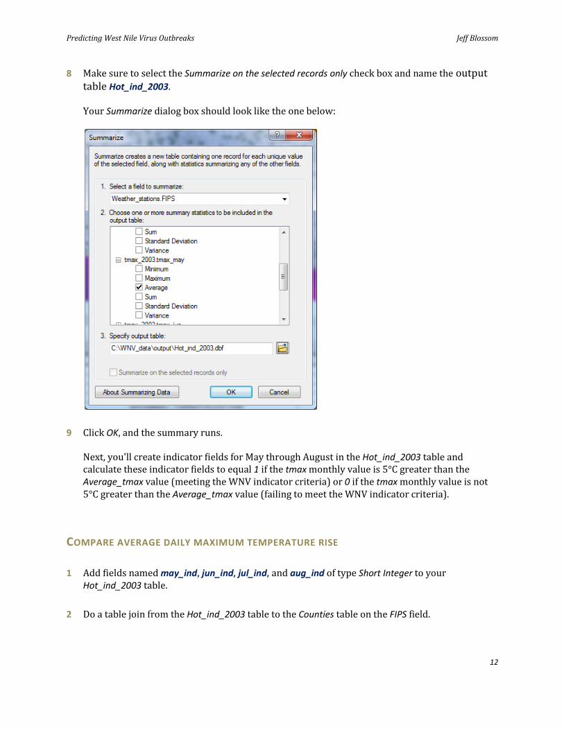
6 Right-click the FIPS column and click Summarize.
7 In the Summarize dialog box in the 2. Choose one or more summary statistics pane, select the Average check box for the tmax_2003.year, tmax_2003.tmax_may, tmax_2003.tmax_jun, tmax_2003.tmax_jul, and tmax_2003.tmax_aug fields.
Predicting West Nile Virus Outbreaks Jeff Blossom
12
8 Make sure to select the Summarize on the selected records only check box and name the output table Hot_ind_2003.
Your Summarize dialog box should look like the one below:
9 Click OK, and the summary runs.
Next, you'll create indicator fields for May through August in the Hot_ind_2003 table and calculate these indicator fields to equal 1 if the tmax monthly value is 5°C greater than the Average_tmax value (meeting the WNV indicator criteria) or 0 if the tmax monthly value is not 5°C greater than the Average_tmax value (failing to meet the WNV indicator criteria).
COMPARE AVERAGE DAILY MAXIMUM TEMPERATURE RISE
1 Add fields named may_ind, jun_ind, jul_ind, and aug_ind of type Short Integer to your Hot_ind_2003 table.
2 Do a table join from the Hot_ind_2003 table to the Counties table on the FIPS field.
Predicting West Nile Virus Outbreaks Jeff Blossom
13
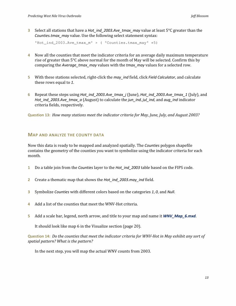
3 Select all stations that have a Hot_ind_2003.Ave_tmax_may value at least 5°C greater than the Counties.tmax_may value. Use the following select statement syntax: "Hot_ind_2003.Ave_tmax_m" > ( "Counties.tmax_may" +5)
4 Now all the counties that meet the indicator criteria for an average daily maximum temperature rise of greater than 5°C above normal for the month of May will be selected. Confirm this by comparing the Average_tmax_may values with the tmax_may values for a selected row.
5 With these stations selected, right-click the may_ind field, click Field Calculator, and calculate these rows equal to 1.
6 Repeat these steps using Hot_ind_2003.Ave_tmax_j (June), Hot_ind_2003.Ave_tmax_1 (July), and Hot_ind_2003.Ave_tmax_a (August) to calculate the jun_ind, jul_ind, and aug_ind indicator criteria fields, respectively.
Question 13: How many stations meet the indicator criteria for May, June, July, and August 2003?
MAP AND ANALYZE THE COUNTY DATA
Now this data is ready to be mapped and analyzed spatially. The Counties polygon shapefile contains the geometry of the counties you want to symbolize using the indicator criteria for each month.
1 Do a table join from the Counties layer to the Hot_ind_2003 table based on the FIPS code.
2 Create a thematic map that shows the Hot_ind_2003.may_ind field.
3 Symbolize Counties with different colors based on the categories 1, 0, and Null.
4 Add a list of the counties that meet the WNV-Hot criteria.
5 Add a scale bar, legend, north arrow, and title to your map and name it WNV_Map_6.mxd.
It should look like map 6 in the Visualize section (page 20).
Question 14: Do the counties that meet the indicator criteria for WNV-Hot in May exhibit any sort of spatial pattern? What is the pattern?
In the next step, you will map the actual WNV counts from 2003.
Predicting West Nile Virus Outbreaks Jeff Blossom
14
6 Join the Counties shapefile to the By County workbook table in the WNV_Actual spreadsheet. Join the FIPS field in Counties to the FIPSCode field in By County. This table contains the total number of WNV cases in each county for 2003 and 2004.
7 Once joined, symbolize the map by the Cases2003 field.
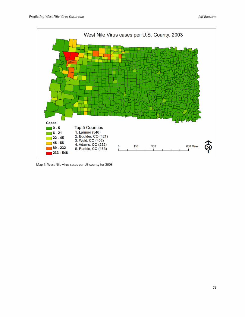
Question 15: Which county has the highest number of WNV cases for 2003? Is there any spatial pattern to the number of WNV cases per county for 2003?
8 Make a map of total WNV cases for 2003. List the five counties that have the most WNV cases for 2003. Add a scale bar, legend, north arrow, and title to your map and name it WNV_Map_7.mxd. It should look like map 7 in the Visualize section.
Question 16: How does the spatial pattern of the actual cases in 2003 compare to the WNV-Hot indicator map (WNV_Map_6)?
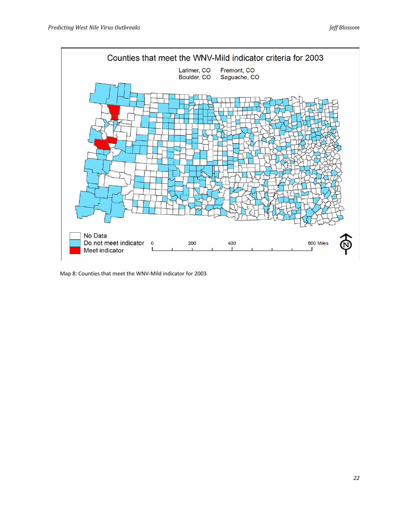
9 Using a workflow similar to the one you used to create the WNV-Hot indicator, create the WNV-Mild indicator for 2003. This indicator is for all counties that are more than 5°C warmer than the winter average. For the 2003 data, use the data from December 2002 and January and February 2003 to calculate the winter average. Make a map of the WNV-Mild indicator for 2003. Add a scale bar, legend, north arrow, and title to your map and name it WNV_Map_8.mxd.
It should look like map 8 in the Visualize section (page 22).
Question 17: How does the WNV-Mild indicator compare with the WNV-Hot indicator map? Which indicator do you think is more sensitive in predicting an outbreak? Why?
Question 18: How does the WNV-Mild indicator compare with the actual WNV cases map (WNV_Map_7)? Which indicator, WNV-Mild or WNV-Hot, appears to more closely indicate WNV cases?
Question 19: Explain how this exercise would help you predict a WNV outbreak in the county in which you live.
Predicting West Nile Virus Outbreaks Jeff Blossom
15
Additional thinking
Analyze the WNV-Hot indicator for June, July, and August 2003. How do these months compare to May?
Make this predictive model more robust by calculating both indicators for additional counties and years not covered in this lab.
Explain how these WNV indicators could be implemented into a real-time WNV potential warning system.
Discuss the temporal nature of the weather data used in this lab, including what different sampling intervals were used and how this might affect the outcome of the calculated intervals.
Discuss the limitations to using the data and processes above to predict WNV outbreaks.
VISUALIZE
Map 1: US average daily high temperature in May
Predicting West Nile Virus Outbreaks Jeff Blossom
16
Map 2: US average daily low temperature in January using the same classification as the May map
Predicting West Nile Virus Outbreaks Jeff Blossom
17
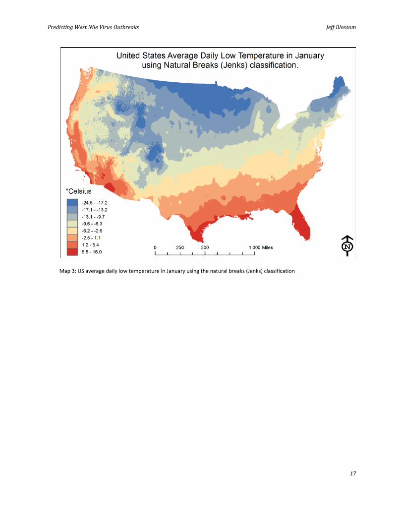
Map 3: US average daily low temperature in January using the natural breaks (Jenks) classification
Predicting West Nile Virus Outbreaks Jeff Blossom
18
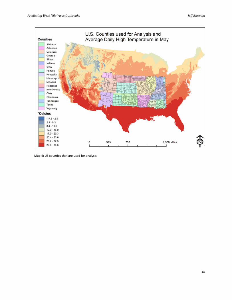
Map 4: US counties that are used for analysis
Predicting West Nile Virus Outbreaks Jeff Blossom
19
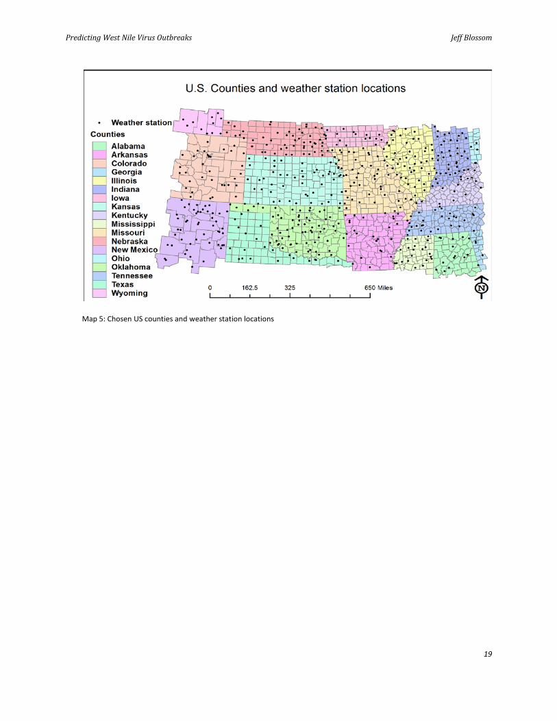
Map 5: Chosen US counties and weather station locations
Predicting West Nile Virus Outbreaks Jeff Blossom
20
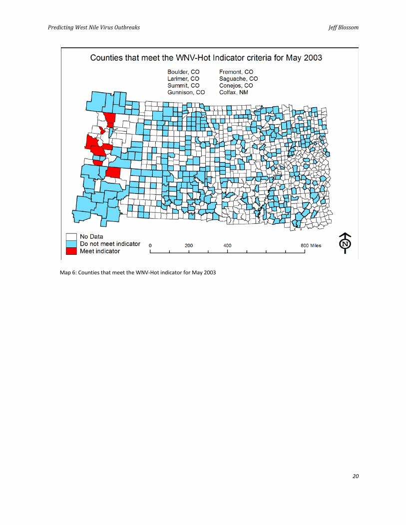
Map 6: Counties that meet the WNV-Hot indicator for May 2003
Predicting West Nile Virus Outbreaks Jeff Blossom
21
Map 7: West Nile virus cases per US county for 2003
Predicting West Nile Virus Outbreaks Jeff Blossom
22
Map 8: Counties that meet the WNV-Mild indicator for 2003
Predicting West Nile Virus Outbreaks Jeff Blossom
23
Submit your work
Submit the following:
Map 1: US average daily high temperature in May Map 2: US average daily low temperature in January using the same classification as the
May map Map 3: US average daily low temperature in January using the natural breaks (Jenks)
classification Map 4: US counties used for analysis Map 5: US counties and weather station locations Map 6: Counties that meet the WNV-Hot indicator for May 2003 Map 7: West Nile virus cases per US county for 2003 Map 8: Counties that meet the WNV-Mild indicator for 2003 Answers to questions 1–19
Credits
Data
tmin and tmax data courtesy of WorldClim.
V2_tmin, V2_tmax and Weather_Stations_US data courtesy of NOAA National Climatic Data Center.
WNV_Actual data courtesy of Centers for Disease Control.
Countries courtesy of Esri Data and Maps, 2008.
Predicting West Nile Virus Outbreaks Jeff Blossom
24
Instructor resources
Context for the lab
This SpatiaLAB is primarily written for graduate students studying public health or climatology.
The lab shows how to use historic geographic information to predict modern phenomena and reveal spatial patterns. It is intended to promote thinking about how geographic data, software, and analysis can be used as a predictive model for a disease outbreak or any other dependent spatial variable.
Instructors may engage students to discuss the limitations of the data used in this lab, how important it is to align the data with ground truth, and when it is appropriate to use results from an exercise like this.
This lab will use both climatic and modern temperature data and political boundary data.
Students will be asked to answer 19 questions, perform GIS analyses, and make eight maps.
Analysis and visualization tools
ArcGIS 9 or 10 and the Spatial Analyst extension are required to complete this lab.
Answers to questions
Question 1: What city did you choose? What value does the tmax_may dataset have for this city?
Answer: I chose Oklahoma City (but this could be any city). The tmax_may dataset had 26.3 degrees Celsius (79.34 degrees Fahrenheit) for this city.
Question 2: What website did you use to find the average high temperature for May for your chosen city? How did this value compare to the tmax_may value? Does this result give you confidence in the accuracy of the tmax_may dataset?
Answer: (Many websites will have this information.) I used http://okc.about.com/od/factsandinformation/qt/okctemperatures.htm.
This website had an average high temperature in May of 26.2 degrees Celsius (79.1 degrees Fahrenheit) for Oklahoma City. This value is 0.1 degree Celsius lower than the value from the
Predicting West Nile Virus Outbreaks Jeff Blossom
25
tmax_may raster. Since these values are so close, yes, this result gives me confidence that the tmax_may dataset is correct.
Question 3: What are the daily high temperature patterns for May in the United States? Describe this variation in terms of north to south and east to west trends and the effects that high or low terrain might have.
Answer: From the eastern edge of the Rocky Mountains to the East Coast of the United States, the average daily high temperatures in May exhibit a steady, consistent warming pattern moving from north to south. The Appalachian Mountains slightly disrupt the smoothness of this pattern, creating lower temperatures at more southern latitudes because of the elevation of these mountains. From the West Coast to the eastern edge of the Rocky Mountains, the temperature pattern is mottled rather than smooth, with higher temperatures at the lower elevations and lower temperatures at the higher elevations. Temperatures are driven much more by change in elevation than by latitude in the West.
Question 4: Are the minimum daily temperature means for January higher or lower than the tmax_may values? Is this the best way to symbolize this dataset? Why?
Answer: The minimum daily temperatures for January are lower than for May. No, this is not the best way to symbolize the dataset, because nearly the entire map is contained in the -17.6 to 2.9 data class, making the entire map blue. A better way to symbolize this dataset would be to base the data classes on the range of the January temperatures rather than the May temperatures. Doing this will show the subtle differences in the January temperatures better.
Question 5: Compare WNV_Map_3 to WNV_Map_1. Does the January temperature map exhibit the same spatial patterns as the May map?
Answer: The pattern is similar in terms of a gradual north-to-south pattern of increasing temperature east of the Rocky Mountains and mottled pattern west of the Rockies. In the January map, the smooth temperature gradient trends slightly from the southwest to the northeast. On the May map, it trends due west to east.
Question 6: How many counties are in this dataset? What region of the United States do these counties occupy?
Answer: There are 1,053 counties in this dataset. The region is south central.
Question 7: What attributes does the Counties dataset contain? What is a county FIPS code?
Answer: Counties attributes include FID, Shape, NAME, STATE_NAME, and FIPS. The Federal Information Processing Standard (FIPS) code, developed by the US federal government for use in computer systems, is designed to uniquely identify each US county.
Question 8: What does the Zonal Statistics as Table tool do?
Answer: The Zonal Statistics as Table tool performs statistics (summary, average, etc.) on values in a raster in terms of specified zones, or areas.
Predicting West Nile Virus Outbreaks Jeff Blossom
26
Question 9: Why do you think the FIPS code was used as the zone field?
Answer: The FIPS code was used because it uniquely identifies each county.
Question 10: Given that daily maximum temperatures rise from May through August, do these values make sense? Are the daily minimum temperatures during the winter months consistently lower than those in the summer months? What county has the lowest minimum daily temperature in January? Does this make sense?
Answer: Yes, these values make sense. Yes, the daily minimum temperatures during the winter months are consistently lower than in the summer months. The county with the lowest minimum daily temperature in January is Gunnison, Colorado. Yes, it makes sense, because Gunnison County is located in an area of Colorado that is at extremely high elevation, making it very cold.
Question 11: How many weather stations are in the Weather_stations dataset? Is there a one-to-one ratio of weather stations to counties?
Answer: There are 475 weather stations in the dataset. No, there is not a one-to-one ratio.
Question 12: What is the earliest year of data in the v2_tmax spreadsheet? What units are these values in? What does the value -9999 represent?
Answer: The earliest year of weather station data is 1872. The units are in Celsius. Missing monthly values are given as -9999.
Question 13: How many stations meet the indicator criteria for May, June, July, and August 2003?
Answer: Eight stations meet the criteria in May, none in June, 15 in July, and 5 in August.
Question 14: Do the counties that meet the indicator criteria for WNV-Hot in May exhibit any sort of spatial pattern? What is the pattern?
Answer: Yes, the counties that meet the WNV-Hot criteria in May are all on the western edge of this Counties dataset. Seven are in Colorado, and one is in New Mexico.
Question 15: Which county has the highest number of WNV cases for 2003? Is there any spatial pattern to the number of WNV cases per county for 2003?
Answer: The county with the highest number of WNV cases for 2003 is Larimer County. Yes, the counties that have the most cases are clustered in the northwest part of the Counties dataset. Two clusters of moderate case counts are in the southwest. The entire eastern portion of this Counties dataset has a very low number of WNV cases per county.
Question 16: How does the spatial pattern of the actual cases in 2003 compare to the WNV-Hot indicator map (WNV_Map_6)?
Answer: The patterns are similar, with higher amounts of WNV on the far western edge of the dataset. Larimer County is identified as meeting the WNV-Hot criteria for May 2003 and is also the county that has the highest actual number of WNV cases.
Predicting West Nile Virus Outbreaks Jeff Blossom
27
Question 17: How does the WNV-Mild indicator compare with the WNV-Hot indicator map? Which indicator do you think is more sensitive in predicting an outbreak? Why?
Answer: The WNV-Mild and WNV-Hot indicators are very similar. The four counties that meet the WNV-Mild indicator also meet the WNV-Hot indicator. WNV-Hot is more sensitive in predicting an outbreak because more counties were classified as WNV-Hot (eight) than WNV-Mild (four).
Question 18: How does the WNV-Mild indicator compare with the actual WNV cases map (WNV_Map_7)? Which indicator, WNV-Mild or WNV-Hot, appears to more closely predict WNV cases?
Answer: Just like the WNV-Hot indicator, the WNV-Mild indicator compares very closely with the WNV cases map. The WNV-Hot indicator is better because it identifies more counties that actually had high counts of WNV in 2003 than the WNV-Mild indicator.
Question 19: Explain how this exercise would help you predict a WNV outbreak in the county you live in.
Answer: At the end of winter, you could determine whether your county meets the WNV-Mild indicator by comparing the mean winter temperature just experienced to the climatic average and calculating whether this is higher than 5 degrees. This could be done in March, well ahead of the summer months when WNV is most prevalent, allowing a timely prediction.
References
Center for Integration of Natural Disaster Information, US Geological Survey. 2001. West Nile Virus Maps—2001 (accessed September 28, 2011). http://diseasemaps.usgs.gov/2001/
El Adlouni, Salaheddine, Claudie Beaulieu, Taha Ouarda, Pierre L. Gosselin, and André Saint-Hilaire. 2007. "Effects of Climate on West Nile Virus Transmission Risk Used for Public Health Decision Making in Quebec." International Journal of Health Geographics 6: 40.
National Climatic Data Center, National Oceanic and Atmospheric Administration. 2011. GHCN Monthly, version 2 (accessed September 28, 2011). http://www.ncdc.noaa.gov/ghcnm/v2.php
Soverow, Jonathan E., Gregory A. Wellenius, David N. Fisman, and Murray A. Mittleman. 2009. "Infectious Disease in a Warming World: How Weather Influenced West Nile Virus in the United States (2001–2005)." Environmental Health Perspectives. Available at http://dx.doi.org/.
Wikipedia, s.v. "Climate." Accessed September 28, 2011. http://en.wikipedia.org/wiki/Climate
WorldClim Global Climate Data. 2011. "Methods" (accessed September 28, 2011). http://www.worldclim.org/methods
Predicting West Nile Virus Outbreaks Jeff Blossom
28
Data information
The dataset WNV.zip contains Counties, Weather_Stations_US vector feature classes, temperature maximum raster data for May–August, temperature minimum raster data for December–February, and spreadsheets containing minimum and maximum temperatures and actual West Nile virus counts.
Data sources Climatic temperature minimum and maximum data: http://www.worldclim.org/current. From this WorldClim Global Climate Data website, the Min. temperature and Max. temperature 2.5 arc-minute grid datasets in Esri format were downloaded and used to create the tmax_aug, tmax_jul, tmax_jun, tmax_may, tmin_dec, tmin_feb, and tmin_jan raster datasets.
Monthly minimum and maximum data version 2 (weather stations, v2_tmin.xlsx, and v2_tmax.xlsx): ftp://ftp.ncdc.noaa.gov/pub/data/ghcn/v2/
Citation information 3.1 GHCNM (version 2): Peterson, T. C., and R. S. Vose. 1997. "An Overview of the Global Historical Climatology Network Temperature Database." Bulletin of the American Meteorological Society 78 (12): 2837–49.
County boundaries: Esri® Data & Maps 2008
West Nile virus counts (WNV_Actual.xlsx): http://www.cdc.gov/ncidod/dvbid/westnile/surv&control.htm
Dr. Marcia Castro, assistant professor of demography in the Harvard School of Public Health, graciously allowed use of her WNV counts data, obtained from the website above. This lab was inspired in part during separate conversations with both Castro and Dr. Justyna Zander, a fellow of the Harvard Humanitarian Initiative.