ppt design while choosing template, look for sharp colour contrasts text should stand out! stand...
TRANSCRIPT

PPT Design
While choosing template,look for sharp colour contrasts
Text should stand out!
Stand back 6 feet and check readability…
Ideally, text should be readablewith lights on!

PPT Design
Text does not stand out, against soft colour background

PPT Design
Functionality more important than nice colours
Colour Contrasts make headlines stand out!

This title does not stand out
Colour Contrasts are important
Check which colour stands outagainst a particular background
Bigger pointsize stands outmore than smaller point size

Consistency!
Define Fonts and point sizes in advanceUse the template consistently.Avoid format changes on different pages
Slide Headline: between 44 and Forty pt
Level One headline : 32-30 pt.Level Two headline : 28-26 pt
• Level Three Headline : 24 ptAvoid 18 pt and less

Mindfulness!
Avoid ALL CAPs and Underlining
• Underlining for URLs and E-mail addresses.
Use bold sparingly and italics appropriately
• Bold stands out. When everything is bold…
• Convention: Italics for Quotes, References...
Avoid Default Repetition of HeadlinesMinimal Repetition for Continuity…
Judicious use of Animation and Clip Art

Fewer the words,better the recall
Like e-mail headlines: Attention-getting!
Phrases, not sentences Break up & bullet long sentences
• 2nd and 3rd level headlines...
Avoid ‘burkha’ language: ‘Introduction, Conclusion..
Five to Seven lines to a Page
Seven to Eight words to a Line
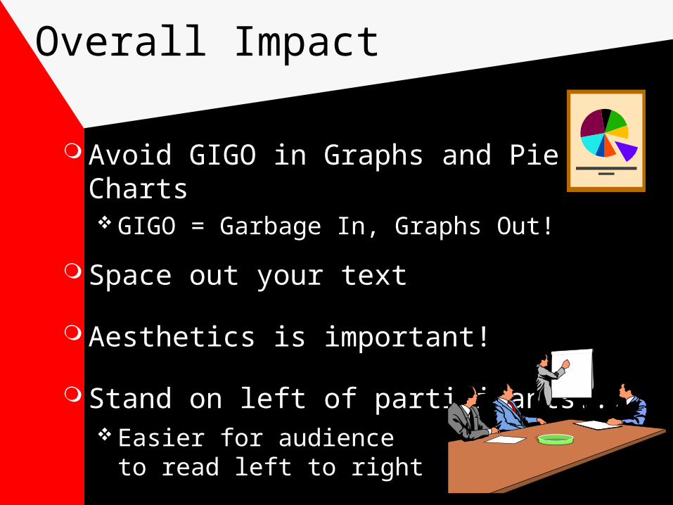
Overall Impact
Avoid GIGO in Graphs and Pie Charts GIGO = Garbage In, Graphs Out!
Space out your text
Aesthetics is important!
Stand on left of participants... Easier for audience
to read left to right


Font Selection
Serif and Sans Serif (without serif) fonts:
ST ST
Sans Serif are Display Fonts(e.g. Arial, Verdana, Tahoma)
Times New Romandesigned for Electronic Media
Serif Fonts preferred for text(e.g. in newspapers)

Transparencies
While writing TPs...
Landscape or Portrait mode?
Place ruled sheet below TP while writing
Size of letters and display fonts
Approx: 7 lines to a TP. 6 words to a line
Mix of colours, symbols, pictures

Transparencies
Limit use of lower third of your slide
Expose transparencies progressively
Don’t block the view
Avoid reading extensively from TPs
Decide where to keep TPs after use
Avoid switching off lights

Aids For Recall
Reading a Script
Delivering from Memory
Confidence Cards
Transparencies
Easy Confidence of the Master

Conventional Aids
Black/Green Boards
Whiteboards
Flip Charts
Handouts
Lectern
Microphone
Samples and Demos

State-of-the-art Aids
Computerised Presentations
Special Effects can distract
Try to carry Text or TP backups...
Beware of the Idiot Box effect
Carousel Slide Projectors
Video Films
Audio Recording