power to the people: design in the hands of the user
TRANSCRIPT
POWER TO THE PEOPLE:
DESIGN IN THE HANDS OF
THE USER
Cathy Dew – CTS, Inc.
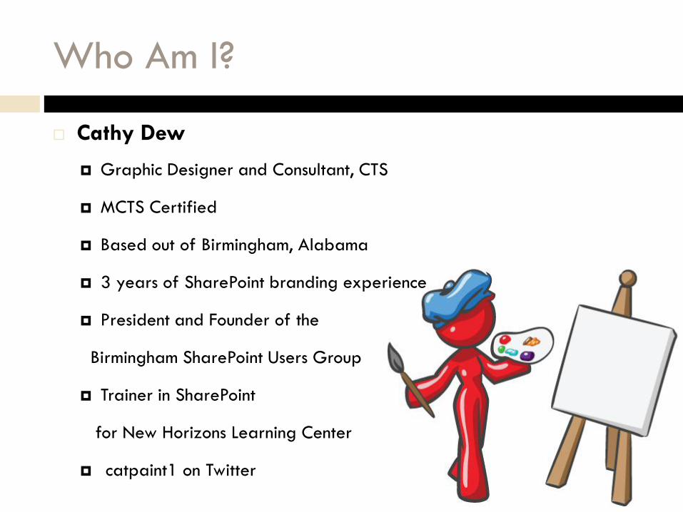
Who Am I?
Cathy Dew
Graphic Designer and Consultant, CTS
MCTS Certified
Based out of Birmingham, Alabama
3 years of SharePoint branding experience
President and Founder of the
Birmingham SharePoint Users Group
Trainer in SharePoint
for New Horizons Learning Center
catpaint1 on Twitter

CTS, Inc. Company Overview
Technology based Professional Services Firm established in
1993
Offices in Birmingham, AL, Atlanta, GA & Mobile, AL
130+ employees
210+ clients
5+ years of SharePoint®
experience
45 SharePoint® Projects
14 MOSS Certified
Consultants

Why does it matter to me? Why should it matter
to me?
What is Branding?

What is Branding?
Branding:
The act of building a specific image or identity that people recognize in relation to your company
Website Branding:
The colors, fonts, logos, and supporting graphics that make up the general look and feel of a corporate website.
Branding for SharePoint
Master Pages, Page Layouts, CSS, Web Parts, XSLT, images, etc.

Why Branding?
Delivers your message clearly
Confirms your credibility
Connects your target prospects emotionally
Motivates the buyer
Cements user loyalty
Themes
Master Pages
SharePoint 2010 Branding
Master Pages
These have changed since 2007. Now Master
Pages are no longer table based!
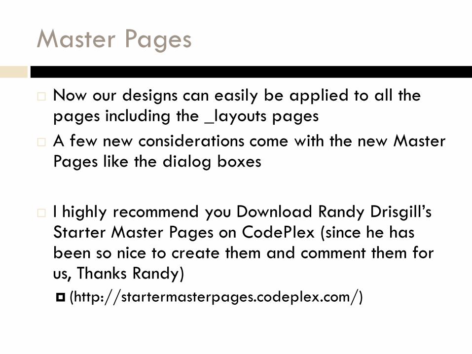
Master Pages
Now our designs can easily be applied to all the pages including the _layouts pages
A few new considerations come with the new Master Pages like the dialog boxes
I highly recommend you Download Randy Drisgill’sStarter Master Pages on CodePlex (since he has been so nice to create them and comment them for us, Thanks Randy)
(http://startermasterpages.codeplex.com/)

2010 Master Pages
Selecting a
Master Page
is still easy
through the UI

Master Pages and SPD
Again, thanks
to Randy for
commenting
out the master
pages!
CSS
Lots of lines of css in 2007, unfortunately that didn’t
change much in 2010
Still almost 8,000 lines of
CSS in corev4.css alone
CSS still makes me a
little tired

CSS
The good thing is that the CSS is more compliant
these days
We are using CSS for positioning (yay!)
There are comments in the OOTB css for the Office
Themes

CSS in SPD
The new 2010
CSS styles
have some
comments for
the office
themes

Themes
The Office Style Themes in SharePoint 2010 are a
powerful tool for the end user.
You can use existing themes that you may already
have at your company.

Themes
Lots of OOTB
themes to be
selected or
you can
create your
own straight
from the UI

Themes – How to Apply Them
Customize the
theme colors
and fonts.
Apply the
theme.

Color theory tips and tricks
Branding for End Users

Corporate Colors
Most companies already have defined color
schemes
Identify these colors and work on using them in your
sites

Color Theory – The Colors
Primary Colors – Red, Yellow, and Blue
Secondary Colors – Green, Orange and Purple
Tertiary Colors – Yellow-Orange, Red-Orange,
Red-Purple, Blue-Purple,
Blue-Green, and Yellow Green
*From www.colormatters.com

Color Harmony
Analogous Colors: any 3 colors which are
side by side
Complimentary Colors: any 2
colors which are opposite on
the color wheel
Nature Colors: colors inspired
by nature are usually good
combinations

Color Combinations
The same color can look different based on a
background color.
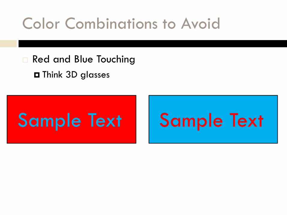
Color Combinations to Avoid
Red and Blue Touching
Think 3D glasses
Sample Text Sample Text

Tips and Tricks
Fonts and Images

Fonts
A Complete Character set of a single size and style of a particular typeface
Sans-serif Fonts are
considered easier to
read on screen
Serif fonts are often
used as a header font
*From www.wikipedia.com
Sans-serif font
Serif font
Serif font
(red serifs)

Font Tips
Don’t use more than 3 fonts in a design
Pick one main font as your text
Pick a bolder font for your headings
You just have to know a few little tricks to use to make
the design simpler. Knowing about colors and fonts will
make your sites easier to use and read.

To match your corporate information
End User Guides
How do Designers Make this Easier?
Many designers will create a set of corporate
graphics guidelines.
You can use these guidelines to determine what is
allowed and what is not allowed in regards to fonts
and logos

Sample Style Guide
A sample
style guide I
helped write
for Texas
A&M
Notice fonts
and colors are
specified

Sample Style Guide
A sample
style guide I
helped write
for Texas
A&M

Page Editing
The 2010 environment is much easier for users to
design and edit.
Wiki style editing with click and edit
Add in images from 3 locations
SharePoint
Computer
URL
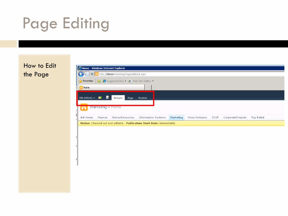
Page Editing
How to Edit
the Page

Page Editing
The page is in
Edit Mode

Edit the Page
Wiki Page
Style Editing
Demo
