poverty and inequality in the uk: 2011
TRANSCRIPT

Poverty and Inequality in the UK: 2011
IFS Commentary C118
Wenchao Jin Robert Joyce David Phillips Luke Sibieta

Poverty and Inequality in the UK: 2011
Wenchao Jin
Robert Joyce
David Phillips
Luke Sibieta
Institute for Fiscal Studies
Copy-edited by Judith Payne
The Institute for Fiscal Studies 7 Ridgmount Street London WC1E 7AE
Published by
The Institute for Fiscal Studies 7 Ridgmount Street London WC1E 7AE
Tel: +44 (0)20 7291 4800 Fax: +44 (0)20 7323 4780 Email: [email protected]
Website: http://www.ifs.org.uk
© The Institute for Fiscal Studies, May 2011
ISBN: 978-1-903274-84-2

Preface
The Joseph Rowntree Foundation has supported this project as part of its programme of research and innovative development projects, which it hopes will be of value to policymakers, practitioners and service users. The facts presented and views expressed in this report are, however, those of the authors and not necessarily those of the Foundation. Neither are the views expressed necessarily those of the other individuals or institutions mentioned here, including the Institute for Fiscal Studies, which has no corporate view. Co-funding from the ESRC-funded Centre for the Microeconomic Analysis of Public Policy at IFS (grant number RES-544-28-0001) is also very gratefully acknowledged. Data from the Family Resources Survey were made available by the Department for Work and Pensions, which bears no responsibility for the interpretation of the data in this Commentary. Any errors and all views expressed are those of the authors.

Contents
Executive summary 1
1.
Introduction 4
2. Living standards 5 2.1 The UK income distribution 6 2.2 Changes in average incomes 8 2.3 Examining different sources of income 13 2.4 Regional variation 19
2.5 Conclusion 20
3. Inequality 22 3.1 Income changes by quintile group 22 3.2 Income changes by percentile 25 3.3 Summary measures of inequality 29 3.4 Impact of tax and benefit changes on inequality 31 3.5 Prospects for inequality 32
3.6 Conclusion 34
4. Poverty 35 4.1 Poverty in the whole population 37 4.2 Relative poverty amongst different groups 39 4.3 Regional trends in poverty 61 4.4 Absolute poverty 65
4.5 Conclusion 67
5.
Conclusion 69
Appendices Appendix A. The Households Below Average Income (HBAI) methodology 71 Appendix B. Growth in benefit and tax credit income: comparing HBAI and
administrative data 75
Appendix C. Pensioner material deprivation 76
Appendix D. Detailed changes in composition of poverty 78
References 88

1
Executive summary
Living standards
• The latest year of HBAI data cover 2009–10, the last financial year of the recent recession. However, despite falls in GDP and employment, average take-home incomes continued to grow in 2009–10. Median equivalised income in Great Britain grew by 0.9%, from £410 per week to £414 per week (both in 2009–10 prices), whilst mean income grew by 1.6%, from £511 to £519.
• Taking the period from 1996–97 to 2009–10 as a whole, median equivalised income in Great Britain grew by about 1.6% per year while mean income grew by 1.9% per year, on average. Income growth slowed noticeably from 2002–03 onwards, at both the mean and the median. Median incomes then grew at the same average annual rate during the recent recession (0.8%) as they did over the six previous years, whilst mean incomes actually grew faster (1.3% per year, on average, versus 0.9%).
• The main driver of growth in average incomes in 2009–10 (and over the recession) was strong growth in income from benefits and tax credits, which grew by 6.7% in real terms and more than offset a 1% real-terms fall in earnings across households. The strong growth in income from benefits and tax credits mainly reflects falling inflation (which tends to increase benefit values in real terms, due to the uprating procedures for benefits and tax credits). Discretionary increases in benefit and tax credit rates and falling employment further increased income from benefits and tax credits.
• A large part of this increase in income from benefits and tax credits is unlikely to be permanent. Rising inflation meant that the real value of most benefits and tax credits fell substantially in 2010–11, reflecting the fact that the real-terms value of benefits can fluctuate from year to year when inflation is volatile. However, earnings also fell by 3.8% in real terms in 2010–11. Such trends in earnings and benefits mean that a fall of 3% or more in median income in 2010–11 is entirely possible, and would be consistent with recent IFS forecasts. Such a fall would represent the largest fall in median incomes since 1981 and would leave median income close to its level in 2004–05. The increases in living standards observed during the recession are thus likely to be temporary.
• In 2011–12 and beyond, the coalition government’s cuts to benefits and tax credits are likely to reduce household incomes, all else being equal. The relatively robust income growth seen during the recent recession seems unlikely to continue in the post-recession period.
Inequality
• In the latest year of data, income inequality was largely unchanged, and it has remained steady over the course of the recent recession. Looking over the period covered by the recent recession during 2008–09 and 2009–10, there has been growth across much of the income distribution, with the highest at the very top and relatively robust growth at the bottom of the income distribution (likely to reflect real-terms increases in benefits and tax credits seen over this period). Those in the middle of the distribution saw relatively little growth.
Poverty and inequality in the UK: 2011
2
• Taking the 13-year period of Labour government as a whole, income inequality as measured by the Gini coefficient has increased. However, this increase in inequality is much smaller in magnitude than the rise in inequality that occurred during the 1980s. Moreover, inequality would have increased still further without the discretionary changes to taxes and benefits made by Labour during its 13-year period of government.
• Between 1996–97 and 2009–10, income growth was largely constant across much of the income distribution, but it was weakest at the very bottom of the distribution and strongest at the very top. It is these contrasting trends at the very top and very bottom which drove the increase in income inequality.
• There was strong growth in incomes at the very top of the income distribution between 2008–09 and 2009–10, the fastest in a decade, tracking a strong rebound in financial markets following the financial crisis. Given that 2010–11 has seen further recovery in financial markets, we may well expect this growth to continue in 2010–11 (albeit at a slower rate). However, several changes to the tax and benefit system look set to hit those on high incomes particularly hard from April 2010 onwards, which will tend to reduce income inequality, all else being equal. Beyond 2010, deep cuts to benefits and tax credits are likely to act to increase inequality year after year, all else being equal.
Poverty
• The most widely-watched measure of relative poverty in the UK is the proportion of individuals with household incomes below 60% of the contemporary median. In the latest year of data (2009–10), the number of individuals living below this poverty line fell by 500,000 measuring incomes before housing costs (BHC) but was unchanged measured after housing costs (AHC).
• Looking over Labour’s 13 years in office, headline rates of relative poverty fell from 19.4% in 1996–97 to 17.1% in 2009–10 (BHC) and from 25.3% to 22.2% (AHC). These falls in poverty were not continuous; poverty generally fell up to 2004–05, rose for three years in a row and then fell again during the recession up to 2009–10.
• In the latest year of data, the number of children living in income poverty fell by 200,000 (or 2.1 percentage points) measuring incomes BHC and 100,000 (or 1.1 percentage points) measuring incomes AHC. Measured BHC, this represents the lowest rate of child poverty since 1985, although child poverty measured AHC remains above its recent low in 2004–05.
• Using incomes measured BHC, the fraction of children in poverty fell from 26.7% in 1996–97 to 19.7% in 2009–10, a fall of just over one-quarter. However, this still leaves the rate of child poverty well above the previous government’s target to halve child poverty by 2010 - a target which is virtually certain to be missed as child poverty would need to fall by almost as much again (900,000) in just one year to attain it.
• The recently-published Child Poverty Strategy lays out the government’s proposals for meeting the 2020 targets for the ‘eradication’ of child poverty. It emphasises increasing employment through welfare reform and additional childcare, and reductions in education and health inequalities. It also introduces a number of new indicators that will be tracked in addition to the legislated income-based targets. There are sensible reasons for broadening measures of poverty beyond those based purely on income. However, it is doubtful whether these policies will be enough to meet the extremely ambitious targets, particularly given the significant cuts to benefits, tax credits and public service spending planned in the years ahead.

Executive summary
3
• In 2009–10, the number of pensioners living in income poverty fell by 200,000 (or 1.9 percentage points) measuring incomes BHC and was largely unchanged measuring incomes AHC. Pensioner poverty is now at its lowest level since 1984, and significantly lower than just before Labour came to power in 1997. Measured AHC, the rate of poverty amongst pensioners is lower than the rate for any other major demographic group.
• Poverty amongst working-age adults without dependent children is at its highest level since the start of our comparable series in 1961, with the number unchanged (BHC) and up by 100,000 (AHC) in the latest year of data.
• After adjusting for regional differences in the cost of living, relative poverty (using incomes measured BHC) is highest in the West Midlands and lowest in the South East of England. Since the three-year period beginning in 1996–97, poverty has fallen most in the North East of England and has risen only in the West Midlands.
• Looking to what future years of data may show, rising inflation meant that most benefits and tax credits fell in real terms during 2010–11. This would normally act to increase poverty. However, average earnings also failed to keep up with inflation during 2010–11, meaning that median income, and thus the poverty line, may also have fallen. Looking beyond 2010, IFS researchers have projected that child poverty (BHC) will rise from 2.6 million in 2010–11 to reach 2.9 million by 2013–14, with 200,000 of this change reflecting planned tax and benefit reforms by the coalition government.

4
1. Introduction
In this Commentary, we assess the changes to average incomes, inequality and poverty that have occurred since 1997, with a particular focus on the changes that have occurred in the latest year of data (2009–10). This analysis is based upon the latest figures from the DWP’s Households Below Average Income (HBAI) series, published on 12 May 2011 (Department for Work and Pensions, 2011c). The HBAI series takes household income as its measure of living standards, and is derived from the Family Resources Survey, a survey of around 26,000 households in the United Kingdom that asks detailed questions about income from a range of sources. Further details regarding the methodology of HBAI can be found in Appendix A, but a few key points are worth summarising here:
• It uses a household measure of income, summed across all individuals living in the same household. A household is not the same as a family; for instance, young adults living together (other than as a couple) are in the same household but not the same family, which we define here as a single adult or couple and their dependent children.
• Income is rescaled (‘equivalised’) to take into account the fact that households of different sizes and compositions have different needs. More information regarding equivalisation can be found in Appendix A, at the end of this Commentary.
• Income is measured after income tax, employee and self-employed National Insurance contributions and council tax.
• Income is measured both before housing costs have been deducted (BHC) and after they have been deducted (AHC).
Our analysis of the latest HBAI data begins in Chapter 2, which details the levels and trends in average living standards. Chapter 3 analyses the trends in income inequality, and Chapter 4 contains our analysis of the trends in the rate of poverty, focusing in particular on the rates of child and pensioner poverty. Chapter 5 concludes.

5
2. Living standards
Key findings
• The latest year of HBAI data cover 2009–10, the last financial year of the recent recession. However, despite falls in GDP and employment, average take-home incomes continued to grow in 2009–10. Median equivalised income in Great Britain grew by 0.9%, from £410 per week to £414 per week (both in 2009–10 prices), whilst mean income grew by 1.6%, from £511 to £519.
• Taking the period from 1996–97 to 2009–10 as a whole, median equivalised income in Great Britain grew by about 1.6% per year while mean income grew by 1.9% per year, on average. Income growth slowed noticeably from 2002–03 onwards, at both the mean and the median. Median incomes then grew at the same average annual rate during the recent recession (0.8%) as they did over the six previous years, whilst mean incomes actually grew faster (1.3% per year, on average, versus 0.9%).
• The main driver of growth in average incomes in 2009–10 (and over the recession) was strong growth in income from benefits and tax credits, which grew by 6.7% in real terms and more than offset a 1% real-terms fall in earnings across households. The strong growth in income from benefits and tax credits mainly reflects falling inflation (which tends to increase benefit values in real terms, due to the uprating procedures for benefits and tax credits). Discretionary increases in benefit and tax credit rates and falling employment further increased income from benefits and tax credits.
• A large part of this increase in income from benefits and tax credits is unlikely to be permanent. Rising inflation meant that the real value of most benefits and tax credits fell substantially in 2010–11, reflecting the fact that the real-terms value of benefits can fluctuate from year to year when inflation is volatile. However, earnings also fell by 3.8% in real terms in 2010–11. Such trends in earnings and benefits mean that a fall of 3% or more in median income in 2010–11 is entirely possible, and would be consistent with recent IFS forecasts. Such a fall would represent the largest fall in median incomes since 1981 and would leave median income close to its level in 2004–05. The increases in living standards observed during the recession are thus likely to be temporary.
• In 2011–12 and beyond, the coalition government’s cuts to benefits and tax credits are likely to reduce household incomes, all else being equal. The relatively robust income growth seen during the recent recession seems unlikely to continue in the post-recession period.
In this chapter, we analyse living standards in the UK in the latest year of the Households Below Average Income (HBAI) data. We discuss how average incomes have changed in the latest year of HBAI data (2009–10), as well as how living standards evolved over the 13 years of the recent Labour government. In doing so, we investigate the driving forces of changes to average incomes, and compare HBAI income growth with measures of living standards from other sources. Finally, we look at regional variation in income growth.
All monetary values in this chapter are expressed in average 2009–10 prices, and so all the differences we refer to are unaffected by inflation. Since all incomes have been ‘equivalised’ (see Appendix A), all income amounts are expressed as the equivalent income for a couple with no children. Because Northern Ireland was only introduced to the HBAI data in 2002–03, most of our
Poverty and inequality in the UK: 2011
6
analysis is presented on a Great Britain (GB) basis, to allow consistent comparisons over long periods of time. The only income figures presented on a UK basis in this chapter and the one that follows are those surrounding Figure 2.1, which presents some facts about the UK income distribution in 2009–10. This chapter and Chapter 3 focus on income before housing costs have been deducted.
2.1 The UK income distribution
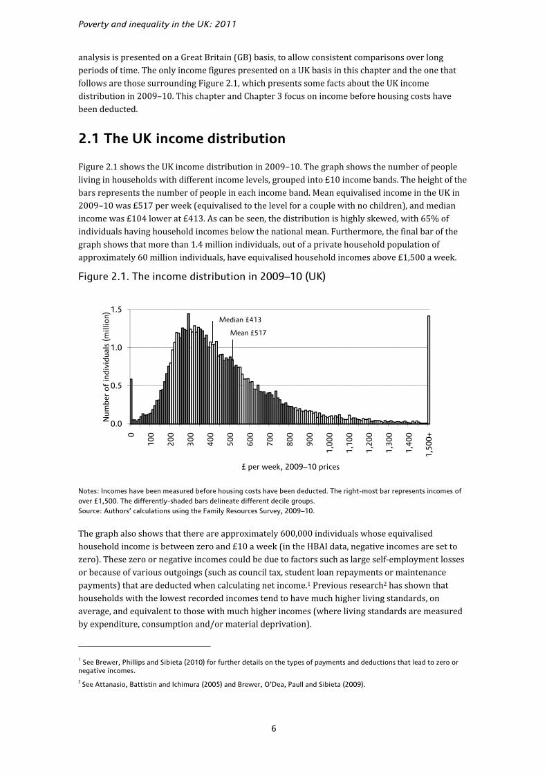
Figure 2.1 shows the UK income distribution in 2009–10. The graph shows the number of people living in households with different income levels, grouped into £10 income bands. The height of the bars represents the number of people in each income band. Mean equivalised income in the UK in 2009–10 was £517 per week (equivalised to the level for a couple with no children), and median income was £104 lower at £413. As can be seen, the distribution is highly skewed, with 65% of individuals having household incomes below the national mean. Furthermore, the final bar of the graph shows that more than 1.4 million individuals, out of a private household population of approximately 60 million individuals, have equivalised household incomes above £1,500 a week.
Figure 2.1. The income distribution in 2009–10 (UK)
Notes: Incomes have been measured before housing costs have been deducted. The right-most bar represents incomes of over £1,500. The differently-shaded bars delineate different decile groups. Source: Authors’ calculations using the Family Resources Survey, 2009–10.
The graph also shows that there are approximately 600,000 individuals whose equivalised household income is between zero and £10 a week (in the HBAI data, negative incomes are set to zero). These zero or negative incomes could be due to factors such as large self-employment losses or because of various outgoings (such as council tax, student loan repayments or maintenance payments) that are deducted when calculating net income.1 Previous research2 has shown that households with the lowest recorded incomes tend to have much higher living standards, on average, and equivalent to those with much higher incomes (where living standards are measured by expenditure, consumption and/or material deprivation).
1 See Brewer, Phillips and Sibieta (2010) for further details on the types of payments and deductions that lead to zero or negative incomes. 2 See Attanasio, Battistin and Ichimura (2005) and Brewer, O’Dea, Paull and Sibieta (2009).
0.0
0.5
1.0
1.5
0
100
200
300
400
500
600
700
800
900
1,00
0
1,10
0
1,20
0
1,30
0
1,40
0
1,50
0+
Num
ber
of in
divi
dual
s (m
illio
n)
£ per week, 2009–10 prices
Median £413
Mean £517
Living standards
7
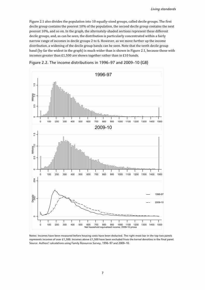
Figure 2.1 also divides the population into 10 equally-sized groups, called decile groups. The first decile group contains the poorest 10% of the population, the second decile group contains the next poorest 10%, and so on. In the graph, the alternately-shaded sections represent these different decile groups, and, as can be seen, the distribution is particularly concentrated within a fairly narrow range of incomes in decile groups 2 to 6. However, as we move further up the income distribution, a widening of the decile group bands can be seen. Note that the tenth decile group band (by far the widest in the graph) is much wider than is shown in Figure 2.1, because those with incomes greater than £1,500 are shown together rather than in £10 bands.
Figure 2.2. The income distributions in 1996–97 and 2009–10 (GB)
Notes: Incomes have been measured before housing costs have been deducted. The right-most bar in the top two panels represents incomes of over £1,500. Incomes above £1,500 have been excluded from the kernel densities in the final panel. Source: Authors’ calculations using Family Resources Survey, 1996–97 and 2009–10.
00.
51.
01.
5M
illio
ns
0 100 200 300 400 500 600 700 800 900 1000 1100 1200 1300 1400 1500
1996-97
00.
51.
01.
5M
illio
ns
0 100 200 300 400 500 600 700 800 900 1000 1100 1200 1300 1400 1500
2009-10
0.0
02.0
04D
ensi
ty
0 100 200 300 400 500 600 700 800 900 1000 1100 1200 1300 1400 1500Net household equivalised income, 2009-10 prices
1996-97
2009-10

Poverty and inequality in the UK: 2011
8
Figure 2.2 shows how the income distribution changed during Labour’s 13 years in office, between 1996–97 and 2009–10. (From now on, the focus will be on Great Britain rather than the UK, in order to allow us to make consistent comparisons of income distributions over time.) The first two panels of Figure 2.2 repeat the type of presentation used in Figure 2.1, showing the number of people in various income bands in each year. The third panel allows us to see more clearly how the shape of the income distribution has changed over time, with the height of each data point representing a ‘density’ measure of people with that level of income.3
Looking at this lowest panel, which compares 1996–97 with 2009–10, the shape of the income distribution appears to have changed in two ways. First, there has been a rightward shift as a result of general growth in households’ real incomes. (This does not mean that all households have become richer, however. People’s incomes tend to fluctuate across years and over their lifetimes.4) Second, the peak of the income distribution has become less distinct. Whereas in 1996–97 there was a pronounced spike around the modal income of about £200,5 by 2009–10 there was a broader peak in the distribution between about £250 and £400. Looking at the top two panels, it can be seen that about three times as many individuals fall into the highest income band in 2009–10 as in 1996–97.
2.2 Changes in average incomes
In this section, we discuss how average incomes changed over Labour’s 13 years in office, paying particular attention to the latest year of data (2009–10), the second year of the recent recession. We also compare the patterns of income change observed under Labour to those seen under the last period of Conservative government, from 1979 to 1997.
The financial year 2009–10 contains the last two quarters of the recent recession and two quarters of weak GDP growth – real GDP per capita fell by more than 4% between 2008–09 and 2009–10.6 Employment continued to fall, according to official statistics (see Section 2.3). The gloomy picture for national income and employment seen over this financial year might lead one to expect take-home incomes also to have dropped or stagnated. In fact, average take-home incomes as measured in HBAI grew in 2009–10, and at a comparable rate to that seen in the past decade. Median income grew by about 0.9% in real terms (from £410 to £414), while mean income in Great Britain grew by about 1.6% in real terms (from £511 to £519).
Over the 13 years of Labour as a whole, median weekly BHC income in Great Britain increased from £338 in 1996–97 to £414 in 2009–10. This corresponds to a real rise of about 23%, or 1.6% per year on average. Similarly, mean income increased by 28% (1.9% when annualised), from £405 to £519.7 Both of these growth rates are comparable to those seen under the Conservatives between1979 and 1996–97, which were 1.6% at the median and 2.1% at the mean.
Table 2.1 shows real percentage changes in median and mean incomes in each year during Labour’s 13 years in office, together with the 95% confidence intervals for these changes.8 Looking at income 3 The units for these kernel density estimates are such that the total area under each plotted line is 1 rather than the size of the total population. 4 If a two-earner household in 1996–97 became a pensioner couple in 2009–10, it is quite likely that its income was lower in 2009–10 than in 1996–97. 5 Modal income refers to the income level possessed by the greatest proportion of the population. 6 GDP per capita calculated for financial years based on ONS series IHXW on a quarterly basis. 7 Income growth is rather stronger when measured AHC rather than BHC: median and mean AHC incomes increased by 2.0% and 2.4% respectively between 1996–97 and 2009–10. 8 For information on confidence intervals, see Source to Table 2.1.

Living standards
9
growth in the latest year of data at the mean and median, neither is statistically significantly different from zero. However, it is relatively rare for changes in any single year to be statistically significantly different from zero. The cumulative growth between 1996–97 and 2009–10 is statistically significantly greater than zero, at both the mean and median. Median income in 2009–10 was also statistically significantly higher than in 2007–08.
Table 2.1. Real income growth and 95% confidence intervals (GB)
Median income Mean income
Lower Point Upper Lower Point Upper
1997–98 0.3% 1.8% 3.1% 0.9% 2.6% 4.0%
1998–99 0.3% 1.5% 3.1% 1.5% 3.5% 5.5%
1999–00 1.7% 3.1% 4.6% –0.2% 2.1% 4.3%
2000–01 1.6% 3.1% 4.5% 2.4% 4.4% 6.6%
2001–02 3.6% 4.9% 6.2% 2.2% 4.4% 6.6%
2002–03 0.8% 2.0% 3.4% –0.9% 1.3% 3.4%
2003–04 –1.1% 0.0% 1.2% –2.3% –0.4% 1.8%
2004–05 –0.2% 1.0% 2.1% –0.5% 1.4% 3.1%
2005–06 –0.2% 1.1% 2.3% –0.7% 1.4% 3.4%
2006–07 –0.9% 0.4% 1.7% –1.4% 0.8% 3.2%
2007–08 –1.3% 0.2% 1.6% –1.6% 1.1% 3.4%
2008–09 –0.8% 0.7% 2.4% –1.5% 1.1% 3.7%
2009–10 –0.7% 0.9% 2.3% –1.3% 1.6% 4.4%
From 1996–97 to 2009–10
21% 23% 24% 25% 28% 31%
Note: Incomes have been measured before housing costs have been deducted. Source: Authors’ calculations using Family Resources Survey, various years. Confidence intervals were calculated by bootstrapping the changes using 500 iterations. This involves recalculating statistics for each of a series of random samples drawn from the original sample, as a way of approximating the distribution of statistics that would be calculated from different possible samples out of the underlying population. See Davison and Hinkley (1997).
Table 2.1 also shows that there was a turning point in income growth between 2001–02 and 2002–03. While mean income growth had been consistently above 2% between 1997–98 and 2001–02, it has been less than 2% in every year since then. There was also an obvious slowdown in median income growth from 2002–03.
To gain a fuller picture of recent changes in living standards, it is also informative to compare the HBAI estimates of changes in average income with estimates from other sources.
Table 2.2 compares five measures of growth in living standards. Three are derived from the National Accounts: real gross domestic product (GDP) per head, ‘real household disposable income per head’ (RHDI) and ‘household final consumption expenditure’ (HFCE). The remaining two are based on HBAI income at the mean and median, respectively. Real GDP per head is a widely-used measure of economic well-being, showing the estimated market value of all final goods and services produced in the UK economy, divided by the total number of people in the UK. Real household disposable income, as the name implies, focuses on the household sector,9 and so excludes the incomes of companies and the government. However, unlike our HBAI income measure, RHDI does make some deductions for housing costs and is thus not a purely BHC measure of income.10 Household final consumption expenditure (including the expenditure of non-profit institutions 9 Though the household sector used for this measure also includes charities and universities. 10 RHDI does not deduct rental payments, but, like AHC measures, it is measured after mortgage interest payments.

Poverty and inequality in the UK: 2011
10
serving households) is a measure of spending, rather than income. It captures expenditure incurred by households on consumption of goods and services, and is thus not directly comparable to income measures. The National Accounts measures are only able to provide estimates at the mean, so are more likely to be comparable to mean HBAI income than median HBAI income (all else being equal). Income growth at the median, as measured in HBAI, is shown for reference purposes. In all of this analysis, we focus on measures of material living standards. Alternatively, one could look at a wider measure of people’s overall well-being. Indeed, the coalition government has announced a desire to measure national well-being, and the Office for National Statistics (ONS0 has launched a major consultation on the subject. (See Box 2.1.)
Box 2.1. Measuring well-being
It has long been recognised that GDP (and, indeed, all material measures) cannot fully reflect people’s level of life satisfaction or happiness. Family relationships, a feeling of community or belonging and the local environment are all important to people’s well-being, but difficult to capture in any material measures. For example, voluntary work can benefit individuals in ways that do not necessarily increase the current incomes of volunteers or beneficiaries, nor contribute to GDP. One might also want to take into account the sustainability of economic development and the natural environment.
In November 2010, the coalition government launched a national debate on how to measure the nation’s well-being,a following a commitment to ‘developing broader indicators of well-being and sustainability’.b In doing so, the UK follows other countries such as Canada and France, which have undertaken similar exercises.c Following consultation with the public, academics and other experts, the ONS has already added subjective well-being questions to the Integrated Household Survey (in April 2011). The challenge ahead will be how to design and present well-being measures as a whole, and how to use them when making policy decisions.
In practice, there are many difficulties in constructing overall measures of national well-being. The first problem arises when one attempts to aggregate well-being measures. Whereas all categories of incomes and expenditures are measured in monetary terms, different well-being measures have very different units of measurement. Adding up different aspects of well-being (such as access to a park and high-quality family relationships) will thus require some assumptions on how to combine them, which will no doubt be controversial, and different choices are likely to lead to quite different results. Meanwhile, subjective measures of well-being such as survey questions on one’s overall level of happiness can be difficult to design. The wording and order of questions can potentially affect the responses, and are thus currently being tested by the ONS.
It is also difficult to know how well-being measures could inform policy decisions. First, it is not clear what the trade-off should be between the material and subjective well-being benefits of a particular policy; should one proceed with a policy if it reduces material benefits but improves subjective well-being? Second, it can often be difficult to establish whether a particular policy will causally generate material benefits. It is even more difficult to prove causality in the case of subjective well-being, where the factors driving well-being are not well understood and are highly controversial. Generally speaking, it is not clear how sensitive measures of well-being and happiness would be to policy interventions. However, current research in the field is exploring how to explain variation in subjective well-being across people and countries.d
a. http://www.ons.gov.uk/about/newsroom/statements/national-statistician-launches-well-being-debate.pdf. b. See box 1.2 in June 2010 Budget (HM Treasury, 2010a). c. The Canadian government already publishes a number of well-being indicators (http://www4.hrsdc.gc.ca/[email protected]?cid=14). The French government commissioned a report (Stiglitz, Sen and Fitoussi, 2009) and has started implementing its recommendations (http://www.stiglitz-sen-fitoussi.fr/en/index.htm). d. For example, Stevenson and Wolfers (2008), Daly, Oswald, Wilson and Wu (2011) and Blanchflower and Oswald (2011).
Living standards
11
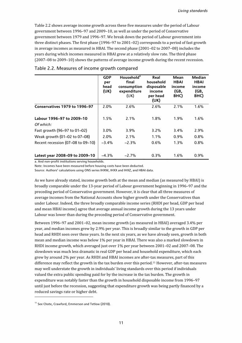
Table 2.2 shows average income growth across these five measures under the period of Labour government between 1996–97 and 2009–10, as well as under the period of Conservative government between 1979 and 1996–97. We break down the period of Labour government into three distinct phases. The first phase (1996–97 to 2001–02) corresponds to a period of fast growth in average incomes as measured in HBAI. The second phase (2001–02 to 2007–08) includes the years during which incomes measured in HBAI grew at a relatively slow rate. The third phase (2007–08 to 2009–10) shows the patterns of average income growth during the recent recession.
Table 2.2. Measures of income growth compared
GDP per
head (UK)
Householda
final consumption expenditure
(UK)
Real household disposable
income per head
(UK)
Mean HBAI
income (GB, BHC)
Median HBAI
income(GB, BHC)
Conservatives 1979 to 1996–97 2.0% 2.6% 2.6% 2.1% 1.6%
Labour 1996–97 to 2009–10 1.5% 2.1% 1.8% 1.9% 1.6%
Of which:
Fast growth (96–97 to 01–02) 3.0% 3.9% 3.2% 3.4% 2.9%
Weak growth (01–02 to 07–08) 2.0% 2.1% 1.1% 0.9% 0.8%
Recent recession (07–08 to 09–10) –3.4% –2.3% 0.6% 1.3% 0.8%
Latest year 2008–09 to 2009–10 –4.3% –2.7% 0.3% 1.6% 0.9%
a. And non-profit institutions serving households. Note: Incomes have been measured before housing costs have been deducted. Source: Authors’ calculations using ONS series IHXW, IHXX and IHXZ, and HBAI data.
As we have already stated, income growth both at the mean and median (as measured by HBAI) is broadly comparable under the 13-year period of Labour government beginning in 1996–97 and the preceding period of Conservative government. However, it is clear that all three measures of average incomes from the National Accounts show higher growth under the Conservatives than under Labour. Indeed, the three broadly comparable income series (RHDI per head, GDP per head and mean HBAI income) agree that average annual income growth during the 13 years under Labour was lower than during the preceding period of Conservative government.
Between 1996–97 and 2001–02, mean income growth (as measured in HBAI) averaged 3.4% per year, and median incomes grew by 2.9% per year. This is broadly similar to the growth in GDP per head and RHDI seen over these years. In the next six years, as we have already seen, growth in both mean and median income was below 1% per year in HBAI. There was also a marked slowdown in RHDI income growth, which averaged just over 1% per year between 2001–02 and 2007–08. The slowdown was much less dramatic in real GDP per head and household expenditure, which each grew by around 2% per year. As RHDI and HBAI incomes are after-tax measures, part of this difference may reflect the growth in the tax burden over this period.11 However, after-tax measures may well understate the growth in individuals’ living standards over this period if individuals valued the extra public spending paid for by the increase in the tax burden. The growth in expenditure was notably faster than the growth in household disposable income from 1996–97 until just before the recession, suggesting that expenditure growth was being partly financed by a reduced savings rate or higher debt. 11 See Chote, Crawford, Emmerson and Tetlow (2010).
Poverty and inequality in the UK: 2011
12
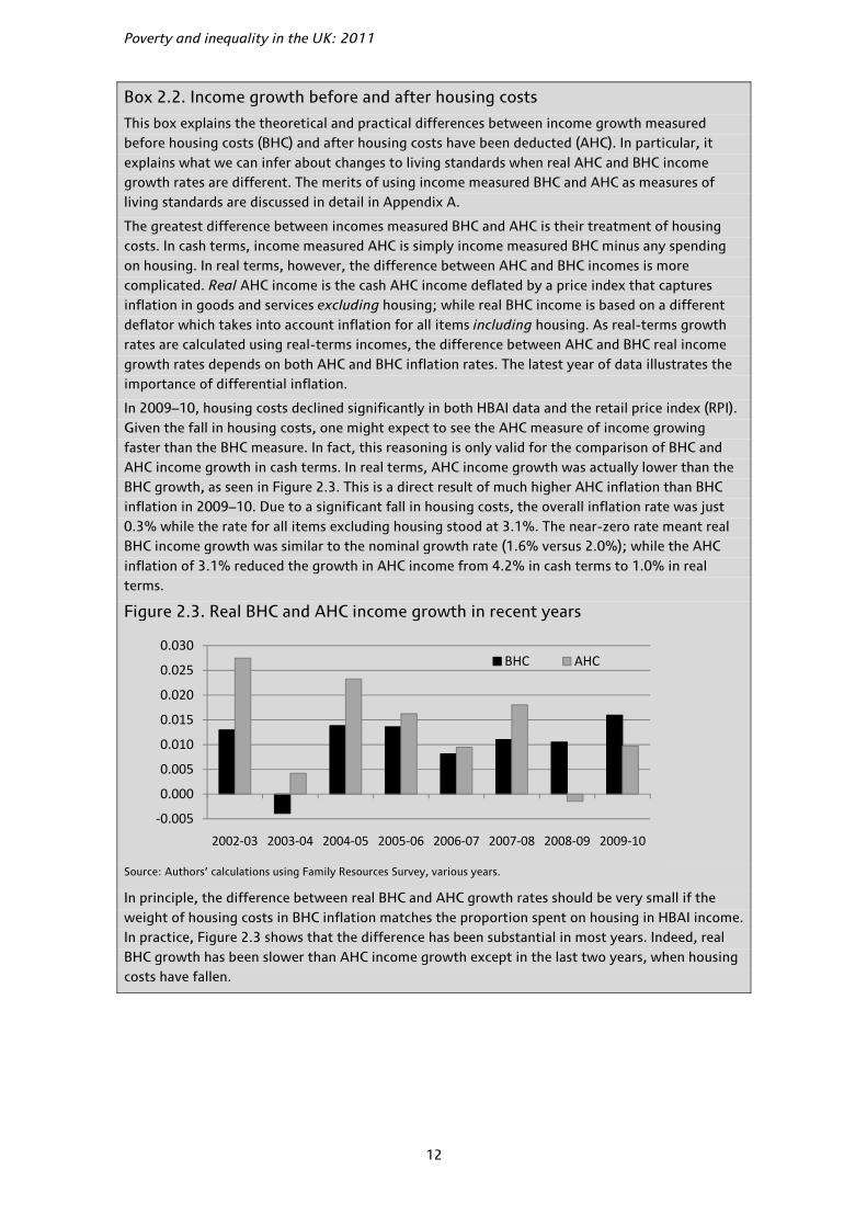
Box 2.2. Income growth before and after housing costs
This box explains the theoretical and practical differences between income growth measured before housing costs (BHC) and after housing costs have been deducted (AHC). In particular, it explains what we can infer about changes to living standards when real AHC and BHC income growth rates are different. The merits of using income measured BHC and AHC as measures of living standards are discussed in detail in Appendix A.
The greatest difference between incomes measured BHC and AHC is their treatment of housing costs. In cash terms, income measured AHC is simply income measured BHC minus any spending on housing. In real terms, however, the difference between AHC and BHC incomes is more complicated. Real AHC income is the cash AHC income deflated by a price index that captures inflation in goods and services excluding housing; while real BHC income is based on a different deflator which takes into account inflation for all items including housing. As real-terms growth rates are calculated using real-terms incomes, the difference between AHC and BHC real income growth rates depends on both AHC and BHC inflation rates. The latest year of data illustrates the importance of differential inflation.
In 2009–10, housing costs declined significantly in both HBAI data and the retail price index (RPI). Given the fall in housing costs, one might expect to see the AHC measure of income growing faster than the BHC measure. In fact, this reasoning is only valid for the comparison of BHC and AHC income growth in cash terms. In real terms, AHC income growth was actually lower than the BHC growth, as seen in Figure 2.3. This is a direct result of much higher AHC inflation than BHC inflation in 2009–10. Due to a significant fall in housing costs, the overall inflation rate was just 0.3% while the rate for all items excluding housing stood at 3.1%. The near-zero rate meant real BHC income growth was similar to the nominal growth rate (1.6% versus 2.0%); while the AHC inflation of 3.1% reduced the growth in AHC income from 4.2% in cash terms to 1.0% in real terms.
Figure 2.3. Real BHC and AHC income growth in recent years
Source: Authors’ calculations using Family Resources Survey, various years.
In principle, the difference between real BHC and AHC growth rates should be very small if the weight of housing costs in BHC inflation matches the proportion spent on housing in HBAI income. In practice, Figure 2.3 shows that the difference has been substantial in most years. Indeed, real BHC growth has been slower than AHC income growth except in the last two years, when housing costs have fallen.
-0.005
0.000
0.005
0.010
0.015
0.020
0.025
0.030
2002-03 2003-04 2004-05 2005-06 2006-07 2007-08 2008-09 2009-10
BHC AHC

Living standards
13
During the recession (between 2007–08 and 2009–10), GDP fell by 3.4% per year and household expenditure fell by 2.3% per year, on average. Somewhat surprisingly, real household disposable income per head continued to grow, as did mean and median incomes as measured in HBAI. Part of this discrepancy may result from falling mortgage rates, which translated into higher disposable incomes, even as GDP fell. However, this cannot account for the growth in the HBAI income measure, since it measures incomes before housing costs are deducted (BHC). Changes in incomes measured after housing costs (AHC) are discussed in Box 2.2.
One potential source of the discrepancy between GDP and HBAI income growth is welfare payments – income transfers from the government to households. In the next section, we show that growth in welfare payments can indeed explain much of the growth in household incomes during the recession. Without offsetting tax increases, a substantial portion of this increase in welfare payments would have been funded by increased borrowing over this period. This would have increased household incomes, but would have had no direct impact on GDP.12
Looking to the future, the Office for Budget Responsibility (OBR) expects RHDI to fall by 0.7% in 2010 and by 0.4% in 2011. RHDI is then predicted to recover gradually and to grow by about 2% per year in both 2014 and 2015.13 This is one reason to be pessimistic about HBAI income growth in 2010–11 and 2011–12, with little prospect of growth until 2012–13.
2.3 Examining different sources of income
We saw from Table 2.2 that the growth in mean and median income (as measured by HBAI) was markedly higher than all the National Accounts series in 2009–10. In order to further understand the growth in HBAI income, it is helpful to break household income down into its component sources. To this end, Table 2.3 shows what happened to the various sources of household income, both in the last year and over the period of Labour government since 1996–97.
The first three rows of Table 2.3 relate to the latest year of HBAI data, 2009–10. The first row shows how large a share of total income is comprised by each individual component. We see that earnings is by some distance the largest single source of household income, on average, making up about two-thirds of all income. Income from state benefits and tax credits is the next-largest component, comprising over a fifth of total household income (on average), followed by income from savings, investments and private pensions, and self-employment income.
Box 2.3. Changes to the SPI adjustment for those with very high incomes
We have seen in Table 2.3 that total household income grew by 1.1% in 2009–10 for the selected subsample, quite different from the 1.6% growth at the mean for all households in the HBAI. As we note in the discussion of Table 2.3, this difference is due to the exclusion (from Table 2.3) of households for which the sum of all income sources is different from their HBAI income: namely, households with negative incomes (whose incomes are set to zero under the HBAI methodology) and households with very high incomes (whose income totals are subject to a separate adjustment). However, the methodology used for the latter adjustment (of very rich households) has changed between the 2008–09 and 2009–10 HBAI data sets. In this box, we discuss the implications of this change for overall income growth.
12 The indirect impact of a fiscal stimulus is the subject of much political and economic debate; see Ilzetzski, Mendoza and Végh (2010). 13 Office for Budget Responsibility, 2011. The forecasts are for calendar years.

Poverty and inequality in the UK: 2011
14
In order to address the concern that the Family Resources Survey (FRS) does not accurately capture the incomes of the very rich, because of under-reporting and under-sampling, the incomes of very rich individuals are adjusted based on a separate data source, known as the Survey of Personal Incomes (SPI). The SPI is a data set of income tax records collated by HM Revenue and Customs (HMRC), which is likely to give a significantly more accurate picture of very high incomes than a sample-based survey such as the FRS. The incomes of the richest individuals in the HBAI data are therefore replaced by the mean value of income among the richest individuals in the SPI.
But how do we define who ‘very rich’ individuals are? Before 2009–10, they were defined by two separate income thresholds: one for pensioners (a gross income threshold of £60,000 per year) and one for non-pensioners (a net income threshold of £150,000 per year). Individuals with incomes above these levels were deemed ‘very rich’, and their incomes were adjusted based on the SPI data. However, these thresholds were kept constant in cash terms from 1999–2000 onwards. Both inflation and income growth have led to the proportion of SPI-adjusted cases increasing steadily over time. In 1999–2000, just 0.22% of households in the FRS sample were subjected to the SPI adjustment. By 2008–09, this had risen to 0.61%.
Two changes to the SPI methodology were made in 2009–10. First, instead of using fixed cash thresholds, fixed proportions of individuals will now be subject to the adjustment – the richest 0.3% of non-pensioners and the richest 1.2% of pensioners. This will correct the previous tendency for ever-more individuals to get ‘dragged’ into the SPI adjustment. Second, gross income thresholds will now be used for all individuals (where previously net income thresholds were used for non-pensioners). Further details of both these changes can be found in Department for Work and Pensions (2011c).
These methodological changes affect the statistics presented in the HBAI data to various degrees. Table 2.4 compares 2009–10 statistics under the new and old SPI methodologies (all years before 2009–10 continue to be presented using the old methodology). In 2009–10, about 0.6% of all households in the FRS sample saw their incomes adjusted (under both new and old methodologies), representing 1.0% of all households in Great Britain after weighting.
Table 2.4. Comparing old and new methods to adjust top incomes (GB)
Note: All incomes are measured before housing costs. Source: Authors’ calculations using Family Resources Survey, 2009–10, and the Survey of Personal Incomes.
Table 2.4 makes clear that the change in methodology makes a significant difference to income growth for the very top percentile (growth of 13.0% under the new methodology, compared with 7.7% under the old methodology). However, this difference in top-income growth also leads to a noticeable difference in income growth at the mean. Mean incomes as measured by HBAI grew by 1.6% under the new methodology, but would have grown by just 1.2% under the old methodology. However, the methodological changes only had a small effect on the median, its growth and, as a result, the poverty statistics.
Statistics for 2009–10 Old SPI method New SPI method
Mean income £517 £519
Median income £414 £414
Growth in mean income 1.20% 1.60%
Growth in median income 0.8% 0.9%
Income at the 99th percentile £2220 £2330
Growth at the 99th percentile 7.7% 13.0%
% of SPI-adjusted cases (unweighted)
0.65% 0.56%
% of SPI-adjusted households (weighted)
1.05% 1.04%

Living standards
15
Table 2.3. Income sources: real year-on-year income growth and share of total income (GB)
Source of income Deductions from
income (including
council tax)
Totalincome
Mean
Earnings Self- employment
Benefits and tax credits
Income from savings,
investments and private
pensions
Other income
HBAI income
Share of total income in 2009–10 65% 8% 21% 10% 3% –6% 100% n/a
Change in latest year: 2008–09 to 2009–10 –1.0% 4.4% 6.7% –0.2% 1.0% –1.7% 1.1% 1.6%
Contribution to growth in 2009–10 –0.7ppt 0.3ppt 1.3ppt 0.0ppt 0.0ppt 0.1ppt 1.1ppt n/a
Annual change under Labour:
1996–97 to 2009–10 2.2% 0.6% 1.2% 1.2% 3.0% 3.5% 1.7% 1.9%
Of which:
1996–97 to 2001–02 4.2% 0.8% 1.2% 1.1% 4.6% 6.3% 2.9% 3.4%
2001–02 to 2007–08 0.5% 0.2% 1.3% 1.3% 1.7% 1.1% 0.7% 0.9%
2007–08 to 2009–10 0.0% –2.1% 5.6% 0.2% 3.1% –0.8% 1.1% 1.3%
Contribution to growth 2007–08 to 2009–10 0.0ppt –0.2ppt 1.1ppt 0.0ppt 0.1ppt 0.0ppt 1.1ppt n/a
Notes: All columns except the last one relate to a subsample of households in HBAI, as described in the text. The excluded groups of households were identified by comparing the sum of all income components with the HBAI income. To take rounding into account, we consider any difference of £1 or more in absolute terms to be a result of adjustments and the household would be excluded from the analysis for this table. All incomes have been equivalised and are measured at the household level and before housing costs have been deducted. Source: Authors’ calculations using Family Resources Survey, various years.
The second row of Table 2.3 shows how these income sources grew in 2009–10; and the third row shows how much each source of income contributed to the growth in total income. Note that the growth in total income in Table 2.3 (of 1.1%) differs somewhat from the growth in mean income shown in Table 2.1 (of 1.6%) owing to methodological differences between the two tables. Specifically, in analysing income sources in Table 2.3, we must exclude households with the very highest incomes, whose income values are ‘adjusted’ according to the HBAI methodology (this adjustment is discussed in detail in Box 2.3). The adjustment process means that these households’ income components no longer sum to their total income, meaning that they cannot be included in the calculations for Table 2.3. We must also exclude households whose measured income is negative, since their income is set to zero under the HBAI methodology (meaning that their income components also do not sum to their total income). The result of these two exclusions is that the income components analysed in Table 2.3 can only account for growth in total income of 1.1%, not the overall 1.6% shown in Table 2.1.14
Looking at individual sources, we see that earnings fell by 1.0% in real terms in 2009–10, which would have led to a fall in total income of about 0.7% if no other income components had changed. However, the fall in earnings was more than compensated for by rapid growth in benefits and tax credits and self-employment profits.
14 The remaining households (all except the two excluded groups) have their total income equal to their HBAI income.

Poverty and inequality in the UK: 2011
16
Self-employment income increased by 4.4% in 2009–10,15 accounting for 0.3 percentage points of the 1.1% increase in total income in 2009–10. However, note that figures relating to self-employment can be particularly volatile from year to year. In addition, self-employment losses are a common source of negative total income, and high-income individuals are also more likely to be self-employed than the majority.
The striking growth in income from benefits and tax credits in 2009–10 merits further investigation. Real growth in benefits and tax credits in 2009–10 stood at 6.7%, the strongest rise since 1999–2000. As the biggest contributor to overall growth, it would have led to a 1.3% rise in total income if all else were equal. Appendix B shows that this growth is matched by growth in benefit and tax credit payments in DWP and HMRC administrative data. In fact, the administrative data show an even larger increase in welfare expenditure than the HBAI data.
There are three explanations for this fast growth in benefits income. First, due to falling inflation, uprating procedures for benefits and tax credits meant that most such benefits grew significantly in real terms in 2009–10. (We discuss this matter in detail in Section 4.2, but it is worth noting that these procedures also led to benefits and tax credits falling in real terms for most families in 2010–11, often by more than 3%.) The second reason for the rapid growth in benefits income in 2009–10 was that falling rates of employment during the recession (discussed later in this section) increased the number of people eligible for various means-tested benefits and tax credits (notably Jobseeker’s Allowance). Finally, several discretionary increases in benefits and tax credits came into force over the course of 2009–10, such as a significant increase in the child element of Child Tax Credit. However, this effect is also likely to be temporary. Welfare policy changes announced by the coalition government (discussed in Section 3.5) will reduce households’ income from benefits and tax credits in the next few years, all else being equal.
Table 2.3 also shows the annual growth rates of different income components over the 13-year period of Labour government, with the fourth row showing the annualised changes over the whole period. The following three rows break Labour’s period of government into three periods – the rapid income growth of 1996–97 to 2001–02, the slower growth of 2001–02 to 2007–08, and the most recent two years of the recession. We see that the growth in household earnings slowed dramatically after 2001–02, from an average rate of 4.2% per year between 1996–97 and 2001–02, down to just 0.5% per year between 2001–02 and 2007–08. This slowdown in earnings growth explains much of the slowdown in household income growth after 2001–02. Further falls in earnings growth after 2007–08 would have acted to reduce income growth during the recession years relative to the years before. However, this was more than compensated for by the robust growth in benefit and tax credit income after 2007–08. Indeed, as seen in the last row of Table 2.3, the 1.1% growth in total income during the two years of recession was almost exclusively driven by growth in income from benefits and tax credits.
Employment and earnings
As we have already seen, earnings from employment are by far the largest single source of total household incomes in the UK, on average. It is therefore important to investigate whether the FRS data (underlying HBAI) are giving an accurate picture of the state of the UK labour market, with measures of employment and earnings growth that track other sources of national statistics reasonably closely. In this subsection, we investigate these issues in more detail.
15 The 4.4% increase followed a large fall in self-employment income in 2008–09. Taking the two recession years as a whole, we observe that self-employment income fell by an annualised 2.1%, as shown in Table 2.3.
Living standards
17
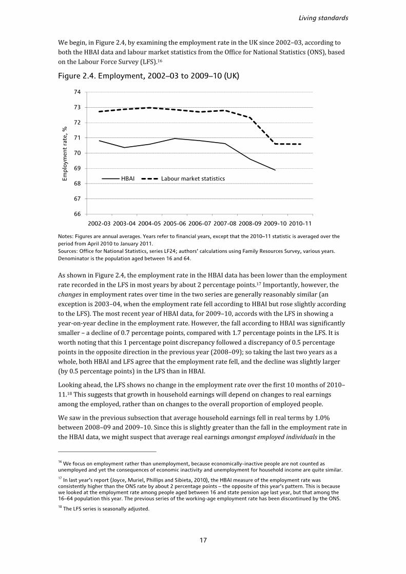
We begin, in Figure 2.4, by examining the employment rate in the UK since 2002–03, according to both the HBAI data and labour market statistics from the Office for National Statistics (ONS), based on the Labour Force Survey (LFS).16
Figure 2.4. Employment, 2002–03 to 2009–10 (UK)
Notes: Figures are annual averages. Years refer to financial years, except that the 2010–11 statistic is averaged over the period from April 2010 to January 2011. Sources: Office for National Statistics, series LF24; authors’ calculations using Family Resources Survey, various years. Denominator is the population aged between 16 and 64.
As shown in Figure 2.4, the employment rate in the HBAI data has been lower than the employment rate recorded in the LFS in most years by about 2 percentage points.17 Importantly, however, the changes in employment rates over time in the two series are generally reasonably similar (an exception is 2003–04, when the employment rate fell according to HBAI but rose slightly according to the LFS). The most recent year of HBAI data, for 2009–10, accords with the LFS in showing a year-on-year decline in the employment rate. However, the fall according to HBAI was significantly smaller – a decline of 0.7 percentage points, compared with 1.7 percentage points in the LFS. It is worth noting that this 1 percentage point discrepancy followed a discrepancy of 0.5 percentage points in the opposite direction in the previous year (2008–09); so taking the last two years as a whole, both HBAI and LFS agree that the employment rate fell, and the decline was slightly larger (by 0.5 percentage points) in the LFS than in HBAI.
Looking ahead, the LFS shows no change in the employment rate over the first 10 months of 2010–11.18 This suggests that growth in household earnings will depend on changes to real earnings among the employed, rather than on changes to the overall proportion of employed people.
We saw in the previous subsection that average household earnings fell in real terms by 1.0% between 2008–09 and 2009–10. Since this is slightly greater than the fall in the employment rate in the HBAI data, we might suspect that average real earnings amongst employed individuals in the
16 We focus on employment rather than unemployment, because economically-inactive people are not counted as unemployed and yet the consequences of economic inactivity and unemployment for household income are quite similar. 17 In last year’s report (Joyce, Muriel, Phillips and Sibieta, 2010), the HBAI measure of the employment rate was consistently higher than the ONS rate by about 2 percentage points – the opposite of this year’s pattern. This is because we looked at the employment rate among people aged between 16 and state pension age last year, but that among the 16–64 population this year. The previous series of the working-age employment rate has been discontinued by the ONS. 18 The LFS series is seasonally adjusted.
66
67
68
69
70
71
72
73
74
2002-03 2003-04 2004-05 2005-06 2006-07 2007-08 2008-09 2009-10 2010-11
Em
ploy
men
t ra
te, %
HBAI Labour market statistics

Poverty and inequality in the UK: 2011
18
HBAI data must have fallen slightly.19 To examine this, we now look at earnings amongst workers observed in HBAI, and compare the trend in earnings with that shown by the national average weekly earnings (AWE) index, the primary source of earnings growth information for Great Britain.
Up to now, we have been examining real-terms growth in individual earnings after tax. However, the AWE records individual earnings before taxes. We have therefore constructed a comparable earnings measure from HBAI (which is thus not comparable to the measure of HBAI net earnings presented in Table 2.3). Figure 2.5 presents the level of earnings before tax as measured by HBAI and the AWE in cash terms (the AWE is a cash-terms index) and relative to their level in 2003–04, such that they are equal to 100 in 2003–04.
Figure 2.5. HBAI versus average weekly earnings index, before tax, cash-terms index, 2003–04 = 100 (GB)
Notes: The HBAI and AWE earnings measures both include bonus payments. Years refer to financial years, except that the 2010–11 AWE statistic is averaged over the period from April 2010 to February 2011. Sources: Average Weekly Earnings Total Pay Index, ONS's Labour Market Statistical Bulletin Historical Supplement, series K54U; authors’ calculations using Family Resources Survey, various years.
Figure 2.5 shows that earnings growth in HBAI and the AWE have tracked each other very closely in recent years. While earnings growth was slightly lower in HBAI from 2004–05 to 2007–08,the HBAI series has ‘caught up’ with the AWE, such that both series show overall earnings growth of around 25% between 2003–04 and 2009–10. Individual years show discrepancies in various directions, with substantially faster growth in HBAI earnings between 2007–08 and 2008–09, but substantially slower (indeed, negative) growth the following year, but we would not wish to place much emphasis on any single year of data. HBAI is based on a survey of 25,000 households and is thus subject to uncertainty and sampling error from year to year.
Looking ahead to the next year of HBAI data (2010–11), the AWE suggests a generally negative outlook for real earnings growth. We observe a cash-terms increase of only 1.1% in AWE in 2010–11, and thus a real-terms fall of 3.8%.20 Given that the employment rate changed little over the course of 2010–11, we thus expect real household earnings in HBAI to fall broadly in line with AWE 19 However, note that the average earnings shown in Table 2.3 relate to a subsample of households, while the employment rates shown in Figure 2.4 relate to all individuals aged 16–64, so the difference between changes in the two is not exactly equal to the change in average earnings among the employed. 20 The change in AWE in 2010–11 was based on the average AWE of the first 11 months, since AWE for March 2011 is not available yet. Inflation is measured using the all-items RPI (CHAW) for the first 11 months of 2010–11 (5.0%).
100
105
110
115
120
125
130
2003-04 2004-05 2005-06 2006-07 2007-08 2008-09 2009-10 2010-11
Ear
ning
s in
dex
(200
3–04
= 1
00) HBAI AWE
Living standards
19
in 2010–11 (after making allowances for sampling variation). With earnings being the largest single component of household incomes (on average), this is likely to reduce overall income growth in 2010–11. Moreover, incomes from benefits and tax credits – the second largest source of income – also fell in real terms in 2010–11 (as discussed in Section 4.2). There are therefore significant downside risks to the two largest components of household incomes in 2010–11.
Joyce (2011) forecasts the level of median income in 2010–11 and beyond in order to estimate levels of poverty up to 2013–14. Based on 2008–09 data, he forecasts a total real-terms fall of 2.2% in median income between 2008–09 and 2010–11. As we observe a 0.9% rise in median incomes in 2009–10, median incomes would need to fall by 3.1% in 2010–11 for this forecast to be correct. Given that real average earnings fell by 3.8% over the first 11 months of 2010–11 and as benefits and tax credits also fell in real-terms by a similar magnitude, such a fall seems entirely possible. Joyce forecasts a further 2.1% real-terms fall in median income in 2011–12 and a largely static picture up to 2013–14.
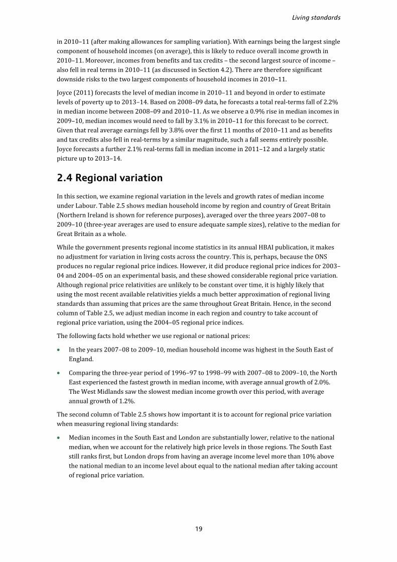
2.4 Regional variation
In this section, we examine regional variation in the levels and growth rates of median income under Labour. Table 2.5 shows median household income by region and country of Great Britain (Northern Ireland is shown for reference purposes), averaged over the three years 2007–08 to 2009–10 (three-year averages are used to ensure adequate sample sizes), relative to the median for Great Britain as a whole.
While the government presents regional income statistics in its annual HBAI publication, it makes no adjustment for variation in living costs across the country. This is, perhaps, because the ONS produces no regular regional price indices. However, it did produce regional price indices for 2003–04 and 2004–05 on an experimental basis, and these showed considerable regional price variation. Although regional price relativities are unlikely to be constant over time, it is highly likely that using the most recent available relativities yields a much better approximation of regional living standards than assuming that prices are the same throughout Great Britain. Hence, in the second column of Table 2.5, we adjust median income in each region and country to take account of regional price variation, using the 2004–05 regional price indices.
The following facts hold whether we use regional or national prices:
• In the years 2007–08 to 2009–10, median household income was highest in the South East of England.
• Comparing the three-year period of 1996–97 to 1998–99 with 2007–08 to 2009–10, the North East experienced the fastest growth in median income, with average annual growth of 2.0%. The West Midlands saw the slowest median income growth over this period, with average annual growth of 1.2%.
The second column of Table 2.5 shows how important it is to account for regional price variation when measuring regional living standards:
• Median incomes in the South East and London are substantially lower, relative to the national median, when we account for the relatively high price levels in those regions. The South East still ranks first, but London drops from having an average income level more than 10% above the national median to an income level about equal to the national median after taking account of regional price variation.
Poverty and inequality in the UK: 2011
20
Table 2.5. Median income by region and country in 2007–08 to 2009–10 and growth since 1996–97 to 1998–99 (GB)
Region or country Median income in 2007–08 to 2009–
10 (national median = 100),
assuming uniform national prices
Median income in 2007–08 to 2009–10
(national median = 100), using regional
price relativities
Average annual median income growth since 1996–97 to 1998–99
South East 116.1 109.6 1.4%
London 111.3 100.8 1.9%
East 106.7 104.9 1.4%
South West 101.1 99.2 1.9%
Scotland 100.7 105.9 1.8%
North West 93.7 95.6 1.3%
East Midlands 93.6 96.0 1.6%
West Midlands 93.1 94.6 1.2%
Yorkshire and Humber 92.1 97.2 1.7%
Wales 91.8 98.0 1.6%
North East 89.8 94.7 2.0%
Great Britain median £409.09 £411.66 1.8%
Memo: Northern Ireland 91.1 94.5 n/a
Notes: Incomes have been measured before housing costs have been deducted. Regions are defined on the basis of former Government Office Regions. Income growth (shown in the final column) is the same whether regional or national prices are used, since we only have regional price indices available for a single year. The average growth rate is not available for Northern Ireland because the HBAI series has only covered Northern Ireland since 2002–03. Source: Authors’ calculations using Family Resources Survey, various years, and ONS regional price indices for 2004–05 (see Wingfield, Fenwick and Smith (2005)).
• In contrast, median incomes in Wales and Scotland, relative to the national median, appear much higher when we account for the relatively low prices in those countries. Wales rises from tenth to sixth in the rankings; Scotland rises from fifth to second, with a median income nearly 6% higher than the national median. Median incomes in the North East, Yorkshire and the Humber, and Northern Ireland also rise by considerable amounts relative to the national median after taking account of regional price differences.
2.5 Conclusion
The latest year of HBAI data, which includes the last quarters of the recent recession, shows that despite falls in GDP and employment figures, average take-home incomes continued to grow in 2009–10. Median equivalised income in Great Britain grew by 0.9%, from £410 per week to £414 per week (both in 2009–10 prices). Mean weekly income grew by about 1.6%, from £511 to £519, a substantial part of which was driven by growth at the top end of the income distribution and methodological changes to the way top incomes were adjusted.
Taking the period from 1996–97 to 2009–10 as a whole, median equivalised income in Great Britain grew by about 1.6% per year while the mean grew by 1.9% per year, on average. However, annual income growth noticeably slowed down from 2002–03, at both the mean and the median. Somewhat surprisingly, mean income actually grew faster during the recent recession than over the
Living standards
21
preceding period of comparatively sluggish income growth (from 2001–02 to 2007–08), despite the fact that the economy was not in recession in this earlier period. (Income growth averaged 0.9% per year between 2001–02 and 2007–08, compared with 1.3% per year during the recession.)
The main driver of growth in average incomes in 2009–10 (and over the recession as a whole) was strong growth in income from benefits and tax credits. This strong growth reflects falling inflation (which tends to increase benefit values in real terms, due to the uprating procedures for benefits and tax credits), as well as falling employment rates and discretionary changes in benefit and tax credit rates. Since a large part of this increase in benefits and tax credits was not offset by tax increases, government borrowing had to increase as a result. It is thus perhaps unsurprising that we observe rising median take-home incomes even alongside substantial falls in GDP per head.
Looking ahead to future years of income data, however, we see many reasons for pessimism. Recent IFS research forecasts a total real-terms fall of 2.2% in median income between 2008–09 and 2010–11. Since we observe a 0.9% rise in median incomes in 2009–10, median incomes would need to fall by 3.1% in 2010–11 for this forecast to be correct. In the first 11 months of 2010–11, earnings (the largest source of household income) fell by 3.8% in real terms and there was little change in the rate of employment. Moreover, rising inflation meant that the real value of most benefits and tax credits fell substantially in 2010–11, reflecting the fact that the real-terms value of benefits can fluctuate from year to year when inflation is volatile. A fall of 3% or more in median income in 2010–11 thus seems entirely possible. Such a fall would represent the largest fall in median incomes since 1981 and would leave median income very close to that last seen in 2004–05. The OBR also forecasts a fall in household disposable income in 2010, though this is somewhat smaller at 0.7%.
The years from 2011 onwards will see various cuts to benefits and tax credits that have been announced by the coalition government, which are likely to reduce household incomes still further. Overall, the relatively robust income growth seen during the recent recession looks very unlikely to continue in the post-recession period.

22
3. Inequality
Key findings
• In the latest year of data, income inequality was largely unchanged, and it has remained steady over the course of the recent recession. Looking over the period covered by the recent recession during 2008–09 and 2009–10, there has been growth across much of the income distribution, with the highest at the very top and relatively robust growth at the bottom of the income distribution (likely to reflect real-terms increases in benefits and tax credits seen over this period). Those in the middle of the distribution saw relatively little growth.
• Taking the 13-year period of Labour government as a whole, income inequality as measured by the Gini coefficient has increased. However, this increase in inequality is much smaller in magnitude than the rise in inequality that occurred during the 1980s. Moreover, inequality would have increased still further without the discretionary changes to taxes and benefits made by Labour during its 13-year period of government.
• Between 1996–97 and 2009–10, income growth was largely constant across much of the income distribution, but it was weakest at the very bottom of the distribution and strongest at the very top. It is these contrasting trends at the very top and very bottom which drove the increase in income inequality.
• There was strong growth in incomes at the very top of the income distribution between 2008–09 and 2009–10, the fastest in a decade, tracking a strong rebound in financial markets following the financial crisis. Given that 2010–11 has seen further recovery in financial markets, we may well expect this growth to continue in 2010–11 (albeit at a slower rate). However, several changes to the tax and benefit system look set to hit those on high incomes particularly hard from April 2010 onwards, which will tend to reduce income inequality, all else being equal. Beyond 2010, deep cuts to benefits and tax credits are likely to act to increase inequality year after year, all else being equal.
Chapter 2 considered changes in average incomes, without considering how evenly (or otherwise) these changes were distributed. In this chapter, we look at how income growth has varied across the income distribution, and how the degree of income inequality has changed in the latest year of data (2009–10), as well as over the period of Labour government as a whole from 1996–97.
In our discussions of inequality, we will be adopting a relative notion of inequality. This means that should all incomes increase or decrease by the same proportional amount, we would conclude that income inequality had remained unchanged.
3.1 Income changes by quintile group
One common way to show how inequality has changed across the population is to consider average real income growth by quintile group (each quintile group contains 20% of the population, or
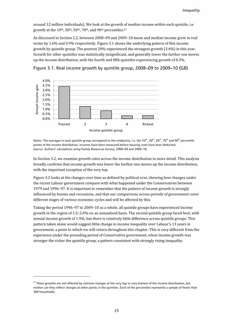
Inequality
23
around 12 million individuals). We look at the growth of median income within each quintile, i.e. growth at the 10th, 30th, 50th, 70th, and 90th percentiles.21
As discussed in Section 2.2, between 2008–09 and 2009–10 mean and median income grew in real terms by 1.6% and 0.9% respectively. Figure 3.1 shows the underlying pattern of this income growth by quintile group. The poorest 20% experienced the strongest growth (3.4%) in this year. Growth for other quintiles was statistically insignificant, and generally lower the further one moves up the income distribution, with the fourth and fifth quintiles experiencing growth of 0.3%.
Figure 3.1. Real income growth by quintile group, 2008–09 to 2009–10 (GB)
Notes: The averages in each quintile group correspond to the midpoints, i.e. the 10th, 30th, 50th, 70th and 90th percentile points of the income distribution. Incomes have been measured before housing costs have been deducted. Source: Authors’ calculations using Family Resources Survey, 2008–09 and 2009–10.
In Section 3.2, we examine growth rates across the income distribution in more detail. This analysis broadly confirms that income growth was lower the further one moves up the income distribution, with the important exception of the very top.
Figure 3.2 looks at the changes over time as defined by political eras, showing how changes under the recent Labour government compare with what happened under the Conservatives between 1979 and 1996–97. It is important to remember that the pattern of income growth is strongly influenced by booms and recessions, and that our comparisons across periods of government cover different stages of various economic cycles and will be affected by this.
Taking the period 1996–97 to 2009–10 as a whole, all quintile groups have experienced income growth in the region of 1.5–2.0% on an annualised basis. The second quintile group fared best, with annual income growth of 1.9%, but there is relatively little difference across quintile groups. This pattern taken alone would suggest little change in income inequality over Labour’s 13 years in government, a point to which we will return throughout this chapter. This is very different from the experience under the preceding period of Conservative government, when income growth was stronger the richer the quintile group, a pattern consistent with strongly rising inequality.
21 These growths are not affected by extreme changes at the very top or very bottom of the income distribution, but neither can they reflect changes at other points in the quintiles. Each of the percentiles represents a sample of fewer than 300 households.
0.0%0.5%1.0%1.5%2.0%2.5%3.0%3.5%4.0%
Poorest 2 3 4 Richest
Ann
ual i
ncom
e ga
in
Income quintile group

Poverty and inequality in the UK: 2011
24
Figure 3.2. Real income growth by quintile group (GB)
Labour: 1996–97 to 2009–10
Conservatives: 1979 to 1996–97
Notes: The averages in each quintile group correspond to the midpoints, i.e. the 10th, 30th, 50th, 70th and 90th percentile points of the income distribution. Incomes have been measured before housing costs have been deducted. Source: Authors’ calculations using Family Expenditure Survey and Family Resources Survey, various years.
Table 3.1. Real income growth by quintile group, across parliaments (GB)
Income quintile group Mean
Poorest 2 3 4 Richest
Conservatives (1979 to 1996–97) 0.8% 1.1% 1.6% 1.9% 2.5% 2.1%
Of which: Thatcher (1979 to 1990) 0.4% 1.2% 2.1% 2.7% 3.6% 2.8%
Major (1990 to 1996–97) 1.7% 0.9% 0.6% 0.5% 0.7% 0.8%
Labour (1996–97 to 2009–10) 1.8% 1.9% 1.6% 1.5% 1.7% 1.9%
Of which: Labour I (1996–97 to 2000–01) 2.4% 2.7% 2.4% 2.5% 2.7% 3.1%
Labour II (2000–01 to 2004–05) 2.6% 2.5% 2.0% 1.6% 1.4% 1.7%
Labour III (2004–05 to 2009–10) 0.5% 0.7% 0.6% 0.7% 1.1% 1.2%
Notes: The averages in each quintile group correspond to the midpoints, i.e. the 10th, 30th, 50th, 70th and 90th percentile points of the income distribution. Incomes have been measured before housing costs have been deducted. Source: Authors’ calculations using Family Expenditure Survey and Family Resources Survey, various years.
0%
1%
2%
3%
Poorest 2 3 4 Richest
Ave
rage
ann
ual i
ncom
e ga
in
Income quintile group
0%
1%
2%
3%
Poorest 2 3 4 Richest
Ave
rage
ann
ual i
ncom
e ga
in
Income quintile group
Inequality
25
Table 3.1 gives income growth by quintile group separately for each of Labour’s terms in office and also divides the previous Conservative era into the premierships of Thatcher and Major. It shows that during Labour’s first term, robust annualised income growth of 2.4% or more per year was experienced across the distribution. In contrast, during Labour’s second term, income grew faster for poorer quintiles than for richer ones: income for the poorest quintile grew by 2.6% on an annualised basis, compared with 1.4% for the richest quintile. In Labour’s third term, income growth was lower for every quintile than in the previous two terms, and lowest for the bottom quintile. Only the richest group experienced income growth of more than 1% per year in this period.
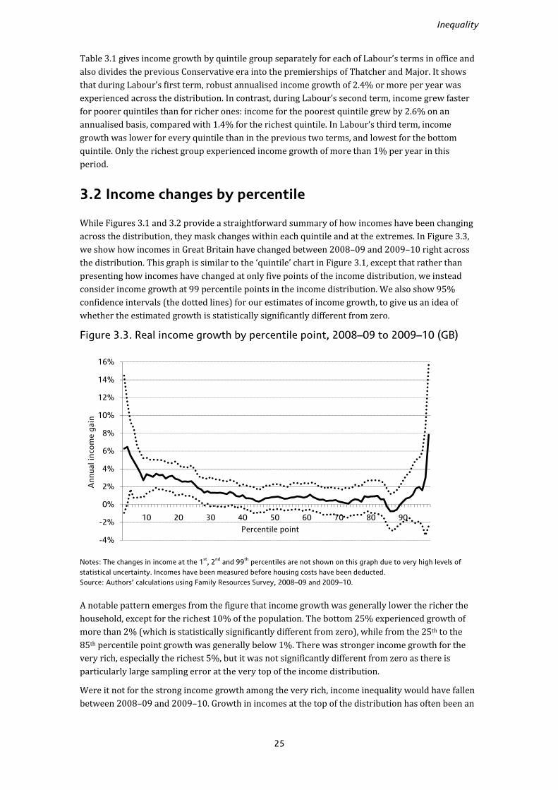
3.2 Income changes by percentile
While Figures 3.1 and 3.2 provide a straightforward summary of how incomes have been changing across the distribution, they mask changes within each quintile and at the extremes. In Figure 3.3, we show how incomes in Great Britain have changed between 2008–09 and 2009–10 right across the distribution. This graph is similar to the ‘quintile’ chart in Figure 3.1, except that rather than presenting how incomes have changed at only five points of the income distribution, we instead consider income growth at 99 percentile points in the income distribution. We also show 95% confidence intervals (the dotted lines) for our estimates of income growth, to give us an idea of whether the estimated growth is statistically significantly different from zero.
Figure 3.3. Real income growth by percentile point, 2008–09 to 2009–10 (GB)
Notes: The changes in income at the 1st, 2nd and 99th percentiles are not shown on this graph due to very high levels of statistical uncertainty. Incomes have been measured before housing costs have been deducted. Source: Authors’ calculations using Family Resources Survey, 2008–09 and 2009–10.
A notable pattern emerges from the figure that income growth was generally lower the richer the household, except for the richest 10% of the population. The bottom 25% experienced growth of more than 2% (which is statistically significantly different from zero), while from the 25th to the 85th percentile point growth was generally below 1%. There was stronger income growth for the very rich, especially the richest 5%, but it was not significantly different from zero as there is particularly large sampling error at the very top of the income distribution.
Were it not for the strong income growth among the very rich, income inequality would have fallen between 2008–09 and 2009–10. Growth in incomes at the top of the distribution has often been an
-4%
-2%
0%
2%
4%
6%
8%
10%
12%
14%
16%
10 20 30 40 50 60 70 80 90
Ann
ual i
ncom
e ga
in
Percentile point
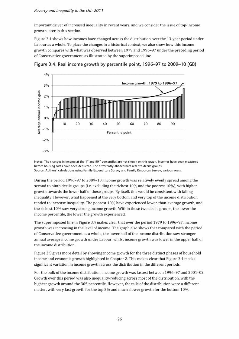
Poverty and inequality in the UK: 2011
26
important driver of increased inequality in recent years, and we consider the issue of top-income growth later in this section.
Figure 3.4 shows how incomes have changed across the distribution over the 13-year period under Labour as a whole. To place the changes in a historical context, we also show how this income growth compares with what was observed between 1979 and 1996–97 under the preceding period of Conservative government, as illustrated by the superimposed line.
Figure 3.4. Real income growth by percentile point, 1996–97 to 2009–10 (GB)
Notes: The changes in income at the 1st and 99th percentiles are not shown on this graph. Incomes have been measured before housing costs have been deducted. The differently-shaded bars refer to decile groups. Source: Authors’ calculations using Family Expenditure Survey and Family Resources Survey, various years.
During the period 1996–97 to 2009–10, income growth was relatively evenly spread among the second to ninth decile groups (i.e. excluding the richest 10% and the poorest 10%), with higher growth towards the lower half of these groups. By itself, this would be consistent with falling inequality. However, what happened at the very bottom and very top of the income distribution tended to increase inequality. The poorest 10% have experienced lower-than-average growth, and the richest 10% saw very strong income growth. Within these two decile groups, the lower the income percentile, the lower the growth experienced.
The superimposed line in Figure 3.4 makes clear that over the period 1979 to 1996–97, income growth was increasing in the level of income. The graph also shows that compared with the period of Conservative government as a whole, the lower half of the income distribution saw stronger annual average income growth under Labour, whilst income growth was lower in the upper half of the income distribution.
Figure 3.5 gives more detail by showing income growth for the three distinct phases of household income and economic growth highlighted in Chapter 2. This makes clear that Figure 3.4 masks significant variation in income growth across the distribution in the different periods.
For the bulk of the income distribution, income growth was fastest between 1996–97 and 2001–02. Growth over this period was also inequality-reducing across most of the distribution, with the highest growth around the 30th percentile. However, the tails of the distribution were a different matter, with very fast growth for the top 5% and much slower growth for the bottom 10%.
-3%
-2%
-1%
0%
1%
2%
3%
4%
10 20 30 40 50 60 70 80 90
Ave
rage
ann
ual i
ncom
e ga
in
Percentile point
Income growth: 1979 to 1996–97

Inequality
27
Figure 3.5. Real income growth by percentile point in three periods since 1996–97 (GB)
Notes: The changes in income at the 1st and 2nd percentiles are not shown on this graph. Incomes have been measured before housing costs have been deducted. Source: Authors’ calculations using Family Resources Survey, various years.
The period between 2001–02 and 2007–08 saw much slower income growth, as discussed in Chapter 2. For most of the income distribution, growth was relatively flat at around 1%, much lower than in the previous four years. The strong growth at the top and real falls in income at the bottom tended to increase income inequality.
Income growth during the two years of recession was similar to that for the preceding six years for the upper half of the income distribution. But growth was noticeably higher for the poorer half during the recession than the average growth over the previous six years; and the difference was most pronounced for the poorest 20% of the population. This meant reduced inequality across most of the income distribution during the recession, although the very top saw the highest income growth of all.
One likely driving factor behind the strong income growth amongst those with lower incomes between 2007–08 and 2009–10 was higher income from benefits and tax credits. As mentioned in Section 2.3, average income received from this source grew by 5.6% per year in real terms during these two years. This reflects a number of different factors: falling inflation and the uprating rules of benefits and tax credits; increased eligibility for benefits and tax credits as a result of falling employment; and discretionary changes to benefits and tax credits. Such income forms a larger part of poorer households’ total income than for richer households, and therefore its growth was relatively more important for poorer households.
Top-income growth and financial markets
In last year’s report (Joyce, Muriel, Phillips and Sibieta, 2010), we suggested that falling incomes at the very top of the income distribution may (partly) have reflected the troubles faced by the financial sector. High-income individuals earn a larger fraction of their income from savings and investments than individuals further down the income distribution; and a significant fraction of top
-2%
-1%
0%
1%
2%
3%
4%
5%
6%
10 20 30 40 50 60 70 80 90
1996–97 to 2001–02 2001–02 to 2007–08 2007–08 to 2009–10
Percentile point
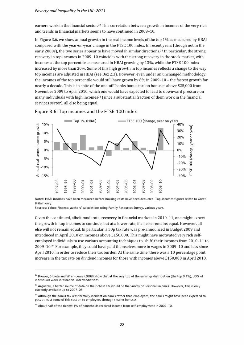
Poverty and inequality in the UK: 2011
28
earners work in the financial sector.22 This correlation between growth in incomes of the very rich and trends in financial markets seems to have continued in 2009–10.
In Figure 3.6, we show annual growth in the real income levels of the top 1% as measured by HBAI compared with the year-on-year change in the FTSE 100 index. In recent years (though not in the early 2000s), the two series appear to have moved in similar directions.23 In particular, the strong recovery in top incomes in 2009–10 coincides with the strong recovery in the stock market, with incomes at the top percentile as measured in HBAI growing by 13%, while the FTSE 100 index increased by more than 30%. Some of this high growth in top incomes reflects a change to the way top incomes are adjusted in HBAI (see Box 2.3). However, even under an unchanged methodology, the incomes of the top percentile would still have grown by 8% in 2009–10 – the fastest growth for nearly a decade. This is in spite of the one-off ‘banks bonus tax’ on bonuses above £25,000 from November 2009 to April 2010, which one would have expected to lead to downward pressure on many individuals with high incomes24 (since a substantial fraction of them work in the financial services sector), all else being equal.
Figure 3.6. Top incomes and the FTSE 100 index
Notes: HBAI incomes have been measured before housing costs have been deducted. Top-incomes figures relate to Great Britain only. Sources: Yahoo Finance; authors’ calculations using Family Resources Survey, various years.
Given the continued, albeit moderate, recovery in financial markets in 2010–11, one might expect the growth in top incomes to continue, but at a lower rate, if all else remains equal. However, all else will not remain equal. In particular, a 50p tax rate was pre-announced in Budget 2009 and introduced in April 2010 on incomes above £150,000. This might have motivated very rich self-employed individuals to use various accounting techniques to ‘shift’ their incomes from 2010–11 to 2009–10.25 For example, they could have paid themselves more in wages in 2009–10 and less since April 2010, in order to reduce their tax burden. At the same time, there was a 10 percentage point increase in the tax rate on dividend incomes for those with incomes above £150,000 in April 2010.
22 Brewer, Sibieta and Wren-Lewis (2008) show that at the very top of the earnings distribution (the top 0.1%), 30% of individuals work in ‘financial intermediation’. 23 Arguably, a better source of data on the richest 1% would be the Survey of Personal Incomes. However, this is only currently available up to 2007–08. 24 Although the bonus tax was formally incident on banks rather than employees, the banks might have been expected to pass at least some of this cost on to employees through smaller bonuses. 25 About half of the richest 1% of households received income from self-employment in 2009–10.
-40%
-30%
-20%
-10%
0%
10%
20%
30%
40%
-15%
-10%
-5%
0%
5%
10%
15%
1997
–98
1998
–99
1999
–00
2000
–01
2001
–02
2002
–03
2003
–04
2004
–05
2005
–06
2006
–07
2007
–08
2008
–09
2009
–10
FTSE
100
(cha
nge,
yea
r on
yea
r)
Ann
ual r
eal-
term
s in
com
e gr
owth
Top 1% (HBAI) FTSE 100 (change, year on year)

Inequality
29
This might also have incentivised self-employed individuals to shift their dividend incomes from April 2010 onward to 2009–10. In addition to income shifting towards 2009–10, the tax changes might also have induced income shifting from 2010–11 to the more distant future. For example, instead of paying themselves in wages and dividends, self-employed individuals can also retain income in their companies to generate more capital gains (which will be realised when they sell the companies). Both the 50p rate and the higher tax rate on dividend incomes meant an increase in the personal income tax rate relative to the capital gains tax rate, increasing the incentive to defer compensation. Therefore, the tax changes might have contributed to income growth for the very rich in 2009–10, and are likely to reduce observed income growth for them in 2010–11.
3.3 Summary measures of inequality
While Figures 3.3 to 3.5 give a very detailed impression of how incomes have changed between specific years, it can also prove useful to construct some summary measures of how inequality has evolved over time. This section discusses trends in various inequality measures.
The Gini coefficient
The Gini coefficient is a popular measure of income inequality that condenses the entire income distribution into a single number between 0 and 1: the higher the number, the greater the degree of income inequality. A value of 0 corresponds to the absence of inequality, so that, having adjusted for household size and composition, all individuals have the same household income. In contrast, a value of 1 corresponds to inequality in its most extreme form, with a single individual having all the income in the economy.
Figure 3.7 shows the evolution of the Gini coefficient since 1979. Inequality rose dramatically over the 1980s, from around 0.25 in 1979 to a peak of around 0.34 in the early 1990s. The scale of this rise in inequality has been shown elsewhere to be unparalleled both historically and compared with the changes taking place at the same time in most other developed countries, though the United States did see a similarly sharp increase in inequality.26
Since the early 1990s, the changes in income inequality have been less dramatic. After falling slightly over the early to mid-1990s, inequality rose again during Labour’s first term, with the Gini coefficient reaching a new peak of 0.35 in 2000–01. During Labour’s second term, however, the Gini fell, with the level of inequality in 2003–04 returning to that last seen in 1997–98. Over the first two terms of the Labour government, the net effect of these changes was to leave income inequality largely unchanged and at historically high levels.
Income inequality (as measured by the Gini coefficient) rose in each of the first three years of Labour’s third term. This left the Gini coefficient in 2007–08 at 0.36, its highest level since our comparable time series began in 1961. Since 2007–08, there has been little change in the Gini coefficient, leaving it very close to its historic high. The increases in the Gini since Labour came to power in 1996–97 and since the recent low in 2003–04 are both statistically significant.27
26 See Goodman, Johnson and Webb (1997), Gottschalk and Smeeding (1997) and Atkinson (1999). 27 Standard errors were calculated using the bootstrap methodology. See Source to Table 2.1 for more detail.

Poverty and inequality in the UK: 2011
30
Figure 3.7. The Gini coefficient (GB)
Note: The Gini coefficient has been calculated using incomes before housing costs have been deducted. Source: Authors’ calculations using Family Expenditure Survey and Family Resources Survey, various years.
Other summary measures of inequality
There are many other measures available to summarise income inequality. Figure 3.8 shows the path of a selection of inequality measures, indexed so as to equal 1 in 1996–97. The 90/10 ratio is the simplest of these measures: it is the ratio of the income of the household at the 90th percentile point to that of the household at the 10th percentile point. The mean log deviation (MLD) measures (roughly) the expected percentage difference between the income of a randomly-selected individual and overall mean income. The Atkinson measure allows one to choose a value for society’s aversion to inequality, defining the amount that society considers it necessary to give to a ‘poor’ person, having taken a given amount of income from a ‘rich’ person, in order to keep overall social welfare the same. The value we have chosen for this parameter reflects a society that considers it necessary to give £33 to a ‘poor’ person, having taken £100 from a ‘rich’ person, in order to keep overall social welfare the same (this is a relatively inequality-averse society). This measure was discussed in more detail in appendix C of Brewer, Goodman, Shaw and Sibieta (2006).
While the precise pattern of inequality changes varies between these different measures, all measures agree in certain key respects. They all show inequality rising for the first few years after 1996–97, but then falling back to a low point in 2003–04 or 2004–05, and rising again after 2004–05. All measures except the 90/10 ratio suggest inequality was significantly higher in 2009–10 than in 1996–97.28
In the latest year, the four inequality measures give rather different pictures. The Gini and the MLD measures have risen very slightly, the Atkinson has risen substantially and the 90/10 has fallen considerably. Among the four, only the change in 90/10 is statistically significant. Recall from Figure 3.3 that income growth in 2009–10 was inequality-reducing across much of the income distribution, but inequality-increasing for the richest 10%. The differing paths of the different inequality measures reflect the fact that they vary in their level of sensitivity to income growth at
28 Standard errors for these inequality measures were calculated using the bootstrap methodology. See Source to Table 2.1 for more detail.
0.20
0.25
0.30
0.35
0.40
1979
1981
1983
1985
1987
1989
1991
1993
-94
1995
-96
1997
-98
1999
-00
2001
-02
2003
-04
2005
-06
2007
-08
2009
-10
Gin
i coe
ffic
ient
Thatcher Blair/BrownMajor

Inequality
31
the very top of the distribution. The 90/10 ratio, for example, is completely unaffected by growth above the 90th percentile, so shows a slight decline. Other measures, such as the MLD, Atkinson and Gini coefficient, are affected (to varying degrees) by growth at the top of the distribution, so do not fall in 2009–10.
Figure 3.8. Summary measures of income inequality (GB)
Notes: Measures have been calculated using incomes before housing costs have been deducted. The Atkinson inequality
measure is shown for an inequality aversion parameter, e, of 1.5. This implies that society considers it necessary to give
£33 to a ‘poor’ person, having taken £100 from a ‘rich’ person, in order to keep overall social welfare the same. Source: Authors’ calculations using Family Resources Survey, various years.
3.4 Impact of tax and benefit changes on inequality
Income inequality rose during the 13 years of Labour government across a range of potential measures. However, this does not necessarily mean that Labour’s changes to the tax and benefit system increased income inequality, as other changes to the economy and society could also have driven the increase in income inequality.
Previous IFS work (Adam and Browne, 2010), reproduced in Figure 3.9, has sought to calculate what income inequality would be had the parameters of previous tax and benefit systems simply been uprated in line with prices or national income. Specifically, for each year, it shows the change in the Gini coefficient relative to its actual level in 2009–10 had the uprated tax and benefit system for that year been in place in 2009–10, under the assumptions that all benefit rates and tax thresholds are uprated over time in line with the RPI (solid line) or in line with GDP (dotted line). Uprating all benefit rates and tax allowances by GDP tends to be more progressive than uprating by RPI, partly because GDP normally grows faster than prices.29
29 Generally speaking, benefits form a larger part of total income for the poor than for the rich. But tax threshold increases tend to have a more ambiguous impact on inequality. Therefore, uprating both benefit rates and tax thresholds at a faster pace tends to reduce income inequality.
0.9
1.0
1.1
1.2
1996
-97
1997
-98
1998
-99
1999
-00
2000
-01
2001
-02
2002
-03
2003
-04
2004
-05
2005
-06
2006
-07
2007
-08
2008
-09
2009
-10
MLD 90/10 Gini Atkinson

Poverty and inequality in the UK: 2011
32
Figure 3.9. Impact on Gini of replacing the 2009–10 tax and benefit system with those from previous years
Note: The years from 1993 onwards represent financial years, e.g. 1996 means 1996–97. Source: Figure 3.2 from Adam and Browne (2010).
Of particular interest is 1997–98, as this tells us how much higher the Gini would be in 2009–10 had Labour simply uprated the tax and benefit system it inherited in line with prices or with national income. Compared with its actual level in 2009–10, the Gini coefficient would be 0.034 higher under the RPI uprating scenario, or 0.016 higher under the GDP one. This means that Labour’s tax and benefit changes reduced income inequality compared with either counterfactual, though the magnitude of the effect depends on the assumptions. Moreover, Adam and Browne (2010) show that the conclusion that Labour’s discretionary reforms were inequality-reducing holds across a range of other measures of income inequality. By contrast, the Conservatives’ reform to benefits and taxes during their preceding period in government increased inequality substantially relative to the scenario of uprating by GDP, and slightly relative to the scenario of uprating by the RPI.30
3.5 Prospects for inequality
There have been significant changes to direct taxes and welfare policies since April 2010, with more set to take effect in the coming years. Many changes are likely to have important distributional consequences.
On the tax side, many of the changes taking effect or announced since April 2010 are likely to reduce inequality, all else being equal, including a number of tax increases for the better-off. First, a new higher tax rate of 50% was introduced on incomes above £150,000 in April 2010. At the same time, the income tax personal allowance started to be withdrawn gradually for incomes above £100,000. These two measures should reduce income growth at the very top of the income distribution in 2010–11, all else being equal.31 From April 2011, the annual allowance for tax-
30 The 1979 tax and benefit system uprated by GDP would lead to a lower Gini than the reality in 2009–10 by 0.02, whereas the 1997 system uprated by GDP would lead to an increase of 0.016 relative to the reality in 2009–10. Under the alternative assumption of uprating by RPI, the difference would be smaller but in the same direction. 31 Part of the lower income growth at the top may come from tax-motivated income shifting, which was discussed in Section 3.2.
-0.04
-0.03
-0.02
-0.01
0.00
0.01
0.02
0.03
0.04
0.05
1978 1980 1982 1984 1986 1988 1990 1992 1994 1996 1998 2000 2002 2004 2006 2009
Incr
ease
in G
ini r
elat
ive
to 2
00
9–1
0
Uprated in line with RPI Uprated in line with GDP
Inequality
33
privileged pension saving will be £50,000; and from April 2012, a lifetime allowance of £1.5 million will be introduced. Each of these measures is likely to reduce income inequality, all else being equal.
The coalition government has chosen to increase the income tax personal allowance in April 2011, reducing the higher-rate income tax threshold in April 2011 to offset the gains from the higher personal allowance for higher-rate taxpayers. The government has also set out plans for another increase in the personal allowance in April 2012, which will benefit all income taxpayers. It is not obvious, however, how these changes will affect income inequality as measured by the Gini coefficient or other summary measures. How much a household will gain as a proportion of its net income depends on the number of income taxpayers in the household, each taxpayer’s gross earnings and the household’s income from other sources as well. Many low-income households do not contain any income taxpayers and therefore will not benefit from the changes at all. Amongst income taxpayers, however, the richest will gain less, on average, as a proportion of income than those with lower incomes because there is a maximum cash-terms gain. As a result, the impact of tax threshold changes is likely to be hump-shaped across the income distribution, with little gain (as a percentage of income) at the top and bottom of the income distribution, but larger gains in the middle.
Turning to state benefits, significant cuts to spending on benefits and tax credits have also been announced by the coalition government. The June 2010 Budget set out a reduction to welfare spending of £11 billion by 2014–15, and the 2010 Spending Review announced a further £7 billion of welfare cuts by 2014–15. Because welfare payments account for a larger proportion of poorer households’ incomes than for richer ones, the impact of welfare cuts as a proportion of total income will be greater for the poor than for the rich. Thus, the welfare cuts are likely to increase income inequality, all else being equal.
Note that these planned welfare cuts will take effect gradually, with less than £400 million worth of cuts taking place in 2010–11 and about £2.3 billion in 2011–12. The amount of the cuts will then increase each year to reach £18 billion in 2014–15. An important part of the deepening of cuts is the change of indexation of most benefits and tax credits to the consumer price index (CPI) from April 2011. Since the CPI tends to give a lower measure of inflation than the indices currently used for uprating benefits and tax credits, the switch to CPI means slower growth in benefits and tax credits. The impact of this on income inequality is likely to accumulate year on year. However, given that the coalition government appears to consider the CPI to give a better measure of inflation, the real-terms index used in HBAI for incomes before housing costs are deducted could well change from RPI to CPI in the future. Browne and Levell (2010) argue that the CPI may better reflect consumers’ ability to substitute between goods, but as it does not include the cost of housing it may be less appropriate for assessing real-terms changes in the incomes of the whole population.
Overall, the policy changes to taxes and benefits will have mixed effects on income inequality in 2010–11 and in the coming years. Recent analysis by IFS researchers32 has examined the distributional impact by 2014–15, which is reproduced in Figure 3.10. The negative impact of these measures as a proportion of household income is decreasing in income across much of the income distribution, but it will be most significant among the very richest – households that contain individuals with incomes greater than £100,000 per year.
32 ‘Personal tax and benefit changes’, presentation by James Browne at the 2011 IFS Post-Budget Briefing, downloadable from http://www.ifs.org.uk/budgets/budget2011/budget2011_jb.pdf.

Poverty and inequality in the UK: 2011
34
Figure 3.10. Impact of changes to tax and benefit system on net income in 2014–15 by decile group
Source: Slide 17 of ‘Personal tax and benefit changes’, presentation by James Browne at the 2011 IFS Post-Budget Briefing, downloadable from http://www.ifs.org.uk/budgets/budget2011/budget2011_jb.pdf.
3.6 Conclusion
In the latest year of data (2009–10), income inequality was largely unchanged, and thus it remains close to the historical high reached in 2007–08. Income inequality as measured by the Gini coefficient hardly changed at all during the recent recession. However, this is not to say that income growth was uniform across the income distribution. Indeed, it has been highest at the very top of the income distribution and still relatively robust for those towards the bottom of the distribution. It is those around the middle of the income distribution who have seen the weakest income growth over the recent recession.
Taking the 13-year period from 1996–97 as a whole, income inequality as measured by the Gini coefficient has increased. Between 1996–97 and 2009–10, income growth was largely constant across much of the income distribution, but it was weak at the very bottom and highest at the very top. These trends at the extremes of the income distribution more than cancelled out the inequality-reducing trends in the rest of the income distribution. As a result, income inequality as measured by the Gini coefficient increased during Labour’s period in office. However, the change was smaller in magnitude than the rise in inequality that occurred during the 1980s. Furthermore, inequality would have increased by more if Labour had made no discretionary changes to taxes and benefits.
Looking to the future, several changes to the tax system look set to hit those on high incomes particularly hard from April 2010 onwards, which will tend to reduce income inequality, all else being equal. On the other hand, deep cuts to benefits and tax credits are likely to act to increase inequality year after year, all else being equal.
-8%
-7%
-6%
-5%
-4%
-3%
-2%
-1%
0%
1%
1 2 3 4 5 6 7 8 9 10>£100k All
Pro
po
rtio
nal
ch
ang
e in
net
inco
me
Income decile group
Announced before Budget 2011 Budget 2011 Total

35
4. Poverty
Key findings
• The most widely-watched measure of relative poverty in the UK is the proportion of individuals with household incomes below 60% of the contemporary median. In the latest year of data (2009–10), the number of individuals living below this poverty line fell by 500,000 measuring incomes before housing costs (BHC) but was unchanged measured after housing costs (AHC).
• Looking over Labour’s 13 years in office, headline rates of relative poverty fell from 19.4% in 1996–97 to 17.1% in 2009–10 (BHC) and from 25.3% to 22.2% (AHC). These falls in poverty were not continuous; poverty generally fell up to 2004–05, rose for three years in a row and then fell again during the recession up to 2009–10.
• In the latest year of data, the number of children living in income poverty fell by 200,000 (or 2.1 percentage points) measuring incomes BHC and 100,000 (or 1.1 percentage points) measuring incomes AHC. Measured BHC, this represents the lowest rate of child poverty since 1985, although child poverty measured AHC remains above its recent low in 2004–05.
• Using incomes measured BHC, the fraction of children in poverty fell from 26.7% in 1996–97 to 19.7% in 2009–10, a fall of just over one-quarter. However, this still leaves the rate of child poverty well above the previous government’s target to halve child poverty by 2010 - a target which is virtually certain to be missed as child poverty would need to fall by almost as much again (900,000) in just one year to attain it.
• The recently-published Child Poverty Strategy lays out the government’s proposals for meeting the 2020 targets for the ‘eradication’ of child poverty. It emphasises increasing employment through welfare reform and additional childcare, and reductions in education and health inequalities. It also introduces a number of new indicators that will be tracked in addition to the legislated income-based targets. There are sensible reasons for broadening measures of poverty beyond those based purely on income. However, it is doubtful whether these policies will be enough to meet the extremely ambitious targets, particularly given the significant cuts to benefits, tax credits and public service spending planned in the years ahead.
• In 2009–10, the number of pensioners living in income poverty fell by 200,000 (or 1.9 percentage points) measuring incomes BHC and was largely unchanged measuring incomes AHC. Pensioner poverty is now at its lowest level since 1984, and significantly lower than just before Labour came to power in 1997. Measured AHC, the rate of poverty amongst pensioners is lower than the rate for any other major demographic group.
• Poverty amongst working-age adults without dependent children is at its highest level since the start of our comparable series in 1961, with the number unchanged (BHC) and up by 100,000 (AHC) in the latest year of data.
• After adjusting for regional differences in the cost of living, relative poverty (using incomes measured BHC) is highest in the West Midlands and lowest in the South East of England. Since the three-year period beginning in 1996–97, poverty has fallen most in the North East of England and has risen only in the West Midlands.

Poverty and inequality in the UK: 2011
36
• Looking to what future years of data may show, rising inflation meant that most benefits and tax credits fell in real terms during 2010–11. This would normally act to increase poverty. However, average earnings also failed to keep up with inflation during 2010–11, meaning that median income, and thus the poverty line, may also have fallen. Looking beyond 2010, IFS researchers have projected that child poverty (BHC) will rise from 2.6 million in 2010–11 to reach 2.9 million by 2013–14, with 200,000 of this change reflecting planned tax and benefit reforms by the coalition government.
In this chapter, we summarise the trends since 1996–97 in some of the government’s main income-based poverty indicators, all derived from HBAI data. The release of data covering 2009–10 means that we can now provide an overall assessment of the trends in poverty during the last Labour government’s full term of office. Reducing poverty amongst families with children was made a key element of that government’s agenda in 1999, following then Prime Minister Tony Blair’s pledge to ‘abolish child poverty within a generation’.33 In 2010, the last government passed the Child Poverty Act with cross-party support, requiring future governments to meet a 2020 target of eradicating child poverty and publish regular strategies on their plans to do so. The Conservative–Liberal Democrat coalition has confirmed that this target remains part of the new government’s policy (HM Government, 2011).
In Section 4.1, we analyse recent changes in relative poverty for the population as a whole. Section 4.2 focuses on subgroups of the population, examining poverty first amongst children and pensioners, groups favoured by the previous government’s tax and benefit reforms, and then amongst working-age adults without dependent children, a group much less favoured by recent tax and benefit reforms. Section 4.3 discusses trends in poverty across the regions and nations of the UK, Section 4.4 discusses absolute poverty and Section 4.5 concludes.
As noted in Appendix A, figures are presented on a GB basis up to and including 2001–02 and on a UK basis from 2002–03 (i.e. largely the same way as they are presented in HBAI).34 Due to this break in the series, and because the size of populations can change over time, when looking at longer-run poverty trends we will focus on the fraction of individuals that are in poverty rather than the number of individuals. Nevertheless, most of the following tables present both the number of people who are poor and the percentage of the relevant population that this number represents. We also report estimates of whether changes in poverty are statistically significant.35 Box 4.1 gives more details of how we measure and report poverty in this publication.
33 Tony Blair, Beveridge Lecture, Toynbee Hall, London, 18 March 1999. 34 Some headline indicators are presented on a UK basis in HBAI back to 1998–99, with data imputed for Northern Ireland between 1998–99 and 2001–02 inclusive. 35 The confidence intervals used were calculated by bootstrapping the changes using 500 iterations (see Source to Table 2.1).

Poverty
37
Box 4.1. Poverty definitions and the reporting of poverty
Unless stated otherwise, we measure poverty by counting the number of individuals whose household income is below 60% of that of the median individual (the median individual is in the middle of the income distribution).a The indicator is a ‘relative’ measure of poverty because the poverty line moves with median income each year. This definition of poverty as a relative concept is in common with those used in most of the rest of Europe but contrasts with, for example, the official measure of poverty used by the United States Census Bureau, which was initially based on the income required to purchase a fixed basket of food items and has since been uprated in line with price changes. Such measures are called ‘absolute’ measures of poverty – although this terminology is not intended to suggest that it measures a more severe state of poverty than relative poverty – and we also report the number of people living in households with income below 60% of the median individual’s income as fixed (in real terms) in 1996–97 just prior to when the last government came to power (and 1998–99 for child poverty, representing the previous government’s official measure of absolute child poverty for the 2010 child poverty targets).
Poverty rates can be measured using incomes measured before housing costs (BHC) or after housing costs (AHC) (see Appendix A), and we present both, but it should be noted that the Child Poverty Act 2010 defines a measure of child poverty in terms of incomes measured BHC only. The government reports the number of individuals rounded to the nearest 100,000, and likewise rounds changes in the number to the nearest 100,000. For consistency and ease of comparison, we also use this convention. Sometimes, this can lead to numbers that can be difficult to interpret and confusing. For example, using the unrounded numbers, there were 13,444,270 people in poverty measured AHC in 2008–09 and 13,450,357 in 2009–10. Rounded to the nearest 100,000, these would be 13.4 million and 13.5 million, respectively. Rounded to the nearest 100,000, the change in the number of people in poverty measured AHC between 2008–09 and 2009–10 (6,087) is zero, however. The level of poverty has risen but the change in poverty was zero. To avoid confusion, we highlight other such examples as they arise.
The government reports poverty rates rounded to the nearest full percentage point. Here we depart from its methodology and round percentages to the nearest tenth (0.1) of a per cent. This allows us to be more precise and to report smaller changes in the proportion of people in poverty than the government.
a. In this chapter, most estimates of poverty are presented on a GB basis up to and including 2001–02 and on a UK basis in 2002–03 and subsequent years. The size of the discontinuity caused by the inclusion of Northern Ireland is small: using a UK-wide poverty line, the risk of poverty in Northern Ireland in 2009–10 was 23.4% measuring incomes BHC, slightly higher than that in the rest of the UK (16.9%) (the gap is smaller when measuring incomes AHC – 23.7% in Northern Ireland compared with 22.1% in the rest of the UK); but only 2.9% of individuals in the UK live in Northern Ireland.
4.1 Poverty in the whole population
In the UK in 2009–10, there were 13.5 million individuals in relative poverty measuring incomes after housing costs (AHC) and 10.4 million measuring them before housing costs (BHC), using a poverty line equal to 60% of median income. On this indicator, between 1997–98 and 2004–05, Labour oversaw the longest decline in the poverty rate since the start of our consistent time series in 1961. However, this decline in poverty came to an end in 2004–05, and poverty then rose for three consecutive years.
Between 2007–08 and 2008–09, poverty fell by 100,000 measuring incomes BHC (or by 0.3 percentage points) and was unchanged measuring incomes AHC (although as a proportion of the total population it fell by 0.2 percentage points). In the latest year of data, 2009–10, poverty fell by a further 500,000 (or by 0.9 percentage points) measuring incomes BHC and was unchanged (or
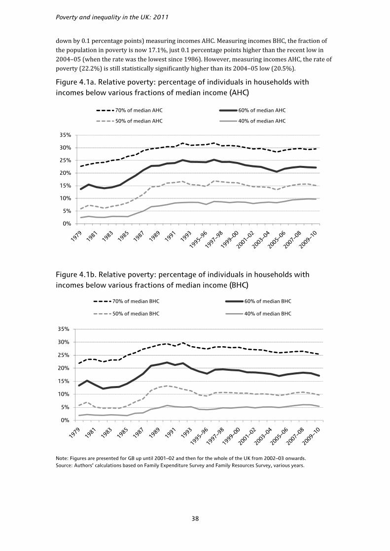
Poverty and inequality in the UK: 2011
38
down by 0.1 percentage points) measuring incomes AHC. Measuring incomes BHC, the fraction of the population in poverty is now 17.1%, just 0.1 percentage points higher than the recent low in 2004–05 (when the rate was the lowest since 1986). However, measuring incomes AHC, the rate of poverty (22.2%) is still statistically significantly higher than its 2004–05 low (20.5%).
Figure 4.1a. Relative poverty: percentage of individuals in households with incomes below various fractions of median income (AHC)
Figure 4.1b. Relative poverty: percentage of individuals in households with incomes below various fractions of median income (BHC)
Note: Figures are presented for GB up until 2001–02 and then for the whole of the UK from 2002–03 onwards. Source: Authors’ calculations based on Family Expenditure Survey and Family Resources Survey, various years.
0%
5%
10%
15%
20%
25%
30%
35%
70% of median AHC 60% of median AHC
50% of median AHC 40% of median AHC
0%
5%
10%
15%
20%
25%
30%
35%
70% of median BHC 60% of median BHC
50% of median BHC 40% of median BHC

Poverty
39
To give more perspective, Figure 4.1 shows relative poverty in Great Britain between 1979 and 2001–02 and in the UK from 2002–03 onwards, measuring incomes AHC (Figure 4.1a) and BHC (Figure 4.1b) and under a range of poverty lines. (Note that the rest of this chapter will focus mostly on poverty lines defined as 60% of median income.) One can see from these graphs that poverty rates measured AHC tend to be higher than those measured BHC, because those on low incomes tend to spend a greater proportion of their incomes on housing than those on higher incomes.
Poverty rates increased dramatically during the mid- to late 1980s, more slowly in the early 1990s, and then stabilised or fell from the mid-1990s onwards, about the same time that the last Labour government came to power. To be more specific, in Labour’s first term, overall poverty fell by 2.1 percentage points (AHC) and by 1.0 percentage points (BHC); it then fell slightly faster during the second term, falling by a further 2.6 percentage points (AHC) and 1.4 percentage points (BHC). All of these declines are statistically significant. The new data for 2009–10 complete our picture for the third and final term of the last Labour government. Poverty rose in 2005–06, 2006–07 and 2007–08, and these rises have not been fully undone by the falls in 2008–09 and 2009–10. Hence, during the third term, there was a cumulative rise between 2004–05 and 2009–10 of 1.7 percentage points (AHC) and 0.1 percentage points (BHC). This means that during Labour’s period in office, poverty fell by a cumulative 3.1 percentage points (AHC) and 2.3 percentage points (BHC). This compares with a rise of 11.6 percentage points (AHC) and 6.1 percentage points (BHC) under the preceding period of Conservative government (from 1979 to 1996–97).
Poverty rates also increased during the 1980s using other poverty lines (40%, 50% and 70% of the median income). Poverty has fallen or stabilised since the mid-1990s using the 50% and 70% thresholds. However, when we consider the 40% poverty line, we see that this measure of poverty has actually risen by 0.9 percentage points (AHC) and by 1.0 percentage point (BHC) since 1996–97. These rises are both statistically significantly different from zero. However, the people with the lowest incomes are not necessarily those with the lowest living standards, and the 40% of median poverty line is unlikely to be a good way of measuring ‘severe poverty’.36 The government has no measure of ‘severe poverty’ for the population as a whole but has recently stated that children will be considered to be severely poor if they live in a household with income less than 50% of the median and are materially deprived (HM Government, 2011).
4.2 Relative poverty amongst different groups
This section examines poverty amongst children and pensioners (two groups targeted by tax and benefit reforms under the previous Labour government) and amongst working-age adults without dependent children (who have fared less well).37
Tables 4.1 and 4.2 contain detailed information on relative poverty, using a 60% poverty line, since 1996–97 for the population as a whole (the last pair of columns) and for various subgroups (the other columns). Using rounded numbers, the overall picture of no change in poverty between 2008–09 and 2009–10 measuring incomes AHC comprises 100,000 additional working-age adults without children in poverty, no change in the number of pensioners and working-age adults with children in poverty, and 100,000 fewer children in poverty. Measuring incomes BHC, the fall in overall poverty of 500,000 comprises no change in the number of poor working-age adults without children, 100,000 fewer working-age adults with children, 200,000 fewer children and 200,000 fewer pensioners in poverty. It should be noted that in some cases, the levels reported in Tables 4.1 36 For a more detailed consideration of these issues, see Brewer, Phillips and Sibieta (2010). 37 We use the shorthand ‘working-age adults without children’ or ‘working-age non-parents’ to refer to ‘working-age adults without dependent children’.

Poverty and inequality in the UK: 2011
40
and 4.2 may have changed (to the nearest 100,000) even though the change is zero (rounded to the nearest 100,000), and vice versa – see Box 4.1 for more details.
Using incomes measured BHC, the child poverty rate is now statistically significantly below its previous recent low point in 2004–05 and is at its lowest level since 1985. However, despite small falls this year and last, about one-eighth of the fall in child poverty in the first two terms of Labour’s period in office using incomes measured AHC has been reversed as a result of the net rise in child poverty since 2004–05. However, the last government’s period of office saw significant falls in child poverty overall: the fraction of children in poverty has fallen by 6.9 percentage points (BHC) or 5.0 percentage points (AHC) since 1996–97.
The fall in pensioner poverty in 2009–10 means that the rate of pensioner poverty is at its lowest since 1984 using incomes measured BHC or AHC. Since comparable figures began in 1961, pensioner poverty has been lower than in 2009–10 in only three years measuring incomes BHC and in only two years measuring incomes AHC (all in the early 1980s following a deep recession which reduced median income). Measured AHC, pensioners now have a lower rate of poverty than all other groups in society. However, using incomes measured BHC, the rate of pensioner poverty exceeds that of working-age adults (although it is below that of children).
Table 4.1. Relative poverty: percentage and number of individuals in households with incomes below 60% of median AHC income
Children Pensioners Working-age parents
Working-age non-parents
All
% Million % Million % Million % Million % Million
1996–97 (GB) 34.1 4.3 29.1 2.9 26.6 3.3 17.2 3.5 25.3 14.0
1997–98 (GB) 33.2 4.2 29.1 2.9 25.9 3.2 15.9 3.3 24.4 13.6
1998–99 (GB) 33.9 4.3 28.6 2.9 26.3 3.2 15.5 3.2 24.4 13.6
1999–00 (GB) 32.7 4.2 27.6 2.8 25.5 3.1 16.1 3.4 24.0 13.4
2000–01 (GB) 31.1 3.9 25.9 2.6 24.7 3.0 16.2 3.4 23.1 13.0
2001–02 (GB) 30.8 3.9 25.6 2.6 24.5 3.0 15.6 3.4 22.7 12.8
2002–03 (UK) 29.8 3.9 24.2 2.5 24.1 3.0 16.5 3.7 22.4 13.1
2003–04 (UK) 28.7 3.7 20.6 2.2 23.5 2.9 16.6 3.7 21.5 12.6
2004–05 (UK) 28.4 3.6 17.6 1.9 23.0 2.9 16.1 3.6 20.5 12.1
2005–06 (UK) 29.8 3.8 17.0 1.8 24.9 3.1 17.6 4.0 21.7 12.8
2006–07 (UK) 30.5 3.9 18.9 2.1 25.2 3.2 17.6 4.0 22.2 13.2
2007–08 (UK) 31.1 4.0 18.1 2.0 25.6 3.3 18.1 4.2 22.5 13.5
2008–09 (UK) 30.3 3.9 16.0 1.8 25.6 3.3 19.1 4.4 22.3 13.4
2009–10 (UK) 29.1 3.8 15.6 1.8 25.2 3.4 19.7 4.5 22.2 13.5
Changes
1996–97 to 2000–01 –3.0 –3.2 –1.9 (–1.0) –2.1
2000–01 to 2004–05 –2.8 –8.3 –1.6 (–0.1) –2.6
2004–05 to 2009–10 (0.7) (0.1) –2.0 (–0.1) 2.2 0.5 3.7 0.8 1.7 1.4
2008–09 to 2009–10 (–1.1) (–0.1) (–0.4) (0.0) (–0.4) (0.0) (0.6) (0.1) (–0.1) (0.0)
Notes: Reported changes may not equal the differences between the corresponding numbers due to rounding. Changes in parentheses are not significantly different from zero at the 5% level. Because of the discontinuity in the series due to the inclusion of Northern Ireland from 2002–03, changes in the number of people in poverty since before 2002–03 are not available. However, due to Northern Ireland’s small population and similar poverty rates, the changes in poverty rates reported should be accurate. All figures are presented using the modified OECD equivalence scale. Source: Authors’ calculations based on Family Resources Survey, various years.
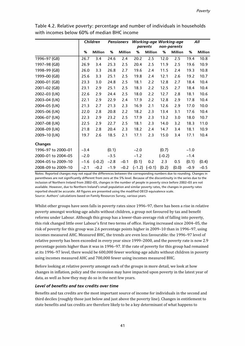
Poverty
41
Table 4.2. Relative poverty: percentage and number of individuals in households with incomes below 60% of median BHC income
Children Pensioners Working-age parents
Working-age non-parents
All
% Million % Million % Million % Million % Million
1996–97 (GB) 26.7 3.4 24.6 2.4 20.2 2.5 12.0 2.5 19.4 10.8
1997–98 (GB) 26.9 3.4 25.3 2.5 20.4 2.5 11.9 2.5 19.6 10.9
1998–99 (GB) 26.0 3.3 26.8 2.7 19.6 2.4 11.5 2.4 19.3 10.8
1999–00 (GB) 25.6 3.3 25.1 2.5 19.8 2.4 12.1 2.6 19.2 10.7
2000–01 (GB) 23.3 3.0 24.8 2.5 18.1 2.2 12.8 2.7 18.4 10.4
2001–02 (GB) 23.1 2.9 25.1 2.5 18.3 2.2 12.5 2.7 18.4 10.4
2002–03 (UK) 22.6 2.9 24.4 2.5 18.0 2.2 12.7 2.8 18.1 10.6
2003–04 (UK) 22.1 2.9 22.9 2.4 17.9 2.2 12.8 2.9 17.8 10.4
2004–05 (UK) 21.3 2.7 21.3 2.3 16.9 2.1 12.6 2.9 17.0 10.0
2005–06 (UK) 22.0 2.8 20.8 2.2 18.2 2.3 13.4 3.1 17.6 10.4
2006–07 (UK) 22.3 2.9 23.2 2.5 17.9 2.3 13.2 3.0 18.0 10.7
2007–08 (UK) 22.5 2.9 22.7 2.5 18.1 2.3 14.0 3.2 18.3 11.0
2008–09 (UK) 21.8 2.8 20.4 2.3 18.2 2.4 14.7 3.4 18.1 10.9
2009–10 (UK) 19.7 2.6 18.5 2.1 17.1 2.3 15.0 3.4 17.1 10.4
Changes
1996–97 to 2000–01 –3.4 (0.1) –2.0 (0.7) –1.0
2000–01 to 2004–05 –2.0 –3.5 –1.2 (–0.2) –1.4
2004–05 to 2009–10 –1.6 (–0.2) –2.8 –0.1 (0.1) 0.2 2.3 0.5 (0.1) (0.4)
2008–09 to 2009–10 –2.1 –0.2 –1.9 –0.2 (–1.2) (–0.1) (0.2) (0.0) –0.9 –0.5
Notes: Reported changes may not equal the differences between the corresponding numbers due to rounding. Changes in parentheses are not significantly different from zero at the 5% level. Because of the discontinuity in the series due to the inclusion of Northern Ireland from 2002–03, changes in the number of people in poverty since before 2002–03 are not available. However, due to Northern Ireland’s small population and similar poverty rates, the changes in poverty rates reported should be accurate. All figures are presented using the modified OECD equivalence scale. Source: Authors’ calculations based on Family Resources Survey, various years.
Whilst other groups have seen falls in poverty rates since 1996–97, there has been a rise in relative poverty amongst working-age adults without children, a group not favoured by tax and benefit reforms under Labour. Although this group has a lower-than-average risk of falling into poverty, this risk changed little over Labour’s first two terms of office. Having increased since 2004–05, the risk of poverty for this group was 2.6 percentage points higher in 2009–10 than in 1996–97, using incomes measured AHC. Measured BHC, the trends are even less favourable: the 1996–97 level of relative poverty has been exceeded in every year since 1999–2000, and the poverty rate is now 2.9 percentage points higher than it was in 1996–97. If the rate of poverty for this group had remained at its 1996–97 level, there would be 600,000 fewer working-age adults without children in poverty using incomes measured AHC and 700,000 fewer using incomes measured BHC.
Before looking at relative poverty amongst each of the groups in more detail, we look at how changes in inflation, policy and the recession may have impacted upon poverty in the latest year of data, as well as how they may do so in the next few years.
Level of benefits and tax credits over time
Benefits and tax credits are the most important source of income for individuals in the second and third deciles (roughly those just below and just above the poverty line). Changes in entitlement to state benefits and tax credits are therefore likely to be a key determinant of what happens to

Poverty and inequality in the UK: 2011
42
relative poverty. Table 4.3 shows year-on-year growth rates in cash-terms entitlements to benefits and tax credits for some key family types likely to be in or close to poverty, and compares these with the year-on-year changes in the poverty line (in cash terms) and in prices. For example, a single pensioner with sufficient National Insurance (NI) credits could claim £95.25/week in Basic State Pension in 2009–10 and £97.65/week in 2010–11.38 This increase (£2.40) is equivalent to 2.5% of the level in 2009–10, which is shown in the relevant cell in Table 4.3. Numbers in bold in the table mark the instances where entitlements to benefits and tax credits grew by more than inflation (as measured by RPI – which is approximately equal to the growth in prices including housing costs that is used to deflate income measured BHC – and Rossi – which is equal to the growth in prices excluding housing costs that is used to deflate income measured AHC). Shaded cells mark instances where entitlements to benefits and tax credits grew faster than both the BHC and AHC poverty lines; considered in isolation, this would suggest a declining relative poverty rate for that family type in that year.39
Table 4.3 shows the following:
• All the family types shown saw the real value of maximum entitlements to benefits and tax credits increase in 2009–10 (where ‘real’ is defined after accounting for inflation as measured by both the RPI and the Rossi index). RPI growth was 0.5% and Rossi growth was 3.2% that year, whilst all these family types saw cash increases in entitlement of 4.8% or above for that year.
• Given that the BHC poverty line grew by just 1.3% in cash terms in 2009–10, and the AHC poverty line increased by 3.9% in cash terms, maximum entitlements to benefits and tax credits for all families increased more than the poverty lines in cash terms in 2009–10. For most non-pensioner families, this is the second consecutive year in which growth in maximum entitlements exceeds the growth in the poverty line.
• Although many other things affect the level of incomes received by those around the poverty line, it is notable that child poverty has fallen in the only two years since 2004–05 that benefit and tax credit entitlements have grown in real terms and relative to the poverty line, whilst it rose in the previous three years of relatively small increases in benefits and tax credits.40,41 The significant rise in the real levels of maximum entitlements partly reflects a discretionary increase in tax credits in April 2009 and partly reflects much lower inflation during 2009–10 than the very high rate in September 2008 that was used to uprate benefits in April 2009.
38 In order to claim the full amount of Basic State Pension, a single pensioner needs to have paid sufficient amounts of NI contributions or have received enough NI credits; or his/her late spouse/partner needs to have had an NI contribution record that satisfied these conditions. The pensioner may also get Pension Credit from the state if his/her income and savings are low enough. 39 Some of these benefits are designed only to cover non-housing costs, and so it might be more appropriate to compare them with changes in the Rossi index or growth in the AHC poverty line. For example, growth in the rate of jobseeker’s allowance for a single adult has exceeded the change in RPI in only two years, but it has exceeded the change in Rossi in eight years. From April 2011, most benefits and tax credits are being uprated in line with the CPI measure of inflation. In April 2010 and earlier, they were uprated in line with either RPI or Rossi. 40 The per-child element of Child Tax Credit has been increased at least in line with average earnings since 2004–05. However, a non-working family with children also receives income from Child Benefit (by default, increased in line with RPI), Income Support (by default, increased in line with Rossi) and the family element of Child Tax Credit (by default, frozen in nominal terms), so the total value of state support will increase by considerably less than average earnings. Working families with children do not receive Income Support, but they receive Working Tax Credit, which is increased in line with RPI. 41 Analysis in Brewer, Browne, Joyce and Sibieta (2010) supports this viewpoint. Table 5.2 of that paper shows what the rate of child poverty would be in 2010–11 if the tax systems of 1998–99, 2004–05 and 2007–08 (suitably uprated to account for inflation or GDP growth) were in place compared with what it is projected to be under the actual 2010–11 system. The figures show that tax and benefit changes between 1998–99 and 2004–05 acted to significantly reduce child poverty, all else equal, whilst tax and benefit changes between 2004–05 and 2007–08 had little effect on poverty.

Tabl
e 4.
3. A
nnua
l gro
wth
in n
omin
al e
ntit
lem
ents
to
stat
e su
ppor
t fo
r ce
rtai
n fa
mily
typ
es (
%)
C
oup
le,
3 c
hild
ren,
n
o w
ork
Lon
e p
aren
t,1
ch
ild,
no
wo
rk
Lon
e p
aren
t,1
ch
ild,
par
t-ti
me
wo
rk
Sin
gle
p
erso
n o
n
Job
seek
er’s
A
llow
ance
Sin
gle
p
erso
n o
n
Inca
pac
ity
Ben
efit
Bas
ic S
tate
P
ensi
on
(s
ing
le)
Sin
gle
p
ensi
on
er
enti
tled
to
m
ean
s-te
sted
b
enef
its
Co
uple
p
ensi
on
er
enti
tled
to
m
ean
s-te
sted
b
enef
its
Po
vert
y lin
e (B
HC
)
Po
vert
y lin
e (A
HC
)
RP
IR
oss
i
1997
–98
2.6
2.1
2.
02
.62.
12
.1
2.6
2.6
5.0
3.8
3.3
2.4
199
8–9
92
.4–3
.8
–5.5
2.4
3.6
3.6
2.
42
.43.
84
.33.
12
.2
199
9–0
09
.38
.6
9.3
2.1
3.2
3.2
6
.56
.55.
05
.51.
61
.7
200
0–0
11
3.4
8
.8
18
.11.
61
.11.
1 4
.64
.65.
95
.83.
01
.4
200
1–0
29
.16
.4
7.2
1.6
3.3
7.4
1
7.5
15
.36.
37
.51.
51
.7
200
2–0
34
.13
.2
4.2
1.7
1.7
4.1
6
.56
.63.
74
.82.
11
.5
200
3–0
48
.56
.5
7.4
1.3
1.7
2.6
4.3
4.0
2.4
2.4
2.8
1.7
200
4–0
56
.04
.6
5.0
1.8
2.8
2.8
3.0
3.3
4.0
2.6
3.1
1.3
200
5–0
62
.52
.0
3.1
1.0
3.1
3.1
3
.83
.83.
53
.22.
61
.9
2006
–07
3.1
2.8
3.
02
.22.
72
.7
4.2
4.2
4.1
3.7
3.7
3.1
2007
–08
3.6
3.2
3.
73
.03.
63
.6
4.4
4.4
4.3
3.4
4.1
2.8
200
8–0
97
.05
.4
6.2
2.3
3.9
3.9
4.2
4.2
3.6
3.4
3.0
4.5
200
9–1
06
.46
.1
5.5
6.3
6.4
5.0
4
.84
.81.
33
.90.
53
.2
2010
–11
2.2
2.0
1.
91
.81.
72
.5
2.0
2.0
n/a
n/a
5.0
5.4
2011
–12
6.1
4.9
4.
13
.13.
14
.6
3.6
3.6
n/a
n/a
5.2
n/a
Not
es:
The
tabl
e sh
ows
annu
al c
hang
es in
max
imum
ent
itle
men
ts t
o be
nefi
ts f
or v
ario
us f
amily
typ
es w
ith
no p
riva
te in
com
e (e
xcep
t th
e w
orki
ng lo
ne p
aren
t, w
ho is
ass
umed
to
earn
an
amou
nt t
hat
is
belo
w t
he p
erso
nal i
ncom
e ta
x al
low
ance
and
the
pri
mar
y th
resh
old
for
Nat
iona
l Ins
uran
ce c
ontr
ibut
ions
) ig
nori
ng H
ousi
ng B
enef
it a
nd C
ounc
il Ta
x B
enef
it a
nd t
he v
alue
of
free
sch
ool m
eals
for
fam
ilies
w
ith
child
ren.
‘RP
I’ m
easu
res
chan
ge
in a
nnua
l ave
rage
of
RP
I all-
item
s in
dex
sinc
e th
e pr
evio
us y
ear
(exc
ept
20
11
–12
, fig
ures
for
whi
ch a
re t
he S
epte
mbe
r 2
01
1 f
orec
ast)
; ‘R
ossi
’ mea
sure
s ch
ange
in
annu
al a
vera
ge o
f R
ossi
sin
ce t
he p
revi
ous
year
. For
20
11
–12
, RP
I is
the
esti
mat
ed a
nnua
l gro
wth
in S
epte
mbe
r 2
01
1 a
s es
tim
ated
in t
able
C.2
of
the
Mar
ch 2
01
1 B
udge
t (H
M T
reas
ury,
20
11
). N
o pr
edic
tion
s fo
r R
ossi
are
ava
ilab
le f
or 2
01
1–1
2 o
nwar
ds. V
alue
s in
bol
d ar
e gr
eate
r th
an b
oth
the
chan
ge
in R
PI a
nd t
he c
hang
e in
Ros
si o
ver
the
sam
e pe
rio
d; s
hade
d ce
lls a
re g
reat
er t
han
the
chan
ge in
bo
th t
he B
HC
and
AH
C p
over
ty li
nes.
Fo
r fu
rthe
r de
tails
, co
ntac
t au
tho
rs.
Sour
ce:
Aut
hors
’ cal
cula
tio
ns.

Poverty and inequality in the UK: 2011
44
• Since 2000–01, the growth in maximum entitlements to benefits for pensioner families with no private income has exceeded the growth in the poverty line (measuring incomes AHC) in each year (and in each year except 2004–05 measuring incomes BHC). Since 2003–04, this has been because maximum entitlements to their benefits rise each year in line with average earnings, growth in which has tended to be above the growth in median income.
• The level of Jobseeker’s Allowance (JSA) for a single unemployed person has risen more slowly than the poverty line (measuring incomes AHC or BHC) in every year since 1996–97 except in 2009–10. This growth in the real value of JSA in 2009–10 is due to the very high inflation in September 2008 which subsequently declined rapidly to average just 0.5% (RPI) or 3.2% (Rossi) in 2009–10. The low growth in benefit entitlement for working-age adults without children in previous years will have presumably contributed towards the rise in poverty amongst working-age adults without children up to 2008–09. Poverty rose further for this group in 2009–10, despite the growth in benefit entitlement. This could reflect rising unemployment and the fact that maximum entitlement to out-of-work benefits remains well below the poverty line for this group.
As highlighted above, one reason why some maximum entitlements to benefits and tax credits increased substantially in real terms (relative to both RPI and Rossi) is that following a general increase in inflation over the period 2005 to 2008, inflation fell from late 2008 onwards.42 Most benefits and tax credits are uprated each April using the rate of inflation in the September of the previous year (as measured by RPI or Rossi in the past and by CPI from 2011–12 onwards); for example, for the year 2009–10, such benefits were increased in April 2009 above the previous year’s level by the rate of inflation (RPI or Rossi) prevailing in September 2008. Others, including Pension Credit and the child element of Child Tax Credit, were uprated each April by the growth in average earnings measured over the previous May to July. Figure 4.2 shows that this rate of increase (5.0% for the RPI or 3.3% for average earnings) was higher than the subsequent annual average inflation rate during 2009–10 (0.5% for the RPI), and this means that the real value of benefits previously linked to the RPI (such as the state pension) was higher in 2009–10 than in 2008–09. Benefits previously linked to Rossi were increased by 6.3%, whilst inflation on this measure turned out to be 3.2% over the year.
The volatility of inflation means that the real value of benefits and tax credits is set to fall in 2010–11. RPI inflation in September 2009 was negative (–1.4%). In general, when inflation is negative, benefit and tax credit rates are frozen, but in the 2009 Pre-Budget Report (HM Treasury, 2009), the government decided to increase the rates of benefits and tax credits normally uprated with RPI by 1.5% in April 2010. (The 1.5% rise was due to be undone in April 2011 by an increase of 1.5 percentage points less than the rate of RPI in September 2010; but since the coalition government plans to switch to CPI uprating from April 2011, the 1.5 percentage point rise will not be undone.) The fact that these RPI-linked benefits and tax credits were increased even though the relevant RPI inflation figure was negative represents a genuine rise in their value. However, because inflation (as measured by RPI) was 5.0% in 2010–11, the real value of these RPI-linked benefits and tax credits still fell by 3.5%.43
Other benefits and tax credits fell slightly less in real terms, due to different indexations and discretionary policy changes. Those linked to the Rossi index (such as personal allowances in Income Support) were uprated by 1.8% in April 2010, which was 3.2 percentage points below RPI inflation for the year 2010–11. Those linked to average earnings were uprated by 1.7% in April 2010, equivalent to 3.3 percentage points below RPI inflation. In addition, discretionary changes to some benefits and tax credits in 2010–11 increased the generosity of those welfare payments. In particular, Basic State Pension was increased by
42 If private incomes respond to changes in the rate of inflation more rapidly than state benefits (as may be, given that, for instance, wage negotiations are likely to take into account expected future inflation as well as past inflation), falling inflation may also increase the value of benefits relative to the poverty line. 43 Except that the real value of the Basic State Pension fell by less in 2010–11, as discussed below.
Poverty
45
2.5% and the child element in Child Tax Credit was increased by £20/year on top of the earnings indexation. Therefore, pensioners and families with children saw the cash levels of their benefits and tax credits increased by about 2.0%–2.5%, as seen in Table 4.3.
Figure 4.2. RPI inflation in survey year compared with RPI/CPI in previous September and average earningsa in previous May–July
a. Including bonus; seasonally adjusted. Notes: RPI was used as the measure of inflation to uprate non-means-tested benefits for 2010–11 and earlier, but CPI is being used from 2011–12 onwards. Therefore ‘RPI/CPI previous September’ means RPI for years to 2010–11 and CPI for 2011–12. Sources: ONS RPI inflation (CZBH), CPI inflation (D7G7) average earnings (LNNC) series; RPI annual average for 2011–12 is the projected rate of RPI inflation for quarter 3 of 2011 from Office for Budget Responsibility (2011).
To sum up briefly, most benefits and tax credits (except Basic State Pension and the child element in Child Tax Credit) fell by more than 3% in real terms in 2010–11. The extent to which this leads to a rise in poverty will depend on the real growth in median income, which also seems likely to be negative in 2010–11 (see Chapter 2).
Looking into the future, the Office for Budget Responsibility predicts inflation will remain at high levels during 2011–12, and this, together with the switch to CPI for uprating most benefits and tax credits, will act to reduce real entitlements for most groups in society in the coming year.44 An exception to this is out-of-work families with several children. As seen in Table 4.3, a workless couple with three children will see a real increase in their welfare income, which is driven by a significant increase above automatic indexation for the child element of Child Tax Credit.45
In general, when inflation and earnings growth are volatile, the real value of benefits is likely to fluctuate year on year; and this will clearly affect the rate of poverty. In the long run, however, this effect should be close to zero, with small real rises in one year being balanced by small real falls in others. However, as
44 Since the CPI measure of inflation tends to be lower than RPI and Rossi measures, the indexation switch is likely to reduce the real values of the CPI-linked benefits and tax credits year after year. More detailed discussion on the differences among the three inflation measures can be found in Crossley, Leicester and Levell (2010). 45 The child element in Child Tax Credit was increased by £180 above indexation in April 2011; and it will be further increased by £110 above indexation in April 2012.
-4%
-2%
0%
2%
4%
6%
8%
10%
12%
1989
1990
1991
1992
1993
1994
–95
1995
–96
1996
–97
1997
–98
1998
–99
1999
–00
2000
–01
2001
–02
2002
–03
2003
–04
2004
–05
2005
–06
2006
–07
2007
–08
2008
–09
2009
–10
2010
–11
2011
–12
Earnings previous May–July
RPI/CPI previous September
RPI annual average

Poverty and inequality in the UK: 2011
46
mentioned earlier, because benefits were not cut when inflation was negative, the period of negative inflation during 2009 will lead to benefit rates that are permanently higher in real terms.46
The changes in poverty amongst children, pensioners and working-age adults without dependent children are now explored in more detail. We focus upon poverty rates derived using income measured BHC for children, as this is the indicator of relative low income used in the targets in the Child Poverty Act 2010; for consistency, we use this measure in detailed analyses of the other types of households. However, poverty rates derived from income measured AHC are also provided.
Child poverty
The numbers of children living in poverty in the UK in 2009–10 were 3.8 million (AHC) and 2.6 million (BHC), down by 100,000 and 200,000 since the previous year, respectively. These correspond to falls in the proportion of children living in poverty of 1.1 percentage points (AHC) and 2.1 percentage points (BHC). The fall in child poverty measuring incomes BHC is statistically significant and leaves the rate of poverty on this measure at its lowest rate since 1985. And although child poverty measuring incomes AHC remains above the rate in 2004–05, the rate of child poverty is statistically significantly lower than the rate inherited by the last Labour government when it entered office on either measure.
Table 4.4. Decomposition of the fall in relative child poverty (BHC), 2008–09 to 2009–10, by family type and work status
Poverty rate Percentage ofchild population
Compositional effect
Incidence effect
Total change in poverty
2008–09 2009–10 2008–09 2009–10
Lone parents
Full-time 14.1% 8.7% 6.7% 6.0% 7,803 –43,864 –36,061
Part-time 19.5% 16.0% 6.1% 6.2% –646 –27,489 –28,136
Workless 54.4% 44.9% 11.4% 10.8% –20,189 –134,997 –155,186
All/Total 34.5% 27.7% 24.1% 23.1% –13,033 –206,350 –219,382
Couples with children
Self-employed 22.6% 23.5% 12.2% 11.9% –1,120 13,627 12,507
Two full-time earners 2.1% 3.2% 15.6% 16.2% –14,175 20,987 6,812
One full-time, one part-time
4.9% 3.9% 22.7% 21.4% 27,828 –28,279 –451
One full-time, one not working
23.6% 18.9% 16.3% 16.8% 309 –101,590 –101,280
One or two part-time 55.3% 49.5% 4.1% 4.5% 15,997 –31,691 –15,693
Workless 64.7% 62.2% 5.0% 6.2% 65,910 –18,016 47,893
All/Total 17.8% 17.4% 75.9% 76.9% 94,748 –144,961 –50,212
All children 21.8% 19.7% 100.0% 100.0% 81,716 –351,310 –231,901
Notes: Poverty rates are measured as the percentage of the group with income below 60% of the population-wide BHC median income. The ‘All children’ total change includes an effect due to the total size of the child population (which is estimated to have increased by around 180,000), and hence cannot be derived by simply summing the other totals. Source: Authors’ calculations based on Family Resources Survey, 2008–09 and 2009–10.
46 Brewer, Browne, Leicester and Miller (2010) estimate that undoing the real rise in benefits that occurred because benefits were not cut when RPI inflation was negative would save around £700 million a year from 2011–12.
Poverty
47
A decomposition of the fall in child poverty from 2008–09 to 2009–10 can help tell us why child poverty has fallen, and Table 4.4 gives such a breakdown. The principle behind the table is to divide all children into nine family types (according to the number of adults in the family and their working patterns) and then divide all changes in poverty into incidence effects – which represent changes in the risk of poverty for particular family types – and compositional effects – which reflect changes in the distribution of children between these nine family types.47 It should be pointed out that although the overall fall in child poverty (BHC) between 2008–09 and 2009–10 was statistically different from zero, it is not necessarily the case that the estimated incidence and compositional effects in Table 4.4 are statistically significant. The decomposition does, however, explain the mechanics of why child poverty has fallen.
The bottom row of Table 4.4 shows that the fall in child poverty is mainly the result of incidence effects (a reduced risk of poverty for particular family types), with changes in the composition of families acting to increase poverty slightly.48 Considering the pattern of changes in more detail:
• The risk of poverty has fallen for children living in most family types, with the exceptions being children living either with two full-time working parents or with two parents where at least one is self-employed (these children together account for 28.1% of all children in 2009–10). The fall in the risk of poverty has been most notable for workless lone-parent families and for couples where one partner works full time and the other does not work.
• The fraction of children living in households where no-one works increased, albeit only slightly, from 16.4% in 2008–09 to 17.0% in 2009–10. The number of children living with workless lone parents fell, whilst the number living with workless couples rose.
Manipulation of the (unrounded) figures underlying Table 4.4 reveals that the fraction of children in poverty who live in couple families was 67.7% in 2009–10, up from 62.0% in 2008–09, and the fraction of poor children in families with someone in work was 55.8%, down from 56.9% in 2008–09. However, the risk of poverty is still higher for children in lone-parent families than for those in couple families, and workless households still face a far greater risk of poverty than those in work.
Table 4.5 repeats the analysis of Table 4.4 but for the longer period between 1996–97 – just before the last government came to power – and the latest year of data, 2009–10. This shows us the extent to which the fall in child poverty under Labour was driven by a changing composition of families with children, and which groups of families with children saw the biggest changes in poverty risk. Because of changes in the numbers of children (and the inclusion of Northern Ireland in the Family Resources Survey since 2002–03), we focus on poverty rates rather than the number of children in poverty.
The bottom row of Table 4.5 shows that the fall in child poverty under Labour was mainly (two-thirds) due to incidence effects (a reduced risk of poverty for particular family types), with changes in the composition of families acting to produce the remaining one-third of the fall in child poverty. However, that is not to say that Labour’s policy was responsible for two-thirds of the fall and the other third was due to other factors. Changes in the composition of families may reflect policies (such as the increase in financial support for those in work and the expansion of welfare-to-work schemes), and changes in the incidence of poverty may reflect changes in society and the economy unrelated to policy. Considering the pattern of changes in more detail:
• The incidence of poverty has fallen for children living in most family types, with the exceptions being children living either with two full-time working parents or with two parents where at least one of
47 For more details, see appendix D of Brewer, Goodman, Shaw and Sibieta (2006). The authors acknowledge that they were motivated to present these decompositions by the analysis in Sutherland, Sefton and Piachaud (2003). 48 Note that the relative importance of incidence and compositional effects is sensitive to the number and definition of family types used in the decomposition.

Poverty and inequality in the UK: 2011
48
them is self-employed (these children together account for 28.1% of all children in 2009–10). The fall in the incidence of poverty has been most notable for non-working families and for lone parents and couples where the only workers work part time. Among all lone-parent families, for example, the child poverty rate fell from 49% to 28% over the period. Some of the fall was due to a compositional shift – a relative decline in the number of children with workless lone parents compared with in-work lone parents. In addition, lone-parent families (alongside workless families and couples with just one part-time earner) are likely to have particularly benefited from increases in the generosity of benefits and tax credits for families with children, which have been targeted at those with low incomes. Browne and Phillips (2010) show that workless lone parents and couple parents have gained 16% (or £49 and £63 per week, respectively), on average, under Labour’s tax and benefit reform since 1997, and working lone parents over 12% (or £52 per week), on average. It is thus perhaps unsurprising that these groups should see a fall in their risk of poverty.
• Despite the increase in the fraction of children living in workless households in the recent recession, since 1996–97 the numbers have declined substantially from 22.8% to 17.0%. This reflects both fewer children living with workless lone parents and fewer children living with workless couples.
Manipulation of the (unrounded) figures underlying Table 4.5 reveals that the fraction of children in poverty who live in couple families was 67.7% in 2009–10, up from 61.0% in 1996–97, despite a fall in the fraction of all children in couple families during that period. The fraction of poor children in families with someone in work was 55.8%, up substantially from 43.0% in 1996–97. This reflects both the fall in the proportion of workless families and the particularly large falls in poverty incidence for workless families.
Table 4.5. Decomposition of the fall in relative child poverty (BHC), 1996–97 to 2009–10, by family type and work status
Poverty rate Percentage ofchild population
Compositional effect
Incidence effect
Total change in poverty
1996–97 2009–10 1996–97 2009–10
Lone parents
Full-time 12.2% 8.7% 3.6% 6.0% –0.3% –0.2% –0.4%
Part-time 28.7% 16.0% 3.8% 6.2% 0.0% –0.6% –0.6%
Workless 63.6% 44.9% 13.9% 10.8% –1.0% –2.3% –3.4%
All/Total 48.7% 27.7% 21.4% 23.1% –1.3% –3.1% –4.4%
Couples with children
Self-employed 21.8% 23.5% 13.0% 11.9% 0.0% 0.2% 0.2%
Two full-time earners 1.5% 3.2% 13.1% 16.2% –0.6% 0.2% –0.3%
One full-time, one part-time
4.3% 3.9% 23.5% 21.4% 0.3% –0.1% 0.3%
One full-time, one not working
23.3% 18.9% 17.2% 16.8% 0.0% –0.8% –0.8%
One or two part-time 60.7% 49.5% 3.1% 4.5% 0.5% –0.4% 0.0%
Workless 71.8% 62.2% 8.8% 6.2% –1.2% –0.7% –1.9%
All/Total 20.7% 17.4% 78.6% 76.9% –1.0% –1.5% –2.6%
All children 26.7% 19.7% 100.0% 100.0% –2.3% –4.7% –6.9%
Notes: Poverty rates are measured as the percentage of the group with income below 60% of the population-wide BHC median income. The 1996–97 figures exclude Northern Ireland but as Northern Irish children represent only a very small fraction of children throughout the United Kingdom, UK child poverty rates are unlikely to be affected to an extent that changes the patterns shown in this table. Source: Authors’ calculations based on Family Resources Survey, 1996–97 and 2009–10.
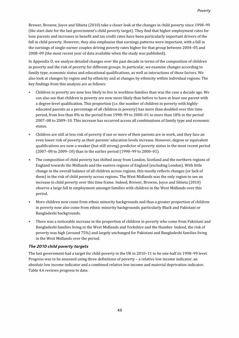
Poverty
49
Brewer, Browne, Joyce and Sibieta (2010) take a closer look at the changes in child poverty since 1998–99 (the start date for the last government’s child poverty target). They find that higher employment rates for lone parents and increases in benefit and tax credit rates have been particularly important drivers of the fall in child poverty. However, they also emphasise that earnings patterns were important, with a fall in the earnings of single-earner couples driving poverty rates higher for that group between 2004–05 and 2008–09 (the most recent year of data available when the study was published).
In Appendix D, we analyse detailed changes over the past decade in terms of the composition of children in poverty and the risk of poverty for different groups. In particular, we examine changes according to family type, economic status and educational qualifications, as well as interactions of these factors. We also look at changes by region and by ethnicity and at changes by ethnicity within individual regions. The key findings from this analysis are as follows:
• Children in poverty are now less likely to live in workless families than was the case a decade ago. We can also see that children in poverty are now more likely than before to have at least one parent with a degree-level qualification. This proportion (i.e. the number of children in poverty with highly-educated parents as a percentage of all children in poverty) has more than doubled over this time period, from less than 8% in the period from 1998–99 to 2000–01 to more than 18% in the period 2007–08 to 2009–10. This increase has occurred across all combinations of family type and economic status.
• Children are still at less risk of poverty if one or more of their parents are in work, and they face an even lower risk of poverty as their parents’ education levels increase. However, degree or equivalent qualifications are now a weaker (but still strong) predictor of poverty status in the most recent period (2007–08 to 2009–10) than in the earlier period (1998–99 to 2000–01).
• The composition of child poverty has shifted away from London, Scotland and the northern regions of England towards the Midlands and the eastern regions of England (excluding London). With little change in the overall balance of all children across regions, this mostly reflects changes (or lack of them) in the risk of child poverty across regions. The West Midlands was the only region to see an increase in child poverty over this time frame. Indeed, Brewer, Browne, Joyce and Sibieta (2010) observe a large fall in employment amongst families with children in the West Midlands over this period.
• More children now come from ethnic minority backgrounds and thus a greater proportion of children in poverty now also come from ethnic minority backgrounds, particularly Black and Pakistani or Bangladeshi backgrounds.
• There was a noticeable increase in the proportion of children in poverty who come from Pakistani and Bangladeshi families living in the West Midlands and Yorkshire and the Humber. Indeed, the risk of poverty was high (around 75%) and largely unchanged for Pakistani and Bangladeshi families living in the West Midlands over the period.
The 2010 child poverty targets
The last government had a target for child poverty in the UK in 2010–11 to be one-half its 1998–99 level. Progress was to be assessed using three definitions of poverty – a relative low income indicator, an absolute low income indicator and a combined relative low income and material deprivation indicator. Table 4.6 reviews progress to date.
Poverty and inequality in the UK: 2011
50
Table 4.6. Progress towards halving child poverty in the UK by 2010–11
Relative poverty,UK, modified OECD
(BHC)
Absolute poverty,UK, modified OECD
(BHC)
Material deprivation and relative low income
% Million % Million % Million
1998–99 26.1 3.4 26.1 3.4 20.8 2.6
1999–00 25.7 3.4 23.4 3.1
2000–01 23.4 3.1 19.1 2.5
2001–02 23.2 3.0 15.2 2.0
2002–03 22.6 2.9 14.1 1.8
2003–04 22.1 2.9 13.7 1.8
2004–05 21.3 2.7 12.9 1.7 17.1 2.2
2005–06 22.0 2.8 12.7 1.6 16.3 2.1
2006–07 22.3 2.9 13.1 1.7 15.6 2.0
2007–08 22.5 2.9 13.4 1.7 17.2 2.2
2008–09 21.8 2.8 12.4 1.6 17.1 2.2
2009–10 19.7 2.6 10.8 1.4 15.7 2.0
Change since 1998–99 –6.3 –0.9 –15.3 –2.0 –5.1 –0.6
Target for 2010–11 1.7 1.7 1.3
Notes: Reported changes may not equal the differences between the corresponding numbers due to rounding. The data are for the UK and incomes are equivalised using the modified OECD equivalence scale. For the purposes of the child poverty target in 2010–11, DWP has had to estimate the level of relative child poverty in the UK in 1998–99 (Northern Ireland was first included in the official HBAI series in 2002–03). For the combined indicator of material deprivation and relative low income, a threshold of 70% of median income is used to determine a relative low income. Sources: Authors’ calculations based on Family Resources Survey, various years; Department for Work and Pensions (2011c). UK poverty levels for years 1998–99 to 2001–02 draw on DWP’s imputed estimates of poverty levels in Northern Ireland over this period.
The most-watched of these three measures was the pure relative poverty target, which was for child poverty in the UK in 2010–11 to be one-half its level in 1998–99, using a poverty line of 60% of median BHC income and the modified OECD equivalence scale. As we saw earlier, the number of children in poverty under this measure fell by 200,000 in 2009–10 to 2.6 million. This means that child poverty has fallen by 900,000 to the nearest hundred thousand (or just over one-quarter) in the 11 years since 1998–99 and needs to fall by a further 900,000 in 2010–11 to meet this element of the target. The absolute poverty target (based on a poverty line of 60% of median income in 1998–99) does look likely to be met, with the number of children in absolute poverty being 1.4 million in 2009–10, 300,000 lower than the 2010–11 target of 1.7 million.
Table 4.6 also shows that the combined indicator of material deprivation and a relative low income fell by 200,000 between 2008–09 and 2009–10, although it remains a little higher than the low reached in 2006–07 (albeit not statistically significantly so). That material deprivation has fallen during the recent recession may be surprising but it does accord with rising real incomes for low-income households. However, the level of material deprivation would still need to fall in 2010–11 by more than it has in the last 11 years in order to meet the previous government’s 2010 target.
The 2020 child poverty targets
The Child Poverty Act 2010, passed with cross-party support, makes the target to eradicate child poverty by 2020 a legal requirement. The Act sets four UK-wide targets that define the eradication of child poverty: a rate of relative income poverty below 10%; less than 5% of children suffering both material deprivation and a relative low income (using a low-income threshold set at 70% of the median); less than 5% of children living in absolute poverty, defined as income less than 60% of the 2010–11 median
Poverty
51
income; and a rate of persistent poverty less than a yet-to-be-specified target. The most-watched measure is likely to be the relative income poverty indicator.
In previous poverty and inequality reports,49 we have argued that a focus on income-based measures may skew the policy response towards reforms that have immediate and predictable impacts on household incomes – such as tax and benefit changes – rather than those that most cost-effectively improve children’s quality of life or reduce the risk of intergenerational transmission of poverty – such as improvements to education.
To some extent, the new government’s Child Poverty Strategy, published on 5 April 2011, recognises this problem.50 It states that poverty is ‘about far more than income’ and expresses concern that a focus on the ‘symptoms’ as opposed to ‘causes’ of poverty led to poor policymaking and poor outcomes. Hence, as well as a new measure of severe poverty, the strategy sets out a number of ancillary indicators that will be tracked to assess whether the government is on course to eradicate child poverty. These indicators are grouped into broad themes, and progress on improving them (and on meeting the existing income-based targets) is linked to a number of specific government policies.
Absent are the very large increases in benefits and tax credits that the last Labour government used, particularly in its first and second terms. The new government is keen to promote this as a change in approach based on lessons learned, but the need for significant fiscal tightening over the next few years would make large increases in benefits and tax credits difficult to afford in any case. Furthermore, the new strategy has much in common with the last government’s proposed strategy for meeting the child poverty targets published at the time of the March 2010 Budget.51 This also focused on promoting work as the best route out of poverty, the need to improve early childhood development and narrow the gap in educational attainment, smoothing the path from adolescence to adulthood, and targeting geographical areas with significant concentrations of deprivation.
Financial Support and Work
The strategy proposes four new indicators in the realm of work and transitions from childhood to the labour market:
• the proportion of children living in workless households; • the proportion of children in working families in relative poverty; • the proportion of 18- to 24-year-olds participating in education or training; • the proportion of 18- to 24-year-olds not participating in education, employment or training (NEET).
The strategy emphasises two policy strands as key in increasing employment amongst families with children and increasing the incomes of low-income working families. First is the introduction of the Universal Credit, which reduces the rates at which benefits are withdrawn as earnings increase for many low-income families, and which replaces a myriad of overlapping benefits with a simpler unified system. This will increase incomes directly, and indirectly if employment increases as a result of the stronger and clearer incentives for a family to have at least one worker or if the simplified system increases the number of people who claim what they are entitled to. However, IFS researchers have shown that the financial incentive to have a second adult working will weaken, and those already working on middle incomes will face a weaker incentive to increase their earnings.52 The government claims that increased entitlements
49 See, for example, box 4.2 of Brewer, Muriel, Phillips and Sibieta (2009). 50 HM Government, 2011. 51 HM Treasury, Department for Children, Schools and Families, and Department for Work and Pensions, 2010. 52 Brewer, Browne and Jin, 2011.

Poverty and inequality in the UK: 2011
52
and higher take-up (arising from a simpler system) will reduce child poverty by 350,000.53 If employment increases in response to the introduction of Universal Credit, the impact could be higher.
The government is also making numerous other changes to the benefit and tax credit system, many of which reduce entitlements for those on low incomes (such as cuts to the generosity of Housing Benefit, real reductions in Child Benefit and Working Tax Credit, increases in conditionality for disability benefits, and smaller increases in benefits and tax credits to account for inflation). It has claimed that these other reforms have no measurable impact on child poverty by 2012–13,54 but this claim is based on analysis that excludes many of the changes planned (they are excluded due to difficulties in modelling them using the available data). Recent IFS research has also modelled the planned cuts to Local Housing Allowance, and has extended the forecast horizon forward to 2013–14, finding that the reforms increase relative child poverty by about 200,000 in 2012–13 and 2013–14.55 Whilst we know about changes planned after 2013–14 (some of which could increase child poverty), IFS researchers have not modelled the impact of reforms after 2013–14 because this will depend on how the Universal Credit will be rolled out, full details of which are not yet available. This makes it difficult to assess whether the government’s changes to the benefit and tax credit system will act to reduce or increase child poverty in the years ahead.
The government also hopes to increase employment through the provision of more targeted and intensive support in finding work, together with the imposition of new conditions and sanctions on those deemed able to work but not currently doing so. These measures include the new Work Programme, moving lone parents whose youngest child is aged 5 or over to Jobseeker’s Allowance (from Income Support) and a reassessment of disability benefit recipients. The extent to which these plans will increase employment or simply shift people from other benefits to Jobseeker’s Allowance is, however, unclear.
Family Environment and ‘Life Chances’
A number of new indicators are proposed in the rather broad area of children’s life chances:
• the difference in probability of low birth weight between high and low social classes; • a measure of school readiness and child development (yet to be defined); • the attainment gap between children receiving free school meals and other children at ages 11 and 16
(Key Stages 2 and 4); • the gap between children eligible and not eligible for free school meals (at 15) in terms of the
proportion achieving two A levels; • the gap between children eligible and not eligible for free school meals (at 15) in terms of the
proportion achieving qualifications equivalent to two A levels; • the levels of higher education participation at 19 for children who received free school meals at 15
and those who did not, and the gap between them; • conception rates for girls aged 15–17; • the number of young people aged 10–17 receiving their first reprimand, warning or conviction; • a breakdown of children in relative poverty by family status (married couples, cohabiting couples and
lone parents).
The strategy sets out a diverse set of issues the government feels are important in making progress on these indicators. These include reducing the likelihood and the effects of family breakdown, improving parental skills and style, improving local housing and communities, and focusing efforts on families facing
53 Department for Work and Pensions, 2011a. 54 Spending Review 2010 (HM Treasury, 2010b). 55 Joyce, 2011.

Poverty
53
multiple and interrelated problems.56 However, the key elements of this part of the strategy appear to be focused on reducing educational and health inequalities by targeting resources at poor and disadvantaged children. This includes an expansion in the coverage of 15 hours of free childcare/early education to 130,000 2-year-olds (up from 20,000) from 2013, which may also allow more parents to return to work. Another key policy is the Pupil Premium, which will skew per-pupil funding towards schools with large numbers of pupils eligible for free school meals (although per-pupil funding will fall in real terms, on average, over the period covered by the Spending Review57). The strategy also lists plans for additional support for low-income children entering higher education, a duty for the NHS Commissioning Board to reduce inequalities in access to, and outcomes from, NHS healthcare, and increasing the number of health visitors and community nurses.
These particular programmes may increase the focus of public service providers and resources on disadvantaged children and this might itself act to reduce inequalities, but the broader environment is one of significant public spending cuts (albeit necessitated by an unsustainable budget deficit). This means that schools, hospitals, local authorities and charities that receive a substantial proportion of their funding from the Government will see much tighter budgets than they have been used to in recent years. Cuts may fall on existing programmes and schemes that act to improve the life chances of disadvantaged children. Arguably, this is already happening (for example, the replacement of the Education Maintenance Allowance in England with a much smaller discretionary fund58).
Assessing the Strategy
The inclusion of additional indicators in the battery of measures that the government monitors to determine whether it is making progress in eradicating child poverty is welcome. By moving beyond income-based measures, the strategy may promote a focus on addressing the longer-run inequalities and constraints that influence the intergenerational transmission of poverty. One concern with having many targets and indicators is that it can reduce verifiability and accountability if multiple indicators are moving in different directions. The soon-to-be-set-up independent Child Poverty Commission could help improve credibility by providing an overall assessment as to whether the Child Poverty Strategy is likely to reduce child poverty to the level required by the Act. The government should also clarify whether there is a hierarchy of targets and indicators (for instance, are the new measures considered equal or ancillary to the income-based targets that are legislated for in the Child Poverty Act?).
Much less clear is whether the particular policies to be implemented will materially reduce child poverty and improve children’s life chances. It is undoubtedly much more difficult to estimate the impact on poverty of changes to public services than changes in benefits and tax credits, but this is not to imply that one approach or the other is more likely to prove successful. Furthermore, although a focus on early educational intervention is welcome, it is highly unlikely that successful interventions could impact on the level of child poverty in 2020 (just nine years away at present). The only policy mentioned in the strategy that has a clearly-demonstrated impact on child poverty in the near future is the Universal Credit, which increases benefit entitlements by around £2.0 billion per year when fully implemented.59 Such increases in benefit entitlements are very similar to the way in which the last government reduced child poverty between 1996–97 and 2009–10.
56 Having multiple problems is defined as having five or more problems from a basket of seven indicators: being in a workless household; overcrowding; maternal mental health problems; long-standing limiting illness of a parent; both parents lacking any educational qualifications; low income; and inability to afford basic items of food and clothing. (Cabinet Office, 2007.) 57 Sibieta, 2010. 58 Chowdry and Sibieta, 2011. 59 Department for Work and Pensions, 2011a.
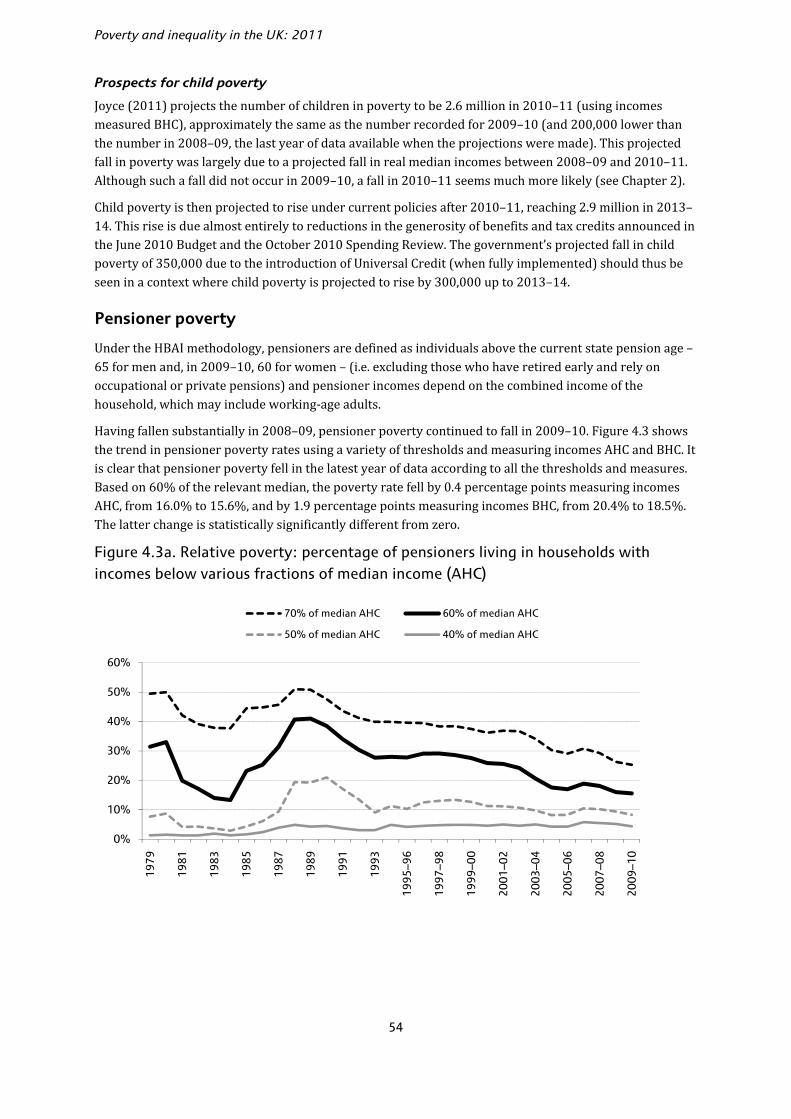
Poverty and inequality in the UK: 2011
54
Prospects for child poverty
Joyce (2011) projects the number of children in poverty to be 2.6 million in 2010–11 (using incomes measured BHC), approximately the same as the number recorded for 2009–10 (and 200,000 lower than the number in 2008–09, the last year of data available when the projections were made). This projected fall in poverty was largely due to a projected fall in real median incomes between 2008–09 and 2010–11. Although such a fall did not occur in 2009–10, a fall in 2010–11 seems much more likely (see Chapter 2).
Child poverty is then projected to rise under current policies after 2010–11, reaching 2.9 million in 2013–14. This rise is due almost entirely to reductions in the generosity of benefits and tax credits announced in the June 2010 Budget and the October 2010 Spending Review. The government’s projected fall in child poverty of 350,000 due to the introduction of Universal Credit (when fully implemented) should thus be seen in a context where child poverty is projected to rise by 300,000 up to 2013–14.
Pensioner poverty
Under the HBAI methodology, pensioners are defined as individuals above the current state pension age – 65 for men and, in 2009–10, 60 for women – (i.e. excluding those who have retired early and rely on occupational or private pensions) and pensioner incomes depend on the combined income of the household, which may include working-age adults.
Having fallen substantially in 2008–09, pensioner poverty continued to fall in 2009–10. Figure 4.3 shows the trend in pensioner poverty rates using a variety of thresholds and measuring incomes AHC and BHC. It is clear that pensioner poverty fell in the latest year of data according to all the thresholds and measures. Based on 60% of the relevant median, the poverty rate fell by 0.4 percentage points measuring incomes AHC, from 16.0% to 15.6%, and by 1.9 percentage points measuring incomes BHC, from 20.4% to 18.5%. The latter change is statistically significantly different from zero.
Figure 4.3a. Relative poverty: percentage of pensioners living in households with incomes below various fractions of median income (AHC)
0%
10%
20%
30%
40%
50%
60%
1979
1981
1983
1985
1987
1989
1991
1993
1995
–96
1997
–98
1999
–00
2001
–02
2003
–04
2005
–06
2007
–08
2009
–10
70% of median AHC 60% of median AHC
50% of median AHC 40% of median AHC

Poverty
55
Figure 4.3b. Relative poverty: percentage of pensioners living in households with incomes below various fractions of median income (BHC)
Note: Figures are presented for GB up until 2001–02 and for the whole of the UK from 2002–03 onwards. Source: Authors’ calculations based on Family Expenditure Survey and Family Resources Survey, various years.
Using a poverty line of 60% of median income, there are now 1.8 million pensioners in poverty measuring incomes AHC and 2.1 million measuring incomes BHC in the UK. Pensioner poverty is at its lowest level since the first half of the 1980s. In particular, the rate of pensioner poverty has been lower than that in 2009–10 in only two years since the start of our consistent time series in 1961 (1983 and 1984) using incomes measured AHC and in only three years (1982 to 1984) using incomes measured BHC. Furthermore, for the third consecutive year, the rate of poverty amongst pensioners is lower than that for any of the other three population groups considered (i.e. children, and working-age adults with and without dependent children) measuring incomes AHC.
Tables 4.1 and 4.2 set out poverty rates amongst pensioners since 1996–97. Measuring incomes AHC, pensioner poverty has declined extremely rapidly: the 13.5 percentage point fall since 1996–97 at 60% of median AHC income constitutes a cut in poverty of almost one-half (46%). There has also been a fall in pensioner poverty measuring incomes BHC, by 6.1 percentage points (or a quarter) between 1996–97 and 2009–10, and this is also statistically significant. The falls in pensioner poverty using incomes measured AHC tended to be concentrated during the Labour government’s second term rather than its first or third term. Using incomes measured BHC, the falls took place mainly during the last government’s second and third terms. Figure 4.3 shows how pensioner poverty has evolved over a longer time frame (since 1979) with a variety of poverty thresholds. It shows that poverty rates amongst pensioners have fallen using a variety of thresholds measuring incomes AHC or BHC.
Why did pensioner poverty fall in 2009–10? Pensioner poverty fell in previous recessions because, at least in part, falls in employment and wages acted to reduce median income, whereas the incomes of pensioners proved relatively resilient. However, in 2009–10, median income continued to grow on both BHC and AHC bases, so this cannot have had a role in the fall in pensioner poverty this time round. Instead, the incomes of poor pensioners must have grown by more than median income.
One reason for this may be fairly large increases in benefit entitlements (following rapid inflation in September 2008) during a period in which inflation was subdued (see Table 4.3). Indeed, the average benefit income of the poorest 30% of pensioners (i.e. those in poverty and just over the poverty line) rose by 6.9%, far ahead of the growth in the poverty line, although it should be noted this could reflect a changing composition of the pensioner population as well as changes in benefit rates (see Table 4.7 later).
0%
10%
20%
30%
40%
50%
60%19
79
1981
1983
1985
1987
1989
1991
1993
–94
1995
–96
1997
–98
1999
–00
2001
–02
2003
–04
2005
–06
2007
–08
2009
–10
70% of median BHC 60% of median BHC
50% of median BHC 40% of median BHC

Poverty and inequality in the UK: 2011
56
As well as changes in actual benefit receipts and entitlements, HBAI benefit income may change because of changes in the proportion of benefit expenditure captured by the Family Resources Survey. Figure 4.4 shows how the proportion of Pension Credit expenditure captured by the FRS has changed since 2004–05. Last year, we saw that a small increase in the fraction (from 52% to 55%) of Pension Credit expenditure picked up by the FRS may have been one reason for the fall in measured pensioner poverty in 2008–09.60 This would be the case if the increase in the reporting of Pension Credit receipt was concentrated amongst households that would otherwise be just under the poverty line. This improvement in the recording of Pension Credit expenditure is not repeated in the latest year of data, 2009–10. Instead, the fraction of spending on Pension Credit captured by the FRS fell to 54%.
Figure 4.4. Fraction of expenditure on Pension Credit recorded by the FRS
Notes: Figures are presented for GB only, as benefit payments in Northern Ireland are administered by the Department for Social Development in Northern Ireland, not DWP. The figures for the fraction of Pension Credit expenditure picked up the FRS in the years prior to 2009–10 differ slightly from the figures reported for these years in the 2010 Commentary (Joyce, Muriel, Phillips and Sibieta, 2010) because the earlier figures mistakenly compared expenditure from the FRS for the whole UK with DWP estimates of spending for Great Britain only. Source: Authors’ calculations using the HBAI survey, DWP administrative expenditure figures (available at http://research.dwp.gov.uk/asd/asd4/index.php?page=medium_term) and various HMRC Annual Reports and Departmental Accounts (available at http://www.hmrc.gov.uk/about/reports.htm).
Table 4.7 shows how the amounts of different income sources have changed over time for the poorest 30% of pensioners. It shows that the main driver of income growth amongst poorer pensioners in 2009–10 was growth in benefits and tax credits (6.2 percentage points). Growth in income from occupational pensions would have increased pensioners’ incomes by 0.7 percentage points, all else being equal. However, these increases were partly offset by a fall of 14.1% in the amount of income from savings, investments and personal pensions, driven by very low interest rates during 2009–10. The housing costs of low-income pensioners rose in cash terms by 7.6%, on average. This contrasts with the experience of working-age adults, many of whom benefited from big falls in interest payments on their mortgages. Few pensioners who own their homes are still paying off their mortgages, so few have benefited from cuts to interest rates.
60 The 51% and 54% figures for the fraction of Pension Credit expenditure picked up the FRS in 2007–08 and 2008–09, respectively, differ slightly from the figures reported for these years in the 2010 Commentary (Joyce, Muriel, Phillips and Sibieta, 2010) because the earlier figures mistakenly compared expenditure from the FRS for the whole UK with DWP estimates of spending for Great Britain only.
50%
52%
54%
56%
58%
60%
2004–05 2005–06 2006–07 2007–08 2008–09 2009–10
Fraction of expenditure

Poverty
57
Table 4.7. Income sources: nominal year-on-year income growth and share of total BHC income (UK)
Source of income Deductions from
income (incl.
council tax)
Totalincome(BHC)
Housingcosts
Earnings and self-
employment
Benefits and tax credits
Occupational pensions
Income from savings,
investments and personal
pensions
Other income
Share of total income in 2009–10
3.2% 88.7% 12.6% 5.5% 1.2% –11.2% 100% N/A
Change in latest year: 2008–09 to 2009–10
5.1% 6.9% 5.3% –14.1% 11.7% 0.8% 6.1% 7.6%
Contribution to growth in 2009–10
0.2ppt 6.2ppt 0.7ppt –0.8ppt 0.1ppt –0.1ppt 6.1ppt N/A
Annual change since 2002–03
2002–03 to 2009–10 9.7% 4.2% 6.4% 5.8% 5.4% 6.3% 4.5% 4.1%
Of which:
2002–03 to 2007–08 8.7% 3.2% 6.5% 11.6% 3.5% 7.6% 3.7% 2.9%
2007–08 to 2009–10 12.2% 6.9% 6.2% –7.4% 11.0% 3.2% 6.5% 7.3%Notes: The table relates to the subsample of households in the HBAI that contain the poorest 30% of pensioners (i.e. those in poverty and just above the poverty line), but excluding those households with negative reported incomes. All incomes have been equivalised and are measured at the household level and before housing costs have been deducted. Source: Authors’ calculations using Family Resources Survey, various years.
Table 4.8. Exploring the fall in relative pensioner poverty from 2008–09 to 2009–10, by partnership status, sex and age
Poverty rate (BHC) Poverty rate (AHC) Fraction of pensioners
2008–09 2009–10 2008–09 2009–10 2008–09 2009–10
Couples
Male partner aged 80+ 23.0% 20.0% 17.0% 15.9% 9.9% 10.9%
Male partner aged 70–79 19.0% 17.1% 14.5% 16.3% 24.5% 25.3%
Male partner aged under 70 15.5% 13.3% 13.7% 12.0% 24.3% 25.6%
Single
Female aged 80+ 27.1% 25.5% 20.6% 20.4% 11.1% 11.0%
Female aged 70–79 25.1% 26.9% 16.9% 16.3% 9.7% 9.1%
Female aged 60–69 23.2% 21.4% 20.6% 18.7% 9.6% 8.4%
Male aged 80+ 19.8% 19.2% 16.3% 13.5% 3.6% 3.1%
Male aged 70–79 18.9% 13.7% 11.6% 13.1% 4.6% 3.9%
Male aged 65–69 15.5% 15.5% 15.5% 16.7% 2.8% 2.5%
All pensioners 20.4% 18.5% 16.0% 15.6% 100% 100%
Note: Poverty rates are measured as the percentage of the group with income below 60% of the population-wide BHC/AHC median income. Source: Authors’ calculations based on Family Resources Survey, 2008–09 and 2009–10.
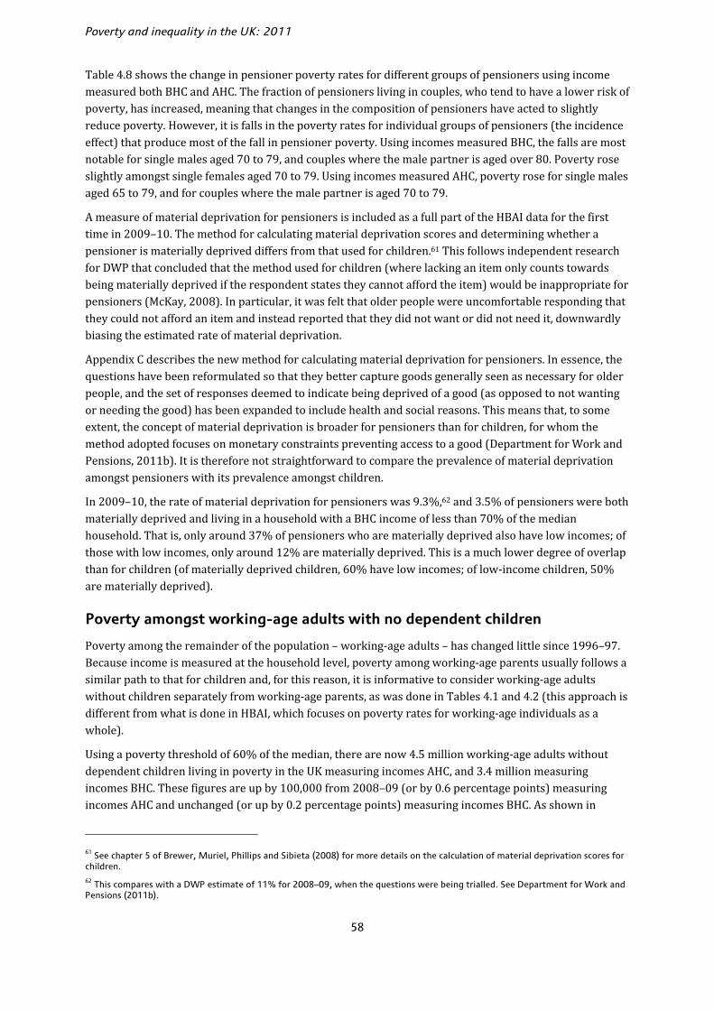
Poverty and inequality in the UK: 2011
58
Table 4.8 shows the change in pensioner poverty rates for different groups of pensioners using income measured both BHC and AHC. The fraction of pensioners living in couples, who tend to have a lower risk of poverty, has increased, meaning that changes in the composition of pensioners have acted to slightly reduce poverty. However, it is falls in the poverty rates for individual groups of pensioners (the incidence effect) that produce most of the fall in pensioner poverty. Using incomes measured BHC, the falls are most notable for single males aged 70 to 79, and couples where the male partner is aged over 80. Poverty rose slightly amongst single females aged 70 to 79. Using incomes measured AHC, poverty rose for single males aged 65 to 79, and for couples where the male partner is aged 70 to 79.
A measure of material deprivation for pensioners is included as a full part of the HBAI data for the first time in 2009–10. The method for calculating material deprivation scores and determining whether a pensioner is materially deprived differs from that used for children.61 This follows independent research for DWP that concluded that the method used for children (where lacking an item only counts towards being materially deprived if the respondent states they cannot afford the item) would be inappropriate for pensioners (McKay, 2008). In particular, it was felt that older people were uncomfortable responding that they could not afford an item and instead reported that they did not want or did not need it, downwardly biasing the estimated rate of material deprivation.
Appendix C describes the new method for calculating material deprivation for pensioners. In essence, the questions have been reformulated so that they better capture goods generally seen as necessary for older people, and the set of responses deemed to indicate being deprived of a good (as opposed to not wanting or needing the good) has been expanded to include health and social reasons. This means that, to some extent, the concept of material deprivation is broader for pensioners than for children, for whom the method adopted focuses on monetary constraints preventing access to a good (Department for Work and Pensions, 2011b). It is therefore not straightforward to compare the prevalence of material deprivation amongst pensioners with its prevalence amongst children.
In 2009–10, the rate of material deprivation for pensioners was 9.3%,62 and 3.5% of pensioners were both materially deprived and living in a household with a BHC income of less than 70% of the median household. That is, only around 37% of pensioners who are materially deprived also have low incomes; of those with low incomes, only around 12% are materially deprived. This is a much lower degree of overlap than for children (of materially deprived children, 60% have low incomes; of low-income children, 50% are materially deprived).
Poverty amongst working-age adults with no dependent children
Poverty among the remainder of the population – working-age adults – has changed little since 1996–97. Because income is measured at the household level, poverty among working-age parents usually follows a similar path to that for children and, for this reason, it is informative to consider working-age adults without children separately from working-age parents, as was done in Tables 4.1 and 4.2 (this approach is different from what is done in HBAI, which focuses on poverty rates for working-age individuals as a whole).
Using a poverty threshold of 60% of the median, there are now 4.5 million working-age adults without dependent children living in poverty in the UK measuring incomes AHC, and 3.4 million measuring incomes BHC. These figures are up by 100,000 from 2008–09 (or by 0.6 percentage points) measuring incomes AHC and unchanged (or up by 0.2 percentage points) measuring incomes BHC. As shown in
61 See chapter 5 of Brewer, Muriel, Phillips and Sibieta (2008) for more details on the calculation of material deprivation scores for children. 62 This compares with a DWP estimate of 11% for 2008–09, when the questions were being trialled. See Department for Work and Pensions (2011b).

Poverty
59
Figure 4.5, the rates of poverty for this group are now 19.7% (AHC) and 15.0% (BHC), with both of these figures being the highest poverty rate amongst working-age non-parents since the start of our consistent time series in 1961 and both being statistically significantly higher than the rate in 1996–97.
Figure 4.5a. Relative poverty: percentage of working-age non-parents living in households with incomes below various fractions of median income (AHC)
Figure 4.5b. Relative poverty: percentage of working-age non-parents living in households with incomes below various fractions of median income (BHC)
Note: Figures are presented for GB up until 2001–02 and for the whole of the UK from 2002–03 onwards. Source: Authors’ calculations based on Family Expenditure Survey and Family Resources Survey, various years.
0%
5%
10%
15%
20%
25%
1979
1981
1983
1985
1987
1989
1991
1993
–94
1995
–96
1997
–98
1999
–00
2001
–02
2003
–04
2005
–06
2007
–08
2009
–10
70% of median AHC 60% of median AHC
50% of median AHC 40% of median AHC
0%
5%
10%
15%
20%
25%
1979
1981
1983
1985
1987
1989
1991
1993
–94
1995
–96
1997
–98
1999
–00
2001
–02
2003
–04
2005
–06
2007
–08
2009
–10
70% of median BHC 60% of median BHC
50% of median BHC 40% of median BHC

Poverty and inequality in the UK: 2011
60
Two years ago, we explored reasons for the change in the rate of poverty amongst working-age non-parents between 1996–97 and 2007–08, measuring incomes AHC.63 To do this, we split changes into those resulting from changes in the risk of being in poverty for particular groups (the incidence effect) and the changing composition of the working-age non-parent population (the compositional effect). We can now extend this analysis to cover the last government’s full period in office (i.e. to 2009–10) and we show the results in Table 4.9. In summary:
• Increased employment amongst couples was offset by increased worklessness amongst single adults, meaning that compositional shifts had very little effect, overall, on the rate of relative poverty for working-age adults without children.
• On the other hand, the incidence effects acted to increase relative poverty overall, because most of the family types saw a rising risk of relative poverty over the period. The most important of these were the rise in the risk of poverty for couples with one adult not working and the other working full time and the increase in the risk of poverty for single individuals working full time.
• The only group for which the risk of poverty fell was workless single adults, and this fall was very small.
Table 4.9. Decomposition of the rise in relative poverty amongst working-age non-parents (AHC), 1996–97 to 2009–10, by family type and work status
Poverty rate Percentage of working-age non-parent population
Compositional effect
Incidence effect
Total change in poverty
1996–97 2009–10 1996–97 2009–10
Single individuals
Full-time 6.6% 10.6% 25.3% 24.4% 0.1% 1.0% 1.1%
Part-time 28.2% 28.7% 4.1% 5.8% 0.2% 0.0% 0.2%
Workless 55.6% 55.3% 14.8% 16.5% 0.6% –0.4% 0.3%
Couples, no children
Self-employed 14.5% 16.4% 7.8% 7.1% 0.0% 0.1% 0.2%
Two full-time earners 0.3% 2.1% 18.8% 21.0% –0.4% 0.4% 0.0%
One full-time, one part-time
2.0% 5.1% 8.7% 8.0% 0.1% 0.3% 0.4%
One full-time, one not working
10.1% 18.9% 8.7% 8.3% 0.0% 0.7% 0.8%
One or two part-time 20.8% 24.3% 4.2% 3.8% 0.0% 0.1% 0.1%
Workless 39.2% 43.1% 7.7% 5.1% –0.6% 0.3% –0.3%
All working-age non-parents
17.2% 19.7% 100.0% 100.0% 0.0% 2.6% 2.6%
Notes: Poverty rates are measured as the percentage of the group with income below 60% of the GB population-wide AHC median income for 1996–97 and the UK population-wide AHC median income for 2009–10. Because of the significant increase in population since 1996–97 (and the inclusion of Northern Ireland from 2002–03), we present results using percentage points rather than numbers. Source: Authors’ calculations based on Family Resources Survey, 1996–97 and 2009–10.
63 See pages 48 and 50 of Brewer, Muriel, Phillips and Sibieta (2009).

Poverty
61
In Appendix D, we analyse detailed changes over the past decade in terms of the composition of working-age adults without dependent children in poverty and the risk of poverty for different groups. As with our analysis of child poverty, we examine changes according to family type, economic status and educational qualifications, as well as interactions of these factors. We also look at changes by region and by ethnicity and at changes by ethnicity within individual regions. The key findings from this analysis are as follows:
• A greater proportion of working-age adults without children in poverty are now in work than they were a decade ago. However, 60% of those in poverty still come from workless families, with 45% in single workless families alone. Equally, those in poverty have higher education levels, on average, in the latest three-year period than in the period 1998–99 to 2000–01.
• All family types and education levels experienced a greater risk of poverty over the past decade. The same can be said of almost all groupings of family type, economic status and education level. Those at greatest risk of poverty are, unsurprisingly, workless families and those with low levels of educational qualification.
• Across regions, a greater proportion of those in poverty now live in the Midlands, the East of England and London, with a lower proportion living in the northern regions of England, Wales, Scotland and the South West. Mirroring an increased proportion of ethnic minorities amongst all working-age adults without dependent children, a greater proportion of those in poverty now come from an ethnic minority background compared with a decade ago.
• There were increases in the risk of poverty amongst working-age adults without dependent children across almost all regions and ethnicities.
4.3 Regional trends in poverty
Last year, we took an in-depth look at the trends in poverty across the regions and nations of the UK for the whole population.64 We repeat this analysis below, given that we now have a picture for the entire period of the last government’s term of office. To calculate the number of individuals in poverty in a region, we simply count how many individuals in that region live in households with equivalised incomes below 60% of the national median; in other words, we do not calculate a separate poverty line for each region on the basis of its own median income.
The official HBAI report presents figures for regional poverty rates without adjusting incomes for the different costs of living in different parts of the country. This means that poverty is likely to be overstated somewhat in the less expensive regions of the country (for instance, northern England and Wales) and understated for the more expensive areas (such as London and the South East of England). We use regional price indices for 2004–05 (constructed by the Office for National Statistics) to adjust for differences in the cost of living across regions for various years between 1996–97 and 2009–10. It is unlikely that relative prices were the same as they were in 2004–05 throughout this period, but it is highly likely that using the 2004–05 regional price indices is a better approximation than assuming the cost of living is the same throughout the UK. When presenting results for the overall population, we show poverty rates using both national and regional prices, but when breaking down results by population subgroup, we present our new results using regional prices only; the comparable numbers using national prices can be obtained from the DWP’s official HBAI publication.65
64 See section 4.3 of Joyce, Muriel, Phillips and Sibieta (2010). 65 Department for Work and Pensions, 2011c.

Poverty and inequality in the UK: 2011
62
Table 4.10a. Relative poverty across the United Kingdom (BHC) using national prices
Region Average poverty rate in period Change(C) – (A)
(ppt) 1996–97 to
1998–99 (A)
2002–03 to 2004–05
(B)
2007–08 to 2009–10
(C)
West Midlands 20.0% 20.1% 22.2% +2.1%
Northern Ireland – 20.3% 21.7% n/a
North East 24.9% 22.3% 21.6% –3.3%
Wales 22.7% 20.8% 20.7% –2.0%
Yorkshire and Humber 23.4% 19.2% 20.5% –2.9%
East Midlands 20.3% 19.2% 19.8% –0.5%
North West 22.7% 18.9% 19.4% –3.4%
Scotland 20.5% 18.6% 17.1% –3.5%
London 18.6% 18.5% 16.9% –1.7%
South West 18.8% 15.5% 15.7% –3.1%
East 15.7% 14.3% 15.3% –0.4%
South East 13.3% 12.1% 12.5% –0.9%
Total 19.4% 17.6% 17.8% –1.6%
Notes: Reported changes may not equal the differences between the corresponding numbers due to rounding. Northern Ireland
was not included in the FRS until 2002–03 onwards. Regions are defined as former Government Office Regions. Source: Authors’ calculations based on Family Resources Survey, various years.
Table 4.10a shows the rate of poverty (BHC) using national prices for three periods: the three financial years corresponding to Labour’s commencement of office (1996–97, 1997–98 and 1998–99); the three years corresponding to the period when overall poverty was approaching its lowest recent level (2002–03, 2003–04 and 2004–05); and the three most recent years of data (2007–08, 2008–09 and 2009–10). (Three-year averages are used to ensure adequate sample sizes.) The regions are ordered from highest to lowest poverty rate (in the three most recent years of data). Table 4.10b repeats this analysis using regional prices, again ordering regions from highest to lowest poverty rate in the latest period. The rankings using national prices are shown in parentheses in this table.
In the most recent three years of data, using national prices, overall poverty based on incomes measured BHC is highest in the West Midlands (22.2%) and lowest in the South East of England (12.5%). Poverty fell most rapidly over the period under consideration in Scotland, the North West, the North East and the South West of England, and Yorkshire and the Humber. Relative poverty rose in the West Midlands.
When we adjust for differences in the cost of living in Table 4.10b, the West Midlands still has the highest rate of poverty measured BHC, but London now has the second-highest rate (up from the ninth-highest rate before adjusting for cost-of-living differences). On the other hand, the North East and Wales have the sixth- and eighth-highest rates respectively (as opposed to third and fourth before adjusting for cost-of-living differences). The pattern of changes when using regional prices is similar to that found when using national prices. The small differences are the result of the adjustment for regional cost-of-living differences shifting the poverty line in cash terms to parts of the income distribution that might be somewhat more or less dense than the parts around the original national-prices poverty line.
Tables 4.11a to 4.11c show the rates of poverty across the regions and nations of the UK by population subgroup: children (4.11a); pensioners (4.11b); and working-age adults without dependent children (4.11c). An examination of the results reveals some interesting patterns.

Poverty
63
Table 4.10b. Relative poverty across the United Kingdom (BHC) using regional prices
Region Average poverty rate in period Change(C) – (A)
(ppt) 1996–97 to
1998–99 (A)
2002–03 to 2004–05
(B)
2007–08 to 2009–10
(C)
West Midlands (1) 19.4% 19.3% 21.3% +2.0%
London (9) 23.5% 22.9% 21.3% –2.2%
Northern Ireland (2) – 18.3% 19.5%
East Midlands (6) 19.2% 18.4% 18.9% –0.3%
North West (7) 21.2% 17.5% 18.0% –3.2%
North East (3) 21.2% 18.6% 17.7% –3.5%
Yorkshire and Humber (5) 20.5% 16.0% 17.3% –3.1%
Wales (4) 19.0% 16.7% 16.8% –2.1%
South West (10) 19.8% 16.6% 16.6% –3.2%
East (11) 16.5% 15.3% 16.2% –0.4%
Scotland (8) 17.8% 16.3% 14.8% –3.0%
South East (12) 15.6% 14.4% 14.7% –1.0%
Total 19.4% 17.5% 17.7% –1.7%
Notes: Reported changes may not equal the differences between the corresponding numbers due to rounding. Northern Ireland was not included in the FRS until 2002–03 onwards. Regions are defined as former Government Office Regions. The numbers in parentheses are the rankings in 2007–08 to 2009–10 using national prices, from Table 4.10a. Source: Authors’ calculations based on Family Resources Survey, various years, and ONS regional price indices for 2004–05 (see Wingfield, Fenwick and Smith (2005)).
Table 4.11a. Relative child poverty across the United Kingdom (BHC) using regional prices
Region Average poverty rate in period Change (ppt) 1996–97 to 1998–99 2007–08 to 2009–10
West Midlands 27.4% 28.0% +0.6% London 34.1% 26.7% –7.4% Northern Ireland – 23.3% n/a
North West 30.7% 22.9% –7.8% Yorkshire and Humber 28.5% 21.4% –7.2% East Midlands 24.2% 21.0% –3.2% North East 30.5% 20.4% –10.1% Wales 25.1% 19.7% –5.4% South West 24.7% 17.9% –6.8% Scotland 26.4% 17.4% –9.0% East 20.8% 17.2% –3.7% South East 19.7% 16.9% –2.8%
Total 26.6% 21.1% –5.4%
Notes: Reported changes may not equal the differences between the corresponding numbers due to rounding. Northern Ireland
was not included in the FRS until 2002–03 onwards. Regions are defined as former Government Office Regions. Source: Authors’ calculations based on Family Resources Survey, various years, and ONS regional price indices for 2004–05 (see Wingfield, Fenwick and Smith (2005)).
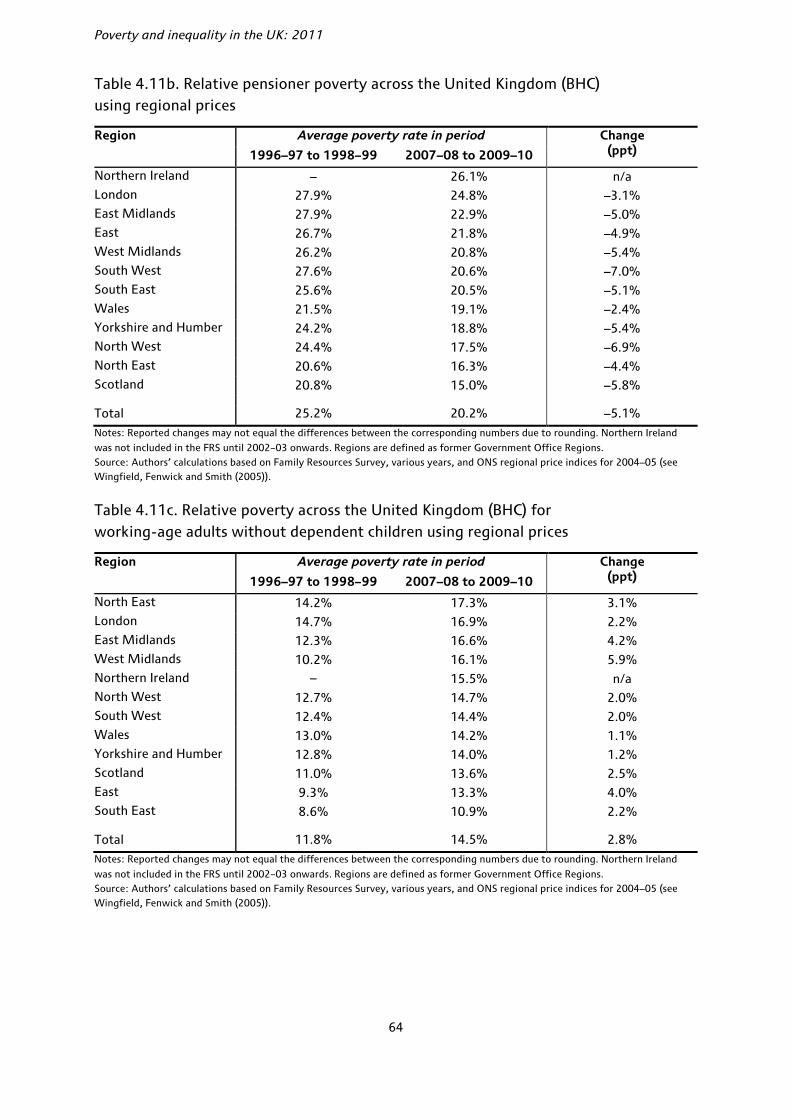
Poverty and inequality in the UK: 2011
64
Table 4.11b. Relative pensioner poverty across the United Kingdom (BHC) using regional prices
Region Average poverty rate in period Change (ppt) 1996–97 to 1998–99 2007–08 to 2009–10
Northern Ireland – 26.1% n/a London 27.9% 24.8% –3.1% East Midlands 27.9% 22.9% –5.0% East 26.7% 21.8% –4.9% West Midlands 26.2% 20.8% –5.4% South West 27.6% 20.6% –7.0% South East 25.6% 20.5% –5.1% Wales 21.5% 19.1% –2.4% Yorkshire and Humber 24.2% 18.8% –5.4% North West 24.4% 17.5% –6.9% North East 20.6% 16.3% –4.4% Scotland 20.8% 15.0% –5.8%
Total 25.2% 20.2% –5.1%
Notes: Reported changes may not equal the differences between the corresponding numbers due to rounding. Northern Ireland
was not included in the FRS until 2002–03 onwards. Regions are defined as former Government Office Regions. Source: Authors’ calculations based on Family Resources Survey, various years, and ONS regional price indices for 2004–05 (see Wingfield, Fenwick and Smith (2005)).
Table 4.11c. Relative poverty across the United Kingdom (BHC) for working-age adults without dependent children using regional prices
Region Average poverty rate in period Change (ppt) 1996–97 to 1998–99 2007–08 to 2009–10
North East 14.2% 17.3% 3.1% London 14.7% 16.9% 2.2% East Midlands 12.3% 16.6% 4.2% West Midlands 10.2% 16.1% 5.9% Northern Ireland – 15.5% n/a North West 12.7% 14.7% 2.0% South West 12.4% 14.4% 2.0% Wales 13.0% 14.2% 1.1% Yorkshire and Humber 12.8% 14.0% 1.2% Scotland 11.0% 13.6% 2.5% East 9.3% 13.3% 4.0% South East 8.6% 10.9% 2.2%
Total 11.8% 14.5% 2.8%
Notes: Reported changes may not equal the differences between the corresponding numbers due to rounding. Northern Ireland
was not included in the FRS until 2002–03 onwards. Regions are defined as former Government Office Regions. Source: Authors’ calculations based on Family Resources Survey, various years, and ONS regional price indices for 2004–05 (see Wingfield, Fenwick and Smith (2005)).
Poverty
65
In the most recent three years of data, once we adjust for differences in the cost of living, child poverty measured BHC is highest in the West Midlands (28.0%) and London (26.7%) and lowest in Scotland (17.4%), the East (17.2%) and the South East (16.9%). Since the three years 1996–97 to 1998–99, child poverty has fallen most in Scotland, London and northern regions of England (by more than 7 percentage points) and least in the South East of England, the East Midlands and the West Midlands (where it has actually risen slightly).
Pensioner poverty (BHC) is highest in Northern Ireland (26.1%) and London (24.8%) and lowest in the North East of England (16.3%) and Scotland (15.0%). The biggest fall in pensioner poverty has been in the South West of England, followed by the North West of England (both around 7 percentage points). The smallest falls have been in London and Wales (although pensioners in Wales have a below-average risk of living in poverty after adjusting for differences in the cost of living).
Poverty amongst working-age adults without dependent children is highest in the North East of England (17.3%) and London (16.9%) and lowest in the East (13.3%) and South East (10.9%) of England. Poverty has increased in all parts of the UK for this group, with the rise being most notable in the West Midlands, the East Midlands and the East of England and smallest in Wales and Yorkshire and the Humber.
Overall, the relatively poor performance of London and the Midlands stands out, as does the relatively strong performance of Scotland. An analysis of the causes of the differences in the rates of poverty and the differences in the trends in poverty across regions and by population group is beyond the scope of this Commentary. It is clear, however, that there is not a simple north–south divide for either levels or trends of relative poverty.
4.4 Absolute poverty
Nearly all the poverty figures presented so far have been based on relative measures of poverty, i.e. measures of poverty where the poverty line moves each year in line with median income growth. Tables 4.12 and 4.13 set out estimates of the number of individuals in poverty, where the poverty line is fixed in real terms at 60% of 1996–97 median income, measuring incomes AHC and BHC respectively. The tables show poverty for the population as a whole, and separately for children, pensioners and working-age adults. The choice of a base year for an absolute poverty line is arbitrary, but 1996–97 was the last year prior to the previous Labour government coming to power, and it therefore seems a good measure with which to judge the last government’s overall performance on reducing absolute poverty (note that the absolute poverty tier of the previous government’s child poverty target for 2010 is assessed against 60% of median income in 1998–99, and the 2020 target uses 60% of median income in 2010–11).
In 2009–10, there were 8.0 million individuals (13.1% of the UK population) living in absolute poverty measuring incomes AHC, a fall of 200,000 since 2008–09. Measuring incomes BHC, there were 5.6 million individuals in absolute poverty, 500,000 fewer than in 2008–09 (the rate of absolute poverty measuring incomes BHC fell from 10.2% to 9.3%). The fall in absolute poverty measuring incomes AHC in the latest year of data is not statistically significant, though the fall in absolute poverty is statistically significant when measuring incomes BHC. Furthermore, both measures are significantly lower than they were in 1996–97; measuring incomes BHC, it was at its lowest ever level in 2009–10.
Absolute child and pensioner poverty (using 60% of the 1996–97 median income as a poverty line) both fell in 2009–10. Absolute child poverty fell 100,000 (or 1.3 percentage points) on an AHC basis to 2.0 million, and by 100,000 (or 1.2 percentage points) on a BHC basis; neither change was statistically significantly different from zero. The fall in absolute pensioner poverty was 100,000 to the nearest hundred thousand (or a fall of 1.0 percentage point) on an AHC basis, and 200,000 on a BHC basis (or a

Poverty and inequality in the UK: 2011
66
statistically significant fall of 2.2 percentage points). Both absolute child and pensioner poverty are significantly lower than they were in 1996–97.66 For working-age adults without dependent children, poverty fell by 100,000 measuring incomes BHC and rose by 100,000 measuring incomes AHC (although neither change was statistically significantly different from zero). Absolute poverty amongst this group has also fallen since 1996–97, but by much less than it has done for families with children and pensioners.
Going forwards, Joyce (2011) estimates the levels of absolute poverty amongst children and working-age adults using a threshold of 60% of the projected median income (BHC) in 2010–11 (the actual value will be used to assess progress towards meeting the absolute poverty component of the Child Poverty Act target). By construction, the projected levels of absolute and relative child poverty are the same in 2010–11, at 2.6 million (or 19.9%). However, since the author projects a cumulative fall in median income up to 2013–14, absolute child poverty is projected to be higher by 2013–14 (3.1 million, or 23.2%) than relative child poverty (2.9 million, or 21.9%), and will thus have risen by more. Poverty amongst working-age non-parents is projected to be 3.5 million (14.8%) in 2010–11. Holding the poverty line constant in real terms, absolute poverty is projected to rise to 4.1 million in 2013–14 amongst this group (or 16.6%), whilst projected relative poverty is expected to rise to 4.0 million (or 16.0%).
Table 4.12. Absolute poverty: percentage and number of individuals in households with incomes below 60% of 1996–97 median AHC income
Children Pensioners Working-age parents
Working-age non-parents
All
% Million % Million % Million % Million % Million
1996–97 (GB) 34.1 4.3 29.1 2.9 26.6 3.3 17.2 3.5 25.3 14.0
1997–98 (GB) 32.4 4.1 27.7 2.8 25.1 3.1 15.4 3.2 23.6 13.2
1998–99 (GB) 31.7 4.0 26.0 2.6 24.4 3.0 14.8 3.1 22.7 12.7
1999–00 (GB) 29.0 3.7 21.1 2.1 22.6 2.8 14.4 3.0 20.7 11.6
2000–01 (GB) 24.6 3.1 16.2 1.6 19.6 2.4 14.0 3.0 18.0 10.1
2001–02 (GB) 20.7 2.6 11.6 1.2 17.1 2.1 12.1 2.6 15.0 8.5
2002–03 (UK) 18.2 2.4 9.7 1.0 15.4 1.9 11.9 2.7 13.6 8.0
2003–04 (UK) 17.4 2.3 8.6 0.9 14.9 1.9 12.2 2.7 13.3 7.8
2004–05 (UK) 15.9 2.0 6.8 0.7 13.6 1.7 11.3 2.6 12.0 7.1
2005–06 (UK) 16.4 2.1 7.0 0.8 14.5 1.8 12.3 2.8 12.7 7.5
2006–07 (UK) 17.2 2.2 8.8 1.0 14.9 1.9 12.2 2.8 13.2 7.9
2007–08 (UK) 17.4 2.2 8.3 0.9 14.9 1.9 12.6 2.9 13.4 8.0
2008–09 (UK) 16.9 2.2 7.9 0.9 15.6 2.0 13.4 3.1 13.6 8.2
2009–10 (UK) 15.6 2.0 6.9 0.8 14.5 1.9 14.1 3.2 13.1 8.0
Changes
1996–97 to 2000–01 –9.5 –12.9 –7.0 –3.2 –7.3
2000–01 to 2004–05 –8.7 –9.3 –6.0 –2.7 –6.0
2004–05 to 2009–10 (–0.3) (0.0) (0.1) (0.1) 0.8 0.2 2.8 0.6 1.1 0.9
2008–09 to 2009–10 (–1.3) (–0.1) (–1.0) (–0.1) –1.1 –0.2 (0.7) (0.1) (–0.5) (–0.2)
Notes: Reported changes may not equal differences between the corresponding numbers due to rounding. Changes in parentheses are not significantly different from zero at the 5% level. Because of the discontinuity in the series due to the inclusion of Northern Ireland from 2002–03, changes in the number of people in poverty since before 2002–03 are not available. However, due to Northern Ireland’s small population and similar poverty rates, the changes in poverty rates reported should be accurate. All figures are presented using the modified OECD equivalence scale. Source: Authors’ calculations based on Family Resources Survey, various years.
66 Absolute pensioner poverty (AHC) remains very slightly higher than in 2004–05, though not by a statistically significant amount.

Poverty
67
Table 4.13. Absolute poverty: percentage and number of individuals in households with incomes below 60% of 1996–97 median BHC income
Children Pensioners Working-age parents
Working-age non-parents
All
% Million % Million % Million % Million % Million
1996–97 (GB) 26.7 3.4 24.6 2.4 20.2 2.5 12.0 2.5 19.4 10.8
1997–98 (GB) 25.8 3.3 23.7 2.4 19.5 2.4 11.4 2.4 18.6 10.4
1998–99 (GB) 24.1 3.1 23.8 2.4 18.0 2.2 10.7 2.2 17.7 9.9
1999–00 (GB) 21.0 2.7 20.2 2.0 16.4 2.0 10.4 2.2 15.8 8.9
2000–01 (GB) 17.2 2.2 17.5 1.8 13.5 1.6 10.4 2.2 13.9 7.8
2001–02 (GB) 13.3 1.7 15.6 1.6 11.1 1.3 8.8 1.9 11.5 6.5
2002–03 (UK) 12.4 1.6 14.1 1.5 10.3 1.3 8.9 2.0 10.9 6.4
2003–04 (UK) 12.0 1.6 13.1 1.4 10.0 1.2 9.2 2.1 10.7 6.2
2004–05 (UK) 11.3 1.5 11.7 1.3 9.5 1.2 8.7 2.0 10.0 5.9
2005–06 (UK) 11.4 1.5 10.9 1.2 9.9 1.3 9.1 2.1 10.1 5.9
2006–07 (UK) 11.8 1.5 13.0 1.4 10.0 1.3 9.0 2.1 10.6 6.3
2007–08 (UK) 11.8 1.5 12.8 1.4 9.8 1.3 9.7 2.2 10.8 6.4
2008–09 (UK) 11.0 1.4 10.8 1.2 9.9 1.3 9.6 2.2 10.2 6.1
2009–10 (UK) 9.8 1.3 8.6 1.0 8.9 1.2 9.4 2.1 9.3 5.6
Changes
1996–97 to 2000–01 –9.5 –7.1 –6.6 –1.7 –5.6
2000–01 to 2004–05 –5.9 –5.8 –4.1 –1.7 –3.9
2004–05 to 2009–10 –1.5 –0.2 –3.1 –0.3 (–0.5) (0.0) 0.7 0.2 –0.7 (–0.3)
2008–09 to 2009–10 (–1.2) (–0.1) –2.2 –0.2 (–1.0) (–0.1) (–0.1) (–0.1) –0.9 –0.5
Notes: Reported changes may not equal differences between the corresponding numbers due to rounding. Changes in parentheses are not significantly different from zero at the 5% level. Because of the discontinuity in the series due to the inclusion of Northern Ireland from 2002–03, changes in the number of people in poverty since before 2002–03 are not available. However, due to Northern Ireland’s small population and similar poverty rates, the changes in poverty rates reported should be accurate. All figures are presented using the modified OECD equivalence scale. Source: Authors’ calculations based on Family Resources Survey, various years.
4.5 Conclusion
For the second consecutive year, poverty fell in 2009–10, by 500,000 (or 0.9 percentage points) measuring incomes BHC, and by zero to the nearest 100,000 (or 0.1 percentage points) measuring incomes AHC. Looking over Labour’s 13 years of government as a whole, headline rates of relative poverty fell significantly, from 19.4% in 1996–97 (just before Labour came to power) to 17.1% in 2009–10 (its last full year of government) measuring incomes BHC, or from 25.3% to 22.2% measuring incomes AHC. These falls in poverty were not continuous, however; poverty generally fell up to 2004–05, rose for three years in a row and then fell again during the recession in the latest two years up to 2009–10.
In the latest year of data, poverty rates fell most for children and pensioners, who benefited from tax and benefit reforms, but increased for working-age adults without dependent children, a group not favoured by the tax and benefit reforms. This continues the pattern observed over Labour’s period of government as a whole, during which time child poverty and pensioner poverty fell significantly. The rate of child poverty is now at its lowest level since 1985 (BHC) but remains above its recent low in 2004–05 (AHC), and pensioner poverty is at its lowest level since the mid-1980s. However, poverty amongst working-age adults without dependent children has increased by 2.9 percentage points (BHC) and 2.6 percentage points (AHC) since 1996–97, and is at a record high (at least since the start of our consistent time series on poverty going back to 1961).

Poverty and inequality in the UK: 2011
68
Looking forward, previous work by IFS researchers predicts child poverty will fall to 2.6 million in 2010–11 before increasing to 2.9 million in 2013–14. The Child Poverty Act 2010 makes meeting the 2020 target to ‘eradicate’ child poverty legally binding. The new Child Poverty Strategy sets out how the coalition government plans to make progress towards this target, and adds additional indicators covering employment, health and education. By moving beyond income targets and focusing on other inequalities and constraints that poor families face, the strategy recognises that a focus on income alone may lead policy to be skewed towards short-term measures as opposed to long-term changes that can break the transmission of poverty across generations. However, it is doubtful whether the policy measures the strategy emphasises (such as the Universal Credit, Work Programme and Pupil Premium) will reduce child poverty in 2020, and the significant cuts to spending on benefits and tax credits and on public services are likely to increase it, other things being equal.
Poverty rates and the recent trends in poverty vary significantly across the United Kingdom. After adjusting for differences in the cost of living in different areas (which is found to be very important), overall poverty is highest in the West Midlands and lowest in the South East of England. Since 1996–97 to 1998–99, it has fallen most in the North East of England and risen only in the West Midlands.
69
5. Conclusion
This Commentary has examined how poverty and living standards have changed over the 13-year period of Labour government from 1997 onwards, as well as what has happened during the recent recession, the deepest the UK has faced since the Second World War.
Under Labour, average incomes rose by 1.9% per year, on average, at the mean and 1.6% at the median. This is broadly comparable to what happened under the preceding period of Conservative government. However, the growth in average incomes under Labour has not been evenly spread; it was relatively robust up until about 2002, after which it slowed quite dramatically. This slowdown appears to have been driven by a slowdown in the growth of net earnings. Between 2002 and 2008, both mean and median incomes grew by less than 1% per year, on average.
In 2008, the UK entered a particularly deep recession and unemployment increased sharply. On its own, this would lead us to expect a fall in average incomes. Somewhat surprisingly, average incomes actually seem to have grown during the recession from 2007–08 to 2009–10. However, on closer examination this was driven by unusually large growth in income from benefits and tax credits, itself driven by a combination of falling inflation and backward-looking uprating rules for benefits and tax credits, as well as discretionary changes and rising unemployment. Such growth is unlikely to be sustainable in the long run, and the rising inflation in 2010–11 will unwind these increases. Combined with falls in real earnings, average incomes seem likely to fall substantially in 2010–11. Hence, the pain from the recession has been delayed, not avoided. Further into the future, tax rises and welfare cuts are likely to further depress household incomes. The future picture for average incomes is not a rosy one.
Income inequality rose during Labour’s period in office, and in 2009–10 it was at around its highest level since current measurement began in the early 1960s. This rise followed the much sharper rises that occurred during the 1980s. Labour’s tax and benefit reforms also seem to have mitigated the rise in income inequality, preventing the gap between rich and poor from widening more than it did. Crucially, if it wasn’t for very high growth at the top of the income distribution (and weak growth at the very bottom), income inequality would have fallen under Labour. A key factor acting to increase income inequality was the racing-away of top incomes during periods of financial boom, particularly in the late 1990s and the mid-2000s; 2009–10 saw a particularly dramatic rise in the incomes of the top 1%. Cuts to benefits and tax credits are likely to hit those on low incomes, whilst those on high incomes will be hit by the 50p tax rate and other tax changes. The less-than-rosy picture for living standards seems to be one shared by all; the uncertainty surrounds whether poor or rich will see the largest falls in their incomes.
Relative poverty fell from 25% to 22% (AHC) and from 19% to 17% (BHC) over the period of the Labour government. This followed sharp rises under the Conservatives, when it rose from 14% to 25% (AHC) and from 13% to 19% (BHC). So, using the most widely-watched definition of relative poverty, poverty rates still remain much higher than at the end of the 1970s. The falls that did occur took place during Labour’s first and second terms, with poverty largely static during Labour’s third term. There were also strong differences amongst different demographic groups, with families with children and pensioners seeing the largest falls in poverty. Although likely to fall well short of Labour’s target to halve child poverty by 2010, child poverty still fell by a quarter during its time in office (measuring incomes BHC). On the most widely-watched measure, it now stands at 20%, the lowest rate since 1985. These falls in child poverty appear to have been driven by relatively generous increases to benefits and tax credits, but also by increases in employment, particularly amongst lone parents. Pensioner poverty actually fell even faster than child poverty, reaching its lowest rate since 1984 by the end of Labour’s period in office. Excluding the early 1980s, when pensioner poverty was only temporarily low, pensioner poverty is now lower than at any point in the last fifty years. However, poverty amongst working-age adults without dependent children

Poverty and inequality in the UK: 2011
70
increased under Labour, and is now at a record high. This last group was not relatively favoured by tax and benefit reforms under Labour.
Given the need to reduce the deficit, it is clearly going to be more difficult for the new government to reduce poverty, or even keep it steady. Indeed, IFS researchers have predicted a rise in child and working-age poverty by 2013–14. When implemented in full, Universal Credit is likely to reduce child poverty, but it is hard to see how any government could confidently expect to meet the obligation of the 2010 Child Poverty Act to ‘eradicate’ child poverty by 2020 (to be assessed according to four different targets, including a rate of relative child poverty less than 10%). The new Child Poverty Strategy sets out additional indicators covering employment, health and education. By moving beyond income targets and focusing on other inequalities and constraints that poor families face, it recognises that a focus on income alone may lead policy to be skewed towards short-term measures as opposed to long-term changes that can break the transmission of poverty across generations. Although this is a sensible framework, there is still a need for policies proven to reduce poverty and that will reduce child poverty in 2020 or before.

71
Appendix A. The Households Below Average Income (HBAI) methodology67
Income as a measure of living standards
Most people would consider that human well-being consists of more than a simple measure of material circumstances. However, even if we wanted to, it would be extremely hard to define an objective index of human well-being or happiness, let alone to measure it. The main approach to living standards taken in the HBAI document (and therefore in this Commentary too) is to focus solely on material circumstances, and to use income as a simple proxy for most of the analysis. For families with children, there is also a ‘material deprivation’ indicator, which is based upon both income and the inability of a family with children to afford specific goods and services; discussion and analysis of this indicator can be found in chapter 5 of Brewer, Muriel, Phillips and Sibieta (2008). From 2009–10, there is a measure of material deprivation for pensioners as well.
Even as a measure of material well-being, the HBAI income measure has some important limitations. For example, the income measure here is a ‘snapshot’ measure – reflecting actual, or in some cases ‘usual’, income around the time of the Family Resources Survey (FRS) interview. Income measured in this way will reflect both the temporary and the long-run circumstances of individuals, although the latter would generally be regarded as a better measure of welfare. Income-based statistics will also attribute the same level of welfare to people with the same income, regardless of how much savings or other assets they have, or how much they spend. Consumption would arguably make a better measure of well-being, though reliable data can be harder to collect. Using consumption as our measure of well-being can change our interpretation of who is ‘poor’ and how rates of poverty have changed over time.68
The treatment of housing costs
The government’s HBAI publications look at two measures of income. One measure captures income before housing costs are deducted (BHC) and the other is a measure after housing costs have been deducted (AHC). Initially, the government treated these as complementary indicators of living standards, presenting both in its HBAI publications, but the previous government’s 2010–11 target for child poverty was defined solely in terms of income measured BHC, as are the measures of child poverty in the Child Poverty Act 2010.
The case for using these different income measures arises from variation in housing costs. When deciding whether to measure living standards on an AHC basis as well as BHC, the main issues are whether people face genuine choices over their housing and whether housing cost differentials accurately reflect differences in housing quality.
It is often argued that some individuals do not have much choice over the type or cost of housing services that they consume, whereas they have considerably more choice over the purchase of other consumption goods (such as food or clothing). For these individuals, it could be argued that an AHC measure is a more suitable measure of their well-being. Lack of choice over housing cost and quality is particularly important in the social rented sector, where individuals tend to have little choice over their housing and where rents
67 Many of these issues are also discussed in Berthoud and Zantomio (2008). 68 See Brewer, Goodman and Leicester (2006).
Poverty and inequality in the UK: 2011
72
have often been set with little reference to housing quality or the prevailing market rents. Consider, for instance, a tenant of a socially-rented property entitled to full Housing Benefit, and suppose that their social landlord increases their rent by £10 per week. Because their Housing Benefit receipts would increase to compensate them for this, their BHC income would increase by £10 and their AHC income would remain unchanged. As the rental increase does not reflect an increase in their housing quality, their living standards would remain unchanged and, hence, the AHC measure would better reflect the (lack of) change in their living standards.
However, for individuals who do exercise a considerable degree of choice over cost and quality, housing can be seen more like a consumption good like any other, and a BHC income measure may therefore be preferable. For instance, consider two households with the same BHC income, one of whom decides to spend a larger fraction of that income on a larger house in a better neighbourhood, and the other on consumer durables. On an AHC basis, the former household would be considered poorer, whilst their living standards may be comparable (and, indeed, the household spending more on housing has revealed through its choice that it is ‘better off’ spending more on housing rather than having more to spend on other goods and services).
Pensioners are another group for whom an AHC measure has often been considered appropriate. This is because around 70% of pensioners own their homes outright (most of the remainder are social renters).69 People who own their homes outright will be able to attain a higher standard of living than individuals with the same income level but who have mortgage or rental payments, since housing is an asset which is of benefit to those who own their own homes. On a BHC measure, an individual who owns their own house will be treated as being as well off as an otherwise-identical individual who is still paying off a mortgage; an AHC measure, though, would indicate that the former was better off.70
For these reasons, commentators (including the authors of this Commentary) have often focused on AHC incomes when considering the living standards of individuals at the lower end of the income scale, or when measuring poverty, but looked at incomes measured BHC when considering the entire income distribution. However, for a fuller picture of living standards, it is best to keep in mind both measures.
Income sharing
To the extent that income sharing takes place within households, the welfare of any one individual in a household will depend not only on their own income, but also on the incomes of other household members. By measuring income at the household level, the HBAI statistics implicitly assume that all individuals within the household are equally well off and therefore occupy the same position in the income distribution. For some households, this assumption may provide a reasonable approximation – for example, some couples may benefit equally from all income coming into the household. For others, such as students sharing a house, it is unlikely to be appropriate. This is by no means the only ‘reasonable’ assumption that we can make: for example, we could assume that there is complete income sharing within the different benefit units of a household but not between them. However, given the data available, it is one of the least arbitrary assumptions that can be made.
69 Authors’ calculations using FRS. 70 A conceptually better solution to this problem would be to impute an income from owner-occupation and add this to BHC income. Unlike the AHC measure, this would also capture the benefits to individuals living in better-quality housing than others.

Appendix A
73
Comparing incomes across households
If household income is to reflect the standard of living that household members enjoy, and if we are to compare these incomes across different household types, then some method is required to adjust incomes for the different needs that different households may face.
The official HBAI income statistics currently use the modified OECD scale, shown in Table A.1, to adjust incomes on the basis of household size and composition, expressing all incomes as the amount that a childless couple would require to enjoy the same standard of living. For example, when income is measured before housing costs, the OECD scale implies that a single person would require 67% of the income that a childless couple would require to attain the same standard of living. So, to get the equivalent income of that single person, we divide their actual income by 0.67. This process is referred to as ‘income equivalisation’.
Table A.1. OECD equivalence scales
BHC equivalence scale AHC equivalence scale
First adult 0.67 0.58
Spouse 0.33 0.42
Other second adult 0.33 0.42
Third and subsequent adults 0.33 0.42
Child aged under 14 0.20 0.20
Child aged 14 and over 0.33 0.42
The modified OECD scale does not take into account other characteristics of the household besides the age and number of individuals in the household, although there may be other important factors affecting a household’s needs. An important example of these would be the disability or health status of household members. The conventional methodology in HBAI would place a household receiving disability benefits higher up the income distribution than an otherwise-equivalent household without such benefits. But if this higher level of income only compensates the household for the greater needs it has or the extra costs it faces, then the standard of living of this household may be no higher.71
Sample weighting, and adjusting the incomes of the ‘very rich’
The incomes analysed in this Commentary are derived from the Family Resources Survey (FRS) and, prior to 1994–95, the Family Expenditure Survey (FES). These surveys are designed to provide a broadly representative sample of households in Great Britain until 2001–02, and in the whole United Kingdom from 2002–03 onwards. However, because they are voluntary surveys, there is inevitably a problem of non-response, which may differ according to family type and according to income. Such non-response bias is dealt with in two ways. First, weights are applied to the data to ensure that the composition of the sample (in terms of age, sex, marital status, region and a number of other variables) reflects the true UK population (see Department for Work and Pensions (2011c)). For example, if there are proportionately fewer lone parents in the sample than there are in the population, then relatively more weight must be placed upon the data from those who actually do respond.
Second, a special procedure is applied to the incomes at the very top of the distribution to correct for the volatility in reported incomes. This adjustment procedure uses projected data from HMRC’s Survey of
71 See also section 5.3 of Brewer, Muriel, Phillips and Sibieta (2008).

Poverty and inequality in the UK: 2011
74
Personal Incomes (SPI) – a supposedly more reliable source of data for the richest individuals based on income tax returns. The very richest individuals, for whom the SPI adjustment is applied, are assigned an income level derived from the SPI survey. This adjustment has changed in the latest year of data, and more details can be found in the main commentary in Box 2.3. The number of the richest individuals is then controlled for by a slight modification to the frequency weights that are applied. However, there is no corresponding correction for non-response, or for misreporting of incomes at the lower end of the income scale, meaning caution should be used when considering those with the very lowest incomes.
The income measure summarised
In the analysis in this Commentary, we therefore follow the government’s HBAI methodology, using household equivalised income after deducting taxes and adding benefits, expressed as the equivalent income for a couple with no dependent children and in average 2009–10 prices, as our measure of living standards. For brevity, we often use this term interchangeably with ‘income’.
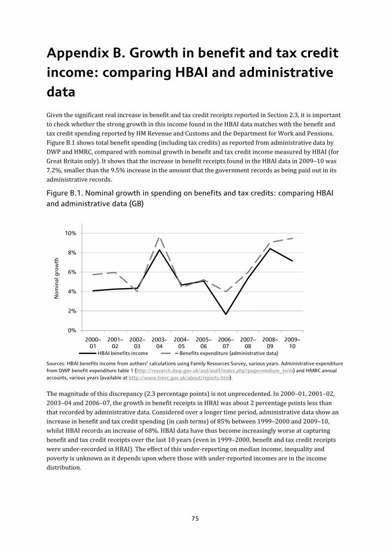
75
Appendix B. Growth in benefit and tax credit income: comparing HBAI and administrative data
Given the significant real increase in benefit and tax credit receipts reported in Section 2.3, it is important to check whether the strong growth in this income found in the HBAI data matches with the benefit and tax credit spending reported by HM Revenue and Customs and the Department for Work and Pensions. Figure B.1 shows total benefit spending (including tax credits) as reported from administrative data by DWP and HMRC, compared with nominal growth in benefit and tax credit income measured by HBAI (for Great Britain only). It shows that the increase in benefit receipts found in the HBAI data in 2009–10 was 7.2%, smaller than the 9.5% increase in the amount that the government records as being paid out in its administrative records.
Figure B.1. Nominal growth in spending on benefits and tax credits: comparing HBAI and administrative data (GB)
Sources: HBAI benefits income from authors’ calculations using Family Resources Survey, various years. Administrative expenditure from DWP benefit expenditure table 1 (http://research.dwp.gov.uk/asd/asd4/index.php?page=medium_term) and HMRC annual accounts, various years (available at http://www.hmrc.gov.uk/about/reports.htm).
The magnitude of this discrepancy (2.3 percentage points) is not unprecedented. In 2000–01, 2001–02, 2003–04 and 2006–07, the growth in benefit receipts in HBAI was about 2 percentage points less than that recorded by administrative data. Considered over a longer time period, administrative data show an increase in benefit and tax credit spending (in cash terms) of 85% between 1999–2000 and 2009–10, whilst HBAI records an increase of 68%. HBAI data have thus become increasingly worse at capturing benefit and tax credit receipts over the last 10 years (even in 1999–2000, benefit and tax credit receipts were under-recorded in HBAI). The effect of this under-reporting on median income, inequality and poverty is unknown as it depends upon where those with under-reported incomes are in the income distribution.
0%
2%
4%
6%
8%
10%
2000–01
2001–02
2002–03
2003–04
2004–05
2005–06
2006–07
2007–08
2008–09
2009–10
Nom
inal
gro
wth
HBAI benefits income Benefits expenditure (administrative data)
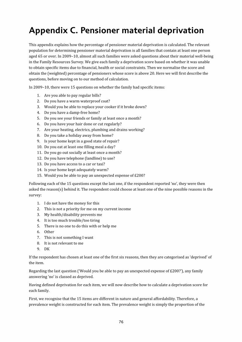
76
Appendix C. Pensioner material deprivation
This appendix explains how the percentage of pensioner material deprivation is calculated. The relevant population for determining pensioner material deprivation is all families that contain at least one person aged 65 or over. In 2009–10, almost all such families were asked questions about their material well-being in the Family Resources Survey. We give each family a deprivation score based on whether it was unable to obtain specific items due to financial, health or social constraints. Then we normalise the score and obtain the (weighted) percentage of pensioners whose score is above 20. Here we will first describe the questions, before moving on to our method of calculation.
In 2009–10, there were 15 questions on whether the family had specific items:
1. Are you able to pay regular bills? 2. Do you have a warm waterproof coat? 3. Would you be able to replace your cooker if it broke down? 4. Do you have a damp-free home? 5. Do you see your friends or family at least once a month? 6. Do you have your hair done or cut regularly? 7. Are your heating, electrics, plumbing and drains working? 8. Do you take a holiday away from home? 9. Is your home kept in a good state of repair? 10. Do you eat at least one filling meal a day? 11. Do you go out socially at least once a month? 12. Do you have telephone (landline) to use? 13. Do you have access to a car or taxi? 14. Is your home kept adequately warm? 15. Would you be able to pay an unexpected expense of £200?
Following each of the 15 questions except the last one, if the respondent reported ‘no’, they were then asked the reason(s) behind it. The respondent could choose at least one of the nine possible reasons in the survey:
1. I do not have the money for this 2. This is not a priority for me on my current income 3. My health/disability prevents me 4. It is too much trouble/too tiring 5. There is no one to do this with or help me 6. Other 7. This is not something I want 8. It is not relevant to me 9. DK
If the respondent has chosen at least one of the first six reasons, then they are categorised as ‘deprived’ of the item.
Regarding the last question (‘Would you be able to pay an unexpected expense of £200?’), any family answering ‘no’ is classed as deprived.
Having defined deprivation for each item, we will now describe how to calculate a deprivation score for each family.
First, we recognise that the 15 items are different in nature and general affordability. Therefore, a prevalence weight is constructed for each item. The prevalence weight is simply the proportion of the

Appendix C
77
relevant families that own the item, i.e. those who replied ‘yes’ as a proportion of all who were asked the question.
We give each family a score equal to the prevalence weight for each item it is deprived of, and a score of zero for each item it is not. The 15 scores are added up for each family to create its deprivation score.
The highest possible deprivation score for any family is simply the sum of the 15 prevalence weights. This number is called the maximum. For each family, we divide its deprivation score by the maximum and multiply it by 100. Thus, we get a final score in the range 0 to 100 for each family. In the final step, we weight each family according to the number of pensioners it contains and other demographic characteristics, and obtain the proportion of pensioners whose final score is above 20.

78
Appendix D. Detailed changes in composition of poverty
In this appendix, we analyse detailed changes over the past decade in the composition of children in poverty and the risk of poverty for different groups. In particular, we examine changes according to family type, economic status and educational qualifications; as well as interactions of these factors. We also look at changes by region and by ethnicity and at changes by ethnicity within individual regions. We then repeat this analysis for working-age adults without dependent children.
Child poverty
Family type, economic status and educational qualifications
We begin by analysing how the composition of all children and those in poverty has changed over the past decade in terms of family type, economic status and parents’ educational qualifications. We divide all families with children into six different groups based on the number of adults in the household and their working patterns: workless couples; single-earner couples; two-earner couples; couples where at least one parent is self-employed; workless lone parents; and lone parents in work. Within each of the six groups, we then further divide children into groups based on their parents’ highest educational qualification: no formal educational qualifications; pre-16 or GCSE-equivalent qualifications;72 post-16 or A-level-equivalent qualifications; and degree or equivalent qualifications. This creates a total of 24 groups.
The first two columns of Table D.1 show the proportion of all children falling into these groups in two separate three-year periods: 1998–99 to 2000–01 and 2007–08 to 2009–10. The next two columns show the proportion of children in poverty who fall into these groups in these three-year periods. In this and all other cases in this appendix, we use a poverty line based on 60% of the contemporary median income before housing costs (BHC) have been deducted. This allows us to see how children in poverty differ from the overall population in terms of family type, economic status and parents’ educational qualifications, and whether this pattern has changed over time. The final two columns show the average risk of poverty in these periods for each group. For reference purposes, we also present such data for the six overall groups based on family type and economic status, and the four overall groups based on parents’ educational qualifications.
As some groups represent relatively small numbers of children, one should not place a high degree of emphasis on precise changes in the risk of poverty for individual groups. Indeed, we have chosen not to present the risk of poverty for groups represented by fewer than 50 families in the Family Resources Survey. Moreover, the changes in the risk of poverty are unlikely to be statistically significant for individual groups and we thus choose to highlight the general pattern of results.
72 In the initial period, between 1998–99 and 2000–01, we are not able to distinguish fully between formal educational qualifications below degree level. We therefore define those with pre-16 or GCSE-equivalent qualifications to be those with formal educational qualifications and who finished school at age 16 or under. Those with formal educational qualifications below degree level who finished school after the age of 16 are classed as having post-16 or A-level-equivalent qualifications.

Appendix D
79
Table D.1. Composition and risk of child poverty by family type, economic status and educational qualifications
Percentage of all Percentage ofthose in poverty
Risk of poverty(BHC)
1998–99 to 2000–01
2007–08 to 2009–10
1998–99 to 2000–01
2007–08 to 2009–10
1998–99 to 2000–01
2007–08 to 2009–10
Couples (workless) 6.9% 6.2% 19.1% 19.0% 69% 66%
No qualifications 2.6% 1.5% 7.4% 5.0% 71% 71%
GCSE or equivalent 2.5% 2.7% 7.1% 8.3% 70% 65%
A level or equivalent 1.1% 0.9% 3.2% 2.6% 71% 65%
Degree or equivalent 0.6% 1.1% 1.3% 3.1% 58% 61%
Couples (one earner) 20.8% 22.3% 22.1% 25.9% 27% 25%
No qualifications 2.1% 1.6% 4.8% 3.6% 58% 49%
GCSE or equivalent 7.2% 6.5% 9.7% 10.4% 33% 35%
A level or equivalent 5.8% 4.6% 5.4% 5.3% 23% 25%
Degree or equivalent 5.7% 9.6% 2.3% 6.5% 10% 15%
Couples (two earners) 37.2% 36.4% 5.3% 6.5% 4% 4%
No qualifications 1.5% 0.8% 0.6% 0.4% 10% 10%
GCSE or equivalent 12.6% 9.1% 2.3% 2.3% 5% 6%
A level or equivalent 12.0% 8.1% 1.7% 1.3% 4% 4%
Degree or equivalent 11.0% 18.3% 0.7% 2.5% 2% 3%
Couples (self-employed) 11.3% 11.3% 11.2% 12.0% 25% 23%
No qualifications 0.8% 0.5% 1.5% 1.1% 47% 46%
GCSE or equivalent 3.7% 3.5% 3.8% 3.9% 26% 24%
A level or equivalent 3.6% 2.7% 3.8% 3.2% 26% 26%
Degree or equivalent 3.2% 4.6% 2.1% 3.8% 16% 18%
Lone parent (workless) 14.1% 11.7% 35.5% 28.2% 63% 52%
No qualifications 6.4% 4.0% 16.9% 10.4% 66% 56%
GCSE or equivalent 5.0% 5.4% 12.7% 12.7% 64% 51%
A level or equivalent 2.3% 1.5% 5.1% 3.4% 56% 49%
Degree or equivalent 0.4% 0.9% 0.8% 1.8% 46% 44%
Lone parent (in work) 9.7% 11.9% 6.7% 8.1% 17% 15%
No qualifications 1.7% 1.5% 1.8% 1.7% 26% 25%
GCSE or equivalent 3.9% 5.2% 3.1% 4.0% 20% 17%
A level or equivalent 2.7% 2.5% 1.3% 1.5% 12% 13%
Degree or equivalent 1.3% 2.8% 0.5% 0.9% 9% 7%
All 100% 100% 100% 100% 22% 25%
Memo:
Education levels
No qualifications 15.2% 9.9% 33.2% 22.3% 54% 48%
GCSE or equivalent 35.0% 32.5% 38.7% 41.7% 28% 28%
A level or equivalent 27.5% 20.2% 20.4% 17.4% 19% 19%
Degree or equivalent 22.3% 37.3% 7.7% 18.5% 9% 11%
Note: Poverty rates are measured as the percentage of the group with income below 60% of the population-wide BHC median income. Source: Authors’ calculations based on Family Resources Survey, various years.

Poverty and inequality in the UK: 2011
80
• Overall composition – It is clear that amongst children living in couple families, there has been a shift away from workless and two-earner couples towards more children living in single-earner couple families. The lone parent employment rate has increased. There has been a clear improvement in the average education levels of parents, with a substantial reduction in the number of children whose parent(s) have no formal educational qualifications, and an increase in the proportion whose parents have a degree (or equivalent qualification) from just over a fifth to 37% in the latest three-year period. Within each family type, the proportion with a degree or equivalent qualification has increased. This trend appears to be strongest for single-earner and two-earner couple families.
• Composition of children in poverty – Children in poverty are now less likely to live in workless families than was the case a decade ago, particularly amongst lone parents. We can also see that children in poverty are now more likely than before to have at least one parent with a degree-level qualification. This proportion has more than doubled over this time period, from less than 8% in 1998–99 to 2000–01 to more than 18% in the period from 2007–08 to 2009–10. There has been an equally large shift away from families where parents have no formal qualifications. Such changes by parental education largely seem to reflect higher levels of education amongst parents in general. Within each family type, we also notice that a greater proportion of children in poverty now come from families where parents have higher levels of educational qualifications, with the increase in those with a degree or equivalent being particularly large for single-earner couple families, representing over 6% of all children in poverty in the most recent period. The three largest groups amongst children in poverty remained workless lone parents with GCSE or equivalent qualifications, workless lone parents with no qualifications and single-earner couples with GCSE or equivalent qualifications. However, between them they represented just a third of all children in poverty in the most recent period (2007–08 to 2009–10) compared with nearly 40% in the earlier period (1998–99 to 2000–01). The composition of child poverty has thus become more diverse across family type, economic status and educational qualifications, as well as shifting towards families with higher levels of education.
• Risk of poverty – It is quite clear that families where more parents work are still less likely to be in poverty. The same is true of those with higher levels of educational qualifications. Within family types, those with higher educational qualifications are at less risk of poverty, with the gradient strongest for those where parents work. This is not surprising, as educational qualifications are often found to increase both hourly wages and total earnings (Blundell, Dearden and Sianesi, 2005); it is less clear how education can reduce the risk of poverty for those out of work, where the differences are indeed less stark. In terms of changes over time, it is noticeable that the risk of poverty has fallen considerably for children living in workless lone-parent families and has also fallen, to a lesser extent, for most other family types. However, the risk of poverty is largely unchanged, but still very low, for two-earner couple families. There has been a slight fall in the risk of poverty for children whose parents have no formal qualifications, matched by a slight increase for those whose parents have degree-level qualifications: hence, parents’ educational qualifications are now a slightly weaker (but still strong) predictor of poverty status than a decade ago. Within family types, there is a less obvious pattern. Looking at workless lone parents, reductions in the risk of child poverty have been concentrated amongst those with qualifications below degree level, whilst it has fallen for all but one educational level amongst working lone parents. Amongst single-earner couple families, there has been a clear increase in the risk of child poverty for those with any formal educational qualifications, with the largest increase amongst those with degree-level qualifications. There has been little change in the risk of poverty by education amongst two-earner couples. Therefore, it seems reasonably clear that amongst most family types, degree or equivalent qualifications are a slightly weaker (but still strong) predictor of poverty status in the most recent period (2007–08 to 2009–10) than in the earlier period (1998–99 to 2000–01).

Appendix D
81
Region and ethnicity
We now discuss how the characteristics of all children and of those in poverty have changed over the past decade with respect to region of residence and ethnic background. Specifically, we group all children into the 11 former Government Office Regions of Great Britain. Within each of these regions, we group children according to their parents’ ethnicity:73 White; Mixed/Other; Indian; Pakistani/Bangladeshi; and Black. Although these are quite broad ethnic groups, more disaggregation would result in very small sample sizes. In four regions where there are very few children from ethnic minority backgrounds, we have grouped all children from non-white backgrounds together. These regions are the North East, the South West, Wales and Scotland.
In contrast to our analysis in Section 4.3, we analyse poverty rates across regions based on national prices, and thus do not make any adjustments for the regional cost of living.
Table D.2 shows the same information as Table D.1 for our groups of children based on ethnicity and region. For each group, it shows the proportion of all children in this group, the composition of all children in poverty in this group and their specific risk of poverty. As before, this is shown for two time periods: 1998–99 to 2000–01 and 2007–08 to 2009–10. We do not show the risk of poverty where the sample size is less than 50 families in either period.
Table D.2. Composition and risk of child poverty by region and ethnicity
Percentage of all Percentage ofthose in poverty
Risk of poverty(BHC)
1998–99 to 2000–01
2007–08 to 2009–10
1998–99 to 2000–01
2007–08 to 2009–10
1998–99 to 2000–01
2007–08 to 2009–10
North East 4.5% 4.3% 6.0% 5.2% 34% 27%
White 4.4% 4.0% 5.9% 4.8% 33% 26%
Ethnic minorities 0.1% 0.2% 0.1% 0.4% – –
North West 12.3% 11.7% 14.8% 14.1% 30% 26%
White 11.2% 10.4% 11.7% 11.2% 26% 23%
Mixed/Other 0.1% 0.2% 0.2% 0.3% 35% 28%
Indian 0.2% 0.2% 0.6% 0.4% 65% 46%
Pakistani/Bangladeshi 0.6% 0.7% 2.1% 1.6% 86% 50%
Black 0.1% 0.2% 0.2% 0.6% 40% 50%
Yorkshire and Humber 8.9% 8.9% 10.8% 10.7% 30% 26%
White 8.1% 7.5% 8.6% 7.4% 27% 21%
Mixed/Other 0.1% 0.1% 0.1% 0.2% 34% 26%
Indian 0.1% 0.2% 0.2% 0.3% – –
Pakistani/Bangladeshi 0.6% 0.8% 1.7% 2.5% 75% 69%
Black 0.1% 0.2% 0.2% 0.4% 55% 37%
East Midlands 7.3% 7.4% 7.4% 7.8% 26% 23%
White 6.5% 6.5% 6.2% 6.1% 24% 20%
Mixed/Other 0.1% 0.2% 0.1% 0.3% – –
Indian 0.4% 0.4% 0.5% 0.8% 35% 48%
Pakistani/Bangladeshi 0.2% 0.1% 0.6% 0.2% 71% 28%
Black 0.1% 0.2% 0.1% 0.4% 25% 38%
73 Ethnic backgrounds defined according to the self-reported ethnic background of the family reference person.
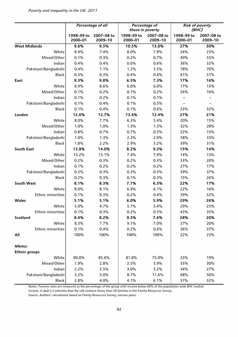
Poverty and inequality in the UK: 2011
82
Percentage of all Percentage ofthose in poverty
Risk of poverty(BHC)
1998–99 to 2000–01
2007–08 to 2009–10
1998–99 to 2000–01
2007–08 to 2009–10
1998–99 to 2000–01
2007–08 to 2009–10
West Midlands 9.6% 9.5% 10.5% 13.0% 27% 30%
White 8.4% 7.4% 8.0% 7.8% 24% 23%
Mixed/Other 0.1% 0.3% 0.2% 0.7% 49% 55%
Indian 0.4% 0.4% 0.6% 0.6% 36% 32%
Pakistani/Bangladeshi 0.4% 1.1% 1.2% 3.5% 78% 70%
Black 0.3% 0.3% 0.4% 0.4% 41% 31%
East 9.3% 9.8% 6.5% 7.3% 17% 16%
White 8.9% 8.6% 6.0% 6.0% 17% 15%
Mixed/Other 0.1% 0.2% 0.1% 0.2% 26% 16%
Indian 0.1% 0.2% 0.1% 0.1% – –
Pakistani/Bangladeshi 0.1% 0.4% 0.1% 0.5% – –
Black 0.1% 0.4% 0.1% 0.6% 23% 32%
London 12.6% 12.7% 13.4% 12.4% 27% 21%
White 8.0% 7.7% 6.3% 5.4% 20% 15%
Mixed/Other 1.0% 1.0% 1.3% 1.3% 32% 28%
Indian 0.8% 0.7% 0.7% 0.5% 22% 15%
Pakistani/Bangladeshi 1.0% 1.3% 2.3% 2.0% 58% 33%
Black 1.8% 2.2% 2.9% 3.2% 39% 31%
South East 13.8% 14.0% 8.2% 9.3% 15% 14%
White 13.2% 13.1% 7.4% 7.9% 14% 13%
Mixed/Other 0.2% 0.3% 0.2% 0.3% 33% 20%
Indian 0.1% 0.2% 0.2% 0.2% 27% 17%
Pakistani/Bangladeshi 0.2% 0.3% 0.3% 0.5% 39% 37%
Black 0.2% 0.3% 0.1% 0.3% 15% 26%
South West 8.1% 8.3% 7.1% 6.5% 22% 17%
White 8.0% 8.1% 6.9% 6.1% 22% 16%
Ethnic minorities 0.1% 0.3% 0.2% 0.4% 39% 32%
Wales 5.1% 5.1% 6.0% 5.9% 29% 26%
White 5.0% 4.7% 5.7% 5.4% 29% 25%
Ethnic minorities 0.1% 0.3% 0.2% 0.5% 43% 35%
Scotland 8.4% 8.2% 9.3% 7.6% 28% 20%
White 8.3% 7.7% 9.1% 7.0% 27% 20%
Ethnic minorities 0.1% 0.4% 0.2% 0.6% 36% 37%
All 100% 100% 100% 100% 22% 25%
Memo:
Ethnic groups
White 90.0% 85.6% 81.8% 75.0% 23% 19%
Mixed/Other 1.9% 2.8% 2.5% 3.9% 33% 30%
Indian 2.2% 2.5% 3.0% 3.2% 34% 27%
Pakistani/Bangladeshi 3.2% 5.0% 8.7% 11.6% 68% 50%
Black 2.8% 4.0% 4.1% 6.1% 37% 32%
Notes: Poverty rates are measured as the percentage of the group with income below 60% of the population-wide BHC median income. A dash (–) indicates that the cell contains fewer than 50 families in the Family Resources Survey. Source: Authors’ calculations based on Family Resources Survey, various years.

Appendix D
83
• Overall composition – There has been relatively little change in the overall composition of children across regions between these two time periods. However, a larger proportion of children now come from ethnic minority backgrounds than was the case a decade ago. In the period 1998–99 to 2000–01, about 10% of children were from ethnic minority backgrounds, and this increased to around 14% by 2007–08 to 2009–10. There was particularly large growth in the proportion from Pakistani or Bangladeshi backgrounds. There has been growth in the proportion of children from ethnic minority backgrounds across almost all regions, with the growth being largest for Pakistani and Bangladeshi families living in the West Midlands and for children from Black backgrounds living in London.
• Composition of children in poverty – In terms of the composition of children in poverty, there has been a shift away from London, Scotland and the northern regions of England towards the Midlands and the eastern regions of England (excluding London). With little change in the overall balance of all children across regions, this mostly reflects changes (or lack of them) in the risk of child poverty across regions. Section 4.3 noted that the West Midlands was the only region to see an increase in the rate of child poverty over a similar period, with Brewer, Browne, Joyce and Sibieta (2010) also showing a large fall in parental employment in the West Midlands. Partly reflecting the changes in the overall composition of children across this period, a greater proportion of children in poverty now come from ethnic minority backgrounds, particularly Black and Pakistani or Bangladeshi backgrounds. Looking within individual regions, there has been an increase in the proportion from ethnic minorities across most regions. In particular, there was a noticeable increase in the proportion of children in poverty who come from Pakistani and Bangladeshi families living in the West Midlands and Yorkshire and the Humber. Indeed, the risk of poverty was high and largely unchanged for Pakistani and Bangladeshi families living in the West Midlands over this period, who now make up 3–4% of all children in poverty.
• Risk of poverty – There was a reduction in the risk of child poverty across almost all regions, the exception being the West Midlands. There has also been a reduction in the risk of poverty for all ethnic groups. Within individual regions, the picture is more complicated. There has been little change in the risk of poverty amongst children from most ethnic backgrounds in the West Midlands, with about three-quarters of children from Pakistani and Bangladeshi backgrounds in that region in poverty. Children from Pakistani and Bangladeshi families living in the North West and London also faced a high risk of poverty in 1998–99 to 2000–01, but these risks had fallen by 2007–08 to 2009–10. Other notable changes include an increased risk of poverty for children from Black backgrounds living in the North West, the East Midlands, the East of England and the South East, while there were reductions in Yorkshire and the Humber, the West Midlands and London. Children from Indian backgrounds saw an increased risk of poverty in the East Midlands, but falls in the risk of poverty in the North West, the West Midlands, London and the South East. Children from mixed or other ethnic backgrounds saw falls in the risk of poverty across almost all regions, the exception being the West Midlands.
Poverty amongst working-age adults without dependent children
In this section, we analyse how the composition of poverty amongst working-age adults without (dependent) children has changed over the past decade. As for child poverty, we look at two detailed breakdowns: family type, economic status and educational qualifications; and region and ethnicity.

Poverty and inequality in the UK: 2011
84
Table D.3. Composition and risk of poverty for working-age adults without dependent children by family type, economic status and education qualifications
Percentage of all Percentage ofthose in poverty
Risk of poverty(BHC)
1998–99 to 2000–01
2007–08 to 2009–10
1998–99 to 2000–01
2007–08 to 2009–10
1998–99 to 2000–01
2007–08 to 2009–10
Couples (workless) 7.1% 5.4% 21.3% 15.5% 36% 42%
No qualifications 2.3% 1.4% 7.9% 4.6% 42% 48%
GCSE or equivalent 2.8% 1.8% 8.2% 5.5% 36% 43%
A level or equivalent 1.0% 0.8% 3.1% 2.0% 37% 39%
Degree or equivalent 1.0% 1.5% 2.0% 3.4% 25% 35%
Couples (one earner) 11.4% 11.2% 9.3% 11.6% 10% 15%
No qualifications 1.8% 1.3% 2.4% 1.9% 16% 22%
GCSE or equivalent 4.8% 3.6% 4.0% 4.5% 10% 18%
A level or equivalent 2.1% 1.9% 1.6% 2.3% 9% 18%
Degree or equivalent 2.7% 4.4% 1.3% 2.9% 6% 10%
Couples (two earners) 30.3% 30.7% 3.7% 4.8% 2% 2%
No qualifications 1.9% 1.5% 0.4% 0.5% 3% 5%
GCSE or equivalent 10.4% 7.6% 1.2% 1.2% 1% 2%
A level or equivalent 8.3% 6.3% 0.8% 1.1% 1% 3%
Degree or equivalent 9.5% 15.3% 1.1% 2.0% 2% 2%
Singles (workless) 14.1% 16.1% 43.2% 45.5% 37% 41%
No qualifications 4.9% 4.3% 15.9% 14.2% 40% 48%
GCSE or equivalent 5.6% 5.5% 17.1% 15.8% 37% 42%
A level or equivalent 2.1% 3.5% 6.6% 8.2% 39% 34%
Degree or equivalent 1.6% 2.7% 3.6% 7.3% 28% 39%
Singles (in work) 28.1% 28.0% 11.7% 13.0% 5% 7%
No qualifications 3.3% 2.7% 2.3% 2.2% 9% 12%
GCSE or equivalent 10.5% 9.5% 4.9% 5.1% 6% 8%
A level or equivalent 8.2% 6.8% 2.6% 2.6% 4% 6%
Degree or equivalent 6.2% 9.0% 1.8% 3.1% 4% 5%
Self-employed 9.0% 8.7% 10.8% 9.6% 15% 16%
No qualifications 1.1% 0.8% 1.8% 1.4% 21% 26%
GCSE or equivalent 3.3% 2.6% 4.5% 3.1% 16% 17%
A level or equivalent 2.3% 1.8% 2.9% 1.9% 16% 16%
Degree or equivalent 2.3% 3.5% 1.6% 3.3% 9% 14%
All 100% 100% 100% 100% 12% 14%
Memo:
Education levels
No qualifications 15.3% 11.9% 30.8% 24.8% 24% 31%
GCSE or equivalent 37.4% 30.7% 39.9% 35.0% 13% 17%
A level or equivalent 24.0% 21.1% 17.7% 18.1% 9% 13%
Degree or equivalent 23.3% 36.4% 11.6% 22.1% 6% 9%
Note: Poverty rates are measured as the percentage of the group with income below 60% of the population-wide BHC median income. Source: Authors’ calculations based on Family Resources Survey, various years.

Appendix D
85
Family type, economic status and educational qualifications
For this breakdown, we use very similar groups to those used for the previous analysis of child poverty. The only difference is that the self-employed category now includes both single people and couples.74 Table D.3 shows the proportion of all working-age adults without children in these groups, the composition of those in poverty and their specific risk of poverty (using a threshold of 60% of the contemporary median income (BHC)). We look at the same three-year periods: 1998–99 to 2000–01 and 2007–08 to 2009–10.
• Overall composition – It is clear that amongst couples without dependent children, there has been a shift towards two-earner families away from workless and single-earner families over the past decade. However, there has been an increase in the proportion of single workless adults. As was the case for families with children, average education levels have increased over the past decade, which can also be seen amongst each individual family type. In the period 1998–99 to 2000–01, about 23% held degree-level qualifications, and this has increased to 36% in the latest three-year period, from 2007–08 to 2009–10.
• Composition of those in poverty – A greater proportion of working-age adults without children in poverty are now in work than they were a decade ago. However, this has mainly come from a reduction in the proportion of workless couples. About 60% of those in poverty still come from workless families, with 45% in single workless families alone. Those in poverty have higher education levels, on average, in the latest three-year period than in 1998–99 to 2000–01. The proportion with a degree-level qualification has increased from 12% to 22% in 2007–08 to 2009–10. Within each family type, there has also been an increase in average education levels.
• Risk of poverty – All family types and education levels experienced a greater risk of poverty over the past decade. The same can be said of almost all groupings of family type, economic status and education level. Those at greatest risk of poverty are, unsurprisingly, workless families and those with low levels of educational qualification.
Region and ethnicity
We now discuss how the characteristics of working age adults without dependent children and those in poverty have changed over the past decade with respect to region of residence and ethnic background. (See Table D.4.)
• Overall composition – There has been relatively little change in the proportion of working-age adults without children living in different regions, with only small increases in the proportions living in Yorkshire and the Humber, East Midlands and London offset by reductions in other regions. As for families with children, a larger proportion of working-age adults without children come from an ethnic minority background in the latest three-year period (just over 9%) than in the three years beginning in 1998–99 (just under 6%). Within each region, there has also been an increase in the proportion from an ethnic minority background.
• Composition of those in poverty – Across regions, a greater proportion of those in poverty now live in the Midlands, the East of England and London, with a lower proportion living in the northern regions of England, Wales, Scotland and the South West. Mirroring the increased proportion of ethnic minorities amongst all working-age adults without dependent children, a greater proportion of those in poverty now come from ethnic minority backgrounds as compared with a decade ago. Within individual regions, the patterns are again rather complicated. In most regions, there has been an
74 In the analysis of child poverty, the small numbers of self-employed lone parents were classed as working lone parents.
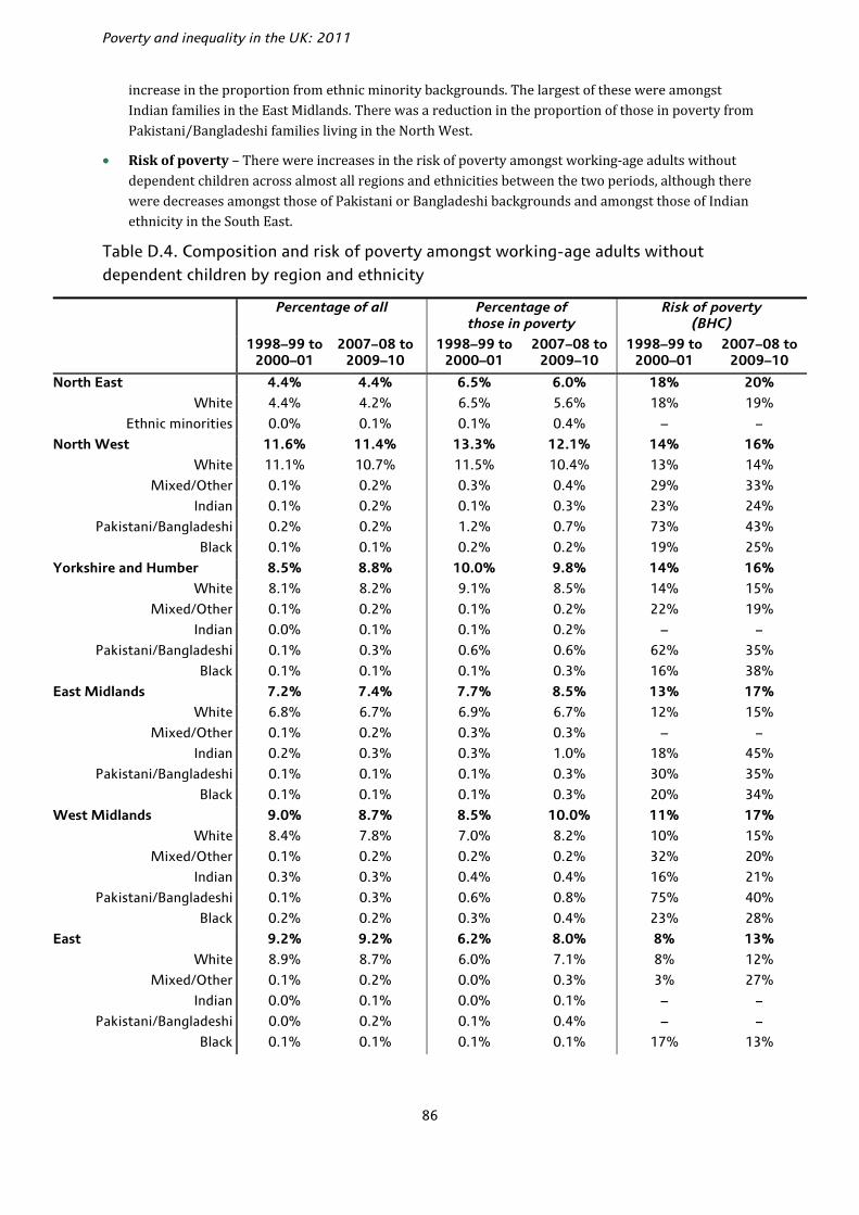
Poverty and inequality in the UK: 2011
86
increase in the proportion from ethnic minority backgrounds. The largest of these were amongst Indian families in the East Midlands. There was a reduction in the proportion of those in poverty from Pakistani/Bangladeshi families living in the North West.
• Risk of poverty – There were increases in the risk of poverty amongst working-age adults without dependent children across almost all regions and ethnicities between the two periods, although there were decreases amongst those of Pakistani or Bangladeshi backgrounds and amongst those of Indian ethnicity in the South East.
Table D.4. Composition and risk of poverty amongst working-age adults without dependent children by region and ethnicity
Percentage of all Percentage ofthose in poverty
Risk of poverty(BHC)
1998–99 to 2000–01
2007–08 to 2009–10
1998–99 to 2000–01
2007–08 to 2009–10
1998–99 to 2000–01
2007–08 to 2009–10
North East 4.4% 4.4% 6.5% 6.0% 18% 20%
White 4.4% 4.2% 6.5% 5.6% 18% 19%
Ethnic minorities 0.0% 0.1% 0.1% 0.4% – –
North West 11.6% 11.4% 13.3% 12.1% 14% 16%
White 11.1% 10.7% 11.5% 10.4% 13% 14%
Mixed/Other 0.1% 0.2% 0.3% 0.4% 29% 33%
Indian 0.1% 0.2% 0.1% 0.3% 23% 24%
Pakistani/Bangladeshi 0.2% 0.2% 1.2% 0.7% 73% 43%
Black 0.1% 0.1% 0.2% 0.2% 19% 25%
Yorkshire and Humber 8.5% 8.8% 10.0% 9.8% 14% 16%
White 8.1% 8.2% 9.1% 8.5% 14% 15%
Mixed/Other 0.1% 0.2% 0.1% 0.2% 22% 19%
Indian 0.0% 0.1% 0.1% 0.2% – –
Pakistani/Bangladeshi 0.1% 0.3% 0.6% 0.6% 62% 35%
Black 0.1% 0.1% 0.1% 0.3% 16% 38%
East Midlands 7.2% 7.4% 7.7% 8.5% 13% 17%
White 6.8% 6.7% 6.9% 6.7% 12% 15%
Mixed/Other 0.1% 0.2% 0.3% 0.3% – –
Indian 0.2% 0.3% 0.3% 1.0% 18% 45%
Pakistani/Bangladeshi 0.1% 0.1% 0.1% 0.3% 30% 35%
Black 0.1% 0.1% 0.1% 0.3% 20% 34%
West Midlands 9.0% 8.7% 8.5% 10.0% 11% 17%
White 8.4% 7.8% 7.0% 8.2% 10% 15%
Mixed/Other 0.1% 0.2% 0.2% 0.2% 32% 20%
Indian 0.3% 0.3% 0.4% 0.4% 16% 21%
Pakistani/Bangladeshi 0.1% 0.3% 0.6% 0.8% 75% 40%
Black 0.2% 0.2% 0.3% 0.4% 23% 28%
East 9.2% 9.2% 6.2% 8.0% 8% 13%
White 8.9% 8.7% 6.0% 7.1% 8% 12%
Mixed/Other 0.1% 0.2% 0.0% 0.3% 3% 27%
Indian 0.0% 0.1% 0.0% 0.1% – –
Pakistani/Bangladeshi 0.0% 0.2% 0.1% 0.4% – –
Black 0.1% 0.1% 0.1% 0.1% 17% 13%

Appendix D
87
Percentage of all Percentage ofthose in poverty
Risk of poverty(BHC)
1998–99 to 2000–01
2007–08 to 2009–10
1998–99 to 2000–01
2007–08 to 2009–10
1998–99 to 2000–01
2007–08 to 2009–10
London 14.0% 14.4% 13.0% 13.7% 11% 14%
White 10.9% 10.3% 8.2% 8.2% 9% 12%
Mixed/Other 0.8% 1.0% 1.2% 1.5% 18% 22%
Indian 0.6% 1.0% 0.6% 0.8% 12% 11%
Pakistani/Bangladeshi 0.4% 0.7% 0.8% 1.1% 28% 22%
Black 1.2% 1.4% 2.1% 2.2% 21% 23%
South East 13.8% 13.4% 9.1% 9.0% 8% 10%
White 13.3% 12.5% 8.6% 8.2% 8% 10%
Mixed/Other 0.2% 0.4% 0.3% 0.4% 18% 14%
Indian 0.1% 0.2% 0.2% 0.2% 20% 12%
Pakistani/Bangladeshi 0.0% 0.2% 0.0% 0.2% 3% 20%
Black 0.1% 0.1% 0.1% 0.1% 7% 9%
South West 8.4% 8.3% 8.7% 7.9% 13% 14%
White 8.2% 8.0% 8.3% 7.6% 12% 14%
Ethnic minorities 0.2% 0.3% 0.3% 0.3% 23% 15%
Wales 4.8% 4.7% 5.7% 5.4% 14% 17%
White 4.7% 4.6% 5.5% 5.3% 14% 17%
Ethnic minorities 0.1% 0.2% 0.1% 0.1% 22% 13%
Scotland 9.3% 9.2% 11.4% 9.6% 15% 15%
White 9.2% 9.0% 11.1% 8.9% 15% 15%
Ethnic minorities 0.1% 0.2% 0.4% 0.6% 35% 39%
All 100% 100% 100% 100% 12% 14%
Memo:
Ethnic groups
White 94.1% 90.6% 88.7% 84.6% 12% 14%
Mixed/Other 1.6% 2.7% 2.8% 4.0% 20% 22%
Indian 1.4% 2.3% 1.8% 3.1% 15% 20%
Pakistani/Bangladeshi 0.9% 2.1% 3.5% 4.4% 46% 32%
Black 1.9% 2.3% 3.3% 3.8% 21% 24%
Notes: Poverty rates are measured as the percentage of the group with income below 60% of the population-wide BHC median income. A dash (–) indicates that the cell contains fewer than 50 families in the Family Resources Survey. Source: Authors’ calculations based on Family Resources Survey, various years.

88
References Adam, S. and Browne, J. (2010), ‘Redistribution, work incentives and thirty years of UK tax and benefit reform’, Institute for Fiscal Studies (IFS), Working Paper 10/24 (http://www.ifs.org.uk/wps/wp1024.pdf).
Atkinson, A. (1999), ‘The distribution of income in the UK and OECD countries in the twentieth century’, Oxford Review of Economic Policy, vol. 15, no. 4, pp. 56–75.
Attanasio, O., Battistin, E. and Ichimura, H. (2005), ‘What really happened to consumption inequality in the US?’, in E. Berndt and C. Hulten (eds), Measurement Issues in Economics – The Paths Ahead: Essays in Honor of Zvi Griliches, Chicago: University of Chicago Press.
Berthoud, R. and Zantomio, F. (eds) (2008), Measuring Poverty: Seven Key Issues, Colchester: Institute for Social and Economic Research.
Blanchflower, D. and Oswald, A. (2011), ‘International happiness’, NBER Working Paper no. 16668 (http://www.nber.org/papers/w16668).
Blundell, R., Dearden, L. and Sianesi, B. (2005), ‘Evaluating the effect of education on earnings: models, methods and results from the National Child Development Survey’, Journal of the Royal Statistical Society, Series A, vol. 168, pp. 473–512.
Brewer, M., Browne, J. and Jin, W. (2011), Universal Credit: A Preliminary Analysis, Institute for Fiscal Studies (IFS), Briefing Note no. 116 (http://www.ifs.org.uk/bns/bn116.pdf).
Brewer, M., Browne, J., Joyce, R. and Sibieta, L. (2010), ‘Child poverty in the UK since 1998–99: lessons from the past decade’, Institute for Fiscal Studies (IFS), Working Paper no. 10/23 (http://www.ifs.org.uk/publications/5303).
Brewer, M., Browne, J., Leicester, A. and Miller, H. (2010), ‘Options for fiscal tightening: tax increases and benefit cuts’, in R. Chote, C. Emmerson and J. Shaw (eds), The IFS Green Budget: February 2010, Commentary no. 112, London: Institute for Fiscal Studies (http://www.ifs.org.uk/budgets/gb2010/10chap7.pdf).
Brewer, M., Goodman, A. and Leicester, A. (2006), Household Spending in Britain: What Can It Teach Us about Poverty?, Bristol: Policy Press.
Brewer, M., Goodman, A., Shaw, J. and Sibieta, L. (2006), Poverty and Inequality in Britain: 2006, Commentary no. 101, London: Institute for Fiscal Studies (http://www.ifs.org.uk/comms/comm101.pdf).
Brewer, M., Muriel, A., Phillips, D. and Sibieta, L. (2008), Poverty and Inequality in the UK: 2008, Commentary no. 105, London: Institute for Fiscal Studies (http://www.ifs.org.uk/comms/comm105.pdf).
Brewer, M., Muriel, A., Phillips, D. and Sibieta, L. (2009), Poverty and Inequality in the UK: 2009, Commentary no. 109, London: Institute for Fiscal Studies (http://www.ifs.org.uk/comms/c109.pdf).
Brewer, M., O’Dea, C., Paull, G. and Sibieta, L. (2009), The Living Standards of Families Reporting Low Incomes, DWP Research Report no. 577, London: Department for Work and Pensions.
Brewer, M., Phillips, D, and Sibieta, L. (2010), What Has Happened to ‘Severe Poverty’ under Labour?, Institute for Fiscal Studies (IFS), 2010 Election Briefing Note no. 3 (http://www.ifs.org.uk/bns/bn90.pdf).
Brewer, M., Sibieta, L. and Wren-Lewis, L. (2008), Racing Away? Income Inequality and the Evolution of High Incomes, Institute for Fiscal Studies (IFS), Briefing Note no. 76 (http://www.ifs.org.uk/publications.php?publication_id=4108).
Browne, J. and Levell, P. (2010), The Distributional Effect of Tax and Benefit Reforms to Be Introduced between June 2010 and April 2014: A Revised Assessment, Institute for Fiscal Studies (IFS), Briefing Note no. 108 (http://www.ifs.org.uk/bns/bn108.pdf).

References
89
Browne, J. and Phillips, D. (2010), Tax and Benefit Reforms under Labour, Institute for Fiscal Studies (IFS), 2010 Election Briefing Note no. 1 (http://www.ifs.org.uk/bns/bn88.pdf).
Cabinet Office (2007), Families at Risk: Background on Families with Multiple Disadvantages.
Chote, R., Crawford, R., Emmerson, C. and Tetlow, G. (2010), The Tax Burden under Labour, Institute for Fiscal Studies (IFS), 2010 Election Briefing Note no. 4 (http://www.ifs.org.uk/bns/bn91.pdf).
Chowdry, H. and Sibieta, L. (2011), ‘Many unanswered questions over EMA successor’, Institute for Fiscal Studies (IFS), Observation (http://www.ifs.org.uk/publications/5529).
Crossley, T., Leicester, A. and Levell, P. (2010), ‘A tale of 3 indices: further thoughts on benefit indexation’, Institute for Fiscal Studies (IFS), Observation (http://www.ifs.org.uk/publications/5301).
Daly, M., Oswald, A., Wilson, D. and Wu, S. (2011), ‘Dark contrasts: the paradox of high rates of suicide in happy places’, Journal of Economic Behavior & Organization, forthcoming.
Davison, A. C. and Hinkley, D. V. (1997), Bootstrap Methods and Their Application, Cambridge: Cambridge University Press.
Department for Work and Pensions (2011a), Impact Assessment: Universal Credit, London: DWP (http://www.dwp.gov.uk/docs/universal-credit-wr2011-ia.pdf).
Department for Work and Pensions (2011b), Households Below Average Income publication – pensioner material deprivation indicator technical note, London: DWP (http://research.dwp.gov.uk/asd/hbai/technical_note_20110307.pdf).
Department for Work and Pensions (2011c), Households Below Average Income: An Analysis of the Income Distribution 1994/95 – 2009/10, London: DWP.
Goodman, A., Johnson, P. and Webb, S. (1997), Inequality in the UK, Oxford: Oxford University Press.
Gottschalk, P. and Smeeding, T. M. (1997), ‘Cross-national comparisons of earnings and income inequality’, Journal of Economic Literature, vol. 35, pp. 633–87.
HM Government (2011), A New Approach to Child Poverty: Tackling the Causes of Disadvantage and Transforming Families’ Lives, London: TSO (https://www.education.gov.uk/publications/eOrderingDownload/CM-8061.pdf).
HM Treasury (2009), Pre-Budget Report 2009, London: TSO (available at http://www.hm-treasury.gov.uk/budget_archive.htm).
HM Treasury (2010a), Budget 2010, London: TSO (available at http://www.hm-treasury.gov.uk/budget_archive.htm).
HM Treasury (2010b), Spending Review 2010, London: TSO (http://cdn.hm-treasury.gov.uk/sr2010_completereport.pdf).
HM Treasury (2011), Budget 2011, London: TSO (http://www.hm-treasury.gov.uk/2011budget_documents.htm).
HM Treasury, Department for Children, Schools and Families, and Department for Work and Pensions (2010), Ending Child Poverty: Mapping the Route to 2020, London: TSO (http://webarchive.nationalarchives.gov.uk/+/http:/www.hm-treasury.gov.uk/budget2010_childpoverty.htm)
Ilzetzki, E., Mendoza, E. and Végh, C. (2010), ‘How big (small?) are fiscal multipliers?’, NBER Working Paper no. 16479 (http://www.nber.org/papers/w16479).
Joyce, R. (2011), ‘Poverty projections between 2010–11 and 2013–14: a post-Budget 2011 update’, Institute for Fiscal Studies (IFS), mimeo (http://www.ifs.org.uk/docs/mimeo_rj_2011.pdf).
Joyce, R., Muriel, A., Phillips, D. and Sibieta, L. (2010), Poverty and Inequality in the UK: 2010, Commentary no. 116, London: Institute for Fiscal Studies (http://www.ifs.org.uk/comms/comm116.pdf).
Poverty and inequality in the UK: 2011
90
McKay (2008), Measuring material deprivation among older people: Methodological Study to revise the Family Resources Survey questions, London: DWP (http://research.dwp.gov.uk/asd/asd5/WP54.pdf) Office for Budget Responsibility (2011), Economic and Fiscal Outlook, March 2011 (http://budgetresponsibility.independent.gov.uk/economic-and-fiscal-outlook-march-2011/).
Sibieta, L. (2010), ‘Pupil Premium: simple and transparent financial incentive’, Institute for Fiscal Studies (IFS), Observation (http://www.ifs.org.uk/publications/5371).
Stevenson, B. and Wolfers, J. (2008), ‘Economic growth and subjective well-being: reassessing the Easterlin paradox,’ NBER Working Paper no. 14282 (http://www.nber.org/papers/w14282).
Stiglitz, J. E., Sen, A. and Fitoussi, J-P. (2009) Report by the Commission on the Measurement of Economic Performance and Social Progress.
Sutherland, H., Sefton, T. and Piachaud, D. (2003), Poverty in Britain, York: Joseph Rowntree Foundation.
Wingfield, D., Fenwick, D. and Smith, K. (2005), ‘Relative regional consumer price levels in 2004’, Economic Trends, vol. 615, pp. 36–46.