posters influences
TRANSCRIPT

This PowerPoint shows the progression of horror film posters over the years.

A Caverne Maudite, 31 Dec 1898: One of the first silent short films, the poster for this was simply an image.
The Hunchback, 31 Aug 1909:This was one of the first posters both used for the cinema film, and the theatre production of the film. It was quite detailed and based around the design of a comic book.
Frankenstein, 18 Mar 1910: This poster was is one of the first landscape posters.

The Cabinet of Dr. Caligari: 26 Feb 1920.Dr. Jekyll and Mr. Hyde: 18 Mar 1920.The Golem: 29 Oct 1920. All of the posters creating during this time used similar fonts and basic colour schemes.The images are simple are the main focus of all posters

The Phantom of the Opera: 25 Nov 1925Dracula: 12 Feb 1931The Invisible Man: 13 Nov 1933These posters were all designed with bright colours and can be easily compared to comic books, this is what made them so attractive to audiences.

Son of Frankenstein: 13 Jan 1939,The Wolf Man: 12 Dec 1941,Cat People: 6 Dec 1942
Not much varied from the 1930’s-40’s posters, the layouts were very similar and the colour schemes were still the same bright primary colours

The Body Snatcher: 25 May 1945House on Haunted Hill: 17 Feb 1959Dr. Terror's House of Horrors: 23 Feb 1965
Over the 1940’s 1960’s the colour schemes of the posters became much darker, and the fonts become much more sharp.

Night of the Living Dead: 1 Oct 1968The Exorcist :26 Dec 1973
The Texas Chainsaw Massacre :1 Oct 1974
From the late 60’s to 70’s the colour black became more and more often used, and the type font became more serious. However the images on the print have become more sharper/finer detailed

The Omen: 6 Jun 1976The Hills Have Eyes: 22 Jul 1977Dawn of the Dead: 2 Sep 1978
Black has now become a stereotypical feature of all posters Since the 70’s. Posters have now started to include more text.

Friday the 13th: 9 May 1980Poltergiest: 4 Jun 1982The Thing: 25 Jun 1982

A Nightmare on Elm Street: 9 Nov 1984Fright Night: 2 Aug 1985Leviathan: 22 Sep 1989 Throughout the whole of the 1980’s, the
layout of posters became easily recognizable having the main image centre, include titles and a billboard

The Silence of the Lambs: 14 Feb 1991Candyman: 2 Sep 1992Scream: 20 Dec 1996
In the 90’s the layout was kept the same, but using black and white became more increasingly popular colour scheme

Blade: 21 Aug 1998The Blair Witch Project: 30 Jul 1999
Valentine: 2 Feb 2001
During this time period the colour red became a significant colour that represents danger. The colour
scheme of Red, Black and White were very popular and effective.

Cabin Fever: 14 Sep 2002The Ring: 18 Oct 2002The Grudge: 22 Oct 2004
Nothing more has changed in what is included in the posters, or in the layout; therefore posters after this time period have become very
recognizable, but the colour scheme is what distinguishes the horror posters from other posters.

Silent Hill: 21 Apr 2006The Eye: 1 Feb 2008Sinister: 5 Oct 2011
The main image of the poster is often also included in the trailer to the film

The Woman in Black: 3 Feb 2012
The Cabin in the Woods: 9 Mar 2012
The Possession: 31 Aug 2012
These are posters of popular films released through out 2012
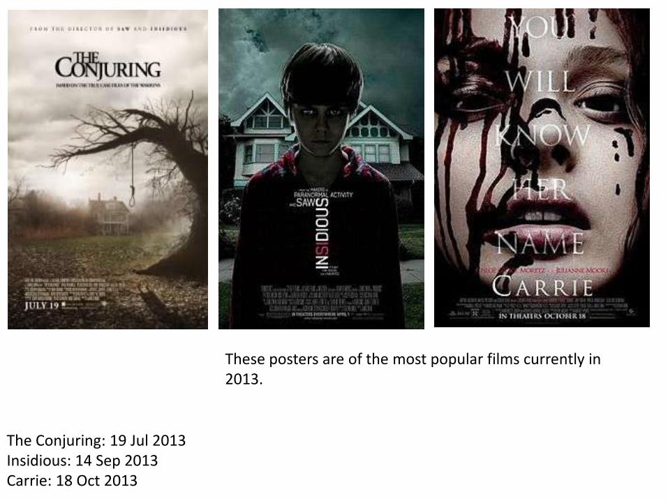
The Conjuring: 19 Jul 2013Insidious: 14 Sep 2013Carrie: 18 Oct 2013
These posters are of the most popular films currently in 2013.