poster/advert textual analysis
TRANSCRIPT
Ancillary Task Research – Poster Advert Textual AnalysisKieran Panchal

Skying – The Horrors
This is a poster for the release of the album ‘Skying’ by the The Horrors, which was released in July 2011. The majority of the poster is an image of the album artwork, which would create a link with the album itself and allow the audience to identify ‘Skying’ upon it’s release in a shop or online. A psychedelic theme runs throughout the poster, reinforced by the use of bright colours and abstract imagery, created using overlays with images with low transparency. The reviews at the bottom end of the poster are a convincing aspect that shows the credibility of the product, especially due to the reviewers being top music magazines.
Wide kerning between letters
Album cover used asthe central image
Vibrant colour scheme reinforcing the psychedelic genre of the band whilst being visually attractive to the audience
Overlaid images using high transparencies to createabstract effect
Consumer access point – iTunes
The prevalent colour of blueconnotes the sky. ‘Skying’ is thealbum name.
Reviews of the album fromcontemporary music magazine,adding credibility. The use of ‘stars’ is universally recognised and allows for quick reference.
Rounded Sans Serif type face – same font used for all ‘The Horrors’ publications.
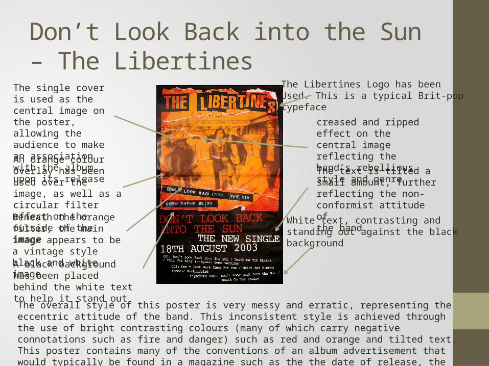
Don’t Look Back into the Sun – The Libertines
The Libertines Logo has been Used. This is a typical Brit-pop typeface
creased and ripped effect on the central image reflecting the band’s rebellious style and genre
White text, contrasting and standing out against the black background
The text is tilted a small amount, further reflecting the non-conformist attitude ofthe band.
The single cover is used as the central image on the poster, allowing the audience to make an association with the album upon its releaseAn orange colour overlay has been used over the image, as well as a circular filter effect on the outside of the image
Beneath the orange filter, the main image appears to be a vintage style black and white imageA black background has been placed behind the white text to help it stand out
The overall style of this poster is very messy and erratic, representing the eccentric attitude of the band. This inconsistent style is achieved through the use of bright contrasting colours (many of which carry negative connotations such as fire and danger) such as red and orange and tilted text. This poster contains many of the conventions of an album advertisement that would typically be found in a magazine such as the the date of release, the album artwork, the band logo and the track listings.

The Prodigy – Invaders Must Die
Jagged capitalised typeface which has the appearance of being etched into the page with straight lines. This reflects the rebellious and unruly nature of the band. The typeface has been used later in the advert also which brings an elements of style and fluency to the page.
The HMV logo is an access point/point of sale allowing consumers to take action and buy the product in response to this advertisement.
Prevalence of black on the page connoting death, evil and mystery. This again reinforces genre.
Lightning bolt style graphic used within the font, rebelling against normal Sans Serif font conventions
The main central image is an abstract image the audience would be unfamiliar with and therefore may have to make their own interpretations about – some form of aircraft with people boarding perhaps?
The background colour is not a pure tone of white, and instead is a more dirty and gritty shade. A vignette has also been used, giving the impression that darkness is closing in.
Secondary information is placed towards the bottom of the page. Hierarchically this information is less important, hence why it is positioned at the bottom in the page and in a smaller typeface. The most important information that the band are trying to get across is the name of the band and album. Graphological Symbols (arrows) used
repeatedly, suggesting widespread action
This poster advertisement is particularly successful due to the way in which it accommodates its target audience (rock fans), such as through the use of rigid typefaces, gritty colours and textures and dark imagery. The way that the graphology within the advert is so open to the audience to interpret meaning is also effective, as each a consumer can take the poster differently. As well as this, the poster incorporates all of the key information and conventions of album posters, such as the release date, website address and point of sale. It has most likely been created through a design software such as Photoshop using a layer-
style approach, perhaps with colour washes to create the unique tones.