poster development
TRANSCRIPT

Poster Development and Using of MS-PowerPoint®
Dr. Ahmed-Refat 2005
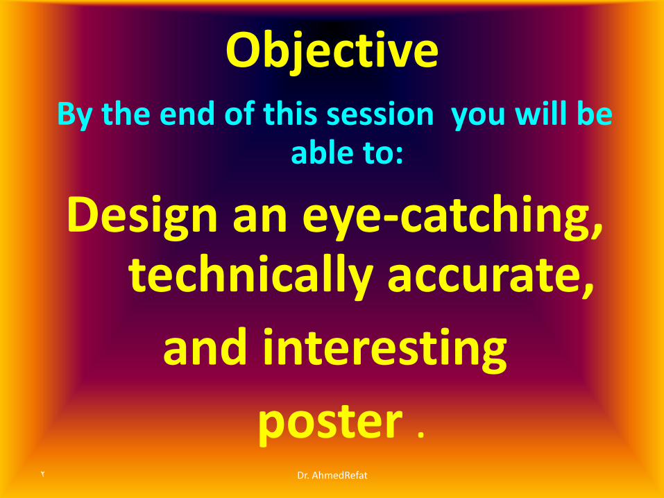
Objective By the end of this session you will be
able to:
Design an eye-catching, technically accurate,
and interesting
poster . 2 Dr. AhmedRefat

Overview: • Poster is a visual tool ………………..…………….
• Recommended Layout ,Orientation ,Components
• Effective Poster Vs Poor Poster layout
Basic tools
• Using colors , letters , background
• Visual Grammar Reader Gravity
• 3 X 5 rule 20/40/40 rule
• Blank spaces
Dr. AhmedRefat 3

Poster is
• An illustrated abstract
• …. It shows, not tells.
• A visual communications tool.
4 Dr. AhmedRefat

Purpose of the poster
• To attract the attention of people and maintain their interest .
• It should therefore be eye catching, technically accurate, interesting and well laid out.
5 Dr. AhmedRefat

Poster= Text + Graphs 1 : 2 ratio
• Posters are designed to be both eye-catching and informative.
• Typically posters include both textual and graphic elements.
6 Dr. AhmedRefat

ELEMENTS OF AN EFFECTIVE POSTER
• Focused on single message
• Use of graphics—images/ graphs can help tell the story, use text in moderation
• Ordered —keep sequence ordered and obvious
• Concise, short, and straightforward . 7 Dr. AhmedRefat
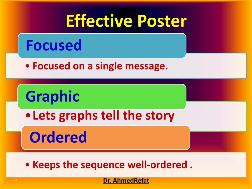
Effective Poster
• Focused on a single message.
Focused
•Lets graphs tell the story
Graphic
• Keeps the sequence well-ordered .
Ordered
8 AhmedRefatDr.

Poor Poster
• Main points hard to find.
Focus…
• Poor Graphics ……. Small text
Graphs….
• Poor Organization
Order….
9 Dr. AhmedRefat

How can you grab / hook your readers'
attention
10 Dr. AhmedRefat

Ways to Quickly Get Your Audience’s Attention
11 Dr. AhmedRefat

Your Audience
Know your audience
a. Experts
b. Various disciplines
c. General audience/laypersons
12 Dr. AhmedRefat
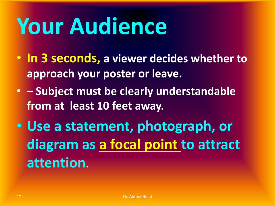
Your Audience
• In 3 seconds, a viewer decides whether to approach your poster or leave.
• – Subject must be clearly understandable from at least 10 feet away.
• Use a statement, photograph, or diagram as a focal point to attract attention.
13 Dr. AhmedRefat
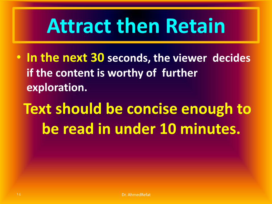
Attract then Retain
• In the next 30 seconds, the viewer decides if the content is worthy of further exploration.
Text should be concise enough to be read in under 10 minutes.
14 Dr. AhmedRefat

Consider … key elements
• First ..Planning
• Focus Your message
• Layout & Design
• Headings
• Graphics & Colors
Grabbing / hooking your readers
15 Dr. AhmedRefat

Planning
• Know the audience
• Poster size
• Identify central message
• Organize your information
16 Dr. AhmedRefat

Define Your Message
• What is the one thing you want
your audience to know ?
• This message should be reflected
in the title and supported by the
content of the poster
17 Dr. AhmedRefat
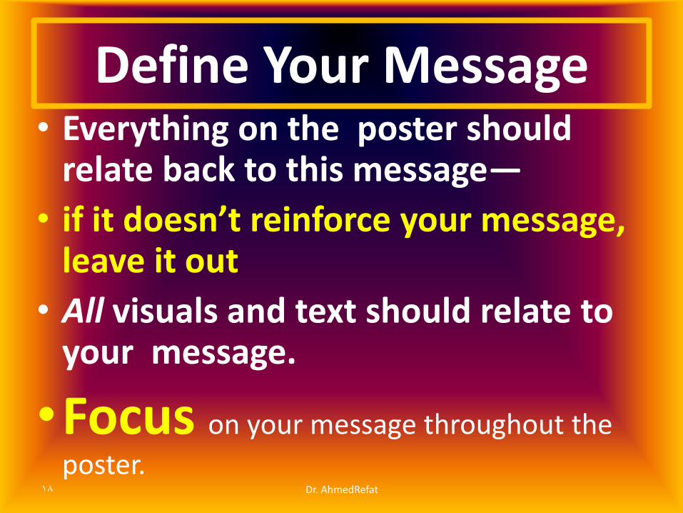
• Everything on the poster should relate back to this message—
• if it doesn’t reinforce your message, leave it out
• All visuals and text should relate to your message.
•Focus on your message throughout the
poster.
Define Your Message
18 Dr. AhmedRefat

ORGANIZE YOUR INFORMATION
• Title
• Authors and Affiliations
• Introduction
• Objectives/Goal/Research Question/Problem
• Methods
• Data and Results
• Conclusions/Implications
• References and
• Acknowledgements
19 Dr. AhmedRefat
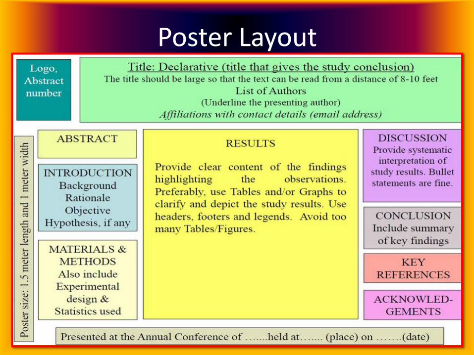
Poster Layout
Dr. AhmedRefat 20

LAYOUT AND DESIGN • Creating a sketch
• Layout
• Background and colors
• Spacing
• Headings
• Font and text
• Graphics
21 Dr. AhmedRefat
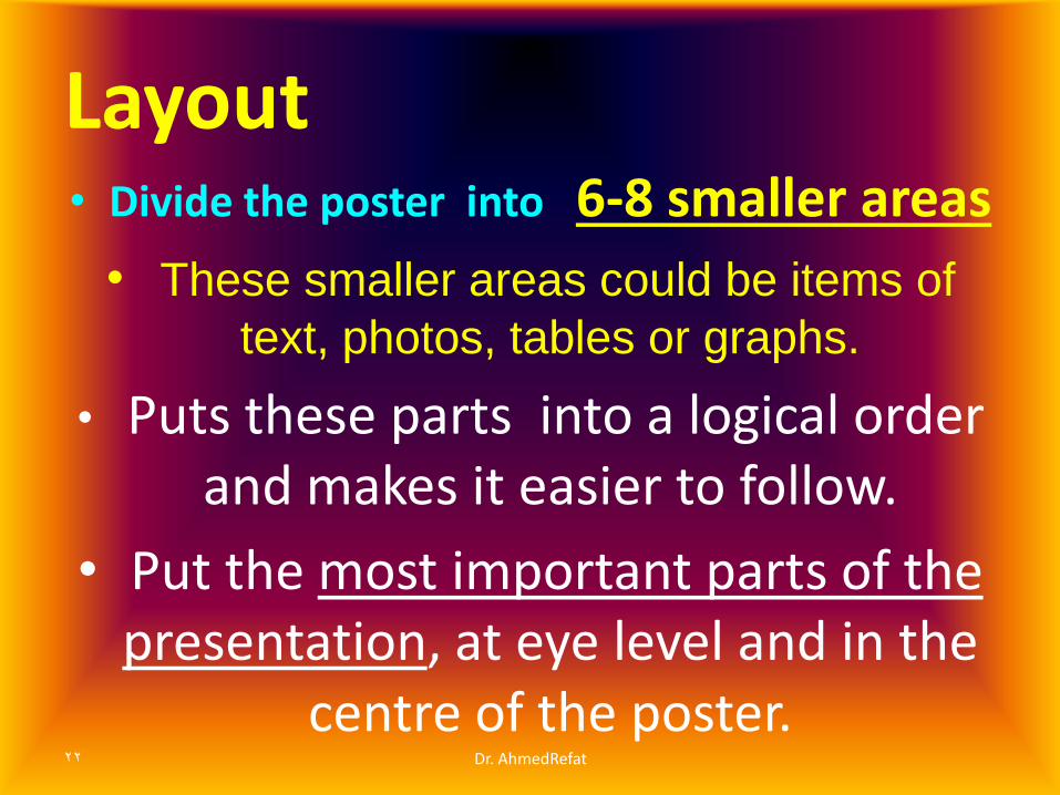
Layout • Divide the poster into 6-8 smaller areas
• These smaller areas could be items of
text, photos, tables or graphs.
• Puts these parts into a logical order and makes it easier to follow.
• Put the most important parts of the presentation, at eye level and in the
centre of the poster. 22 Dr. AhmedRefat
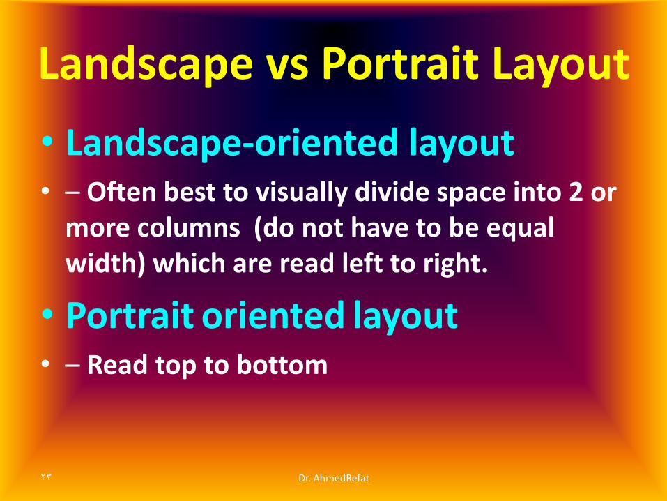
Landscape vs Portrait Layout
• Landscape-oriented layout • – Often best to visually divide space into 2 or
more columns (do not have to be equal width) which are read left to right.
• Portrait oriented layout • – Read top to bottom
23 Dr. AhmedRefat

Sketch it out!
Think visually
24 Dr. AhmedRefat

Poster Size Small …………28” X 40”………..…70-100
Typical ………36” X 48”…..91-121
Big 42” X 56 “ ..106-142 cm
54 x 58” = 137 x147
Dr. AhmedRefat 25

Sketch it out!
26 Dr. AhmedRefat

Layout • use a visual grammar
• use a column format
• use organization cues
• use "reader gravity“
• 3 X 5 rule
• use headings wisely
• balance the placement of text and graphics
27 Dr. AhmedRefat

Visual Grammar : Layout VG is…… a graphic hierarchy that helps
readers identify the most important parts of your poster.
• Certain things need to be “in place” in order to make it readable
• Column format—arrange content in 3 or 4 columns
• Organizational cues—use bullets (or numbers when appropriate)
28 Dr. AhmedRefat

Visual Grammar : Layout • VG is a graphic hierarchy that helps readers
identify the most important parts of your poster.
29 Dr. AhmedRefat

“Reader Gravity”—in English, top to bottom first, then left to right
30 Dr. AhmedRefat
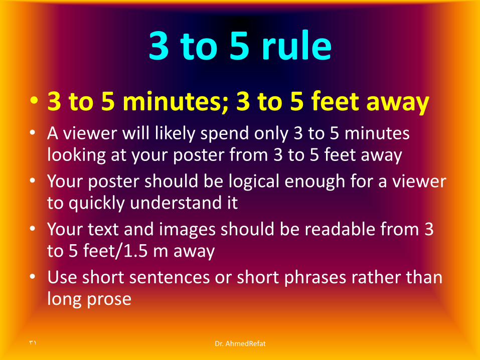
3 to 5 rule
• 3 to 5 minutes; 3 to 5 feet away • A viewer will likely spend only 3 to 5 minutes
looking at your poster from 3 to 5 feet away
• Your poster should be logical enough for a viewer to quickly understand it
• Your text and images should be readable from 3 to 5 feet/1.5 m away
• Use short sentences or short phrases rather than long prose
31 Dr. AhmedRefat

Headings • Headings - including the title, section titles, and
figure captions - should ...
• Summarize Use headings as opportunities to summarize your work in large letters.
• Organize Good headings are part of the visual grammar that helps move readers through your poster.
• Be Hierarchical The more important the point, the larger the type.
32 Dr. AhmedRefat

ORGANIZATION/ORDER
Dr. AhmedRefat 33
BAD
GOOD
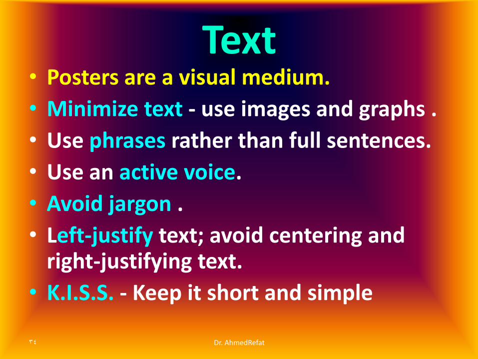
Text • Posters are a visual medium.
• Minimize text - use images and graphs .
• Use phrases rather than full sentences.
• Use an active voice.
• Avoid jargon .
• Left-justify text; avoid centering and right-justifying text.
• K.I.S.S. - Keep it short and simple
34 Dr. AhmedRefat

Color • Use a light background and dark letters .
• Avoid dark backgrounds with light letters - very tiring to read… very tiring to read.
• Stick to a theme of 2 or 3 colors - much more will overload and confuse viewers.
• Overly bright colors will attract attention - and then wear out readers' eyes.
35 Dr. AhmedRefat

Color • Should
• – highlight or emphasize
• – separate and define sections
• – associate related information
• Should not
• – compete with the information
• – overwhelm the viewer 36 Dr. AhmedRefat

Lettering
37 Dr. AhmedRefat

Minimum sizes: 18-24-48-72- 90
38 Dr. AhmedRefat
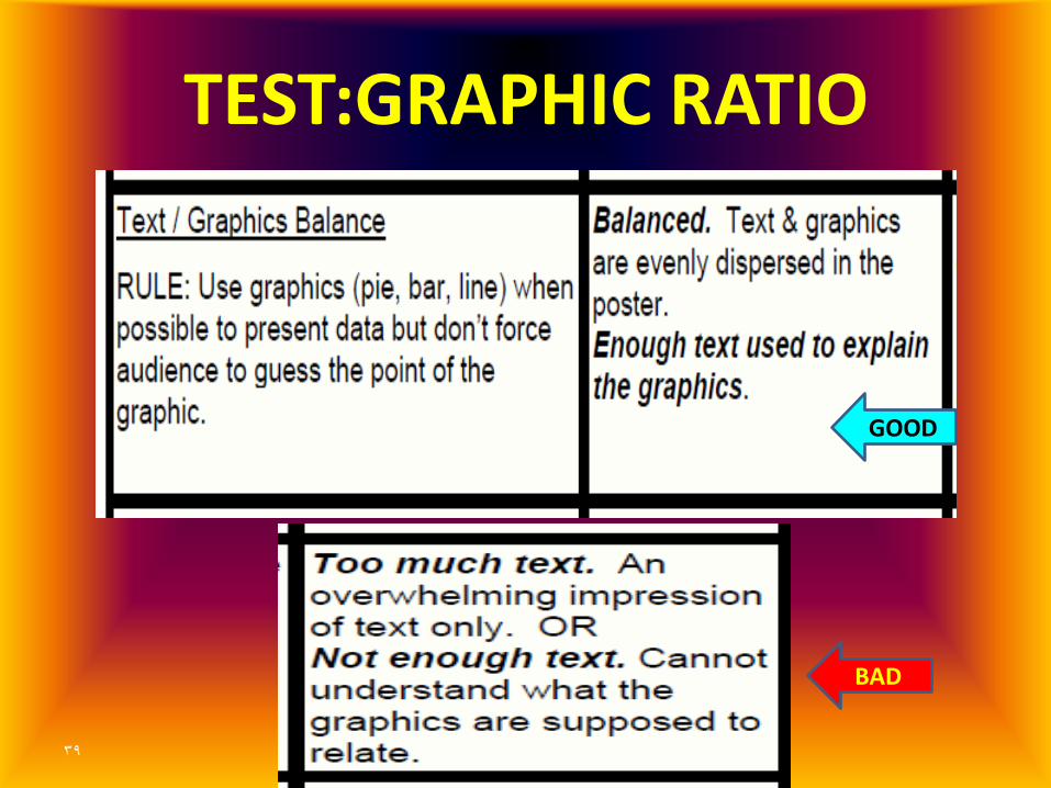
TEST:GRAPHIC RATIO
Dr. AhmedRefat 39
BAD
GOOD

Layout — Blank space:
Leave enough room so that the viewer can stay
focused on individual sections
40 Dr. AhmedRefat

Blank space:
• – Leave enough room so that the viewer can stay focused on individual sections
• A good poster has about 50% blank space, !!! and lots of informative pictures and figures.
20 % text …..40 % figures…… 40 % blank space
41 Dr. AhmedRefat

20-40-40 Rule
42 Dr. AhmedRefat

Layout — Blank space:
Use lots of blank space around margins to define sections:
43 Dr. AhmedRefat
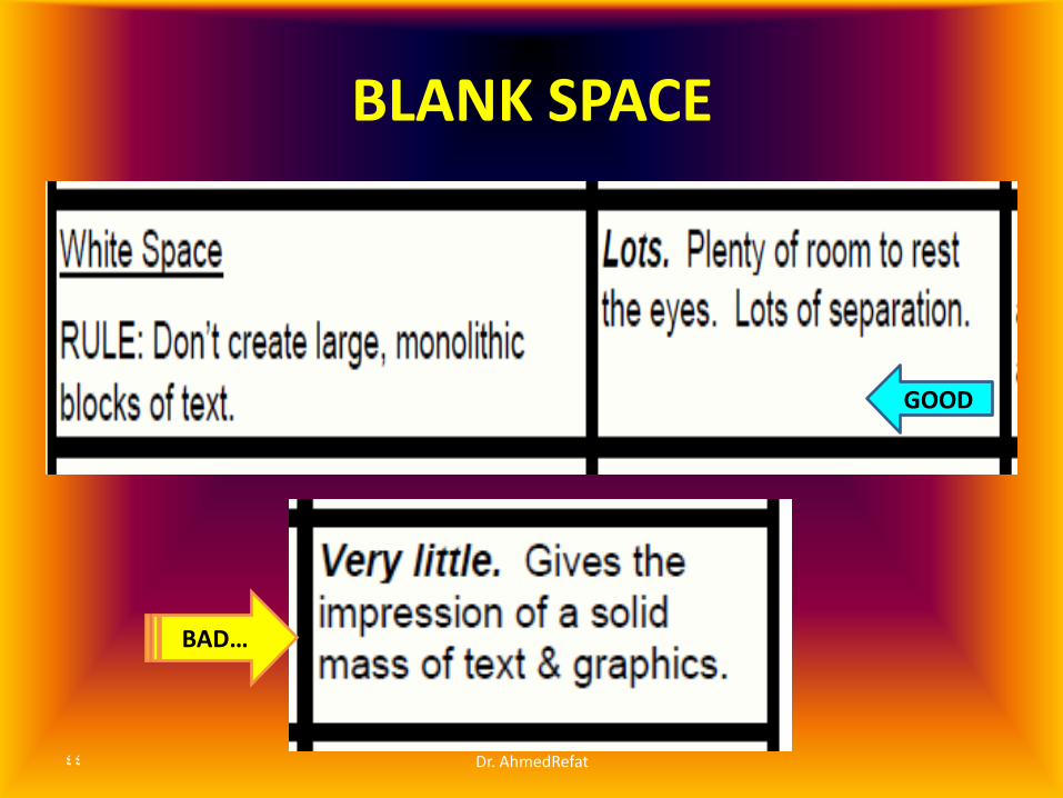
BLANK SPACE
Dr. AhmedRefat 44
BAD…
GOOD

Background may be • – A solid color
• – A gradient
• – A texture
• – A photograph
45 Dr. AhmedRefat

46 Dr. AhmedRefat

BACKGROUND
Dr. AhmedRefat 47
GOOD
BAD

How to use
MS- Power Point
in creating the poster
48 Dr. AhmedRefat

Software Options
• MS PowerPoint : Easy-to-use tool, many people already know how to use it.
• Adobe Illustrator & Adobe Photoshop …. more features ..more complex and expensive.
• MS Excel Create graphics and export them for PowerPoint - but you'll need to clean them up.
• OpenOffice … Free alternatives to MS Office.
49 Dr. AhmedRefat

Dr. AhmedRefat 50
Three Steps for Developing a Poster
by using
MS-Power Point ®

1-YOU NEDD A PLAIN SHEET
Dr. AhmedRefat 51
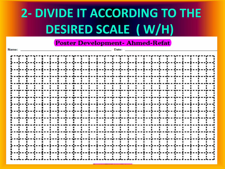
2- DIVIDE IT ACCORDING TO THE DESIRED SCALE ( W/H)
Dr. AhmedRefat 52
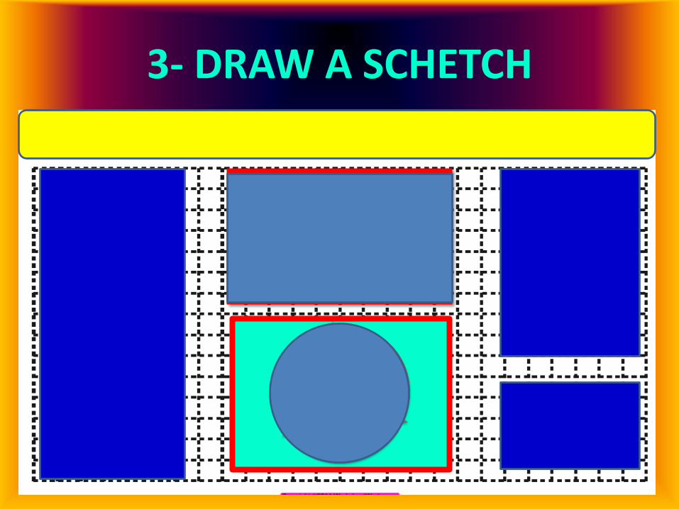
3- DRAW A SCHETCH
Dr. AhmedRefat 53
S
A
K

3- Put Your Data…Save..Print!!
Dr. AhmedRefat 54
How To Develop A Poster By Using MS-PowerPoint Presentation Dr Ahmed-Refat
Introduction •Kadckdkdjksdvjksvjksfv\sFV\svfblebejbebkebhekbkev •Brknk rbkerber
•Rlrglgr w •W rgk wgkwrkgkrgg •G •G •G
Organization
how to move through poster •Implicit. Headings (Introduction, Methods, etc.) or other device implies organization and flow. Explicit numbering, column bars, row bars, etc
S
A
K

Step One: Set Up Your Poster -1
Dr. AhmedRefat 55

Step One: Set Up Your Poster-2
Dr. AhmedRefat 56
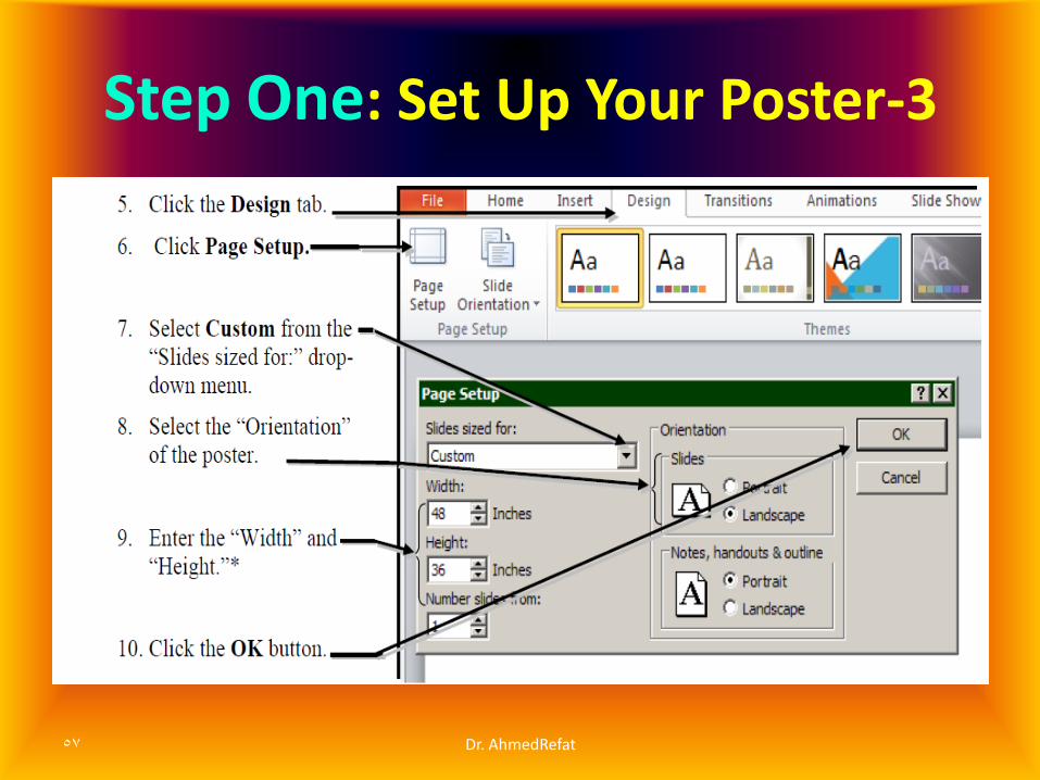
Step One: Set Up Your Poster-3
Dr. AhmedRefat 57
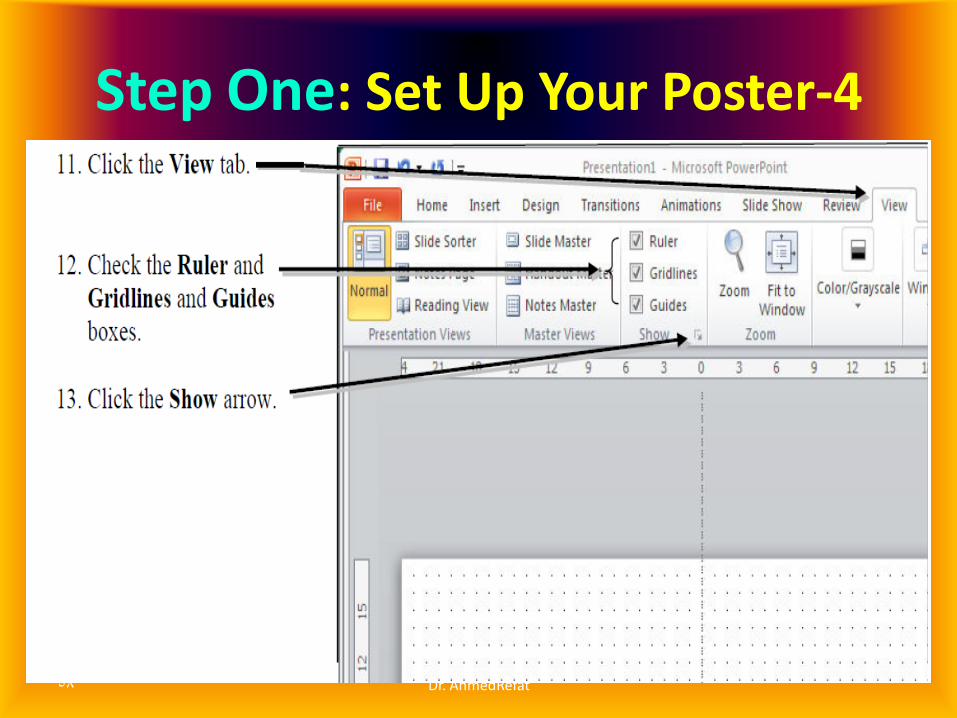
Step One: Set Up Your Poster-4
Dr. AhmedRefat 58

Step One: Set Up Your Poster-5
Dr. AhmedRefat 59

Step Two: Put the Text & Graphics
Dr. AhmedRefat 60

Step Two: Put the Text & Graphics
Dr. AhmedRefat 61

Step Three: Save / Print
Dr. AhmedRefat 62

Cited references
1-Guidelines for poster presentations - John Jay College available from
http://www.jjay.cuny.edu/academics/Poster_Guidelines.pdf
2-http://www.cns.cornell.edu/documents/ScientificPosters.pdf
3-Creating a poster using PowerPoint:
http://www.cmer.wsu.edu/~yonge/ce465/poster.pdf
4- "60-Second Evaluation" by Hess, G.R. at the site: Creating Effective Poster Presentations. http://www.ncsu.edu/project/posters
63 Dr. AhmedRefat