portfolio 2011
DESCRIPTION
A catalog of freelance graphic design and illustration projects completed in 2011.TRANSCRIPT

Ted Laytondesign + illustration
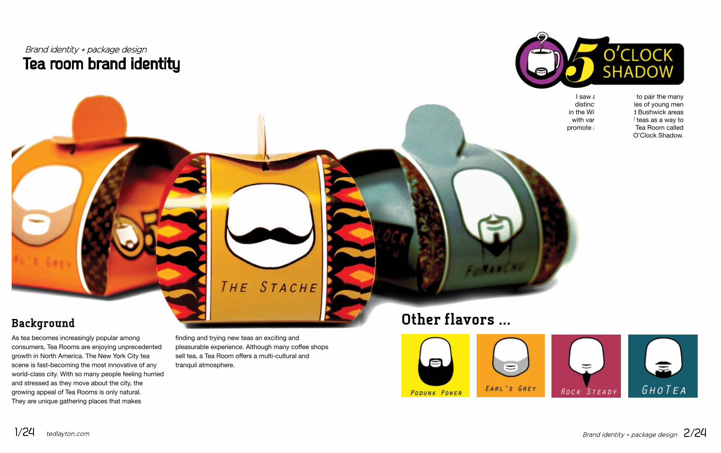
I saw an opportunity to pair the many distinct facial hairstyles of young men
in the Williamsburg and Bushwick areas with various flavors of teas as a way to
promote a hypothetical Tea Room called Five O’Clock Shadow.
Other flavors ...
Brand identity + package design 2 241 24 tedlayton.com
Brand identity + package design
Tea room brand identity
As tea becomes increasingly popular amongconsumers, Tea Rooms are enjoying unprecedented growth in North America. The New York City tea scene is fast-becoming the most innovative of any world-class city. With so many people feeling hurried and stressed as they move about the city, thegrowing appeal of Tea Rooms is only natural.They are unique gathering places that makes
finding and trying new teas an exciting and pleasurable experience. Although many coffee shops sell tea, a Tea Room offers a multi-cultural andtranquil atmosphere.
Background

Opportunity for brand recognitionSince each style of facial hair is as unique each type of tea, I paired teas with beards that were the most compatible. The sample packs are a game of association. Each type of tea can be identified by their unique beard style.
Tea sampler packsThese sampler packs are designed to achieve two things. Not only can they hold up to 3 oz. of tea leaves, keeping them dry and making them easy to carry, they are also made of 100% post-consumer recycled cardboard and are completely reversible so that they can be reused as gift boxes.
By extending the life cycle of the pack-aging the presence of the Five O’Clock Shadow brand will be increased.
The StacheNarino Columbian Blend
Earl’s GreyEarl Grey
Fu Man ChuDragon Well Tea
Brand identity + package design 4 243 24 tedlayton.com
Brand identity + package design
Tea room brand identity
2.
2.
1.
1.

Illustration
The Pantry Party Poster Series
5 24 tedlayton.com
President’s DayThe question posed whendefining the theme of this poster was ...
“If Lincoln were alive to-day, would he be into punk rock?”
My answer was to makeelements of the presidential seal edgier and more ag-gressive and brought Abe up to the 21st Century with piercings and a crew cut to strongly communicates that this Pantry Party was going to be a scene for edgy,alternative music.
illustration 6 24

Illustration
The Pantry Party Poster Series
7 24 tedlayton.com
It was for this poster thatI chose to create a theme based
on the opposite of what I thought was a silent farm; a noisy circus.
The main feature is a captive gorilla, which appears to almost be bursting through the paper. This illusion
is made more convincing by having a human scale gorilla head, the same size as the person holding up the poster.
Silent Farm
illustration 8 24

Illustration
The Pantry Party Poster Series
9 24 tedlayton.com
The FirehouseFor this commission,
The Pantry Party did not yet know when or where their
next show would be.
I responded witha graphic format that
allowed them to fill in the details about the event in
the spaces allotted.
illustration 10 24
illustration
The Pantry Party Poster Series
11 24 tedlayton.com
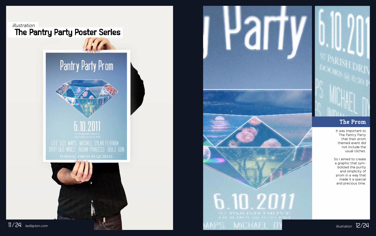
The PromIt was important to
The Pantry Party that their prom
themed event did not include the
usual cliches.
So I aimed to create a graphic that sym-
bolized the purity and simplicity of
prom in a way that made it a special
and precious time.
illustration 12 24

illustration
The Pantry Party Poster Series One in the hand ...
These drawn, undead hands clutch dollar bills and a soup can to call
attention to the fact thatThe Pantry Party will
accept either foradmission to
the show.
13 24 tedlayton.com illustration 14 24

Graphic design
DIY Zombie Masks as Promotional Art
15 24 tedlayton.com
It’s InfectiousThe recent national obsession with Zombies has saturated all facets of pop culture including televi-sion, movies, theme rides and even charity running events. So it was only fitting to adopt this theme for this year’s Halloween Pantry Party at the Texas Firehouse.
It was the vision of The Pantry Party team and myself to provide guests with their own handheld zombie mask. To promote the event, we sent out downloadable versions of the mask so that guests could put one together themselves.
Graphic design 16 24

Graphic design
DIY zombie masks as promotional art
17 24 tedlayton.com
For the purposes of designing an easy Do-It-Yourself Zombie Mask, great attention to detail was required.The eyeholes are aligned to fit an average adult person.
Aim for the head!
Graphic design 18 24
I also created a step-by-step downloadable manual so that making it would be easy as click, print, cut and
walk around aimlessly seeking human flesh.

Design for learning
Infographics present complex information quickly andclearly. I developed this graphic to better understand the sales service that Sales Associates are expect-
graphic design
‘At your service’ infographic
19 24 tedlayton.com
The extra gray boxes describe each step in greater detail. A color key is provided to identify which communications involve the customers and which are purely internal.
Careful analysis of each step in the sales process made it easier to link items to each other. At this
stage I used color to separate the items into groups.
Creating the artwork that identified each item as a step in the sales process.
The steps are composed in a game board type layout so anyone can follow the path to victory.
With a
“bigpicture”
level ofunderstanding,
the sales team wasmore confident in
their work.
Stock Check
WECC
Ship to StoreO site Delivery
Discover
RTC Delivery
Engage
Close the Sale
Graphic design 20 24
1.2.
3.
3.
2.
1.
ed to provide at the West Elm store in Dumbo. In order to create this visual map I needed to take a “systems thinking” approach to organizing the content. I took into special consideration the colors, icons and directional cues used to link or relate one part of the process to another.

graphic design + brand identity
The I Am Campaign
21 24 tedlayton.com
About The CampaignThe I Am Campaign is a small non-profit organization with the mission of supporting the child victims of human trafficking and sex trade in the United States. They have a variety of programs to help those children rebuild self esteem in an environment where they feel safe and loved.
Brand identity + graphic design 22 24
About Logos and IconsThe commission to build their brand came with only one directive, to have a contemporary and appeal-ing visual identity. The identity I developed for each of their six branches were simple illustrations of the
services The I Am Campaign provided. I created files for print, web and silk-screen tee shirt use.

illustration
Miscellaneous Musings
As an exercise in observational drawing, I drew these skulls by hand to showcase my ability to draw a single object from multiple points of view.
A logo for a friend’s personal business card.
A commissioned por-
23 23 tedlayton.com illustration 23 24