polio modeling and data analysis...
TRANSCRIPT

Polio Modeling and Data Analysis Report
Pakistan
EMOD Polio Team, Global Good For questions please contact: [email protected]
10/17/2012
Executive Summary We review the performance of the very-high-vulnerability district list built in April 2012, and update
this list using non-polio AFP and campaign history data as of Jul 28, 2012. This updated list identifies
46 districts susceptible to a large outbreak (with multiple cases) in the next 12 months if virus is
introduced to the district.
We evaluate immunity trends using non-polio AFP samples dose history, and compare them with
force of infection and invasion threshold estimates. We identify 9 districts with significant decreases
in immunity in the last 12 months.
We evaluate the concordance of independent monitoring (IM) with lot-quality assessment sampling
(LQAS). In Sindh province, IM and LQAS are now completely discordant. In other provinces, there are
signs of increased discordance. Reductions of IM-LQAS concordance imply either a reduction in the
information content of IM, or a reduction in the information content of LQAS data.
Using LQAS to track SIA quality, poor-performing districts of Sindh province show statistically
significant coverage improvements (from 65% to 85% since January 2011). Coverage improvements
in other provinces could not be statistically confirmed due to the limited number of districts they
have measured with LQAS.
In order to reduce the uncertainty of province-level SIA coverage estimates, and to be more
effective at detecting poor-performing districts, we suggest that every district be measured with
LQAS once per six months as is now being planned for Nigeria for the same reasons.
Outbreak Vulnerability Assessment Update
Summary Approximately 67% and 81% of cases detected in 2012 (as of September 30th 2012) were in districts
within the very-high-vulnerability and high-vulnerability district lists built in April 2012.
Using non-polio AFP and campaign history data (as of July 28th 2012), we presented updated very
high vulnerability and high vulnerability district lists. These lists identify 46 districts at risk of a large
outbreak (with multiple cases) in the next 12 months if virus is introduced.
For populous districts, e.g., Peshawar and Rawalpindi, we suggest that the location of AFP cases and
SIA quality indicators be reported at sub-district level (town, tehsil, or union council as appropriate)

as it is currently being done for Karachi. This will allow analysis of immunity data to be more
sensitive to local heterogeneity.
Overview and Results Vulnerability score considers various factors such as NP-AFP based immunity history and campaign
quality, country-specific invasion threshold and demographics such as population. The vulnerability
model does not use historical cases as inputs.
Based on the line list of cases from the September 30, 2012 weekly report, 40 cases (37 WPV1, 2 WPV3
and 1 WPV+WPV3) were identified in Pakistan in 2012. In Table 1, we present the number of cases in the
very high vulnerability list since January 1st. The performance of the list is in accordance with previous
historical validations in the last 5 years (as shown in the previous report), with about 67% of cases (60%
excluding Khyber, since it is known as a very high risk district for polio outbreak because of insecurity
and its inaccessibility to receive recent vaccine campaigns), came from the list. All but one district
with >=2 cases are in the Very High Vulnerability (VHV) list.
Mardan and Charsadda from KP were the only two districts so far having 2 cases and was not on the
VHV/HV list. In Figure 1 we present dose histories for three districts in KP to allow direct comparison:
Mardan and Charsadda, one of the worst-performing districts (Shangla), and one district not on VHV list,
but on HV list and has 1 case so far this year (Karak). Therefore, based on recent NP-AFP samples,
because the average number for both Routine Immunization (RI) and Supplementary Immunization
Activity (SIA) doses are very high, it is unable to predict the multiple-case outbreak from dose history.
WPV1 Unpredicted areas in the Q1 VHV list
(cases)1. District with * is in HV but not
in VHV list.
25/37 in VHV list (67%) 30/37 in HV list (81%) If excluding Khyber: 18/30 in VHV list (60%) 23/30 in HV list (76%)
Jhang, Punjab (1) Rajanpur, Punjab* (1) Larkana, Sindh* (1) Mardan, KP (2) Charsadda, KP (2) Swabi, KP* (1) Rawalpindi, Punjab (1) Haripur, KP (1) Karak, KP* (1) Diamir, GB* (1)
Table 1. Number of cases in the very high vulnerability list, and unpredicted areas between 1/1/2012 and 9/22/2012, based on weekly updated line list.
1 Torghar, KP was part of Marsehra, KP until 2011 and our geographic boundary of Marsehra included Torghar
when performing the vulnerability analysis.
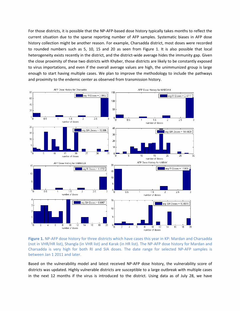
For those districts, it is possible that the NP-AFP-based dose history typically takes months to reflect the
current situation due to the sparse reporting number of AFP samples. Systematic biases in AFP dose
history collection might be another reason. For example, Charsadda district, most doses were recorded
to rounded numbers such as 5, 10, 15 and 20 as seen from Figure 1. It is also possible that local
heterogeneity exists recently in the district, and the district-wide average hides the immunity gap. Given
the close proximity of these two districts with Khyber, those districts are likely to be constantly exposed
to virus importations, and even if the overall average values are high, the unimmunized group is large
enough to start having multiple cases. We plan to improve the methodology to include the pathways
and proximity to the endemic center as observed from transmission history.
Figure 1. NP-AFP dose history for three districts which have cases this year in KP: Mardan and Charsadda (not in VHR/HR list), Shangla (in VHR list) and Karak (in HR list). The NP-AFP dose history for Mardan and Charsadda is very high for both RI and SIA doses. The date range for selected NP-AFP samples is between Jan 1 2011 and later.
Based on the vulnerability model and latest received NP-AFP dose history, the vulnerability score of
districts was updated. Highly vulnerable districts are susceptible to a large outbreak with multiple cases
in the next 12 months if the virus is introduced to the district. Using data as of July 28, we have

identified 45 districts with very high vulnerability, and 64 districts with high vulnerability (this number
includes very high vulnerability districts). The map showing distributions of high-vulnerability districts is
presented in Figure 2. The updated score reflects the approximate force of infection in the model. The
force of infection was estimated by observing the invasion threshold among districts with outbreaks. In
Figure 2 we present the type-1 vulnerability score distributions of districts, as well as changes in
vulnerability scores between April and July 2012. In general, most districts have seen a decreasing trend
of scores over the past few months, which leads to a decreasing number of high-risk districts.
Figure 2. (A) distribution of vulnerability score by district, July 2012. (B) changes in vulnerability score between the March and July updates.
In Table 2 we list the districts with very high vulnerability for type 1. The full list of very high and high
vulnerability districts, as well as the complete list of outbreak vulnerability scores is available in the
accompanying spreadsheet.
State Very High Vulnerability Districts
Balochistan Quetta, Killa Abdulah, Pishin, Khuzdar, Jafarabad, NSirabad, Lasbela, Loralai
FATA Khyber, N. Wazir, Kurram, Bajour, Orakzai, mohmand, S. Wazir
KP DI Khan, Shangla, Swat, Bannu, Mansehra, Lakkimrwt, Hangu, Kohat, Kohistan, Peshawar2
Punjab Sahiwal, Okara, Bhakkar
Sindh Dadu, Mirpurkhas, Badin, Tharparkar, NFeroz, Ghotki, Thatta, Sanghar, Hyderabad, Jacobabad, Kambar, Shikarpur, Sukkur, Umerkot, Karachi-Saddar, Sbenazirabad
AJK Bagh (including Haveli)
GB Gilgit (including Hunza-Nagar)
Table 2. List of High Vulnerability Districts as of July 28th 2012. High vulnerability is defined as a vulnerability score above the selected threshold (score >=22000, please refer to Appendix for details) where it is likely to have large outbreaks with multiple cases. Districts are ordered by the score.
2 According to the consistent presence of multiple cases in past years and the close proximity to endemic regions.
Possibly due to the large sub-district level heterogeneities, we are unable to assess risk and explain the recent cases for Peshawar at the district level.

Peshawar was placed on the Very High Vulnerability list because of the constant presence of cases in the
past, despite of its high average values of dose history. Large local heterogeneity and the close proximity
to endemic areas are likely to be the reason. Therefore, we suggest that for large districts and cities such
as Peshawar and Rawalpindi, the spatial location could be collected in more details, and location of AFP
cases and campaign monitoring data could be collected at the sub-district level, similar to Karachi.
Invasion Threshold and Immunity Trends from NP-AFP samples
Summary Invasion threshold in the vulnerability model was selected based on maximum unprotected
immunity level for districts with multiple cases.
We evaluate immunity trends using non-polio AFP samples dose history, and compare them with
force of infection and invasion threshold estimates.
We listed districts with significant immunity drops over the past year as seen from NP-AFP dose
history.
Overview and Results In epidemic models, the invasion threshold, or force of infection defines the virus transmissibility, as
well as the minimum immunity (herd immunity) required to protect the area. To optimally distinguish
high risk districts without being overly inclusive, it is necessary to identify the appropriate invasion
threshold and corresponding effective reproduction number (Reff) in the country.
In the vulnerability model, we calculated the invasion threshold using a data-driven approach, based on
observing the past outbreaks and immunity levels inside districts (please refer to “Vulnerability” section
in the Appendix for details). Between Jan 2003 and Jul 2012, we calculated the immunity of each district
each year based on non-polio AFP samples, and find the maximum unprotected immunity level for
infected districts with persistent transmission (defined as districts with more than 2 annual polio cases).
Figure 3 shows the full scatter plot between annual type 1 WPV cases versus annual immunity level
between 2003 and 2011. Based on the evidence from the past 8 years, for Pakistan, the minimum
protected immunity (herd immunity threshold) below which transmission is unlikely to persist (where
two or fewer cases per year are observed) is close to 90% and consistent across provinces.
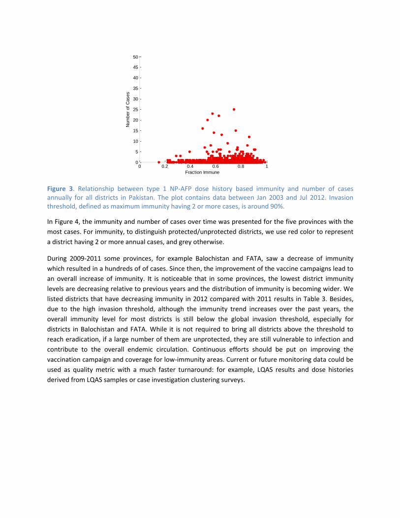
Figure 3. Relationship between type 1 NP-AFP dose history based immunity and number of cases annually for all districts in Pakistan. The plot contains data between Jan 2003 and Jul 2012. Invasion threshold, defined as maximum immunity having 2 or more cases, is around 90%.
In Figure 4, the immunity and number of cases over time was presented for the five provinces with the
most cases. For immunity, to distinguish protected/unprotected districts, we use red color to represent
a district having 2 or more annual cases, and grey otherwise.
During 2009-2011 some provinces, for example Balochistan and FATA, saw a decrease of immunity
which resulted in a hundreds of of cases. Since then, the improvement of the vaccine campaigns lead to
an overall increase of immunity. It is noticeable that in some provinces, the lowest district immunity
levels are decreasing relative to previous years and the distribution of immunity is becoming wider. We
listed districts that have decreasing immunity in 2012 compared with 2011 results in Table 3. Besides,
due to the high invasion threshold, although the immunity trend increases over the past years, the
overall immunity level for most districts is still below the global invasion threshold, especially for
districts in Balochistan and FATA. While it is not required to bring all districts above the threshold to
reach eradication, if a large number of them are unprotected, they are still vulnerable to infection and
contribute to the overall endemic circulation. Continuous efforts should be put on improving the
vaccination campaign and coverage for low-immunity areas. Current or future monitoring data could be
used as quality metric with a much faster turnaround: for example, LQAS results and dose histories
derived from LQAS samples or case investigation clustering surveys.
0 0.2 0.4 0.6 0.8 10
5
10
15
20
25
30
35
40
45
50
Fraction Immune
Num
ber
of
Cases

Figure 4. Type 1 Immunity changes over time for all districts, as well as number of type 1 WPV cases in the province. In a column of each year, there is a dot for each district in the state: red for 2+ cases and gray for 1 or 0 cases in that year. The height of each dot indicates estimated immunity based on NP-AFP (left y-axis). The total annual incidence of WPV1 cases in the state is shown by the green trace (right y-axis). Any breaks in the green trace are years of zero cases.
2002 2003 2004 2005 2006 2007 2008 2009 2010 2011 2012 20130
0.2
0.4
0.6
0.8
1
year
fraction im
mune
BALOCHISTAN
2002 2003 2004 2005 2006 2007 2008 2009 2010 2011 2012 201310
-1
100
101
102
103
num
ber
of
cases
district w ith 0 or 1 case
district w ith >=2 cases
total number of cases
2002 2003 2004 2005 2006 2007 2008 2009 2010 2011 2012 20130
0.2
0.4
0.6
0.8
1
year
fraction im
mune
F.A.T.A.
2002 2003 2004 2005 2006 2007 2008 2009 2010 2011 2012 201310
-1
100
101
102
103
num
ber
of
cases
district w ith 0 or 1 case
district w ith >=2 cases
total number of cases
2002 2003 2004 2005 2006 2007 2008 2009 2010 2011 2012 20130
0.2
0.4
0.6
0.8
1
year
fraction im
mune
KP
2002 2003 2004 2005 2006 2007 2008 2009 2010 2011 2012 201310
-1
100
101
102
103
num
ber
of
cases
district w ith 0 or 1 case
district w ith >=2 cases
total number of cases
2002 2003 2004 2005 2006 2007 2008 2009 2010 2011 2012 20130
0.2
0.4
0.6
0.8
1
year
fraction im
mune
PUNJAB
2002 2003 2004 2005 2006 2007 2008 2009 2010 2011 2012 201310
-1
100
101
102
103
num
ber
of
cases
district w ith 0 or 1 case
district w ith >=2 cases
total number of cases
2002 2003 2004 2005 2006 2007 2008 2009 2010 2011 2012 20130
0.2
0.4
0.6
0.8
1
year
fraction im
mune
SINDH
2002 2003 2004 2005 2006 2007 2008 2009 2010 2011 2012 201310
-1
100
101
102
103
num
ber
of
cases
district w ith 0 or 1 case
district w ith >=2 cases
total number of cases
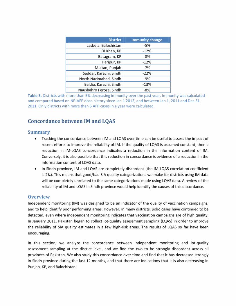
District Immunity change
Lasbela, Balochistan -5%
DI Khan, KP -12%
Batagram, KP -8%
Haripur, KP -12%
Multan, Punjab -7%
Saddar, Karachi, Sindh -22%
North Nazimabad, Sindh -9%
Baldia, Karachi, Sindh -13%
Naushahro Feroze, Sindh -8%
Table 3. Districts with more than 5% decreasing immunity over the past year. Immunity was calculated and compared based on NP-AFP dose history since Jan 1 2012, and between Jan 1, 2011 and Dec 31, 2011. Only districts with more than 5 AFP cases in a year were calculated.
Concordance between IM and LQAS
Summary Tracking the concordance between IM and LQAS over time can be useful to assess the impact of
recent efforts to improve the reliability of IM. If the quality of LQAS is assumed constant, then a
reduction in IM-LQAS concordance indicates a reduction in the information content of IM.
Conversely, it is also possible that this reduction in concordance is evidence of a reduction in the
information content of LQAS data.
In Sindh province, IM and LQAS are completely discordant (the IM-LQAS correlation coefficient
is 2%). This means that good/bad SIA quality categorizations we make for districts using IM data
will be completely unrelated to the same categorizations made using LQAS data. A review of the
reliability of IM and LQAS in Sindh province would help identify the causes of this discordance.
Overview Independent monitoring (IM) was designed to be an indicator of the quality of vaccination campaigns,
and to help identify poor performing areas. However, in many districts, polio cases have continued to be
detected, even where independent monitoring indicates that vaccination campaigns are of high quality.
In January 2011, Pakistan began to collect lot-quality assessment sampling (LQAS) in order to improve
the reliability of SIA quality estimates in a few high-risk areas. The results of LQAS so far have been
encouraging.
In this section, we analyze the concordance between independent monitoring and lot-quality
assessment sampling at the district level, and we find the two to be strongly discordant across all
provinces of Pakistan. We also study this concordance over time and find that it has decreased strongly
in Sindh province during the last 12 months, and that there are indications that it is also decreasing in
Punjab, KP, and Balochistan.

Methods LQAS lots, consisting of five clusters of 10 children, are collected at the Union Council level within a pre-
determined district. The specific union council is selected based on probability proportional to size. By
comparison, post-campaign independent monitoring (IM) is collected for multiple union councils within
a district based on a risk assessment; more union councils are sampled in “high-risk” districts compared
to “medium-risk” districts.
In order to measure the concordance between IM and LQAS, we matched 850 of the 869 LQAS lots
collected since January 2011 with the corresponding IM coverage (less than 60 months old, by finger
marking). We only had access to district-aggregated IM data for this analysis, so the LQAS and IM data
are thus matched at the district-level instead of the Union Council level. This limits the comparison of
these data sources because, even if we IM and LQAS were perfectly correlated, the correlation
coefficient between district-aggregated IM and LQAS would be below 100%. However, this comparison
remains informative as we expect the vaccination coverage of union councils from the same district to
be related. Our analysis also confirms this fact when it shows that the IM-LQAS correlation can be
sizable (30-40%). In future reports, this limitation in our analysis can be overcome by having access to
sub-district level monitoring data.
Results In Figure 5, we plot the number of times a given LQAS-IM coverage pairs appears in the data set. The
degree of concordance between IM and LQAS can be measured using correlation coefficients. Across the
850 matched IM-LQAS lots, the Pearson correlation coefficient is 34%: IM captures only 12% of the LQAS
variance. This means that knowing IM coverage provides very little information on what the LQAS
covered fraction would be. For example, if IM reports coverage above 95%, there is a 29% chance that
LQAS will report a coverage (defined as the proportion of fingermarked children) below 90%, and a 7%
chance that LQAS will report a coverage below 80%.

Figure 5 - Two-dimensional histogram of IM-LQAS coverage pairs, collected in 2011 and 2012. The frequency of observations is presented on a color scale: the more frequent a specific IM-LQAS pair, the darker the shade of red. If IM was an unbiased indicator of coverage, it would lie along the blue line.
Figure 6 – Histograms of LQAS covered fraction, by tranches of IM coverage.
IM coverage is strongly biased upwards compared to LQAS. 85% of the matched LQAS lots had lower
coverage than the corresponding IM coverage. If median IM coverage was unbiased, this fraction would
be 50%. IM systematically underestimates the fraction of missed children during vaccination campaigns.
In Figure 2, we show the distribution of LQAS covered fraction which can be expected when IM coverage
is within certain tranches.
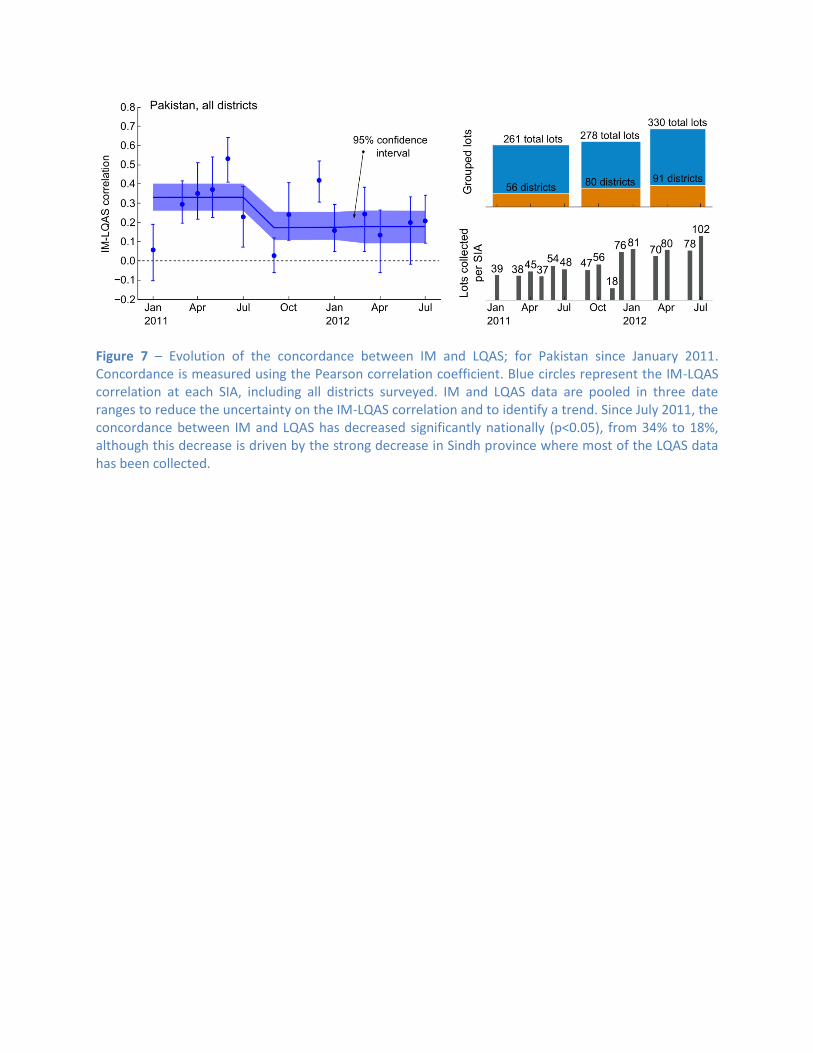
Figure 7 – Evolution of the concordance between IM and LQAS; for Pakistan since January 2011. Concordance is measured using the Pearson correlation coefficient. Blue circles represent the IM-LQAS correlation at each SIA, including all districts surveyed. IM and LQAS data are pooled in three date ranges to reduce the uncertainty on the IM-LQAS correlation and to identify a trend. Since July 2011, the concordance between IM and LQAS has decreased significantly nationally (p<0.05), from 34% to 18%, although this decrease is driven by the strong decrease in Sindh province where most of the LQAS data has been collected.

Figure 8 – Trend analysis of IM-LQAS concordance, by province. Shaded regions represent 95% confidence intervals3. Circles indicate the IM-LQAS correlation coefficient calculated for each SIA. A statistically significant decrease in IM-LQAS concordance is seen in Sindh (41% to 2%). In Punjab, KP, and Balochistan, the suggested trends are not statistically significant. The significant scatter of the SIA-specific correlation coefficients indicates how unreliable IM data is in anticipating the LQAS results.
Tracking the concordance between IM and LQAS over time can be useful to assess the impact of recent
efforts to improve the reliability of IM. If the quality of LQAS is assumed constant, then a reduction in
IM-LQAS concordance indicates a reduction in the information content of IM. Conversely, it is also
possible that this reduction in concordance is evidence of a reduction in the reliability of LQAS data. In
Figure 7, we show that the IM-LQAS concordance is decreasing nationally. In Figure 8, looking province
by province, we see that a similar decrease is observed in all areas.
From June 2011 to October 2011, a new IM methodology was piloted in Sindh province. In part, it
involved randomly selecting union councils from a district instead of biasing this sample towards “high-
3 The confidence intervals take into account the intrinsic error of individual LQAS measurements (beta distribution
for the sample size, ignoring the design effect) and the small number of IM-LQAS pairs (95% jackknife subsampling).
risk” union councils. This should, in principle, increase the IM-LQAS concordance since the IM sample of
UCs is no longer biased towards “high-risk” areas. Instead, the concordance dropped precipitously
during that time period. When, in December 2011, the IM pilot ended and the methodology returned to
what it was, the concordance remains essentially zero. This suggests that the source of the discordance
between IM and LQAS in Sindh was not a result of the IM pilot.
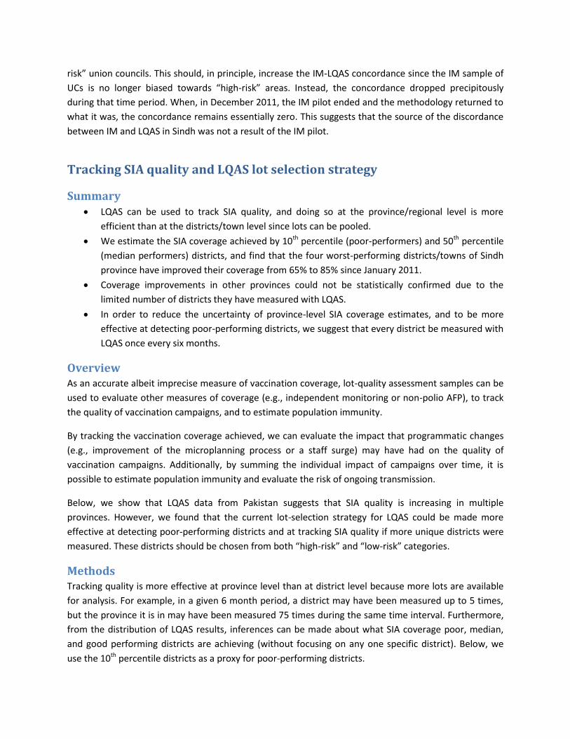
Tracking SIA quality and LQAS lot selection strategy
Summary LQAS can be used to track SIA quality, and doing so at the province/regional level is more
efficient than at the districts/town level since lots can be pooled.
We estimate the SIA coverage achieved by 10th percentile (poor-performers) and 50th percentile
(median performers) districts, and find that the four worst-performing districts/towns of Sindh
province have improved their coverage from 65% to 85% since January 2011.
Coverage improvements in other provinces could not be statistically confirmed due to the
limited number of districts they have measured with LQAS.
In order to reduce the uncertainty of province-level SIA coverage estimates, and to be more
effective at detecting poor-performing districts, we suggest that every district be measured with
LQAS once every six months.
Overview As an accurate albeit imprecise measure of vaccination coverage, lot-quality assessment samples can be
used to evaluate other measures of coverage (e.g., independent monitoring or non-polio AFP), to track
the quality of vaccination campaigns, and to estimate population immunity.
By tracking the vaccination coverage achieved, we can evaluate the impact that programmatic changes
(e.g., improvement of the microplanning process or a staff surge) may have had on the quality of
vaccination campaigns. Additionally, by summing the individual impact of campaigns over time, it is
possible to estimate population immunity and evaluate the risk of ongoing transmission.
Below, we show that LQAS data from Pakistan suggests that SIA quality is increasing in multiple
provinces. However, we found that the current lot-selection strategy for LQAS could be made more
effective at detecting poor-performing districts and at tracking SIA quality if more unique districts were
measured. These districts should be chosen from both “high-risk” and “low-risk” categories.
Methods Tracking quality is more effective at province level than at district level because more lots are available
for analysis. For example, in a given 6 month period, a district may have been measured up to 5 times,
but the province it is in may have been measured 75 times during the same time interval. Furthermore,
from the distribution of LQAS results, inferences can be made about what SIA coverage poor, median,
and good performing districts are achieving (without focusing on any one specific district). Below, we
use the 10th percentile districts as a proxy for poor-performing districts.

The set of distinct districts measured from a province can be taken as samples from a finite set. Multiple
LQAS lots from the same district are combined to reduce the uncertainty of the coverage estimate. From
this set of measurements, a coverage for each district is generated by sampling a beta distribution
parameterized from the total number of missed children and the total number of children sampled in
that district. The resulting list of coverage, one coverage value per district, is ordered and the 10th
percentile coverage and its 90% confidence interval are calculated using the hypergeometric probability
distribution function. This process is repeated to average over the uncertainty of the LQAS coverage
estimates.
Districts where LQAS is conducted are often chosen based on estimates of the risk they present to
interrupting transmission. These risk estimations are typically reflect where past cases have been
detected and where other programmatic data have indicated SIA quality to be insufficient. Selecting
LQAS lots to measure the most “at-risk” districts first is useful in detecting poor performance, but this
strategy can miss districts where performance is poorer than in the “at-risk” districts. By comparison, a
strategy that also measures “low-risk” districts is more likely to detect all the poor-performing districts.
In Figure 9, we compare estimates of SIA coverage in Sindh and KP provinces. In Sindh, the uncertainty
in 10th percentile coverage is significantly less than in is in KP because 90% of districts/towns have
historically been sampled in a given 6 month period. By comparison, KP has sampled between 36% and
68% of its districts with LQAS. Reducing uncertainty in 10th percentile coverage can be achieved by
sampling more distinct districts/towns without increasing the total number of lots collected. For
example, the total number of lots collected in KP between Aug-2011 and Feb-2012 and between Feb-
2012 and Jul-2012 is approximately the same, but lots were distributed more broadly in the last 6
months. As a result, the confidence interval has narrowed from 63% to 24% (see Table 1).
Figure 9 – Estimates of SIA coverage in 10th percentile and 50th percentile districts, under the random-sampling assumption, are shown for Sindh and KP provinces. Lots collected in different SIAs are grouped to reduce statistical error. For each group, we indicate the total number of lots collected and the number of distinct districts measured.
Results In Table 4, we evaluate the SIA quality achieved by poor-performers the provinces of Pakistan over three
periods, using the method presented above and conservatively assuming the lot-selection to be no
better than random at identifying poor-performers. This shows that, over the last 19 months, Sindh
province has significantly improved SIA coverage in its poor-performing districts, from 75% to 86%. In
other provinces, the changes in SIA coverage are not statistically significant, in part because only a
limited fraction of the districts have been sampled in those areas. In FATA, AJK, and GB, the number of
LQAS lots which has been collected is insufficient to evaluate trends in coverage.

Province Jan 2011 – Jul 2011
Sep 2011 – Jan 2012
Mar 2012 – Jul 2012
10th percentile Punjab (w/ Islamabad) 81% (8 – 84) 81% (16 – 83) 86% (14 – 89) Sindh 75% (59 – 79) 81% (78 – 84) 86% (83 – 88) Khyber-Pakhtunkhwa 65% (6 – 72) 80% (11 – 86) 85% (60 – 91) Balochistan 73% (9 – 80) 74% (18 – 79) 82% (28 – 86) FATA Insufficient data AJK, GB No data 50th percentile Punjab (w/ Islamabad) 86% (82 – 91) 91% (87 – 94) 91% (88 – 93) Sindh 87% (83 – 90) 90% (88 – 92) 93% (91 – 94) Khyber-Pakhtunkhwa 79% (67 – 87) 88% (84 – 92) 93% (91 – 95) Balochistan 84% (78 – 89) 87% (80 – 91) 89% (86 – 91) FATA Insufficient data AJK, GB No data
Table 4. Evolution of SIA quality in poor performing (10th percentile) and median-performing (50th percentile) districts over the last 19 months, with 95% confidence intervals.
Figure 10 - Histograms of LQAS covered fraction, by province and time period. Since January 2011, fewer poor-performing districts have been detected throughout these 4 provinces. Considering the many unmeasured districts in Balochistan, KP, and Punjab, there is a significant chance that some poor-performing districts have yet to be detected.

In Figure 10, we present histograms of the reported LQAS covered fraction, per province for
approximately 6-month-long periods. Each histogram represents the collection of all LQAS lots in a given
region. From each histogram, it is possible to separately track trends in coverage for the worst
performing districts, the median performing districts, and the best performing districts.
Figure 11 – Distribution of LQAS lots collected since January 2011, compared to the distribution of polio cases since July 2010, in Pakistan. Many districts have never been measured while others have been measured after each SIA. Only a few districts in the FATA region have been measured, even though polio virus transmission there has been widespread. The A.J.K. and Gilgit-Baltistan provinces have not yet been measured with LQAS.
In Figure 11, we show the geographical distribution of cases during the last two years and compare it
with the geographical distribution of LQAS lots. While provinces like Sindh have received extensive
attention, others like FATA have been measured significantly less. Additionally, extended areas of
Balochistan and Punjab remain entirely unsampled.
Cases continue to be detected in areas which have been polio free or generally thought to be at low risk.
Traditional measures of risk can thus not fully be relied upon to estimate where SIA quality is lacking.
LQAS can provide more reliable information about SIA quality than IM. Using it to explore the SIA quality
achieved outside of “at-risk” areas would help detect poor-performing areas ahead of the virus. Given
the number of LQAS lots currently collected in Pakistan, we recommend that all districts be measured
with LQAS at least once every 6 months.
Appendix: Detailed Methodology
Vulnerability Vulnerability to the local outbreak of poliovirus is determined by the local force of infection and the
population immunity level. In the model, population immunity can be initialized from random

population samples to reflect the pre-existing vaccine histories. For example, NP-AFP database could be
treated as random samples and they contain useful information such as the number of routine and SIA
doses received. The model therefore uses this information for historical NP-AFP samples back in 2 years
to calculate population immunity. The length was chosen to balance the need between having enough
samples and reflecting recent immunity changes. Therefore, for a given district, average immunity
coverage can be calculated for all non-polio records during this period.
In this study, we use a fixed per-dose efficacy model to estimate the population immunity. Population
immunity was estimated based on approximate number of doses of tOPV, or mOPV for a non-polio AFP
sample, and per-dose seroconversion rates. Since the database only records the total number of SIA
doses, we divide this number into the approximate number of doses for each type by looking at
different types of SIA campaigns performed from date of birth to date of onset. Per-dose type 1 polio
seroconversion rates were chosen as 0.11 for tOPV and 0.3 for mOPV, which are results from the India
tOPV and mOPV1 case-control study in 2007 ([1]). For bOPV we assume the vaccine efficacy will be the
same as mOPV. We plan to improve the immunity level estimation by initializing it with an antibody-
mediated immunity model with secondary transmission.
SIA Exposure Rate Past year routine immunization coverage was found through the recorded routine doses in non-polio
samples. Together with SIA campaign plans and types of vaccine used, the fraction of exposure to those
campaigns for samples in the NP-AFP database could be calculated, which measures the efficiency of
campaigns. The SIA exposure rate is therefore the average SIA coverage ratio over a certain period,
calculating the fraction between SIA dose history in non-polio samples and the actual number of
campaigns performed in the district. The coverage for a district is calculated by a weighted average for
all AFP cases which overlap with the period we are interested in.
The SIA exposure rate is a proxy for SIA coverage which can be calculated from non-polio AFP samples.
Since the number of doses reported by NP-AFP may have biases, the resulting SIA exposure rate is
unlikely to be an accurate measure of coverage which can be directly compared with independent
monitoring coverage estimates of lot-quality assessment coverage estimates. Besides, this SIA exposure
is a simple aggregate across different NP-AFP samples; it does not take into account difference in
accessibility to vaccination campaigns or correlation between coverage from one campaign to the next.
In order to model varying accessibility within the population, e.g., missed children, with any accuracy,
additional dose-history samples would be needed. Also, longitudinal cohort study would help
understand the nature of correlations in coverage and help improve the accuracy of model projections.
Nonetheless, the SIA exposure rate is a complementary campaign quality metric where trends can be
extracted. Furthermore, this exposure rate is consistent with the population immunity estimates
constructed from NP-AFP samples and, as a result, can be used to project population immunity self-
consistently.
Force of Infection Using AFP-based historical immunity and case counts, we aim to estimate the approximate force of
infection in the model by observing the invasion threshold among districts with outbreaks. Between Jan

2006 – August 2012, districts having annual polio cases >=2 was selected and the average immunity
throughout the year was calculated. For each province, we use the maximum immunity among the
infected districts as the ‘worst case scenario’ to estimate the possible invasion threshold. As seen in
Figure 3 and Figure 4, the worst case scenario of invasion threshold is about 90%. Therefore, in our SEIR
infection model, we use the effective force of infection , which is slightly worse than the
‘worst case scenario’ and corresponds to a herd immunity of 91%, to represent the maximum invasion
threshold.
Infection Model A simple SEIR model is used to simulate the polio infection process, with latent period 2 days and
infectious period for 2 weeks. We use the reproductive number , obtained from the invasion
threshold described above. Since the transmissibility is the same for every district, it threw out other
factors such as sanitations or social contacts, so the vulnerability score mainly represents the
demographics and immunity coverage.
The vulnerability score shows the vulnerability to spread based on the population immunity and other
demographic factors such as number of children under 5 years old and birth/death rates. After the
initial infection, the simulation runs for a year with regular NIDs. We use a projected SIA schedule of 4
bOPV and 2 tOPV campaigns in the coming year. New births are born into the community and their
immunization status depends on the POL3 coverage, estimated from the NP-AFP database. The number
of infections at the end of simulation will be the vulnerability score. If the score is large there will be
immunity gaps and the district has greater risk of outbreak following importation.
The following flowchart shows the details of the model.
Defining Vulnerability Threshold Two thresholds, very high and high vulnerability, indicate that the districts have a high possibility of
having a large local outbreak, if the virus is imported into the area. It is important to stress that a
vulnerability score under the threshold may still have a few cases because of the possible sub-district
immunity gaps at the sub-district level. However, it is unlikely to find a large number of cases.
We obtained the different vulnerability threshold by defining the conditions when a district is infected
(“positive”). Under the high vulnerability assumption, if one or more cases were present in one calendar
year, the district is defined as infected in that year. Under the very high vulnerability assumption, the
infected district needs to have two or more cases in the local area in one year.
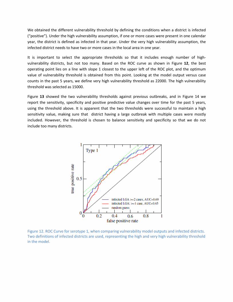
It is important to select the appropriate thresholds so that it includes enough number of high-
vulnerability districts, but not too many. Based on the ROC curve as shown in Figure 12, the best
operating point lies on a line with slope 1 closest to the upper left of the ROC plot, and the optimum
value of vulnerability threshold is obtained from this point. Looking at the model output versus case
counts in the past 5 years, we define very high vulnerability threshold as 22000. The high vulnerability
threshold was selected as 15000.
Figure 13 showed the two vulnerability thresholds against previous outbreaks, and in Figure 14 we
report the sensitivity, specificity and positive predictive value changes over time for the past 5 years,
using the threshold above. It is apparent that the two thresholds were successful to maintain a high
sensitivity value, making sure that district having a large outbreak with multiple cases were mostly
included. However, the threshold is chosen to balance sensitivity and specificity so that we do not
include too many districts.
Figure 12. ROC Curve for serotype 1, when comparing vulnerability model outputs and infected districts. Two definitions of infected districts are used, representing the high and very high vulnerability threshold in the model.

Figure 13. Predicted vulnerability score versus number of cases for all districts, between 2007 and 2011. The vulnerability score thresholds for high vulnerability and very high vulnerability, obtained from the best operating point on the ROC curve, are also marked on the plot.
Figure 14. Sensitivity, Specificity and Positive Predictive Value of the outbreak vulnerability model over time
Reference [1] Grassly, N. C., J. Wenger, et al. (2007). "Protective efficacy of a monovalent oral type 1 poliovirus
vaccine: a case-control study." The Lancet 369(9570): 1356-1362.