plug-in css 100 power solutions
TRANSCRIPT

Plug-in CSS 100 POWER SOLUTIONS
Robin Nixon
New York Chicago San Francisco Lisbon London Madrid Mexico City
Milan New Delhi San Juan Seoul Singapore Sydney Toronto

Copyright © 2011 by The McGraw-Hill Companies. All rights reserved. Except as permitted under the United States Copyright Act of 1976, no part of this publication may be reproduced or distributed in any form or by any means, or stored in a database or retrieval system, without the prior written permission of the publisher.
ISBN: 978-0-07-174877-3
MHID: 0-07-174877-6
The material in this eBook also appears in the print version of this title: ISBN: 978-0-07-174876-6, MHID: 0-07-174876-8.
All trademarks are trademarks of their respective owners. Rather than put a trademark symbol after every occurrence of a trademarked name, we use names in an editorial fashion only, and to the benefi t of the trademark owner, with no intention of infringement of the trademark. Where such designations appear in this book, they have been printed with initial caps.
McGraw-Hill eBooks are available at special quantity discounts to use as premiums and sales promotions, or for use in corporate training programs. To contact a representative please e-mail us at [email protected].
Information has been obtained by McGraw-Hill from sources believed to be reliable. However, because of the possibility of human or mechanical error by our sources, McGraw-Hill, or others, McGraw-Hill does not guarantee the accuracy, adequacy, or completeness of any information and is not responsible for any errors or omissions or the results obtained from the use of such information.
TERMS OF USE
This is a copyrighted work and The McGraw-Hill Companies, Inc. (“McGrawHill”) and its licensors reserve all rights in and to the work. Use of this work is subject to these terms. Except as permitted under the Copyright Act of 1976 and the right to store and retrieve one copy of the work, you may not decompile, disassemble, reverse engineer, reproduce, modify, create derivative works based upon, transmit, distribute, disseminate, sell, publish or sublicense the work or any part of it without McGraw-Hill’s prior consent. You may use the work for your own noncommercial and personal use; any other use of the work is strictly prohibited. Your right to use the work may be terminated if you fail to comply with these terms.
THE WORK IS PROVIDED “AS IS.” McGRAW-HILL AND ITS LICENSORS MAKE NO GUARANTEES OR WARRANTIES AS TO THE ACCURACY, ADEQUACY OR COMPLETENESS OF OR RESULTS TO BE OBTAINED FROM USING THE WORK, INCLUDING ANY INFORMATION THAT CAN BE ACCESSED THROUGH THE WORK VIA HYPERLINK OR OTHERWISE, AND EXPRESSLY DISCLAIM ANY WARRANTY, EXPRESS OR IMPLIED, INCLUDING BUT NOT LIMITED TO IMPLIED WARRANTIES OF MERCHANTABILITY OR FITNESS FOR A PARTICULAR PURPOSE. McGraw-Hill and its licensors do not warrant or guarantee that the functions contained in the work will meet your requirements or that its operation will be uninterrupted or error free. Neither McGraw-Hill nor its licensors shall be liable to you or anyone else for any inaccuracy, error or omission, regardless of cause, in the work or for any damages resulting therefrom. McGraw-Hill has no responsibility for the content of any information accessed through the work. Under no circumstances shall McGraw-Hill and/or its licensors be liable for any indirect, incidental, special, punitive, consequential or similar damages that result from the use of or inability to use the work, even if any of them has been advised of the possibility of such damages. This limitation of liability shall apply to any claim or cause whatsoever whether such claim or cause arises in contract, tort or otherwise.

For Julie

About the AuthorRobin Nixon has worked with and written about computers since the early 1980s (his first computer was a Tandy TRS 80 Model 1 with a massive 4KB of RAM!). During this time, he has written in excess of 500 articles for many of the UK’s top computer magazines. Plug-in CSS is his seventh book.
Robin lives on the southeast coast of England with his wife, Julie, a trained nurse, and their five children, and also finds time to foster three disabled children, as well as work full time from home as a technical author.
Also by Robin NixonLearning PHP, MySQL and JavaScript, O’Reilly 2009, ISBN 978-0596157135
Ubuntu: Up and Running, O’Reilly 2010, ISBN 978-0596804848
Plug-in PHP, McGraw-Hill 2010, ISBN 978-0071666596
Plug-in JavaScript, McGraw-Hill 2010, ISBN 978-0071738613
About the Technical EditorAlan Solis has more than 30 years experience designing, writing, and maintaining software for companies ranging from small start-ups to large corporations. He currently is designing and maintaining web sites and web applications using PHP, JavaScript, Java, and various relational databases.
In his spare time, Alan enjoys creative writing and is a published short story and poetry author. Alan lives in the San Jose, California, area with his wife, Cheryl.
v

Contents at a Glance
Part I About CSS and These Plug-ins 1 How to Use the Plug-ins . . . . . . . . . . . . . . . . . . . . . . . . . . . . . . . . . . . . . . . . . . . 3 2 CSS Crash Course . . . . . . . . . . . . . . . . . . . . . . . . . . . . . . . . . . . . . . . . . . . . . . . . 15
Part II The Classes 3 Manipulating Objects . . . . . . . . . . . . . . . . . . . . . . . . . . . . . . . . . . . . . . . . . . . . . 37 4 Text and Typography . . . . . . . . . . . . . . . . . . . . . . . . . . . . . . . . . . . . . . . . . . . . . 95 5 Menus and Navigation . . . . . . . . . . . . . . . . . . . . . . . . . . . . . . . . . . . . . . . . . . . . 131 6 Page Layout . . . . . . . . . . . . . . . . . . . . . . . . . . . . . . . . . . . . . . . . . . . . . . . . . . . . . . 151 7 Visual Effects . . . . . . . . . . . . . . . . . . . . . . . . . . . . . . . . . . . . . . . . . . . . . . . . . . . . 169
Part III The Dynamic Classes 8 Dynamic Objects . . . . . . . . . . . . . . . . . . . . . . . . . . . . . . . . . . . . . . . . . . . . . . . . . 205 9 Dynamic Text and Typography . . . . . . . . . . . . . . . . . . . . . . . . . . . . . . . . . . . . . 235 10 Dynamic Interaction . . . . . . . . . . . . . . . . . . . . . . . . . . . . . . . . . . . . . . . . . . . . . . 253 11 Incorporating JavaScript . . . . . . . . . . . . . . . . . . . . . . . . . . . . . . . . . . . . . . . . . . 265 12 Superclasses . . . . . . . . . . . . . . . . . . . . . . . . . . . . . . . . . . . . . . . . . . . . . . . . . . . . . 273
Index . . . . . . . . . . . . . . . . . . . . . . . . . . . . . . . . . . . . . . . . . . . . . . . . . . . . . . . . . . . 285
v

This page intentionally left blank
Contents
Acknowledgments . . . . . . . . . . . . . . . . . . . . . . . . . . . . . . . . . . . . . . . . . . . . . . . . xxiIntroduction . . . . . . . . . . . . . . . . . . . . . . . . . . . . . . . . . . . . . . . . . . . . . . . . . . . . . . xxiii
Part I About CSS and These Plug-ins
1 How to Use the Plug-ins . . . . . . . . . . . . . . . . . . . . . . . . . . . . . . . . . . . . . . . . . . . 3Downloading and Installing Web Browsers . . . . . . . . . . . . . . . . . . . . . . . . . . . 4Older Versions of Microsoft Internet Explorer . . . . . . . . . . . . . . . . . . . . . . . . . 5
Emulating Internet Explorer 6 and 7 . . . . . . . . . . . . . . . . . . . . . . . . . . . 6The Companion Web Site . . . . . . . . . . . . . . . . . . . . . . . . . . . . . . . . . . . . . . . . . . 7About the Document Object Model . . . . . . . . . . . . . . . . . . . . . . . . . . . . . . . . . . 8
How the DOM Works . . . . . . . . . . . . . . . . . . . . . . . . . . . . . . . . . . . . . . . 8About Cascading Style Sheets . . . . . . . . . . . . . . . . . . . . . . . . . . . . . . . . . . . . . . 10
Importing a Style Sheet . . . . . . . . . . . . . . . . . . . . . . . . . . . . . . . . . . . . . . 11Local Style Settings . . . . . . . . . . . . . . . . . . . . . . . . . . . . . . . . . . . . . . . . . . 12IDs and Classes . . . . . . . . . . . . . . . . . . . . . . . . . . . . . . . . . . . . . . . . . . . . . 12
CSS and Semicolons . . . . . . . . . . . . . . . . . . . . . . . . . . . . . . . . . . . . . . . . . . . . . . . 12Using the Plug-ins in Your Own Web Sites . . . . . . . . . . . . . . . . . . . . . . . . . . . 13
Class Name Conflicts . . . . . . . . . . . . . . . . . . . . . . . . . . . . . . . . . . . . . . . . 13JavaScript-aided Plug-ins . . . . . . . . . . . . . . . . . . . . . . . . . . . . . . . . . . . . . . . . . . 13
Including JavaScript-aided CSS Alongside Pure CSS . . . . . . . . . . . . . 14Users Without JavaScript . . . . . . . . . . . . . . . . . . . . . . . . . . . . . . . . . . . . . 14
Summary . . . . . . . . . . . . . . . . . . . . . . . . . . . . . . . . . . . . . . . . . . . . . . . . . . . . . . . . 14
2 CSS Crash Course . . . . . . . . . . . . . . . . . . . . . . . . . . . . . . . . . . . . . . . . . . . . . . . . 15CSS Rules . . . . . . . . . . . . . . . . . . . . . . . . . . . . . . . . . . . . . . . . . . . . . . . . . . . . . . . . 16
Multiple Assignments . . . . . . . . . . . . . . . . . . . . . . . . . . . . . . . . . . . . . . . 16Comments . . . . . . . . . . . . . . . . . . . . . . . . . . . . . . . . . . . . . . . . . . . . . . . . . 17Style Types . . . . . . . . . . . . . . . . . . . . . . . . . . . . . . . . . . . . . . . . . . . . . . . . . 17Default Styles . . . . . . . . . . . . . . . . . . . . . . . . . . . . . . . . . . . . . . . . . . . . . . 17User Styles . . . . . . . . . . . . . . . . . . . . . . . . . . . . . . . . . . . . . . . . . . . . . . . . . 17External Style Sheets . . . . . . . . . . . . . . . . . . . . . . . . . . . . . . . . . . . . . . . . 18Internal Styles . . . . . . . . . . . . . . . . . . . . . . . . . . . . . . . . . . . . . . . . . . . . . . 18Inline Styles . . . . . . . . . . . . . . . . . . . . . . . . . . . . . . . . . . . . . . . . . . . . . . . . 19
Selectors . . . . . . . . . . . . . . . . . . . . . . . . . . . . . . . . . . . . . . . . . . . . . . . . . . . . . . . . . 19Type . . . . . . . . . . . . . . . . . . . . . . . . . . . . . . . . . . . . . . . . . . . . . . . . . . . . . . 19Descendant . . . . . . . . . . . . . . . . . . . . . . . . . . . . . . . . . . . . . . . . . . . . . . . . 19Child . . . . . . . . . . . . . . . . . . . . . . . . . . . . . . . . . . . . . . . . . . . . . . . . . . . . . . 19
vii

viii P l u g - i n C S S : 1 0 0 P o w e r S o l u t i o n s C o n t e n t s ix
ID . . . . . . . . . . . . . . . . . . . . . . . . . . . . . . . . . . . . . . . . . . . . . . . . . . . . . . . . 20Class . . . . . . . . . . . . . . . . . . . . . . . . . . . . . . . . . . . . . . . . . . . . . . . . . . . . . . 20Attribute . . . . . . . . . . . . . . . . . . . . . . . . . . . . . . . . . . . . . . . . . . . . . . . . . . . 21Universal . . . . . . . . . . . . . . . . . . . . . . . . . . . . . . . . . . . . . . . . . . . . . . . . . . 21Grouping . . . . . . . . . . . . . . . . . . . . . . . . . . . . . . . . . . . . . . . . . . . . . . . . . . 22
The Cascade . . . . . . . . . . . . . . . . . . . . . . . . . . . . . . . . . . . . . . . . . . . . . . . . . . . . . . 22Style Sheet Creators . . . . . . . . . . . . . . . . . . . . . . . . . . . . . . . . . . . . . . . . . 22Style Sheet Methods . . . . . . . . . . . . . . . . . . . . . . . . . . . . . . . . . . . . . . . . . 23Style Sheet Selectors . . . . . . . . . . . . . . . . . . . . . . . . . . . . . . . . . . . . . . . . . 23The !important Tag . . . . . . . . . . . . . . . . . . . . . . . . . . . . . . . . . . . . . . . . . . 24
The Difference between Divs and Spans . . . . . . . . . . . . . . . . . . . . . . . . . . . . . . 25Measurements . . . . . . . . . . . . . . . . . . . . . . . . . . . . . . . . . . . . . . . . . . . . . . . . . . . . 26Fonts . . . . . . . . . . . . . . . . . . . . . . . . . . . . . . . . . . . . . . . . . . . . . . . . . . . . . . . . . . . . 27
Font Family . . . . . . . . . . . . . . . . . . . . . . . . . . . . . . . . . . . . . . . . . . . . . . . . 27Font Style . . . . . . . . . . . . . . . . . . . . . . . . . . . . . . . . . . . . . . . . . . . . . . . . . . 28Font Size . . . . . . . . . . . . . . . . . . . . . . . . . . . . . . . . . . . . . . . . . . . . . . . . . . . 28Font Weight . . . . . . . . . . . . . . . . . . . . . . . . . . . . . . . . . . . . . . . . . . . . . . . . 28
Text . . . . . . . . . . . . . . . . . . . . . . . . . . . . . . . . . . . . . . . . . . . . . . . . . . . . . . . . . . . . . 28Decoration . . . . . . . . . . . . . . . . . . . . . . . . . . . . . . . . . . . . . . . . . . . . . . . . . 28Spacing . . . . . . . . . . . . . . . . . . . . . . . . . . . . . . . . . . . . . . . . . . . . . . . . . . . . 29Alignment . . . . . . . . . . . . . . . . . . . . . . . . . . . . . . . . . . . . . . . . . . . . . . . . . 29Transformation . . . . . . . . . . . . . . . . . . . . . . . . . . . . . . . . . . . . . . . . . . . . . 29Indenting . . . . . . . . . . . . . . . . . . . . . . . . . . . . . . . . . . . . . . . . . . . . . . . . . . 29
Colors . . . . . . . . . . . . . . . . . . . . . . . . . . . . . . . . . . . . . . . . . . . . . . . . . . . . . . . . . . . 29Positioning Elements . . . . . . . . . . . . . . . . . . . . . . . . . . . . . . . . . . . . . . . . . . . . . . 30Pseudo Classes . . . . . . . . . . . . . . . . . . . . . . . . . . . . . . . . . . . . . . . . . . . . . . . . . . . 31Shorthand . . . . . . . . . . . . . . . . . . . . . . . . . . . . . . . . . . . . . . . . . . . . . . . . . . . . . . . 32The Box Model . . . . . . . . . . . . . . . . . . . . . . . . . . . . . . . . . . . . . . . . . . . . . . . . . . . 33
Margin . . . . . . . . . . . . . . . . . . . . . . . . . . . . . . . . . . . . . . . . . . . . . . . . . . . . 33Border . . . . . . . . . . . . . . . . . . . . . . . . . . . . . . . . . . . . . . . . . . . . . . . . . . . . . 34Padding . . . . . . . . . . . . . . . . . . . . . . . . . . . . . . . . . . . . . . . . . . . . . . . . . . . 34Content . . . . . . . . . . . . . . . . . . . . . . . . . . . . . . . . . . . . . . . . . . . . . . . . . . . . 34
Summary . . . . . . . . . . . . . . . . . . . . . . . . . . . . . . . . . . . . . . . . . . . . . . . . . . . . . . . . 34
Part II The Classes
3 Manipulating Objects . . . . . . . . . . . . . . . . . . . . . . . . . . . . . . . . . . . . . . . . . . . . . 37Plug-in 1: Positioning . . . . . . . . . . . . . . . . . . . . . . . . . . . . . . . . . . . . . . . . . . . . . . 38
Classes and Properties . . . . . . . . . . . . . . . . . . . . . . . . . . . . . . . . . . . . . . . 38About the Classes . . . . . . . . . . . . . . . . . . . . . . . . . . . . . . . . . . . . . . . . . . . 39How to Use Them . . . . . . . . . . . . . . . . . . . . . . . . . . . . . . . . . . . . . . . . . . . 39The Classes . . . . . . . . . . . . . . . . . . . . . . . . . . . . . . . . . . . . . . . . . . . . . . . . 40
Plug-in 2: Floating . . . . . . . . . . . . . . . . . . . . . . . . . . . . . . . . . . . . . . . . . . . . . . . . 40Classes and Properties . . . . . . . . . . . . . . . . . . . . . . . . . . . . . . . . . . . . . . . 40About the Classes . . . . . . . . . . . . . . . . . . . . . . . . . . . . . . . . . . . . . . . . . . . 41

viii P l u g - i n C S S : 1 0 0 P o w e r S o l u t i o n s C o n t e n t s ix
How to Use Them . . . . . . . . . . . . . . . . . . . . . . . . . . . . . . . . . . . . . . . . . . . 42The Classes . . . . . . . . . . . . . . . . . . . . . . . . . . . . . . . . . . . . . . . . . . . . . . . . 42
Plug-in 3: Background Colors . . . . . . . . . . . . . . . . . . . . . . . . . . . . . . . . . . . . . . . 43Classes and Properties . . . . . . . . . . . . . . . . . . . . . . . . . . . . . . . . . . . . . . . 43About the Classes . . . . . . . . . . . . . . . . . . . . . . . . . . . . . . . . . . . . . . . . . . . 44How to Use Them . . . . . . . . . . . . . . . . . . . . . . . . . . . . . . . . . . . . . . . . . . . 44The Classes . . . . . . . . . . . . . . . . . . . . . . . . . . . . . . . . . . . . . . . . . . . . . . . . 45
Plug-in 4: Gradients . . . . . . . . . . . . . . . . . . . . . . . . . . . . . . . . . . . . . . . . . . . . . . . 46Classes and Properties . . . . . . . . . . . . . . . . . . . . . . . . . . . . . . . . . . . . . . . 46About the Classes . . . . . . . . . . . . . . . . . . . . . . . . . . . . . . . . . . . . . . . . . . . 48How to Use Them . . . . . . . . . . . . . . . . . . . . . . . . . . . . . . . . . . . . . . . . . . . 49The Classes . . . . . . . . . . . . . . . . . . . . . . . . . . . . . . . . . . . . . . . . . . . . . . . . 50
Plug-in 5: Inverse Gradients . . . . . . . . . . . . . . . . . . . . . . . . . . . . . . . . . . . . . . . . 52Classes and Properties . . . . . . . . . . . . . . . . . . . . . . . . . . . . . . . . . . . . . . . 53About the Classes . . . . . . . . . . . . . . . . . . . . . . . . . . . . . . . . . . . . . . . . . . . 54How to Use Them . . . . . . . . . . . . . . . . . . . . . . . . . . . . . . . . . . . . . . . . . . . 54The Classes . . . . . . . . . . . . . . . . . . . . . . . . . . . . . . . . . . . . . . . . . . . . . . . . 55
Plug-in 6: Box Shadows . . . . . . . . . . . . . . . . . . . . . . . . . . . . . . . . . . . . . . . . . . . . 58Classes and Properties . . . . . . . . . . . . . . . . . . . . . . . . . . . . . . . . . . . . . . . 58About the Classes . . . . . . . . . . . . . . . . . . . . . . . . . . . . . . . . . . . . . . . . . . . 58How to Use Them . . . . . . . . . . . . . . . . . . . . . . . . . . . . . . . . . . . . . . . . . . . 59The Classes . . . . . . . . . . . . . . . . . . . . . . . . . . . . . . . . . . . . . . . . . . . . . . . . 60
Plug-in 7: Padding . . . . . . . . . . . . . . . . . . . . . . . . . . . . . . . . . . . . . . . . . . . . . . . . 61Classes and Properties . . . . . . . . . . . . . . . . . . . . . . . . . . . . . . . . . . . . . . . 62About the Classes . . . . . . . . . . . . . . . . . . . . . . . . . . . . . . . . . . . . . . . . . . . 62How to Use Them . . . . . . . . . . . . . . . . . . . . . . . . . . . . . . . . . . . . . . . . . . . 62The Classes . . . . . . . . . . . . . . . . . . . . . . . . . . . . . . . . . . . . . . . . . . . . . . . . 63
Plug-in 8: Rounded Borders . . . . . . . . . . . . . . . . . . . . . . . . . . . . . . . . . . . . . . . . 63Classes and Properties . . . . . . . . . . . . . . . . . . . . . . . . . . . . . . . . . . . . . . . 64About the Classes . . . . . . . . . . . . . . . . . . . . . . . . . . . . . . . . . . . . . . . . . . . 64How to Use Them . . . . . . . . . . . . . . . . . . . . . . . . . . . . . . . . . . . . . . . . . . . 65The Classes . . . . . . . . . . . . . . . . . . . . . . . . . . . . . . . . . . . . . . . . . . . . . . . . 65
Plug-in 9: Transparency . . . . . . . . . . . . . . . . . . . . . . . . . . . . . . . . . . . . . . . . . . . . 66Classes and Properties . . . . . . . . . . . . . . . . . . . . . . . . . . . . . . . . . . . . . . . 67About the Classes . . . . . . . . . . . . . . . . . . . . . . . . . . . . . . . . . . . . . . . . . . . 67How to Use Them . . . . . . . . . . . . . . . . . . . . . . . . . . . . . . . . . . . . . . . . . . . 67The Classes . . . . . . . . . . . . . . . . . . . . . . . . . . . . . . . . . . . . . . . . . . . . . . . . 68
Plug-in 10: Visibility and Display . . . . . . . . . . . . . . . . . . . . . . . . . . . . . . . . . . . 69Classes and Properties . . . . . . . . . . . . . . . . . . . . . . . . . . . . . . . . . . . . . . . 70About the Classes . . . . . . . . . . . . . . . . . . . . . . . . . . . . . . . . . . . . . . . . . . . 70How to Use Them . . . . . . . . . . . . . . . . . . . . . . . . . . . . . . . . . . . . . . . . . . . 70The Classes . . . . . . . . . . . . . . . . . . . . . . . . . . . . . . . . . . . . . . . . . . . . . . . . 71
Plug-in 11: Scroll Bars . . . . . . . . . . . . . . . . . . . . . . . . . . . . . . . . . . . . . . . . . . . . . . 71Classes and Properties . . . . . . . . . . . . . . . . . . . . . . . . . . . . . . . . . . . . . . . 72About the Classes . . . . . . . . . . . . . . . . . . . . . . . . . . . . . . . . . . . . . . . . . . . 72

x P l u g - i n C S S : 1 0 0 P o w e r S o l u t i o n s C o n t e n t s xi
How to Use Them . . . . . . . . . . . . . . . . . . . . . . . . . . . . . . . . . . . . . . . . . . . 73The Classes . . . . . . . . . . . . . . . . . . . . . . . . . . . . . . . . . . . . . . . . . . . . . . . . 74
Plug-in 12: Maximum Sizes . . . . . . . . . . . . . . . . . . . . . . . . . . . . . . . . . . . . . . . . . 74Classes and Properties . . . . . . . . . . . . . . . . . . . . . . . . . . . . . . . . . . . . . . . 76About the Classes . . . . . . . . . . . . . . . . . . . . . . . . . . . . . . . . . . . . . . . . . . . 76How to Use Them . . . . . . . . . . . . . . . . . . . . . . . . . . . . . . . . . . . . . . . . . . . 76The Classes . . . . . . . . . . . . . . . . . . . . . . . . . . . . . . . . . . . . . . . . . . . . . . . . 77
Plug-in 13: Location . . . . . . . . . . . . . . . . . . . . . . . . . . . . . . . . . . . . . . . . . . . . . . . 77Classes and Properties . . . . . . . . . . . . . . . . . . . . . . . . . . . . . . . . . . . . . . . 77About the Classes . . . . . . . . . . . . . . . . . . . . . . . . . . . . . . . . . . . . . . . . . . . 79How to Use Them . . . . . . . . . . . . . . . . . . . . . . . . . . . . . . . . . . . . . . . . . . . 79The Classes . . . . . . . . . . . . . . . . . . . . . . . . . . . . . . . . . . . . . . . . . . . . . . . . 79
Plug-in 14: Selective Margins . . . . . . . . . . . . . . . . . . . . . . . . . . . . . . . . . . . . . . . 80Classes and Properties . . . . . . . . . . . . . . . . . . . . . . . . . . . . . . . . . . . . . . . 81About the Classes . . . . . . . . . . . . . . . . . . . . . . . . . . . . . . . . . . . . . . . . . . . 81How to Use Them . . . . . . . . . . . . . . . . . . . . . . . . . . . . . . . . . . . . . . . . . . . 82The Classes . . . . . . . . . . . . . . . . . . . . . . . . . . . . . . . . . . . . . . . . . . . . . . . . 82
Plug-in 15: Selective Padding . . . . . . . . . . . . . . . . . . . . . . . . . . . . . . . . . . . . . . . 83Classes and Properties . . . . . . . . . . . . . . . . . . . . . . . . . . . . . . . . . . . . . . . 84About the Classes . . . . . . . . . . . . . . . . . . . . . . . . . . . . . . . . . . . . . . . . . . . 84How to Use Them . . . . . . . . . . . . . . . . . . . . . . . . . . . . . . . . . . . . . . . . . . . 85The Classes . . . . . . . . . . . . . . . . . . . . . . . . . . . . . . . . . . . . . . . . . . . . . . . . 85
Plug-in 16: Border Style . . . . . . . . . . . . . . . . . . . . . . . . . . . . . . . . . . . . . . . . . . . . 86Classes and Properties . . . . . . . . . . . . . . . . . . . . . . . . . . . . . . . . . . . . . . . 87About the Classes . . . . . . . . . . . . . . . . . . . . . . . . . . . . . . . . . . . . . . . . . . . 87How to Use Them . . . . . . . . . . . . . . . . . . . . . . . . . . . . . . . . . . . . . . . . . . . 87The Classes . . . . . . . . . . . . . . . . . . . . . . . . . . . . . . . . . . . . . . . . . . . . . . . . 88
Plug-in 17: Border Width . . . . . . . . . . . . . . . . . . . . . . . . . . . . . . . . . . . . . . . . . . . 88Classes and Properties . . . . . . . . . . . . . . . . . . . . . . . . . . . . . . . . . . . . . . . 89About the Classes . . . . . . . . . . . . . . . . . . . . . . . . . . . . . . . . . . . . . . . . . . . 89How to Use Them . . . . . . . . . . . . . . . . . . . . . . . . . . . . . . . . . . . . . . . . . . . 89The Classes . . . . . . . . . . . . . . . . . . . . . . . . . . . . . . . . . . . . . . . . . . . . . . . . 90
Plug-in 18: Border Color . . . . . . . . . . . . . . . . . . . . . . . . . . . . . . . . . . . . . . . . . . . 90Classes and Properties . . . . . . . . . . . . . . . . . . . . . . . . . . . . . . . . . . . . . . . 90About the Classes . . . . . . . . . . . . . . . . . . . . . . . . . . . . . . . . . . . . . . . . . . . 91How to Use Them . . . . . . . . . . . . . . . . . . . . . . . . . . . . . . . . . . . . . . . . . . . 91The Classes . . . . . . . . . . . . . . . . . . . . . . . . . . . . . . . . . . . . . . . . . . . . . . . . 92
Plug-in 19: No Outline . . . . . . . . . . . . . . . . . . . . . . . . . . . . . . . . . . . . . . . . . . . . . 92Classes and Properties . . . . . . . . . . . . . . . . . . . . . . . . . . . . . . . . . . . . . . . 93About the Class . . . . . . . . . . . . . . . . . . . . . . . . . . . . . . . . . . . . . . . . . . . . . 93How to Use It . . . . . . . . . . . . . . . . . . . . . . . . . . . . . . . . . . . . . . . . . . . . . . 93The Class . . . . . . . . . . . . . . . . . . . . . . . . . . . . . . . . . . . . . . . . . . . . . . . . . . 94

x P l u g - i n C S S : 1 0 0 P o w e r S o l u t i o n s C o n t e n t s xi
4 Text and Typography . . . . . . . . . . . . . . . . . . . . . . . . . . . . . . . . . . . . . . . . . . . . . 95Plug-in 20: Fonts . . . . . . . . . . . . . . . . . . . . . . . . . . . . . . . . . . . . . . . . . . . . . . . . . . 96
Classes and Properties . . . . . . . . . . . . . . . . . . . . . . . . . . . . . . . . . . . . . . . 96About the Classes . . . . . . . . . . . . . . . . . . . . . . . . . . . . . . . . . . . . . . . . . . . 97How to Use Them . . . . . . . . . . . . . . . . . . . . . . . . . . . . . . . . . . . . . . . . . . . 97The Classes . . . . . . . . . . . . . . . . . . . . . . . . . . . . . . . . . . . . . . . . . . . . . . . . 99
Plug-in 21: Font Styles . . . . . . . . . . . . . . . . . . . . . . . . . . . . . . . . . . . . . . . . . . . . . 100Classes and Properties . . . . . . . . . . . . . . . . . . . . . . . . . . . . . . . . . . . . . . . 101About the Classes . . . . . . . . . . . . . . . . . . . . . . . . . . . . . . . . . . . . . . . . . . . 101How to Use Them . . . . . . . . . . . . . . . . . . . . . . . . . . . . . . . . . . . . . . . . . . . 102The Classes . . . . . . . . . . . . . . . . . . . . . . . . . . . . . . . . . . . . . . . . . . . . . . . . 102
Plug-in 22: Text Alignment . . . . . . . . . . . . . . . . . . . . . . . . . . . . . . . . . . . . . . . . . 103Classes and Properties . . . . . . . . . . . . . . . . . . . . . . . . . . . . . . . . . . . . . . . 103About the Classes . . . . . . . . . . . . . . . . . . . . . . . . . . . . . . . . . . . . . . . . . . . 104How to Use Them . . . . . . . . . . . . . . . . . . . . . . . . . . . . . . . . . . . . . . . . . . . 104The Classes . . . . . . . . . . . . . . . . . . . . . . . . . . . . . . . . . . . . . . . . . . . . . . . . 105
Plug-in 23: Text Point Size . . . . . . . . . . . . . . . . . . . . . . . . . . . . . . . . . . . . . . . . . . 105Classes and Properties . . . . . . . . . . . . . . . . . . . . . . . . . . . . . . . . . . . . . . . 106About the Classes . . . . . . . . . . . . . . . . . . . . . . . . . . . . . . . . . . . . . . . . . . . 106How to Use Them . . . . . . . . . . . . . . . . . . . . . . . . . . . . . . . . . . . . . . . . . . . 106The Classes . . . . . . . . . . . . . . . . . . . . . . . . . . . . . . . . . . . . . . . . . . . . . . . . 107
Plug-in 24: Text Colors . . . . . . . . . . . . . . . . . . . . . . . . . . . . . . . . . . . . . . . . . . . . . 108Classes and Properties . . . . . . . . . . . . . . . . . . . . . . . . . . . . . . . . . . . . . . . 109About the Classes . . . . . . . . . . . . . . . . . . . . . . . . . . . . . . . . . . . . . . . . . . . 109How to Use Them . . . . . . . . . . . . . . . . . . . . . . . . . . . . . . . . . . . . . . . . . . . 110The Classes . . . . . . . . . . . . . . . . . . . . . . . . . . . . . . . . . . . . . . . . . . . . . . . . 111
Plug-in 25: Text Shadows . . . . . . . . . . . . . . . . . . . . . . . . . . . . . . . . . . . . . . . . . . 112Classes and Properties . . . . . . . . . . . . . . . . . . . . . . . . . . . . . . . . . . . . . . . 112About the Classes . . . . . . . . . . . . . . . . . . . . . . . . . . . . . . . . . . . . . . . . . . . 113How to Use Them . . . . . . . . . . . . . . . . . . . . . . . . . . . . . . . . . . . . . . . . . . . 113The Classes . . . . . . . . . . . . . . . . . . . . . . . . . . . . . . . . . . . . . . . . . . . . . . . . 114
Plug-in 26: Text Transformations . . . . . . . . . . . . . . . . . . . . . . . . . . . . . . . . . . . . 114Classes and Properties . . . . . . . . . . . . . . . . . . . . . . . . . . . . . . . . . . . . . . . 115About the Classes . . . . . . . . . . . . . . . . . . . . . . . . . . . . . . . . . . . . . . . . . . . 115How to Use Them . . . . . . . . . . . . . . . . . . . . . . . . . . . . . . . . . . . . . . . . . . . 115The Classes . . . . . . . . . . . . . . . . . . . . . . . . . . . . . . . . . . . . . . . . . . . . . . . . 116
Plug-in 27: Encapsulation . . . . . . . . . . . . . . . . . . . . . . . . . . . . . . . . . . . . . . . . . . 116Classes and Properties . . . . . . . . . . . . . . . . . . . . . . . . . . . . . . . . . . . . . . . 117About the Classes . . . . . . . . . . . . . . . . . . . . . . . . . . . . . . . . . . . . . . . . . . . 117How to Use Them . . . . . . . . . . . . . . . . . . . . . . . . . . . . . . . . . . . . . . . . . . . 117The Classes . . . . . . . . . . . . . . . . . . . . . . . . . . . . . . . . . . . . . . . . . . . . . . . . 117
Plug-in 28: Google Fonts . . . . . . . . . . . . . . . . . . . . . . . . . . . . . . . . . . . . . . . . . . . 118Classes and Properties . . . . . . . . . . . . . . . . . . . . . . . . . . . . . . . . . . . . . . . 118About the Classes . . . . . . . . . . . . . . . . . . . . . . . . . . . . . . . . . . . . . . . . . . . 119

xii P l u g - i n C S S : 1 0 0 P o w e r S o l u t i o n s C o n t e n t s xiii
How to Use Them . . . . . . . . . . . . . . . . . . . . . . . . . . . . . . . . . . . . . . . . . . . 119The Classes . . . . . . . . . . . . . . . . . . . . . . . . . . . . . . . . . . . . . . . . . . . . . . . . 121
Plug-in 29: Drop Cap . . . . . . . . . . . . . . . . . . . . . . . . . . . . . . . . . . . . . . . . . . . . . . 122Classes and Properties . . . . . . . . . . . . . . . . . . . . . . . . . . . . . . . . . . . . . . . 122About the Class . . . . . . . . . . . . . . . . . . . . . . . . . . . . . . . . . . . . . . . . . . . . . 123How to Use It . . . . . . . . . . . . . . . . . . . . . . . . . . . . . . . . . . . . . . . . . . . . . . 123The Class . . . . . . . . . . . . . . . . . . . . . . . . . . . . . . . . . . . . . . . . . . . . . . . . . . 123
Plug-in 30: Columns . . . . . . . . . . . . . . . . . . . . . . . . . . . . . . . . . . . . . . . . . . . . . . . 124Classes and Properties . . . . . . . . . . . . . . . . . . . . . . . . . . . . . . . . . . . . . . . 124About the Classes . . . . . . . . . . . . . . . . . . . . . . . . . . . . . . . . . . . . . . . . . . . 125How to Use Them . . . . . . . . . . . . . . . . . . . . . . . . . . . . . . . . . . . . . . . . . . . 125The Classes . . . . . . . . . . . . . . . . . . . . . . . . . . . . . . . . . . . . . . . . . . . . . . . . 126
Plug-in 31: Text Indent . . . . . . . . . . . . . . . . . . . . . . . . . . . . . . . . . . . . . . . . . . . . . 127Classes and Properties . . . . . . . . . . . . . . . . . . . . . . . . . . . . . . . . . . . . . . . 128About the Classes . . . . . . . . . . . . . . . . . . . . . . . . . . . . . . . . . . . . . . . . . . . 128How to Use Them . . . . . . . . . . . . . . . . . . . . . . . . . . . . . . . . . . . . . . . . . . . 128The Classes . . . . . . . . . . . . . . . . . . . . . . . . . . . . . . . . . . . . . . . . . . . . . . . . 128
Plug-in 32: Symbols . . . . . . . . . . . . . . . . . . . . . . . . . . . . . . . . . . . . . . . . . . . . . . . 129Classes and Properties . . . . . . . . . . . . . . . . . . . . . . . . . . . . . . . . . . . . . . . 129About the Classes . . . . . . . . . . . . . . . . . . . . . . . . . . . . . . . . . . . . . . . . . . . 129How to Use Them . . . . . . . . . . . . . . . . . . . . . . . . . . . . . . . . . . . . . . . . . . . 130The Classes . . . . . . . . . . . . . . . . . . . . . . . . . . . . . . . . . . . . . . . . . . . . . . . . 130
5 Menus and Navigation . . . . . . . . . . . . . . . . . . . . . . . . . . . . . . . . . . . . . . . . . . . . 131Plug-in 33: Buttons . . . . . . . . . . . . . . . . . . . . . . . . . . . . . . . . . . . . . . . . . . . . . . . . 132
Classes and Properties . . . . . . . . . . . . . . . . . . . . . . . . . . . . . . . . . . . . . . . 132About the Classes . . . . . . . . . . . . . . . . . . . . . . . . . . . . . . . . . . . . . . . . . . . 132How to Use Them . . . . . . . . . . . . . . . . . . . . . . . . . . . . . . . . . . . . . . . . . . . 132The Classes . . . . . . . . . . . . . . . . . . . . . . . . . . . . . . . . . . . . . . . . . . . . . . . . 134
Plug-in 34: Vertical Menu . . . . . . . . . . . . . . . . . . . . . . . . . . . . . . . . . . . . . . . . . . 135Classes and Properties . . . . . . . . . . . . . . . . . . . . . . . . . . . . . . . . . . . . . . . 136About the Class . . . . . . . . . . . . . . . . . . . . . . . . . . . . . . . . . . . . . . . . . . . . . 136How to Use It . . . . . . . . . . . . . . . . . . . . . . . . . . . . . . . . . . . . . . . . . . . . . . 136The Class . . . . . . . . . . . . . . . . . . . . . . . . . . . . . . . . . . . . . . . . . . . . . . . . . . 141
Plug-in 35: Horizontal Menu . . . . . . . . . . . . . . . . . . . . . . . . . . . . . . . . . . . . . . . 142Classes and Properties . . . . . . . . . . . . . . . . . . . . . . . . . . . . . . . . . . . . . . . 143About the Class . . . . . . . . . . . . . . . . . . . . . . . . . . . . . . . . . . . . . . . . . . . . . 143How to Use It . . . . . . . . . . . . . . . . . . . . . . . . . . . . . . . . . . . . . . . . . . . . . . 143The Class . . . . . . . . . . . . . . . . . . . . . . . . . . . . . . . . . . . . . . . . . . . . . . . . . . 143
Plug-in 36: Top Dock Bar . . . . . . . . . . . . . . . . . . . . . . . . . . . . . . . . . . . . . . . . . . . 144Classes and Properties . . . . . . . . . . . . . . . . . . . . . . . . . . . . . . . . . . . . . . . 144About the Classes . . . . . . . . . . . . . . . . . . . . . . . . . . . . . . . . . . . . . . . . . . . 145How to Use Them . . . . . . . . . . . . . . . . . . . . . . . . . . . . . . . . . . . . . . . . . . . 145The Classes . . . . . . . . . . . . . . . . . . . . . . . . . . . . . . . . . . . . . . . . . . . . . . . . 146

xii P l u g - i n C S S : 1 0 0 P o w e r S o l u t i o n s C o n t e n t s xiii
Plug-in 37: Bottom Dock Bar . . . . . . . . . . . . . . . . . . . . . . . . . . . . . . . . . . . . . . . . 146Classes and Properties . . . . . . . . . . . . . . . . . . . . . . . . . . . . . . . . . . . . . . . 147About the Classes . . . . . . . . . . . . . . . . . . . . . . . . . . . . . . . . . . . . . . . . . . . 147How to Use Them . . . . . . . . . . . . . . . . . . . . . . . . . . . . . . . . . . . . . . . . . . . 147The Classes . . . . . . . . . . . . . . . . . . . . . . . . . . . . . . . . . . . . . . . . . . . . . . . . 147
Plug-in 38: Tooltip and Tooltip Fade . . . . . . . . . . . . . . . . . . . . . . . . . . . . . . . . . 148Classes and Properties . . . . . . . . . . . . . . . . . . . . . . . . . . . . . . . . . . . . . . . 148About the Classes . . . . . . . . . . . . . . . . . . . . . . . . . . . . . . . . . . . . . . . . . . . 148How to Use Them . . . . . . . . . . . . . . . . . . . . . . . . . . . . . . . . . . . . . . . . . . . 149The Classes . . . . . . . . . . . . . . . . . . . . . . . . . . . . . . . . . . . . . . . . . . . . . . . . 150
6 Page Layout . . . . . . . . . . . . . . . . . . . . . . . . . . . . . . . . . . . . . . . . . . . . . . . . . . . . . . 151Plug-in 39: Reset CSS . . . . . . . . . . . . . . . . . . . . . . . . . . . . . . . . . . . . . . . . . . . . . . 152
Classes and Properties . . . . . . . . . . . . . . . . . . . . . . . . . . . . . . . . . . . . . . . 153About the Class . . . . . . . . . . . . . . . . . . . . . . . . . . . . . . . . . . . . . . . . . . . . . 153How to Use It . . . . . . . . . . . . . . . . . . . . . . . . . . . . . . . . . . . . . . . . . . . . . . 153The Class . . . . . . . . . . . . . . . . . . . . . . . . . . . . . . . . . . . . . . . . . . . . . . . . . . 154
Plug-in 40: Default CSS . . . . . . . . . . . . . . . . . . . . . . . . . . . . . . . . . . . . . . . . . . . . 155Classes and Properties . . . . . . . . . . . . . . . . . . . . . . . . . . . . . . . . . . . . . . . 156About the Class . . . . . . . . . . . . . . . . . . . . . . . . . . . . . . . . . . . . . . . . . . . . . 156How to Use It . . . . . . . . . . . . . . . . . . . . . . . . . . . . . . . . . . . . . . . . . . . . . . 156The Class . . . . . . . . . . . . . . . . . . . . . . . . . . . . . . . . . . . . . . . . . . . . . . . . . . 156
Plug-in 41: Boxout . . . . . . . . . . . . . . . . . . . . . . . . . . . . . . . . . . . . . . . . . . . . . . . . 158Classes and Properties . . . . . . . . . . . . . . . . . . . . . . . . . . . . . . . . . . . . . . . 159About the Classes . . . . . . . . . . . . . . . . . . . . . . . . . . . . . . . . . . . . . . . . . . . 159How to Use Them . . . . . . . . . . . . . . . . . . . . . . . . . . . . . . . . . . . . . . . . . . . 159The Classes . . . . . . . . . . . . . . . . . . . . . . . . . . . . . . . . . . . . . . . . . . . . . . . . 160
Plug-in 42: Quote . . . . . . . . . . . . . . . . . . . . . . . . . . . . . . . . . . . . . . . . . . . . . . . . . 160Classes and Properties . . . . . . . . . . . . . . . . . . . . . . . . . . . . . . . . . . . . . . . 161About the Classes . . . . . . . . . . . . . . . . . . . . . . . . . . . . . . . . . . . . . . . . . . . 162How to Use Them . . . . . . . . . . . . . . . . . . . . . . . . . . . . . . . . . . . . . . . . . . . 162The Classes . . . . . . . . . . . . . . . . . . . . . . . . . . . . . . . . . . . . . . . . . . . . . . . . 162
Plug-in 43: Left Sidebar . . . . . . . . . . . . . . . . . . . . . . . . . . . . . . . . . . . . . . . . . . . . 163Classes and Properties . . . . . . . . . . . . . . . . . . . . . . . . . . . . . . . . . . . . . . . 164About the Class . . . . . . . . . . . . . . . . . . . . . . . . . . . . . . . . . . . . . . . . . . . . . 164How to Use It . . . . . . . . . . . . . . . . . . . . . . . . . . . . . . . . . . . . . . . . . . . . . . 164The Class . . . . . . . . . . . . . . . . . . . . . . . . . . . . . . . . . . . . . . . . . . . . . . . . . . 165
Plug-in 44: Right Sidebar . . . . . . . . . . . . . . . . . . . . . . . . . . . . . . . . . . . . . . . . . . . 165Classes and Properties . . . . . . . . . . . . . . . . . . . . . . . . . . . . . . . . . . . . . . . 166About the Class . . . . . . . . . . . . . . . . . . . . . . . . . . . . . . . . . . . . . . . . . . . . . 166How to Use It . . . . . . . . . . . . . . . . . . . . . . . . . . . . . . . . . . . . . . . . . . . . . . 166The Class . . . . . . . . . . . . . . . . . . . . . . . . . . . . . . . . . . . . . . . . . . . . . . . . . . 166
Plug-in 45: Page Break . . . . . . . . . . . . . . . . . . . . . . . . . . . . . . . . . . . . . . . . . . . . . 167Classes and Properties . . . . . . . . . . . . . . . . . . . . . . . . . . . . . . . . . . . . . . . 167About the Class . . . . . . . . . . . . . . . . . . . . . . . . . . . . . . . . . . . . . . . . . . . . . 168
xiv P l u g - i n C S S : 1 0 0 P o w e r S o l u t i o n s C o n t e n t s xv
How to Use It . . . . . . . . . . . . . . . . . . . . . . . . . . . . . . . . . . . . . . . . . . . . . . 168The Class . . . . . . . . . . . . . . . . . . . . . . . . . . . . . . . . . . . . . . . . . . . . . . . . . . 168
7 Visual Effects . . . . . . . . . . . . . . . . . . . . . . . . . . . . . . . . . . . . . . . . . . . . . . . . . . . . 169Plug-in 46: Star Rating . . . . . . . . . . . . . . . . . . . . . . . . . . . . . . . . . . . . . . . . . . . . . 170
Classes and Properties . . . . . . . . . . . . . . . . . . . . . . . . . . . . . . . . . . . . . . . 170About the Classes . . . . . . . . . . . . . . . . . . . . . . . . . . . . . . . . . . . . . . . . . . . 171How to Use Them . . . . . . . . . . . . . . . . . . . . . . . . . . . . . . . . . . . . . . . . . . . 171The Classes . . . . . . . . . . . . . . . . . . . . . . . . . . . . . . . . . . . . . . . . . . . . . . . . 171
Plug-in 47: Star Rating Using Images . . . . . . . . . . . . . . . . . . . . . . . . . . . . . . . . 171Classes and Properties . . . . . . . . . . . . . . . . . . . . . . . . . . . . . . . . . . . . . . . 172About the Classes . . . . . . . . . . . . . . . . . . . . . . . . . . . . . . . . . . . . . . . . . . . 172How to Use Them . . . . . . . . . . . . . . . . . . . . . . . . . . . . . . . . . . . . . . . . . . . 172The Classes . . . . . . . . . . . . . . . . . . . . . . . . . . . . . . . . . . . . . . . . . . . . . . . . 173
Plug-in 48: Progress Bar . . . . . . . . . . . . . . . . . . . . . . . . . . . . . . . . . . . . . . . . . . . . 173Classes and Properties . . . . . . . . . . . . . . . . . . . . . . . . . . . . . . . . . . . . . . . 173About the Classes . . . . . . . . . . . . . . . . . . . . . . . . . . . . . . . . . . . . . . . . . . . 174How to Use Them . . . . . . . . . . . . . . . . . . . . . . . . . . . . . . . . . . . . . . . . . . . 174The Classes . . . . . . . . . . . . . . . . . . . . . . . . . . . . . . . . . . . . . . . . . . . . . . . . 174
Plug-in 49: Scale Up . . . . . . . . . . . . . . . . . . . . . . . . . . . . . . . . . . . . . . . . . . . . . . . 174Classes and Properties . . . . . . . . . . . . . . . . . . . . . . . . . . . . . . . . . . . . . . . 175About the Classes . . . . . . . . . . . . . . . . . . . . . . . . . . . . . . . . . . . . . . . . . . . 175How to Use Them . . . . . . . . . . . . . . . . . . . . . . . . . . . . . . . . . . . . . . . . . . . 176The Classes . . . . . . . . . . . . . . . . . . . . . . . . . . . . . . . . . . . . . . . . . . . . . . . . 176
Plug-in 50: Scale Down . . . . . . . . . . . . . . . . . . . . . . . . . . . . . . . . . . . . . . . . . . . . 178Classes and Properties . . . . . . . . . . . . . . . . . . . . . . . . . . . . . . . . . . . . . . . 179About the Classes . . . . . . . . . . . . . . . . . . . . . . . . . . . . . . . . . . . . . . . . . . . 179How to Use Them . . . . . . . . . . . . . . . . . . . . . . . . . . . . . . . . . . . . . . . . . . . 179The Classes . . . . . . . . . . . . . . . . . . . . . . . . . . . . . . . . . . . . . . . . . . . . . . . . 180
Plug-in 51: Transition All . . . . . . . . . . . . . . . . . . . . . . . . . . . . . . . . . . . . . . . . . . . 181Classes and Properties . . . . . . . . . . . . . . . . . . . . . . . . . . . . . . . . . . . . . . . 183About the Classes . . . . . . . . . . . . . . . . . . . . . . . . . . . . . . . . . . . . . . . . . . . 183How to Use Them . . . . . . . . . . . . . . . . . . . . . . . . . . . . . . . . . . . . . . . . . . . 183The Classes . . . . . . . . . . . . . . . . . . . . . . . . . . . . . . . . . . . . . . . . . . . . . . . . 184
Plug-in 52: Thumb View . . . . . . . . . . . . . . . . . . . . . . . . . . . . . . . . . . . . . . . . . . . 185Classes and Properties . . . . . . . . . . . . . . . . . . . . . . . . . . . . . . . . . . . . . . . 185About the Class . . . . . . . . . . . . . . . . . . . . . . . . . . . . . . . . . . . . . . . . . . . . . 186How to Use It . . . . . . . . . . . . . . . . . . . . . . . . . . . . . . . . . . . . . . . . . . . . . . 186The Class . . . . . . . . . . . . . . . . . . . . . . . . . . . . . . . . . . . . . . . . . . . . . . . . . . 187
Plug-in 53: Caption Image . . . . . . . . . . . . . . . . . . . . . . . . . . . . . . . . . . . . . . . . . . 188Classes and Properties . . . . . . . . . . . . . . . . . . . . . . . . . . . . . . . . . . . . . . . 189About the Classes . . . . . . . . . . . . . . . . . . . . . . . . . . . . . . . . . . . . . . . . . . . 190How to Use Them . . . . . . . . . . . . . . . . . . . . . . . . . . . . . . . . . . . . . . . . . . . 190The Classes . . . . . . . . . . . . . . . . . . . . . . . . . . . . . . . . . . . . . . . . . . . . . . . . 191

xiv P l u g - i n C S S : 1 0 0 P o w e r S o l u t i o n s C o n t e n t s xv
Plug-in 54: Pointer . . . . . . . . . . . . . . . . . . . . . . . . . . . . . . . . . . . . . . . . . . . . . . . . 192Classes and Properties . . . . . . . . . . . . . . . . . . . . . . . . . . . . . . . . . . . . . . . 192About the Class . . . . . . . . . . . . . . . . . . . . . . . . . . . . . . . . . . . . . . . . . . . . . 193How to Use It . . . . . . . . . . . . . . . . . . . . . . . . . . . . . . . . . . . . . . . . . . . . . . 193The Class . . . . . . . . . . . . . . . . . . . . . . . . . . . . . . . . . . . . . . . . . . . . . . . . . . 193
Plug-in 55: Rotation . . . . . . . . . . . . . . . . . . . . . . . . . . . . . . . . . . . . . . . . . . . . . . . 193Classes and Properties . . . . . . . . . . . . . . . . . . . . . . . . . . . . . . . . . . . . . . . 194About the Classes . . . . . . . . . . . . . . . . . . . . . . . . . . . . . . . . . . . . . . . . . . . 195How to Use Them . . . . . . . . . . . . . . . . . . . . . . . . . . . . . . . . . . . . . . . . . . . 195The Classes . . . . . . . . . . . . . . . . . . . . . . . . . . . . . . . . . . . . . . . . . . . . . . . . 196
Plug-in 56: Odd and Even Text Colors . . . . . . . . . . . . . . . . . . . . . . . . . . . . . . . 196Classes and Properties . . . . . . . . . . . . . . . . . . . . . . . . . . . . . . . . . . . . . . . 197About the Classes . . . . . . . . . . . . . . . . . . . . . . . . . . . . . . . . . . . . . . . . . . . 197How to Use Them . . . . . . . . . . . . . . . . . . . . . . . . . . . . . . . . . . . . . . . . . . . 198The Classes . . . . . . . . . . . . . . . . . . . . . . . . . . . . . . . . . . . . . . . . . . . . . . . . 199
Plug-in 57: Odd and Even Background Colors . . . . . . . . . . . . . . . . . . . . . . . . 199Classes and Properties . . . . . . . . . . . . . . . . . . . . . . . . . . . . . . . . . . . . . . . 200About the Classes . . . . . . . . . . . . . . . . . . . . . . . . . . . . . . . . . . . . . . . . . . . 200How to Use Them . . . . . . . . . . . . . . . . . . . . . . . . . . . . . . . . . . . . . . . . . . . 200The Classes . . . . . . . . . . . . . . . . . . . . . . . . . . . . . . . . . . . . . . . . . . . . . . . . 201
Part III The Dynamic Classes
8 Dynamic Objects . . . . . . . . . . . . . . . . . . . . . . . . . . . . . . . . . . . . . . . . . . . . . . . . . 205Plug-in 58: NoJS (nojs) and OnlyJS (onlyjs) . . . . . . . . . . . . . . . . . . . . . . . . . . . 206
Variables, Functions, and Properties . . . . . . . . . . . . . . . . . . . . . . . . . . . 207About the Classes . . . . . . . . . . . . . . . . . . . . . . . . . . . . . . . . . . . . . . . . . . . 207How to Use Them . . . . . . . . . . . . . . . . . . . . . . . . . . . . . . . . . . . . . . . . . . . 207The JavaScript . . . . . . . . . . . . . . . . . . . . . . . . . . . . . . . . . . . . . . . . . . . . . . 209
Plug-in 59: Middle (middle) . . . . . . . . . . . . . . . . . . . . . . . . . . . . . . . . . . . . . . . . 209Variables, Functions, and Properties . . . . . . . . . . . . . . . . . . . . . . . . . . . 210About the Class . . . . . . . . . . . . . . . . . . . . . . . . . . . . . . . . . . . . . . . . . . . . . 210How to Use It . . . . . . . . . . . . . . . . . . . . . . . . . . . . . . . . . . . . . . . . . . . . . . 210The JavaScript . . . . . . . . . . . . . . . . . . . . . . . . . . . . . . . . . . . . . . . . . . . . . . 210
Plug-in 60: Center (center) . . . . . . . . . . . . . . . . . . . . . . . . . . . . . . . . . . . . . . . . . . 210Variables, Functions, and Properties . . . . . . . . . . . . . . . . . . . . . . . . . . . 211About the Class . . . . . . . . . . . . . . . . . . . . . . . . . . . . . . . . . . . . . . . . . . . . . 211How to Use It . . . . . . . . . . . . . . . . . . . . . . . . . . . . . . . . . . . . . . . . . . . . . . 211The JavaScript . . . . . . . . . . . . . . . . . . . . . . . . . . . . . . . . . . . . . . . . . . . . . . 211
Plug-in 61: Top (top) . . . . . . . . . . . . . . . . . . . . . . . . . . . . . . . . . . . . . . . . . . . . . . . 212Variables, Functions, and Properties . . . . . . . . . . . . . . . . . . . . . . . . . . . 212About the Class . . . . . . . . . . . . . . . . . . . . . . . . . . . . . . . . . . . . . . . . . . . . . 212How to Use It . . . . . . . . . . . . . . . . . . . . . . . . . . . . . . . . . . . . . . . . . . . . . . 212The JavaScript . . . . . . . . . . . . . . . . . . . . . . . . . . . . . . . . . . . . . . . . . . . . . . 212

xvi P l u g - i n C S S : 1 0 0 P o w e r S o l u t i o n s C o n t e n t s xvii
Plug-in 62: Bottom (bottom) . . . . . . . . . . . . . . . . . . . . . . . . . . . . . . . . . . . . . . . . 213Variables, Functions, and Properties . . . . . . . . . . . . . . . . . . . . . . . . . . . 213About the Class . . . . . . . . . . . . . . . . . . . . . . . . . . . . . . . . . . . . . . . . . . . . . 213How to Use It . . . . . . . . . . . . . . . . . . . . . . . . . . . . . . . . . . . . . . . . . . . . . . 213The JavaScript . . . . . . . . . . . . . . . . . . . . . . . . . . . . . . . . . . . . . . . . . . . . . . 213
Plug-in 63: Left (left) . . . . . . . . . . . . . . . . . . . . . . . . . . . . . . . . . . . . . . . . . . . . . . . 214Variables, Functions, and Properties . . . . . . . . . . . . . . . . . . . . . . . . . . . 214About the Class . . . . . . . . . . . . . . . . . . . . . . . . . . . . . . . . . . . . . . . . . . . . . 214How to Use It . . . . . . . . . . . . . . . . . . . . . . . . . . . . . . . . . . . . . . . . . . . . . . 214The JavaScript . . . . . . . . . . . . . . . . . . . . . . . . . . . . . . . . . . . . . . . . . . . . . . 214
Plug-in 64: Right (right) . . . . . . . . . . . . . . . . . . . . . . . . . . . . . . . . . . . . . . . . . . . . 215Variables, Functions, and Properties . . . . . . . . . . . . . . . . . . . . . . . . . . . 215About the Class . . . . . . . . . . . . . . . . . . . . . . . . . . . . . . . . . . . . . . . . . . . . . 215How to Use It . . . . . . . . . . . . . . . . . . . . . . . . . . . . . . . . . . . . . . . . . . . . . . 215The JavaScript . . . . . . . . . . . . . . . . . . . . . . . . . . . . . . . . . . . . . . . . . . . . . . 215
Plug-in 65: On Demand (ondemand) . . . . . . . . . . . . . . . . . . . . . . . . . . . . . . . . 216Variables, Functions, and Properties . . . . . . . . . . . . . . . . . . . . . . . . . . . 217About the Class . . . . . . . . . . . . . . . . . . . . . . . . . . . . . . . . . . . . . . . . . . . . . 217How to Use It . . . . . . . . . . . . . . . . . . . . . . . . . . . . . . . . . . . . . . . . . . . . . . 217The JavaScript . . . . . . . . . . . . . . . . . . . . . . . . . . . . . . . . . . . . . . . . . . . . . . 218
Plug-in 66: Fadein (fadein[n]) . . . . . . . . . . . . . . . . . . . . . . . . . . . . . . . . . . . . . . . 219Variables, Functions, and Properties . . . . . . . . . . . . . . . . . . . . . . . . . . . 219About the Class . . . . . . . . . . . . . . . . . . . . . . . . . . . . . . . . . . . . . . . . . . . . . 220How to Use It . . . . . . . . . . . . . . . . . . . . . . . . . . . . . . . . . . . . . . . . . . . . . . 220The JavaScript . . . . . . . . . . . . . . . . . . . . . . . . . . . . . . . . . . . . . . . . . . . . . . 220
Plug-in 67: Fadeout (fadeout[n]) . . . . . . . . . . . . . . . . . . . . . . . . . . . . . . . . . . . . 220Variables, Functions, and Properties . . . . . . . . . . . . . . . . . . . . . . . . . . . 220About the Class . . . . . . . . . . . . . . . . . . . . . . . . . . . . . . . . . . . . . . . . . . . . . 220How to Use It . . . . . . . . . . . . . . . . . . . . . . . . . . . . . . . . . . . . . . . . . . . . . . 221The JavaScript . . . . . . . . . . . . . . . . . . . . . . . . . . . . . . . . . . . . . . . . . . . . . . 221
Plug-in 68: Resize Textarea (resizeta[n|n]) . . . . . . . . . . . . . . . . . . . . . . . . . . . . 222Variables, Functions, and Properties . . . . . . . . . . . . . . . . . . . . . . . . . . . 222About the Class . . . . . . . . . . . . . . . . . . . . . . . . . . . . . . . . . . . . . . . . . . . . . 222How to Use It . . . . . . . . . . . . . . . . . . . . . . . . . . . . . . . . . . . . . . . . . . . . . . 222The JavaScript . . . . . . . . . . . . . . . . . . . . . . . . . . . . . . . . . . . . . . . . . . . . . . 223
Plug-in 69: Rotate (rotate[n]) . . . . . . . . . . . . . . . . . . . . . . . . . . . . . . . . . . . . . . . . 223Variables, Functions, and Properties . . . . . . . . . . . . . . . . . . . . . . . . . . . 224About the Class . . . . . . . . . . . . . . . . . . . . . . . . . . . . . . . . . . . . . . . . . . . . . 224How to Use It . . . . . . . . . . . . . . . . . . . . . . . . . . . . . . . . . . . . . . . . . . . . . . 225The JavaScript . . . . . . . . . . . . . . . . . . . . . . . . . . . . . . . . . . . . . . . . . . . . . . 225
Plug-in 70: Width (w[n]) . . . . . . . . . . . . . . . . . . . . . . . . . . . . . . . . . . . . . . . . . . . 226Variables, Functions, and Properties . . . . . . . . . . . . . . . . . . . . . . . . . . . 226About the Class . . . . . . . . . . . . . . . . . . . . . . . . . . . . . . . . . . . . . . . . . . . . . 226How to Use It . . . . . . . . . . . . . . . . . . . . . . . . . . . . . . . . . . . . . . . . . . . . . . 226The JavaScript . . . . . . . . . . . . . . . . . . . . . . . . . . . . . . . . . . . . . . . . . . . . . . 226
xvi P l u g - i n C S S : 1 0 0 P o w e r S o l u t i o n s C o n t e n t s xvii
Plug-in 71: Height (h[n]) . . . . . . . . . . . . . . . . . . . . . . . . . . . . . . . . . . . . . . . . . . . 227Variables, Functions, and Properties . . . . . . . . . . . . . . . . . . . . . . . . . . . 227About the Class . . . . . . . . . . . . . . . . . . . . . . . . . . . . . . . . . . . . . . . . . . . . . 227How to Use It . . . . . . . . . . . . . . . . . . . . . . . . . . . . . . . . . . . . . . . . . . . . . . 227The JavaScript . . . . . . . . . . . . . . . . . . . . . . . . . . . . . . . . . . . . . . . . . . . . . . 228
Plug-in 72: X (x[n]) . . . . . . . . . . . . . . . . . . . . . . . . . . . . . . . . . . . . . . . . . . . . . . . . 228Variables, Functions, and Properties . . . . . . . . . . . . . . . . . . . . . . . . . . . 228About the Class . . . . . . . . . . . . . . . . . . . . . . . . . . . . . . . . . . . . . . . . . . . . . 228How to Use It . . . . . . . . . . . . . . . . . . . . . . . . . . . . . . . . . . . . . . . . . . . . . . 229The JavaScript . . . . . . . . . . . . . . . . . . . . . . . . . . . . . . . . . . . . . . . . . . . . . . 229
Plug-in 73: Y (y[n]) . . . . . . . . . . . . . . . . . . . . . . . . . . . . . . . . . . . . . . . . . . . . . . . . 229Variables, Functions, and Properties . . . . . . . . . . . . . . . . . . . . . . . . . . . 230About the Class . . . . . . . . . . . . . . . . . . . . . . . . . . . . . . . . . . . . . . . . . . . . . 230How to Use It . . . . . . . . . . . . . . . . . . . . . . . . . . . . . . . . . . . . . . . . . . . . . . 230The JavaScript . . . . . . . . . . . . . . . . . . . . . . . . . . . . . . . . . . . . . . . . . . . . . . 230
Plug-in 74: Text Color (color[colorname/#nnnnnn/#nnn]) . . . . . . . . . . . . . . . 230Variables, Functions, and Properties . . . . . . . . . . . . . . . . . . . . . . . . . . . 231About the Class . . . . . . . . . . . . . . . . . . . . . . . . . . . . . . . . . . . . . . . . . . . . . 231How to Use It . . . . . . . . . . . . . . . . . . . . . . . . . . . . . . . . . . . . . . . . . . . . . . 231The JavaScript . . . . . . . . . . . . . . . . . . . . . . . . . . . . . . . . . . . . . . . . . . . . . . 232
Plug-in 75: Background Color (bcolor[#nnnnnn]) . . . . . . . . . . . . . . . . . . . . . . 232Variables, Functions, and Properties . . . . . . . . . . . . . . . . . . . . . . . . . . . 232About the Class . . . . . . . . . . . . . . . . . . . . . . . . . . . . . . . . . . . . . . . . . . . . . 232How to Use It . . . . . . . . . . . . . . . . . . . . . . . . . . . . . . . . . . . . . . . . . . . . . . 233The JavaScript . . . . . . . . . . . . . . . . . . . . . . . . . . . . . . . . . . . . . . . . . . . . . . 233
9 Dynamic Text and Typography . . . . . . . . . . . . . . . . . . . . . . . . . . . . . . . . . . . . . 235Plug-in 76: Typetext (typetext[n]) . . . . . . . . . . . . . . . . . . . . . . . . . . . . . . . . . . . . 236
Variables, Functions, and Properties . . . . . . . . . . . . . . . . . . . . . . . . . . . 236About the Class . . . . . . . . . . . . . . . . . . . . . . . . . . . . . . . . . . . . . . . . . . . . . 236How to Use It . . . . . . . . . . . . . . . . . . . . . . . . . . . . . . . . . . . . . . . . . . . . . . 237The JavaScript . . . . . . . . . . . . . . . . . . . . . . . . . . . . . . . . . . . . . . . . . . . . . . 237
Plug-in 77: Digits Only (digitsonly) . . . . . . . . . . . . . . . . . . . . . . . . . . . . . . . . . . 237Variables, Functions, and Properties . . . . . . . . . . . . . . . . . . . . . . . . . . . 238About the Class . . . . . . . . . . . . . . . . . . . . . . . . . . . . . . . . . . . . . . . . . . . . . 238How to Use It . . . . . . . . . . . . . . . . . . . . . . . . . . . . . . . . . . . . . . . . . . . . . . 238The JavaScript . . . . . . . . . . . . . . . . . . . . . . . . . . . . . . . . . . . . . . . . . . . . . . 238
Plug-in 78: Text Only (textonly) . . . . . . . . . . . . . . . . . . . . . . . . . . . . . . . . . . . . . 239Variables, Functions, and Properties . . . . . . . . . . . . . . . . . . . . . . . . . . . 239About the Class . . . . . . . . . . . . . . . . . . . . . . . . . . . . . . . . . . . . . . . . . . . . . 239How to Use It . . . . . . . . . . . . . . . . . . . . . . . . . . . . . . . . . . . . . . . . . . . . . . 240The JavaScript . . . . . . . . . . . . . . . . . . . . . . . . . . . . . . . . . . . . . . . . . . . . . . 240
Plug-in 79: No Spaces (nospaces) . . . . . . . . . . . . . . . . . . . . . . . . . . . . . . . . . . . . 240Variables, Functions, and Properties . . . . . . . . . . . . . . . . . . . . . . . . . . . 240About the Class . . . . . . . . . . . . . . . . . . . . . . . . . . . . . . . . . . . . . . . . . . . . . 241
xviii P l u g - i n C S S : 1 0 0 P o w e r S o l u t i o n s C o n t e n t s xix
How to Use It . . . . . . . . . . . . . . . . . . . . . . . . . . . . . . . . . . . . . . . . . . . . . . 241The JavaScript . . . . . . . . . . . . . . . . . . . . . . . . . . . . . . . . . . . . . . . . . . . . . . 241
Plug-in 80: No Punctuation (nopunct) . . . . . . . . . . . . . . . . . . . . . . . . . . . . . . . 241Variables, Functions, and Properties . . . . . . . . . . . . . . . . . . . . . . . . . . . 242About the Class . . . . . . . . . . . . . . . . . . . . . . . . . . . . . . . . . . . . . . . . . . . . . 242How to Use It . . . . . . . . . . . . . . . . . . . . . . . . . . . . . . . . . . . . . . . . . . . . . . 242The JavaScript . . . . . . . . . . . . . . . . . . . . . . . . . . . . . . . . . . . . . . . . . . . . . . 243
Plug-in 81: Minimum Whitespace (minwhitespace) . . . . . . . . . . . . . . . . . . . . 243Variables, Functions, and Properties . . . . . . . . . . . . . . . . . . . . . . . . . . . 244About the Class . . . . . . . . . . . . . . . . . . . . . . . . . . . . . . . . . . . . . . . . . . . . . 244How to Use It . . . . . . . . . . . . . . . . . . . . . . . . . . . . . . . . . . . . . . . . . . . . . . 244The JavaScript . . . . . . . . . . . . . . . . . . . . . . . . . . . . . . . . . . . . . . . . . . . . . . 244
Plug-in 82: Google Font (gfont[n]) . . . . . . . . . . . . . . . . . . . . . . . . . . . . . . . . . . . 244Variables, Functions, and Properties . . . . . . . . . . . . . . . . . . . . . . . . . . . 245About the Class . . . . . . . . . . . . . . . . . . . . . . . . . . . . . . . . . . . . . . . . . . . . . 246How to Use It . . . . . . . . . . . . . . . . . . . . . . . . . . . . . . . . . . . . . . . . . . . . . . 246The JavaScript . . . . . . . . . . . . . . . . . . . . . . . . . . . . . . . . . . . . . . . . . . . . . . 247
Plug-in 83: Text Middle (textmiddle) . . . . . . . . . . . . . . . . . . . . . . . . . . . . . . . . . 248Variables, Functions, and Properties . . . . . . . . . . . . . . . . . . . . . . . . . . . 248About the Class . . . . . . . . . . . . . . . . . . . . . . . . . . . . . . . . . . . . . . . . . . . . . 248How to Use It . . . . . . . . . . . . . . . . . . . . . . . . . . . . . . . . . . . . . . . . . . . . . . 249The JavaScript . . . . . . . . . . . . . . . . . . . . . . . . . . . . . . . . . . . . . . . . . . . . . . 249
Plug-in 84: Text Glow (textglow[#nnnnnn|#nnnnnn|n]) . . . . . . . . . . . . . . . . 249Variables, Functions, and Properties . . . . . . . . . . . . . . . . . . . . . . . . . . . 249About the Class . . . . . . . . . . . . . . . . . . . . . . . . . . . . . . . . . . . . . . . . . . . . . 250How to Use It . . . . . . . . . . . . . . . . . . . . . . . . . . . . . . . . . . . . . . . . . . . . . . 250The JavaScript . . . . . . . . . . . . . . . . . . . . . . . . . . . . . . . . . . . . . . . . . . . . . . 250
Plug-in 85: Background Glow (backglow[#nnnnnn|#nnnnnn|n]) . . . . . . . . 250Variables, Functions, and Properties . . . . . . . . . . . . . . . . . . . . . . . . . . . 251About the Class . . . . . . . . . . . . . . . . . . . . . . . . . . . . . . . . . . . . . . . . . . . . . 251How to Use It . . . . . . . . . . . . . . . . . . . . . . . . . . . . . . . . . . . . . . . . . . . . . . 251The JavaScript . . . . . . . . . . . . . . . . . . . . . . . . . . . . . . . . . . . . . . . . . . . . . . 251
10 Dynamic Interaction . . . . . . . . . . . . . . . . . . . . . . . . . . . . . . . . . . . . . . . . . . . . . . 253Plug-in 86: Placeholder (placeholder[prompt]) . . . . . . . . . . . . . . . . . . . . . . . . . 254
Variables, Functions, and Properties . . . . . . . . . . . . . . . . . . . . . . . . . . . 255About the Class . . . . . . . . . . . . . . . . . . . . . . . . . . . . . . . . . . . . . . . . . . . . . 255How to Use It . . . . . . . . . . . . . . . . . . . . . . . . . . . . . . . . . . . . . . . . . . . . . . 255The JavaScript . . . . . . . . . . . . . . . . . . . . . . . . . . . . . . . . . . . . . . . . . . . . . . 255
Plug-in 87: Autofocus (autofocus) . . . . . . . . . . . . . . . . . . . . . . . . . . . . . . . . . . . 255Variables, Functions, and Properties . . . . . . . . . . . . . . . . . . . . . . . . . . . 256About the Class . . . . . . . . . . . . . . . . . . . . . . . . . . . . . . . . . . . . . . . . . . . . . 256How to Use It . . . . . . . . . . . . . . . . . . . . . . . . . . . . . . . . . . . . . . . . . . . . . . 256The JavaScript . . . . . . . . . . . . . . . . . . . . . . . . . . . . . . . . . . . . . . . . . . . . . . 256

xviii P l u g - i n C S S : 1 0 0 P o w e r S o l u t i o n s C o n t e n t s xix
Plug-in 88: Cite (cite[citation]) . . . . . . . . . . . . . . . . . . . . . . . . . . . . . . . . . . . . . . . 256Variables, Functions, and Properties . . . . . . . . . . . . . . . . . . . . . . . . . . . 257About the Class . . . . . . . . . . . . . . . . . . . . . . . . . . . . . . . . . . . . . . . . . . . . . 257How to Use It . . . . . . . . . . . . . . . . . . . . . . . . . . . . . . . . . . . . . . . . . . . . . . 258The JavaScript . . . . . . . . . . . . . . . . . . . . . . . . . . . . . . . . . . . . . . . . . . . . . . 259
Plug-in 89: Reference (ref[type|name]) . . . . . . . . . . . . . . . . . . . . . . . . . . . . . . . . 259Variables, Functions, and Properties . . . . . . . . . . . . . . . . . . . . . . . . . . . 260About the Class . . . . . . . . . . . . . . . . . . . . . . . . . . . . . . . . . . . . . . . . . . . . . 260How to Use It . . . . . . . . . . . . . . . . . . . . . . . . . . . . . . . . . . . . . . . . . . . . . . 260The JavaScript . . . . . . . . . . . . . . . . . . . . . . . . . . . . . . . . . . . . . . . . . . . . . . 261
Plug-in 90: No Copy (nocopy) . . . . . . . . . . . . . . . . . . . . . . . . . . . . . . . . . . . . . . 262Variables, Functions, and Properties . . . . . . . . . . . . . . . . . . . . . . . . . . . 262About the Class . . . . . . . . . . . . . . . . . . . . . . . . . . . . . . . . . . . . . . . . . . . . . 262How to Use It . . . . . . . . . . . . . . . . . . . . . . . . . . . . . . . . . . . . . . . . . . . . . . 262The JavaScript . . . . . . . . . . . . . . . . . . . . . . . . . . . . . . . . . . . . . . . . . . . . . . 263
11 Incorporating JavaScript . . . . . . . . . . . . . . . . . . . . . . . . . . . . . . . . . . . . . . . . . . 265Plug-in 91: Embed JavaScript (embedjs) . . . . . . . . . . . . . . . . . . . . . . . . . . . . . . 266
Variables, Functions, and Properties . . . . . . . . . . . . . . . . . . . . . . . . . . . 266About the Class . . . . . . . . . . . . . . . . . . . . . . . . . . . . . . . . . . . . . . . . . . . . . 266How to Use It . . . . . . . . . . . . . . . . . . . . . . . . . . . . . . . . . . . . . . . . . . . . . . 267The JavaScript . . . . . . . . . . . . . . . . . . . . . . . . . . . . . . . . . . . . . . . . . . . . . . 268
Plug-in 92: If (if[expr]) . . . . . . . . . . . . . . . . . . . . . . . . . . . . . . . . . . . . . . . . . . . . . 268Variables, Functions, and Properties . . . . . . . . . . . . . . . . . . . . . . . . . . . 268About the Class . . . . . . . . . . . . . . . . . . . . . . . . . . . . . . . . . . . . . . . . . . . . . 269How to Use It . . . . . . . . . . . . . . . . . . . . . . . . . . . . . . . . . . . . . . . . . . . . . . 269The JavaScript . . . . . . . . . . . . . . . . . . . . . . . . . . . . . . . . . . . . . . . . . . . . . . 270
Plug-in 93: If Not (ifnot[expr]) . . . . . . . . . . . . . . . . . . . . . . . . . . . . . . . . . . . . . . . 270Variables, Functions, and Properties . . . . . . . . . . . . . . . . . . . . . . . . . . . 271About the Class . . . . . . . . . . . . . . . . . . . . . . . . . . . . . . . . . . . . . . . . . . . . . 271How to Use It . . . . . . . . . . . . . . . . . . . . . . . . . . . . . . . . . . . . . . . . . . . . . . 271The JavaScript . . . . . . . . . . . . . . . . . . . . . . . . . . . . . . . . . . . . . . . . . . . . . . 272
12 Superclasses . . . . . . . . . . . . . . . . . . . . . . . . . . . . . . . . . . . . . . . . . . . . . . . . . . . . . 273What Is a Superclass? . . . . . . . . . . . . . . . . . . . . . . . . . . . . . . . . . . . . . . . . . . . . . . 274Plug-in 94: Clickable (clickable) . . . . . . . . . . . . . . . . . . . . . . . . . . . . . . . . . . . . . 274
Classes . . . . . . . . . . . . . . . . . . . . . . . . . . . . . . . . . . . . . . . . . . . . . . . . . . . . 274About the Superclass . . . . . . . . . . . . . . . . . . . . . . . . . . . . . . . . . . . . . . . . 275How to Use It . . . . . . . . . . . . . . . . . . . . . . . . . . . . . . . . . . . . . . . . . . . . . . 275
Plug-in 95: RSS Button (rssbutton) . . . . . . . . . . . . . . . . . . . . . . . . . . . . . . . . . . . 275Classes . . . . . . . . . . . . . . . . . . . . . . . . . . . . . . . . . . . . . . . . . . . . . . . . . . . . 275About the Superclass . . . . . . . . . . . . . . . . . . . . . . . . . . . . . . . . . . . . . . . . 276How to Use It . . . . . . . . . . . . . . . . . . . . . . . . . . . . . . . . . . . . . . . . . . . . . . 276
xx P l u g - i n C S S : 1 0 0 P o w e r S o l u t i o n s
Plug-in 96: Border (border) . . . . . . . . . . . . . . . . . . . . . . . . . . . . . . . . . . . . . . . . . 277Classes . . . . . . . . . . . . . . . . . . . . . . . . . . . . . . . . . . . . . . . . . . . . . . . . . . . . 277About the Superclass . . . . . . . . . . . . . . . . . . . . . . . . . . . . . . . . . . . . . . . . 277How to Use It . . . . . . . . . . . . . . . . . . . . . . . . . . . . . . . . . . . . . . . . . . . . . . 277
Plug-in 97: Absolute Top Left (abstopleft) . . . . . . . . . . . . . . . . . . . . . . . . . . . . 278Classes . . . . . . . . . . . . . . . . . . . . . . . . . . . . . . . . . . . . . . . . . . . . . . . . . . . . 278About the Superclass . . . . . . . . . . . . . . . . . . . . . . . . . . . . . . . . . . . . . . . . 278How to Use It . . . . . . . . . . . . . . . . . . . . . . . . . . . . . . . . . . . . . . . . . . . . . . 278
Plug-in 98: Rollover (rollover) . . . . . . . . . . . . . . . . . . . . . . . . . . . . . . . . . . . . . . 279Classes . . . . . . . . . . . . . . . . . . . . . . . . . . . . . . . . . . . . . . . . . . . . . . . . . . . . 279About the Superclasses . . . . . . . . . . . . . . . . . . . . . . . . . . . . . . . . . . . . . . 279How to Use Them . . . . . . . . . . . . . . . . . . . . . . . . . . . . . . . . . . . . . . . . . . . 280
Plug-in 99: Vertical Tab (vtab) . . . . . . . . . . . . . . . . . . . . . . . . . . . . . . . . . . . . . . . 280Classes . . . . . . . . . . . . . . . . . . . . . . . . . . . . . . . . . . . . . . . . . . . . . . . . . . . . 281About the Superclass . . . . . . . . . . . . . . . . . . . . . . . . . . . . . . . . . . . . . . . . 281How to Use It . . . . . . . . . . . . . . . . . . . . . . . . . . . . . . . . . . . . . . . . . . . . . . 281
Plug-in 100: Horizontal Tab (htab) . . . . . . . . . . . . . . . . . . . . . . . . . . . . . . . . . . . 282Classes . . . . . . . . . . . . . . . . . . . . . . . . . . . . . . . . . . . . . . . . . . . . . . . . . . . . 282About the Superclass . . . . . . . . . . . . . . . . . . . . . . . . . . . . . . . . . . . . . . . . 282How to Use It . . . . . . . . . . . . . . . . . . . . . . . . . . . . . . . . . . . . . . . . . . . . . . 282
Index . . . . . . . . . . . . . . . . . . . . . . . . . . . . . . . . . . . . . . . . . . . . . . . . . . . . . . . . . . . 285
xxi

xx
Acknowledgments
I would like to thank Wendy Rinaldi for giving me the opportunity to put together another book of handy plug-ins, and Roger Stewart for acting as my personal editor on the book. I also want to thank Joya, Alan, Melinda, Jody, Mike, Vastavikta, and everyone
else who helped create this book, without whom it would not have been the same. McGraw-Hill is an exceptionally professional and friendly company to work with, and it has once again been a pleasure.
xxi

This page intentionally left blank

Introduction
When the World Wide Web was first invented by Tim Berners-Lee, simply having a means to create hypertext links to other documents (including ones on remote computers), and to combine text and images using basic formatting, were
revolutionary concepts that we take for granted today. But slowly web developers started getting used to the initial 20 elements provided by
HTML (Hypertext Markup Language) 1, and began adding more and more features in each new specification of the language. Luckily, though, the people driving this development realized early on that if these extensions to the language were not handled sensibly, they could end up as an unwieldy, tangled web of tags. Thus, it was decided to include cascading style sheets (CSS) within the specification so the content of web pages could be completely separate from the design and layout.
Because of this, over time, HTML arguments such as color='blue' within <font> tags became deprecated in favor of using the syntax style='color:blue;'. In fact, even that type of usage is frowned upon by purist web developers, since the design and content remain combined. Instead, to fully separate the two, it became possible to embed all the styles within a pair of <style> … </style> tags, inside a document’s <head> section, which is great for placing all of a document’s styles in a single place, and yet still keep them as part of the document.
And what about those times when two separate styles were needed—such as one for displaying a page in a browser, and another one to lay it all out in a print-friendly manner? The solution to this was to totally remove all style settings to external style sheets that a document can pull in on demand, as required.
Nowadays, although all the older and deprecated features still work (but for how long is unknown), most good web sites separate out the content and styles into separate documents. By simply loading in a different style sheet, a document (or even an entire web site) can be given a totally new look and feel. In fact, this system is so flexible that you can even create style sheets to output web pages through a voice synthesizer, Braille printer, or a reader for blind people.
In these days of widely varying browser capabilities and screen dimensions, CSS is becoming more important than ever, because you can now create different style sheets for iPhones, iPads, Android devices, PCs and Macs, and so on, and by simply loading in the relevant one at the start, your web pages will look as good as they possibly can on all platforms.
xxiii

xxiv P l u g - i n C S S : 1 0 0 P o w e r S o l u t i o n s
Much More than Just StylesCSS is more than simply a method to restyle a document. It includes dynamic functionality, too. For example, using the hover pseudo class you can change the appearance of an element when the mouse passes over it.
Also, all browsers have their own style properties that extend CSS by adding effects such as fading elements in and out, or moving them about. The only problem with them is that they are unique to each browser (or rendering engine).
Still, by correctly specifying the CSS for each browser it is possible to offer eye-catching effects for those browsers that support them—effects that gracefully degrade to standard functionality on browsers that don’t.
What this Book ProvidesThis book provides 100 ready-to-go CSS classes and groups of classes that you can simply drop into your web pages. And if you are new to CSS, don’t worry that you’ll be using plug-ins you don’t understand, because they are fully documented and their functionally clearly explained, often with tips on how you can further tailor them to your requirements.
Each property, class, pseudo class, and every other aspect of CSS is detailed as it is encountered, and for beginners there’s also an in-a-nutshell guide to CSS before the plug-ins, explaining the box model and much more to get you up to speed.
Includes CSS 3, HTML, and HTML 5With the adoption of CSS 3 features in all modern browsers, this book also provides plug-ins to take advantage of this latest version, including native text and box shadowing, rounded borders, and even web fonts, so you can break away from the same old fonts the Web has put up with for so many years.
Also all the plug-ins come with HTML examples and screen shots showing you exactly how to use them in real-world situations. What’s more, some of the plug-ins show ways to use CSS in conjunction with the emerging HTML 5 standard to make your web pages even more interactive and dynamic, helping you create more cutting-edge web sites.
About the Plug-insAll this book’s plug-ins are ready to use and can be either typed in (if you don’t have Internet access), copied and pasted, or downloaded from plugincss.com, where they are stored as in a compressed .zip file.
When you visit the web site, you can navigate through the plug-ins chapter by chapter, view the CSS highlighted in color for clarity, and can also click through and try out the plug-ins directly on the web site before downloading them for your own use.
What Is and Isn’t IncludedAlthough the first aim of this book is to provide newcomers to CSS with a comprehensive resource of plug-ins to draw on, it has a secondary goal: to help you move up to the next level and create your own CSS toolkit. Therefore, all the plug-ins are thoroughly documented and

xxiv P l u g - i n C S S : 1 0 0 P o w e r S o l u t i o n s I n t r o d u c t i o n xxv
explained in detail, and advice is given on ways to improve and extend them, as well as on how to adapt them to your own requirements.
And while this book isn’t a design manual or a teaching guide, I do hope that by reading through the explanations, rather than just including the plug-ins in your projects, you’ll pick up a number of tips and tricks that many developers take years to discover, and by osmosis will learn more about CSS.
Plug-in LicenseYou are free to use any of the plug-ins in this book in your own projects, and may modify them as necessary, without attributing this book—although if you do attribute them, it will always be appreciated.
However, you may not sell, give away, or otherwise distribute the plug-ins themselves in any manner, whether printed or in electronic format, without the written permission of the publisher.
The Companion Web SiteA companion web site (plugincss.com) accompanies this book, where all 100 plug-ins are available for download, along with example HTML files for you to experiment with.
The web site is best used in conjunction with this book. As you read a chapter, call it up on the web site, too, and list each plug-in on the screen with color-highlighted syntax. This makes it very easy to see the structure of each program.
When you wish to, you can click a link to copy and paste a particular plug-in right into your own style sheets. Or, if you prefer, you can download all the plug-ins to your computer, from where you can pick the one(s) to upload to your own web site.

This page intentionally left blank
Chapter 1How to Use the Plug-ins
Chapter 2CSS Crash Course
part Iabout CSS and these plug-ins

This page intentionally left blank

Chapter 1
how to Use the plug-ins

4 p a r t I : a b o u t C S S a n d t h e s e p l u g - i n s C h a p t e r 1 : h o w t o U s e t h e p l u g - i n s 5
Because CSS is supported by all major browsers, you might think that using it is as easy as having a text editor and a web browser. Well, you could get by with just those, but there’s actually a lot more to it if you want to produce pages that display to their
best on all major browsers.First of all, although CSS is available on almost all web browsers, it varies slightly between
them in the way certain features are implemented, including differing amounts of spacing around elements, and even sizes of elements. This means you need to be able to test your web pages on all the main browsers to ensure they display well in all cases.
Therefore, if you use Mac OS X or another operating system such as Linux, you really need to also have access to a Windows computer because recent versions of Internet Explorer are available only for that operating system.
Downloading and Installing Web BrowsersTable 1-1 lists the five major web browsers and their Internet download locations. While all of them can be installed on a Windows PC, some of them are not available for OS X or Linux. The web pages at these URLs are smart and offer up the correct version to download according to your operating system, if available. Before proceeding with this book, I recommend that you ensure you have installed as many of these browsers on your computer as you can.
If you’re running any version of Windows from XP onwards, you will be able to install all the browsers, but on other operating systems it’s not quite so easy. For example, on Mac OS X (because development of IE for the Mac was halted many years ago when it reached version 5), you can install all the browsers except for Microsoft Internet Explorer. And although it’s possible to install the Wine windows application interface on a Mac and run Internet Explorer using it, I have found it to be a laborious process with inconsistent results. Therefore, I wouldn’t recommend that method. Neither would I suggest you rely on those web sites that take screen shots of a web page in different browsers, because they can’t tell you whether the mouse, keyboard, and other features are working well, or at all.
Instead, your best option is to either perform a dual install of Windows alongside Mac OS X, or ensure you have access to a Windows PC. After all, unless you intend to develop only for Mac computers, people using a Windows operating system will represent the majority of your users by far.
As for Linux, not only does it not have access to Internet Explorer, there is no version of Safari either, although all the other browsers do come in Linux flavors. And, as with OS X,
Web Browser Download URL Windows Mac Linux
Apple Safari apple.com/safari
Google Chrome google.com/chrome
Microsoft Internet Explorer microsoft.com/ie
Mozilla Firefox mozilla.com/firefox
Opera opera.com/download
Table 1-1 Web Browser Download URLs and Supported Operating Systems
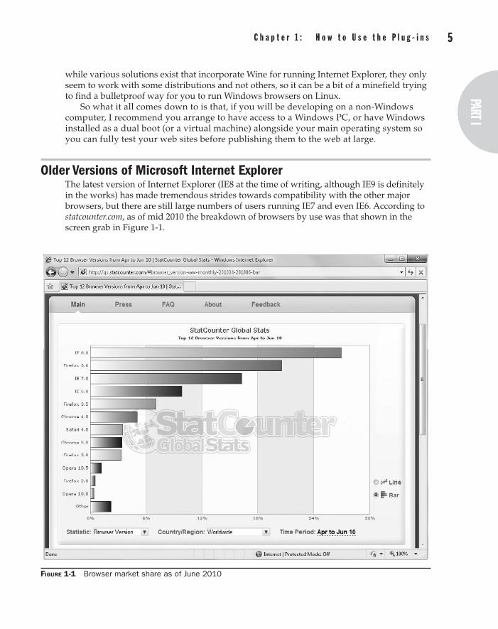
4 p a r t I : a b o u t C S S a n d t h e s e p l u g - i n s part I
C h a p t e r 1 : h o w t o U s e t h e p l u g - i n s 5part Ipart I
while various solutions exist that incorporate Wine for running Internet Explorer, they only seem to work with some distributions and not others, so it can be a bit of a minefield trying to find a bulletproof way for you to run Windows browsers on Linux.
So what it all comes down to is that, if you will be developing on a non-Windows computer, I recommend you arrange to have access to a Windows PC, or have Windows installed as a dual boot (or a virtual machine) alongside your main operating system so you can fully test your web sites before publishing them to the web at large.
Older Versions of Microsoft Internet ExplorerThe latest version of Internet Explorer (IE8 at the time of writing, although IE9 is definitely in the works) has made tremendous strides towards compatibility with the other major browsers, but there are still large numbers of users running IE7 and even IE6. According to statcounter.com, as of mid 2010 the breakdown of browsers by use was that shown in the screen grab in Figure 1-1.
Figure 1-1 Browser market share as of June 2010

6 p a r t I : a b o u t C S S a n d t h e s e p l u g - i n s C h a p t e r 1 : h o w t o U s e t h e p l u g - i n s 7
Because each version of Internet Explorer works differently (with IE6 and IE7 having over 25 percent of all users between them), besides testing your web pages in the latest versions of the main browsers you also need to test them in these older versions, too. I know, it’s a pain, but it has to be done. Luckily, though, there’s a trick to make this easier than it might otherwise be.
Emulating Internet Explorer 6 and 7To aid developers who have designed web sites to work specifically with older versions, the developers of Internet Explorer created a meta tab that you can add to the head of a web page to make IE think it is an earlier version of itself. Here are the two main meta tags you would use.
<meta http-equiv="X-UA-Compatible" content="IE=7" /> <meta http-equiv="X-UA-Compatible" content="IE=5" />
And this is an example of how you would incorporate the IE7 tag:
<html> <head> <meta http-equiv="X-UA-Compatible" content="IE=7" /> <title>My Website</title> </head> <body> ... Website Contents ...
There is no IE=6 option (presumably because the rendering engines for IE5 and IE6 are so similar), so using the IE=5 option makes Internet Explorer enter what is known as “quirks” mode, in which it behaves like both IE5 and IE6.
Incidentally, if you wish to force Internet Explorer into full standards mode (to be as compatible as possible with other browsers), you can use the option IE=8. Or, without the meta tag, Internet Explorer will use its own proprietary and optimal settings, known as “edge” mode—which you can also select with the option IE=edge. Of course, once you have finished testing, you should remove or comment out these meta tags unless you wish to use one for a particular reason.
In addition, you should always ensure you have a suitable HTML doctype declaration at the start of each document. For example, the most commonly found doctype is the following, which has been fully tested and works with all the plug-ins in this book.
<!DOCTYPE HTML PUBLIC "-//W3C//DTD HTML 4.01 Transitional//EN" "http://www.w3.org/TR/html4/loose.dtd">
Tip If you use a different doctype from this, certain plug-ins may behave differently, and you may find you have to slightly modify them. I often use both the preceding “loose” doctype and the IE7 meta tag to get the most compatible results with other major browsers. Remember that if IE behaves strangely when all other browsers appear to work well with your web pages, the solution could be to change the doctype and/or IE5/IE7 meta tags. If you are interested in the subject of browser compatibility and its various nuances, I recommend visiting the Quirks Mode web site at quirksmode.org.

6 p a r t I : a b o u t C S S a n d t h e s e p l u g - i n s part I
C h a p t e r 1 : h o w t o U s e t h e p l u g - i n s 7part Ipart I
The Companion Web SiteTo save you the effort of typing them all in, you can download the plug-ins from this book’s companion web site at plugincss.com (see Figure 1-2).
Click the Download link to download the file plug-ins.zip, which is an archive file (easily extractable on all operating systems) containing all the plug-ins. Once extracted, you’ll find all the plug-ins in numerical order, saved in the file PC.css. There is also a file called ReadMe.txt which contains the latest details about the plug-ins, including any improvements or updates that have been made since this book was published.
Additionally, there are various example files showing the use of each plug-in, which you can load into a browser to try out for yourself.
Accompanying these are a couple of JavaScript files called PJ.js and PC.js, which are explained toward the end of this chapter in the section on JavaScript, and which are used by the plug-ins in Chapter 12.
Figure 1-2 The companion web site at plugincss.com
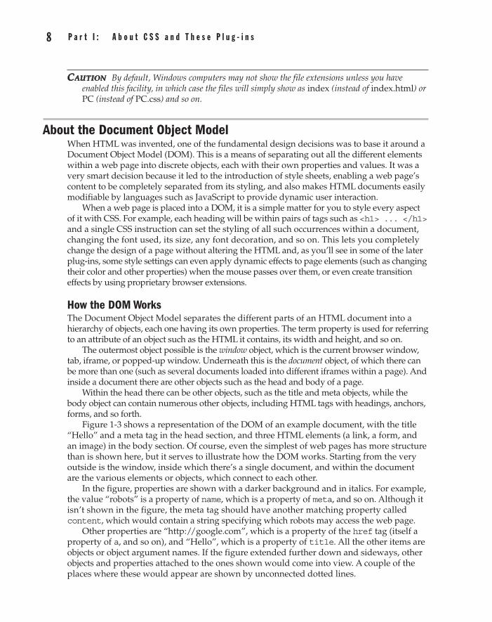
8 p a r t I : a b o u t C S S a n d t h e s e p l u g - i n s C h a p t e r 1 : h o w t o U s e t h e p l u g - i n s 9
CauTion By default, Windows computers may not show the file extensions unless you have enabled this facility, in which case the files will simply show as index (instead of index.html) or PC (instead of PC.css) and so on.
About the Document Object ModelWhen HTML was invented, one of the fundamental design decisions was to base it around a Document Object Model (DOM). This is a means of separating out all the different elements within a web page into discrete objects, each with their own properties and values. It was a very smart decision because it led to the introduction of style sheets, enabling a web page’s content to be completely separated from its styling, and also makes HTML documents easily modifiable by languages such as JavaScript to provide dynamic user interaction.
When a web page is placed into a DOM, it is a simple matter for you to style every aspect of it with CSS. For example, each heading will be within pairs of tags such as <h1> ... </h1> and a single CSS instruction can set the styling of all such occurrences within a document, changing the font used, its size, any font decoration, and so on. This lets you completely change the design of a page without altering the HTML and, as you’ll see in some of the later plug-ins, some style settings can even apply dynamic effects to page elements (such as changing their color and other properties) when the mouse passes over them, or even create transition effects by using proprietary browser extensions.
How the DOM WorksThe Document Object Model separates the different parts of an HTML document into a hierarchy of objects, each one having its own properties. The term property is used for referring to an attribute of an object such as the HTML it contains, its width and height, and so on.
The outermost object possible is the window object, which is the current browser window, tab, iframe, or popped-up window. Underneath this is the document object, of which there can be more than one (such as several documents loaded into different iframes within a page). And inside a document there are other objects such as the head and body of a page.
Within the head there can be other objects, such as the title and meta objects, while the body object can contain numerous other objects, including HTML tags with headings, anchors, forms, and so forth.
Figure 1-3 shows a representation of the DOM of an example document, with the title “Hello” and a meta tag in the head section, and three HTML elements (a link, a form, and an image) in the body section. Of course, even the simplest of web pages has more structure than is shown here, but it serves to illustrate how the DOM works. Starting from the very outside is the window, inside which there’s a single document, and within the document are the various elements or objects, which connect to each other.
In the figure, properties are shown with a darker background and in italics. For example, the value “robots” is a property of name, which is a property of meta, and so on. Although it isn’t shown in the figure, the meta tag should have another matching property called content, which would contain a string specifying which robots may access the web page.
Other properties are “http://google.com”, which is a property of the href tag (itself a property of a, and so on), and “Hello”, which is a property of title. All the other items are objects or object argument names. If the figure extended further down and sideways, other objects and properties attached to the ones shown would come into view. A couple of the places where these would appear are shown by unconnected dotted lines.
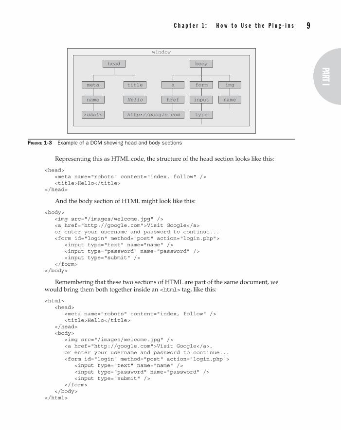
8 p a r t I : a b o u t C S S a n d t h e s e p l u g - i n s part I
C h a p t e r 1 : h o w t o U s e t h e p l u g - i n s 9part Ipart I
Representing this as HTML code, the structure of the head section looks like this:
<head> <meta name="robots" content="index, follow" /> <title>Hello</title> </head>
And the body section of HTML might look like this:
<body> <img src="/images/welcome.jpg" /> <a href="http://google.com">Visit Google</a> or enter your username and password to continue... <form id="login" method="post" action="login.php"> <input type="text" name="name" /> <input type="password" name="password" /> <input type="submit" /> </form> </body>
Remembering that these two sections of HTML are part of the same document, we would bring them both together inside an <html> tag, like this:
<html> <head> <meta name="robots" content="index, follow" /> <title>Hello</title> </head> <body> <img src="/images/welcome.jpg" /> <a href="http://google.com">Visit Google</a>, or enter your username and password to continue... <form id="login" method="post" action="login.php"> <input type="text" name="name" /> <input type="password" name="password" /> <input type="submit" /> </form> </body> </html>
Figure 1-3 Example of a DOM showing head and body sections
head
meta title
body
a form img
robots type
window
name Hello href input name
http://google.com

10 p a r t I : a b o u t C S S a n d t h e s e p l u g - i n s C h a p t e r 1 : h o w t o U s e t h e p l u g - i n s 11
Of course, a web page can look quite different from this, but it will usually follow the same form, although that’s not always the case because most browsers are very forgiving and allow you to omit many things, such as the closing tags at the end, and the opening ones, too, if you choose. I don’t recommend you do this though, because one day you might want to convert your page to XHTML, which is a lot stricter. So it’s always a good idea to close every tag, and make sure you do so in the right order. For example, you shouldn’t close a document by issuing </html> followed by </body> because the proper nesting of tags would be broken by this reversal.
For the same reason, you should also get into the habit of self-closing any tags that do not have a closing version, such as <img src="…" />, which does not have a matching </img> tag, and therefore requires a / character right before the final > in order to properly close it. In the same way, <br> becomes <br />, and so on.
You should also remember that arguments within tags must have either single or double quotation marks to be XHTML compatible, even though nearly all browsers allow you to omit them.
noTe In the early days of the Web, when most users had very slow dial-up modems, it was common to see all manner of things such as quotation marks and various tags omitted from web pages. But nowadays, most of your users will have fairly decent bandwidth speeds, and there’s no longer any reason to do this.
About Cascading Style SheetsUsing CSS, you can apply styles to your web pages to make them look exactly how you want. This works because CSS is connected to the DOM so you can quickly and easily restyle any element. For example, if you don’t like the default look of the <h1>, <h2>, and other heading tags, you can assign new styles to override the default settings for the font family and size used, or decide whether bold or italics should be set, and many more properties, too.
One way you can add styling to a web page is by inserting the required statements into the head of a web page between the <head> and </head> tags. So, to change the style of the <h1> tag, you might use the following code:
<style> h1 { color:red; font-size:3em; font-family:Arial; } </style>
Within an HTML page, this might look like the following (see Figure 1-4):
<html> <head> <style> h1 { color:red; font-size:3em; font-family:Arial; } </style> </head> <title>Hello World</title> <body> <h1>Hello there</h1> </body> </html>

10 p a r t I : a b o u t C S S a n d t h e s e p l u g - i n s part I
C h a p t e r 1 : h o w t o U s e t h e p l u g - i n s 11part Ipart I
Importing a Style SheetWhen you wish to style a whole site, rather than a single page, a better way to manage style sheets is to completely remove them from your web pages to separate files, and then import the ones you need. This lets you have different style sheets for different layouts (such as web and print), without changing the HTML.
This can be achieved a couple of different ways, the first of which is by using the CSS @import directive like this:
<style> @import url("/css/styles.css"); </style>
This statement tells the browser to fetch a style sheet with the name styles.css from the /css folder. The @import command is quite flexible in that you can create style sheets that themselves pull in other style sheets, and so on. Just make sure that there are no <style> or </style> tags in any of your external style sheets, otherwise they will not work.
Importing CSS from within HTMLYou can also include a style sheet with the HTML <link> tag like this:
<link rel="stylesheet" type="text/css" href="/css/styles.css" />
This has the exact same effect as the @import directive, except that <link> is an HTML-only tag and is not a valid style directive, so it cannot be used from within one style sheet to pull in another, and also cannot be placed within a pair of <style> … </style> tags.
Just as you can use multiple @import directives within your CSS to include multiple external style sheets, you can also use as many <link> statements as you like in your HTML.
Figure 1-4 Styling the <h1> tag, with the original style shown in the small window

12 p a r t I : a b o u t C S S a n d t h e s e p l u g - i n s C h a p t e r 1 : h o w t o U s e t h e p l u g - i n s 13
Local Style SettingsThere is also nothing stopping you from individually setting or overriding certain styles for the current page on a case-by-case basis by inserting style statements directly within HTML, like this (which results in italic blue text within the tags):
<div style="font-style:italic; color:blue;">Hello</div>
But this should be reserved only for the most exceptional circumstances since it breaks the separation of content and layout.
IDs and ClassesA better solution for setting the style of an element is to assign an ID to it in the HTML, like this:
<div id='iblue'>Hello</div>
What this does is state that the contents of the div with the ID iblue should have the style defined in the #iblue style setting applied to it. The matching CSS statement for this might look like the following
#iblue { font-style:italic; color:blue; }
Note the use of the # symbol, which specifies that only the ID with the name iblue should be styled with this statement.
If you would like to apply the same style to many elements, you do not have to give each one a different ID because you can specify a class to manage them all, like this:
<div class="iblue">Hello</div>
What this does is state that the contents of this element (and any others that use the class), should have the style defined in the iblue class applied to it. Once a class is applied, you can use the following style setting, either in the page header or within an external style sheet for setting the styles for the class:
.iblue { font-style:italic; color:blue; }
Instead of using a # symbol, which is reserved for IDs, class statements are prefaced with a . (period) symbol.
noTe You can apply styles to elements in many more ways than using single IDs or classes. These are explained in detail in Chapter 2.
CSS and SemicolonsIn order to separate CSS statements when they appear on the same line, you must place semicolons after each. But if there is only one statement on a line (or in an inline style setting within an HTML tag), you can omit the semicolon.

12 p a r t I : a b o u t C S S a n d t h e s e p l u g - i n s part I
C h a p t e r 1 : h o w t o U s e t h e p l u g - i n s 13part Ipart I
To avoid hard-to-find CSS errors, you may prefer to always use a semicolon after every CSS setting while developing your style sheets, only removing the unnecessary ones later if you need to optimize your style sheets for maximum download speed and minimum size.
Using the Plug-ins in Your Own Web SitesOnce you have downloaded the plug-ins.zip file from the plugincss.com web site (and extracted the files from it), the recommended way for you to access them is to load the entire set stored in the file PC.css as an external style sheet, with a command such as:
<link rel="stylesheet" type="text/css" href="css/PC.css" />
Here, /css is the folder where you have saved the file (relative to the current folder) and PC.css is the filename of the style sheet (the initials P and C are short for Plug-in and CSS).
This method of inclusion ensures that you can add new elements to your web pages that require additional plug-ins, without having to copy and paste the additional ones in separately. The file is not very different in size from an average image, thus the speed of loading and bandwidth consumed are about the same, so normally it won’t be an issue to include the entire file. But should you need to only include some of the plug-ins, they are clearly commented and you can easily copy and paste them into another style sheet, or into the <style> section of your web page.
noTe Some of the JavaScript-aided plug-ins require a couple more lines of HTML to include. If you wish to use them, please refer to the section entitled JavaScript-Aided Plug-ins a little further on.
Class Name ConflictsIn order to keep the plug-ins easy to access, I have tried to always use short, self-explanatory class names, even including a number of single-letter classes such as i (which applies italics to text).
However, if your own style or that of a third party use any of the same class names, then one or other class will take precedence (according to rules explained in the next chapter), and the other styles may only be partially implemented, if at all. In such cases, you are unlikely to be able to successfully use both at the same time.
JavaScript-aided Plug-insSome of the plug-ins in this book perform actions that are simply not possible to achieve with CSS alone. They do this by using two JavaScript libraries of plug-ins. These are PJ.js, from the companion book to this, Plug-in JavaScript, and PC.js, which was specially written for this book. The PJ.js functions provide a wide range of positioning, sizing, and transition effects, which are then called upon by the PC.js functions to achieve various enhanced CSS effects.
Using these libraries is very easy and clearly explained in the sections that access them, and simply consists of including the following line of HTML in the head of a web page:
<script src="PJ.js"></script><script src="PC.js"></script>

14 p a r t I : a b o u t C S S a n d t h e s e p l u g - i n s
This line loads in the libraries from the current folder (but you can also import them from elsewhere) and performs the basic initialization required by them. Both of these files are also included in the plug-ins.zip file downloadable from the plugincss.com web site.
Including JavaScript-aided CSS Alongside Pure CSSIn order to use all of the plug-ins in this book (both pure CSS and JavaScript-aided), and to set up and forget their inclusion, I recommend you add the following two lines to the head section of all your web pages that use them:
<link rel="stylesheet" type="text/css" href="PC.css" /> <script src="PJ.js"></script><script src="PC.js"></script>
Remember to preface the filenames with the correct path(s) if you are importing these files from somewhere other than the current folder.
noTe There is a smaller version of the PJ.js file called PJsmall.js, which is also available in the plug-ins.zip download. It contains all the same functions and works in exactly the same manner, but it has been compressed to around half the size of PJ.js. Therefore, where file size and/or available bandwidth are an issue, you may wish to use this smaller file instead of PJ.js.
Users Without JavaScriptThere is a slight downside to using the JavaScript-aided plug-ins, in that a very small number of users have JavaScript disabled on their browser. Therefore, you may choose to not use the JavaScript-aided plug-ins, which would be a shame since they provide some great enhancements.
Or you could include an HTML segment such as the following to ask your readers to enable JavaScript on your web site (in which case you should remember that those enhanced features that cannot degrade gracefully will simply not be available to users without JavaScript):
<noscript> <h1>JavaScript Enhanced</h1> This website is enhanced with JavaScript and you will be able to view it at its best only if you enable JavaScript in your browser. </noscript>
Alternatively, a much friendlier method (albeit a little more time-consuming), is to offer an alternative <noscript> ... </noscript> section of HTML for each time you use JavaScript-aided CSS. That way your non-JavaScript users will never know the difference.
SummaryYou should now have a basic picture of how style sheets work, how CSS and the DOM relate to each other, and how to import the plug-ins. In the next chapter, we’ll take a crash course on CSS, at the end of which you will be able to understand and use all the plug-ins in this book. You will also be able to create your own variations by tweaking or extending them.

Chapter 2
CSS Crash Course
part Iabout CSS and these plug-ins
16 p a r t I : a b o u t C S S a n d t h e s e p l u g - i n s C h a p t e r 2 : C S S C r a s h C o u r s e 17
The subject of Cascading Style Sheets (CSS) is a large one, covering a wide range of different techniques, and there are many books that have been written solely about how to use it and how it works. But in this chapter, I have distilled as much of this
information as possible into an easily digestible primer that provides all the information you need to use the plug-ins in this book.
If you are already used to CSS, I recommend you at least skim through this chapter to get a quick refresher on the subject since the rest of the book draws on this information.
CSS RulesBefore looking at the inner workings of style sheets, let’s examine the structure of CSS and break down the rules for constructing CSS statements.
Each statement starts with a selector, which is what the rule affects. For example, in the following assignment, h1 is the selector being given a font size 240 percent larger than the default:
h1 { font-size:240%; }
By providing a new value to the font-size property of the selector, this ensures that the contents of all <h1> … </h1> pairs of tags will be displayed at a font size 240 percent larger than the default size. This is achieved by placing one or more assignments within the { and } symbols that follow the selector (in this case: font-size:240%;).
The part before the : (colon) symbol is the property, while the remainder is the value applied to it. Lastly, there is a ; (semicolon) to end the statement, which in this instance is not required (but would be if another assignment were to follow on the same line). For the sake of avoiding tricky to track down errors, in this book I always include the semicolons even when they are not necessary.
Multiple AssignmentsYou can create multiple property assignments in a couple of different ways. First, you can concatenate them on the same line, like this:
h1 { font-size:240%; color:blue; }
This adds a second assignment that changes the color of all <h1> headers to blue. You can also place the assignments one per line, like the following:
h1 { font-size:240%; color:blue; }
Or you can space the assignments out a little more so they line up below each other in a column at the colons, like this:
h1 { font-size:240%; color:blue; }

16 p a r t I : a b o u t C S S a n d t h e s e p l u g - i n spart I
C h a p t e r 2 : C S S C r a s h C o u r s e 17part Ipart I
This way you can easily see where each new set of rules begins, because of the selector in the first column, and because the assignments that follow are neatly lined up with all property values starting at the same horizontal offset.
There is no right or wrong way to lay out your CSS, but I recommend you at least try to keep each block of CSS consistent with itself, so it can be easily taken in at a glance. This is the approach I have taken in this book, in that I always try to make groups of assignments as tidy and symmetrical as I can so the individual CSS rules are easy to follow.
CommentsIt is a good idea to comment your CSS rules, even if you only describe the main groups of statements rather than all or most of them. You can do this in two different ways. First, you can place a comment within a pair of /* … */ tags, like this:
/* This is a CSS comment */
Or you can extend a comment over many lines, like this:
/* A Multi line comment */
Caution If you use multiline comments, you should be aware that you cannot nest more comments within them, otherwise you will get unpredictable errors.
Style TypesA number of different style types exist, ranging from the default styles set up by your browser (and any user styles you may have applied), through inline or embedded styles to external style sheets. The styles defined in each type have a hierarchy of precedence, from low to high.
Default StylesThe lowest level of style precedence is the default styling applied by a web browser. These styles are created as a fallback for when a web page doesn’t have any styles and are intended to be a generic set of styles that will display reasonably well in most instances.
Pre-CSS, these were the only styles applied to a document, and only a handful of them could be changed by a web page (such as font face, color and size, and a few element-sizing arguments).
User StylesUser styles are the next highest precedence of styles, and are supported by most modern browsers, but are implemented differently by each. If you would like to learn how to create your own default styles for browsing, use a search engine to enter your browser name followed by user styles (for example, enter firefox user styles for the Mozilla Firefox browser). Figure 2-1 shows a user style sheet being applied to Microsoft Internet Explorer 8 by clicking Internet Options | General | Accessibility.
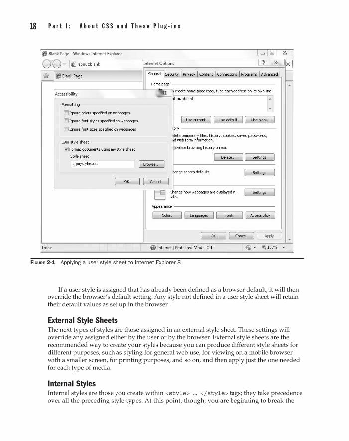
18 p a r t I : a b o u t C S S a n d t h e s e p l u g - i n s C h a p t e r 2 : C S S C r a s h C o u r s e 19
If a user style is assigned that has already been defined as a browser default, it will then override the browser’s default setting. Any style not defined in a user style sheet will retain their default values as set up in the browser.
External Style SheetsThe next types of styles are those assigned in an external style sheet. These settings will override any assigned either by the user or by the browser. External style sheets are the recommended way to create your styles because you can produce different style sheets for different purposes, such as styling for general web use, for viewing on a mobile browser with a smaller screen, for printing purposes, and so on, and then apply just the one needed for each type of media.
Internal StylesInternal styles are those you create within <style> … </style> tags; they take precedence over all the preceding style types. At this point, though, you are beginning to break the
Figure 2-1 Applying a user style sheet to Internet Explorer 8
18 p a r t I : a b o u t C S S a n d t h e s e p l u g - i n spart I
C h a p t e r 2 : C S S C r a s h C o u r s e 19part Ipart I
separation between styling and content since any external style sheets loaded in at the same time will have a lower precedence.
Inline StylesAn inline style is where you assign a property directly to an element. It also has the highest precedence of any style type. It is used like this:
<a href="http://google.com" style="color:green;">Visit Google</a>
In this example, the link specified will be displayed in green, regardless of any default or other color settings applied by any other type of style sheet, whether directly to this link or generically for all links.
When you use this type of styling, you are breaking the separation between layout and content; therefore, it is recommended you do so only when you have a very good reason.
SelectorsThe means by which you access one or more elements is called selection, and the part of a CSS rule that does this is known as a selector. As you might expect, there are many different varieties of selector.
TypeThe type selector works on types of HTML elements such as <p> or <i>. For example, the following rule will ensure that all the contents within <p> … </p> tags are fully justified:
p { text-align:justify; }
DescendantDescendant selectors let you apply styles to elements that are contained within other elements. For example, the following rule sets all text within <b> … </b> tags to red, but only if they occur within <p> … </p> tags (like this: <p><b>Hello</b> there</p>):
p b { color:red; }
Descendant selectors can continue nesting indefinitely, so the following is a perfectly valid rule to make bold text within a list element of an unordered list display in blue:
ul li b { color:blue; }
ChildThe child selector is similar to the descendant selector, but is more constraining about when the style will be applied by selecting only those elements that are direct children of another element. For example, the following code uses a descendant selector that will change any bold text within a paragraph to red, even if the bold text is itself within italics (like this <p><i><b>Hello</b> there</i></p>):
p b { color:red; }
20 p a r t I : a b o u t C S S a n d t h e s e p l u g - i n s C h a p t e r 2 : C S S C r a s h C o u r s e 21
In this instance, the word “Hello” displays in red. However, when this more general type of behavior is not required, a child selector can be used to narrow the scope of the selector. For example, the following child selector will set bold text to red only if the element is a direct child of a paragraph, and is not itself contained within another element:
p > b { color:red; }
Now the word “Hello” will not change color because it is not a direct child of the paragraph.
IDIf you give an element an ID name (like this: <div id='mydiv'>), then you can directly access it from CSS in the following way, which changes all the text in the div to italic:
#mydiv { font-style:italic; }
Reusing IDsIDs can be used only once within a document; therefore, only the first occurrence found will receive the new property value assigned by a CSS rule. But in CSS, you can directly reference any IDs that have the same name, as long as they occur within different element types, like this:
<div id='myid'>Hello</div> <span id='myid'>Hello</span>
Because IDs normally apply only to unique elements, the following rule will apply an underline to only the first occurrence of myid:
#myid { text-decoration:underline; }
However, you can ensure that CSS applies the rule to both occurrences like this:
span#myid { text-decoration:underline; } div#myid { text-decoration:underline; }
Or more succinctly, like this (see the section on grouping a little further on):
span#myid, div#myid { text-decoration:underline; }
Caution If you use this form of selection, you should remember that any JavaScript that also must access these elements cannot easily do so because the commonly used getElementByID() function will return only the first occurrence. To reference any other instances, the programmer would have to search through the whole list of elements in the document, a cumbersome task to undertake.
ClassA much better way to reference multiple elements at a time is with a class. When you want to share the styling of a number of elements in a page, you can assign them all the same class name (like this: <span class='myclass'>) and then create a single rule to modify all
20 p a r t I : a b o u t C S S a n d t h e s e p l u g - i n spart I
C h a p t e r 2 : C S S C r a s h C o u r s e 21part Ipart I
those elements at once, as in the following rule, which creates a 10-pixel left-margin offset for all elements using the class:
.myclass { margin-left:10px; }
In modern browsers, HTML elements may also use more than one class by separating them with spaces, like this: <span class='thisclass thatclass otherclass'>, which is the technique used in this book to provide multiple styles to elements. Older browsers only allow a single class, so if you are targeting them, you should put the most important class first.
Narrowing Class ScopeYou can narrow the scope of action of a class by specifying the types of elements to which it should apply. For example, the following rule applies the setting only to paragraphs that use the class main:
p.main { text-indent:30px; }
In this example, only paragraphs using the class main (like this: <p class="main">) will receive the new property value. Any other element types that may try to access the class (such as <div class="main">) will be ignored.
AttributeMany HTML tags support attributes and using this type of selector can save you from having to use IDs and classes for referencing them. For example, you can directly reference attributes in the following manner, which sets all elements with the attribute type="submit" to a width of 100 pixels:
[type="submit"] { width:100px; }
If you wish to narrow the scope of the selector to, for example, only form input elements with that attribute type, you could use the following rule instead:
form input[type="submit"] { width:100px; }
note Attribute selectors also work on IDs and classes so that, for example, [class="classname"] performs in exactly the same way as the ID selector .classname (except that the latter has a higher precedence). Likewise, [id="idname"] is equivalent to using the class selector .idname. The # and . prefaced class and ID selectors can, therefore, be viewed as shorthand for attribute selectors, but with a higher precedence.
UniversalThe wildcard or universal selector matches any element, so the following rule will make a complete mess of a document by giving a green border to all of its elements:
* { border:1px solid green; }

22 p a r t I : a b o u t C S S a n d t h e s e p l u g - i n s C h a p t e r 2 : C S S C r a s h C o u r s e 23
It’s therefore unlikely that you will use the * on its own, but as part of a compound rule it can be very powerful. For example, the following rule will apply the same styling as earlier, but only to all paragraphs that are subelements of the element with the ID boxout, and only as long as they are not direct children:
#boxout * p {border:1px solid green; }
Here, the first selector following #boxout is a * symbol, and so it refers to any element within the boxout object. The following p selector then narrows down the selection focus by changing the selector to apply only to paragraphs (as defined by the p) that are subelements of elements returned by the * selector. Therefore, this CSS rule performs the following actions (in which I use the terms object and element interchangeably to refer to the same thing):
1. Finds the object with the ID of boxout.
2. Finds all subelements of the object returned in step 1.
3. Finds all p subelements of the objects returned in step 2 and, since this is the final selector in the group, also finds all p sub- and sub-subelements (and so on) of the objects returned in step 2.
4. Applies the styles within the { and } characters to the objects returned in step 3.
The net result of this is that the green border is applied only to paragraphs that are grandchildren (or great-grandchildren, and so on) of the main element.
GroupingUsing CSS, it is possible to apply a rule to more than one element, class, or any other type of selector at the same time by separating the selectors with commas. So, for example, the following rule will place a dotted orange line underneath all paragraphs, the element with the ID of idname, and all elements using the class classname:
p, .idname, #classname { border-bottom:1px dotted orange; }
The CascadeOne of the most fundamental things about CSS properties is that they cascade, which is why they are called Cascading Style Sheets. But what does this mean? Well, cascading is a method used to resolve potential conflicts between the various types of style sheet a browser supports, and apply them in order of precedence according to who created them, the method used to create the style, and the types of properties selected.
Style Sheet CreatorsThree main types of style sheet are supported by all modern browsers. In order of precedence from high to low, they are:
1. Those created by a document’s author
2. Those created by the user
3. Those created by the browser
22 p a r t I : a b o u t C S S a n d t h e s e p l u g - i n spart I
C h a p t e r 2 : C S S C r a s h C o u r s e 23part Ipart I
These three sets of style sheets are processed in reverse order. First, the defaults in the web browser are applied to the document. Without these defaults, web pages that don’t use style sheets would look terrible. They include the font face, size and color, element spacing, table borders and spacing, and all the other reasonable styling a user would expect.
Next, if the user has created any user styles to employ in preference to the standard ones, these are applied, replacing any of the browser’s default styles that may conflict.
Lastly, any styles created by the current document’s author are then applied, replacing any that have been created either as browser defaults or by the user.
Style Sheet MethodsStyle sheets can be created in three different ways, or methods. In high to low order of precedence, they are:
1. As inline styles
2. In an embedded style sheet
3. As an external style sheet
Again, these methods of style sheet creation are applied in reverse order of precedence. Therefore, all external style sheets are processed first, and their styles are applied to the document.
Next, any embedded styles (within <style> … </style> tags) are processed, and any that conflict with external rules are given precedence and override the others.
Lastly, any styles applied directly to an element as an inline style (such as <div style="…"> … </div>) are given the highest precedence, and override all previously assigned properties.
Style Sheet SelectorsSelecting elements to be styled is done in three different ways. Going from highest to lowest order of precedence, they are:
1. Referencing by individual ID
2. Referencing in groups by class
3. Referencing by element tags (such as <p> or <b>)
Selectors are processed according to the number and types of elements affected by a rule, which is a little different than the previous two methods for resolving conflicts. This is because rules do not have to apply only to one type of selector at a time, and may reference many different selectors. Therefore, a method is needed to determine the precedence of rules that can contain any combination of selectors. This is done by calculating the specificity of each rule by ordering them from the widest to narrowest scope of action.
This specificity is calculated by creating three-part numbers based on the selector types in the earlier numbered list. These compound numbers start off looking like [0, 0, 0]. When processing a rule, each selector that references an ID increments the first number by 1, so that the compound number would become [1, 0, 0]. Let’s say there are three ID references in a particular rule; thus, the compound number becomes [3, 0, 0].

24 p a r t I : a b o u t C S S a n d t h e s e p l u g - i n s C h a p t e r 2 : C S S C r a s h C o u r s e 25
Then, the number of selectors that reference a class is placed in the second part of the compound number. Let’s say there were five of them, making the number [3, 5, 0].
Finally, all selectors that reference element tags are counted and this number is placed in the last part of the compound number. Let’s say there were two, so the final compound number becomes [3, 5, 2], which is all that is needed to compare this rule’s specificity with any another.
In cases with nine or fewer of each type in a compound number, you can convert it directly to a decimal number, which in this case is 352. Rules with a lower number than this will have lower precedence, and those with a higher number will have greater precedence. Where two rules share the same value, the most recently applied one wins.
Using a Different Number BaseWhere there is more than nine of a type in a number, you have to work in a higher number base. For example, the compound number [11, 7, 19] doesn’t convert to decimal by simply concatenating the three parts. Instead, you can convert the number to a higher base, such as base 20 (or higher if there are more than 19 of any type).
To do this, multiply the three parts out and add the results like this, starting with the rightmost number and working left:
20×19 = 380 20×20×7 = 2800 20×20×20×11 = 88000 Total in decimal = 91180
On the left, replace the values of 20 with the base you are using, then once all the compound numbers of a set of rules are converted from this base to decimal, it is easy to determine the specifity, and therefore the precedence of each. Thankfully, all this is handled for you by the CSS processor, but knowing how it works helps you to properly construct rules and understand what precedence they will have.
The !important TagWhere two or more style rules are equivalent, only the most recently processed rule will take precedence. However, you can force a rule to a higher precedence than other equivalent rules using the !important tag, like this:
p { color:#ff0000 !important; }
When you do this, all previous equivalent settings are overridden (even ones using !important) and any equivalent rules that are processed later will be ignored. So, for example, the second of the two following rules would normally take precedence, but because of the use of !important in the prior assignment, it is ignored:
p { color:#ff0000 !important; } p { color:#ffff00 }

24 p a r t I : a b o u t C S S a n d t h e s e p l u g - i n spart I
C h a p t e r 2 : C S S C r a s h C o u r s e 25part Ipart I
The Difference between Divs and SpansBoth divs and spans are types of containers, but they have different qualities. By default, a div has infinite width (at least to the browser edge), which can be seen by applying a border to one, like this:
<div style="border:1px solid green;">Hello</div>
A span, however, is only as wide as the text it contains. Therefore, the following line of HTML shows the border only around the word “Hello,” and it does not extend to the right-hand edge of the browser:
<span style="border:1px solid green;">Hello</span>
Also, spans follow text or other objects as they wrap around and can therefore have a complicated border. For example, in the following web page, CSS has been used to make the background of all divs yellow, all spans cyan, and to add a border to both before creating a few example spans and divs:
<html <head> <title>Div and span example</title> <style> div, span { border:1px solid black; } div { background-color:yellow; } span { background-color:cyan; } </style> </head> <body> <div>This text is within a div tag</div> This isn't. <div>And this is again.</div><br /> <span>This text is inside a span tag.</span> This isn't. <span>And this is again.</span><br /><br /> <div>This is a larger amount of text in a div that wraps around to the next line of the browser</div><br /> <span>This is a larger amount of text in a span that wraps around to the next line of the browser</span> </body> </html>
Figure 2-2 shows what this page looks like in a web browser. Although it is printed only in shades of gray in the paperback version of this book, the figure clearly shows how divs extend to the right-hand edge of a browser and force following content to appear at the start of the first available position below them.
The figure also shows how spans keep to themselves and only take up the space required to hold their contents, without forcing following content to appear below them. For example, in the bottom two examples of the figure, you can also see that when divs wrap around the screen edge, they retain a rectangular shape, whereas spans simply follow the flow of the contents within them.

26 p a r t I : a b o u t C S S a n d t h e s e p l u g - i n s C h a p t e r 2 : C S S C r a s h C o u r s e 27
Therefore, since divs can only be rectangular, they are better suited for containing objects such as images, boxouts, quotes, and so on, while spans are best used for holding text or other attributes that follow one after another inline (such as sections of text).
MeasurementsCSS supports an impressive range of different units of measurement, enabling you to tailor your web pages precisely to specific values or relative dimensions. The ones I generally use (which you will likely find the most useful) are pixels, points, ems, and percent.
• Pixels The size of a pixel varies according to the dimensions and pixel depth of the user’s monitor. One pixel equals the width/height of a single dot on the screen, and so this measurement is best suited to monitors. Example: #classname { margin:5px; }
• Points A point is equivalent in size to 1/72 of an inch. The measurement comes from a print design background and is best suited for that medium, but is also commonly used on monitors. Example: #classname { font-size:14pt; }
• Inches An inch is the equivalent of 72 points and is also a measurement type best suited for print. Example: #classname { width:3in; }
• Centimeters Centimeters are another unit of measurement best suited for print. One centimeter is a little over 28 points. Example: #classname { height:2cm; }
Figure 2-2 A variety of divs and spans of differing widths
26 p a r t I : a b o u t C S S a n d t h e s e p l u g - i n spart I
C h a p t e r 2 : C S S C r a s h C o u r s e 27part Ipart I
• Millimeters A millimeter is one-tenth of a centimeter (or almost 3 points). Millimeters are another measure best suited to print. Example: #classname { font-size:5mm; }
• Picas A pica is another print typographic measurement, which is equivalent to 12 points. Example: #classname { font-size:1pc; }
• Ems An em is equal to the current font size and is, therefore, one of the more useful measurements for CSS since it is used to describe relative dimensions. Example: #classname { font-size:2em; }
• Exs An ex is also related to the current font size; it is equivalent to the height of a lowercase letter “x”. This is a less popular unit of measurement and is typically used as a good approximation for helping set the width of a box that will contain some text. Example: #classname { width:20ex; }
• Percent This unit is related to the em in that it is exactly 100 times greater (when used on a font). Whereas 1 em equals the current font size, the same size is 100 in percent. When not relating to a font, this unit is relative to the size of the container of the property being accessed. Example: #classname { height:120%; }
FontsUsing CSS, you can style four main font properties: family, style, size, and weight. Between them, you can fine-tune the way text displays in your web pages and/or when printed, and so on.
Font FamilyThe font-family property assigns the font to use. It also supports listing a variety of fonts in order of preference so that styling can fall back gracefully when the user doesn’t have the preferred font installed. For example, to set the default font for paragraphs, you might use a CSS rule such as this:
p { font-family: Verdana, Arial, Helvetica, sans-serif; }
Where a font name is made up of two or more words, you must enclose the name in quotation marks, like this:
p { font-family: "Times New Roman", Georgia, serif; }
tip Because they should be available on virtually all web browsers and operating systems, the safest font families to use on a web page are Arial, Helvetica, Times New Roman, Times, Courier New, and Courier. The Verdana, Georgia, Comic Sans MS, Trebuchet MS, Arial Black, and Impact fonts are safe for Mac and PC use, but may not be installed on other operating systems such as Linux. Other common but less safe fonts are Palatino, Garamond, Bookman, and Avant Garde. If you use one of the less safe fonts, make sure you offer fallbacks of one or more safer fonts in your CSS, so your web pages will degrade gracefully on browsers without your preferred fonts.

28 p a r t I : a b o u t C S S a n d t h e s e p l u g - i n s C h a p t e r 2 : C S S C r a s h C o u r s e 29
Font StyleWith this property, you can choose to display a font normally, in italics or obliquely. The following rules create three classes (normal, italic, and oblique) that can be applied to elements to create these effects:
.normal {font-style:normal; }
.italic {font-style:italic; }
.oblique {font-style:oblique; }
Font SizeAs described in the earlier section on measurements, you can change a font’s size in many ways. But these all boil down to two main types: fixed and relative. A fixed setting looks like the following rule, which sets the default paragraph font size to 14 point:
p { font-size:14pt; }
Alternatively, you may wish to work with the current default font size, using it to style various types of text such as headings. In the following rules, relative sizes of some headers are defined, with the <h4> tag starting off 20 percent bigger than the default, and with each larger size being another 40 percent larger than the previous one:
h1 { font-size:240%; } h2 { font-size:200%; } h3 { font-size:160%; } h4 { font-size:120%; }
Font WeightUsing this property, you can choose how boldly to display a font. The main values you will use are likely to be normal and bold, like this:
.bold { font-weight:bold; }
TextRegardless of the font in use, you can further modify the way text displays by altering its decoration, spacing, and alignment. A crossover exists between the text and font properties though, such that effects like italics or bold text are achieved via the font-style and font-weight properties, while others such as underlining require the text-decoration property.
DecorationWith the text-decoration property, you can apply effects to text such as underline, line-through, overline, and blink. For example, the following rule creates a new class called over that applies overlines to text (the weight of over, under, and through lines will match that of the font):
.over { text-decoration:overline; }

28 p a r t I : a b o u t C S S a n d t h e s e p l u g - i n spart I
C h a p t e r 2 : C S S C r a s h C o u r s e 29part Ipart I
SpacingA number of different properties allow you to modify line, word, and letter spacing. For example, the following rules change the line spacing for paragraphs by modifying the line-height property to be 25 percent greater, the word-spacing property is set to 30 pixels and letter-spacing is set to 3 pixels:
p { line-height :125%; word-spacing :30px; letter-spacing:3px; }
AlignmentFour types of text alignment are available in CSS: left, right, center, and justify. In the following rule, default paragraph text is set to full justification:
p { text-align:justify; }
TransformationFour properties are available for transforming text: none, capitalize, uppercase, and lowercase. For example, the following rule creates a class called upper that will ensure all text is displayed in uppercase when it is used:
.upper { text-transform:uppercase; }
IndentingUsing the text-indent property, you can indent the first line of a block of text by a specified amount. For example, the following rule indents the first line of every paragraph by 20 pixels, although a different unit of measurement or a percent increase could also be applied:
p { text-indent:20px; }
ColorsColors can be applied to the foreground and background of text and objects using the color and background-color properties (or by supplying a single argument to the background property). The colors specified can be one of the named colors (such as red or blue), colors created from hexadecimal RGB triplets (such as #ff0000 or #0000ff), or colors created using the rgb() CSS function.
The standard 16 color names as defined by the W3C (w3.org) standards organization are aqua, black, blue, fuchsia, gray, green, lime, maroon, navy, olive, purple, red, silver, teal, white, and yellow. The following rule uses one of these names to set the background color for an object with the ID of object.
#object { background-color:silver; }

30 p a r t I : a b o u t C S S a n d t h e s e p l u g - i n s C h a p t e r 2 : C S S C r a s h C o u r s e 31
In the following rule, the foreground color of text in all divs is set to yellow (because on a computer display hexadecimal levels of ff red, plus ff green, plus 00 blue creates the color yellow):
div { color:#ffff00; }
Or, if you don’t wish to work in hexadecimal, you can specify your color triplets using the rgb() function, as in the following rule, which changes the background color of the current document to aqua.
body { background-color:rgb(0, 255, 255); }
tip If you prefer not to work in ranges of 256 levels per color, you can use percentages in the rgb() function instead, with values from 0 to 100, ranging from the lowest (zero) amount of a primary color, through to the highest (100), like this: rgb(58%, 95%, 74%). You can also use floating point values for even finer color control, like this: rgb(23.4%, 67.6%, 15.5%).
Positioning ElementsElements within a web page fall where they are placed in the document, but can be moved about by changing an element’s position property from the default of static to one of absolute, relative, or fixed.
An element with absolute positioning is removed from the document and any other elements that can will flow into its released space. You can then position the object anywhere you like within the document using the top, right, bottom, and left properties. It will then rest on top of (or behind) other elements.
So, for example, to move an object with the ID of object to the absolute location of 100 pixels down from the document start and 200 pixels in from the left, you would apply the following rules to it (you can also use any of the other units of measurement supported by CSS):
#object { position:absolute; top :100px; left :200px; }
Likewise, you can move the object relative to the location it would occupy in the normal document flow. So, for example, to move object 10 pixels down and 10 pixels to the right of its normal location, use the following rules:
#object { position:relative; top :10px; left :10px; }
The final positioning property setting lets you move an object to an absolute location, but only within the current browser viewport. Then, when the document is scrolled, the object remains exactly where it has been placed, with the main document scrolling beneath

30 p a r t I : a b o u t C S S a n d t h e s e p l u g - i n spart I
C h a p t e r 2 : C S S C r a s h C o u r s e 31part Ipart I
it—this is a great way to create dock bars and other similar devices. For example, to fix the object to the top left corner of the browser window, use the following rules:
#object { position:fixed; top :0px; left :0px; }
Figure 2-3 shows a simple dock bar created using a value of fixed for the position property to align the icons at the screen bottom. With a little JavaScript or proprietary CSS transforms, the icons can be made to resize as the mouse passes over them, as is happening to the second icon. See my book Plug-in JavaScript (McGraw-Hill Professional, 2010) for this and many other neat JavaScript plug-ins.
Pseudo ClassesA number of selectors and classes, used only within a style sheet, do not have any matching tags or attributes within any HTML. Their task is to classify elements using characteristics other than their name, attributes, or content that cannot be deduced from the document tree. These include pseudo classes such as first-line, first-child, and first-letter.
Pseudo classes are separated from elements using a : (colon) character. To create a class called bigfirst for emphasizing the first letter of an element, you would use a rule such as the following:
.bigfirst:first-letter { font-size:400%; float :left; }
When the bigfirst class is applied to an element, the first letter’s display size is much enlarged, with the remaining text (at normal size) neatly flowing around it (due to the float property), as if the first letter were an image or other object.
Figure 2-3 Creating a simple dock bar using the position property

32 p a r t I : a b o u t C S S a n d t h e s e p l u g - i n s C h a p t e r 2 : C S S C r a s h C o u r s e 33
Other pseudo classes include hover, link, active, and visited, all of which are mostly useful for applying to anchor elements, as in the following rules, which set the default color of all links to blue, and that of links that have already been visited to light blue:
a:link { color:blue; } a:visited { color:lightblue; }
The following pair of rules is interesting in that it uses the hover pseudo class, meaning they are applied only when the mouse is placed over the element and, in this example, they change the link to white text on a red background, providing a dynamic effect you would normally only expect from using JavaScript code:
a:hover { color :white; background:red; }
Here I have used the background property with a single argument, instead of the longer background-color property. The active pseudo class is also dynamic in that it effects a change to a link during the time between the mouse button being clicked and released—as with this rule, which changes the link color to dark blue:
a:active { color:darkblue; }
Another interesting dynamic pseudo class is focus, which is applied only when an element is focused by the user selecting it with the keyboard or mouse, as with the following rule, which uses the universal selector to always place a mid-gray, dotted, 2-pixel border around the currently focused object:
*:focus { border:2px dotted #888888; }
ShorthandTo save space, groups of related CSS properties can be concatenated into a single shorthand assignment. For example, I have already used the shorthand for creating a border a few times, as in the focus rule in the previous section, which is actually a shorthand concatenation of the following rule set:
*:focus { border-width:2px; border-style:dotted; border-color:#888888; }
When using a shorthand rule, you need only apply the properties up to the point where you wish to change values. So you could use the following to set only a border’s width and style, but not its color:
*:focus { border:2px dotted; }

32 p a r t I : a b o u t C S S a n d t h e s e p l u g - i n spart I
C h a p t e r 2 : C S S C r a s h C o u r s e 33part Ipart I
The Box ModelThe fundamental CSS properties affecting the layout of a page are based around the box model; a nested set of properties surrounding an element, as shown in Figure 2-4.
Virtually all elements have (or can have) these properties, including the document body, whose margin you can, for example, remove with the following rule:
body { margin:0px; }
Once you have the hang of the box model, you will be well on your way to creating professionally laid out pages, since these properties alone will make up much of your page styling.
MarginThe margin is the outermost level of the box model. It separates elements from each other and its use is quite smart. For example, assume you have chosen to give a number of elements a default margin of 10 pixels around them. When placed on top of each other, this would create a gap of 20 pixels due to adding the border widths together.
However, to overcome this potential issue, when two elements with borders are directly one above the other, only the larger of the two margins is used to separate them. If both margins are the same width, just one of the widths is used. This way, you are much more likely to get the result you want. You should note, however, that the margins of absolutely positioned or inline elements do not collapse.
The margins of an element can be changed en-masse with the margin property, or individually with margin-left, margin-top, margin-right, and margin-bottom.
Margin
Border
Padding
Element contents
Figure 2-4 The nested levels of the CSS box model

34 p a r t I : a b o u t C S S a n d t h e s e p l u g - i n s
When setting the margin property, you can supply one, two, three, or four arguments, which have the effects commented in the following rules:
margin:1px; /* Set all margins to 1 pixel width */ margin:1px 2px; /* Set the top and bottom margins to 1 pixel and the left and right to 2 pixels width */ margin:1px 2px 3px; /* Set the top margin to 1 pixel, the left and right to 2 pixels and the bottom margin to 3 pixels width */ margin:1px 2px 3px 4px; /* Set the top margin to 1 pixel, the right to 2 pixels, the bottom to 3 pixels and the left margin to 4 pixels width */
BorderThe border level of the box model is similar to the margin except that there is no collapsing. The main properties used to modify borders are border, border-left, border-top, border-right, and border-bottom, and each of these can have other subproperties added as suffixes, such as –color, –style, and –width.
The four ways of accessing individual property settings used for the margin property also apply with the border-width property, so all the following are valid rules:
border-width:1px; /* All borders */ border-width:1px 2px; /* Top/bottom and left/right */ border-width:1px 2px 3px; /* Top, left/right and bottom */ border-width:1px 2px 3px 4px; /* Top, right, bottom and left */
PaddingThe deepest of the box model levels is the padding, which is applied inside any borders and/or margins. The main properties used to modify padding are padding, padding-left, padding-top, padding-right, and padding-bottom.
The four ways of accessing individual property settings used for the margin and border properties also apply to the padding property, so all the following are valid rules:
padding:1px; /* All borders */ padding:1px 2px; /* Top/bottom and left/right */ padding:1px 2px 3px; /* Top, left/right and bottom */ padding:1px 2px 3px 4px; /* Top, right, bottom and left */
ContentDeep within the box model levels, at their center, lies an element that can be styled in all the ways discussed in this chapter, and which can (and usually will) contain further subelements. They in turn may contain sub-subelements and so on, each with their own styling and box model settings.
SummaryAlthough it has covered only a subset of CSS (there are many, many more aspects to the language than could ever be properly discussed in a single chapter), there is enough here to help you understand all the plug-ins in this book and modify them to your own requirements. You should also find this chapter a handy reference as your skills develop.

Chapter 3Manipulating Objects
Chapter 4Text and Typography
Chapter 5Menus and Navigation
Chapter 6Page Layout
Chapter 7Visual Effects
part IIthe Classes

This page intentionally left blank

Chapter 3
Manipulating Objects

38 p a r t I I : t h e C l a s s e s C h a p t e r 3 : M a n i p u l a t i n g O b j e c t s 39
This chapter introduces 19 groups of CSS classes you can use in your web pages to manage the positioning of elements, change text and background colors, add gradient fills and box shadows, alter transparency, and do a whole lot more.
Using the supplied PC.css file (available at plugincss.com), you can simply add class names to your HTML class declarations to apply any of a wide range of styling to an element, without having to write any CSS yourself.
And because modern browsers support the use of multiple class names in a declaration, you can supply as many classes as you like to style elements exactly how you want then. This means that with over 880 classes to draw on in this chapter alone, you can concentrate on creating great web pages without the hassle of writing and tweaking CSS rules.
PositioningThe positioning classes let you decide the type of positioning to use for an object between the four types available (absolute, fixed, relative, and static), each of which changes the way CSS properties will affect objects using them. For example, Figure 3-1 shows two sections of text that have been given vertical offsets of 25 pixels, but because one has absolute positioning and the other is fixed, when the document is scrolled, one of them scrolls and the other remains where it is.
Classes and Propertiesabsolute abs
Class to assign absolute positioning to an object, plus a shorthand version to save on typing
fixed fix
Class to assign fixed positioning to an object, plus a shorthand version to save on typing
relative rel
Class to assign relative positioning to an object, plus a shorthand version to save on typing
static sta
Class to assign static positioning to an object, plus a shorthand version to save on typing
position Property containing the type of object positioning to use out of absolute, fixed, relative, or static
Figure 3-1 Different positioning types behave in different ways.
1

38 p a r t I I : t h e C l a s s e s part II
C h a p t e r 3 : M a n i p u l a t i n g O b j e c t s 39
About the ClassesThe four classes in this group are absolute, fixed, relative, and static, and they have the following effects:
• absolute When this position property is assigned to an object, it can be removed from the normal flow of the document to any other part. When it is moved, any other objects that can will move in to occupy the space released. Absolute objects can be placed behind or in front of other objects, and their coordinates are relative to the first parent object that has a position other than static.
• fixed This type of positioning is similar to absolute, except that the object’s coordinates are based on the browser window, such that if the document is scrolled, any fixed objects remain where they are and do not scroll with it.
• relative An object that is given relative positioning has its coordinates based on the location it occupied when the document was fully loaded.
• static Static positioning is the default for all elements and indicates that an object is to remain at the position within a document that it first occupied when the document was fully loaded.
How to Use ThemTo use these classes, you reference them from HTML, like this:
<span class='absolute'>Example text</span>
Here’s an example HTML page illustrating use of the absolute and fixed classes:
<!DOCTYPE HTML PUBLIC "-//W3C//DTD HTML 4.01 Transitional//EN" "http://www.w3.org/TR/html4/loose.dtd"> <!-- saved from url=(0014)about:internet --> <html> <head> <title>Plug-in CSS: Example 1</title> <link rel='stylesheet' type='text/css' href='PC.css' /> <script src='PJ.js'></script><script src='PC.js'></script> </head> <body> <span class='absolute' style='left:100px; top:25px;'> Absolute 100 x 25 </span> <span class='fixed' style='left:300px; top:25px;'> Fixed 300 x 25 </span> <br /><br /><br /><br /><br /><br /><br /><br /><br /><br /><br /> <br /><br /><br /><br /><br /><br /><br /><br /><br /><br /><br /> </body> </html>
In this example, one span has been made absolute and moved to a position 100 pixels across by 25 down from the document start, while the other is fixed at an offset of 300 pixels across and 25 down from the top left corner of the browser window.

40 p a r t I I : t h e C l a s s e s C h a p t e r 3 : M a n i p u l a t i n g O b j e c t s 41
The <br /> tags that follow create 22 blank lines so that if you open this code in a small browser window, it will create a scroll bar at the right side which, if you scroll it, will move the text with absolute positioning, but the fixed text will remain in place.
You probably have noticed the use of inline styles in this example, such as style= 'left:100px; top:25px;'. These are required to assign the coordinates to each element. Later on, you will see how you can use much simpler classes instead of direct CSS rules.
Also, to save on typing, instead of using the longhand class names of absolute, relative, fixed, and static, you can use the alternate shorthand names of abs, fix, rel, and sta instead (there are handy shorthand versions for many of the more commonly used classes in this book).
Note Because this is the first example, I have shown you a complete HTML web page including all the lines you need at the start, such as the document type and the “saved from” comment used to stop Internet Explorer from displaying errors when a page is viewed on a local file system. I have also shown the page title and the HTML required to load in the style sheet and JavaScript files. However, in future examples I will show only the main HTML. Don’t forget that you can download all the examples in their entirety from the companion web site at plugincss.com.
The Classes.absolute, .abs { position:absolute; } .fixed, .fix { position:fixed; } .relative, .rel { position:relative; } .static, .sta { position:static; }
FloatingThe float property makes it possible for you to choose to place an object at either the right or left of a section of HTML and have accompanying text flow around it. To enable you to do this without writing any CSS rules, you can use the ready-made ones supplied with this plug-in.
In Figure 3-2, both the leftfloat and rightfloat classes have been used to display boats on either side of the screen with text flowing around them.
Classes and Propertiesleftfloat lf
Class to float an object to the left and make text and other elements flow around it (plus shorthand version)
leftfloat_h lf_h
The same as leftfloat, but this style is only applied when the mouse is over the element to which it applies (plus shorthand version)
rightfloat rf
Class to float an object to the left and make text and other elements flow around it (plus shorthand version)
rightfloat_h rf_h
The same as rightfloat, but this style is only applied when the mouse is over the element to which it applies (plus shorthand version)
nofloat nf
Class to unfloat a previously floated object (plus shorthand version)
nofloat_h nf_h
The same as nofloat, but this style is applied only when the mouse is over the element to which it applies (plus shorthand version)
float Property to float an object, which accepts the values left, right, or none
2

40 p a r t I I : t h e C l a s s e s part II
C h a p t e r 3 : M a n i p u l a t i n g O b j e c t s 41
About the ClassesThis group has three main classes:
• leftfloat This class floats an object to the left, with other elements flowing around it. The flowing can be exited by issuing a <br clear='left'> tag, which causes all following HTML to appear under the floated object.
• rightfloat This class floats an object to the right, with other elements flowing around it. The flowing can be exited by issuing a <br clear='right'> tag, which causes all following HTML to appear under the floated object.
• nofloat Using this class will unfloat an object that has previously been floated.
As well as the shorthand versions of these class names, there is another group of classes that have the suffix _h appended to their names. This is one of the more powerful features of the plug-ins in this book in that (where it makes logical sense) each class also has an accompanying hover class denoted by the _h suffix. When these hover classes are used, their styles will be applied only when the mouse is over the object to which they refer. This makes it easy for you to apply rollover and other dynamic effects without writing a single line of either CSS or JavaScript.
Figure 3-2 Using the leftfloat and rightfloat classes

42 p a r t I I : t h e C l a s s e s C h a p t e r 3 : M a n i p u l a t i n g O b j e c t s 43
How to Use ThemTo use these classes, you refer to them from any section of HTML to which you wish them applied. For example, the following HTML creates two floats—one on the left and one on the right—with text flowing around them (as shown in Figure 3-2):
<font size='4'> <img class='lf' src='boat.png'>A boat is a watercraft of modest size designed to float or plane, to provide passage across water. Usually this water will be inland (lakes) or in protected coastal areas. However, boats such as the whaleboat were designed to be operated from a ship in an offshore environment.<br clear='left'> <img class='rf' src='boat.png'>In naval terms, a boat is something small enough to be carried aboard another vessel (a ship). Strictly speaking a submarine is a boat as defined by the Royal Navy. Some boats too large for the naval definition include the Great Lakes freighter, riverboat, narrowboat and ferryboat.<br clear='right'>
Note the use of the <br clear='...'> tags to end the floating at specific places in the HTML. As well as these specific tags, if you want to ensure that no floats are applied to a section of text, you can also issue the tag <br clear='all'> to clear any and all left or right floats. You will also see that I have used the lf and rf shorthand versions of the class names, instead of having to type in the longer class names of leftfloat and rightfloat.
Note As mentioned in the previous plug-in group, the start and end portions of the HTML file are not shown here since they will usually all be exactly the same as each other. Therefore, only the main HTML is shown in this and all future examples.
Using the Hover ClassesTo change the float property of an object when the mouse passes over it, you can use one of the class names with the _h suffix, like this:
<img class='lf_h' src='boat.png'>This text will display below the boat image by default. But when the mouse is passed over the boat it will move up to flow around the image.
In the following and in many other plug-in groups, you will see how this feature particularly comes into its own.
Note Although it’s not likely that you would often want to change the float property of an element when it is hovered over, it is certainly possible that this feature could be required for certain applications and, as it takes only a few extra characters of CSS to support, there’s no reason to omit the feature.
The Classes.leftfloat, .leftfloat_h:hover, .lf, .lf_h:hover { float:left; } .rightfloat, .rightfloat_h:hover, .rf, .rf_h:hover { float:right; } .nofloat, .nofloat_h:hover, .nf, .nf_h:hover { float:none; }

42 p a r t I I : t h e C l a s s e s part II
C h a p t e r 3 : M a n i p u l a t i n g O b j e c t s 43
Background ColorsThis group of classes illustrates the power of the plug-ins because they provide six different ways of changing the background color of an object to any of 21 different colors. Figure 3-3 shows six objects, with each using one of the different methods of changing the background color. In the first three, the entire element is modified, while in the second three only links that are contained within the element are affected.
As you hover over and/or click the different links, you will see the color change for the whole element in lines 2 and 3, but only for the link part in lines 5 and 6. As with all the examples, the one used to create this screen grab is downloadable from the companion web site at plugincss.com.
Classes and Propertiesaqua_b aqua_ba aqua_bh aqua_lb aqua_lba aqua_lbh
Class to change the background color of an object to aqua (aqua_b), plus classes to do so only if the object is actively being clicked (aqua_ba) or hovered over (aqua_bh), and another three classes to change the background of any links within the object (aqua_lb), any links within the object that are actively being clicked (aqua_lba), and any links within the object that are being hovered over (aqua_lbh)
black_b (etc…) Classes – as aqua but for black
blue_b (etc…) Classes – as aqua but for blue
brown_b (etc…) Classes – as aqua but for brown
fuchsia_b (etc…) Classes – as aqua but for fuchsia
gold_b (etc…) Classes – as aqua but for gold
gray_b (etc…) Classes – as aqua but for gray
green_b (etc…) Classes – as aqua but for green
khaki_b (etc…) Classes – as aqua but for khaki
lime_b (etc…) Classes – as aqua but for lime
Figure 3-3 This plug-in group offers many different ways of changing background colors.
3

44 p a r t I I : t h e C l a s s e s C h a p t e r 3 : M a n i p u l a t i n g O b j e c t s 45
maroon_b (etc…) Classes – as aqua but for maroon
navy_b (etc…) Classes – as aqua but for navy
olive_b (etc…) Classes – as aqua but for olive
orange_b (etc…) Classes – as aqua but for orange
pink_b (etc…) Classes – as aqua but for pink
purple_b (etc…) Classes – as aqua but for purple
red_b (etc…) Classes – as aqua but for red
silver_b (etc…) Classes – as aqua but for silver
teal_b (etc…) Classes – as aqua but for teal
white_b (etc…) Classes – as aqua but for white
yellow_b (etc…) Classes – as aqua but for yellow
background Property containing background settings
About the ClassesThis plug-in group has 21 main classes, with six different types of each that can be selected by choosing the required suffix. The preceding Classes and Properties table lists the available colors. Here is what the suffixes do:
• _b Used to refer to a background property.
• _ba Used to refer only to the background property of an object that is active (in other words, that is in the process of being clicked).
• _bh Used to refer only to the background property of an object that the mouse is hovering over.
• _lb Used to refer only to the background property of a link within the object.
• _lba Used to refer only to the background property of a link within the object that is actively being clicked.
• _lbh Used to refer only to the background property of a link within the object over which the mouse is hovering.
How to Use ThemWhen you wish to change the background color of an object, first choose the color out of the 21 in the Classes and Properties table, and then decide when the color should be applied. So, let’s assume you want to change the background color of an object to gold. To do this, you only need to use some simple HTML such as this:
<div class='gold_b'>This element has a gold background</div>
Or, if you wish the background color to change to orange, but only when the mouse is over it, you might use the following code:
<div class='orange_bh'>This element turns orange when moused over</div>

44 p a r t I I : t h e C l a s s e s part II
C h a p t e r 3 : M a n i p u l a t i n g O b j e c t s 45
Then again, perhaps you would like the background to change color only when it is clicked. In which case, you might use code such as this:
<div class='purple_ba'>This element turns purple when clicked</div>
Or you can be really creative and combine all three effects into one, like this:
<div class='gold_b orange_bh purple_ba'>This element has a gold background that turns orange when hovered over and purple when clicked</div>
Changing Links within the ObjectSometimes you won’t want to change the background color of an entire object, but may wish to do so for any links it contains, and you can do this using HTML such as the following:
<div class='gold_lb'>This element has a plain background. <a href='#'>And this link has a gold background</a></div>
Or all three types of color change can be applied to just the links within an object, like this:
<div class='gold_lb orange_lbh purple_lba'>This element has a plain background. <a href='#'>And this link has a gold background that turns orange when hovered over and purple when clicked</a></div>
Here’s the HTML used to create the screen grab in Figure 3-3:
<div class='aqua_b' >This is text. <a href='#'>This is a link</a>.</div> <div class='aqua_ba' >This is text. <a href='#'>This is a link</a>.</div> <div class='aqua_bh' >This is text. <a href='#'>This is a link</a>.</div> <div class='aqua_lb' >This is text. <a href='#'>This is a link</a>.</div> <div class='aqua_lba'>This is text. <a href='#'>This is a link</a>.</div> <div class='aqua_lbh'>This is text. <a href='#'>This is a link</a>.</div>
As you can see, these classes provide a great deal of interactive functionality, with no need for writing JavaScript programs or creating your own CSS rules.
tip Try downloading the example file from the companion web site and clicking on (and hovering over) different parts of each element to get a feel for how the different suffixes work.
The Classes.aqua_b, .aqua_ba:active, .aqua_bh:hover, .aqua_lb a, .aqua_lba a:active, .aqua_lbh a:hover {background:#0ff} .black_b, .black_ba:active, .black_bh:hover, .black_lb a, .black_lba a:active, .black_lbh a:hover {background:#000} .blue_b, .blue_ba:active, .blue_bh:hover, .blue_lb a, .blue_lba a:active, .blue_lbh a:hover {background:#00f} .brown_b, .brown_ba:active, .brown_bh:hover, .brown_lb a, .brown_lba a:active, .brown_lbh a:hover {background:#c44} .fuchsia_b, .fuchsia_ba:active, .fuchsia_bh:hover, .fuchsia_lb a,.fuchsia_lba a:active,.fuchsia_lbh a:hover{background:#f0f}
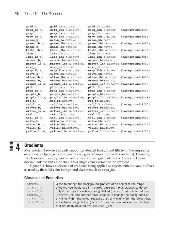
46 p a r t I I : t h e C l a s s e s C h a p t e r 3 : M a n i p u l a t i n g O b j e c t s 47
.gold_b, .gold_ba:active, .gold_bh:hover,
.gold_lb a, .gold_lba a:active, .gold_lbh a:hover {background:#fc0}
.gray_b, .gray_ba:active, .gray_bh:hover,
.gray_lb a, .gray_lba a:active, .gray_lbh a:hover {background:#888}
.green_b, .green_ba:active, .green_bh:hover,
.green_lb a, .green_lba a:active, .green_lbh a:hover {background:#080}
.khaki_b, .khaki_ba:active, .khaki_bh:hover,
.khaki_lb a, .khaki_lba a:active, .khaki_lbh a:hover {background:#cc8}
.lime_b, .lime_ba:active, .lime_bh:hover,
.lime_lb a, .lime_lba a:active, .lime_lbh a:hover {background:#0f0}
.maroon_b, .maroon_ba:active, .maroon_bh:hover,
.maroon_lb a, .maroon_lba a:active, .maroon_lbh a:hover {background:#800}
.navy_b, .navy_ba:active, .navy_bh:hover,
.navy_lb a, .navy_lba a:active, .navy_lbh a:hover {background:#008}
.olive_b, .olive_ba:active, .olive_bh:hover,
.olive_lb a, .olive_lba a:active, .olive_lbh a:hover {background:#880}
.orange_b, .orange_ba:active, .orange_bh:hover,
.orange_lb a, .orange_lba a:active, .orange_lbh a:hover {background:#f80}
.pink_b, .pink_ba:active, .pink_bh:hover,
.pink_lb a, .pink_lba a:active, .pink_lbh a:hover {background:#f88}
.purple_b, .purple_ba:active, .purple_bh:hover,
.purple_lb a, .purple_lba a:active, .purple_lbh a:hover {background:#808}
.red_b, .red_ba:active, .red_bh:hover,
.red_lb a, .red_lba a:active, .red_lbh a:hover {background:#f00}
.silver_b, .silver_ba:active, .silver_bh:hover,
.silver_lb a, .silver_lba a:active, .silver_lbh a:hover {background:#ccc}
.teal_b, .teal_ba:active, .teal_bh:hover,
.teal_lb a, .teal_lba a:active, .teal_lbh a:hover {background:#088}
.white_b, .white_ba:active, .white_bh:hover,
.white_lb a, .white_lba a:active, .white_lbh a:hover {background:#fff}
.yellow_b, .yellow_ba:active, .yellow_bh:hover,
.yellow_lb a, .yellow_lba a:active, .yellow_lbh a:hover {background:#ff0}
GradientsMost modern browsers already support graduated background fills (with the surprising exception of Opera, which is usually very good at supporting web standards). Therefore, the classes in this group can be used to easily create gradient effects. And even Opera doesn’t look too bad as it defaults to a single color average of the gradient.
Figure 3-4 shows a selection of gradients being applied to objects with the same suffixes as used by the solid color background classes (such as aqua_b).
Classes and Propertiescarrot1 carrot1_a carrot1_h carrot1_l carrot1_la carrot1_lh
Class to change the background gradient of an object to the range of colors you would see in a carrot (carrot1), plus classes to do so only if the object is actively being clicked (carrot1_a) or hovered over (carrot1_h), and another three classes to change the background of any links within the object (carrot1_l), any links within the object that are actively being clicked (carrot1_la), and any links within the object that are being hovered over (carrot1_lh)
4

46 p a r t I I : t h e C l a s s e s part II
C h a p t e r 3 : M a n i p u l a t i n g O b j e c t s 47
chrome1 (etc…) Classes – as carrot1 but for a range of chrome steel colors
coffee1 (etc…) Classes – as carrot1 but for a range of coffee brown colors
dusk1 (etc…) Classes – as carrot1 but for a range of dusky blue colors
earth1 (etc…) Classes – as carrot1 but for a range of brown earth colors
fire1 (etc…) Classes – as carrot1 but for a range of yellowy orange fire colors
grass1 (etc…) Classes – as carrot1 but for a range of fresh green grass colors
iron1 (etc…) Classes – as carrot1 but for a range of metallic iron colors
plum1 (etc…) Classes – as carrot1 but for a range of purple plum colors
rose1 (etc…) Classes – as carrot1 but for a range of red rose colors
sky1 (etc…) Classes – as carrot1 but for a range of blue sky colors
sunset1 (etc…) Classes – as carrot1 but for a range of orangy sunset colors
tin1 (etc…) Classes – as carrot1 but for a range of metallic tin colors
water1 (etc…) Classes – as carrot1 but for a range of clear blue water colors
wine1 (etc…) Classes – as carrot1 but for a range of deep red wine colors
background Property to which the gradient (or solid color) is applied
filter Property used by Internet Explorer for creating gradients and other effects
Figure 3-4 Applying gradient backgrounds is easy with these classes.

48 p a r t I I : t h e C l a s s e s C h a p t e r 3 : M a n i p u l a t i n g O b j e c t s 49
About the ClassesThis plug-in group has 15 main classes, with six different types of each that can be selected by choosing the required suffix. The preceding Classes and Properties table lists the available gradients. Here is what the suffixes do:
• (no suffix) Without a suffix, the object’s background gradient will be set to the color supplied.
• _a This suffix is used to refer only to the background gradient of an object that is active (in other words, that is in the process of being clicked).
• _h This suffix is used to refer only to the background gradient of an object that the mouse is hovering over.
• _l This suffix is used to refer only to the background gradient of a link within the object.
• _la This suffix is used to refer only to the background gradient of a link within the object that is actively being clicked.
• _lh This suffix is used to refer only to the background gradient of a link within the object over which the mouse is hovering.
There is no _b suffix since gradients are background-only properties anyway. Therefore, all the other suffixes are a little shorter than those used for the solid colors in the previous plug-in group.
The property used to achieve the gradient (or solid fallback color) background is the background property. In the case of the Apple Safari and Google Chrome browsers, it is passed a string that looks like this:
background:-webkit-gradient(linear, left top, left bottom, from(#f44), to(#922));
This tells those browsers to create a linear gradient fill, starting at the top left of the object and continuing to the bottom left, starting with the color #f44, slowly graduating to the color #922.
Firefox and other Mozilla-based browsers require the following string format to be applied to the property:
background:-moz-linear-gradient(top, #f44, #922);
While all other browsers (and all future browsers once it is made the international standard) should send a string such as this:
background:linear-gradient(left top, #f44, #922);
Microsoft, often the odd one out, takes quite a different approach, so it is necessary to pass a string such as the following to its filter property:
filter:progid:DXImageTransform.Microsoft.Gradient( startColorstr='#f04040', endColorstr='#902020');

48 p a r t I I : t h e C l a s s e s part II
C h a p t e r 3 : M a n i p u l a t i n g O b j e c t s 49
Also, for those browsers that do not support gradients, a simple solid color string such as #d33 is provided before any of the preceding lines, so that if all the gradient rules fail, at least the simple color setting will remain active.
The downside of all this, as you will often see as you progress through this book, is that all the browsers have to be catered to and, therefore, all the different strings must be applied for each gradient. This means that the CSS rules end up quite large. But then again, because all the work has already been done for you, all you need to do is include the CSS file and use simple class names in your HTML—you can forget about how cumbersome some of the rules are.
How to Use ThemYou apply a gradient in much the same way as a solid background color. For example, to set the background gradient of an object to the water1 gradient, you might use HTML such as this:
<div class='water1'>This is the water1 gradient</div>
As with the solid-colored backgrounds, you can also choose when a gradient is to be applied according to whether an object is moused over or clicked, and also whether the object contains any links that should have their gradients changed.
Here’s the HTML code used to create the screen grab in Figure 3-4:
<div class='carrot1'>This is carrot1</div><br /> <div class='sky1_h'>This is plain - or sky1 when the mouse hovers over it</div><br /> <div class='grass1_a'>This is plain - or grass1 when it is clicked</div><br /> <div class='carrot1_l'>This is plain. <a href='#'>This link is carrot1</a></div><br /> <div class='water1_lh'>This is plain. <a href='#'>This link is water1 when hovered</a></div><br /> <div class='tin1_la'>This is plain. <a href='#'>This link is tin1 when clicked</a></div>
It is very similar to the example in the previous plug-in group, in that the first three objects have their entire background gradient set, while the second three have only the links contained within them changed.
Incidentally, if you are wondering why all these class names end with the number 1, it’s because there’s a complementary set of gradients that fade in the other vertical direction, in the following plug-in group.
Note These classes degrade gracefully, so older browsers that do not support gradient backgrounds, and the current version of Opera (10.6 as I write) will simply show a solid background representative of the average gradient color when you use them. Hopefully, Opera will support this feature soon.

50 p a r t I I : t h e C l a s s e s C h a p t e r 3 : M a n i p u l a t i n g O b j e c t s 51
The Classes.carrot1, .carrot1_a:active, .carrot1_h:hover, .carrot1_l a, .carrot1_la a:active, .carrot1_lh a:hover { background:#ea4; background:-webkit-gradient(linear, left top, left bottom, from(#fd8), to(#c60)); background:-moz-linear-gradient(top, #fd8, #c60); background:linear-gradient(left top, #fd8, #c60); filter :progid:DXImageTransform.Microsoft.Gradient( startColorstr='#f0d080', endColorstr='#c06000'); } .chrome1, .chrome1_a:active, .chrome1_h:hover, .chrome1_l a, .chrome1_la a:active, .chrome1_lh a:hover { background:#ddd; background:-webkit-gradient(linear, left top, left bottom, from(#fff), to(#aaa)); background:-moz-linear-gradient(top, #fff, #aaa); background:linear-gradient(left top, #fff, #aaa); filter :progid:DXImageTransform.Microsoft.Gradient( startColorstr='#f0f0f0', endColorstr='#a0a0a0'); } .coffee1, .coffee1_a:active, .coffee1_h:hover, .coffee1_l a, .coffee1_la a:active, .coffee1_lh a:hover { background:#c94; background:-webkit-gradient(linear, left top, left bottom, from(#fc6), to(#752)); background:-moz-linear-gradient(top, #fc6, #752); background:linear-gradient(left top, #fc6, #752); filter :progid:DXImageTransform.Microsoft.Gradient( startColorstr='#f0c060', endColorstr='#705020'); } .dusk1, .dusk1_a:active, .dusk1_h:hover, .dusk1_l a, .dusk1_la a:active, .dusk1_lh a:hover { background:#79c; background:-webkit-gradient(linear, left top, left bottom, from(#8ad), to(#357)); background:-moz-linear-gradient(top, #8ad, #357); background:linear-gradient(left top, #8ad, #357); filter :progid:DXImageTransform.Microsoft.Gradient( startColorstr='#80a0d0', endColorstr='#305070'); } .earth1, .earth1_a:active, .earth1_h:hover, .earth1_l a, .earth1_la a:active, .earth1_lh a:hover { background:#a86; background:-webkit-gradient(linear, left top, left bottom, from(#db8), to(#532)); background:-moz-linear-gradient(top, #db8, #532); background:linear-gradient(left top, #db8, #532); filter :progid:DXImageTransform.Microsoft.Gradient( startColorstr='#d0b080', endColorstr='#503020'); } .fire1, .fire1_a:active, .fire1_h:hover, .fire1_l a, .fire1_la a:active, .fire1_lh a:hover { background:#db3;

50 p a r t I I : t h e C l a s s e s part II
C h a p t e r 3 : M a n i p u l a t i n g O b j e c t s 51
background:-webkit-gradient(linear, left top, left bottom, from(#ef5), to(#b40)); background:-moz-linear-gradient(top, #ef5, #b40); background:linear-gradient(left top, #ef5, #b40); filter :progid:DXImageTransform.Microsoft.Gradient( startColorstr='#e0f050', endColorstr='#b04000'); } .grass1, .grass1_a:active, .grass1_h:hover, .grass1_l a, .grass1_la a:active, .grass1_lh a:hover { background:#7b6; background:-webkit-gradient(linear, left top, left bottom, from(#ae9), to(#160)); background:-moz-linear-gradient(top, #ae9, #160); background:linear-gradient(left top, #ae9, #160); filter :progid:DXImageTransform.Microsoft.Gradient( startColorstr='#a0e090', endColorstr='#106000'); } .iron1, .iron1_a:active, .iron1_h:hover, .iron1_l a, .iron1_la a:active, .iron1_lh a:hover { background:#777; background:-webkit-gradient(linear, left top, left bottom, from(#999), to(#333)); background:-moz-linear-gradient(top, #999, #333); background:linear-gradient(left top, #999, #333); filter :progid:DXImageTransform.Microsoft.Gradient( startColorstr='#909090', endColorstr='#303030'); } .plum1, .plum1_a:active, .plum1_h:hover, .plum1_l a, .plum1_la a:active, .plum1_lh a:hover { background:#969; background:-webkit-gradient(linear, left top, left bottom, from(#b8a), to(#636)); background:-moz-linear-gradient(top, #b8a, #636); background:linear-gradient(left top, #b8a, #636); filter :progid:DXImageTransform.Microsoft.Gradient( startColorstr='#b080a0', endColorstr='#603060'); } .rose1, .rose1_a:active, .rose1_h:hover, .rose1_l a, .rose1_la a:active, .rose1_lh a:hover { background:#e45; background:-webkit-gradient(linear, left top, left bottom, from(#f67), to(#b12)); background:-moz-linear-gradient(top, #f67, #b12); background:linear-gradient(top, #f67, #b12); filter :progid:DXImageTransform.Microsoft.Gradient( startColorstr='#f06070', endColorstr='#b01020'); } .sky1, .sky1_a:active, .sky1_h:hover, .sky1_l a, .sky1_la a:active, .sky1_lh a:hover { background:#abe; background:-webkit-gradient(linear, left top, left bottom, from(#cdf), to(#68c)); background:-moz-linear-gradient(top, #cdf, #68c); background:linear-gradient(left top, #cdf, #68c);

52 p a r t I I : t h e C l a s s e s C h a p t e r 3 : M a n i p u l a t i n g O b j e c t s 53
filter :progid:DXImageTransform.Microsoft.Gradient( startColorstr='#c0d0f0', endColorstr='#6080c0'); } .sunset1, .sunset1_a:active, .sunset1_h:hover, .sunset1_l a, .sunset1_la a:active, .sunset1_lh a:hover { background:#ed3; background:-webkit-gradient(linear, left top, left bottom, from(#fe4), to(#ca0)); background:-moz-linear-gradient(top, #fe4, #ca0); background:linear-gradient(left top, #fe4, #ca0); filter :progid:DXImageTransform.Microsoft.Gradient( startColorstr='#f0e040', endColorstr='#c0a000'); } .tin1, .tin1_a:active, .tin1_h:hover, .tin1_l a, .tin1_la a:active, .tin1_lh a:hover { background:#aaa; background:-webkit-gradient(linear, left top, left bottom, from(#bbb), to(#777)); background:-moz-linear-gradient(top, #bbb, #777); background:linear-gradient(left top, #bbb, #777); filter :progid:DXImageTransform.Microsoft.Gradient( startColorstr='#b0b0b0', endColorstr='#707070'); } .water1, .water1_a:active, .water1_h:hover, .water1_l a, .water1_la a:active, .water1_lh a:hover { background:#ace; background:-webkit-gradient(linear, left top, left bottom, from(#eff), to(#58c)); background:-moz-linear-gradient(top, #eff, #58c); background:linear-gradient(left top, #eff, #58c); filter :progid:DXImageTransform.Microsoft.Gradient( startColorstr='#e0f0f0', endColorstr='#5080c0'); } .wine1, .wine1_a:active, .wine1_h:hover, .wine1_l a, .wine1_la a:active, .wine1_lh a:hover { background:#d33; background:-webkit-gradient(linear, left top, left bottom, from(#f44), to(#922)); background:-moz-linear-gradient(top, #f44, #922); background:linear-gradient(left top, #f44, #922); filter :progid:DXImageTransform.Microsoft.Gradient( startColorstr='#f04040', endColorstr='#902020'); }
Inverse GradientsThe classes in this plug-in group are the inverse of the ones in the previous section in that they create background gradient fills that look as if the previous fills were flipped from top to bottom. They are particularly useful as mouseover or button click effects as can be seen in Figure 3-5, which is an updated version of the example in the previous plug-in group that now alternates gradients when clicked and/or hovered over.
5

52 p a r t I I : t h e C l a s s e s part II
C h a p t e r 3 : M a n i p u l a t i n g O b j e c t s 53
Notice how the second set of links does not show any gradients. This is due to an unfortunate bug in Internet Explorer (the browser used for the screen grab), and serves to illustrate how these classes will degrade gracefully when they cannot be applied to their fullest effect. In any case, with a little extra HTML, it is easy to work around this IE bug by using only the first three types of class that assign gradients to an entire object—then Opera will be the only browser unable to show them (but it will at least still display a solid color representative of the gradient).
Classes and Propertiescarrot2 (etc…) Classes – as carrot1 but reversed from top to bottom
chrome2 (etc…) Classes – as chrome1 but reversed from top to bottom
coffee2 (etc…) Classes – as coffee1 but reversed from top to bottom
dusk2 (etc…) Classes – as dusk1 but reversed from top to bottom
earth2 (etc…) Classes – as earth1 but reversed from top to bottom
fire2 (etc…) Classes – as fire1 but reversed from top to bottom
grass2 (etc…) Classes – as grass1 but reversed from top to bottom
iron2 (etc…) Classes – as iron1 but reversed from top to bottom
Figure 3-5 Using complementary gradient pairs for link and hover effects

54 p a r t I I : t h e C l a s s e s C h a p t e r 3 : M a n i p u l a t i n g O b j e c t s 55
plum2 (etc…) Classes – as plum1 but reversed from top to bottom
rose2 (etc…) Classes – as rose1 but reversed from top to bottom
sky2 (etc…) Classes – as sky1 but reversed from top to bottom
sunset2 (etc…) Classes – as sunset1 but reversed from top to bottom
tin2 (etc…) Classes – as tin1 but reversed from top to bottom
water2 (etc…) Classes – as water1 but reversed from top to bottom
wine2 (etc…) Classes – as wine1 but reversed from top to bottom
background Property to which the gradient (or solid color) is applied
filter Property used by Internet Explorer for creating gradients and other effects
About the ClassesThese classes are almost identical to those in the previous plug-in group except that they have a number 2 in them instead of a 1, and they display gradients that are the inverse from top to bottom.
How to Use ThemYou can use these classes in the same way as the first set of gradients, or use them to make cool mouseover effects like in the following example, which is an extension of the one in the previous plug-in group that swaps the gradients when moused over and/or clicked:
<div class='carrot2'>This is carrot2</div><br /> <div class='sky1 sky2_h'>This is sky1 - or sky2 when the mouse hovers over it</div><br /> <div class='grass1 grass2_a'>This is grass1 - or grass2 when it is clicked</div><br /> <div class='carrot2_l'>This is plain. <a href='#'>This link is carrot2</a></div><br /> <div class='water1_l water2_lh'>This is plain. <a href='#'>This link is water1 or water2 when hovered</a></div><br /> <div class='tin1_l tin2_la'>This is plain. <a href='#'>This link is tin1 or tin2 when clicked</a></div>
Already, these are some quite impressive effects, but now take a look at what you can do with the HTML <button> tag:
<button class='sky1 sky2_a'>Please click me</button>
When you click buttons that use gradient classes in this way, they appear to depress even more than normal and produce a highly professional looking effect.
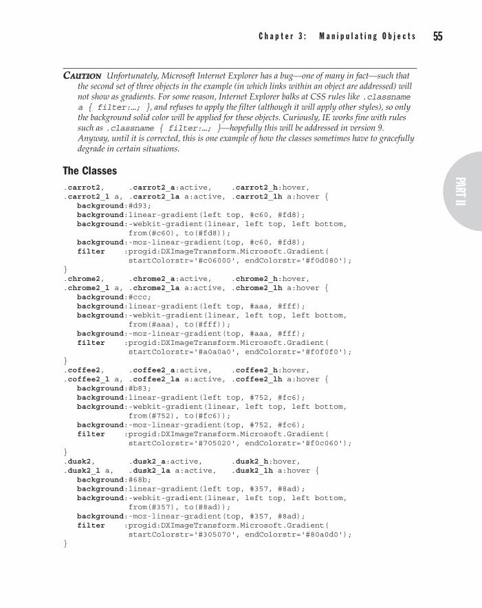
54 p a r t I I : t h e C l a s s e s part II
C h a p t e r 3 : M a n i p u l a t i n g O b j e c t s 55
CautioN Unfortunately, Microsoft Internet Explorer has a bug—one of many in fact—such that the second set of three objects in the example (in which links within an object are addressed) will not show as gradients. For some reason, Internet Explorer balks at CSS rules like .classname a { filter:…; }, and refuses to apply the filter (although it will apply other styles), so only the background solid color will be applied for these objects. Curiously, IE works fine with rules such as .classname { filter:…; }—hopefully this will be addressed in version 9. Anyway, until it is corrected, this is one example of how the classes sometimes have to gracefully degrade in certain situations.
The Classes.carrot2, .carrot2_a:active, .carrot2_h:hover, .carrot2_l a, .carrot2_la a:active, .carrot2_lh a:hover { background:#d93; background:linear-gradient(left top, #c60, #fd8); background:-webkit-gradient(linear, left top, left bottom, from(#c60), to(#fd8)); background:-moz-linear-gradient(top, #c60, #fd8); filter :progid:DXImageTransform.Microsoft.Gradient( startColorstr='#c06000', endColorstr='#f0d080'); } .chrome2, .chrome2_a:active, .chrome2_h:hover, .chrome2_l a, .chrome2_la a:active, .chrome2_lh a:hover { background:#ccc; background:linear-gradient(left top, #aaa, #fff); background:-webkit-gradient(linear, left top, left bottom, from(#aaa), to(#fff)); background:-moz-linear-gradient(top, #aaa, #fff); filter :progid:DXImageTransform.Microsoft.Gradient( startColorstr='#a0a0a0', endColorstr='#f0f0f0'); } .coffee2, .coffee2_a:active, .coffee2_h:hover, .coffee2_l a, .coffee2_la a:active, .coffee2_lh a:hover { background:#b83; background:linear-gradient(left top, #752, #fc6); background:-webkit-gradient(linear, left top, left bottom, from(#752), to(#fc6)); background:-moz-linear-gradient(top, #752, #fc6); filter :progid:DXImageTransform.Microsoft.Gradient( startColorstr='#705020', endColorstr='#f0c060'); } .dusk2, .dusk2_a:active, .dusk2_h:hover, .dusk2_l a, .dusk2_la a:active, .dusk2_lh a:hover { background:#68b; background:linear-gradient(left top, #357, #8ad); background:-webkit-gradient(linear, left top, left bottom, from(#357), to(#8ad)); background:-moz-linear-gradient(top, #357, #8ad); filter :progid:DXImageTransform.Microsoft.Gradient( startColorstr='#305070', endColorstr='#80a0d0'); }

56 p a r t I I : t h e C l a s s e s C h a p t e r 3 : M a n i p u l a t i n g O b j e c t s 57
.earth2, .earth2_a:active, .earth2_h:hover,
.earth2_l a, .earth2_la a:active, .earth2_lh a:hover { background:#975; background:linear-gradient(left top, #532, #db8); background:-webkit-gradient(linear, left top, left bottom, from(#532), to(#db8)); background:-moz-linear-gradient(top, #532, #db8); filter :progid:DXImageTransform.Microsoft.Gradient( startColorstr='#503020', endColorstr='#d0b080'); } .fire2, .fire2_a:active, .fire2_h:hover, .fire2_l a, .fire2_la a:active, .fire2_lh a:hover { background:#ca2; background:linear-gradient(left top, #b40, #ef5); background:-webkit-gradient(linear, left top, left bottom, from(#b40), to(#ef5)); background:-moz-linear-gradient(top, #b40, #ef5); filter :progid:DXImageTransform.Microsoft.Gradient( startColorstr='#b04000', endColorstr='#e0f050'); } .grass2, .grass2_a:active, .grass2_h:hover, .grass2_l a, .grass2_la a:active, .grass2_lh a:hover { background:#6a5; background:linear-gradient(left top, #160, #ae9); background:-webkit-gradient(linear, left top, left bottom, from(#160), to(#ae9)); background:-moz-linear-gradient(top, #160, #ae9); filter :progid:DXImageTransform.Microsoft.Gradient( startColorstr='#106000', endColorstr='#aaee99'); } .iron2, .iron2_a:active, .iron2_h:hover, .iron2_l a, .iron2_la a:active, .iron2_lh a:hover { background:#666; background:linear-gradient(left top, #333, #999); background:-webkit-gradient(linear, left top, left bottom, from(#333), to(#999)); background:-moz-linear-gradient(top, #333, #999); filter :progid:DXImageTransform.Microsoft.Gradient( startColorstr='#303030', endColorstr='#909090'); } .plum2, .plum2_a:active, .plum2_h:hover, .plum2_l a, .plum2_la a:active, .plum2_lh a:hover { background:#858; background:linear-gradient(left top, #636, #b8a); background:-webkit-gradient(linear, left top, left bottom, from(#636), to(#b8a)); background:-moz-linear-gradient(top, #636, #b8a); filter :progid:DXImageTransform.Microsoft.Gradient( startColorstr='#603060', endColorstr='#b080a0'); } .rose2, .rose2_a:active, .rose2_h:hover, .rose2_l a, .rose2_la a:active, .rose2_lh a:hover { background:#d34; background:linear-gradient(left top, #b12, #f67); background:-webkit-gradient(linear, left top, left bottom, from(#b12), to(#f67));

56 p a r t I I : t h e C l a s s e s part II
C h a p t e r 3 : M a n i p u l a t i n g O b j e c t s 57
background:-moz-linear-gradient(top, #b12, #f67); filter :progid:DXImageTransform.Microsoft.Gradient( startColorstr='#b01020', endColorstr='#f06070'); } .sky2, .sky2_a:active, .sky2_h:hover, .sky2_l a, .sky2_la a:active, .sky2_lh a:hover { background:#9ad; background:linear-gradient(left top, #68c, #cdf); background:-webkit-gradient(linear, left top, left bottom, from(#68c), to(#cdf)); background:-moz-linear-gradient(top, #68c, #cdf); filter :progid:DXImageTransform.Microsoft.Gradient( startColorstr='#6080c0', endColorstr='#c0d0f0'); } .sunset2, .sunset2_a:active, .sunset2_h:hover, .sunset2_l a, .sunset2_la a:active, .sunset2_lh a:hover { background:#dc2; background:linear-gradient(left top, #ca0, #fe4); background:-webkit-gradient(linear, left top, left bottom, from(#ca0), to(#fe4)); background:-moz-linear-gradient(top, #ca0, #fe4); filter :progid:DXImageTransform.Microsoft.Gradient( startColorstr='#c0a000', endColorstr='#f0e040'); } .tin2, .tin2_a:active, .tin2_h:hover, .tin2_l a, .tin2_la a:active, .tin2_lh a:hover { background:#999; background:linear-gradient(left top, #777, #bbb); background:-webkit-gradient(linear, left top, left bottom, from(#777), to(#bbb)); background:-moz-linear-gradient(top, #777, #bbb); filter :progid:DXImageTransform.Microsoft.Gradient( startColorstr='#707070', endColorstr='#b0b0b0'); } .water2, .water2_a:active, .water2_h:hover, .water2_l a, .water2_la a:active, .water2_lh a:hover { background:#9bd; background:linear-gradient(left top, #58c, #eff); background:-webkit-gradient(linear, left top, left bottom, from(#58c), to(#eff)); background:-moz-linear-gradient(top, #58c, #eff); filter :progid:DXImageTransform.Microsoft.Gradient( startColorstr='#5080c0', endColorstr='#e0f0f0'); } .wine2, .wine2_a:active, .wine2_h:hover, .wine2_l a, .wine2_la a:active, .wine2_lh a:hover { background:#c22; background:linear-gradient(left top, #922, #f44); background:-webkit-gradient(linear, left top, left bottom, from(#922), to(#f44)); background:-moz-linear-gradient(top, #922, #f44); filter :progid:DXImageTransform.Microsoft.Gradient( startColorstr='#902020', endColorstr='#f04040'); }

58 p a r t I I : t h e C l a s s e s C h a p t e r 3 : M a n i p u l a t i n g O b j e c t s 59
Box ShadowsAdding a shadow effect underneath images and other objects helps them stand out. Using the classes in this plug-in group, you can add box shadows of five different shades in six different ways.
Figure 3-6 shows a photograph repeated six times. The first copy has no box shadow, while the other five range from the lightest to the darkest box shadow. This screen grab was taken using Internet Explorer, which doesn’t support blurring. All other browsers blur and round the edges of box shadows, providing a smoother effect.
Classes and Propertiesboxshadow boxshadow_a boxshadow_h boxshadow_l boxshadow_la boxshadow_lh
Class to add a box shadow to an object (boxshadow), plus classes to do so only if the object is actively being clicked (boxshadow_a) or hovered over (boxshadow_h), and another three classes to add a box shadow only to any links within the object (boxshadow_l), any links within the object that are actively being clicked (boxshadow_la), and any links within the object that are being hovered over (boxshadow_lh)
lightestboxshadow (etc…) Class – as boxshadow but with the lightest shadow
lightboxshadow (etc…) Class – as boxshadow but with a lighter shadow
darkboxshadow (etc…) Class – as boxshadow but with a darker shadow
darkestboxshadow (etc…) Class – as boxshadow but with the darkest shadow
-moz-box-shadow Property to create a box shadow on Firefox and other Mozilla browsers
-webkit-box-shadow Property to create a box shadow on Safari and Chrome
filter Property to create box shadows and other effects on Internet Explorer
box-shadow Property to create a box shadow on all other browsers
About the ClassesThis group has five classes, each of which is supplied with the standard suffixes used to change the way they act: _a for active, _h for hover, _l for a link, _la for an active link, and _lh for a hovered link.
The box shadow is applied using the box-shadow CSS property, or –moz-box-shadow for Mozilla-based browsers such as Firefox, or –webkit-box-shadow for Safari and Chrome. In all cases, the values passed are the shadow color, its vertical and horizontal offset from the object, and the amount of blurring to use. So a typical box shadow rule looks like this:
box-shadow:#444444 4px 4px 6px;
On Internet Explorer, box shadowing is handled by the filter property and the equivalent CSS rule is as follows:
filter:progid:DXImageTransform.Microsoft.Shadow(color='#444444', Direction=135, Strength=6);
6

58 p a r t I I : t h e C l a s s e s part II
C h a p t e r 3 : M a n i p u l a t i n g O b j e c t s 59
tip If you are interested in tweaking the PC.css file, there is also a DropShadow filter argument available in Internet Explorer that provides a different effect and which is identical in use to the Shadow argument, except for the extra four letters preceding the word Shadow. You could therefore use it in the following way:
filter:progid:DXImageTransform.Microsoft.DropShadow(color='#444444', Direction=135, Strength=6);
How to Use ThemTo add a box shadow to an object, enter its class name into some HTML, like this:
<img class='boxshadow' src='photo1.jpg' />
You can also choose any of the four lighter or darker variants, or add one of the action suffixes to change the way the box shadow is implemented. For example, to add a darker box shadow to an object when it is being hovered over, you might do this:
<img class='darkboxshadow_h' src='photo1.jpg' />
Or you could combine the two to give an object a lighter box shadow that changes to a darker one when hovered over, like this:
<img class='lightboxshadow darkboxshadow_h ' src='photo1.jpg' />
Figure 3-6 Adding box shadows makes objects stand out from the page.

60 p a r t I I : t h e C l a s s e s C h a p t e r 3 : M a n i p u l a t i n g O b j e c t s 61
Here is the HTML that was used to create the screen grab in Figure 3-6:
<div class='black_bh' style='padding:10px;'> <img src='photo1.jpg' /> <img class='lightestboxshadow' src='photo1.jpg' /> <img class='lightboxshadow' src='photo1.jpg' /> <br /><br /> <img class='boxshadow' src='photo1.jpg' /> <img class='darkboxshadow' src='photo1.jpg' /> <img class='darkestboxshadow' src='photo1.jpg' /> </div>
In this example, there are six instances of a photo: one with no box shadow, and five more with shadows of varying shades. A few and <br /> tags are used to neatly space them out.
Enclosing these photos is a <div> tag that has been set to change its background color to black when hovered over (using the black_bh class), so you can pass the mouse over it and see the effect of the lighter shadows when used on a dark background.
The Classes.boxshadow, .boxshadow_a:active, .boxshadow_h:hover, .boxshadow_l a, .boxshadow_la a:active, .boxshadow_lh a:hover { -moz-box-shadow :#888888 4px 4px 6px; -webkit-box-shadow:#888888 4px 4px 6px; box-shadow :#888888 4px 4px 6px; filter :progid:DXImageTransform.Microsoft.Shadow( color='#888888', Direction=135, Strength=6); } .lightestboxshadow, .lightestboxshadow_a:active, .lightestboxshadow_h:hover, .lightestboxshadow_l a, .lightestboxshadow_la a:active, .lightestboxshadow_lh a:hover { -moz-box-shadow :#ffffff 4px 4px 6px; -webkit-box-shadow:#ffffff 4px 4px 6px; box-shadow :#ffffff 4px 4px 6px; filter :progid:DXImageTransform.Microsoft.Shadow( color='#cccccc', Direction=135, Strength=6); } .lightboxshadow, .lightboxshadow_a:active, .lightboxshadow_h:hover, .lightboxshadow_l a, .lightboxshadow_la a:active, .lightboxshadow_lh a:hover { -moz-box-shadow :#cccccc 4px 4px 6px; -webkit-box-shadow:#cccccc 4px 4px 6px; box-shadow :#cccccc 4px 4px 6px; filter :progid:DXImageTransform.Microsoft.Shadow( color='#cccccc', Direction=135, Strength=6); } .darkboxshadow, .darkboxshadow_a:active, .darkboxshadow_h:hover, .darkboxshadow_l a, .darkboxshadow_la a:active, .darkboxshadow_lh a:hover { box-shadow :#444444 4px 4px 6px; -moz-box-shadow :#444444 4px 4px 6px;

60 p a r t I I : t h e C l a s s e s part II
C h a p t e r 3 : M a n i p u l a t i n g O b j e c t s 61
-webkit-box-shadow:#444444 4px 4px 6px; filter :progid:DXImageTransform.Microsoft.Shadow( color='#444444', Direction=135, Strength=6); } .darkestboxshadow, .darkestboxshadow_a:active, .darkestboxshadow_h:hover, .darkestboxshadow_l a, .darkestboxshadow_la a:active, .darkestboxshadow_lh a:hover { -moz-box-shadow :#000000 4px 4px 6px; -webkit-box-shadow:#000000 4px 4px 6px; box-shadow :#000000 4px 4px 6px; filter :progid:DXImageTransform.Microsoft.Shadow( color='#000000', Direction=135, Strength=6); }
PaddingWhen you need to quickly add some padding around an object, as long as you’re happy to use values of 2, 5, 8, 11, or 15 pixels, you can simply drop one of the class names in this group into your HTML.
For example, Figure 3-7 shows the example from the previous plug-in group modified so that each picture has a different amount of padding. A border has been added to each to make it clear how much padding has been applied.
Figure 3-7 Applying different padding classes to a photograph
7

62 p a r t I I : t h e C l a s s e s C h a p t e r 3 : M a n i p u l a t i n g O b j e c t s 63
Classes and Propertiespadding padding_a padding_h padding_l padding_la
padding_lh
Class to add 8 pixels of padding around an object (padding), plus classes to do so only if the object is actively being clicked (padding_a) or hovered over (padding_h), and another three classes to add padding only to any links within the object (padding_l), any links within the object that are actively being clicked (padding_la), and any links within the object that are being hovered over (padding_lh)
smallestpadding (etc…)
Class – as padding but with 2 pixels of padding
smallpadding (etc…)
Class – as padding but with 5 pixels of padding
largepadding (etc…)
Class – as padding but with 11 pixels of padding
largestpadding (etc…)
Class – as padding but with 15 pixels of padding
padding Property to set an object’s padding
About the ClassesThis group has five classes, and each is supplied with the standard suffixes used to change the way they act: _a for active, _h for hover, _l for a link, _la for an active link, and _lh for a hovered link. Padding is applied using the padding CSS property, with values of 2px, 5px, 8px, 11px, or 15px, like this:
padding:8px;
How to Use ThemUsing the padding classes is as easy as choosing the size you need and using that classname in a class='…' argument, like this:
<img class='padding' src='photo1.jpg' />
You can add padding to most objects, not just images. You can also choose to use any of the dynamic versions of these classes. For example, to give an object a small padding and then enlarge it when the mouse hovers over it, you could use code such as this:
<img class='smallpadding largepadding_h' src='photo1.jpg' />
Or to change the padding only when the object is clicked, you could use:
<img class='smallpadding largepadding_a' src='photo1.jpg' />

62 p a r t I I : t h e C l a s s e s part II
C h a p t e r 3 : M a n i p u l a t i n g O b j e c t s 63
And, of course, there are also the classes for modifying only links within an object, like the following, which applies a small padding to any such links, and which changes to a larger padding when the link is hovered over:
<img class='smallpadding_l largepadding_lh' src='photo1.jpg' />
Here is the HTML used to create the page shown in Figure 3-7:
<img border='1' src='photo1.jpg' /> <img border='1' class='smallestpadding' src='photo1.jpg' /> <img border='1' class='smallpadding' src='photo1.jpg' /> <br /><br /> <img border='1' class='padding' src='photo1.jpg' /> <img border='1' class='largepadding' src='photo1.jpg' /> <img border='1' class='largestpadding' src='photo1.jpg' />
The Classes.padding, .padding_a:active, .padding_h:hover, .padding_l a, .padding_la a:active, .padding_lh a:hover { padding:8px; } .smallestpadding, .smallestpadding_a:active, .smallestpadding_h:hover, .smallestpadding_l a, .smallestpadding_la a:active, .smallestpadding_lh a:hover { padding:2px; } .smallpadding, .smallpadding_a:active, .smallpadding_h:hover, .smallpadding_l a, .smallpadding_la a:active, .smallpadding_lh a:hover { padding:5px; } .largepadding, .largepadding_a:active, .largepadding_h:hover, .largepadding_l a, .largepadding_la a:active, .largepadding_lh a:hover { padding:11px; } .largestpadding, .largestpadding_a:active, .largestpadding_h:hover, .largestpadding_l a, .largestpadding_la a:active, .largestpadding_lh a:hover { padding:15px; }
Rounded BordersYou can create rounded borders in many ways, from using images and image parts, to table cells, nested elements, and so on. Generally, they are quite complicated to use, but thankfully the new CSS 3 border-radius command is supported on all browsers except Internet Explorer, and even that browser can handle them from version 9 on, as can be seen in Figure 3-8, which shows a screen grab from the IE 9 Platform Preview.
8
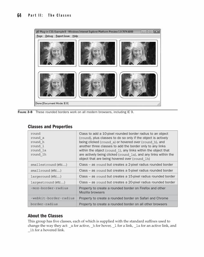
64 p a r t I I : t h e C l a s s e s C h a p t e r 3 : M a n i p u l a t i n g O b j e c t s 65
Classes and Propertiesround round_a round_h round_l round_la round_lh
Class to add a 10-pixel rounded border radius to an object (round), plus classes to do so only if the object is actively being clicked (round_a) or hovered over (round_h), and another three classes to add the border only to any links within the object (round_l), any links within the object that are actively being clicked (round_la), and any links within the object that are being hovered over (round_lh)
smallestround (etc…) Class – as round but creates a 2-pixel radius rounded border
smallround (etc…) Class – as round but creates a 5-pixel radius rounded border
largeround (etc…) Class – as round but creates a 15-pixel radius rounded border
largestround (etc…) Class – as round but creates a 20-pixel radius rounded border
-moz-border-radius Property to create a rounded border on Firefox and other Mozilla browsers
-webkit-border-radius Property to create a rounded border on Safari and Chrome
border-radius Property to create a rounded border on all other browsers
About the ClassesThis group has five classes, each of which is supplied with the standard suffixes used to change the way they act: _a for active, _h for hover, _l for a link, _la for an active link, and _lh for a hovered link.
Figure 3-8 These rounded borders work on all modern browsers, including IE 9.

64 p a r t I I : t h e C l a s s e s part II
C h a p t e r 3 : M a n i p u l a t i n g O b j e c t s 65
The rounded border is applied using the border-radius CSS property, or –moz-border-radius for Mozilla-based browsers such as Firefox, or –webkit-border-radius for Safari and Chrome. In all cases, a pixel value is passed, like this CSS rule:
border-radius:10px;
Interestingly, Internet Explorer was late to the game in supporting rounded borders, but today it actually does a better job than the other browsers because if the object is an image it also gets slightly rounded at the corners, whereas other browsers leave the images untouched. I suppose it could be argued that this is a case of Microsoft doing things in a nonstandard way again, but I like their approach to this feature.
How to Use ThemTo add a rounded border to an object, you must first ensure that a border has been enabled. This can be done the old-fashioned way in images with an argument such as border='1', or via CSS such as border:1px solid; (or using the border classes later in this chapter).
Once a border is visible, you can round it off by including one of the classes, like this:
<img border='1' class='round padding' src='photo1.jpg' />
This will add a rounded border with a radius of 10 pixels. You can choose smaller or larger radii and also use the various standard suffixes to change the border only when clicked or hovered over, or only when it is part of a link within the current object.
Here is the HTML used to create Figure 3-8:
<img border='1' class='padding' src='photo1.jpg' /> <img border='1' class='smallestround padding' src='photo1.jpg' /> <img border='1' class='smallround padding' src='photo1.jpg' /> <br /><br /> <img border='1' class='round padding' src='photo1.jpg' /> <img border='1' class='largeround padding' src='photo1.jpg' /> <img border='1' class='largestround padding' src='photo1.jpg' />
The Classes.round, .round_a:active, .round_h:hover, .round_l a, .round_la a:active, .round_lh a:hover { border-radius :10px; -moz-border-radius :10px; -webkit-border-radius:10px; } .smallestround, .smallestround_a:active, .smallestround_h:hover, .smallestround_l a, .smallestround_la a:active, .smallestround_lh a:hover { border-radius :2px; -moz-border-radius :2px; -webkit-border-radius:2px; } .smallround, .smallround_a:active, .smallround_h:hover, .smallround_l a, .smallround_la a:active, .smallround_lh a:hover {

66 p a r t I I : t h e C l a s s e s C h a p t e r 3 : M a n i p u l a t i n g O b j e c t s 67
border-radius :5px; -moz-border-radius :5px; -webkit-border-radius:5px; } .largeround, .largeround_a:active, .largeround_h:hover, .largeround_l a, .largeround_la a:active, .largeround_lh a:hover { border-radius :15px; -moz-border-radius :15px; -webkit-border-radius:15px; } .largestround, .largestround_a:active, .largestround_h:hover, .largestround_l a, .largestround_la a:active, .largestround_lh a:hover { border-radius :20px; -moz-border-radius :20px; -webkit-border-radius:20px; }
TransparencyThe ability to change the transparency of an object opens up a wide range of professional effects, and the classes in this plug-in group make doing so very easy. For example, Figure 3-9 shows a photograph displayed at 11 different levels of transparency.
Figure 3-9 You can vary the transparency of objects with these classes.
9

66 p a r t I I : t h e C l a s s e s part II
C h a p t e r 3 : M a n i p u l a t i n g O b j e c t s 67
Classes and Propertiestrans00 trans00_a trans00_h trans00_l trans00_la trans00_lh
Class to set the transparency of an object to 0%, or no transparency (trans00), plus classes to do so only if the object is actively being clicked (trans00_a) or hovered over (trans00_h), and another three classes to set the transparency only for any links within the object (trans00_l), any links within the object that are actively being clicked (trans00_la), and any links within the object that are being hovered over (trans00_lh)
trans01 - trans10 (etc…) Classes to change the transparency of an object in steps of 10 percent, including _a, _h, _l, _la, and _lh suffixes for each
opacity Property used by all modern browsers for changing the opacity (and therefore the transparency) of an object
filter Property used by Internet Explorer for opacity and other features
About the ClassesTransparency, or more precisely the inverse of it, opacity, is one area that most of the browser developers caught up with a while ago, so there is no need to use property names such as –moz-opacity or –webkit-opacity. Instead, the single property opacity is all that is required, as in the following CSS rule, which sets the opacity of an object to 50 percent:
opacity:0.5;
Of course, Microsoft always likes to be different, so Internet Explorer uses the filter property instead, like this (with a value between 0 and 100, rather than 0 and 1):
filter:alpha(opacity = '50');
How to Use ThemYou can change the opacity of an object by selecting the class name you want out of the 11 levels between 0 and 100 percent. Then, you can optionally choose a suffix to determine how the change should be made, as with the following code, which sets the transparency of a photograph to 50 percent:
<img class='trans05' src='photo2.jpg' />
A neat trick you can utilize for highlighting photos is to also provide a different level of transparency when a picture is hovered over, as with the following example, which changes the transparency of the photo to zero percent (or solid) when the mouse passes over it:
<img class='trans05 trans00_h' src='photo2.jpg' />
You can also use the other standard suffixes to change the transparency when an object is clicked, or only for links within an object.

68 p a r t I I : t h e C l a s s e s C h a p t e r 3 : M a n i p u l a t i n g O b j e c t s 69
Here is the HTML used to create Figure 3-9:
<img class='trans00' src='photo2.jpg' /> <img class='trans01 trans00_h' src='photo2.jpg' /> <img class='trans02 trans01_h' src='photo2.jpg' /> <img class='trans03 trans02_h' src='photo2.jpg' /> <img class='trans04 trans03_h' src='photo2.jpg' /> <img class='trans05 trans04_h' src='photo2.jpg' /> <img class='trans06 trans05_h' src='photo2.jpg' /> <img class='trans07 trans06_h' src='photo2.jpg' /> <img class='trans08 trans07_h' src='photo2.jpg' /> <img class='trans09 trans08_h' src='photo2.jpg' /> <img class='trans10 trans09_h' src='photo2.jpg' />
With the exception of the first, when you pass the mouse over the pictures, they darken by 10 percent.
The Classes.trans00, .trans00_a:active, .trans00_h:hover, .trans00_l a, .trans00_la a:active, .trans00_lh a:hover { opacity:1; filter :alpha(opacity = '100'); } .trans01, .trans01_a:active, .trans01_h:hover, .trans01_l a, .trans01_la a:active, .trans01_lh a:hover { opacity:0.9; filter :alpha(opacity = '90'); } .trans02, .trans02_a:active, .trans02_h:hover, .trans02_l a, .trans02_la a:active, .trans02_lh a:hover { opacity:0.8; filter :alpha(opacity = '80'); } .trans03, .trans03_a:active, .trans03_h:hover, .trans03_l a, .trans03_la a:active, .trans03_lh a:hover { opacity:0.7; filter :alpha(opacity = '70'); } .trans04, .trans04_a:active, .trans04_h:hover, .trans04_l a, .trans04_la a:active, .trans04_lh a:hover { opacity:0.6; filter :alpha(opacity = '60'); } .trans05, .trans05_a:active, .trans05_h:hover, .trans05_l a, .trans05_la a:active, .trans05_lh a:hover { opacity:0.5; filter :alpha(opacity = '50'); } .trans06, .trans06_a:active, .trans06_h:hover, .trans06_l a, .trans06_la a:active, .trans06_lh a:hover { opacity:0.4; filter :alpha(opacity = '40'); }

68 p a r t I I : t h e C l a s s e s part II
C h a p t e r 3 : M a n i p u l a t i n g O b j e c t s 69
.trans07, .trans07_a:active, .trans07_h:hover,
.trans07_l a, .trans07_la a:active, .trans07_lh a:hover { opacity:0.3; filter :alpha(opacity = '30'); } .trans08, .trans08_a:active, .trans08_h:hover, .trans08_l a, .trans08_la a:active, .trans08_lh a:hover { opacity:0.2; filter :alpha(opacity = '20'); } .trans09, .trans09_a:active, .trans09_h:hover, .trans09_l a, .trans09_la a:active, . a:hover { opacity:0.1; filter :alpha(opacity = '10'); } .trans10, .trans10_a:active, .trans10_h:hover, .trans10_l a, .trans10_la a:active, .trans10_lh a:hover { opacity:0; filter :alpha(opacity = '0'); }
Visibility and DisplayThe classes in this plug-in group provide different ways of presenting objects, including making them visible or invisible, hidden (a different type of invisible), or positioning them either inline or as a block.
Figure 3-10 shows three images in which the first is presented normally using the visible class (which is the default for all objects). The second uses the invisible class, which retains its dimensions, as can be seen by the caption still in the correct place. The third image uses the hidden class, so it has been completely removed from display, as can be seen by the caption which has collapsed in to occupy the space released.
Figure 3-10 Using the visible, invisible, and hidden classes to present images
10
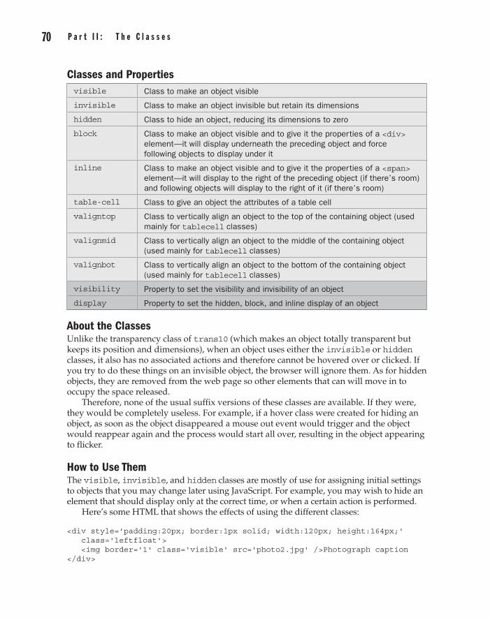
70 p a r t I I : t h e C l a s s e s C h a p t e r 3 : M a n i p u l a t i n g O b j e c t s 71
Classes and Propertiesvisible Class to make an object visible
invisible Class to make an object invisible but retain its dimensions
hidden Class to hide an object, reducing its dimensions to zero
block Class to make an object visible and to give it the properties of a <div> element—it will display underneath the preceding object and force following objects to display under it
inline Class to make an object visible and to give it the properties of a <span> element—it will display to the right of the preceding object (if there’s room) and following objects will display to the right of it (if there’s room)
table-cell Class to give an object the attributes of a table cell
valigntop Class to vertically align an object to the top of the containing object (used mainly for tablecell classes)
valignmid Class to vertically align an object to the middle of the containing object (used mainly for tablecell classes)
valignbot Class to vertically align an object to the bottom of the containing object (used mainly for tablecell classes)
visibility Property to set the visibility and invisibility of an object
display Property to set the hidden, block, and inline display of an object
About the ClassesUnlike the transparency class of trans10 (which makes an object totally transparent but keeps its position and dimensions), when an object uses either the invisible or hidden classes, it also has no associated actions and therefore cannot be hovered over or clicked. If you try to do these things on an invisible object, the browser will ignore them. As for hidden objects, they are removed from the web page so other elements that can will move in to occupy the space released.
Therefore, none of the usual suffix versions of these classes are available. If they were, they would be completely useless. For example, if a hover class were created for hiding an object, as soon as the object disappeared a mouse out event would trigger and the object would reappear again and the process would start all over, resulting in the object appearing to flicker.
How to Use ThemThe visible, invisible, and hidden classes are mostly of use for assigning initial settings to objects that you may change later using JavaScript. For example, you may wish to hide an element that should display only at the correct time, or when a certain action is performed.
Here’s some HTML that shows the effects of using the different classes:
<div style='padding:20px; border:1px solid; width:120px; height:164px;' class='leftfloat'> <img border='1' class='visible' src='photo2.jpg' />Photograph caption </div>

70 p a r t I I : t h e C l a s s e s part II
C h a p t e r 3 : M a n i p u l a t i n g O b j e c t s 71
<div style='padding:20px; border:1px solid; width:120px; height:164px;' class='leftfloat'> <img border='1' class='invisible' src='photo2.jpg'/>Photograph caption </div> <div style='padding:20px; border:1px solid; width:120px; height:164px;' class='leftfloat'> <img border='1' class='hidden' src='photo2.jpg' />Photograph caption </div>
Each image is embedded within a <div> that has 20 pixels of padding, a solid border, and is floated to the left. These act as placeholders. Then, within each <div> there is one instance each of a visible, invisible, and hidden class, each followed by a picture caption. The result is the screen grab in Figure 3-10.
Using the block and inline ClassesThe other two classes in this group have the effect of giving an object either the positioning properties of a <div>, for the block class, or those of a <span> for the inline class.
Objects with a block display property start on a new line, and objects that follow them also start on a new line. Objects with an inline display property follow on from the right of the previous object, only dropping to the next line if they would extend past the right margin. Also, if there’s room, objects following after an inline object will also display to the right of it.
The tablecell and valign ClassesSometimes it can be helpful to give an object the properties of a table cell. For example, when used in a table cell, the vertical-align property mimics the deprecated HTML valign property, so it can be used to vertically center objects inside other objects, like this:
<div class='tablecell valignmid'> This text is vertically centered </div>
You can also use the valigntop and valignbot classes in table cells.
The Classes.visible { visibility:visible; } .invisible { visibility:hidden; } .hidden { display :none; } .block { display :block; } .inline { display :inline; } .tablecell { display :table-cell; } .valigntop { vertical-align:top; } .valignmid { vertical-align:middle; } .valignbot { vertical-align:bottom; }
Scroll BarsUsing the plug-ins in this group, you can decide whether and how to display scroll bars on an object that supports them. In Figure 3-11, an excerpt from a poem by William Blake is displayed in three different ways. The first instance uses forced vertical and horizontal scroll bars, the second uses no scroll bars, and the third uses automatic scroll bars—therefore, only the vertical scroll bar is visible.
1 1

72 p a r t I I : t h e C l a s s e s C h a p t e r 3 : M a n i p u l a t i n g O b j e c t s 73
Classes and Propertiesscroll scroll_a scroll_h scroll_l scroll_la scroll_lh scroll_f
Class to set the overflow property (and hence the scrolling) of an object (scroll), plus classes to do so only if the object is actively being clicked (scroll_a) or hovered over (scroll_h), and another three classes to set the scroll bars only for any links within the object (scroll_l), any links within the object that are actively being clicked (scroll_la), and any links within the object that are being hovered over (scroll_lh), or when the object has focus (scroll_f)
noscroll (etc…) Class to set the overflow property of an object to hidden, and therefore remove any scroll bars
nooverflow (etc…) Class that is an alias of noscroll, and does exactly the same
autoscroll (etc…) Class to set the overflow property of an object to auto, and therefore show only those scroll bars needed to view the object’s contents
overflow (etc…) Class that is an alias of autoscroll, and does exactly the same
overflow Property of an object to specify whether contents are allowed to overflow, and if so, how
About the ClassesThese classes let you specify what to do with any content that would otherwise overflow the bounds of its containing object. You can choose to force the display of both vertical and horizontal scroll bars with the scroll class, to hide any overflow with the noscroll (or nooverflow) class, or to let the browser choose whether and which scroll bars to use with the autoscroll (or overflow) class.
Figure 3-11 Use these classes to choose the types of scroll bars you want.
72 p a r t I I : t h e C l a s s e s part II
C h a p t e r 3 : M a n i p u l a t i n g O b j e c t s 73
The standard suffixes of _a, _h, _l, _la, and _lh are also supported to apply the change only when the mouse is hovering over an object or it is being clicked, or to apply the setting only to links within the object. There is also a new suffix available that hasn’t been seen before, _f, which is available on classes such as this that may apply to input elements. With it, you can apply the setting only to an element that has focus, such as an <input> or <textarea> that has been clicked.
How to Use ThemThere are three different types of scroll bar classes: scroll, noscroll (also called nooverflow), and autoscroll (also called overflow). Once you have decided which to apply to an object and (optionally) whether to use any suffix to control the way the setting is applied, simply embed the class name as an argument in the class='…' section of the object declaration, like this:
<div class='autoscroll'> The contents goes here </div>
Alternatively, scroll bars are actually only required on an object when you want to scroll it, so you could choose to only display them when the mouse passes over scrollable text, like this:
<div class='autoscroll_h'> The contents goes here </div>
Or maybe you have created a <textarea> field and only want scroll bars to appear when the user clicks into it to begin typing, which you can do using the _f suffix, like this:
<textarea rows='5' cols='50' class='noscroll autoscroll_f'> The contents goes here </textarea>
In this case, it’s important that the noscroll class is used in conjunction with autoscroll_f so that the scroll bars will disappear when the object no longer has focus.
Here’s the HTML that was used to produce the screen grab in Figure 3-11:
<div class='scroll leftfloat' style='width:250px; height:180px;'> <h4>William Blake<br />Auguries of Innocence</h4> To see a world in a grain of sand,<br /> And a heaven in a wild flower,<br /> Hold infinity in the palm of your hand,<br /> And eternity in an hour.<br /><br /> A robin redbreast in a cage<br /> Puts all heaven in a rage. </div> <div class='noscroll autoscroll_h leftfloat' style='width:250px; height:180px; padding-left:20px'> <h4>William Blake<br />Auguries of Innocence</h4>

74 p a r t I I : t h e C l a s s e s C h a p t e r 3 : M a n i p u l a t i n g O b j e c t s 75
To see a world in a grain of sand,<br /> And a heaven in a wild flower,<br /> Hold infinity in the palm of your hand,<br /> And eternity in an hour.<br /><br /> A robin redbreast in a cage<br /> Puts all heaven in a rage. </div> <div class='autoscroll' style='width:250px; height:180px; padding-left:20px'> <h4>William Blake<br />Auguries of Innocence</h4> To see a world in a grain of sand,<br /> And a heaven in a wild flower,<br /> Hold infinity in the palm of your hand,<br /> And eternity in an hour.<br /><br /> A robin redbreast in a cage<br /> Puts all heaven in a rage. </div>
The first instance of the poem has forced scroll bars, the second has none (but if the mouse is passed over it, an automatic vertical scroll bar will appear), and the third has an automatic vertical scroll bar.
The Classes.scroll, .scroll_a:active, .scroll_h:hover, .scroll_l a, .scroll_la a:active, .scroll_lh a:hover, .scroll_f:focus { overflow:scroll; } .noscroll, .noscroll_a:active, .noscroll_h:hover, .noscroll_l a, .noscroll_la a:active, .noscroll_lh a:hover, .nooverflow, .nooverflow_a:active, .nooverflow_h:hover, .nooverflow_l a, .nooverflow_la a:active, .nooverflow_lh a:hover, .noscroll_f:focus, .nooverflow_f:focus { overflow:hidden; } .autoscroll, .autoscroll_a:active, .autoscroll_h:hover, .autoscroll_l a, .autoscroll_la a:active, .autoscroll_lh a:hover, .overflow, .overflow_a:active, .overflow_h:hover, .overflow_l a, .overflow_la a:active, .overflow_lh a:hover, .autoscroll_f:focus, .overflow_f:focus { overflow:auto; }
Maximum SizesUsing these classes, you can resize an object to better fill the amount of space allocated to it by its containing object. For example, in Figure 3-12 a 250 × 167 pixel photograph is displayed in four different ways within a 500 × 100 pixel boundary, using the nooverflow class to prevent any part of the image from leaking outside of the boundary.
1 2

74 p a r t I I : t h e C l a s s e s part II
C h a p t e r 3 : M a n i p u l a t i n g O b j e c t s 75
The first image is displayed using its default dimensions, but as it is taller than 100 pixels, the bottom half is cut off.
The second image has had its width increased to that of the containing object and, because no new size was specified for its height, the image has also been resized vertically by the browser to retain the same relative dimensions. This time most of the image is now missing.
The third image has had its height set to that of the containing object and its width has been accordingly reduced by the browser. Since the photo’s width is less than the width of the containing object, the entire image is visible.
Lastly, the final image has been resized to the width and height of the containing object and, while the whole image is in view, it has been horizontally stretched.
Figure 3-12 Setting an image’s dimensions to various maximum values
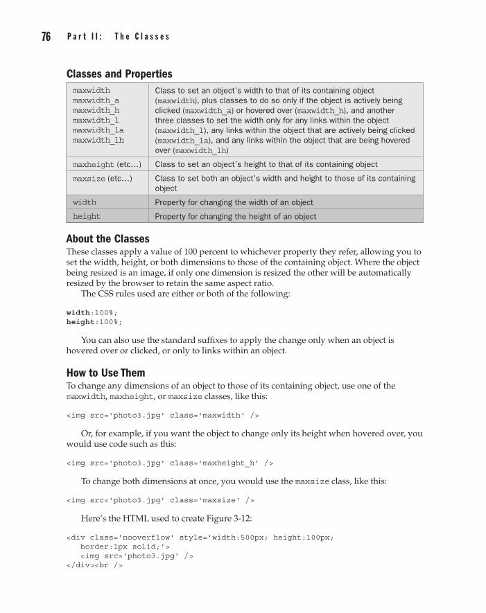
76 p a r t I I : t h e C l a s s e s C h a p t e r 3 : M a n i p u l a t i n g O b j e c t s 77
Classes and Propertiesmaxwidth maxwidth_a maxwidth_h maxwidth_l maxwidth_la maxwidth_lh
Class to set an object’s width to that of its containing object (maxwidth), plus classes to do so only if the object is actively being clicked (maxwidth_a) or hovered over (maxwidth_h), and another three classes to set the width only for any links within the object (maxwidth_l), any links within the object that are actively being clicked (maxwidth_la), and any links within the object that are being hovered over (maxwidth_lh)
maxheight (etc…) Class to set an object’s height to that of its containing object
maxsize (etc…) Class to set both an object’s width and height to those of its containing object
width Property for changing the width of an object
height Property for changing the height of an object
About the ClassesThese classes apply a value of 100 percent to whichever property they refer, allowing you to set the width, height, or both dimensions to those of the containing object. Where the object being resized is an image, if only one dimension is resized the other will be automatically resized by the browser to retain the same aspect ratio.
The CSS rules used are either or both of the following:
width:100%; height:100%;
You can also use the standard suffixes to apply the change only when an object is hovered over or clicked, or only to links within an object.
How to Use ThemTo change any dimensions of an object to those of its containing object, use one of the maxwidth, maxheight, or maxsize classes, like this:
<img src='photo3.jpg' class='maxwidth' />
Or, for example, if you want the object to change only its height when hovered over, you would use code such as this:
<img src='photo3.jpg' class='maxheight_h' />
To change both dimensions at once, you would use the maxsize class, like this:
<img src='photo3.jpg' class='maxsize' />
Here’s the HTML used to create Figure 3-12:
<div class='nooverflow' style='width:500px; height:100px; border:1px solid;'> <img src='photo3.jpg' /> </div><br />

76 p a r t I I : t h e C l a s s e s part II
C h a p t e r 3 : M a n i p u l a t i n g O b j e c t s 77
<div class='nooverflow' style='width:500px; height:100px; border:1px solid;'> <img src='photo3.jpg' class='maxwidth' /> </div><br /> <div class='nooverflow' style='width:500px; height:100px; border:1px solid;'> <img src='photo3.jpg' class='maxheight' /> </div><br /> <div class='nooverflow' style='width:500px; height:100px; border:1px solid;'> <img src='photo3.jpg' class='maxsize' /> </div>
As always, this example file and its images are available for download from the companion web site at plugincss.com.
The Classes.maxwidth, .maxwidth_a:active, .maxwidth_h:hover, .maxwidth_l a, .maxwidth_la a:active, .maxwidth_lh a:hover { width :100%; } .maxheight, .maxheight_a:active, .maxheight_h:hover .maxheight_l a, .maxheight_la a:active, .maxheight_lh a:hover { height:100%; } .maxsize, .maxsize_a:active, .maxsize_h:hover, .maxsize_l a, .maxsize_la a:active, .maxsize_lh a:hover { height:100%; width:100%; }
LocationThe classes in plug-in group 13 offer a variety of absolute and relative positioning functions. For example, in Figure 3-13 the totop, tobottom, toleft, and toright classes have been used to place four images in the corners of their containing object.
Classes and Propertiestotop Class to move an object to the top edge of its container
tobottom Class to move an object to the bottom edge of its container
toleft Class to move an object to the left edge of its container
toright Class to move an object to the right edge of its container
leftby0 leftby0_h
Class to move an object left by 0 pixels (or move it to the left edge of the containing object), the _h suffix is used for applying the property only when it is hovered over
leftby5 – leftby100 (etc…)
Classes to move an object left by a value of 5 or from 10 through 100 pixels in steps of 10, the _h suffix is used for applying the property only when it is hovered over
1 3

78 p a r t I I : t h e C l a s s e s C h a p t e r 3 : M a n i p u l a t i n g O b j e c t s 79
rightby0 – rightby100 (etc…)
Classes – as the leftby… classes but moves the object right
upby0 – upby100 (etc…) Classes – as the leftby… classes but moves the object up
downby0 – downby100 (etc…)
Classes – as the leftby… classes but moves the object down
top Property for changing the vertical distance of an object from the top of its container, or for moving an object by relative vertical amounts
bottom Property for changing the vertical distance of an object from the bottom of its container, or for moving an object by relative vertical amounts
left Property for changing the horizontal distance of an object from the left of its container, or for moving an object by relative horizontal amounts
right Property for changing the horizontal distance of an object from the right of its container, or for moving an object by relative horizontal amounts
Figure 3-13 Moving images to the four corners of their containing object
78 p a r t I I : t h e C l a s s e s part II
C h a p t e r 3 : M a n i p u l a t i n g O b j e c t s 79
About the ClassesThese classes access the top, bottom, left, and right properties of an object to either place it in an absolute position or move it by a relative amount. The _h suffix of the class names is supported to apply the change only when an object is hovered over, while the other suffixes are not supported, since it is unlikely they would ever be used.
Some of the CSS rules used are similar to the following examples:
top:20px; left:-5px; right:0px; bottom:50px;
How to Use ThemTo position an object against one or more edges of its containing object, you can use code such as the following, which was used to create Figure 3-13:
<div class='relative' style='width:500px; height:350px;'> <img class='absolute toleft totop' src='photo4.jpg' /> <img class='absolute toright totop' src='photo4.jpg' /> <img class='absolute toleft tobottom' src='photo4.jpg' /> <img class='absolute toright tobottom' src='photo4.jpg' /> </div>
This example creates a container out of a <div>, which is given a position property of relative so it is no longer static (the default). Therefore, all the absolute objects within it will place themselves relative to it.
Inside the <div>, the classes are used in pairs to place each of the photographs in the four corners of the parent object.
Moving Objects by Relative AmountsYou can also move objects relative to their current position by 5 pixels, or any amount between 10 and 100 pixels in steps of 10, like this:
<img class='rightby50 downby50' src='image.jpg' />
This example moves the object down and to the right by 50 pixels. If the object doesn’t already have a position, it will be placed 50 pixels down from the top and in from the left edge of its containing object.
The Classes.totop, .totop_h:hover { top :0px; } .tobottom, .tobottom_h:hover { bottom:0px; } .toleft, .toleft_h:hover { left :0px; } .toright, .toright_h:hover { right :0px; } .leftby0, .leftby0_h:hover, .rightby0, .rightby0_h:hover { left:0px; } .leftby5, .leftby5_h:hover { left:-5px; } .leftby10, .leftby10_h:hover { left:-10px; }

80 p a r t I I : t h e C l a s s e s C h a p t e r 3 : M a n i p u l a t i n g O b j e c t s 81
.leftby20, .leftby20_h:hover { left:-20px; }
.leftby30, .leftby30_h:hover { left:-30px; }
.leftby40, .leftby40_h:hover { left:-40px; }
.leftby50, .leftby50_h:hover { left:-50px; }
.leftby60, .leftby60_h:hover { left:-60px; }
.leftby70, .leftby70_h:hover { left:-70px; }
.leftby80, .leftby80_h:hover { left:-80px; }
.leftby90, .leftby90_h:hover { left:-90px; }
.leftby100, .leftby100_h:hover { left:-100px; } .rightby5, .rightby5_h:hover { left:5px; } .rightby10, .rightby10_h:hover { left:10px; } .rightby20, .rightby20_h:hover { left:20px; } .rightby30, .rightby30_h:hover { left:30px; } .rightby40, .rightby40_h:hover { left:40px; } .rightby50, .rightby50_h:hover { left:50px; } .rightby60, .rightby60_h:hover { left:60px; } .rightby70, .rightby70_h:hover { left:70px; } .rightby80, .rightby80_h:hover { left:80px; } .rightby90, .rightby90_h:hover { left:90px; } .rightby100, .rightby100_h:hover { left:100px; } .upby0, .upby0_h:hover, .downby0, .downby0_h:hover { top:0px; } .upby5, .upby5_h:hover { top:-5px; } .upby10, .upby10_h:hover { top:-10px; } .upby20, .upby20_h:hover { top:-20px; } .upby30, .upby30_h:hover { top:-30px; } .upby40, .upby40_h:hover { top:-40px; } .upby50, .upby50_h:hover { top:-50px; } .upby60, .upby60_h:hover { top:-60px; } .upby70, .upby70_h:hover { top:-70px; } .upby80, .upby80_h:hover { top:-80px; } .upby90, .upby90_h:hover { top:-90px; } .upby100, .upby100_h:hover { top:-100px; } .downby5, .downby5_h:hover { top:5px; } .downby10, .downby10_h:hover { top:10px; } .downby20, .downby20_h:hover { top:20px; } .downby30, .downby30_h:hover { top:30px; } .downby40, .downby40_h:hover { top:40px; } .downby50, .downby50_h:hover { top:50px; } .downby60, .downby60_h:hover { top:60px; } .downby70, .downby70_h:hover { top:70px; } .downby80, .downby80_h:hover { top:80px; } .downby90, .downby90_h:hover { top:90px; } .downby100, .downby100_h:hover { top:100px; }
Selective MarginsUsing the classes in this group of plug-ins, you can specify or change any of the four margins of an object by 5 pixels, or by any amount between 10 and 100 pixels, in steps of 10. In Figure 3-14, eleven <div> tags have been created, each one resting on the left edge
1 4
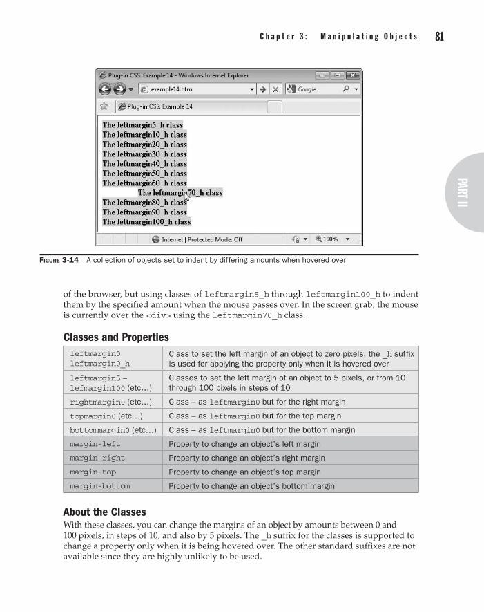
80 p a r t I I : t h e C l a s s e s part II
C h a p t e r 3 : M a n i p u l a t i n g O b j e c t s 81
of the browser, but using classes of leftmargin5_h through leftmargin100_h to indent them by the specified amount when the mouse passes over. In the screen grab, the mouse is currently over the <div> using the leftmargin70_h class.
Classes and Propertiesleftmargin0 leftmargin0_h
Class to set the left margin of an object to zero pixels, the _h suffix is used for applying the property only when it is hovered over
leftmargin5 – lefmargin100 (etc…)
Classes to set the left margin of an object to 5 pixels, or from 10 through 100 pixels in steps of 10
rightmargin0 (etc…) Class – as leftmargin0 but for the right margin
topmargin0 (etc…) Class – as leftmargin0 but for the top margin
bottommargin0 (etc…) Class – as leftmargin0 but for the bottom margin
margin-left Property to change an object’s left margin
margin-right Property to change an object’s right margin
margin-top Property to change an object’s top margin
margin-bottom Property to change an object’s bottom margin
About the ClassesWith these classes, you can change the margins of an object by amounts between 0 and 100 pixels, in steps of 10, and also by 5 pixels. The _h suffix for the classes is supported to change a property only when it is being hovered over. The other standard suffixes are not available since they are highly unlikely to be used.
Figure 3-14 A collection of objects set to indent by differing amounts when hovered over

82 p a r t I I : t h e C l a s s e s C h a p t e r 3 : M a n i p u l a t i n g O b j e c t s 83
Some of the CSS rules used are similar to the following examples:
margin-left:10px; margin-right:-10px; margin-top:20px; margin-bottom:0px;
How to Use ThemTo use these classes, refer to the one you need by placing its name in the class='…' argument of an HTML tag, like this:
<div class='leftmargin30'>This text is indented by 30 pixels</div>
You can also apply the hover versions of these classes, for example enabling you to create professional looking animations for menus, like this:
<div class='leftmargin10 leftmargin20_h'>Menu Item 1</div> <div class='leftmargin10 leftmargin20_h'>Menu Item 2</div> <div class='leftmargin10 leftmargin20_h'>Menu Item 3</div>
Following is the code used to create the screen shown in Figure 3-14:
<span class='leftmargin5_h lime_b'>The leftmargin5_h class</span><br /> <span class='leftmargin10_h lime_b'>The leftmargin10_h class</span><br /> <span class='leftmargin20_h lime_b'>The leftmargin20_h class</span><br /> <span class='leftmargin30_h lime_b'>The leftmargin30_h class</span><br /> <span class='leftmargin40_h lime_b'>The leftmargin40_h class</span><br /> <span class='leftmargin50_h lime_b'>The leftmargin50_h class</span><br /> <span class='leftmargin60_h lime_b'>The leftmargin60_h class</span><br /> <span class='leftmargin70_h lime_b'>The leftmargin70_h class</span><br /> <span class='leftmargin80_h lime_b'>The leftmargin80_h class</span><br /> <span class='leftmargin90_h lime_b'>The leftmargin90_h class</span><br /> <span class='leftmargin100_h lime_b'>The leftmargin100_h class</span>
Each item has a background fill color of lime green, is aligned with the left side of the browser, and indents by the number of pixels specified in the class name it uses when the mouse passes over it.
Margins are external to objects and are therefore invisible, as can be seen in Figure 3-14, where the lime green background color has not been apportioned to the margin area of the hovered element.
The Classes.leftmargin0, .leftmargin0_h:hover { margin-left:0px; } .leftmargin5, .leftmargin5_h:hover { margin-left:5px; } .leftmargin10, .leftmargin10_h:hover { margin-left:10px; } .leftmargin20, .leftmargin20_h:hover { margin-left:20px; } .leftmargin30, .leftmargin30_h:hover { margin-left:30px; } .leftmargin40, .leftmargin40_h:hover { margin-left:40px; } .leftmargin50, .leftmargin50_h:hover { margin-left:50px; }

82 p a r t I I : t h e C l a s s e s part II
C h a p t e r 3 : M a n i p u l a t i n g O b j e c t s 83
.leftmargin60, .leftmargin60_h:hover { margin-left:60px; }
.leftmargin70, .leftmargin70_h:hover { margin-left:70px; }
.leftmargin80, .leftmargin80_h:hover { margin-left:80px; }
.leftmargin90, .leftmargin90_h:hover { margin-left:90px; }
.leftmargin100, .leftmargin100_h:hover { margin-left:100px; } .rightmargin0, .rightmargin0_h:hover { margin-right:0px; } .rightmargin5, .rightmargin5_h:hover { margin-right:5px; } .rightmargin10, .rightmargin10_h:hover { margin-right:10px; } .rightmargin20, .rightmargin20_h:hover { margin-right:20px; } .rightmargin30, .rightmargin30_h:hover { margin-right:30px; } .rightmargin40, .rightmargin40_h:hover { margin-right:40px; } .rightmargin50, .rightmargin50_h:hover { margin-right:50px; } .rightmargin60, .rightmargin60_h:hover { margin-right:60px; } .rightmargin70, .rightmargin70_h:hover { margin-right:70px; } .rightmargin80, .rightmargin80_h:hover { margin-right:80px; } .rightmargin90, .rightmargin90_h:hover { margin-right:90px; } .rightmargin100, .rightmargin100_h:hover { margin-right:100px; } .topmargin0, .topmargin0_h:hover { margin-top:0px; } .topmargin5, .topmargin5_h:hover { margin-top:5px; } .topmargin10, .topmargin10_h:hover { margin-top:10px; } .topmargin20, .topmargin20_h:hover { margin-top:20px; } .topmargin30, .topmargin30_h:hover { margin-top:30px; } .topmargin40, .topmargin40_h:hover { margin-top:40px; } .topmargin50, .topmargin50_h:hover { margin-top:50px; } .topmargin60, .topmargin60_h:hover { margin-top:60px; } .topmargin70, .topmargin70_h:hover { margin-top:70px; } .topmargin80, .topmargin80_h:hover { margin-top:80px; } .topmargin90, .topmargin90_h:hover { margin-top:90px; } .topmargin100, .topmargin100_h:hover { margin-top:100px; } .bottommargin0, .bottommargin0_h:hover { margin-bottom:0px; } .bottommargin5, .bottommargin5_h:hover { margin-bottom:5px; } .bottommargin10, .bottommargin10_h:hover { margin-bottom:10px; } .bottommargin20, .bottommargin20_h:hover { margin-bottom:20px; } .bottommargin30, .bottommargin30_h:hover { margin-bottom:30px; } .bottommargin40, .bottommargin40_h:hover { margin-bottom:40px; } .bottommargin50, .bottommargin50_h:hover { margin-bottom:50px; } .bottommargin60, .bottommargin60_h:hover { margin-bottom:60px; } .bottommargin70, .bottommargin70_h:hover { margin-bottom:70px; } .bottommargin80, .bottommargin80_h:hover { margin-bottom:80px; } .bottommargin90, .bottommargin90_h:hover { margin-bottom:90px; } .bottommargin100, .bottommargin100_h:hover { margin-bottom:100px; }
Selective PaddingYou’ve already seen the basic padding classes provided in plug-in group 9. You can also use this collection of classes to give you even greater control over which edges to pad and by how much.
1 5

84 p a r t I I : t h e C l a s s e s C h a p t e r 3 : M a n i p u l a t i n g O b j e c t s 85
In Figure 3-15, a collection of <span> objects have been given varying leftpadding.._h properties. The mouse is currently over the one assigned a value of 90 pixels, which has therefore been indented by that amount.
Classes and Propertiesleftpadding0 leftpadding0_h
Class to set the left padding of an object to zero pixels, the _h suffix is used for applying the property only when it is hovered over
leftpadding5 – lefpadding100 (etc…)
Classes to set the left padding of an object to 5 pixels, or from 10 through 100 pixels in steps of 10
rightpadding0 (etc…) Class – as leftpadding0 but for the right padding
toppadding0 (etc…) Class – as leftpadding0 but for the top padding
bottompadding0 (etc…) Class – as leftpadding0 but for the bottom padding
padding-left Property to change an object’s left padding
padding-right Property to change an object’s right padding
padding-top Property to change an object’s top padding
padding-bottom Property to change an object’s bottom padding
About the ClassesWith these classes, you can change the padding of an object by amounts between 0 and 100 pixels, in steps of 10, and also by 5 pixels. The _h suffix for the classes is supported to change a property only when it is being hovered over. The other standard suffixes are not available since they are highly unlikely to be used.
Figure 3-15 The left padding of these objects is set to differing amounts when hovered over

84 p a r t I I : t h e C l a s s e s part II
C h a p t e r 3 : M a n i p u l a t i n g O b j e c t s 85
Here are some examples of the CSS rules used by these classes:
padding-left:5px; padding-right:20px; padding-top:0px; padding-bottom:-10px;
How to Use ThemThese classes provide similar results to the margin classes in the previous plug-in group, except that the padding of an object is internal to it and so the padded area assumes the properties of the rest of the object. This can be seen in Figure 3-15, in which the 90-pixels wide padding that has been applied to the left side of the indented span has assumed the lime green background color of the object. Here is the code used to create the screen grab:
<span class='leftpadding5_h lime_b'>Using leftpadding5_h </span><br /> <span class='leftpadding10_h lime_b'>Using leftpadding10_h </span><br /> <span class='leftpadding20_h lime_b'>Using leftpadding20_h </span><br /> <span class='leftpadding30_h lime_b'>Using leftpadding30_h </span><br /> <span class='leftpadding40_h lime_b'>Using leftpadding40_h </span><br /> <span class='leftpadding50_h lime_b'>Using leftpadding50_h </span><br /> <span class='leftpadding60_h lime_b'>Using leftpadding60_h </span><br /> <span class='leftpadding70_h lime_b'>Using leftpadding70_h </span><br /> <span class='leftpadding80_h lime_b'>Using leftpadding80_h </span><br /> <span class='leftpadding90_h lime_b'>Using leftpadding90_h </span><br /> <span class='leftpadding100_h lime_b'>Using leftpadding100_h</span>
Because of the padding property’s ability to seem to stretch an object, you will see this feature used to good effect in Chapter 12, in conjunction with animated transitions to smoothly move menu items in and out again as the mouse hovers over them.
The Classes.leftpadding0, .leftpadding0_h:hover { padding-left:0px; } .leftpadding5, .leftpadding5_h:hover { padding-left:5px; } .leftpadding10, .leftpadding10_h:hover { padding-left:10px; } .leftpadding20, .leftpadding20_h:hover { padding-left:20px; } .leftpadding30, .leftpadding30_h:hover { padding-left:30px; } .leftpadding40, .leftpadding40_h:hover { padding-left:40px; } .leftpadding50, .leftpadding50_h:hover { padding-left:50px; } .leftpadding60, .leftpadding60_h:hover { padding-left:60px; } .leftpadding70, .leftpadding70_h:hover { padding-left:70px; } .leftpadding80, .leftpadding80_h:hover { padding-left:80px; } .leftpadding90, .leftpadding90_h:hover { padding-left:90px; } .leftpadding100, .leftpadding100_h:hover { padding-left:100px; } .rightpadding0, .rightpadding0_h:hover { padding-right:0px; } .rightpadding5, .rightpadding5_h:hover { padding-right:5px; } .rightpadding10, .rightpadding10_h:hover { padding-right:10px; } .rightpadding20, .rightpadding20_h:hover { padding-right:20px; } .rightpadding30, .rightpadding30_h:hover { padding-right:30px; } .rightpadding40, .rightpadding40_h:hover { padding-right:40px; } .rightpadding50, .rightpadding50_h:hover { padding-right:50px; } .rightpadding60, .rightpadding60_h:hover { padding-right:60px; }
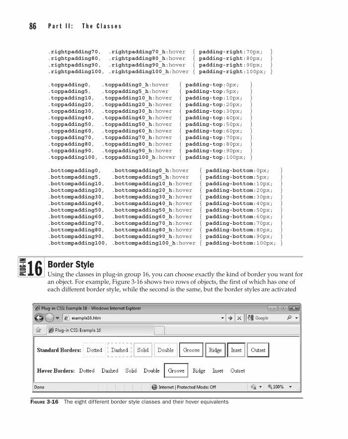
86 p a r t I I : t h e C l a s s e s C h a p t e r 3 : M a n i p u l a t i n g O b j e c t s 87
.rightpadding70, .rightpadding70_h:hover { padding-right:70px; }
.rightpadding80, .rightpadding80_h:hover { padding-right:80px; }
.rightpadding90, .rightpadding90_h:hover { padding-right:90px; }
.rightpadding100, .rightpadding100_h:hover { padding-right:100px; } .toppadding0, .toppadding0_h:hover { padding-top:0px; } .toppadding5, .toppadding5_h:hover { padding-top:5px; } .toppadding10, .toppadding10_h:hover { padding-top:10px; } .toppadding20, .toppadding20_h:hover { padding-top:20px; } .toppadding30, .toppadding30_h:hover { padding-top:30px; } .toppadding40, .toppadding40_h:hover { padding-top:40px; } .toppadding50, .toppadding50_h:hover { padding-top:50px; } .toppadding60, .toppadding60_h:hover { padding-top:60px; } .toppadding70, .toppadding70_h:hover { padding-top:70px; } .toppadding80, .toppadding80_h:hover { padding-top:80px; } .toppadding90, .toppadding90_h:hover { padding-top:90px; } .toppadding100, .toppadding100_h:hover { padding-top:100px; } .bottompadding0, .bottompadding0_h:hover { padding-bottom:0px; } .bottompadding5, .bottompadding5_h:hover { padding-bottom:5px; } .bottompadding10, .bottompadding10_h:hover { padding-bottom:10px; } .bottompadding20, .bottompadding20_h:hover { padding-bottom:20px; } .bottompadding30, .bottompadding30_h:hover { padding-bottom:30px; } .bottompadding40, .bottompadding40_h:hover { padding-bottom:40px; } .bottompadding50, .bottompadding50_h:hover { padding-bottom:50px; } .bottompadding60, .bottompadding60_h:hover { padding-bottom:60px; } .bottompadding70, .bottompadding70_h:hover { padding-bottom:70px; } .bottompadding80, .bottompadding80_h:hover { padding-bottom:80px; } .bottompadding90, .bottompadding90_h:hover { padding-bottom:90px; } .bottompadding100, .bottompadding100_h:hover { padding-bottom:100px; }
Border StyleUsing the classes in plug-in group 16, you can choose exactly the kind of border you want for an object. For example, Figure 3-16 shows two rows of objects, the first of which has one of each different border style, while the second is the same, but the border styles are activated
Figure 3-16 The eight different border style classes and their hover equivalents
1 6
86 p a r t I I : t h e C l a s s e s part II
C h a p t e r 3 : M a n i p u l a t i n g O b j e c t s 87
only when the mouse passes over them. In the screen grab, the mouse is currently hovering over the object with grooved borders in the second row.
Classes and Propertiesbdotted bdotted_h
Classes to set an object’s border style to dotted either immediately, or when hovered over
bdashed bdashed_h
Classes to set an object’s border style to dashed either immediately, or when hovered over
bsolid bsolid_h
Classes to set an object’s border style to solid either immediately, or when hovered over
bdouble bdouble_h
Classes to set an object’s border style to double either immediately, or when hovered over
bgroove bgroove_h
Classes to set an object’s border style to groove either immediately, or when hovered over—this effect depends on the border color
bridge bridge_h
Classes to set an object’s border style to ridge either immediately, or when hovered over—this effect depends on the border color
binset binset_h
Classes to set an object’s border style to inset either immediately, or when hovered over—this effect depends on the border color
boutset boutset_h
Classes to set an object’s border style to outset either immediately, or when hovered over—this effect depends on the border color
border-style Property for changing an object’s border style
About the ClassesThese classes enable the selection of all eight different types of border style, which can be applied immediately, or only when hovered over. They achieve this effect using the border-style property, like this:
border-style:dashed;
How to Use ThemAs soon as you choose a border style for an object, the border will be displayed, but some of the classes only show these styles at their best when a mid-range color is also supplied (see the Border Color plug-in group).
To add a border to an object, refer to the border style in a class, like this:
<span class='bdouble'>Double</span>
Following is the HTML used to create the screen grab in Figure 3-16:
<br /><b>Standard Borders:</b> <span class='bdotted padding blime'>Dotted</span> <span class='bdashed padding blime'>Dashed</span> <span class='bsolid padding blime'>Solid </span> <span class='bdouble padding blime'>Double</span> <span class='bgroove padding blime'>Groove</span>
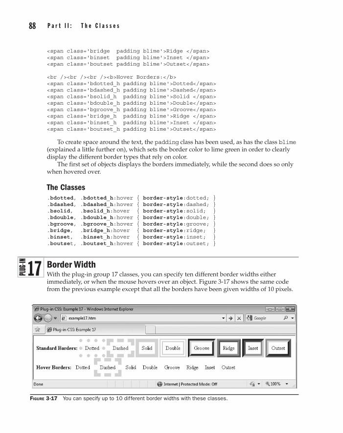
88 p a r t I I : t h e C l a s s e s C h a p t e r 3 : M a n i p u l a t i n g O b j e c t s 89
<span class='bridge padding blime'>Ridge </span> <span class='binset padding blime'>Inset </span> <span class='boutset padding blime'>Outset</span> <br /><br /><br /><b>Hover Borders:</b> <span class='bdotted_h padding blime'>Dotted</span> <span class='bdashed_h padding blime'>Dashed</span> <span class='bsolid_h padding blime'>Solid </span> <span class='bdouble_h padding blime'>Double</span> <span class='bgroove_h padding blime'>Groove</span> <span class='bridge_h padding blime'>Ridge </span> <span class='binset_h padding blime'>Inset </span> <span class='boutset_h padding blime'>Outset</span>
To create space around the text, the padding class has been used, as has the class blime (explained a little further on), which sets the border color to lime green in order to clearly display the different border types that rely on color.
The first set of objects displays the borders immediately, while the second does so only when hovered over.
The Classes.bdotted, .bdotted_h:hover { border-style:dotted; } .bdashed, .bdashed_h:hover { border-style:dashed; } .bsolid, .bsolid_h:hover { border-style:solid; } .bdouble, .bdouble_h:hover { border-style:double; } .bgroove, .bgroove_h:hover { border-style:groove; } .bridge, .bridge_h:hover { border-style:ridge; } .binset, .binset_h:hover { border-style:inset; } .boutset, .boutset_h:hover { border-style:outset; }
Border WidthWith the plug-in group 17 classes, you can specify ten different border widths either immediately, or when the mouse hovers over an object. Figure 3-17 shows the same code from the previous example except that all the borders have been given widths of 10 pixels.
Figure 3-17 You can specify up to 10 different border widths with these classes.
1 7
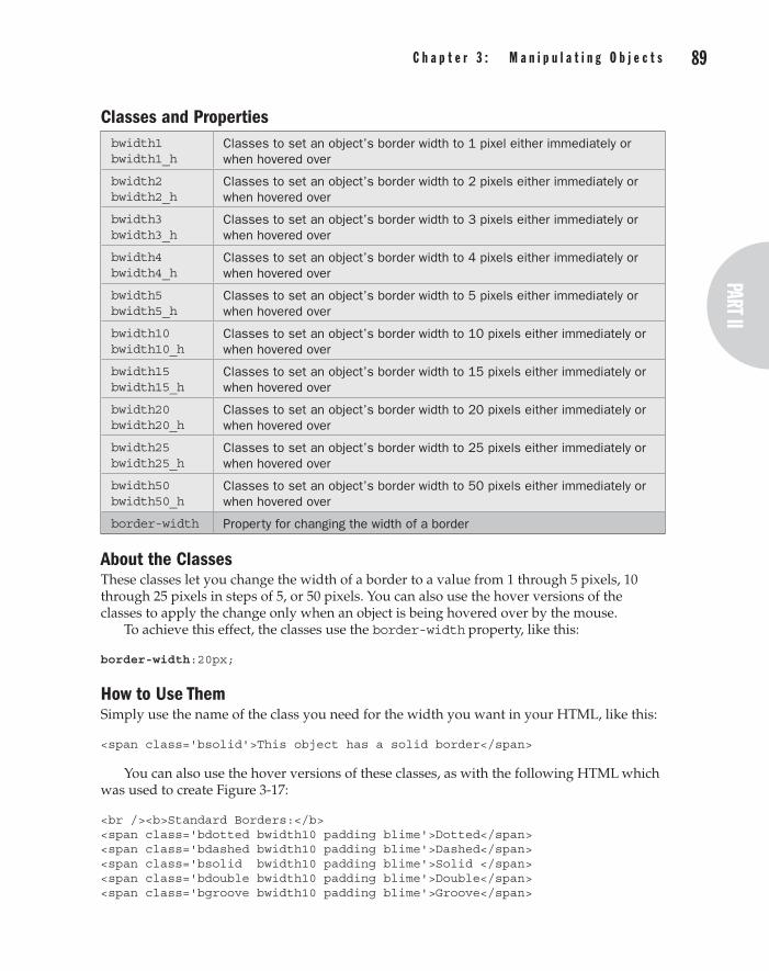
88 p a r t I I : t h e C l a s s e s part II
C h a p t e r 3 : M a n i p u l a t i n g O b j e c t s 89
Classes and Propertiesbwidth1 bwidth1_h
Classes to set an object’s border width to 1 pixel either immediately or when hovered over
bwidth2 bwidth2_h
Classes to set an object’s border width to 2 pixels either immediately or when hovered over
bwidth3 bwidth3_h
Classes to set an object’s border width to 3 pixels either immediately or when hovered over
bwidth4 bwidth4_h
Classes to set an object’s border width to 4 pixels either immediately or when hovered over
bwidth5 bwidth5_h
Classes to set an object’s border width to 5 pixels either immediately or when hovered over
bwidth10 bwidth10_h
Classes to set an object’s border width to 10 pixels either immediately or when hovered over
bwidth15 bwidth15_h
Classes to set an object’s border width to 15 pixels either immediately or when hovered over
bwidth20 bwidth20_h
Classes to set an object’s border width to 20 pixels either immediately or when hovered over
bwidth25 bwidth25_h
Classes to set an object’s border width to 25 pixels either immediately or when hovered over
bwidth50 bwidth50_h
Classes to set an object’s border width to 50 pixels either immediately or when hovered over
border-width Property for changing the width of a border
About the ClassesThese classes let you change the width of a border to a value from 1 through 5 pixels, 10 through 25 pixels in steps of 5, or 50 pixels. You can also use the hover versions of the classes to apply the change only when an object is being hovered over by the mouse.
To achieve this effect, the classes use the border-width property, like this:
border-width:20px;
How to Use ThemSimply use the name of the class you need for the width you want in your HTML, like this:
<span class='bsolid'>This object has a solid border</span>
You can also use the hover versions of these classes, as with the following HTML which was used to create Figure 3-17:
<br /><b>Standard Borders:</b> <span class='bdotted bwidth10 padding blime'>Dotted</span> <span class='bdashed bwidth10 padding blime'>Dashed</span> <span class='bsolid bwidth10 padding blime'>Solid </span> <span class='bdouble bwidth10 padding blime'>Double</span> <span class='bgroove bwidth10 padding blime'>Groove</span>

90 p a r t I I : t h e C l a s s e s C h a p t e r 3 : M a n i p u l a t i n g O b j e c t s 91
<span class='bridge bwidth10 padding blime'>Ridge </span> <span class='binset bwidth10 padding blime'>Inset </span> <span class='boutset bwidth10 padding blime'>Outset</span> <br /><br /><br /><b>Hover Borders:</b> <span class='bdotted_h bwidth10 padding blime'>Dotted</span> <span class='bdashed_h bwidth10 padding blime'>Dashed</span> <span class='bsolid_h bwidth10 padding blime'>Solid </span> <span class='bdouble_h bwidth10 padding blime'>Double</span> <span class='bgroove_h bwidth10 padding blime'>Groove</span> <span class='bridge_h bwidth10 padding blime'>Ridge </span> <span class='binset_h bwidth10 padding blime'>Inset </span> <span class='boutset_h bwidth10 padding blime'>Outset</span>
In each of these objects, a different border style is specified, with a width of 10 pixels and standard padding. Once again, the blime class (see the next section) has been used to set a border color that will show all the styles to their best effect.
The Classes.bwidth1, .bwidth1_h:hover { border-width:1px; } .bwidth2, .bwidth2_h:hover { border-width:2px; } .bwidth3, .bwidth3_h:hover { border-width:3px; } .bwidth4, .bwidth4_h:hover { border-width:4px; } .bwidth5, .bwidth5_h:hover { border-width:5px; } .bwidth10, .bwidth10_h:hover { border-width:10px; } .bwidth15, .bwidth15_h:hover { border-width:15px; } .bwidth20, .bwidth20_h:hover { border-width:20px; } .bwidth25, .bwidth25_h:hover { border-width:25px; } .bwidth50, .bwidth50_h:hover { border-width:50px; }
Border ColorWith this final group of border classes, you can choose any of 21 different colors to apply to a border either immediately, or when it is moused over. Figure 3-18 expands on the example in the previous section to present two rows of objects using a variety of different border styles, widths, and colors. The second row of classes apply only when the mouse passes over an object. In the figure, it is currently over the Inset object.
Classes and Propertiesbaqua baqua_h bblack bblack_h bblue bblue_h bbrown bbrown_h bfuchsia bfuchsia_h bgold bgold_h bgray bgray_h bgreen bgreen_h bkhaki bkhaki_h blime blime_h bmaroon bmaroon_h bnavy bnavy_h bolive bolive_h borange borange_h bpink bpink_h bpurple bpurple_h bred bred_h bsilver bsilver_h bteal bteal_h bwhite bwhite_h byellow byellow_h
Classes to change the border color of an object either immediately, or when it is moused over
Border-color Property to change the border color of an object
1 8

90 p a r t I I : t h e C l a s s e s part II
C h a p t e r 3 : M a n i p u l a t i n g O b j e c t s 91
About the ClassesThese classes provide a wide range of colors that you can apply to borders either immediately or when they are moused over. The property that is manipulated is border-color, like this:
border-color:#c44;
How to Use ThemUsing these color classes is as easy as putting their names within an object’s class='…' argument, like this:
<span class='bbrown'>This object has a brown border</span>
In the following example HTML (which was used to create Figure 3-18), a variety of different colors has been used, along with different border styles and widths:
<br /><br /><br /><b>Standard Borders:</b> <span class='bdotted bwidth1 padding baqua'>Dotted</span> <span class='bdashed bwidth3 padding bblack' >Dashed</span> <span class='bsolid bwidth5 padding bblue' >Solid </span> <span class='bdouble bwidth10 padding bbrown' >Double</span> <span class='bgroove bwidth15 padding bfuchsia' >Groove</span> <span class='bridge bwidth20 padding bgold' >Ridge </span> <span class='binset bwidth25 padding bgray' >Inset </span> <span class='boutset bwidth50 padding bgreen' >Outset</span> <br /><br /><br /><br /><br /><br /><b>Hover Borders:</b> <span class='bdotted_h bwidth1 padding bkhaki' >Dotted</span> <span class='bdashed_h bwidth3 padding bmaroon'>Dashed</span> <span class='bsolid_h bwidth5 padding bnavy' >Solid </span>
Figure 3-18 A selection of the different border types, widths, and colors available

92 p a r t I I : t h e C l a s s e s C h a p t e r 3 : M a n i p u l a t i n g O b j e c t s 93
<span class='bdouble_h bwidth10 padding bolive' >Double</span> <span class='bgroove_h bwidth15 padding borange'>Groove</span> <span class='bridge_h bwidth20 padding bpurple'>Ridge </span> <span class='binset_h bwidth25 padding bpink' >Inset </span> <span class='boutset_h bwidth50 padding bred' >Outset</span>
The Classes.baqua, .baqua_h:hover { border-color:#0ff; } .bblack, .bblack_h:hover { border-color:#000; } .bblue, .bblue_h:hover { border-color:#00f; } .bbrown, .bbrown_h:hover { border-color:#c44; } .bfuchsia, .bfuchsia_h:hover { border-color:#f0f; } .bgold, .bgold_h:hover { border-color:#fc0; } .bgray, .bgray_h:hover { border-color:#888; } .bgreen, .bgreen_h:hover { border-color:#080; } .bkhaki, .bkhaki_h:hover { border-color:#cc8; } .blime, .blime_h:hover { border-color:#0f0; } .bmaroon, .bmaroon_h:hover { border-color:#800; } .bnavy, .bnavy_h:hover { border-color:#008; } .bolive, .bolive_h:hover { border-color:#880; } .borange, .borange_h:hover { border-color:#f80; } .bpink, .bpink_h:hover { border-color:#f88; } .bpurple, .bpurple_h:hover { border-color:#808; } .bred, .bred_h:hover { border-color:#f00; } .bsilver, .bsilver_h:hover { border-color:#ccc; } .bteal, .bteal_h:hover { border-color:#088; } .bwhite, .bwhite_h:hover { border-color:#fff; } .byellow, .byellow_h:hover { border-color:#ff0; }
No OutlineTo enable people to tab through a document more easily, some browsers display a dotted outline around the object being focused on, as well as highlight it. This certainly helps make it clear which object has the focus, but as you can see in Figure 3-19 where Button 2 has the focus, the dotted border inset into the button destroys much of the button’s 3D gradient effect.
Figure 3-19 Button 2 shows a highlight and a dotted outline.
1 9

92 p a r t I I : t h e C l a s s e s part II
C h a p t e r 3 : M a n i p u l a t i n g O b j e c t s 93
On the other hand, in Figure 3-20, Button 3 is now focused on, and because it is using the nooutline class, there is no dotted outline. As you can see, there is still a highlight around the button, which is sufficient to inform you that the button has the focus, and the button itself looks much cleaner as a result. And on a color monitor (rather than a grayscale printed page like this), it looks even better.
Classes and Propertiesnooutline Class to remove the dotted border from an object that has focus
outline Property used by most browsers to enable or disable the outline
border Property used by Firefox and other Mozilla-based browsers (in conjunction with the ::-moz-focus-inner pseudo class) to enable or disable the outline
About the ClassWhen applied to an object, this class prevents it from displaying a dotted outline when it has focus. This is achieved on most browsers with the :focus pseudo class and the outline property, like this:
.nooutline:focus { outline:none; }
However, Firefox and other Mozilla-based browsers need to be handled differently, so the following alternative is used:
.nooutline::-moz-focus-inner { border:none; padding:1px 3px; }
When the outline is removed in a Firefox browser, it reduces the size of a button by the amount of the removed outline, so the padding property is updated to increase the button’s size back again.
How to Use ItTo prevent an object that has focus from displaying a dotted outline, just insert the nooutline class into the object’s class='…' argument, like this:
<button class='nooutline'>Click me</button>
Figure 3-20 The dotted outline has been removed from Button 3, leaving only the highlight.

94 p a r t I I : t h e C l a s s e s
Here is the HTML used to create Figures 3-19 and 3-20. If you press the TAB key several times or click the buttons, you’ll see that Button 3 does not show the dotted outline that the others display:
<button>Button 1</button> <button>Button 2</button> <button class='nooutline'>Button 3</button> <button>Button 4</button> <button>Button 5</button>
The Class.nooutline:focus { outline:none; } .nooutline::-moz-focus-inner { border :none; padding:1px 3px; }
Chapter 4
text and typography
part IIthe Classes

96 p a r t I I : t h e C l a s s e s C h a p t e r 4 : t e x t a n d t y p o g r a p h y 97
This chapter features a wide range of powerful plug-ins for managing most aspects of using and presenting fonts. These include quick access to font families, embedding any of an additional 19 fonts courtesy of Google, changing text size alignment and
styles, and adding colors and drop shadows.There are also handy classes to transform your text, automatically add icons and other
characters such as quotation marks, create professional drop cap effects, and more. Between them, there are over 720 classes for doing almost everything you could want to do with text, without having to write your own CSS rules.
FontsChoosing a font for displaying text is very easy using the classes in this plug-in group, as you only need to enter a short name into the class argument of an object. Plus, each font offers fallback fonts so that systems without the exact font you choose will display the closest match that they have. You can also decide when to enable the fonts since there are six versions of each class.
In Figure 4-1, all the available font classes have been used twice: once to display the associated fonts immediately, and again for mouse hover versions. In the second group of fonts, “Lucida Grande” is currently being hovered over.
Classes and Propertiesarial arial_a arial_h arial_l arial_la arial_lh
Classes to assign a font to an object (arial), to do so only when it is actively being clicked (arial_a), or when it is being hovered over (arial_h), also three classes to enable a font only for a link within the object (arial_l), a link within the object that is being clicked (arial_la), or a link within the object that is being hovered over (arial_lh)
arialb (etc…) Class – the same as Arial, but for Arial Bold
arialn (etc…) Class – the same as Arial, but for Arial Narrow
avant (etc…) Class – the same as Arial, but for Avant Garde
bookman (etc…) Class – the same as Arial, but for Bookman
century (etc…) Class – the same as Arial, but for Century Gothic
copper (etc…) Class – the same as Arial, but for Copperplate
comic (etc…) Class – the same as Arial, but for Comic Sans MS
courier (etc…) Class – the same as Arial, but for Courier
couriern (etc…) Class – the same as Arial, but for Courier New
garamond (etc…) Class – the same as Arial, but for Garamond
gill (etc…) Class – the same as Arial, but for Gill Sans MT
georgia (etc…) Class – the same as Arial, but for Georgia
helvetica (etc…) Class – the same as Arial, but for Helvetica
impact (etc…) Class – the same as Arial, but for Impact
20

96 p a r t I I : t h e C l a s s e s part II
C h a p t e r 4 : t e x t a n d t y p o g r a p h y 97
lucida (etc…) Class – the same as Arial, but for Lucida
lucidac (etc…) Class – the same as Arial, but for Lucida Console
palatino (etc…) Class – the same as Arial, but for Palatino
tahoma (etc…) Class – the same as Arial, but for Tahoma
times (etc…) Class – the same as Arial, but for Times
timesnr (etc…) Class – the same as Arial, but for Times New Roman
trebuchet (etc…) Class – the same as Arial, but for Trebuchet
verdana (etc…) Class – the same as Arial, but for Verdana
font-family Property used for changing font
About the ClassesThese classes use the CSS font-family property to assign the font you choose. Fallback fonts are provided for each to ensure that if a computer doesn’t have a particular font, it can at least display the closest one it does have.
For example, the copper class uses the following rule:
font-family:"Copperplate", "Copperplate Gothic Light", serif;
How to Use ThemTo use a font class, enter its name in the class argument of an object. For example, to change to the Impact font, you could use HTML such as this:
<span class='impact'>Impact</span>
Figure 4-1 A typical collection of fonts on a Windows computer

98 p a r t I I : t h e C l a s s e s C h a p t e r 4 : t e x t a n d t y p o g r a p h y 99
Or, to change a font only when the mouse hovers over the object, you might use this:
<span class='impact_h'>Impact</span>
Or you can combine classes so that, for example, to change the font of an object to Verdana, and then to Georgia when it is hovered over, you might use this:
<span class='verdana Georgia_h'>Impact</span>
You can also use the other class suffixes to enable a font only when it is actively clicked (classname_a), or when it is a link that is part of the object (classname_l), when it is a clicked link that is part of the object (classname_la), or when it is a hovered link that is part of the object (classname_lh).
Here is the code used to create Figure 4-1:
<span class='arial' >Arial</span>, <span class='arialb' >Arial Bold</span>, <span class='arialn' >Arial Narrow</span>, <span class='avant' >Avant Garde</span> <span class='bookman' >Bookman</span> <span class='century' >Century Gothic</span> <span class='copper' >Copperplate</span> <span class='comic' >Comic Sans MS</span> <span class='courier' >Courier</span> <span class='couriern' >Courier New</span> <span class='garamond' >Garamond</span> <span class='gill' >Gill Sans</span> <span class='georgia' >Georgia</span> <span class='helvetica'>Helvetica</span> <span class='impact' >Impact</span> <span class='lucida' >Lucida Grande</span> <span class='lucidacon'>Lucida Console</span> <span class='palatino' >Palatino</span> <span class='tahoma' >Tahoma</span> <span class='times' >Times</span> <span class='timesnr' >Times New Roman</span> <span class='trebuchet'>Trebuchet</span> <span class='verdana' >Verdana</span><br /><br /> <span class='arial_h' >Arial</span>, <span class='arialb_h' >Arial Bold</span>, <span class='arialn_h' >Arial Narrow</span>, <span class='avant_h' >Avant Garde</span> <span class='bookman_h' >Bookman</span> <span class='century_h' >Century Gothic</span> <span class='copper_h' >Copperplate</span> <span class='comic_h' >Comic Sans MS</span> <span class='courie_hr' >Courier</span> <span class='couriern_h' >Courier New</span> <span class='garamond_h' >Garamond</span> <span class='gill_h' >Gill Sans</span> <span class='georgia_h' >Georgia</span>

98 p a r t I I : t h e C l a s s e s part II
C h a p t e r 4 : t e x t a n d t y p o g r a p h y 99
<span class='helvetica_h'>Helvetica</span> <span class='impact_h' >Impact</span> <span class='lucida_h '>Lucida Grande</span> <span class='lucidacon_h'>Lucida Console</span> <span class='palatino_h' >Palatino</span> <span class='tahoma_h' >Tahoma</span> <span class='times_h' >Times</span> <span class='timesnr_h' >Times New Roman</span> <span class='trebuchet_h'>Trebuchet</span> <span class='verdana_h' >Verdana</span>
The Classes.arial, .arial_a:active, .arial_h:hover, .arial_l a, .arial_la a:active, .arial_lh a:hover { font-family:"Arial", sans-serif; } .arialb, .arialb_a:active, .arialb_h:hover, .arialb_l a, .arialb_la a:active, .arialb_lh a:hover { font-family:"Arial Black", sans-serif; } .arialn, .arialn_a:active, .arialn_h:hover, .arialn_l a, .arialn_la a:active, .arialbn_lh a:hover { font-family:"Arial Narrow", sans-serif; } .avant, .avant_a:active, .avant_h:hover, .avant_l a, .avant_la a:active, .avant_lh a:hover { font-family:"Avant Garde", sans-serif; } .bookman, .bookman_a:active, .bookman_h:hover, .bookman_l a, .bookman_la a:active, .bookman_lh a:hover { font-family:"Bookman", "Bookman Old Style", serif; } .century, .century_a:active, .century_h:hover, .century_l a, .century_la a:active, .century_lh a:hover { font-family:"Century Gothic", sans-serif; } .copper, .copper_a:active, .copper_h:hover, .copper_l a, .copper_la a:active, .copper_lh a:hover { font-family:"Copperplate", "Copperplate Gothic Light", serif; } .comic, .comic_a:active, .comic_h:hover, .comic_l a, .comic_la a:active, .comic_lh a:hover { font-family:"Comic Sans MS", cursive; } .courier, .courier_a:active, .courier_h:hover, .courier_l a, .courier_la a:active, .courier_lh a:hover { font-family:"Courier", monospace; } .couriern, .couriern_a:active, .couriern_h:hover, .couriern_l a, .couriern_la a:active, .couriern_lh a:hover { font-family:"Courier New", monospace; } .garamond, .garamond_a:active, .garamond_h:hover, .garamond_l a, .garamond_la a:active, .garamond_lh a:hover { font-family:"Garamond", serif; } .gill, .gill_a:active, .gill_h:hover, .gill_l a, .gill_la a:active, .gill_lh a:hover { font-family:"Gill Sans", "Gill Sans MT", sans-serif; } .georgia, .georgia_a:active, .georgia_h:hover, .georgia_l a, .georgia_la a:active, .georgia_lh a:hover { font-family:"Georgia", serif; }

100 p a r t I I : t h e C l a s s e s C h a p t e r 4 : t e x t a n d t y p o g r a p h y 101
.helvetica, .helvetica_a:active, .helvetica_h:hover,
.helvetica_l a, .helvetica_la a:active, .helvetica_lh a:hover { font-family:"Helvetica, sans-serif"; } .impact, .impact_a:active, .impact_h:hover, .impact_l a, .impact_la a:active, .impact_lh a:hover { font-family:"Impact", fantasy; } .lucida, .lucida_a:active, .lucida_h:hover, .lucida_l a, .lucida_la a:active, .lucida_lh a:hover { font-family:"Lucida Grande", "Lucida Sans Unicode", sans-serif; } .lucidac, .lucidac_a:active, .lucidac_h:hover, .lucidac_l a, .lucidac_la a:active, .lucidac_lh a:hover { font-family:"Lucida Console", monospace; } .palatino, .palatino_a:active, .palatino_h:hover, .palatino_l a, .palatino_la a:active, .palatino_lh a:hover { font-family:"Palatino", "Palatino Linotype", serif; } .tahoma, .tahoma_a:active, .tahoma_h:hover, .tahoma_l a, .tahoma_la a:active, .tahoma_lh a:hover { font-family:"Tahoma", sans-serif; } .times, .times_a:active, .times_h:hover, .times_l a, .times_la a:active, .times_lh a:hover { font-family:"Times", serif; } .timesnr, .timesnr_a:active, .timesnr_h:hover, .timesnr_l a, .timesnr_la a:active, .timesnr_lh a:hover { font-family:"Times New Roman", serif; } .trebuchet, .trebuchet_a:active, .trebuchet_h:hover, .trebuchet_l a, .trebuchet_la a:active, .trebuchet_lh a:hover { font-family:"Trebuchet", sans-serif; } .verdana, .verdana_a:active, .verdana_h:hover, .verdana_l a, .verdana_la a:active, .verdana_lh a:hover { font-family:"Verdana", sans-serif; }
Font StylesChoosing font styles with CSS can involve up to three different properties. But when you want to choose font styles such as bold, italic, or underline, these classes are much simpler. Figure 4-2 shows the various styles being applied one at a time until all are employed
Figure 4-2 The various font styles supported by these classes
2 1

100 p a r t I I : t h e C l a s s e s part II
C h a p t e r 4 : t e x t a n d t y p o g r a p h y 101
(Internet Explorer doesn’t support the blink property, so on that browser, any blinking text is shown in bold).
In the second row, the text is set to change font only when hovered over, as is the case with the word Underline.
Classes and Propertiesb b_a b_h b_l b_la b_lh
Classes to assign a font to bold (b), to do so only when it is actively being clicked (b_a), or when it is being hovered over (b_h), also three classes to enable bold for a link within the object (b_l), a link within the object that is being clicked (b_la), or a link within the object that is being hovered over (b_lh)
i (etc…) Class – as b but to enable italic text
l (etc…) Class – as b but to enable overline text
n (etc…) Class – as b but to restore normal styles
o (etc…) Class – as b but to enable oblique text
u (etc…) Class – as b but to enable underlined text
t (etc…) Class – as b but to enable linethrough text
w (etc…) Class – as b but to enable winking (or blinking) text, or bold in Internet Explorer
font-weight Property for changing the weight of a font
font-style Property for changing the style of a font
text-decoration Property for adding a decoration to a font
About the ClassesThese classes use three different CSS rules to create different font styles. They also support the suffixes such as _h to apply the new style only when an object is hovered over, and so on. For example, here are the CSS rules used to restore a font’s styling to normal:
font-style:normal; font-weight:normal; text-decoration:none;
Out of all modern browsers, only Internet Explorer will not display blinking text, so the bold attribute is selected instead. This is achieved using a CSS “hack” that only Internet Explorer can see, like this:
font-weight:bold\0;
By adding the \0 to the end of the rule, all browsers except Internet Explorer will ignore the rule, while IE will accept the rule and ignore the \0. This is also the case with the current preview version of IE 9.

102 p a r t I I : t h e C l a s s e s C h a p t e r 4 : t e x t a n d t y p o g r a p h y 103
How to Use ThemThese font class names have been kept to single letters because they are frequently used, so it saves on typing and keeps class arguments short. To use them, just add the class letter (or letter plus suffix) to a class argument, like the following, which sets both an Arial font and italic styling:
<span class='arial i'>This text is in an italic Arial font</span>
This is the HTML used to create the screen grab in Figure 4-2:
<span class='b'>Bold <span class='i'>Italic <span class='l'>overLine <span class='o'>Oblique <span class='u'>Underline <span class='t'>lineThrough <span class='w'>Wink </span></span></span></span></span></span></span><br /><br /> <span class='b_h'>Bold</span>, <span class='i_h'>Italic</span>, <span class='l_h'>overLine</span>, <span class='o_h'>Oblique</span>, <span class='u_h'>Underline</span>, <span class='t_h'>lineThrough</span>, <span class='w_h'>Wink</span>
The Classes.b, .b_a:active, .b_h:hover, .b_l a, .b_la a:active, .b_lh a:hover { font-weight:bold; } .i, .i_a:active, .i_h:hover, .i_l a, .i_la a:active, .i_lh a:hover { font-style:italic; } .l, .l_a:active, .l_h:hover, .l_l a, .l_la a:active, .l_lh a:hover { text-decoration:overline; } .n, .n_a:active, .n_h:hover, .n_l a, .n_la a:active, .n_lh a:hover { font-style:normal; font-weight:normal; text-decoration:none; } .o, .o_a:active, .o_h:hover, .o_l a, .o_la a:active, .o_lh a:hover { font-style:oblique; } .u, .u_a:active, .u_h:hover, .u_l a, .u_la a:active, .u_lh a:hover { text-decoration:underline; } .t, .t_a:active, .t_h:hover, .t_l a, .t_la a:active, .t_lh a:hover { text-decoration:line-through; } .w, .w_a:active, .w_h:hover, .w_l a, .w_la a:active, .w_lh a:hover { text-decoration:blink; font-weight:bold\0; /* IE */ }

102 p a r t I I : t h e C l a s s e s part II
C h a p t e r 4 : t e x t a n d t y p o g r a p h y 103
Text AlignmentWith these classes, you can choose between applying left, center, right, or full justification, as shown in Figure 4-3, which includes one example of each type of justification (taken from Charles Dickens’ novel, A Tale of Two Cities):
Classes and Propertiesleftjustify leftjustify_a leftjustify_h leftjustify_l leftjustify_la leftjustify_lh lj lj_a lj_h lj_l lj_la lj_lh
Classes to left-align text—the default—(leftjustify), to do so only when it is actively being clicked (leftjustify_a), or when it is being hovered over (leftjustify_h), also three classes to enable bold for a link within the object (leftjustify_l), a link within the object that is being clicked (leftjustify_la), or a link within the object that is being hovered over (leftjustify_lh), plus six shorthand versions (lj...)
center (etc…) c (etc…)
Class – as leftjustify but for centered text
rightjustify (etc…) rj (etc…)
Class – as leftjustify but for right-justified text
justify (etc…) j (etc…)
Class – as leftjustify but for fully justified text
text-align Property used for aligning text
Figure 4-3 The four different types of text justification: left, center, right, and full
2 2

104 p a r t I I : t h e C l a s s e s C h a p t e r 4 : t e x t a n d t y p o g r a p h y 105
About the ClassesThese classes use the text-align property to set the alignment of some text, like this:
text-align:right;
How to Use ThemYou can use these classes to change the justification of text by entering their names into the class argument of an object, like this:
<span class='justify'>This text is fully justified</span>
Or you may prefer the shorthand class names, like this:
<span class='j'>This text is fully justified</span>
You can also use the standard suffixes to change the justification only when the text is hovered over, like this:
<span class=c_h'>This text is centered when hovered over</span>
Here is the HTML used for the screen grab in Figure 4-3:
<div style='width:125px' class='leftfloat padding lime_b'> <div class='leftjustify'>It was the best of times, it was the worst of times, it was the age of wisdom, it was the age of foolishness, it was the epoch of belief, it was the epoch of incredulity, it...</div></div> <div style='width:138px' class='leftfloat padding yellow_b'> <div class='center'>It was the best of times, it was the worst of times, it was the age of wisdom, it was the age of foolishness, it was the epoch of belief, it was the epoch of incredulity, it...</div></div> <div style='width:125px' class='leftfloat padding pink_b'> <div class='rightjustify'>It was the best of times, it was the worst of times, it was the age of wisdom, it was the age of foolishness, it was the epoch of belief, it was the epoch of incredulity, it...</div></div> <div style='width:125px' class='leftfloat padding aqua_b'> <div class='justify'>It was the best of times, it was the worst of times, it was the age of wisdom, it was the age of foolishness, it was the epoch of belief, it was the epoch of incredulity, it...</div></div>
Each <div> is set to a width of 125 pixels, except for the second one, which has to be a little wider since centered text takes up more space. Also each one is given a different background color for clarity, and they are floated to the left so they line up in a row.
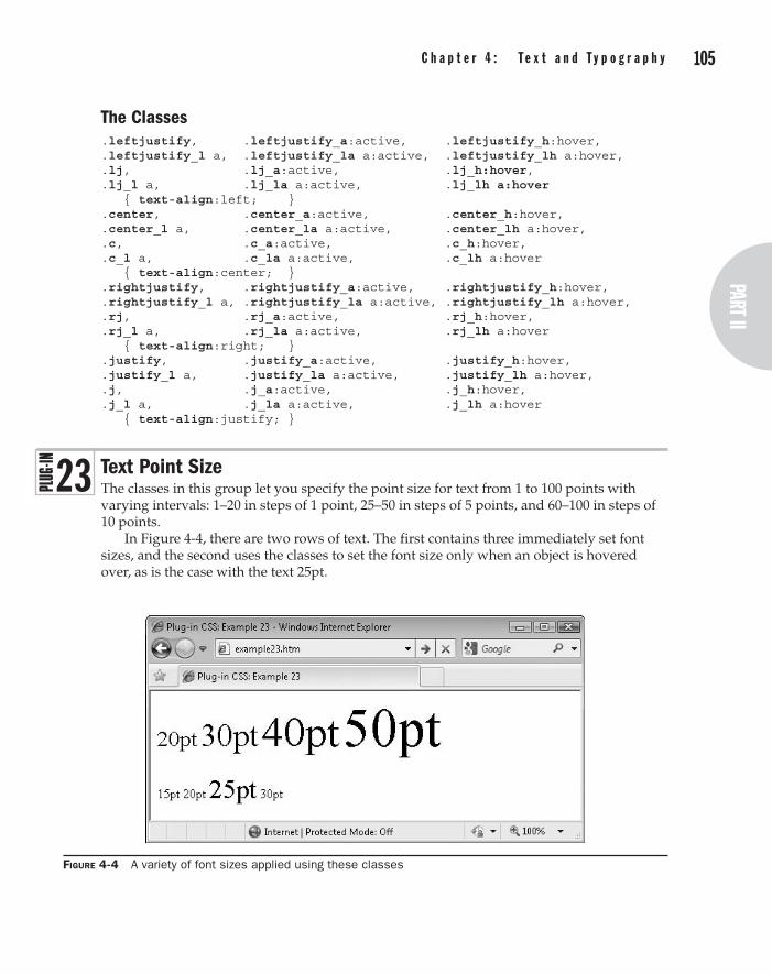
104 p a r t I I : t h e C l a s s e s part II
C h a p t e r 4 : t e x t a n d t y p o g r a p h y 105
The Classes.leftjustify, .leftjustify_a:active, .leftjustify_h:hover, .leftjustify_l a, .leftjustify_la a:active, .leftjustify_lh a:hover, .lj, .lj_a:active, .lj_h:hover, .lj_l a, .lj_la a:active, .lj_lh a:hover { text-align:left; } .center, .center_a:active, .center_h:hover, .center_l a, .center_la a:active, .center_lh a:hover, .c, .c_a:active, .c_h:hover, .c_l a, .c_la a:active, .c_lh a:hover { text-align:center; } .rightjustify, .rightjustify_a:active, .rightjustify_h:hover, .rightjustify_l a, .rightjustify_la a:active, .rightjustify_lh a:hover, .rj, .rj_a:active, .rj_h:hover, .rj_l a, .rj_la a:active, .rj_lh a:hover { text-align:right; } .justify, .justify_a:active, .justify_h:hover, .justify_l a, .justify_la a:active, .justify_lh a:hover, .j, .j_a:active, .j_h:hover, .j_l a, .j_la a:active, .j_lh a:hover { text-align:justify; }
Text Point SizeThe classes in this group let you specify the point size for text from 1 to 100 points with varying intervals: 1–20 in steps of 1 point, 25–50 in steps of 5 points, and 60–100 in steps of 10 points.
In Figure 4-4, there are two rows of text. The first contains three immediately set font sizes, and the second uses the classes to set the font size only when an object is hovered over, as is the case with the text 25pt.
Figure 4-4 A variety of font sizes applied using these classes
2 3

106 p a r t I I : t h e C l a s s e s C h a p t e r 4 : t e x t a n d t y p o g r a p h y 107
Classes and Propertiespt1 pt1_a pt1_h pt1_l pt1_la pt1_lh
Class to change the text size to 1 point (pt1), plus classes to do so only if the object is actively being clicked (pt1_a) or hovered over (pt1_h), and another three classes to change the point size of any links within the object (pt1_l), any links within the object that are actively being clicked (pt1_la), and any links within the object that are being hovered over (pt1_lh)
pt2 – pt20 (etc…) Classes – in steps of 1 point, as pt1
pt25 – pt50 (etc…) Classes – in steps of 5 points, as pt1
pt60 – pt100 (etc…) Classes – in steps of 10 points, as pt1
font-size Property containing the text font size
About the ClassesYou can change the size of a font in many ways, such as by using ems or pixels and so on, but one of the most common is to use point size, and so the most useful sizes have been given class names of pt1 through pt20, pt25 through pt50 in steps of 5 points, and pt60 through pt100 in steps of 10 points. These are applied using the font-size class, like this:
font-size:45pt;
How to Use ThemTo set the point size of some text, place the matching class name in the class argument of the object containing the text, like this:
<span class='pt14'>This is 14pt text</span>
You can also use the standard class suffixes to specify when the font size is applied, such as the font size hover class, like this:
<span class='pt20_h'>This is 20pt text when hovered over</span>
And you can combine classes too. For example, the following code sets the enclosed text to 10pt, or 14pt when hovered, and 12pt when clicked:
<span class='pt10 pt14_h pt12_a'>Hover over and click me</span>
Here is the code used to create the screen grab in Figure 4-4:
<span class='pt20'>20pt</span> <span class='pt30'>30pt</span> <span class='pt40'>40pt</span> <span class='pt50'>50pt</span><br /><br /> <span class='pt15_h'>15pt</span> <span class='pt20_h'>20pt</span> <span class='pt25_h'>25pt</span> <span class='pt30_h'>30pt</span>
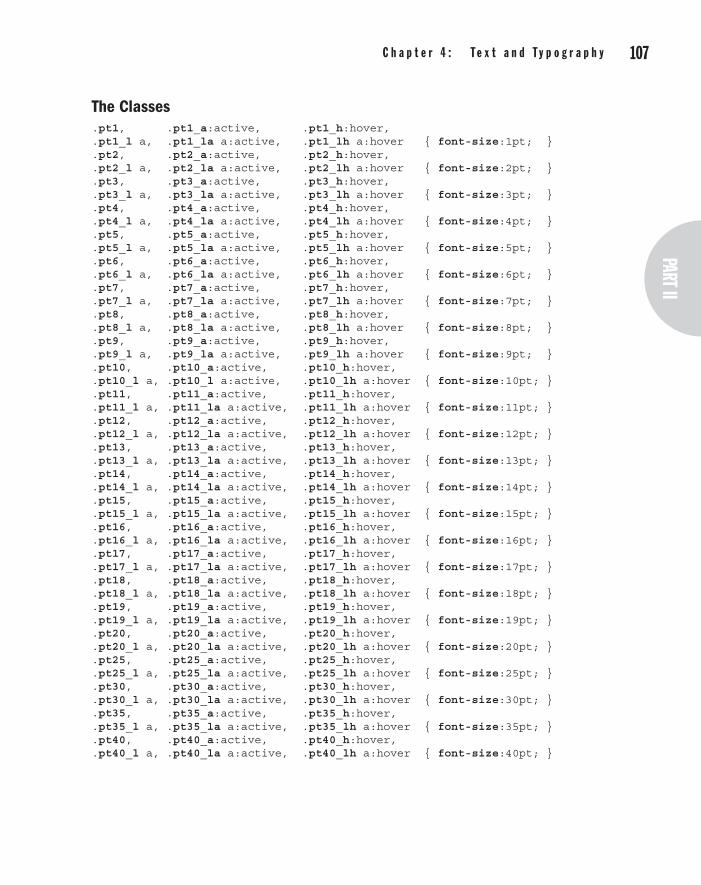
106 p a r t I I : t h e C l a s s e s part II
C h a p t e r 4 : t e x t a n d t y p o g r a p h y 107
The Classes.pt1, .pt1_a:active, .pt1_h:hover, .pt1_l a, .pt1_la a:active, .pt1_lh a:hover { font-size:1pt; } .pt2, .pt2_a:active, .pt2_h:hover, .pt2_l a, .pt2_la a:active, .pt2_lh a:hover { font-size:2pt; } .pt3, .pt3_a:active, .pt3_h:hover, .pt3_l a, .pt3_la a:active, .pt3_lh a:hover { font-size:3pt; } .pt4, .pt4_a:active, .pt4_h:hover, .pt4_l a, .pt4_la a:active, .pt4_lh a:hover { font-size:4pt; } .pt5, .pt5_a:active, .pt5_h:hover, .pt5_l a, .pt5_la a:active, .pt5_lh a:hover { font-size:5pt; } .pt6, .pt6_a:active, .pt6_h:hover, .pt6_l a, .pt6_la a:active, .pt6_lh a:hover { font-size:6pt; } .pt7, .pt7_a:active, .pt7_h:hover, .pt7_l a, .pt7_la a:active, .pt7_lh a:hover { font-size:7pt; } .pt8, .pt8_a:active, .pt8_h:hover, .pt8_l a, .pt8_la a:active, .pt8_lh a:hover { font-size:8pt; } .pt9, .pt9_a:active, .pt9_h:hover, .pt9_l a, .pt9_la a:active, .pt9_lh a:hover { font-size:9pt; } .pt10, .pt10_a:active, .pt10_h:hover, .pt10_l a, .pt10_l a:active, .pt10_lh a:hover { font-size:10pt; } .pt11, .pt11_a:active, .pt11_h:hover, .pt11_l a, .pt11_la a:active, .pt11_lh a:hover { font-size:11pt; } .pt12, .pt12_a:active, .pt12_h:hover, .pt12_l a, .pt12_la a:active, .pt12_lh a:hover { font-size:12pt; } .pt13, .pt13_a:active, .pt13_h:hover, .pt13_l a, .pt13_la a:active, .pt13_lh a:hover { font-size:13pt; } .pt14, .pt14_a:active, .pt14_h:hover, .pt14_l a, .pt14_la a:active, .pt14_lh a:hover { font-size:14pt; } .pt15, .pt15_a:active, .pt15_h:hover, .pt15_l a, .pt15_la a:active, .pt15_lh a:hover { font-size:15pt; } .pt16, .pt16_a:active, .pt16_h:hover, .pt16_l a, .pt16_la a:active, .pt16_lh a:hover { font-size:16pt; } .pt17, .pt17_a:active, .pt17_h:hover, .pt17_l a, .pt17_la a:active, .pt17_lh a:hover { font-size:17pt; } .pt18, .pt18_a:active, .pt18_h:hover, .pt18_l a, .pt18_la a:active, .pt18_lh a:hover { font-size:18pt; } .pt19, .pt19_a:active, .pt19_h:hover, .pt19_l a, .pt19_la a:active, .pt19_lh a:hover { font-size:19pt; } .pt20, .pt20_a:active, .pt20_h:hover, .pt20_l a, .pt20_la a:active, .pt20_lh a:hover { font-size:20pt; } .pt25, .pt25_a:active, .pt25_h:hover, .pt25_l a, .pt25_la a:active, .pt25_lh a:hover { font-size:25pt; } .pt30, .pt30_a:active, .pt30_h:hover, .pt30_l a, .pt30_la a:active, .pt30_lh a:hover { font-size:30pt; } .pt35, .pt35_a:active, .pt35_h:hover, .pt35_l a, .pt35_la a:active, .pt35_lh a:hover { font-size:35pt; } .pt40, .pt40_a:active, .pt40_h:hover, .pt40_l a, .pt40_la a:active, .pt40_lh a:hover { font-size:40pt; }

108 p a r t I I : t h e C l a s s e s C h a p t e r 4 : t e x t a n d t y p o g r a p h y 109
.pt45, .pt45_a:active, .pt45_h:hover,
.pt45_l a, .pt45_la a:active, .pt45_lh a:hover { font-size:45pt; }
.pt50, .pt50_a:active, .pt50_h:hover,
.pt50_l a, .pt50_la a:active, .pt50_lh a:hover { font-size:50pt; }
.pt60, .pt60_a:active, .pt60_h:hover,
.pt60_l a, .pt60_la a:active, .pt60_lh a:hover { font-size:60pt; }
.pt70, .pt70_a:active, .pt70_h:hover,
.pt70_l a, .pt70_la a:active, .pt70_lh a:hover { font-size:70pt; }
.pt80, .pt80_a:active, .pt80_h:hover,
.pt80_l a, .pt80_la a:active, .pt80_lh a:hover { font-size:80pt; }
.pt90, .pt90_a:active, .pt90_h:hover,
.pt90_l a, .pt90_la a:active, .pt90_lh a:hover { font-size:90pt; }
.pt100, .pt100_a:active, .pt100_h:hover,
.pt100_l a,.pt100_la a:active, .pt100_lh a:hover { font-size:100pt;}
Text ColorsIn Chapter 3, a number of classes were provided that let you change the background color of an object. These classes partner them by letting you change the text color. The same set of 21 colors is supported, along with all the usual suffixes to control how they are applied.
In Figure 4-5, all the colors are shown twice: the first set uses the main text color class names to immediately apply the color, while the second set uses the _h suffix so the color is only applied when the mouse passes over an object.
Figure 4-5 The 21 different colors supported by these classes, followed by the same colors as hover-over classes
2 4

108 p a r t I I : t h e C l a s s e s part II
C h a p t e r 4 : t e x t a n d t y p o g r a p h y 109
Classes and Propertiesaqua aqua_a aqua_h aqua_l aqua_la aqua_lh
Class to change the background color of an object to aqua (aqua), plus classes to do so only if the object is actively being clicked (aqua_a) or hovered over (aqua_h), and another three classes to change the background of any links within the object (aqua_l), any links within the object that are actively being clicked (aqua_la), and any links within the object that are being hovered over (aqua_lh)
black (etc…) Classes – as aqua but for black
blue (etc…) Classes – as aqua but for blue
brown (etc…) Classes – as aqua but for brown
fuchsia (etc…) Classes – as aqua but for fuchsia
gold (etc…) Classes – as aqua but for gold
gray (etc…) Classes – as aqua but for gray
green (etc…) Classes – as aqua but for green
khaki (etc…) Classes – as aqua but for khaki
lime (etc…) Classes – as aqua but for lime
maroon (etc…) Classes – as aqua but for maroon
navy (etc…) Classes – as aqua but for navy
olive (etc…) Classes – as aqua but for olive
orange (etc…) Classes – as aqua but for orange
pink (etc…) Classes – as aqua but for pink
purple (etc…) Classes – as aqua but for purple
red (etc…) Classes – as aqua but for red
silver (etc…) Classes – as aqua but for silver
teal (etc…) Classes – as aqua but for teal
white (etc…) Classes – as aqua but for white
yellow (etc…) Classes – as aqua but for yellow
color Property containing text color settings
About the ClassesThe reason for using the _b suffix for the background colors in Chapter 3 is now clear: It’s because the text colors in this plug-in group have the non-_b names. As with the background classes, there are 21 color choices, and six different ways of applying them using the standard class suffixes such as _h to apply a color to an object only when it is being hovered over by the mouse.
The property being manipulated is color, like this:
color:#580;

110 p a r t I I : t h e C l a s s e s C h a p t e r 4 : t e x t a n d t y p o g r a p h y 111
How to Use ThemTo change the color of a section of text, enter the matching class name (and any optional suffix) in the class argument of the object’s HTML tag, like this:
<span class='gold'>This text is gold</span>
You can also use the standard dynamic suffixes so that, for example, a section of text can be changed to navy when it is hovered over like this:
<span class='navy_h'>This text is navy when hovered over</span>
Here is the code used to create the image in Figure 4-5:
<div class='b pt20'> <span class='aqua' >aqua </span> <span class='black' >black </span> <span class='blue' >blue </span> <span class='brown' >brown </span> <span class='fuchsia' >fuchsia</span> <span class='gold' >gold </span> <span class='gray' >gray </span> <span class='green' >green </span> <span class='khaki' >khaki </span> <span class='lime' >lime </span> <span class='maroon' >maroon </span> <span class='navy' >navy </span> <span class='olive' >olive </span> <span class='orange' >orange </span> <span class='pink' >pink </span> <span class='purple' >purple </span> <span class='red' >red </span> <span class='silver' >silver </span> <span class='teal' >teal </span> <span class='white' >white </span> <span class='yellow' >yellow </span><br /><br /> <span class='aqua_h' >aqua </span> <span class='black_h' >black </span> <span class='blue_h' >blue </span> <span class='brown_h' >brown </span> <span class='fuchsia_h'>fuchsia</span> <span class='gold_h' >gold </span> <span class='gray_h' >gray </span> <span class='green_h' >green </span> <span class='khaki_h' >khaki </span> <span class='lime_h' >lime </span> <span class='maroon_h' >maroon </span> <span class='navy_h' >navy </span> <span class='olive_h' >olive </span> <span class='orange_h' >orange </span> <span class='pink_h' >pink </span> <span class='purple_h' >purple </span>
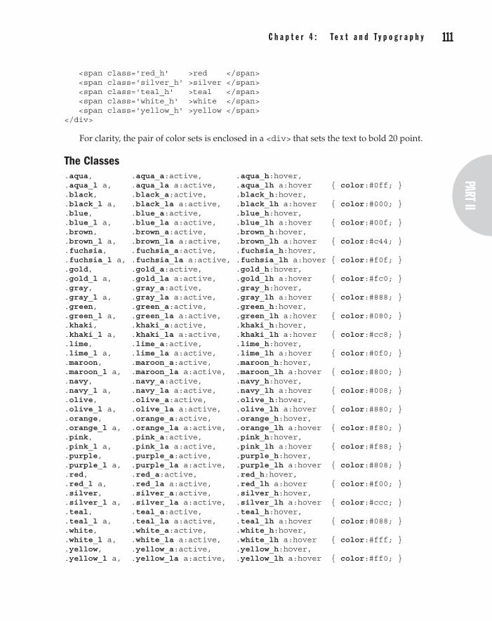
110 p a r t I I : t h e C l a s s e s part II
C h a p t e r 4 : t e x t a n d t y p o g r a p h y 111
<span class='red_h' >red </span> <span class='silver_h' >silver </span> <span class='teal_h' >teal </span> <span class='white_h' >white </span> <span class='yellow_h' >yellow </span> </div>
For clarity, the pair of color sets is enclosed in a <div> that sets the text to bold 20 point.
The Classes.aqua, .aqua_a:active, .aqua_h:hover, .aqua_l a, .aqua_la a:active, .aqua_lh a:hover { color:#0ff; } .black, .black_a:active, .black_h:hover, .black_l a, .black_la a:active, .black_lh a:hover { color:#000; } .blue, .blue_a:active, .blue_h:hover, .blue_l a, .blue_la a:active, .blue_lh a:hover { color:#00f; } .brown, .brown_a:active, .brown_h:hover, .brown_l a, .brown_la a:active, .brown_lh a:hover { color:#c44; } .fuchsia, .fuchsia_a:active, .fuchsia_h:hover, .fuchsia_l a, .fuchsia_la a:active, .fuchsia_lh a:hover { color:#f0f; } .gold, .gold_a:active, .gold_h:hover, .gold_l a, .gold_la a:active, .gold_lh a:hover { color:#fc0; } .gray, .gray_a:active, .gray_h:hover, .gray_l a, .gray_la a:active, .gray_lh a:hover { color:#888; } .green, .green_a:active, .green_h:hover, .green_l a, .green_la a:active, .green_lh a:hover { color:#080; } .khaki, .khaki_a:active, .khaki_h:hover, .khaki_l a, .khaki_la a:active, .khaki_lh a:hover { color:#cc8; } .lime, .lime_a:active, .lime_h:hover, .lime_l a, .lime_la a:active, .lime_lh a:hover { color:#0f0; } .maroon, .maroon_a:active, .maroon_h:hover, .maroon_l a, .maroon_la a:active, .maroon_lh a:hover { color:#800; } .navy, .navy_a:active, .navy_h:hover, .navy_l a, .navy_la a:active, .navy_lh a:hover { color:#008; } .olive, .olive_a:active, .olive_h:hover, .olive_l a, .olive_la a:active, .olive_lh a:hover { color:#880; } .orange, .orange_a:active, .orange_h:hover, .orange_l a, .orange_la a:active, .orange_lh a:hover { color:#f80; } .pink, .pink_a:active, .pink_h:hover, .pink_l a, .pink_la a:active, .pink_lh a:hover { color:#f88; } .purple, .purple_a:active, .purple_h:hover, .purple_l a, .purple_la a:active, .purple_lh a:hover { color:#808; } .red, .red_a:active, .red_h:hover, .red_l a, .red_la a:active, .red_lh a:hover { color:#f00; } .silver, .silver_a:active, .silver_h:hover, .silver_l a, .silver_la a:active, .silver_lh a:hover { color:#ccc; } .teal, .teal_a:active, .teal_h:hover, .teal_l a, .teal_la a:active, .teal_lh a:hover { color:#088; } .white, .white_a:active, .white_h:hover, .white_l a, .white_la a:active, .white_lh a:hover { color:#fff; } .yellow, .yellow_a:active, .yellow_h:hover, .yellow_l a, .yellow_la a:active, .yellow_lh a:hover { color:#ff0; }

112 p a r t I I : t h e C l a s s e s C h a p t e r 4 : t e x t a n d t y p o g r a p h y 113
Text ShadowsUsing these classes, you can apply shadows of varying strengths underneath sections of text. Figure 4-6 shows two sets of shadowed text. The first has used the main class names to immediately apply the shadows, while the second has used the hover versions of the classes to apply the shadows only when the objects are hovered over, as is currently the case with the second instance of the phrase “Medium Shadow.”
This grab was taken using Internet Explorer, and the filter property used for creating these shadows is much harsher than those created in most other modern browsers, which also blur and round the shadows for a softer effect.
Classes and Propertiesshadow shadow_a shadow_h shadow_l shadow_la shadow_lh
Class to place a shadow underneath some text (shadow), plus classes to do so only if the object is actively being clicked (shadow_a) or hovered over (shadow_h), and another three classes to place the shadow under any links within the object (shadow_l), any links within the object that are actively being clicked (shadow_la), and any links within the object that are being hovered over (shadow_lh)
lightestshadow (etc…)
Class – as shadow but creates the lightest shadow
lightshadow (etc…)
Class – as shadow but creates a light shadow
darkshadow (etc…) Class – as shadow but creates a dark shadow
darkestshadow (etc…)
Class – as shadow but creates the darkest shadow
text-shadow Property to apply a shadow to text
filter Property used by Internet Explorer to apply shadows and many other features to objects
Figure 4-6 Applying shadows to text using the standard and hover versions of the classes
2 5

112 p a r t I I : t h e C l a s s e s part II
C h a p t e r 4 : t e x t a n d t y p o g r a p h y 113
About the ClassesThese classes apply shadows to text using the CSS text-shadow property or the Microsoft proprietary filter property in Internet Explorer, like this:
text-shadow:#888888 3px 3px 4px; filter :progid:DXImageTransform.Microsoft.Shadow( color='#888888', Direction=135, Strength=5);
How to Use ThemTo use these classes, enter their names into the class argument of the containing object for some text. I recommend you use only the <div> tag when you want shadowed text (since Internet Explorer—even the version 9 preview—refuses to add shadows to text within a <span> or any other inline object), like this:
<div class='shadow'>This text is shadowed</div>
Alternatively, Internet Explorer will add shadows if a <span> is floated, as in the following, which uses the lf class (short for leftfloat):
<span class='shadow lf'>Shadowed text, floated left</span>
You can also use the hover and other forms of classes as in the following, which adds the shadow only when hovered over:
<div class='shadow_h'>This text is shadowed when hovered</div>
Following is the HML used to create Figure 4-6. In it, the <span> tags all use the lf class to float them so that Internet Explorer will be able to create shadows.
<div class='b pt20'> <span class='lightestshadow lf gray_bh'>Lightest Shadow </span> <span class='lightshadow lf gray_bh'>Light Shadow </span> <span class='shadow lf gray_bh'>Medium Shadow </span> <span class='darkshadow lf gray_bh'>Dark Shadow </span> <span class='darkestshadow lf gray_bh'>Darkest Shadow </span> </div><br clear='left'> <div class='b pt20'> <span class='lightestshadow_h lf'>Lightest Shadow </span> <span class='lightshadow_h lf'>Light Shadow </span> <span class='shadow_h lf'>Medium Shadow </span> <span class='darkshadow_h lf'>Dark Shadow </span> <span class='darkestshadow_h lf'>Darkest Shadow </span> </div>
When you hover over the first five elements, the background changes to gray (using the gray_bh class) so you can see the effect of the different lightnesses of shadow on different

114 p a r t I I : t h e C l a s s e s C h a p t e r 4 : t e x t a n d t y p o g r a p h y 115
backgrounds. If you hover over the second set of five elements, the shadow will be applied only as the mouse passes over them.
The Classes.shadow, .shadow_a:active, .shadow_h:hover, .shadow_l a, .shadow_la a:active, .shadow_lh a:hover { text-shadow:#888888 3px 3px 4px; filter :progid:DXImageTransform.Microsoft.Shadow( color='#888888', Direction=135, Strength=5); } .lightestshadow, .lightestshadow_a:active, .lightestshadow_h:hover, .lightestshadow_l a, .lightestshadow_la a:active, .lightestshadow_lh a:hover { text-shadow:#ffffff 3px 3px 4px; filter :progid:DXImageTransform.Microsoft.Shadow( color='#ffffff', Direction=135, Strength=5); } .lightshadow, .lightshadow_a:active, .lightshadow_h:hover, .lightshadow_l a, .lightshadow_la a:active, .lightshadow_lh a:hover { text-shadow:#cccccc 3px 3px 4px; filter :progid:DXImageTransform.Microsoft.Shadow( color='#cccccc', Direction=135, Strength=5); } .darkshadow, .darkshadow_a:active, .darkshadow_h:hover, .darkshadow_l a, .darkshadow_la a:active, .darkshadow_lh a:hover { text-shadow:#444444 3px 3px 4px; filter :progid:DXImageTransform.Microsoft.Shadow( color='#444444', Direction=135, Strength=5); } .darkestshadow, .darkestshadow_a:active, .darkestshadow_h:hover, .darkestshadow_l a, .darkestshadow_la a:active, .darkestshadow_lh a:hover { text-shadow:#000000 3px 3px 4px; filter :progid:DXImageTransform.Microsoft.Shadow( color='#000000', Direction=135, Strength=5); }
Text TransformationsWhen you need to quickly change the case of a section of text, you can simply apply one of the classes in this plug-in group. Figure 4-7 shows the four different transformations being used on a famous Albert Einstein quotation.
2 6

114 p a r t I I : t h e C l a s s e s part II
C h a p t e r 4 : t e x t a n d t y p o g r a p h y 115
Classes and Propertiescaps caps_a caps_h caps_l caps_la caps_lh
Class to change the first letter of each word in a section of text to a capital letter (caps), plus classes to do so only if the object is actively being clicked (caps_a) or hovered over (caps_h), and another three classes to change the case of any links within the object (caps_l), any links within the object that are actively being clicked (caps_la), and any links within the object that are being hovered over (caps_lh)
scaps (etc…) Class – as caps but changes the entire text to small capital letters
lower (etc…) Class – as caps but changes the entire text to all lowercase
upper (etc…) Class – as caps but changes the text to all uppercase
text-transform Property to capitalize text or change it to lower- or uppercase
font-variant Property to implement a font variant such as small capital letters
About the ClassesThese classes make use of the text-transform and font-variant properties to change a selection of text, like this:
text-transform:capitalize; font-variant:small-caps;
How to Use ThemYou can transform a section of text by using one of these classes in the class argument of the containing object, like this:
<span class='scaps'>This text displays in small capital letters</span>
Figure 4-7 These classes provide a quick means of transforming sections of text.

116 p a r t I I : t h e C l a s s e s C h a p t e r 4 : t e x t a n d t y p o g r a p h y 117
The standard suffixes are also available for transforming the text only under certain conditions, such as when the mouse hovers over it, like this:
<span class='scaps_h'>Small caps when hovered over</span>
Here is the HTML used for the screen grab in Figure 4-7:
<div class='b pt15'> <div class='caps' >The important thing is not to stop questioning</div> <div class='scaps'>The important thing is not to stop questioning</div> <div class='lower'>The important thing is not to stop questioning</div> <div class='upper'>The important thing is not to stop questioning</div> </div>
The Classes.caps, .caps_a:active, .caps_h:hover, .caps_l a, .caps_la a:active, .caps_lh a:hover { text-transform:capitalize; } .scaps, .scaps_a:active, .scaps_h:hover, .scaps_l a, .scaps_la a:active, .scaps_lh a:hover { font-variant :small-caps; } .lower, .lower_a:active, .lower_h:hover, .lower_l a, .lower_la a:active, .lower_lh a:hover { text-transform:lowercase; } .upper, .upper_a:active, .upper_h:hover, .upper_l a, .upper_la a:active, .upper_lh a:hover { text-transform:uppercase; }
EncapsulationEncapsulation is a neat trick you can use to enclose a section of text within other text or objects. In this case, it is used to automatically add quotation marks and other symbols before and after a section of text, as shown in Figure 4-8, in which a phrase is repeated five times, each using a different encapsulation class.
Figure 4-8 Enclosing a section of text with symbols using the encapsulation classes
2 7

116 p a r t I I : t h e C l a s s e s part II
C h a p t e r 4 : t e x t a n d t y p o g r a p h y 117
Classes and Propertiesquotes quotes_h
Classes to place curly quotation marks before and after a section of text (quotes), or only when the text is hovered over (quotes_h)
parens (etc…) Class – as quotes but for parentheses
brackets (etc…) Class – as quotes but for brackets
braces (etc…) Class – as quotes but for braces
chevrons (etc…) Class – as quotes but for chevrons
content Property used to insert content before and after some text
About the ClassesThese classes use the pseudo classes :before and :after to insert characters before and after a section of text using the content property, as in the following, which places curly quotation marks before and after the text:
.quotes:before { content:'\201c'; }
.quotes:after { content:'\201d'; }
How to Use ThemWhen you want to encapsulate some text, enter the class needed into the class argument of the text’s container, like this:
<div class='quotes'>This will have quotes added to it</div>
Or, you could add the quotes, only when the mouse hovers over the text, for example, like this:
<div class='quotes_h'>This has quotes added when hovered over</div>
The other dynamic suffixes (such as _a, and so on) are not supported by these classes since they would almost certainly never be used.
The Classes.quotes:before, .quotes_h:hover:before { content:'\201c'; } .quotes:after, .quotes_h:hover:after { content:'\201d'; } .parens:before, .parens_h:hover:before { content:'('; } .parens:after, .parens_h:hover:after { content:')'; } .brackets:before, .brackets_h:hover:before { content:'['; } .brackets:after, .brackets_h:hover:after { content:']'; } .braces:before, .braces_h:hover:before { content:'{'; } .braces:after, .braces_h:hover:after { content:'}'; } .chevrons:before, .chevrons_h:hover:before { content:'<'; } .chevrons:after, .chevrons_h:hover:after { content:'>'; }
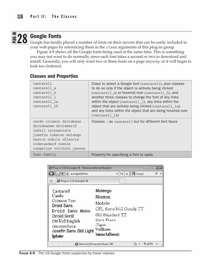
118 p a r t I I : t h e C l a s s e s C h a p t e r 4 : t e x t a n d t y p o g r a p h y 119
Google FontsGoogle has kindly placed a number of fonts on their servers that can be easily included in your web pages by referencing them in the class arguments of this plug-in group.
Figure 4-9 shows all the Google fonts being used at the same time. This is something you may not want to do normally, since each font takes a second or two to download and install. Generally, you will only want two or three fonts on a page anyway, or it will begin to look too cluttered.
Classes and Propertiescantarell cantarell_a cantarell_h cantarell_l cantarell_la cantarell_lh
Class to select a Google font (cantarell), plus classes to do so only if the object is actively being clicked (cantarell_a) or hovered over (cantarell_h), and another three classes to change the font of any links within the object (cantarell_l), any links within the object that are actively being clicked (cantarell_la), and any links within the object that are being hovered over (cantarell_lh)
cardo crimson droidsans droidsansm droidserif imfell inconsolata josefin lobster molengo neuton nobile oflsorts oldstandard reenie tangerine vollkorn yanone
Classes – as cantarell but for different font faces
font-family Property for specifying a font to apply
Figure 4-9 The 19 Google fonts supported by these classes
2 8
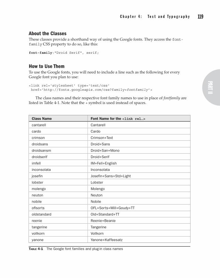
118 p a r t I I : t h e C l a s s e s part II
C h a p t e r 4 : t e x t a n d t y p o g r a p h y 119
About the ClassesThese classes provide a shorthand way of using the Google fonts. They access the font-family CSS property to do so, like this:
font-family:"Droid Serif", serif;
How to Use ThemTo use the Google fonts, you will need to include a line such as the following for every Google font you plan to use:
<link rel='stylesheet' type='text/css' href='http://fonts.googleapis.com/css?family=fontfamily'>
The class names and their respective font family names to use in place of fontfamily are listed in Table 4-1. Note that the + symbol is used instead of spaces.
Table 4-1 The Google font families and plug-in class names
Class Name Font Name for the <link rel…>
cantarell Cantarell
cardo Cardo
crimson Crimson+Text
droidsans Droid+Sans
droidsansm Droid+San+Mono
droidserif Droid+Serif
imfell IM+Fell+English
inconsolata Inconsolata
josefin Josefin+Sans+Std+Light
lobster Lobster
molengo Molengo
neuton Neuton
nobile Nobile
oflsorts OFL+Sorts+Mill+Goudy+TT
oldstandard Old+Standard+TT
reenie Reenie+Beanie
tangerine Tangerine
vollkorn Vollkorn
yanone Yanone+Kaffeesatz

120 p a r t I I : t h e C l a s s e s C h a p t e r 4 : t e x t a n d t y p o g r a p h y 121
To load in the Crimson Text font, for example, you would, therefore, use the following code in the <head> section of a web page:
<link rel='stylesheet' type='text/css' href='http://fonts.googleapis.com/css?family=Crimson+Text'>
Then in the page’s body you can use the font like this:
<span class='crimson'>This text uses the Crimson Text Font</span>
The following is the <head> code used to create Figure 4-9. It’s a little long-winded because it loads in every single font (you will probably only want a few of them):
<link rel='stylesheet' type='text/css' href='http://fonts.googleapis.com/css?family=Cantarell'> <link rel='stylesheet' type='text/css' href='http://fonts.googleapis.com/css?family=Cardo'> <link rel='stylesheet' type='text/css' href='http://fonts.googleapis.com/css?family=Crimson+Text'> <link rel='stylesheet' type='text/css' href='http://fonts.googleapis.com/css?family=Droid+Sans'> <link rel='stylesheet' type='text/css' href='http://fonts.googleapis.com/css?family=Droid+Sans+Mono'> <link rel='stylesheet' type='text/css' href='http://fonts.googleapis.com/css?family=Droid+Serif'> <link rel='stylesheet' type='text/css' href='http://fonts.googleapis.com/css?family=IM+Fell+English'> <link rel='stylesheet' type='text/css' href='http://fonts.googleapis.com/css?family=Inconsolata'> <link rel='stylesheet' type='text/css' href='http://fonts.googleapis.com/css?family=Josefin+Sans+Std+Light'> <link rel='stylesheet' type='text/css' href='http://fonts.googleapis.com/css?family=Lobster'> <link rel='stylesheet' type='text/css' href='http://fonts.googleapis.com/css?family=Molengo'> <link rel='stylesheet' type='text/css' href='http://fonts.googleapis.com/css?family=Neuton'> <link rel='stylesheet' type='text/css' href='http://fonts.googleapis.com/css?family=Nobile'> <link rel='stylesheet' type='text/css' href='http://fonts.googleapis.com/css?family=OFL+Sorts+Mill+Goudy+TT'> <link rel='stylesheet' type='text/css' href='http://fonts.googleapis.com/css?family=Old+Standard+TT'> <link rel='stylesheet' type='text/css' href='http://fonts.googleapis.com/css?family=Reenie+Beanie'> <link rel='stylesheet' type='text/css' href='http://fonts.googleapis.com/css?family=Tangerine'> <link rel='stylesheet' type='text/css' href='http://fonts.googleapis.com/css?family=Vollkorn'> <link rel='stylesheet' type='text/css' href='http://fonts.googleapis.com/css?family=Yanone+Kaffeesatz'>

120 p a r t I I : t h e C l a s s e s part II
C h a p t e r 4 : t e x t a n d t y p o g r a p h y 121
And here is the code from the body of the example:
<div class='pt15 lf padding'> <div class='cantarell' >Cantarell </div> <div class='cardo' >Cardo </div> <div class='crimson' >Crimson Text </div> <div class='droidsans' >Droid Sans </div> <div class='droidsansm' >Droid Sans Mono </div> <div class='droidserif' >Droid Serif </div> <div class='imfell' >IM Fell English </div> <div class='inconsolata'>Inconsolata </div> <div class='josefin' >Josefin Sans Std Light </div> <div class='lobster' >Lobster </div></div> <div class='pt15 padding'> <div class='molengo' >Molengo </div> <div class='neuton' >Neuton </div> <div class='nobile' >Nobile </div> <div class='oflsorts' >OFL Sorts Mill Goudy TT</div> <div class='oldstandard'>Old Standard TT </div> <div class='reenie' >Reenie Beanie </div> <div class='tangerine' >Tangerine </div> <div class='vollkorn' >Vollkorn </div> <div class='yanone' >Yanone Kaffeesatz</div></div>
Note In Chapter 9, I’ll introduce a method you can use to automate all this, as long as your users have JavaScript, but the method in this plug-in will allow you to display Google fonts to all users of recent browsers, regardless of having JavaScript or not.
The Classes.cantarell, .cantarell_a:active, .cantarell_h:hover, .cantarell_l a, .cantarell_la a:active .cantarell_lh a:hover { font-family:"Cantarell", sans-serif; } .cardo, .cardo_a:active, .cardo_h:hover, .cardo_l a, .cardo_la a:active .cardo_lh a:hover { font-family:"Cardo", serif; } .crimson, .crimson_a:active, .crimson_h:hover, .crimson_l a, .crimson_la a:active .crimson_lh a:hover { font-family:"Crimson Text", serif; } .droidsans, .droidsans_a:active, .droidsans_h:hover, .droidsans_l a, .droidsans_la a:active .droidsans_lh a:hover { font-family:"Droid Sans", sans-serif; } .droidsansm, .droidsansm_a:active, .droidsansm_h:hover, .droidsansm_l a, .droidsansm_la a:active .droidsansm_lh a:hover { font-family:"Droid Sans Mono", monospace; } .droidserif, .droidserif_a:active, .droidserif_h:hover, .droidserif_l a, .droidserif_la a:active .droidserif_lh a:hover { font-family:"Droid Serif", serif; } .imfell, .imfell_a:active, .imfell_h:hover, .imfell_l a, .imfell_la a:active .imfell_lh a:hover { font-family:"IM Fell English", serif; } .inconsolata, .inconsolata_a:active, .inconsolata_h:hover,

122 p a r t I I : t h e C l a s s e s C h a p t e r 4 : t e x t a n d t y p o g r a p h y 123
.inconsolata_l a, .inconsolata_la a:active .inconsolata_lh a:hover { font-family:"Inconsolata", monospace; } .josefin, .josefin_a:active, .josefin_h:hover, .josefin_l a, .josefin_la a:active .josefin_lh a:hover { font-family:"Josefin Sans Std Light", sans-serif; } .lobster, .lobster_a:active, .lobster_h:hover, .lobster_l a, .lobster_la a:active .lobster_lh a:hover { font-family:"Lobster", fantasy, serif; } .molengo, .molengo_a:active, .molengo_h:hover, .molengo_l a, .molengo_la a:active .molengo_lh a:hover { font-family:"Molengo", sans-serif; } .neuton, .neuton_a:active, .neuton_h:hover, .neuton_l a, .neuton_la a:active .neuton_lh a:hover { font-family:"Neuton", sans-serif; } .nobile, .nobile_a:active, .nobile_h:hover, .nobile_l a, .nobile_la a:active .nobile_lh a:hover { font-family:"Nobile", sans-serif; } .oflsorts, .oflsorts_a:active, .oflsorts_h:hover, .oflsorts_l a, .oflsorts_la a:active .oflsorts_lh a:hover { font-family:"OFL Sorts Mill Goudy TT", serif; } .oldstandard, .oldstandard_a:active, .oldstandard_h:hover, .oldstandard_l a, .oldstandard_la a:active .oldstandard_lh a:hover { font-family:"Old Standard TT", serif; } .reenie, .reenie_a:active, .reenie_h:hover, .reenie_l a, .reenie_la a:active .reenie_lh a:hover { font-family:"Reenie Beanie", cursive, serif; } .tangerine, .tangerine_a:active, .tangerine_h:hover, .tangerine_l a, .tangerine_la a:active .tangerine_lh a:hover { font-family:"Tangerine", cursive, serif; } .vollkorn, .vollkorn_a:active, .vollkorn_h:hover, .vollkorn_l a, .vollkorn_la a:active .vollkorn_lh a:hover { font-family:"Vollkorn", serif; } .yanone, .yanone_a:active, .yanone_h:hover, .yanone_l a, .yanone_la a:active .yanone_lh a:hover { font-family:"Yanone Kaffeesatz", sans-serif; }
Drop CapPlacing a drop cap at the start of an article is a mainstay of print design, but it’s also easy to achieve on the Web with Plug-in 29, as shown in Figure 4-10, which features a famous quotation from Shakespeare’s play, Macbeth.
Classes and Propertiesdropcap dropcap_h
Classes to turn the contents of an object into a drop capital (dropcap), or do so only when the object is hovered over (dropcap_h)
font-size Property to change the font size of text
line-height Property to change the line height of text
margin-right Property to change and object’s right margin width
margin-bottom Property to change and object’s bottom margin width
float-left Property to float and object to the left
2 9
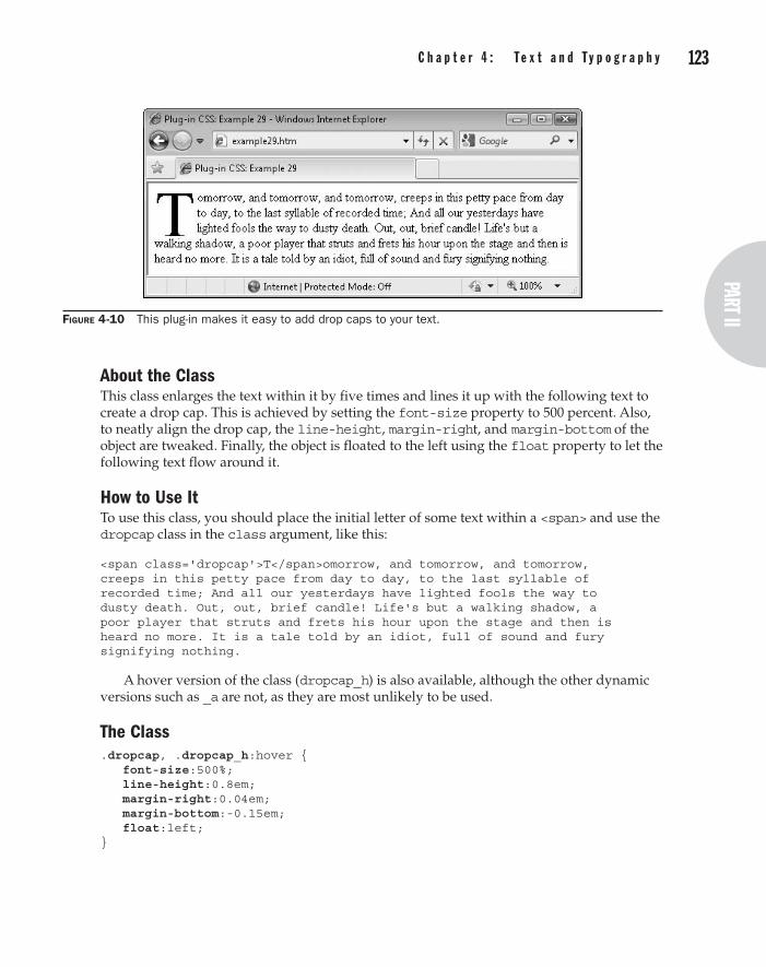
122 p a r t I I : t h e C l a s s e s part II
C h a p t e r 4 : t e x t a n d t y p o g r a p h y 123
About the ClassThis class enlarges the text within it by five times and lines it up with the following text to create a drop cap. This is achieved by setting the font-size property to 500 percent. Also, to neatly align the drop cap, the line-height, margin-right, and margin-bottom of the object are tweaked. Finally, the object is floated to the left using the float property to let the following text flow around it.
How to Use ItTo use this class, you should place the initial letter of some text within a <span> and use the dropcap class in the class argument, like this:
<span class='dropcap'>T</span>omorrow, and tomorrow, and tomorrow, creeps in this petty pace from day to day, to the last syllable of recorded time; And all our yesterdays have lighted fools the way to dusty death. Out, out, brief candle! Life's but a walking shadow, a poor player that struts and frets his hour upon the stage and then is heard no more. It is a tale told by an idiot, full of sound and fury signifying nothing.
A hover version of the class (dropcap_h) is also available, although the other dynamic versions such as _a are not, as they are most unlikely to be used.
The Class.dropcap, .dropcap_h:hover { font-size:500%; line-height:0.8em; margin-right:0.04em; margin-bottom:-0.15em; float:left; }
Figure 4-10 This plug-in makes it easy to add drop caps to your text.
124 p a r t I I : t h e C l a s s e s C h a p t e r 4 : t e x t a n d t y p o g r a p h y 125
ColumnsIf you would like to present your text in columns to many of your users, these classes will automatically lay them out for you using between two and five columns, inclusive. I say many of your users because, unfortunately, no version of IE (including the preview of version 9) supports the web standard for columns, and neither does the Opera browser.
Nevertheless, on all other modern browsers columns work well, as shown by Figure 4-11, which shows these classes being used and displayed in the Google Chrome browser.
Classes and Propertiescolumns2 columns2_h
Classes to reformat text into two columns (columns2), or to do so only when the text is hovered over (columns2_h)
columns3 (etc…) Class – as columns2 but for three columns
columns4 (etc…) Class – as columns2 but for four columns
Columns5 (etc…) Class – as columns2 but for five columns
-moz-column-rule Property to specify the type of ruled line between columns on Firefox and other Mozilla browsers
-webkit-column-rule Property to specify the type of ruled line between columns on Safari and Google Chrome
-o-column-rule Property to specify the type of ruled line between columns on Opera (when/if it is supported)
column-rule Property to specify the type of ruled line between columns on all other browsers (but not IE)
-moz-column-gap Property to specify the gap between columns on Firefox and other Mozilla browsers
-webkit-column-gap Property to specify the gap between columns on Safari and Google Chrome
-o-column-gap Property to specify the gap between columns on Opera (when/if it is supported)
column-gap Property to specify the gap between columns on all other browsers (but not IE)
-moz-column-count Property to specify the number of columns on Firefox and other Mozilla browsers
-webkit-column-count Property to specify the number of columns on Safari and Google Chrome
-o-column-count Property to specify the number of columns on Opera (when/if it is supported)
column-count Property to specify the number of columns on all other browsers (but not IE)
3 0

124 p a r t I I : t h e C l a s s e s part II
C h a p t e r 4 : t e x t a n d t y p o g r a p h y 125
About the ClassesThese classes display text in the number of columns you choose, between two and five inclusive, using the CSS column rules, as in the following example, which creates a two-column display:
column-rule:dashed 1px #888888; column-gap:20px; column-count:2;
Firefox and other Mozilla-based browsers require –moz placed before these properties, and Apple Safari and Google Chrome require –webkit. Although Opera doesn’t yet support columns, it seems likely that the browser will do so soon, so to future proof the classes, versions of the properties prefaced with –o are also included.
How to Use ThemTo use these classes, decide the number of columns you want and place the relevant class in the class argument of the text’s container, like the following text from the US Declaration of Independence, which was used to create the screen grab in Figure 4-11:
<div class='columns3'>When in the Course of human events it becomes necessary for one people to dissolve the political bands which have connected them with another and to assume among the powers of the earth, the separate and equal station to which the Laws of Nature and of Nature's God entitle them, a decent respect to the opinions of mankind requires that they should declare the causes which impel them to the separation. We hold these truths to be self-evident, that all men are created equal...</div>
Neither Opera nor Microsoft Internet Explorer has caught up with the rest of the Web on this feature, so the text will simply display in a single column on those browsers. If you
Figure 4-11 Create multiple columns on browsers that support the feature

126 p a r t I I : t h e C l a s s e s C h a p t e r 4 : t e x t a n d t y p o g r a p h y 127
wish to have them also display columns, you will need to create an alternative section of HTML, which might look something like this:
<div style='width:160px' class='lf padding'>When in the Course of human events it becomes necessary for one people to dissolve the political bands which have connected them with another and to assume</div> <div style='width:160px; class='lf padding'>among the powers of the earth, the separate and equal station to which the Laws of Nature and of Nature's God entitle them, a decent respect to the opinions of mankind</div> <div style='width:160px' class='lf padding'>requires that they should declare the causes which impel them to the separation. We hold these truths to be self-evident, that all men are created equal...</div>
The Classes.columns2, .columns2_h:hover { -moz-column-rule: dashed 1px #888888; -webkit-column-rule: dashed 1px #888888; -o-column-rule: dashed 1px #888888; column-rule: dashed 1px #888888; -moz-column-gap: 20px; -webkit-column-gap: 20px; -o-column-gap: 20px; column-gap: 20px; -moz-column-count: 2; -webkit-column-count:2; -o-column-count: 2; column-count: 2; } .columns3, .columns3_h:hover { -moz-column-rule: dashed 1px #888888; -webkit-column-rule: dashed 1px #888888; -o-column-rule: dashed 1px #888888; column-rule: dashed 1px #888888; -moz-column-gap: 20px; -webkit-column-gap: 20px; -o-column-gap: 20px; column-gap: 20px; -moz-column-count: 3; -webkit-column-count:3; -o-column-count: 3; column-count: 3; } .columns4, .columns4_h:hover { -moz-column-rule: dashed 1px #888888; -webkit-column-rule: dashed 1px #888888; -o-column-rule: dashed 1px #888888; column-rule: dashed 1px #888888; -moz-column-gap: 20px;
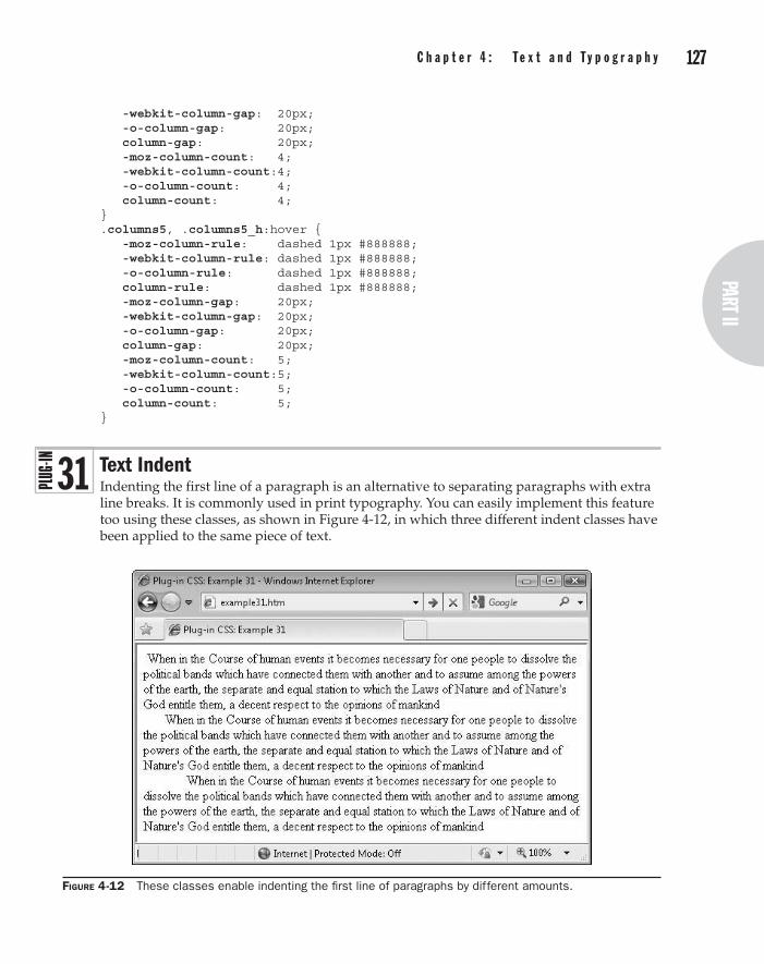
126 p a r t I I : t h e C l a s s e s part II
C h a p t e r 4 : t e x t a n d t y p o g r a p h y 127
-webkit-column-gap: 20px; -o-column-gap: 20px; column-gap: 20px; -moz-column-count: 4; -webkit-column-count:4; -o-column-count: 4; column-count: 4; } .columns5, .columns5_h:hover { -moz-column-rule: dashed 1px #888888; -webkit-column-rule: dashed 1px #888888; -o-column-rule: dashed 1px #888888; column-rule: dashed 1px #888888; -moz-column-gap: 20px; -webkit-column-gap: 20px; -o-column-gap: 20px; column-gap: 20px; -moz-column-count: 5; -webkit-column-count:5; -o-column-count: 5; column-count: 5; }
Text IndentIndenting the first line of a paragraph is an alternative to separating paragraphs with extra line breaks. It is commonly used in print typography. You can easily implement this feature too using these classes, as shown in Figure 4-12, in which three different indent classes have been applied to the same piece of text.
Figure 4-12 These classes enable indenting the first line of paragraphs by different amounts.
3 1

128 p a r t I I : t h e C l a s s e s C h a p t e r 4 : t e x t a n d t y p o g r a p h y 129
Classes and Propertiesindent1 indent1_h
Classes to indent the first line of a section of text by 1 percent of the containing object’s width (indent1), or to do so only when the text is hovered over (indent1_h)
indent2 – indent10 (etc…)
Class – as indent1 for 2 to 10 percent indent
text-indent Property for indenting the first line of a section of text
About the ClassesThese classes use the CSS text-indent property to indent the first line of a section of text by between 1 and 10 percent of the width of the containing object, like this:
text-indent:3%;
Percentage values are used to make the classes scalable for all font sizes.
How to Use ThemWhen you want the first line of a section of text to be indented, use one of these classes in the class argument of the text’s container, like the following, which indents the first line by 5 percent:
<div class='indent5'>When in the Course of human events it becomes necessary for one people to dissolve the political bands which have connected them with another and to assume among the powers of the earth, the separate and equal station to which the Laws of Nature and of Nature's God entitle them, a decent respect to the opinions of mankind</div>
Or more likely you will use the class within a <p> tag, like this:
<p class='indent5'>When in the Course of human events (etc…) </p>
The hover version suffix of these classes (_h) is also supported, but the other dynamic variants are not, as they are very unlikely to ever be used.
tip If you do use <p> tags with these classes, you may wish to modify the top and/or bottom margins for this tag since paragraphs will be separated and identified by indentation, rather than by spacing.
The Classes.indent1, .indent1_h:hover { text-indent:1%; } .indent2, .indent2_h:hover { text-indent:2%; } .indent3, .indent3_h:hover { text-indent:3%; } .indent4, .indent4_h:hover { text-indent:4%; } .indent5, .indent5_h:hover { text-indent:5%; } .indent6, .indent6_h:hover { text-indent:6%; } .indent7, .indent7_h:hover { text-indent:7%; } .indent8, .indent8_h:hover { text-indent:8%; } .indent9, .indent9_h:hover { text-indent:9%; } .indent10, .indent10_h:hover { text-indent:10%; }

128 p a r t I I : t h e C l a s s e s part II
C h a p t e r 4 : t e x t a n d t y p o g r a p h y 129
SymbolsThe final plug-ins in this chapter provide easy access to four commonly used icons: checkmark, cross, e-mail, and star. Figure 4-13 shows the icons automatically attached to a set of four buttons. A second set use the hover versions of the classes in which the icons are initially lighter, but darken when hovered over (although, unfortunately, not in Internet Explorer when used on a button).
Classes and Propertiescheck check_h
Classes to preface text (or any object) with a checkmark icon (check), or to do so only when the text is hovered over (check_h)
cross Class – as check but for a cross icon
email Class – as check but for an e-mail icon
star Class – as check but for a star icon
font-family Property to change the font
font-weight Property to change the weight of a font
color Property to change the color of text
content Property to add content to an object
opacity Property used by non-IE browsers for opacity setting
filter Property used by Internet Explorer for opacity and other features
About the ClassesThese classes use the content property to place an icon before the text (or any object) that uses them. The text is also set to Courier with the font-family property, bold using the font-weight property, with colors set to green for check, red for cross, blue for email, and yellow for star, using the color property.
To create the hover effect, the opacity property is set to 50 percent, or 100 percent when hovered over. Microsoft browsers use the alternate filter property for this.
Figure 4-13 Use these classes to automatically add icons to text.
3 2

130 p a r t I I : t h e C l a s s e s
How to Use ThemTo use these classes, simply refer to them in the class argument of an object, as with the following HTML, which was used to create Figure 4-13, and also utilizes the hover versions of the classes:
<center> <button class='check'>Submit</button> <button class='cross'>Cancel</button> <button class='email'>Email Us</button> <button class='star'>New Stuff</button><br /><br /> <button class='check_h'>Submit</button> <button class='cross_h'>Cancel</button> <button class='email_h'>Email Us</button> <button class='star_h'>New Stuff</button> </center>
The Classes.check:before, .check_h:before, .check_h:hover:before { font-family:Courier; font-weight:bold; content:'\2713 '; color:#008800; } .cross:before, .cross_h:before, .cross_h:hover:before { font-family:Courier; font-weight:bold; content:'\2715 '; color:#ff0000; } .email:before, .email_h:before, .email_h:hover:before { font-family:Courier; content:'\2709 '; color:#0066ff; } .star:before, .star_h:before, .star_h:hover:before { font-family:Courier; content:'\2730 '; color:#888800; } .check_h:before, .cross_h:before, .email_h:before, .star_h:before { opacity:.5; filter :alpha(opacity = '50'); } .check_h:hover:before, .cross_h:hover:before, .email_h:hover:before, .star_h:hover:before { opacity:1; filter :alpha(opacity = '100'); }

Chapter 5
Menus and Navigation
part IIthe Classes
132 p a r t I I : t h e C l a s s e s C h a p t e r 5 : M e n u s a n d N a v i g a t i o n 133
This chapter explores a range of classes used for creating buttons and vertical and horizontal menus, and for implementing top and bottom dock bars similar to those used by Mac OS X.
There’s also a handy class for creating tooltips that you can format in a variety of different ways. Between them, you can provide a professional range of menuing and navigation aids for your web visitors.
ButtonsPlug-in group 33 makes it a simple matter to quickly create buttons when you need them. In Figure 5-1, an Internet Explorer and Safari web browser have been placed next to each other, showing the same web page. IE displays the different button sizes, but cannot manage the rounded borders, whereas Safari displays the buttons well. As you can see, even though IE is missing the rounded corners, it degrades gracefully.
Classes and Propertiesbutton Class to create a medium-sized button
smallbutton Class to create a small button
largebutton Class to create a large button
Padding Property to change an object’s padding
border Property containing border details such as width and color
font-size Property to change the size of a font
text-align Property to align text to the left, right, center, or be fully justified
width Property containing the width of an object
overflow Property for setting whether and how objects overflow their boundaries
About the ClassesThree classes are available in this plug-in for creating medium, small, or large buttons. They also use the :hover pseudo class to provide professional effects when clicked or hovered over. To do this, they change the object’s border, font-size, text-align, width, and overflow properties.
Hovered versions of the buttons change the border, while clicking them moves the button text down and to the right to emulate a 3D press.
How to Use ThemYou can use these classes with any objects, but they work best with <input type='submit'> and <button> tags. In conjunction with other classes, you can give the buttons rounded borders, different background colors, gradients that change when clicked or hovered over, add shadow effects, and more.
3 3

132 p a r t I I : t h e C l a s s e s part II
C h a p t e r 5 : M e n u s a n d N a v i g a t i o n 133
Here is the HTML used to create the screen grabs in Figure 5-1:
<input type='submit' class='smallbutton' value='Small Button' /> <input type='submit' class='button' value='Medium Button' /> <input type='submit' class='largebutton' value='Large Button' /><br /><br /> <input type='submit' class='smallbutton smallestround lime_b' value='Small Button' /> <input type='submit' class='button round yellow_b' value='Medium Button' /> <input type='submit' class='largebutton largestround aqua_b' value='Large Button' /><br /><br /> <input type='submit' class='smallbutton smallestround carrot1 carrot2_a' value='Small Button' /> <input type='submit' class='button round sky1 sky2_a' value='Medium Button' /> <input type='submit' class='largebutton largestround wine1 wine2_a white' value='Large Button' /><br /><br/>
Figure 5-1 These classes make it easy to create great looking buttons.
134 p a r t I I : t h e C l a s s e s C h a p t e r 5 : M e n u s a n d N a v i g a t i o n 135
<input type='submit' class='smallbutton smallestround rose1 rose2_a white_h' value='Small Button' /> <input type='submit' class='button round sunset1 sunset2_a white_h' value='Medium Button' /> <input type='submit' class='largebutton largestround grass1 grass2_a white_h' value='Large Button' /><br /><br/>
The first row of buttons offers plain features, while the second row adds rounded borders and background colors. In the third row, the background colors have been replaced with gradient fills that reverse when the buttons are clicked, while the fourth row adds a hover color of white to each button.
As I have already noted a few times, different browsers have different features and so they will fall back gracefully when one isn’t supported. For example, Internet Explorer will not display rounded borders, but Firefox, Opera, Safari, and Chrome will. There again, Opera won’t display gradient background fills, and so on.
Even so, these button classes go a long way toward producing more engaging web sites and, as browsers implement the missing features, these classes will display better, without you having to change anything.
The Classes.button { padding:8px; } .button:hover { border:2px solid #666666; padding:7px 8px 8px 7px; } .button:active { border-width:2px 1px 1px 2px; padding:9px 7px 7px 9px; } .smallbutton { font-size:75%; padding:2px; } .smallbutton:hover { border:2px solid #666666; padding:1px 2px 2px 1px; } .smallbutton:active { border-width:2px 1px 1px 2px; padding:3px 1px 1px 3px; } .largebutton { font-size:125%; padding:15px; }

134 p a r t I I : t h e C l a s s e s part II
C h a p t e r 5 : M e n u s a n d N a v i g a t i o n 135
.largebutton:hover { border:2px solid #666666; padding:14px 15px 15px 14px; } .largebutton:active { border-width:2px 1px 1px 2px; padding:16px 14px 14px 16px; } .button, .smallbutton, .largebutton { text-align:center; border-color:#999999; border-width:1px 2px 2px 1px; vertical-align:top; border-style:solid; /* Required by Opera */ width:auto; /* Required by IE to not pad the sides */ overflow:visible; }
Vertical MenuPlug-in 34 creates a dynamic vertical menu using only unordered lists. In Figure 5-2, three levels of menu have been created, with each overlaying and offset from the previous, and with each submenu set to overlay the chevron submenu indicator of its parent.
Figure 5-2 With this plug-in, you can create professional looking vertical menus.
3 4

136 p a r t I I : t h e C l a s s e s C h a p t e r 5 : M e n u s a n d N a v i g a t i o n 137
Classes and Propertiesvmenu Class to create a set of vertical menus
width Property containing the width of an object
height Property containing the height of an object
display Property used to set the display type of an object, such as block, inline, or none
text-decoration Property containing the decoration for a section of text, such as underlines
border Property containing all the border parameters of an object
margin Property containing all the margin parameters of an object
padding Property containing all the padding parameters of an object
line-height Property containing the height of a section of text
list-style Property containing the type of list
left Property containing the offset of an object from the left of its containing object
top Property containing the offset of an object from the top of its containing object
z-index Property controlling how far behind or in front an object is compared to others
float Property used to float an object to the right or left
position Property used to manage the position of an object, such as relative or absolute
content Property used to add content to an object from a CSS rule
About the ClassThis class manipulates a large number of CSS properties in order to create menus and submenus that dynamically appear and disappear as required. The way it works is to make all second- and third-level menus (if any) invisible, and then it unhides them when they are due to appear.
The submenus are also given absolute positioning so they can be placed alongside the parent menu, starting at the item that calls them up, covering over the chevron symbol that indicates a submenu is available.
How to Use ItTo use this class, create a menu structure using unordered lists. The simplest of which might look like this:
<div class='vmenu aqua_b black_l blue_lh u_lh'> <ul> <!-- Beg Level 1 --> <li><a href='url'>Item 1</a></li> <li><a href='url'>Item 2</a></li>

136 p a r t I I : t h e C l a s s e s part II
C h a p t e r 5 : M e n u s a n d N a v i g a t i o n 137
<li><a href='url'>Item 3</a></li> <li><a href='url'>Item 4</a></li> <li><a href='url'>Item 5</a></li> </ul> <!-- End Level 1 --> </div>
The entire menu is enclosed in a <div> with the class name of vmenu. This div has its background color set to aqua, text within links set to black (or blue when hovered over), and underlines in links are enabled when hovered over. Inside this there are five list elements within an unordered list, and each of these elements contains a link.
For clarity, I have left a line break before and after the section labeled with <!—Beg Level 1 --> and <!—End Level 1 --> comments. These breaks indicate a complete section. When you open this HTML in a web browser, it looks like Figure 5-3, in which the third menu entry is currently being hovered over.
Creating a Two-Level MenuUsing almost the same structure it’s easy to add a second level of menus, as with the following example, which has taken the preceding HTML and expanded it to add three second-level menus:
<div class='vmenu aqua_b black_l blue_lh u_lh'> <ul> <!-- Beg Level 1 --> <li class='vmenu1'> <a href='url'>Item 1</a> <ul class='aqua_b'> <!-- Beg Level 2 --> <li><a href='url'>Item 1-A</a></li> <li><a href='url'>Item 1-B</a></li> <li><a href='url'>Item 1-C</a></li> </ul> <!-- End Level 2 -->
Figure 5-3 A single-level menu created with this class

138 p a r t I I : t h e C l a s s e s C h a p t e r 5 : M e n u s a n d N a v i g a t i o n 139
</li> <li><a href='url'>Item 2</a></li> <li><a href='url'>Item 3</a></li> <li class='vmenu1'> <a href='url' >Item 4</a> <ul class='aqua_b'> <!-- Beg Level 2 --> <li><a href='url'>Item 4-A</a></li> <li><a href='url'>Item 4-B</a></li> </ul> <!-- End Level 2 --> </li> <li class='vmenu1'> <a href='url'>Item 5</a> <ul class='aqua_b'> <!-- Beg Level 2 --> <li><a href='url'>Item 5-A</a></li> <li><a href='url'>Item 5-B</a></li> <li><a href='url'>Item 5-C</a></li> </ul> <!-- End Level 2 --> </li> </ul> <!-- End Level 1 --> </div>
When viewed in a browser, this example looks like Figure 5-4, in which the first of the three menus has been opened by hovering over Item 1 in the main menu.
To add each second-level menu, the <li> and </li> tags surrounding the entry to which the menus are attached have been altered. The <li> tag has become <li class='vmenu1'>
Figure 5-4 A two-level menu created with this class

138 p a r t I I : t h e C l a s s e s part II
C h a p t e r 5 : M e n u s a n d N a v i g a t i o n 139
and the </li> has been moved to after the position where the new menu was added. In other words, the line…
<li><a href='url'>Item 1</a></li>
…has become the following section of code (the new code being marked by the comments):
<li class='vmenu1'> <a href='url'>Item 1</a> <ul class='aqua_b'> <!-- Beg Level 2 --> <li><a href='url'>Item 1-A</a></li> <li><a href='url'>Item 1-B</a></li> <li><a href='url'>Item 1-C</a></li> </ul> <!-- End Level 2 --> </li>
Creating a Three-Level MenuYou can take the process a step further by adding another level of menus, like the following code, which was used to create Figure 5-2:
<div class='vmenu aqua_b black_l blue_lh u_lh'> <ul> <!-- Beg Level 1 --> <li class='vmenu1'> <a href='url'>Item 1</a> <ul class='aqua_b'> <!-- Beg Level 2 --> <li class='vmenu1'> <a href='url'>Item 1-A</a> <ul class='aqua_b'> <!-- Beg Level 3 --> <li><a href='url'>Item 1-A-a</a></li> <li><a href='url'>Item 1-A-b</a></li> </ul> <!-- End Level 3 --> </li> <li><a href='url'>Item 1-B</a></li> <li><a href='url'>Item 1-C</a></li> </ul> <!-- End Level 2 --> </li> <li><a href='url'>Item 2</a></li> <li><a href='url'>Item 3</a></li> <li class='vmenu1'> <a href='url'>Item 4</a> <ul class='aqua_b'> <!-- Beg Level 2 --> <li><a href='url'>Item 4-A</a></li> <li class='vmenu1'> <a href='url'>Item 4-B</a>

140 p a r t I I : t h e C l a s s e s C h a p t e r 5 : M e n u s a n d N a v i g a t i o n 141
<ul class='aqua_b'> <!-- Beg Level 3 --> <li><a href='url'>Item 4-B-a</a></li> <li><a href='url'>Item 4-B-b</a></li> <li><a href='url'>Item 4-B-c</a></li> </ul> <!-- End Level 3 --> </li> </ul> <!-- End Level 2 --> </li> <li class='vmenu1'> <a href='url'>Item 5</a> <ul class='aqua_b'> <!-- Beg Level 2 --> <li class='vmenu1'> <a href='url'>Item 5-A</a> <ul class='aqua_b'> <!-- Beg Level 3 --> <li><a href='url'>Item 5-A-a</a></li> <li><a href='url'>Item 5-A-b</a></li> </ul> <!-- End Level 3 --> </li> <li><a href='url'>Item 5-B</a></li> <li><a href='url'>Item 5-C</a></li> </ul> <!-- End Level 2 --> </li> </ul> <!-- End Level 1 --> </div>
Here, one of the second-level items has been split into a menu in the same way the first-level item was split into a second-level menu.
This example is now quite long, so to make its working clearer, following is the underlying set of nested unordered list items as they would appear without the CSS styling, as you can determine for yourself by not importing the PC.css style sheet file:
Item 1 Item 1-A Item 1-A-a Item 1-A-b Item 1-B Item 1-C Item 2 Item 3 Item 4 Item 4-A Item 4-B Item 4-B-a Item 4-B-b Item 4-B-c

140 p a r t I I : t h e C l a s s e s part II
C h a p t e r 5 : M e n u s a n d N a v i g a t i o n 141
Item 5 Item 5-A Item 5-A-a Item 5-A-b Item 5-B Item 5-C
If you study the following CSS rules, you’ll see references to an hmenu class. This is because the following horizontal menu plug-in (Plug-in 35) shares many of the same styles, so bringing them into the same rules is more efficient than including them twice.
By the way, a fourth (or any deeper) level of menus is not supported by this plug-in.
The Class.vmenu, .hmenu { width:150px; } .vmenu a, .hmenu a { display:table-cell; width:150px; text-decoration:none; } .vmenu ul, .hmenu ul { border:1px solid #000; margin:0px; padding:0px; } .vmenu ul li, .hmenu ul li { height:25px; line-height:25px; list-style:none; padding-left:10px; } .vmenu ul li:hover, .hmenu ul li:hover { position:relative; } .vmenu ul ul, .hmenu ul ul { display:none; position:absolute; } .vmenu ul ul { left:125px; top:5px; } .vmenu ul li:hover ul, .hmenu ul li:hover ul { z-index:1; } .vmenu ul li:hover ul { display:block; }
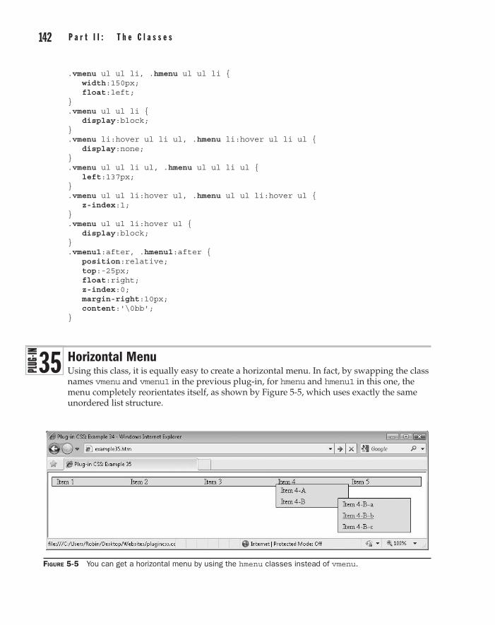
142 p a r t I I : t h e C l a s s e s C h a p t e r 5 : M e n u s a n d N a v i g a t i o n 143
.vmenu ul ul li, .hmenu ul ul li { width:150px; float:left; } .vmenu ul ul li { display:block; } .vmenu li:hover ul li ul, .hmenu li:hover ul li ul { display:none; } .vmenu ul ul li ul, .hmenu ul ul li ul { left:137px; } .vmenu ul ul li:hover ul, .hmenu ul ul li:hover ul { z-index:1; } .vmenu ul ul li:hover ul { display:block; } .vmenu1:after, .hmenu1:after { position:relative; top:-25px; float:right; z-index:0; margin-right:10px; content:'\0bb'; }
Horizontal MenuUsing this class, it is equally easy to create a horizontal menu. In fact, by swapping the class names vmenu and vmenu1 in the previous plug-in, for hmenu and hmenu1 in this one, the menu completely reorientates itself, as shown by Figure 5-5, which uses exactly the same unordered list structure.
Figure 5-5 You can get a horizontal menu by using the hmenu classes instead of vmenu.
3 5

142 p a r t I I : t h e C l a s s e s part II
C h a p t e r 5 : M e n u s a n d N a v i g a t i o n 143
Classes and Propertiesvmenu Class to create a set of horizontal menus
width Property containing the width of an object
height Property containing the height of an object
display Property used to set the display type of an object, such as block, inline, or none
text-decoration Property containing the decoration for a section of text, such as underlines
border Property containing all the border parameters of an object
margin Property containing all the margin parameters of an object
padding Property containing all the padding parameters of an object
line-height Property containing the height of a section of text
list-style Property containing the type of list
left Property containing the offset of an object from the left of its containing object
top Property containing the offset of an object from the top of its containing object
z-index Property controlling how far behind or in front an object is compared to others
float Property used to float an object to the right or left
position Property used to manage the position of an object, such as relative or absolute
content Property used to add content to an object from a CSS rule
About the ClassThis class is almost the same as for the vertical menu, except that a few CSS rules have been modified to display the menus inline so they line up horizontally. It also moves the submenus to slightly different relative locations.
How to Use ItYou use this class in exactly the same way as the vertical menu class, just change the class names used from vmenu and vmenu1 to hmenu and hmenu1. Please refer to the Vertical Menu plug-in (Plug-in 34) for full details.
Following are the additional tweaks made to the class in the previous section to provide horizontal menus.
The Class.hmenu, .hmenu ul, .hmenu ul li, .hmenu ul li:hover ul, .hmenu ul ul li, .hmenu ul ul li:hover ul { display:inline; }
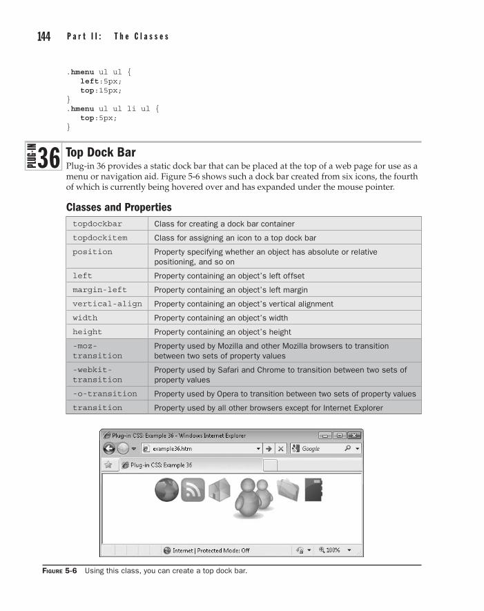
144 p a r t I I : t h e C l a s s e s C h a p t e r 5 : M e n u s a n d N a v i g a t i o n 145
.hmenu ul ul { left:5px; top:15px; } .hmenu ul ul li ul { top:5px; }
Top Dock BarPlug-in 36 provides a static dock bar that can be placed at the top of a web page for use as a menu or navigation aid. Figure 5-6 shows such a dock bar created from six icons, the fourth of which is currently being hovered over and has expanded under the mouse pointer.
Classes and Propertiestopdockbar Class for creating a dock bar container
topdockitem Class for assigning an icon to a top dock bar
position Property specifying whether an object has absolute or relative positioning, and so on
left Property containing an object’s left offset
margin-left Property containing an object’s left margin
vertical-align Property containing an object’s vertical alignment
width Property containing an object’s width
height Property containing an object’s height
-moz-transition
Property used by Mozilla and other Mozilla browsers to transition between two sets of property values
-webkit-transition
Property used by Safari and Chrome to transition between two sets of property values
-o-transition Property used by Opera to transition between two sets of property values
transition Property used by all other browsers except for Internet Explorer
Figure 5-6 Using this class, you can create a top dock bar.
3 6

144 p a r t I I : t h e C l a s s e s part II
C h a p t e r 5 : M e n u s a n d N a v i g a t i o n 145
About the ClassesThis plug-in has two classes: the first (topdockbar) is used to create a container for the dock bar items, and the second is for attaching to icons used in the dock bar (topdockitem).
The topdockbar class moves the object that uses it to the top of the browser and centers it. The object’s position is also fixed so it will not move when the browser scrolls.
The topdockitem class attaches a transition to the object so that any changes made to it will transition over the time period specified (on browsers that support transitions). It also aligns each item to the top of the dock bar so that passing the mouse over it will enlarge the image but keep it top-aligned.
A :hover pseudo class is then used to enlarge the icons when moused over, and restore them when the mouse passes away.
How to Use ThemTo use these classes, you need to have six icons that are 86 × 86 pixels in size. If they are different sizes or a different number, you may need to modify the code in the PC.css file.
These images are then resized to 50 × 50 pixels for the initial display (so that they can be enlarged to their full dimensions when moused over).
Then, write some HTML to contain all the images, such as this:
<div class='topdockbar'> <img class='topdockitem' src='i1.gif'> <img class='topdockitem' src='i2.gif'> <img class='topdockitem' src='i3.gif'> <img class='topdockitem' src='i4.gif'> <img class='topdockitem' src='i5.gif'> <img class='topdockitem' src='i6.gif'> </div>
When you use this HTML in a web page, you get the result seen in Figure 5-6. Of course, you will also attach links to the images to give each a function. When you do, a border may be displayed around the images, which you can remove by adding the argument border='0' to the <img…> tag. You may also wish to use Plug-in 19 (No Outline) to remove the dotted focus outline added to clicked elements.
Note In Internet Explorer, when the icons are hovered over, they will instantly enlarge, and reduce down again in size when the mouse passes away. But on all of Opera 10, Firefox 4, Safari 5, and the Chrome 5 web browsers (or better), the enlarging and reduction are animated using CSS transitions, which automatically generate and display a sequence of frames between a start and end set of styles settings.
Changing the Number of Icons and/or Icon SizesIn the following CSS rules, note the value assigned to the margin-left property in order to center the dock bar. If you change the icon sizes or number of icons, you should calculate a new value for this property, using this formula:
(Reduced image size x Number of images) / 2 + (Actual width – Reduced width) / 4

146 p a r t I I : t h e C l a s s e s C h a p t e r 5 : M e n u s a n d N a v i g a t i o n 147
So, for example, if you intend to use five 100 × 100 pixel images with a reduced size of 80 × 80 pixels, this is the calculation:
(5 x 100) / 2 + (100 – 80) / 4
This would give you a new value of 5 multiplied by 100 (which is 500), divided by 2 (which is 250), plus 100 – 80 (which is 20), divided by 4 (which is 5), which equals 250 plus 5, or a final value of 255 pixels.
You will also see mention of a bottomdockbar class in these rules. This is because the following plug-in shares much of the CSS, so it also shares some of the CSS rule assignments to save repeating the code.
The Classes.topdockbar, .bottomdockbar { position:fixed; left:50%; margin-left:-159px; /* Set to (total width of reduced images) / 2 */ /* + (actual width - reduced width) / 4 */ } .topdockitem, .bottomdockitem { -moz-transition: all .2s; -webkit-transition:all .2s; -o-transition: all .2s; transition: all .2s; vertical-align:top; width: 50px; /* Set to reduced image width */ height:50px; /* Set to reduced image height */ } .topdockitem:hover, .bottomdockitem:hover { width: 86px; /* Set to actual image width */ height:86px; /* Set to actual image height */ }
Bottom Dock BarPlug-in 37 lets you create a bottom dock bar in the same way you can create a top dock bar in the previous plug-in. Figure 5-7 shows the classes being used in the Apple Safari browser.
Figure 5-7 Creating a bottom dock bar in the Apple Safari Browser
3 7

146 p a r t I I : t h e C l a s s e s part II
C h a p t e r 5 : M e n u s a n d N a v i g a t i o n 147
Classes and Propertiesbottomdockbar Class for creating a bottom dock bar container
bottomdockitem Class for assigning an icon to a bottom dock bar
position Property specifying whether an object has absolute or relative positioning, and so on
left Property containing an object’s left offset
margin-left Property containing an object’s left margin
vertical-align Property containing an object’s vertical alignment
width Property containing an object’s width
height Property containing an object’s height
-moz-transition Property used by Mozilla and other Mozilla browsers to transition between two sets of property values
-webkit-transition
Property used by Safari and Chrome to transition between two sets of property values
-o-transition Property used by Opera to transition between two sets of property values
transition Property used by all other browsers except for Internet Explorer
About the ClassesThese classes work in exactly the same manner as the topdockbar and topdockitem classes, only replacing those class names with bottomdockbar and bottomdockitem.
How to Use ThemUsing these items is identical to creating a top dock bar, except for swapping the class names to bottomdockbar and bottomdockitem. Therefore, please refer to the previous plug-in for details.
Following are the additional CSS rules required to create bottom dock bars. If you change the height of any images, you will also need to change the margin-top property to the new height plus 7 pixels, and padding-top to the difference in pixels between the actual height of the images and their reduced heights.
The Classes.bottomdockbar { top:100%; margin-top:-93px; /* Set to -(actual image height + 7) */ } .bottomdockitem { padding-top:36px; /* Set to (actual height) - (reduced height) */ } .bottomdockitem:hover { padding-top:0px; }
148 p a r t I I : t h e C l a s s e s C h a p t e r 5 : M e n u s a n d N a v i g a t i o n 149
Tooltip and Tooltip FadePlug-in group 38 lets you add tooltips (most of whose dimensions and HTML you can decide) to any object. In Figure 5-8, the word gravity has been assigned a short tooltip, briefly providing an explanation for the term. Tooltips can also be applied to links and any other objects.
Classes and Propertiestooltip Class to display a tooltip when the mouse passes over an object
tooltipfade Class to fade in a tooltip when the mouse passes over an object (for browsers that support transitions)
text-decoration Property for changing text decorations such as underlines
position Property containing an objects’ position, such as absolute or relative
display Property containing the way an object displays, such as block or inline
top Property containing the vertical offset of an object from the top of its container
left Property containing the horizontal offset of an object from the left of its container
white-space Property used to disallow word wrapping at spaces
background Property containing an object’s background settings
border Property containing an object’s border settings
color Property containing an object’s text color
font-family Property specifying the font to use
font-size Property specifying the font size to use
line-height Property specifying the line height of a font
padding Property containing an object’s padding settings
opacity Property used to control an object’s opacity (or transparency)
-moz-transition Property for creating transitions on Firefox and other Mozilla browsers
-webkit-transition Property for creating transitions on Safari and Chrome
-o-transition Property for creating transitions on Opera
transition Property for creating transitions on all other browsers (except IE)
filter Property used by IE for opacity and other features
About the ClassesThe tooltip class takes a <span> that must be provided alongside the object being given a tooltip, and then hides it away to be displayed only when the mouse passes over the object.
The tooltipfade class is identical except that (where supported) it uses CSS transitions to slide and fade a tooltip into place.
3 8

148 p a r t I I : t h e C l a s s e s part II
C h a p t e r 5 : M e n u s a n d N a v i g a t i o n 149
How to Use ThemTo use either of these classes, you must place a <span> directly following the object to be given the tooltip, in which you should place the tip to be displayed, like this:
<a class='tooltip' href='/'>Home<span>Go to the Home page</span></a>
The <span> is then lifted from the flow of the web page and made invisible, to appear only when the object is moused over.
Here is the code used to create Figure 5-8, showing the two different variants of the class in action:
<a href='/'>Home</a> | <a href='/news/'>News</a> | <a class='tooltip' href='/links/'>Links<span>Click here for a<br /> collection of great links</span></a><br /><br /> A planet is a celestial body orbiting a star or stellar remnant that is massive enough to be rounded by its own <span class='tooltipfade i'>gravity<span>Gravitation, or gravity, is one of the four<br />fundamental interactions of nature (along<br />with the strong force, electromagnetism<br />and the weak force)</span></span>, is not massive enough to cause thermonuclear fusion, and has (etc...)
The first use of these classes is of the tooltip class in the third link from the top, and the second is of the tooltipfade class in the text below it. The class argument of 'tooltipfade i' tells the browsers to display the text within the tooltip in italics. When displayed in either the Opera 10, Firefox 4, Safari 5, or Chrome 5 browsers (or better), the tooltip attached to the word gravity will slide down into place, smoothly fading in at the same time. On Internet Explorer, the tooltip will simply appear and disappear as the mouse hovers over the object and away again.
These classes disallow automatic wrapping at white space so that the width of each tooltip can be specified according to where the <br /> tags are placed, and therefore the final width is that of the widest line.
Figure 5-8 With this class, you can add tooltips to any object.

150 p a r t I I : t h e C l a s s e s
Note The text and background colors of the tooltips are fixed, so if you want different ones, you’ll need to alter the PC.css file accordingly.
The Classes.tooltip:hover, .tooltipfade:hover { text-decoration:none; position:relative; } .tooltip span { display:none; } .tooltip:hover span { display:block; position:absolute; top:40px; left:0px; white-space:nowrap; background:#ffffdd; border:1px solid #888888; color:#444444; font-family:Arial, Helvetica, sans-serif; font-size:8pt; line-height:95%; padding:2px 5px; } .tooltipfade span { position:absolute; white-space:nowrap; font-family:Arial, Helvetica, sans-serif; font-size:8pt; line-height:95%; padding:2px 5px; top:0px; top:-10000px\0; /* IE hack to keep it out of the way */ left:0px; background:#ffffdd; border:1px solid #888888; color:#444444; opacity:0; filter:alpha(opacity = '0'); } .tooltipfade:hover span { -moz-transition :all .5s linear; -webkit-transition:all .5s linear; -o-transition :all .5s linear; transition :all .5s linear; opacity:1; filter:alpha(opacity = '100'); top:40px; }
Chapter 6
page Layout
part IIthe Classes
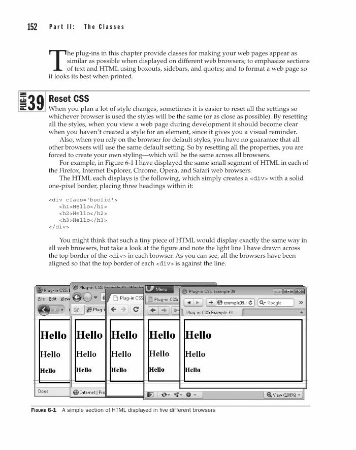
152 p a r t I I : t h e C l a s s e s C h a p t e r 6 : p a g e L a y o u t 153
The plug-ins in this chapter provide classes for making your web pages appear as similar as possible when displayed on different web browsers; to emphasize sections of text and HTML using boxouts, sidebars, and quotes; and to format a web page so
it looks its best when printed.
Reset CSSWhen you plan a lot of style changes, sometimes it is easier to reset all the settings so whichever browser is used the styles will be the same (or as close as possible). By resetting all the styles, when you view a web page during development it should become clear when you haven’t created a style for an element, since it gives you a visual reminder.
Also, when you rely on the browser for default styles, you have no guarantee that all other browsers will use the same default setting. So by resetting all the properties, you are forced to create your own styling—which will be the same across all browsers.
For example, in Figure 6-1 I have displayed the same small segment of HTML in each of the Firefox, Internet Explorer, Chrome, Opera, and Safari web browsers.
The HTML each displays is the following, which simply creates a <div> with a solid one-pixel border, placing three headings within it:
<div class='bsolid'> <h1>Hello</h1> <h2>Hello</h2> <h3>Hello</h3> </div>
You might think that such a tiny piece of HTML would display exactly the same way in all web browsers, but take a look at the figure and note the light line I have drawn across the top border of the <div> in each browser. As you can see, all the browsers have been aligned so that the top border of each <div> is against the line.
3 9
Figure 6-1 A simple section of HTML displayed in five different browsers
152 p a r t I I : t h e C l a s s e s part II
C h a p t e r 6 : p a g e L a y o u t 153
Now look at the bottom border of each <div>. Using a graphics program, I counted the difference in pixels and can report that the Internet Explorer <div> is three pixels shorter than the Firefox one. If you look at the two other light lines I drew—under the lowest and over the highest of the bottom borders—you can easily see this discrepancy. Also, the headings are one, one, and two pixels higher up respectively in IE.
Turning to Google Chrome, it has exactly the same appearance as IE and, therefore, is also different from Firefox in the same ways. The Opera <div>, on the other hand, is one pixel shorter than these two, and therefore four pixels shorter than the one in Firefox one. Also, its headings are zero, one, and one pixel higher than IE and Chrome, or one, two, and three pixels higher than Firefox.
Finally, Apple Safari has the same height <div> as IE and Chrome. Therefore, it is three pixels shorter than Firefox—and its headings are also slightly higher than Firefox.
Perhaps you never realized how different all the browsers are—and this example uses only a couple of elements. But by using the reset class, you can remove all these different attributes and start again with your own settings.
Classes and Propertiesreset Class to reset all the major properties of an object—can be applied to a
document to reset all of the document’s properties
(numerous properties)
Properties of an object that are too numerous to mention here
About the ClassThis class resets all the properties of an object that sensibly can be reset, leaving them ready for you to assign your own values. These will then be the same on all browsers.
How to Use ItYou can use this class in a couple of ways. First, to reset only the properties of an object and its subobjects, you might use code such as this:
<div id='obj' class='reset'>Everything in this div is reset</div>
You would then need to write CSS rules for the ID obj to create the property values you want, such as:
#obj p { display:block; Margin:1.12em; }
Alternatively (and probably the most useful method), you can attach the class to the <html> tag, like this:
<html class='reset'>
154 p a r t I I : t h e C l a s s e s C h a p t e r 6 : p a g e L a y o u t 155
Once you do this, your whole web page will lose almost all its styling, ready for you to provide the styles you need.
The Class.reset a, .reset abbr, .reset acronym, .reset address, .reset applet, .reset big, .reset blockquote, .reset body, .reset caption, .reset cite, .reset code, .reset dd, .reset del, .reset dl, .reset dfn, .reset div, .reset dt, .reset em, .reset fieldset, .reset font, .reset form, .reset h1, .reset h2, .reset h3, .reset h4, .reset h5, .reset h6, .reset html, .reset iframe, .reset img, .reset ins, .reset kbd, .reset label, .reset legend, .reset li, .reset object, .reset ol, .reset p, .reset pre, .reset span, .reset q, .reset s, .reset samp, .reset small, .reset strike, .reset strong, .reset sub, .reset sup, .reset table, .reset tbody, .reset td, .reset tfoot, .reset th, .reset thead, .reset tr, .reset tt, .reset ul, .reset var { margin :0; padding :0; border :0; outline :0; font-family :inherit; font-style :inherit; font-weight :inherit; font-size :100%; vertical-align :baseline; } .reset address, .reset ar, .reset caption, .reset cite, .reset code, .reset dfn, .reset em, .reset strong, .reset th, .reset v { font-style :normal; font-weight :normal; } .reset h1, .reset h2, .reset h3, .reset h4, .reset h5, .reset h6 { font-weight :normal; font-size :100%; } .reset blockquote:after, .reset blockquote:before, .reset q:after, .reset q:before { content :''; } .reset caption, .reset th, .reset td { font-weight :normal; text-align :left; }

154 p a r t I I : t h e C l a s s e s part II
C h a p t e r 6 : p a g e L a y o u t 155
.reset .reset fieldset, .reset img { border :0; } .reset abbr, .reset acronym { border :0; } .reset ol, .reset ul { list-style :none; } .reset body { line-height :1; background :#ffffff; color :#000000; } .reset table { border-collapse:separate; border-spacing :0; } .reset:focus { outline :0; }
Default CSSAs an alternative to resetting all the CSS values, you can use this class, which creates a set of default property values, as recommended by the World Wide Web Consortium (w3.org/TR/CSS2/sample.html).
Figure 6-2 shows the same code as in the previous plug-in, displayed in the same browsers, with a single difference—the default class has been attached to the <html> tag. Now that all the browsers are using the same settings, their display is much more similar.
Figure 6-2 Using the default class the differences in display between browsers are reduced.
4 0
156 p a r t I I : t h e C l a s s e s C h a p t e r 6 : p a g e L a y o u t 157
However, some slight differences still remain. This is because it is necessary to allow fonts and margins to scale up or down, so relative em measurements have been used for their values and, due to the different ways each browser calculates them, there is still a slight difference between them. Overall, however, you have a lot more control over a web page’s display using this class, instead of relying on each browser’s default settings.
Classes and Propertiesdefault Class to reset all the major properties of an object—can be applied to a
document to reset all of the document’s properties
(numerous properties)
Properties of an object that are too numerous to mention here
About the ClassThis class resets all the properties of an object to sensible defaults, as recommended by w3.org, the web standards body, so your pages look much more alike on different browsers.
How to Use ItYou can use this class in a couple of ways. First, to set default styles only for the properties of an object and its subobjects, you might use code such as this:
<div id='obj' class='default'>This div has default settings</div>
Alternatively, you might be more likely to attach the class to the <html> tag, like this:
<html class='default'>
Tip In the case of both the reset and default classes, you may prefer to extract the CSS rules for these classes from the PC.css file into separate CSS style sheets that you can import before any others. In which case, use a search and replace facility to remove all instances of .reset for the reset class or .default for the default class, and then the styles will apply to the entire document, not just to classes using those names. For example, the rule .default h1 applies only to <h1> tags with an element ID of default. But by removing the .default prior to the h1, the rule will apply to all instances of the <h1> tag anywhere in a web page.
The Class.default address, .default blockquote, .default body, .default center, .default dd, .default dir, .default div, .default dl, .default dt, .default fieldset, .default form, .default frame, .default frameset, .default h1, .default h2, .default h3, .default h4, .default h5, .default h6, .default hr, .default html, .default menu, .default noframes, .default ol, .default p, .default pre, .default ul

156 p a r t I I : t h e C l a s s e s part II
C h a p t e r 6 : p a g e L a y o u t 157
{ display:block; } .default blockquote, .default dir, .default dl, .default fieldset, .default form, .default h4, .default menu, .default ol, .default p, .default ul { margin:1.12em 0; } .default b, .default h1, .default h2, .default h3, .default h4, .default h5, .default h6, .default strong { font-weight:bolder; } .default address, .default cite, .default em, .default i, .default var { font-style:italic; } .default code, .default kbd, .default pre, .default samp, .default tt { font-family:monospace; } .default dd, .default dir, .default menu, .default ol, .default ul { margin-left:40px; } .default button, .default input, .default select, .default textarea { display:inline-block; } .default ol ol, .default ol ul, .default ul ol, .default ul ul { margin-top:0; margin-bottom:0; } .default del, .default s, .default strike { text-decoration:line-through; } .default small, .default sub, .default sup { font-size:0.83em; } .default tbody, .default tfoot, .default thead { vertical-align :middle; } .default td, .default th, .default tr { vertical-align :inherit; } .default ins, .default u { text-decoration:underline; } .default td, .default th { display:table-cell; padding:2px; } .default a:active, .default a:link { text-decoration:underline; color:#0000ff; } .default big { font-size:1.17em; } .default blockquote { margin-left:40px; margin-right:40px; } .default body { margin:8px; } .default br:before { content:"\A"; white-space:pre-line; } .default caption { display:table-caption; text-align:center; } .default center { text-align:center; } .default col { display:table-column; }

158 p a r t I I : t h e C l a s s e s C h a p t e r 6 : p a g e L a y o u t 159
.default colgroup { display:table-column-group; } .default h1 { font-size:2em; margin:0.7em 0; } .default h2 { font-size:1.5em; margin:0.75em 0; } .default h3 { font-size:1.17em; margin:0.83em 0; } .default h5 { font-size:0.83em; margin:1.5em 0; } .default h6 { font-size:0.75em; margin:1.67em 0; } .default head { display:none; } .default hr { border:1px inset; } .default li { display:list-item; } .default ol { list-style-type:decimal; } .default table { display:table; } .default tbody { display:table-row-group; } .default tfoot { display:table-footer-group; } .default th { font-weight:bolder; text-align:center; } .default thead { display:table-header-group; } .default tr { display:table-row; } .default pre { white-space:pre; } .default sub { vertical-align:sub; } .default sup { vertical-align:super; } .default table { border-spacing:2px; } .default a:visited { color:#800080; } .default :focus { outline:thin dotted invert; }
BoxoutWith the boxout class, you can easily place a section of HTML within a special boxout to make it stand out from the rest of the page. Figure 6-3 shows the class being used to emphasize some information in an article on global warming (taken from wikipedia.org).
4 1

158 p a r t I I : t h e C l a s s e s part II
C h a p t e r 6 : p a g e L a y o u t 159
Classes and Propertiesboxout boxout_h
Class to create a boxout around a section of HTML (boxout), or to do so only when the text is hovered over (boxout_h)
margin Property containing the various margin settings of an object
padding Property containing the various padding settings of an object
border Property containing the various border settings of an object
background Property containing the various background settings of an object
About the ClassesThese classes create a professional looking boxout around any section of HTML. They do so either immediately or only when hovered over, and completely restyle the HTML by altering the margin, padding, border, and background properties of an object.
How to Use ThemTo place a section of HTML into a boxout, you would use HTML such as this:
<div class='boxout'>This text will appear in a boxout</div>
Figure 6-3 The boxout class helps add emphasis to important sections of a page.

160 p a r t I I : t h e C l a s s e s C h a p t e r 6 : p a g e L a y o u t 161
Or you can choose to make the boxout appear only when the HTML is hovered over, like this:
<div class='boxout_h'>This is a boxout when hovered</div>
Tip If you use the hover version of the class, it’s a good idea to ensure the section is already separated from the text above and below, otherwise the change when hovered over may be too much on the eye.
Following is the HTML used to create Figure 6-3. As you can see, when writing, it’s easy to drop the class into a section of text without distracting you from your creative flow:
<h2>Global Warming</h2> Global warming is the increase in the average temperature of Earth's near-surface air and oceans since the mid-20th century and its projected continuation. Global dimming, a result of increasing concentrations of atmospheric aerosols that block sunlight from reaching the surface, has partially countered the effects of greenhouse gas induced warming. <div class='boxout_h'> According to the 2007 Fourth Assessment Report by the Intergovernmental Panel on Climate Change (IPCC), global surface temperature increased 1.33 +/- 0.32 °F during the 20th century. Most of the observed temperature increase since the middle of the 20th century was caused by increasing concentrations of greenhouse gases, which results from human activity such as the burning of fossil fuel and deforestation.</div> Climate model projections summarized in the latest IPCC report indicate that the global surface temperature is likely to rise a further 2.0 to 11.5 °F during the 21st century. The uncertainty in this estimate arises from the use of models with differing sensitivity to greenhouse gas concentrations and the use of differing estimates of future greenhouse gas emissions.
The Classes.boxout, .boxout_h:hover { margin:2% 5%; padding:1% 1.4%; border:1px solid #888; background:#eeeeee; }
QuoteAnother great way to emphasize a section of text is to change the font style to something like italic and add a faded-out icon behind it, as with the quote class. In Figure 6-4, an article about the poet William Wordsworth (from wikipedia.org) has been displayed, with a few lines from one of his poems shown using this class.
4 2

160 p a r t I I : t h e C l a s s e s part II
C h a p t e r 6 : p a g e L a y o u t 161
Classes and PropertiesQuote quote_h
Class to enclose a section of HTML in a quote (quote), or to do so only when the text is hovered over (quote_h)
margin Property containing the various margin settings of an object
padding Property containing the various padding settings of an object
font-style Property containing the style of a font
font-size Property containing the size of a font
content Property for adding content via CSS
position Property specifying an object’s position, such as absolute or relative
left Property containing the offset from the left of an object
top Property containing the offset from the top of an object
line-height Property specifying the line height of a font
margin-bottom Property specifying the bottom margin height
color Property containing the text color
opacity Property specifying the opacity (or transparency) of an object (except IE)
float Property used to float an object to the left or right
Figure 6-4 Using the quote class automatically sets up an appealing style.
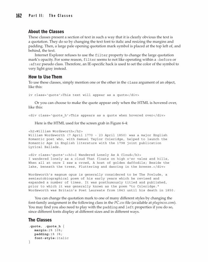
162 p a r t I I : t h e C l a s s e s C h a p t e r 6 : p a g e L a y o u t 163
About the ClassesThese classes present a section of text in such a way that it is clearly obvious the text is a quotation. They do so by changing the text font to italic and resizing the margins and padding. Then, a large pale opening quotation mark symbol is placed at the top left of, and behind, the text.
Internet Explorer refuses to use the filter property to change the large quotation mark’s opacity. For some reason, filter seems to not like operating within a :before or :after pseudo class. Therefore, an IE-specific hack is used to set the color of the symbol to very light gray instead.
How to Use ThemTo use these classes, simply mention one or the other in the class argument of an object, like this:
iv class='quote'>This text will appear as a quote</div>
Or you can choose to make the quote appear only when the HTML is hovered over, like this:
<div class='quote_h'>This appears as a quote when hovered over</div>
Here is the HTML used for the screen grab in Figure 6-4:
<h2>William Wordsworth</h2> William Wordsworth (7 April 1770 - 23 April 1850) was a major English Romantic poet who, with Samuel Taylor Coleridge, helped to launch the Romantic Age in English literature with the 1798 joint publication Lyrical Ballads. <div class='quote'><h3>I Wandered Lonely As A Cloud</h3> I wandered lonely as a cloud That floats on high o'er vales and hills, When all at once I saw a crowd, A host of golden daffodils; Beside the lake, beneath the trees, Fluttering and dancing in the breeze.</div> Wordsworth's magnum opus is generally considered to be The Prelude, a semiautobiographical poem of his early years which he revised and expanded a number of times. It was posthumously titled and published, prior to which it was generally known as the poem "to Coleridge." Wordsworth was Britain's Poet Laureate from 1843 until his death in 1850.
You can change the quotation mark to one of many different styles by changing the font-family assignment in the following class in the PC.css file (available at plugincss.com). You may find you also need to play with the padding and left properties if you do so, since different fonts display at different sizes and in different ways.
The Classes.quote, .quote_h { margin:2% 10%; padding:1% 3%; font-style:italic }

162 p a r t I I : t h e C l a s s e s part II
C h a p t e r 6 : p a g e L a y o u t 163
.quote:before, .quote_h:hover:before { font-size:1500%; font-family:Arial, serif; content:'\201c'; position:relative; left:-15%; top:-1%; line-height:0.7em; margin-bottom:-2em; color:#dddddd\0; /* hack for IE only */ opacity:.1; float:left; }
Left SidebarAnother way of emphasizing a section of HTML is to move it to one side as a boxout and let the main article flow around it. Figure 6-5 shows this class being used to do exactly that on the example from the previous plug-in.
Figure 6-5 Boxouts are another great way to make your text more interesting.
4 3
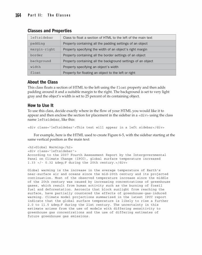
164 p a r t I I : t h e C l a s s e s C h a p t e r 6 : p a g e L a y o u t 165
Classes and Propertiesleftsidebar Class to float a section of HTML to the left of the main text
padding Property containing all the padding settings of an object
margin-right Property specifying the width of an object’s right margin
border Property containing all the border settings of an object
background Property containing all the background settings of an object
width Property specifying an object’s width
float Property for floating an object to the left or right
About the ClassThis class floats a section of HTML to the left using the float property and then adds padding around it and a suitable margin to the right. The background is set to very light gray and the object’s width is set to 25 percent of its containing object.
How to Use ItTo use this class, decide exactly where in the flow of your HTML you would like it to appear and then enclose the section for placement in the sidebar in a <div> using the class name leftsidebar, like this:
<div class='leftsidebar'>This text will appear in a left sidebar</div>
For example, here is the HTML used to create Figure 6-5, with the sidebar starting at the same vertical position as the main text:
<h2>Global Warming</h2> <div class='leftsidebar'> According to the 2007 Fourth Assessment Report by the Intergovernmental Panel on Climate Change (IPCC), global surface temperature increased 1.33 +/- 0.32 °F during the 20th century.</div> Global warming is the increase in the average temperature of Earth's near-surface air and oceans since the mid-20th century and its projected continuation. Most of the observed temperature increase since the middle of the 20th century was caused by increasing concentrations of greenhouse gases, which result from human activity such as the burning of fossil fuel and deforestation. Aerosols that block sunlight from reaching the surface, have partially countered the effects of greenhouse-gas-induced warming. Climate model projections summarized in the latest IPCC report indicate that the global surface temperature is likely to rise a further 2.0 to 11.5 °F during the 21st century. The uncertainty in this estimate arises from the use of models with differing sensitivity to greenhouse gas concentrations and the use of differing estimates of future greenhouse gas emissions.
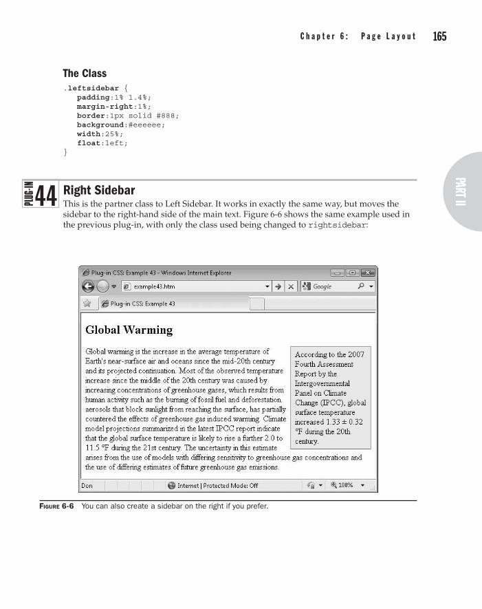
164 p a r t I I : t h e C l a s s e s part II
C h a p t e r 6 : p a g e L a y o u t 165
The Class.leftsidebar { padding:1% 1.4%; margin-right:1%; border:1px solid #888; background:#eeeeee; width:25%; float:left; }
Right SidebarThis is the partner class to Left Sidebar. It works in exactly the same way, but moves the sidebar to the right-hand side of the main text. Figure 6-6 shows the same example used in the previous plug-in, with only the class used being changed to rightsidebar:
Figure 6-6 You can also create a sidebar on the right if you prefer.
4 4

166 p a r t I I : t h e C l a s s e s C h a p t e r 6 : p a g e L a y o u t 167
Classes and Propertiesrightsidebar Class to float a section of HTML to the right of the main text
padding Property containing all the padding settings of an object
margin-left Property specifying the width of an object’s left margin
border Property containing all the border settings of an object
background Property containing all the background settings of an object
width Property specifying an object’s width
float Property for floating an object to the left or right
About the ClassThis class floats a section of HTML to the right using the float property and then adds padding around it and a suitable margin to the left. The background is very light gray and the object’s width is set to 25 percent of its containing object.
How to Use ItTo use this class, decide exactly where in the flow of your HTML you would like it to appear and then enclose the section for placement in the sidebar in a <div>, with the class name rightsidebar, like this:
<div class='rightsidebar'>This text will appear in a right sidebar</div>
For example, here is the HTML used to create Figure 6-6, with the sidebar starting at the same vertical position as the main text (since the article text is identical to that in the previous plug-in, only the first five lines are shown):
<h2>Global Warming</h2> <div class='rightsidebar'> According to the 2007 Fourth Assessment Report by the Intergovernmental Panel on Climate Change (IPCC), global surface temperature increased 1.33 +/- 0.32 °F during the 20th century.</div> (etc…)
The Class.rightsidebar { padding:1% 1.4%; margin-left:1%; border:1px solid #888; background:#eeeeee; width:25%; float:right; }

166 p a r t I I : t h e C l a s s e s part II
C h a p t e r 6 : p a g e L a y o u t 167
Page BreakPlug-in 45 is a short and sweet class that you will find useful when visitors print out a web page, because with it you can specify where the page breaks should be located, so the printout will look much cleaner than web pages printed without using such a feature. For example, although the text is too small to read clearly, Figure 6-7 shows a copy of the Wikipedia Computer Printers page being viewed using Internet Explorer’s Print Preview mode.
Immediately, you may notice that a couple of things could be improved here, such as the heading near the bottom left of the first page, which would be better moved over to the top of the following page. At the same time, there’s a heading at the bottom of the second page that currently isn’t too short, but if the first heading is moved to that page, it will become so. Therefore, it could also be moved to the following page.
However, in Figure 6-8, by placing a <br /> tag containing this class just before each of the headings, you can see that the page layout is clearer—without headings commencing too near the bottom of any page.
After adding these two page breaks, it looks like a page break should also be forced at the start of the short paragraph at the bottom of the third page in Figure 6-8, which is also easily achieved.
Classes and Propertiesbreak Class to force a page break at the current location when it is printed
page-break-before
Property to set up page breaks for printing purposes
Figure 6-7 A copy of Wikipedia’s Computer Printers page in Print Preview mode
4 5

168 p a r t I I : t h e C l a s s e s
About the ClassThis class is acted on only when a web page is being printed (or print previewed). With it, you specify where you want printing to continue on a new page of paper. To do this, the plug-in makes use of the page-break-before property.
How to Use ItThe best way to use this class is to drop it in at the start of a heading you would like to ensure appears on a new sheet of paper when printed, like this:
<h1 class='break'>This is a heading</h1>
Or you may wish to attach it to a <p> or <br /> tag, like this:
<p class='break'>The start of a paragraph... <br class='break' />Text after a line break...
CauTion Usually, it’s best to add this class to an existing tag because if you add it to a new <p> or other tag, you may see unwanted extra line breaks or other styling when the web page is viewed normally.
The Class.break { page-break-before:always; }
Figure 6-8 Using this class, printouts can be made much easier to read.

Chapter 7
Visual effects
part IIthe Classes
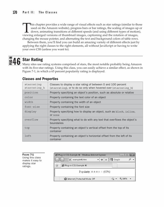
170 p a r t I I : t h e C l a s s e s C h a p t e r 7 : V i s u a l e f f e c t s 171
This chapter provides a wide range of visual effects such as star ratings (similar to those used on the Amazon website), progress bars or bar ratings, the scaling of images up or down, animating transitions at different speeds (and using different types of motion),
viewing enlarged versions of thumbnail images, captioning and the rotation of images, changing the mouse pointer, and alternating the text and background colors of table rows.
Between them, you’ll find you can build an amazing variety of different effects just by applying the right classes to the right elements, all without JavaScript or having to write your own CSS (unless you want to).
Star RatingMany sites use rating systems comprised of stars, the most notable probably being Amazon with its five-star ratings. Using this class, you can easily achieve a similar effect, as shown in Figure 7-1, in which a 65 percent popularity rating is displayed.
Classes and Propertiesstarrating starrating_h
Classes to display a star rating of between 0 and 100 percent (starrating), or to do so only when hovered over (starrating_h)
position Property specifying an object’s position, such as absolute or relative
color Property containing the text color of an object
width Property containing the width of an object
font-size Property containing the font size
display Property specifying how to display an object, such as block, inline, or none
overflow Property specifying what to do with any text that overflows the object’s boundaries
top Property containing an object’s vertical offset from the top of its container
left Property containing an object’s horizontal offset from the left of its container
4 6
Figure 7-1 Using this class makes it easy to display star ratings.

170 p a r t I I : t h e C l a s s e s part II
C h a p t e r 7 : V i s u a l e f f e c t s 171
About the ClassesThese classes display a star rating using a star symbol already available as a character; therefore, they need no external image. This is achieved by overlaying two sets of stars. The first is a set of five very light stars, and the second is a set of darker stars truncated to the right at whatever percent value is to be displayed.
How to Use ThemTo use these classes, embed a <div> (whose width is set using a style argument to the percent value to display) within another container such as a <span>, like this:
<span class='starrating'>★★★★★ <div style='width:65%'>★★★★★</div> </span>
The ★ HTML entity represents the solid star symbol, and the width parameter of the style argument restricts the width of the inner <div> to only 65 percent of the outer <span>.
You can also choose to display the rating only when hovered over, by using the starrating_h class instead of starrating. Also, because of the simplicity of this plug-in’s design, you can easily use other characters instead of stars.
The Classes.starrating, .starrating_h { position:relative; color:#ffddcc; width:65px; font-size:10pt; } .starrating_h div { display:none; } .starrating div, .starrating_h:hover div { display:block; position:absolute; overflow:hidden; color:#ff9900; top:0px; left:0px; }
Star Rating Using ImagesIn much the same way that you can use different characters instead of the star in the previous plug-in, with this plug-in you can use images of your choice. In Figure 7-2, this class has been used with a pair of star images for a more interesting effect, due to the range of colors an image can use.
4 7

172 p a r t I I : t h e C l a s s e s C h a p t e r 7 : V i s u a l e f f e c t s 173
Classes and Propertiesstarratingi starratingi_h
Classes to display a star rating of between 0 and 100 percent using gif images (starratingi), or to do so only when hovered over (starratingi_h)
position Property specifying an object’s position, such as absolute or relative
width Property containing the width of an object
height Property containing the height of an object
background Property containing an object’s various background settings
top Property containing an object’s vertical offset from the top of its container
left Property containing an object’s horizontal offset from the left of its container
About the ClassesThese classes display a star rating using an image. This is achieved by using images for the backgrounds of two objects that are overlaid on each other. The first is a set of five very light stars, and the second is a set of darker stars with the right cut off at whatever percent value is to be displayed.
How to Use ThemTo use these classes, embed a <div> (whose width is set to the percent value to display) within another <div> (not a <span>), like this:
<div class='starratingi'><div style='width:52%'></div></div>
In this example the width parameter of the style argument restricts the width of the inner <div> to only 52 percent of the outer <div>. You can also choose to display the rating only when hovered over by using the starratingi_h class instead of starratingi.
You can change the images for any others of your choosing by altering the PC.css file (by either editing the starratingi class, or copying it and creating a new one), but if they will have dimensions other than 13 × 12 pixels, you will need to also alter the width and height properties in the class definition to the new image width (multiplied by the number of images used) and height. You will also need to change the filenames if you aren’t using star1.gif and star2.gif. Don’t forget that all the examples, classes, and images are available for download at plugincss.com.
Figure 7-2 Using images for the stars provides greater color depth.
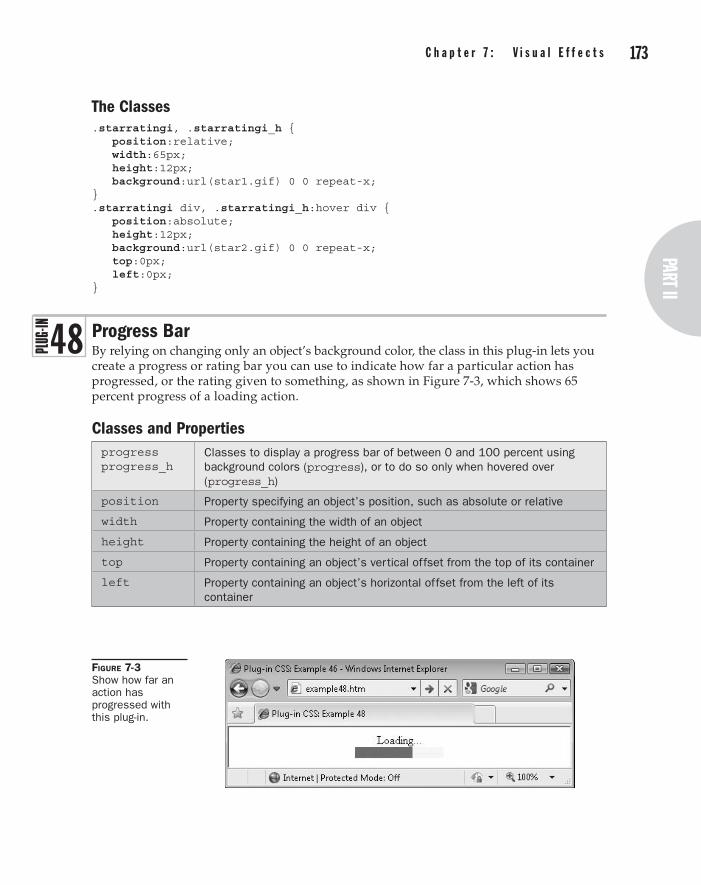
172 p a r t I I : t h e C l a s s e s part II
C h a p t e r 7 : V i s u a l e f f e c t s 173
The Classes.starratingi, .starratingi_h { position:relative; width:65px; height:12px; background:url(star1.gif) 0 0 repeat-x; } .starratingi div, .starratingi_h:hover div { position:absolute; height:12px; background:url(star2.gif) 0 0 repeat-x; top:0px; left:0px; }
Progress BarBy relying on changing only an object’s background color, the class in this plug-in lets you create a progress or rating bar you can use to indicate how far a particular action has progressed, or the rating given to something, as shown in Figure 7-3, which shows 65 percent progress of a loading action.
Classes and Propertiesprogress progress_h
Classes to display a progress bar of between 0 and 100 percent using background colors (progress), or to do so only when hovered over (progress_h)
position Property specifying an object’s position, such as absolute or relative
width Property containing the width of an object
height Property containing the height of an object
top Property containing an object’s vertical offset from the top of its container
left Property containing an object’s horizontal offset from the left of its container
Figure 7-3 Show how far an action has progressed with this plug-in.
4 8

174 p a r t I I : t h e C l a s s e s C h a p t e r 7 : V i s u a l e f f e c t s 175
About the ClassesThese classes display a progress bar using only the background colors of two objects that are overlaid on each other.
How to Use ThemTo display a progress bar <div> inside another and give each a background color or perhaps a gradient fill using a suitable class (and use the style argument to set the width of the inner <div>), you would use code such as this:
<div class='progress yellow_b'> <div class='red_b' style='width:65%'></div> </div>
In this example, a yellow progress bar is created with a red bar on top of it showing 65 percent progress. Or here’s an example that uses gradient fills:
<div class='progress sunset1'> <div class='sky1' style='width:23%'></div> </div>
You can also use the progress_h class to show the progress only when the object is hovered over by the mouse.
As you can see, you can specify both colors and the percentage to indicate directly from HTML. But, if you would like to have a progress bar with dimensions other than 120 × 15 pixels, you’ll need to modify the class rules in the PC.css file.
The Classes.progress, .progress_h { position:relative; width:120px; height:15px; } .progress div, .progress_h:hover div { position:absolute; height:15px; top:0px; left:0px; }
Scale UpThese classes let you scale an object up by between 110 and 200 percent. Rather than simply changing the width and height of an object, these classes scale it in place, without pushing other objects around to make room. Therefore, they are great for special effects such as rollovers.
Figure 7-4 shows ten instances of a 100 × 100–pixel image displayed at dimensions between 110 × 110 and 200 × 200 pixels. As you can see, none of them has affected the location of any of the other images.
4 9

174 p a r t I I : t h e C l a s s e s part II
C h a p t e r 7 : V i s u a l e f f e c t s 175
Classes and Propertiesscaleup1 scaleup1_h
Classes to scale up an image by 110 percent (scaleup1), or to do so only when hovered over (scaleup1_h)
scaleup2 – scaleup10 (etc…)
Class – as scaleup1 but for scaling between 120 and 200 percent
-moz-transform Property for transforming an object in Firefox and other Mozilla browsers
-webkit-transform Property for transforming an object in Safari and Chrome
-o-transform Property for transforming an object in Opera
transform Property for transforming an object in all other browsers (except IE)
filter Property for transforming an image in Internet Explorer
About the ClassesThese classes are particularly useful in that they create effects you don’t often see so easily implemented. What they do is use the CSS transform property (or browser-specific versions of it) along with the scale() argument, like this:
transform:scale(1.5);
Figure 7-4 These classes let you resize an image in situ without affecting other objects.

176 p a r t I I : t h e C l a s s e s C h a p t e r 7 : V i s u a l e f f e c t s 177
Caution On Internet explorer, the filter property is used instead of transform to achieve a similar effect. However, this means that on IE only images can be scaled (whereas you can scale <div>, <span>, and other objects with other browsers). And there’s another couple of provisos: While all other browsers scale using the object’s center, IE scales from the top left. It also scales objects up behind other objects. Therefore, elements that may be scaled up should be separated from others that could obscure it, or vice versa. There is more on this topic in Plug-in 51.
How to Use ThemTo use these classes, place them in the class argument of an object to be scaled, as in the following example, which was used to create Figure 7-4:
<img src='smiley.gif' class='scaleup1' /> <img src='smiley.gif' class='scaleup2' /> <img src='smiley.gif' class='scaleup3' /> <img src='smiley.gif' class='scaleup4' /> <img src='smiley.gif' class='scaleup5' /><br /><br /><br /> <img src='smiley.gif' class='scaleup6' /> <img src='smiley.gif' class='scaleup7' /> <img src='smiley.gif' class='scaleup8' /> <img src='smiley.gif' class='scaleup9' /> <img src='smiley.gif' class='scaleup10' />
You can also use the _h hover versions of the classes to resize an object only when it is hovered over, like this:
<img src='smiley.gif' class='scaleup5_h' />
note When scaling up an object in the Opera or Firefox browsers, if the new size of the object will place its boundaries outside the browser’s borders, scroll bars will be added to the browser. This behavior does not occur on other browsers.
The Classes.scaleup1, .scaleup1_h:hover { -moz-transform :scale(1.1); -webkit-transform:scale(1.1); -o-transform :scale(1.1); transform :scale(1.1); filter :progid:DXImageTransform.Microsoft.Matrix( SizingMethod='auto expand', M11='1.1', M22='1.1'); } .scaleup2, .scaleup2_h:hover { -moz-transform :scale(1.2); -webkit-transform:scale(1.2); -o-transform :scale(1.2); transform :scale(1.2);

176 p a r t I I : t h e C l a s s e s part II
C h a p t e r 7 : V i s u a l e f f e c t s 177
filter :progid:DXImageTransform.Microsoft.Matrix( SizingMethod='auto expand', M11='1.2', M22='1.2'); } .scaleup3, . :hover { -moz-transform :scale(1.3); -webkit-transform:scale(1.3); -o-transform :scale(1.3); transform :scale(1.3); filter :progid:DXImageTransform.Microsoft.Matrix( SizingMethod='auto expand', M11='1.3', M22='1.3'); } .scaleup4, .scaleup4_h:hover { -moz-transform :scale(1.4); -webkit-transform:scale(1.4); -o-transform :scale(1.4); transform :scale(1.4); filter :progid:DXImageTransform.Microsoft.Matrix( SizingMethod='auto expand', M11='1.4', M22='1.4'); } .scaleup5, .scaleup5_h:hover { -moz-transform :scale(1.5); -webkit-transform:scale(1.5); -o-transform :scale(1.5); transform :scale(1.5); filter :progid:DXImageTransform.Microsoft.Matrix( SizingMethod='auto expand', M11='1.5', M22='1.5'); } .scaleup6, .scaleup6_h:hover { -moz-transform :scale(1.6); -webkit-transform:scale(1.6); -o-transform :scale(1.6); transform :scale(1.6); filter :progid:DXImageTransform.Microsoft.Matrix( SizingMethod='auto expand', M11='1.6', M22='1.6'); } .scaleup7, .scaleup7_h:hover { -moz-transform :scale(1.7); -webkit-transform:scale(1.7); -o-transform :scale(1.7); transform :scale(1.7); filter :progid:DXImageTransform.Microsoft.Matrix( SizingMethod='auto expand', M11='1.7', M22='1.7'); } .scaleup8, .scaleup8_h:hover { -moz-transform :scale(1.8); -webkit-transform:scale(1.8); -o-transform :scale(1.8); transform :scale(1.8); filter :progid:DXImageTransform.Microsoft.Matrix( SizingMethod='auto expand', M11='1.8', M22='1.8'); }

178 p a r t I I : t h e C l a s s e s C h a p t e r 7 : V i s u a l e f f e c t s 179
.scaleup9, .scaleup9_h:hover { -moz-transform :scale(1.9); -webkit-transform:scale(1.9); -o-transform :scale(1.9); transform :scale(1.9); filter :progid:DXImageTransform.Microsoft.Matrix( SizingMethod='auto expand', M11='1.9', M22='1.9'); } .scaleup10, .scaleup10_h:hover { -moz-transform :scale(2); -webkit-transform:scale(2); -o-transform :scale(2); transform :scale(2); filter :progid:DXImageTransform.Microsoft.Matrix( SizingMethod='auto expand', M11='2', M22='2'); }
Scale DownThese classes offer the inverse functionality to the previous plug-in group, in that they reduce an object down by between 10 and 100 percent, as shown in Figure 7-5, in which ten instances of an image have been reduced by these amounts.
As with the previous group of Scale Up classes, these classes do not alter the position of surrounding objects.
Figure 7-5 These classes let you scale objects down to as little as 0 percent in size.
5 0
178 p a r t I I : t h e C l a s s e s part II
C h a p t e r 7 : V i s u a l e f f e c t s 179
Classes and Propertiesscaledown1 scaledown1_h
Classes to scale down an image by 10 percent (scaledown1), or to do so only when hovered over (scaledown1_h)
scaledown2 – scaledown10 (etc…)
Classes – as scaledown1 but for scaling down between 20 and 100 percent
-moz-transform Property for transforming an object in Firefox and other Mozilla browsers
-webkit-transform Property for transforming an object in Safari and Chrome
-o-transform Property for transforming an object in Opera
transform Property for transforming an object in all other browsers (except IE)
filter Property for transforming an image in Internet Explorer
About the ClassesThese classes use the CSS transform property (or browser-specific versions of it) along with the scale() argument, like this:
transform:scale(0.5);
On Internet Explorer, the filter property achieves a similar effect. However, this means that on IE only images can be scaled. Also, while all other browsers scale using the object’s center, IE scales from the top left.
How to Use ThemTo use these classes, place them in the class argument of an object to be scaled, as in the following example, which was used to create Figure 7-5:
<img src='smiley.gif' class='scaledown1' /> <img src='smiley.gif' class='scaledown2' /> <img src='smiley.gif' class='scaledown3' /> <img src='smiley.gif' class='scaledown4' /> <img src='smiley.gif' class='scaledown5' /><br /><br /><br /> <img src='smiley.gif' class='scaledown6' /> <img src='smiley.gif' class='scaledown7' /> <img src='smiley.gif' class='scaledown8' /> <img src='smiley.gif' class='scaledown9' /> <img src='smiley.gif' class='scaledown10' />
You can also use the _h hover versions of the classes to resize an object only when it is hovered over, like this:
<img src='smiley.gif' class='scaledown5_h' />

180 p a r t I I : t h e C l a s s e s C h a p t e r 7 : V i s u a l e f f e c t s 181
The Classes.scaledown1, .scaledown1_h:hover { -moz-transform :scale(0.9); -webkit-transform:scale(0.9); -o-transform :scale(0.9); transform :scale(0.9); filter :progid:DXImageTransform.Microsoft.Matrix( SizingMethod='auto expand', M11='0.9', M22='0.9'); } .scaledown2, .scaledown2_h:hover { -moz-transform :scale(0.8); -webkit-transform:scale(0.8); -o-transform :scale(0.8); transform :scale(0.8); filter :progid:DXImageTransform.Microsoft.Matrix( SizingMethod='auto expand', M11='0.8', M22='0.8'); } .scaledown3, . :hover { -moz-transform :scale(0.7); -webkit-transform:scale(0.7); -o-transform :scale(0.7); transform :scale(0.7); filter :progid:DXImageTransform.Microsoft.Matrix( SizingMethod='auto expand', M11='0.7', M22='0.7'); } .scaledown4, .scaledown4_h:hover { -moz-transform :scale(0.6); -webkit-transform:scale(0.6); -o-transform :scale(0.6); transform :scale(0.6); filter :progid:DXImageTransform.Microsoft.Matrix( SizingMethod='auto expand', M11='0.6', M22='0.6'); } .scaledown5, .scaledown5_h:hover { -moz-transform :scale(0.5); -webkit-transform:scale(0.5); -o-transform :scale(0.5); transform :scale(0.5); filter :progid:DXImageTransform.Microsoft.Matrix( SizingMethod='auto expand', M11='0.5', M22='0.5'); } .scaledown6, .scaledown6_h:hover { -moz-transform :scale(0.4); -webkit-transform:scale(0.4); -o-transform :scale(0.4); transform :scale(0.4); filter :progid:DXImageTransform.Microsoft.Matrix( SizingMethod='auto expand', M11='0.4', M22='0.4'); } .scaledown7, .scaledown7_h:hover { -moz-transform :scale(0.3); -webkit-transform:scale(0.3);

180 p a r t I I : t h e C l a s s e s part II
C h a p t e r 7 : V i s u a l e f f e c t s 181
-o-transform :scale(0.3); transform :scale(0.3); filter :progid:DXImageTransform.Microsoft.Matrix( SizingMethod='auto expand', M11='0.3', M22='0.3'); } .scaledown8, .scaledown8_h:hover { -moz-transform :scale(0.2); -webkit-transform:scale(0.2); -o-transform :scale(0.2); transform :scale(0.2); filter :progid:DXImageTransform.Microsoft.Matrix( SizingMethod='auto expand', M11='0.2', M22='0.2'); } .scaledown9, .scaledown9_h:hover { -moz-transform :scale(0.1); -webkit-transform:scale(0.1); -o-transform :scale(0.1); transform :scale(0.1); filter :progid:DXImageTransform.Microsoft.Matrix( SizingMethod='auto expand', M11='0.1', M22='0.1'); } .scaledown10, .scaledown10_h:hover { -moz-transform :scale(0); -webkit-transform:scale(0); -o-transform :scale(0); transform :scale(0); filter :progid:DXImageTransform.Microsoft.Matrix( SizingMethod='auto expand', M11='0', M22='0'); }
Transition AllFor browsers that support the new transition property, including Opera 10, Firefox 4, Apple Safari 5, and Google Chrome 5 (but, sadly, not Internet Explorer), you can use this plug-in to make any changes made to an object transition smoothly, over a time between 0.1 and 2.0 seconds. Browsers that do not support transitions ignore these classes and will change properties immediately rather than transitioning.
In Figure 7-6 (a screen grab taken using the Apple Safari browser), the mouse is currently hovering over the middle smiley in the bottom row, which has smoothly enlarged—and it will gently shrink back down in size when the mouse moves away.
However, a word of caution when using scaling…. In Figure 7-7 (a screen grab taken using Internet Explorer), the object has correctly enlarged (but not transitioned, as IE doesn’t support it), and you can see the reason for the warning I gave in Plug-in 49 about ensuring objects that may be scaled up in an IE window are separated from each other (since scaled-up objects appear behind others in IE). Other browsers do, however, correctly bring an object to the front when scaled, and move it back to its previous position when not scaled.
5 1

182 p a r t I I : t h e C l a s s e s C h a p t e r 7 : V i s u a l e f f e c t s 183
note Unfortunately, Internet Explorer is currently out of the picture as far as CSS 3 transitions go, with even the IE9 beta not supporting them. So users of this browser will simply see instant changes rather than animated transitions. Let’s hope that this powerful feature is added to IE soon.
Figure 7-6 Combining the transitionall and scale8_h classes to create a rollover effect
Figure 7-7 If you do not separate objects that are scalable, they can obscure each other when viewed in Internet Explorer.

182 p a r t I I : t h e C l a s s e s part II
C h a p t e r 7 : V i s u a l e f f e c t s 183
Classes and Propertiestransitionall transitionall_l
Classes for apply transitions of 0.7 seconds duration to all changed properties of an object (transitionall), or to do so but with linear rather than easing movement (transitionall_l)
transitionallslowest transitionallslow transitionallfast transitionallfastest
Classes – as transitionall and transitionall_l, but for durations of 2.0, 1.5, 0.3, and 0.1 seconds duration, including _l versions for linear movement
-moz-transition Property for transitioning properties of an object over a set duration in Firefox and other Mozilla browsers
-webkit-transition Property for transitioning properties of an object over a set duration in Safari and Chrome
-o-transition Property for transitioning properties of an object over a set duration in Opera
transition Property for transitioning properties of an object over a set duration in all other browsers (except IE)
About the ClassesThese classes apply transitions to all of an object’s properties that change. This change is usually a result of the :hover pseudo class, as used by the _h versions of the classes in this book, or it can be a change instigated through the use of JavaScript, as implemented in the remaining chapters.
The transition is applied to an object using a CSS rule such as the following (or browser-specific variants of the property name like those that begin -moz, -webkit-, or -o-):
transition:all .7s;
Browsers that do not support transitions will ignore this and just change properties immediately, without transitioning.
How to Use ThemTo use these classes, add them to the class argument of an object and forget about them. Then, when any properties of the object are changed that can transition, they will be animated over the period of time specified, rather than changing immediately.
For example, here’s the example HTML from Plug-in 49, but modified to change all the hover effects to transitions of differing durations:
<img src='smiley.gif' class='scaleup1_h transitionallslowest' /> <img src='smiley.gif' class='scaleup2_h transitionallslow' /> <img src='smiley.gif' class='scaleup3_h transitionall' /> <img src='smiley.gif' class='scaleup4_h transitionallfast' /> <img src='smiley.gif' class='scaleup5_h transitionallfastest' /> <br /><br /><br />

184 p a r t I I : t h e C l a s s e s C h a p t e r 7 : V i s u a l e f f e c t s 185
<img src='smiley.gif' class='scaleup6_h transitionallslowest_l' /> <img src='smiley.gif' class='scaleup7_h transitionallslow_l' /> <img src='smiley.gif' class='scaleup8_h transitionall_l' /> <img src='smiley.gif' class='scaleup9_h transitionallfast_l' /> <img src='smiley.gif' class='scaleup10_h transitionallfastest_l' />
The first set of five images use the default easing transition, in which the animation starts slow, increases in speed and then slows again at the end. The second set uses the _l versions of the plug-ins to specify linear motion for the animation, where there is no speeding up and slowing down.
tip You will find you can add transitions to a wide range of the classes in this book that provide _h hover versions. This includes changing colors, position, dimensions, shadows, opacity, borders, and many more properties. All right, users of Internet Explorer won’t get to see these nice transitions (yet), but for the sake of adding a simple extra class to your HTML, all other browser users (which as of late 2010 looks set to become the majority) will enjoy a much more sophisticated environment on their web pages.
The Classes.transitionall { -moz-transition :all .7s; -webkit-transition:all .7s; -o-transition :all .7s; transition :all .7s; } .transitionallslowest { -moz-transition :all 2s; -webkit-transition:all 2s; -o-transition :all 2s; transition :all 2s; } .transitionallslow { -moz-transition :all 1.5s; -webkit-transition:all 1.5s; -o-transition :all 1.5s; transition :all 1.5s; } .transitionallfast { -moz-transition :all .3s; -webkit-transition:all .3s; -o-transition :all .3s; transition :all .3s; } .transitionallfastest { -moz-transition :all .1s; -webkit-transition:all .1s; -o-transition :all .1s; transition :all .1s; }

184 p a r t I I : t h e C l a s s e s part II
C h a p t e r 7 : V i s u a l e f f e c t s 185
.transitionall_l { -moz-transition :all .7s linear; -webkit-transition:all .7s linear; -o-transition :all .7s linear; transition :all .7s linear; } .transitionallslowest_l { -moz-transition :all 2s linear; -webkit-transition:all 2s linear; -o-transition :all 2s linear; transition :all 2s linear; } .transitionallslow_l { -moz-transition :all 1.5s linear; -webkit-transition:all 1.5s linear; -o-transition :all 1.5s linear; transition :all 1.5s linear; } .transitionallfast_l { -moz-transition :all .3s linear; -webkit-transition:all .3s linear; -o-transition :all .3s linear; transition :all .3s linear; } .transitionallfastest_l { -moz-transition :all .1s linear; -webkit-transition:all .1s linear; -o-transition :all .1s linear; transition :all .1s linear; }
Thumb ViewThis class provides a simple and effective way for users to browse large versions of photo thumbnails. In Figure 7-8, six thumbnails are displayed and the mouse is currently hovering over the second, which has caused the large version of the image to be displayed.
Classes and Propertiesthumbview Class to display a larger image of a thumbnail
position Property containing the position of an object, such as relative or absolute
top Property containing the vertical offset of an object from the top of its container
left Property containing the horizontal offset of an object from the left of its container
display Property specifying how an object is displayed, such as inline or block
5 2

186 p a r t I I : t h e C l a s s e s C h a p t e r 7 : V i s u a l e f f e c t s 187
About the ClassThis class displays the contents of a <span> that accompanies a thumbnail image by hiding it using the opacity property and by scaling it to zero dimensions—until the mouse passes over the image, when the <span> is scaled back up again, and the opacity is restored to reveal it. The <span> is set to appear inset from the left of the container and down from the top by 30 pixels.
For some reason, the Opera browser doesn’t vertically offset the same way that the other browsers do, so a browser-specific hack is used to change the top property of the <span> to a different value.
How to Use ItAlthough this plug-in is intended mainly for displaying a large version of a thumbnail image, because it simply hides and displays a <span> on demand, you can place anything you like in it, meaning you can use it to display information on an image or other details.
Here is the HTML used for Figure 7-8:
<span class='thumbview'> <img class='bwidth1 bblack bsolid' src='t1.jpg' /> <span><img class='bwidth2 bblack bsolid' src='i1.jpg' /></span> </span> <span class='thumbview'> <img class='bwidth1 bblack bsolid' src='t2.jpg' /> <span><img class='bwidth2 bblack bsolid' src='i2.jpg' /></span> </span>
Figure 7-8 Use these classes to create a simple viewer for thumbnail images.

186 p a r t I I : t h e C l a s s e s part II
C h a p t e r 7 : V i s u a l e f f e c t s 187
<span class='thumbview'> <img class='bwidth1 bblack bsolid' src='t3.jpg' /> <span><img class='bwidth2 bblack bsolid' src='i3.jpg' /></span> </span><br /> <span class='thumbview'> <img class='bwidth1 bblack bsolid' src='t4.jpg' /> <span><img class='bwidth2 bblack bsolid' src='i4.jpg' /></span> </span> <span class='thumbview'> <img class='bwidth1 bblack bsolid' src='t5.jpg' /> <span><img class='bwidth2 bblack bsolid' src='i5.jpg' /></span> </span> <span class='thumbview'> <img class='bwidth1 bblack bsolid' src='t6.jpg' /> <span><img class='bwidth2 bblack bsolid' src='i6.jpg' /></span> </span>
The outer container of each thumbnail and image is a <span>, but it could equally be a <div> or other container. Within each container is an image followed by a <span>, in which a large version of each thumbnail image is placed. When the mouse passes over the outer container, the inner one is set to display, and when the mouse passes out, the inner one is hidden again.
note In Internet Explorer, what has been described here is pretty much what you will see. But on Opera 10, Firefox 4, Apple Safari 5, and Google Chrome 5, the images (or whatever is contained in the inner <span>) will fade and zoom in at the same time (and out again when the mouse passes away) due to the combined use of transitions, scaling, and opacity. If you can, try to view it in one of these browsers to see the impressive effect that results.
The Class.thumbview { position:relative; } .thumbview span { position:absolute; top:-30px; left:30px; -moz-transition :all .3s linear; -webkit-transition:all .3s linear; -o-transition :all .3s linear; transition :all .3s linear; -moz-transform :scale(0); -webkit-transform :scale(0); -o-transform :scale(0); transform :scale(0); opacity :0; z-index :0; filter :progid:DXImageTransform.Microsoft.Matrix( SizingMethod='auto expand', M11='0', M22='0'); }

188 p a r t I I : t h e C l a s s e s C h a p t e r 7 : V i s u a l e f f e c t s 189
.thumbview:hover span { -moz-transform :scale(1); -webkit-transform :scale(1); -o-transform :scale(1); transform :scale(1); opacity :1; z-index :100; filter :progid:DXImageTransform.Microsoft.Matrix( SizingMethod='auto expand', M11='1', M22='1'); } @media all and (-webkit-min-device-pixel-ratio:10000), /* Only Opera */ not all and (-webkit-min-device-pixel-ratio:0) { /* sees this hack */ .thumbview span { top:30px; } }
Caption ImageUsing this plug-in you can present your images with neat white borders and a shadowed caption on a thicker border at the picture’s bottom. In Figure 7-9, the HTML from the previous example has been reused, with this class added to provide captions, and without the previous borders, since this class provides its own.
Figure 7-9 Use Plug-in 53 to add captions and interesting effects to images
5 3

188 p a r t I I : t h e C l a s s e s part II
C h a p t e r 7 : V i s u a l e f f e c t s 189
The screen grab was taken using Google Chrome, which is representative of the results you’ll get with most browsers in that there is a smooth transition, the border of the photo is white and shadowed, and the caption is shadowed text on a translucent background.
However, in Internet Explorer it’s not possible to achieve quite the same effect, mainly because IE dislikes using many of its features within a content property that is part of a pseudo class such as :before, or :after. Nevertheless, as you can see in Figure 7-10, it degrades reasonably well thanks to a few (unfortunately necessary) CSS hacks.
Classes and Propertiescaption caption_h
Classes to add a caption and other embellishments to an image (caption), or to do so only when the object is hovered over (caption_h)
position Property containing the position of an object, such as absolute or relative
background Property containing an object’s background settings
padding Property containing an object’s padding settings
border Property containing an object’s border settings
color Property containing the text color of an object
top Property containing the vertical offset of an object from the top of its container
Figure 7-10 Displaying an image using a caption class in Internet Explorer
190 p a r t I I : t h e C l a s s e s C h a p t e r 7 : V i s u a l e f f e c t s 191
bottom Property containing the vertical offset of an object from the bottom of its container
left Property containing the horizontal offset of an object from the left of its container
height Property containing the height of an object
line-height Property containing the line height of an object
text-align Property containing the alignment of the text in an object, such as left or right
font-size Property containing the font size of an object
font-weight Property containing the font weight of an object
font-family Property containing the font family of an object
content Property for adding content to an abject from CSS
opacity Property containing the opacity (or invisibility) of an object
About the ClassesThese classes frame and caption an image in a professional manner by changing various properties such as its borders, and by adding content taken from the alt argument.
The caption_h class applies the caption only when the mouse passes over the associated image, while the caption class applies it as soon as the larger image is displayed.
A few hacks must be used in the CSS to get Internet Explorer to display anything at all! These consist of affixing the \0 suffix to any rules that only IE should see. Also, to create the light ribbon behind the captions, the Unicode character 2588 (a solid block) is repeated 50 times in a :before set of rules. This block character string should be enough for reasonably wide pictures, but you can easily increase it if it isn’t. Non-IE browsers do not see these :before rules.
How to Use ThemTo use these classes, you need to provide a caption for the image in the alt argument of its container (such as a <div> or <span>), and then use either the caption or caption_h class in the class argument, like this:
<span class='caption_h' alt='A caption'> <img src='myimage.jpg' /> </span>
For example, following is the HTML used for Figures 7-9 and 7-10, which combines the thumbview class with both the caption and caption_h classes:
<span class='thumbview'> <img class='bwidth1 bblack bsolid' src='t1.jpg' /> <span class='caption' alt='San Francisco, Pier 39 Seals'> <img src='i1.jpg' /> </span> </span>
190 p a r t I I : t h e C l a s s e s part II
C h a p t e r 7 : V i s u a l e f f e c t s 191
<span class='thumbview'> <img class='bwidth1 bblack bsolid' src='t2.jpg' /> <span class='caption' alt='San Francisco Bay Bridge'> <img src='i2.jpg' /> </span> </span> <span class='thumbview'> <img class='bwidth1 bblack bsolid' src='t3.jpg' /> <span class='caption' alt='The San Francisco Peaks'> <img src='i3.jpg' /> </span> </span><br /> <span class='thumbview'> <img class='bwidth1 bblack bsolid' src='t4.jpg' /> <span class='caption_h' alt='San Francisco Peaks Forest'> <img src='i4.jpg' /> </span> </span> <span class='thumbview'> <img class='bwidth1 bblack bsolid' src='t5.jpg' /> <span class='caption_h' alt='San Francisco Park Lake'> <img src='i5.jpg' /> </span> </span> <span class='thumbview'> <img class='bwidth1 bblack bsolid' src='t6.jpg' /> <span class='caption_h' alt='Las Vegas At Night'> <img src='i6.jpg' /> </span> </span>
The captions are immediately displayed when the larger version is shown of any of the top row of thumbnails, but the bottom row of icons only open up the large image. You need to move the mouse into this image to be shown the caption, too.
The Classes.caption, .caption_h { position:relative; } .caption img, .caption_h img { background:#000000; padding:3px; } .caption img, .caption_h:hover img { padding:0px; border:3px solid #ffffff; border:3px solid #eeeeee\0; /* IE hack */ -moz-box-shadow :3px 5px 9px #444; -webkit-box-shadow:3px 5px 9px #444; box-shadow :3px 5px 9px #444; }

192 p a r t I I : t h e C l a s s e s C h a p t e r 7 : V i s u a l e f f e c t s 193
.caption:before\0, .caption_h:hover:before\0 { /* IE hack section */ position:absolute\0; color:#eeeeee\0; top:auto\0; bottom:3px\0; left:0px\0; font-size:20pt\0; font-weight:bold\0; font-family:Impact\0; content: '\2588\2588\2588\2588\2588\2588\2588\2588\2588\2588\2588\2588 \2588\2588\2588\2588\2588\2588\2588\2588\2588\2588\2588\2588\2588\2588 \2588\2588\2588\2588\2588\2588\2588\2588\2588\2588\2588\2588\2588\2588 \2588\2588\2588\2588\2588\2588\2588\2588\2588\2588'; /* 1 long line */ } .caption:after, .caption_h:hover:after { position:absolute; background:#ffffff; color:#000000; top:auto; bottom:3px; left:0px; width:100%; text-align:center; height:30px; line-height:30px; font-size:8pt; text-shadow:#888888 2px 2px 2px; font-weight:bold; font-family:Verdana, Helvetica, sans-serif; content:attr(alt); opacity:.9; }
PointerThis pointer class is useful for making the mouse cursor change from an arrow to a pointing finger when it passes over an object, and is especially useful for attaching to buttons (which generally don’t have this cursor behavior).
In Figure 7-11, two screen grabs have been taken with the mouse pointer enabled, and then merged to show the effect of passing the cursor over one object not using this class, and another that is. In the figure, the mouse cursor has changed to a pointing finger as it passes over the second button.
Classes and Propertiespointer Class to change the mouse cursor to a pointing finger when it passes over
an object
cursor Property for changing the mouse cursor
5 4
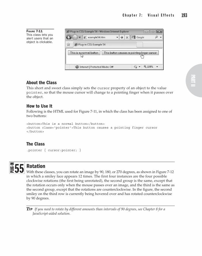
192 p a r t I I : t h e C l a s s e s part II
C h a p t e r 7 : V i s u a l e f f e c t s 193
About the ClassThis short and sweet class simply sets the cursor property of an object to the value pointer, so that the mouse cursor will change to a pointing finger when it passes over the object.
How to Use ItFollowing is the HTML used for Figure 7-11, in which the class has been assigned to one of two buttons:
<button>This is a normal button</button> <button class='pointer'>This button causes a pointing finger cursor </button>
The Class.pointer { cursor:pointer; }
RotationWith these classes, you can rotate an image by 90, 180, or 270 degrees, as shown in Figure 7-12 in which a smiley face appears 12 times. The first four instances are the four possible clockwise rotations (the first being unrotated), the second group is the same, except that the rotation occurs only when the mouse passes over an image, and the third is the same as the second group, except that the rotations are counterclockwise. In the figure, the second smiley on the third row is currently being hovered over and has rotated counterclockwise by 90 degrees.
tip If you need to rotate by different amounts than intervals of 90 degrees, see Chapter 8 for a JavaScript-aided solution.
Figure 7-11 This class lets you alert users that an object is clickable.
5 5

194 p a r t I I : t h e C l a s s e s C h a p t e r 7 : V i s u a l e f f e c t s 195
Classes and Propertiesrotatec90 rotatec90_h
Classes to rotate an image clockwise by 90 degrees (rotatec90), or to do so only when the object is hovered over (rotatec90_h)
rotatec180 rotatec270 (etc…)
Classes – as rotatec90 but for rotating an object by 180 or 270 degrees, including _h classes for doing so only when hovered over
rotatea90 rotatea270 (etc…)
Classes – as rotatec90 but for rotating an object counterclockwise by 180 or 270 degrees, including _h classes for doing so only when hovered over
-moz-transform Property used by Firefox and other Mozilla browsers to transform an object
-webkit-transform Property used by Safari and Chrome to transform an object
-o-transform Property used by Opera to transform an object
transform Property used by all other browsers to transform an object (but not IE)
filter Property used by IE to rotate an image, among many other features
Figure 7-12 These classes let you display images in any of four different rotations.

194 p a r t I I : t h e C l a s s e s part II
C h a p t e r 7 : V i s u a l e f f e c t s 195
About the ClassesThese classes take an object and apply a rotation of 90, 180, or 270 degrees to it. The transforms used rotate in either a clockwise or counterclockwise direction so, for example, the rotatec90 class uses this CSS rule:
transform:rotate(90deg);
…and the rotatea90 class uses this rule (the a standing for the initial letter of the European term anticlockwise, since c is already taken for clockwise):
transform:rotate(-90deg);
The reason for providing both clockwise and counterclockwise methods is to allow the use of the transitionall classes (Plug-in 51) with these classes. When combined, on browsers that support transitions, the image will rotate smoothly in the direction supplied, rather than immediately change.
The Internet Explorer browser doesn’t support transitions but does change the object to the required rotation.
How to Use ThemTo use these classes, enter them into the class argument of an object, like this:
<img class='rotatec90' src='myphoto.jpg' />
Browsers other than Internet Explorer support the rotating of any object such as a <span> or <div>, which means complete sections of text and HTML can be rotated. But IE is limited to only images.
Here is the HTML used to create Figure 7-12:
<img src='smiley.gif' /> <img class='rotatec90' src='smiley.gif' /> <img class='rotatec180' src='smiley.gif' /> <img class='rotatec270' src='smiley.gif' /><br /> <img src='smiley.gif' /> <img class='transitionall rotatec90_h' src='smiley.gif' /> <img class='transitionall rotatec180_h' src='smiley.gif' /> <img class='transitionall rotatec270_h' src='smiley.gif' /><br /> <img src='smiley.gif' /> <img class='transitionall_l rotatea90_h' src='smiley.gif' /> <img class='transitionall_l rotatea180_h' src='smiley.gif' /> <img class='transitionall_l rotatea270_h' src='smiley.gif' />
The first group instantly rotates the images and the second one rotates them only when the mouse hovers over an image. This group also implements the transitionall class, so that browsers that support it will animate the rotation.
The final group is the same as the second except that the images rotate counterclockwise, and the transitionall_l class is used for a linear, rather than easing, movement to the animation.
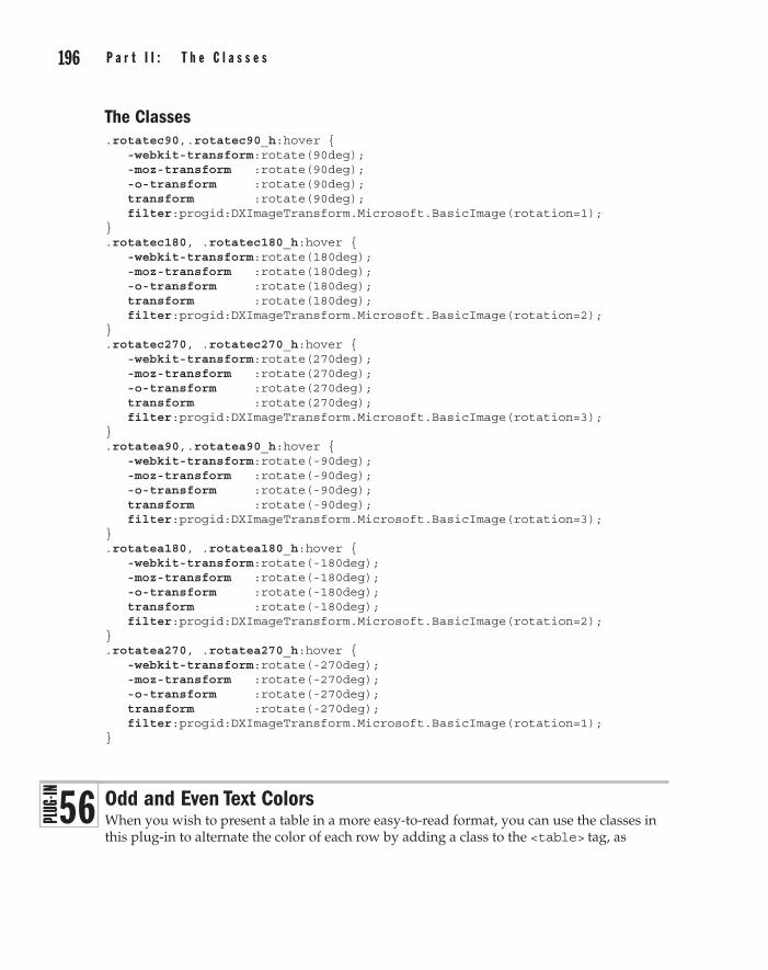
196 p a r t I I : t h e C l a s s e s C h a p t e r 7 : V i s u a l e f f e c t s 197
The Classes.rotatec90,.rotatec90_h:hover { -webkit-transform:rotate(90deg); -moz-transform :rotate(90deg); -o-transform :rotate(90deg); transform :rotate(90deg); filter:progid:DXImageTransform.Microsoft.BasicImage(rotation=1); } .rotatec180, .rotatec180_h:hover { -webkit-transform:rotate(180deg); -moz-transform :rotate(180deg); -o-transform :rotate(180deg); transform :rotate(180deg); filter:progid:DXImageTransform.Microsoft.BasicImage(rotation=2); } .rotatec270, .rotatec270_h:hover { -webkit-transform:rotate(270deg); -moz-transform :rotate(270deg); -o-transform :rotate(270deg); transform :rotate(270deg); filter:progid:DXImageTransform.Microsoft.BasicImage(rotation=3); } .rotatea90,.rotatea90_h:hover { -webkit-transform:rotate(-90deg); -moz-transform :rotate(-90deg); -o-transform :rotate(-90deg); transform :rotate(-90deg); filter:progid:DXImageTransform.Microsoft.BasicImage(rotation=3); } .rotatea180, .rotatea180_h:hover { -webkit-transform:rotate(-180deg); -moz-transform :rotate(-180deg); -o-transform :rotate(-180deg); transform :rotate(-180deg); filter:progid:DXImageTransform.Microsoft.BasicImage(rotation=2); } .rotatea270, .rotatea270_h:hover { -webkit-transform:rotate(-270deg); -moz-transform :rotate(-270deg); -o-transform :rotate(-270deg); transform :rotate(-270deg); filter:progid:DXImageTransform.Microsoft.BasicImage(rotation=1); }
Odd and Even Text ColorsWhen you wish to present a table in a more easy-to-read format, you can use the classes in this plug-in to alternate the color of each row by adding a class to the <table> tag, as
5 6

196 p a r t I I : t h e C l a s s e s part II
C h a p t e r 7 : V i s u a l e f f e c t s 197
shown in Figure 7-13 (a screen grab from Google Chrome), where the text color in the odd rows has been changed to green.
These classes work in all the latest browsers except for Internet Explorer (even the IE9 beta), although it is rumored that the final release of IE9 may support the properties these classes rely on. IE8 and lower will simply display tables the normal way.
Classes and Propertiesaqua_o aqua_e
Classes to change the text color of either all odd rows in a table to aqua (aqua_o), or all even rows (aqua_e)
black blue brown fuchsia gold gray green khaki lime maroon navy olive orange pink purple red silver teal white yellow (etc…)
Classes – as aqua_o and aqua_e, but for the colors shown
nth-child() Pseudo class used with the values odd or even for accessing odd or even numbered rows
color Property containing the text color of an object
About the ClassesThese classes change the text color of either the odd- or even-numbered rows in a table by using the nth-child pseudo class, like this:
.aqua_o tr:nth-child(odd) { color:#0ff; }
Figure 7-13 Using the Plug-in 56 classes to create alternately colored rows of text in tables
198 p a r t I I : t h e C l a s s e s C h a p t e r 7 : V i s u a l e f f e c t s 199
For example, this rule sets the class aqua_o to change the text color of all odd table rows to aqua, using the tr: part of the rule, in conjunction with the :nth-child(odd) pseudo class. For even rows, the odd parameter is changed to even.
How to Use ThemTo use these classes, simply mention them in the class argument of a table, as in the following, which will change the text color of all even rows to green:
<table class='green_e'>
Here’s the HTML used to create Figure 7-13:
<table class='bsolid bwidth1 green_e' cellspacing='0' cellpadding='3'> <tr class='green_e'> <td><b>Browser</b></td> <td><b>Market Share</b></td> </tr> <tr> <td>Internet Explorer</td> <td>51.15%</td> </tr> <tr> <td>Firefox</td> <td>31.03%</td> </tr> <tr> <td>Chrome</td> <td>8.30%</td> </tr> <tr> <td>Safari</td> <td>4.90%</td> </tr> <tr> <td>Opera</td> <td>2.01%</td> </tr> <tr> <td>Others</td> <td>2.11%</td> </tr> </table>
This example displays the market share of the main web browsers in July 2010 according to Wikipedia. It starts by creating a solid black border around the table with a width of one pixel, and then uses the green_e class to set the color of all even rows in the table to green. The table’s cellspacing and cellpadding arguments are also set to 0 and 3, respectively, for improved styling.
A color class with the suffix _o could also be used if the odd row color needed changing from the default of black.

198 p a r t I I : t h e C l a s s e s part II
C h a p t e r 7 : V i s u a l e f f e c t s 199
The Classes.aqua_o tr:nth-child(odd), .aqua_e tr:nth-child(even) { color:#0ff } .black_o tr:nth-child(odd), .black_e tr:nth-child(even) { color:#000 } .blue_o tr:nth-child(odd), .blue_e tr:nth-child(even) { color:#00f } .brown_o tr:nth-child(odd), .brown_e tr:nth-child(even) { color:#c44 } .fuchsia_o tr:nth-child(odd), .fuchsia_e tr:nth-child(even) { color:#f0f } .gold_o tr:nth-child(odd), .gold_e tr:nth-child(even) { color:#fc0 } .gray_o tr:nth-child(odd), .gray_e tr:nth-child(even) { color:#888 } .green_o tr:nth-child(odd), .green_e tr:nth-child(even) { color:#080 } .khaki_o tr:nth-child(odd), .khaki_e tr:nth-child(even) { color:#cc8 } .lime_o tr:nth-child(odd), .lime_e tr:nth-child(even) { color:#0f0 } .maroon_o tr:nth-child(odd), .maroon_e tr:nth-child(even) { color:#800 } .navy_o tr:nth-child(odd), .navy_e tr:nth-child(even) { color:#008 } .olive_o tr:nth-child(odd), .olive_e tr:nth-child(even) { color:#880 } .orange_o tr:nth-child(odd), .orange_e tr:nth-child(even) { color:#f80 } .pink_o tr:nth-child(odd), .pink_e tr:nth-child(even) { color:#f88 } .purple_o tr:nth-child(odd), .purple_e tr:nth-child(even) { color:#808 } .red_o tr:nth-child(odd), .red_e tr:nth-child(even) { color:#f00 } .silver_o tr:nth-child(odd), .silver_e tr:nth-child(even) { color:#ccc } .teal_o tr:nth-child(odd), .teal_e tr:nth-child(even) { color:#088 } .white_o tr:nth-child(odd), .white_e tr:nth-child(even) { color:#fff } .yellow_o tr:nth-child(odd), .yellow_e tr:nth-child(even) { color:#ff0 }
Odd and Even Background ColorsThese classes complement those in Plug-in 56 by enabling the changing of a table row’s odd or even background colors as shown in Figure 7-14, in which the background colors have been styled to alternate between lime green and aqua.
5 7

200 p a r t I I : t h e C l a s s e s C h a p t e r 7 : V i s u a l e f f e c t s 201
As with the odd and even text color classes, these classes will not work with Internet Explorer, although they may do so in the full release of IE9. In IE8 and earlier, the table will simply display as normal; therefore, you may wish to apply a standard background color to your tables as a fallback.
Classes and Propertiesaqua_bo aqua_be
Classes to change the background color of either all odd rows in a table to aqua (aqua_bo), or all even rows (aqua_be)
black blue brown fuchsia gold gray green khaki lime maroon navy olive orange pink purple red silver teal white yellow (etc…)
Classes – as aqua_bo and aqua_be, but for the colors shown
nth-child() Pseudo class used with the values odd or even for accessing odd or even numbered rows
background Property containing the background color of an object
About the ClassesThese classes work in the same way as those in the previous plug-in group, except that they change the background instead of the color property.
How to Use ThemTo use these classes, simply mention them in the class argument of a table as in the following, which will change the background color of all even rows to aqua:
<table class='aqua_be'>
Figure 7-14 The table from the previous plug-in, now styled with alternating background colors

200 p a r t I I : t h e C l a s s e s part II
C h a p t e r 7 : V i s u a l e f f e c t s 201
Here’s the HTML used to create Figure 7-14:
<table class='bsolid bwidth1 green_e aqua_be lime_bo' cellspacing='0' cellpadding='3'> <tr class='green_e'> <td><b>Browser</b></td> <td><b>Market Share</b></td> </tr> <tr> <td>Internet Explorer</td> <td>51.15%</td> </tr> <tr> <td>Firefox</td> <td>31.03%</td> </tr> <tr> <td>Chrome</td> <td>8.30%</td> </tr> <tr> <td>Safari</td> <td>4.90%</td> </tr> <tr> <td>Opera</td> <td>2.01%</td> </tr> <tr> <td>Others</td> <td>2.11%</td> </tr> </table>
This example adds the classes aqua_be and lime_bo to the previous example to change the background colors of the table rows. Although the colors in this example may look garish when you run them on your computer, I chose them because they convert well to the gray scale printing used in this book—and it’s easy enough for you to change them anyway.
note This concludes the standard CSS plug-ins. In the next chapter, I’ll introduce Dynamic classes and show what you can do when you add a little JavaScript to your CSS.
The Classes.aqua_bo tr:nth-child(odd), .aqua_be tr:nth-child(even) { background:#0ff } .black_bo tr:nth-child(odd), .black_be tr:nth-child(even) { background:#000 } .blue_bo tr:nth-child(odd), .blue_be tr:nth-child(even) { background:#00f } .brown_bo tr:nth-child(odd), .brown_be tr:nth-child(even) { background:#c44 }

202 p a r t I I : t h e C l a s s e s
.fuchsia_bo tr:nth-child(odd), .fuchsia_be tr:nth-child(even) { background:#f0f } .gold_bo tr:nth-child(odd), .gold_be tr:nth-child(even) { background:#fc0 } .gray_bo tr:nth-child(odd), .gray_be tr:nth-child(even) { background:#888 } .green_bo tr:nth-child(odd), .green_be tr:nth-child(even) { background:#080 } .khaki_bo tr:nth-child(odd), .khaki_be tr:nth-child(even) { background:#cc8 } .lime_bo tr:nth-child(odd), .lime_be tr:nth-child(even) { background:#0f0 } .maroon_bo tr:nth-child(odd), .maroon_be tr:nth-child(even) { background:#800 } .navy_bo tr:nth-child(odd), .navy_be tr:nth-child(even) { background:#008 } .olive_bo tr:nth-child(odd), .olive_be tr:nth-child(even) { background:#880 } .orange_bo tr:nth-child(odd), .orange_be tr:nth-child(even) { background:#f80 } .pink_bo tr:nth-child(odd), .pink_be tr:nth-child(even) { background:#f88 } .purple_bo tr:nth-child(odd), .purple_be tr:nth-child(even) { background:#808 } .red_bo tr:nth-child(odd), .red_be tr:nth-child(even) { background:#f00 } .silver_bo tr:nth-child(odd), .silver_be tr:nth-child(even) { background:#ccc } .teal_bo tr:nth-child(odd), .teal_be tr:nth-child(even) { background:#088 } .white_bo tr:nth-child(odd), .white_be tr:nth-child(even) { background:#fff } .yellow_bo tr:nth-child(odd), .yellow_be tr:nth-child(even) { background:#ff0 }

Part IIIthe Dynamic ClassesChaPter 8Dynamic Objects
ChaPter 9Dynamic Text and Typography
ChaPter 10Dynamic Interaction
ChaPter 11Incorporating JavaScript
ChaPter 12Superclasses

This page intentionally left blank

ChaPter 8
Dynamic Objects

206 P a r t I I I : t h e D y n a m i c C l a s s e s C h a p t e r 8 : D y n a m i c O b j e c t s 207
Powerful as CSS is, it isn’t really a language, as shown by the plug-ins in this book having to repeat large chunks of code where only a minor change is required between each, such as a color or width. A language, on the other hand, is very good at repeating
things based on only a few lines of code. And that’s where JavaScript fits in, because with it you can bring the dynamic interaction of a web page up an order of magnitude.
What’s more, many of the classes in this chapter allow you to enter values as parameters to create exactly the result you want, including moving objects about in the browser, loading images in only when (or if) they are scrolled into view, fading images in and out over user-definable periods, resizing and rotating objects by any amount, and changing an object’s text and background colors to all possible values.
NoJS (nojs) and OnlyJS (onlyjs)There is a downside to employing JavaScript-aided classes because some people have JavaScript turned off, generally due to a habit they got into when pop-up windows became so prevalent. But with the advent of pop-up blocking in all modern browsers, the percent of users with JavaScript disabled has dropped from a height of around 12–15 percent a decade ago, to an estimated 2 percent or so nowadays. It may not be a large number of users, but it’s still enough that, where possible, care should be taken to offer fallback features for these users. And that’s what this first dynamic plug-in helps with, providing you with an easy way to offer fallback HTML for browsers on which the dynamic classes fail.
You can use the <noscript> tag for this, but it requires you to place all the fallback sections of code within pairs of these tags, and there’s no simple solution for hiding standard HTML from non-JavaScript browsers. However, by using the nojs class for any block of code that should be viewable only to non-JavaScript browsers, no extra tags are required. You simply use the name in the class argument of an object, and the onlyjs class is used to make any section of HTML visible only to JavaScript-enabled browsers.
For example, the screen grab in Figure 8-1 shows a sentence enclosed within a <div> using the nojs class, making the sentence visible only to users without JavaScript, or who have JavaScript disabled.
Tip JavaScript can be disabled and reenabled in Internet Explorer by pressing alt-t, selecting Internet Options, choosing the Security tab, clicking the Custom level button, and then scrolling down and checking Active Scripting: Disable or Enable. Different commands are required to do this on other browsers.
Figure 8-1 The sentence in this window will be seen only on browsers without JavaScript.
5 8

206 P a r t I I I : t h e D y n a m i c C l a s s e sPart III
C h a p t e r 8 : D y n a m i c O b j e c t s 207
Alternatively, in Figure 8-2, JavaScript is running in the browser and so a section of text for JavaScript-enabled browsers only is displayed.
Variables, Functions, and Propertiesclassname String variable containing the name of the class—used by all these plug-ins
so not mentioned again
thistag Object referring to the current object—used by all these plug-ins so not mentioned again
search() JavaScript function to search one string for another—used by all these plug-ins so not mentioned again
Hide() Function to hide an object
Show() Function to show an object
About the ClassesThese classes provide complementary functionality to each other. The nojs class is ignored on non-JavaScript browsers; therefore, any object using the class is viewable. But on JavaScript-enabled browsers, the nojs class is acted upon by JavaScript and any object using it is hidden, so users who have JavaScript will not see any objects using the nojs class.
On the other hand, the onlyjs class should be used in conjunction with a style argument to hide an object from non-JavaScript browsers, but browsers with JavaScript enabled detect the class and unhide such objects so they become visible.
How to Use ThemYou will generally use these classes in pairs, so you can offer one set of HTML to users with JavaScript and another to those without, like this:
<div style='display:none;' class='onlyjs'> This sentence is visible only to JavaScript users </div> <div class='nojs'> This sentence is visible only to non-JavaScript users </div>
In the first <div>, both the arguments style='display:none' and class='onlyjs' must be applied in order to make its contents visible only to browsers with JavaScript enabled.
Figure 8-2 With JavaScript enabled, a different sentence becomes visible.

208 P a r t I I I : t h e D y n a m i c C l a s s e s C h a p t e r 8 : D y n a m i c O b j e c t s 209
For non-JavaScript browsers, you simply attach the argument class='nojs' to an object to ensure that only users without JavaScript enabled can see it.
About the JavaScriptDon’t worry if you don’t program, because you can ignore these JavaScript code segments and skip to the next plug-in—they are included simply for programmers who may be interested in how they work.
The following partial JavaScript listing shows the main setup JavaScript code for all of the classes in the remainder of this book. It starts with initializing the PJ.js JavaScript library from my book Plug-in JavaScript. This is a library of JavaScript files that make using the language much simpler, especially for code that must run in a variety of modern browsers. As with all the other files used in this book, PJ.js, is available as part of the download at the companion web site at plugincss.com.
Initialize() OnDOMReady(function() { var gfurl = 'http://fonts.googleapis.com/css?family=' var wheight = GetWindowHeight() var tags = document.getElementsByTagName("*") var numtags = tags.length var font = '' var elems = [] var gfonts = [] var cites = [] var refers = [] var sclasses = [] var gfindex = 0 var cindex = 0 var demand = false var index, index2, thistag, regex, oldclassname loadsclasses(sclasses) for (index = 0 ; index < numtags ; ++ index) { thistag = tags[index] var tagname = thistag.tagName.toLowerCase() var tagtype = (thistag.type) ? thistag.type.toLowerCase() : '' var classname = thistag.className.toLowerCase() var cnamecopy = classname var origcname = thistag.className var repeat = true
After initializing the PJ.js library (which provides much of the functionality of these dynamic classes), the OnDOMReady() function is called, which sets up the code after it in such a way that the classes become active only once the entire web page is loaded (but before any images or other embedded objects), so that all objects in it can then be referenced at the earliest possible opportunity.
After that, a number of variables used by JavaScript are declared. If you load the code into an editor, you can issue a quick search to see which variables are used by which routines.
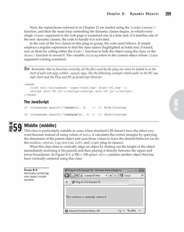
208 P a r t I I I : t h e D y n a m i c C l a s s e sPart III
C h a p t e r 8 : D y n a m i c O b j e c t s 209
Next, the superclasses referred to in Chapter 12 are loaded using the loadsclasses() function, and then the main loop controlling the dynamic classes begins, in which every single class= argument in the web page is examined one at a time and, if it matches one of the new dynamic classes, the code to handle it is activated.
In the case of the two classes in this plug-in group, the code used follows. It simply employs a regular expression to find the class names (highlighted in bold) and, if found, acts on them by calling either the Hide() function to hide the object using the class, or the Show() function to reveal it. The variable thistag refers to the current object whose class argument is being examined.
Tip Remember that to function correctly, all the files used by the plug-ins must be loaded in at the start of each web page within <head> tags, like the following example which pulls in the PC.css style sheet and the PJ.js and PC.js JavaScript libraries:
<head> <link rel='stylesheet' type='text/css' href='PC.css' /> <script src='PJ.js'></script><script src='PC.js'></script> </head>
The JavaScriptif (classname.search(/\bnojs\b/, 0) != -1) Hide(thistag) if (classname.search(/\bonlyjs\b/, 0) != -1) Show(thistag)
Middle (middle)This class is particularly suitable in cases when standard CSS doesn’t have the effect you want because instead of using values of auto, it calculates the correct margins by querying the dimension of the parent object and uses those values to force the desired behavior (as do the middle, center, top, bottom, left, and right plug-in classes).
What this class does is vertically align an object by finding out the height of the object immediately enclosing it (its parent) and then placing it directly between the upper and lower boundaries. In Figure 8-3, a 300 × 100–pixel <div> contains another object that has been vertically centered using this class.
Figure 8-3 Vertically centering one object inside another
5 9

210 P a r t I I I : t h e D y n a m i c C l a s s e s C h a p t e r 8 : D y n a m i c O b j e c t s 211
Variables, Functions, and Propertiesparentnode Object containing the parent of the current object
H() Function to return the height of an object
O() Function to return an object – used by most of these dynamic classes and therefore will not be mentioned again
Px() Function to add the suffix px to a value – used by many of these dynamic classes and therefore will not be mentioned again
marginTop Property containing the object’s top margin
marginBottom Property containing the object’s bottom margin
About the ClassAfter looking up the height of the parent object, this class then sets the marginTop and marginBottom JavaScript equivalents of the CSS margin-top and margin-bottom properties to equal values sufficient to display the object exactly in the middle.
NoTe Wherever you see a JavaScript property that starts with a lowercase letter and has an uppercase one in the middle, you can convert it to a CSS property by changing the uppercase letter to lowercase and placing a hyphen before it. Therefore, marginBottom becomes margin-bottom, and so on.
How to Use ItIn order to use this class, the parent object needs to already have a position other than static, such as relative or absolute, and the object to be moved should be given an absolute position, like this:
<div style='width:400px; height:100px;' class='relative lime_b'> <div class='absolute aqua_b middle'> This sentence is vertically centered </div> </div>
This example sets the outer <div> to a width of 400 and a height of 100 pixels, gives it relative positioning and sets the background to lime. The inner <div> is given absolute positioning, a background color of aqua, and is assigned the middle class.
The JavaScriptif (classname.search(/\bmiddle\b/, 0) != -1) { S(thistag).marginTop = S(thistag).marginBottom = Px((H(thistag.parentNode) - H(thistag)) / 2) }
Center (center)Plug-in 60 is similar to the middle class, but it centers an object horizontally. In Figure 8-4, the previous example has been extended to also center the inner object using this class.
60
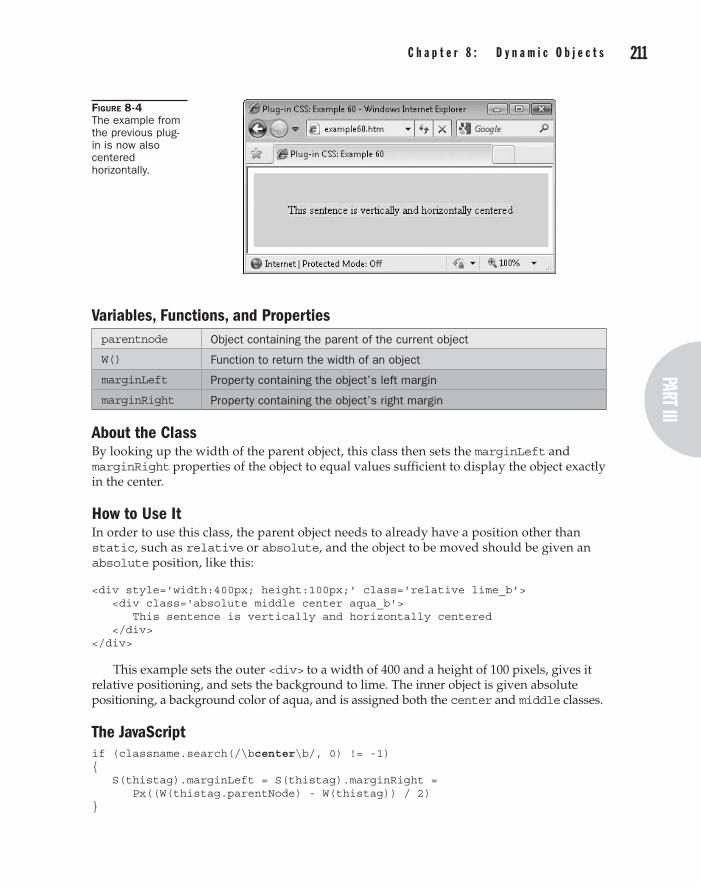
210 P a r t I I I : t h e D y n a m i c C l a s s e sPart III
C h a p t e r 8 : D y n a m i c O b j e c t s 211
Variables, Functions, and Propertiesparentnode Object containing the parent of the current object
W() Function to return the width of an object
marginLeft Property containing the object’s left margin
marginRight Property containing the object’s right margin
About the ClassBy looking up the width of the parent object, this class then sets the marginLeft and marginRight properties of the object to equal values sufficient to display the object exactly in the center.
How to Use ItIn order to use this class, the parent object needs to already have a position other than static, such as relative or absolute, and the object to be moved should be given an absolute position, like this:
<div style='width:400px; height:100px;' class='relative lime_b'> <div class='absolute middle center aqua_b'> This sentence is vertically and horizontally centered </div> </div>
This example sets the outer <div> to a width of 400 and a height of 100 pixels, gives it relative positioning, and sets the background to lime. The inner object is given absolute positioning, a background color of aqua, and is assigned both the center and middle classes.
The JavaScriptif (classname.search(/\bcenter\b/, 0) != -1) { S(thistag).marginLeft = S(thistag).marginRight = Px((W(thistag.parentNode) - W(thistag)) / 2) }
Figure 8-4 The example from the previous plug-in is now also centered horizontally.

212 P a r t I I I : t h e D y n a m i c C l a s s e s C h a p t e r 8 : D y n a m i c O b j e c t s 213
Top (top)This class attaches an object to the top of its parent, as shown in Figure 8-5, in which the previous example is top- instead of middle-aligned.
Variables, Functions, and Propertiesparentnode Object containing the parent of the current object
H() Function to return the height of an object
marginTop Property containing the object’s top margin
marginBottom Property containing the object’s bottom margin
About the ClassBy looking up the height of the parent object, this class then sets the marginTop property to 0 pixels and the marginBottom property of the object to the value required to ensure it stays at the top of its containing object.
How to Use ItIn order to use this class, the parent object needs to already have a position other than static, such as relative or absolute, and the object to be moved should be given an absolute position, like this:
<div style='width:400px; height:100px;' class='relative lime_b'> <div class='absolute top center aqua_b'> This sentence is top aligned and horizontally centered </div> </div>
Here, the inner object is given absolute positioning, a background color of aqua, and is assigned both the top and center classes.
The JavaScriptif (classname.search(/\btop\b/, 0) != -1) { S(thistag).marginTop = '0px'; S(thistag).marginBottom = Px(H(thistag.parentNode) -H(thistag)) }
Figure 8-5 The inner object is top-aligned using this class.
6 1

212 P a r t I I I : t h e D y n a m i c C l a s s e sPart III
C h a p t e r 8 : D y n a m i c O b j e c t s 213
Bottom (bottom)This class attaches an object to the bottom of its parent, as shown in Figure 8-6, in which the previous example is bottom- instead of top-aligned.
Variables, Functions, and Propertiesparentnode Object containing the parent of the current object
H() Function to return the height of an object
marginTop Property containing the object’s top margin
marginBottom Property containing the object’s bottom margin
About the ClassBy looking up the height of the parent object, this class then sets the marginBottom property to 0 pixels and the marginTop property of the object to the value required to ensure it stays at the bottom of its containing object.
How to Use ItThe following example is the same as the previous one, with just one class change:
<div style='width:400px; height:100px;' class='relative lime_b'> <div class='absolute bottom center aqua_b'> This sentence is bottom aligned and horizontally centered </div> </div>
Here the inner object is assigned both the bottom and center classes.
The JavaScriptif (classname.search(/\bbottom\b/, 0) != -1) { S(thistag).marginTop = Px(H(thistag.parentNode) -H(thistag)) S(thistag).marginBottom = '0px'; }
Figure 8-6 The inner object is bottom-aligned using this class.
62

214 P a r t I I I : t h e D y n a m i c C l a s s e s C h a p t e r 8 : D y n a m i c O b j e c t s 215
Left (left)Plug-in 63 is similar to the center class, but it aligns an object to the left. In Figure 8-7, the previous example has been modified to left-align the inner object using this class, rather than centering it. The object is also middle-aligned vertically.
Variables, Functions, and PropertiesParentnode Object containing the parent of the current object
W() Function to return the width of an object
marginLeft Property containing the object’s left margin
marginRight Property containing the object’s right margin
About the ClassBy looking up the width of the parent object, this class then sets the marginLeft property to 0 pixels and the marginRight property of the object to the value required to ensure it stays at the left of its containing object.
How to Use ItThe following example is the same as the previous one, with just one class change:
<div style='width:400px; height:100px;' class='relative lime_b'> <div class='absolute left middle aqua_b'> This sentence is left aligned and vertically centered </div> </div>
Here the inner object is assigned both the left and middle classes.
The JavaScriptif (classname.search(/\bleft\b/, 0) != -1) { S(thistag).marginLeft = '0px'; S(thistag).marginRight = Px(W(thistag.parentNode) - W(thistag)) }
Figure 8-7 The example from the previous plug-in is now left-aligned and centered vertically.
63
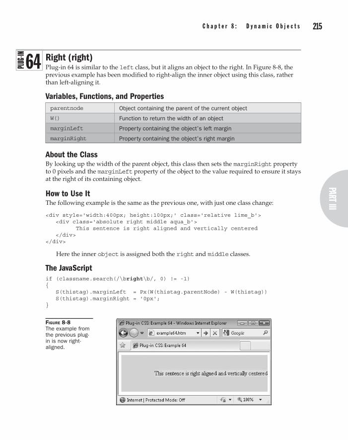
214 P a r t I I I : t h e D y n a m i c C l a s s e sPart III
C h a p t e r 8 : D y n a m i c O b j e c t s 215
Right (right)Plug-in 64 is similar to the left class, but it aligns an object to the right. In Figure 8-8, the previous example has been modified to right-align the inner object using this class, rather than left-aligning it.
Variables, Functions, and Propertiesparentnode Object containing the parent of the current object
W() Function to return the width of an object
marginLeft Property containing the object’s left margin
marginRight Property containing the object’s right margin
About the ClassBy looking up the width of the parent object, this class then sets the marginRight property to 0 pixels and the marginLeft property of the object to the value required to ensure it stays at the right of its containing object.
How to Use ItThe following example is the same as the previous one, with just one class change:
<div style='width:400px; height:100px;' class='relative lime_b'> <div class='absolute right middle aqua_b'> This sentence is right aligned and vertically centered </div> </div>
Here the inner object is assigned both the right and middle classes.
The JavaScriptif (classname.search(/\bright\b/, 0) != -1) { S(thistag).marginLeft = Px(W(thistag.parentNode) - W(thistag)) S(thistag).marginRight = '0px'; }
Figure 8-8 The example from the previous plug-in is now right-aligned.
64
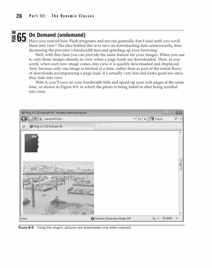
216 P a r t I I I : t h e D y n a m i c C l a s s e s C h a p t e r 8 : D y n a m i c O b j e c t s 217
On Demand (ondemand)Have you noticed how Flash programs and movies generally don’t load until you scroll them into view? The idea behind this is to save on downloading data unnecessarily, thus decreasing the provider’s bandwidth fees and speeding up your browsing.
Well, with this class you can provide the same feature for your images. When you use it, only those images already in view when a page loads are downloaded. Then, as you scroll, when each new image comes into view it is quickly downloaded and displayed. And, because only one image is fetched at a time, rather than as part of the initial flurry of downloads accompanying a page load, it’s actually very fast and looks good too since they fade into view.
With it, you’ll save on your bandwidth bills and speed up your web pages at the same time, as shown in Figure 8-9, in which the photo is being faded in after being scrolled into view.
Figure 8-9 Using this plug-in, pictures are downloaded only when required.
65

216 P a r t I I I : t h e D y n a m i c C l a s s e sPart III
C h a p t e r 8 : D y n a m i c O b j e c t s 217
Variables, Functions, and Propertiestagname String variable containing the name of the tag, such as img
SCROLL_Y Global integer variable containing the amount by which the browser has scrolled (global variables are always all uppercase in this program)
wheight Integer variable containing the height of the browser viewport
index Integer variable used for iterating through all the classes found in a web page
elems[] String Array containing the sources of all images yet to be loaded
thistag.alt String variable (and a property of thistag) containing the alternate text for the current image
thistag.src String variable (and a property of thistag) containing the source of the current image
demand Integer variable used as a flag and set to true if the ondemand class is being used on a web page
setTimeout() JavaScript function to call a function after a set period
DoOnDemand() Function to keep an eye on images and decide whether to load them
Opacity() Function to set the opacity of an object
Y() Function to return the height of an object
FadeIn() Function to fade an object in over a set time
About the ClassThis class checks all images in a web page to see whether they are using the ondemand class. Any that do have their position in the web page examined to see if they are within view. If they are, then the image locations are loaded in from the alt arguments and placed in the src arguments to download them. But any that are not yet in view have their opacity set to zero so that the broken image icon will not display.
Later in the program, a function will be set up to keep an eye on these images, and download and fade them in gently as they come into view.
How to Use ItTo use this class, all you need to do is attach the ondemand class to any images you have decided should use this feature, and use the alt argument for the image URL not the src argument (this is important), like this:
<img class='ondemand' alt='myphoto.jpg' />
The image will then only be downloaded and faded in when it is scrolled into view.For programmers interested in the JavaScript code that later monitors the images
(towards the end of the PC.js file), here it is (non-programmers can skip ahead to the next plug-in):
if (demand) setTimeout(DoOnDemand, 10)

218 P a r t I I I : t h e D y n a m i c C l a s s e s C h a p t e r 8 : D y n a m i c O b j e c t s 219
This line checks whether the variable demand has a value of true. If so, then the ondemand class has been used at least once in the web page and so the function DoOnDemand() is set to be called in 10 milliseconds. That function looks like this:
function DoOnDemand() { demand = false for (index = 0 ; index < numtags ; ++index) { thistag = tags[index] if (elems[index]) { demand = true if (Y(thistag) < (SCROLL_Y + wheight)) { thistag.onload = function() { FadeIn(this, 500) } thistag.src = elems[index] elems[index] = '' } } } if (demand) setTimeout(DoOnDemand, 10) }
What it does is iterate through the array elems[], which has previously been assigned the locations of all ondemand images, and checks whether the image is in view. If so, then the FadeIn() function is set to be called as soon as the image is loaded, and then the image’s src= argument is given the location of the image, so it can be fetched. Once an image is loaded, its entry in the elems[] array is removed so it won’t be looked up again.
After this, if the variable demand is true, then the interrupt is set up to call the function in a further 10 milliseconds (and so on until all images are downloaded). If it is not true, then no more images require loading in, and so no more calls are made to the interrupt function.
Following is the initial code that locates instances of the ondemand class and acts on them.
CauTioN Remember that you must use the alt argument of an image not its src argument when using the ondemand class. This is to prevent fast browsers that may have already parsed the full HTML from trying to load images in until the program lets it. With no URLs in the src arguments, the browser will skip them.
The JavaScriptif (classname.search(/\bondemand\b/, 0) != -1 && tagname == 'img') { if (Y(thistag) > (SCROLL_Y + wheight))
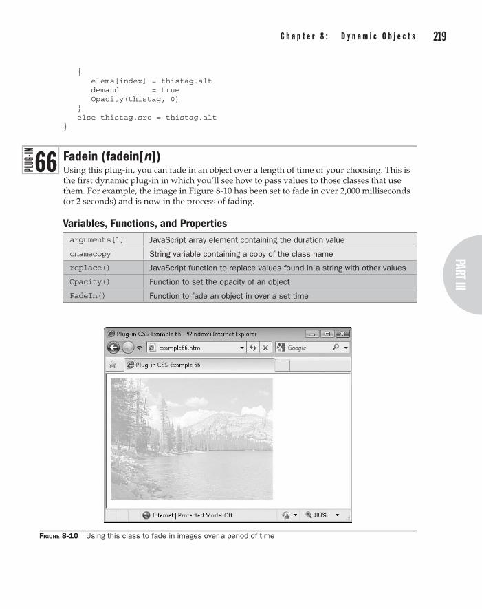
218 P a r t I I I : t h e D y n a m i c C l a s s e sPart III
C h a p t e r 8 : D y n a m i c O b j e c t s 219
{ elems[index] = thistag.alt demand = true Opacity(thistag, 0) } else thistag.src = thistag.alt }
Fadein (fadein[n])Using this plug-in, you can fade in an object over a length of time of your choosing. This is the first dynamic plug-in in which you’ll see how to pass values to those classes that use them. For example, the image in Figure 8-10 has been set to fade in over 2,000 milliseconds (or 2 seconds) and is now in the process of fading.
Variables, Functions, and Propertiesarguments[1] JavaScript array element containing the duration value
cnamecopy String variable containing a copy of the class name
replace() JavaScript function to replace values found in a string with other values
Opacity() Function to set the opacity of an object
FadeIn() Function to fade an object in over a set time
Figure 8-10 Using this class to fade in images over a period of time
66
220 P a r t I I I : t h e D y n a m i c C l a s s e s C h a p t e r 8 : D y n a m i c O b j e c t s 221
About the ClassThis class uses the JavaScript replace() function on a copy of the class name, and specifies an anonymous, inline function for handling the replacement. But, rather than replacing, the function only wants access to the matched string, which it receives in the array element arguments[1]. It then sets the opacity of the object to 0 and calls the FadeIn() function (from PJ.js), passing it the object to fade and the value in arguments[1], which is the number of milliseconds the fade should take.
How to Use ItTo make an object fade in, use this dynamic class in its class argument, as in the following (ensuring that duration of the fade in milliseconds is placed within a pair of square brackets):
<img class='fadein[2000]' src='i5.jpg' />
Any value from 0 upwards is acceptable for the duration length, and the argument and square brackets may not be omitted.
The JavaScriptif (classname.search(/\bfadein\b/, 0) != -1) { cnamecopy.replace(/fadein\[([^\]]*)\]/, function() { Opacity(thistag, 0); FadeIn(thistag, arguments[1]) } ) }
Fadeout (fadeout[n])Plug-in 67 offers the inverse functionality to the fadein[] class by fading out an object over a set period of time, as shown in Figure 8-11, in which a photo is in the process of fading out using this class.
Variables, Functions, and Propertiesarguments[1] JavaScript array element containing the fade duration length
cnamecopy String variable containing a copy of the class name
replace() JavaScript function to replace values found in a string with other values
Opacity() Function to set the opacity of an object
FadeOut() Function to fade out object over a set time
About the ClassThis class uses the JavaScript replace() function in the same way as the fadein[] plug-in to pass a duration interval to the FadeOut() function.
67

220 P a r t I I I : t h e D y n a m i c C l a s s e sPart III
C h a p t e r 8 : D y n a m i c O b j e c t s 221
How to Use ItTo make an object fade out, use this dynamic class in its class argument, like this (ensuring that duration of the fade in milliseconds is placed within a pair of square brackets):
<img class='fadeout[2000]' src='i6.jpg' />
Any value from 0 upwards is acceptable for the duration length, and the argument and square brackets may not be omitted.
Tip You can fade out any object, not just images. Beware, however, because Internet Explorer removes the ClearType setting on any text that has its opacity changed, making it appear more jagged. One solution is to fade a white object in and out that you place over another. The one underneath will then appear to fade out and in, and no fonts will be affected.
The JavaScriptif (classname.search(/\bfadeout\b/, 0) != -1) { cnamecopy.replace(/fadeout\[([^\]]*)\]/, function() { FadeOut(thistag, arguments[1]) } ) }
Figure 8-11 You can also fade out objects with the fadeout class.

222 P a r t I I I : t h e D y n a m i c C l a s s e s C h a p t e r 8 : D y n a m i c O b j e c t s 223
Resize Textarea (resizeta[n|n])Choosing the right dimensions for a <textarea> input tag can be difficult. Make it too small and there is not much room for the user. But if it’s too large, it may appear daunting to the user, who will feel they need to fill the space.
Thankfully, the resizeta[] class provides an answer, allowing you to set up a <textarea> with an initial number of rows. This class will then monitor it for the minimum and maximum values you give it, contracting and expanding the area according to how many lines of text have been input, as shown in Figure 8-12.
Variables, Functions, and Propertiestagname String variable containing the name of the tag, such as img
cnamecopy String variable containing a copy of the class name
arguments[1] JavaScript array element containing the minimum number of rows
arguments[2] JavaScript array element containing the maximum number of rows
replace() JavaScript Function to replace values found in a string with other values
ResizeTextarea() Function to automatically resize a textarea as necessary
About the ClassThis class uses the JavaScript replace() function on a copy of the class name, and specifies an anonymous inline function for handling the replacement. But, rather than replacing, the function only wants access to the matched string, which it receives in the array elements arguments[1] and arguments[2]. It then passes these values to the ResizeTextarea() function, which continuously monitors the textarea, contracting and expanding it as necessary.
How to Use ItTo use this class, set up a <textarea> tag with the required number of rows and columns, then place the resizeta[] class in the class argument and provide the minimum and
Figure 8-12 A textarea that was originally three rows high has expanded to five.
68

222 P a r t I I I : t h e D y n a m i c C l a s s e sPart III
C h a p t e r 8 : D y n a m i c O b j e c t s 223
maximum number of rows within the square brackets. These two values must be separated with a | symbol, which is the standard way to separate values passed in these dynamic classes. The result looks like this:
<textarea class='resizeta[3|8]' rows='3' cols='50'></textarea>
This example creates a 3-row by 50-column <textarea>, which can expand up to 8 and retract back to 3 rows.
The JavaScriptif (classname.search(/\bresizeta\b/, 0) != -1 && tagname == 'textarea') { cnamecopy.replace(/resizeta\[([^\|]*)\|([^\]]*)\]/, function() { ResizeTextarea(thistag, arguments[1], arguments[2]) } ) }
Rotate (rotate[n])This class starts to use a little meatier code. It’s a more powerful version of the rotatec… and rotatea… classes from Plug-in 55 in Chapter 7, because it supports rotating an object between 1 and 359 degrees or –1 and –359 degrees.
For example, the image of the hand in Figure 8-13 has been rotated by –45, –22.5, 0, 22.5, and 45 degrees, respectively.
Figure 8-13 Using this class, you can rotate any object clockwise or counterclockwise, by any amount.
69

224 P a r t I I I : t h e D y n a m i c C l a s s e s C h a p t e r 8 : D y n a m i c O b j e c t s 225
Variables, Functions, and Propertiescnamecopy String variable copy of the class name
arguments[1] JavaScript array element containing the amount of rotation
r Array copy of the JavaScript arguments[] array, the amount by which to rotate the object
rad cosrad sinrad Floating point variables used for calculating rotation values for Internet Explorer
w h Integer variables containing the width and height of the object
REL Global string variable containing the value “relative”
replace() JavaScript function to replace values found in a string with other values
W() Function to get the width of an object
H() Function to get the height of an object
S() Function to set the style properties of an object
Locate() Function to move an object to a new location
MozTransform Property for setting up a transformation on Firefox and other Mozilla-based browsers
WebkitTransform Property for setting up a transformation on the Safari and Chrome browsers
OTransform Property for setting up a transformation on the Opera browser
transform Property for setting up a transformation on all other browsers (except IE)
filter Property used by Internet Explorer for image transformations, among other features
About the ClassThis class uses the JavaScript replace() function on a copy of the class name, and specifies an anonymous inline function for handling the replacement. However, rather than replacing, the function only wants access to the matched string, which it receives in the array element arguments[1]. If the browser is not Internet Explorer, it then passes this value to the S() function to modify the correct transform property for the browser.
If the browser is IE (determined by checking for the existence of the filter property), a series of calculations are made to determine the correct values for the matrix function IE uses to rotate an object. The matrix is then applied by assigning it to the filter property using the S() function, and then the object is moved to a relative location that will make the rotation appear to have occurred around its center (to match the way all other browsers rotate).

224 P a r t I I I : t h e D y n a m i c C l a s s e sPart III
C h a p t e r 8 : D y n a m i c O b j e c t s 225
How to Use ItTo use this class, enter its name in the class argument of the object to be rotated, ensuring you pass the amount of rotation required within a pair of square brackets, like the following, which rotates the image clockwise by 17 degrees:
<img class='rotate[17]' src='image.jpg' />
Here, for example, is the HTML used to create Figure 8-13:
<img class='rotate[-45]' src='hand.jpg' /> <img class='rotate[-22.5]' src='hand.jpg' /> <img src='hand.jpg' /> <img class='rotate[22.5]' src='hand.jpg' /> <img class='rotate[45]' src='hand.jpg' />
CauTioN On all recent browsers other than Internet Explorer, you can rotate any object. But because IE has to use the filter property for this effect, it will only work on images.
The JavaScriptif (classname.search(/\brotate\b/, 0) != -1) { cnamecopy.replace(/rotate\[([^\]]*)\]/, function() { var r = arguments[1] S(thistag).MozTransform = 'rotate(' + r + 'deg)' S(thistag).WebkitTransform = 'rotate(' + r + 'deg)' S(thistag).OTransform = 'rotate(' + r + 'deg)' S(thistag).transform = 'rotate(' + r + 'deg)' if (typeof S(thistag).filter != UNDEF) { var rad = r * (Math.PI * 2 / 360) var cosrad = Math.cos(rad) var sinrad = Math.sin(rad) var w = W(thistag) var h = H(thistag) var filter = 'progid:DXImageTransform.Microsoft.' + 'Matrix(M11=' + cosrad + ', M12=' + -sinrad + ', M21=' + sinrad + ', M22=' + cosrad + ", SizingMethod='auto expand')" S(thistag).filter = filter Locate(thistag, REL, -((W(thistag) - w) / 2), -((H(thistag) - h) / 2)) } } ) }

226 P a r t I I I : t h e D y n a m i c C l a s s e s C h a p t e r 8 : D y n a m i c O b j e c t s 227
Width (w[n])Throughout this book, there have been examples where the width of an object has required changing, and this has been achieved using a style argument. However, with this class you can specify the width of an object as a dynamic class parameter, as shown in Figure 8-14, in which the width of the <div> has been set to 450 pixels.
Variables, Functions, and PropertiesCnamecopy String variable copy of the class name
arguments[1] JavaScript array element containing the new width
replace() JavaScript function to replace one section of a string with another
S() Function to modify a style property of an object
width Property containing the width of an object
About the ClassThis class uses the replace() function to pass the width from the class argument to the S() function in order to modify the object’s width by changing the width property.
How to Use ItTo use this class, enter the width amount in pixels within square brackets after the class name like this, which sets the width of the <div> to 450 pixels:
<div class='w[450] yellow red_b'>Hello</div>
No measurements other than pixels are supported, and you must enter a number greater than 0 in the square brackets.
The JavaScriptif (classname.search(/\bw\b/, 0) != -1) { cnamecopy.replace(/w\[([^\]]*)\]/, function()
Figure 8-14 Using this class to change the width of an object
70

226 P a r t I I I : t h e D y n a m i c C l a s s e sPart III
C h a p t e r 8 : D y n a m i c O b j e c t s 227
{ S(thistag).width = Px(arguments[1]) } ) }
Height (h[n])With this class, you can specify the height of an object as a dynamic class parameter, as in the case of Figure 8-15, in which the example in the previous plug-in has also had its height set to 70 pixels.
Variables, Functions, and Propertiescnamecopy String variable copy of the class name
arguments[1] JavaScript array element containing the new height
replace() JavaScript function to replace one section of a string with another
S() Function to modify a style property of an object
height Property containing the height of an object
About the ClassThis class uses the replace() function to pass the width from the class argument to the S() function in order to modify the object’s height by changing the height property.
How to Use ItTo use this class, enter the height amount in pixels within square brackets after the class name like this, which sets the height of the <div> to 70 pixels:
<div class='h[70] yellow red_b'>Hello</div>
No measurements other than pixels are supported, and you must enter a number greater than 0 in the square brackets.
Figure 8-15 Using this class to change the height of an object
7 1

228 P a r t I I I : t h e D y n a m i c C l a s s e s C h a p t e r 8 : D y n a m i c O b j e c t s 229
The JavaScriptif (classname.search(/\bh\b/, 0) != -1) { cnamecopy.replace(/h\[([^\]]*)\]/, function() { S(thistag).height = Px(arguments[1]) } ) }
X (x[n])Once you free an object from the flow of a web page by giving it a position other than static (such as relative or absolute), you can move it where you like on a page (or within its containing object). Using this class, you can change an object’s horizontal position on the page as shown in Figure 8-16, in which a 115 × 115–pixel object has been inset from the left of the browser by 475 pixels.
Variables, Functions, and Propertiescnamecopy String variable copy of the class name
arguments[1] JavaScript array element containing the new offset
replace() JavaScript function to replace one section of a string with another
S() Function to modify a style property of an object
left Property containing the left offset of the object
About the ClassThis class uses the replace() function to pass the horizontal location from the class argument to the S() function in order to modify the object’s left offset by changing its left property.
Figure 8-16 The box has been inset from the left by 475 pixels using this class.
72

228 P a r t I I I : t h e D y n a m i c C l a s s e sPart III
C h a p t e r 8 : D y n a m i c O b j e c t s 229
How to Use ItTo use this class, enter the left offset amount in pixels within square brackets after the class name like this, which sets the left offset of the <div> to 475 pixels (and also sets the width and height to 115 pixels each):
<div class='absolute w[115] h[115] x[475] yellow blue_b'> 115 x 115 pixels, in by 475 pixels. </div>
No measurements other than pixels are supported, and you must enter a number greater than 0 in the square brackets.
The JavaScriptif (classname.search(/\bx\b/, 0) != -1) { cnamecopy.replace(/x\[([^\]]*)\]/, function() { S(thistag).left = Px(arguments[1]) } ) }
Y (y[n])This is the partner class for x[]; it moves an object down by the amount specified in the parameter in square brackets. Figure 8-17 shows the example from the previous plug-in, but with its vertical offset set to 53 pixels.
Figure 8-17 The object has now been moved down by 53 pixels.
73

230 P a r t I I I : t h e D y n a m i c C l a s s e s C h a p t e r 8 : D y n a m i c O b j e c t s 231
Variables, Functions, and Propertiescnamecopy String variable copy of the class name
arguments[1] JavaScript array element containing the new offset
replace() JavaScript function to replace one section of a string with another
S() Function to modify a style property of an object
top Property containing the top offset of the object
About the ClassThis class uses the replace() function to pass the vertical location from the class argument to the S() function in order to modify the object’s top offset by changing its top property.
How to Use ItTo use this class, enter the top offset amount in pixels within square brackets after the class name like this, which sets the top offset of the <div> to 53 pixels (and also sets the width and height to 115 pixels each and the left offset to 475 pixels):
<div class='absolute w[115] h[115] x[475] y[53] yellow blue_b'> 115 x 115 pixels, inset from the left by 475 pixels, and down by 53 pixels. </div>
No measurements other than pixels are supported, and you must enter a number greater than 0 in the square brackets.
Tip You can also use negative values on objects with relative position to move them both to the left and up in the browser.
The JavaScriptif (classname.search(/\by\b/, 0) != -1) { cnamecopy.replace(/y\[([^\]]*)\]/, function() { S(thistag).top = Px(arguments[1]) } ) }
Text Color (color[colorname/#nnnnnn/#nnn])Although previous chapters have introduced a basic set of 21 color names that you can use within classes, sometimes you need much finer color control, which is what this class provides. With it, you can choose any color value from #000000 through to #ffffff (or the #000 to #fff short forms), as well as any pre-defined color names that browsers understand, such as blue, green, or violet. In Figure 8-18, six different color values have been selected using this class.
74
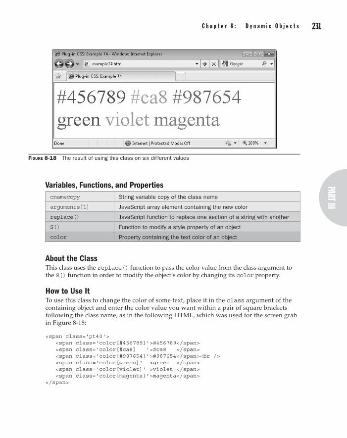
230 P a r t I I I : t h e D y n a m i c C l a s s e sPart III
C h a p t e r 8 : D y n a m i c O b j e c t s 231
Variables, Functions, and Propertiescnamecopy String variable copy of the class name
arguments[1] JavaScript array element containing the new color
replace() JavaScript function to replace one section of a string with another
S() Function to modify a style property of an object
color Property containing the text color of an object
About the ClassThis class uses the replace() function to pass the color value from the class argument to the S() function in order to modify the object’s color by changing its color property.
How to Use ItTo use this class to change the color of some text, place it in the class argument of the containing object and enter the color value you want within a pair of square brackets following the class name, as in the following HTML, which was used for the screen grab in Figure 8-18:
<span class='pt40'> <span class='color[#456789]'>#456789</span> <span class='color[#ca8] '>#ca8 </span> <span class='color[#987654]'>#987654</span><br /> <span class='color[green]' >green </span> <span class='color[violet]' >violet </span> <span class='color[magenta]'>magenta</span> </span>
Figure 8-18 The result of using this class on six different values

232 P a r t I I I : t h e D y n a m i c C l a s s e s C h a p t e r 8 : D y n a m i c O b j e c t s 233
The JavaScriptif (classname.search(/\bcolor\b/, 0) != -1) { cnamecopy.replace(/color\[([^\]]*)\]/, function() { S(thistag).color = arguments[1] } ) }
Background Color (bcolor[#nnnnnn])This class provides the same functionality as the color[] class, except for changing the background color of an object, as shown in Figure 8-19, in which the same six color values from the previous example have now been applied to the background properties of the objects.
Variables, Functions, and Propertiescnamecopy String variable copy of the class name
arguments[1] JavaScript array element containing the new color
replace() JavaScript function to replace one section of a string with another
S() Function to modify a style property of an object
backgroundColor Property containing the background color of an object
About the ClassThis class uses the replace() function to pass the color value from the class argument to the S() function in order to modify the object’s background color by changing its backgroundColor property.
Figure 8-19 This class lets you change the background of any object to any color.
7 5
232 P a r t I I I : t h e D y n a m i c C l a s s e sPart III
C h a p t e r 8 : D y n a m i c O b j e c t s 233
How to Use ItTo use this class to change the background color of some text, place it in the class argument of the containing object and enter the color value you want within a pair of square brackets following the class name, as in the following HTML, which was used for the screen grab in Figure 8-19:
<span class='pt40'> <span class='bcolor[#456789]'>#456789 </span> <span class='bcolor[#ca8]' >#ca8 </span> <span class='bcolor[#987654]'>#987654 </span><br /> <span class='bcolor[green]' >green </span> <span class='bcolor[violet]' >violet </span> <span class='bcolor[magenta]'>magenta </span> </span>
The JavaScript if (classname.search(/\bbcolor\b/, 0) != -1) { cnamecopy.replace(/bcolor\[([^\]]*)\]/, function() { S(thistag).backgroundColor = arguments[1] } ) }

This page intentionally left blank

Chapter 9
Dynamic text and typography
part IIIthe Dynamic Classes

236 p a r t I I I : t h e D y n a m i c C l a s s e s C h a p t e r 9 : D y n a m i c t e x t a n d t y p o g r a p h y 237
This chapter explores a range of dynamic classes for enhancing the way you use text in a web page, including a typewriter or teletype effect, a way of cleaning up strings by removing unwanted characters and whitespace, automatically loading Google fonts in
from the Google servers when you reference them, vertically aligning text within an object, and creating glow effects by cycling the foreground and background colors of objects.
Typetext (typetext[n])Plug-in 76 displays the contents of an object as if it is being typed out on a typewriter or teletype machine. The class also takes a parameter specifying the duration of the animation so you can specify the exact time you require.
For example, in Figure 9-1 the poem “The Tyger” by William Blake is being typed to the screen over the course of 60 seconds.
Variables, Functions, and PropertiesCnamecopy String variable copy of the class name
arguments[1] JavaScript array element containing the animation duration
replace() JavaScript function to replace one section of a string with another
TextType() Function to modify a style property of an object
About the ClassThis class removes the contents of the object it applies to and then replaces it over a time duration passed to it.
7 6
Figure 9-1 Displaying a poem like a typewriter using this plug-in

236 p a r t I I I : t h e D y n a m i c C l a s s e spart III
C h a p t e r 9 : D y n a m i c t e x t a n d t y p o g r a p h y 237
How to Use ItTo use this class, enter its name into the class argument of the containing object, along with the animation duration within square brackets, as with the following example, which was used for the screen grab in Figure 9-1:
<pre><div class='typetext[60000]'> Tyger, Tyger burning bright, In the forests of the night: What immortal hand or eye, Could frame thy fearful symmetry? In what distant deeps or skies. Burnt the fire of thine eyes! On what wings dare he aspire! What the hand, dare sieze the fire? And what shoulder, and what art, Could twist the sinews of thy heart? And when thy heart began to beat, What dread hand? and what dread feet? What the hammer? what the chain, In what furnace was thy brain? What the anvil? what dread grasp, Dare its deadly terrors clasp! When the stars threw down their spears And water'd heaven with their ears: Did he smile his work to see? Did he who made the Lamb make thee? Tyger, Tyger burning bright, In the forests of the night: What immortal hand or eye, Dare frame thy fearful symmetry?</div></pre>
The JavaScriptif (classname.search(/\btypetext\b/, 0) != -1) { cnamecopy.replace(/typetext\[([^\]]*)\]/, function() { TextType(thistag, 1, arguments[1]) } ) }
Digits Only (digitsonly)Plug-in 77 removes any characters from an input field that are not digits or whitespace. For example, in Figure 9-2 the user has been asked for their credit card number and has also entered some irrelevant text.
Figure 9-2 The user has input more than just a card number.
7 7
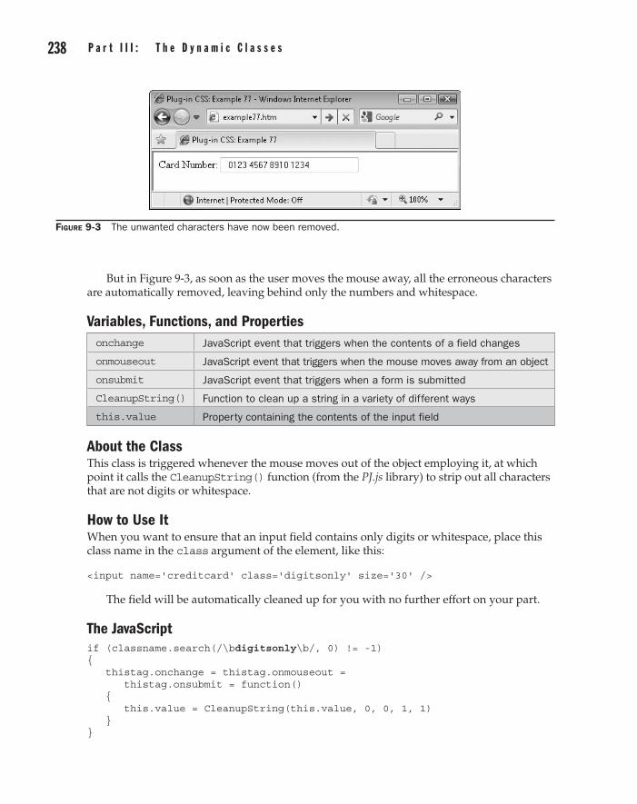
238 p a r t I I I : t h e D y n a m i c C l a s s e s C h a p t e r 9 : D y n a m i c t e x t a n d t y p o g r a p h y 239
But in Figure 9-3, as soon as the user moves the mouse away, all the erroneous characters are automatically removed, leaving behind only the numbers and whitespace.
Variables, Functions, and Propertiesonchange JavaScript event that triggers when the contents of a field changes
onmouseout JavaScript event that triggers when the mouse moves away from an object
onsubmit JavaScript event that triggers when a form is submitted
CleanupString() Function to clean up a string in a variety of different ways
this.value Property containing the contents of the input field
About the ClassThis class is triggered whenever the mouse moves out of the object employing it, at which point it calls the CleanupString() function (from the PJ.js library) to strip out all characters that are not digits or whitespace.
How to Use ItWhen you want to ensure that an input field contains only digits or whitespace, place this class name in the class argument of the element, like this:
<input name='creditcard' class='digitsonly' size='30' />
The field will be automatically cleaned up for you with no further effort on your part.
The JavaScriptif (classname.search(/\bdigitsonly\b/, 0) != -1) { thistag.onchange = thistag.onmouseout = thistag.onsubmit = function() { this.value = CleanupString(this.value, 0, 0, 1, 1) } }
Figure 9-3 The unwanted characters have now been removed.

238 p a r t I I I : t h e D y n a m i c C l a s s e spart III
C h a p t e r 9 : D y n a m i c t e x t a n d t y p o g r a p h y 239
Text Only (textonly)Plug-in 78 is similar to the previous one in that it removes all characters that are not text or whitespace from an input field. For example, in Figure 9-4 the user has entered some numbers into the field, which are not allowed.
However, in Figure 9-5 only the text and whitespace remain once the mouse is moved out of the field.
Variables, Functions, and Propertiesonchange JavaScript event that triggers when the contents of a field change
onmouseout JavaScript event that triggers when the mouse moves away from an object
onsubmit JavaScript event that triggers when a form is submitted
CleanupString() Function to clean up a string in a variety of different ways
this.value Property containing the contents of the input field
About the ClassThis class is triggered whenever the mouse moves out of the object employing it, at which point it calls the CleanupString() function to strip out all characters that are not text or whitespace.
Figure 9-4 The user has entered numbers, which are not allowed.
Figure 9-5 The field has been cleaned up by removing the numbers.
7 8
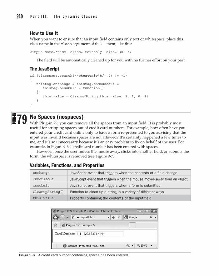
240 p a r t I I I : t h e D y n a m i c C l a s s e s C h a p t e r 9 : D y n a m i c t e x t a n d t y p o g r a p h y 241
How to Use ItWhen you want to ensure that an input field contains only text or whitespace, place this class name in the class argument of the element, like this:
<input name='name' class='textonly' size='30' />
The field will be automatically cleaned up for you with no further effort on your part.
The JavaScriptif (classname.search(/\btextonly\b/, 0) != -1) { thistag.onchange = thistag.onmouseout = thistag.onsubmit = function() { this.value = CleanupString(this.value, 1, 1, 0, 1) } }
No Spaces (nospaces)With Plug-in 79, you can remove all the spaces from an input field. It is probably most useful for stripping spaces out of credit card numbers. For example, how often have you entered your credit card online only to have a form re-presented to you advising that the input was invalid because spaces are not allowed? It’s certainly happened a few times to me, and it’s so unnecessary because it’s an easy problem to fix on behalf of the user. For example, in Figure 9-6 a credit card number has been entered with spaces.
However, once the user moves the mouse away, clicks into another field, or submits the form, the whitespace is removed (see Figure 9-7).
Variables, Functions, and Propertiesonchange JavaScript event that triggers when the contents of a field change
onmouseout JavaScript event that triggers when the mouse moves away from an object
onsubmit JavaScript event that triggers when a form is submitted
CleanupString() Function to clean up a string in a variety of different ways
this.value Property containing the contents of the input field
Figure 9-6 A credit card number containing spaces has been entered.
7 9

240 p a r t I I I : t h e D y n a m i c C l a s s e spart III
C h a p t e r 9 : D y n a m i c t e x t a n d t y p o g r a p h y 241
About the ClassThis class is triggered whenever the mouse moves out of the object employing it, at which point it calls the CleanupString() function to strip out all whitespace from it.
How to Use ItTo remove the whitespace from a field, place this class name in the class argument of the element, as in the following example, in which both the digitsonly and nospaces classes have been used (they generally go well together when used for inputting credit card details):
<input name='creditcard' class='digitsonly nospaces' size='30'/>
The field will be automatically cleaned up for you by removing all non-digits and all whitespace.
The JavaScriptif (classname.search(/\bnospaces\b/, 0) != -1) { thistag.onchange = thistag.onmouseout = thistag.onsubmit = function() { this.value = CleanupString(this.value, 1) } }
No Punctuation (nopunct)Sometimes you want just the bare text to be posted to a web form, and not any punctuation like exclamation points and question marks. You can do this easily with Plug-in 80, which strips them all out for you.
For example, in Figure 9-8 the user is being prompted for a reminder phrase that will be used to prompt them if they forget their password.
Figure 9-7 Now the spaces have been automatically removed.
8 0

242 p a r t I I I : t h e D y n a m i c C l a s s e s C h a p t e r 9 : D y n a m i c t e x t a n d t y p o g r a p h y 243
But in Figure 9-9 the user has moved the mouse away and so the punctuation has been automatically filtered out.
Variables, Functions, and Propertiesonchange JavaScript event that triggers when the contents of a field change
onmouseout JavaScript event that triggers when the mouse moves away from an object
onsubmit JavaScript event that triggers when a form is submitted
CleanupString() Function to clean up a string in a variety of different ways
this.value Property containing the contents of the input field
About the ClassThis class is triggered whenever the mouse moves out of the object employing it, at which point it calls the CleanupString() function to strip out all punctuation characters from it.
How to Use ItTo remove the punctuation characters from a field, place this class name in the class argument of the element, as in the following example:
<input name='reminder' class='nopunct' size='30'/>
The field will be automatically cleaned up for you by removing all the punctuation.
Figure 9-8 This input contains several punctuation characters.
Figure 9-9 The punctuation has now been removed.

242 p a r t I I I : t h e D y n a m i c C l a s s e spart III
C h a p t e r 9 : D y n a m i c t e x t a n d t y p o g r a p h y 243
The JavaScriptif (classname.search(/\bnopunct\b/, 0) != -1) { thistag.onchange = thistag.onmouseout = thistag.onsubmit = function() { this.value = CleanupString(this.value, 0, 0, 0, 1) } }
Minimum Whitespace (minwhitespace)Using Plug-in 81, you can remove all the additional whitespace characters users sometimes enter, replacing any groups of more than one whitespace character with a single space.
For example, in Figure 9-10 a <textarea> has been created in which a user is entering their bio, with a somewhat messy use of whitespace.
However, after passing the mouse away, the extra whitespace is removed, leaving a much better formatted text (see Figure 9-11).
Figure 9-10 This <textarea> contains a lot of unnecessary whitespace.
Figure 9-11 Now the text has been stripped of unnecessary extra whitespace.
8 1

244 p a r t I I I : t h e D y n a m i c C l a s s e s C h a p t e r 9 : D y n a m i c t e x t a n d t y p o g r a p h y 245
Variables, Functions, and Propertiesonchange JavaScript event that triggers when the contents of a field change
onmouseout JavaScript event that triggers when the mouse moves away from an object
onsubmit JavaScript event that triggers when a form is submitted
CleanupString() Function to clean up a string in a variety of different ways
this.value Property containing the contents of the input field
About the ClassThis class is triggered whenever the mouse moves out of the object employing it, at which point it calls the CleanupString() function to strip out all extra whitespace characters from it.
How to Use ItTo remove the extra whitespace from a field, place this class name in the class argument of the element, as in the following example:
<textarea class='minwhitespace' rows='6' cols='30'></textarea>
The field will be automatically cleaned up for you by removing all the extra whitespace.
The JavaScriptif (classname.search(/\bminwhitespace\b/, 0) != -1) { thistag.onchange = thistag.onmouseout = thistag.onsubmit = function() { this.value = CleanupString(this.value, 0, 0, 0, 0, 0, 0, 1) } }
Google Font (gfont[n])In Plug-in 28 of Chapter 4, you saw how to incorporate Google fonts into your web pages. Unfortunately, you have to fiddle around with it a bit since you must add a <link rel…> tag for every font you include. But using this class, you simply mention a Google font by name, and if it hasn’t been loaded in yet, it is fetched automatically for you.
Figure 9-12 is similar to Figure 4-9 but was achieved using this plug-in, and without having to manually load in all the fonts.
8 2

244 p a r t I I I : t h e D y n a m i c C l a s s e spart III
C h a p t e r 9 : D y n a m i c t e x t a n d t y p o g r a p h y 245
Variables, Functions, and Propertiesarguments[1] JavaScript array element containing the font name to use
font String variable containing the full font name
window[font] Array attached to the window object instead of using a global array, containing the value true if a Google font is already due to be loaded
gfonts Local array containing the Google fonts to be loaded
gfindex Integer variable containing the number of Google fonts to load
index Integer variable used for iterating through an array
newcss Object containing a new style sheet to append to the DOM
index Integer variable used for iterating through an array
Index Integer variable used for iterating through an array
replace() JavaScript function to replace a section of one string with another
createElement() JavaScript function to create a new element object
setAttribute() JavaScript function to set an attribute of an object
appendChild( () JavaScript function to add a new element to the DOM
fontFamily Property containing the font family of an object
window.opera Property only set in the Opera browser; used for determining whether the browser requires a redraw
document.body.style
Property that, if changed, forces a browser redraw in Opera
Figure 9-12 This class makes using Google fonts even easier.

246 p a r t I I I : t h e D y n a m i c C l a s s e s C h a p t e r 9 : D y n a m i c t e x t a n d t y p o g r a p h y 247
About the ClassThis is a very easy class to use but a little complicated to explain. If you are interested only in how you can use it, then skip to the next section.
This class works by making a note of every class argument you use that mentions the gfont[] class name. Then, if the font required has not been marked to be fetched from Google’s servers, the full font name is added to the gfonts[] array, and the fontFamily property is set to the font to use.
Later on, the fonts are all loaded in from Google’s servers, but only after all the dynamic functions have been processed. This is because the act of loading in the new style sheets changes the document object model (DOM) by adding new elements to it which, if done before the HTML processing is complete, would corrupt the array of elements to be processed each time a new font is fetched.
How to Use ItTo use this class to access Google’s fonts, just mention it in a class argument, supplying the shorthand name of the font from Table 9-1 in the following square brackets, like this:
<div class='gfont[crimson]'>Crimson Text</div>
Table 9-1 The Google Font Families and Shorthand Class Argument Names
Shorthand Font Name
cantarell Cantarell
cardo Cardo
crimson Crimson Text
droidsans Droid Sans
droidsansm Droid Sans Mono
droidserif Droid Serif
imfell IM Fell English
inconsolata Inconsolata
josefin Josefin Sans Std Light
lobster Lobster
molengo Molengo
neuton Neuton
nobile Nobile
oflsorts OFL Sorts Mill Goudy TT
oldstandard Old Standard TT
reenie Reenie Beanie
tangerine Tangerine
vollkorn Vollkorn
yanone Yanone Kaffeesatz

246 p a r t I I I : t h e D y n a m i c C l a s s e spart III
C h a p t e r 9 : D y n a m i c t e x t a n d t y p o g r a p h y 247
About the JavaScriptOnce all the dynamic classes used in a web page have been processed, the following JavaScript code is run to load in all the Google fonts from Google’s servers that were accessed in the page:
for (index = 0 ; index < gfindex ; ++index) { var newcss = document.createElement('link') newcss.setAttribute('href', gfurl + escape(gfonts[index])) newcss.setAttribute('rel', 'stylesheet') newcss.setAttribute('type', 'text/css') document.getElementsByTagName('head')[0].appendChild(newcss) }
With the fonts loaded, all browsers that support these fonts will be displaying them, with the exception of Opera, which requires a nudge to redraw the browser, like this:
if (gfindex && window.opera) setTimeout(function() { document.body.style += "" }, 1)
Following is the code used in the main section of JavaScript to process just the gfont[] class.
The JavaScriptif (classname.search(/\bgfont\b/, 0) != -1) { cnamecopy.replace(/gfont\[([^\]]*)\]/, function() { switch(arguments[1]) { case 'cantarell' : font = 'Cantarell'; break case 'cardo' : font = 'Cardo'; break case 'crimson' : font = 'Crimson Text'; break case 'droidsans' : font = 'Droid Sans'; break case 'droidsansm' : font = 'Droid Sans Mono'; break case 'droidserif' : font = 'Droid Serif'; break case 'imfell' : font = 'IM Fell English'; break case 'inconsolata': font = 'Inconsolata'; break case 'josefin' : font = 'Josefin Sans Std Light'; break case 'lobster' : font = 'Lobster'; break case 'molengo' : font = 'Molengo'; break case 'neuton' : font = 'Neuton'; break case 'nobile' : font = 'Nobile'; break case 'oflsorts' : font = 'OFL Sorts Mill Goudy TT'; break case 'oldstandard': font = 'Old Standard TT'; break case 'reenie' : font = 'Reenie Beanie'; break case 'tangerine' : font = 'Tangerine'; break case 'vollkorn' : font = 'Vollkorn'; break case 'yanone' : font = 'Yanone Kaffeesatz'; break }

248 p a r t I I I : t h e D y n a m i c C l a s s e s C h a p t e r 9 : D y n a m i c t e x t a n d t y p o g r a p h y 249
if (!window[font]) { window[font] = true gfonts[gfindex++] = font } S(thistag).fontFamily = font if (window.opera) setTimeout(function() // Required by Opera { document.body.style += "" }, 1) // to redraw window } ) }
Text Middle (textmiddle)Plug-in 83 vertically centers text using the trick of setting the CSS line-height property to that of the containing object. This is easy enough to do in your CSS on a single-element basis, but because exact heights must be entered, this class is superior since it does the calculation for you.
For example, the <div> in Figure 9-13 has been set to 100 pixels in height, and the text within it has been vertically centered using this plug-in.
Variables, Functions, and PropertiesPx() Function to add the suffix px to a string
lineHeight Property containing the line height of the object
About the ClassThis class looks up the height of the object and then sets the line height of its contents to the same as the object height, which has the effect of vertically centering the text.
Figure 9-13 The text within the object has been vertically centered.
8 3

248 p a r t I I I : t h e D y n a m i c C l a s s e spart III
C h a p t e r 9 : D y n a m i c t e x t a n d t y p o g r a p h y 249
How to Use ItTo vertically center text within an object, mention this class in its class argument like in this example, which first sets the object height to 100 pixels, and the background to aqua, so you can clearly see the effect:
<div class='h[100] textmiddle aqua_b'> This line is vertically centered </div>
The JavaScriptif (classname.search(/\btextmiddle\b/, 0) != -1) { S(thistag).lineHeight = Px(H(thistag)) }
Text Glow (textglow[#nnnnnn|#nnnnnn|n])Plug-in 84 cycles between two colors over a time period you specify, providing a glowing effect. For example, in Figure 9-14 the text has been set to cycle through from yellow to red over the course of a second, and then back again, and so on.
Variables, Functions, and Propertiescnamecopy String variable copy of the class name
arguments[1] JavaScript array element containing the first color
arguments[2] JavaScript array element containing the second color
arguments[3] JavaScript array element containing the animation duration
replace() JavaScript function to replace one section of a string with another
ColorFade() Function to constantly fade between two colors
Figure 9-14 You can create a text glow effect with this class.
8 4

250 p a r t I I I : t h e D y n a m i c C l a s s e s C h a p t e r 9 : D y n a m i c t e x t a n d t y p o g r a p h y 251
About the ClassThis class calls the ColorFade() function (from the PJ.js file) to constantly fade between two text colors. It uses the JavaScript replace() function to capture the values passed with the class, and then supplies them to ColorFade() via the arguments[] array.
How to Use ItTo use this class, you must specify two six-digit hex color numbers, prefaced by # symbols, as well as a duration for the animation in milliseconds. These parameters should be separated by | symbols and placed within square brackets following the class name that is passed in a class argument, like this:
<div class='textglow[#ffff00|#ff0000|1000] b'> This text cycles from yellow to red over the course of a second </div>
This example cycles between the colors yellow and red over the course of a second (1000 milliseconds), and then back over the same duration, at which point the animation begins again.
The JavaScriptif (classname.search(/\btextglow\b/, 0) != -1) { cnamecopy.replace(/textglow\[([^\|]*)\|([^\|]*)\|([^\]]*)\]/, function() { ColorFade(thistag, arguments[1], arguments[2], 'text', arguments[3]) } ) }
Background Glow (backglow[#nnnnnn|#nnnnnn|n])Plug-in 85 is similar to the previous one, but it provides a glow effect to the background color property of an object, as shown in Figure 9-15. This is the same as the previous example, except that a background glow from lime green to blue over 1.5 seconds has been added.
Figure 9-15 Combining background and foreground color glows
8 5

250 p a r t I I I : t h e D y n a m i c C l a s s e spart III
C h a p t e r 9 : D y n a m i c t e x t a n d t y p o g r a p h y 251
Variables, Functions, and Propertiescnamecopy String variable copy of the class name
arguments[1] JavaScript array element containing the first color
arguments[2] JavaScript array element containing the second color
arguments[3] JavaScript array element containing the animation duration
replace() JavaScript function to replace one section of a string with another
ColorFade() Function to constantly fade between two colors
About the ClassThis class calls the ColorFade() function with slightly different arguments to constantly fade between two background colors. It uses the JavaScript replace() function to capture the values passed with the class, and then supplies them to ColorFade() via the arguments[] array.
How to Use ItTo use this class, you must specify two six-digit hex color numbers, prefaced by # symbols, as well as a duration for the animation in milliseconds. These parameters should be separated by | symbols and placed within square brackets following the class name passed in a class argument, like this:
<div class='textglow[#ffff00|#ff0000|1000] b backglow[#00ff00|#0000ff|1500] b'> This text cycles from yellow to red over the course of a second, while the background cycles from lime green to blue over 1.5 seconds </div>
This example cycles between the text colors yellow and red over the course of a second (1000 milliseconds), and then back over the same duration, at which point the animation begins again. At the same time, the background color cycles from lime green to blue over 1.5 seconds, and back again, and so on.
Caution Due to the way the two color glow functions operate, they require six-digit hex color values, and will not accept three-digit or name color values.
The JavaScriptif (classname.search(/\bbackglow\b/, 0) != -1) { cnamecopy.replace(/backglow\[([^\|]*)\|([^\|]*)\|([^\]]*)\]/, function() { ColorFade(thistag, arguments[1], arguments[2], '', arguments[3]) } ) }

This page intentionally left blank

Chapter 10
Dynamic Interaction
part IIIthe Dynamic Classes

254 p a r t I I I : t h e D y n a m i c C l a s s e s C h a p t e r 1 0 : D y n a m i c I n t e r a c t i o n 255
The classes in this chapter are designed to offer features that could only otherwise be created using JavaScript. For example, both the HTML5 placeholder and autofocus attributes have been emulated as dynamic classes, so you can now offer these features
on most JavaScript-enabled browsers.Also, there is a powerful system for adding citations to a web page, and automatically
creating a list of them all at the article end, giving you the ability to use names to refer to objects, which are then automatically converted into numbers you can use to create labels or captions such as Figure 1, Table 3, and so on. During this, the numbering is kept consistent even if you move the referenced objects about on the page.
Finally, there’s a simple class for preventing casual users from trying to copy and paste the contents of your web page.
Placeholder (placeholder[prompt])Plug-in 86 provides similar functionality to the HTML5 placeholder attribute for input fields. With it, you can specify default text you would like to appear in a field that has no input—for use as a prompt for the user—as shown in Figure 10-1.
In Figure 10-2, once the user starts entering data into the field, the placeholder is forgotten and will not reappear unless the data entered is deleted by the user.
Figure 10-1 A placeholder prompt is displayed in an empty field.
Figure 10-2 The placeholder prompt is removed when data is entered into the field.
8 6
254 p a r t I I I : t h e D y n a m i c C l a s s e spart III
C h a p t e r 1 0 : D y n a m i c I n t e r a c t i o n 255
Variables, Functions, and Propertiestagname String variable containing the name of the current tag, such as input
origcname String variable containing an exact copy of the class name before the class name is converted to lowercase
arguments[1] JavaScript array element containing the placeholder text
replace() JavaScript function to replace a section of text in a string with another
FieldPrompt() Function (from PJ.js) to activate a placeholder in a field
placeholder HTML 5 Property containing any placeholder text
About the ClassThis class uses the replace() function to pass the argument containing the placeholder text to the FieldPrompt() function, via the arguments[] array. The origcname string variable is used for the replace() function, rather than the usual cnamecopy string, since it retains any uppercase characters that should be used in the placeholder. But before applying the placeholder text to a field, it checks whether the browser already has an HTML5 placeholder value set, and if so, it does nothing, allowing that to override this class.
How to Use ItTo insert a placeholder prompt in a field, place the prompt text within square brackets following the class name, in the class argument of an object, like this:
<input type='text' name='name' class='placeholder[Enter your name]' />
The JavaScriptif (classname.search(/\bplaceholder\b/, 0) != -1 && tagname == 'input') { origcname.replace(/placeholder\[([^\]]*)\]/, function() { if (thistag.placeholder == '' || typeof thistag.placeholder == UNDEF) FieldPrompt(thistag, arguments[1]) } ) }
Autofocus (autofocus)With Plug-in 87, you can specify which object should have focus when a page loads, in the same way that google.com, for example, automatically places the input cursor into the search field so it’s ready for you to enter your search term.
In Figure 10-3, normally no field would have focus on page load, but by using this class the input field has been focused, and the text cursor is now displaying within it.
8 7

256 p a r t I I I : t h e D y n a m i c C l a s s e s C h a p t e r 1 0 : D y n a m i c I n t e r a c t i o n 257
Variables, Functions, and Propertiestagname Variable containing the tag name, such as input
tagtype Variable containing the type of a tag, such as hidden
focus() JavaScript function to provide focus to an object
About the ClassThis class checks whether the tag name is one of input, select, textarea, or button, and proceeds only if it is. Next it checks whether the tag type has the value hidden, and if so, it then uses the focus() function to give the tag focus.
How to Use ItTo use this class, enter its name into the class argument of any <input>, <select>, <textarea>, or <button> object, like this:
<input type='text' name='name' class='autofocus' />
The JavaScriptif (classname.search(/\bautofocus\b/, 0) != -1 && tagname == 'input' || tagname == 'select' || tagname == 'textarea' || tagname == 'button') { if (tagtype != 'hidden') thistag.focus() }
Cite (cite[citation])Using Plug-in 88, you can easily add citations as you compile an article, which will then be automatically numbered, hyperlinked in superscript text, and referenced at the end of the article. For example, Figure 10-4 features a short biography of Sir Timothy Berners-Lee (inventor of the World Wide Web) that incorporates two references to articles on other sites, which have been marked as they occur in the text and detailed at the article end.
Figure 10-3 Use this class to give focus to any object you choose.
8 8

256 p a r t I I I : t h e D y n a m i c C l a s s e spart III
C h a p t e r 1 0 : D y n a m i c I n t e r a c t i o n 257
Variables, Functions, and Propertiesorigcname String variable containing an exact copy of the class name before the
class name is converted to lowercase
arguments[1] JavaScript array element containing the citation details
Cites[] Array containing the list of citation details
cindex Integer variable containing the number of citations
replace() JavaScript Function to replace a section of text in a string with another
Html() Function (from PJ.js) to read or write the HTML contents of an object
InsVars() Function (from PJ.js) for inserting one or more values into a string
verticalAlign Property containing the vertical alignment of an object
textDecoration Property containing the text decoration of an object, such as underline
fontSize Property containing the font size of an object
About the ClassThis class makes a note of all cite[] class references as they occur and places the citation details from each into the array cites[]. A superscript link is then made to the list of citations, which will appear once all have been processed. Using these links, you can jump directly to the matching citation later in the web page.
Figure 10-4 This class makes handling citations extremely easy.

258 p a r t I I I : t h e D y n a m i c C l a s s e s C h a p t e r 1 0 : D y n a m i c I n t e r a c t i o n 259
How to Use ItTo use this class, you need to include some citation details within the square brackets of a cite[] class argument, like this:
Global warming may be increasing<span class='cite[Wikipedia]'></span>.
Or you can include a link within the citation details if you prefer, like this:
Global warming may be increasing<span class="cite[<a href=' http://en.wikipedia.org/wiki/Global_warming'>Wikipedia</a>]"></span>.
In this case, the class argument is enclosed in double quotation marks so that the URL within it can be placed in single quotation marks.
Once you have placed all your citations in the article text, you must then place an object with the ID name of citations somewhere on your web page, which will then be used for placing the citation details in once they have all been processed, like this:
<div id='citations'></div>
To see this work in practice, here is the HTML used for Figure 10-4:
<h3>Sir Timothy Berners-Lee</h3> Sir Timothy Berners-Lee, OM, KBE, FRS, FREng, FRSA, born 8 June 1955<span class="cite[<a href='http://www.w3.org/People/Berners-Lee/Longer.html'> w3.org</a>]"></span>, is a British engineer and computer scientist and MIT professor credited with inventing the World Wide Web, making the first proposal for it in March 1989<span class="cite[<a href='http://205. 188.238.181/time/time100/scientist/profile/bernerslee.html'>Time</a>]"> </span>. On 25 December 1990, with the help of Robert Cailliau and a young student at CERN, he implemented the first successful communication between an HTTP client and server via the Internet. <div id='citations'</div>
The JavaScript that Creates the Citation ListIf you are interested in how this works, the following code runs after all the dynamic classes in a web page have been processed, but only if cindex has a value greater than 0 (indicating there is at least one citation):
if (cindex > 0) { var html = '<ol>' for (index = 0 ; index < cindex ; ++index) html += InsVars('<a name=cite#1></a><li>#2</li>', index + 1, cites[index]) if (typeof O('citations') != UNDEF) Html('citations', html + '</ol>') }
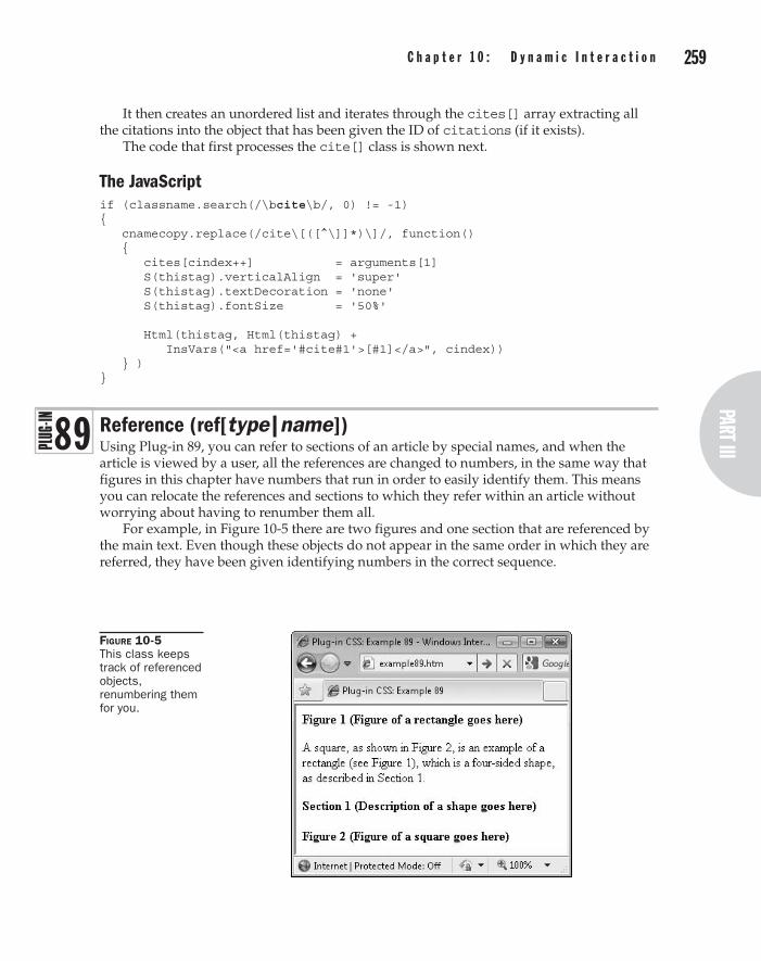
258 p a r t I I I : t h e D y n a m i c C l a s s e spart III
C h a p t e r 1 0 : D y n a m i c I n t e r a c t i o n 259
It then creates an unordered list and iterates through the cites[] array extracting all the citations into the object that has been given the ID of citations (if it exists).
The code that first processes the cite[] class is shown next.
The JavaScriptif (classname.search(/\bcite\b/, 0) != -1) { cnamecopy.replace(/cite\[([^\]]*)\]/, function() { cites[cindex++] = arguments[1] S(thistag).verticalAlign = 'super' S(thistag).textDecoration = 'none' S(thistag).fontSize = '50%' Html(thistag, Html(thistag) + InsVars("<a href='#cite#1'>[#1]</a>", cindex)) } ) }
Reference (ref[type|name])Using Plug-in 89, you can refer to sections of an article by special names, and when the article is viewed by a user, all the references are changed to numbers, in the same way that figures in this chapter have numbers that run in order to easily identify them. This means you can relocate the references and sections to which they refer within an article without worrying about having to renumber them all.
For example, in Figure 10-5 there are two figures and one section that are referenced by the main text. Even though these objects do not appear in the same order in which they are referred, they have been given identifying numbers in the correct sequence.
Figure 10-5 This class keeps track of referenced objects, renumbering them for you.
8 9

260 p a r t I I I : t h e D y n a m i c C l a s s e s C h a p t e r 1 0 : D y n a m i c I n t e r a c t i o n 261
Variables, Functions, and Propertiescnamecopy String variable containing a copy of the class name
arguments[1] JavaScript array element containing the reference object type
arguments[2] JavaScript array element containing the reference object name
a1 a2
Variable copies of arguments[1] and arguments[2] used as shorthand to simplify the code
refers[] Array containing all the references
replace() JavaScript function to replace a section of text in a string with another
Html() Function (from PJ.js) to read or write the HTML contents of an object
About the ClassThis class takes an object type and an object name and then keeps track of where these are used throughout a web page. They are then given numerical values according to the order in which they are encountered, such that (for example) the first figure object is given the value 1, the second is given the value 2, and so on.
How to Use ItTo use this class, you must give every object you reference a unique name, so that whenever it is mentioned, the correct number can be placed with it. You also need to specify the type of each object so you can, for instance, have figures and tables, and as many other object types as you need.
So, for example, to announce that an object is a figure, you might use code such as this:
<b>Figure <span class='ref[fig|uniquename]'></span><br /> <img src='animage.jpg' />
In this case, the unique name is uniquename, and the object type is fig. To now reference this figure from anywhere in the web page, you would use code such as this:
(see Figure <span class='ref[fig|uniquename]'></span>)
Leave the contents of the <span> (or other object you use) empty because the class will place the number to display inside it, overwriting anything already there.
Once you have done this, you can move the figure and any references to it to any other places in the article and they will still correctly reference each other—and, if necessary, they will be renumbered should the figure be moved before or after another figure.
Here’s another example that uses this class, and which creates the result seen in Figure 10-5:
<b>Figure <span class='ref[fig|rect]'></span> (Figure of a rectangle goes here)</b>

260 p a r t I I I : t h e D y n a m i c C l a s s e spart III
C h a p t e r 1 0 : D y n a m i c I n t e r a c t i o n 261
<p>A square, as shown in Figure <span class='ref[fig|square]'></span>, is an example of a rectangle (see Figure <span class='ref[fig|rect]'> </span>), which is a four-sided shape, as described in Section <span class='ref[sec|shape]'></span>.</p> <b>Section <span class='ref[sec|shape]'></span> (Description of a shape goes here)</b><br /><br /> <b>Figure <span class='ref[fig|square]'></span> (Figure of a square goes here)</b>
I have highlighted the references in bold so you can quickly see them. Three objects in total are referenced:
• fig|rect
• fig|square
• sec|shape
Two of the objects are of type fig and the other is of type sec. What the class does is allocate the fig object numbers in the order in which they first appear in the document (and would do the same for the sec objects, except there is only one).
Therefore, if fig|square is encountered first, it will become Figure 1, but if fig|rect is the first one found, then it will be Figure 1. This means that all the objects will always be ordered correctly according to where they appear in an article (no matter where you move them to), making it easy for your readers to locate them.
The JavaScriptif (classname.search(/\bref\b/, 0) != -1) { cnamecopy.replace(/ref\[([^\|]*)\|([^\]]*)\]/, function() { var a1 = arguments[1] var a2 = arguments[2] if (typeof refers[a1] == UNDEF) { refers[a1] = Array() refers[a1]['count'] = 1 refers[a1][a2] = 1 } else if (typeof refers[a1][a2] == UNDEF) refers[a1][a2] = ++refers[a1]['count'] Html(thistag, refers[a1][a2]) } ) }

262 p a r t I I I : t h e D y n a m i c C l a s s e s C h a p t e r 1 0 : D y n a m i c I n t e r a c t i o n 263
No Copy (nocopy)Sometimes you want to prevent idle copying and pasting of your work, or simply wish to prevent the ugly effect that a highlighted section of text might have on your design. You can do so using Plug-in 90, as shown in Figure 10-6, in which the first section of text can be copied, but the second cannot.
Variables, Functions, and PropertiesPreventAction() Function (from PJ.js) to prevent drag and copy actions
About the ClassThis class prevents the use of drag and drop on an object. It works well on most browsers but there is a bug in Internet Explorer in which you can commence a drag operation outside of an object that uses this class and the browser will allow you to continue the drag into it. But IE does correctly prevent starting a drag operation from within objects using this class.
How to Use ItTo prevent an object from allowing drag-and-copy operations, mention this class name in the object’s class argument, like this:
<p class='nocopy'>This text is uncopyable</p>
However, due to the Internet Explorer bug, you will have the best results if you attach this class to the <body> section of a web page, like this (so that nothing on a web page can be copied):
<body class='nocopy'> ... Your web page contents </body>
Figure 10-6 Prevent sections of text from being copied with this plug-in.
9 0

262 p a r t I I I : t h e D y n a m i c C l a s s e spart III
C h a p t e r 1 0 : D y n a m i c I n t e r a c t i o n 263
Here is the HTML used for Figure 10-6:
<p>The copy feature of a web browser allows you to transfer content from it to another program. You can, for example, click on this text and drag the mouse to highlight some of it, which you can then copy.</p> <p class='nocopy'>On the other hand, when you don't wish this feature to be enabled, you can turn it off, as with this section of text, which you will find cannot be copied by dragging with the mouse button held down.</p>
The JavaScriptif (classname.search(/\bnocopy\b/, 0) != -1) { PreventAction(thistag, 'both', true) }

This page intentionally left blank

Chapter 11
Incorporating JavaScript
part IIIthe Dynamic Classes

266 p a r t I I I : t h e D y n a m i c C l a s s e s C h a p t e r 1 1 : I n c o r p o r a t i n g J a v a S c r i p t 267
Even if you are not a programmer, or not familiar with JavaScript, you can still make use of this powerful language using the classes in this chapter. With them, you can embed simple calculations or complex expressions within an object, just by placing
them within a pair of special tokens.You can also use these plug-ins to leverage the power of JavaScript for creating sections
of conditional HTML, whether based on expressions of your choice, or using a special global keyword to identify the browser in use (such as Firefox, or Internet Explorer, and so on).
Once you’ve used these classes, I think you may find them so handy you’ll wonder how you ever managed without them.
Embed JavaScript (embedjs)Using Plug-in 91, you can embed snippets of JavaScript within an object, without having to use <script> tags. This makes it easy for you to display the result of a calculation, or anything else that can be displayed by JavaScript.
For example, in Figure 11-1 a number of code snippets have been embedded within a paragraph of text, which have been evaluated with the results then inserted in their place.
Variables, Functions, and Propertiesreplace() JavaScript function to replace one section of text with another
Html() Function to get or set the HTML contents of an object
try() … catch() JavaScript functions to try an expression and, if there is an error, catch it quietly without throwing an error
Eval() JavaScript function to evaluate an expression
About the ClassWhen this class is encountered, the object using it is parsed to see whether it has any sections embedded within [[ and ]] tags. If so, these sections are evaluated as JavaScript code and the result returned by the evaluation is substituted for the entire section from the opening [[ to the closing ]].
9 1
Figure 11-1 A paragraph with several JavaScript snippets embedded in it
266 p a r t I I I : t h e D y n a m i c C l a s s e spart III
C h a p t e r 1 1 : I n c o r p o r a t i n g J a v a S c r i p t 267
How to Use ItWith this class, you have the ability to easily embed any JavaScript inline with text. For example, you might want to display the result of a simple calculation and can do so like this:
<div class='embedjs'>The result of 23.2 * 7 is [[23.2 * 7]].</div>
As you can see, you don’t need to know anything about JavaScript to use this class to display the result of arithmetic calculations. You can also access the global variable BROWSER, which is used by the PJ.js file to keep track of the current browser type. It will have a value such as “IE”, “Opera”, “Firefox”, and so on, and can be displayed like this:
<div class='embedjs'>Your browser is [[BROWSER]].</div>
You can also embed much larger sections of code by separating the expressions from each other with a semicolon, like this:
<div class='embedjs'> The multiplication table for the number 12 is [[mystr = ''; for (myvar = 1 ; myvar < 13 ; ++myvar) mystr += myvar * 12 + ' '; mystr]]</div>
Or, if you prefer, you can format the contents like program code as follows (still ensuring that there are semicolons at the end of each statement except the final one, which is optional):
<div class='embedjs'>The multiplication table for the number 12 is [[ mystr = ''; for (myvar = 1 ; myvar < 13 ; ++myvar) mystr += myvar * 12 + ' '; mystr ]] </div>
The output from this example is:
The multiplication table for the number 12 is 12 24 36 48 60 72 84 96 108 120 132 144
Caution In the for() loop of this example, the < entity is used instead of the < symbol because placing the < within HTML confuses browsers, which expect an HTML tag to follow it. Likewise, you must use the > entity where you need a > symbol. The only way you can use the < and > symbols is if the entire JavaScript snippet is encased in quotation marks, like this: "[[76 < 83.3]]", which will return the value true.
Here’s the HTML used for Figure 11-1, in which I have highlighted the embedded JavaScript snippets in bold:
<div class='embedjs'> You are using the following browser: [[BROWSER]]. The square root of 42 is [[Math.sqrt(42)]]. The value of the new variable 'count' is [[count = 0]]. After incrementing it the new value is [[++count]]. The result of (64 / 3 + 128) / 3.2 is [[(64 / 3 + 128) / 3.2]]. </div>

268 p a r t I I I : t h e D y n a m i c C l a s s e s C h a p t e r 1 1 : I n c o r p o r a t i n g J a v a S c r i p t 269
As you can see, you can also create a new variable (such as count, in the preceding example), and then refer to it later in a web page (as long as you don’t make it local by prefacing it with the var keyword, in which case it will work only in the current code snippet).
If you make a mistake, such as introducing a syntax error, an error message will be displayed in red, instead of the result you were expecting. For example, the following is invalid:
<div class='embedjs'>The result of 66 x 87 is [[66 x 87]].</div>
The problem is that the x symbol is not a valid operator in JavaScript, and it should be replaced with a * symbol. Therefore, because the parser was expecting a semicolon following the 66, the preceding snippet will generate an output similar to the following:
The result of 66 x 87 is [SyntaxError: missing ; before statement]
The JavaScriptif (classname.search(/\bembedjs\b/, 0) != -1) { Html(thistag, Html(thistag).replace(/\[\[([^\]]*)\]\]/g, function() { arguments[1] = arguments[1].replace(/</g, '<') arguments[1] = arguments[1].replace(/>/g, '>') try { return eval(arguments[1]) } catch(e) { return "<span class='red'>[" + e + "]</span>" } } )) }
If (if[expr])If you’ve ever wished you could write conditional HTML, then you should find this class very handy, because with it you can display an object only if an expression evaluates to true. For example, in Figure 11-2, the screen grab was taken after midday; therefore, it displays the phrase “Good Afternoon”.
Variables, Functions, and Propertiesreplace() JavaScript function to replace one section of text with another
Html() Function to get or set the HTML contents of an object
Eval() JavaScript function to evaluate an expression
9 2
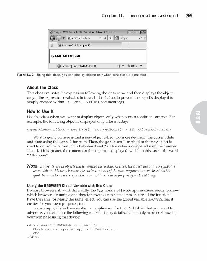
268 p a r t I I I : t h e D y n a m i c C l a s s e spart III
C h a p t e r 1 1 : I n c o r p o r a t i n g J a v a S c r i p t 269
About the ClassThis class evaluates the expression following the class name and then displays the object only if the expression evaluates to true. If it is false, to prevent the object’s display it is simply encased within <!-- and --> HTML comment tags.
How to Use ItUse this class when you want to display objects only when certain conditions are met. For example, the following object is displayed only after midday:
<span class='if[now = new Date(); now.getHours() > 11]'>Afternoon</span>
What is going on here is that a new object called now is created from the current date and time using the Date() function. Then, the getHours() method of the now object is used to return the current hour between 0 and 23. This value is compared with the number 11 and, if it is greater, the contents of the <span> is displayed, which in this case is the word “Afternoon”.
note Unlike its use in objects implementing the embedjs class, the direct use of the > symbol is acceptable in this case, because the entire contents of the class argument are enclosed within quotation marks, and therefore the > cannot be mistaken for part of an HTML tag.
Using the BROWSER Global Variable with this ClassBecause browsers all work differently, the PJ.js library of JavaScript functions needs to know which browser is running, and therefore tweaks can be made to ensure all the functions have the same (or nearly the same) effect. You can use the global variable BROWSER that it creates for your own purposes, too.
For example, if you have written an application for the iPad tablet that you want to advertise, you could use the following code to display details about it only to people browsing your web page using that device:
<div class="if[BROWSER == 'iPad']"> Check out our special app for iPad users... etc... </div>
Figure 11-2 Using this class, you can display objects only when conditions are satisfied.
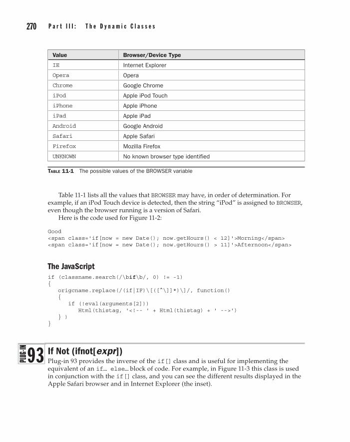
270 p a r t I I I : t h e D y n a m i c C l a s s e s C h a p t e r 1 1 : I n c o r p o r a t i n g J a v a S c r i p t 271
Table 11-1 lists all the values that BROWSER may have, in order of determination. For example, if an iPod Touch device is detected, then the string “iPod” is assigned to BROWSER, even though the browser running is a version of Safari.
Here is the code used for Figure 11-2:
Good <span class='if[now = new Date(); now.getHours() < 12]'>Morning</span> <span class='if[now = new Date(); now.getHours() > 11]'>Afternoon</span>
The JavaScriptif (classname.search(/\bif\b/, 0) != -1) { origcname.replace(/(if|IF)\[([^\]]*)\]/, function() { if (!eval(arguments[2])) Html(thistag, '<!-- ' + Html(thistag) + ' -->') } ) }
If Not (ifnot[expr])Plug-in 93 provides the inverse of the if[] class and is useful for implementing the equivalent of an if… else… block of code. For example, in Figure 11-3 this class is used in conjunction with the if[] class, and you can see the different results displayed in the Apple Safari browser and in Internet Explorer (the inset).
Table 11-1 The possible values of the BROWSER variable
Value Browser/Device Type
IE Internet Explorer
Opera Opera
Chrome Google Chrome
iPod Apple iPod Touch
iPhone Apple iPhone
iPad Apple iPad
Android Google Android
Safari Apple Safari
Firefox Mozilla Firefox
UNKNOWN No known browser type identified
9 3
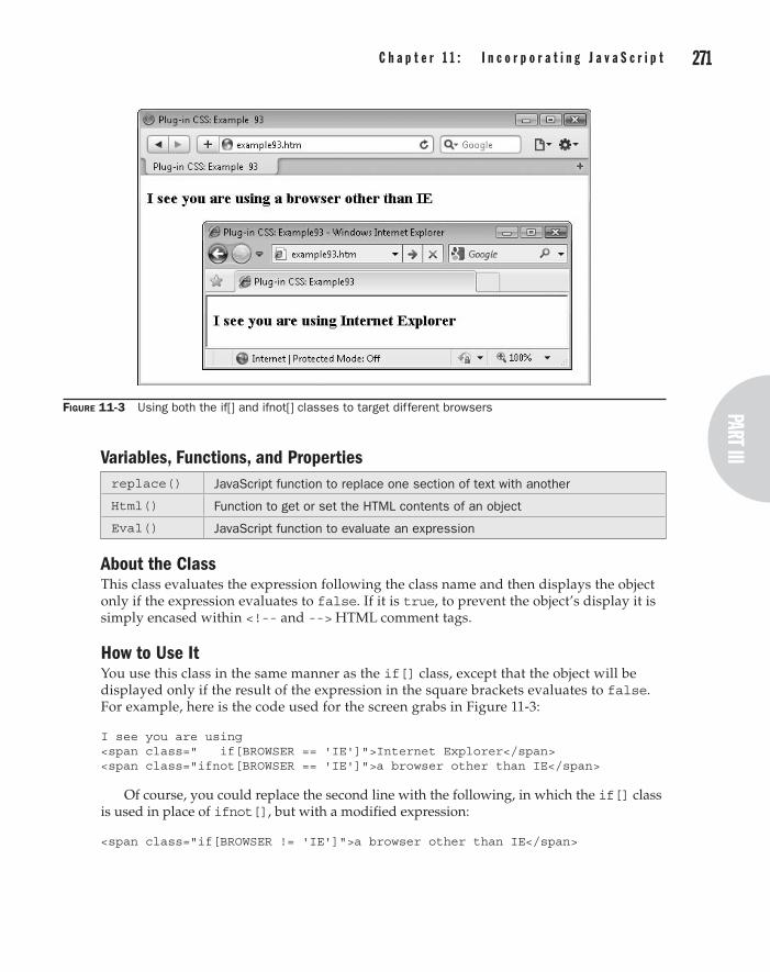
270 p a r t I I I : t h e D y n a m i c C l a s s e spart III
C h a p t e r 1 1 : I n c o r p o r a t i n g J a v a S c r i p t 271
Variables, Functions, and Propertiesreplace() JavaScript function to replace one section of text with another
Html() Function to get or set the HTML contents of an object
Eval() JavaScript function to evaluate an expression
About the ClassThis class evaluates the expression following the class name and then displays the object only if the expression evaluates to false. If it is true, to prevent the object’s display it is simply encased within <!-- and --> HTML comment tags.
How to Use ItYou use this class in the same manner as the if[] class, except that the object will be displayed only if the result of the expression in the square brackets evaluates to false. For example, here is the code used for the screen grabs in Figure 11-3:
I see you are using <span class=" if[BROWSER == 'IE']">Internet Explorer</span> <span class="ifnot[BROWSER == 'IE']">a browser other than IE</span>
Of course, you could replace the second line with the following, in which the if[] class is used in place of ifnot[], but with a modified expression:
<span class="if[BROWSER != 'IE']">a browser other than IE</span>
Figure 11-3 Using both the if[] and ifnot[] classes to target different browsers
272 p a r t I I I : t h e D y n a m i c C l a s s e s
But the point of the ifnot[] class is that you don’t have to rewrite an expression that was used in an if[] class; you can simply copy the entire expression and place it within an ifnot[] class to achieve the inverse effect of the original, which is very handy if the expression is quite complex.
note This completes all the dynamic classes in this book. In the next and final chapter, I’ll show you how you can combine any of these classes together to create superclasses, which have the combined functionality of many classes at once.
The JavaScriptif (classname.search(/\bifnot\b/, 0) != -1) { origcname.replace(/(ifnot|IFNOT)\[([^\]]*)\]/, function() { if (eval(arguments[2])) Html(thistag, '<!-- ' + Html(thistag) + ' -->') } ) }
Chapter 12
Superclasses
part IIIthe Dynamic Classes

274 p a r t I I I : t h e D y n a m i c C l a s s e s C h a p t e r 1 2 : S u p e r c l a s s e s 275
Now that you have access to the almost 1800 classes from the previous chapters, this chapter focuses on combining them in combinations to make superclasses—single classes with the functionality of several classes at once. These superclasses include
creating an RSS button, applying simple borders, handling rollovers, horizontal and vertical animated tabs, and more.
You’ll also discover how easy it is to create your own superclasses using simple <meta ...> statements to help make building dynamic web pages the easiest it has ever been.
What Is a Superclass?Superclasses are classes that contain groups of other classes. For example, the first superclass in this chapter, clickable, contains the nooutline and pointer classes (Plug-ins 19 and 54).
Seven superclasses have been predefined for you in the PC.js file, and you can easily create your own using the <meta ...> tag, like this:
<meta http-equiv='sclass' name='clickable' content='nooutline pointer' />
In this example, the superclass clickable is created by placing the argument http-equiv='sclass' within a <meta ...> tag, followed by the argument specifying the name of the superclass, name='clickable', and finally the classes to put in the superclass, content='nooutline pointer'.
Here’s another example:
<meta http-equiv='sclass' name='yellowonblue' content='yellow blue_b' />
This creates the new superclass yellowonblue which will set the foreground color of the object to which it applies to yellow, and the background to blue.
Note You can include as many classes in a superclass as you like, as well as any combination of normal and dynamic classes from this book, or even throw in your own classes created either within <style> tags or from a style sheet.
Clickable (clickable)The purpose of Plug-in 94 is to clearly indicate that objects, and buttons in particular, are clickable. It does this by removing any outline that may be placed around the object when it has the focus, and by turning the mouse cursor into a pointer when it hovers over the object.
In Figure 12-1, two rows of buttons have been created. The first row doesn’t use this superclass, but the second does.
In the screen grab, you can clearly see the dotted outline that has been applied to the first Cancel button, but which will not appear over the second one. Also, the mouse cursor will change to a pointer when over the second row, but not the first.
Classesnooutline Plug-in 19: Prevents a dotted outline being placed over an object in focus
pointer Plug-in 54: Turns the mouse cursor into a pointer when it hovers over the object
9 4

274 p a r t I I I : t h e D y n a m i c C l a s s e spart III
C h a p t e r 1 2 : S u p e r c l a s s e s 275
About the SuperclassBy combining the effects of two other classes, this superclass helps to clearly indicate when an object is clickable.
How to Use ItTo use this superclass, enter its name into the class argument of an object. For example, the following code was used to create the screen grab in Figure 12-1:
<button class='check_h'>Submit</button> <button class='cross_h'>Cancel</button> <button class='email_h'>Email Us</button> <button class='star_h' >New Stuff</button><br /> <button class='check_h clickable'>Submit</button> <button class='cross_h clickable'>Cancel</button> <button class='email_h clickable'>Email Us</button> <button class='star_h clickable' >New Stuff</button>
Try passing your mouse over the different rows and clicking various buttons to see the differences between them.
RSS Button (rssbutton)Plug-in 95 creates a great looking RSS button without the need for including an image. For example, Figure 12-2 shows it being applied to both a <button> and a <span> object in both the Chrome and Internet Explorer browsers. Although there are minute differences between them, all the buttons look quite respectable.
Classescarrot1 Plug-in 4: Changes the background to the gradient carrot1
carrot2_a Plug-in 5: Changes the background to the gradient carrot2 when the object is clicked
smallestround Plug-in 8: Applies a 2-pixel rounded border
Figure 12-1 This superclass removes outlines and changes the mouse cursor to a pointer.
9 5

276 p a r t I I I : t h e D y n a m i c C l a s s e s C h a p t e r 1 2 : S u p e r c l a s s e s 277
b Plug-in 21: Changes the font weight to bold
white Plug-in 24: Changes the foreground color to white
yellow_h Plug-in 24: Changes the hover color to yellow
smallbutton Plug-in 33: Creates a button with a 75 percent font size, and 2 pixels of padding
clickable Plug-in 94: Indicates that the object is clickable
About the SuperclassThis superclass brings together a large number of CSS rules from several different classes, even including the previous superclass, clickable, to create a dynamic, 3D-effect RSS button.
How to Use ItTo use this superclass, you will need to surround it with an <a href='...'> tag pointing to your RSS feed, like this:
<a class='n' href='myfeed.xml'> <span class='rssbutton'>RSS FEED</span> </a>
The first line references the RSS feed and uses the n class to suppress the underline that would otherwise appear under the button. The middle line applies the rssbutton superclass to a <span> tag, and supplies the string “RSS FEED” to it.
You can also use the <button> tag by placing it in a form like this:
<form method='get' action='myfeed.xml'> <button class='rssbutton'>RSS FEED</button> </form>
Figure 12-2 The RSS button superclass used on different objects in different browsers

276 p a r t I I I : t h e D y n a m i c C l a s s e spart III
C h a p t e r 1 2 : S u p e r c l a s s e s 277
CautioN When using the <button> tag, Internet Explorer will submit the text between the <button> and </button> tags, while other browsers will submit the contents of its value attribute (if any).
Border (border)Often, you want to quickly add a border to an object and Plug-in 96 will do the job for you, instead of having to supply a set of CSS rules. For example, in Figure 12-3 a photograph is displayed twice, the second time using this superclass.
Classesbsolid Plug-in 16: Sets the object’s border to solid
bwidth1 Plug-in 17: Sets the object’s border width to 1 pixel
bblack Plug-in 18: Sets the object’s border color to black
About the SuperclassThis superclass uses all three border classes to create a simple, 1-pixel black border around the object.
How to Use ItWhen you want to quickly add a border to an object, just enter this superclass name in its class argument, like this:
<img class='border' src='myphoto.jpg' />
Figure 12-3 Displaying an image without and with the border superclass
9 6

278 p a r t I I I : t h e D y n a m i c C l a s s e s C h a p t e r 1 2 : S u p e r c l a s s e s 279
Absolute Top Left (abstopleft)Whenever you create a rollover or need to align objects on top of each other, the process is the same. All objects after the first one should be moved to the top left corner of the containing object, and Plug-in 97 makes doing so quick and easy.
You can see this superclass in use in Figure 12-4, where the boat image has been superimposed over the photograph.
Classesabsolute Plug-in 1: Gives an object absolute positioning
totop Plug-in 13: Moves an object to the top of its container
toleft Plug-in 13: Moves an object to the left of its container
About the SuperclassThis superclass applies three classes to give an object absolute positioning, and to move it to its containing object’s top left corner.
How to Use ItTo use this superclass, you will need a container object with a position other than static in which to place your objects. Then, the second object onward must apply the superclass, as in the following example, which was used for Figure 12-4:
<div class='relative'> <img class='trans07' src='i2.jpg' /> <img class='abstopleft trans06' src='boat.png' /> </div>
Figure 12-4 Use this superclass to lay objects over each other.
9 7

278 p a r t I I I : t h e D y n a m i c C l a s s e spart III
C h a p t e r 1 2 : S u p e r c l a s s e s 279
In this example, the larger image is given a transparency level of 7 and the boat a transparency of 6 and they have been superimposed over each other. Reasons you would want to do this include creating slideshows and rollovers, as in the following plug-in.
Rollover (rollover)Plug-in 98 makes it very easy for you to create rollover effects, as shown in Figure 12-5, in which two face images are displayed that, when moused over, turn from happy to sad, and vice versa.
Classestrans00 Plug-in 9: Sets the transparency of an object to fully visible
trans00_h Plug-in 9: Sets the transparency of an object to fully visible when the mouse cursor passes over it
trans10 Plug-in 9: Sets the transparency of an object to completely invisible
trans10_h Plug-in 9: Sets the transparency of an object to completely invisible when the mouse cursor passes over it
abstopleft Plug-in 97: Gives an object absolute positioning and moves it to the top left corner of its container
About the SuperclassesThese two superclasses are intended to be used together. The rollover superclass should be applied to the first of a rollover pair of objects, and rollover_h to the second. Once implemented, whenever the mouse passes over the objects, the first one is set to transparent and the second to fully visible so the one you can see swaps. When the mouse is moved away, the first object becomes visible again and the second invisible.
In another illustration of superclasses being used as members of other superclasses, the abstopleft superclass is used as one of the members of this superclass pair.
Figure 12-5 Creating rollover effects with this pair of superclasses
9 8
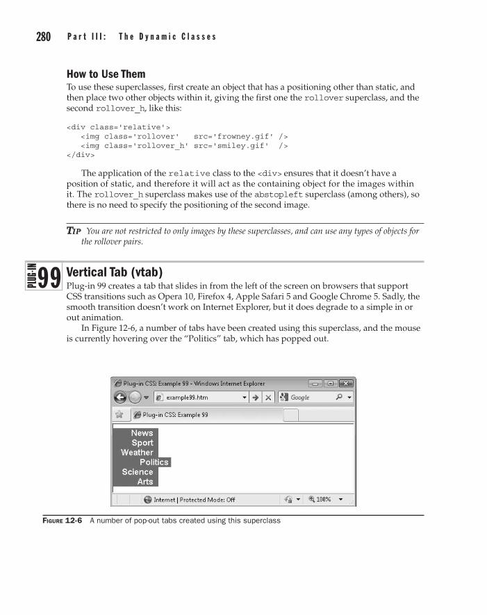
280 p a r t I I I : t h e D y n a m i c C l a s s e s C h a p t e r 1 2 : S u p e r c l a s s e s 281
How to Use ThemTo use these superclasses, first create an object that has a positioning other than static, and then place two other objects within it, giving the first one the rollover superclass, and the second rollover_h, like this:
<div class='relative'> <img class='rollover' src='frowney.gif' /> <img class='rollover_h' src='smiley.gif' /> </div>
The application of the relative class to the <div> ensures that it doesn’t have a position of static, and therefore it will act as the containing object for the images within it. The rollover_h superclass makes use of the abstopleft superclass (among others), so there is no need to specify the positioning of the second image.
tip You are not restricted to only images by these superclasses, and can use any types of objects for the rollover pairs.
Vertical Tab (vtab)Plug-in 99 creates a tab that slides in from the left of the screen on browsers that support CSS transitions such as Opera 10, Firefox 4, Apple Safari 5 and Google Chrome 5. Sadly, the smooth transition doesn’t work on Internet Explorer, but it does degrade to a simple in or out animation.
In Figure 12-6, a number of tabs have been created using this superclass, and the mouse is currently hovering over the “Politics” tab, which has popped out.
Figure 12-6 A number of pop-out tabs created using this superclass
9 9
280 p a r t I I I : t h e D y n a m i c C l a s s e spart III
C h a p t e r 1 2 : S u p e r c l a s s e s 281
Classesleftpadding10 Plug-in 15: Applies 10 pixels of padding to the object’s left side
leftpadding40_h Plug-in 15: Applies 40 pixels of padding to the object’s left side when it is hovered over by the mouse
rightpadding5 Plug-in 15: Applies 5 pixels of padding to the object’s right side
b Plug-in 21: Sets the object’s font weight to bold
transitionallfast_l Plug-in 51: Applies a linear transition of 0.3 seconds to any property changes that occur on the object (where supported by the browser)
About the SuperclassThis is a great little superclass for creating a variety of animation and menuing effects. It works by changing the left padding of an object when the mouse passes over it. In conjunction with CSS3 transitions (on browsers that support them), the object will slide out and in smoothly over the course of 0.3 seconds. In Internet Explorer and other browsers that don’t support transitions, the object will simply pop in and out.
How to Use ItTo use this superclass, first create a container object by giving it a position other than static. For example, here is the HTML used for Figure 12-6:
<div class='relative red_b leftby20 arial w[100]'> <div class='vtab white red_b yellow_h right w[80]'>News</div> <div class='vtab white red_b yellow_h right w[80]'>Sport</div> <div class='vtab white red_b yellow_h right w[80]'>Weather</div> <div class='vtab white red_b yellow_h right w[80]'>Politics</div> <div class='vtab white red_b yellow_h right w[80]'>Science</div> <div class='vtab white red_b yellow_h right w[80]'>Arts</div> </div>
In the first line of this example, the <div> is given relative positioning, a red background color, is moved to the left by 20 pixels (to send it past the screen edge), its font family is set to Arial, and it is given a width of 100 pixels.
Inside it are six tabs, each of which uses the vtab superclass, and it is set to white text on a red background, which changes to yellow text when hovered over with the mouse. The text is also aligned to the right and the width of each tab is set to 80 pixels.
When you pass your mouse over the tabs on a browser that supports CSS3 transitions, you’ll see them sliding in and out in a pleasing and professional manner. Even on IE and other browsers that do not support transitions, the effect still happens, although instantly rather than over time.
All the example now needs is for <a href='...'> tags to be placed around each tab (possibly including the use of the n class to suppress any underlines) and the menu will be complete. When you do this, ensure that the <a href='…'> and </a> are placed around the <div> (or other container), not within it.

282 p a r t I I I : t h e D y n a m i c C l a s s e s C h a p t e r 1 2 : S u p e r c l a s s e s 283
Horizontal Tab (htab)Plug-in 100 is similar to the previous plug-in, except that it creates drop-down tabs, as shown in Figure 12-7 in which the “Science” tab is currently being hovered over, and has therefore slid down.
Classesabsolute Plug-in 1: Gives an object absolute positioning
toppadding20_h Plug-in 15: Applies 20 pixels of padding to the object’s top when it is hovered over by the mouse
b Plug-in 21: Sets the object’s font weight to bold
center Plug-in 22: Centers the object’s contents
transitionallfast_l Plug-in 51: Applies a linear transition of 0.3 seconds to any property changes that occur on the object (where supported by the browser)
About the SuperclassThis superclass works by changing the top padding of an object when the mouse passes over it. In conjunction with CSS3 transitions (on browsers that support them), the object will slide down and up smoothly over the course of 0.3 seconds. In Internet Explorer and other browsers that don’t support transitions, the object will simply pop down and back up again.
How to Use ItTo use this superclass, you need to first create a container object by giving it a position other than static. For example, here is the HTML used for Figure 12-7:
<div class='red_b arial'> <span class='htab white red_b yellow_h w[80] x[0]' >News</span> <span class='htab white red_b yellow_h w[80] x[80]' >Sport</span> <span class='htab white red_b yellow_h w[80] x[160]'>Weather</span> <span class='htab white red_b yellow_h w[80] x[240]'>Politics</span> <span class='htab white red_b yellow_h w[80] x[320]'>Science</span> <span class='htab white red_b yellow_h w[80] x[400]'>Arts</span> </div>
Figure 12-7 These pop-out tabs drop down vertically when hovered over.
100

282 p a r t I I I : t h e D y n a m i c C l a s s e spart III
C h a p t e r 1 2 : S u p e r c l a s s e s 283
In the first line of this example, the <div> is given a red background color, and its font family is set to Arial.
Inside it are six tabs, each of which uses the htab superclass, and is also set to white text on a red background, which changes to yellow text when hovered over with the mouse. The width of each tab is set to 80 pixels, and the horizontal location of each tab is moved in by 80 pixels from the previous one.
When you pass your mouse over the tabs on a browser that supports CSS3 transitions, you’ll see them smoothly sliding down and up. In IE and other browsers, the tabs instantly pop down and up.

This page intentionally left blank

A_a suffix
active box shadows, 58active padding, 62active rounded borders, 64active scrollbars, 72–73active transparency, 67background gradients, 48
absolute property, positioningclasses for, 38–40defined, 30
abstopleft superclass, 278–280active pseudo class, 32alignment
dropcap, 123text, 103–105types of text, 29vertically centering object inside another, 209
alt argument of image, ondemand class, 217–218
Apple Safari, downloading and installing, 4–5asterisk (*) symbols
/*.*/ tags for CSS rule comments, 17wildcards, 21–22
attribute selectors, 21autofocus class, 255–256autoscroll class, 72–74
B_b suffix, background properties, 44, 48, 109_ba suffix, defined, 44–45backglow[] class, 250–251background color
with bcolor[] class, 232–233for buttons, 132–134classes for, 43–46
color property, 29–30odd and even, 200
background propertyboxouts, 159–160gradients, 47–48inverse gradients, 54odd and even background color, 200–202
bcolor[] class, dynamic objects, 232–233_bh suffix, defined, 44–45block class, visibility and display, 71body section, DOM, 8–9bold value, font weight, 28border property, boxouts, 159–160border superclass, 277border-color property, 90–92border-radius command, rounded borders,
63–65borders
box model, 34color, 90–92rounded, 63–66styles, 86–88width, 88–90
border-width property, 34bottom class, dynamic objects, 213bottom dock bar plug-in classes, 146–147bottom dock bar plug-in, navigation, 146–147bottom property, location, 78–80bottomdockitem class, 147box model, CSS
borders, 34content, 34margins, 33–34overview of, 33–34padding, 34properties affecting page layout, 33
box shadows plug-in, 58–61
Index
285
286 P l u g - I n C S S : 1 0 0 P o w e r S o l u t i o n s I n d e x 287
boxout plug-inclasses, 158–160layout as left sidebar, 163–165layout as right sidebar, 165–166
box-shadow property, 58break class, adding page breaks, 167–168BROWSER global variable, with if[] class,
269–270button class, 132–134button click events, 52–57buttons
classes for creating, 132–135clickable, 274–275RSS, 275–277
Ccapitalize property, text transformation, 29caption image plug-in, visual effects, 188–192cascade, CSS
defined, 22!important tag, 24style sheet creators, 22–23style sheet methods, 23style sheet selectors, 23–24using different number base, 24
Cascading Style Sheets. See CSS (Cascading Style Sheets)
center alignment, text, 29center class, dynamic objects, 210–211centimeters, CSS measurement in, 26checkmark icon, 129–130child selectors, 19–20cite[] class, dynamic interaction, 256–259classes
applying same style to elements with, 12attribute selectors for, 21dynamic. See dynamic classesfont style, 28manipulating objects. See object
manipulation plug-insmenus and navigation. See menu and
navigation plug-insname conflicts when using plug-ins, 13narrowing scope of, 21page layout. See page layout plug-inspseudo, 31–32text and typography. See text and
typography plug-insvisual effects. See visual effect plug-ins
CleanupString( ) functiondigitsonly class, 238minwhitespace class, 244nopunct class, 242–243nospaces class, 240–241textonly class, 239–240
clickable superclass, 274–275
colon (:) character, separating pseudo classes, 31–32
color. See also background colorbackground and foreground text, 29–30border, 90–92odd and even text, 196–199text, 108–111, 230–231
color propertysymbols, 129text color, odd and even, 197text color properties, 29–30text colors plug-in, 109
color[] class, for dynamic text, 230–232ColorFade( ) function, 249–251column plug-in, text and typography, 124–127comma (,) symbol, grouping selectors, 22comments, applying to CSS rules, 17companion web site for this book, downloading
plug-ins from, 7content, box model, 34content property, encapsulation, 117content property, symbols, 129creators, style sheet, 22–23cross icons, 129–130CSS (Cascading Style Sheets)
box model, 33–34the cascade, 22–24colors, 29–30divs and spans, 25–26fonts, 27–28IDs and classes, 12importing, 11local style settings, 12measurements, 26–27overview of, 10positioning elements, 30–31pseudo classes, 31–32rules, 16–19selectors, 19–22and semicolons, 12–13shorthand, 32text, 28–29
cursor property, pointer class, 192–193
Ddecoration, text, 28default CSS plug-in, layout, 155–158default styles, CSS rules for, 17descendant selectors, 19digitsonly class, dynamic text and
typography, 237–238display, CSS classes for, 69–71divs, spans vs., 25–26document object, 8Document Object Model. See DOM (Document
Object Model)

286 P l u g - I n C S S : 1 0 0 P o w e r S o l u t i o n s I n d e x 287
DOM (Document Object Model)CSS connected to, 10–12how it works, 8–10overview of, 8
drop cap plug-in, text and typography, 122–123dropcap class, 122–123DropShadow filter argument, IE, 59dynamic classes
dynamic interaction. See dynamic interactiondynamic objects. See dynamic objectsincorporating JavaScript. See JavaScript-
aided plug-inssuperclasses. See superclassestext and typography. See dynamic text
and typographydynamic interaction
autofocus class, 255–256cite[] class, 256–259nocopy class, 262–263placeholder[] class, 254–255ref[] class, 259–261
dynamic objectsbcolor[] class, 232–233bottom class, 213center class, 210–211color[] class, 230–232fadein[n] class, 219–220fadeout[n] class, 220–221height (h[n]) class, 227–228left class, 214middle class, 209–210nojs and onlyjs classes, 206–209ondemand class, 216–219resizeta class, 220–221right class, 215rotate[n] class, 223–225top class, 212width[] class, 226x[] class, 228–229y[] class, 229–230
dynamic text and typographybackglow[] class, 250–251digitsonly class, 237–238Google font (gfont[]) class, 244–248minwhitespace class, 243–244nopunct class, 241–243nospaces class, 240–241textglow[] class, 249–250textmiddle class, 248–249textonly class, 239–240typetext[] class, 236–237
Ee-mail icon, 129–130embedded styles, style sheets as, 23
embedjs class, using JavaScript, 266–268ems, CSS measurement in, 27encapsulation plug-in, text and typography,
116–117exs, CSS measurement in, 27external style sheets
creating style sheets as, 23CSS rules for, 18
FFadeIn( ) function, fadein[] class, 219–220fadein[n] class, 219–220FadeOut( ) function, fadeout[] class, 220–221fadeout[n] class, 220–221file extensions, enabling on Windows PC, 8filter property, IE
box shadows, 58–59gradients, 47inverse gradients, 54symbols, 129transparency, 67
fixed font size, 28fixed property, positioning
CSS classes for, 38–40defined, 30–31
float property, floating plug-in, 40–42float-left property, drop caps, 122focus pseudo class, 32font plug-ins
CSS, 27–28Google, 118–122overview of, 96–100style, 100–102
font-family propertyassigning chosen font, 97Google fonts, 118–119overview of, 27–28symbols, 129
font-size propertybuttons, 132CSS units of measurement using, 26–27drop caps, 122–123overview of, 28quotations, 161–162rules for constructing CSS statements, 16text point size, 106–108tooltips and tooltip fade, 148
font-style propertyfont style, 101–102local styles, 12overview of, 28quotations, 161–162setting style by assigning ID to element,
12, 20font-variant property, text transformations, 115

288 P l u g - I n C S S : 1 0 0 P o w e r S o l u t i o n s I n d e x 289
font-weight propertycaption image, 190font styles, 101–102overview of, 28symbols, 129–130
foreground color, text and objects, 29–30functions
autofocus class, 256backglow[] class, 251center class, 211cite[] class, 257color[] class, 231digitsonly class, 238embedjs class, 266fadein[n] class, 219fadeout[n] class, 220gfont[] class (Google fonts), 245height[] class, 227if[] class, 268ifnot[] class, 271middle class, 210minwhitespace class, 244nocopy class, 262–263nojs and onlyjs classes, 207nopunct class, 242nospaces class, 240ondemand class, 217placeholder[] class, 255ref[] class, 260rotate[] class, 224textglow[] class, 249–250textmiddle class, 248–249textonly class, 239typetext[] class, 236width[] class, 226x[] class, 228y[] class, 230
Ggfont[] class (Google fonts), 244–248Google Chrome, downloading and installing,
4–5Google fonts
classes, 118–122dynamic text with gfont[], 244–248
gradientsbutton, 132–134classes and properties, 46–47classes for, 48–52inverse, 52–57overview of, 46
grouping selectors, 22–24
H_h suffix, for hover classes, 40h[] (height) class, dynamic objects, 227–228
head section, DOMapplying styles to, 10–11JavaScript-aided CSS with pure CSS for, 14overview of, 8–9
hexadecimal RGB triplets, text and object color, 29–30
hidden class, visibility, 69–71hmenu class, horizontal menus, 142–144hmenul class, horizontal menus, 143horizontal menu plug-in, 142–144hover classes, 40–41hover pseudo class, 32htab (horizontal tab) superclass, 282–283HTML
creating tags compatible with XHTML, 10doctype declaration, 6importing CSS from within, 11local style settings, 12setting style with IDs and classes, 12
Iicons, top dock bar, 145–146IDs
attribute selectors and, 21defined, 20reusing, 20selecting elements to be styled with, 23–24setting style of element with, 12
IE=5 meta tag, 6IE=6 meta tag, 6IE=7 meta tag, 6if[] class
ifnot[] class vs., 270–272incorporating JavaScript, 268–270
ifnot[] class, 270–272images
captions, 188–192on demand, 216–219padding, 61–62star ratings for, 171–173
@import directive, style sheets, 11!important tag, forcing rule to higher
precedence, 24importing, 11inches, CSS measurement in, 26indented text
classes, 127–128using text-indent property, 29
inline class, 71inline styles
creating style sheets as, 23CSS rules for, 19
interaction. See dynamic interactioninternal styles, CSS rules for, 18–19inverse gradients, 52–57invisible class, 69–71italic class, font styles, 28

288 P l u g - I n C S S : 1 0 0 P o w e r S o l u t i o n s I n d e x 289
JJavaScript
downloading files from companion web site, 7
main setup code for, 208–209reusing IDs and, 20
JavaScript-aided plug-insdynamic objects. See dynamic objectsembedjs class, 266–268if[] class, 268–270ifnot[] class, 270–272overview of, 13–14for users without JavaScript, 14using alongside pure CSS, 14using in your web sites, 13
justify alignment, text, 29
L_l suffix
box shadows, 58defined, 48padding, 62rounded borders, 64scroll bars for objects, 73transition all, 183–184transparency, 67
_la suffixbox shadows, 58defined, 48padding, 62rounded borders, 64scroll bars for objects, 73transition all, 183–184transparency, 67
largebutton class, 132–134layout. See page layout plug-ins_lb suffix, defined, 44_lba suffix, defined, 44_lbh suffix, defined, 44left alignment, text, 29left class, dynamic objects, 214left property
location, 78–80x[] class, 228
left sidebar plug-in, layout, 163–165leftfloat class, 40–42line-height property, drop caps, 122link pseudo class, 32<link> tag, 11links, changing background color, 45Linux, downloading/installing web browsers on,
4–5local style settings, 12location, CSS classes for, 77–80lowercase property, text transformation, 29
MMac OS X, downloading and installing web
browsers on, 4margin property, 33–34, 159–160marginBottom property, 210, 212–213margin-bottom property, drop caps, 122–123marginLeft property, 211, 214–215margin-left property, top dock bar, 145–146marginRight property, 211, 214–215margin-right property, drop caps, 122–123margins
box model, 33–34selective, 80–83
marginTop property, 210, 212–213margin-top property, bottom dock bar icons, 146maxheight class, 76–77maximum size, setting image dimensions to,
74–77maxsize class, 76–77maxwidth class, 76–77measurements, CSS range of, 26–27menu and navigation plug-ins
bottom dock bar, 146–147buttons, 132–135horizontal menu, 142–144tooltips and tooltip fade, 148–150top dock bar, 144–146vertical menu. See vertical menu plug-in
methods, for creating style sheets, 23Microsoft Internet Explorer
downloading and installing, 4–5testing web pages on older versions of, 5–6
middle class, dynamic objects, 209–210millimeters, CSS measurement in, 27minwhitespace class, dynamic text and
typography, 243–244mouseovers, creating with inverse gradients,
52–57-moz-box-shadow property, box shadows, 58Mozilla Firefox, downloading and installing, 4–5multiline comments, applying to CSS rules, 17multiple property assignments, 16–17
Nnamed colors, for text and objects, 29–30nocopy class, dynamic interaction, 262–263nofloat class, 40–42nojs class, dynamic objects, 206–209none property, text transformation, 29nooutline class, 92–94, 274–275nooverflow class, 72–74nopunct class, dynamic text and typography,
241–243normal class, font style, 28normal value, font weight, 28

290 P l u g - I n C S S : 1 0 0 P o w e r S o l u t i o n s I n d e x 291
<noscript>.</noscript> tags, 14, 206noscroll class, 72–74nospaces class, dynamic text and typography,
240–241
Oobject manipulation plug-ins
background color classes, 43–46border color classes, 90–92border style classes, 86–88border width classes, 88–90box shadow classes, 58–61floating classes, 40–42gradient classes, 46–52inverse gradient classes, 52–57location classes, 77–80maximum size classes, 74–77no outline classes, 92–94overview of, 38padding classes, 61–63positioning classes, 38–40rounded border classes, 63–66scroll bar classes, 71–74selective margin classes, 80–83selective padding classes, 83–86transparency classes, 66–69visibility and display classes, 69–71
objectsapplying foreground and background
colors to, 29–30dynamic. See dynamic objectshow the DOM works, 8–10
oblique class, font style, 28odd and even background colors, visual effects,
199–202odd and even text colors, visual effects, 196–199ondemand class, dynamic objects, 216–219online references
downloading and installing web browsers, 4–5
plug-ins from book’s companion web site, 7Quirks Mode web site, 6
onlyjs class, dynamic objects, 206–209opacity( ) function
on demand plug-in, 217fadein plug-in, 219fadeout plug-in, 220–221
opacity propertycaption image, 190quotations, 161–163symbols, 129–130tooltips and tooltip fade, 148–150transition all, 184–185transparency, 67–69
Opera, 4–5, 125–126
Ppadding
adding, 61–63box model, 34selective, 83–86
padding propertyapplying padding, 62box model, 34boxouts, 159–160
page break plug-in, layout, 167–168page layout plug-ins
boxout class, 158–160break class, 167–168default CSS class, 155–158leftsidebar class, 163–165quote class, 160–163reset class, 152–155rightsidebar class, 165–166
page-break-before property, 167–168PC.css, 13PC.js, 7, 14percent, CSS measurement in, 27period (.) symbol, 12pixels, CSS measurement in, 26–27PJ.js
downloading from companion web site, 7main setup JavaScript code, 208–209using JavaScript-aided plug-ins, 14
PJsmall.js, 14placeholder[] class, dynamic interaction,
254–255Plug-in JavaScript (McGraw-Hill Professional,
2010), 31plug-ins, how to use
about CSS, 10–12about Document Object Model, 8–10CSS and semicolons, 12–13downloading and installing web browsers,
4–5downloading from companion web site for
this book, 7–8JavaScript-aided plug-ins, 13–14older versions of Microsoft Internet
Explorer, 5–6overview of, 4in your own web sites, 13
plug-ins.zip file, 7, 13–14point size plug-in, text, 105–108pointer class
clickable buttons with superclasses, 274–275visual effects, 192
points, CSS measurement in, 26positioning
creating absolute, 278–279CSS classes for, 38–40CSS properties for, 30–31
290 P l u g - I n C S S : 1 0 0 P o w e r S o l u t i o n s I n d e x 291
pound (#) symbol, 12PreventAction( ) function, nocopy class,
262–263progress bar plug-in, visual effects, 173–174properties
box model, 33–34cite[] class, 257color, 29–30CSS rules for statements, 16fonts, 27–28grouping related CSS, into shorthand, 32how the DOM works, 8–10multiple assignment, 16–17placeholder[] class, 255text, 28–29
properties, dynamic objectsbcolor[] class, 232bottom class, 213center class, 211color[] class, 231height[] class, 227left class, 214middle class, 210nojs and onlyjs classes, 207right class, 215rotate[] class, 224top class, 212width[] class, 226x[] class, 228y[] class, 230
properties, dynamic text and typographybackglow[] class, 251digitsonly class, 238gfont[] class (Google fonts), 245minwhitespace class, 244nopunct class, 242nospaces class, 240textglow[] class, 249–250textmiddle class, 248–249textonly class, 239typetext[] class, 236
properties, manipulating objects. See also properties, dynamic objects
background color, 43border color, 90border style, 87border width, 89box shadow, 58floating objects, 40gradient, 47inverse gradient, 54location, 78maximum size, 76no outline, 93positioning, 38scroll bar, 72selective margin, 81–82
selective padding, 84transparency, 67visibility and display, 70
properties, menus and navigationbottom dock bar, 147buttons, 132horizontal menus, 143tooltips and tooltip fade, 148top dock bar, 144vertical menus, 136
properties, page layoutboxout, 159left sidebar, 164page break, 167quote, 161right sidebar, 166
properties, text and typography. See also properties, dynamic text and typography
column, 124drop caps, 122–123font, 96–97font style, 101Google font, 118symbols, 129text alignment, 103–104text color, 109text indent, 128text point size, 106text transformation, 115
properties, visual effectscaption image, 189–190odd and even background colors, 200odd and even text colors, 197pointer, 192progress bar, 173rotation, 194scale down, 179scale up, 175star rating, 170star rating using images, 172thumb view, 185transition all, 183
pseudo classes, 31–32
QQuirks Mode web site, 6quotation marks (“ ”), font names with multiple
words, 27quote plug-in, layout, 160–163
Rrelative font size, 28relative property, positioning, 30, 38–40replace( ) function
backglow[] class, 251bcolor[] class, 232–233
292 P l u g - I n C S S : 1 0 0 P o w e r S o l u t i o n s I n d e x 293
replace( ) function (cont.)color[] class, 231fadein[] class, 219–220fadeout[] class, 220–221resizeta[] class, 222–233rotate[] class, 224textglow[] class, 249–250width[] class, 226x[] class, 228y[] class, 230
reset CSS plug-in, layout, 152–155resizeta[] class, textarea, 222–233ResizeTextarea( ) function, resizeta[]
class, 222–233rgb( ) function, CSS, 29–30right alignment, text, 29right class, dynamic objects, 215right property, location, 78–80right sidebar plug-in, layout, 165–166rightfloat class, 40–42rollover effects, 279–280rotation
rotate[] class, dynamic objects, 223–225visual effects, 193–196
rounded bordersadding to buttons, 132–134CSS classes for, 63–66
rssbutton class, 275–277rules, CSS
applying comments to, 17default styles, 17external style sheets, 18forcing to higher precedence with
!important tag, 24inline styles, 19internal styles, 18–19multiple property assignments, 16–17overview of, 16style sheet selectors, 23–24style types, 17user styles, 17–18
SS( ) function, x[] class, 228Safari, downloading and installing, 4–5scale down plug-in, visual effects, 178–181scale up plug-in, visual effects, 174–178scroll bars, 71–74scroll class, 72–74selective margins, 80–83selective padding, 83–86selectors
CSS rules for constructing statements, 16grouping, 22style sheet, 23–24varieties of, 19–22
semicolonsCSS and, 12–13CSS rules for constructing statements, 16
shadowsadding to buttons, 132–134box, 58–61classes for text and typography, 112–114
shorthand, 32smallbutton class, 132–134spacing, text, 29<span> tag
caption class, 190–192difference between <div> and, 25–26thumbview class, 185–188tooltip class, 148–150
star icon, 129–130star rating
classes, 170–171using images, 171–173
static property, positioning, 38–40style sheet
creators, 22–23methods, 23selectors, 23–24
style typesdefault styles, 17defined, 17–19external style sheets, 18inline styles, 19internal styles, 18–19user styles, 17–18
<style> . </style> tags, for internal styles, 18–19
stylesborder, 86–88font, 100–102
superclassesabstopleft, 278–279border, 277clickable, 274–275htab, 282–283rollover effects, 279–280rssbutton, 275–277setting up main JavaScript code with, 209understanding, 274vtab, 280–281
symbol plug-in, text and typography, 129–130
Ttablecell class, 71tags
importance of closing, 10selecting elements to be styled with, 23–24
textfonts. See font plug-insforeground and background color for, 29–30

292 P l u g - I n C S S : 1 0 0 P o w e r S o l u t i o n s I n d e x 293
indented, 127–128odd and even text colors, 196–199properties, 28–29using color[] class for dynamic, 230–231
text and typography plug-ins. See also dynamic text and typography
column classes, 124–127drop cap classes, 122–123encapsulation classes, 116–117font classes, 96–100font style classes, 100–102Google font classes, 118–122symbol classes, 129–130text alignment classes, 103–105text colors classes, 108–111text indent classes, 127–128text point size classes, 105–108text shadow classes, 112–114text transformation classes, 114–116
text-align property, 29, 104<textarea> tag, 222–223text-decoration property
defined, 28font styles, 101horizontal menu, 143resusing IDs, 20tooltips and tooltip fade, 148vertical menu, 136
textglow[] class, dynamic text, 249–250text-indent property, 29, 128textmiddle class, dynamic typography,
248–249textonly class, dynamic typography, 239–240text-shadow property, 112–113text-transform property, 29, 115three-level vertical menu, 139–141thumb view, visual effects, 185–188toleft class, location, 77–80tooltip fade plug-in, navigation, 148–150tooltip plug-in, navigation, 148–150top class, dynamic objects, 212top dock bar plug-in, navigation, 144–146top property, location, 78–80topdockbar class, 144–146topdockitem class, 144–146toright class, location, 77–80totop class, location, 77–80transform property, 175–178, 179–181transformation
properties for text, 29text and typography classes, 114–116
transition all plug-inin rotation, 195visual effects, 181–185
transition property, transition all plug-in, 181–185
transparencyclasses for object, 66–69in rollover effects, 278–280
two-level vertical menu, 136–139type selector, 19typetext[] class, dynamic text, 236–237typography. See dynamic text and typography;
text and typography plug-ins
Uuniversal (wildcard) selector, 21–22unordered lists. See vertical menu plug-inuppercase property, text transformation, 29users
CSS rules for styles, 17–18without JavaScript, 14
Vvalign class, 71values, CSS rules for constructing statements, 16variables
autofocus class, 256backglow[] class, 251center class, 211cite[] class, 257color[] class, 231digitsonly class, 238embedjs class, 266fadein[n] class, 219fadeout[n] class, 220gfont[] class (Google fonts), 245height[] class, 227middle class, 210minwhitespace class, 244nojs and onlyjs classes, 207nopunct class, 242nospaces class, 240ondemand class, 217placeholder[] class, 255ref[] class, 260rotate[] class, 224textglow[] class, 249–250textonly class, 239typetext[] class, 236width[] class, 226x[] class, 228y[] class, 230
vertical menu plug-inthe class, 141–142creating three-level menu, 139–141creating two-level menu, 136–139overview of, 135–139
vertical tab (vtab) superclass, 280–281visibility and display, CSS classes for, 69–71visible class, 69–71

294 P l u g - I n C S S : 1 0 0 P o w e r S o l u t i o n s
visited pseudo class, 32visual effect plug-ins
caption image, 188–192odd and even background color classes,
199–202odd and even text color classes, 196–199pointer class, 192progress bar class, 173–174rotation classes, 193–196scale down classes, 178–181scale up classes, 174–178star rating classes, 170–171star rating using images classes, 171–173thumb view class, 185–188transition all classes, 181–185
vmenu class. See vertical menu plug-invmenul class, 138–142vtab (vertical tab) superclass, 280–281
Wweb browsers
downloading and installing, 4–5testing web pages on all main, 4
-webkit-box-shadow property, box shadows, 58width
difference between divs and spans, 25–26specifying as dynamic class parameter, 226specifying border, 88–90
width (w[]) class, 226wildcard (universal) selector, 21–22windows, how DOM works, 8–9Windows PC
having access to when developing on non-Windows computer, 4–5
showing file extensions on, 8Wine windows application interface, 4–5word-spacing property, text, 29
Xx[] class, dynamic objects, 228–229XHTML, creating HTML tag compatibility
with, 10
Yy[] class, dynamic objects, 229–230