photo style - ksb · photo style the consistent ksb ... these must be removed or repaired before...
TRANSCRIPT
1©
KSB
Akt
ien
ges
ells
chaf
t / L
ast
up
dat
ed: S
epte
mb
er 2
013
Photo Style
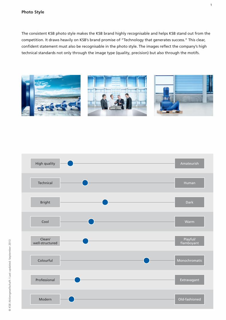
The consistent KSB photo style makes the KSB brand highly recognisable and helps KSB stand out from the
competition. It draws heavily on KSB’s brand promise of “Technology that generates success.” This clear,
confident statement must also be recognisable in the photo style. The images reflect the company’s high
technical standards not only through the image type (quality, precision) but also through the motifs.
High quality Amateurish
Technical Human
Bright Dark
Cool Warm
Clean/ well-structured
Playful/ flamboyant
Colourful Monochromatic
Professional Extravagant
Modern Old-fashioned
2©
KSB
Akt
ien
ges
ells
chaf
t / L
ast
up
dat
ed: S
epte
mb
er 2
013
Photo Style,
Key Aspects
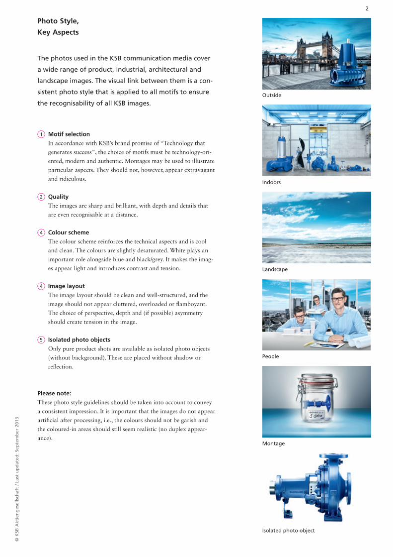
1 Motif selection
In accordance with KSB’s brand promise of “Technology that
generates success”, the choice of motifs must be technology-ori-
ented, modern and authentic. Montages may be used to illustrate
particular aspects. They should not, however, appear extravagant
and ridiculous.
2 Quality
The images are sharp and brilliant, with depth and details that
are even recognisable at a distance.
4 Colour scheme
The colour scheme reinforces the technical aspects and is cool
and clean. The colours are slightly desaturated. White plays an
important role alongside blue and black/grey. It makes the imag-
es appear light and introduces contrast and tension.
4 Image layout
The image layout should be clean and well-structured, and the
image should not appear cluttered, overloaded or fl amboyant.
The choice of perspective, depth and (if possible) asymmetry
should create tension in the image.
5 Isolated photo objects
Only pure product shots are available as isolated photo objects
(without background). These are placed without shadow or
refl ection.
Please note:
These photo style guidelines should be taken into account to convey
a consistent impression. It is important that the images do not appear
artifi cial after processing, i.e., the colours should not be garish and
the coloured-in areas should still seem realistic (no duplex appear-
ance).
The photos used in the KSB communication media cover
a wide range of product, industrial, architectural and
landscape images. The visual link between them is a con-
sistent photo style that is applied to all motifs to ensure
the recognisability of all KSB images.
Isolated photo object
Outside
Indoors
Landscape
People
Montage
3©
KSB
Akt
ien
ges
ells
chaf
t / L
ast
up
dat
ed: S
epte
mb
er 2
013
Photo Style,
Blue – Recommended Values for Outdoor Shots
Recommended values (outdoor shots)
Compared with the blue (cyan) value the red component is reduced and a
little yellow added. In the lighter shades, the amount of red decreases to a
greater extent than the amount of yellow. It is optimal when a slight red and
yellow component is still present especially in the bright areas and the grada-
tions of blue do not just consist of cyan.
Please note:
The blue gradations in the image should neither be purplish (-> too much
red) nor turquoise ( -> too much yellow).
All values are indicative and not absolute values.
The blue and the desaturated area dominate the image. With outdoor shots it appears stronger and more
intense depending on the light conditions than with indoor shots. The colour appears richer.
The blue essentially derives from KSB Blue (100c/60m/0y/10k). For use in images, the red component is some-
what reduced, as its gradations would appear too purplish.
90c / 34m / 10y / 25k
80c / 25m / 10y / 20k
65c / 13m / 10y / 6k
50c / 10m / 10y / 2k
30c / 6m / 9y / 0k
14c / 4m / 7y / 0k
90c / 35m / 10y / 25k
80c / 20m / 7y / 10k
67c / 1m / 7y / 0k
30c / 1m / 2y / 0k
Colour
The main colours for the new visual concept
are part of the KSB colour scheme: blue,
black/grey and white. In addition, one or
more optional accent colours can be used.
These three components ( 1 blue area, 2
area with reduced colour saturation (black/
grey), 3 accent colours) determine the
image style.
1
1
2
2
3
3
3
4©
KSB
Akt
ien
ges
ells
chaf
t / L
ast
up
dat
ed: S
epte
mb
er 2
013
Photo Style,
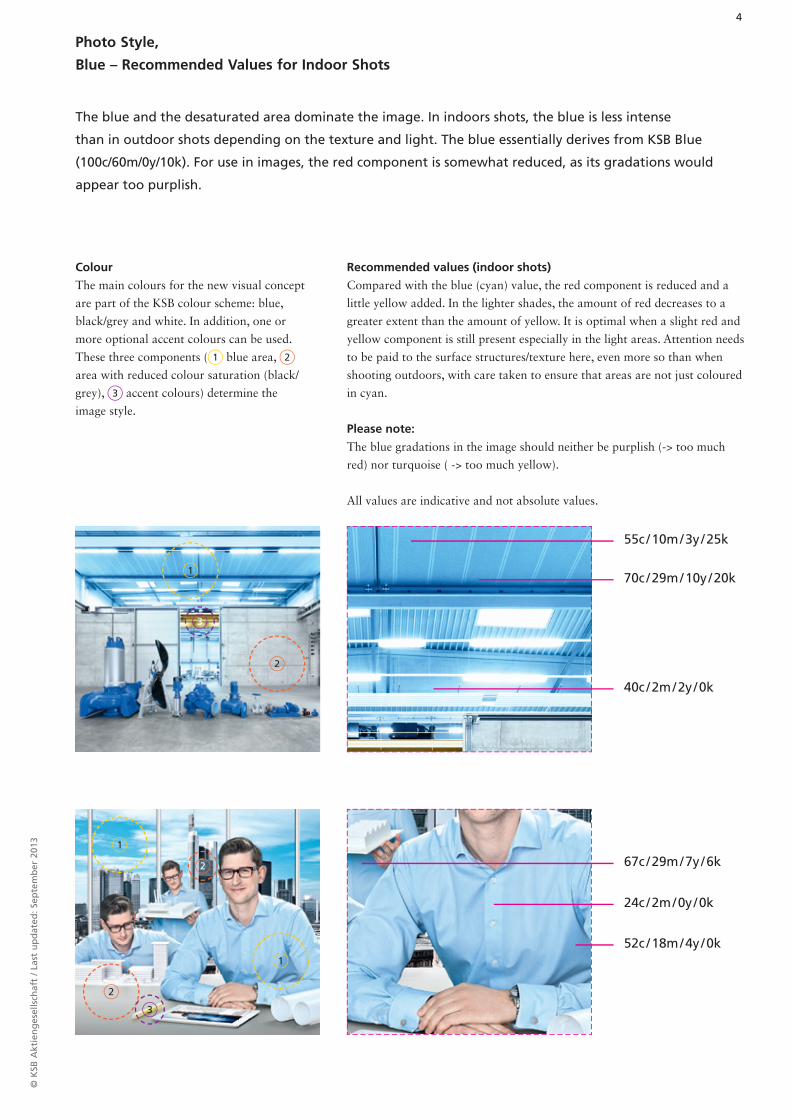
Blue – Recommended Values for Indoor Shots
Recommended values (indoor shots)
Compared with the blue (cyan) value, the red component is reduced and a
little yellow added. In the lighter shades, the amount of red decreases to a
greater extent than the amount of yellow. It is optimal when a slight red and
yellow component is still present especially in the light areas. Attention needs
to be paid to the surface structures/texture here, even more so than when
shooting outdoors, with care taken to ensure that areas are not just coloured
in cyan.
Please note:
The blue gradations in the image should neither be purplish (-> too much
red) nor turquoise ( -> too much yellow).
All values are indicative and not absolute values.
55c / 10m / 3y / 25k
70c / 29m / 10y / 20k
40c / 2m / 2y / 0k
67c / 29m / 7y / 6k
24c / 2m / 0y / 0k
52c / 18m / 4y / 0k
The blue and the desaturated area dominate the image. In indoors shots, the blue is less intense
than in outdoor shots depending on the texture and light. The blue essentially derives from KSB Blue
(100c/60m/0y/10k). For use in images, the red component is somewhat reduced, as its gradations would
appear too purplish.
Colour
The main colours for the new visual concept
are part of the KSB colour scheme: blue,
black/grey and white. In addition, one or
more optional accent colours can be used.
These three components ( 1 blue area, 2
area with reduced colour saturation (black/
grey), 3 accent colours) determine the
image style.
1
1
1
2
2
3
2
3
5©
KSB
Akt
ien
ges
ells
chaf
t / L
ast
up
dat
ed: S
epte
mb
er 2
013
Photo Style,
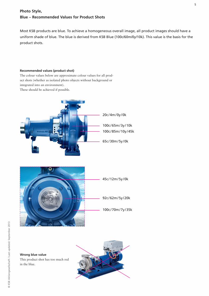
Blue – Recommended Values for Product Shots
Recommended values (product shot)
The colour values below are approximate colour values for all prod-
uct shots (whether as isolated photo objects without background or
integrated into an environment).
These should be achieved if possible.
Wrong blue value
This product shot has too much red
in the blue.
Most KSB products are blue. To achieve a homogeneous overall image, all product images should have a
uniform shade of blue. The blue is derived from KSB Blue (100c/60m/0y/10k). This value is the basis for the
product shots.
45c / 12m / 5y / 0k
92c / 62m / 5y / 20k
100c / 70m / 7y / 35k
20c / 4m / 0y / 0k
100c / 65m / 3y / 10k
100c / 85m / 10y / 45k
65c / 30m / 5y / 0k
6©
KSB
Akt
ien
ges
ells
chaf
t / L
ast
up
dat
ed: S
epte
mb
er 2
013
Photo Style,
Product Shots
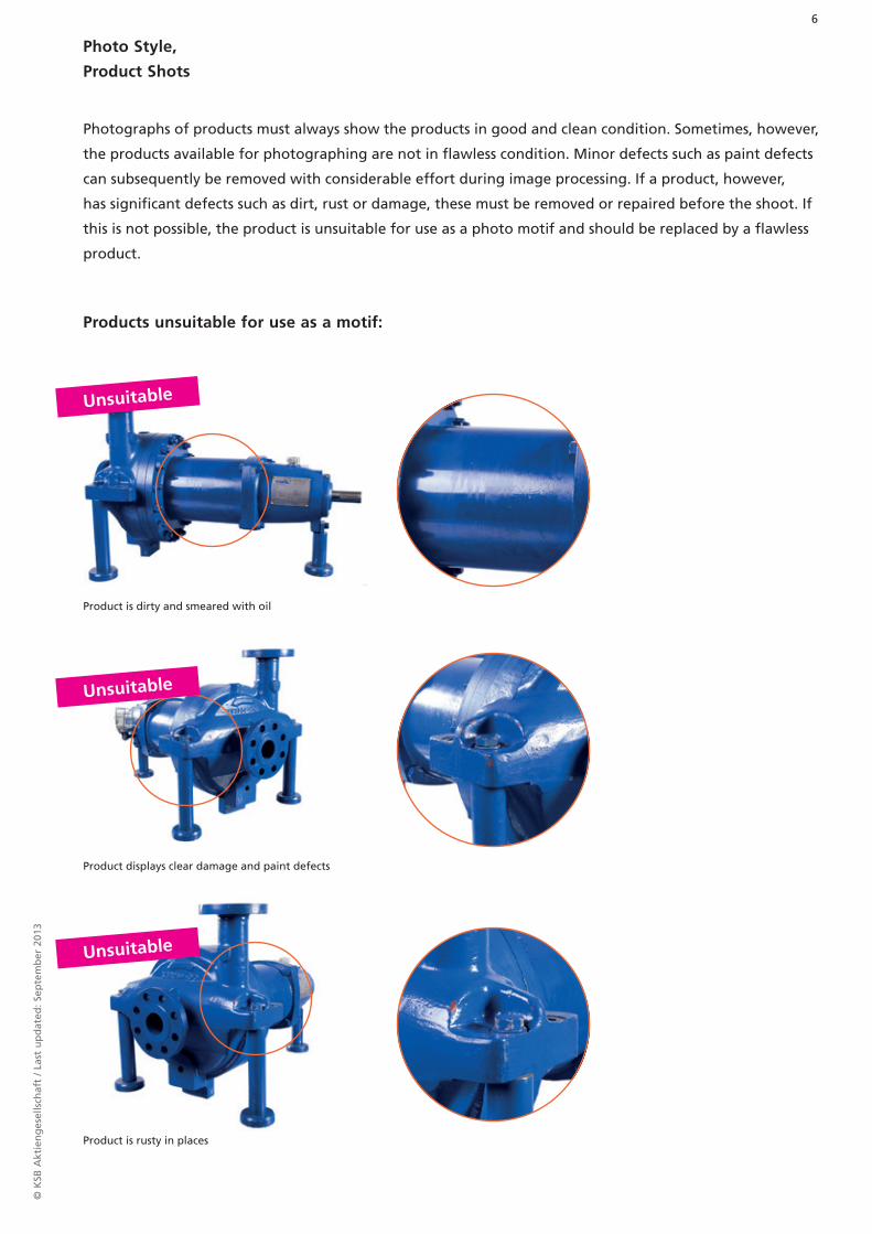
Products unsuitable for use as a motif:
Photographs of products must always show the products in good and clean condition. Sometimes, however,
the products available for photographing are not in flawless condition. Minor defects such as paint defects
can subsequently be removed with considerable effort during image processing. If a product, however,
has significant defects such as dirt, rust or damage, these must be removed or repaired before the shoot. If
this is not possible, the product is unsuitable for use as a photo motif and should be replaced by a flawless
product.
Product is dirty and smeared with oil
Product displays clear damage and paint defects
Product is rusty in places
Unsuitable
Unsuitable
Unsuitable
7©
KSB
Akt
ien
ges
ells
chaf
t / L
ast
up
dat
ed: S
epte
mb
er 2
013
Photo Style,
Editorial Images
Often the quality of images for editorial use is less than optimal.
They are sometimes too dark, too blurry or the colours are too
strong. The suitability of an image for a KSB publication can be
checked using a checklist:
Quick checklist:
1. Brightness: Is the image bright enough or can it be lightened?
2. Colour reduction: Are the colours in the image too bright, and can
they be reduced?
3. Shades of blue: Does the image contain enough shades of blue? Do
the blue gradations appear purplish or turquoise and can they be
reduced?
4. Accent colour: Are there one or more accent colours?
5. Sharpness: Is the image quality high and is it sharp?
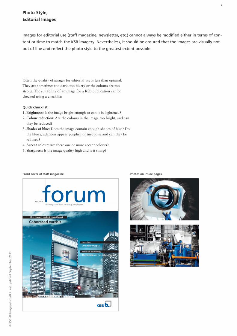
Front cover of staff magazine Photos on inside pages
Images for editorial use (staff magazine, newsletter, etc.) cannot always be modified either in terms of con-
tent or time to match the KSB imagery. Nevertheless, it should be ensured that the images are visually not
out of line and reflect the photo style to the greatest extent possible.
Caboresed earchit Mus consed molest eaqui blaut
voluptas excepta
Dis nonsequos nos intus, velendi
Interview
Materials technology
The Magazine for KSB Group Employees
Issue 4/2012
8©
KSB
Akt
ien
ges
ells
chaf
t / L
ast
up
dat
ed: S
epte
mb
er 2
013
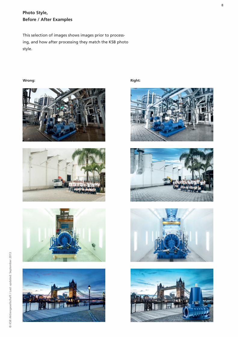
Photo Style,
Before / After Examples
Wrong: Right:
This selection of images shows images prior to process-
ing, and how after processing they match the KSB photo
style.
9©
KSB
Akt
ien
ges
ells
chaf
t / L
ast
up
dat
ed: S
epte
mb
er 2
013
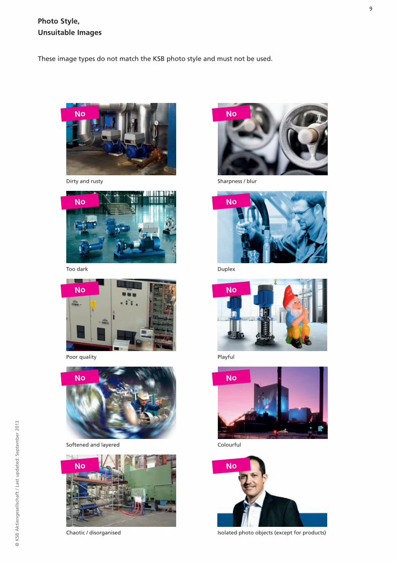
Photo Style,
Unsuitable Images
These image types do not match the KSB photo style and must not be used.
Dirty and rusty Sharpness / blur
Too dark Duplex
Poor quality Playful
Softened and layered
Chaotic / disorganised
Colourful
Isolated photo objects (except for products)
No
No
No
No
No
No
No
No
No
No