phar1811 - data analysis - garth tarrgarthtarr.com/wp-content/uploads/2013/08/phar1811_lns.pdf ·...
TRANSCRIPT
PHAR1811Data Analysis
GARTH TARR
SEMESTER 1, 2013
Motivation Notation Location Variation Graphs Bivariate
Outline
Introduction and Motivation
Notation, Definitions and Sigma Notation
Measures of Location
Measures of Variation
Visualising Data Using Tables and Graphs
Analysing Bivariate Data

Motivation Notation Location Variation Graphs Bivariate
Housekeeping
Contact Details
• Email: B [email protected]
• Room: 806 Carslaw Building
• Consultation: by appointment (email to arrange a time)
Weekly workshops
• Week 4: Tutorial
• Week 5: Computer lab
• Week 6: Quiz
Materials
• Í sydney.edu.au/science/maths/u/gartht/PHAR1811
Calculator
You need to bring a (non-programmable) calculator with you to alllectures, tutorials, labs and quizzes!
Motivation Notation Location Variation Graphs Bivariate
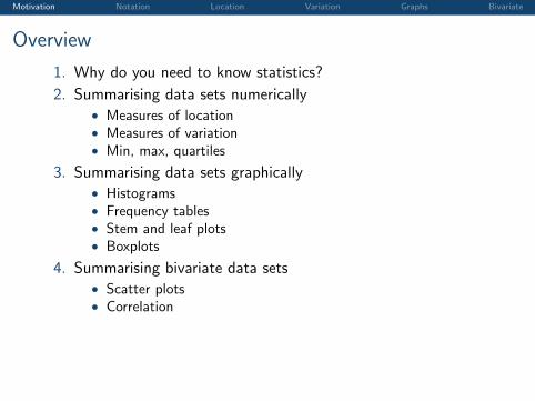
Overview
1. Why do you need to know statistics?
2. Summarising data sets numerically• Measures of location• Measures of variation• Min, max, quartiles
3. Summarising data sets graphically• Histograms• Frequency tables• Stem and leaf plots• Boxplots
4. Summarising bivariate data sets• Scatter plots• Correlation
Motivation Notation Location Variation Graphs Bivariate
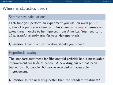
Where is statistics used?
Sample size calculations
Each time you perform an experiment you use, on average, 15grams of a particular chemical. This chemical is very expensive andtakes three months to be imported from America. You need to run10 successful experiments for your Honours thesis.
Question: How much of the drug should you order?
Hypothesis testing
The standard treatment for Rheumatoid arthritis had a measurableimprovement for 63% of people. A new drug trialled has beentrialled on 100 people. 68 people recorded a measurableimprovement.
Question: Is the new drug better than the standard treatment?
Motivation Notation Location Variation Graphs Bivariate
Where is statistics used?
Quality control
Pfizer manufactures 10,000 Sildenafil citrate1 tablets per hour. Arandom inspection of 500 tablets shows that 6 are of poor quality.The acceptable poor quality rating is 1% or lower.
Question: Is the production process working to the requiredstandard?
Describing data
You have blood pressure measurements for 10,000 individuals in anExcel worksheet.
Question: How do you present this data in a meaningful way?
1Commonly known as Viagra

Motivation Notation Location Variation Graphs Bivariate
Where is statistics used?
Business
You own a pharmacy. You think you sell more boxes of tissues inwinter than in summer. You have monthly sales data for tissues forthe past three years.
Question: How many tissues should you order each month?
Medicine
In the past, doctors did not wash their hands (or their surgicalinstruments) between patients. Florence Nightingale observed thatless patients died in wards where nurses washed their hands.
Question: Does washing your hands save lives?
Motivation Notation Location Variation Graphs Bivariate
Where is statistics used?
Predictive Modelling
Certain search terms are good indicators of flu activity. Google FluTrends uses aggregated Google search data to estimate current fluactivity around the world in near real-time.
Motivation Notation Location Variation Graphs Bivariate
Where is statistics used?
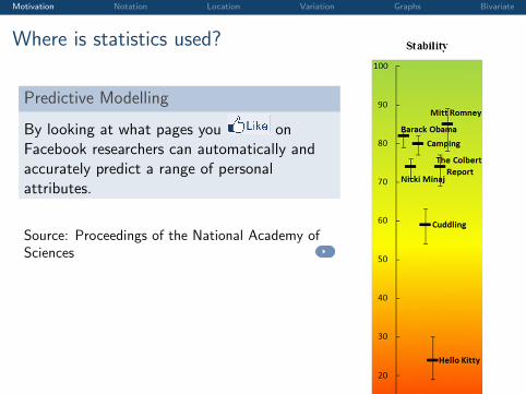
Predictive Modelling
By looking at what pages you onFacebook researchers can automatically andaccurately predict a range of personalattributes.
Source: Proceedings of the National Academy ofSciences
Fig. S1. Average levels of five personality traits and age of the users associated with selected Likes presented on the percentile scale. For example, the averageextraversion of users associated with “The Colbert Report” was relatively low: it was lower only for 23% of other Likes in the sample. Error bars signify 95%confidence intervals of the mean.
Kosinski et al. www.pnas.org/cgi/content/short/1218772110 3 of 6
Motivation Notation Location Variation Graphs Bivariate
What’s involved in a statistical study?
Statistics exist because of randomness, i.e. variability due tochance. To deal with this, statistical studies generally involve:
1. Experimental Design: How to collect data to best target thepopulation of interest and minimise bias.
2. Descriptive Statistics: Present the data in meaningful waysto look for patterns after the data are collected. Calculatesummary measures of location and variability to describepatterns.
3. Modelling: Fit an appropriate probability model to accountfor the patterns and variability in the data.
4. Inference: What does the observed sample tell us about the“target population”? How reliable is that information?
• Over the next two weeks we will consider step 2.
Motivation Notation Location Variation Graphs Bivariate
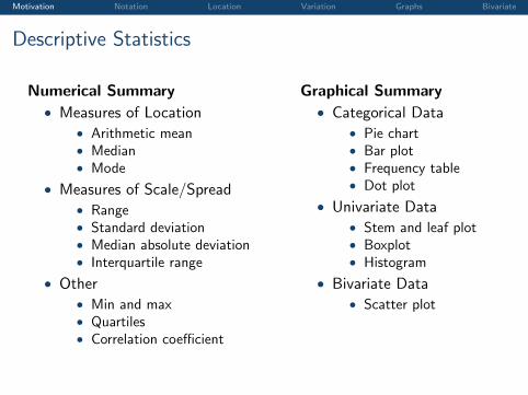
Descriptive Statistics
Numerical Summary
• Measures of Location• Arithmetic mean• Median• Mode
• Measures of Scale/Spread• Range• Standard deviation• Median absolute deviation• Interquartile range
• Other• Min and max• Quartiles• Correlation coefficient
Graphical Summary
• Categorical Data• Pie chart• Bar plot• Frequency table• Dot plot
• Univariate Data• Stem and leaf plot• Boxplot• Histogram
• Bivariate Data• Scatter plot
Motivation Notation Location Variation Graphs Bivariate
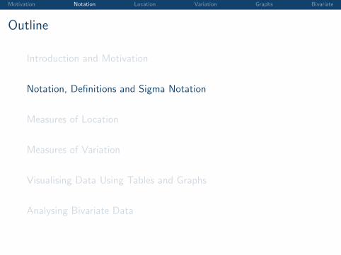
Outline
Introduction and Motivation
Notation, Definitions and Sigma Notation
Measures of Location
Measures of Variation
Visualising Data Using Tables and Graphs
Analysing Bivariate Data
Motivation Notation Location Variation Graphs Bivariate
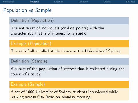
Population vs Sample
Definition (Population)
The entire set of individuals (or data points) with thecharacteristic that is of interest for a study.
Example (Population)
The set of all enrolled students across the University of Sydney.
Definition (Sample)
A subset of the population of interest that is collected during thecourse of a study.
Example (Sample)
A set of 1000 University of Sydney students interviewed whilewalking across City Road on Monday morning.
Motivation Notation Location Variation Graphs Bivariate
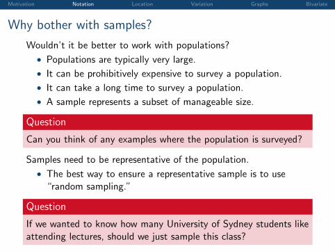
Why bother with samples?
Wouldn’t it be better to work with populations?
• Populations are typically very large.
• It can be prohibitively expensive to survey a population.
• It can take a long time to survey a population.
• A sample represents a subset of manageable size.
Question
Can you think of any examples where the population is surveyed?
Samples need to be representative of the population.
• The best way to ensure a representative sample is to use“random sampling.”
Question
If we wanted to know how many University of Sydney students likeattending lectures, should we just sample this class?
Motivation Notation Location Variation Graphs Bivariate
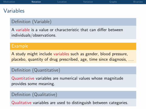
Variables
Definition (Variable)
A variable is a value or characteristic that can differ betweenindividuals/observations.
Example
A study might include variables such as gender, blood pressure,placebo, quantity of drug prescribed, age, time since diagnosis, . . .
Definition (Quantitative)
Quantitative variables are numerical values whose magnitudeprovides some meaning.
Definition (Qualitative)
Qualitative variables are used to distinguish between categories.
Motivation Notation Location Variation Graphs Bivariate
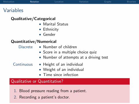
Variables
Qualitative/Categorical• Marital Status• Ethnicity• Gender
Quantitative/Numerical
Discrete • Number of children• Score in a multiple choice quiz• Number of attempts at a driving test
Continuous • Height of an individual• Weight of an individual• Time since infection
Qualitative or Quantitative?
1. Blood pressure reading from a patient.
2. Recording a patient’s doctor.
Motivation Notation Location Variation Graphs Bivariate
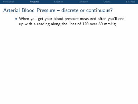
Arterial Blood Pressure – discrete or continuous?
• When you get your blood pressure measured often you’ll endup with a reading along the lines of 120 over 80 mmHg.
1.1.2 Estimating cardiac output from arterial blood pressure
Throughout the past century, the premise that CO could be estimated by analysis of thearterial blood pressure (ABP) waveform (Figure 1-3) has captured the attention of manyinvestigators. More than a dozen methods of calculating CO from ABP have been proposed,many of which are now commercially available. This approach to determine CO has thefollowing advantages:
• Obtaining ABP is non-invasive or minimally invasive.
• ABP waveforms are routinely measured in clinical settings such as ICUs.
• The ABP waveform is measured continuously, allowing for continuous CO estimates.
• Cost benefits: The transformation from ABP to CO requires only numerical compu-tation. No expensive equipment or expert technicians are required.
time [sec]
AB
P[m
mH
g]
0 0.5 1 1.5 2 2.5 340
60
80
100
Figure 1-3: The arterial blood pressure (ABP) waveform.
To understand the relation between pressure (ABP) and flow (CO), we first start witha very simple representation of the cardiovascular system. Shown in Figure 1-4, there aretwo blocks: the heart and the systemic circulation. Blood flows out of the heart with arate of q(t) and a corresponding arterial pressure P (t). Assuming that the internal state ofthe heart and the systemic circulation does not change, then it is plausible that higher flowcorresponds to higher pressure. Unfortunately, in real life, system states such as systemicresistance can dynamically change within seconds, giving rise to a much more complicatedpressure-flow relationship. The dozen or so methods of determining flow from pressureuse cardiovascular system models and represent the internal structure of the two blocks inFigure 1-4 with varying levels of complexity, thereby quantitatively relating P (t) and q(t).
Having so many di!erent P ! q relations existing today suggests that there is no con-sensus as to which method works best. Studies conducted in the past have mostly been onanimals or a small set of human subjects under well-controlled laboratory conditions. TheCO estimators have not been extensively evaluated with a large set of clinical ABP wave-forms, hence the performance of CO estimation is still uncertain. It is entirely possible thatthere will be circumstances in real world clinical practice in which these indirect methodsproduce unacceptable estimates. The main goal of the research presented in this thesis isto determine the performance of the CO estimators.
1.1.3 MIMIC II database & data quality
Before evaluating the performance of CO estimation, we must first establish a suitablestudy population that contains ABP waveform data and contemporaneous reference CO
16
• Continuous variable measured discretely. . .
Motivation Notation Location Variation Graphs Bivariate
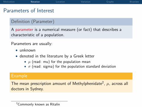
Parameters of Interest
Definition (Parameter)
A parameter is a numerical measure (or fact) that describes acharacteristic of a population.
Parameters are usually:
• unknown
• denoted in the literature by a Greek letter• µ (read: mu) for the population mean• σ (read: sigma) for the population standard deviation
Example
The mean prescription amount of Methylphenidate2, µ, across alldoctors in Sydney.
2Commonly known as Ritalin
Motivation Notation Location Variation Graphs Bivariate
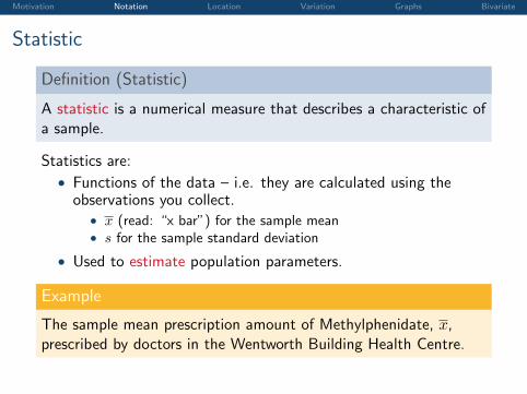
Statistic
Definition (Statistic)
A statistic is a numerical measure that describes a characteristic ofa sample.
Statistics are:
• Functions of the data – i.e. they are calculated using theobservations you collect.
• x (read: “x bar”) for the sample mean• s for the sample standard deviation
• Used to estimate population parameters.
Example
The sample mean prescription amount of Methylphenidate, x,prescribed by doctors in the Wentworth Building Health Centre.
Motivation Notation Location Variation Graphs Bivariate
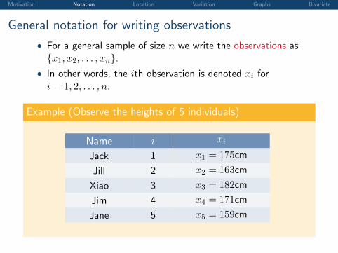
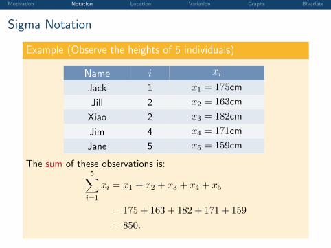
General notation for writing observations
• For a general sample of size n we write the observations as{x1, x2, . . . , xn}.
• In other words, the ith observation is denoted xi fori = 1, 2, . . . , n.
Example (Observe the heights of 5 individuals)
Name i xi
Jack 1 x1 = 175cm
Jill 2 x2 = 163cm
Xiao 3 x3 = 182cm
Jim 4 x4 = 171cm
Jane 5 x5 = 159cm
Motivation Notation Location Variation Graphs Bivariate
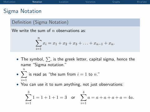
Sigma Notation
Definition (Sigma Notation)
We write the sum of n observations as:
n∑i=1
xi = x1 + x2 + x3 + . . .+ xn−1 + xn.
• The symbol,∑
, is the greek letter, capital sigma, hence thename “Sigma notation.”
•n∑
i=1
is read as “the sum from i = 1 to n.”
• You can use it to sum anything, not just observations:
3∑i=1
1 = 1 + 1 + 1 = 3 or4∑
i=1
a = a+ a+ a+ a = 4a.
Motivation Notation Location Variation Graphs Bivariate
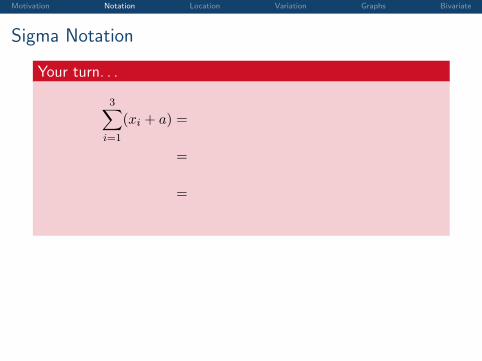
Sigma Notation
Your turn. . .
3∑i=1
(xi + a) =
(x1 + a) + (x2 + a) + (x3 + a)
=
(x1 + x2 + x3) + (a+ a+ a)
=
3∑i=1
xi + 3a
Motivation Notation Location Variation Graphs Bivariate
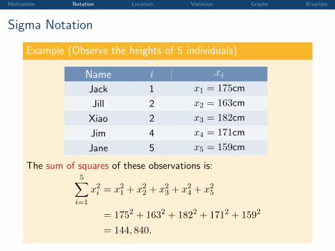
Sigma Notation
Example (Observe the heights of 5 individuals)
Name i xi
Jack 1 x1 = 175cm
Jill 2 x2 = 163cm
Xiao 2 x3 = 182cm
Jim 4 x4 = 171cm
Jane 5 x5 = 159cm
The sum of these observations is:5∑
i=1
xi = x1 + x2 + x3 + x4 + x5
= 175 + 163 + 182 + 171 + 159
= 850.
Motivation Notation Location Variation Graphs Bivariate
Sigma Notation
Example (Observe the heights of 5 individuals)
Name i xi
Jack 1 x1 = 175cm
Jill 2 x2 = 163cm
Xiao 2 x3 = 182cm
Jim 4 x4 = 171cm
Jane 5 x5 = 159cm
The sum of squares of these observations is:5∑
i=1
x2i = x21 + x22 + x23 + x24 + x25
= 1752 + 1632 + 1822 + 1712 + 1592
= 144, 840.
Motivation Notation Location Variation Graphs Bivariate
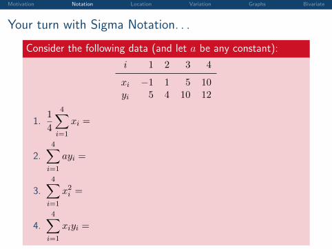
Your turn with Sigma Notation. . .
Consider the following data (and let a be any constant):
i 1 2 3 4
xi −1 1 5 10yi 5 4 10 12
1.1
4
4∑i=1
xi =
2.4∑
i=1
ayi =
3.4∑
i=1
x2i =
4.4∑
i=1
xiyi =
Motivation Notation Location Variation Graphs Bivariate
Outline
Introduction and Motivation
Notation, Definitions and Sigma Notation
Measures of Location
Measures of Variation
Visualising Data Using Tables and Graphs
Analysing Bivariate Data
Motivation Notation Location Variation Graphs Bivariate
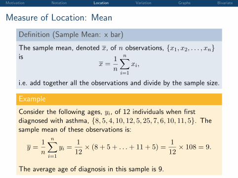
Measure of Location: Mean
Definition (Sample Mean: x bar)
The sample mean, denoted x, of n observations, {x1, x2, . . . , xn}is
x =1
n
n∑i=1
xi,
i.e. add together all the observations and divide by the sample size.
Example
Consider the following ages, yi, of 12 individuals when firstdiagnosed with asthma, {8, 5, 4, 10, 12, 5, 25, 7, 6, 10, 11, 5}. Thesample mean of these observations is:
y =1
n
n∑i=1
yi =1
12× (8 + 5 + . . .+ 11 + 5) =
1
12× 108 = 9.
The average age of diagnosis in this sample is 9.
Motivation Notation Location Variation Graphs Bivariate
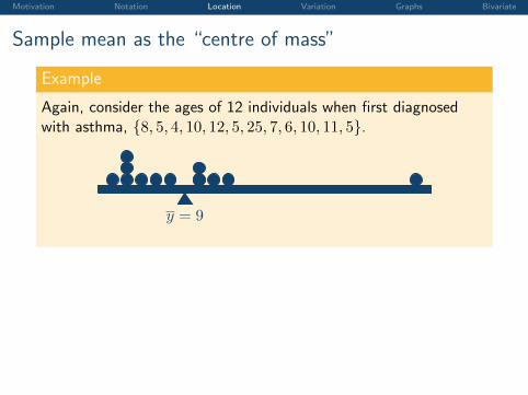
Sample mean as the “centre of mass”
Example
Again, consider the ages of 12 individuals when first diagnosedwith asthma, {8, 5, 4, 10, 12, 5, 25, 7, 6, 10, 11, 5}.
y = 9
Motivation Notation Location Variation Graphs Bivariate
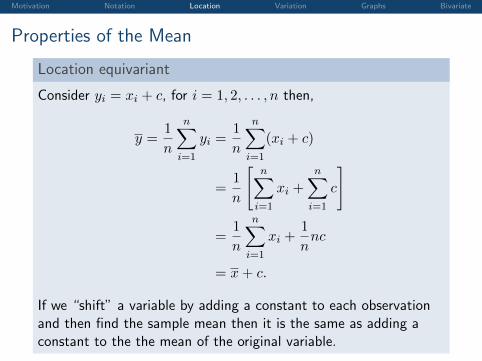
Properties of the Mean
Location equivariant
Consider yi = xi + c, for i = 1, 2, . . . , n then,
y =1
n
n∑i=1
yi =1
n
n∑i=1
(xi + c)
=1
n
[n∑
i=1
xi +n∑
i=1
c
]
=1
n
n∑i=1
xi +1
nnc
= x+ c.
If we “shift” a variable by adding a constant to each observationand then find the sample mean then it is the same as adding aconstant to the the mean of the original variable.
Motivation Notation Location Variation Graphs Bivariate
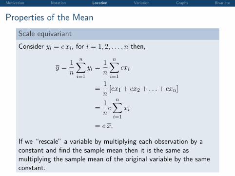
Properties of the Mean
Scale equivariant
Consider yi = c xi, for i = 1, 2, . . . , n then,
y =1
n
n∑i=1
yi =1
n
n∑i=1
cxi
=1
n[cx1 + cx2 + . . .+ cxn]
=1
nc
n∑i=1
xi
= c x.
If we “rescale” a variable by multiplying each observation by aconstant and find the sample mean then it is the same asmultiplying the sample mean of the original variable by the sameconstant.
Motivation Notation Location Variation Graphs Bivariate
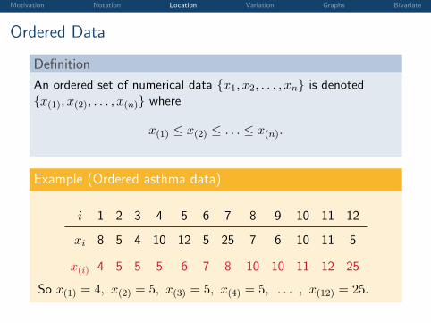
Ordered Data
Definition
An ordered set of numerical data {x1, x2, . . . , xn} is denoted{x(1), x(2), . . . , x(n)} where
x(1) ≤ x(2) ≤ . . . ≤ x(n).
Example (Ordered asthma data)
i 1 2 3 4 5 6 7 8 9 10 11 12
xi 8 5 4 10 12 5 25 7 6 10 11 5
x(i) 4 5 5 5 6 7 8 10 10 11 12 25
So x(1) = 4, x(2) = 5, x(3) = 5, x(4) = 5, . . . , x(12) = 25.
Motivation Notation Location Variation Graphs Bivariate
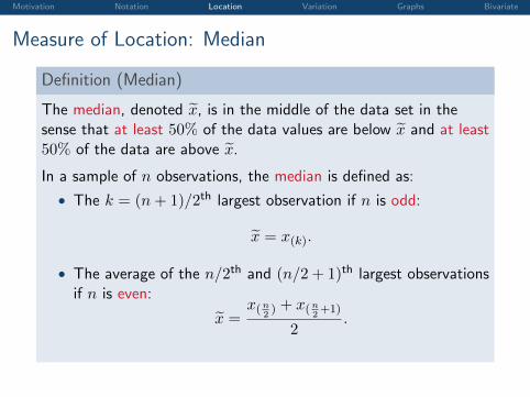
Measure of Location: Median
Definition (Median)
The median, denoted x̃, is in the middle of the data set in thesense that at least 50% of the data values are below x̃ and at least50% of the data are above x̃.
In a sample of n observations, the median is defined as:
• The k = (n+ 1)/2th largest observation if n is odd:
x̃ = x(k).
• The average of the n/2th and (n/2 + 1)th largest observationsif n is even:
x̃ =x(n
2) + x(n
2+1)
2.
Motivation Notation Location Variation Graphs Bivariate
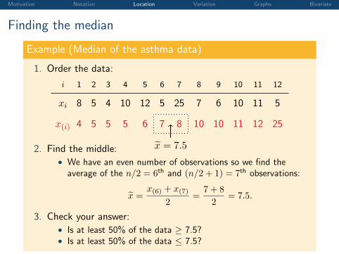
Finding the median
Example (Median of the asthma data)
1. Order the data:
i 1 2 3 4 5 6 7 8 9 10 11 12
xi 8 5 4 10 12 5 25 7 6 10 11 5
x(i) 4 5 5 5 6 7 8 10 10 11 12 25
x̃ = 7.52. Find the middle:• We have an even number of observations so we find the
average of the n/2 = 6th and (n/2 + 1) = 7th observations:
x̃ =x(6) + x(7)
2=
7 + 8
2= 7.5.
3. Check your answer:• Is at least 50% of the data ≥ 7.5?• Is at least 50% of the data ≤ 7.5?
Motivation Notation Location Variation Graphs Bivariate
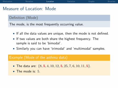
Measure of Location: Mode
Definition (Mode)
The mode, is the most frequently occurring value.
• If all the data values are unique, then the mode is not defined.
• If two values are both share the highest frequency. Thesample is said to be ‘bimodal’.
• Similarly you can have ‘trimodal’ and ‘multimodal’ samples.
Example (Mode of the asthma data)
• The data are: {8,5, 4, 10, 12,5, 25, 7, 6, 10, 11,5}.• The mode is: 5.
Motivation Notation Location Variation Graphs Bivariate
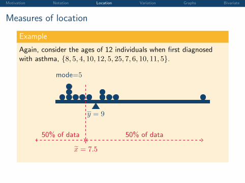
Measures of location
Example
Again, consider the ages of 12 individuals when first diagnosedwith asthma, {8, 5, 4, 10, 12, 5, 25, 7, 6, 10, 11, 5}.
y = 9
x̃ = 7.5
50% of data50% of data
mode=5
Motivation Notation Location Variation Graphs Bivariate
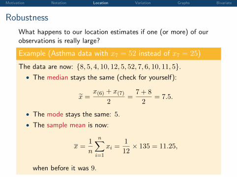
Robustness
What happens to our location estimates if one (or more) of ourobservations is really large?
Example (Asthma data with x7 = 52 instead of x7 = 25)
The data are now: {8, 5, 4, 10, 12, 5, 52, 7, 6, 10, 11, 5}.• The median stays the same (check for yourself):
x̃ =x(6) + x(7)
2=
7 + 8
2= 7.5.
• The mode stays the same: 5.
• The sample mean is now:
x =1
n
n∑i=1
xi =1
12× 135 = 11.25,
when before it was 9.
Motivation Notation Location Variation Graphs Bivariate
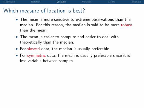
Which measure of location is best?
• The mean is more sensitive to extreme observations than themedian. For this reason, the median is said to be more robustthan the mean.
• The mean is easier to compute and easier to deal withtheoretically than the median.
• For skewed data, the median is usually preferable.
• For symmetric data, the mean is usually preferable since it isless variable between samples.
Motivation Notation Location Variation Graphs Bivariate
Outline
Introduction and Motivation
Notation, Definitions and Sigma Notation
Measures of Location
Measures of Variation
Visualising Data Using Tables and Graphs
Analysing Bivariate Data
Motivation Notation Location Variation Graphs Bivariate
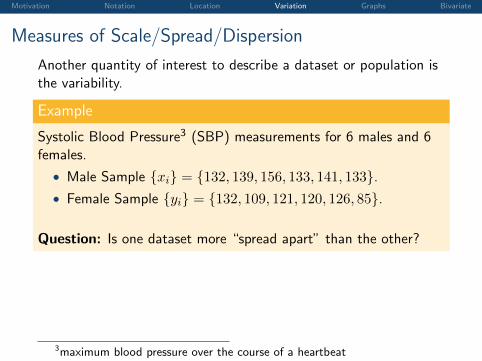
Measures of Scale/Spread/Dispersion
Another quantity of interest to describe a dataset or population isthe variability.
Example
Systolic Blood Pressure3 (SBP) measurements for 6 males and 6females.
• Male Sample {xi} = {132, 139, 156, 133, 141, 133}.• Female Sample {yi} = {132, 109, 121, 120, 126, 85}.
Question: Is one dataset more “spread apart” than the other?
3maximum blood pressure over the course of a heartbeat
Motivation Notation Location Variation Graphs Bivariate
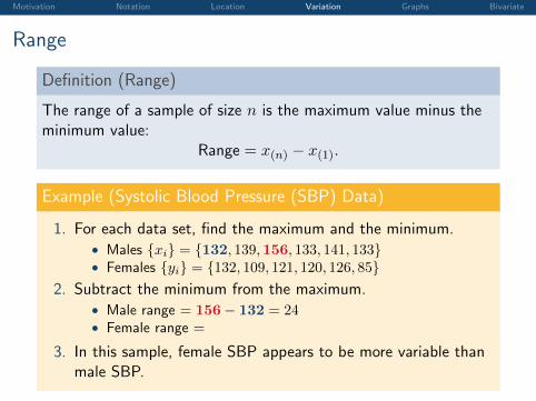
Range
Definition (Range)
The range of a sample of size n is the maximum value minus theminimum value:
Range = x(n) − x(1).
Example (Systolic Blood Pressure (SBP) Data)
1. For each data set, find the maximum and the minimum.• Males {xi} = {132, 139,156, 133, 141, 133}• Females {yi} = {132, 109, 121, 120, 126, 85}
2. Subtract the minimum from the maximum.• Male range = 156− 132 = 24• Female range =
132− 85 = 47
3. In this sample, female SBP appears to be more variable thanmale SBP.
Motivation Notation Location Variation Graphs Bivariate
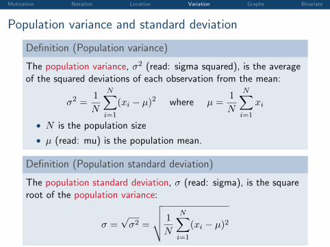
Population variance and standard deviation
Definition (Population variance)
The population variance, σ2 (read: sigma squared), is the averageof the squared deviations of each observation from the mean:
σ2 =1
N
N∑i=1
(xi − µ)2 where µ =1
N
N∑i=1
xi
• N is the population size
• µ (read: mu) is the population mean.
Definition (Population standard deviation)
The population standard deviation, σ (read: sigma), is the squareroot of the population variance:
σ =√σ2 =
√√√√ 1
N
N∑i=1
(xi − µ)2
Motivation Notation Location Variation Graphs Bivariate
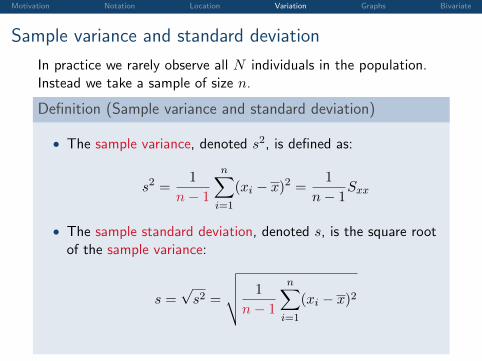
Sample variance and standard deviation
In practice we rarely observe all N individuals in the population.Instead we take a sample of size n.
Definition (Sample variance and standard deviation)
• The sample variance, denoted s2, is defined as:
s2 =1
n− 1
n∑i=1
(xi − x)2 =1
n− 1Sxx
• The sample standard deviation, denoted s, is the square rootof the sample variance:
s =√s2 =
√√√√ 1
n− 1
n∑i=1
(xi − x)2
Motivation Notation Location Variation Graphs Bivariate
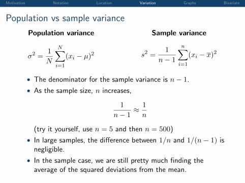
Population vs sample variance
Population variance
σ2 =1
N
N∑i=1
(xi − µ)2
Sample variance
s2 =1
n− 1
n∑i=1
(xi − x)2
• The denominator for the sample variance is n− 1.
• As the sample size, n increases,
1
n− 1≈ 1
n
(try it yourself, use n = 5 and then n = 500)
• In large samples, the difference between 1/n and 1/(n− 1) isnegligible.
• In the sample case, we are still pretty much finding theaverage of the squared deviations from the mean.
Motivation Notation Location Variation Graphs Bivariate
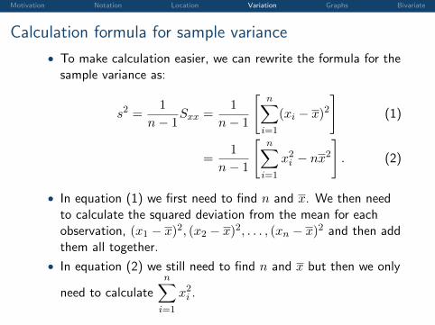
Calculation formula for sample variance
• To make calculation easier, we can rewrite the formula for thesample variance as:
s2 =1
n− 1Sxx =
1
n− 1
[n∑
i=1
(xi − x)2]
(1)
=1
n− 1
[n∑
i=1
x2i − nx2]. (2)
• In equation (1) we first need to find n and x. We then needto calculate the squared deviation from the mean for eachobservation, (x1 − x)2, (x2 − x)2, . . . , (xn − x)2 and then addthem all together.
• In equation (2) we still need to find n and x but then we only
need to calculaten∑
i=1
x2i .
Motivation Notation Location Variation Graphs Bivariate
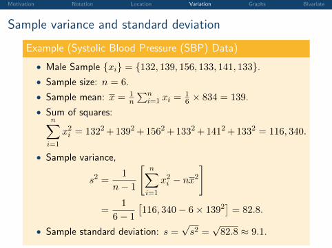
Sample variance and standard deviation
Example (Systolic Blood Pressure (SBP) Data)
• Male Sample {xi} = {132, 139, 156, 133, 141, 133}.• Sample size: n = 6.
• Sample mean: x = 1n
∑ni=1 xi =
16 × 834 = 139.
• Sum of squares:n∑
i=1
x2i = 1322+1392+1562+1332+1412+1332 = 116, 340.
• Sample variance,
s2 =1
n− 1
[n∑
i=1
x2i − nx2]
=1
6− 1
[116, 340− 6× 1392
]= 82.8.
• Sample standard deviation: s =√s2 =
√82.8 ≈ 9.1.
Motivation Notation Location Variation Graphs Bivariate
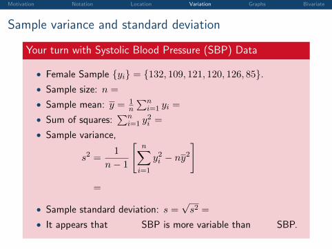
Sample variance and standard deviation
Your turn with Systolic Blood Pressure (SBP) Data
• Female Sample {yi} = {132, 109, 121, 120, 126, 85}.• Sample size: n =
6.
• Sample mean: y = 1n
∑ni=1 yi =
16 × 693 = 115.5.
• Sum of squares:∑n
i=1 y2i =
81, 447.
• Sample variance,
s2 =1
n− 1
[n∑
i=1
y2i − ny2]
=
1
6− 1
[81, 447− 6× (115.5)2
]= 281.1.
• Sample standard deviation: s =√s2 =
√281.1 ≈ 16.8.
• It appears that
female
SBP is more variable than
male
SBP.
Motivation Notation Location Variation Graphs Bivariate
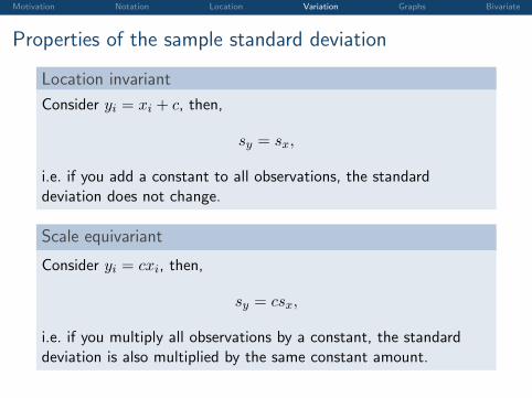
Properties of the sample standard deviation
Location invariant
Consider yi = xi + c, then,
sy = sx,
i.e. if you add a constant to all observations, the standarddeviation does not change.
Scale equivariant
Consider yi = cxi, then,
sy = csx,
i.e. if you multiply all observations by a constant, the standarddeviation is also multiplied by the same constant amount.
Motivation Notation Location Variation Graphs Bivariate
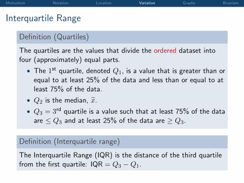
Interquartile Range
Definition (Quartiles)
The quartiles are the values that divide the ordered dataset intofour (approximately) equal parts.
• The 1st quartile, denoted Q1, is a value that is greater than orequal to at least 25% of the data and less than or equal to atleast 75% of the data.
• Q2 is the median, x̃.
• Q3 = 3rd quartile is a value such that at least 75% of the dataare ≤ Q3 and at least 25% of the data are ≥ Q3.
Definition (Interquartile range)
The Interquartile Range (IQR) is the distance of the third quartilefrom the first quartile: IQR = Q3 −Q1.
Motivation Notation Location Variation Graphs Bivariate
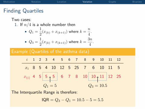
Finding Quartiles
Two cases:1. If n/4 is a whole number then
• Q1 =1
2(x(k) + x(k+1)) where k =
n
4.
• Q3 =1
2(x(k) + x(k+1)) where k =
3n
4.
Example (Quartiles of the asthma data)
i 1 2 3 4 5 6 7 8 9 10 11 12
xi 8 5 4 10 12 5 25 7 6 10 11 5
x(i) 4 5 5 5 6 7 8 10 10 11 12 25
Q1 = 5 Q3 = 10.5
The Interquartile Range is therefore:
IQR = Q3 −Q1 = 10.5− 5 = 5.5
Motivation Notation Location Variation Graphs Bivariate
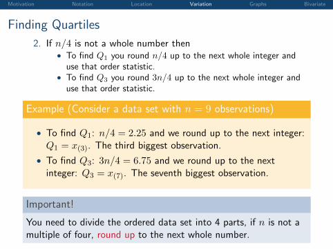
Finding Quartiles
2. If n/4 is not a whole number then• To find Q1 you round n/4 up to the next whole integer and
use that order statistic.• To find Q3 you round 3n/4 up to the next whole integer and
use that order statistic.
Example (Consider a data set with n = 9 observations)
• To find Q1: n/4 = 2.25 and we round up to the next integer:Q1 = x(3). The third biggest observation.
• To find Q3: 3n/4 = 6.75 and we round up to the nextinteger: Q3 = x(7). The seventh biggest observation.
Important!
You need to divide the ordered data set into 4 parts, if n is not amultiple of four, round up to the next whole number.
Motivation Notation Location Variation Graphs Bivariate
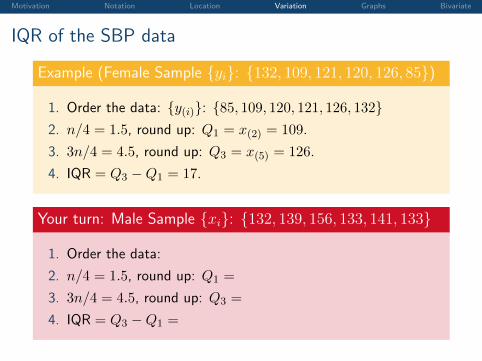
IQR of the SBP data
Example (Female Sample {yi}: {132, 109, 121, 120, 126, 85})
1. Order the data: {y(i)}: {85, 109, 120, 121, 126, 132}2. n/4 = 1.5, round up: Q1 = x(2) = 109.
3. 3n/4 = 4.5, round up: Q3 = x(5) = 126.
4. IQR = Q3 −Q1 = 17.
Your turn: Male Sample {xi}: {132, 139, 156, 133, 141, 133}
1. Order the data:
{x(i)}: {132, 133, 133, 139, 141, 156}
2. n/4 = 1.5, round up: Q1 =
x(2) = 133.
3. 3n/4 = 4.5, round up: Q3 =
x(5) = 141.
4. IQR = Q3 −Q1 =
8.
Motivation Notation Location Variation Graphs Bivariate
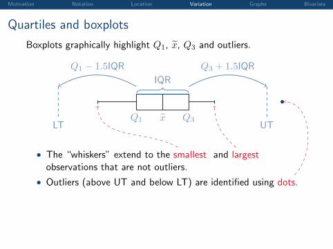
Quartiles and boxplots
Boxplots graphically highlight Q1, x̃, Q3 and outliers.
Q1 Q3x̃
IQR
UTLT
Q3 + 1.5IQRQ1 − 1.5IQR
• The “whiskers” extend to the smallest and largestobservations that are not outliers.
• Outliers (above UT and below LT) are identified using dots.
Motivation Notation Location Variation Graphs Bivariate
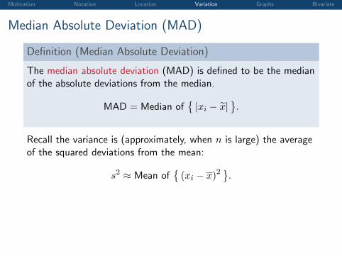
Median Absolute Deviation (MAD)
Definition (Median Absolute Deviation)
The median absolute deviation (MAD) is defined to be the medianof the absolute deviations from the median.
MAD = Median of{|xi − x̃|
}.
Recall the variance is (approximately, when n is large) the averageof the squared deviations from the mean:
s2 ≈ Mean of{(xi − x)2
}.
Motivation Notation Location Variation Graphs Bivariate
Median Absolute Deviation (MAD)
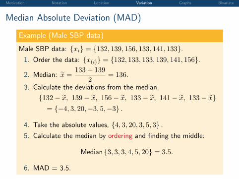
Example (Male SBP data)
Male SBP data: {xi} = {132, 139, 156, 133, 141, 133}.1. Order the data: {x(i)} = {132, 133, 133, 139, 141, 156}.
2. Median: x̃ =133 + 139
2= 136.
3. Calculate the deviations from the median.
{132− x̃, 139− x̃, 156− x̃, 133− x̃, 141− x̃, 133− x̃}= {−4, 3, 20,−3, 5,−3} .
4. Take the absolute values, {4, 3, 20, 3, 5, 3} .5. Calculate the median by ordering and finding the middle:
Median {3, 3, 3, 4, 5, 20} = 3.5.
6. MAD = 3.5.
Motivation Notation Location Variation Graphs Bivariate
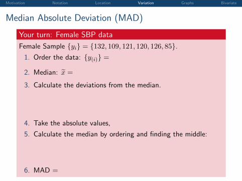
Median Absolute Deviation (MAD)
Your turn: Female SBP data
Female Sample {yi} = {132, 109, 121, 120, 126, 85}.1. Order the data: {y(i)} =
{85, 109, 120, 121, 126, 132} .
2. Median: x̃ =
120 + 121
2= 120.5.
3. Calculate the deviations from the median.
{132− x̃, 109− x̃, 121− x̃, 120− x̃, 126− x̃, 85− x̃}= {11.5,−11.5, 0.5,−0.5, 5.5,−35.5} .
4. Take the absolute values,
{11.5, 11.5, 0.5, 0.5, 5.5, 35.5} .
5. Calculate the median by ordering and finding the middle:
Median {0.5, 0.5, 5.5, 11.5, 11.5, 35.5} = 8.5.
6. MAD =
8.5.
Motivation Notation Location Variation Graphs Bivariate
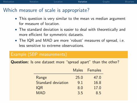
Which measure of scale is appropriate?
• This question is very similar to the mean vs median argumentfor measure of location.
• The standard deviation is easier to deal with theoretically andmore efficient for symmetric datasets.
• The IQR and MAD are more ‘robust’ measures of spread, i.e.less sensitive to extreme observations.
Example (SBP measurements)
Question: Is one dataset more “spread apart” than the other?
Males Females
Range 25.0 47.0Standard deviation 9.1 16.8IQR 8.0 17.0MAD 3.5 8.5
Motivation Notation Location Variation Graphs Bivariate
Outline
Introduction and Motivation
Notation, Definitions and Sigma Notation
Measures of Location
Measures of Variation
Visualising Data Using Tables and Graphs
Analysing Bivariate Data
Motivation Notation Location Variation Graphs Bivariate
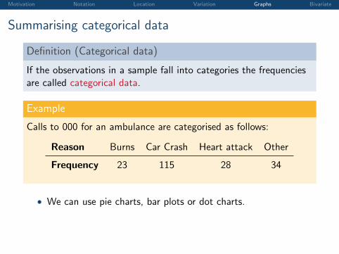
Summarising categorical data
Definition (Categorical data)
If the observations in a sample fall into categories the frequenciesare called categorical data.
Example
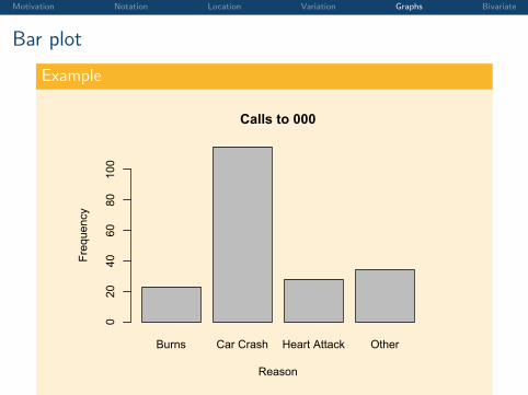
Calls to 000 for an ambulance are categorised as follows:
Reason Burns Car Crash Heart attack Other
Frequency 23 115 28 34
• We can use pie charts, bar plots or dot charts.
Motivation Notation Location Variation Graphs Bivariate
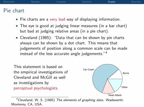
Pie chart
• Pie charts are a very bad way of displaying information.
• The eye is good at judging linear measures (in a bar chart)but bad at judging relative areas (in a pie chart).
• Cleveland (1985): “Data that can be shown by pie chartsalways can be shown by a dot chart. This means thatjudgements of position along a common scale can be madeinstead of the less accurate angle judgements.”4
This statement is based onthe empirical investigations ofCleveland and McGill as wellas investigations byperceptual psychologists.
BurnsCar Crash
Heart Attack
Other
Calls to 000
4Cleveland, W. S. (1985) The elements of graphing data. Wadsworth:Monterey, CA, USA.
Motivation Notation Location Variation Graphs Bivariate
Bar plot
Example
Burns Car Crash Heart Attack Other
Calls to 000
Reason
Frequency
020
4060
80100
Motivation Notation Location Variation Graphs Bivariate
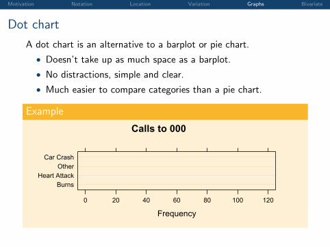
Dot chart
A dot chart is an alternative to a barplot or pie chart.
• Doesn’t take up as much space as a barplot.
• No distractions, simple and clear.
• Much easier to compare categories than a pie chart.
Example
Calls to 000
Frequency
BurnsHeart Attack
OtherCar Crash
0 20 40 60 80 100 120
Motivation Notation Location Variation Graphs Bivariate
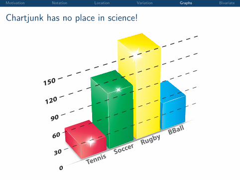
Chartjunk has no place in science!
Rugby
Soccer
BBall
Tennis
Motivation Notation Location Variation Graphs Bivariate
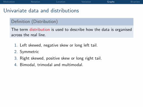
Univariate data and distributions
Definition (Distribution)
The term distribution is used to describe how the data is organisedacross the real line.
1. Left skewed, negative skew or long left tail.
2. Symmetric
3. Right skewed, positive skew or long right tail.
4. Bimodal, trimodal and multimodal.
Motivation Notation Location Variation Graphs Bivariate
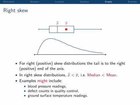
Right skew
x̃ x
• For right (positive) skew distributions the tail is to the right(positive) end of the axis.
• In right skew distributions, x̃ < x, i.e. Median < Mean.
• Examples might include:• blood pressure readings,• defect counts in quality control,• ground surface temperature readings.
Motivation Notation Location Variation Graphs Bivariate
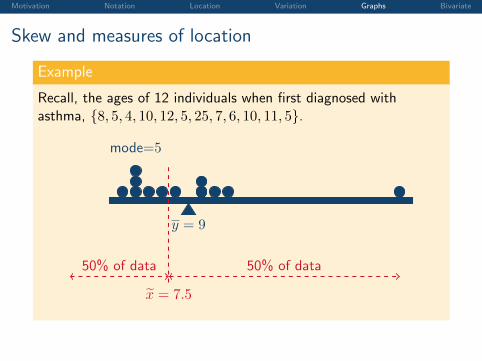
Skew and measures of location
Example
Recall, the ages of 12 individuals when first diagnosed withasthma, {8, 5, 4, 10, 12, 5, 25, 7, 6, 10, 11, 5}.
y = 9
x̃ = 7.5
50% of data50% of data
mode=5
Motivation Notation Location Variation Graphs Bivariate
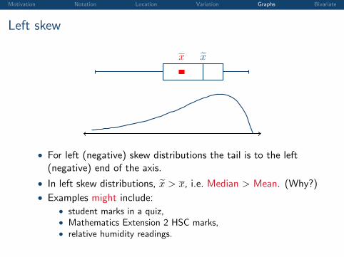
Left skew
x̃x
• For left (negative) skew distributions the tail is to the left(negative) end of the axis.
• In left skew distributions, x̃ > x, i.e. Median > Mean. (Why?)
• Examples might include:• student marks in a quiz,• Mathematics Extension 2 HSC marks,• relative humidity readings.
Motivation Notation Location Variation Graphs Bivariate
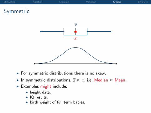
Symmetric
x̃
x
• For symmetric distributions there is no skew.
• In symmetric distributions, x̃ ≈ x, i.e. Median ≈ Mean.
• Examples might include:• height data,• IQ results,• birth weight of full term babies.
Motivation Notation Location Variation Graphs Bivariate
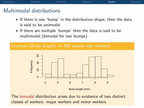
Multimodal distributions
• If there is one ‘bump’ in the distribution shape, then the datais said to be unimodal.
• If there are multiple ‘bumps’ then the data is said to bemultimodal (bimodal for two bumps).
Example (Body lengths of 300 weaver ant workers)
Body length (mm)
Frequency
4 5 6 7 8 9
020
4060
The bimodal distribution arises due to existence of two distinctclasses of workers: major workers and minor workers.
Motivation Notation Location Variation Graphs Bivariate
Frequency tables
Definition (Frequency table)
A frequency table is able to summarise a large dataset to helpidentify patterns while retaining all the information in the data set.For each unique value (or class) in the frequency table thefrequency of occurrences is recorded.
Motivation Notation Location Variation Graphs Bivariate
Frequency tables
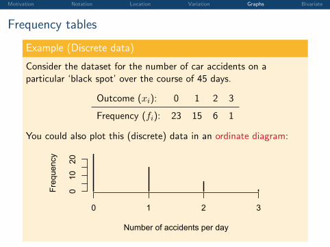
Example (Discrete data)
Consider the dataset for the number of car accidents on aparticular ‘black spot’ over the course of 45 days.
Outcome (xi): 0 1 2 3
Frequency (fi): 23 15 6 1
You could also plot this (discrete) data in an ordinate diagram:
010
20
Car Accidents
Number of accidents per day
Frequency
0 1 2 3
Motivation Notation Location Variation Graphs Bivariate
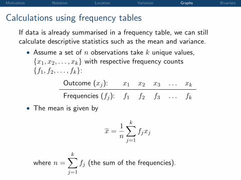
Calculations using frequency tables
If data is already summarised in a frequency table, we can stillcalculate descriptive statistics such as the mean and variance.
• Assume a set of n observations take k unique values,{x1, x2, . . . , xk} with respective frequency counts{f1, f2, . . . , fk}:
Outcome (xj): x1 x2 x3 . . . xk
Frequencies (fj): f1 f2 f3 . . . fk
• The mean is given by
x =1
n
k∑j=1
fjxj
where n =
k∑j=1
fj (the sum of the frequencies).
Motivation Notation Location Variation Graphs Bivariate
Calculations using frequency tables
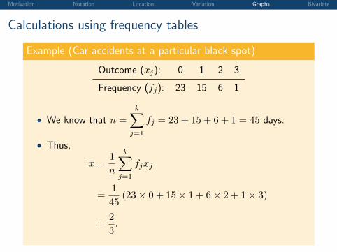
Example (Car accidents at a particular black spot)
Outcome (xj): 0 1 2 3
Frequency (fj): 23 15 6 1
• We know that n =
k∑j=1
fj = 23 + 15 + 6 + 1 = 45 days.
• Thus,
x =1
n
k∑j=1
fjxj
=1
45(23× 0 + 15× 1 + 6× 2 + 1× 3)
=2
3.
Motivation Notation Location Variation Graphs Bivariate
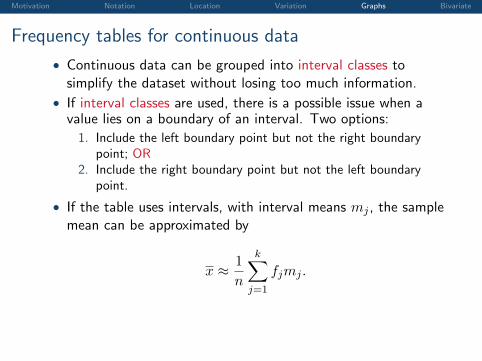
Frequency tables for continuous data
• Continuous data can be grouped into interval classes tosimplify the dataset without losing too much information.
• If interval classes are used, there is a possible issue when avalue lies on a boundary of an interval. Two options:
1. Include the left boundary point but not the right boundarypoint; OR
2. Include the right boundary point but not the left boundarypoint.
• If the table uses intervals, with interval means mj , the samplemean can be approximated by
x ≈ 1
n
k∑j=1
fjmj .
Motivation Notation Location Variation Graphs Bivariate
Frequency tables
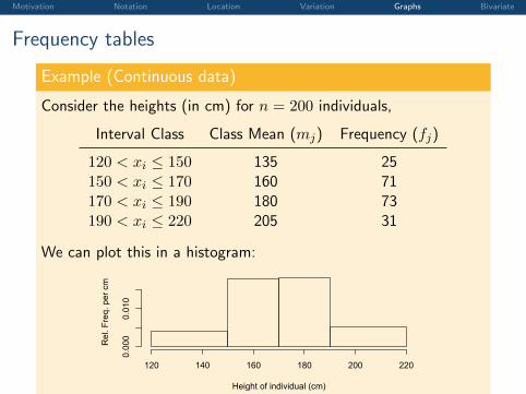
Example (Continuous data)
Consider the heights (in cm) for n = 200 individuals,
Interval Class Class Mean (mj) Frequency (fj)
120 < xi ≤ 150 135 25150 < xi ≤ 170 160 71170 < xi ≤ 190 180 73190 < xi ≤ 220 205 31
We can plot this in a histogram:
Height of individual (cm)
Rel
. Fre
q. p
er c
m
120 140 160 180 200 220
0.000
0.010
Motivation Notation Location Variation Graphs Bivariate
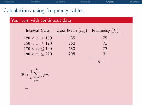
Calculations using frequency tables
Your turn with continuous data
Interval Class Class Mean (mj) Frequency (fj)
120 < xi ≤ 150 135 25150 < xi ≤ 170 160 71170 < xi ≤ 190 180 73190 < xi ≤ 220 205 31
n =
200
x ≈ 1
n
k∑j=1
fjmj
=
1
200(135× 25 + 160× 71 + 180× 73 + 205× 31)
=
171.15
Motivation Notation Location Variation Graphs Bivariate
Histograms
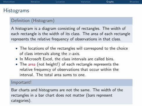
Definition (Histogram)
A histogram is a diagram consisting of rectangles. The width ofeach rectangle is the width of its class. The area of each rectanglerepresents the relative frequency of observations in that class.
• The locations of the rectangles will correspond to the choiceof class intervals along the x-axis.
• In Microsoft Excel, the class intervals are called bins.• The area (not height!) of each rectangle represents the
relative frequency of observations that occur within theinterval. The total area sums to one.
Important!
Bar charts and histograms are not the same. The width of therectangles in a bar chart does not matter (bars representcategories).
Motivation Notation Location Variation Graphs Bivariate
Histograms
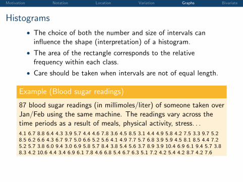
• The choice of both the number and size of intervals caninfluence the shape (interpretation) of a histogram.
• The area of the rectangle corresponds to the relativefrequency within each class.
• Care should be taken when intervals are not of equal length.
Example (Blood sugar readings)
87 blood sugar readings (in millimoles/liter) of someone taken overJan/Feb using the same machine. The readings vary across thetime periods as a result of meals, physical activity, stress. . .
4.1 6.7 8.8 6.4 4.3 3.9 5.7 4.4 4.6 7.8 3.6 4.5 8.5 3.1 4.4 4.9 5.8 4.2 7.5 3.3 9.7 5.28.5 6.2 6.6 4.3 6.7 9.7 5.0 6.6 5.2 5.6 4.1 4.9 7.7 5.7 6.8 3.9 5.9 4.5 8.1 8.5 4.4 7.25.2 5.7 3.8 6.0 9.4 3.0 6.9 5.8 5.7 8.4 3.8 5.4 5.6 3.7 8.9 3.9 10.4 6.9 6.1 9.4 5.7 3.88.3 4.2 10.6 4.4 3.4 6.9 6.1 7.8 4.6 6.8 5.4 6.7 6.3 5.1 7.2 4.2 5.4 4.2 8.7 4.2 7.6
Motivation Notation Location Variation Graphs Bivariate
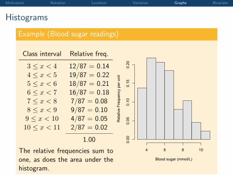
Histograms
Example (Blood sugar readings)
Class interval Relative freq.
3 ≤ x < 4 12/87 = 0.144 ≤ x < 5 19/87 = 0.225 ≤ x < 6 18/87 = 0.216 ≤ x < 7 16/87 = 0.187 ≤ x < 8 7/87 = 0.088 ≤ x < 9 9/87 = 0.109 ≤ x < 10 4/87 = 0.0510 ≤ x < 11 2/87 = 0.02
1.00
The relative frequencies sum toone, as does the area under thehistogram.
Blood sugar (mmol/L)
Rel
ativ
e Fr
eque
ncy
per u
nit
4 6 8 10
0.00
0.05
0.10
0.15
0.20
Motivation Notation Location Variation Graphs Bivariate
Histograms
Example (Blood sugar readings)
Class interval Rel. Freq.
3 ≤ x < 3.5 4/87 = 0.053.5 ≤ x < 4 8/87 = 0.09
......
10 ≤ x < 10.5 1/87 = 0.0110.5 ≤ x < 11 1/87 = 0.01
1.00
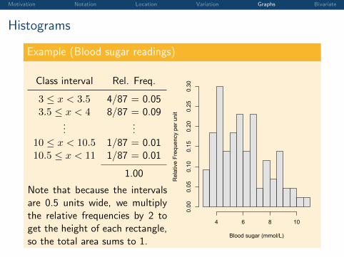
Note that because the intervalsare 0.5 units wide, we multiplythe relative frequencies by 2 toget the height of each rectangle,so the total area sums to 1.
Blood sugar (mmol/L)
Rel
ativ
e Fr
eque
ncy
per u
nit
4 6 8 10
0.00
0.05
0.10
0.15
0.20
0.25
0.30
Motivation Notation Location Variation Graphs Bivariate
Histograms
Example (Blood sugar readings)
Class int. Relative freq.
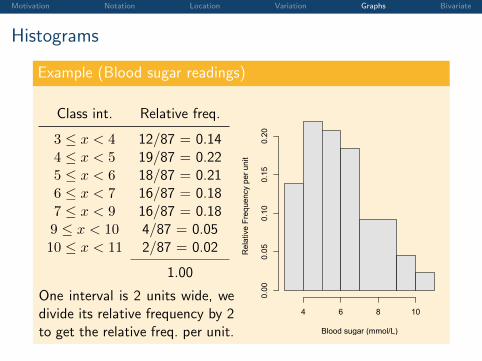
3 ≤ x < 4 12/87 = 0.144 ≤ x < 5 19/87 = 0.225 ≤ x < 6 18/87 = 0.216 ≤ x < 7 16/87 = 0.187 ≤ x < 9 16/87 = 0.189 ≤ x < 10 4/87 = 0.0510 ≤ x < 11 2/87 = 0.02
1.00
One interval is 2 units wide, wedivide its relative frequency by 2to get the relative freq. per unit. Blood sugar (mmol/L)
Rel
ativ
e Fr
eque
ncy
per u
nit
4 6 8 10
0.00
0.05
0.10
0.15
0.20
Motivation Notation Location Variation Graphs Bivariate
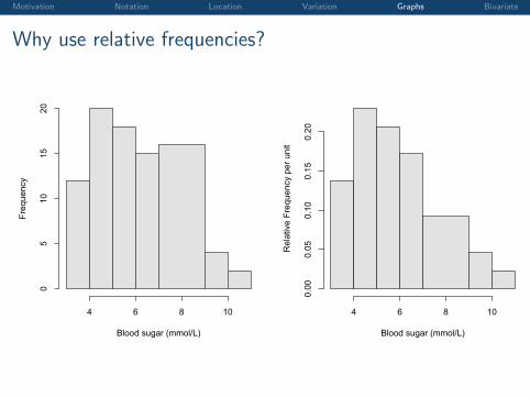
Why use relative frequencies?
Blood sugar (mmol/L)
Frequency
4 6 8 10
05
1015
20
Blood sugar (mmol/L)
Rel
ativ
e Fr
eque
ncy
per u
nit
4 6 8 100.00
0.05
0.10
0.15
0.20
Motivation Notation Location Variation Graphs Bivariate
Stem and Leaf Plots
• The stem-and-leaf provides a simple and easy way tosummarise data and display the shape.
• It retains all data information and shows their distribution.
• It is suitable for relatively small data sets.
Procedure:
1. Separate each data point into stem components and a leafcomponent. The leaf is in general the least significant figure(last digit).
2. Write all stem digits left of a vertical line.
3. Write all leaf digits right of the vertical line.
4. Re-arrange each leaf digit so each row is ordered – this makesit easier to find the median and quartiles!
5. State the scale, e.g. “the leaf is the 1st decimal place”.
Motivation Notation Location Variation Graphs Bivariate
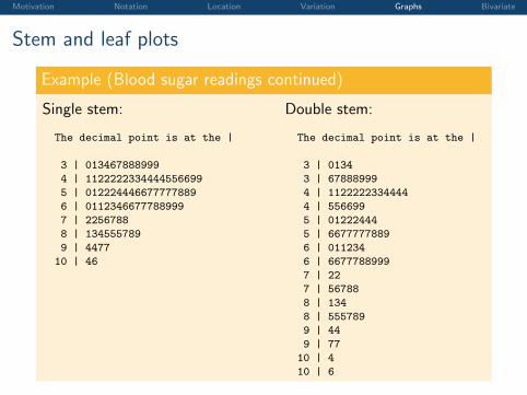
Stem and leaf plots
Example (Blood sugar readings continued)
Single stem:
The decimal point is at the |
3 | 013467888999
4 | 1122222334444556699
5 | 012224446677777889
6 | 0112346677788999
7 | 2256788
8 | 134555789
9 | 4477
10 | 46
Double stem:
The decimal point is at the |
3 | 0134
3 | 67888999
4 | 1122222334444
4 | 556699
5 | 01222444
5 | 6677777889
6 | 011234
6 | 6677788999
7 | 22
7 | 56788
8 | 134
8 | 555789
9 | 44
9 | 77
10 | 4
10 | 6
Motivation Notation Location Variation Graphs Bivariate
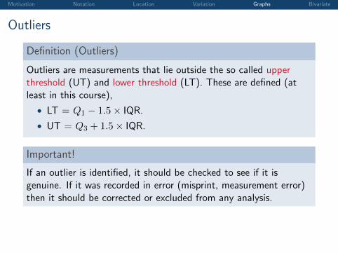
Outliers
Definition (Outliers)
Outliers are measurements that lie outside the so called upperthreshold (UT) and lower threshold (LT). These are defined (atleast in this course),
• LT = Q1 − 1.5× IQR.
• UT = Q3 + 1.5× IQR.
Important!
If an outlier is identified, it should be checked to see if it isgenuine. If it was recorded in error (misprint, measurement error)then it should be corrected or excluded from any analysis.
Motivation Notation Location Variation Graphs Bivariate
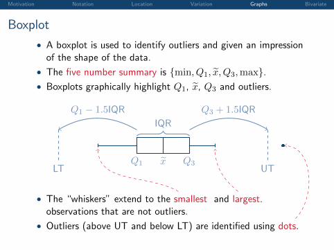
Boxplot
• A boxplot is used to identify outliers and given an impressionof the shape of the data.
• The five number summary is {min, Q1, x̃, Q3,max}.• Boxplots graphically highlight Q1, x̃, Q3 and outliers.
Q1 Q3x̃
IQR
UTLT
Q3 + 1.5IQRQ1 − 1.5IQR
• The “whiskers” extend to the smallest and largest.observations that are not outliers.
• Outliers (above UT and below LT) are identified using dots.
Motivation Notation Location Variation Graphs Bivariate
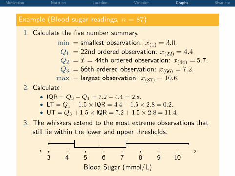
Example (Blood sugar readings, n = 87)
1. Calculate the five number summary.
min = smallest observation: x(1) = 3.0.Q1 = 22nd ordered observation: x(22) = 4.4.Q2 = x̃ = 44th ordered observation: x(44) = 5.7.Q3 = 66th ordered observation: x(66) = 7.2.
max = largest observation: x(87) = 10.6.
2. Calculate• IQR = Q3 −Q1 = 7.2− 4.4 = 2.8.• LT = Q1 − 1.5× IQR = 4.4− 1.5× 2.8 = 0.2.• UT = Q3 + 1.5× IQR = 7.2 + 1.5× 2.8 = 11.4.
3. The whiskers extend to the most extreme observations thatstill lie within the lower and upper thresholds.
Blood Sugar (mmol/L)
3 4 5 6 7 8 9 10
Blood Sugar (mmol/L)
3 4 5 6 7 8 9 10
Motivation Notation Location Variation Graphs Bivariate
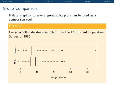
Group Comparison
If data is split into several groups, boxplots can be used as acomparison tool.
Example
Consider 534 individuals sampled from the US Current PopulationSurvey of 1985.
Male
Female
0 10 20 30 40
Wage ($/hour)
Motivation Notation Location Variation Graphs Bivariate
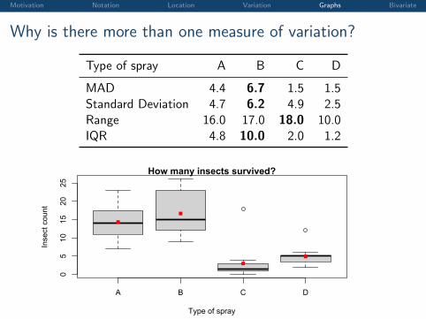
Why is there more than one measure of variation?
Type of spray A B C D
MAD 4.4 6.7 1.5 1.5Standard Deviation 4.7 6.2 4.9 2.5Range 16.0 17.0 18.0 10.0IQR 4.8 10.0 2.0 1.2
A B C D
05
1015
2025
How many insects survived?
Type of spray
Inse
ct c
ount
XKCD
Motivation Notation Location Variation Graphs Bivariate
Outline
Introduction and Motivation
Notation, Definitions and Sigma Notation
Measures of Location
Measures of Variation
Visualising Data Using Tables and Graphs
Analysing Bivariate Data
Motivation Notation Location Variation Graphs Bivariate
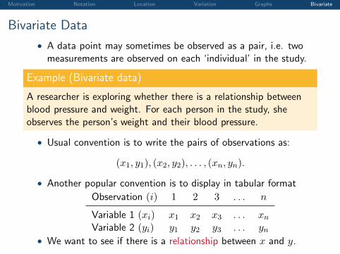
Bivariate Data
• A data point may sometimes be observed as a pair, i.e. twomeasurements are observed on each ‘individual’ in the study.
Example (Bivariate data)
A researcher is exploring whether there is a relationship betweenblood pressure and weight. For each person in the study, sheobserves the person’s weight and their blood pressure.
• Usual convention is to write the pairs of observations as:
(x1, y1), (x2, y2), . . . , (xn, yn).
• Another popular convention is to display in tabular format
Observation (i) 1 2 3 . . . n
Variable 1 (xi) x1 x2 x3 . . . xnVariable 2 (yi) y1 y2 y3 . . . yn
• We want to see if there is a relationship between x and y.
Motivation Notation Location Variation Graphs Bivariate
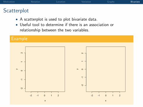
Scatterplot
• A scatterplot is used to plot bivariate data.• Useful tool to determine if there is an association or
relationship between the two variables.
Example
-2 -1 0 1 2
-2-1
01
2
x
y
-2 -1 0 1 2
-2-1
01
2
x
y
Motivation Notation Location Variation Graphs Bivariate
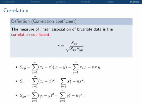
Correlation
Definition (Correlation coefficient)
The measure of linear association of bivariate data is thecorrelation coefficient,
r =Sxy√SxxSyy
.
• Sxy =
n∑i=1
(xi − x)(yi − y) =n∑
i=1
xiyi − nx y.
• Sxx =
n∑i=1
(xi − x)2 =n∑
i=1
x2i − nx2.
• Syy =
n∑i=1
(yi − y)2 =n∑
i=1
y2i − ny2.
Motivation Notation Location Variation Graphs Bivariate
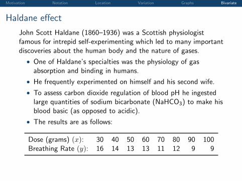
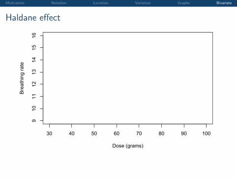
Haldane effect
John Scott Haldane (1860–1936) was a Scottish physiologistfamous for intrepid self-experimenting which led to many importantdiscoveries about the human body and the nature of gases.
• One of Haldane’s specialties was the physiology of gasabsorption and binding in humans.
• He frequently experimented on himself and his second wife.
• To assess carbon dioxide regulation of blood pH he ingestedlarge quantities of sodium bicarbonate (NaHCO3) to make hisblood basic (as opposed to acidic).
• The results are as follows:
Dose (grams) (x): 30 40 50 60 70 80 90 100Breathing Rate (y): 16 14 13 13 11 12 9 9
Motivation Notation Location Variation Graphs Bivariate
Haldane effect
30 40 50 60 70 80 90 100
910
1112
1314
1516
Dose (grams)
Bre
athi
ng ra
te
Motivation Notation Location Variation Graphs Bivariate
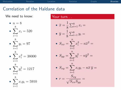
Correlation of the Haldane data
We need to know:
• n = 8
•8∑
i=1
xi = 520
•8∑
i=1
yi = 97
•8∑
i=1
x2i = 38000
•8∑
i=1
y2i = 1217
•8∑
i=1
xiyi = 5910
Your turn. . .
• x =1
8
∑8i=1 xi =
65
• y =1
8
∑8i=1 yi =
12.125
• Sxx =
n∑i=1
x2i − nx2 =
4200
• Syy =
n∑i=1
y2i − ny2 =
40.875
• Sxy =n∑
i=1
xiyi − nx y =
− 395
• r = Sxy√SxxSyy
=
− 0.953.
Motivation Notation Location Variation Graphs Bivariate
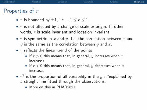
Properties of r
• r is bounded by ±1, i.e. −1 ≤ r ≤ 1.
• r is not affected by a change of scale or origin. In otherwords, r is scale invariant and location invariant.
• r is symmetric in x and y. I.e. the correlation between x andy is the same as the correlation between y and x.
• r reflects the linear trend of the points• If r > 0 this means that, in general, y increases when x
increases• If r < 0 this means that, in general, y decreases when x
increases
• r2 is the proportion of all variability in the y’s “explained by”a straight line fitted through the observations.
• More on this in PHAR2821!
Motivation Notation Location Variation Graphs Bivariate
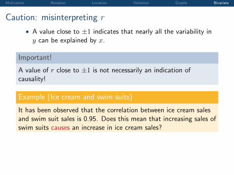
Caution: misinterpreting r
• A value close to ±1 indicates that nearly all the variability iny can be explained by x.
Important!
A value of r close to ±1 is not necessarily an indication ofcausality!
Example (Ice cream and swim suits)
It has been observed that the correlation between ice cream salesand swim suit sales is 0.95. Does this mean that increasing sales ofswim suits causes an increase in ice cream sales?
Motivation Notation Location Variation Graphs Bivariate
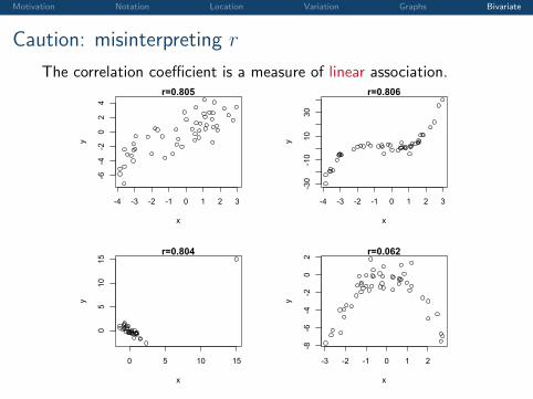
Caution: misinterpreting r
The correlation coefficient is a measure of linear association.
-4 -3 -2 -1 0 1 2 3
-6-4
-20
24
r=0.805
x
y
-4 -3 -2 -1 0 1 2 3
-30
-10
1030
r=0.806
x
y
0 5 10 15
05
1015
r=0.804
x
y
-3 -2 -1 0 1 2
-8-6
-4-2
02 r=0.062
x
y
Motivation Notation Location Variation Graphs Bivariate
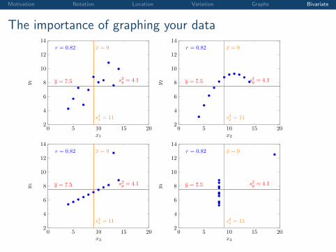
The importance of graphing your data
0 5 10 15 202
4
6
8
10
12
14
y = 7.5 s2y = 4.1
x = 9
s2x = 11
r = 0.82
x1
y 1
0 5 10 15 202
4
6
8
10
12
14
y = 7.5 s2y = 4.1
x = 9
s2x = 11
r = 0.82
x2
y 2
0 5 10 15 202
4
6
8
10
12
14
y = 7.5 s2y = 4.1
x = 9
s2x = 11
r = 0.82
x3
y 3
0 5 10 15 202
4
6
8
10
12
14
y = 7.5 s2y = 4.1
x = 9
s2x = 11
r = 0.82
x4
y 4
Motivation Notation Location Variation Graphs Bivariate
References
F.J. Anscombe.Graphs in Statistical Analysis.The American Statistician, 27(1):17–21, 1973.
M.C. Phipps and M.P. Quine.A Primer Statistics.Pearson Education Australia, 4th edition, 2001.
J.A. Rice.Mathematical statistics and data analysis.Duxbury Press, 1995.
H. Rosling.The Joy of Stats – 200 Countries, 200 Years, 4 Minutes.BBC Four, 2010.
XKCD