peer feedback(1) 3
TRANSCRIPT
Peer Feedback
name
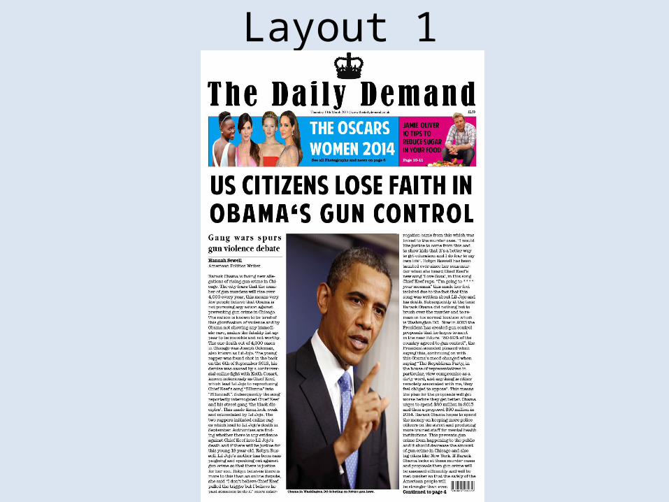
Layout 1
Feedback 1What do you like about the design?
I particularly like the crown logo in the middle above the font as it works well because it is the same colour as the font. I also like the banner of advertisements across the top width of the page as it helps break up the page and adds colour as well as drawing more attention to the publication. I like the overall look of the page as it looks clean and is well presented. I think the 3 columns work well as it makes it easy to read and understand as well as looking modern. What areas of the idea could be developed? I think the font could be developed slightly more to make the headlines more eye catching and give the newspapers name more of a signature look. The ‘gang wars spurs gun violence debate’ headline font could be changed slightly as it looks a bit spread out between each letter making It harder to read a bolder font could also be used. I also think that the photograph of Barack Obama could be made smaller to allow for more text and it not to fill up the whole column.
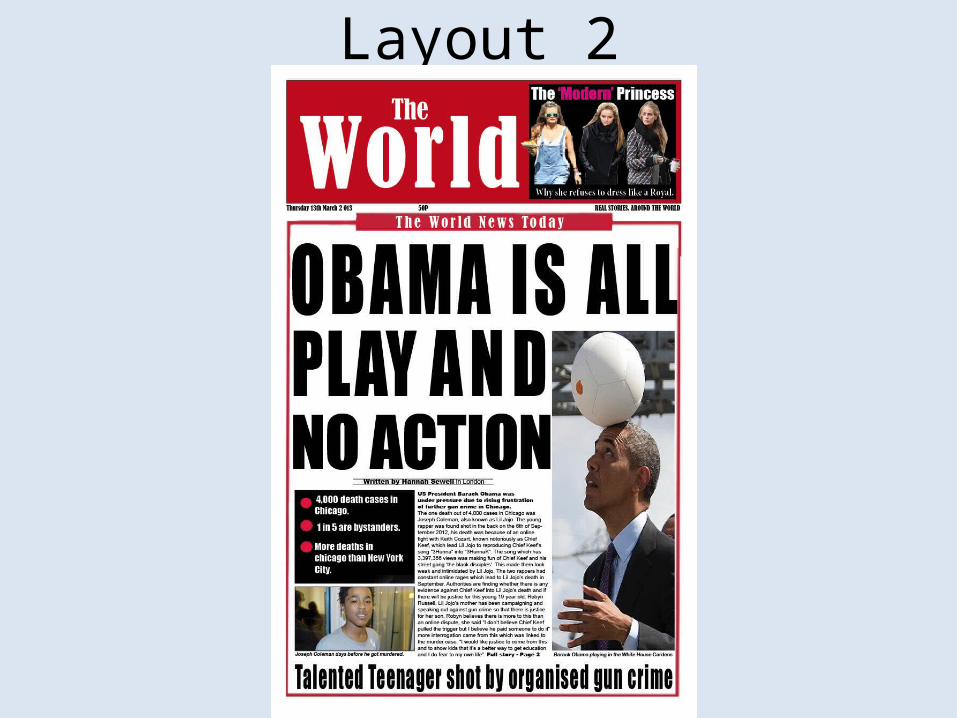
Layout 2
Feedback 2What do you like about the design? One thing which I like about this design is the article headline. It is catchy and fun, keeping the reader engaged and making it less serious. This is good for a broadsheet because they have a simpler and younger reading audience which means it does not need to be of a high intelligence. The red banner with the newspaper name works well because the red helps it to stand out and grabs the readers eye, it also separates it from the rest of the paper and ensures it doesn’t blend in and look like part of the headline. I feel the image works well along side the headline because it portrays nicely what the pun of the headline is and also adds light hearted humour to the page.
What areas of the idea could be developed?One thing I would change may be the advert at the top of the page. Although it works nicely and is eye catching, I feel it would look more professional and better if when using Photoshop you had zoomed in closer when cutting out certain aspects or even used a small feather on your cut to make the edging smoother and less choppy. I would also consider using a slightly larger picture or less copy on the front of the paper for your article as they are not usually holding a lot of the story, cutting this down would make it more realistic and would also leave more room to experiment and play with different images, fonts and sizes to make it look more ‘fun’ and something pleasing to the eye.
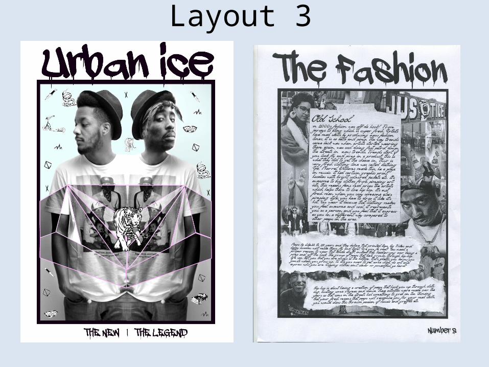
Layout 3
Feedback 3What do you like about the design?
I really like the font used on this fanzine I think that it is very suitable. Straight away I can tell what type of sub culture the fanzine is made for. The images used on the fanzine page are clear and I like how there isn’t too much text it is balanced out with the right amount of images. I also really like the fanzine name as it is catchy and appropriate for the sub culture of hip-hop. I think the collage of images on the inside page is really creative and interesting to look at. I also like the bold border which is around the image I think this gives it a organized look. The language of the copy is suitable for the audience as it is informative but it is written in a informal way.
What areas of the idea could be developed?
The only thing which I think could be improved on the fanzine is adding more colour, the fanzine looks quite dull and I think adding colours that are suitable for the sub culture would give the fanzine a stronger look.
Summary of FeedbackWhat do you agree with from your feedback?• “Straight away I can tell what type of sub culture the fanzine is made for.” this shows that research has helped the audience to know what fanzine it is which is important straight away.• “I would change the advert at the top of the page. I feel it would look more professional and better if when using Photoshop you had zoomed in closer when cutting out certain aspects or even used a small feather on your cut to make the edging smoother and less choppy.” I agree with this because I’m not very good at detailing around each character so it’s helped that they have noticed that so that I can improve it further the next time. By making it look more professional and properly looking at it properly it will help to make my tabloid much realistic.• “The only thing which I think could be improved on the fanzine is adding more colour, the fanzine looks quite dull and I think adding colours that are suitable for the sub culture would give the fanzine a stronger look.” I completely agree with this because I went safe when doing my work black and white but I also thought that black and white would be a good theme for Hip Hop as modern meets old school. I tried adding colour to the front page but it wasn’t bright enough.
What do you disagree with from your feedback?• “The ‘gang wars spurs gun violence debate’ headline font could be changed slightly as it looks a bit spread out between each letter” I disagree with this because you need to spread the letters out so that it takes up a lot of the white space. To improve it I could add another little words just so it’s not to spaced apart. (broadsheet)• “I think that the photograph of Barack Obama could be made smaller to allow for more text and it not to fill up the whole column.” I think that the image needed to be large so that it gave him a dictator effect and to make him powerful, if he was smaller and surrounded by text then he would look a lot weaker. (broadsheet)