peabody municipal fcu - brand guidelines · peabody municipal fcu peabody municipal fcu logo logo...
TRANSCRIPT

BRANDGUIDELINESBRANDGUIDELINES
Copyright © 2017, Bromley Agency. All rights reserved.

0001
02
03
04
05
06
07
08
INTRODUCTION TO
PEABODY MUNICIPAL FCU
PEABODY MUNICIPAL FCU
LOGO
LOGO CLEAR ZONES
LOGO COLORS
LOGO MISUSES
PRODUCT PORTFOLIO
COLOR PALETTE
TYPOGRAPHY
.
03
05
07
09
12
14
16
18
TOC 02
TABLE OFCONTENTS
PEABODY MUNICIPAL FCU BRAND GUIDLINES

01PEABODY MUNICIPAL FCU BRAND GUIDLINES INTRODUCTION TO
PEABODY MUNICIPAL FCU
03
INTRODUCTION TOPEABODY MUNICIPAL FCU

01PEABODY MUNICIPAL FCU BRAND GUIDLINES INTRODUCTION TO
PEABODY MUNICIPAL FCU
04
INTRODUCTION TOPEABODY MUNICIPAL FCU
MISSION STATEMENT
Peabody Municipal Federal Credit Union is
dedicated to providing competitive financial
products and superior service to our members
through sound business practices. The Credit Union
movement is committed to superior service to our
membership.
BRAND PROMISE & POSITION
Peabody Municipal Federal Credit Union is
committed to superior service to their membership.
BRAND STORY
Peabody Municipal Federal Credit Union was
formed for the purpose of encouraging savings by
offering a good return, using connective monies to
make loans at competitively low interest rates.
Providing other member services on a cooperative
basis.

02PEABODY MUNICIPAL FCU
LOGO
05
PEABODYMUNICIPAL FCULOGO
PEABODY MUNICIPAL FCU BRAND GUIDLINES

02PEABODY MUNICIPAL FCU
LOGO
06
PEABODYMUNICIPAL FCULOGO
The form of the Peabody Municipal FCU
Symbol is based on a blue-red letter P
with letter M defining the blank space, in
a way to resemble the linitials PM.
Peabody Municipal FCU Wordmark uses
a Engravers Gothic BT typeface and
should not be altered.
Together, the Symbol and Wordmark
create the Peabody Municipal FCU Logo.
The Logo forms the most significant
feature of the Peabody Municipal FCU
product and company identity. It should
be used on all aspects of branded
communication.
The Peabody Municipal FCU Logo should
never be altered, tilted, distorted,
manipulated or disassembled on any
application.
Minimum Size 1”
Peabody Municipal FCU Symbol Peabody Municipal FCU Wordmark
Peabody Municipal FCU Logo
PEABODY MUNICIPAL FCU BRAND GUIDLINES

03LOGO CLEAR ZONES 07
LOGOCLEAR ZONES
PEABODY MUNICIPAL FCU BRAND GUIDLINES

03LOGO CLEAR ZONES 08
LOGOCLEAR ZONES
The following is the clear zone rule for the
Peabody Municipal FCU Logo In order to
gain maximum visibility, the Peabody
Municipal FCU Logo should always
appear with a minimum area of clear
space around the logo. This area should
be free of any type or graphic element.
Using center-line height of the text
“FEDERAL CREDIT UNION” as “X,” the
clear space is a 1X area around the entire
Logo.
This rule applies to all versions of the
Peabody Municipal FCU Logo on all
mediums.
PEABODY MUNICIPAL FCU BRAND GUIDLINES
X
X
X
X
X

04LOGO COLORS 09
LOGOCOLORS
PEABODY MUNICIPAL FCU BRAND GUIDLINES

04LOGO COLORS 10
LOGOCOLORS
FULL COLOR LOGO
Consistent use of the Peabody Municipal
FCU Logo colors will help build visibility
and recognition for Peabody Municipal
FCU and will set them apart from their
competitors. The descriptions below
apply to both the vertical and horizontal
Logo formats.
4-Color Process (CMYK)
The 4-color process Logo is used for all
printing purposes.
3-Color (RGB)
This version is used for all on-screen
applications.RED
BLUE
BLUE
PEABODY MUNICIPAL FCU BRAND GUIDLINES
RED

04LOGO COLORS 11
LOGOCOLORS
ONE COLOR LOGO
Across applications, every effort should
be made to use the full-color Peabody
Municipal FCU Logo, on a white or black
background. However, in instances
where only one color is available for
printing, use the one-color options to the
right. The descriptions below apply to
both the vertical and horizontal Logo
formats.
Grayscale
Where needed, the PMFCU Logo can be
printed as a combination of two gray
color tones (such as Word stationery
templates and merchandise).
1-Color Black and White
Use this simple, 1-color version where
coloring may not be possible (such as
e m b o s s i n g , g l a s s d e c a l s a n d
embroidery).
GRAYSCALE
WHITE
BLACK
PEABODY MUNICIPAL FCU BRAND GUIDLINES

05LOGO MISUSES 12
LOGOMISUSES
PEABODY MUNICIPAL FCU BRAND GUIDLINES

NO!05
LOGO MISUSES 13
LOGOMISUSES
Because the Peabody Municipal FCU
Logo is the brand’s primary visual
representation, its integrity should be
respected at all times, in all places.
Please do not stretch, condense,
augment or distort its form in any way.
Changing any graphic element of the
Logo will weaken its impact and detract
from the consistent image we seek to
project. The illustrations to the right
describe some, but not all, of the more
common misunderstandings and
inappropriate uses of the Logo.
Please use only approved electronic art
when reproduc ing the Peabody
Municipal FCU Logo.
SCALE: Do not play with the
scale of the logo. The proportions
of the logos should not be altered
in any way.
CONTRAST: The logos should
always be placed in locations that
are not too complex to allow
them to be viewed clearly.
COLOR: Do not change the
colors of any of the logos.
PROPORTIONS: Do not change
proportions of the Symbol and
Wordmark.
ORIENTATION: Do not change
the orientation of the logo by
rotating it any way.
CROP: Do not crop the logo in
any way.
EFFECTS: Do not add any kind of
effects like a drop shadow to the
logo.
TRANSPARENCY: Do not lay
any kind of transparency over the
logo.
PEABODY MUNICIPAL FCU BRAND GUIDLINES

06PRODUCT PORTFOLIO 14
PRODUCTPORTFOLIO
PEABODY MUNICIPAL FCU BRAND GUIDLINES
06PRODUCT PORTFOLIO 15
PRODUCTPORTFOLIO
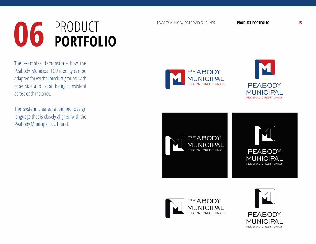
The examples demonstrate how the
Peabody Municipal FCU identity can be
adapted for vertical product groups, with
copy size and color being consistent
across each instance.
The system creates a unified design
language that is closely aligned with the
Peabody Municipal FCU brand.
PEABODY MUNICIPAL FCU BRAND GUIDLINES

07COLOR PALETTE 16
COLORPALETTE
PEABODY MUNICIPAL FCU BRAND GUIDLINES

07COLOR PALETTE 17
COLORPALETTE
Color is a primary means of visual
identification that we use to create a
powerful emotional response. The Logo
colors were chosen with care to convey
that Peabody Municipal FCU is a vibrant,
forward-looking brand. The consistent
use of a limited number of colors will
build strong external recognition and
memorability for Peabody Municipal
FCU.
Primary Palette
Our primary colors, Dark Blue and Accent
Red, are intended to be the main
signifying colors for the brand. In terms
of brightness, they are on a darker side of
the spectrum.
Light Blue, Black and Grays round out our
Primary Palette and provide a foundation
for Peabody Municipal FCU Logo to stand
out.
DARK BLUE
CMYK
RGB
HEX #
LIGHT BLUE
CMYK
RGB
HEX #
ACCENT RED
CMYK
RGB
HEX #
REAL BLACK
CMYK
RGB
HEX #
50% BLACK
CMYK
RGB
HEX #
20% BLACK
CMYK
RGB
HEX #
100 080 027 015
040 073 128
284980
084 032 003 000
081 143 199
518FC7
012 100 100 007
174 000 000
AE0000
075 068 065 090
000 000 000
000000
000 000 000 050
149 150 153
959699
000 000 000 020
209 210 212
D1D2D4
PEABODY MUNICIPAL FCU BRAND GUIDLINES

08TYPOGRAPHY 18
TYPOGRAPHY
PEABODY MUNICIPAL FCU BRAND GUIDLINES

08TYPOGRAPHY 19
TYPOGRAPHY
Peabody Municipal FCU’s primary
typeface is Roboto. Modern, flexible,
free and easy to read, Roboto font family
is uniquely suited for a wide range of
visual communications. Multiple levels
of typographic hierarchy are defined
both for impact and clarity of our
communications.
When to use?
Use Roboto for all Peabody Municipal
FCU communications where possible.
Use Roboto in rendered form for online
and electronic applications. When use of
Roboto is not possible, use the Arial font
family. The weights shown for Roboto
font are approved for use.
USAGE: TITLE
ROBOTO BLACK
USAGE: TITLE, HEADER, SUB-HEADER
ROBOTO CONDENSED BOLD
USAGE: BODY TEXT
ROBOTO
USAGE: BODY TEXT
ROBOTO CONDENSED
THE QUICK BROWN FOX JUMPS OVER THE LAZY DOG
1234567890
!@#$%^&*(){}[]\|;':"<>?
THE QUICK BROWN FOX JUMPS OVER THE LAZY DOG
the quick brown fox jumps over the lazy dog
1234567890 !@#$%^&*(){}[]\|;':"<>?
THE QUICK BROWN FOX JUMPS OVER THE LAZY DOG
the quick brown fox jumps over the lazy dog
1234567890 !@#$%^&*(){}[]\|;':"<>?
THE QUICK BROWN FOX JUMPS OVER THE LAZY DOG
the quick brown fox jumps over the lazy dog
1234567890 !@#$%^&*(){}[]\|;':"<>?
PEABODY MUNICIPAL FCU BRAND GUIDLINES
08TYPOGRAPHY 20
TYPOGRAPHY
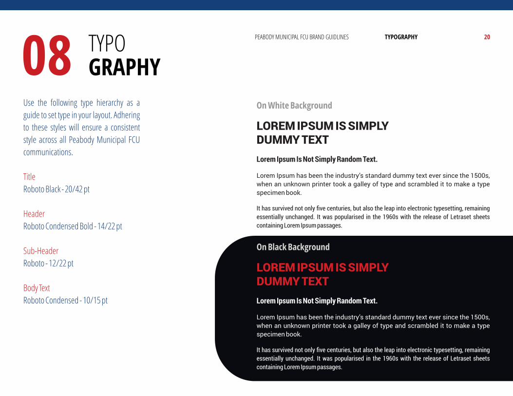
Use the following type hierarchy as a
guide to set type in your layout. Adhering
to these styles will ensure a consistent
style across all Peabody Municipal FCU
communications.
Title
Roboto Black - 20/42 pt
Header
Roboto Condensed Bold - 14/22 pt
Sub-Header
Roboto - 12/22 pt
Body Text
Roboto Condensed - 10/15 pt
On White Background
LOREM IPSUM IS SIMPLY DUMMY TEXT
Lorem Ipsum Is Not Simply Random Text.
Lorem Ipsum has been the industry’s standard dummy text ever since the 1500s,
when an unknown printer took a galley of type and scrambled it to make a type
specimen book.
It has survived not only five centuries, but also the leap into electronic typesetting, remaining
essentially unchanged. It was popularised in the 1960s with the release of Letraset sheets
containing Lorem Ipsum passages.
On Black Background
LOREM IPSUM IS SIMPLY DUMMY TEXT
Lorem Ipsum Is Not Simply Random Text.
Lorem Ipsum has been the industry’s standard dummy text ever since the 1500s,
when an unknown printer took a galley of type and scrambled it to make a type
specimen book.
It has survived not only five centuries, but also the leap into electronic typesetting, remaining
essentially unchanged. It was popularised in the 1960s with the release of Letraset sheets
containing Lorem Ipsum passages.
PEABODY MUNICIPAL FCU BRAND GUIDLINES
The process that was used to derive the elements and style of the
color schemes and logos for Peabody Municipal Federal Credit
Union is the intellectual property of Bromley Agency, copyright, 2017.
Logo and style of the color schemes are the property of Peabody
Municipal FCU, copyright, 2017.
THIS BRAND WAS
DEVELOPED BY
www.bromleyagency.com