paul landry portolio no crops
TRANSCRIPT
PAUL LANDRYDESIGNS
pld
resumeresume
$ $$
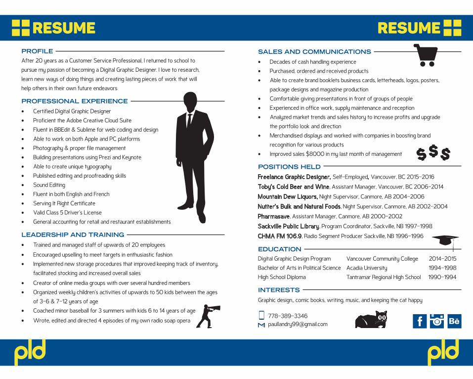
EDUCATIONDigital Graphic Design Program Bachelor of Arts in Political Science High School Diploma
Vancouver Community CollegeAcadia UniversityTantramar Regional High School
2014-20151994-19981990-1994
INTERESTS
Graphic design,, comic books, writing, music, and keeping the cat happy
pld
PROFILEAfter 20 years as a Customer Service Professional, I returned to school to pursue my passion of becoming a Digital Graphic Designer. I love to research, learn new ways of doing things and creating lasting pieces of work that will help others in their own future endeavors
PROFESSIONAL EXPERIENCE
• Certified Digital Graphic Designer• Proficient the Adobe Creative Cloud Suite• Fluent in BBEdit & Sublime for web coding and design• Able to work on both Apple and PC platforms• Photography & proper file management• Building presentations using Prezi and Keynote• Able to create unique typography• Published editing and proofreading skills• Sound Editing• Fluent in both English and French• Serving It Right Certificate• Valid Class 5 Driver’s License• General accounting for retail and restaurant establishments
LEADERSHIP AND TRAINING
• Trained and managed staff of upwards of 20 employees
• Encouraged upselling to meet targets in enthusiastic fashion • Implemented new storage procedures that improved keeping track of inventory,
facilitated stocking and increased overall sales
• Creator of online media groups with over several hundred members • Organized weekly children’s activities of upwards to 50 kids between the ages
of 3-6 & 7-12 years of age • Coached minor baseball for 3 summers with kids 6 to 14 years of age
• Wrote, edited and directed 4 episodes of my own radio soap opera
SALES AND COMMUNICATIONS
• Decades of cash handling experience• Purchased, ordered and received products• Able to create brand booklets business cards, letterheads, logos, posters,
package designs and magazine production• Comfortable giving presentations in front of groups of people• Experienced in office work, supply maintenance and reception• Analyzed market trends and sales history to increase profits and upgrade
the portfolio look and direction• Merchandised displays and worked with companies in boosting brand
recognition for various products• Improved sales $8000 in my last month of management
POSITIONS HELD
Freelance Graphic Designer, Self-Employed, Vancouver, BC 2015-2016
Toby’s Cold Beer and Wine, Assistant Manager, Vancouver, BC 2006-2014
Mountain Dew Liquors, Night Supervisor, Canmore, AB 2004-2006
Nutter’s Bulk and Natural Foods, Night Supervisor, Canmore, AB 2002-2004
Pharmasave, Assistant Manager, Canmore, AB 2000-2002
Sackville Public Library, Program Coordinator, Sackville, NB 1997-1998
CHMA FM 106.9, Radio Segment Producer Sackville, NB 1996-1996
pldpld
SALEFORDVDs&
BLU-RAYS
Open Everyday Noon To 11pm
3451 Cambie Street, 604-873-6958 1470 Commercial Drive, 604-251-3305
BLACK DOG VIDEOblackdogvideo.bc.ca
#follow us on
THURSDAYSRENT 2 GET 1 FREE
COME IN OUT OF THE LIGHT
#follow us on
3451 Cambie Street, 604-873-6958 1470 Commercial Drive, 604-251-3305
BLACK DOG VIDEOblackdogvideo.bc.ca
3451 Cambie Street, 604-873-6958 1470 Commercial Drive, 604-251-3305
BLACK DOG VIDEOblackdogvideo.bc.ca
KIDS MOVIESONLY $3 ALL SUMMER
ON 7 DAY RENTALS
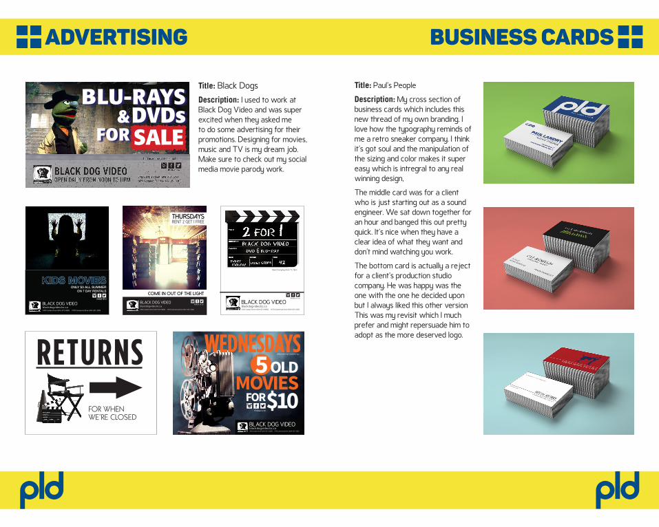
Title: Black Dogs Description: I used to work at Black Dog Video and was super excited when they asked me to do some advertising for their promotions. Designing for movies, music and TV is my dream job. Make sure to check out my social media movie parody work.
5OLDMOVIESFOR$10
WEDNESDAYSOPEN EVERYDAY NOON TO 11pm
3451 Cambie Street, 604-873-6958 1470 Commercial Drive, 604-251-3305
BLACK DOG VIDEOblackdogvideo.bc.ca
FOR WHENWE’RE CLOSED
RETURNS
Title: Paul’s People
Description: My cross section of business cards which includes this new thread of my own branding. I love how the typography reminds of me a retro sneaker company. I think it’s got soul and the manipulation of the sizing and color makes it super easy which is intregral to any real winning design,
The middle card was for a client who is just starting out as a sound engineer. We sat down together for an hour and banged this out pretty quick. It’s nice when they have a clear idea of what they want and don’t mind watching you work.
The bottom card is actually a reject for a client’s production studio company. He was happy was the one with the one he decided upon but I always liked this other version This was my revisit which I much prefer and might repersuade him to adopt as the more deserved logo.
business cardsadvertising
pldpld
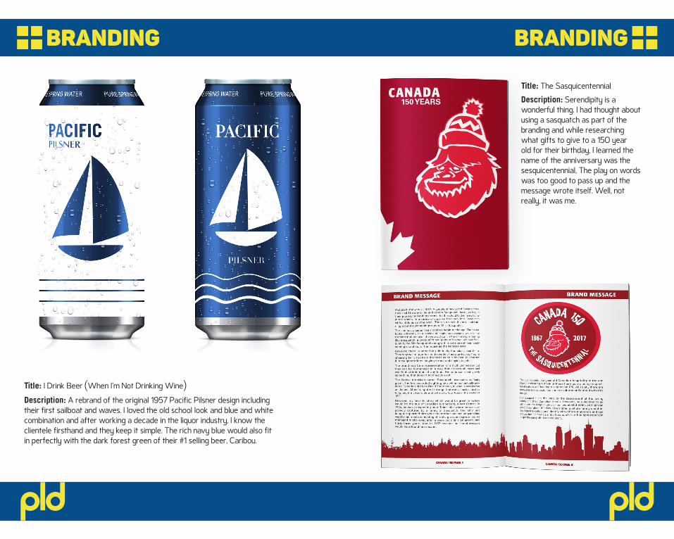
Title: I Drink Beer (When I’m Not Drinking Wine)
Description: A rebrand of the original 1957 Pacific Pilsner design including their first sailboat and waves. I loved the old school look and blue and white combination and after working a decade in the liquor industry, I know the clientele firsthand and they keep it simple. The rich navy blue would also fit in perfectly with the dark forest green of their #1 selling beer, Caribou.
Title: The SasquicentennialDescription: Serendipity is a wonderful thing. I had thought about using a sasquatch as part of the branding and while researching what gifts to give to a 150 year old for their birthday, I learned the name of the anniversary was the sesquicentennial, The play on words was too good to pass up and the message wrote itself. Well, not really, it was me.
brandingbranding
pldpld
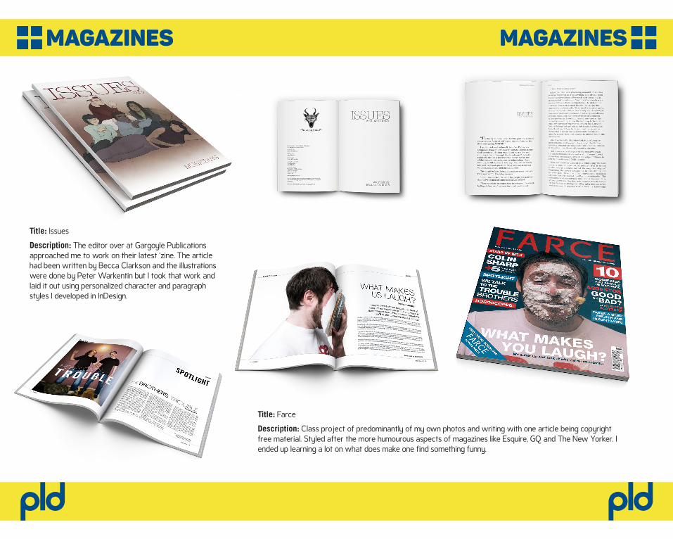
Title: Issues
Description: The editor over at Gargoyle Publications approached me to work on their latest ‘zine. The article had been written by Becca Clarkson and the illustrations were done by Peter Warkentin but I took that work and laid it out using personalized character and paragraph styles I developed in InDesign.
Title: Farce
Description: Class project of predominantly of my own photos and writing with one article being copyright free material. Styled after the more humourous aspects of magazines like Esquire, GQ and The New Yorker. I ended up learning a lot on what does make one find something funny.
magazinesmagazines
pldpld
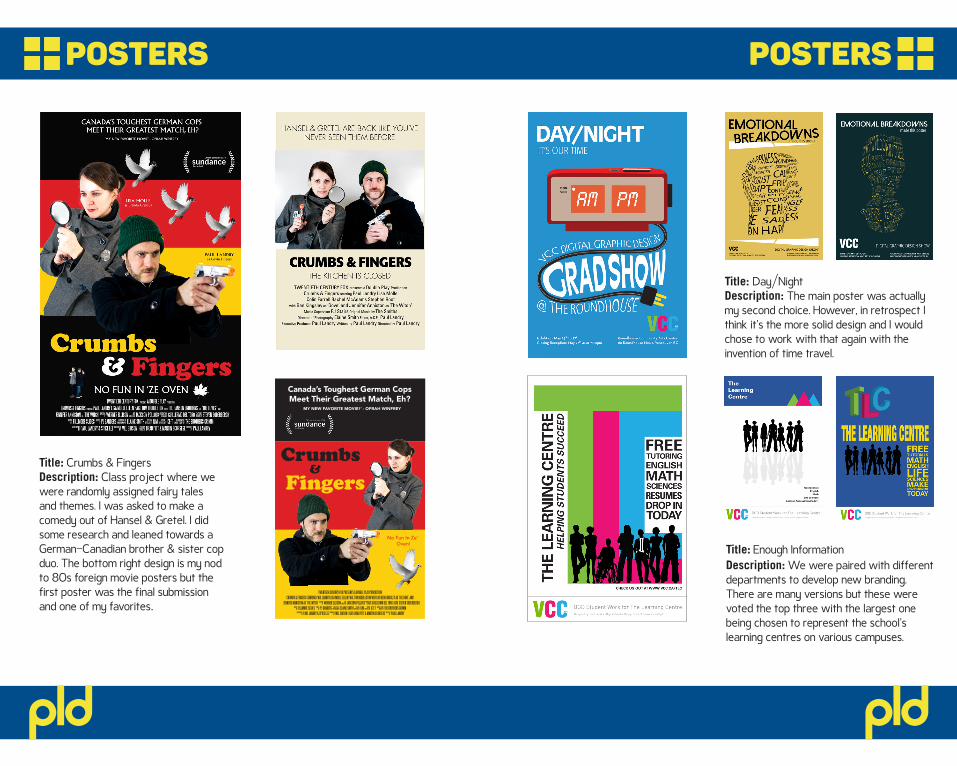
Title: Enough InformationDescription: We were paired with different departments to develop new branding. There are many versions but these were voted the top three with the largest one being chosen to represent the school’s learning centres on various campuses.
Title: Day/NightDescription: The main poster was actually my second choice. However, in retrospect I think it’s the more solid design and I would chose to work with that again with the invention of time travel.
Title: Crumbs & FingersDescription: Class project where we were randomly assigned fairy tales and themes. I was asked to make a comedy out of Hansel & Gretel. I did some research and leaned towards a German-Canadian brother & sister cop duo. The bottom right design is my nod to 80s foreign movie posters but the first poster was the final submission and one of my favorites.
postersposters
Canada’s Toughest German CopsMeet Their Greatest Match, Eh?
‘MY NEW FAVORITE MOVIE!’ - OPRAH WINFREY
TWENTIETH CENTURY FOX PRESENTS A DOUBLE PLAY PRODUCTIONCRUMBS & FINGERS STARRING PAUL LANDRY LISA MOLLE ELLEN PAGE TOM HIDDLESTON WITH SIR BEN KINGSLEY AS ‘THE DOVE’ AND
JENNIFER ANNISTON AS ‘THE WITCH’ b WERNER ELLISON w JACKSON POLLOCKf GUILLERMO DEL TORO d STEVEN SODERBERGHc FILLMORE SLIDES e PJ SANDERS g ELAINE SMITH s ILM t ICE-T n THE BROTHERS GRIMM
o PAUL LANDRY & SPIKE LEE j MEL GIBSON p BRAD PITT & MARTIN SCORSESE k PAUL LANDRY
No Fun In Ze’ Oven!
Crumbs&
Fingers
pldpld
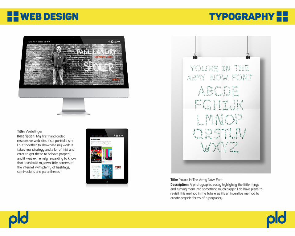
Title: WebslingerDescription: My first hand coded responsive web site. It’s a portfolio site I put together to showcase my work. It takes real strategy and a lot of trial and error to get these to behave properly and it was extremely rewarding to know that I can build my own little corners of the internet with plenty of hashtags, semi-colons and parantheses.
Title: You’re In The Army Now, FontDescription: A photographic essay highlighing the little things and turning them into something much bigger. I do have plans to revisit this method in the future as it’s an inventive method to create organic forms of typography.
typographyweb design
pldpld
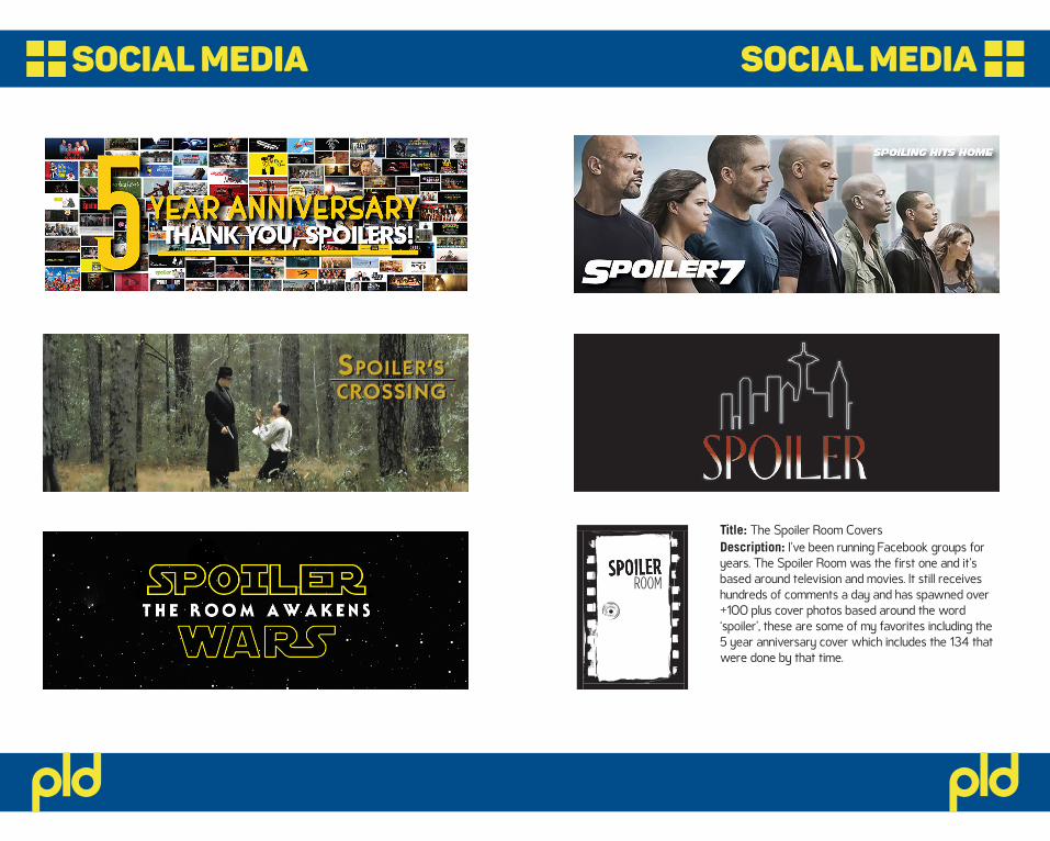
Title: The Spoiler Room CoversDescription: I’ve been running Facebook groups for years. The Spoiler Room was the first one and it’s based around television and movies. It still receives hundreds of comments a day and has spawned over +100 plus cover photos based around the word ‘spoiler’, these are some of my favorites including the 5 year anniversary cover which includes the 134 that were done by that time.
ROOM
social mediasocial media
SPOILER’SSPOILER’SCROSSINGCROSSING
pldpld
pld