paratexts and translation of the exotic
TRANSCRIPT

1
©2021 M. Axelsson, R. Næsje. This is an open access article distributed under the terms of the Creative Commons CC-BY-NC 4.0 License (https://creativecommons.org/licenses/by-nc/4.0/), permitting all non-commercial use, distribution, and reproduction in any medium, provided the original work is properly cited. Citation: Barnboken – tidskrift för barnlitteraturforskning/Barnboken: Journal of Children’s Literature Research, Vol. 44, 2021 http://dx.doi.org/10.14811/clr.v44.579
Marcus Axelsson and Ragnhild Næsje
Paratexts and Translation of the ExoticThe German, French, and English Covers of Maria Parr’s Vaffelhjarte and Tonje Glimmerdal
Abstract: This article investigates how the covers of two novels, Vaffel-hjarte (Waffle Hearts, 2005) and Tonje Glimmerdal (Astrid the Un-stoppable, 2009) by the Norwegian children’s fiction author Maria Parr, are visually and verbally translated into German, French, and English. The central question of this study is how representations of characters, theme, and geographical context are rendered in the target text paratexts. Method-ologically, the study is inspired by Gunther Kress and Theo Van Leeuwen’s grammar of visual design. The results show that the target paratexts to a large extent reflect the novel, but in different ways and not necessarily by staying close to the source paratexts. Previous research on paratexts and translation shows that exotic source text elements tend to be foregrounded in translation. This is something that we also see regarding the French and the British Parr translations, but not the German. Drawing on previous research by Kathryn Batchelor and Maria Pujol-Valls, we would like to put forward the hypothesis that verbal text – that is, the narrative in the novel – and paratexts behave differently in translation. As verbal text, ac-cording to previous research, often is more adapted to the target culture when migrating from a peripheral system (Norway) to more central ones (France and Great Britain), the opposite seems to be the case for translated paratexts, where exotic source culture elements are reinforced in central systems. Concerning the German cover, where there was no foregrounding of exotic source culture elements, we raise the possibility that such fore-grounding is not needed, since German readers are already familiar with Scandinavian children’s literature. Keywords: translation studies, image analysis, Maria Parr, source culture, paratexts, book covers
2 Barnboken: Journal of Children’s Literature Research, Vol. 44, 2021
Although readers are well familiar with the admonition not to judge a book by its cover, the attention devoted by the publishing industry to cover art indicates that this is a major driver of sales (Mossop 1). In this article, we argue that the cover design of a book is of even greater importance in the case of children’s literature, since both children and adults choosing books for children want to buy books with covers that appeal to young readers (cf. Mjør 5, 12). This article investigates how the covers of two novels by Norwegian children’s fiction author Maria Parr – Vaffelhjarte (Waffle Hearts, 2005) and Tonje Glimmerdal (Astrid the Unstoppable, 2009) – are visually and verbally translated into German, French, and English. More specifi-cally, the aim of this study is to compare how representations of char-acters, theme, and geographical context are rendered in the source text cover images and target text cover images.
This study positions itself within the field of Translation Studies (TS) and more specifically within Descriptive Translation Studies (DTS) (see e.g. Toury; Hermans). Typical for DTS is a descriptive approach, focusing on the choices that translators, publishers, and illustrators make, and what effects these choices have.
Foreshadowing Paratexts
The book cover is part of a book’s paratexts. Paratexts are elements that surround a text in order to present it. In addition to book covers, such elements could be titles, prefaces, book reviews, and so on (Genette 1; Mjør 1). It is common to distinguish be-tween “peritexts,” which are elements that belong to the physical book, and “epitexts,” which are elements related to the book, but published elsewhere (Genette 5). In this article, we focus on peri-texts, but stick to the general term “paratexts.” Anna Gil-Bardají, Pilar Orero, and Sara Rovira-Esteva describe paratexts as “an area of thinking” where the text is conceived of as an extension of itself (7). The notion of paratexts as an “area of thinking” suggests that the paratexts will greatly influence readers before they have even started to read the actual novel. Gil-Bardají and her colleagues are not alone in their reasoning. When defining what paratexts are, scholars focus almost as much on what paratexts do. Jeremy Munday claims that paratexts frame a text (214), while Ingeborg Mjør argues that paratexts reflect a literary work’s content. Mjør stresses that paratexts affect their readers and have great power over how a text will be read, also noting that paratexts foreshad-ow the composition of a novel in terms of dramaturgy (1, 5–6, 12).

3Barnboken: Journal of Children’s Literature Research, Vol. 44, 2021
Kathryn Batchelor defines paratext as “a consciously crafted threshold for a text which has the potential to influence the way(s) in which the text is received” (142). Batchelor reviews studies on “paratexts and image-formation in translation” and notes that in translations between Western cultures, it seems to be common to foreground “exotic” source culture elements in target text paratexts (37–39). Maria Pujol-Valls also identifies this strategy when investi-gating how the Norwegian landscape is rendered in the illustrations of the Spanish version of Parr’s Tonje Glimmerdal. She notices that the exotic elements of nature, such as snowy hills and fjord landscapes, are foregrounded in the Spanish version. In fact, the characters in the images have become less prominent in order to make space for the Norwegian landscape (Pujol-Valls 7–10).
In his study of visual translations of book cover images, Brian Mossop notes that the target texts often have covers that do not cor-respond to the plot. He suggests that book covers are primarily mar-keting devices and that they depend on both the target culture and the time period when a novel is published. According to Mossop, a book cover is also a freestanding art object, and the most important function of a book cover is therefore not necessarily to reflect the ac-tual narrative (2). To some extent, this contradicts the views present-ed above, where paratexts are described as frames foreshadowing the actual narrative.
Multimodal Approaches to Translated Children’s Literature
In recent years, scholars have used Gunther Kress and Theo Van Leeuwen’s multimodal theories to study images in children’s lite-rature. These multimodal analyses focus on texts “whose meanings are realized through more than one semiotic code” (Kress and Van Leeuwen 177), in this case images and verbal text. Two scholars who draw on multimodal theories to examine the translation of child-ren’s literature are Sara Van Meerbergen (Nederländska bilderböcker blir svenska; “The Church as a Cream Pie”), and Van Meerbergen and Charlotte Lindgren (“Pettson and Findus Go Glocal”), who analy-ze Dutch and French translations of Swedish children’s literature. Van Meerbergen finds that source text elements highlighting mo-ral aspects and the risks involved in playing are toned down in the Swedish target texts, which instead emphasize having fun. In addi-tion, duties associated with being a “model child” are toned down in the target text (Nederländska 158, 207; “Church” 110–11). In their joint study, Van Meerbergen and Lindgren find that “referential
4 Barnboken: Journal of Children’s Literature Research, Vol. 44, 2021
interplay”1, that is, when visually depicted elements or actions are picked up on and referred to directly in the written text (239), is less prominent in the target texts than in the source text. In addition, the depiction of action is less foregrounded in the Dutch and French tar-get texts (243).
Vaffelhjarte and Tonje Glimmerdal in Translation
Table 1 provides an overview of our primary material, indicating title, year of publication, and publisher.
Vaffelhjarte (2005) is the story of Lena and Trille’s eventful life in the coastal town of Knert-Mathilde, whereas Tonje Glimmerdal (2009) re-volves around the protagonist Tonje facing challenges with her best friend Gunvald. Vaffelhjarte is an episodic narrative in the sense that each chapter may be read separately, whereas Tonje Glimmerdal is a more cohesive narrative.
The novels are set in western Norway, where mountains, sea, and snow are recurring elements. Nina Goga argues that the setting is of great importance in Parr’s works, as it is closely connected with the protagonists’ identities. In Tonje Glimmerdal, it is frequently mentio-ned that Glimmerdal is Tonje’s own valley (Goga 2; see also Bache-Wiig 3). Goga observes that the place names are first introduced in the titles: Vaffelhjarte has a subtitle, Lena og eg i Knert-Mathilde (Lena and I in Knert-Mathilde), and the title Tonje Glimmerdal signals both that the narrative revolves around a girl whose surname is Glimmer-dal and the actual valley Glimmerdal (Goga 2).
Given that their identities are so closely linked to the places whe-re they live, it is no surprise that the protagonists have close ties to nature, where they can move about freely. In fact, both “nature” and “motion” are words associated with Parr’s protagonists (cf. Goga
Table 1. Title, Year of Publication, and Publisher of the Investigated Material.
5Barnboken: Journal of Children’s Literature Research, Vol. 44, 2021
2–3). Bache-Wiig describes both Lena and Tonje as girls who like action and adventures (2, 4). Tonje even has the motto “fart og sjølv-tillit” (speed and self-confidence). In addition, both girls are resolute and outspoken (see Goga; Bache-Wiig 2, 4), whereas Trille is pensive and careful.
The Grammar of Visual Design as a Method for Comparing Book Covers
To investigate how the cover images are visually translated, we con-duct image analyses based on concepts from Kress and Van Leeu-wen’s grammar of visual design. Like Kress and Van Leeuwen, we divide the concepts into representation, interaction, and image compo-sition (Painter et al. 7). Representation refers to how versions of the world are created in language and images (Björkvall 57). The most central concepts within representation are processes, participants, and circumstances (Painter et al. 7). Processes describe different actions that participants perform (Björkvall 60–61). The processes may be dy-namic, narrative processes, or static, conceptual processes (Painter et al. 56). In the former, motion is expressed by means of vectors pointing in the direction of movement (Björkvall 63). Regarding conceptual processes, two sub-categories, classificational and symbolic processes, are relevant to this study. Classificational processes describe hierarchic relations between participants, whereas symbolic processes describe what something signifies, and may be associated with symbolic attrib-utes (Björkvall 72–75; Kress and Van Leeuwen 105). Lastly, circum-stances provide information about background and setting (Björkvall 68; Painter et al. 78).
Interaction pertains both to the interaction between the depicted, represented, participants and the reader (interactive participant), and the interaction between the represented participants (Painter et al. 15–16; Van Meerbergen, Nederländska 78). The former is analyzed in terms of social distance (Kress and Van Leeuwen 124–129), and the latter in terms of proximity (Painter et al. 16). A close shot of a re-presented participant, or a short distance between two represented participants, signal a close relationship, whereas the opposite sig-nals distance (Kress and Van Leeuwen 124–129; Painter et al. 16). Regarding eye contact, the grammar of visual design suggests that a represented participant whose eyes are directed toward the readers demands their attention, whereas lack of eye contact signals that the-re are no such demands (Björkvall 31). If participants are portrayed in profile, they are detached from the interactive participants, or not part of their world (Björkvall 55; Painter et al. 17).
6 Barnboken: Journal of Children’s Literature Research, Vol. 44, 2021
Image composition refers to how different elements are combined in an image. Information value, salience, and framing are key concepts. Regarding information value, the positioning of elements (left–right, up–down, center–margin) provides them with specific information values (Kress and Van Leeuwen 176–77). The right side of an image or a head turned toward the right may, for example, represent the futu-re or moving forward (cf. Kress and Van Leeuwen 205; Van Meerber-gen, Nederländska 85, 126, 163). Salience pertains to how an element attracts the reader’s attention. This may be done by means of for ex-ample size, color, or cultural value (Björkvall 101–103). The concept of visual rhyme is connected to salience and focuses on how similar shapes and colors create connections between elements (Kress and Van Leeuwen 204). Finally, frames create dividing lines between ele-ments and show how these disconnect or connect elements (177). The more the elements are connected, the more they are prone to being interpreted as belonging together (203–204).
We also study how verbal texts (titles) and images interplay and how covers and plot reflect each other. To study this relationship, we turn to the concepts of anchorage and relay. When image and verbal text communicate the same message, there is anchorage, and when they communicate new, different, or completing messages, there is relay (Kress and Van Leeuwen 18).
The Covers of Vaffelhjarte
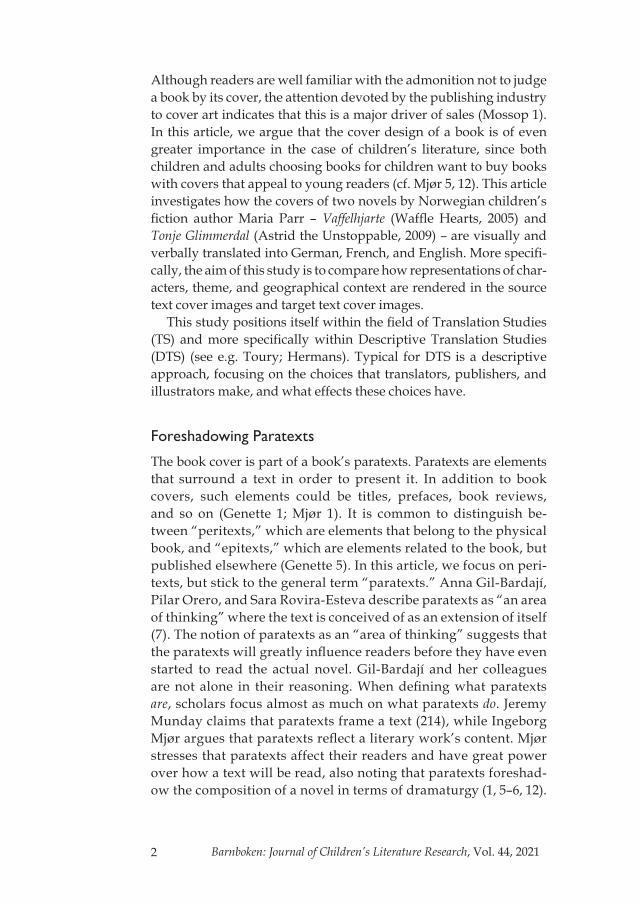
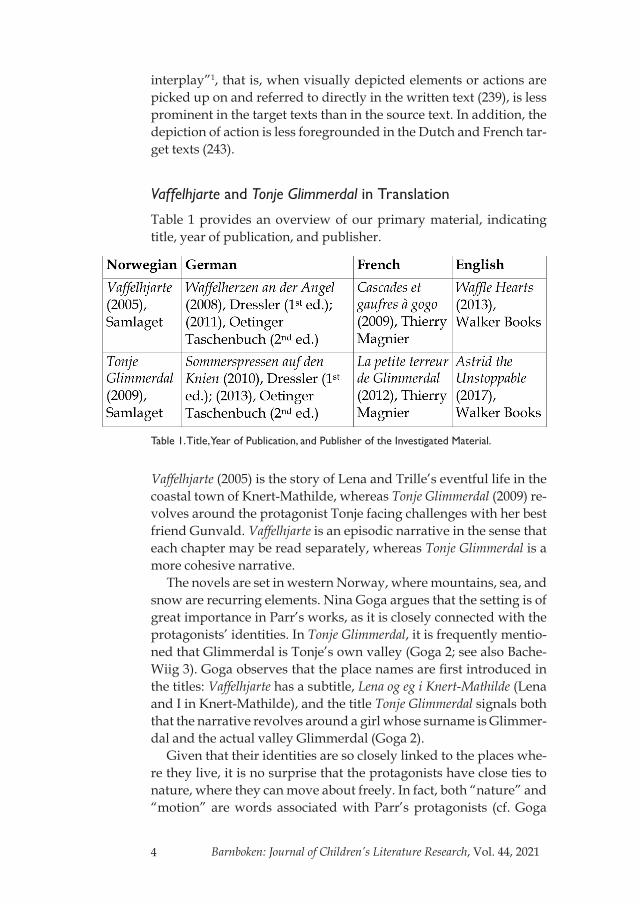
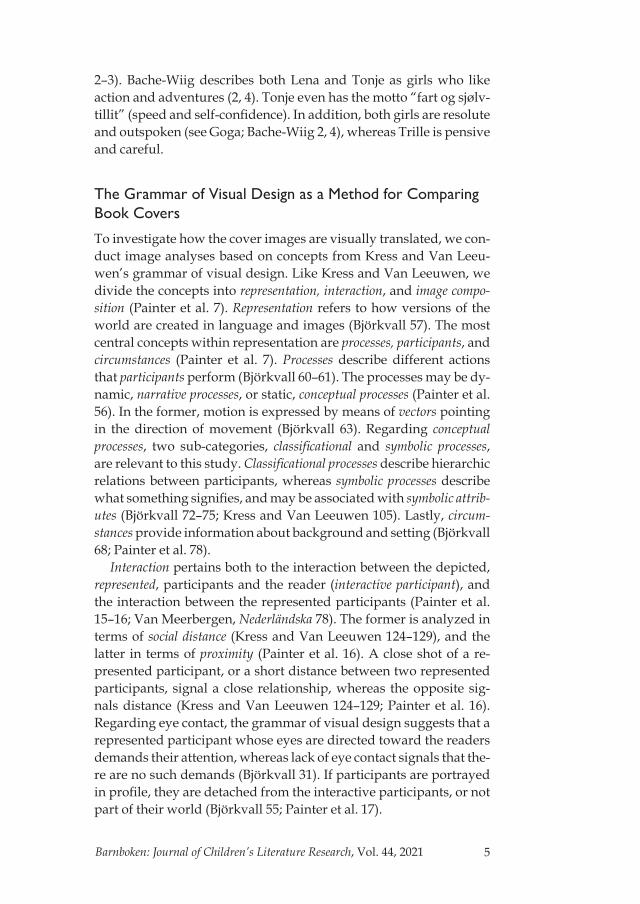
Images 1–3 show the front covers of the German, French, and British versions of Vaffelhjarte.2
The cover of the first Norwegian edition foregrounds the theme of friendship; Trille and Lena are depicted next to each other inside a frame. Both source text covers depict narrative processes. On the cover of the first edition, Trille collects waffles using a fishing rod, while Lena is nibbling on a waffle, offered by Trille. The cover of the second edition depicts some of the “pacy” episodes taking pla-ce in the novel, giving a hint of the protagonists’ eventful life and the novel’s episodic structure. On the source text covers, there is no background revealing where Lena and Trille are. The title, Vaffel-hjarte (waffle hearts), is written in capital letters on the cover of both editions. The waffle heart is anchored in image and verbal text on the first edition’s cover, whereas no waffle can be seen on the cover of the second edition.
Different strategies have been used to translate the title. The Bri-tish publisher has chosen a literal translation, Waffle Hearts. The

7Barnboken: Journal of Children’s Literature Research, Vol. 44, 2021
Image 1. Cover of Waffelherzen an der Angel, © Oetinger Taschenbuch, Hamburg. Cover image by Ute Krause.
Image 2. Cover of Cascades et gaufres à gogo by Maria Parr © Thierry Magnier, 2009, 2014. Cover image by Mathis.
Image 3. Cover of Waffle Hearts. Copyright © 2009 Det Norske Samlaget, Oslo. Title by Maria Parr © Det Norske Samlaget. Jacket/Cover Illustration and Chap-ter Headings © 2013 Kate Forrester. Translation © 2013 Guy Puzey.

8 Barnboken: Journal of Children’s Literature Research, Vol. 44, 2021
German title, Waffelherzen an der Angel (waffle hearts on the fishing rod), is inspired by an episode where Lena and Trille use a fishing rod to haul waffles up to the second floor. The German paratexts thus foreshadow the plot and give hints of the novel’s episodic composition to a greater extent than the source text title.
The French title, Cascades et gaufres à gogo (waterfalls and waffles in abundance), is farther from the source text than both the British and the German versions. The French title is difficult to trace back to an event taking place in the novel, since cascades means “waterfalls” and there are no waterfalls in the story. However, there are many waterfalls in the mountainous landscape of western Norway, and water is an omnipresent element in Knert-Mathilde. Bearing in mind Pujol-Valls’ and Batchelor’s theories on the foregrounding of the ex-otic, we suggest that the French title hints at the geographical setting. We also argue that Lena herself, with her energy and her habit of not holding anything back, could be described as a waterfall. À gogo is a playful phrase meaning “in abundance,” and since the gaufres (waffles) are a recurring element throughout the novel, the French title also foreshadows the content of the book.
Consequently, in all three target texts, the titles foreshadow the novel’s content, but in different ways. Like the Norwegian source text, the British title signals that waffle hearts will play a role in the novel. The German title is somewhat more explicit, since it refers to a specific episode in the novel. Similarly, the French title is inspired by the actions in the plot, but in a more metaphorical way than the German title.
The waffles are anchored in both text and image on the British and German covers. On the former, a heart-shaped waffle in a fry-ing pan is positioned at the bottom (image 3). On the German cover, Trille is “fishing,” using his foot to pull a heart-shaped waffle from the stack (image 1). On the French cover, the reader sees Lena clim-bing up a rope toward the moon (image 2). At first sight, one may not notice that there is also a case of anchorage on the French cover, but a closer look at the moon reveals a waffle pattern on its surface. All three cover images thereby retain the anchorage of the waffle from the Norwegian first edition.
Turning to representation, the German cover image represents a narrative process, where vectors express actions and show relations. Trille’s leg forms a vector pointing toward the waffles, while his foot, with a freshly caught waffle on it, points toward Lena. The vectors show the waffles’ importance and tie both the characters and the stack of waffles together. According to the grammar of visual design,

9Barnboken: Journal of Children’s Literature Research, Vol. 44, 2021
Lena is the goal – a participant to whom a deed is done (Kress and Van Leeuwen 46) – of Trille’s actions, which means that the waffle is intended for her. In addition, Trille’s foot indicates that Lena is the center of Trille’s narrative (cf. Goga 1). The German paratexts there-by hint at Lena and Trille’s relationship in the story and foreshadow Trille’s role as a narrator. Trille’s difficult task in catching a waffle for Lena with his foot indicates his affection for her; he is prepared to go through many hardships for her.
In terms of interaction and proximity, both represented partici-pants on the German cover are depicted close to each other, which signals the characters’ friendship in the story. Regarding their inter- action with the interactive participant, Lena and Trille are portrayed from a long distance, since we can see their entire bodies. They are both looking at the waffles and no eye contact is established with the reader. The long distance and the lack of eye contact with the reader implies that the interactive potential is low.
The French cover also represents a narrative process. The advent- urous Lena is climbing up a rope that forms a vector, pointing toward the goal – the waffle moon – possibly in order to “catch the moon” for Trille, who is watching Lena from a window below. Compared to the German version and the Norwegian first edition, the roles are reversed, since it is now Lena who offers Trille the waffle. Through- out the novel, Trille constantly wonders whether Lena considers him her best friend. Lena catching the moon for Trille metaphorically fo-reshadows a cathartic episode in the novel, where Lena finally tells Trille that he is her best friend. Consequently, the French publisher has added a perspective in the paratexts that is not present in the source text.
The reader views Lena and Trille from a long distance on the French cover; they appear only as two dots. The two of them are also placed quite far apart, as Lena is on her way to the moon while Trille is in a house on earth. However, this distance is compensated for by Trille’s eyes being turned toward Lena, which signals an interest in her. In addition, the visual rhyme – both Lena and Trille being paint- ed in yellow – suggests that they belong together. The color makes them visually salient against a dark blue background, and indicates that they are the protagonists.
As opposed to the German and French covers, the British version does not express motion. Lena and Trille are sitting in trees, but no vectors attract the reader’s attention. We are dealing with a concep-tual classificational process, but also a symbolic process since some symbolic attributes are present. A classificational process shows the
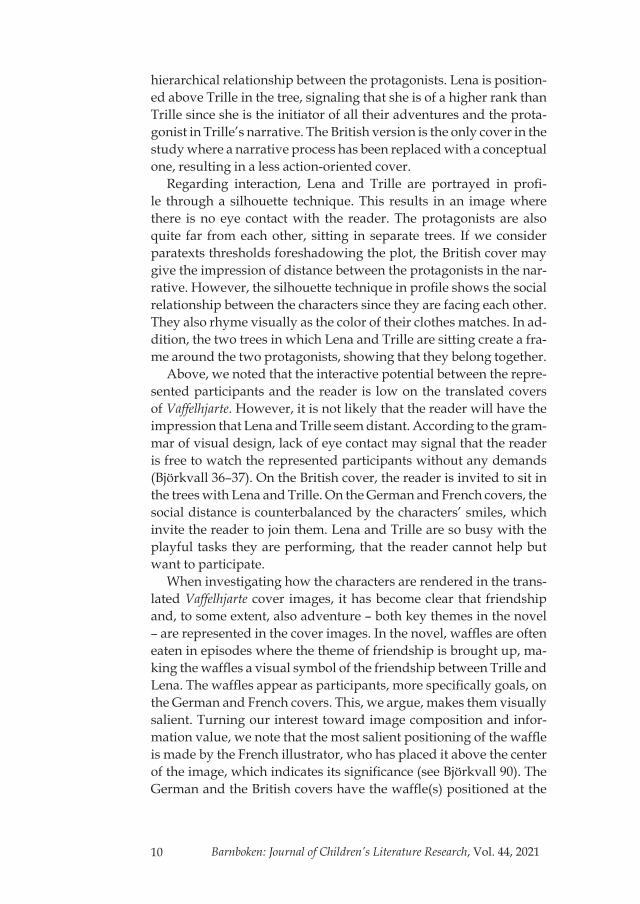
10 Barnboken: Journal of Children’s Literature Research, Vol. 44, 2021
hierarchical relationship between the protagonists. Lena is position- ed above Trille in the tree, signaling that she is of a higher rank than Trille since she is the initiator of all their adventures and the prota-gonist in Trille’s narrative. The British version is the only cover in the study where a narrative process has been replaced with a conceptual one, resulting in a less action-oriented cover.
Regarding interaction, Lena and Trille are portrayed in profi-le through a silhouette technique. This results in an image where there is no eye contact with the reader. The protagonists are also quite far from each other, sitting in separate trees. If we consider paratexts thresholds foreshadowing the plot, the British cover may give the impression of distance between the protagonists in the nar-rative. However, the silhouette technique in profile shows the social relationship between the characters since they are facing each other. They also rhyme visually as the color of their clothes matches. In ad-dition, the two trees in which Lena and Trille are sitting create a fra-me around the two protagonists, showing that they belong together.
Above, we noted that the interactive potential between the repre-sented participants and the reader is low on the translated covers of Vaffelhjarte. However, it is not likely that the reader will have the impression that Lena and Trille seem distant. According to the gram-mar of visual design, lack of eye contact may signal that the reader is free to watch the represented participants without any demands (Björkvall 36–37). On the British cover, the reader is invited to sit in the trees with Lena and Trille. On the German and French covers, the social distance is counterbalanced by the characters’ smiles, which invite the reader to join them. Lena and Trille are so busy with the playful tasks they are performing, that the reader cannot help but want to participate.
When investigating how the characters are rendered in the trans- lated Vaffelhjarte cover images, it has become clear that friendship and, to some extent, also adventure – both key themes in the novel – are represented in the cover images. In the novel, waffles are often eaten in episodes where the theme of friendship is brought up, ma-king the waffles a visual symbol of the friendship between Trille and Lena. The waffles appear as participants, more specifically goals, on the German and French covers. This, we argue, makes them visually salient. Turning our interest toward image composition and infor-mation value, we note that the most salient positioning of the waffle is made by the French illustrator, who has placed it above the center of the image, which indicates its significance (see Björkvall 90). The German and the British covers have the waffle(s) positioned at the

11Barnboken: Journal of Children’s Literature Research, Vol. 44, 2021
bottom center (German) or bottom left (British) corner of the page, communicating something authentic and well-known (Björkvall 90). Color is an important semiotic resource for making something visu-ally salient and the yellow, golden-brown color of the German stack of waffles makes it stand out from the green background. Earlier we noted that Lena and Trille are painted in yellow on the French cover, as is the moon. The visual rhyme thus connects the three partici-pants and makes them visually salient. Color-wise, the British waffle blends into the background, but it is large, and placed in the fore-ground, which makes it visually salient.
Waffles are eaten in large parts of the Western world, but their shape is not always the same. While waffles normally are flower-shaped – consisting of four or five waffle hearts – in Norway and Germany, they are often square in France and Great Britain. In addition to the protagonists eating waffles when the theme of friendship is brought up, the fact that the waffles look like hearts underlines their function as a symbol of affinity. The choice to re-tain the heart-shape of the waffle on the British cover, and in ad-dition place it in a steaming frying pan, may be seen as counter-balancing the overall colorlessness of the cover. The heart-shaped waffle, combined with the heat from the frying pan, also alludes to the warmth and friendship between Lena and Trille. The handle of the frying pan points toward Trille, implying that he is in charge of making the waffles. This, in turn, may foreshadow Trille’s invest-ment in his and Lena’s friendship.
In terms of theme, we have also made an important finding when it comes to the British and French covers. Behind the waffle on the British cover, a symbolic attribute is present: a church. The church has a cross on top of the belfry, which mirrors the Christian theme in the novel. Positioned in the bottom left corner of the image, the church symbolizes faith as a solid, and well-known, base for the protago-nists. Similarly, the mast of the boat on the French cover resembles a cross, which is a symbolic attribute foreshadowing the religious theme. No religious symbols are visible on the Norwegian covers, and this aspect of the novel has thus been added in the French and British cover images.
The grammar of visual design is also suitable for the study of how geographical context is rendered on the covers. As in the case of the source text covers, the German cover has no background, which suggests that the story could take place anywhere in the world. The Scandinavian setting is thereby omitted, which contradicts Batchel-or’s hypothesis on the foregrounding of the exotic.
12 Barnboken: Journal of Children’s Literature Research, Vol. 44, 2021
The French background shows a hilly coastal landscape. The reader sees Lena and Trille somewhat from above, possibly from one of the surrounding mountain tops. This suggests a setting in the mountainous landscape of Western Norway, again foregrounding the exotic. In accordance with Pujol-Valls’ results, the fact that the characters are depicted as quite small gives prominence to the Nor-wegian landscape. The boat in the background could be seen as re-sembling a viking ship, and a symbolic attribute is thus used to create an ambience for the narrative.
On the British cover, two trees, together with several symbolic attributes, frame the cover and provide us with geographical infor-mation. There is a hilly landscape, with a snow-covered mountain to the left and the reader may catch a glimpse of the sea in the upper right corner. These elements are not placed in salient positions, but the mere fact that they are present strengthens Batchelor’s theory about the foregrounding of exotic source culture elements in trans- lated paratexts. In addition, the British cover image could, with all its detailed symbolic attributes, be described as “consciously crafted,” as Batchelor would have put it (142). The attributes also include a few Christmas decorations hanging from the branches of the two trees. The decorations give associations to a Christmas tree – the Scandina-vian tree par excellence, namely the spruce.
The Covers of Tonje Glimmerdal
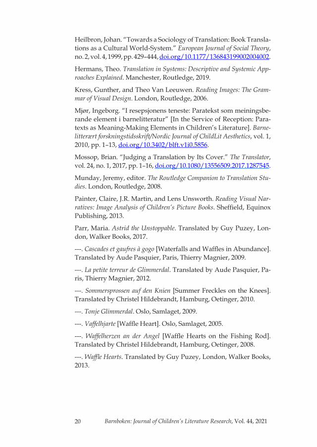
Images 4–7 show the front cover of the first Norwegian edition of Tonje Glimmerdal as well as its German, French, and British versions.
The Norwegian cover of Tonje Glimmerdal (image 4) expresses a great deal of motion and represents a narrative process where Tonje is executing a freestyle jump on skis in a wintry Norwegian landsca-pe. Tonje’s eyes are focused on her jump rather than seeking the in-teractive participant’s gaze. She is turned somewhat to the right, and her skis point in the reading direction, functioning as a page-turner. The cover image refers to an event that takes place at the beginning of the novel and it captures Tonje’s motto, “speed and self-confidence.”
In the Norwegian edition, the protagonist Tonje is anchored in both the title and the cover image. In the case of Tonje Glimmerdal, we focus more on the title and less on the images than we did when ana-lyzing Vaffelhjarte. The reason for this is the fact that there is hardly any interaction between represented participants on the Tonje Glim-merdal covers. Moreover, we devote more attention to the title be-cause of the name Tonje Glimmerdal. Names have caused literary
13Barnboken: Journal of Children’s Literature Research, Vol. 44, 2021
Image 4. Cover of Tonje Glimmerdal (1st ed.), © Samlaget. Cover image by Åshild Irgens.
Image 5. Cover of Sommersprossen auf den Knien, © Oetinger Taschen-buch, Hamburg. Cover image by Heike Herold.
Image 6. Cover of La petite terreur de Glim-merdal by Maria Parr © Thierry Magnier, 2012. Cover image by Mathis.
Image 7. Cover of Astrid the Unstop-pable. Copyright © 2009 Det Norske Samlaget, Oslo. Title by Maria Parr © Det Norske Samlaget. Cover/Jacket and Chapter illustrations © 2017 Katie Harnett. Translation © 2017 Guy Puzey.

14 Barnboken: Journal of Children’s Literature Research, Vol. 44, 2021
translators many a headache over the years, not least in children’s literature (Čičelyte and Jaleniauskiene 31; Bertills 195–198). In an ar-ticle on literary onomastics, Johan Svedjedal points out that names often have thematic and symbolic meanings that are important for a literary work (53–54; see also Bertills 40). Bearing in mind both Sved-jedal’s theory and the fact that names can have transparent meanings in one language that are completely opaque in another, it is evident why names are considered important, but also difficult, to translate.
“Tonje” is a Norwegian name that is rarely used in other countri-es. Its etymology and meaning are not transparent to a native spea-ker, and there is no apparent symbolic connotation associated with the name that needs to be conveyed to the target text readers. Moving on to “Glimmerdal,” it literally means “the glistening valley” and brings to mind the sun shining over a snowy landscape (cf. images 4 and 7). Glimmerdal is both a surname and the name of the valley where Tonje’s family lives. The habit of taking one’s name from one’s homestead was common in Norway in the early twentieth century. Tonje Glimmerdal appears to take place in present times, which would suggest that the Glimmerdal family has lived in the same place for many years. In accordance with Harald Bache-Wiig’s earlier obser-vations, this stresses Tonje’s right to reign over her own kingdom.
In the British title, Astrid the Unstoppable, Tonje has turned into “Astrid,” which is an unusual name in English. However, like Tonje, it is a common name in Norway, so the title is kept within a Scandi-navian context. Turning to Tonje’s last name, Astrid has received the epithet “the Unstoppable,” which captures her motto, “speed and self-confidence,” as well as her action-oriented personality. Conse-quently, the geographical context of Glimmerdal, and Tonje’s right to claim her own land, disappear in the British title, but the publisher has compensated for this loss by keeping the thematic and symbolic value of her name.
In the French title, Tonje’s last name is kept: La petite terreur de Glimmerdal (the little terror from Glimmerdal). Here “Glimmerdal” may be interpreted as a surname, but most likely refers to the place name. As in the British title, the meaning of the name and Tonje’s genealogical claim of a territory are lost in translation, since it is not comprehensible for a speaker of French with no knowledge of Nor-wegian. Nor is it likely that the target text readers have knowledge of Norwegian naming conventions. However, the word terreur is used jokingly to refer to Tonje and her personality, and again, as in the British translation, the thematic and symbolic value of the name is reinforced, but in the form of a nickname instead of her first name.

15Barnboken: Journal of Children’s Literature Research, Vol. 44, 2021
Regarding the German title, it can be noted that the publisher has used a completely different translation strategy and has created a new title, Sommersprossen auf den Knien (summer freckles on the knees), foreshadowing an episode in the novel where the narrator mentions that Tonje, as she rides her bike wearing shorts, has freckles on her knees. This is an interesting move away from the glistening snow of Glimmerdal to a summer-related theme.
In terms of the interplay between the title and the cover images, it is evident that there is, just like on the Norwegian cover (image 4), an anchorage on the British (image 7) and the French (image 6) covers, as the character who is mentioned in the title is the one portrayed on the cover. While Van Meerbergen and Lindgren’s research on Pettson shows that there is less anchorage in the target texts in com-parison to the Pettson source texts, this is not the case in our study. This demonstrates that translators use different strategies and that there is no default go-to translation strategy. On the German cover (image 5), it seems as if there is a case of relay or, at least, an absence of anchorage. One has to read the passage in the novel where Tonje is biking and her freckles are described in order to understand the title. This absence of anchorage, of Tonje not being mentioned in the title, may signal to the reader that the protagonist is of secondary importance in the plot. Nor does the German cover image reflect the bike scene in the book (where Tonje is wearing shorts and a helmet), and it therefore seems as if Mossop’s theories about book covers not necessarily reflecting the actual novel have come into play. That being said, we argue that Tonje personifies her motto, “speed and self-confidence,” on all the covers of the translated editions where, just like on the source text cover, narrative processes communicate action and motion.
The German cover represents a narrative process where Tonje is riding her bike at full speed. There are a couple of speed lines behind her and in front of the tires. In addition, Tonje’s hair is flying behind her, which increases the sense of motion – an important ingredient in the novel – even more than on the source text cover. The high speed – and the absence of one important attribute: the bike helmet – therefore suggests that Tonje is more audacious, or even reckless, in the German image than in the Norwegian, which may attract readers looking for action and adventure.
The German Tonje does not establish eye contact with the reader. Tonje’s eyes appear to be so focused on what she is doing that she cannot take any notice of her surroundings. In combination with the fact that Tonje is not named or mentioned in the title on the German cover, this makes her role in the novel somewhat unclear.

16 Barnboken: Journal of Children’s Literature Research, Vol. 44, 2021
Naturally, the French cover also represents a narrative process since Tonje once again is riding her bike. She is about to go down a hill, which gives a sense of speed also to the French cover. However, there are some differences between the German and the French co-vers. Tonje’s pet, the seagull Måse-Geir, appears as a participant sit-ting on top of her helmet, thereby functioning as a symbolic attribute. The cover image reenacts a scene from the novel and is consequently more anchored in the plot than the German cover. The presence of a helmet also makes Tonje appear as a much more responsible child on the French cover (cf. Van Meerbergen’s results mentioned earlier).
The French Tonje is portrayed at a long distance in profile and it is hard to make eye contact with her since her eye(s) appear only as a dot. However, this social distance is counterbalanced by Måse-Geir’s beak, which points to the right – that is, forward – functioning as a page-turner that invites us to socialize with Tonje by taking part in her story. Måse-Geir is positioned in the upper center of the image, which is a position of high information value. Bearing in mind the paratexts’ potential for reflecting a literary work, it could be argued that the French cover gives the reader the impression that Måse-Geir is more central to the plot than he actually is.
The British cover is a paraphrase of the source text cover image: Tonje is, once again, positioned on skis, high above a wintry land- scape. Compared to the source text cover, one attribute is missing – the hat – which, as on the German cover, makes Tonje appear less responsible. Although Tonje is not necessarily moving forward at a high speed, motion is still central to the image since she is represented in a state of maximum potential energy. According to the grammar of visual design, the covers represent a so-called reactional process (see Kress and Van Leeuwen 67–68), depicting a person’s reactions to something that happens in the outer world – in this case, Tonje’s freestyle jump or her bike racing. On the British cover, Tonje focuses all her attention on executing her jump and there is no time for social interaction. She is viewed from a long distance, partly portrayed in profile, which signals that she is not part of the reader’s world. At the same time, however, Tonje’s skis being turned toward the right – as on the French cover – invites the reader to turn the page and engage in her story.
Måse-Geir also appears on the British cover, but here his role is symbolic rather than social. He is positioned at the top of the cover, bringing to mind a peace dove or, if stretching the interpretation even farther, the dove of the Holy Spirit. Although the religious theme is much more toned down in Tonje Glimmerdal than in Vaffelhjarte, it is

17Barnboken: Journal of Children’s Literature Research, Vol. 44, 2021
still present, and Måse-Geir’s appearance on the cover may be read as reflecting this theme, which once again is most salient on the Bri-tish cover.
Regarding circumstances and the geographical context, image 4 shows that the cover of the Norwegian edition of Tonje Glimmerdal focuses on Tonje in a wintry and somewhat hilly landscape. The Ger-man and French covers, on the other hand, highlight summer instead of winter. This is manifested in attributes; Tonje is riding a bike and she is dressed in summer clothes. Hence, there is no foregrounding of the exotic. Nevertheless, we are hesitant to go as far as to argue that a so-called domesticating translation strategy has been used sin-ce this bike riding may take place anywhere in the world.
A landscape similar to the source text image, but a more dramatic, “winter wonderland” one is depicted on the British cover. The moun-tains are higher, there is snow in the air, and snowy tree branches frame Tonje. As opposed to the German and the French covers, we see the foregrounding of the exotic in this cover image. Similarly to the cover of Waffle Hearts, the cover of Astrid the Unstoppable also conveys a Christmas feeling. It is worth noting that the British publis-her has chosen to highlight Christmas despite the fact that the novel takes place between winter break and Easter. The Christmas wre-ath framing the title and the spruce trees framing Tonje create this Christmas ambience. As in the case of Waffle Hearts, the spruce also functions as a symbol of Scandinavia.
Book Covers – An Important Object of Analysis
We would like to end this study by placing it in a larger translatio-nal context. There are few studies on paratexts and translation in children’s literature. Although only a case study, the results from this study contribute with important results to this field. Moreover, it has also generated hypotheses for further studies. Gideon Toury argues that it is important to take context and the macro-level into consideration when conducting translational analyses (31–34). We argue that directing the attention toward translated paratexts and, more specifically, book cover illustrations is the best way to put Toury’s ideas into practice. Book covers are an important object of analysis since they give signals about different intended readers, different didactic standards, and different book markets in sour-ce and target cultures. Book covers also reveal different views on the source culture geography, and we have, in accordance with Batchelor’s and Pujol-Valls’s theories on the foregrounding of the

18 Barnboken: Journal of Children’s Literature Research, Vol. 44, 2021
exotic in translated paratexts, seen that mountains and sometimes also the sea – both typical components of the geography of western Norway – are present on the British and French target text covers. None of the German covers, however, depicts a typical Scandinavi-an setting. In a larger translational context, this result is especially interesting since it, to some extent, contradicts previous research in Translation Studies that focuses solely on the textual level. Normal-ly, literature from peripheral literary systems – in this case, Norway – tends to be more domesticated when it migrates to more central lit- erary systems (Toury 306–307). The Anglo-American and the French literary systems are the most central in the world (Heilbron 434), and it would therefore be expected that the British and French cover images would have changed more to appear to be set in a French or British context, but this is not the case. Drawing on Batchelor and Pujol-Valls, we would therefore like to put forward the hypothesis that paratexts and verbal text are affected quite differently when they are moved from one literary system to another. We would also like to put forward the hypothesis that it is not necessary to foreground the Norwegian context in Germany since German readers are quite familiar with Scandinavian children’s literature. However, this is a hypothesis that remains to be investigated empirically.
Biographical information: Marcus Axelsson, PhD, is an associate profes-sor of Scandinavian languages at the Department of Teacher Education at Østfold University College in Halden, Norway. He specializes in the fields of Translation Studies and the Sociology of Literature and has, among other things, published research dealing with the translation of young adult literature for girls in the 1950s.
Ragnhild Næsje is an assistant professor of Norwegian at the Department of Teacher Education at Østfold University College in Halden, Norway. She specializes in the study of children’s literature and in the didactics of literature. She holds an MA in the didactics of literature and has published research on pedagogical methods in the teacher trainee program.

19Barnboken: Journal of Children’s Literature Research, Vol. 44, 2021
Notes1 Cf. “anchorage” (Kress and Van Leeuwen 18).
2 Reprint of images of the two Norwegian covers of Vaffelhjarte has not been granted by the artist. The cover image may be found at www.tanum. no_vaffelhjarte-maria-parr-9788252166590 (1st ed.) and Samlaget’s web-page: samlaget.no/products/vaffelhjarte-lena-og-eg-i-knert-mathilde (2nd ed.) (both accessed 19 May 2019).
Works Cited
Bache-Wiig, Harald. “Fra Sveits til Glimmerdal: Maria Parrs Ton-je Glimmerdal – en gjenskaping av Johanna Spyris Heidi?” [From Switzerland to Glimmerdal. Maria Parr’s Tonje Glimmerdal – a Re- Creation of Johanna Spyri’s Heidi?]. Barnelitterært forskningstids-skrift/Nordic Journal of ChildLit Aesthetics, vol. 1, 2010, pp. 1–7, doi. org/10.3402/blft.v1i0.5872.
Batchelor, Kathryn. Translation and Paratexts. London, Routledge, 2018.
Bertills, Yvonne. Beyond Identification: Proper Names in Children’s Li-terature. Diss., Åbo Akademi University. Åbo, Åbo akademis förlag, 2003.
Björkvall, Anders. Den visuella texten: Multimodal analys i praktiken [The Visual Text: Multimodal Analysis in Practice]. Stockholm, Hall-gren & Fallgren, 2009.
Čičelyte, Vilma, and Evelina Jaleniauskiene. “The Strategies for Translating Proper Names in Children’s Literature.” Studies about Languages, no. 15, 2009, pp. 31–42.
Genette, Gerard. Paratexts: Thresholds of Interpretation. Paris, Le Seuil, 1987.
Gil-Bardají, Anna, Pilar Orero, and Sara Rovira-Esteva. “Introduc-tion.” Translation Peripheries: Paratextual Elements in Translation, edi-ted by Anna Gil-Bardají, Pilar Orero, and Sara Rovira Estera, Bern, Peter Lang, 2012, pp. 7–11.
Goga, Nina. “Landskap og bannskap i Maria Parrs forfatterskap” [Landscape and Foul Language in Maria Parr’s Authorship]. Barne-litterært forskningstidsskrift/Nordic Journal of ChildLit Aesthetics, vol. 2, 2011, pp. 1–9, doi.org/10.3402/blft.v2i0.5969.
20 Barnboken: Journal of Children’s Literature Research, Vol. 44, 2021
Heilbron, Johan. “Towards a Sociology of Translation: Book Transla-tions as a Cultural World-System.” European Journal of Social Theory, no. 2, vol. 4, 1999, pp. 429–444, doi.org/10.1177/136843199002004002.
Hermans, Theo. Translation in Systems: Descriptive and Systemic App-roaches Explained. Manchester, Routledge, 2019.
Kress, Gunther, and Theo Van Leeuwen. Reading Images: The Gram-mar of Visual Design. London, Routledge, 2006.
Mjør, Ingeborg. “I resepsjonens teneste: Paratekst som meiningsbe-rande element i barnelitteratur” [In the Service of Reception: Para- texts as Meaning-Making Elements in Children’s Literature]. Barne-litterært forskningstidsskrift/Nordic Journal of ChildLit Aesthetics, vol. 1, 2010, pp. 1–13, doi.org/10.3402/blft.v1i0.5856.
Mossop, Brian. “Judging a Translation by Its Cover.” The Translator, vol. 24, no. 1, 2017, pp. 1–16, doi.org/10.1080/13556509.2017.1287545.
Munday, Jeremy, editor. The Routledge Companion to Translation Stu-dies. London, Routledge, 2008.
Painter, Claire, J.R. Martin, and Lens Unsworth. Reading Visual Nar-ratives: Image Analysis of Children’s Picture Books. Sheffield, Equinox Publishing, 2013.
Parr, Maria. Astrid the Unstoppable. Translated by Guy Puzey, Lon-don, Walker Books, 2017.
---. Cascades et gaufres à gogo [Waterfalls and Waffles in Abundance]. Translated by Aude Pasquier, Paris, Thierry Magnier, 2009.
---. La petite terreur de Glimmerdal. Translated by Aude Pasquier, Pa-ris, Thierry Magnier, 2012.
---. Sommersprossen auf den Knien [Summer Freckles on the Knees]. Translated by Christel Hildebrandt, Hamburg, Oetinger, 2010.
---. Tonje Glimmerdal. Oslo, Samlaget, 2009.
---. Vaffelhjarte [Waffle Heart]. Oslo, Samlaget, 2005.
---. Waffelherzen an der Angel [Waffle Hearts on the Fishing Rod]. Translated by Christel Hildebrandt, Hamburg, Oetinger, 2008.
---. Waffle Hearts. Translated by Guy Puzey, London, Walker Books, 2013.

21Barnboken: Journal of Children’s Literature Research, Vol. 44, 2021
Pujol-Valls, Maria. “Translating Landscape. Maria Parr’s Tonje Glim-merdal from an Ecocritical Perspective.” Barnboken: Journal of Child-ren’s Literature Research, vol. 41, 2018, doi.org/10.14811/clr.v41i0.351.
Svedjedal, Johan. “Almqvist och namnen: En studie i litterär ono-mastik” [Almqvist and the Names: A Study in Literary Onomastics]. Samlaren, vol. 125, 2004, pp. 52–77.
Toury, Gideon. Descriptive Translation Studies and Beyond. Amster-dam, John Benjamins Publishing Company, 2012.
Van Meerbergen, Sara. “The Church as a Cream Pie: A Multimo-dal Translation Analysis of Changing Child Images in Picture Book Translation.” True North: Literary Translation in the Nordic Countries, edited by B.J. Epstein, Newcastle upon Tyne, Cambridge Scholars Publishing, 2014, pp. 98–116.
---. Nederländska bilderböcker blir svenska: En multimodal översättnings-analys [Dutch Picture Books Become Swedish: A Multimodal Trans-lation Analysis]. Diss., Stockholm University. Stockholm, Acta Uni-versitatis Stockholmiensis, 2010.
Van Meerbergen, Sara, and Charlotte Lindgren. “Pettson and Findus Go Glocal: Recontextualization of Images and Multimodal Analysis of Simultaneous Action in Dutch and French Translations.” Child-ren’s Literature in Translation: Texts and Contexts, edited by Jan van Collie and Jack McMartin, Leuven, Leuven University Press, 2020, pp. 231–247.