p a g e | 1 spot report overvie of espot reports for administrators.pdfp a g e | 1 spot report...
TRANSCRIPT

P a g e | 1
SPOT Report Overview
To Access your SPOT Reports: Log in at my.tcu.edu using your TCU username and password. From the Main Menu drop down box, select Faculty or Student Center, then select SPOT. When you first log in, you will come to this page (See below). You can get to your report options by clicking on Reports on the top purple bar, or selecting one of the blue hyperlinks listed under Reports on the page.
Reporting Options: There are several Report options available to you under the Reports link in the top purple bar. However, I am going to provide you with a brief explanation of the 5 main reports listed on the home page (see above).
1. Response Rates You can click on this link to see what the response rates are for your department. Using the drop-down menus, you can filter what you want to see. You can also click on the name of your department in the response rate chart and it will drill down from department level to each individual course response rate.

P a g e | 2
2. Survey Results This option allows you to access and export 4 types of reports: the custom report, the comments report, individual Evaluations and the myFocus report. When you click on Survey results, you will come to this page. Here you will click on the semester hyperlink.
Once you click on the semester hyperlink, you will come to this screen. Click on the one of the hyperlinks in the “Course Dept.” column (2nd column on left).
You will then come to a screen like this:
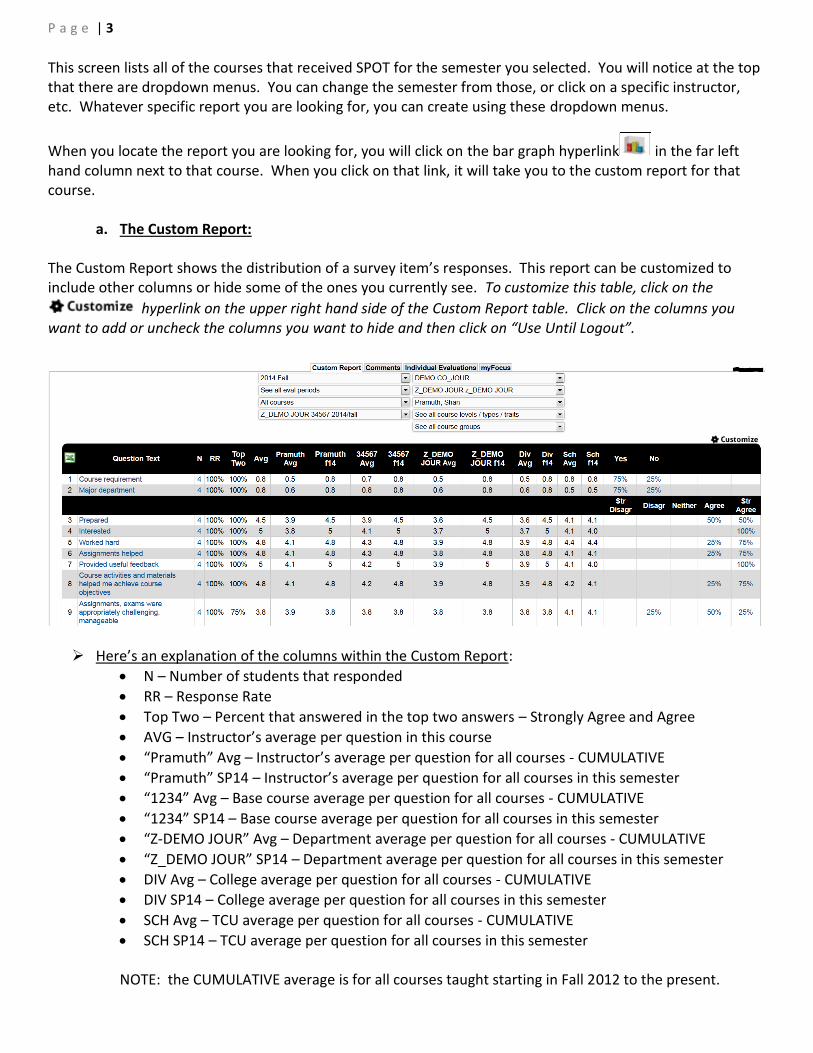
P a g e | 3
This screen lists all of the courses that received SPOT for the semester you selected. You will notice at the top that there are dropdown menus. You can change the semester from those, or click on a specific instructor, etc. Whatever specific report you are looking for, you can create using these dropdown menus.
When you locate the report you are looking for, you will click on the bar graph hyperlink in the far left hand column next to that course. When you click on that link, it will take you to the custom report for that course.
a. The Custom Report: The Custom Report shows the distribution of a survey item’s responses. This report can be customized to include other columns or hide some of the ones you currently see. To customize this table, click on the
hyperlink on the upper right hand side of the Custom Report table. Click on the columns you want to add or uncheck the columns you want to hide and then click on “Use Until Logout”.
Here’s an explanation of the columns within the Custom Report:
N – Number of students that responded
RR – Response Rate
Top Two – Percent that answered in the top two answers – Strongly Agree and Agree
AVG – Instructor’s average per question in this course
“Pramuth” Avg – Instructor’s average per question for all courses - CUMULATIVE
“Pramuth” SP14 – Instructor’s average per question for all courses in this semester
“1234” Avg – Base course average per question for all courses - CUMULATIVE
“1234” SP14 – Base course average per question for all courses in this semester
“Z-DEMO JOUR” Avg – Department average per question for all courses - CUMULATIVE
“Z_DEMO JOUR” SP14 – Department average per question for all courses in this semester
DIV Avg – College average per question for all courses - CUMULATIVE
DIV SP14 – College average per question for all courses in this semester
SCH Avg – TCU average per question for all courses - CUMULATIVE
SCH SP14 – TCU average per question for all courses in this semester
NOTE: the CUMULATIVE average is for all courses taught starting in Fall 2012 to the present.

P a g e | 4
Filtering Options in the Custom Report:
The blue hyperlinks within the report may be clicked on to drill down and show how a particular group has responded to the other items in the survey. For example, if you want to see how majors in the department in which the course is offered responded to the survey, you would simply click on the % hyperlink associated with "Yes - Am a major in the department offering this course.”
Furthermore, within the custom report, users can filter on student characteristics such as
discriminate overall and rating tendency- overall. These calculations become more precise as
further data is added to the eSPOT system.
The discriminate overall of the student is a calculation that determines how discriminating is the pattern of a student's responses based on ALL of the assessments a student has ever completed in the eSPOT system since Fall 2012. Does the student always respond with "3"s to every survey item or does the student appear to give some thought to each response? Students are classified into six categories from Very Discriminate to Careless. The rating tendency - overall of the student is a calculation that determines the student's scoring tendency when you look at ALL of the assessments a student has ever completed in the eSPOT system since Fall 2012. Students are classified into five categories from Very Easy Grader to Very Hard Grader.
Custom Report Charts:
Below the Custom Report table, you will see a Questions Averages chart which highlights 10 questions from the survey and compares it with the Department, College and TCU average.

P a g e | 5
Below that you will see a Distribution of scores chart evaluating the same 10 questions in the Questions Averages chart.
Comments: Next, you will see a list of all comments or text responses from the survey. The comments are grouped together under each question. (The comments on the Custom Report are also available as a separate report.)
IMPORTANT: Next to some student comments, there is a student disposition description given. The "Student Disposition" is a quick visual tool designed to give some context for the comments. The student disposition is a calculation that determines the student's satisfaction (i.e. tends to be very satisfied/dissatisfied on all assessments). Please remember that the student disposition calculation is based on ALL of the student's eSPOT submissions in the current system since Fall 2012. Therefore, next to a very positive comment, the student disposition may be that of Dissatisfied. This means that based on all assessment data in the system for the student he or she is generally dissatisfied, but may have had a great experience in a particular class. If you see “Dissatisfied”, it means that the student overall gave LOW scores on numeric questions. If you see a blank area, it means that the student who wrote that comment was giving ‘middle range’ scores to numeric questions. If you see “V. Satisfied”, it means that the student overall gave HIGH scores for numeric questions.

P a g e | 6
Word Cloud Analysis:
Word Cloud shows instructors trends and themes in their comments. The bigger a word is, the more prominently it is used throughout the comments. If you click on the word, it will give you all the comments that contain that particular word.
Exporting the Custom Report: All eSPOT reports from the SmartEvals! system can be exported for offline storage purposes, for additional data analysis with external software or for obtaining a printed copy of your report.
To get a copy of the custom reports, you want to click on the excel icon located in the top black bar of the report.
Once you click on that, you will be taken to this screen:
Click on the drop down menu and select which format you want the report in. Please note that each file type exports the reports a bit differently. If you want the entire report and the graphs, select PDF. Next you will click on the Export button located in the middle.

P a g e | 7
b. The Comments Report, Individual Evaluations and myFocus Report:
You can get to these three reports by clicking on the appropriate tab at the top of the screen of your Custom Report.
The Comments Report groups together all the comments given for a particular question so it’s easy to see similarities or patterns. It also includes Student Disposition. See note above for an explanation.
The Individual Evaluation Report displays the individual surveys for each student who completes an assessment for a course. This report format is similar to traditional paper assessments.
The myFocus report is a summary report for ALL classes uploaded to the eSPOT system since Fall 2012.
This includes classes from the current and prior semesters using SmartEvals! (although the data from
prior semesters is weighted less than the data from the current semester). With the myFocus
development tool, instructors have the ability to see areas for improvement, according to their course
assessments, and create "Action Plans" to improve their performance. Instructors also have the
opportunity to see areas where they excel, and provide best practices advice to their peers.
Instructors will receive a myFocus score for instructor-level questions on their course
assessment surveys (except write-in comments). These myFocus scores are calculated by
including ALL of an instructor’s responses from ALL of his/her classes in the system. Scores
range from 1 – 100, based on the following three components:
o Average of the instructor’s percentile rank scores for each question
o Confidence Interval calculation for each question
o Question Applicability
The scores are then compared to those of other instructors who were asked the same question.
The Color Spectrum: A myFocus report may be shaded green (instructor’s mean score was in
top 30th percentile among the comparison group), white (instructor’s mean scores was within
the middle range of the comparison group), and/or red (instructor’s mean scores was in
approximately the bottom 30th percentile).
PLEASE NOTE: The comparison group is currently set as the University. Also, please keep in
mind that there will always be a bottom 30% and that the relativity of scores should always be
examined.
Exporting these reports: Both the comments report and the myFocus report are exported the same way as the Custom report
by clicking on the icon. The Individual Evaluations can be exported by clicking on the “Export Report to PDF” button.

P a g e | 8
3. Email PDF Reports
This option allows you to create a pdf report and email it to your TCU email address. Using the drop down menus, you can select what you want your report to be and choose whether you want just the custom report, just the comments, the custom report with the comments or the custom report with comments and the charts. *PLEASE NOTE: This report may be helpful for department chairs that may want to run one big report for merit evaluations, tenure etc. For example, you could select All of 2016, then your department, and leave it so you see all instructors, all course levels/types, and all course groups. Then you can select Custom Report only, for example, and then go down to the list of names and select which instructors you want to include in your report. Then you would click on “Email me the selected reports”. See screen shot below.
Once you click on “Email me the selected reports”, an email will be sent to your TCU email address with a separate PDF reports attached for each course the instructors you selected taught. If you want it all in one big PDF report, click on the “Group reports into one PDF file” below the Email the selected reports. Instead of individual PDF reports, you will receive one big PDF report.

P a g e | 9
4. Export Raw Data
This will allow you to export the raw data in various ways. As in the other reports, the drop-down menus will allow you to filter your report how you want it. And then you can select which type of export you want. Below is an example of how we in the IR office run our main data export. It will show you which options we selected.
5. Print Quarter Sheets This allows you to print out brief instructions for students on how they can access their SPOTs. There are four per sheet.