outlook 2014 - the great race - pb
TRANSCRIPT

EYE ON THE MARKET OUTLOOK 2014 J.P. Morgan Private Bank
The Great Race. Markets have zoomed ahead since 2009, anticipating that eventually the world’s economies would catch up. Thanks to extra fuel from the Fed, the U.S. is running at a steady pace and should accelerate modestly in 2014. China has hit some potholes but is still moving, just more slowly. Japan’s experimental model is designed to overtake EM surplus countries; still a work in progress. The Eurozone is moving again, but its design is economically and aerodynamically flawed. The EM debtors are temporarily off-road. See inside for more details.

The countries and regions depicted on the cover make up 75%-80% of the world on both a GDP and equity market capitalization basis. The remainder is primarily made up of developed countries of two kinds: commodity exporters like Canada and Australia, and countries in Europe that do not use the Euro (UK, Denmark, Sweden, Norway, Switzerland, etc.). With the exception of Australia (which has been affected by the China slowdown), all these countries are in growth mode as 2013 comes to a close. From an artistic license perspective, they would have been depicted on the cover near the front of the pack. These countries are all different, but similar in one important way: they set their own monetary policy and do not suffer from the albatross of a common currency.
Countries referred to as “Emerging Markets” do not rely on the same economic model. Some still rely on substantial foreign capital for growth (India, Brazil, Indonesia and Turkey), while others run a trade surplus (exporters of Southeast Asia), or run small trade deficits and no longer require large inflows (Mexico, Poland and the Czech Republic). The eventual return to a higher interest rate world is a bigger risk for the first group than the second or third.
Returns shown on the front cover represent the period from January 1, 2010 to November 30, 2013. Note: Past performance is not indicative of future returns. See sources and definitions at the end of this publication.
Cover illustration by Matthieu Forichon

How do you summarize a year that was in many respects indefinable? On one hand, the European sovereign debt crisis, contracting housing markets and high unemployment weighed heavy on all of our minds. But at the same time, record corporate profits and strong emerging markets growth left reason for optimism.
So rather than look back, we’d like to look ahead. Because if there’s one thing that we’ve learned from the past few years, it’s that while we can’t predict the future, we can certainly help you prepare for it.
To help guide you in the coming year, our Chief Investment Officer Michael Cembalest has spent the past several months working with our investment leadership across Asset Management worldwide to build a comprehensive view of the macroeconomic landscape. In doing so, we’ve uncovered some potentially exciting investment opportunities, as well as some areas where we see reason to proceed with caution.
Sharing these perspectives and opportunities is part of our deep commitment to you and what we focus on each and every day. We are grateful for your continued trust and confidence, and look forward to working with you in 2011.
Most sincerely,
MARY CALLAHAN ERDOESChief Executive Officer
J.P. Morgan Asset Management
Happy New Year. As we enter 2014, we remind ourselves of how much has changed in the past
two years, from 2012’s uncertain landscape to 2013’s increased stability and markets moving
quickly as a result. But even as markets surged, corporate profits, employment and economic
growth have struggled to keep pace.
So where do we go from here? What needs to happen in the coming year to close these gaps?
That’s exactly what Michael Cembalest, our Chairman of Market and Investment Strategy,
sets out to answer in his Outlook 2014, “The Great Race.” Michael and team take a closer look
at the factors that will determine the markets’ continued progress, and most importantly the
investment opportunities we can expect as a result.
The 2014 Outlook reflects our view of the global investment landscape and focuses on the
opportunities in the year ahead. It is our thought leadership and sound investment guidance
that have enabled us to provide our clients with the most effective solutions for the last
175 years.
Thank you, as always, for your continued trust and confidence in J.P. Morgan.
Most sincerely,

1
EYE ON THE MARKET • OUTLOOK 2014 JANUARY 1, 2014
EYE ON THE MARKET OUTLOOK 2014 JANUARY 1, 2014
1
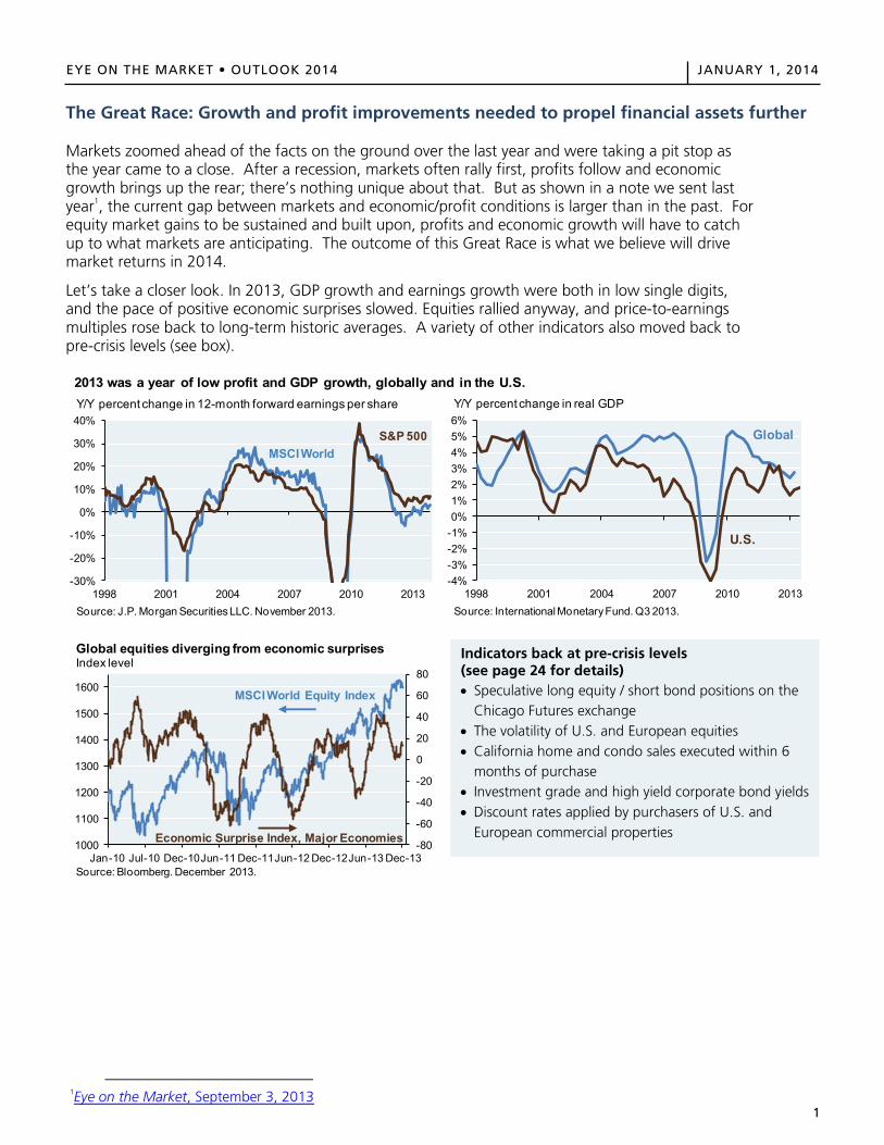
The Great Race: Growth and profit improvements needed to propel financial assets further Markets zoomed ahead of the facts on the ground over the last year and were taking a pit stop as the year came to a close. After a recession, markets often rally first, profits follow and economic growth brings up the rear; there’s nothing unique about that. But as shown in a note we sent last year1, the current gap between markets and economic/profit conditions is larger than in the past. For equity market gains to be sustained and built upon, profits and economic growth will have to catch up to what markets are anticipating. The outcome of this Great Race is what we believe will drive market returns in 2014.
Let’s take a closer look. In 2013, GDP growth and earnings growth were both in low single digits, and the pace of positive economic surprises slowed. Equities rallied anyway, and price-to-earnings multiples rose back to long-term historic averages. A variety of other indicators also moved back to pre-crisis levels (see box).
1Eye on the Market, September 3, 2013
2013 was a year of low profit and GDP growth, globally and in the U.S.
-30%
-20%
-10%
0%
10%
20%
30%
40%
1998 2001 2004 2007 2010 2013Source: J.P. Morgan Securities LLC. November 2013.
Y/Y percent change in 12-month forward earnings per share
MSCI WorldS&P 500
-4%-3%-2%-1%0%1%2%3%4%5%6%
1998 2001 2004 2007 2010 2013Source: International Monetary Fund. Q3 2013.
Y/Y percent change in real GDP
Global
U.S.
-80
-60
-40
-20
0
20
40
60
80
1000
1100
1200
1300
1400
1500
1600
Jan-10 Jul-10 Dec-10Jun-11 Dec-11Jun-12 Dec-12Jun-13 Dec-13
Global equities diverging from economic surprisesIndex level
Source: Bloomberg. December 2013.
MSCI World Equity Index
Economic Surprise Index, Major Economies
Indicators back at pre-crisis levels (see page 24 for details) Speculative long equity / short bond positions on the
Chicago Futures exchange The volatility of U.S. and European equities California home and condo sales executed within 6
months of purchase Investment grade and high yield corporate bond yields Discount rates applied by purchasers of U.S. and
European commercial properties
2
EYE ON THE MARKET • OUTLOOK 2014 JANUARY 1, 2014
EYE ON THE MARKET OUTLOOK 2014 JANUARY 1, 2014
2
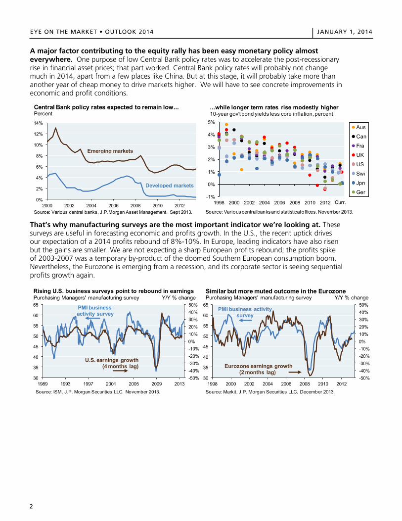
A major factor contributing to the equity rally has been easy monetary policy almost everywhere. One purpose of low Central Bank policy rates was to accelerate the post-recessionary rise in financial asset prices; that part worked. Central Bank policy rates will probably not change much in 2014, apart from a few places like China. But at this stage, it will probably take more than another year of cheap money to drive markets higher. We will have to see concrete improvements in economic and profit conditions.
That’s why manufacturing surveys are the most important indicator we’re looking at. These surveys are useful in forecasting economic and profits growth. In the U.S., the recent uptick drives our expectation of a 2014 profits rebound of 8%-10%. In Europe, leading indicators have also risen but the gains are smaller. We are not expecting a sharp European profits rebound; the profits spike of 2003-2007 was a temporary by-product of the doomed Southern European consumption boom. Nevertheless, the Eurozone is emerging from a recession, and its corporate sector is seeing sequential profits growth again.
0%
2%
4%
6%
8%
10%
12%
14%
2000 2002 2004 2006 2008 2010 2012Source: Various central banks, J.P.Morgan Asset Management. Sept 2013.
Central Bank policy rates expected to remain low...Percent
Emerging markets
Developed markets
-1%
0%
1%
2%
3%
4%
5%
1998 2000 2002 2004 2006 2008 2010 2012 2014
Aus
Can
Fra
UK
US
Swi
Jpn
Ger
...while longer term rates rise modestly higher10-year gov't bond yields less core inflation, percent
Curr.
Source: Various central banks and statisticaloffices. November 2013.
-50%-40%-30%-20%-10%0%10%20%30%40%50%
30
35
40
45
50
55
60
65
1989 1993 1997 2001 2005 2009 2013
Source: ISM, J.P. Morgan Securities LLC. November 2013.
Rising U.S. business surveys point to rebound in earningsPurchasing Managers' manufacturing survey Y/Y % change
PMI business activity survey
U.S. earnings growth(4 months lag)
-50%-40%-30%-20%-10%0%10%20%30%40%50%
30
35
40
45
50
55
60
65
1998 2000 2002 2004 2006 2008 2010 2012
Source: Markit, J.P. Morgan Securities LLC. December 2013.
Similar but more muted outcome in the EurozonePurchasing Managers' manufacturing survey Y/Y % change
PMI business activity survey
Eurozone earnings growth(2 months lag)
3
EYE ON THE MARKET • OUTLOOK 2014 JANUARY 1, 2014EYE ON THE MARKET OUTLOOK 2014 JANUARY 1, 2014
3
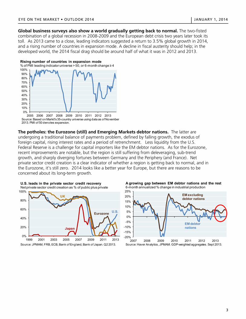
Global business surveys also show a world gradually getting back to normal. The two-fisted combination of a global recession in 2008-2009 and the European debt crisis two years later took its toll. As 2013 came to a close, leading indicators suggested a return to 3.5% global growth in 2014, and a rising number of countries in expansion mode. A decline in fiscal austerity should help; in the developed world, the 2014 fiscal drag should be around half of what it was in 2012 and 2013.
The potholes: the Eurozone (still) and Emerging Markets debtor nations. The latter are undergoing a traditional balance of payments problem, defined by falling growth, the exodus of foreign capital, rising interest rates and a period of retrenchment. Less liquidity from the U.S. Federal Reserve is a challenge for capital importers like the EM debtor nations. As for the Eurozone, recent improvements are notable, but the region is still suffering from deleveraging, sub-trend growth, and sharply diverging fortunes between Germany and the Periphery (and France). Net private sector credit creation is a clear indicator of whether a region is getting back to normal, and in the Eurozone, it’s still zero. 2014 looks like a better year for Europe, but there are reasons to be concerned about its long-term growth.
0%10%20%30%40%50%60%70%80%90%
100%
2005 2006 2007 2008 2009 2010 2011 2012 2013Source: Based on Markit's 35-country universe using data as of November 2013. PMI of 50 denotes expansion.
Rising number of countries in expansion mode% of PMI leading indicator universe > 50, or 6-month change ≥ 4
0%
20%
40%
60%
80%
100%
1999 2001 2003 2005 2007 2009 2011 2013Source: JPMAM, FRB, ECB, Bank of England, Bank of Japan. Q2 2013.
U.S. leads in the private sector credit recoveryNet private sector credit creation as % of public plus private
Eurozone U.S.
Japan
UK
-20%
-15%
-10%-5%0%5%
10%15%
20%
25%
2007 2008 2009 2010 2011 2012 2013Source: Haver Analytics, JPMAM. GDP-weighted aggregates. Sept 2013.
A growing gap between EM debtor nations and the rest6-month annualized % change in industrial production
EM debtor nations
EM excluding debtor nations
4
EYE ON THE MARKET • OUTLOOK 2014 JANUARY 1, 2014EYE ON THE MARKET OUTLOOK 2014 JANUARY 1, 2014
4
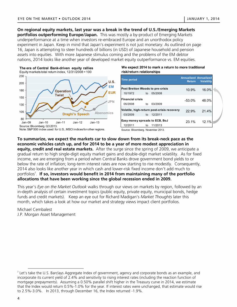
On regional equity markets, last year was a break in the trend of U.S./Emerging Markets portfolios outperforming Europe/Japan. This was mostly a by-product of Emerging Markets underperformance at a time when investors re-embraced Europe and an unorthodox policy experiment in Japan. Keep in mind that Japan’s experiment is not just monetary: As outlined on page 16, Japan is attempting to steer hundreds of billions (in USD) of Japanese household and pension assets into equities. With more Japanese stimulus coming and the problems of the EM debtor nations, 2014 looks like another year of developed market equity outperformance vs. EM equities.
To summarize, we expect the markets car to slow down from its break-neck pace as the economic vehicles catch up, and for 2014 to be a year of more modest appreciation in equity, credit and real estate markets. After the surge since the spring of 2009, we anticipate a gradual return to high single-digit equity market gains and double-digit market volatility. As for fixed income, we are emerging from a period when Central Banks drove government bond yields to or below the rate of inflation; long-term interest rates are now starting to rise modestly. Consequently, 2014 also looks like another year in which cash and lower-risk fixed income don’t add much to portfolios2. If so, investors would benefit in 2014 from maintaining many of the portfolio allocations that have been working since the global recession ended in 2009.
This year’s Eye on the Market Outlook walks through our views on markets by region, followed by an in-depth analysis of certain investment topics (public equity, private equity, municipal bonds, hedge funds and credit markets). Keep an eye out for Richard Madigan’s Market Thoughts later this month, which takes a look at how our market and strategy views impact client portfolios.
Michael Cembalest J.P. Morgan Asset Management
2 Let’s take the U.S. Barclays Aggregate Index of government, agency and corporate bonds as an example, and incorporate its current yield of 2.4% and sensitivity to rising interest rates (including the reaction function of mortgage prepayments). Assuming a 0.50% parallel shift higher in the Treasury curve in 2014, we estimate that the Index would return 0.5%-1.0% for the year. If interest rates were unchanged, that estimate would rise to 2.5%-3.0%. In 2013, through December 16, the Index returned -1.9%.
80
105
130
155
180
205
230
Jan-09 Jan-10 Jan-11 Jan-12 Jan-13Source: Bloomberg. Q3 2013.Note: S&P 500 index used for U.S., MSCI indices for other regions.
The era of Central Bank-driven equity ralliesEquity markets total return index, 12/31/2008 = 100
EMEUR
JPN
U.S.
AbenomicsDraghi's Speech
Operation Twist
Post Bretton Woods to pre-crisis10/1972 to 05/2008
Financial crisis05/2008 to 03/2009
Volatile, high-return post-crisis recovery03/2009 to 12/2011
Easy money spreads to ECB, BoJ12/2011 to 11/2013
Source: Bloomberg. November 2013.
23.1% 12.1%
Time period Annualized Return
Annualized Volatility
10.9% 16.0%
We expect 2014 to mark a return to more traditional risk/return relationships
-53.0% 48.0%
22.9% 21.4%
EYE ON THE MARKET OUTLOOK 2014 JANUARY 1, 2014
4
On regional equity markets, last year was a break in the trend of U.S./Emerging Markets portfolios outperforming Europe/Japan. This was mostly a by-product of Emerging Markets underperformance at a time when investors re-embraced Europe and an unorthodox policy experiment in Japan. Keep in mind that Japan’s experiment is not just monetary: As outlined on page 16, Japan is attempting to steer hundreds of billions (in USD) of Japanese household and pension assets into equities. With more Japanese stimulus coming and the problems of the EM debtor nations, 2014 looks like another year of developed market equity outperformance vs. EM equities.
To summarize, we expect the markets car to slow down from its break-neck pace as the economic vehicles catch up, and for 2014 to be a year of more modest appreciation in equity, credit and real estate markets. After the surge since the spring of 2009, we anticipate a gradual return to high single-digit equity market gains and double-digit market volatility. As for fixed income, we are emerging from a period when Central Banks drove government bond yields to or below the rate of inflation; long-term interest rates are now starting to rise modestly. Consequently, 2014 also looks like another year in which cash and lower-risk fixed income don’t add much to portfolios2. If so, investors would benefit in 2014 from maintaining many of the portfolio allocations that have been working since the global recession ended in 2009.
This year’s Eye on the Market Outlook walks through our views on markets by region, followed by an in-depth analysis of certain investment topics (public equity, private equity, municipal bonds, hedge funds and credit markets). Keep an eye out for Richard Madigan’s Market Thoughts later this month, which takes a look at how our market and strategy views impact client portfolios.
Michael Cembalest J.P. Morgan Asset Management
2 Let’s take the U.S. Barclays Aggregate Index of government, agency and corporate bonds as an example, and incorporate its current yield of 2.4% and sensitivity to rising interest rates (including the reaction function of mortgage prepayments). Assuming a 0.50% parallel shift higher in the Treasury curve in 2014, we estimate that the Index would return 0.5%-1.0% for the year. If interest rates were unchanged, that estimate would rise to 2.5%-3.0%. In 2013, through December 16, the Index returned -1.9%.
80
105
130
155
180
205
230
Jan-09 Jan-10 Jan-11 Jan-12 Jan-13Source: Bloomberg. Q3 2013.Note: S&P 500 index used for U.S., MSCI indices for other regions.
The era of Central Bank-driven equity ralliesEquity markets total return index, 12/31/2008 = 100
EMEUR
JPN
U.S.
AbenomicsDraghi's Speech
Operation Twist
Post Bretton Woods to pre-crisis10/1972 to 05/2008
Financial crisis05/2008 to 03/2009
Volatile, high-return post-crisis recovery03/2009 to 12/2011
Easy money spreads to ECB, BoJ12/2011 to 11/2013
Source: Bloomberg. November 2013.
23.1% 12.1%
Time period Annualized Return
Annualized Volatility
10.9% 16.0%
We expect 2014 to mark a return to more traditional risk/return relationships
-53.0% 48.0%
22.9% 21.4%
5
EYE ON THE MARKET • OUTLOOK 2014 JANUARY 1, 2014EYE ON THE MARKET OUTLOOK 2014 JANUARY 1, 2014
5
Table of Contents
United States: Post-austerity growth improvements to show up by mid-year 6 Europe: Enjoy the intermission 9 Emerging Markets: Debtor nation balance of payment crises not as severe as prior episodes 12 Japan: The experiment continues, but so far, only weakening the Yen seems to work 15
In-depth investment topics Risk and opportunity in credit markets 19 A revised look at private equity performance, and some themes for 2014 20 On recent underperformance of hedge funds vs. equities, and outperformance vs. bonds 21 Tracking performance trends in active equity management 22 How different are the countries of the European Monetary Union? 23 Indicators cited in the preface that have returned to pre-crisis levels 24 U.S. fiscal outlook: Quieter in 2014, with long-term battles ahead 25 U.S. municipal bond outlook and the constitutional question of Detroit 26
6
EYE ON THE MARKET • OUTLOOK 2014 JANUARY 1, 2014EYE ON THE MARKET OUTLOOK 2014 JANUARY 1, 2014
6
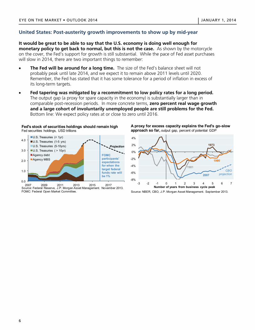
United States: Post-austerity growth improvements to show up by mid-year
It would be great to be able to say that the U.S. economy is doing well enough for monetary policy to get back to normal, but this is not the case. As shown by the motorcycle on the cover, the Fed’s support for growth is still substantial. While the pace of Fed asset purchases will slow in 2014, there are two important things to remember:
The Fed will be around for a long time. The size of the Fed’s balance sheet will notprobably peak until late 2014, and we expect it to remain above 2011 levels until 2020.Remember, the Fed has stated that it has some tolerance for a period of inflation in excess ofits long-term targets.
Fed tapering was mitigated by a recommitment to low policy rates for a long period.The output gap (a proxy for spare capacity in the economy) is substantially larger than incomparable post-recession periods. In more concrete terms, zero percent real wage growthand a large cohort of involuntarily unemployed people are still problems for the Fed.Bottom line: We expect policy rates at or close to zero until 2016.
0.0
1.0
2.0
3.0
4.0
2007 2009 2011 2013 2015 2017
U.S. Treasuries (< 1yr)U.S. Treasuries (1-5 yrs)U.S. Treasuries (5-10yrs)U.S. Treasuries ( > 10yr)Agency debtAgency MBS
Source: Federal Reserve, J.P. Morgan Asset Management. November 2013.FOMC: Federal Open Market Committee.
Fed's stock of securities holdings should remain highFed securities holdings, USD trillions
Projection
FOMC participants' expectations for when the target federal funds rate will be 1%
-8%
-6%
-4%
-2%
0%
2%
4%
-3 -2 -1 0 1 2 3 4 5 6 7Number of years from business cycle peak
Source: NBER, CBO, J.P. Morgan Asset Management. September 2013.
A proxy for excess capacity explains the Fed's go-slow approach so far, output gap, percent of potential GDP
1973
1990
1981
2007CBO
projection
EYE ON THE MARKET • OUTLOOK 2014 JANUARY 1, 2014
7
EYE ON THE MARKET OUTLOOK 2014 JANUARY 1, 2014
7
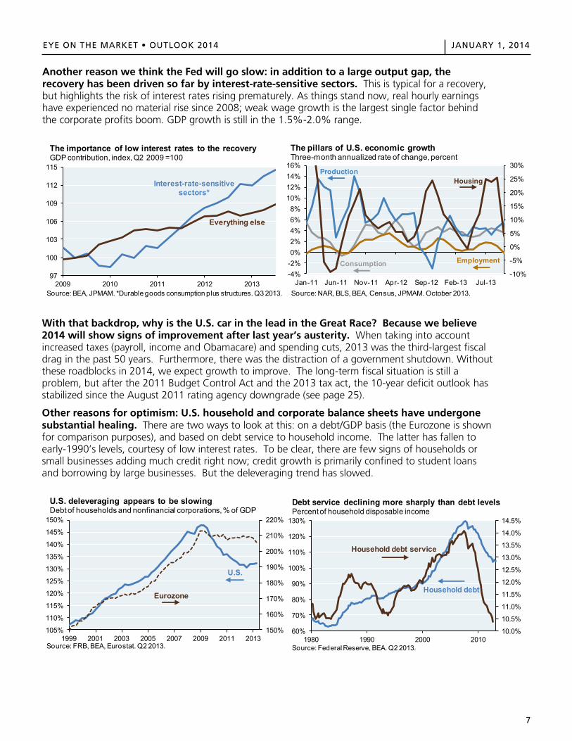
Another reason we think the Fed will go slow: in addition to a large output gap, the recovery has been driven so far by interest-rate-sensitive sectors. This is typical for a recovery, but highlights the risk of interest rates rising prematurely. As things stand now, real hourly earnings have experienced no material rise since 2008; weak wage growth is the largest single factor behind the corporate profits boom. GDP growth is still in the 1.5%-2.0% range.
With that backdrop, why is the U.S. car in the lead in the Great Race? Because we believe 2014 will show signs of improvement after last year’s austerity. When taking into account increased taxes (payroll, income and Obamacare) and spending cuts, 2013 was the third-largest fiscal drag in the past 50 years. Furthermore, there was the distraction of a government shutdown. Without these roadblocks in 2014, we expect growth to improve. The long-term fiscal situation is still a problem, but after the 2011 Budget Control Act and the 2013 tax act, the 10-year deficit outlook has stabilized since the August 2011 rating agency downgrade (see page 25).
Other reasons for optimism: U.S. household and corporate balance sheets have undergone substantial healing. There are two ways to look at this: on a debt/GDP basis (the Eurozone is shown for comparison purposes), and based on debt service to household income. The latter has fallen to early-1990’s levels, courtesy of low interest rates. To be clear, there are few signs of households or small businesses adding much credit right now; credit growth is primarily confined to student loans and borrowing by large businesses. But the deleveraging trend has slowed.
97
100
103
106
109
112
115
2009 2010 2011 2012 2013Source: BEA, JPMAM. *Durable goods consumption plus structures. Q3 2013.
The importance of low interest rates to the recoveryGDP contribution, index, Q2 2009 =100
Interest-rate-sensitive sectors*
Everything else
-10%
-5%
0%
5%
10%
15%
20%
25%
30%
-4%-2%0%2%4%6%8%
10%12%14%16%
Jan-11 Jun-11 Nov-11 Apr-12 Sep-12 Feb-13 Jul-13Source: NAR, BLS, BEA, Census, JPMAM. October 2013.
The pillars of U.S. economic growthThree-month annualized rate of change, percent
HousingProduction
Consumption Employment
150%
160%
170%
180%
190%
200%
210%
220%
105%
110%
115%
120%
125%
130%
135%
140%
145%
150%
1999 2001 2003 2005 2007 2009 2011 2013Source: FRB, BEA, Eurostat. Q2 2013.
U.S. deleveraging appears to be slowingDebt of households and nonfinancial corporations, % of GDP
U.S.
Eurozone
10.0%
10.5%
11.0%
11.5%
12.0%
12.5%
13.0%
13.5%
14.0%
14.5%
60%
70%
80%
90%
100%
110%
120%
130%
1980 1990 2000 2010
Debt service declining more sharply than debt levelsPercent of household disposable income
Household debt
Household debt service
Source: Federal Reserve, BEA. Q2 2013.
8
EYE ON THE MARKET • OUTLOOK 2014 JANUARY 1, 2014EYE ON THE MARKET OUTLOOK 2014 JANUARY 1, 2014
8
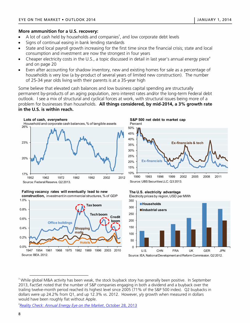
More ammunition for a U.S. recovery: A lot of cash held by households and companies3, and low corporate debt levels Signs of continual easing in bank lending standards State and local payroll growth increasing for the first time since the financial crisis; state and local
consumption and investment are now the strongest in four years Cheaper electricity costs in the U.S., a topic discussed in detail in last year’s annual energy piece4
and on page 20 Even after accounting for shadow inventory, new and existing homes for sale as a percentage of
households is very low (a by-product of several years of limited new construction). The numberof 25-34 year olds living with their parents is at a 35-year high
Some believe that elevated cash balances and low business capital spending are structurally permanent by-products of an aging population, zero interest rates and/or the long-term Federal debt outlook. I see a mix of structural and cyclical forces at work, with structural issues being more of a problem for businesses than households. All things considered, by mid-2014, a 3% growth rate in the U.S. is within reach.
3 While global M&A activity has been weak, the stock buyback story has generally been positive. In September 2013, FactSet noted that the number of S&P companies engaging in both a dividend and a buyback over the trailing twelve-month period reached its highest level since 2005 (71% of the S&P 500 index). Q2 buybacks in dollars were up 24.2% from Q1, and up 12.3% vs. 2012. However, y/y growth when measured in dollars would have been roughly flat without Apple. 4Reality Check: Annual Energy Eye on the Market, October 28, 2013
17%
20%
23%
26%
1952 1962 1972 1982 1992 2002 2012
Lots of cash, everywhereHousehold and corporate cash balances, % of tangible assets
Source: Federal Reserve. Q2 2013.
10%
15%
20%
25%
30%
35%
40%
45%
50%
1990 1993 1996 1999 2002 2005 2008 2011Source: UBS Securities LLC. Q3 2013.
S&P 500 net debt to market cap Percent
Ex-financials & tech
Ex-financials
0.0%
0.2%
0.4%
0.6%
0.8%
1.0%
1947 1954 1961 1968 1975 1982 1989 1996 2003 2010Source: BEA. 2012.
Falling vacancy rates will eventually lead to new construction, investment in commercial structures, % of GDP
Office buildings
Hotels
Shopping malls
Tax boom
TechboomCreditboom
0
50
100
150
200
250
300
350
U.S. CHN FRA UK GER JPN
Households
Industrial users
The U.S. electricity advantageElectricity prices by region,USD per MWh
Source: IEA, National Development and Reform Commission. Q2 2012.
EYE ON THE MARKET OUTLOOK 2014 JANUARY 1, 2014
8
More ammunition for a U.S. recovery: A lot of cash held by households and companies3, and low corporate debt levels Signs of continual easing in bank lending standards State and local payroll growth increasing for the first time since the financial crisis; state and local
consumption and investment are now the strongest in four years Cheaper electricity costs in the U.S., a topic discussed in detail in last year’s annual energy piece4
and on page 20 Even after accounting for shadow inventory, new and existing homes for sale as a percentage of
households is very low (a by-product of several years of limited new construction). The numberof 25-34 year olds living with their parents is at a 35-year high
Some believe that elevated cash balances and low business capital spending are structurally permanent by-products of an aging population, zero interest rates and/or the long-term Federal debt outlook. I see a mix of structural and cyclical forces at work, with structural issues being more of a problem for businesses than households. All things considered, by mid-2014, a 3% growth rate in the U.S. is within reach.
3 While global M&A activity has been weak, the stock buyback story has generally been positive. In September 2013, FactSet noted that the number of S&P companies engaging in both a dividend and a buyback over the trailing twelve-month period reached its highest level since 2005 (71% of the S&P 500 index). Q2 buybacks in dollars were up 24.2% from Q1, and up 12.3% vs. 2012. However, y/y growth when measured in dollars would have been roughly flat without Apple. 4Reality Check: Annual Energy Eye on the Market, October 28, 2013
17%
20%
23%
26%
1952 1962 1972 1982 1992 2002 2012
Lots of cash, everywhereHousehold and corporate cash balances, % of tangible assets
Source: Federal Reserve. Q2 2013.
10%
15%
20%
25%
30%
35%
40%
45%
50%
1990 1993 1996 1999 2002 2005 2008 2011Source: UBS Securities LLC. Q3 2013.
S&P 500 net debt to market cap Percent
Ex-financials & tech
Ex-financials
0.0%
0.2%
0.4%
0.6%
0.8%
1.0%
1947 1954 1961 1968 1975 1982 1989 1996 2003 2010Source: BEA. 2012.
Falling vacancy rates will eventually lead to new construction, investment in commercial structures, % of GDP
Office buildings
Hotels
Shopping malls
Tax boom
TechboomCreditboom
0
50
100
150
200
250
300
350
U.S. CHN FRA UK GER JPN
Households
Industrial users
The U.S. electricity advantageElectricity prices by region,USD per MWh
Source: IEA, National Development and Reform Commission. Q2 2012.
9
EYE ON THE MARKET • OUTLOOK 2014 JANUARY 1, 2014
EYE ON THE MARKET OUTLOOK 2014 JANUARY 1, 2014
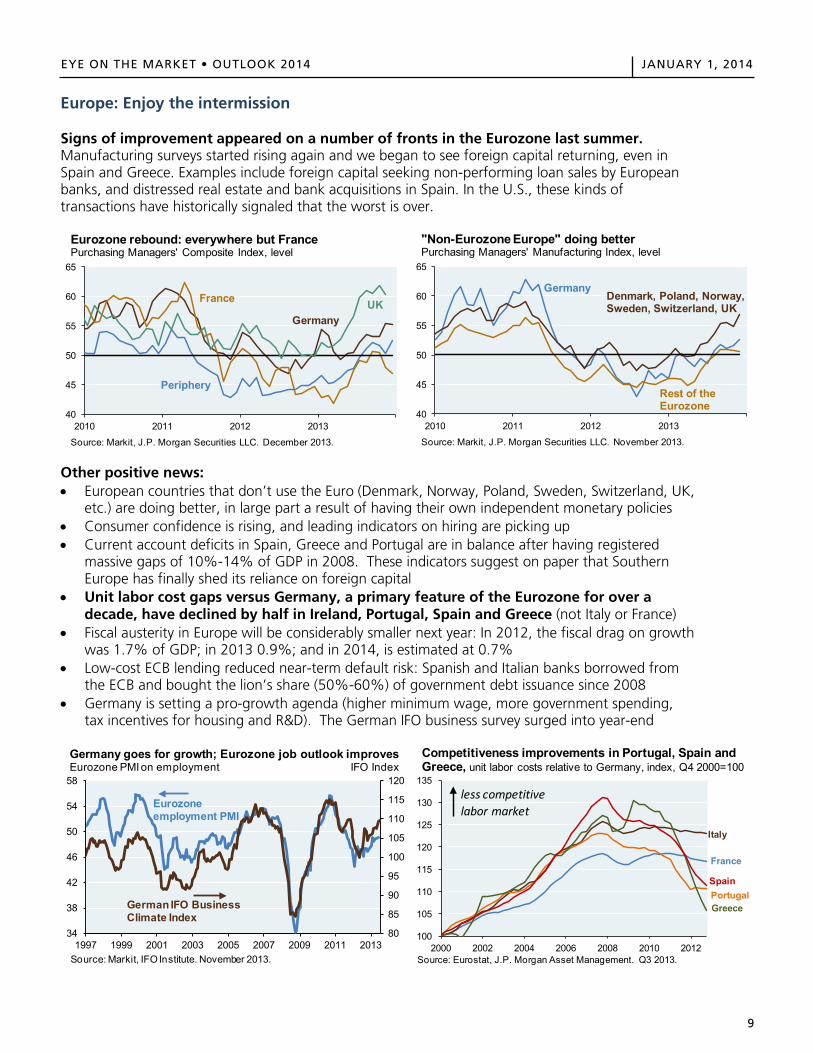
Europe: Enjoy the intermission Signs of improvement appeared on a number of fronts in the Eurozone last summer. Manufacturing surveys started rising again and we began to see foreign capital returning, even in Spain and Greece. Examples include foreign capital seeking non-performing loan sales by European banks, and distressed real estate and bank acquisitions in Spain. In the U.S., these kinds of transactions have historically signaled that the worst is over.
Other positive news: • European countries that don’t use the Euro (Denmark, Norway, Poland, Sweden, Switzerland, UK,
etc.) are doing better, in large part a result of having their own independent monetary policies • Consumer confidence is rising, and leading indicators on hiring are picking up • Current account deficits in Spain, Greece and Portugal are in balance after having registered
massive gaps of 10%-14% of GDP in 2008. These indicators suggest on paper that Southern Europe has finally shed its reliance on foreign capital
• Unit labor cost gaps versus Germany, a primary feature of the Eurozone for over a decade, have declined by half in Ireland, Portugal, Spain and Greece (not Italy or France)
• Fiscal austerity in Europe will be considerably smaller next year: In 2012, the fiscal drag on growth was 1.7% of GDP; in 2013 0.9%; and in 2014, is estimated at 0.7%
• Low-cost ECB lending reduced near-term default risk: Spanish and Italian banks borrowed from the ECB and bought the lion’s share (50%-60%) of government debt issuance since 2008
• Germany is setting a pro-growth agenda (higher minimum wage, more government spending, tax incentives for housing and R&D). The German IFO business survey surged into year-end
40
45
50
55
60
65
2010 2011 2012 2013
Source: Markit, J.P. Morgan Securities LLC. December 2013.
Eurozone rebound: everywhere but FrancePurchasing Managers' Composite Index, level
Germany
France
Periphery
UK
40
45
50
55
60
65
2010 2011 2012 2013
Source: Markit, J.P. Morgan Securities LLC. November 2013.
"Non-Eurozone Europe" doing betterPurchasing Managers' Manufacturing Index, level
Germany
Rest of the Eurozone
Denmark, Poland, Norway, Sweden, Switzerland, UK
80
85
90
95
100
105
110
115
120
34
38
42
46
50
54
58
1997 1999 2001 2003 2005 2007 2009 2011 2013Source: Markit, IFO Institute. November 2013.
Germany goes for growth; Eurozone job outlook improvesEurozone PMI on employment IFO Index
Eurozoneemployment PMI
German IFO Business Climate Index
100
105
110
115
120
125
130
135
2000 2002 2004 2006 2008 2010 2012Source: Eurostat, J.P. Morgan Asset Management. Q3 2013.
Competitiveness improvements in Portugal, Spain and Greece, unit labor costs relative to Germany, index, Q4 2000=100
France
Greece
Italy
PortugalSpain
less competitive labor market
9
10
EYE ON THE MARKET • OUTLOOK 2014 JANUARY 1, 2014EYE ON THE MARKET OUTLOOK 2014 JANUARY 1, 2014
10
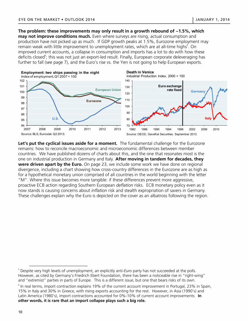
The problem: these improvements may only result in a growth rebound of ~1.5%, which may not improve conditions much. Even where surveys are rising, actual consumption and production have not picked up as much. If GDP growth peaks at 1.5%, Eurozone employment may remain weak with little improvement to unemployment rates, which are at all-time highs5. On improved current accounts, a collapse in consumption and imports has a lot to do with how these deficits closed6; this was not just an export-led result. Finally, European corporate deleveraging has further to fall (see page 7), and the Euro’s rise vs. the Yen is not going to help European exports.
Let’s put the cyclical issues aside for a moment. The fundamental challenge for the Eurozone remains: how to reconcile macroeconomic and microeconomic differences between member countries. We have published dozens of charts about this, and the one that resonates most is the one on industrial production in Germany and Italy. After moving in tandem for decades, they were driven apart by the Euro. On page 23, we include some work we have done on regional divergence, including a chart showing how cross-country differences in the Eurozone are as high as for a hypothetical monetary union comprised of all countries in the world beginning with the letter “M”. Where this issue becomes more tangible: if these differences prevent more aggressive, proactive ECB action regarding Southern European deflation risks. ECB monetary policy even as it now stands is causing concerns about inflation risk and stealth expropriation of savers in Germany. These challenges explain why the Euro is depicted on the cover as an albatross following the region.
5 Despite very high levels of unemployment, an explicitly anti-Euro party has not succeeded at the polls. However, as cited by Germany’s Friedrich Ebert Foundation, there has been a noticeable rise in “right-wing” and “extremist” parties in parts of Europe. This is a different issue, but one that bears risks of its own. 6 In real terms, import contraction explains 19% of the current account improvement in Portugal, 23% in Spain, 15% in Italy and 30% in Greece, with rising exports accounting for the rest. However, in Asia (1990’s) and Latin America (1980’s), import contractions accounted for 0%-10% of current account improvements. In other words, it is rare that an import collapse plays such a big role.
94
95
96
97
98
99
100
101
102
2007 2008 2009 2010 2011 2012 2013Source: BLS, Eurostat. Q2 2013.
Employment: two ships passing in the nightIndex of employment, Q1 2007 = 100
U.S.
European Union
Eurozone
70
80
90
100
110
120
130
140
1982 1986 1990 1994 1998 2002 2006 2010
Source: OECD, GaveKal Securities. September 2013.
Death in VeniceIndustrial Production Index, 2000 = 100
GermanyEuro exchange
rate fixed
Italy
EYE ON THE MARKET OUTLOOK 2014 JANUARY 1, 2014
10
The problem: these improvements may only result in a growth rebound of ~1.5%, which may not improve conditions much. Even where surveys are rising, actual consumption and production have not picked up as much. If GDP growth peaks at 1.5%, Eurozone employment may remain weak with little improvement to unemployment rates, which are at all-time highs5. On improved current accounts, a collapse in consumption and imports has a lot to do with how these deficits closed6; this was not just an export-led result. Finally, European corporate deleveraging has further to fall (see page 7), and the Euro’s rise vs. the Yen is not going to help European exports.
Let’s put the cyclical issues aside for a moment. The fundamental challenge for the Eurozone remains: how to reconcile macroeconomic and microeconomic differences between member countries. We have published dozens of charts about this, and the one that resonates most is the one on industrial production in Germany and Italy. After moving in tandem for decades, they were driven apart by the Euro. On page 23, we include some work we have done on regional divergence, including a chart showing how cross-country differences in the Eurozone are as high as for a hypothetical monetary union comprised of all countries in the world beginning with the letter “M”. Where this issue becomes more tangible: if these differences prevent more aggressive, proactive ECB action regarding Southern European deflation risks. ECB monetary policy even as it now stands is causing concerns about inflation risk and stealth expropriation of savers in Germany. These challenges explain why the Euro is depicted on the cover as an albatross following the region.
5 Despite very high levels of unemployment, an explicitly anti-Euro party has not succeeded at the polls. However, as cited by Germany’s Friedrich Ebert Foundation, there has been a noticeable rise in “right-wing” and “extremist” parties in parts of Europe. This is a different issue, but one that bears risks of its own. 6 In real terms, import contraction explains 19% of the current account improvement in Portugal, 23% in Spain, 15% in Italy and 30% in Greece, with rising exports accounting for the rest. However, in Asia (1990’s) and Latin America (1980’s), import contractions accounted for 0%-10% of current account improvements. In other words, it is rare that an import collapse plays such a big role.
94
95
96
97
98
99
100
101
102
2007 2008 2009 2010 2011 2012 2013Source: BLS, Eurostat. Q2 2013.
Employment: two ships passing in the nightIndex of employment, Q1 2007 = 100
U.S.
European Union
Eurozone
70
80
90
100
110
120
130
140
1982 1986 1990 1994 1998 2002 2006 2010
Source: OECD, GaveKal Securities. September 2013.
Death in VeniceIndustrial Production Index, 2000 = 100
GermanyEuro exchange
rate fixed
Italy
11
EYE ON THE MARKET • OUTLOOK 2014 JANUARY 1, 2014EYE ON THE MARKET OUTLOOK 2014 JANUARY 1, 2014
11
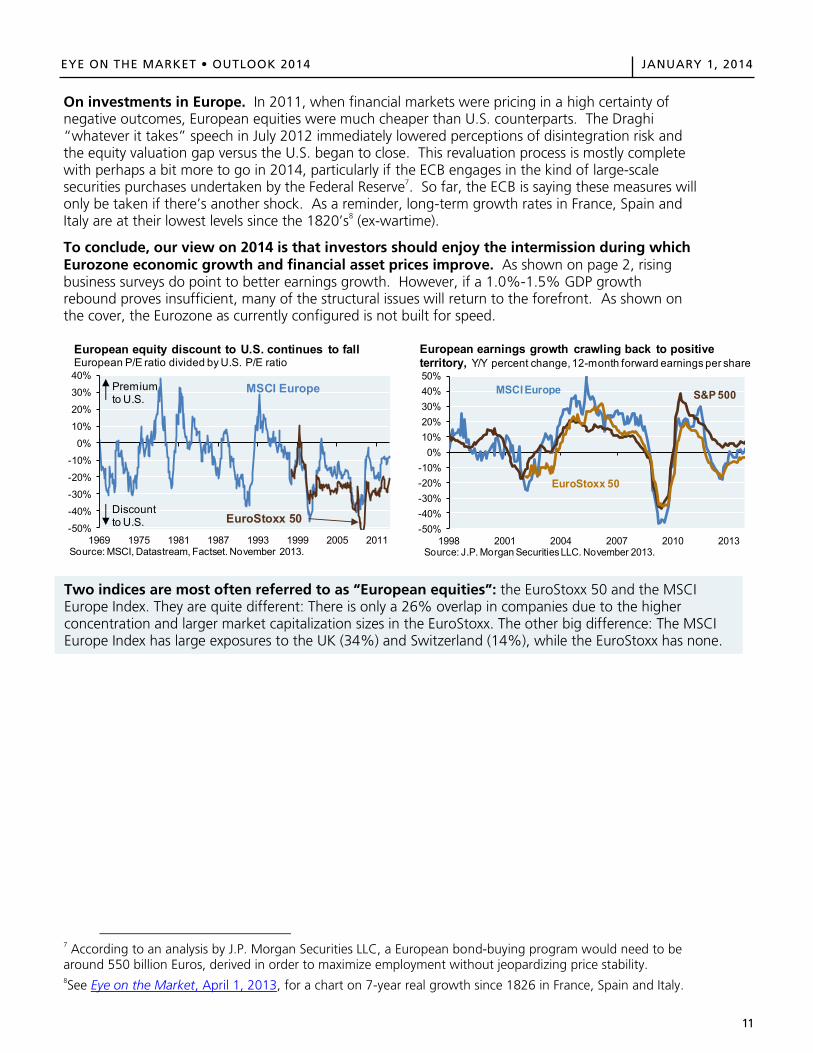
On investments in Europe. In 2011, when financial markets were pricing in a high certainty of negative outcomes, European equities were much cheaper than U.S. counterparts. The Draghi “whatever it takes” speech in July 2012 immediately lowered perceptions of disintegration risk and the equity valuation gap versus the U.S. began to close. This revaluation process is mostly complete with perhaps a bit more to go in 2014, particularly if the ECB engages in the kind of large-scale securities purchases undertaken by the Federal Reserve7. So far, the ECB is saying these measures will only be taken if there’s another shock. As a reminder, long-term growth rates in France, Spain and Italy are at their lowest levels since the 1820’s8 (ex-wartime).
To conclude, our view on 2014 is that investors should enjoy the intermission during which Eurozone economic growth and financial asset prices improve. As shown on page 2, rising business surveys do point to better earnings growth. However, if a 1.0%-1.5% GDP growth rebound proves insufficient, many of the structural issues will return to the forefront. As shown on the cover, the Eurozone as currently configured is not built for speed.
7 According to an analysis by J.P. Morgan Securities LLC, a European bond-buying program would need to be around 550 billion Euros, derived in order to maximize employment without jeopardizing price stability. 8See Eye on the Market, April 1, 2013, for a chart on 7-year real growth since 1826 in France, Spain and Italy.
-50%
-40%
-30%
-20%
-10%
0%
10%
20%
30%
40%
1969 1975 1981 1987 1993 1999 2005 2011Source: MSCI, Datastream, Factset. November 2013.
European equity discount to U.S. continues to fallEuropean P/E ratio divided by U.S. P/E ratio
Premium to U.S.
Discount to U.S. EuroStoxx 50
MSCI Europe
-50%-40%-30%-20%-10%
0%10%20%30%40%50%
1998 2001 2004 2007 2010 2013Source: J.P. Morgan Securities LLC. November 2013.
European earnings growth crawling back to positive territory, Y/Y percent change, 12-month forward earnings per share
MSCI Europe S&P 500
EuroStoxx 50
Two indices are most often referred to as “European equities”: the EuroStoxx 50 and the MSCI Europe Index. They are quite different: There is only a 26% overlap in companies due to the higher concentration and larger market capitalization sizes in the EuroStoxx. The other big difference: The MSCI Europe Index has large exposures to the UK (34%) and Switzerland (14%), while the EuroStoxx has none.
EYE ON THE MARKET OUTLOOK 2014 JANUARY 1, 2014
11
On investments in Europe. In 2011, when financial markets were pricing in a high certainty of negative outcomes, European equities were much cheaper than U.S. counterparts. The Draghi “whatever it takes” speech in July 2012 immediately lowered perceptions of disintegration risk and the equity valuation gap versus the U.S. began to close. This revaluation process is mostly complete with perhaps a bit more to go in 2014, particularly if the ECB engages in the kind of large-scale securities purchases undertaken by the Federal Reserve7. So far, the ECB is saying these measures will only be taken if there’s another shock. As a reminder, long-term growth rates in France, Spain and Italy are at their lowest levels since the 1820’s8 (ex-wartime).
To conclude, our view on 2014 is that investors should enjoy the intermission during which Eurozone economic growth and financial asset prices improve. As shown on page 2, rising business surveys do point to better earnings growth. However, if a 1.0%-1.5% GDP growth rebound proves insufficient, many of the structural issues will return to the forefront. As shown on the cover, the Eurozone as currently configured is not built for speed.
7 According to an analysis by J.P. Morgan Securities LLC, a European bond-buying program would need to be around 550 billion Euros, derived in order to maximize employment without jeopardizing price stability. 8See Eye on the Market, April 1, 2013, for a chart on 7-year real growth since 1826 in France, Spain and Italy.
-50%
-40%
-30%
-20%
-10%
0%
10%
20%
30%
40%
1969 1975 1981 1987 1993 1999 2005 2011Source: MSCI, Datastream, Factset. November 2013.
European equity discount to U.S. continues to fallEuropean P/E ratio divided by U.S. P/E ratio
Premium to U.S.
Discount to U.S. EuroStoxx 50
MSCI Europe
-50%-40%-30%-20%-10%
0%10%20%30%40%50%
1998 2001 2004 2007 2010 2013Source: J.P. Morgan Securities LLC. November 2013.
European earnings growth crawling back to positive territory, Y/Y percent change, 12-month forward earnings per share
MSCI Europe S&P 500
EuroStoxx 50
Two indices are most often referred to as “European equities”: the EuroStoxx 50 and the MSCI Europe Index. They are quite different: There is only a 26% overlap in companies due to the higher concentration and larger market capitalization sizes in the EuroStoxx. The other big difference: The MSCI Europe Index has large exposures to the UK (34%) and Switzerland (14%), while the EuroStoxx has none.
12
EYE ON THE MARKET • OUTLOOK 2014 JANUARY 1, 2014EYE ON THE MARKET OUTLOOK 2014 JANUARY 1, 2014
12
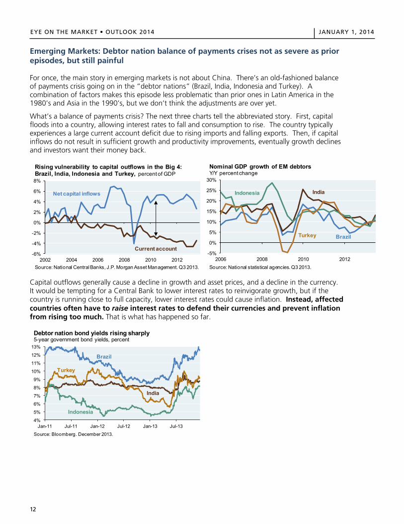
Emerging Markets: Debtor nation balance of payments crises not as severe as prior episodes, but still painful
For once, the main story in emerging markets is not about China. There’s an old-fashioned balance of payments crisis going on in the “debtor nations” (Brazil, India, Indonesia and Turkey). A combination of factors makes this episode less problematic than prior ones in Latin America in the 1980’s and Asia in the 1990’s, but we don’t think the adjustments are over yet.
What’s a balance of payments crisis? The next three charts tell the abbreviated story. First, capital floods into a country, allowing interest rates to fall and consumption to rise. The country typically experiences a large current account deficit due to rising imports and falling exports. Then, if capital inflows do not result in sufficient growth and productivity improvements, eventually growth declines and investors want their money back.
Capital outflows generally cause a decline in growth and asset prices, and a decline in the currency. It would be tempting for a Central Bank to lower interest rates to reinvigorate growth, but if the country is running close to full capacity, lower interest rates could cause inflation. Instead, affected countries often have to raise interest rates to defend their currencies and prevent inflation from rising too much. That is what has happened so far.
-6%
-4%
-2%
0%
2%
4%
6%
8%
2002 2004 2006 2008 2010 2012Source: National Central Banks, J.P. Morgan Asset Management. Q3 2013.
Rising vulnerability to capital outflows in the Big 4: Brazil, India, Indonesia and Turkey, percent of GDP
Net capital inflows
Current account-5%
0%
5%
10%
15%
20%
25%
30%
2006 2008 2010 2012Source: National statistical agencies. Q3 2013.
Nominal GDP growth of EM debtorsY/Y percent change
Turkey Brazil
Indonesia India
4%
5%
6%
7%
8%
9%
10%
11%
12%
13%
Jan-11 Jul-11 Jan-12 Jul-12 Jan-13 Jul-13
Source: Bloomberg. December 2013.
Debtor nation bond yields rising sharply5-year government bond yields, percent
Brazil
Turkey
Indonesia
India
13
EYE ON THE MARKET • OUTLOOK 2014 JANUARY 1, 2014EYE ON THE MARKET OUTLOOK 2014 JANUARY 1, 2014
13
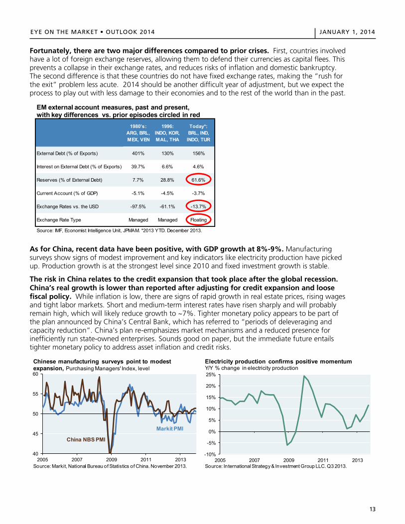
Fortunately, there are two major differences compared to prior crises. First, countries involved have a lot of foreign exchange reserves, allowing them to defend their currencies as capital flees. This prevents a collapse in their exchange rates, and reduces risks of inflation and domestic bankruptcy. The second difference is that these countries do not have fixed exchange rates, making the “rush for the exit” problem less acute. 2014 should be another difficult year of adjustment, but we expect the process to play out with less damage to their economies and to the rest of the world than in the past.
As for China, recent data have been positive, with GDP growth at 8%-9%. Manufacturing surveys show signs of modest improvement and key indicators like electricity production have picked up. Production growth is at the strongest level since 2010 and fixed investment growth is stable.
The risk in China relates to the credit expansion that took place after the global recession. China’s real growth is lower than reported after adjusting for credit expansion and loose fiscal policy. While inflation is low, there are signs of rapid growth in real estate prices, rising wages and tight labor markets. Short and medium-term interest rates have risen sharply and will probably remain high, which will likely reduce growth to ~7%. Tighter monetary policy appears to be part of the plan announced by China’s Central Bank, which has referred to “periods of deleveraging and capacity reduction”. China’s plan re-emphasizes market mechanisms and a reduced presence for inefficiently run state-owned enterprises. Sounds good on paper, but the immediate future entails tighter monetary policy to address asset inflation and credit risks.
1980's: ARG, BRL, MEX, VEN
1996: INDO, KOR, MAL, THA
Today*: BRL, IND, INDO, TUR
External Debt (% of Exports) 401% 130% 156%
Interest on External Debt (% of Exports) 39.7% 6.6% 4.6%
Reserves (% of External Debt) 7.7% 28.8% 61.6%
Current Account (% of GDP) -5.1% -4.5% -3.7%
Exchange Rates vs. the USD -97.5% -61.1% -13.7%
Exchange Rate Type Managed Managed Floating
Source: IMF, Economist Intelligence Unit, JPMAM. *2013 YTD. December 2013.
EM external account measures, past and present, with key differences vs. prior episodes circled in red
40
45
50
55
60
2005 2007 2009 2011 2013
Chinese manufacturing surveys point to modest expansion, Purchasing Managers' Index, level
Source: Markit, National Bureau of Statistics of China. November 2013.
Markit PMI
China NBS PMI
-10%
-5%
0%
5%
10%
15%
20%
25%
2005 2007 2009 2011 2013Source: International Strategy & Investment Group LLC. Q3 2013.
Electricity production confirms positive momentumY/Y % change in electricity production
14
EYE ON THE MARKET • OUTLOOK 2014 JANUARY 1, 2014EYE ON THE MARKET OUTLOOK 2014 JANUARY 1, 2014
14
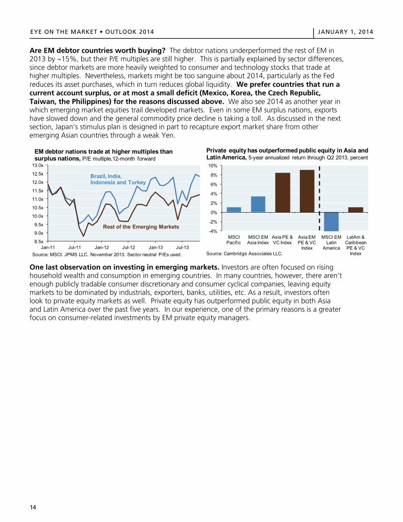
Are EM debtor countries worth buying? The debtor nations underperformed the rest of EM in 2013 by ~15%, but their P/E multiples are still higher. This is partially explained by sector differences, since debtor markets are more heavily weighted to consumer and technology stocks that trade at higher multiples. Nevertheless, markets might be too sanguine about 2014, particularly as the Fed reduces its asset purchases, which in turn reduces global liquidity. We prefer countries that run a current account surplus, or at most a small deficit (Mexico, Korea, the Czech Republic, Taiwan, the Philippines) for the reasons discussed above. We also see 2014 as another year in which emerging market equities trail developed markets. Even in some EM surplus nations, exports have slowed down and the general commodity price decline is taking a toll. As discussed in the next section, Japan’s stimulus plan is designed in part to recapture export market share from other emerging Asian countries through a weak Yen.
One last observation on investing in emerging markets. Investors are often focused on rising household wealth and consumption in emerging countries. In many countries, however, there aren’t enough publicly tradable consumer discretionary and consumer cyclical companies, leaving equity markets to be dominated by industrials, exporters, banks, utilities, etc. As a result, investors often look to private equity markets as well. Private equity has outperformed public equity in both Asia and Latin America over the past five years. In our experience, one of the primary reasons is a greater focus on consumer-related investments by EM private equity managers.
8.5x
9.0x
9.5x
10.0x
10.5x
11.0x
11.5x
12.0x
12.5x
13.0x
Jan-11 Jul-11 Jan-12 Jul-12 Jan-13 Jul-13Source: MSCI. JPMS LLC. November 2013. Sector neutral P/Es used.
EM debtor nations trade at higher multiples than surplus nations, P/E multiple,12-month forward
Rest of the Emerging Markets
Brazil, India, Indonesia and Turkey
-4%
-2%
0%
2%
4%
6%
8%
10%
MSCI Pacif ic
MSCI EM Asia Index
Asia PE & VC Index
Asia EM PE & VC
Index
MSCI EM Latin
America
LatAm & Caribbean PE & VC
Index
Private equity has outperformed public equity in Asia and Latin America, 5-year annualized return through Q2 2013, percent
Source: Cambridge Associates LLC.
15
EYE ON THE MARKET • OUTLOOK 2014 JANUARY 1, 2014EYE ON THE MARKET OUTLOOK 2014 JANUARY 1, 2014
15
Japan: The experiment continues, but so far, only weakening the Yen seems to work
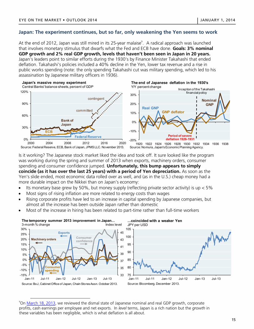
At the end of 2012, Japan was still mired in its 25-year malaise9. A radical approach was launched that involves monetary stimulus that dwarfs what the Fed and ECB have done. Goals: 3% nominal GDP growth and 2% real GDP growth, levels that haven’t been seen in Japan in 20 years. Japan’s leaders point to similar efforts during the 1930’s by Finance Minister Takahashi that ended deflation. Takahashi’s policies included a 40% decline in the Yen, lower tax revenue and a rise in public works spending (note: the only spending Takahashi cut was military spending, which led to his assassination by Japanese military officers in 1936).
Is it working? The Japanese stock market liked the idea and took off. It sure looked like the program was working during the spring and summer of 2013 when exports, machinery orders, consumer spending and consumer confidence jumped. Unfortunately, this bump appears to simply coincide (as it has over the last 25 years) with a period of Yen depreciation. As soon as the Yen’s slide ended, most economic data rolled over as well, and (as in the U.S.) cheap money had a more durable impact on the Nikkei than on Japan’s economy: Its monetary base grew by 50%, but money supply (reflecting private sector activity) is up < 5% Most signs of rising inflation are more related to energy costs than wages Rising corporate profits have led to an increase in capital spending by Japanese companies, but
almost all the increase has been outside Japan rather than domestic Most of the increase in hiring has been related to part-time rather than full-time workers
9On March 18, 2013, we reviewed the dismal state of Japanese nominal and real GDP growth, corporate profits, cash earnings per employee and net exports. In level terms, Japan is a rich nation but the growth in these variables has been negligible, which is what deflation is all about.
0%
30%
60%
90%
120%
2000 2004 2008 2012 2016 2020Source: Federal Reserve, ECB, Bank of Japan, JPMS LLC. November 2013.
Japan's massive money experimentCentral Banks' balance sheets, percent of GDP
Bank ofJapan
ECBFederal Reserve
committed
contingent
-20%
-10%
0%
10%
20%
30%
1920 1922 1924 1926 1928 1930 1932 1934 1936 1938
The end of Japanese deflation in the 1930'sY/Y percent change
Real GNP
Nominal GNP
Source: Nomura, Japan's Economic Planning Agency.
GNP deflator
Period of severe deflation 1926-1931
Inception of the Takahashi financial policy
33
35
37
39
41
43
45
-15%
-10%
-5%
0%
5%
10%
15%
20%
25%
30%
Jan-11 Jul-11 Jan-12 Jul-12 Jan-13 Jul-13
Source: BoJ, Cabinet Office of Japan, Chain Stores Assn. October 2013.
The temporary summer 2013 improvement in Japan...3-month % change Index level
Exports
Consumer spending
Machinery orders Consumerconfidence
75
80
85
90
95
100
105
Jan-11 Jul-11 Jan-12 Jul-12 Jan-13 Jul-13Source: Bloomberg. December 2013.
...coincided with a weaker YenJPY per USD
EYE ON THE MARKET OUTLOOK 2014 JANUARY 1, 2014
15
Japan: The experiment continues, but so far, only weakening the Yen seems to work
At the end of 2012, Japan was still mired in its 25-year malaise9. A radical approach was launched that involves monetary stimulus that dwarfs what the Fed and ECB have done. Goals: 3% nominal GDP growth and 2% real GDP growth, levels that haven’t been seen in Japan in 20 years. Japan’s leaders point to similar efforts during the 1930’s by Finance Minister Takahashi that ended deflation. Takahashi’s policies included a 40% decline in the Yen, lower tax revenue and a rise in public works spending (note: the only spending Takahashi cut was military spending, which led to his assassination by Japanese military officers in 1936).
Is it working? The Japanese stock market liked the idea and took off. It sure looked like the program was working during the spring and summer of 2013 when exports, machinery orders, consumer spending and consumer confidence jumped. Unfortunately, this bump appears to simply coincide (as it has over the last 25 years) with a period of Yen depreciation. As soon as the Yen’s slide ended, most economic data rolled over as well, and (as in the U.S.) cheap money had a more durable impact on the Nikkei than on Japan’s economy: Its monetary base grew by 50%, but money supply (reflecting private sector activity) is up < 5% Most signs of rising inflation are more related to energy costs than wages Rising corporate profits have led to an increase in capital spending by Japanese companies, but
almost all the increase has been outside Japan rather than domestic Most of the increase in hiring has been related to part-time rather than full-time workers
9On March 18, 2013, we reviewed the dismal state of Japanese nominal and real GDP growth, corporate profits, cash earnings per employee and net exports. In level terms, Japan is a rich nation but the growth in these variables has been negligible, which is what deflation is all about.
0%
30%
60%
90%
120%
2000 2004 2008 2012 2016 2020Source: Federal Reserve, ECB, Bank of Japan, JPMS LLC. November 2013.
Japan's massive money experimentCentral Banks' balance sheets, percent of GDP
Bank ofJapan
ECBFederal Reserve
committed
contingent
-20%
-10%
0%
10%
20%
30%
1920 1922 1924 1926 1928 1930 1932 1934 1936 1938
The end of Japanese deflation in the 1930'sY/Y percent change
Real GNP
Nominal GNP
Source: Nomura, Japan's Economic Planning Agency.
GNP deflator
Period of severe deflation 1926-1931
Inception of the Takahashi financial policy
33
35
37
39
41
43
45
-15%
-10%
-5%
0%
5%
10%
15%
20%
25%
30%
Jan-11 Jul-11 Jan-12 Jul-12 Jan-13 Jul-13
Source: BoJ, Cabinet Office of Japan, Chain Stores Assn. October 2013.
The temporary summer 2013 improvement in Japan...3-month % change Index level
Exports
Consumer spending
Machinery orders Consumerconfidence
75
80
85
90
95
100
105
Jan-11 Jul-11 Jan-12 Jul-12 Jan-13 Jul-13Source: Bloomberg. December 2013.
...coincided with a weaker YenJPY per USD
16
EYE ON THE MARKET • OUTLOOK 2014 JANUARY 1, 2014EYE ON THE MARKET OUTLOOK 2014 JANUARY 1, 2014
16
Japan’s government is using more than monetary policy to try and boost its financial markets:
The Nippon Investment Savings Account allows notoriously equity-averse Japanese households to buy ~US$10K per year of risky assets and exempts them from taxation for five years as long as the account is invested in equities or mutual funds. This plan could prompt hundreds of billions of dollars to shift from bank deposits to equities over the next five years (Japanese households have ~US$8 trillion of deposits). Nomura estimated last May that NISA accounts could reach ~US$260 billion by 2018. If Toshin investment funds are any guide, Japanese households would invest around half of their NISA balances in Japanese securities.
A November 2013 report from a government-appointed panel proposed new guidelines for Japan’s US$3 trillion Government Pension Investment Fund that would raise weights in domestic and non-Japanese equities from 24% to 40%. The proposal is still under consideration, and would represent another source of demand for Japanese equities if adopted.
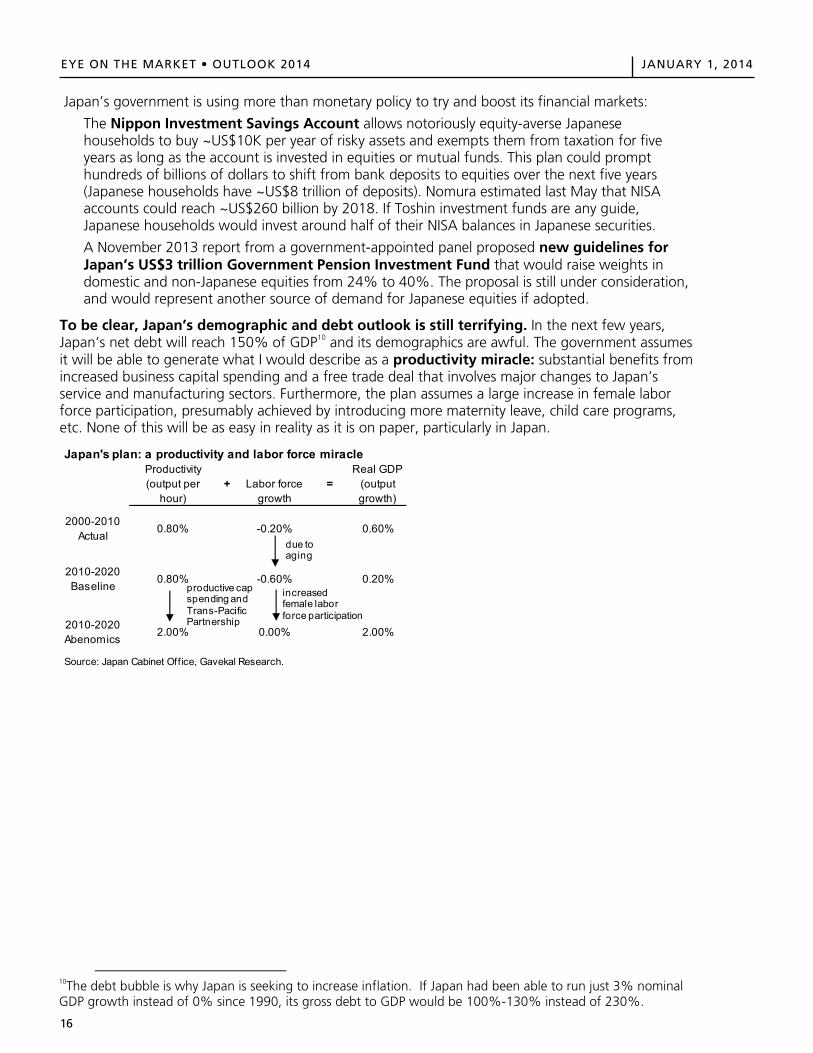
To be clear, Japan’s demographic and debt outlook is still terrifying. In the next few years, Japan’s net debt will reach 150% of GDP10 and its demographics are awful. The government assumes it will be able to generate what I would describe as a productivity miracle: substantial benefits from increased business capital spending and a free trade deal that involves major changes to Japan’s service and manufacturing sectors. Furthermore, the plan assumes a large increase in female labor force participation, presumably achieved by introducing more maternity leave, child care programs, etc. None of this will be as easy in reality as it is on paper, particularly in Japan.
10The debt bubble is why Japan is seeking to increase inflation. If Japan had been able to run just 3% nominal GDP growth instead of 0% since 1990, its gross debt to GDP would be 100%-130% instead of 230%.
Japan's plan: a productivity and labor force miracleProductivity (output per
hour)+ Labor force
growth=
Real GDP(output growth)
2000-2010 Actual
0.80% -0.20% 0.60%
2010-2020 Baseline
0.80% -0.60% 0.20%
2010-2020 Abenomics
2.00% 0.00% 2.00%
Source: Japan Cabinet Office, Gavekal Research.
due to aging
increasedfemale labor force participation
productive cap spending and Trans-Pacific Partnership
EYE ON THE MARKET OUTLOOK 2014 JANUARY 1, 2014
16
Japan’s government is using more than monetary policy to try and boost its financial markets:
The Nippon Investment Savings Account allows notoriously equity-averse Japanese households to buy ~US$10K per year of risky assets and exempts them from taxation for five years as long as the account is invested in equities or mutual funds. This plan could prompt hundreds of billions of dollars to shift from bank deposits to equities over the next five years (Japanese households have ~US$8 trillion of deposits). Nomura estimated last May that NISA accounts could reach ~US$260 billion by 2018. If Toshin investment funds are any guide, Japanese households would invest around half of their NISA balances in Japanese securities.
A November 2013 report from a government-appointed panel proposed new guidelines for Japan’s US$3 trillion Government Pension Investment Fund that would raise weights in domestic and non-Japanese equities from 24% to 40%. The proposal is still under consideration, and would represent another source of demand for Japanese equities if adopted.
To be clear, Japan’s demographic and debt outlook is still terrifying. In the next few years, Japan’s net debt will reach 150% of GDP10 and its demographics are awful. The government assumes it will be able to generate what I would describe as a productivity miracle: substantial benefits from increased business capital spending and a free trade deal that involves major changes to Japan’s service and manufacturing sectors. Furthermore, the plan assumes a large increase in female labor force participation, presumably achieved by introducing more maternity leave, child care programs, etc. None of this will be as easy in reality as it is on paper, particularly in Japan.
10The debt bubble is why Japan is seeking to increase inflation. If Japan had been able to run just 3% nominal GDP growth instead of 0% since 1990, its gross debt to GDP would be 100%-130% instead of 230%.
Japan's plan: a productivity and labor force miracleProductivity (output per
hour)+ Labor force
growth=
Real GDP(output growth)
2000-2010 Actual
0.80% -0.20% 0.60%
2010-2020 Baseline
0.80% -0.60% 0.20%
2010-2020 Abenomics
2.00% 0.00% 2.00%
Source: Japan Cabinet Office, Gavekal Research.
due to aging
increasedfemale labor force participation
productive cap spending and Trans-Pacific Partnership
17
EYE ON THE MARKET • OUTLOOK 2014 JANUARY 1, 2014EYE ON THE MARKET OUTLOOK 2014 JANUARY 1, 2014
17
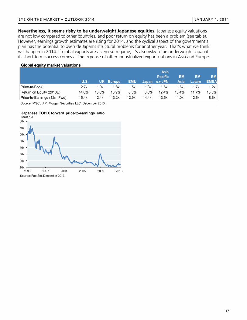
Nevertheless, it seems risky to be underweight Japanese equities. Japanese equity valuations are not low compared to other countries, and poor return on equity has been a problem (see table). However, earnings growth estimates are rising for 2014, and the cyclical aspect of the government’s plan has the potential to override Japan’s structural problems for another year. That’s what we think will happen in 2014. If global exports are a zero-sum game, it’s also risky to be underweight Japan if its short-term success comes at the expense of other industrialized export nations in Asia and Europe.
Global equity market valuations
U.S. UK Europe EMU Japan
Asia Pacific ex-JPN
EM Asia
EM Latam
EM EMEA
Price-to-Book 2.7x 1.9x 1.8x 1.5x 1.3x 1.6x 1.6x 1.7x 1.2xReturn on Equity (2013E) 14.6% 13.8% 10.9% 8.5% 8.0% 12.4% 13.4% 11.7% 13.5%Price-to-Earnings (12m Fwd) 15.4x 12.4x 13.2x 12.9x 14.4x 13.5x 11.0x 12.6x 8.6xSource: MSCI, J.P. Morgan Securities LLC. December 2013.
10x
20x
30x
40x
50x
60x
70x
80x
1993 1997 2001 2005 2009 2013Source: FactSet. December 2013.
Japanese TOPIX forward price-to-earnings ratioMultiple

18
EYE ON THE MARKET • OUTLOOK 2014 JANUARY 1, 2014EYE ON THE MARKET OUTLOOK 2014 JANUARY 1, 2014
18
Beyond the Great Race
The remainder of this year’s Outlook provides further analysis of some market and investment themes that are part of our portfolio thinking for 2014.
I: Risk and opportunity in credit markets II: A revised look at private equity performance, and some themes for 2014 III: On the recent underperformance of hedge funds relative to equities, and outperformance
vs. bonds IV: Tracking performance trends in active equity management V: How different are the countries of the European Monetary Union? VI: Indicators cited in the preface that have returned to pre-crisis levels VII: U.S. fiscal outlook: Quieter in 2014, with long-term battles ahead VIII: U.S. municipal bond outlook and the constitutional question of Detroit
19
EYE ON THE MARKET • OUTLOOK 2014 JANUARY 1, 2014
EYE ON THE MARKET OUTLOOK 2014 JANUARY 1, 2014
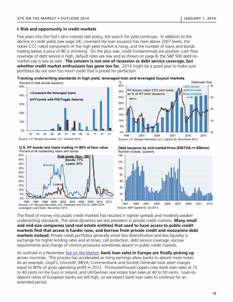
I: Risk and opportunity in credit markets
Five years into the Fed’s zero interest rate policy, the search for yield continues. In addition to the decline in credit yields (see page 24), covenant-lite loan issuance has risen above 2007 levels, the riskier CCC-rated component of the high yield market is rising, and the number of loans and bonds trading below a price of 80 is shrinking. On the plus side, credit fundamentals are positive: cash flow coverage of debt service is high, default rates are low and as shown on page 8, the S&P 500 debt-to-market cap is low as well. The concern is not one of recession or debt service coverage, but whether credit market enthusiasm has gone too far. 2014 might be a good year to make sure portfolios do not own too much credit that is priced for perfection.
Tracking underwriting standards in high yield, leveraged loan and leveraged buyout markets
The flood of money into public credit markets has resulted in tighter spreads and modestly weaker underwriting standards. The same dynamics are less prevalent in private credit markets. Many small and mid-size companies (and real estate entities) that used to have access to public credit markets find that access is harder now, and borrow from private credit and mezzanine debt markets instead. Private credit portfolios generally entail less diversification and less liquidity in exchange for higher lending rates and at times, call protection, debt service coverage, escrow requirements and change of control provisions sometimes absent in public credit markets.
As outlined in a November Eye on the Market, bank loan sales in Europe are finally picking up across countries. This process has accelerated as rising earnings allow banks to absorb more losses. As an example, Lloyd’s, Unicredit, BBVA, Commerzbank and Société Générale took asset charges equal to 90% of gross operating profit in 2012. PricewaterhouseCoopers cites bank loan sales at 10 to 40 cents on the Euro in Ireland, and UK/German real estate loan sales at 40 to 50 cents. Loan-to-deposit ratios of European banks are still high, so we expect bank loan sales to continue for an extended period.
0%
10%
20%
30%
40%
50%
02 03 04 05 06 07 08 09 10 11 12 13
Covenant-lite leveraged loans
HY bonds with PIK/Toggle features
Percent of total annual issuance
Source: J.P. Morgan Securities LLC. October 2013.
2x
3x
4x
5x
6x
0%
5%
10%
15%
20%
25%
30%
35%
40%
1998 2001 2004 2007 2010 2013
% Debt/cash flow
HY issues rated CCC and lower as % of HY total issuance
LBO seniordebt-to-cash flow multiple
Source: J.P. Morgan Securities LLC, Capital IQ. November 2013.
0%5%
10%15%20%25%30%35%40%45%50%
1994 1996 1998 2000 2002 2004 2006 2008 2010 2012Source: J.P. Morgan Securities LLC, Standard and Poor's, S&P/LSTA Leveraged Loan Index. November 2013.
U.S. HY bonds and loans trading <= 80% of face value Percent of all outstanding loans and bonds
Loans
Bonds
Peak levels (Nov. '08)Bonds: 77%Loans: 81%
0
20
40
60
80
100
120
140
1997 1999 2001 2003 2005 2007 2009 2011 2013
Debt issuance by mid-market firms (EBITDA <= $50mm)Number of deals, quarterly
Source: S&P Capital IQ. Q3 2013.
19
20
EYE ON THE MARKET • OUTLOOK 2014 JANUARY 1, 2014EYE ON THE MARKET OUTLOOK 2014 JANUARY 1, 2014
20
II: A revised look at private equity performance, and some themes for 2014
In July of 2013, we wrote a detailed paper on private equity11, part of which focused on recent findings by an Oxford lecturer regarding problems with a commonly used private equity performance database. Due to stale records, missing cash distributions and incomplete fund records, widely read prior studies factored in a downward performance bias for private equity. After the exclusion of incomplete fund records, the previously estimated private equity underperformance of 3%-6% against the S&P 500 turns into outperformance of 4% per year.
A separate 2013 paper from academics in Virginia, Oxford and Chicago confirms these findings. The authors found that buyout funds outperformed the S&P 500 in each of the last three decades. Venture capital funds, on the other hand, had a great run in the 1990’s, after which industry performance has been below equity markets. The authors also found that performance of buyout funds did not differ substantially by fund size, and that there is no identifiable relationship between manager fees or GP ownership levels and buyout fund performance.
Subsequent to our paper’s release, the most frequent questions we received were:
How do buyout funds perform relative to public equity when using benchmarks other than the S&P 500 (to reflect the small/mid-cap nature of companies often acquired by private equity firms)?
The authors of the paper cited above also computed buyout fund performance using the Russell 2000, the Russell 2000 Value Index and the NASDAQ. Buyout fund outperformance using an S&P 500 benchmark was 1.22x; using the Russell 2000, Russell 2000 Value Index and NASDAQ, the ratios were 1.22x, 1.16x and 1.20x, respectively. In other words, basically the same.
How does buyout fund outperformance look when applying leverage to the S&P 500 benchmark (to reflect the high level of leverage often used by buyout funds)?
The authors reran their analyses using a leveraged S&P 500 benchmark. Buyout outperformance fell to 1.08x; still positive, but less than the original results. Interestingly, this measure was 1.28x for the 2000’s, 1.09x for the 1990’s and 0.76x for the 1980’s. Applying leverage to the S&P during a decade with two 40%+ declines in the market created a lot of distress in the benchmark.
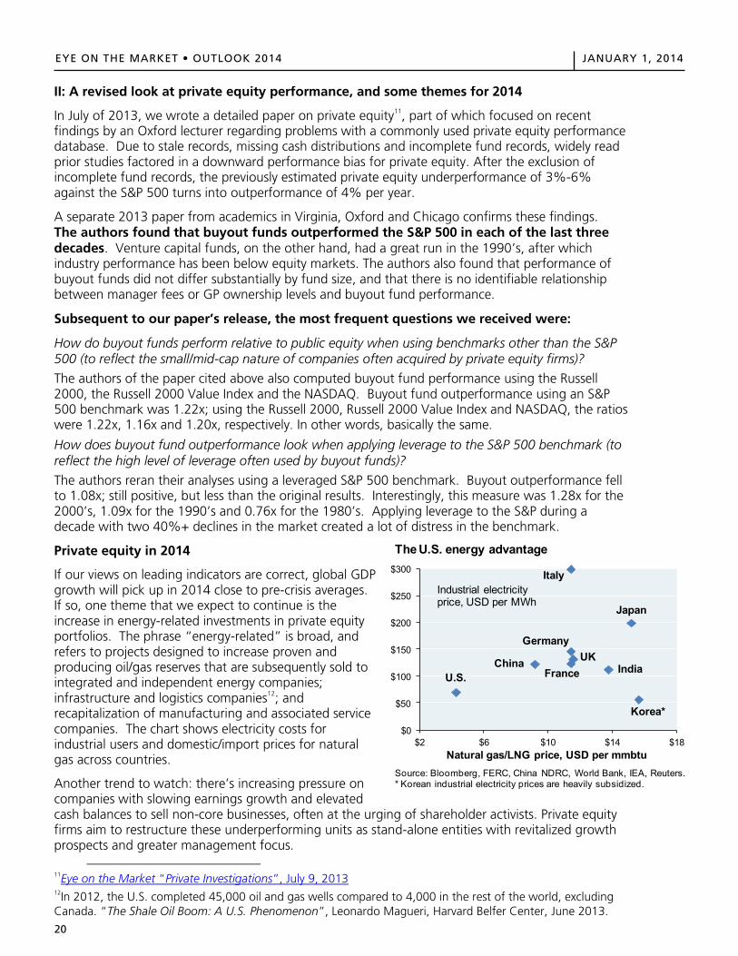
Private equity in 2014
If our views on leading indicators are correct, global GDP growth will pick up in 2014 close to pre-crisis averages. If so, one theme that we expect to continue is the increase in energy-related investments in private equity portfolios. The phrase “energy-related” is broad, and refers to projects designed to increase proven and producing oil/gas reserves that are subsequently sold to integrated and independent energy companies; infrastructure and logistics companies12; and recapitalization of manufacturing and associated service companies. The chart shows electricity costs for industrial users and domestic/import prices for natural gas across countries.
Another trend to watch: there’s increasing pressure on companies with slowing earnings growth and elevated cash balances to sell non-core businesses, often at the urging of shareholder activists. Private equity firms aim to restructure these underperforming units as stand-alone entities with revitalized growth prospects and greater management focus.
11Eye on the Market “Private Investigations”, July 9, 201312In 2012, the U.S. completed 45,000 oil and gas wells compared to 4,000 in the rest of the world, excludingCanada. “The Shale Oil Boom: A U.S. Phenomenon”, Leonardo Magueri, Harvard Belfer Center, June 2013.
$0
$50
$100
$150
$200
$250
$300
$2 $6 $10 $14 $18
Source: Bloomberg, FERC, China NDRC, World Bank, IEA, Reuters. * Korean industrial electricity prices are heavily subsidized.
The U.S. energy advantage
Natural gas/LNG price, USD per mmbtu
U.S.
Italy
Japan
Korea*
IndiaChina
Germany
FranceUK
Industrial electricity price, USD per MWh
EYE ON THE MARKET OUTLOOK 2014 JANUARY 1, 2014
20
II: A revised look at private equity performance, and some themes for 2014
In June of 2013, we wrote a detailed paper on private equity11, part of which focused on recentfindings by an Oxford lecturer regarding problems with a commonly used private equity performance database. Due to stale records, missing cash distributions and incomplete fund records, widely readprior studies factored in a downward performance bias for private equity. After the exclusion ofincomplete fund records, the previously estimated private equity underperformance of 3%-6%against the S&P 500 turns into outperformance of 4% per year.
A separate 2013 paper from academics in Virginia, Oxford and Chicago confirms these findings.The authors found that buyout funds outperformed the S&P 500 in each of the last three decades. Venture capital funds, on the other hand, had a great run in the 1990’s, after which industry performance has been below equity markets. The authors also found that performance ofbuyout funds did not differ substantially by fund size, and that there is no identifiable relationship between manager fees or GP ownership levels and buyout fund performance.
Subsequent to our paper’s release, the most frequent questions we received were:
How do buyout funds perform relative to public equity when using benchmarks other than the S&P 500 (to reflect the small/mid-cap nature of companies often acquired by private equity firms)?
The authors of the paper cited above also computed buyout fund performance using the Russell2000, the Russell 2000 Value Index and the NASDAQ. Buyout fund outperformance using an S&P 500 benchmark was 1.22x; using the Russell 2000, Russell 2000 Value Index and NASDAQ, the ratioswere 1.22x, 1.16x and 1.20x, respectively. In other words, basically the same.
How does buyout fund outperformance look when applying leverage to the S&P 500 benchmark (to reflect the high level of leverage often used by buyout funds)?
The authors reran their analyses using a leveraged S&P 500 benchmark. Buyout outperformance fellto 1.08x; still positive, but less than the original results. Interestingly, this measure was 1.28x for the2000’s, 1.09x for the 1990’s and 0.76x for the 1980’s. Applying leverage to the S&P during a decade with two 40%+ declines in the market created a lot of distress in the benchmark.
Private equity in 2014
If our views on leading indicators are correct, global GDP growth will pick up in 2014 close to pre-crisis averages.If so, one theme that we expect to continue is theincrease in energy-related investments in private equity portfolios. The phrase “energy-related” is broad, andrefers to projects designed to increase proven andproducing oil/gas reserves that are subsequently sold tointegrated and independent energy companies;infrastructure and logistics companies12; andrecapitalization of manufacturing and associated servicecompanies. The chart shows electricity costs forindustrial users and domestic/import prices for naturalgas across countries.
Another trend to watch: there’s increasing pressure on companies with slowing earnings growth and elevated cash balances to sell non-core businesses, often at the urging of shareholder activists. Private equityfirms aim to restructure these underperforming units as stand-alone entities with revitalized growthprospects and greater management focus.
11Eye on the Market “Private Investigations”, July 9, 2013 12In 2012, the U.S. completed 45,000 oil and gas wells compared to 4,000 in the rest of the world, excluding Canada. “The Shale Oil Boom: A U.S. Phenomenon”, Leonardo Magueri, Harvard Belfer Center, June 2013.
$0
$50
$100
$150
$200
$250
$300
$2 $6 $10 $14 $18
Source: Bloomberg, FERC, China NDRC, World Bank, IEA, Reuters.* Korean industrial electricity prices are heavily subsidized.
The U.S. energy advantage
Natural gas/LNG price, USD per mmbtu
U.S.
Italy
Japan
Korea*
IndiaChina
Germany
FranceUK
Industrial electricityprice, USD per MWh
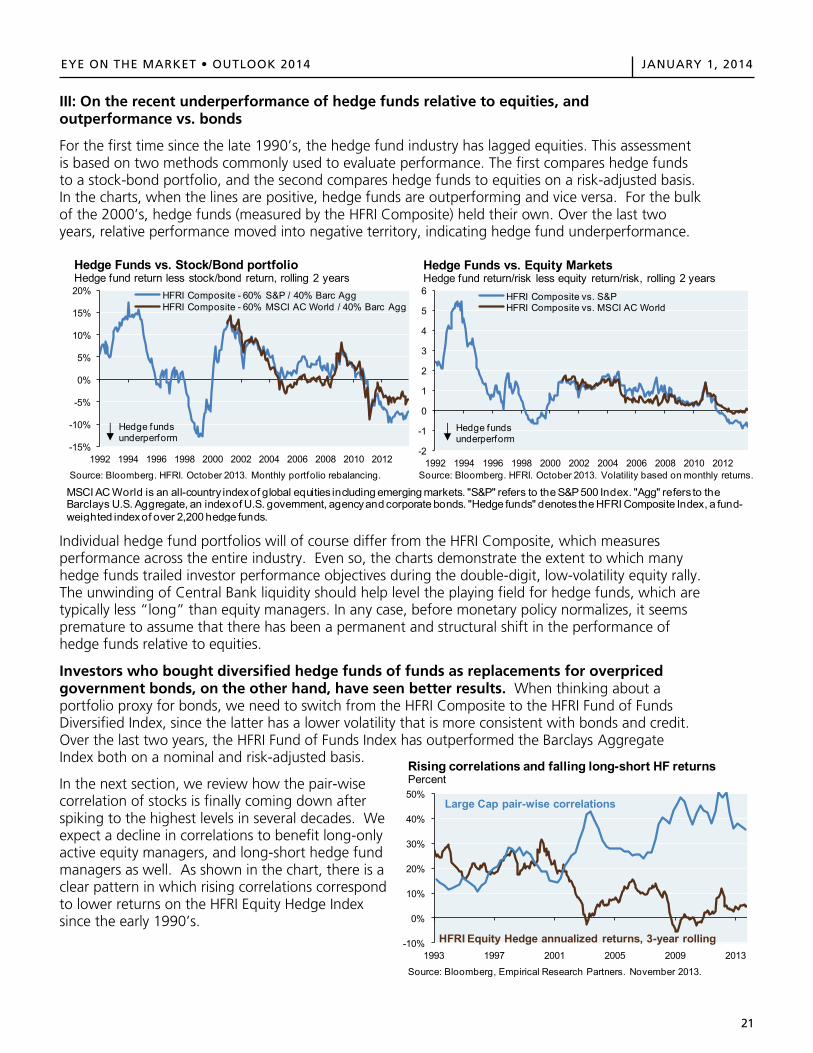
21
EYE ON THE MARKET • OUTLOOK 2014 JANUARY 1, 2014
EYE ON THE MARKET OUTLOOK 2014 JANUARY 1, 2014
21
III: On the recent underperformance of hedge funds relative to equities, and outperformance vs. bonds
For the first time since the late 1990’s, the hedge fund industry has lagged equities. This assessment is based on two methods commonly used to evaluate performance. The first compares hedge funds to a stock-bond portfolio, and the second compares hedge funds to equities on a risk-adjusted basis. In the charts, when the lines are positive, hedge funds are outperforming and vice versa. For the bulk of the 2000’s, hedge funds (measured by the HFRI Composite) held their own. Over the last two years, relative performance moved into negative territory, indicating hedge fund underperformance.
Individual hedge fund portfolios will of course differ from the HFRI Composite, which measures performance across the entire industry. Even so, the charts demonstrate the extent to which many hedge funds trailed investor performance objectives during the double-digit, low-volatility equity rally. The unwinding of Central Bank liquidity should help level the playing field for hedge funds, which are typically less “long” than equity managers. In any case, before monetary policy normalizes, it seems premature to assume that there has been a permanent and structural shift in the performance of hedge funds relative to equities.
Investors who bought diversified hedge funds of funds as replacements for overpriced government bonds, on the other hand, have seen better results. When thinking about a portfolio proxy for bonds, we need to switch from the HFRI Composite to the HFRI Fund of Funds Diversified Index, since the latter has a lower volatility that is more consistent with bonds and credit. Over the last two years, the HFRI Fund of Funds Index has outperformed the Barclays Aggregate Index both on a nominal and risk-adjusted basis.
In the next section, we review how the pair-wise correlation of stocks is finally coming down after spiking to the highest levels in several decades. We expect a decline in correlations to benefit long-only active equity managers, and long-short hedge fund managers as well. As shown in the chart, there is a clear pattern in which rising correlations correspond to lower returns on the HFRI Equity Hedge Index since the early 1990’s.
-15%
-10%
-5%
0%
5%
10%
15%
20%
1992 1994 1996 1998 2000 2002 2004 2006 2008 2010 2012
HFRI Composite - 60% S&P / 40% Barc AggHFRI Composite - 60% MSCI AC World / 40% Barc Agg
Source: Bloomberg. HFRI. October 2013. Monthly portfolio rebalancing.
Hedge Funds vs. Stock/Bond portfolioHedge fund return less stock/bond return, rolling 2 years
Hedge fundsunderperform
-2
-1
0
1
2
3
4
5
6
1992 1994 1996 1998 2000 2002 2004 2006 2008 2010 2012
HFRI Composite vs. S&PHFRI Composite vs. MSCI AC World
Source: Bloomberg. HFRI. October 2013. Volatility based on monthly returns.
Hedge Funds vs. Equity MarketsHedge fund return/risk less equity return/risk, rolling 2 years
Hedge fundsunderperform
MSCI AC World is an all-country index of global equities including emerging markets. "S&P" refers to the S&P 500 Index. "Agg" refers to the Barclays U.S. Aggregate, an index of U.S. government, agency and corporate bonds. "Hedge funds" denotes the HFRI Composite Index, a fund-weighted index of over 2,200 hedge funds.
-10%
0%
10%
20%
30%
40%
50%
1993 1997 2001 2005 2009 2013
Source: Bloomberg, Empirical Research Partners. November 2013.
Rising correlations and falling long-short HF returnsPercent
Large Cap pair-wise correlations
HFRI Equity Hedge annualized returns, 3-year rolling
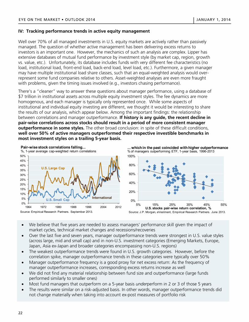
22
EYE ON THE MARKET • OUTLOOK 2014 JANUARY 1, 2014EYE ON THE MARKET OUTLOOK 2014 JANUARY 1, 2014
22
IV: Tracking performance trends in active equity management
Well over 70% of all managed investments in U.S. equity markets are actively rather than passively managed. The question of whether active management has been delivering excess returns to investors is an important one. However, the mechanics of such an analysis are complex. Lipper has extensive databases of mutual fund performance by investment style (by market cap, region, growth vs. value, etc.). Unfortunately, its database includes funds with very different fee characteristics (no load, institutional load, front-end load, back-end load, level load, etc.). Furthermore, a given manager may have multiple institutional load share classes, such that an equal-weighted analysis would over-represent some fund companies relative to others. Asset-weighted analyses are even more fraught with problems, given the timing issues involved (e.g., investors chasing performance).
There’s a “cleaner” way to answer these questions about manager performance, using a database of $7 trillion in institutional assets across multiple equity investment styles. The fee dynamics are more homogenous, and each manager is typically only represented once. While some aspects of institutional and individual equity investing are different, we thought it would be interesting to share the results of our analysis, which appear below. Among the important findings: the relationship between correlations and manager outperformance. If history is any guide, the recent decline in pair-wise correlations across stocks should result in a period of more consistent manager outperformance in some styles. The other broad conclusion: in spite of these difficult conditions, well over 50% of active managers outperformed their respective investible benchmarks in most investment styles on a trailing 5-year basis.
0%5%
10%15%20%25%30%35%40%45%50%
1964 1972 1980 1988 1996 2004 2012
Pair-wise stock correlations falling...%, 1-year average cap-weighted return correlations
Source: Empirical Research Partners. September 2013.
U.S. Large Cap
U.S. Small Cap International0%
20%
40%
60%
80%
100%
5% 15% 25% 35% 45% 55%
Source: J.P. Morgan, eVestment, Empirical Research Partners. June 2013.
% of managers outperforming ETF, 1-year basis, 1996-2013
U.S. stocks pair-wise return correlation, %
... which in the past coincided with higher outperformance
We believe that five years are needed to assess managers' performance skill given the impact of market cycles, technical market changes and recessions/recoveries
Over the last five and seven years, manager outperformance trends were strongest in U.S. value styles(across large, mid and small cap) and in non-U.S. investment categories (Emerging Markets, Europe,Japan, Asia ex-Japan and broader categories encompassing non-U.S. regions)
The weakest outperformance trends were found in U.S. growth categories. However, before thecorrelation spike, manager outperformance trends in these categories were typically over 50%
Manager outperformance frequency is a good proxy for net excess return: As the frequency ofmanager outperformance increases, corresponding excess returns increase as well
We did not find any material relationship between fund size and outperformance (large fundsperformed similarly to smaller ones)
Most fund managers that outperform on a 5-year basis underperform in 2 or 3 of those 5 years The results were similar on a risk-adjusted basis. In other words, manager outperformance trends did
not change materially when taking into account ex-post measures of portfolio risk
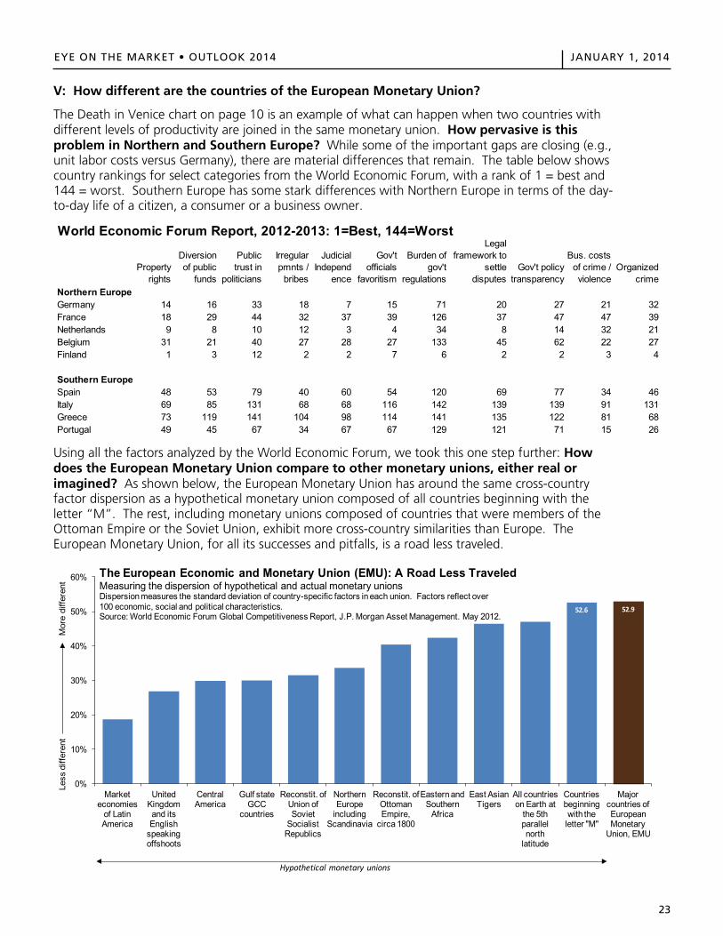
23
EYE ON THE MARKET • OUTLOOK 2014 JANUARY 1, 2014
EYE ON THE MARKET OUTLOOK 2014 JANUARY 1, 2014
V: How different are the countries of the European Monetary Union?
The Death in Venice chart on page 10 is an example of what can happen when two countries with different levels of productivity are joined in the same monetary union. How pervasive is this problem in Northern and Southern Europe? While some of the important gaps are closing (e.g., unit labor costs versus Germany), there are material differences that remain. The table below shows country rankings for select categories from the World Economic Forum, with a rank of 1 = best and 144 = worst. Southern Europe has some stark differences with Northern Europe in terms of the day-to-day life of a citizen, a consumer or a business owner.
Using all the factors analyzed by the World Economic Forum, we took this one step further: How does the European Monetary Union compare to other monetary unions, either real or imagined? As shown below, the European Monetary Union has around the same cross-country factor dispersion as a hypothetical monetary union composed of all countries beginning with the letter “M”. The rest, including monetary unions composed of countries that were members of the Ottoman Empire or the Soviet Union, exhibit more cross-country similarities than Europe. The European Monetary Union, for all its successes and pitfalls, is a road less traveled.
World Economic Forum Report, 2012-2013: 1=Best, 144=Worst
Property rights
Diversion of public
funds
Public trust in
politicians
Irregular pmnts /
bribes
Judicial Independ
ence
Gov't officials
favoritism
Burden of gov't
regulations
Legal framework to
settle disputes
Gov't policy transparency
Bus. costs of crime / violence
Organized crime
Northern EuropeGermany 14 16 33 18 7 15 71 20 27 21 32France 18 29 44 32 37 39 126 37 47 47 39Netherlands 9 8 10 12 3 4 34 8 14 32 21Belgium 31 21 40 27 28 27 133 45 62 22 27Finland 1 3 12 2 2 7 6 2 2 3 4
Southern EuropeSpain 48 53 79 40 60 54 120 69 77 34 46Italy 69 85 131 68 68 116 142 139 139 91 131Greece 73 119 141 104 98 114 141 135 122 81 68Portugal 49 45 67 34 67 67 129 121 71 15 26
0%
10%
20%
30%
40%
50%
60%
Market economies
of Latin America
United Kingdom and its English
speaking offshoots
Central America
Gulf state GCC
countries
Reconstit. of Union of Soviet
Socialist Republics
Northern Europe
including Scandinavia
Reconstit. of Ottoman Empire,
circa 1800
Eastern and Southern
Africa
East Asian Tigers
All countries on Earth at
the 5th parallel north
latitude
Countries beginning with the
letter "M"
Major countries of European Monetary
Union, EMU
Less
diff
eren
t
Mor
e di
ffere
nt
The European Economic and Monetary Union (EMU): A Road Less TraveledMeasuring the dispersion of hypothetical and actual monetary unionsDispersion measures the standard deviation of country-specific factors in each union. Factors reflect over 100 economic, social and political characteristics. Source: World Economic Forum Global Competitiveness Report, J.P. Morgan Asset Management. May 2012.
Hypothetical monetary unions
52.6 52.9
23
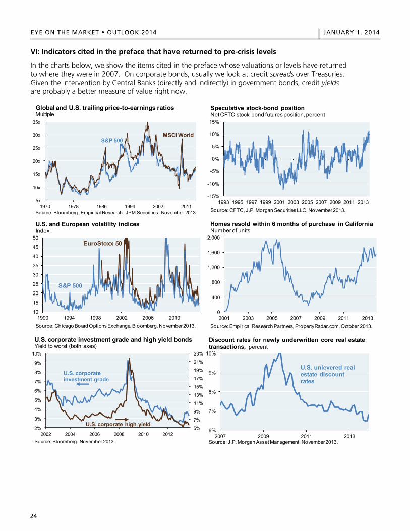
24
EYE ON THE MARKET • OUTLOOK 2014 JANUARY 1, 2014
EYE ON THE MARKET OUTLOOK 2014 JANUARY 1, 2014
24
VI: Indicators cited in the preface that have returned to pre-crisis levels
In the charts below, we show the items cited in the preface whose valuations or levels have returned to where they were in 2007. On corporate bonds, usually we look at credit spreads over Treasuries. Given the intervention by Central Banks (directly and indirectly) in government bonds, credit yields are probably a better measure of value right now.
5x
10x
15x
20x
25x
30x
35x
1970 1978 1986 1994 2002 2011Source: Bloomberg, Empirical Research. JPM Securities. November 2013.
Global and U.S. trailing price-to-earnings ratiosMultiple
S&P 500MSCI World
-15%
-10%
-5%
0%
5%
10%
15%
1993 1995 1997 1999 2001 2003 2005 2007 2009 2011 2013Source: CFTC, J.P. Morgan Securities LLC. November 2013.
Speculative stock-bond positionNet CFTC stock-bond futures position, percent
10
15
20
25
30
35
40
45
50
1990 1994 1998 2002 2006 2010Source: Chicago Board Options Exchange, Bloomberg. November 2013.
U.S. and European volatility indicesIndex
S&P 500
EuroStoxx 50
0
400
800
1,200
1,600
2,000
2001 2003 2005 2007 2009 2011 2013Source: Empirical Research Partners, PropertyRadar.com. October 2013.
Homes resold within 6 months of purchase in CaliforniaNumber of units
5%
7%
9%
11%
13%
15%
17%
19%
21%
23%
2%
3%
4%
5%
6%
7%
8%
9%
10%
2002 2004 2006 2008 2010 2012Source: Bloomberg. November 2013.
U.S. corporate investment grade and high yield bonds Yield to worst (both axes)
U.S. corporate high yield
U.S. corporate investment grade
6%
7%
8%
9%
10%
2007 2009 2011 2013Source: J.P. Morgan Asset Management. November 2013.
Discount rates for newly underwritten core real estate transactions, percent
U.S. unlevered real estate discount rates
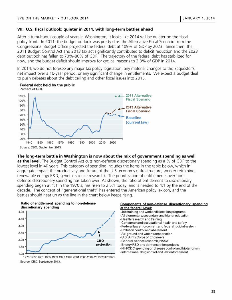
25
EYE ON THE MARKET • OUTLOOK 2014 JANUARY 1, 2014
EYE ON THE MARKET OUTLOOK 2014 JANUARY 1, 2014
25
VII: U.S. fiscal outlook: quieter in 2014, with long-term battles ahead
After a tumultuous couple of years in Washington, it looks like 2014 will be quieter on the fiscal policy front. In 2011, the budget outlook was pretty dire: the Alternative Fiscal Scenario from the Congressional Budget Office projected the federal debt at 109% of GDP by 2023. Since then, the 2011 Budget Control Act and 2013 tax act significantly contributed to deficit reduction and the 2023 debt outlook has fallen to 70%-80% of GDP. The trajectory of the federal debt has stabilized for now, and the budget deficit should improve for cyclical reasons to 3.3% of GDP in 2014.
In 2014, we do not foresee any major tax policy legislation, any material changes to the Sequester’s net impact over a 10-year period, or any significant change in entitlements. We expect a budget deal to push debates about the debt ceiling and other fiscal issues into 2015.
The long-term battle in Washington is now about the mix of government spending as well as the level. The Budget Control Act cuts non-defense discretionary spending as a % of GDP to the lowest level in 40 years. This category of spending includes the items in the table below, which in aggregate impact the productivity and future of the U.S. economy (infrastructure, worker retraining, renewable energy R&D, general science research). The prioritization of entitlements over non-defense discretionary spending has taken over. As shown, the ratio of entitlement to discretionary spending began at 1:1 in the 1970’s; has risen to 2.5:1 today; and is headed to 4:1 by the end of the decade. The concept of “generational theft” has entered the American policy lexicon, and the battles should heat up as the line in the chart below keeps rising.
20%30%40%50%60%70%80%90%
100%110%
1940 1950 1960 1970 1980 1990 2000 2010 2020Source: CBO. September 2013.
Federal debt held by the publicPercent of GDP
2011 Alternative Fiscal Scenario
2013 Alternative Fiscal Scenario
Baseline(current law)
1.0x
1.5x
2.0x
2.5x
3.0x
3.5x
4.0x
1973 1977 1981 1985 1989 1993 1997 2001 2005 2009 2013 2017 2021Source: CBO. September 2013.
Ratio of entitlement spending to non-defense discretionary spending
CBO projection
Components of non-defense discretionary spending at the federal level:-Job training and worker dislocation programs-All elementary, secondary and higher education-Health research and training-Consumer and occupational health and safety-Federal law enforcement and federal judicial system-Pollution control and abatement-Air, ground and water transportation -U.S. Army Corps of Engineers-General science research, NASA-Energy R&D and demonstration projects-NIH/CDC spending on disease control and bioterrorism-International drug control and law enforcement
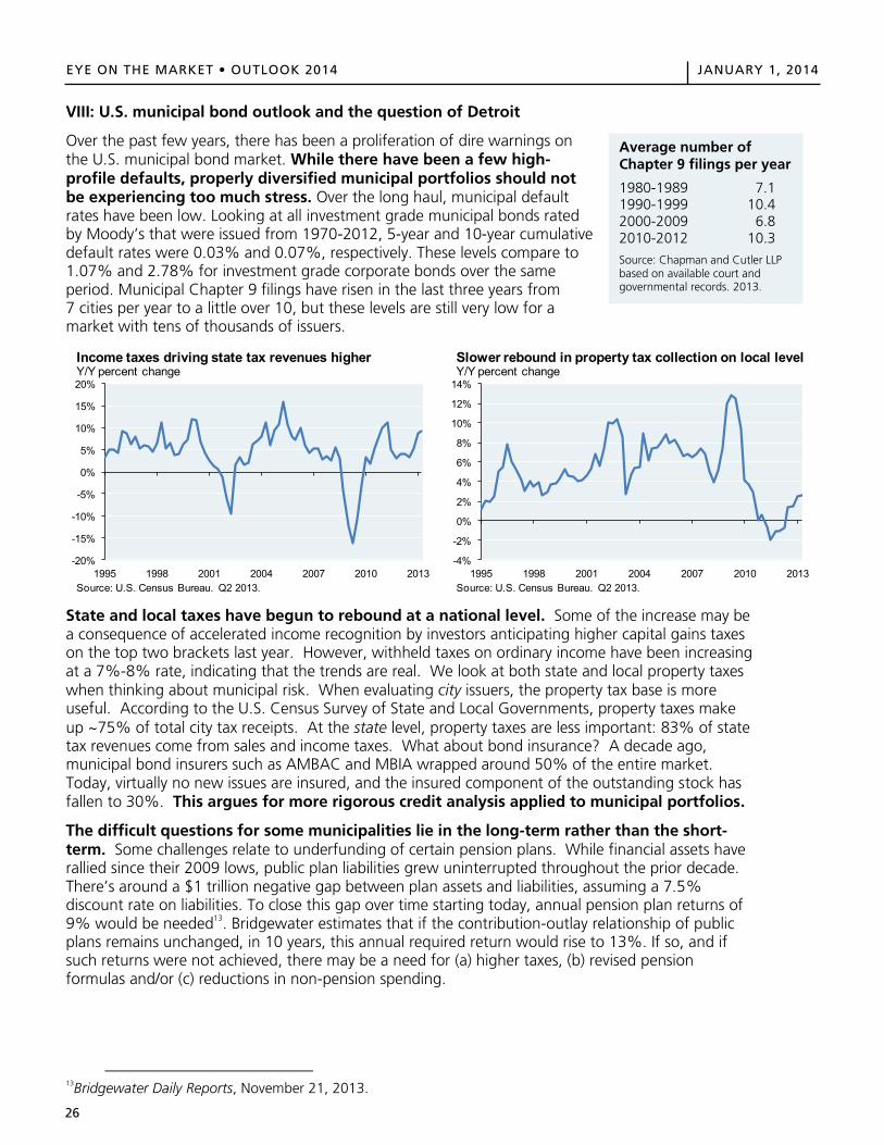
26
EYE ON THE MARKET • OUTLOOK 2014 JANUARY 1, 2014
EYE ON THE MARKET OUTLOOK 2014 JANUARY 1, 2014
26
VIII: U.S. municipal bond outlook and the question of Detroit
Over the past few years, there has been a proliferation of dire warnings on the U.S. municipal bond market. While there have been a few high-profile defaults, properly diversified municipal portfolios should not be experiencing too much stress. Over the long haul, municipal default rates have been low. Looking at all investment grade municipal bonds rated by Moody’s that were issued from 1970-2012, 5-year and 10-year cumulative default rates were 0.03% and 0.07%, respectively. These levels compare to 1.07% and 2.78% for investment grade corporate bonds over the same period. Municipal Chapter 9 filings have risen in the last three years from 7 cities per year to a little over 10, but these levels are still very low for a market with tens of thousands of issuers.
State and local taxes have begun to rebound at a national level. Some of the increase may be a consequence of accelerated income recognition by investors anticipating higher capital gains taxes on the top two brackets last year. However, withheld taxes on ordinary income have been increasing at a 7%-8% rate, indicating that the trends are real. We look at both state and local property taxes when thinking about municipal risk. When evaluating city issuers, the property tax base is more useful. According to the U.S. Census Survey of State and Local Governments, property taxes make up ~75% of total city tax receipts. At the state level, property taxes are less important: 83% of state tax revenues come from sales and income taxes. What about bond insurance? A decade ago, municipal bond insurers such as AMBAC and MBIA wrapped around 50% of the entire market. Today, virtually no new issues are insured, and the insured component of the outstanding stock has fallen to 30%. This argues for more rigorous credit analysis applied to municipal portfolios.
The difficult questions for some municipalities lie in the long-term rather than the short-term. Some challenges relate to underfunding of certain pension plans. While financial assets have rallied since their 2009 lows, public plan liabilities grew uninterrupted throughout the prior decade. There’s around a $1 trillion negative gap between plan assets and liabilities, assuming a 7.5% discount rate on liabilities. To close this gap over time starting today, annual pension plan returns of 9% would be needed13. Bridgewater estimates that if the contribution-outlay relationship of public plans remains unchanged, in 10 years, this annual required return would rise to 13%. If so, and if such returns were not achieved, there may be a need for (a) higher taxes, (b) revised pension formulas and/or (c) reductions in non-pension spending.
13Bridgewater Daily Reports, November 21, 2013.
-20%
-15%
-10%
-5%
0%
5%
10%
15%
20%
1995 1998 2001 2004 2007 2010 2013Source: U.S. Census Bureau. Q2 2013.
Income taxes driving state tax revenues higherY/Y percent change
-4%
-2%
0%
2%
4%
6%
8%
10%
12%
14%
1995 1998 2001 2004 2007 2010 2013Source: U.S. Census Bureau. Q2 2013.
Slower rebound in property tax collection on local levelY/Y percent change
Average number of Chapter 9 filings per year
1980-1989 7.1 1990-1999 10.4 2000-2009 6.8 2010-2012 10.3
Source: Chapman and Cutler LLP based on available court and governmental records. 2013.
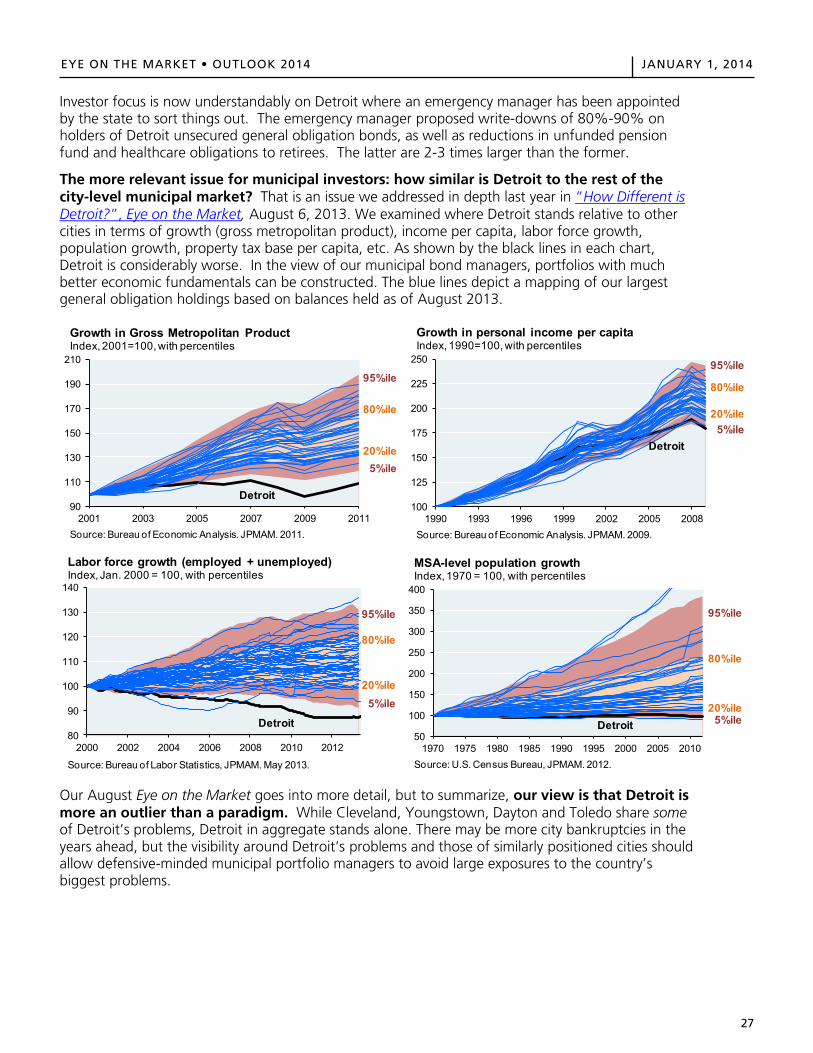
27
EYE ON THE MARKET • OUTLOOK 2014 JANUARY 1, 2014EYE ON THE MARKET OUTLOOK 2014 JANUARY 1, 2014
27
Investor focus is now understandably on Detroit where an emergency manager has been appointed by the state to sort things out. The emergency manager proposed write-downs of 80%-90% on holders of Detroit unsecured general obligation bonds, as well as reductions in unfunded pension fund and healthcare obligations to retirees. The latter are 2-3 times larger than the former.
The more relevant issue for municipal investors: how similar is Detroit to the rest of the city-level municipal market? That is an issue we addressed in depth last year in “How Different is Detroit?”, Eye on the Market, August 6, 2013. We examined where Detroit stands relative to other cities in terms of growth (gross metropolitan product), income per capita, labor force growth, population growth, property tax base per capita, etc. As shown by the black lines in each chart, Detroit is considerably worse. In the view of our municipal bond managers, portfolios with much better economic fundamentals can be constructed. The blue lines depict a mapping of our largest general obligation holdings based on balances held as of August 2013.
Our August Eye on the Market goes into more detail, but to summarize, our view is that Detroit is more an outlier than a paradigm. While Cleveland, Youngstown, Dayton and Toledo share some of Detroit’s problems, Detroit in aggregate stands alone. There may be more city bankruptcies in the years ahead, but the visibility around Detroit’s problems and those of similarly positioned cities should allow defensive-minded municipal portfolio managers to avoid large exposures to the country’s biggest problems.
90
110
130
150
170
190
210
2001 2003 2005 2007 2009 2011Source: Bureau of Economic Analysis. JPMAM. 2011.
Growth in Gross Metropolitan ProductIndex, 2001=100, with percentiles
95%ile
80%ile
20%ile5%ile
Detroit100
125
150
175
200
225
250
1990 1993 1996 1999 2002 2005 2008Source: Bureau of Economic Analysis. JPMAM. 2009.
Growth in personal income per capitaIndex, 1990=100, with percentiles
95%ile
80%ile
20%ile5%ile
Detroit
80
90
100
110
120
130
140
2000 2002 2004 2006 2008 2010 2012
Source: Bureau of Labor Statistics, JPMAM. May 2013.
Labor force growth (employed + unemployed)Index, Jan. 2000 = 100, with percentiles
Detroit
95%ile
80%ile
20%ile5%ile
50
100
150
200
250
300
350
400
1970 1975 1980 1985 1990 1995 2000 2005 2010Source: U.S. Census Bureau, JPMAM. 2012.
MSA-level population growthIndex, 1970 = 100, with percentiles
Detroit
95%ile
80%ile
20%ile5%ile

28
EYE ON THE MARKET • OUTLOOK 2014 JANUARY 1, 2014EYE ON THE MARKET OUTLOOK 2014 JANUARY 1, 2014
28
The Detroit case surfaces the issue of States’ rights versus Federalism. As background, a municipality can only file for bankruptcy under Chapter 9 if its state authorizes it to do so. Around half of U.S. states allow for municipalities to file for bankruptcy; the rest do not. Chapter 9 is only for cities; U.S. states are not permitted to file for bankruptcy. Historically, Chapter 9 has mostly been used by small municipalities, but recent filings by Vallejo (CA), Jefferson County (AL), Central Falls (RI), Stockton (CA) and San Bernardino (CA) have changed that.
Some states have made minor adjustments to pension schemes for existing employees and retirees. They have been minor since the laws of most states make efforts to alter obligations to current retirees difficult. Even in bankruptcy, the ability to alter claims is unclear. How should federal bankruptcy law, which argues for equal treatment of all creditors, be judged against state law indicating that one creditor class (e.g., retirees) is effectively untouchable14?
In what may be a landmark ruling, the judge in the Detroit case ruled that “pension benefits are a contractual obligation of a municipality and not entitled to any heightened protection in bankruptcy”. The judge’s ruling appears to draw on the Supremacy Clause (Article VI, Clause 2), which holds that state governments cannot pass laws that override the U.S. Constitution. What remains to be seen is whether courts in California and other states cite it as precedent or come to a different conclusion15. Counsel for non-bondholder creditors have announced an appeal, but the judge in Detroit ruled that the appeal cannot delay the bankruptcy proceeding.
14Federalist argument: U.S. Constitution Article 1, Section 8 Clause 4, and U.S. Bankruptcy Law, Chapters 9 and 11. States’ Rights argument: 10th amendment of the U.S. Constitution, and (for example), the Michigan StateConstitution, Article IX, Section 24. 15See our August 6, 2013 Eye on the Market for a discussion of the legal debate around Chapter 9 and the involvement of Federal courts in state and local bankruptcy proceedings, and the ability of states and municipalities to declare their obligations as being inviolable (not subject to restructuring).
EYE ON THE MARKET OUTLOOK 2014 JANUARY 1, 2014
28
The Detroit case surfaces the issue of States’ rights versus Federalism. As background, a municipality can only file for bankruptcy under Chapter 9 if its state authorizes it to do so. Around half of U.S. states allow for municipalities to file for bankruptcy; the rest do not. Chapter 9 is only for cities; U.S. states are not permitted to file for bankruptcy. Historically, Chapter 9 has mostly been used by small municipalities, but recent filings by Vallejo (CA), Jefferson County (AL), Central Falls (RI), Stockton (CA) and San Bernardino (CA) have changed that.
Some states have made minor adjustments to pension schemes for existing employees and retirees. They have been minor since the laws of most states make efforts to alter obligations to current retirees difficult. Even in bankruptcy, the ability to alter claims is unclear. How should federal bankruptcy law, which argues for equal treatment of all creditors, be judged against state law indicating that one creditor class (e.g., retirees) is effectively untouchable14?
In what may be a landmark ruling, the judge in the Detroit case ruled that “pension benefits are a contractual obligation of a municipality and not entitled to any heightened protection in bankruptcy”. The judge’s ruling appears to draw on the Supremacy Clause (Article VI, Clause 2), which holds that state governments cannot pass laws that override the U.S. Constitution. What remains to be seen is whether courts in California and other states cite it as precedent or come to a different conclusion15. Counsel for non-bondholder creditors have announced an appeal, but the judge in Detroit ruled that the appeal cannot delay the bankruptcy proceeding.
14Federalist argument: U.S. Constitution Article 1, Section 8 Clause 4, and U.S. Bankruptcy Law, Chapters 9 and 11. States’ Rights argument: 10th amendment of the U.S. Constitution, and (for example), the Michigan StateConstitution, Article IX, Section 24. 15See our August 6, 2013 Eye on the Market for a discussion of the legal debate around Chapter 9 and the involvement of Federal courts in state and local bankruptcy proceedings, and the ability of states and municipalities to declare their obligations as being inviolable (not subject to restructuring).

29
EYE ON THE MARKET • OUTLOOK 2014 JANUARY 1, 2014EYE ON THE MARKET OUTLOOK 2014 JANUARY 1, 2014
29
Cover art data sources Leveraged Loans – S&P Leveraged Loan; High Yield – Barclays U.S. Corporate High Yield; U.S. Commercial Property – NCREIF Property Index; Hedge Funds – HFRI Composite; Emerging Markets – MSCI EM; USD EM Debt – J.P. Morgan EMBI Global. Note: NCREIF Property Index cumulative returns are for the period from January 1, 2010 to September 30, 2013.
Acronyms ACWI – All Country World Index; AMBAC – American Municipal Bond Assurance Corporation; BEA – Bureau of Economic Analysis; BLS – Bureau of Labor Statistics; CBO – Congressional Budget Office; CFTC – Commodity Futures Trading Commission; EAFE – Europe, Australasia and Far East; ECB – European Central Bank; EM – Emerging Market; ETF – Exchange-Traded Fund; FRB – Federal Reserve Bank; GDP – Gross Domestic Product; HFRI – Hedge Fund Research, Inc; IEA – International Energy Agency; IMF – International Monetary Fund; ISM – Institute for Supply Management; MBIA – Municipal Bond Insurance Association; MBS – Mortgage Backed Security; MSCI – Morgan Stanley Capital International; MWh – Megawatt hour; NAR – National Association of Realtors; NBER – National Bureau of Economic Research; OECD – Organisation for Economic Co-operation and Development; P/E – Price-to-earnings; PIK – Payment in Kind; PMI – Purchasing Managers’ Index; VC – Venture Capital; Y/Y – Year-over-Year
IRS Circular 230 Disclosure: JPMorgan Chase & Co. and its affiliates do not provide tax advice. Accordingly, any discussion of U.S. tax matters contained herein (including any attachments) is not intended or written to be used, and cannot be used, in connection with the promotion, marketing or recommendation by anyone unaffiliated with JPMorgan Chase & Co. of any of the matters addressed herein or for the purpose of avoiding U.S. tax-related penalties. Each recipient of this material, and each agent thereof, may disclose to any person, without limitation, the US income and franchise tax treatment and tax structure of the transactions described herein and may disclose all materials of any kind (including opinions or other tax analyses) provided to each recipient insofar as the materials relate to a US income or franchise tax strategy provided to such recipient by JPMorgan Chase & Co. and its subsidiaries.
The material contained herein is intended as a general market commentary. Opinions expressed herein are those of Michael Cembalest and may differ from those of other J.P. Morgan employees and affiliates. This information in no way constitutes J.P. Morgan research and should not be treated as such. Further, the views expressed herein may differ from that contained in J.P. Morgan research reports. The prices/quotes/statistics referenced herein have been obtained from sources deemed to be reliable, but we do not guarantee their accuracy or completeness, any yield referenced is indicative and subject to change. References to the performance or characteristics of our portfolios generally refer to the discretionary Balanced Model Portfolios constructed by J.P. Morgan. It is a proxy for client performance and may not represent actual transactions or investments in client accounts. The views and strategies described herein may not be suitable for all investors. This material is not intended as an offer or solicitation for the purchase or sale of any financial instrument. To the extent referenced herein, real estate, hedge funds, and other private investments may present significant risks, may be sold or redeemed at more or less than the original amount invested; there are no assurances that the stated investment objectives of any investment product will be met. JPMorgan Chase & Co. and its subsidiaries do not render accounting, legal or tax advice and is not a licensed insurance provider. You should consult with your independent advisors concerning such matters.Bank products and services offered by JP Morgan Chase Bank, N.A, and its affiliates. Securities are offered through J.P. Morgan Securities LLC, member NYSE, FINRA and SIPC, and its affiliates globally as local legislation permits.
In the United Kingdom, this material is approved by J.P. Morgan International Bank Limited (JPMIB) with the registered office located at 25 Bank Street, Canary Wharf, London E14 5JP, registered in England No. 03838766 and is authorised by the Prudential Regulation Authority and regulated by the Financial Conduct Authority and Prudential Regulation Authority. In addition, this material may be distributed by: JPMorgan Chase Bank, N.A. Paris branch, which is regulated by the French banking authorities Autorité de Contrôle Prudentiel and Autorité des Marchés Financiers; JPMorgan Chase Bank, N.A. Bahrain branch, licensed as a conventional wholesale bank by the Central Bank of Bahrain (for professional clients only); JPMorgan Chase Bank, N.A. Dubai branch, regulated by the Dubai Financial Services Authority.
In Hong Kong, this material is distributed by JPMorgan Chase Bank, N.A. (JPMCB) Hong Kong branch except to recipients having an account at JPMCB Singapore branch and where this material relates to a Collective Investment Scheme in which case it is distributed by J.P. Morgan Securities (Asia Pacific) Limited (JPMSAPL). Both JPMCB Hong Kong branch and JPMSAPL are regulated by the Hong Kong Monetary Authority. In Singapore, this material is distributed by JPMCB Singapore branch except to recipients having an account at JPMCB Singapore branch and where this material relates to a Collective Investment Scheme (other than private funds such as a private equity and hedge funds) in which case it is distributed by J.P. Morgan (S.E.A.) Limited (JPMSEAL). Both JPMCB Singapore branch and JPMSEAL are regulated by the Monetary Authority of Singapore.
With respect to countries in Latin America, the distribution of this material may be restricted in certain jurisdictions. Receipt of this material does not constitute an offer or solicitation to any person in any jurisdiction in which such offer or solicitation is not authorized or to any person to whom it would be unlawful to make such offer or solicitation. To the extent this content makes reference to a fund, the Fund may not be publicly offered in any Latin American country, without previous registration of such fund’s securities in compliance with the laws of the corresponding jurisdiction.
If you no longer wish to receive these communications please contact your J.P. Morgan representative.
Past performance is not a guarantee of future results.
© 2014 JPMorgan Chase & Co. All rights reserved.
Investment products: Not FDIC insured • No bank guarantee • May lose value
1113-1158-01

30
EYE ON THE MARKET • OUTLOOK 2014 JANUARY 1, 2014
MICHAEL CEMBALEST is Chairman of Market and Investment Strategy for J.P. Morgan Asset Management, a global leader in investment management and private banking with $1.5 trillion of client assets under management worldwide (as of September 30, 2013). He is responsible for leading the strategic market and investment insights across the firm’s Institutional, Funds and Private Banking businesses.
Mr. Cembalest is also a member of the J.P. Morgan Asset Management Investment Committee and a member of the Investment Committee for the J.P. Morgan Retirement Plan for the firm’s 260,000 employees.
Mr. Cembalest was most recently Chief Investment Officer for the firm’s Global Private Bank, a role he held for eight years. He was previously head of a fixed income division of Investment Management, with responsibility for high grade, high yield, emerging markets and municipal bonds.
Before joining Asset Management, Mr. Cembalest served as head strategist for Emerging Markets Fixed Income at J.P. Morgan Securities. Mr. Cembalest joined J.P. Morgan in 1987 as a member of the firm’s Corporate Finance division.
Mr. Cembalest earned an M.A. from the Columbia School of International and Public Affairs in 1986 and a B.A. from Tufts University in 1984.


M I D D L E E A S TDubai
A M E R I C A SBrazil ChileColombiaMexicoPeruUnited States
A S I A Hong KongSingapore
E U R O P EFrance GermanyItalySpainSwitzerlandUnited Kingdom