orange3 educational add-on documentation
TRANSCRIPT

Orange3 Educational Add-onDocumentation
Biolab
Dec 03, 2021


Contents
1 Widgets 3
2 Indices and tables 33
i

ii

Orange3 Educational Add-on Documentation
Widgets in Educational Add-on demonstrate several key data mining and machine learning procedures. The widgetsare useful for beginners to understand the inner working of key algorithms in the data mining and for teachers to beable to visually explain various methods in a classroom.
Contents 1

Orange3 Educational Add-on Documentation
2 Contents
CHAPTER 1
Widgets
1.1 Google Sheets
Read data from a Google Sheets spreadsheet.
Outputs
• Data: data set from the Google Sheets service.
1.1.1 Description
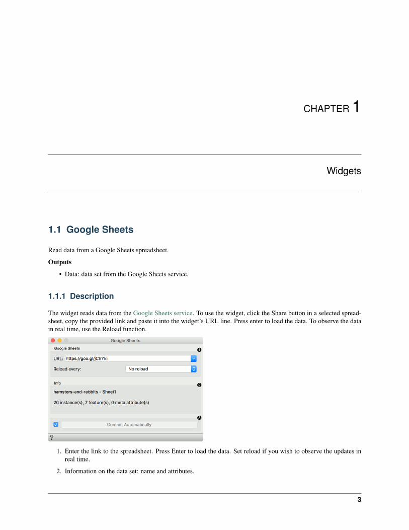
The widget reads data from the Google Sheets service. To use the widget, click the Share button in a selected spread-sheet, copy the provided link and paste it into the widget’s URL line. Press enter to load the data. To observe the datain real time, use the Reload function.
1. Enter the link to the spreadsheet. Press Enter to load the data. Set reload if you wish to observe the updates inreal time.
2. Information on the data set: name and attributes.
3

Orange3 Educational Add-on Documentation
3. If Commit Automatically is ticked, the data will be automatically communicated downstream. Alternatively,press Commit.
1.1.2 Example
This widget is used for loading the data. We have used the link from the Google Sheets: https://goo.gl/jChYki. Thisis a fictional data on hamsters and rabbits, of which some have the disease and some don’t. Use the Data Table toobserve the loaded data in a spreadsheet.
1.2 EnKlik Anketa
Import data from EnKlikAnketa (1ka.si) public URL.
Outputs
• Data: survey results
The EnKlik Anketa widget retrieves survey results obtained from the EnKlikAnketa service. You need to create apublic link to to retrieve the results. Go to the survey you wish to retrieve, then select Data (Podatki) tab and create apublic link (javna povezava) at the top right corner.
Then insert the link into the Public link URL field. The link should look something like this:https://www.1ka.si/podatki/123456/78A9B1CD/.
4 Chapter 1. Widgets
Orange3 Educational Add-on Documentation
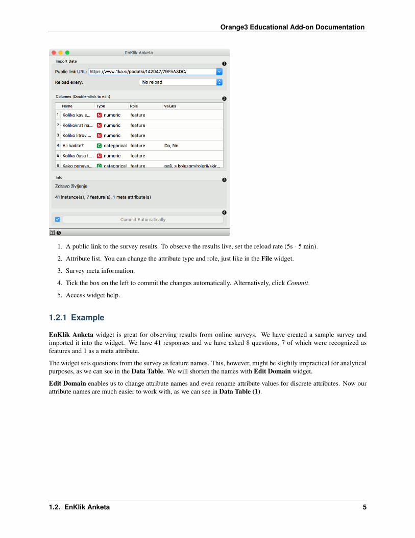
1. A public link to the survey results. To observe the results live, set the reload rate (5s - 5 min).
2. Attribute list. You can change the attribute type and role, just like in the File widget.
3. Survey meta information.
4. Tick the box on the left to commit the changes automatically. Alternatively, click Commit.
5. Access widget help.
1.2.1 Example
EnKlik Anketa widget is great for observing results from online surveys. We have created a sample survey andimported it into the widget. We have 41 responses and we have asked 8 questions, 7 of which were recognized asfeatures and 1 as a meta attribute.
The widget sets questions from the survey as feature names. This, however, might be slightly impractical for analyticalpurposes, as we can see in the Data Table. We will shorten the names with Edit Domain widget.
Edit Domain enables us to change attribute names and even rename attribute values for discrete attributes. Now ourattribute names are much easier to work with, as we can see in Data Table (1).
1.2. EnKlik Anketa 5
Orange3 Educational Add-on Documentation
1.3 Interactive k-Means
Educational widget that shows the working of a k-means clustering.
Inputs
• Data: input data set
Outputs
• Data: data set with cluster annotation
• Centroids: centroids position
1.3.1 Description
The aim of this widget is to show the working of a k-means clustering algorithm on two attributes from a data set. Thewidget applies k-means clustering to the selected two attributes step by step. Users can step through the algorithm andsee how it works.
6 Chapter 1. Widgets

Orange3 Educational Add-on Documentation
1. Select attributes for x and y axis.
2. Number of centroids: set the number of centroids. Randomize: randomly assigns position of centroids. If youwant to add centroid on a particular position in the graph, click on this position. If you want to move the centroid,drag and drop it on the desired position. Show membership lines: if ticked, connection between data points andclosest centroids are shown.
3. Recompute centroids or Reassign membership: step through different stages of the algorithm. Recomputecentroids moves centroids to new positions, based on the most central position of the data assigned to thecentroid. Reassign membership reassigns data points to the centroid they are the closest to. Step back: make astep back in the algorithm. Run: step through the algorithm automatically. Speed: set the speed of automaticstepping.
4. Save Image saves the image to the computer in a .svg or .png format.
1.3.2 Example
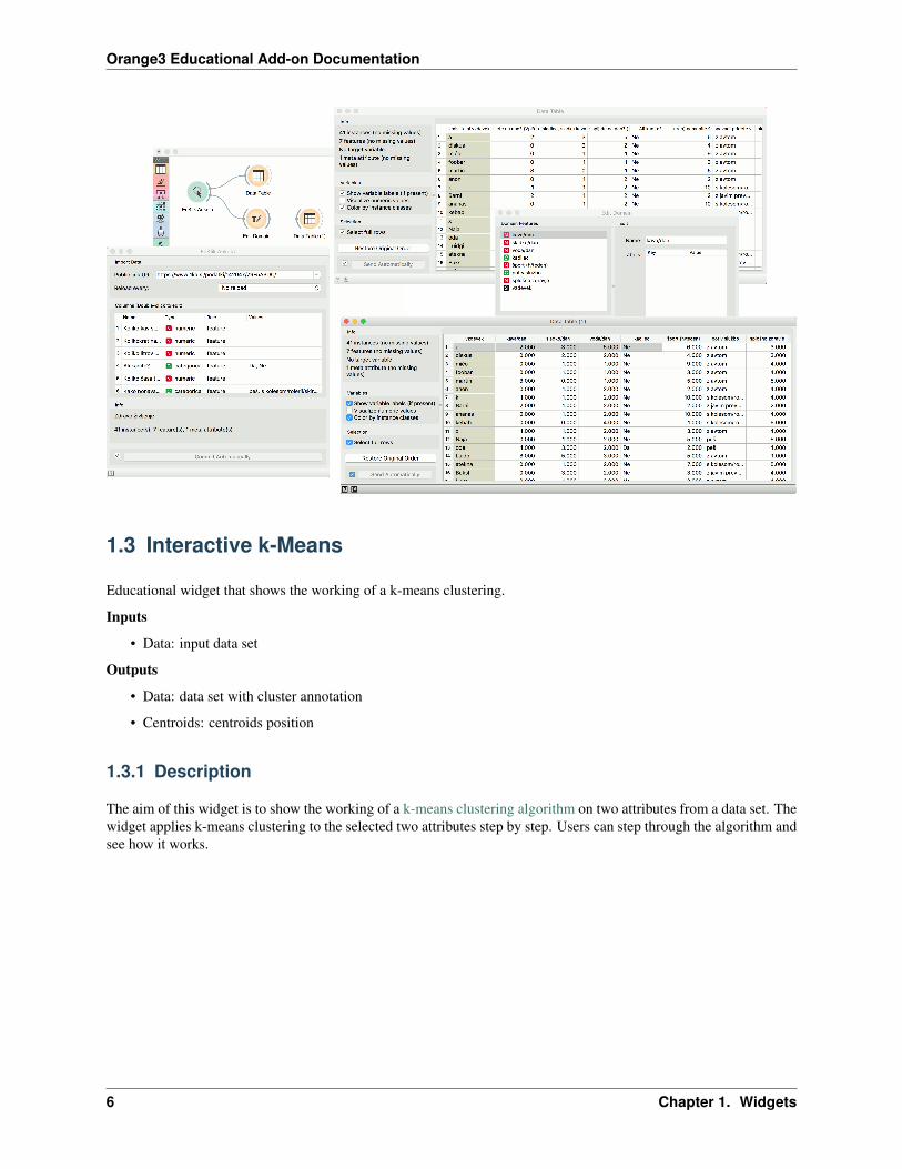
Here are two possible schemas that show how the Interactive k-Means widget can be used. You can load the datafrom File or use any other data source, such as Paint Data. Interactive k-Means widget also produces a data table withresults of clustering and a table with centroids positions. These data can be inspected with the Data Table widget.
1.3. Interactive k-Means 7
Orange3 Educational Add-on Documentation
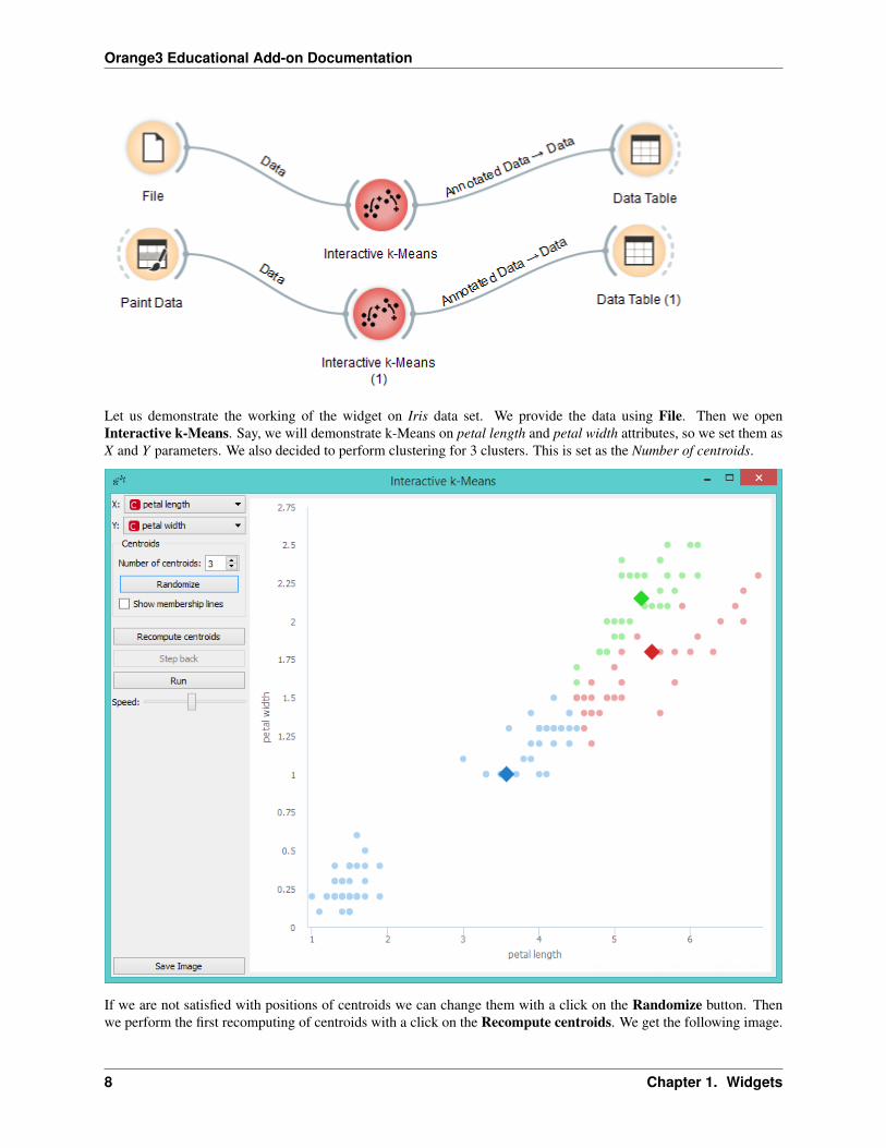
Let us demonstrate the working of the widget on Iris data set. We provide the data using File. Then we openInteractive k-Means. Say, we will demonstrate k-Means on petal length and petal width attributes, so we set them asX and Y parameters. We also decided to perform clustering for 3 clusters. This is set as the Number of centroids.
If we are not satisfied with positions of centroids we can change them with a click on the Randomize button. Thenwe perform the first recomputing of centroids with a click on the Recompute centroids. We get the following image.
8 Chapter 1. Widgets
Orange3 Educational Add-on Documentation
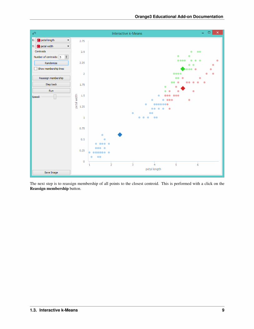
The next step is to reassign membership of all points to the closest centroid. This is performed with a click on theReassign membership button.
1.3. Interactive k-Means 9
Orange3 Educational Add-on Documentation
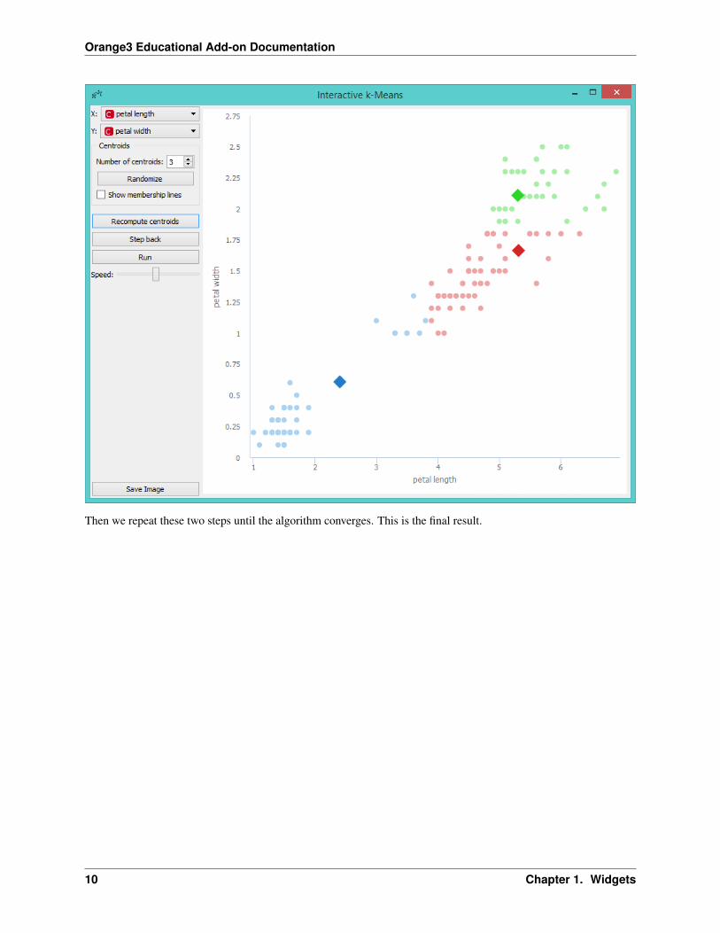
Then we repeat these two steps until the algorithm converges. This is the final result.
10 Chapter 1. Widgets
Orange3 Educational Add-on Documentation
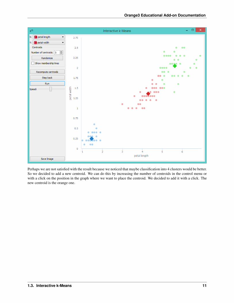
Perhaps we are not satisfied with the result because we noticed that maybe classification into 4 clusters would be better.So we decided to add a new centroid. We can do this by increasing the number of centroids in the control menu orwith a click on the position in the graph where we want to place the centroid. We decided to add it with a click. Thenew centroid is the orange one.
1.3. Interactive k-Means 11
Orange3 Educational Add-on Documentation
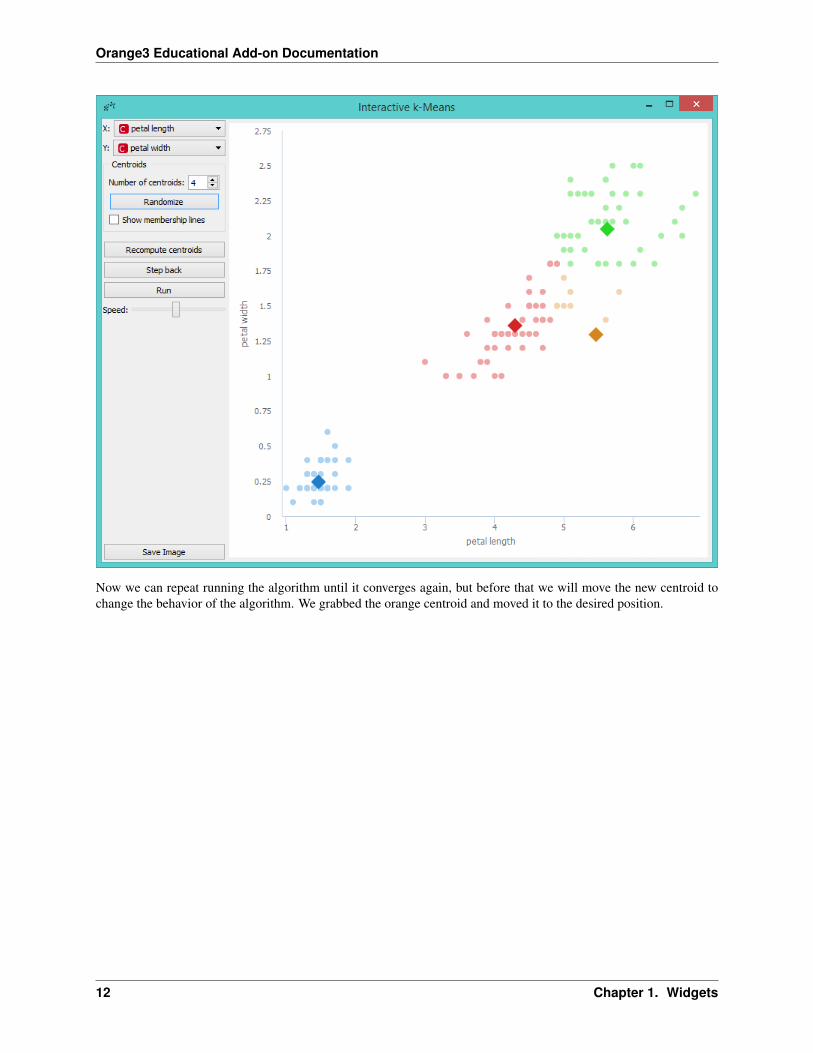
Now we can repeat running the algorithm until it converges again, but before that we will move the new centroid tochange the behavior of the algorithm. We grabbed the orange centroid and moved it to the desired position.
12 Chapter 1. Widgets
Orange3 Educational Add-on Documentation
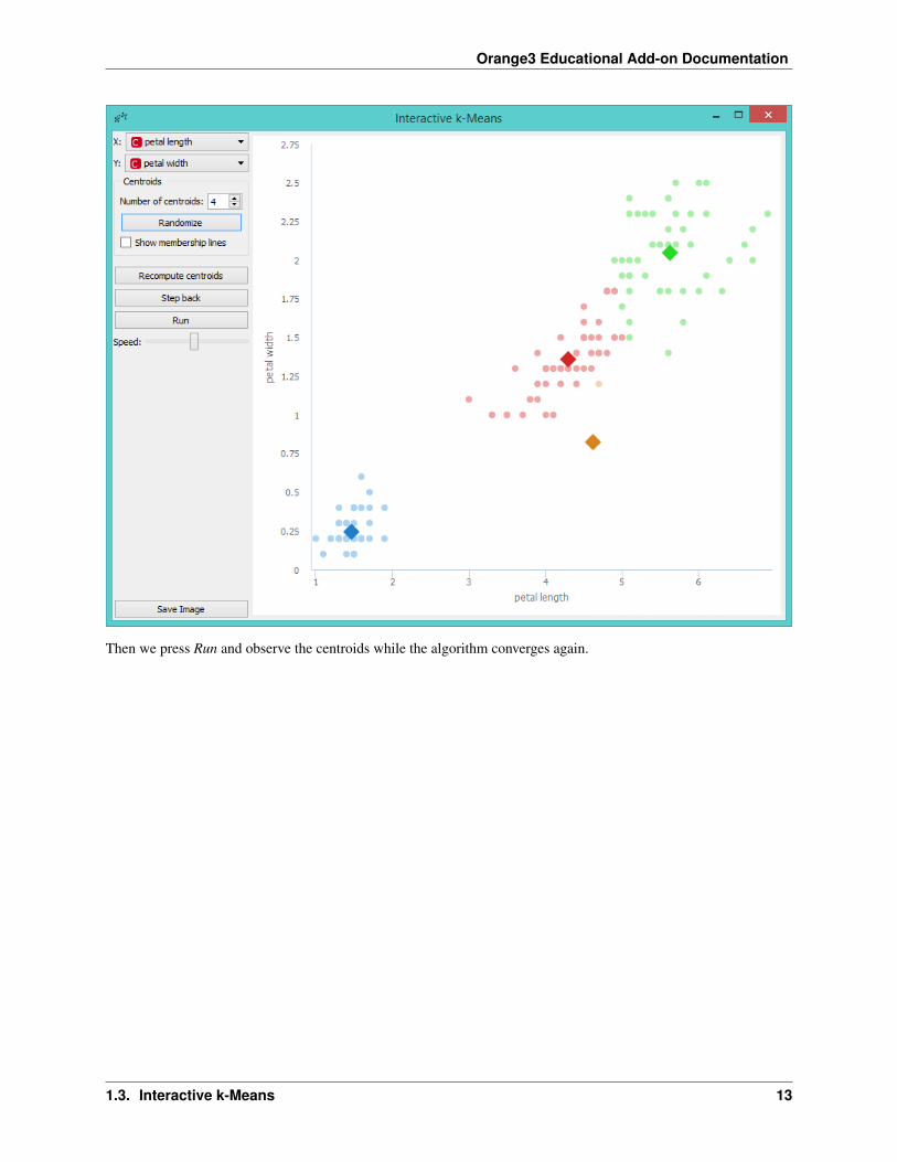
Then we press Run and observe the centroids while the algorithm converges again.
1.3. Interactive k-Means 13
Orange3 Educational Add-on Documentation
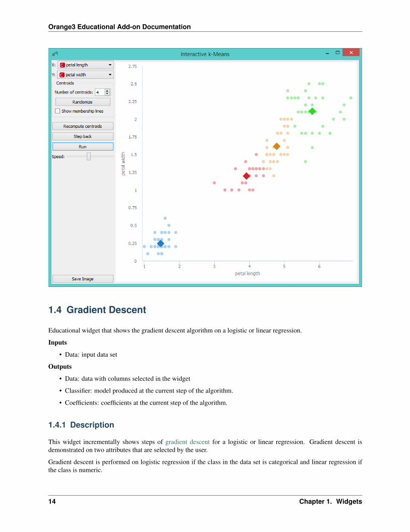
1.4 Gradient Descent
Educational widget that shows the gradient descent algorithm on a logistic or linear regression.
Inputs
• Data: input data set
Outputs
• Data: data with columns selected in the widget
• Classifier: model produced at the current step of the algorithm.
• Coefficients: coefficients at the current step of the algorithm.
1.4.1 Description
This widget incrementally shows steps of gradient descent for a logistic or linear regression. Gradient descent isdemonstrated on two attributes that are selected by the user.
Gradient descent is performed on logistic regression if the class in the data set is categorical and linear regression ifthe class is numeric.
14 Chapter 1. Widgets

Orange3 Educational Add-on Documentation
1. Select two attributes (x and y) on which the gradient descent algorithm is preformed. Select the target class. Itis the class that is classified against all other classes.
2. Learning rate is a step size in the gradient descent With stochastic checkbox you can select whether gradientdescent is stochastic or not. If stochastic is checked you can set step size that is amount of steps of stochasticgradient descent performed in one press on step button. Restart: start algorithm from the beginning
3. Step: perform one step of the algorithm Step back: make a step back in the algorithm
4. Run: automatically perform several steps until the algorithm converges Speed: set speed of the automaticstepping
5. Save Image saves the image to the computer in a .svg or .png format. Report includes widget parameters andvisualization in the report.
1.4.2 Example
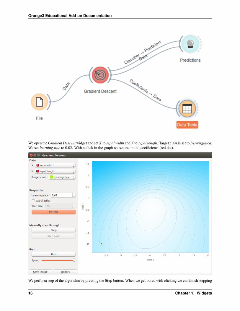
In Orange we connected File widget with Iris data set to the Gradient Descent widget. Iris data set has discrete class,so Logistic regression will be used this time. We connected outputs of the widget to Predictions widget to see how thedata are classified and the Data Table widget where we inspect coefficients of logistic regression.
1.4. Gradient Descent 15
Orange3 Educational Add-on Documentation
We open the Gradient Descent widget and set X to sepal width and Y to sepal length. Target class is set to Iris-virginica.We set learning rate to 0.02. With a click in the graph we set the initial coefficients (red dot).
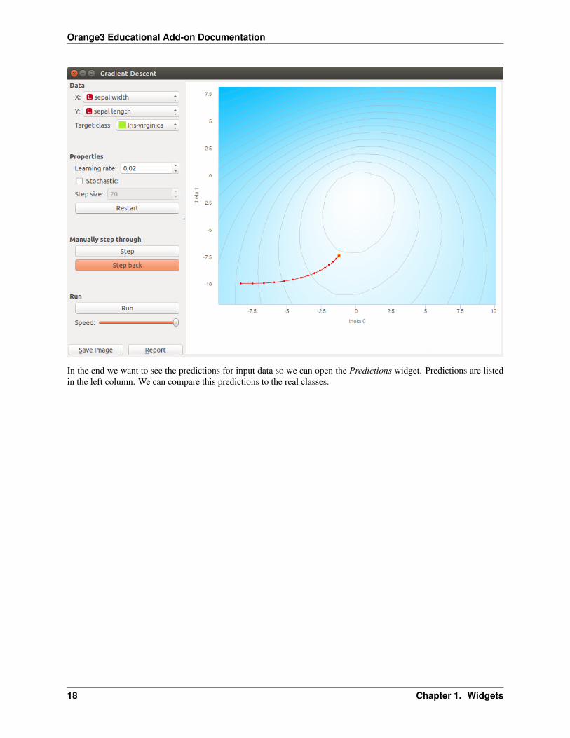
We perform step of the algorithm by pressing the Step button. When we get bored with clicking we can finish stepping
16 Chapter 1. Widgets

Orange3 Educational Add-on Documentation
by pressing on the Run button.
If we want to go back in the algorithm we can do it by pressing Step back button. This will also change the model.Current model uses positions of last coefficients (red-yellow dot).
1.4. Gradient Descent 17
Orange3 Educational Add-on Documentation
In the end we want to see the predictions for input data so we can open the Predictions widget. Predictions are listedin the left column. We can compare this predictions to the real classes.
18 Chapter 1. Widgets

Orange3 Educational Add-on Documentation
If we want to demonstrate the linear regression we can change the data set to Housing. This data set has a continuousclass variable. When using linear regression we can select only one feature which means that our function is linear.Another parameter that is plotted in the graph is intercept of a linear function.
This time we selected INDUS as an independent variable. In the widget we can make the same actions as before. Inthe end we can also check the predictions for each point with the Predictions widget. And check coefficients of linearregression in a Data Table.
1.4. Gradient Descent 19

Orange3 Educational Add-on Documentation
1.5 Polynomial Regression
Educational widget that interactively shows regression line for different regressors.
Inputs
• Data: input data set. It needs at least two continuous attributes.
• Preprocessor: data preprocessors
• Learner: regression algorithm used in the widget. Default set to Linear Regression.
Outputs
• Learner: regression algorithm used in the widget
• Predictor: trained regressor
• Coefficients: regressor coefficients if any
1.5.1 Description
This widget interactively shows the regression line using any of the regressors from the Model module. In the widget,polynomial expansion can be set. Polynomial expansion is a regulation of the degree of the polynom that is used totransform the input data and has an effect on the shape of a curve. If polynomial expansion is set to 1 it means thatuntransformed data are used in the regression.
20 Chapter 1. Widgets

Orange3 Educational Add-on Documentation
1. Regressor name.
2. Input: independent variable on axis x. Polynomial expansion: degree of polynomial expansion. Target: depen-dent variable on axis y.
3. Save Image saves the image to the computer in a .svg or .png format. Report includes widget parameters andvisualization in the report.
1.5.2 Example
We loaded iris data set with the File widget. Then we connected Linear Regression learner to the PolynomialRegression widget. In the widget we selected petal length as our Input variable and petal width as our Target variable.We set Polynomial expansion to 1 which gives us a linear regression line. The result is shown in the figure below.
1.5. Polynomial Regression 21

Orange3 Educational Add-on Documentation
The line can fit better if we increase the Polynomial expansion parameter. Say, we set it to 3.
To observe different results, change Linear Regression to any other regression learner from Orange. Example belowis done with the Tree learner.
22 Chapter 1. Widgets

Orange3 Educational Add-on Documentation
1.6 Polynomial Classification
Educational widget that visually demonstrates classification in two classes for any classifier.
Inputs
• Data: input data set
• Preprocessor: data preprocessors
• Learner: classification algorithm used in the widget. Default set to Logistic Regression Learner.
Outputs
1.6. Polynomial Classification 23
Orange3 Educational Add-on Documentation
• Learner: classification algorithm used in the widget
• Classifier: trained classifier
• Coefficients: classifier coefficients if it has them
1.6.1 Description
This widget interactively shows classification probabilities for classification in two classes using color gradient andcontour lines for any classifiers from the Model section. In the widget, polynomial expansion can be set. Polynomialexpansion is a regulation of the degree of polynom that is used to transform the input data and has an effect on theclassification. If polynomial expansion is set to 1 it means that untransformed data are used in the regression. Ifpolynomial expansion is set to 2 we get following additional attributes:
• first attribute on power 2
• first attribute * second attribute
• second attribute on power 2
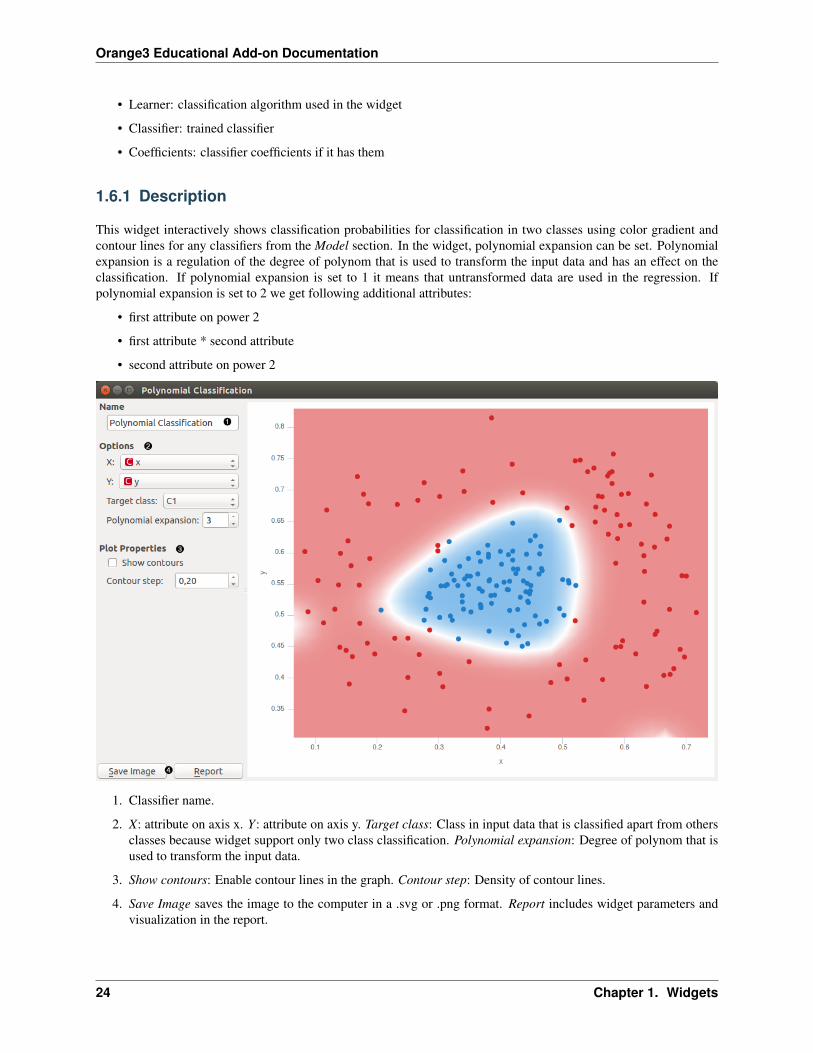
1. Classifier name.
2. X: attribute on axis x. Y: attribute on axis y. Target class: Class in input data that is classified apart from othersclasses because widget support only two class classification. Polynomial expansion: Degree of polynom that isused to transform the input data.
3. Show contours: Enable contour lines in the graph. Contour step: Density of contour lines.
4. Save Image saves the image to the computer in a .svg or .png format. Report includes widget parameters andvisualization in the report.
24 Chapter 1. Widgets

Orange3 Educational Add-on Documentation
1.6.2 Example
We loaded the iris data set with the File widget and connected it to the Polynomial Classification widget. To demon-strate output connections, we connected Coefficients to the Data Table widget where we can inspect their values.Learner output can be connected to Test & Score widget and Classifier to Predictions widget.
In the widget we selected sepal length as our X variable and sepal width as our Y variable. We set the Polynomialexpansion to 1. That performs classification on non transformed data. Result is shown in the figure below. Colorgradient represents the probability of the area to belong to a particular class value. Blue color represents classificationto the target class and red color classification to the class with all other examples.
1.6. Polynomial Classification 25

Orange3 Educational Add-on Documentation
In the next example we changed the File widget to the Paint data widget and plotted some custom data. Because thecenter of the data is of one class and the surrounding of another, Polynomial expansion degree 1 does not perform goodclassification. We set Polynomial expansion to 2 and get the classification in the figure below. We also selected to usecontour lines.
26 Chapter 1. Widgets

Orange3 Educational Add-on Documentation
1.7 Pie Chart
The widget for visualizing discrete attributes in the pie chart.
Inputs
• Data: input data set
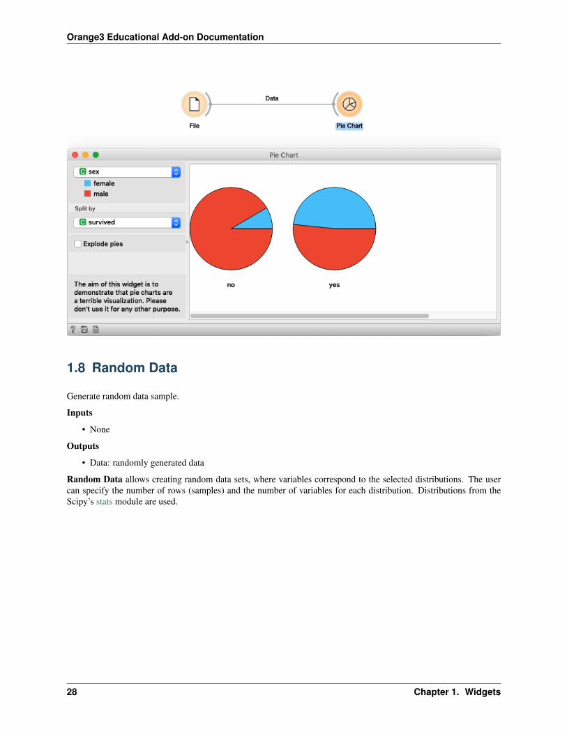
The aim of this widget is to demonstrate that pie charts are a terrible visualization. Please don’t use it for any otherpurpose.
1. Select the attribute you want to visualize.
2. Select the attribute which is used to split data in more charts.
3. Check if you want pies to be exploded (parts of the pie will have space in between).
4. You will see your data visualized here.
5. With those buttons, you can either get help, save the plot, or include plots in the report.
1.7.1 Example
We load the Titanic dataset in File widget and connected the data to Pie Chart. Here we show the distribution ofgender data and split pies by survived attributes. We notice that in the group of passengers that did not survive thereare mainly male while there is a higher proportion of women in the group of people that survived. While the pie chartcan shed some light of data we still suggest using more informative visualizations, e.g. Box Plot.
1.7. Pie Chart 27
Orange3 Educational Add-on Documentation
1.8 Random Data
Generate random data sample.
Inputs
• None
Outputs
• Data: randomly generated data
Random Data allows creating random data sets, where variables correspond to the selected distributions. The usercan specify the number of rows (samples) and the number of variables for each distribution. Distributions from theScipy’s stats module are used.
28 Chapter 1. Widgets

Orange3 Educational Add-on Documentation
1. Normal: A normal continuous random variable. Set the number of variables, the mean and the variance.
2. Bernoulli: A Bernoulli discrete random variable. Set the number of variables and the probability mass function.
3. Binomial: A binomial discrete random variable. Set the number of variables, the number of trials and probabilityof success.
4. Uniform: A uniform continuous random variable. Set the number of variables and the lower and upper boundof the distribution.
5. Discrete uniform: A uniform discrete random variable. Set the number of variables and the number of valuesper variable.
6. Multinomial: A multinomial random variable. Set the probabilities and the number of trials. The probabilitiesshould sum to one. The number of probabilities corresponds to the final number of variables generated.
7. Add more variables. . . enables selecting new distributions from the list and with that adding additional variables.Distributions can be removed by pressing an X in the top left corner of each distribution.
8. Define the sample size (i.e. number of rows, default 1000) and press Generate to output the data set.
1.8. Random Data 29

Orange3 Educational Add-on Documentation
1. Hypergeometric: A hypergeometric discrete random variable. Set the number of variables, number of objects,positives and trials.
2. Negative binomial: A negative binomial discrete random variable. Set the number of variables, number ofsuccesses and the probability of a success.
3. Poisson: A Poisson discrete random variable. Set the number of variables and the event rate (expected numberof occurrences).
4. Exponential: An exponential continuous random variable. Set the number of variables.
5. Gamma: A gamma continuous random variable. Set the number of variables, the shape and scale. The largerthe scale parameter, the more spread out the distribution.
6. Student’s t: A Student’s t continuous random variable. Set the number of variables and the degrees of freedom.
7. Bivariate normal: A multivariate normal random variable where the number of variables is fixed to 2. Thenumber of variables is set to two and cannot be changed. Set the mean and variance of each variable and the
30 Chapter 1. Widgets

Orange3 Educational Add-on Documentation
covariance matrix of the distribution.
1.8.1 Example
We normaly wouldn’t create a data set with so many different distributions but rather, for instance, a set of normallydistributed variables and perhaps a binary variable, which we will use as the target variable. In this example, we usethe default settings, which generate 10 normally distributed variables and a single binomial variable.
We observe the generated data in a Data Table and in Distributions.
1.8. Random Data 31

Orange3 Educational Add-on Documentation
32 Chapter 1. Widgets

CHAPTER 2
Indices and tables
• genindex
• modindex
• search
33