online data visualization for the money in africa project
TRANSCRIPT

i
MLC-1111
GFS-1111
Online Data Visualization
for the Money in Africa Project
An evaluation of the MIT SIMILE Widgets in the use of interactive displays in the British Museum
An Interactive Qualifying Project submitted to the faculty of Worcester Polytechnic Institute in partial
fulfilment of the requirements for the Degree of Bachelor of Science
Submitted by: Chloé Emery Petra Hartman Jon Kelly John Lucker
Submitted to:
Project Advisors: Prof. Guillermo Salazar Prof. Mark Claypool
Project Liaisons: Dr. Catherine Eagleton, Dr. Maxim Bolt, Dr. Leigh Gardner
June 23, 2011
ii
Abstract
Museums worldwide are incorporating interactive technology to enhance their displays.
This project worked with the British Museum‟s Department of Coins and Medals to adapt and
modify the MIT SIMILE Timeline and Timeplot widgets to better display the results of the
Money in Africa research. This project created functioning Timeline and Timeplot widgets with
accompanying user manuals and recommendations by obtaining financial and historical data,
conducting focus group and visitor testing, and meeting with our sponsors and the Web
Development team.

iii
Acknowledgements
Our team would like to thank all of our sponsors: Dr Catherine Eagleton, Dr Maxim Bolt,
and Dr Leigh Gardner for their immeasurable guidance and support for our team during our
project.
We would also like to thank the Web Development team at the British Museum: David
and Anthony, for helping us with the many technical aspects of the widgets. We would never
have been able to progress as far with the widgets without their interest and support.
For being an exceptional host and very enthusiastic about our project, we would like to
express our gratitude towards the Department of Coins and Medals.
The British Museum and Worcester Polytechnic Institute provided us with endless
encouragement and support. Without the collaboration of these two great institutions, this
project would not have been possible.
We would also like to thank Prof. Golding for the extensive preparation, and for taking a
sincere interest in our project.
Lastly we would like to thank our advisors, Prof. Claypool and Prof. Salazar for their
consistent input and persistent examination of the details of our project.

iv
Authorship Page
Chloé Emery diligently researched the history of the Currency Boards and widget content.
Additionally, she worked on the Literature Review and Appendixes A, D and Q. Chloé
also acted as Editor-in-Chief of the report.
Petra Hartman worked tirelessly on the Focus Group and Visitor Testing content in the
Methodology and Results, as well as the Archive Process of the Methodology and
Appendixes C, E, F, G, H, I, and Q.
Jon Kelly worked with extreme determination on the development of the widgets. He also
authored the Timeline sections of the Results and Appendices B, J, K, L and M.
John Lucker wrote the Introduction and Timeplot sections of the Results. John also worked on
Appendixes D, E, G, N, O and P of the report.
Please reference Appendix Q for a more detailed version of our Authorship

v
Table of Contents
Abstract ........................................................................................................................................... ii
Acknowledgements ........................................................................................................................ iii
Authorship Page ............................................................................................................................. iv
Table of Contents .............................................................................................................................v
List of Figures .............................................................................................................................. viii
List of Tables ...................................................................................................................................x
Executive Summary ....................................................................................................................... xi
Chapter 1: INTRODUCTION......................................................................................................... 1
Chapter 2: BACKGROUND AND LITERATURE REVIEW ....................................................... 3
2.1 Introduction ........................................................................................................................... 3
2.2 The Purpose of Museums ...................................................................................................... 3
2.3 Evolution of Museums ........................................................................................................... 4
2.4 Mission of the British Museum and General Content for Widgets ....................................... 5
2.5 The Timeline and Timeplot Widgets .................................................................................... 7
2.5.1 Timeline ..................................................................................................................... 8
2.5.2 Timeplot ..................................................................................................................... 9
2.6 Web Exhibits ....................................................................................................................... 10
2.6.1 Designing Web Exhibits .......................................................................................... 10
2.6.2 Graphic Design ........................................................................................................ 14
2.6.3 Creating a Quality Display....................................................................................... 15
2.6.4 Evaluating Web Exhibits ......................................................................................... 17
2.7 Summary .............................................................................................................................. 18
Chapter: METHODOLOGY ......................................................................................................... 19
3.1 Introduction ......................................................................................................................... 19
3.2 Objective 1: Assessing staff opinions about technological exhibits ................................... 19
vi
3.3 Objective 2: Developing the test Timeline and Timeplot ................................................... 21
3.3.1 Process ..................................................................................................................... 21
3.4 Objective 3: Research background for content of Timeline and Timeplot ......................... 22
3.4.1 allAfrica.com .......................................................................................................... 24
3.4.2 National Archives .................................................................................................... 24
3.5 Objective 4: Testing the Timeline and Timeplot ................................................................ 28
3.6 Objective 5: Develop the Final Product ............................................................................. 30
3.7 Summary ............................................................................................................................ 30
Chapter 4: RESULTS AND ANALYSIS ..................................................................................... 31
4.1 Introduction ......................................................................................................................... 31
4.2 Data Collection and Analysis .............................................................................................. 31
4.2.1 The National Archives ............................................................................................. 31
4.2.2 AllAfrica.com .......................................................................................................... 34
4.3 Widget Development ........................................................................................................... 34
4.3.1 Timeline Development............................................................................................. 35
4.3.2 Timeplot Development ............................................................................................ 40
4.4 Focus Group ........................................................................................................................ 44
4.5 Visitor Testing ..................................................................................................................... 45
4.6 Summary ............................................................................................................................. 48
Chapter 5: CONCLUSION ...........................................................................................................49
5.1 Recommendations ................................................................................................................49
5.2 User Manual ........................................................................................................................ 50
5.3 Summary ............................................................................................................................. 52
REFERENCES ............................................................................................................................ 54
APPENDICES .............................................................................................................................. 57
Appendix A: African Currency Boards ..................................................................................... 57
Appendix B: Sample Blue Book Pictures ................................................................................. 60
Appendix C: Colonial Blue Books Graphs ............................................................................... 63
Appendix D: Sponsor Description ............................................................................................ 67

vii
Appendix D: Testing Focus Group Procedures ........................................................................ 62
Appendix E: Focus Group Materials ........................................................................................ 72
Appendix F: Focus Group Questionnaire Responses ............................................................... 74
Appendix G: Visitor Testing Materials ...................................................................................... 77
Appendix H: Visitor Testing Questionnaire Responses............................................................. 79
Appendix I: Visitor Testing Graphs ........................................................................................... 86
Appendix J: Timeline Change Log ............................................................................................ 90
Appendix K: Timeline Non-Technical User Manual ................................................................. 93
Appendix L: Timeline Technical Manual ................................................................................ 100
Appendix M: Timeline Recommendations ............................................................................... 117
Appendix N: Timeplot Non-Technical User Manual ............................................................... 119
Appendix O: Timeplot Technical User Manual........................................................................ 124
Appendix P: Timeplot Recommendations ................................................................................ 125
Appendix Q: Authorship Table ................................................................................................. 127

viii
List of Figures
Figure 1: Final Version of Timeline .............................................................................................. xi
Figure 2: Final Version of Timeplot ............................................................................................. xii
Figure 3: Example SIMILE Timeline from http://SIMILE-widgets.org/timeline/ ..........................8
Figure 4: Sample Timeplot from http://www.SIMILE-widgets.org/Timeplot/ ..............................9
Figure 5: Sun, Earth and Space exhibit...................................................................................................................... 11
Figure 6: Sun View .............................................................................................................................................................. 12
Figure 7: Heat map of User focus on Websites ..................................................................................................... 13
Figure 8: Churchill Museum Timeline....................................................................................................................... 16
Figure 9: Breakdown of Server Log Visits .............................................................................................................. 17
Figure 10: Site Usage Chart ............................................................................................................................................ 17
Figure 11: Planned Project Timeline .......................................................................................................................... 20
Figure 12: Widget Design Process ............................................................................................................................... 21
Figure 13: Example Widget Dialog Box ......................................................................................23
Figure 14: Original (left) and Enhanced (right) of Coins in 1832 Gambia ...................................... 27
Figure 15: Sample Google Spreadsheet for Blue Book Data ........................................................32
Figure 16: Total Revenue and Total Expense for Tanganyika .....................................................33
Figure 17: Example of events drawn from allAfrica.com .............................................................34
Figure 18: First Timeline Prototype ...............................................................................................35
Figure 19: First Prototype, Compact Painter Version ....................................................................35
Figure 20: Excerpt from Prototype Review notes ............................................................................... 36
Figure 21: Second Timeline Prototype ..........................................................................................37
Figure 22: Third Timeline Prototype .............................................................................................37
Figure 23: Fourth Timeline Prototype ...........................................................................................38
Figure 24: Final Version of Timeline ............................................................................................39
Figure 25: First Timeplot Prototype ..............................................................................................40
Figure 26: Second Timeplot prototype ..........................................................................................41
Figure 27: Third Timeplot Prototype .............................................................................................42
Figure 28: Final Version of Timeplot ............................................................................................43
Figure 29: West African Currency Board Timeplot ......................................................................43
Figure 30: Visitor Rating of Informative Quality in Timeline ......................................................46

ix
Figure 31: Sample Page from the Timeline‟s Technical User Manual ..........................................51
Figure 32: Example Page from the Timeline‟s Non-Technical User Manual ...............................52
Figure 33 Comparative Yearly Statement of Revenue for the Gold Coast 1933-34 .....................60
Figure 34: Comparative Yearly Statement of Expenditure Sierra Leone 1839 .............................61
Figure 35: Net Imports and Exports for the Gold Coast in 1941 ...................................................62
Figure 36: Graph of Uganda Revenue and Expenditure ...............................................................63
Figure 37: Graph of Uganda Net Income .....................................................................................64
Figure 38: Graph of Gold Coast Revenue and Expenditure .........................................................64
Figure 39: Graph of Gold Coasts Imports and Exports ................................................................65
Figure 40: Graph of Revenue and Expenditure in Tanganyika ....................................................65
Figure 41: Graph of Net Income for Tanganyika .........................................................................66
Figure 42: Graph of Total Currency in East Africa ......................................................................66
Figure 43: Total Number of Physical Visits to the British Museum 2003-2004 to 2007-2008 ....67
Figure 44: 2009/2010 Reserve Funds ............................................................................................68
Figure 45: The floor plan of the upper level of galleries ...............................................................69
Figure 46: Comparison of Curatorial Staff ....................................................................................69
Figure 47: Responses for Easy to Operate ....................................................................................87
Figure 48: Responses for Easy to Find Information ......................................................................86
Figure 49: Responses for Well Organized .....................................................................................88
Figure 50: Responses for Informative............................................................................................88
Figure 51: Responses for Easy to Read .........................................................................................89
Figure 52: Responses for Visually Pleasing ..................................................................................89
Figure 53: Timeline example with event properties highlighted ..................................................93
Figure 54: Example of color property: “ImportantEvent” is color=”red” ....................................94
Figure 55: Default Timeline event placement ...............................................................................94
Figure 56: Timeline event placement when TrackNum is specified ............................................95
Figure 57: Examples of durationEvent, latestStart and earliestEnd properties .............................95
Figure 58: New Excel spreadsheet ................................................................................................96
Figure 59: Spreadsheet setup: Essential column labels ................................................................97
Figure 60: Spreadsheet Setup: additional Column Headers ..........................................................97
Figure 61: Select Entire Column ...................................................................................................97
x
Figure 62: Finding the number format field ...................................................................................98
Figure 63: Finding the "Long Date" Format ..................................................................................98
Figure 64: Sample Timeline Events ..............................................................................................99
Figure 65: Timeline from sample events ......................................................................................99
Figure 66: Band Properties Example ..........................................................................................106
Figure 67: Hot Zones and Decorators .........................................................................................106
Figure 68: Number Format Area .................................................................................................120
Figure 69: Timeplot Data Files, Dates ........................................................................................121
Figure 70: Sample Timeplot Data File ........................................................................................121
List of Tables
Table 1: Historical Evolution of Monetary Policy Regimes in Africa ............................................... 7
Table 2: Mapping Attributes to Quality Dimensions .......................................................................... 16
Table 3: Colonial Blue Books Requested ............................................................................................. 25
Table 4: Blue Books reviewed by Person ............................................................................................. 26
Table 5: Blue Books Completed by Country ........................................................................................ 32
Table 6: Focus Group Responses to Timeline ...................................................................................... 44
Table 7: Focus Group Responses to Timeplot ...............................................................................44
Table 8: Summary Statistics of Visitor Testing .............................................................................47
Table 9: DCMS performance indicators for 2009/2010...................................................................... 68
Table 10: Timeline Widget Change Log ............................................................................................... 90

xi
Executive Summary
Many museums have been working to find new and innovative ways to present and
explain the results of their research, and the British Museum is no exception. The Money in
Africa research project is part of the British Museum‟s Department of Coins and Medals, and it
seeks to “explore the history and politics of Africa through the story of its money” (Money in
Africa 2011). The Money in Africa project‟s scope stretches from colonial Africa to the modern
day and the researchers have been searching for tools to help them present the complex story of
Africa‟s money to a larger audience. Two of the tools that they identified were the MIT SIMILE
Timeline and Timeplot widgets. The Timeline widget creates an interactive Web based timeline
and the Timeplot widget overlays time series data with relevant historical events to create an
interactive graph. The goal of this project was to adapt the MIT SIMILE Timeline and Timeplot
widgets and evaluate their potential use by the Money in Africa project, of the British Museum‟s
Department of Coins and Medals.
Figure 1: Final Version of Timeline

xii
Figure 2: Final Version of Timeplot
There were four objectives to achieve in order to complete our project‟s goal. The first
objective was to clarify the requirements for our overall project and the Timeline and Timeplot
that we were developing. Further objectives included: identifying and researching the widget‟s
content, developing the widgets, and testing and evaluating our final versions of the Timeline
and Timeplot. A number of techniques were utilized to complete these objectives. In order to
clarify the requirements a number of conversations were held with our sponsors and with the
Museum‟s Web Development team. We researched the widgets‟ content using the Colonial Blue
Books at the National Archives and the news aggregator allafrica.com. The widgets were
developed using an iterative design process that allowed for continuous input from our sponsors.
A focus group was then conducted, which was a gathering of six members of Museum staff, and
a round of visitor testing, with twenty individuals from the Money Gallery, to evaluate the
widgets‟ effectiveness in displaying the Money in Africa research.
The first objective accomplished was clarifying the requirements of the widgets. We
established that the Timeline would contain information from the monetary history of Nigeria,
Uganda, and Malawi over the past 12 years and the Timeplot would encompass data from the
East and West African Currency Boards during the colonial era. In order to research the content
of the widgets, we gathered data from 510 Colonial Blue Books, located at the National
xiii
Archives. From these books, we gathered statistics for use in the Timeplot and for the Money in
Africa project‟s future use. These statistics included revenue, expenditure, population, currency
value and circulation, imports, and exports. With the help of our sponsors, we collected many
articles from allafrica.com in order to retrieve events for the Timeline. Over the course of the
iterative design process we developed four prototypes and a final version for the Timeline. The
Timeplot, due to a more favorable initial setup, delayed start, and fewer customization options,
had three prototypes and a final version.
We conducted a focus group containing six members selected from the Department of
Coins and Medals. These six individuals had no prior exposure to the Timeline and Timeplot
widgets and represented a range of technical knowledge and experience with graphical displays.
They were very pleased with the widgets and provided valuable recommendations. They
believed the Timeline to be very informative, but felt it needed some additional styling to
improve the visual appeal. Participants observed the Timeplot to be aesthetically pleasing and
easy to operate, but found the organization to be confusing and hard to read. Following the focus
group, we conducted visitor testing. During the visitor testing we received input on the Timeline
from twenty visitors to the Money Gallery. These visitors also offered positive reviews overall.
Similar to the members of the focus group, the visitors found the Timeline to be very
informative, but that it needed to increase its visual appeal. Due to time constraints, we were not
able to act on many of the suggestions given during the testing. However, we have included
these suggestions and their possible solutions in the user manuals for the Timeline and Timeplot.
The goal of our project was to adapt the MIT SIMILE Timeline and Timeplot and
evaluate their potential use by the Money in Africa project, of the British Museum‟s Department
of Coins and Medals. We found that these widgets were powerful tools for presenting research.
The Timeline and Timeplot are able to be maintained and updated by curators and researchers
with minimal contributions from Web developers. Correspondingly, it would be simple for a
Web developer to set up a Timeline or Timeplot for a curator or researcher. Our project created
prototype versions of the Timeline and Timeplot widgets that were well received in the testing
phases and we have assembled individual technical and non-technical user manuals to help the
British Museum further develop the prototypes in the future.

1
Chapter 1: INTRODUCTION
Information has become more easily accessible through the Internet and people have
come to expect advanced technology in everyday life. Museums around the world have been
working to utilize these new technologies to attract and engage visitors. The addition of
technology and interactive exhibits to museums has increased their appeal to visitors and has led
to increased visitor engagement with the displays. Additionally, technology has allowed for
researchers and curators to examine their data from another viewpoint, as is the case for the
Money in Africa project. Access to museums‟ research has also been improved through
increased Web presence and the use of Web exhibits.
The presentation of museum research has incorporated more technology over time with
many resources being used to help display data in ways that would have been difficult to view
before. New technology is often used in the form of interactive displays that better engage the
audience in the research. Creating new user-friendly interactive displays to help researchers and
curators examine and present data can be challenging, and one must consider how to best design
the displays and show information in a helpful manner. In order to make the process easier,
museums search for novel tools which help make displays that promote usability and provide
fascination, learning, and comprehension.
The British Museum‟s Money in Africa research project aims to incorporate interactive
displays into the presentation of their research. The monetary history of Africa is a complex
subject and covers an extended period of time. The currencies in Africa have been in constant
flux due to political unrest, hyperinflation, and developing technology. The Money in Africa
researchers have been looking for creative ways to display these complex stories so they can be
understood by a variety of audiences. Interactive technologies have the potential to better
display large quantities of data than traditional didactic displays, as the latter do not provide an
intuitive way to display vast amounts of information or support curiosity-based discovery.
The Massachusetts Institute of Technology (MIT) Timeline and Timeplot widgets are an
attractive technological option for displaying African currency information with potential
advantages over didactic displays. The Timeline widget‟s ability to show many events in a
compact area allows it to display the numerous changes to Africa‟s currency and related events
2
without overwhelming the user. By overlaying a graph with historical events, the Timeplot
widget is able to give users a time-related context to better interpret information such as
exchange rates and revenue in a more controlled and user-friendly manner.
The goal of our project was to adapt the MIT SIMILE Timeline and Timeplot and
evaluate their potential use by the Money in Africa project and the British Museum as a whole.
We evaluated the effectiveness of using the Timeline and Timeplot widgets to display the Money
in Africa project‟s research by determining ease of use, proper methods of displaying data, and
the inclusiveness of the research of the Department of Coins and Medals. We created a
prototype Timeline and Timeplot, with continuous input from the researchers, containing
information we gathered from the news aggregator allafrica.com and from the Colonial Blue
Books at the National Archives. The feasibility of the widgets was based on solicited opinions
of museum staff and tests conducted on the prototype Timeline and Timeplot with both the
museum staff and visitors.
We think that the Timeline and Timeplot would make good tools for MIA research, and
the British Museum should consider using them more.

3
Chapter 2: BACKGROUND AND LITERATURE REVIEW
2.1 Introduction
Museums serve the purpose of storing artifacts from our past and using them to educate
the public. They work towards this goal through a variety of methods, ranging from physical
exhibits to outreach programs. These methods have developed over time from early museums,
using a didactic method, where visitors walked around a series of artifacts with labels to modern
museums with dynamic exhibits containing interactive components. In addition to these modern
exhibits, the use of Websites to communicate the museum‟s knowledge to the public is becoming
more common. There has been a recent rise in virtual museums that allow people to visit from
anywhere in the world, using their computer, whenever it is convenient for them. Virtual
museums consist of pictures of an exhibit within the museum, and allow the visitors to navigate
as if they were in the museum itself. Conversely, Web exhibits are not found in the museum and
either supplement material found in the museum or act as an independent exhibit. This project
focuses on the proper design and implementation of Web exhibits.
To successfully design and implement these Web exhibits, we used the MIT SIMILE
Timeline and Timeplot widgets. In order to adapt and utilize these interactive technologies for
the Money in Africa research project a knowledge of the purpose and evolution of museums, the
historical content to be entered into the widgets, graphic design, widget design, creating quality
displays, and Web exhibit evaluation is necessary.
2.2 The Purpose of Museums
According to the International Council of Museums (ICOM), “A museum is a non-profit-
making, permanent institution in the service of society and of its development, and open to the
public which acquires, conserves, researches, communicates and exhibits, for purposes of study,
education and enjoyment, material evidence of people and their environment” (“Museum
Definition” 2010). From this definition we can draw a number of specific tasks that a museum
must fulfill. These tasks are acquiring, conserving, researching, communicating and exhibiting.
The first two tasks, acquiring and conserving, are both concerned with a museum‟s collection.
Since their conception, one of the core functions of museums has been to amass and preserve a

4
collection of historically or culturally significant objects. To fulfill these functions, museums
conduct expeditions, buy items from private collectors, perform repairs, and create special
containers to preserve the objects they have collected. These objects are evidence of humanity‟s
past and museums are responsible for preserving them for the next generation. These objects,
however, are worth nothing if they remain in an underground vault. The other main task of a
museum is to make use of their collection. Nearly all museums use their collections as a focus of
research to learn about the past. Besides this research, museums also have a responsibility to
allow the public to access and learn from their collections and research. Through public
exhibitions and displays a museum attempts to both educate and entertain its visitors. While the
methods and subjects of museums vary widely, they all have the same goals, collecting objects
and educating the public.
2.3 Evolution of Museums
One of the goals of every museum is to educate their visitors, but the means by which
they do so is evolving. In the very first museums, the curators acted as the keepers of knowledge
and determined what exhibits or collections they thought the visitors should see and then allowed
them to view those items (Viralingam and Ramaiah 2008). While curators are now just one part
of this decision process, as recently as the 1960s museums still designed their exhibits with this
idea of the museum as the keeper of knowledge. Museums often assumed that everyone saw the
intrinsic educational and cultural value of the museum collections and exhibits. They thought
that simply by collecting, preserving, and presenting these objects, the museum fulfilled its goal
to educate the public (Lang 2006).
However, factors such as new teaching styles, increased competition, reduced visitors,
funding cuts, and new government expectations for museums have lead museums to become
more focused on their visitors‟ desires. Rather than basing exhibits on what the curators and
directors think people should learn about, exhibits are more commonly based on what the
visitor‟s want to learn about (Viralingam and Ramaiah 2008). This new focus is especially
prominent in the UK. In 1997, the Labour Party came into power and helped to promote the
change in focus of museums in the UK. The Department of Culture, Media and Sport (DCMS),
the agency responsible for museums, conducted an extensive review of British museums. They
determined that museums needed to improve the access to, and the educational value of exhibits,

5
to design more creative displays, and to focus on the people rather than just the collection (Lang
2006). This has led to new techniques for designing exhibits as well as outreach programs such
as school field trips, newsletters, and Websites.
In order to make new exhibits, which do a better job of meeting the needs of the visitor,
many museums are starting to make use of interactive and Web exhibits. These exhibits can be
used to explain complex information in an elegant and entertaining form. Interactive exhibits
also serve as a major draw because they engage an audience far more effectively than a static
exhibit. Web exhibits offer some additional benefits over other interactive exhibits. Today
many people, especially the younger generations, use the Internet as one of their primary sources
of information. Therefore, it is more important than ever for museums to maintain a strong Web
presence in order to attract these younger visitors. Web exhibits can increase accessibility to
information because there are far more people who have easy access to the internet than people
who have easy access to a museum. By placing exhibits or information about exhibits online,
museums are able to educate people who they would not have reached otherwise. Web exhibits
allow museums to educate people all over the world, rather than just in their own area
(Viralingam and Ramaiah 2008). Museums are constantly working to improve themselves and
provide a better experience for their visitors.
2.4 Mission of the British Museum and General Content for Widgets
Within the next five years, the British Museum aims to address four key objectives in
order to cultivate its world-class status. These objectives are: “to manage and research the
collection more effectively, to enhance access to the collection, to invest in our people, and to
increase self-generated income” (Strategy 2011). Digital technologies could effectively address
the need for greater access to the museum‟s collections. The Coins and Medals Department
specifically wishes to “create online resources that enable broad audiences to engage with the
research, and its results” (London E11 Project Descriptions 2011). We aim to address these
objectives by creating and testing the Timeline and Timeplot Widgets developed by MIT, with
content pertinent to the Money in Africa project of the Coins and Medals Department.
The content of these widgets was outlined by the Coins and Medals Department. The
Timeplot contains political and monetary data from the East and West African Currency Boards.

6
These boards helped dictate monetary policy and reporting during Africa‟s colonial era. The
Timeline highlights significant events from the past 12 years of history in Nigeria, Uganda, and
Malawi, where the Money in Africa team has been conducting field work (London E11 Project
Descriptions 2011).
To understand the progression of post-independence African monetary history, we must
look at five contrasting monetary policy regimes. Rules-based systems, such as the currency
boards described in Appendix A, are one example of a monetary policy regime (I). Second is
automatic monetary financing (II) also known as “the printing press.” There are two
discretionary regimes that are characterized by the extent to which intervention limits market-
clearing: the controlled economy (III) and those in which monetary policies operate through
credit ceilings (IV). The final regime is one of full market-clearing (V) found in most
sophisticated financial sectors today. The progression of regimes found in Africa can be found
in Table 1 (Honohan and O‟Connell 1997).
(THIS SPACE HAS BEEN INTENTIONALLY LEFT BLANK)
7
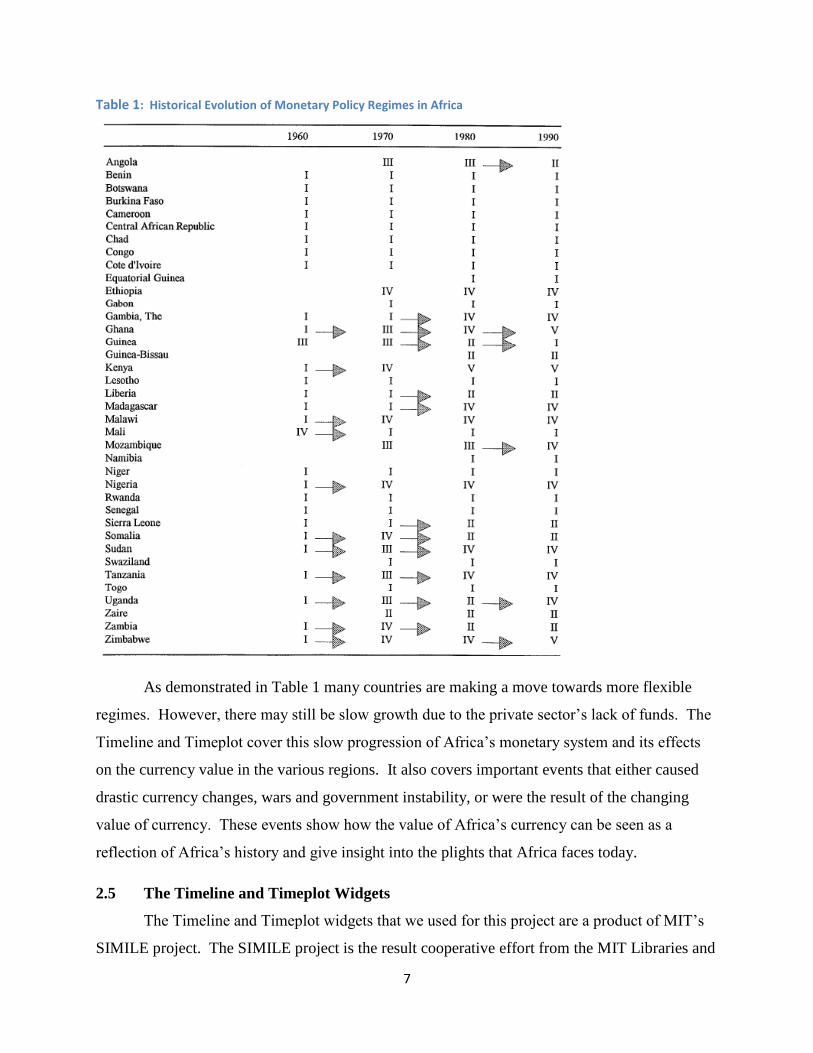
Table 1: Historical Evolution of Monetary Policy Regimes in Africa
As demonstrated in Table 1 many countries are making a move towards more flexible
regimes. However, there may still be slow growth due to the private sector‟s lack of funds. The
Timeline and Timeplot cover this slow progression of Africa‟s monetary system and its effects
on the currency value in the various regions. It also covers important events that either caused
drastic currency changes, wars and government instability, or were the result of the changing
value of currency. These events show how the value of Africa‟s currency can be seen as a
reflection of Africa‟s history and give insight into the plights that Africa faces today.
2.5 The Timeline and Timeplot Widgets
The Timeline and Timeplot widgets that we used for this project are a product of MIT‟s
SIMILE project. The SIMILE project is the result cooperative effort from the MIT Libraries and

8
MIT‟s Computer Science and Artificial Intelligence Laboratory (CSAIL). The SIMILE project‟s
goal is to create “robust, open source tools that empower users to access, mange, visualize, and
reuse digital assets” (SIMILE 2011). The Timeline and Timeplot widgets are two of their
“graduated projects” and are open source software available under the BSD license. Because
both the Timeline and Timeplot are open source, we were able to use this software free of charge
and modify the widgets where it proved necessary
2.5.1 Timeline
The SIMILE Timeline widget is described as a “Web Widget for Visualizing Temporal
Data” (http://SIMILE-widgets.org/timeline/). We can use this widget to create interactive and
informative timelines for the Money in Africa project. The Timeline shown in Figure 3 is from
the SIMILE widget‟s home page and chronicles the events of John F. Kennedy‟s death.
Figure 3: Example SIMILE Timeline from http://SIMILE-widgets.org/timeline/
The Timeline widget allows for instantaneous events (represented by blue bullets above),
events with duration (shown as a blue line), and blocks of time for groups of elements, as seen by
the red area between when Kennedy was shot and his time of death. Clicking on any of the
events opens a balloon that displays additional information about the given event. The widget
also supports filtering and searching to focus on specific information and provides the ability to
change the colors on the Timeline. These features, as well as the ability to scroll the Timeline
using either of the two bars seen above, allow for the Timeline widget to give access to far more
information than a traditional, non-electronic Timeline in a smaller area.
Another advantage of the Timeline widget is its relative simplicity. The widget runs
using only HyperText Markup Language (HTML), Cascading Style Sheets (CSS), and
JavaScript. HTML and CSS stand at the very core of Web design. HTML, or one of its
variants, is used to write the vast majority of Websites. The Timeline widget uses HTML 4.01,
which is fully supported on all browsers. While HTML is mostly concerned with the structure of

9
Websites, CSS deals primarily with their aesthetics. CSS is used to design the colors, layouts,
and fonts of many Web pages. While the can be defined using only HTML, CSS allows for the
same format to be applied throughout an entire Webpage or group of Web pages.
(http://www.w3.org/standards/webdesign/htmlcss) Since the Timeline uses CSS it was easy to
make its style match that of the British Museum‟s existing Website.
HTML and CSS are good for designing static Web pages, but they do not work well for
dynamic content. To fill this gap scripts are used. Scripts allow Websites to change on a regular
basis or according to specific events. The most commonly used scripting language is JavaScript.
(http://www.w3.org/standards/webdesign/script) The fact that the Timeline widget uses only
these three languages means that it is usable on all modern browsers since all three of these
languages are included and enabled by default settings. Some users, usually businesses, will
manually disable JavaScript for security purposes, but this is rare enough to be no more than a
minor issue. Overall, the features and simplicity of the Timeline widget make it a great tool to
display the Money in Africa team‟s research in an interesting way to a wide audience.
2.5.2 Timeplot
The Timeplot widget is used to create interactive plots by overlaying Timeline events on
a plot of time-based data. We used this widget to plot currency denominations and forms across
relevant events in African history. Below is an example Timeplot showing New Legal
Permanent Residents in the U.S. (per year) vs. U.S. Population vs. U.S. History.
Figure 4: Sample Timeplot from http://www.SIMILE-widgets.org/Timeplot/
The Timeplot is capable of plotting multiple series of data (shown by the black and green
lines above). By moving the mouse along the plot the user can see the values of both of the data
series, as well as the date corresponding to the data. The major benefit of the Timeplot is its
ability to display Timeline events on the same plot as the data. Each of the red bars in Figure 4
represents a particular event. Just like with the Timeline widget, clicking on one of these bars
causes a balloon to pop up showing additional information about that event. This gives the user

10
a context for the data they are seeing in a way that is difficult with an ordinary plot. All of the
colors and displays are customizable, allowing it to be tailored to our needs. Because the
Timeplot widget is largely based off the Timeline widget, it also has the same advantage of only
needing HTML, CSS, and JavaScript to work. This gives it that same universal accessibility as
the Timeline widget.
2.6 Web Exhibits
Many museums are adding interactive and technical exhibits in order to attract and
engage visitors. Enhancing exhibits within museums, however, is not the only benefit that recent
advances in technology has for museums. The Internet is a powerful tool for spreading
information and many museums have been working to increase their Web presence. Most
museums now have Web pages with their hours, list of exhibits, and floor maps and many have
digitized images of their collections with interpretive text. Web exhibits are the next step of this
ongoing process of Web development. Web exhibits are just like on-gallery exhibits in that they
give context and details about the items in the collection, but are placed on the museum‟s
Website and are therefore accessible to a much wider audience.
2.6.1 Designing Web Exhibits
Designing a good Web exhibit requires an awareness of the aspects of developing a good
museum exhibit and the aspects of developing a good Website. When building an exhibit one
needs to consider the educational value, attractive power, the mode of presentation, and the
holding power of the material being presented. Web exhibits have these same design concerns,
but also have to concern themselves with Web design issues such as compatibility, load times,
and font styles.
Web exhibits are able to carry far more information than an ordinary in-museum exhibit
would be able to because a Website doesn‟t have the same space concerns that a physical exhibit
has. An exhibit can only physically hold a limited number of items, but a Website is able to hold
an almost limitless number of pictures. This capacity for information is one of the great benefits
of a Web exhibit, but it is also one of its dangers. It is easy to overload a Web exhibit with
information. If a casual browser comes across a Website and is presented with a large amount of
text they are likely to pass it over and the entire purpose of the Web exhibit is lost. In order to
draw a user in, Web exhibits must present an engaging and understandable first glimpse into the
subject (Viralingam and Ramaiah 2008). Interesting pictures can provide draw to a Website or

11
exhibit and a well thought out picture replaces a lot of text in an exhibit. Replacing text with
relevant pictures is crucial for engaging the visitor and providing a more succinct explanation of
the material. Too many high quality pictures, however, can cause long load times and
discourage a user.
Another way to make a Web exhibit more engaging is to make it a series of smaller
pages, rather than have a single page containing all the information. This divides the information
up into easily processed chunks and keeps the user engaged. The homepage is particularly
important for applying this division strategy because it is the first contact for the visitor and sets
the tone for the entire exhibit. This division of material allows for a Web exhibit to cater to both
the casual viewer and the serious researcher. A casual visitor will be able to connect with the
first layer of information and obtain a broad view of the purpose and results of the exhibit. They
may find the content interesting and continue through a few more pages or they may move on
after that first exposure. The serious researcher, who is already interested in the subject area,
might find the initial page of the exhibit too broad or general for their purposes, but by passing
through a few pages they can find information more focused towards a particular interest. This
layered approach to information in the exhibit takes advantage of two of the main advantages of
a Web exhibit. It utilizes the large capacity for information inherent in a Webpage while keeping
the ability for a Web exhibit to draw in viewers and give them some knowledge on the subject
area (Dalrymple, Shaughnessy, Soren, and Wolfe 2004).
An example of this layered approach is Solar Stormwatch‟s Sun, Earth and Space exhibit.
Figure 5 is the first page of the
exhibit. It covers the entire subject
area with an interesting and
engaging graphic. Even this broad
view provides important
information to the casual user by
giving terminology and the general
locations of the celestial bodies.
The user can then easily gain more
information about any interesting
area by clicking on it. Clicking on Figure 5: Solar Sunwatch Exhibit (http://www.solarstormwatch.com/mission_briefing/sun_earth_space)

12
the Sun, for example, yields the screen in Figure 6 which has more detailed information on the
Sun.
The broad view has been removed and more information has been given about the Sun
itself. Once again this view has information on its own such as the cross-section of the sun and
an example of a solar flare. The user can easily continue reading more information about any
particular aspect of the
sun, or move back out to
a broader view.
No matter how
well the information in an
exhibit is divided it will
not be helpful if a user
cannot navigate through
it. Well-designed and
intuitive navigation
controls are one of the
most crucial parts of any
Web exhibit. If users are easily able to gather the information of interest than they are more
likely to stay engaged with the exhibit and continue to investigate the material available to them.
If, on the other hand, they continually find themselves on pages that are not interesting to them,
or cannot find their way back to a page they want, they will become frustrated and abandon the
exhibit. Therefore the controls for a Web exhibit should be prominent and in multiple locations
on a page. There should also be abundant help and guidance provided for those that may have
issues navigating (Viralingam and Ramaiah 2008).
Another advantage of Web exhibits is the capacity for animated displays and interfaces.
These interfaces are excellent ways to engage a user and provide the information in interesting
forms. However, including animated displays requires additional considerations. A poorly
designed interactive display is worse than no display at all. The display has to avoid visual
clutter as it is usually smaller than the rest of the Website. The display also has to remain
compatible with older computers. A very intricate display could be slow to the point of not
Figure 6: Sun View (http://www.solarstormwatch.com/mission_briefing/sun_earth_space)

13
being usable. If newer software is used it may not be supported at all by older browsers or
machines. Thus, while an intricate display may be very interesting it can also seriously reduce
the size of the audience of the exhibit. It is generally a sensible decision to have both animated
and non-animated displays to allow for all viewers (Viralingam and Ramaiah 2008).
While Web exhibits vary greatly in their tone and style there are some stylistic decisions
that are common in most exhibits. It is important to keep the text style and overall design
consistent throughout the entire exhibit (Viralingam and Ramaiah 2008). Changing the design or
text style can confuse or disorient users and takes away from the usability of the exhibit. Web
exhibits are also designed to be interesting and attractive, but not flashy or outgoing. In addition,
clashing colors should never be used on the same Web page. Museum exhibits, both physical
and virtual, are certainly attractions but are very rarely spectacles. Flashy displays and outgoing
fonts or colors take away from the importance and seriousness of the message in the exhibit.
It is important to consider the person who will be using a Website in its design. Small
fonts will be hard for the elderly to read and complex sentences should not be used in an exhibit
meant for young children. In addition, Western cultures tend to read from left to right and so
users will tend to focus on items on the left of the page and then run across to the right when they
spot something interesting. This forms an F-shape area of focus as seen in Figure 7. This area
can be used to advantage when designing the Website, but it is important to remember that many
other cultures will read from right to left and even up the page. This means that for an
international exhibit it is best to center the content so it is easily accessible from either side.
Figure 7: Heat map of User focus on Websites

14
One of the most important things to remember about a Web exhibit is that it is linked to
the museum sponsoring it. Web exhibits essentially function as an advertisement, as well as an
educational tool. Referencing physical exhibits in the museum that are relevant or similar to the
focus of the Web exhibit will encourage physical visitation. The majority of Web exhibit users
feel that they had an enhanced experience when visiting the museum itself and seeing the
physical exhibits linked to the information on the Web. On the other hand, a user should not be
forced to visit the museum or any other external source for a complete experience. While it is
impractical to include all information on a subject in any exhibit, the exhibit should still be
complete. A Web exhibit that provides a complete, engaging experience will act as an attractive
force to the museum without needing to forcefully draw visitors in for more information. If the
user is not given a complete experience the resulting frustration frequently leads them to lose
interest in the subject or respect for the museum. A complete experience, on the other hand,
generally provokes a user‟s curiosity and makes them more likely to follow up with a visit
(Dalrymple, Shaughnessy, Soren, and Wolfe 2004).
2.6.2 Graphic Design
Throughout the project we considered good practices for the visual presentation of data to
ensure that the graphs were accessible, well understood, and found to be aesthetically pleasing by
the user. Edward Tufte, a well-respected Statistician and Professor Emeritus at Yale University,
provides some criteria for a good graphic in one of his books The Visual Display of Quantitative
Information: “show the data, avoid distorting what the data have to say, present many numbers in
a small space, encourage the eye to compare different pieces of data, serve a reasonably clear
purpose: description, exploration, tabulation, or decoration” (Tufte 2001).
Marianne W. Zawitz, a longstanding member of the Bureau of Justice Statistics, and a
frequent lecturer on the topic of data presentation, agrees with Tufte. She emphasizes the
maximization of data density, the ratio of the amount of data presented to the size of the graphic,
through the elimination of non-data ink. This would be ink that adds no useful information to the
graphic, and “chartjunk” which are unnecessary or distracting parts of the graphic. In Zawitz‟s
Data Presentation: A Guide to Good Graphics she warns designers to avoid optical illusions.
Tufte elaborates on this, while focusing more specifically on common illusions such as using
different width bars in a bar chart. When looking at a bar chart the audience naturally judges the
size of each bar by its area, even if the data is only represented by the length. Additionally,

15
Zawitz discusses how patterns can make it difficult to read the data from a graphic. For
example, hash mark patterns can distort the visual size of the bars in a bar chart. The best overall
graphics are presented in a simple and straightforward manner, and not through extravagant
displays (Zawitz 2000).
In The Visual Display of Quantitative Information, Tufte analyzes the method in which
graphics are used in modern literature, ranging from popular magazines to textbooks, and argues
that these publications frequently “dumb down” their graphics. His stance on the matter is that
“it is a frequent mistake in thinking about statistical graphics to underestimate the audience.
Instead, why not assume that if you understand it, most other readers will too? Graphics should
be as intelligent and sophisticated as the accompanying text” (Tufte 2001). Tufte‟s argument is
that properly made graphics can contain large amounts of data while still being understood by
the audience. The graphic should be seamless in its design, and not distract the viewer or distort
the data.
2.6.3 Creating a Quality Display
There are design considerations for both Websites and museum exhibits. A well
designed Website must be easy to navigate and keep the customer interested, as well as having
visual appeal (Wei, Chen, Chen, and Chu 2010). These design considerations are known as
system quality (Table 2) and indicate how easy it is for the visitor to use the Website. Another
concern is information quality, being a measure of how valuable the information in the Webpage
is to the viewer. Information quality is especially important for a Web exhibit because its
purpose is to convey information. Additionally, service quality judges how interactive and
responsive a Website is and how well its services function (Wei, Chen, Chen, and Chu 2010).
This is less of a concern for a Web exhibit, but important nonetheless.

16
Table 2: Mapping Quality Dimensions to website attributes (Wei 2010)
The concerns for an on-gallery display are different than a web-only display. It still
needs to have the same system and information quality as described above, but the on-gallery
display will also be concerned with the
physical features of the exhibit. These
concerns include size and height of the display
and the control type. While many interactive
displays use keyboard and mouse controls, the
use of a touch screen can greatly enhance a
display. “The museum experience is an
unusually tactile, sensual one, and the standard
keyboard-mouse-and-screen setup might seem
out of place.” A touch screen gives an option of making a display which is accessible to a larger
audience. An example of this is in the Churchill Museum in London, which features a large
timeline, shown in Figure 8, using a series of force-sensitive resistors to give multiple visitors
simultaneous access to different items on the life and times of Winston Churchill in a hands-on,
interactive fashion (Geller 2006).
Quality Dimensions Website Quality Attributes
system quality
Ease of use, Ease of navigation, Consistency of
layout, Visual appeal, Fast check out,
Download Delay
information qualityRelevance, Accuracy, Timliness, Content,
Format, Completeness, Understandability
service quality
Effectiveness of product search and
comparison, Interactivity, Responsiveness,
Clarity on security and privacy polices,
Assurance, Empathy, Product tracking
Figure 8: Churchill Museum Timeline

17
2.6.4 Evaluating Web Exhibits
Web exhibits can be evaluated using some of the
same criteria and statistics that are used to evaluate
physical, in-gallery exhibits. These statistics include the
numbers of visitors, average visit time, and what portions
of the exhibit receive the most attention. There are a
number of methods available for determining these values
for conventional exhibits, but gathering these statistics
becomes considerably harder when the exhibit is moved
to a Website. The first statistic to analyze is the number
of visitors. It is fairly simple to retrieve the number of
visitors to a Website using a server‟s log files. These log
files record all activity that involves the Web pages. This
number, however, does not accurately represent the
number of visitors to a Website. Many of these hits can be a result of automated computer
programs called bots, or internal server procedures involved with loading a Website. As shown
in Figure 9, the majority of server traffic comes from either non-human sources or from
automated server activity. Fortunately, there are tools available that can interpret a server‟s log
file to filter out the unwanted portions and provide number that truly represents the number of
visits. An example of such a tool is BetterAWStats (http://betterawstats.com/main/) which was
used to generate the graph shown in Figure 10 (Davies, Dafydd, and Amgueddfa 2010).
Another consideration when evaluating the
number of visitors is the generalized increased
use of the Internet. Use of the Internet has been
rapidly increasing over the years and is projected
to continue to do so in the years to come. This
means that despite the fact that the number of
visits to museum Websites is increasing, studies
have found that the percentage of visits to
Figure 9: Breakdown of Server Log Visits
Figure 10: Site Usage Chart

18
museum Websites out of the total visit to Web pages has decreased. This means that the true
data about the Website is hidden by the general increase in overall Web use. Another statistic
that is important for evaluating exhibits is the total time spent at the exhibit. This is not difficult
to measure in a museum, but it is very hard to accurately measure for a Website. Therefore this
statistic is not commonly used for evaluating Websites and Web exhibits. One of the aspects to
measure while evaluating an exhibit is its most frequented sections. Fortunately a tool such as
Google Analytics can gather this data rather easily. Figure 8 is a chart created with Google
Analytics that measures the relative amount of traffic on each part of a museum site. Overall,
there are a number of statistics that can be used for evaluating Web exhibits provided that certain
considerations are kept in mind (Davies, Dafydd, and Amgueddfa 2010).
2.7 Summary
The British Museum is using a variety of techniques to reach out and better meet the
needs of its various audiences. Web based exhibits have the potential to provide information to a
large audience. However, building effective Web exhibits requires care since our project team
aimed to help the Department of Coins and Medals identify how to design an effective Web
exhibit for the Money in Africa project. Knowledge of the purpose and evolution of museums,
the historical content to be entered into the widgets, graphic design, widget design, creating
quality displays, and Web exhibit evaluation was necessary when creating the Timeline and
Timeplot widgets.

19
Chapter 3: METHODOLOGY
3.1 Introduction
The goal of this project was to adapt the MIT SIMILE Timeline and Timeplot and
analyze their potential use by the Money in Africa project and the British Museum as a whole. In
order to accomplish this goal, the project team identified five objectives: (1) determine the
opinions of staff about the purpose, content, and design of current and future technical displays,
(2) develop prototype widgets to meet the needs and desires of the British Museum staff, (3)
identify and obtain the historical data and narrative content for the widgets, (4) test the widgets
with museum staff and visitors in order to evaluate their content, usability, and design, and (5)
develop final versions of widgets with supporting documentation.
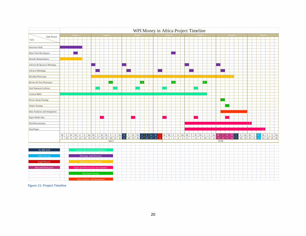
3.2 Objective 1: Assessing Staff Opinions about Technological Exhibits
During the first week (Figure 11), we held meetings with key members of the Department
of Coins and Medals to assess their opinions towards the widgets, as well the general use of
technological and Web exhibits. These meetings were used to clarify several topics that were
important to the process of designing the widgets. Questions were posed, such as: What are the
key audiences of the widgets? What are the key messages that the widgets should convey? Are
there any exhibits covering a similar subject or time span with which the widgets should be
coordinated? Are there any exhibits that can be used as a model while designing the widgets?
In addition to our consultations with the Coins and Medals departmental staff, we held
meetings with members of the British Museum‟s Web Development team. Here, we focused on
more technically oriented questions such as: Are there any guidelines or restrictions governing
the technical specifications, graphical layout, or content of a museum Website? Are there any
design templates for museum Websites? Is there a specific style (fonts, colors, headings, etc.)
for museum Websites? These meetings were conducted in person and were semi-structured. We
used a semi-structured format in order to address specific questions; we also wanted to allow the
interviewees leeway to provide their opinions on the project, and to answer questions we may not
have thought to ask. We used the information and ideas gained from these meetings to aid in
identifying the requirements, as indicated in Objective 2 below.
20
Figure 11: Project Timeline
Interview Staff
Meet Web Developers
Identify Requirements
Advisor & Sponsor Meetings
Advisor Meetings
Develop Prototype 1 2 3 4 F
Review & Test Prototype 1 2 3 F
Visit National Archives
Content R&D
Focus Group Testing
Visitor Testing
Data Analysis and Integration
Paper Drafts Due
Final Presentation F
Final Paper F
M T W Th F S Su M T W Th F S Su M T W Th F S Su M T W Th F S Su M T W Th F S Su M T W Th F S Su M T W Th F S Su
9 10 11 12 13 14 15 16 17 18 19 20 21 22 23 24 25 26 27 28 29 30 31 1 2 3 4 5 6 7 8 9 10 11 12 13 14 15 16 17 18 19 20 21 22 23 24 25 26
No BM Staff
Katie Leaving
Leigh Returns
Max and Katie gone
Data Analysis and Integration
WPI Money in Africa Project TimelineWeek 6
MAY JUNE
Week 7 Time Period
Task
Week 1 Week 2 Week 3 Week 4 Week 5
Content Research & Development
Meetings with Personel
Prototype Development
Paper and Presentation Development
Prototype Testing
21
3.3 Objective 2: Developing the Prototype Timeline and Timeplot Widgets
There are a number of techniques that can be used to develop software. The most basic
of these techniques is commonly referred to as “hacking” together a project, where the primary
goal is to rapidly create a functional final product using predefined requirements. We did not use
this model for designing the widgets, as we required constant input from the British Museum, on
the functionality, content, and appearance of the widgets. These requirements were not fully
defined from the beginning; we therefore referred to our sponsors frequently for their input on
the widgets throughout the development process. A more complex method for software design is
called iterative design, where features and requirements are added over time, and the current
progress is presented to the clients at set intervals. This allows for both indefinite starting
requirements and continuous input. This method best suited our project, as the requirements
were continuously updated and it was essential to receive frequent feedback from our sponsors to
successfully adapt the widgets to meet the needs of the Money in Africa team (Larman and Basili
2003).
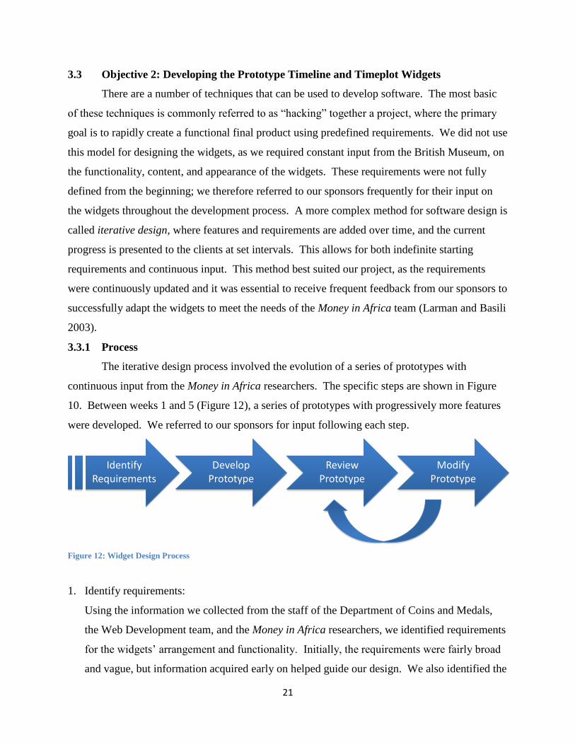
3.3.1 Process
The iterative design process involved the evolution of a series of prototypes with
continuous input from the Money in Africa researchers. The specific steps are shown in Figure
10. Between weeks 1 and 5 (Figure 12), a series of prototypes with progressively more features
were developed. We referred to our sponsors for input following each step.
Figure 12: Widget Design Process
1. Identify requirements:
Using the information we collected from the staff of the Department of Coins and Medals,
the Web Development team, and the Money in Africa researchers, we identified requirements
for the widgets‟ arrangement and functionality. Initially, the requirements were fairly broad
and vague, but information acquired early on helped guide our design. We also identified the
Identify Requirements
Develop Prototype
Review Prototype
Modify Prototype

22
relative difficulties and plausibility of the requested features, based on our knowledge of the
widgets.
2. Develop initial prototype:
Using the preliminary ideas and requirements, we developed an initial prototype of the
widgets. This prototype had a few events and contained a limited set of features. Its main
purpose was to display our ideas regarding the features and aesthetics of the widgets, as well
as our interpretation of those of our sponsor.
3. Review prototype with key staff:
The project team reviewed the prototype in an informal testing and discussion session with
our sponsors and the museum‟s Web Development team to evaluate issues of design,
functionality, and content. This testing precedes visitor and focus group testing, which
occurs after the iterative design process is complete.
4. Modify prototype:
Our project team modified the prototype based on the feedback from the museum staff as
gathered in step 3. Following each of the formal reviews for each widget, the project team
addressed any issues found, added content (see Section 3.4), improved usability, added new
features, and refined the graphic design. The new prototypes derived from these suggestions
and alterations were entered into the procedure once again following the modification
process (repeat step 3).
This process was repeated until the sponsors and the project team believed the prototype was
ready for testing and reviews from a wider audience (see Section 3.5). Our prototype Timeline
and Timeplot widgets both followed this design process. The Timeline had four formal reviews
of the prototype with our sponsors. The Timeplot, however, had three reviews due to a later
starting date in its development, accompanied by fewer customizable options and a more
desirable initial style. No new requirements were added following the first iteration of the
prototypes.
3.4 Objective 3: Research background for content of Timeline and Timeplot
While developing the prototype Timeline and Timeplot, we simultaneously collected and
organized the basic data and narrative content that was presented in the widgets. The widgets
were designed to highlight key events in the monetary history of Africa, particularly the East and
West African Currency Boards for the Timeplot, and the recent history for Malawi, Nigeria, and

23
Uganda for the Timeline. The widgets‟ content, supporting data, and narrative were further
developed with input from the Coins and Medals staff. The first few iterations of the prototype
involved minimal data due to the gradual progression of our data collection. This also ensured
that we received more relevant feedback during the initial prototype reviews, rather than
allowing a piecemeal knowledge to detract from the analysis of the form and layout. Therefore,
we focused on the aesthetics and controls without being distracted by erroneous content. Later
iterations contained more detailed content, which was reviewed and approved by our sponsors.
The East and West African Currency Boards were
monetary authorities established in African in 1919 and 1912
and disbanded in 1966 and 1958, respectively. These
Currency Boards stressed the importance of fiscal discipline
within the countries of their reign and exchanged local
currencies for the "anchor currency" (Masson and Pattillo
2004) (see Appendix A for a more detailed discussion). The
information that was displayed in the dialogue boxes, as in Figure 13, highlights important
events such as wars, political unrest, global events, and influential policy shifts. These dialog
boxes also contain links leading to pages dedicated to that particular event in order to allow an
interested user a more in depth look on that specific subject. The important events displayed in
the widgets were determined in coordination with the opinion of our sponsor through the
iterative design. In the final iterations, the Timeplot contained the classic style of the content
boxes, while the Timeline contained a modified version where the information was found below
the Timeline, as opposed to appearing next to the event.
This information was gathered using various resources, including but not limited to
database searches, allafrica.com, Colonial Blue Books at the National Archives, journal articles,
books, and past Interactive Qualifying Projects (IQP) from Worcester Polytechnic Institute.
Sources that were particularly useful for general historical background are: Masson and Pattillo's
Monetary Geography of Africa, Schuler's Tables of Modern Monetary Systems, and Heakal's
What is a Currency Board? Our primary source for information about Africa‟s recent monetary
history was the news aggregator allafrica.com. This Website gathers articles from African
newspapers, from approximately the past fifteen years, and allows for the user to search using
specific countries and keywords. This Website and those of the central banks allowed us to track
Figure 13: Sample Timeline Dialog Box

24
changes in the currency of Nigeria, Uganda, and Malawi as well as the events and opinions
surrounding those changes. In order to gather information about colonial Africa, we visited the
National Archives to access the Colonial Blue Books. These books are annual reports submitted
by each British colony to the Colonial Office Library, in which financial records and census data
were kept. Extracting this data provided a variety of time-series data sets to use with our
Timeplot. Discovering the historical information that is relevant to the research of the Money in
Africa project is not the primary goal of our IQP, but was necessary to have a sufficient
knowledgebase and data for input into the widgets.
3.4.1 allAfrica.com
When performing research for the Timeline, for Nigeria, Uganda and Malawi, we used
the news aggregator allAfrica.com and its advanced search features. The search function
allowed us to select a specific country and pair it with a keyword, commonly “coin,” “banknote,”
and “currency.” This produced a list of results showing the title and first few sentences of each
article. Based on this information, if an article appeared to be pertinent to our research, it was
read in more detail. If an article was considered useful we acquired an image of it using Zotero,
a Firefox add-on which allows users to store reference material collected online. Once the
articles were collected, we extracted and compiled the important events. Important events
included: redesigning, recalling, or creating a new series of currency. Additionally, articles
regarding forgeries and social interaction with money were noted.
Other events, such as the installation of a new regime, were recorded. We noticed that
this commonly coincided with a new design of banknotes in some countries, commonly with the
portrait of the new ruler, as is seen with former Ugandan president Idi Amin in 1981. However,
many countries, Uganda included, are creating laws dictating that no person, living, dead, or
dying is allowed to be portrayed on their currency. The Central Bank Websites for our
researched countries were also referenced when a piece of information needed to be checked or
obtained, regarding the issue and features of banknotes and coins.
3.4.2 National Archives
Leigh Gardner, one of our sponsors, provided us with a list of Colonial Blue Books to
photograph at the National Archives. The list of books that were to be reviewed were from
twelve countries, split between West and East Africa as shown in Table 3.

25
Table 3: Colonial Blue Books Requested
Location Time Period Reference Numbers
West Africa:
Nigeria 1913-1945 CO 660/1-35
N. Nigeria 1900-1913 CO 465/1-14
S. Nigeria 1900-1913 CO 473/1-16
Lagos 1862-1905 CO 151/1-43
Niger Coast Protectorate 1896-1900 CO 464/1-4
Gold Coast 1845-1946 CO 100/1-96
Sierra Leone 1819-1943 CO 272/1-120
Gambia 1822-1945 CO 90/1-119
East Africa:
Kenya 1901-1946 CO 543/1-36
Uganda 1901-1945 CO 613/1-45
Tanganyika 1921-1948 CO 726/1-30
Zanzibar 1913-1947 CO 690/1-35
During our first day at the National Archives, May 17th
, we registered for reader‟s tickets
which allowed us to obtain the original documents and order documents in advance. We also
learned how to properly handle the documents, as many of them require special care. As we had
not obtained our reader‟s tickets prior to our first trip, we were not permitted to bulk order the
documents. This required us to order three documents at a time, with approximately a forty
minute delay between orders. Once we had obtained our reader‟s tickets, we were able to pre-
order a series of up to 50 consecutive documents as a bulk order, if there was ample space
available and a minimum of three days notice was given. This drastically increased the number
of books completed in each day as it removed most of the waiting period between orders.
However, if space was limited or there were extraneous circumstances, such as mold, the regular
ordering procedure was followed.
At the National Archives, we developed a process for quickly photographing many
documents in a short period of time. Each member of the group chose one country that they
were dedicated to completing, and that individual would preorder the series for that country.

26
Once arriving at the Archives, our bulk orders would be waiting in the proper order in the
designated section of the reader‟s room. Systematically, we would photograph the following
pages: comparative yearly statements of revenue and expenditure, population, currency and
banking, summary of imports and exports, and labor wages. Due to time restrictions and some
documents being unable to obtain, there is a discrepancy between the Blue Books requested,
found in Table 3, and those actually reviewed, found in Table 4. Those photographed by
respective team member on each of the five visits made to the Archives are displayed in Table 4.
Table 4: Obtained Colonial Blue Books and Identification of Team Member Review
People May 17th May 21st May 26th
June 1st June 8th
Chloe 19 Gambia 50 Gambia 50 Gambia
7 N. Nigeria,
3 Tanganyika 10 Nigeria
Petra 10 Uganda 10 Uganda
25 Uganda,
6 Zanzibar 29 Zanzibar 10 Nigeria
Jon 15 Sierra Leone 50 Sierra Leone 55 Sierra Leone 20 Gold Coast 15 Nigeria
John 20 Tanganyika
7 Tanganyika,
7 N. Nigeria 46 Gold Coast 30 Gold Coast 16 S. Nigeria
Following each data collection at the National Archives, the photos from the
photographed Blue Books were organized by country, year, and series on an external hard-drive
provided the British Museum, creating a backup system in a safe location. The photos were then
reviewed and data was extracted. The handwriting in some photos was not legible, and was
enhanced using Adobe Photoshop. This was often necessary with the books from the mid to late
nineteenth century. Enhancements were performed by using the channel mixer, selective color
tool, and by increasing the brightness/contrast. By increasing the contrast between the page and
the ink, as in Figure 14, we were able to read and extract the necessary figures.

27
Figure 14: Original (left) and Enhanced (right) of Coins in 1832 Gambia

28
3.5 Objective 4: Testing the Timeline and Timeplot
Once the Money in Africa researchers and our project team felt that the Timeline and
Timeplot widgets met our requirements in terms of functionality, content, and design, we
revealed the widgets to a wider testing audience. This audience included individuals who had
not participated in the design process and who may have less background knowledge on African
currency. This allowed us to better assess the widgets‟ usability and educational value.
One phase of testing was in the form of a focus group with staff from the Department of
Coins and Medals. There were a number of tasks involved with putting together this focus
group.
1. Plan out the meeting:
We designed a series of tasks for the members of the focus group to complete, ensuring
that they had a chance to make use of the different features of the widgets. We also
designed questions of which we asked them after they had experienced the widgets. In
addition to this, we designed a demonstration of the widgets to confirm that the
participants understand the functionality of the widgets, after which we discussed the
questions we asked before the demonstration. We conducted a brief pilot study of these
questions and tasks with the Money in Africa researchers in order to decide if they are
clear and comprehensive.
2. Arrange the time and location and invite attendees:
Having planned the content of the focus group, the next step was to decide when and
where to hold it and whom to invite. While having higher-level museum staff, such as
curators, in attendance would give us more informed opinions regarding content, it is not
necessary for testing the widgets. Therefore, we arranged a time during the workday,
where as many people as possible are likely to be able to attend, rather than trying to find
a time where specific individuals are free.
3. Hold the focus group:
We began the focus group testing by asking the members of the group to attempt to
complete a set of tasks, which we have prepared, with the widgets. An example of this
would be finding a specific piece of information as the description of the reverse side of
the One Naira coin. We then gave them a short questionnaire to fill out about their
experience with the widgets (See Appendix E). This questionnaire asked the participant

29
to rate the Timeline and Timeplot in the categories of: easy to operate, easy to read, easy
to find information, well organized, informative, and visually pleasing. After the
questionnaire, we demonstrated how we intended an individual to complete our series of
tasks and proceed to discuss the questions asked in the questionnaire.
4. Analyze and act on results:
After the focus group was complete, we analyzed the members‟ feedback in order to
identify the aspects of the widgets that need improvement. We then worked to improve
these areas. This feedback was also used to develop recommendations to the British
Museum concerning any Timeline or Timeplots they may design in the future.
In addition to the focus group testing, we conducted visitor testing. This was to gain a wider
range of opinions and insight into the widgets‟ functionality and appearance. The methodology
for this testing is found below.
1. Develop a testing method:
To test our widget with the visitors, we needed either a small display in the museum or a
Website accessible to the general public. In this case, we performed our testing in the
Money Gallery, on the “Hands On” table. After using the display in a similar manner to
the focus group, we asked the visitor to complete a small questionnaire about their
experience. This questionnaire asked the visitor to rate the Timeline in the categories of:
easy to operate, easy to read, easy to find information, well organized, informative, and
visually pleasing.
2. Run the tests:
We ran these tests on a number of random visitors in order to help avoid sampling bias.
We conducted the tests in the museum by setting up a temporary display in the HSBC
money Gallery. We then asked every third adult individual that enters the gallery to use
the widgets and fill out a questionnaire similar to the one in the focus group testing (See
Appendix G) rating the form and content of the widgets.
3. Analyze and act on the data:
After we had collected data from a number of users, we analyzed the data to identify
issues with the current design of the widgets and work to correct those issues. We then
worked to improve these areas. We can also use this feedback to give recommendations
to the British Museum concerning any Timeline they may design in the future.

30
3.6 Objective 5: Develop the Final Product
Having completed the testing we then made our final changes to the widgets and created
the supporting documentation. We began this process by making any feasible changes that had
been recommended. In the user manuals and Appendices M and P, we included any
recommendations that we believed to be useful, but not permissible due to time or programming
constraints.
These user manuals are guides for the Timeline and Timeplot. For each widget, there are
two manuals, technical and non-technical. The technical user manual is intended for Web
developers who would be setting up and making edits to the widgets. The documentation in this
manual explains how to modify the style and functionality of the widgets. The non-technical
manual is intended for curators and researchers who would be creating and editing the content of
the widgets. For these manuals we described the format of the spreadsheets that the widgets
retrieve their data from. We also described the format in which the spreadsheets are required to
be entered in.
We then tested the non-technical user guides by having one of our sponsors, Dr.
Catherine Eagleton, create the content files with the help of the user guides. By doing this we
found several flaws in the user guides and made the appropriate changes.
3.7 Summary
The goal of our project was to adapt the MIT SIMILE Timeline and Timeplot and
evaluate their potential use by the Money in Africa project, of the Department of Coins and
Medals. In order to accomplish our goal, we met with members of the Department of Coins and
Medals and the British Museum‟s Web Development team, created a prototype Timeline and
Timeplot, researched and developed the widgets‟ content, evaluated the widgets through visitor
and focus group testing, and creating the final versions and supporting documentation.

31
Chapter 4: RESULTS AND ANALYSIS
4.1 Introduction
Through the use of weekly prototype meetings, data collection at the National Archives,
visitor testing, and focus group testing, we have successfully adapted the MIT SIMILE Timeline
and Timeplot for use by the Money in Africa research project, of the British Museum‟s
Department of Coins and Medals. The findings from these meetings enabled us to tailor the
widgets to address the comments and requests of our sponsors, as well as those involved in the
focus group and visitor testing.
Performing statistical analysis of the results from our testing and research allowed us to
determine changes that needed to be made and recommendations for the widgets. Elaborations
on our results as well as summary statistics such as: mean, median, mode, and standard deviation
are found in this section.
4.2 Data Collection and Analysis
In order to develop the content for the Timeline and Timeplot we gathered data from the
National Archives and the news aggregator allafrica.com. The Timeplot has financial data
derived from the Colonial Blue Books found at the National Archives. The Timeline uses
information regarding historical events and currency changes derived from articles on
allafrica.com.
4.2.1 The National Archives
We travelled to the National Archives in Kew Gardens to collect digital images of the
data recorded in the colonial Blue Books for the East and West African colonies, later to become
members of their respective Currency Boards. Examples of these pictures can be found in
Appendix B. We collected data from 510 books and captured a total of 6,286 pictures adding up
to 9.9 GB. We could not, however, retrieve all the books in the short time we had available as a
number were stored offsite. Of the countries that our sponsors identified we, along with our
sponsors, determined that the most dispensable were Lagos whose books were all earlier than our
primary focus area, Kenya whose information was available from another source, and the Niger
Coast Protectorate which is small to the point of insignificance. The breakdown of books
recorded can be found in Table 5.

32
Table 5: Blue Books Completed by Country
Location Time Period Reference Numbers
West Africa:
Nigeria 1913-1945 CO 660/1-35
N. Nigeria 1900-1913 CO 465/1-14
S. Nigeria 1900-1913 CO 473/1-16
Gold Coast 1845-1946 CO 100/1-96
Sierra Leone 1819-1943 CO 272/1-120
Gambia 1822-1945 CO 90/1-119
East Africa:
Uganda 1901-1945 CO 613/1-45
Tanganyika 1921-1948 CO 726/1-30
Zanzibar 1913-1947 CO 690/1-35
Following the data collection, we began compiling the data from Tanganyika, Uganda,
and Gold Coast into tables within spreadsheets. For each book we examined the photographs we
had taken, and extracted statistics on the Year, Total Revenue, Total Population, Total Currency,
Coinage in Circulation, and Imports/Exports. A sample of one of the spreadsheets is found in
Figure 15.
Figure 15: Sample Google Spreadsheet for Blue Book Data
Once the data had been collected and sorted into these categories, we employed data
visualization techniques to locate breakpoints or data inconsistencies. These indicate points of
interest where a historical event could have caused a shift in the statistic and is therefore a
candidate to be displayed on the Timeplot. To this end, we created graphs of population,
revenue, expenditure, and currency in circulation over time for Tanganika, Uganda, and the Gold
Coast. These exploratory graphs were meant to give us a general understanding of the history of
the colonies and to tailor our investigations for the Timeplot‟s content. For example, if a drop in
population occurred during a certain year, we would be compelled to determine what event
caused this. This event would then be inputted into the Timeplot to provide a more

33
comprehensive context and lead to a greater understanding of the economic trends. An example
of this is shown in Figure 16 which shows Total Revenue vs. Total Expenditure over a period of
twenty years in Tanganyika. There is a steady increase of both expenditure and revenue in the
last ten years, and with this data we investigated what event occurred at the start of the large
growth, around 1942, to see what could have caused this.
Figure 16: Total Revenue and Total Expense for Tanganyika
After consulting Leigh Gardner, an economic historian and a member of the Money in
Africa project, we found out that the growth starting in 1942 was due to a combination of
inflation and Great Britain using the African colonies to supply their troops.
After the data and correlations were analyzed it was decided that the most important
information for the Timeplot to display was the Revenue, Expenditure, and Circulation data for
the whole of the East (1924-1945) and West (1912-1944) African Currency Boards overlaid with
global events such as World War II and the Great Depression and local events showing changes
to the Currency Boards‟ structure and the status of their member colonies.
Once this was identified the data in this range was adjusted to more accurately represent
the state of the colonies. To make the financial data accurately represent actual changes in value
the numbers taken from the Blue Books were deflated. This process requires a price index which
is an indicator of how the value of money has changed in a certain economy over time. The
price data, however, for these colonies is inaccurate. As this data is required to create a price
index we used a UK price index to deflate the values. The UK price index was then adjusted

34
from a baseline year of 1974 to a baseline year of 1947, the most recent year we had data for.
The figures we retrieved for revenue, expenditure, currency in circulation, and value of imports
and exports were then adjusted according to this scale. Once this process was completed the data
accurately represented changes in value from year to year and could be entered into the final
Timeplot.
4.2.2 AllAfrica.com
In addition to collecting data from the Colonial Blue Books we also used the news
aggregator allafrica.com to find articles about recent currency related events in Nigeria, Uganda,
and Malawi. We used the information in these articles to construct events as seen in Figure 17.
Figure 17: Example of events drawn from allAfrica.com
Events drawn from the allafrica.com articles include currency changes, changes in political
regimes, and public reaction to currency changes. The articles were condensed down to a title, a
description, a start date, and, where applicable, an end date, and stored in an XML file. This
XML file was later changed to the Google Spreadsheet seen above to be more easily updated.
The events stored in these files were imported by the Timeline widget and displayed to the user.
4.3 Widget Development
One of the key goals for our project was adapting and modifying the Timeline and
Timeplot widgets. The prototype Timeline and Timeplot were developed using an iterative
design process as explained in Section 3.3. Therefore, both of the widgets went through a
number of versions before coming to the final submitted version.

35
4.3.1 Timeline Development
Work on the Timeline began at the end of week 1. The initial requirements provided to
us by the Money in Africa researchers was to create one or more Timelines showing the changes
in currency and related new events for Uganda, Nigeria, and Malawi. In addition, the British
Museum‟s web development team informed us that we were limited to a width of 950 pixels and
a height of around 650 pixels. With this information we created our first prototype (Figure 18).
Figure 18: First Timeline Prototype
This prototype had an event with a tape for each form of currency displaying the period
that it was in circulation for. The tape is the colored bar following an event. The currencies
were separated between banknotes with blue tape and coins with green tape, in descending order
from bottom to top. News events were placed above all other events and were distinguished by
their bolded titles. For example, the 5 pound note was issued in 1959 (as marked by the event
“Nigeria‟s First Currency Issue” and was
withdrawn in the 1965 “Currency Redesigned”
event. Its tape therefore extends from 1959 to
1965. The one penny coin, on the other hand,
was not changed, so its tape continues past 1965.
An additional version of the first
prototype was made using the Timeline‟s
Figure 19: First Prototype, Compact Painter Version

36
compact painter (Figure 19) was also developed. This Timeline grouped all simultaneous events
together to save space. Individual events are distinguishable by their large icons which also
show an image of the relevant currency.
The first prototype review was held on Friday May 20th
. These prototype reviews were
used to gather feedback and new requirements from our sponsors. At each review we recorded
important suggestions and comments made. A section of the notes for the first prototype review
meeting is shown in Figure 20.
Figure 20: Excerpt from Prototype Review notes
From this first review we determined that the prototype using the original painter was
preferable, because it allowed for tapes showing the lifetime of each issue. Our sponsors were
concerned, however, that this model was too crowded. To solve this issue, it was suggested to
group all banknote and coin related changes for a single issue into one event. We also agreed
that moving the event descriptions from text bubbles, as shown in Figure 11, to a box below the
Timeline would be an improvement as the text bubbles obscured the Timeline when opened.

37
We use these comments and proceeded to develop our second prototype shown in Figure
21. A log of the changes made throughout the project can be found in Appendix J.
Figure 21: Second Timeline Prototype
This prototype incorporates the box for displaying events rather than text bubbles as
discussed in the first review meeting. It also has links, the list of denominations on the right of
the box, to descriptions of the individual notes or coins in issue when an event is selected. This
prototype did not include the grouped events discussed in our first review and the links did not
change between events. Due to the Queen‟s Birthday on May 27th
and our trip to the archive on
the 26th
we conducted a short review on the Wednesday the 25th
. We determined that the best
course was to continue working towards the goal set in the first review. This led to the third
prototype shown in Figure 22.
Figure 22: Third Timeline Prototype

38
This prototype contained all the features discussed in the first prototype review. The
events are grouped by notes or coins and events are displayed in the box. In addition, the links in
this version changed correctly when switching between events and the pictures of the notes and
coins showed the reverse side when the user moved the mouse over the image.
The comments during the third prototype review were very positive and our sponsors
were pleased with the overall appearance of the Timeline. The Web development team also
attended this review and suggested that we link to the Museum‟s Collection Online database in
order to retrieve pictures and description of the various notes and coins. This would enable us to
avoid copyright issues and better enable the British Museum to update the Timeline with new
information. The Web team also provided a Webpage template and offered to design a style
sheet to allow the Timeline to better match the Museum‟s current website. Finally, they
recommended that we import the Timeline events from a Google Spreadsheet if possible in order
to make the Timeline easier to maintain.
This input from the Web development team led us to create prototype four as seen in
Figure 23.
Figure 23: Fourth Timeline Prototype

39
This version of the Timeline was the first to be placed in the British Museum‟s template
and its style was modified to better match that of the British Museum‟s Website. Other features
that were introduced in this iteration are the ability to import events from a Google Spreadsheet
and connecting to the Collections Online database in order to fetch details about objects. This
prototype was widely accepted by our sponsors and was approved to continue on to the testing
phase.
After the focus group and visitor testing was completed several changes were made
resulting in the final product shown in Figure 24.
Figure 24: Final Version of Timeline
The final version has additional content displaying the political events in Nigeria, a list of
instructions on how to use the Timeline, and fixed several issues identified by the focus group
including the fact that it loaded improperly in Internet Explorer.
In addition to the final Timeline showing events about Nigeria we also prepared events
for Timelines showing the currency changes for Uganda and Malawi. These events are not
currently shown on a Timeline as it was decided that focusing on improving on the features and
quality of a single Timeline would be more beneficial than creating multiple less refined

40
Timeline. It will be relatively simple for the Money in Africa team to use these events and the
User Manual provided to create Timelines like the one in Figure 20 for Malawi and Uganda.
4.3.2 Timeplot Development
Timeplot development began towards the end of week three. For the time plot we were told
that we would be graphing data from countries in the East and West African Currency Boards.
Based on this we created a basic Timeplot shown in Figure 2. This Timeplot contained data
from Tanganyika and used WWII as an event.
Figure 25: First Timeplot Prototype
While the sponsors were happy with the overall layout of the Timeplot, they felt the colors
were dull and blended together. To address this, the next prototype had different colors to make
the time series stand out. It also contained a title, a legend and a second set of data. The second
prototype is shown in Figure 26.

41
Figure 26: Second Timeplot prototype
In the second prototype review it was decided that the Timeplot would contain financial
data and events for the East and West African Currency Boards as a whole rather than each
individual country as was previously assumed. Based on this change the third prototype
contained data from the whole East African Currency Board as well an additional time series on
a different scale from the other two. It also contained set of local events for the Currency Board
in blue on top of the global historical events. This is the prototype that was tested and evaluated
by the focus group and is shown in Figure 27.
(THIS SPACE HAS BEEN INTENTIONALLY LEFT BLANK)
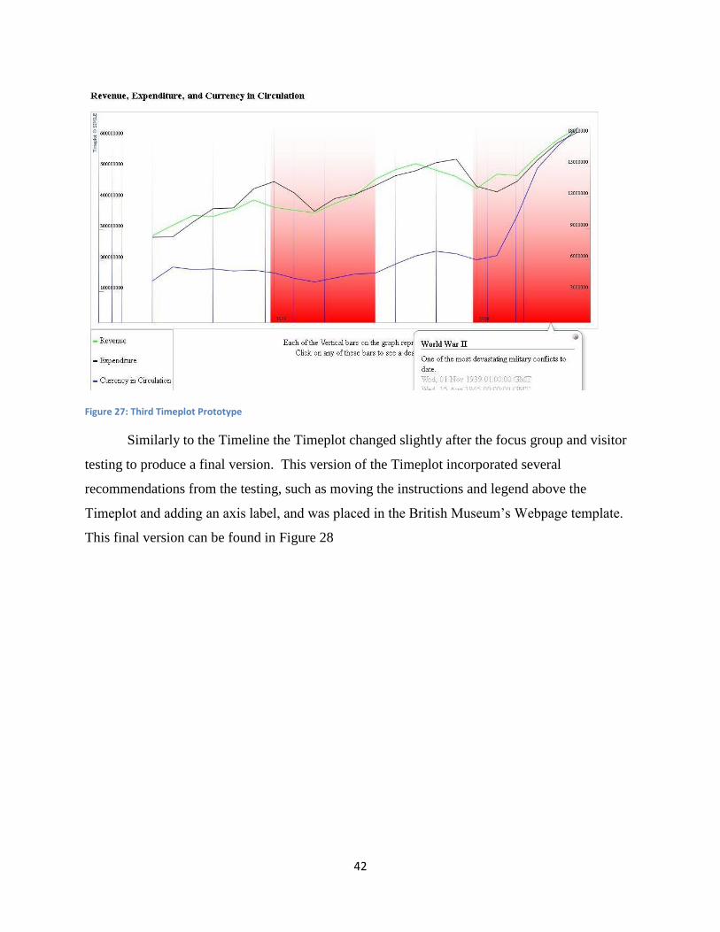
42
Figure 27: Third Timeplot Prototype
Similarly to the Timeline the Timeplot changed slightly after the focus group and visitor
testing to produce a final version. This version of the Timeplot incorporated several
recommendations from the testing, such as moving the instructions and legend above the
Timeplot and adding an axis label, and was placed in the British Museum‟s Webpage template.
This final version can be found in Figure 28

43
Figure 28: Final Version of Timeplot
In addition to this final Timeplot we also developed a Timeplot showing the data from
the West African Currency Board. This Timeplot was not placed in the template and does not
import events from Google Spreadsheets, as the one in Figure 28 does, due to time constraints.
The West African Timeplot can be seen in Figure 29.
Figure 29: West African Currency Board Timeplot

44
In the West African Currency Board Timeplot the currency data is graphed on a separate
plot than the Revenue and Expenditure. This is from the results of our focus group as many of
them found the different scales in the original Timeplot confusing. This Timeplot can be brought
to a final version by adding more events and placing it in the British Museum template and
setting up Google Spreadsheet imports. These tasks can be easily completed with the assistance
of the User Manuals.
4.4 Focus Group
The focus group for the Timeline and Timeplot was conducted on Tuesday June 14th
2011, during week 6 of our project. Six members of British Museum staff participated in the test
of the fourth iteration of the Timeline and third iteration of the Timeplot. After examining and
completing the tasks for the widgets, they completed the questionnaire found in Appendix E.
Their responses can be found in Appendix F. The overall opinion of the focus group was very
positive, and their comments provided us with valuable insight and suggestions. These
suggestions were taken into consideration, without bias, for the final versions of the Timeline
and Timeplot. Tables 6 and 7 contain the responses to the categorical questions and summary
statistics for the Timeline and Timeplot, respectively.
Table 6: Focus Group Responses to Timeline
Table 7: Focus Group Responses to Timeplot
From these responses we were able to gauge the participants‟ opinions on the
components of the Timeline and Timeplot, on a five point scale, with “5” being the best. For the

45
Timeline, the quality with the highest average was “Informative” with 4.5/5 and the quality
“Visually Pleasing” had the lowest average at around 3.2/5. The overall feeling from the focus
group was that the Timeline contained a wealth of information and was easy to use. However, it
could benefit from additional instruction and some visual rearrangement. For the Timeplot we
had different results. The attendees ranked the qualities “Easy to Operate” and “Visually
Pleasing” with the highest average of 4/5 and the quality “Easy to Read” with the lowest average
of around 2.8/5. It was clear that the attendees appreciated the simplicity and aesthetics of the
Timeplot, but felt that its organization and readability could improve.
Apart from the statistical analysis performed following the focus group, we also recorded
and considered any specific comments made by the participants. These comments appear in both
the questionnaires and notes taken during the focus group. These comments included valuable
suggestions such as moving the legend and instructions above the Timeplot to avoid obstructing
by the text bubble and reordering the events on the Timeline. Both of these suggestions were
implemented in the final versions of the widgets to improve their readability.
These comments also highlighted important issues that had to be addressed. For
example, it was recommended that we increase the contrast between the green and blue bars
because they might be hard for people with vision impairment to differentiate between the
colors. This accessibility issue was also raised in regards to the size of the text and it was
suggested that we ensure the Timeline and Timeplot behave properly when the text size is
increased. We have addressed several of the more pressing issues raised, and have included all
the suggestions and issues we have identified in the user manuals.
4.5 Visitor Testing
Visitor testing was performed on June 15th
the day after the focus group testing. The
visitor testing was conducted with the same version of the widgets as the focus group to make
certain that the stimulus was unchanged. However, only the Timeline underwent visitor testing,
due to technical issues with the British Museum laptops. The testing was conducted by
providing the visitor participant with a brief synopsis of the widgets‟ purpose and a general
outline of the content. Following this, the participant was requested to find a certain piece of
information, the description of the reverse side of Nigeria‟s One Naira coin. This is the same

46
piece of information requested in the focus group. If they found this information in less than 5
minutes, it was deemed successful. The questionnaire, found in Appendix G, was then
completed by the visitor participant.
The data analysis for this testing is similar to that found in Section 4.3 for the focus group
testing. After the testing was complete, we reviewed the data and performed statistical analyses.
Measures of central tendency and dispersion were calculated for each of the interval scaled
questions and we plotted line graphs showing the frequency of response. Similarly to the focus
group, the quality with the highest average rating at 7.65/10 was “Informative” and quality with
the lowest average rating at 5.85/10 was “Visually Pleasing”. This leads us to believe that the
style of the Timeline needs improvement. This may be partially explained by the fact that the
Timeline was not in the British Museum template during the visitor testing. A number of the
visitors also expressed through comments that the Timeline needed some more attracting
elements, such as pictures. Graphs were created of each quality (easy to operate, easy to read,
informative, visually pleasing, well organized, and easy to find information) displaying how
many people responded with each number. The graphs were left skewed showing that people
had a positive overall impression of the Timeline. The graph of the ratings for the “Informative”
quality is shown in Figure 30. The modal ratings where 8 and 9 with five results each and the
graph shows a clear left skew. Graphs of the other qualities are located in Appendix I.
Figure 30: Visitors Rating of Informative Quality in Timeline
0
1
2
3
4
5
6
1 2 3 4 5 6 7 8 9 10
# o
f R
esp
on
ses
Rating
Informative
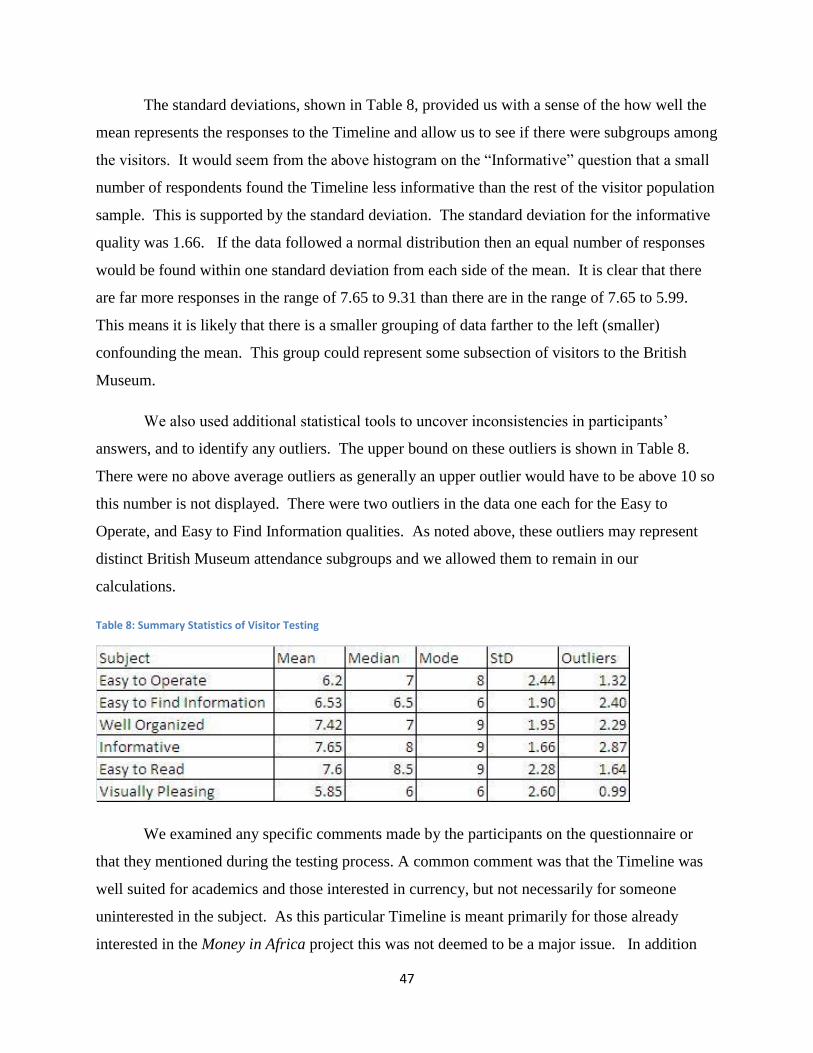
47
The standard deviations, shown in Table 8, provided us with a sense of the how well the
mean represents the responses to the Timeline and allow us to see if there were subgroups among
the visitors. It would seem from the above histogram on the “Informative” question that a small
number of respondents found the Timeline less informative than the rest of the visitor population
sample. This is supported by the standard deviation. The standard deviation for the informative
quality was 1.66. If the data followed a normal distribution then an equal number of responses
would be found within one standard deviation from each side of the mean. It is clear that there
are far more responses in the range of 7.65 to 9.31 than there are in the range of 7.65 to 5.99.
This means it is likely that there is a smaller grouping of data farther to the left (smaller)
confounding the mean. This group could represent some subsection of visitors to the British
Museum.
We also used additional statistical tools to uncover inconsistencies in participants‟
answers, and to identify any outliers. The upper bound on these outliers is shown in Table 8.
There were no above average outliers as generally an upper outlier would have to be above 10 so
this number is not displayed. There were two outliers in the data one each for the Easy to
Operate, and Easy to Find Information qualities. As noted above, these outliers may represent
distinct British Museum attendance subgroups and we allowed them to remain in our
calculations.
Table 8: Summary Statistics of Visitor Testing
We examined any specific comments made by the participants on the questionnaire or
that they mentioned during the testing process. A common comment was that the Timeline was
well suited for academics and those interested in currency, but not necessarily for someone
uninterested in the subject. As this particular Timeline is meant primarily for those already
interested in the Money in Africa project this was not deemed to be a major issue. In addition

48
many of the visitors said that they would use it again so it could still be a valuable tool for the
general British Museum audience if it had a more accessible subject matter.
One of the most frequent comments that people made while testing the Timeline was the
lack of images of money. For the question asking users how they would improve on the
Timeline 25% responded that they would add pictures of the currency. These pictures are
currently not displayed on the Timeline due to the possibility of copyright infringement and
violation of counterfeiting law.
4.6 Summary
Throughout the project this team worked to adapt and modify the Timeline and
Timeplot widgets to better display the research of the Money in Africa team. Through the use of
weekly prototype meetings, data collection at the National Archives, visitor testing, and focus
group testing, we have successfully created a final prototype Timeline and a final prototype
Timeplot. We have also performed statistical and empirical analysis of the information gathered
in the focus groups to generate recommendations for future modifications.

49
Chapter 5: CONCLUSION
Over the past 7 weeks we have been working in conjunction with the Money in Africa
project team to create, analyze, and evaluate Timeline and Timeplot widgets to help them with
their research. The process, as seen in Chapter 3, was to create and revise prototypes with our
sponsors input and then to test the widgets with focus groups and visitor testing. After this, as
seen in Chapter 4, we performed statistical analysis and evaluated the comments from the testing
to determine if the widgets were successfully implemented and would be valid for use by the
Money in Africa research team. Through this process we found that the widgets are useful tools
for display Money in Africa’s project research. They received good reviews from the focus
group and visitor testing and were heavily supported in the meetings with our sponsors. In
addition we found that the widgets are easy enough to update and maintain that the content can
be managed almost entirely by researchers and curators, though a Web developer will be needed
for the initial setup.
5.1 Recommendations
The feedback from our meetings, focus group testing, and visitor testing led us to make
several recommendations. These recommendations aim to help the Money in Africa research
project, as well as the British Museum, decide whether or not to continue using the widgets in
the future. These recommendations were based on how effective the widgets were found to be at
communicating information and how much effort and technical knowledge it takes to develop
and maintain the widgets.
From our focus group and visitor testing (see Section 4.5 and 4.6) we surmised that the
majority of users found that the widgets were helpful. The visitors who tested the Timeline gave
it an average of 7.66 /10 for informative and the focus group gave an average informative rating
of 4.5/5 and 4/5 for the Timeline and Timeplot respectively. The positive results we received
from this testing supports the use of the widgets in the future.
These tests also helped us identify a number of issues with the Timeline and Timeplot‟s
current designs. One of the issues identified during the focus group was that the Timeline‟s
colors were too similar and could be hard to distinguish for those with impaired vision. The
visitor testing also gave us recommendations with 25% suggesting we include images of

50
currency. We did not, however, have time to incorporate all of these suggestions. As part of
our recommendations to the British Museum we have included a list of identified problems and
possible solutions. This list can be found in Appendix M for the Timeline and P for the Timeplot
as well as in the User Manuals. By following some of these recommendations the British
Museum can improve on the widgets for use in the future.
Over the course of developing the Timeline and Timeplot (discussed in Sections 3.3 and
4.4) we determined that greatly modifying the widgets from their default style or adding new
features can take significant technical expertise. In addition, the initial setup of either of the
widgets also requires some familiarity with Web development. Updating and maintaining the
content of the widgets, on the other hand, can be performed by anyone with the assistance of our
user manual (see Section 5.3). Therefore, we recommended that a Web developer be involved
with the customization and initial setup of the widgets. After that stage, however, the Web
developers can leave the task of maintaining the widgets and constructing the content primarily
to the researchers and curatorial staff.
5.2 User Manual
While developing the widgets we recorded our actions and any issues or problems we
had. We compiled these processes into four user manuals, two for the Timeline and two for the
Timeplot. Each widget has a technical and a non-technical user manual. The technical user
manuals contain information on how to set up the widgets and modify their style and features.
Figure 31 shows a sample of the Timeline‟s technical manuals giving instructions on how to link
to the Collections Online database.

51
Figure 31: Sample page from the Timeline's Technical User Manual
The technical manuals for the Timeline and Timeplot can be found in Appendices L and
O respectively.
The Timeline and Timeplot were also given non-technical manuals (found in Appendices
K and N). These manuals are intended for curators and researchers with average computer skills.
A sample is shown in Figure 32.

52
Figure 32: Example page from the Timeline's non-technical user manual
These sections are mainly concerned with the basic setup and modification of the widgets
and give clear step-by-step instructions. They make use of pictures to help explain the concepts
required to update and maintain the widgets to curators and researchers. The sample in Figure
27 instructs the user on how to create Timeline events. In additions to these instructions the
manuals contain our recommendations for the current Timeline and Timeplot. Between these
two sections the Museum will be able to modify and enhance the existing widgets and create
fully functional Timelines and Timeplots for future exhibits.
5.3 Summary
We recommend that the Money in Africa research project continue the development and
use of the Timeline and Timeplot widgets, and encourage the use of these widgets by other

53
research projects as well. The ability of these widgets can display vast amounts of historical and
statistical data and would be useful in displaying their research. The Timeline allows for an
interactive experience while exploring the historical story presented by a research project and the
Timeplot provides data-visualization to highlight trends in the data. In addition, while the initial
setup and any major modifications to the widgets should be done by a Web developer, the
content can be created and maintained almost entirely by the researchers and curators responsible
for the project. This allows both the Web designers and the researchers work together effectively
to create an excellent result.
While the Timeline and Timeplot are already elegant tools for displaying the results of
large research projects they can still be improved upon. We have left a number of
recommendations garnered from our own experience in developing the widgets as well as from
the ideas of our sponsors and the results of our focus group and visitor testing. By resolving
some of these issues the widgets can be further improved, both for the Money in Africa project
and for any other projects that may use it in the future.
This project worked to develop technological tools for the British Museum to use in the
presentation of their research. Museums all over the world have been working on new ways to
display the potentially complicated results of the research they conduct. We have provided the
means for the British Museum to educate a wider audience on large and complex subjects in
accordance with the IQP‟s goal of exploring solutions to a societal or technical problem.

54
REFERENCES
"HTML & CSS." W3C. W3C, 2010. Web. 21 Jun 2011.
<http://www.w3.org/standards/webdesign/htmlcss>.
"Museum Definition." The World Museum Community, 2010. Web. 22 Jun 2011.
<http://icom.museum/who-we-are/the-vision/museum-definition.html>.
"Scripting and Ajax." W3C. W3C, 2010. Web. 21 Jun 2011.
<http://www.w3.org/standards/webdesign/script>.
"Solar Stormwatch: Sun, Earth & Space." The Royal Observatory Greenwich, n.d. Web. 10 Apr
2011. <http://www.solarstormwatch.com/mission_briefing/sun_earth_space>.
Colonial Blue Book for Gambia. CO 90/1-119. Colonial Office Library, 1822-1945. Print.
Colonial Blue Book for Gold Coast. CO 100/1-96. Colonial Office Library, 1845-1946. Print.
Colonial Blue Book for N. Nigeria. CO 465/1-14. Colonial Office Library, 1900-1913. Print.
Colonial Blue Book for Nigeria. CO 660/1-35. Colonial Office Library, 1913-1945. Print.
Colonial Blue Book for S. Nigeria. CO 473/1-16. Colonial Office Library, 1900-1913. Print.
Colonial Blue Book for Sierra Leone . CO 272/1-120. Colonial Office Library, 1819-1943. Print.
Colonial Blue Book for Tanganyika. CO 726/1-30. Colonial Office Library, 1921-1948-1945.
Print.
Colonial Blue Book for Uganda. CO 613/1-45. Colonial Office Library, 1901-1945. Print.
Colonial Blue Book for Zanzibar. CO 690/1-35. Colonial Office Library, 1913-1947. Print.
Dalrymple , John , Roxane Shaughnessy, Barbara Soren, and Diane Wolfe. "Developing
Meaningful On-line Exhibitions: Cloth & Clay: Communicating Culture ." Museums and
Web 2004. Denver, Colorado, USA. 13-17 Apr 2010. Reading.

55
Davies, Graham, Dafydd James, and Amgueddfa Crymu. "Evaluating the On-line Audience of a
New Collections Website." Museums and the Web 2010. National Museum. Denver,
Colorado, USA. 13-17 Apr 2010. Reading.
<http://www.archimuse.com/mw2010/papers/davies/davies.html>.
Geller, T. "Interactive Tabletop Exhibits in Museums and Galleries." Computer Graphics and
Applications, IEEE 26.5 (2006): 6-11. Web. 22 Jun 2011.
Honohan, Patrick, and Stephen O'Connell. "Contrasting Monetary Regimes in Africa Working
Paper." International Monetary Fund n. pag. 1997. Web. 21 Jun 2011.
<http://www.swarthmore.edu/SocSci/soconne1/documents/New%20docs/Honohan_OCo
nnell_IMFwp9764.pdf>.
Lang, Caroline. The Responsive Museum: Working with Audiences in the Twenty-First Century.
1st. Ashgate Publishing Limited, 2006. Print.
Larman, C, and V.R. Basili. "Iterative and Incremental Developments. A Brief History."
Computer. 36.6 (2003): 47-56. Print.
London E11 Project Descriptions. Worcester Polytechnic Institute, 2011. Print.
Masson, Paul , and Catherine Pattillo. Monetary Geography of Africa. Washington, DC, USA :
Brookings Institution Press , 2004. Print.
Nielson, Jakob. "F-Shaped Pattern For Reading Web Content." Jakob Nielson's Alertbox.
useit.com, 17 Apr 2006. Web. 10 Apr 2011.
<http://www.useit.com/alertbox/reading_pattern.html>.
SIMILE Project. Massachusetts Institute of Technology, n.d. Web. 29 Mar 2011. <
http://SIMILE.mit.edu/>.
Tufte, Edward. The Visual Display of Quantitative Information . 2nd. 2001. Print.

56
Viralingam, Nagarajan, and Chennupati Ramaiah. "Comparative Study of HTML and Animated
User Interfaces of an Online Exhibition." Journal of Library and Information
Technology. 28.4 (2008): 43-54. Print.
Wei, Wan-Li, Yuan-Hsiu Chen, Li-Chieh Chen, and Po-Ying Chu. "Web Design and
Assessment for E-Commerce: A Case Study on the Visual Design of a Commercial
Homepage." Management and Service Science (MASS), 2010 International Conference .
2010. Web. 22 Jun 2011.
Zawitz, Marianne . "Data Presentation: A Guide To Good Graphics ." Washington Statistical
Society Methodology Seminars. Bureau of Justice Statistics . 11 Oct 2000. Lecture.
<http://www.scs.gmu.edu/~wss/methods/zawitzg.html>.

57
APPENDICES
Appendix A: African Currency Boards
Currency boards are monetary authorities that establish a fixed exchange rate system that
stresses the importance of strict fiscal discipline within a country or grouping of countries
(Masson and Pattillo 2004). A country's monetary policies are not influenced by the currency
board‟s decisions but are regulated by supply and demand. The „anchor currency‟ is pegged
typically to a strong internationally traded currency, such as the US dollar or European euro.
Often, local currencies will still be in circulation, but the currency board can exchange these bills
into the anchor currency at the determined rate of exchange. The currency board cannot
manipulate the amount of anchor currency given to a nation, and the government through
taxation or borrowing must raise the funds to acquire the money. This is to avoid inflation due to
the printing of money to meet demand. Historically, Africa has known many currency boards.
Examples of which are the East African Currency Board, and the West African Currency Board,
later the CFA franc (Heakal 2003).
The East African Currency Board (EAC) was established in 1919 following World War I
(WWI) but was disbanded in 1966. The nations of Tanzania, Uganda, and Kenya were originally
represented, and were joined by Zanzibar in 1936. The currency used by these countries,
beginning in 1921, was the East African shilling, derived from the British Empire's use of the
sterling currency. The former currency was the silver Indian Rupee but was discontinued as the
anchor currency due to the rising cost of silver after WWI; only to be followed by the short lived
Florin. While under British control, the current nations of Somalia, Ethiopia, and Eritrea
(formerly known as Italian East Africa), also used the shilling. The last coins to bear the name of
East Africa were minted in 1964 around the time of colonial independence. Currently, the East
African Community, which includes the nations of Kenya, Tanzania, Uganda, Rwanda, and
Burundi, is proposing a revival of the East African shilling in 2015 (Schuler n.d.).
The West African Currency Board was established in 1912, serving Nigeria, Ghana,
Sierra Leone, and Gambia. It issued the West African pound, equal to one pound sterling or
twenty shillings. The first member of the West African Currency Board to achieve independence
was Ghana in 1957, and began operating as a central bank for the nations in the board. In 1945
the Colonies Francaise d'Afrique (CFA) franc was introduced alongside the formation of the
58
Caissee Centrale de la France d'Outre-Mer currency board (Olukoju 2004). The CFA franc is
viewed today as a good starting block for countries wishing to establish a regional currency due
to its stability and credibility (Masson and Pattillo 2004).
The idea of Africa establishing a continent-wide monetary system is not widely accepted,
as the disparity between the economies of African nations is too extreme. The largest benefit of
monetary integration is through the savings incurred during transactions. However, most African
nations trade infrequently with their neighbors. Additionally, fiscally responsible countries will
be disinclined to form this union with countries whose excessive spending would place extreme
pressure on the central bank's monetary expansion (Masson and Pattillo 2004).

59
References:
Heakal, Reem. "What is a Currency Board?." Investopedia 15 Mar 2003: n. pag. Web. 21 Jun
2011. <http://www.investopedia.com/articles/03/051503
Masson, Paul , and Catherine Pattillo. Monetary Geography of Africa. Washington, DC, USA :
Brookings Institution Press , 2004. Print.
Olukoju, Ayodwi . "Currencies and Banking." Encyclopedia of African History. 1. Taylor and
Francis, 2004. Web. <http://www.bookrags.com/tandf/currencies-and-banking-tf/>.
Schuler , Kurt . "Tables of Modern Monetary Systems." Currency Boards and Dollarization.
N.p., n.d. Web. 21 Jun 2011. <http://www.dollarization.org/ke.htm>.

60
Appendix B: Sample Blue Book Pictures
For each of the Blue Books we gathered data from we generally took between 10 and 20
pictures. The number of pictures required varied depending on the age of the book and the
format in which the information was published. The key sections we took pictures of where the
Comparative Yearly Statements of Revenue and of Expenditure (Examples in Figures 33 and
34), the Return of Population, the Currency sections and the Total Imports and Exports (Example
in Figure 35).
Figure 33: Comparative Yearly Statement of Revenue for the Gold Coast 1933-34
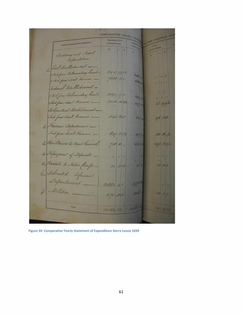
61
Figure 34: Comparative Yearly Statement of Expenditure Sierra Leone 1839

62
.
Figure 35: Net Imports and Exports for the Gold Coast in 1941

63
Appendix C: Colonial Blue Book Graphs
These are the initial graphs from the blue books used in the final Timeplot. After the blue
book images were taken, data was imputed into Google Spreadsheet, and basic graphs for
Uganda, Gold Coast, and Tanganyika were made. These graphs helped to get a general overview
of the countries, and what should be looked at in more detail. This was done before we started
deflating currency.
Uganda:
Figure 36: Graph of Uganda Revenue and Expenditure

64
Figure 37: Graph of Uganda Net Income
Gold Coast:
Figure 38: Graph of Gold Coast Revenue and Expenditure
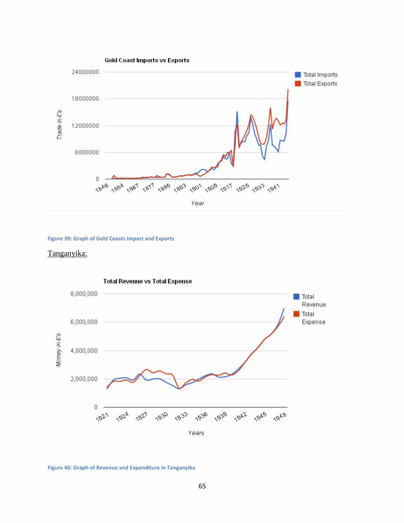
65
Figure 39: Graph of Gold Coasts Import and Exports
Tanganyika:
Figure 40: Graph of Revenue and Expenditure in Tanganyika

66
Figure 41: Graph of Net Income for Tanganyika
Figure 42: Graph of Total Currency in East Africa

67
Appendix D: Sponsor Description
The British Museum came into being through the legacy of Sir Hans Sloane who, on his
death in 1753, bequeathed his collection of more than 71,000 pieces to the nation. While
Parliament established the museum on June 7, 1753, its doors did not open until January 15,
1759. The initial annual attendance of 5,000 has risen to approximately 6 million to date,
making the British Museum one of the most prominent museums in the U.K. This trend has
continued through the recent years as shown by Figure 43.
In the 19th
century, the museum acquired major artifacts such as the Rosetta
Stone and sculptures from the Parthenon and the Townley Collection, thus expanding its
collection. They have continued this effort of expansion by introducing new galleries, education
services, and facilities, such as the Queen Elizabeth II Great Court, the largest enclosed public
space in Europe (History of British Museum 2011). Additionally, the museum hosts international
touring exhibitions from Africa, China, and the Middle East, to expand its geographical reach to
a global level (International Exhibitions 2011). The Museum has continued to grow in the past
few years. Although visitation has declined from a peak in 2008 due to the economic recession,
the Museum‟s most recent annual report shows increases in several Department for Culture,
Media and Sport (DCMS) performance indicators (Table 9) including visits the museum itself,
Website visits, and the percentage of visitors who would recommend others visit (Report and
Accounts 2010).
4,622,000 4,778,000
3,485,000
4,903,000 6,049,000
0
2,000,000
4,000,000
6,000,000
8,000,000
2004 2005 2006 2007 2008
Total Number of Physical Visits to the Museum
from 2003-2004 to 2007-2008
Figure 43: Total Number of Physical Visits to the British Museum from 2003-2004 to 2007-2008

68
The British Museum is a non-
departmental public body, governed
by 25 trustees in accordance with the British Museum Act of 1992. This board of trustees is
responsible for the general management and control of the Museum, and the Museum‟s
Governance Policies and Principles regulate them (Management and Governance 2011). The
museum is a large scale operation. In the 2009/2010 fiscal year the Museum spent £8.8 million
on gallery improvement, work on buildings and storage, and enabling works. This is
significantly less than the £18.2 million spent in 2008/2009. As of March 31, 2010 the Museum
has a total of £577 million in reserve funds an increase over the previous year‟s total of £550
million (Report and Accounts 2010).
Today, the stated goals of the British Museum are to improve the research and
organization of the collection, to improve access to and the experience of the collection, to invest
in the Museum staff, and to increase the
museums self-generated income (The
British Museum Strategy to 2012 2011).
The Department of Coins and
Medals is one of the 10 collections and
research departments at the British
Figure 45: The floor plan of the upper level of galleries
Figure 44: 2009/2010 Reserve Funds

69
Figure 46: Comparison of Curatorial Staff
Museum which report to the Board of Trustees and the Director of the Museum. The other
collections and research departments are: Ancient Egypt and Sudan; Greece and Rome; the
Middle East; Prints and Drawings; Asia; Africa, Oceania, and the Americas; Prehistory and
Europe; Conservation and Scientific Research; and Portable Antiquities and Treasures.
(Collection and Research Departments 2011). The department was officially founded in 1860 to
house the ever-increasing number of coins and medals in the museum. Approximately 20,000
coins and medals were included in Sir Hans Sloane‟s original bequest, and the collection has
grown to nearly a million objects ranging from the 7th
Century BC to present day. The
department presents exhibits featuring the use and development of currency, and conducts
extensive research to further the field of numismatics, as well as offering instruction and
education at all levels of interest (History of the Collection 2011). The majority of the
Department of Coins and Medals display can be found in the permanent HSBC Money Gallery
in Gallery 68.
Gallery 69a is a rotating display used to display currencies from various cultures. While
the Department of Coins and Medals only has two rooms dedicated to its exhibits, it is by no
means small or insignificant. The Department of Coins and Medals contains a large number of
objects and is the second largest department in terms of curatorial staff as shown in Figure 46.
Apart from presenting exhibits to the public, the
department provides a number of services.
One of the ongoing research projects in the department, led by Catherine Eagleton, is
entitled Money in Africa. The project began in April 2006 and is expected to end 2012-13. The
0
5
10
15
20
25
Curatorial Staff
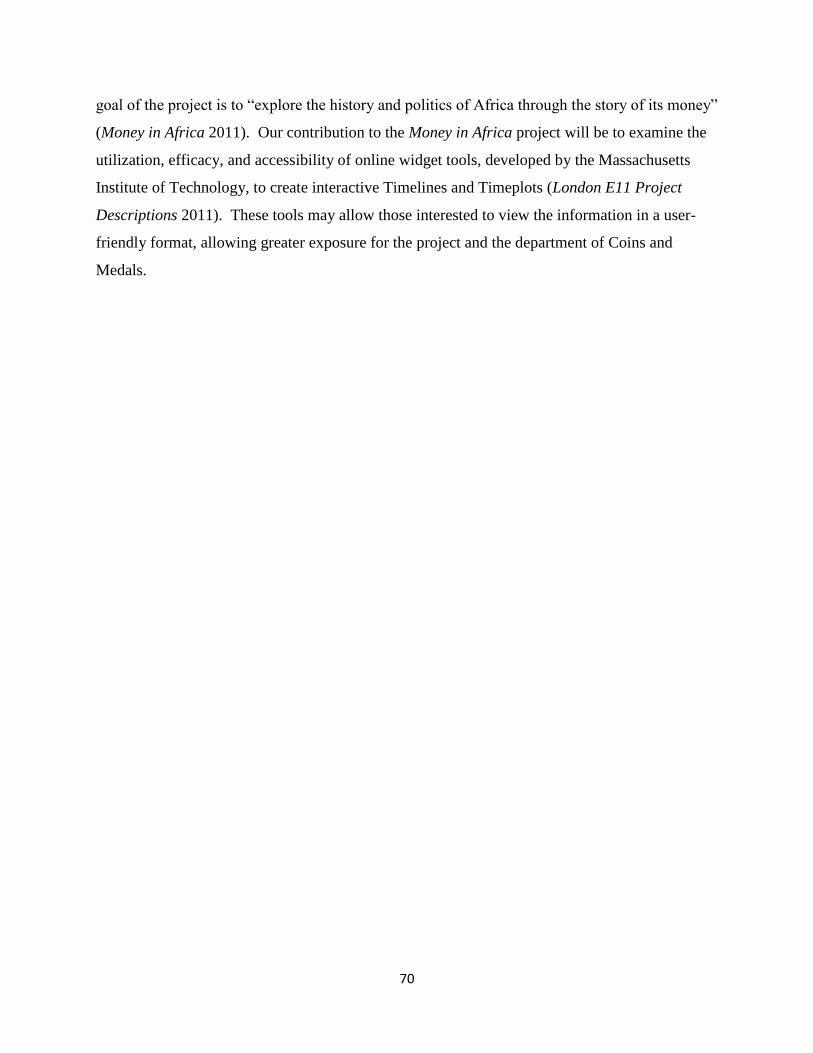
70
goal of the project is to “explore the history and politics of Africa through the story of its money”
(Money in Africa 2011). Our contribution to the Money in Africa project will be to examine the
utilization, efficacy, and accessibility of online widget tools, developed by the Massachusetts
Institute of Technology, to create interactive Timelines and Timeplots (London E11 Project
Descriptions 2011). These tools may allow those interested to view the information in a user-
friendly format, allowing greater exposure for the project and the department of Coins and
Medals.
71
References:
"International Touring Exhibitions and Loans." The British Museum, 2011. Web. 21 Jun 2011.
<http://www.britishmuseum.org/the_museum/museum_in_the_world/international_exhib
itions.aspx>.
The British Museum: Report and Accounts for the Year Ended 31 March 2010. The British
Museum, 2010. Print.
The British Museum: Funding Agreement 2008-2011. The British Museum, 2008. Sections 4,5,6.
PDF.
<http://www.britishmuseum.org/pdf/British_Museum_Signed_Funding_Agreement_2008
-11.pdf>.
SIMILE Project. Massachusetts Institute of Technology, n.d. Web. 29 Mar 2011. <
http://SIMILE.mit.edu/>.
"Membership." The British Museum, 2011. Web. 21 Jun 2011.
<http://www.britishmuseumshoponline.org/icat/membersandsupport#>.
British Museum Management Statement and Financial Memorandum. The British Museum,
2002. PDF. <http://www.britishmuseum.org/pdf/2.%20Financial_memorandum.pdf>.

72
Appendix E: Focus Group Materials

73
Questions for Focus Group
Please use the widgets to answer the following question:
When was the East African Currency Board founded?
Write your answer and how long it took to answer it below. If the process takes more than five
minutes please write “No Answer” and continue.
Answer:_____________________ Time Taken:______________________
[Other tasks similar to this will be presented]
Please rate how well each of the following properties describe the prototype exhibit on a scale of
1-5, 1 being not at all and 5 being extremely well.
Easy to operate ______
Easy to find information ______
Well organized ______
Informative ______
Easy to read ______
Visually pleasing ______
Was there anything specific that you liked about the exhibit?
Was there anything specific that you disliked about the exhibit?
What changes would you make if you could?

74
Appendix F: Focus Group Questionnaire Responses
Person 1:
QUESTION TIMELINE TIMEPLOT
Was there anything specific that you liked about the exhibit?
Was there anything specific that you disliked about the exhibit?
The Timeline might be better at the top of the screen.
What changes would you make if you could?
See last.
Person 2:
QUESTION TIMELINE TIMEPLOT
Was there anything specific that you liked about the exhibit
Really like the timeline – well done! I took forward to using the timeline as I think it is super
Find graph very confusing
Was there anything specific that you disliked about the exhibit
Graph. Bus this can be improved. I can see it will be useful once I understand it.
What changes would you make if you could
Larger box for results needed. More color contrast needed for timelines.
Mostly about the graph. Problem with info boxes and knowing what to click on. Confused over scales. Need a sliding scale thing with mouse so I can read numbers off the scale easily. Need to rearrange the surrounding instructions and info for cleaver use. Lines (for information about events) might be thicker to be more obvious (plus give each a fate at bottom?)
75
Person 3:
QUESTION TIMELINE TIMEPLOT
Was there anything specific that you liked about the exhibit
It’s easy to operate to find information
Was there anything specific that you disliked about the exhibit
It’s not very visually pleasing (colors…)
What changes would you make if you could
Person 4:
QUESTION TIMELINE TIMEPLOT
Was there anything specific that you liked about the exhibit
It is quite interesting and fun to use it.
Was there anything specific that you disliked about the exhibit
The software responds quite slowly. Sometimes, it is not that easy to click the right part to get the information.
What changes would you make if you could
Make it more clearly and user friendly.
Person 5:
QUESTION TIMELINE TIMEPLOT
Was there anything specific that you liked about the exhibit
Was there anything specific that you disliked about the exhibit
What changes would you make if you could

76
Person 6:
QUESTION TIMELINE TIMEPLOT
Was there anything specific that you liked about the exhibit
The Timeplot vertical bars were really useful and especially the shaded red areas showing big events
Was there anything specific that you disliked about the exhibit
Some of the visuals could be more accessible and pleasing i.e. design etc
What changes would you make if you could
The timeline needs more spacing as it is quite cramp and political and/or historical points should be at the top and in bold.
As mentioned, have a moving gridline so you can read data at specific point. Timeplot – put instructions and key at top of screen.

77
Appendix G: Visitor Testing Materials

78
Visitor Questionnaire
Please use the widgets to answer the following question:
What is on the reverse side of the 1991 issue of the One Naira coin?
Write your answer and how long it took to answer it below. If the process takes more than five
minutes please write “No Answer” and continue.
Please rate how well each of the following properties describe the prototype exhibit on a scale of
1-10, 1 being not at all and 10 being extremely well.
Easy to operate ______
Easy to find information ______
Well organized ______
Informative ______
Easy to read ______
Visually pleasing ______
Was there anything specific that you liked or disliked about the exhibit?
Would you use it again if it were displayed on the British Museum‟s website? Why or why not?
What changes would you make if you could?
Are there any other comments you would like to make about the widgets‟ form or content?

79
Appendix H: Visitor Testing Questionnaire Responses
Person 1:
QUESTION RESPONSE
Was there anything specific that you liked or
disliked about the exhibit?
Need to explain requirement for double
clicking.
Would you use it again if it were displayed on
the British Museum website? Why or why not?
Yes
What changes would you make if you could? Pictures of coins.
Are there any other comments you would like
to make about the widgets‟ form or content?
Person 2:
QUESTION RESPONSE
Was there anything specific that you liked or
disliked about the exhibit?
Would you use it again if it were displayed on
the British Museum website? Why or why not?
What changes would you make if you could?
Are there any other comments you would like
to make about the widgets‟ form or content?

80
Person 3:
QUESTION RESPONSE
Was there anything specific that you liked or
disliked about the exhibit?
No. It was nice
Would you use it again if it were displayed on
the British Museum website? Why or why not?
Yes. Useful to research.
What changes would you make if you could? None
Are there any other comments you would like
to make about the widgets‟ form or content?
Pictures.
Person 4:
QUESTION RESPONSE
Was there anything specific that you liked or
disliked about the exhibit?
Timeline- good ideas, perhaps some graphic
imagery
Would you use it again if it were displayed on
the British Museum website? Why or why not?
Yes, need instructions about clicking green line
What changes would you make if you could? More graphics- “click here” balloons
Are there any other comments you would like
to make about the widgets‟ form or content?
Instructions about the timeline – I was a bit
disoriented at first.

81
Person 5:
QUESTION RESPOPNSE
Was there anything specific that you liked or
disliked about the exhibit?
Would you use it again if it were displayed on
the British Museum website? Why or why not?
Not
What changes would you make if you could? Easier height to see monitor
Are there any other comments you would like
to make about the widgets‟ form or content?
No
Person 6:
QUESTION RESPONSE
Was there anything specific that you liked or
disliked about the exhibit?
Would you use it again if it were displayed on
the British Museum website? Why or why not?
What changes would you make if you could?
Are there any other comments you would like
to make about the widgets‟ form or content?
Person 7:
QUESTION RESPONSE
Was there anything specific that you liked or
disliked about the exhibit?
Nothing special
Would you use it again if it were displayed on
the British Museum website? Why or why not?
Yes
What changes would you make if you could? Could be faster to operate
Are there any other comments you would like
to make about the widgets‟ form or content?
No

82
Person 8:
QUESTION RESPONSE
Was there anything specific that you liked or
disliked about the exhibit?
A picture of the coin would have been nice.
Would you use it again if it were displayed on
the British Museum website? Why or why not?
Yes, I‟d use it, but I‟m not sure if I couldn‟t
find any special info I might be looking for.
What changes would you make if you could? Match the screen size. Add pictures
Are there any other comments you would like
to make about the widgets‟ form or content?
Person 9:
QUESTION RESPONSE
Was there anything specific that you liked or
disliked about the exhibit?
Would you use it again if it were displayed on
the British Museum website? Why or why not?
Yes, easy and fast to use.
What changes would you make if you could? None
Are there any other comments you would like
to make about the widgets‟ form or content?
Bigger display of the content
Person 10 (Web Designer, “said it looked like an old website”):
QUESTION RESPONSE
Was there anything specific that you liked or
disliked about the exhibit?
Would you use it again if it were displayed on
the British Museum website? Why or why not?
What changes would you make if you could? Use CSS 3.0
Are there any other comments you would like
to make about the widgets‟ form or content?

83
Person 11:
QUESTION RESPONSE
Was there anything specific that you liked or
disliked about the exhibit?
Like the timeline
Would you use it again if it were displayed on
the British Museum website? Why or why not?
Yes, easy to use
What changes would you make if you could? None
Are there any other comments you would like
to make about the widgets‟ form or content?
No
Person 12:
QUESTION RESPONSE
Was there anything specific that you liked or
disliked about the exhibit?
Kept looking to scroll on far right. Not entirely
sure how I found it. Some of dates on timeline
very pale. A bit utilitarian.
Would you use it again if it were displayed on
the British Museum website? Why or why not?
What changes would you make if you could?
Are there any other comments you would like
to make about the widgets‟ form or content?
Person 13:
QUESTION RESPONSE
Was there anything specific that you liked or
disliked about the exhibit?
Too day not very stimulating
Would you use it again if it were displayed on
the British Museum website? Why or why not?
Yes, if I was specifically searching something.
Would use it again but not for fun.
What changes would you make if you could? It needs to be more visual exciting, more visual
prompts, ect.
Are there any other comments you would like
to make about the widgets‟ form or content?

84
Person 14:
QUESTION RESPONSE
Was there anything specific that you liked or
disliked about the exhibit?
Would you use it again if it were displayed on
the British Museum website? Why or why not?
If looking for coins… yes
What changes would you make if you could? Font bigger
Are there any other comments you would like
to make about the widgets‟ form or content?
Quite dull… depends who you want to use it.
If academic – OK. But not lively enough for
general public.
Person 15:
QUESTION RESPONSE
Was there anything specific that you liked or
disliked about the exhibit?
Would you use it again if it were displayed on
the British Museum website? Why or why not?
Yes, I think it‟s useful for people who likes
coins
What changes would you make if you could?
Are there any other comments you would like
to make about the widgets‟ form or content?
Person 16:
QUESTION RESPONSE
Was there anything specific that you liked or
disliked about the exhibit?
Would you use it again if it were displayed on
the British Museum website? Why or why not?
Yes due to its easy organization
What changes would you make if you could? None
Are there any other comments you would like
to make about the widgets‟ form or content?
No

85
Person 17:
QUESTION RESPONSE
Was there anything specific that you liked or
disliked about the exhibit?
No I wouldn‟t use it
Would you use it again if it were displayed on
the British Museum website? Why or why not?
Timeline bewildering. I don‟t normally use
your computer
What changes would you make if you could? LIST ACTIONS NUMERICALLY ON
SCREEN TIMELINES ECT
Are there any other comments you would like
to make about the widgets‟ form or content?
Probably better for people who have computers
at home – younger people. I like „real‟things
Person 18:
QUESTION RESPONSE
Was there anything specific that you liked or
disliked about the exhibit?
Nope
Would you use it again if it were displayed on
the British Museum website? Why or why not?
Yes, I do not live in Britain
What changes would you make if you could?
Are there any other comments you would like
to make about the widgets‟ form or content?
The scroll bar is not super intuitive clicking the
year may have been more helpful
Person 19:
QUESTION RESPONSE
Was there anything specific that you liked or
disliked about the exhibit?
Would you use it again if it were displayed on
the British Museum website? Why or why not?
What changes would you make if you could? Didn‟t know abbreviation of N1
Are there any other comments you would like
to make about the widgets‟ form or content?

86
Person 20:
QUESTION RESPONSE
Was there anything specific that you liked or
disliked about the exhibit?
Font
Would you use it again if it were displayed on
the British Museum website? Why or why not?
Yes
What changes would you make if you could? Information layout
Are there any other comments you would like
to make about the widgets‟ form or content?

87
Appendix I: Visitor Testing Graphs
Line graphs of Rating vs. Frequency of Response, separated by quality features asked in the
visitor questionnaire.
Quality 1: Easy to Operate:
Figure 47: Responses for Easy to Operate
Quality 2: Easy to Find Information:
Figure 48: Responses for Easy to Find Information

88
Quality 3: Well Organized:
Figure 49: Responses for Well Organized
Quality 4: Informative:
Figure 50: Responses for Informative

89
Quality 5: Easy to Read:
Figure 51: Responses for Easy to Read
Quality 6: Visually Pleasing:
Figure 52: Responses for Visually Pleasing

90
Appendix J: Timeline Change Log
Table7 below is a complete log of the major changes made to the Timeline widget over
the course of its development. Minor changes in wording or styles are not included in this table.
For images of each prototype reviewed please see Section 4.4.1 Timeline Development.
Table 10: Timeline Widget Change Log
5/13/2011 Started Timeline Development
5/16/2011
Changed Events to Duration (has tape following it). Changed Coins to
green
5/18/2011 Used "trackNum" property to order events
5/20/2011 1st prototype review
5/20/2011 Moved from text bubbles to separate content box
5/24/2011
Started grouping events by coin and bank notes. Designed table for
description to fall into, and set up links to pictures
5/25/2011
Added new table for description. Started work to make the table
dynamic
5/26/2011 2nd prototype review
5/31/2011
Made the table update dynamically. Made pounds signs show rather
than question marks. Grouped events, increased tape size to facilitate
clicking.
6/2/2011
Timeline now differentiates between note-related events, coin-related
events, and news events. Added the ability to flip the picture between
the front and back sides
6/3/2011
Changed Background color for the Timeline to white. Made the
mouse-over instruction a caption, and moved the return link to make it
clearer. Changed the "links" to actually look like links
6/3/2011 3rd prototype review + web development team
6/6/2011 Started setting up Google Spreadsheet import
6/7/2011
Finalized Google Spreadsheet import. Resolved permission issues
with shared drive and started setting up database import

91
6/9/2011
Made Timeline fetch only a section of collection's online page instead
of entire thing. Placed the Timeline in the BM webpage template.
6/10/2011 4th Prototype review
10/06/2011
Changed style of the Box to better fit in BM template (black
background and white text). Additional formatting changes. Started
making the Timeline work offline so that we could use it for focus
group and visitor testing. Added events on Nigeria's political history.
13/06/2011
Finished making the Timeline work offline. Added an instructions
page in the Content Box when the Timeline first loads.
6/14/2011 Focus Group testing
6/14/2011
Acted upon a number of the features requested by the focus group.
Moved the overview band above the Timeline and moved the political
events above the currency ones. Also fixed the Timeline in IE
6/15/2011 Visitor testing
6/15/2011
Chose new colors for the Banknote and Coin events to increase
contrast. Added a "return to help" button to return to the instructions
screen.
6/21/2011
Fixed various typos and cultural spellings in the events and
instructions (e.g. Center to Centre)
13/05/2011 Started Widget Development
16/05/2011
Changed Events to Duration (has tape following it). Changed Coins
to green
18/05/2011 Used "trackNum" property to order events
20/05/2011 1st prototype review
20/05/2011 Moved from text bubbles to separate content box
24/05/2011
Started grouping events by coin and bank notes. Designed table for
description to fall into, and set up links to pictures
25/05/2011 2nd prototype review

92
25/05/2011
Added new table for description. Started work to make the table
dynamic
31/05/2011
Made the table update dynamically. Made pounds signs show rather
than question marks. Grouped events, increased tape size to
facilitate clicking.
02/06/2011
Timeline now differentiates between note-related events, coin-
related events, and news events. Added the ability to flip the picture
between the front and back sides
03/06/2011
Changed Background color for the Timeline to white. Made the
mouse-over instruction a caption, and moved the return link to make
it clearer. Changed the "links" to actually look like links
03/06/2011 3rd prototype review + web development team

93
Appendix K: Timeline Non-Technical User Manual
How-to set up Timeline events:
The key to any Timeline is its events. These events have properties that determine where
and how they are displayed.
The 4 most important properties are the event‟s start, end, title, and description.
Figure 53: Timeline example with event properties highlighted
start
All events must have a start date. This is the date where the event will appear on the
timeline.
end
Not all events will have an end date. If an event has no end date it will appear as a small
blue circle on the start date. If an event does have an end date a bar will be drawn from the start
date to the end date.
title
The title is the text that appears on the Timeline next to the event. A title is not
necessary, but is highly recommended because it allows the user to distinguish between events.
The title will also appear in the box below the Timeline when an event is clicked.
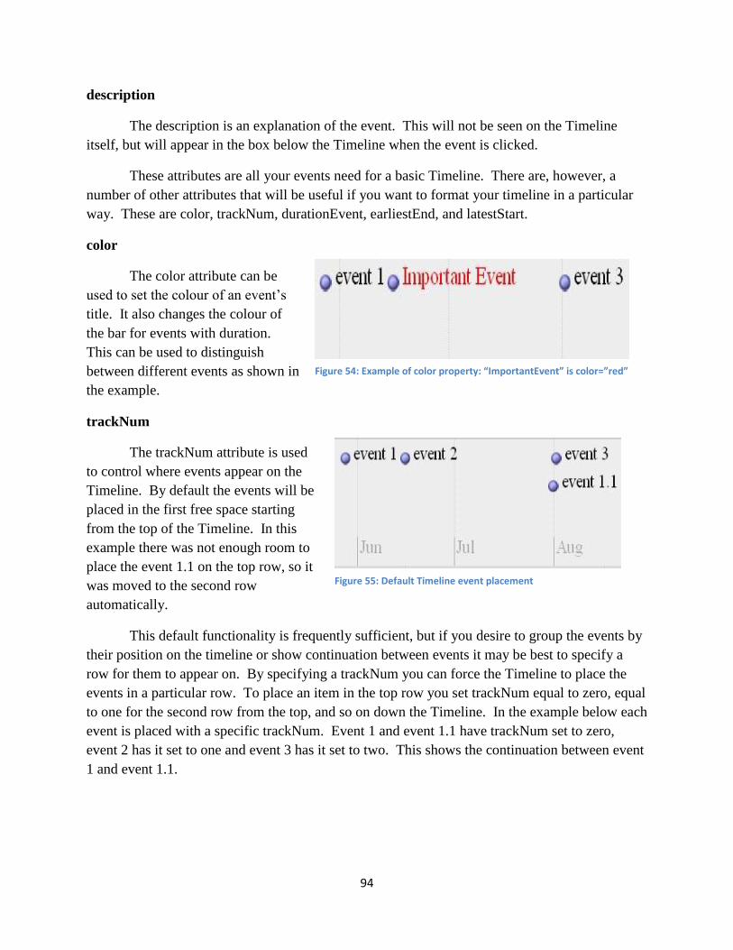
94
description
The description is an explanation of the event. This will not be seen on the Timeline
itself, but will appear in the box below the Timeline when the event is clicked.
These attributes are all your events need for a basic Timeline. There are, however, a
number of other attributes that will be useful if you want to format your timeline in a particular
way. These are color, trackNum, durationEvent, earliestEnd, and latestStart.
color
The color attribute can be
used to set the colour of an event‟s
title. It also changes the colour of
the bar for events with duration.
This can be used to distinguish
between different events as shown in
the example.
trackNum
The trackNum attribute is used
to control where events appear on the
Timeline. By default the events will be
placed in the first free space starting
from the top of the Timeline. In this
example there was not enough room to
place the event 1.1 on the top row, so it
was moved to the second row
automatically.
This default functionality is frequently sufficient, but if you desire to group the events by
their position on the timeline or show continuation between events it may be best to specify a
row for them to appear on. By specifying a trackNum you can force the Timeline to place the
events in a particular row. To place an item in the top row you set trackNum equal to zero, equal
to one for the second row from the top, and so on down the Timeline. In the example below each
event is placed with a specific trackNum. Event 1 and event 1.1 have trackNum set to zero,
event 2 has it set to one and event 3 has it set to two. This shows the continuation between event
1 and event 1.1.
Figure 54: Example of color property: “ImportantEvent” is color=”red”
Figure 55: Default Timeline event placement

95
Figure 56: Timeline event placement when TrackNum is specified
The event properties durationEvent, latestStart, and earliestEnd all control the appearance
of the bar drawn between an events start and end. The different affects of these properties are
shown in the next picture.
Figure 57: Examples of durationEvent, latestStart and earliestEnd properties
durationEvent
The durationEvent property has only two values: true or false. The default value is false.
If durationEvent is false then the event is considered and instantaneous event. Instantaneous
events are always drawn with an icon (the small blue circle). If an instantaneous event has an
end date the bar drawn between the two will be transparent as seen in event 1. If durationEvent
is set to true then the icon will not be drawn and the bar between start and end will be opaque.
The durationEvent property should only be set to true for events with a start and end date.
latestStart
The latestStart attribute is used for events with uncertain starting times. If this is the case
than the start attribute should be set to the earliest possible starting time and latestStart to the
latest possible starting time. When this attribute is set the Timeline will draw a transparent bar
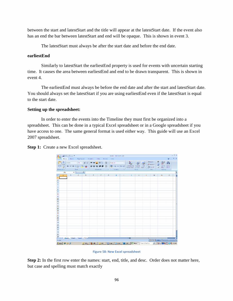
96
between the start and latestStart and the title will appear at the latestStart date. If the event also
has an end the bar between latestStart and end will be opaque. This is shown in event 3.
The latestStart must always be after the start date and before the end date.
earliestEnd
Similarly to latestStart the earliestEnd property is used for events with uncertain starting
time. It causes the area between earliestEnd and end to be drawn transparent. This is shown in
event 4.
The earliestEnd must always be before the end date and after the start and latestStart date.
You should always set the latestStart if you are using earliestEnd even if the latestStart is equal
to the start date.
Setting up the spreadsheet:
In order to enter the events into the Timeline they must first be organized into a
spreadsheet. This can be done in a typical Excel spreadsheet or in a Google spreadsheet if you
have access to one. The same general format is used either way. This guide will use an Excel
2007 spreadsheet.
Step 1: Create a new Excel spreadsheet.
Figure 58: New Excel spreadsheet
Step 2: In the first row enter the names: start, end, title, and desc. Order does not matter here,
but case and spelling must match exactly

97
Figure 59: Spreadsheet setup: Essential column labels
Step 3: Enter the names of any other properties that you may use. Once again order does not
matter, but case and spelling must match. In this case I have added the durationEvent,
trackNum, and color properties.
Figure 60: Spreadsheet Setup: additional Column Headers
Step 4: The start and end columns must be formatted as dates. If they are used latestStart and
earliestEnd must also be formatted as dates.
To do this select the entire start column by clicking on the letter above it.
Figure 61: Select Entire Column
start end title desc
start end title desc durationEvent trackNum color

98
Then go to the Home tab and find the box that says “General” in the Number section.
Figure 62: Finding the number format field
Click on the down arrow in this box to open the drop down menu and select Long Date
Figure 63: Finding the "Long Date" Format
Dates entered into this field will now take the format of dd, <month Name>, yyyy. For example,
entering 29/10/1991 will be formatted to give 29 October 1991. Repeat this formatting process
for the end column and the latestStart and earliestEnd columns (if present).
Step 5: Enter in the information for each event
Each row represents an event. Enter the property value for each event in its respective column
(the event‟s start in the start column, title in title column, description in desc column and so on).
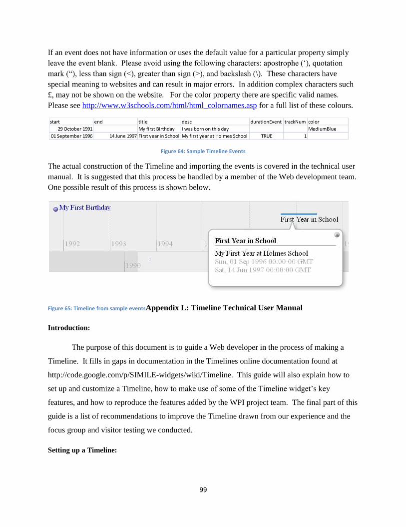
99
If an event does not have information or uses the default value for a particular property simply
leave the event blank. Please avoid using the following characters: apostrophe („), quotation
mark (“), less than sign (<), greater than sign (>), and backslash (\). These characters have
special meaning to websites and can result in major errors. In addition complex characters such
£, may not be shown on the website. For the color property there are specific valid names.
Please see http://www.w3schools.com/html/html_colornames.asp for a full list of these colours.
Figure 64: Sample Timeline Events
The actual construction of the Timeline and importing the events is covered in the technical user
manual. It is suggested that this process be handled by a member of the Web development team.
One possible result of this process is shown below.
Figure 65: Timeline from sample eventsAppendix L: Timeline Technical User Manual
Introduction:
The purpose of this document is to guide a Web developer in the process of making a
Timeline. It fills in gaps in documentation in the Timelines online documentation found at
http://code.google.com/p/SIMILE-widgets/wiki/Timeline. This guide will also explain how to
set up and customize a Timeline, how to make use of some of the Timeline widget‟s key
features, and how to reproduce the features added by the WPI project team. The final part of this
guide is a list of recommendations to improve the Timeline drawn from our experience and the
focus group and visitor testing we conducted.
Setting up a Timeline:
start end title desc durationEvent trackNum color
29 October 1991 My first Birthday I was born on this day MediumBlue
01 September 1996 14 June 1997 First year in School My first year at Holmes School TRUE 1
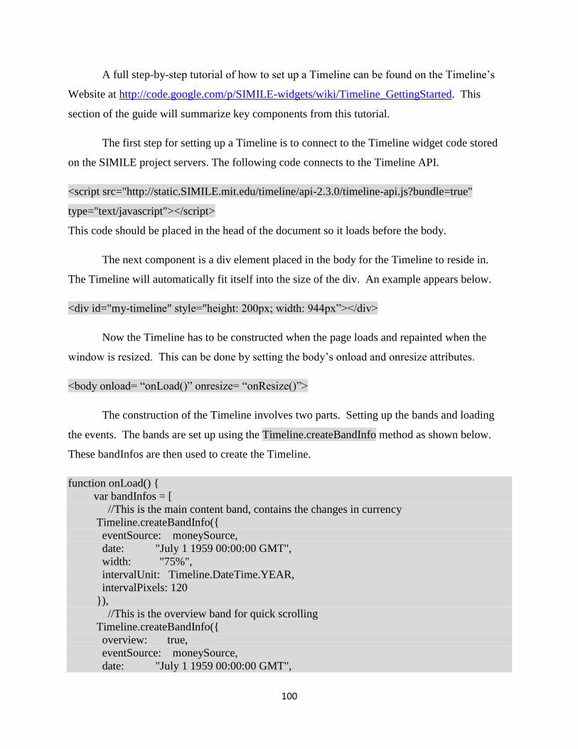
100
A full step-by-step tutorial of how to set up a Timeline can be found on the Timeline‟s
Website at http://code.google.com/p/SIMILE-widgets/wiki/Timeline_GettingStarted. This
section of the guide will summarize key components from this tutorial.
The first step for setting up a Timeline is to connect to the Timeline widget code stored
on the SIMILE project servers. The following code connects to the Timeline API.
<script src="http://static.SIMILE.mit.edu/timeline/api-2.3.0/timeline-api.js?bundle=true"
type="text/javascript"></script>
This code should be placed in the head of the document so it loads before the body.
The next component is a div element placed in the body for the Timeline to reside in.
The Timeline will automatically fit itself into the size of the div. An example appears below.
<div id="my-timeline" style="height: 200px; width: 944px”></div>
Now the Timeline has to be constructed when the page loads and repainted when the
window is resized. This can be done by setting the body‟s onload and onresize attributes.
<body onload= “onLoad()” onresize= “onResize()”>
The construction of the Timeline involves two parts. Setting up the bands and loading
the events. The bands are set up using the Timeline.createBandInfo method as shown below.
These bandInfos are then used to create the Timeline.
function onLoad() {
var bandInfos = [
//This is the main content band, contains the changes in currency
Timeline.createBandInfo({
eventSource: moneySource,
date: "July 1 1959 00:00:00 GMT",
width: "75%",
intervalUnit: Timeline.DateTime.YEAR,
intervalPixels: 120
}),
//This is the overview band for quick scrolling
Timeline.createBandInfo({
overview: true,
eventSource: moneySource,
date: "July 1 1959 00:00:00 GMT",

101
width: "25%",
intervalUnit: Timeline.DateTime.DECADE,
intervalPixels: 300
})
];
bandInfos[1].syncWith = 0;
bandInfos[1].highlight = true;
tl = Timeline.create(document.getElementById("my-timeline"), bandInfos);
}
The createBandInfo method takes several parameters to customize the bands which will
be discussed later. The eventSource parameter takes a source containing the events to be
displayed on the Timeline. This eventSource can be populated in a number of ways. Events can
be manually added or they can be loaded from and XML or JSON file (as they are in the Getting
Started tutorial). The Timeline created by the WPI team manually adds events imported from a
Google Spreadsheet. The code to do this is below.
<script type="text/javascript">
var moneySource; //defines a source to contain the events
function loadWorksheetJSON(json) {
moneySource = new Timeline.DefaultEventSource();
var entries = json.feed.entry; //get the entries in the spreadsheet feed
var events = [];
for (var i = 0; i < entries.length; i++) { //loops through each entry
var entry = entries[i];
var start = convertFromGDataDate(entry["gsx$start"].$t); //gets the start date
var end = entry["gsx$end"].$t; //gets the end date if it exists
if(end){
end = convertFromGDataDate(end);
}
var title = entry["gsx$title"].$t;
var desc = entry["gsx$desc"].$t;
var trackNum = entry["gsx$tracknum"].$t;
var color = entry["gsx$color"].$t;
var duration=entry["gsx$durationevent"].$t;
var event = new Timeline.DefaultEventSource.Event({ //creates a new Event
start: start, //start
end: end ? end : null, // end
text: title ? title : null, //title
instant: !duration, // durationEvent
description: desc, //description

102
color: color ? color : "", // color, passing color null breaks IE
trackNum: trackNum? trackNum : null
});
events.push(event);
}
moneySource.addMany(events); //adds the Events to the event source
}
//converts from a GData to a JavaScript date
function convertFromGDataDate(/*string<YYYY-MM-DD>*/ date) {
var matches = date.match(/(\d{1,})\D(\d{1,})\D(\d{4})/);
var myDate = new Date();
myDate.setFullYear(matches[3], matches[1] - 1, matches[2]);
myDate.setHours(0,0,0,0);
return myDate;
}
</script>
<script type="text/javascript"
src="https://spreadsheets.google.com/feeds/list/YourKeyHere/od6/public/values?alt=json-in-
script&callback=loadWorksheetJSON"></script>
This section of code connects to a Google Spreadsheet and extracts values from it to
create Timeline Events (more information on what these values do is in the regular User
Manual). The first function, loadWorksheetJSON, takes a JSON spreadsheet feed and constructs
events out of it. The spreadsheet feed is in list format which means that each row is treated as a
single entry. Each entry has fields containing each of its cells. These are accessed by:
entry.gsx$Column Name. So the cell of an entry‟s start column would be retrieved by
entry.gsx$start. To get the text out of this cell the function $t is used. So the value in the start
column for a particular entry would be retrieved by entry.gsx$start.$t. This is equivalent to the
entry[“gsx$start”].$t found in the code above.
The second function, convertFromGDataDate, takes a date in the format given by the
spreadsheet feed and converts it to the JavaScript format. It does this by running a regular
expression to retrieve the individual year, month, and day parts. It then sets the time to midnight.
The final part is a script to retrieve the JSON feed. The source for this script tag takes the
following form:

103
http://spreadsheets.google.com/feeds/FeedType/Key/WorksheetID/Visibility/Projection?alt=json
-in-script&callback=FunctionName
The FeedType is one of spreadsheets, worksheets, list, cells, tables, or records.
Spreadsheets fetches whole spreadsheets, Worksheets fetches each page in the given spreadsheet,
List retrieves each row on the given page, Cells retrieves each cell on a given page, Tables
retrieves each table in the spreadsheet, and Records fetches each individual entry in each table.
The code given is set up to work with the list feed.
The Key is a unique identifier for each Google Spreadsheet. This information can be
found in the URL for the spreadsheet. The URL for one of the published data spreadsheets is
below:
https://spreadsheets.google.com/spreadsheet/pub?hl=en_US&hl=en_US&key=0AsIGl0yXCSyX
CSs2b3EtTUg1OWZyaUs5YWltbEtIS0E&output=html
The string from “key=” to “&output” (coloured in red) is the key for this spreadsheet.
WorksheetID refers to which page of the spreadsheet to select for the list or cell feeds.
This can be either a permanent id (e.g. od6 in the code example) or a relative number (e.g. 1 for
page 1, 2 for page 2, etc.) the permanent id will remain even if the order of pages change, but the
relative number depends on the page order.
Visibility is either public or private. It can be public for published or publicly accessible
spreadsheets.
Projection determines to what depth the feed should receive data and can be full, values,
or basic. Full retrieves all data and preserves formulas, values retrieves all data, but replaces
formulas with their evaluation, and basic retrieves only ATOM data and replaces formulas with
their evaluation. The current Timeline uses the values projection.
The alt property causes the feed to format as JSON and the callback parameter causes it
to call the function specified by FunctionName with the JSON object as a parameter when it
finishes loading the feed.

104
More details on all of these property and the entirety of the Google Spreadsheet data feed
can be found in the API Reference at
http://code.google.com/apis/spreadsheets/data/3.0/reference.html.
These parts should give you the core framework for a Timeline.
Customizing the Timeline:
There are several means to customize the Timeline built in to the Timeline widget. Three
examples are the createBandInfo parameters, the Timeline Theme object, and CSS. These will
change the appearance of the Timeline bands and the appearance of the events drawn on the
Timeline.
BandInfo paramaters:
By specifying the parameters passed to the Timeline.createBandInfo method you can
change the default appearance of the Timeline. Repeated here is the createBandInfo methods
from the Money in Africa Timeline.
var bandInfos = [
//This is the main content band, contains the changes in currency
Timeline.createBandInfo({
eventSource: moneySource,
date: "July 1 1959 00:00:00 GMT",
width: "75%",
intervalUnit: Timeline.DateTime.YEAR,
intervalPixels: 120,
theme: theme1
}),
//This is the overview band for quick scrolling
Timeline.createBandInfo({
overview: true,
eventSource: moneySource,
date: "July 1 1959 00:00:00 GMT",
width: "25%",
intervalUnit: Timeline.DateTime.DECADE,
intervalPixels: 300,
theme: theme1
})
];
bandInfos[1].syncWith = 0;

105
bandInfos[1].highlight = true;
The overview parameter (default false) is a Boolean that determines whether the band
contains a main or overview display. The overview display draws events smaller and doesn‟t let
you click on them, but gives an overall picture of the Timeline. It is useful as a quick scrolling
band. The date parameter (default is current time) sets the date the Timeline is centred on when
it first loads. The width parameter determines what percentage of the Timeline each band takes
up (default is evenly sized bands). The intervalUnit parameter determines what unit is displayed
as tics on the band. The intervalPixels parameter determines the space between each tic. The
multiple parameter (not shown) can change these units to an integer multiple of time (e.g. every
5 year or 5 decades). The theme parameter (default is Timeline.ClassicTheme) is a custom
theme that changes the appearance of events on the Timeline. This will be discussed in more
detail in the next section. The line after the createBandInfos, bandInfos[1].syncWith = 0; causes
the second band (the overview) to be linked to the first band. This means that the two bands will
scroll together and always be centered around the same date. The next line,
bandInfos[1].highlight = true, makes the area visible on the first band appear highlighted on the
second.
Additional attributes that are not used in this example are timeZone, trackHeight and
trackGap. The timeZone property can be used to set which time zone the Timeline‟s events will
be displayed in. It is specified as an integer offset from GMT (e.g. timeZone= -5 corresponds to
GMT-5 or Eastern Standard Time). The trackHeight and trackGap properties control how large
each track (row events are stored on) and what the gap between each track is. The picture below
has the affects of the mentioned attributes highlighted.

106
Figure 66: Band Properties Example
Two additional ways to modify the band‟s appearance and function are decorators and
hot zones. Decorators are used to change the background color of the band and draw labels in a
particular location while hot zones are used to create a separate time scale for a particularly
crowded portion of the Timeline. The effect of hot zones and decorators are shown below.
Figure 67: Hot zones and decorators
Decorators are created and then added to the bands they should appear on. If a decorator
should appear on both the main and overview bands it must be added to both individually. There
is no existing documentation on how to create a decorator. The code below is taken from the
JFK example on the Timeline webpage (http://www.SIMILE-
widgets.org/timeline/examples/jfk/jfk.html).
for (var i = 0; i < bandInfos.length; i++) {
bandInfos[i].decorators = [
new Timeline.SpanHighlightDecorator({
startDate: "Fri Nov 22 1963 12:30:00 GMT-0600",
endDate: "Fri Nov 22 1963 13:00:00 GMT-0600",
color: "#FFC080", // set color explicitly

107
opacity: 50,
startLabel: "shot",
endLabel: "t.o.d.",
theme: theme
}),
new Timeline.PointHighlightDecorator({
date: "Fri Nov 22 1963 14:38:00 GMT-0600",
opacity: 50,
theme: theme
// use the color from the css file
}),
...
];
}
These two decorators correspond to the two decorators shown in Figure 2 above. The
SpanHighlightDecorator is used for the first decorator. It highlights a range between the given
startDate and endDate. The color, opacity, and theme are also given. The startLabel and
endLabel are drawn on the band before and after the start date. The PointHighlightDecorator is
responsible for the second decorator shown above. It draws a bar around the size of a default
event icon at the given date. These decorators are added to a BandInfo object‟s decorators field
so they are drawn. The for loop is used to add the list of decorators to all of the bands in the
Timeline. This takes place after the BandInfo objects are created by the
Timeline.createBandInfo method.
Hot zones are created similarly to the decorators, but there are some key differences.
The SIMILE project does have some documentation on this process found at
http://code.google.com/p/SIMILE-widgets/wiki/Timeline_CreatingHotzones. The hot zones
created in the JFK Timeline are below.
var zones = [
{ start: "Fri Nov 22 1963 00:00:00 GMT-0600",
end: "Mon Nov 25 1963 00:00:00 GMT-0600",
magnify: 10,
unit: Timeline.DateTime.DAY
},
{ start: "Fri Nov 22 1963 09:00:00 GMT-0600",
end: "Sun Nov 24 1963 00:00:00 GMT-0600",
magnify: 5,

108
unit: Timeline.DateTime.HOUR
},
{ start: "Fri Nov 22 1963 11:00:00 GMT-0600",
end: "Sat Nov 23 1963 00:00:00 GMT-0600",
magnify: 5,
unit: Timeline.DateTime.MINUTE,
multiple: 10
},
{ start: "Fri Nov 22 1963 12:00:00 GMT-0600",
end: "Fri Nov 22 1963 14:00:00 GMT-0600",
magnify: 3,
unit: Timeline.DateTime.MINUTE,
multiple: 5
}
];
var zones2 = [
{ start: "Fri Nov 22 1963 00:00:00 GMT-0600",
end: "Mon Nov 25 1963 00:00:00 GMT-0600",
magnify: 10,
unit: Timeline.DateTime.WEEK
},
{ start: "Fri Nov 22 1963 09:00:00 GMT-0600",
end: "Sun Nov 24 1963 00:00:00 GMT-0600",
magnify: 5,
unit: Timeline.DateTime.DAY
},
{ start: "Fri Nov 22 1963 11:00:00 GMT-0600",
end: "Sat Nov 23 1963 00:00:00 GMT-0600",
magnify: 5,
unit: Timeline.DateTime.MINUTE,
multiple: 60
},
{ start: "Fri Nov 22 1963 12:00:00 GMT-0600",
end: "Fri Nov 22 1963 14:00:00 GMT-0600",
magnify: 3,
unit: Timeline.DateTime.MINUTE,
multiple: 15
}
];
The list zones1 contains the information for hot zones in the main band, while zones2
contains the hot zone information for the overview band. The start and end properties show the
beginning and end of the hot zone. The magnify property sets how much the Timeline zooms
within the hot zone are. The unit property and the multiple property combine to determine the

109
units marked on the band. For example the unit property of Timeline.DateTime.MINUTE and
the multiple property of 10 causes every 10 minutes to be marked on the Timeline.
Now that the zones are created they need to added to the bands. This has to be done
when the BandInfos are created. This is unlike the decorators which are added after the
BandInfos have already been made. The code for adding the hot zones is shown below.
var bandInfos = [
Timeline.createHotZoneBandInfo({
width: "80%",
intervalUnit: Timeline.DateTime.WEEK,
intervalPixels: 220,
zones: zones,
eventSource: eventSource,
date: date,
timeZone: -6,
theme: theme
}),
Timeline.createHotZoneBandInfo({
width: "20%",
intervalUnit: Timeline.DateTime.MONTH,
intervalPixels: 200,
zones: zones2,
eventSource: eventSource,
date: date,
timeZone: -6,
overview: true,
theme: theme
})
];
If a band is to use hot zones it must be created with the Timeline.createHotZoneBandInfo
method rather than the Timeline.createBandInfo method. The parameters are the same except
for the zones parameter which takes a list of hot zone areas made as shown above. Using this
method will let the Timeline display the hot zones properly.
Themes
An important tool for customizing the Timeline is theme object. The theme sets
information on how events are displayed as well as certain information about the band. The

110
existing documentation on themes can be found at http://code.google.com/p/SIMILE-
widgets/wiki/Timeline_CreatingNewThemes. The custom theme for the Money in Africa
Timeline is below.
var theme1 = Timeline.ClassicTheme.create();
theme1.timeline_start = new Date(Date.UTC(1955, 0, 1));
theme1.timeline_stop = new Date(Date.UTC(2012, 0, 1));
theme1.event.track.height = 15;
theme1.event.tape.height = 8;
The easiest way to create a custom theme is to create an instance of the default theme
(ClassicTheme) and modify it. The attributes specified here are the Timeline‟s start and stop
date and the track and tape height. The timeline_start property specifies the first date on the
timeline. The Timeline will not be able to scroll past the date specified. Similarly, the
timeline_stop property sets the last date on the Timeline. The event.track.height property has the
same function as a band‟s trackHeight property mentioned earlier. The event.tape.height
property sets the height of the bar drawn between an event‟s start and end dates. There are many
other attributes that can be set via themes including icons and mouseWheel behaviour. Each
band can have a specific theme.
CSS
The Timeline widget uses CSS values to set a number of the Timeline‟s default styles.
These values can be overwritten to change the display. In addition, new classes can be made to
set distinct style settings.
An example of a style set by CSS is the bands‟ background colors. These colors are set
for each band by a distinct CSS class. Overwriting this class allows you to set your own color.
The example below set s the color for the first (top) band to white.
<style type="text/css">
.timeline-band-0 .timeline-ether-bg {
background-color: white;
}
</style>
There are many other values that could potentially be overwritten, but there is no
documentation for specific useful values. The default styles can be found at

111
http://code.google.com/p/SIMILE-
widgets/source/browse/timeline/trunk/src/webapp/api/timeline-bundle.css.
In addition to overwriting existing styles it is possible to create new CSS styles for
particular events. By specifying a CSS class name for an event‟s classname attribute the event
can be given a certain class and therefore certain styles. An example of a class with an event is
found below.
<event start="Fri Nov 22 1963 12:30:00 GMT-0600"
title="Kennedy shot"
icon="dark-red-circle.png"
id="Kennedy shot"
classname="important">
President Kennedy shot in Dallas.
</event>
This classname property gives the corresponding event div on the timeline the “important class”.
Its icon is also given the “icon-important” class and its label receives the “label-important” class.
These classes can be given styles to help customize and group events.

112
New Timeline Features:
The Money in Africa Timeline contains three new features not found in ordinary
Timelines. These are importing events from a Google Spreadsheet, loading event descriptions
into the box below the Timeline instead of into text bubbles, and the connection to the Collection
Online database. How to load events from a Google Spreadsheet has been covered in the first
section, so this section will explain how the content box and database link were developed.
The content box is a four cell table with two title cells and two content cells. The left
content cell fills with the description and the right content cell fills with links to the currency in
issue at that time. In order to load the event when it was clicked the default event click function
was overwritten. The function to do so appears below.
//This changes the default mouse click function for events on the timeline
//instead of appearing in a bubble, event description will be in a box below the timeline
Timeline.OriginalEventPainter.prototype._showBubble = function(x, y, evt) {
loadBox(evt.getText(), evt.getDescription (), evt.getStart(), evt.getTrackNum());
}
The x and y variables are the location of the event on the Timeline and evt is the Event object
that was clicked. This function then passes the Title (getText), description, start date, and
trackNum for the event to a function that loads the box. The title is loaded into the left title cell
and the description is loaded into the left content cell.
The start date and trackNum are then used to determine the title and links to load on the
right side of the table. This is done using the function getIssue. This function takes a date and
returns the issue that the given date was in (e.g. If there is a 1972 and 1991 issue then any date
1972-1990 falls in the 1972 issue and any date >= 1991 is in the 1991 issue). These issues are
defined in the nigerianCurrency.js file. An example is shown below.
function currency(t,l, id){
this.title = t;
this.label = l;
this.objectId = id;
}
function issue(t, n, c){
this.title = t;
this.notes = n;
this.coins = c;
}

113
var issues=[];
var notes1959=[new currency("5 Pound Note, 1959 Issue",
"£5","1108952"),
new currency("1 Pound Note, 1959 Issue",
"£1","1108951"),
new currency("10 Shilling Note, 1959 Issue",
"10/-","1108950"),
new currency("5 Shilling Note, 1959 Issue",
"5/-","1108948")];
var coins1959=[new currency("2 Shilling coin, 1959 Issue",
"2/-","932801"),
new currency("1 Shilling coin, 1959 Issue",
"1/-","932792"),
new currency("6 Penny coin, 1959 Issue",
"6p","1052394"),
new currency("3 Penny coin, 1959 Issue",
"3p","1052393"),
new currency("1 Penny coin, 1959 Issue",
"1p","672303"),
new currency("1/2 Penny coin, 1959 Issue",
"1/2p","932796")];
issues.push(new issue("1959 Issue",notes1959,coins1959));
This file creates an array of issue objects. Each issue object contains a title, a list of notes, and a
list of coins. These lists are made up of currency objects which contain a title, a label, and the
corresponding objectID in the Collection Online database. The trackNum is then used to
determine if the notes, coins, or both are loaded. Whichever list of currency is used it is stored
for later use. The labels for each currency loaded are placed in a list in the table‟s right content
cell and the title of the issue is placed in the right title cell. This can be seen below.
moneyList = currencyList;
//starts the list
var listHTML="<ul id=\"linkList\">";
//for each note or coin set up the list element for it
for(i in currencyList){
var money=currencyList[i];
listHTML=listHTML.concat("<li class=\"link\" title =\"",money.title, "\">"
,money.label,"</li>");
}
//closes the list
listHTML.concat("</ul>");
In addition to the labels being set to the contents of the list the title of each currency is set to the
title attribute of its respective list item.

114
The connection to the Collections Online database is made whenever a link in the table‟s
right content cell is clicked. When one of these links is clicked it calls a JQuery function. The
first part of this function is shown below.
$("li").click(function(e){
e.preventDefault();
var title = e.target.title;
var id;
for(var i=0;i<moneyList.length; i++){
if(moneyList[i].title==title){
id=moneyList[i].objectId;
break;
}
}
This section of code prevents the default click behaviour (if any) of the link. It then
determines which link was clicked by matching the title in the stored list of currency to the title
of the link clicked. It then extracts and stores the objectID corresponding to that specific
currency.
The next part of the function starts the AJAX query.
var theURL = "database/search_object_detailsId="+id+".ajax";
$.ajax({
type: 'GET',
url: theURL,
dataType: 'html',
beforeSend: function(){
loadContent(title, "Please wait while we fetch the data from the British Museums's
Collection Online database.");
},
The URL for the query is constructed by adding the specific objectID to the base
Collection Online search URL. Using the beforeSend attribute a “please wait” message is loaded
into the content box.
If the AJAX query successfully connects the success function below will be called. The
function will successfully connect even with an incorrect objectID, but this is a false positive
result. The first part of the success function detects this case and loads an appropriate error
message.
success: function(html) {
//Document not found
if(html.search("No object details were found") != -1){
var restore = "<p class=\"restoreLink\" onclick=\"restore()\" style=\"clear: both; text-
align: center\">Click here to return to the event</p>";
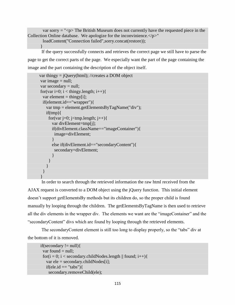
115
var sorry = "<p> The British Museum does not currently have the requested piece in the
Collection Online database. We apologize for the inconvinience.</p>"
loadContent("Connection failed",sorry.concat(restore));
}
If the query successfully connects and retrieves the correct page we still have to parse the
page to get the correct parts of the page. We especially want the part of the page containing the
image and the part containing the description of the object itself.
var thingy = jQuery(html); //creates a DOM object
var image = null;
var secondary = null;
for(var i=0; i < thingy.length; i++){
var element = thingy[i];
if(element.id=="wrapper"){
var tmp = element.getElementsByTagName("div");
if(tmp){
for(var j=0; j<tmp.length; j++){
var divElement=tmp[j];
if(divElement.className=="imageContainer"){
image=divElement;
}
else if(divElement.id=="secondaryContent"){
secondary=divElement;
}
}
}
}
}
In order to search through the retrieved information the raw html received from the
AJAX request is converted to a DOM object using the jQuery function. This initial element
doesn‟t support getElementsBy methods but its children do, so the proper child is found
manually by looping through the children. The getElementsByTagName is then used to retrieve
all the div elements in the wrapper div. The elements we want are the “imageContainer” and the
“secondaryContent” divs which are found by looping through the retrieved elements.
The secondaryContent element is still too long to display properly, so the “tabs” div at
the bottom of it is removed.
if(secondary != null){
var found = null;
for(i = 0; i < secondary.childNodes.length || found; i++){
var ele = secondary.childNodes[i];
if(ele.id == "tabs"){
secondary.removeChild(ele);

116
break;
}
}
The links in both the secondary content and the image divs are set to open in new
windows by the clean function and the two divs are set to float next to each other.
clean(secondary);
}
clean(image);
image.setAttribute("style", "width: 25%; float: left");
secondary.setAttribute("style", "width: 75%; float: right");
The table‟s left content cell is then loaded with the image and secondary content divs as
well as a restore link to get back to the event description.
var contentRow = document.getElementById("contentRow");
contentRow.deleteCell(0);
var contentCell = contentRow.insertCell(0);
contentCell.width="730px";
contentCell.style.overflow="scroll";
contentCell.appendChild(image);
contentCell.appendChild(secondary);
var restore = "<p class=\"restoreLink\" onclick=\"restore()\" style=\"clear: both; text-
align: center\">Click here to return to the event</p>";
contentCell.innerHTML= restore.concat(contentCell.innerHTML);
},
Finally if the AJAX query fails to connect entirely the error function will be called and
load an error message to the content box.
error: function(){
// Inform developer of error – I would remove this for a production ready scenario
var restore = "<p class=\"restoreLink\" onclick=\"restore()\" style=\"clear: both; text-align:
center\">Click here to return to the event</p>";
var sorry = "<p> The British Museum does not currently have the requested piece in the
Collection Online database. We apologize for the inconvinience.</p>"
loadContent("Connection failed",sorry.concat(restore));
}
});
});
This code can be reused to load items other than currency assuming that they are laid out
in a similar fashion.

117
Appendix M: Timeline Recommendations
The Money in Africa Timeline and the Timeline widget in general are far from perfect as
they are. There are a number of issues and improvements that we have found through our work
with the Timeline and from the comments we received from our focus group and visitor testing.
List of Recommendations:
1. Get permission to use pictures of the Nigerian Currency, many users commented on their
lack.
2. Recode the database connection so that it no longer needs the .js file. This could be done
using an import from a Google spreadsheet to fetch and construct the data in a similar form
to the one done for the events. You can fetch the list of labels, titles and objects for each
event from JSON and then set an event id so that you can link the event to the list of links.
3. See if you can find a way to speed up the database connection, this may by simply migrating
the Timeline to the British Museum server, but I cannot be sure.
4. Check the format when text size is increased for readability. Make sure it fits BM
requirements for accessibility
5. Do more complete testing for IE compatibility (shouldn‟t be an issue)
6. Find colors with more contrast so distinction between lines is easier
7. Make clearer instructions, possibly a video, we found that users were able to navigate quite
easily once they understood the instruction, but this was not always immediately obvious to
the user. In addition the instructions should probably appear more prominently rather than in
the relatively small box.
8. The links in particular need to be made more obvious and apparent as many users didn‟t
always think to click on them.
9. Find some way to overwrite the default highlight function while using the timeline, when you
are trying to scroll by clicking and dragging it is very easy to accidentally start highlighting
things on the Timeline and users found it very annoying. If you use pictures of the titles
rather than text highlight problem may go away (this will probably require modifying the
widget‟s source code).
10. Make the box containing the description larger so there is less scrolling
11. Reorder the information from the database so more interesting data, like the description and
inscription, appear higher up (without scrolling)

118
12. Many users tried to click on the years on the timeline to get more information this could be
made clear with better instructions.
13. Give a little more space between events to make sure the titles never overlap.
14. Check the webpage to make sure tags and styles used conform to HTML standards.
15. The Dates drawn on the Timeline are pale; it would be beneficial to boost their contrast.
16. Abbreviations should be clarified; some users were confused by the labels.

119
Appendix N: Timeplot Non-Technical User Manual
This guide was created for use with Windows; if you are using a Mac this guide may require
some modification.
1. Create a folder to contain your timeplot and name it Timeplot
2. Copy the following code into a Word document:
<html>
<head>
<script src="http://api.simile-widgets.org/timeplot/1.1/timeplot-api.js"
type="text/javascript"></script>
<script>
var timeplot;
function onLoad() {
var timeGeometry = new Timeplot.DefaultTimeGeometry({
gridColor: new Timeplot.Color("#000000"),
axisLabelsPlacement: "top"
});
var valueGeometry = new Timeplot.DefaultValueGeometry({
gridColor: "#000000",
axisLabelsPlacement: "left",
min: 0,
max: 8000000
});
var eventSource = new Timeplot.DefaultEventSource();
var eventSource2 = new Timeplot.DefaultEventSource();
var plotInfo = [
];
timeplot = Timeplot.create(document.getElementById("my-timeplot"), plotInfo);
timeplot.loadText("data.txt", " ,", eventSource);
timeplot.loadXML("events.xml", eventSource2);
}
var resizeTimerID = null;
function onResize() {
if (resizeTimerID == null) {
resizeTimerID = window.setTimeout(function() {
resizeTimerID = null;
timeplot.repaint();
}, 100);
}
}
</script>
</head>

120
<body onload="onLoad();" onresize="onResize();">
<div id="my-timeplot" style="height: 400px;"></div>
</body>
</html>
3. Replace the numbers highlighted in green with the minimum and maximum values you
want your value axis to have.
NOTE: When creating a spreadsheet for your Timeplot it is important to properly format it or
else it will not get displayed correctly. The following steps will explain how to format the data in
an Excel spreadsheet so that it can be imported to the Timeplot.
4. First you need to format all of the cells to be plain text. The way you do this is by first
clicking on the upper left hand corner, boxed in green in the screenshot below, to select
the entire spreadsheet.
Figure 68: Number Format Area
5. You then need to change the format of the cells to text by clicking on the drop down,
menu boxed in red in the picture above, and select text from the list.
6. Then you need to put the dates and/times for your data in the first column of the
spreadsheet. Each row can only contain a single date. The date/time can be in any of the
following formats:
2000-06-17 22:49:34
2000-06-17 22:49
2000-06-17 22
2000-06-17
2000-06
2000
7. Once you have done that your spreadsheet should look something like the picture below.

121
Figure 69: Timeplot Data File, Dates
8. You then need to add your data into the other columns. The data must be complete, if
there are blanks in the columns of the spreadsheet the Timeplot will not work. For
example, in the picture below column B is the percentage of people browsing the internet
who used Internet Explorer, column C is the same data for Firefox, and D is the same
data for Chrome.
Figure 70: Sample Timeplot Data File
9. As you enter in the numbers Excel will give you a message saying that you have numbers
formatted as text. Ignore this message, for the Timeplot the numbers in the spreadsheet
need to be formatted as text. You can now save the file as an Excel spreadsheet.
10. Close spreadsheet and open the save file in notepad. To do this right click on the file and
choose open with, then select notepad from the list of programs.
11. Then click file, save as, and in the file name box type data.txt, and save it in your
Timeplot folder.

122
12. Next create a new plain text file in Notepad, in this file you will put the historical events
you want to display on the timeplot in the following format:
<data>
<event
start="Nov 1 1939 00:00:00 GMT"
end="Aug 15 1945 00:00:00 GMT"
title="First Event">
description
</event>
<event
start=”Jan 1 2000 00:00:00 GMT”
title=”Last event”
description
</event>
</data>
Before the first event you need to have <data> and after the last event you need </data>. You can
make as many events as you would like. The times should be in Greenwich Mean Time and the
months should use their three letter abbreviations, if you omit the time the Timeplot will assume
00:00:00 GMT. In the description you should avoid using characters other than letters and
numbers as they can cause errors. Only edit the areas highlighted in blue.
13. Then click File, Save As, then in the file name box type events.xml and save the file in
your Timeplot folder.
14. Now go back to the Word document and in between the yellow brackets you need to add
the following:
Timeplot.createPlotInfo({
id: "Events",
timeGeometry: timeGeometry,
eventSource: eventSource2,
lineColor: "#FF0000"
}),
15. Then in the Word document after the text you added in step 14 you need to add a section
for each series you want to plot in the following format:
Timeplot.createPlotInfo({
id:"Title",
dataSource: new Timeplot.ColumnSource(eventSource,1),
timeGeometry: timeGeometry,
valueGeometry: valueGeometry
}),

123
The number represents the column the data is in where 1 is the second column; the first
column contains dates/times. The Title can be replaced with your own name for the series.
16. At the end of each of the sections created in step 15 there needs to be a comma, as there
is in the example, unless it is the final section. When finished it should look like the
example below.
var plotInfo = [
Timeplot.createPlotInfo({
id: "Events",
timeGeometry: timeGeometry,
eventSource: eventSource2,
lineColor: "#FF0000"
}),
Timeplot.createPlotInfo({
id: "Revenue",
dataSource: new Timeplot.ColumnSource(eventSource,3),
timeGeometry: timeGeometry,
valueGeometry: valueGeometry
}),
Timeplot.creatPlotInfo({
Id: “Expenditure”,
dataSource: new Timeplot.ColumnSource(eventSource,4),
timeGeometry: timeGeometry,
valueGeometry: valueGeometry
];
17. Finally copy everything in the Word Document into Notepad and save it as
Timeplot.html

124
Appendix O: Timeplot Technical User Manual
1. For an explanation on how to create a Timeplot see the Non-Technical User Manual.
2. If you do not choose to set your own maximum and minimum values for the
valueGeometry the Timeplot will choose its own based on the data. It is recommended
that, unless you have negative numbers in your data, you set the minimum at 0.
3. If you would like to you can add a fillColor to any of the Timeplots within the
Timeplot.createPlotInfo operator. The fillColor should be a HTML colour code written as
a string.
4. The Timeplot has a built in function that will display the time and corresponding data
values as you mouse over the Timeplot. You can turn this on for individual plots by
setting showValues to true in the Timeplot.createPlotInfo function.
5. If you want to display two series of data that don‟t have the same time interval, for
example if one set is annual data and the other is monthly, there needs to be two different
data files. If there are blank cells in the data file the Timeplot will fail to plot the data in
Firefox, it still works in IE.
6. For the time series data the Timeplot uses a comma separated text file. If you are given a
properly formatted Excel spreadsheet, see the Non-Technical User Manual, you can
convert it to a comma separated text file without too much trouble. Just save the Excel
spreadsheet as a CSV (comma delimited), it‟s one of the options when you click on Save
As and scroll through the file types, and then open the file with notepad and save it as a
txt file.

125
Appendix P: Timeplot Recommendations
1. Edit the Timeplot so that the bubbles that are displayed when you click on an event are
replaced by boxes similar to those we created for the Timeline. This is more difficult than
in the Timeline as the bubble function is set in the Timeplot code.
a. The mouse click function is defined and registered in the paint function in the
plot.js file (http://code.google.com/p/simile-
widgets/source/browse/timeplot/trunk/src/webapp/api/scripts/plot.js)
b. Lines 302-374 construct and set the event Handlers
2. Edit the Timeplot so that the data bubbles that the mouse-over function generates appears
below the Timeplot instead of on top of it.
a. Like the bubble this requires some effort. The mouse over function is constructed
in the initialize function in the plot.js file and then registered with the following
lines
SimileAjax.DOM.registerEvent(timeplotElement, "mouseover",
mouseOverHandler);
SimileAjax.DOM.registerEvent(timeplotElement, "mousemove",
mouseMoveHandler);
3. Edit the Timeplot so that the numbers used on the values scales have the appropriate
commas.
4. If someone wants to compare two series of data that don‟t fit on the same scale it is
recommended that they put them in two Timeplots with a height of 300px instead of the
current 400px.
5. Edit the Timeplot so that you can choose the intervals for the time scale and so that the
numbers for the time scale appear below the actual plot.
a. This is done in the _calculateGrid function in geometry.js
(http://code.google.com/p/simile-
widgets/source/browse/timeplot/trunk/src/webapp/api/scripts/geometry.js)
b. Lines 592-602
// find the time units nearest to the time period if (p > time.gregorianUnitLengths[time.MILLENNIUM]) { unit = time.MILLENNIUM; } else { for (var unit = time.MILLENNIUM; unit > 0; unit--) { if (time.gregorianUnitLengths[unit-1] <= p && p < time.gregorianUnitLengths[unit]){

126
unit--; break; } } }
c. This finds the largest unit that will have more than one tic. Passing it a unit then
having it use that unit instead would allow for custom unit ranges
6. If possible change the lines marking the time intervals to be solid from the bottom of the
timeline to the top.
7. If possible change the Timeplot so that it can import the data for the time series from a
Google spreadsheet. More on the importing from Google Spreadsheets can be found in
the Timeline‟s Technical Manual
8. If the above is not possible, have the people managing the content send a properly
formatted Excel spreadsheet, see the Non-Technical User Manual, to the Web
Developers and have them convert it to a comma separated text file, see the Technical
User Manual.
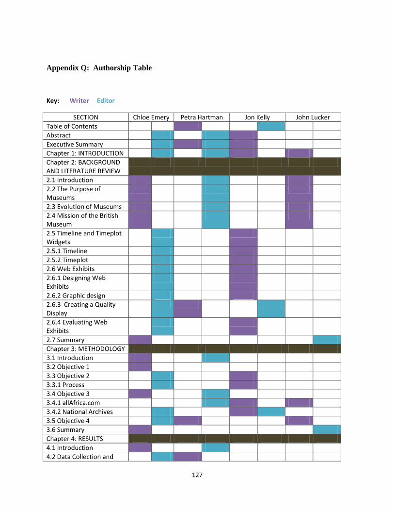
127
Appendix Q: Authorship Table
Key: Writer Editor
SECTION Chloe Emery Petra Hartman Jon Kelly John Lucker
Table of Contents
Abstract
Executive Summary
Chapter 1: INTRODUCTION
Chapter 2: BACKGROUND AND LITERATURE REVIEW
2.1 Introduction
2.2 The Purpose of Museums
2.3 Evolution of Museums
2.4 Mission of the British Museum
2.5 Timeline and Timeplot Widgets
2.5.1 Timeline
2.5.2 Timeplot
2.6 Web Exhibits
2.6.1 Designing Web Exhibits
2.6.2 Graphic design
2.6.3 Creating a Quality Display
2.6.4 Evaluating Web Exhibits
2.7 Summary
Chapter 3: METHODOLOGY
3.1 Introduction
3.2 Objective 1
3.3 Objective 2
3.3.1 Process
3.4 Objective 3
3.4.1 allAfrica.com
3.4.2 National Archives
3.5 Objective 4
3.6 Summary
Chapter 4: RESULTS
4.1 Introduction
4.2 Data Collection and
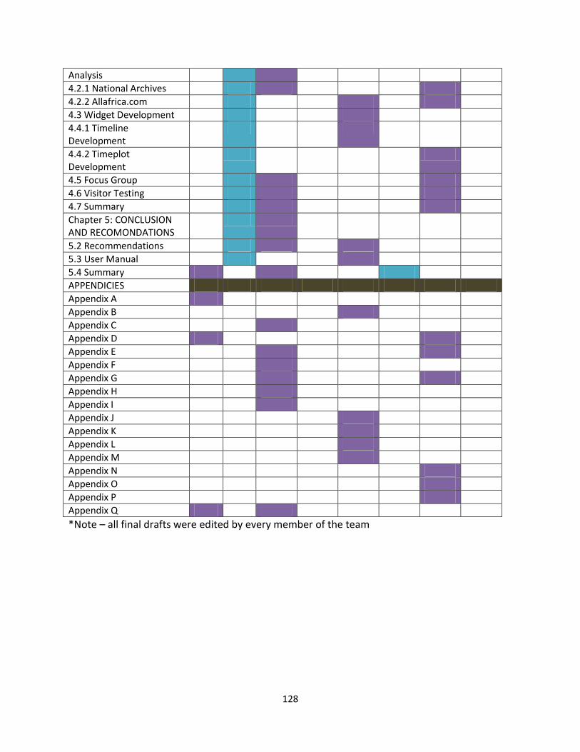
128
Analysis
4.2.1 National Archives
4.2.2 Allafrica.com
4.3 Widget Development
4.4.1 Timeline Development
4.4.2 Timeplot Development
4.5 Focus Group
4.6 Visitor Testing
4.7 Summary
Chapter 5: CONCLUSION AND RECOMONDATIONS
5.2 Recommendations
5.3 User Manual
5.4 Summary
APPENDICIES
Appendix A
Appendix B
Appendix C
Appendix D
Appendix E
Appendix F
Appendix G
Appendix H
Appendix I
Appendix J
Appendix K
Appendix L
Appendix M
Appendix N
Appendix O
Appendix P
Appendix Q
*Note – all final drafts were edited by every member of the team