office of geographic information systems - dakota … of geographic information systems print this...
TRANSCRIPT

Office of Geographic Information Systems Print this Page
Summer 2010 - GIS 101: Mapping Sensitive DataBy Mary Hagerman
Maps show us where things are and how they relate to other things in the vicinity. Mapping data, such as people,facilities, or events, can help us identify patterns, or trends, that might otherwise be difficult to visualize. A map ofclient locations, for instance, could be used for answering questions such as, ‘Where are there groupings ofclients?’, or ‘What would be the best location for a service provider?’ Unfortunately, many people succumb to thebelief that certain data cannot be mapped due to its protected or sensitive nature. It is possible, however, to mapsensitive data without compromising data privacy. There are techniques that can be used to show the distributionof sensitive data, aside from the old standard pin maps that show dots representing the actual locations.
An extremely basic method might be to map the dots at a scale that would allow the map reader to see thegeneral distribution of the dots, but not determine the actual location of any individual dot. Map scale refers to thearea the map covers, or how zoomed in the map is. A small-scale map shows a large area with only a smallamount of detail. A large-scale map shows a more zoomed-in, close-up area with a large amount of detail.Mapping sensitive data at a fairly small scale may be sufficient to protect data privacy concerns.
A better technique would be to use a method that doesnot show the individual dots at all. One such technique isto aggregate the data by some geographic unit, such asmunicipality, census tract, or patrol area. This is calledchoropleth mapping, and is a common technique formapping statistical data like census data. The number ofdots per geographic unit is normalized by area or percentof the total, and the units on the map are shadedaccordingly. This way the map reader can see thegeneral distribution, i.e. which areas have higher valuesthan others, but the individual dots are not shown. Forinstance, instead of mapping clients as dots, clientcounts for each municipality could be mapped as apercentage of the total number of clients.

Another common method for showing trends in sensitivedata is to create a density map. These maps are oftencalled hot spot or heat maps and are commonly used incrime mapping. A density map shows counts of dots byarea. But unlike choropleth maps, the areas used are notarbitrary, but uniform in size and much smaller,approximating the density at each location on the map.For instance, a density map might show counts persquare foot for a 10-foot grid cell. Density maps showmore accurate trends in the data as values can changemore gradually and naturally, not just at jurisdictionalboundaries.
There are other common mapping techniques which areNOT appropriate to use when mapping sensitive data.These include dot density mapping and data shifting. Dotdensity maps are similar to choropleth maps in that dataare aggregated and mapped by some geographic unit, butinstead of shading the units, the appropriate number ofdots is randomly distributed within the unit. Data shiftinginvolves randomly shifting the location of the individual
dots prior to mapping. Both methods are effective in protecting data privacy and in showing the general distributionof the data. However, both also tend to be misleading if the map reader is not familiar with the technique used.Because these methods show dots on the map, they may wrongly imply to the reader that the dots are at theactual locations.
There is no need to shy away from mapping just because the data you work with is sensitive. You can still takeadvantage of the benefits of mapping and spatial analysis. There are effective methods for illustrating trends indata without compromising data privacy. Contact a GIS specialist today to see how GIS can be used to get moreout of your sensitive data.
Copyright 2006 Dakota County, Minnesota

Office of Geographic Information Systems Print this Page
Summer 2010 - Tech Talk: ArcGIS Services
By Joe Sapletal, GISP
As we started to introduce new web applications running on ArcGIS Server, people started asking how they coulduse the "maps" (basemaps) we made for the web in their ArcMap documents? Being that those basemaps arerunning on ArcGIS Server, all they and you need to know is the URL for the server. Not only do you get access tothe basemaps, but access to other services that are currently available. This is a work in progress, and somethings are in their final published form and others are in beta.
The first thing you have to do is connect to the server in ArcCatalog.
1. Open ArcCatalog2. Click on GIS Servers3. Double click on Add ArcGIS Server4. Select Use GIS Services (the default)5. Click Next6. Under Internet Server URL http://gis2.co.dakota.mn.us/ArcGIS/Services7. Click Finish8. Back in ArcCatalog, right click on the connection name and choose Rename9. Name it Dakota County
Once you double click on it to open the connection you can seethe available services. Currently, there are only a few available,but more will appear in the coming months and existing onesmay go away as we consolidate services. As you can see inthis example, there are currently seven Map Services available. Map Services are services that are based on map documents. Itis also possible to have Image Services, which publish rasters(aerial photography) directly from the database; GeocodingServices; Geometry Services; and Geoprocessing Services, forspatial analysis. For a list of the available types and their
abilities visit the ESRI ArcGIS Server Resource Center. All of the services you find here will begin with DC, forDakota County. If you are loading basemaps from other organizations, this naming convention will help you asyou work with them in ArcMap.
DC_Basemap and DC_Basemap_Live contain identical data layers. The difference is that DC_Basemap iscached map tiles, while DC_Basemap_Live is accessing the data live from the database. There are trade-offs tousing one versus the other. Cached Map Services are pre-rendered tiles that aresent to ArcMap or the web map you are using so you don't have to wait for thebasemap to draw. If you use this service in ArcMap, you need to use the service'spredefined map scales and coordinate system or your map will not print outcorrectly. If you use the live basemap you will be able to use the map service atany scale and print a quality map, but it will draw a little slower. Both maps aresynchronized and display the same data within 24 hours of one another. The livebasemap, of course, will show published data immediately, but the cachedbasemap image tiles need to be updated and that process runs nightly.
OL? OL is short for Operational Layer. An Operational Layer is a layer or group oflayers in a map service that are separate from the basemap, but essential to a web map or map product. We

have a few OL's published that have a variety of layers available in them, from USNG grids to property information. DC_OL_DCPI was specifically created for Dakota County Property Information (DCPI). DCPI is the web map thatwill eventually replace the Real Estate Inquiry application. If you want to use the same map services as DCPI,you can use DC_Basemap, DC_Basemap_OrthoPlus and DC_OL_DCPI. Have you tried DCPI?
Dakota County isn't the only resource for basemaps and operational layers. Try adding these services:
Metropolitan Council - http://gis.metc.state.mn.us/arcgis/servicesMnDOT - http://gisservices.dot.state.mn.us/ArcGIS/servicesESRI - http://services.arcgisonline.com/arcgis/services
Many more can be found by visiting ArcGIS Online.
Copyright 2006 Dakota County, Minnesota

Office of Geographic Information Systems Print this Page
Summer 2010 - Department Spotlight: Understanding Transitioning Transit Services in
Dakota CountyBy Sam O'Connell, Dakota County Transit Office; Daren Nyquist, Dakota County Office of Planning and Analysis;and Mary Hagerman, Dakota County Office of GIS
A well-known and heavily-used transportation service, Dial-a-Ride, is changing. Along with a name change toTransit Link, the service area and eligibility for service will also expand. The restructuring effort, which began in2008 by the Metropolitan Council, aims to deliver Dial-a-Ride transit services that are equally available to allmembers of the general public throughout the seven-county metropolitan area where regular route transit service isnot available. In March 2010, the Metropolitan Council selected DARTS to be Dakota County’s Transit Linkprovider for five years.
The Transit Link program is a minibus or van service that provides point-to-point transportation or transportation totransit hubs for regular bus service. It is different from the Americans with Disabilities certified services provided byMetro Mobility, which serves riders who need additional assistance due to physical, cognitive or psychologicallimitations. Transit Link services are intended to supplement regular transit routes, rather than duplicate them.
The newly restructured Transit Link service will establish a consistent set of operating parameters – such as asingle phone number for reservations, consistent hours of operation and a uniform window for advanced tripreservations – for all providers throughout the seven-county region.
For Dakota County, Transit staff felt that this was an opportunity to begin collecting data and assessing thepossible transit needs in the County that could be used to inform the County’s Transit Plan. To assist in thiseffort, the Office of GIS prepared maps to help illustrate which areas are served by regular route service, whichareas would likely be served by Transit Link, and how and where the two might interact. The maps were sharedwith representatives from Dakota County cities to help them assess how the transition from Dial-a-Ride to TransitLink might affect their residents.

The maps show existing regular route service, areas representing reasonable walking distance to regular routeservice, transit hubs, and Transit Link ‘no transfer zones’. Riders whose origin and/or destination are within ½ mile (or ¼ mile in winter) of a regular route may be asked to useregular route service for all or part of the trip. The areas within ¼ mile and ½ mile of regular routes were shaded onthe maps to show the areas within walking distance of regular route service. When a trip combines Transit Linkservice and regular route service, transfers are made at transit hubs. Transit Link trip destinations within 2 miles ofa transit hub would not require a transfer. The areas within two miles of transits hubs were highlighted on themaps, revealing that these 2-mile ‘no transfer zones’ encompass large numbers of activity centers, suggestingthat many Transit Link riders may not have to transfer at all. Additionally, the maps were overlaid with a variety ofamenities representing possible trip origins and destinations, to attempt to speak to the questions, ‘Where are theriders?’ and ‘Where might they be going?’
In the near term, the purpose of the maps is to understand how the different types of transit services will worktogether, and to identify areas/riders that may be most affected by the transition. Longer term, the maps could beuseful for identifying potential high demand areas as well as for identifying potential improvements to servicesprovided. Efforts are also underway to map county clients and service providers to look for cost-savingopportunities and to get a better overall picture of the county’s transit needs.
The switch to the newly revamped Transit Link service is significant as Dakota County will have county-widetransit coverage. Dakota County will be seeking opportunities under the newly restructured program to coordinatemore efficient delivery of transit services with all transit providers. To assist in this transit planning andcoordination effort, Dakota County will be collecting and analyzing data that identifies the frequency, origins anddestinations of Community Service clients through frontline staff. This information could be used to either modifyregular bus route services or target certain populations for supplemental transportation services. This informationcan also be used to leverage additional Transit Link services for County clients, potentially creating savings intransportation costs for the County. This data collection will be an ongoing process through 2010 and 2011.
For more information on this article, contact Sam, Daren, or Mary. For more information on Transit Link, visithttp://www.transitlinktc.org or contact the Metropolitan Council.
Copyright 2006 Dakota County, Minnesota

Office of Geographic Information Systems Print this Page
Summer 2010 - Desktop GIS: Dakota County Business / Employer DataBy Randy Knippel
The Dakota County GIS database now includes businesses in Dakota County, withassociated information such as business name, type of business, number ofemployees, and more. This data is available to county and city staff through theDakota County GIS (DCGIS) online. It was developed using multiple sources to helpwith things like notifications and analysis.
In the past, it was difficult to determine business names and contact information.Departments have been on their own to maintain this kind of data to support theirbusiness processes. In other cases, departments and cities have contracted formailing lists and analysis of businesses in the community. This can now be done
using the County’s GIS database.
The Dakota County GIS online (DCGIS) allows you to see over 300 layers of GIS data. Much of this data isgenerated as a byproduct of government business functions in cities, counties, and state and regional agencies.Parcel data, for example, includes property boundaries from the Surveyor’s Office, value information fromAssessing Services, and ownership information from Property Taxation & Records. Although highly valuable andwidely used, one deficiency of this collection of data is that, while we know who owns a piece of property, wedon’t necessarily know who occupies it. This is especially evident when looking for information about businessesand employers. One parcel representing a strip mall actually hosts multiple businesses that lease space. At thesame time, questions regularly arise that can’t be answered directly using ownership information, such the sizeand type of business. There are also times when it may be important to know where specific types of businessesare, such as gas stations, grocery stores, restaurants, or heavy equipment operators.
Business data is available from several commercial sources for developing sales leads and performing marketanalysis. However, it is quite useful to support government business, too. Along with the specific examples
already cited, this data provides a new perspective on our community for a variety of purposes. Simply seeing thedistribution of all 12,000 employers, colored by the business classification code, reveals patterns of commercialcenters and home businesses.
The business classification system employs the North American Industry Classification System (NAICS), withcross-references to the older Standard Industrial Classification (SIC) system. Both systems provide a very detailedclassification of every business, which can be generalized to varying degrees. For example, the imageabove shows 13 major categories. However, one major category, Retail, comprised of 1780 records, can bebroken down into 12 subcategories including Food, Gasoline, Building Materials, and Clothing. One of thosesubcategories, Food, can be further broken down into detail subcategories including Liquor, Convenience, Fruitand Vegetable Markets, Meat Markets, and Supermarkets.
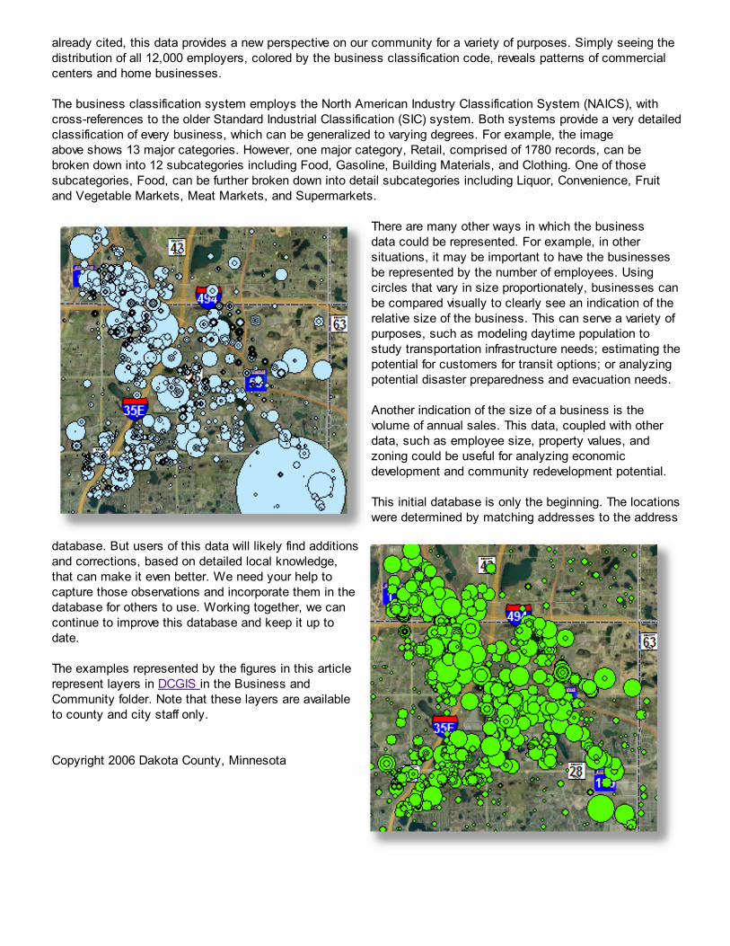
There are many other ways in which the businessdata could be represented. For example, in othersituations, it may be important to have the businessesbe represented by the number of employees. Usingcircles that vary in size proportionately, businesses canbe compared visually to clearly see an indication of therelative size of the business. This can serve a variety ofpurposes, such as modeling daytime population tostudy transportation infrastructure needs; estimating thepotential for customers for transit options; or analyzingpotential disaster preparedness and evacuation needs.
Another indication of the size of a business is thevolume of annual sales. This data, coupled with otherdata, such as employee size, property values, andzoning could be useful for analyzing economicdevelopment and community redevelopment potential.
This initial database is only the beginning. The locationswere determined by matching addresses to the address
database. But users of this data will likely find additionsand corrections, based on detailed local knowledge,that can make it even better. We need your help tocapture those observations and incorporate them in thedatabase for others to use. Working together, we cancontinue to improve this database and keep it up todate.
The examples represented by the figures in this articlerepresent layers in DCGIS in the Business andCommunity folder. Note that these layers are availableto county and city staff only.
Copyright 2006 Dakota County, Minnesota