november 13, 2014 13 excel features that developers should know (hosted by sql pass ba vc) the...
TRANSCRIPT

November 13, 201413 Excel Features that Developers Should Know
(Hosted by SQL PASS BA VC)
The Baker’s Dozen Business Intelligence
13 SQL Server /Business Intelligence
Productivity Tips
Kevin S. GoffMicrosoft SQL Server MVP

13 Excel Features for Developers 2
Kevin S. Goff – Brief BIO
• Developer/architect since 1987 / Microsoft SQL Server MVP• Columnist for CoDe Magazine since 2004,
“The Baker’s Dozen” Productivity Series”, 13 tips on a SQL/BI topic• Wrote a book, collaborated on a 2nd book• Frequent speaker for SQL Server community events and SQL Live!360
Conferences• Email: [email protected] • My site/blog: www.KevinSGoff.Net (includes SQL/BI webcasts)• Releasing some SQL/BI video courseware in 2015

13 Excel Features for Developers 3
• Why Excel?• Business Users rely on Excel for all sorts of
Custom Reporting - good application developers should have general awareness of “how” people are using the data
• Sometimes Excel is a good prototyping tool for reporting, and even for sanity-checking data
• Sometimes developers even use for their own personal projects!
Today’s Topic

13 Excel Features for Developers 4
1. What-If/Goal Seeking2. VLOOKUP3. Named Ranges4. Basic Pivot Tables against OLTP/OLAP Data Sources5. Pivot Table Options (Filters, Calculations, Visual Slicers)6. Pivot Charts and Sparklines7. Dynamic Coloring and Macros8. Power Pivot9. Power Pivot KPIs and DAX10. Power View11. MDX 12. A special Pivot Chart13. Recommended Reading
Topics for today

13 Excel Features for Developers 5
1-What-If/Goal Seeking
• If I scored above 85 on the first three tests….• What is the lowest score I can get on the fourth
test and still have an 85 average overall?Back to TOC

13 Excel Features for Developers 6
1-What-If/Goal Seeking
Want a loan for 20KWant to pay back in 5 yearsWe can afford $400 a month
What interest rate should we look for?
Set payment function first, then do a goal seek on the payment, to see how it changes the rate
Back to TOC

13 Excel Features for Developers 7
2-VLOOKUP• VLOOKUP• Specify:
– The value we want to lookup up
– The table range– The index
column for the return value
– Whether it’s an exact or approximate match
Back to TOC

13 Excel Features for Developers 8
3-Named Ranges
Lock References you want to freeze with the $ , or
create a named cell Range
Don’t use regular range, copy/paste won’t freeze absolute cell references
Lock References you want to freeze with the $ , or
create a named cell Range
Back to TOC

13 Excel Features for Developers 9
1. Can create Pivot Tables or Pivot Charts Against:1. Relational Databases or Views2. OLAP Cubes
2. “All the data” stays in the source, only the results of a query come into the Pivot Table or Pivot Chart
3. For years, the standard way to create analytics in Excel against data4. (We’ll see Power Pivot and how that changes things)
4-Basic Pivot Tables against data sources
Back to TOC

13 Excel Features for Developers 10
5-Pivot Table Options
Slices (Visual Filters)
We can redefine Reseller Sales as a
% of the Row Parent
Can sort each level
by $$$
Back to TOC

13 Excel Features for Developers 11
5-Pivot Table Options
Can implement a “top 5 and all other” manually, behind the scenes, with a copy of the first five rows,
and then a formula:=GETPIVOTDATA(A4, "Total") - SUM(F4:F8)
Back to TOC

13 Excel Features for Developers 12
6-Pivot Charts and Sparklines
Visual Sparkline
Dynamic coloring for high month and low month for each country. Build as a
macro for one row and then re-execute
Back to TOC

13 Excel Features for Developers 13
7-Dynamic Coloring and Macros
Start recording a macroSet Dynamic Conditional Formatting
from the Home Menu dropdownStop recording the macro
Do it for both Top 1 and Bottom 1, and then concatenate one macro
into the other
Back to TOC

13 Excel Features for Developers 14
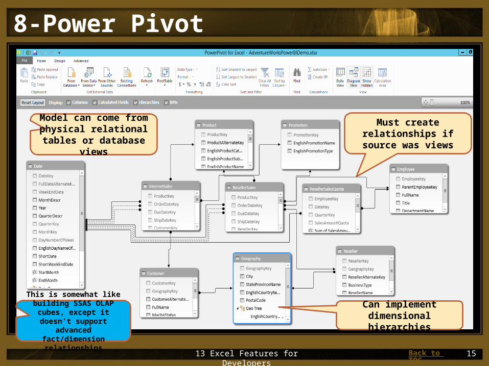
8-Power Pivot
Compressed Star Schema Model “in the basement” of the Excel Sheet
1. Users can point Excel to database content
2. Can create the equivalent of a “mini-cube”, compressed using xVelocity compression
3. The Power Pivot Data Model lives “inside” the Excel Sheet
4. Users can create many Pivot Tables or Pivot Charts off the Model
5. Users can also create Power View report visualizations off the data model
Back to TOC
13 Excel Features for Developers 15
8-Power Pivot
Model can come from physical relational
tables or database views
Must create relationships if source
was views
Can implement dimensional hierarchies
This is somewhat like building SSAS OLAP cubes, except it doesn’t support advanced
fact/dimension relationships
Back to TOC

13 Excel Features for Developers 16
8-Power Pivot
KPI scorecards in Excel, similar to other
SharePoint dashboarding tools
Garrett’s sales as % of Quota was 80.18%. That’s “OK”, so status is yellow. But his sales one year ago was 85.13% of
quota – so his % of quota is trending down, and that’s not good
The % of Quota last year represents a DAX formula to express the % of quota for “same time period last year”
User can look at
sales and quotas by Employee for a year
or a quarter
Back to TOC

13 Excel Features for Developers 17
8-Power Pivot
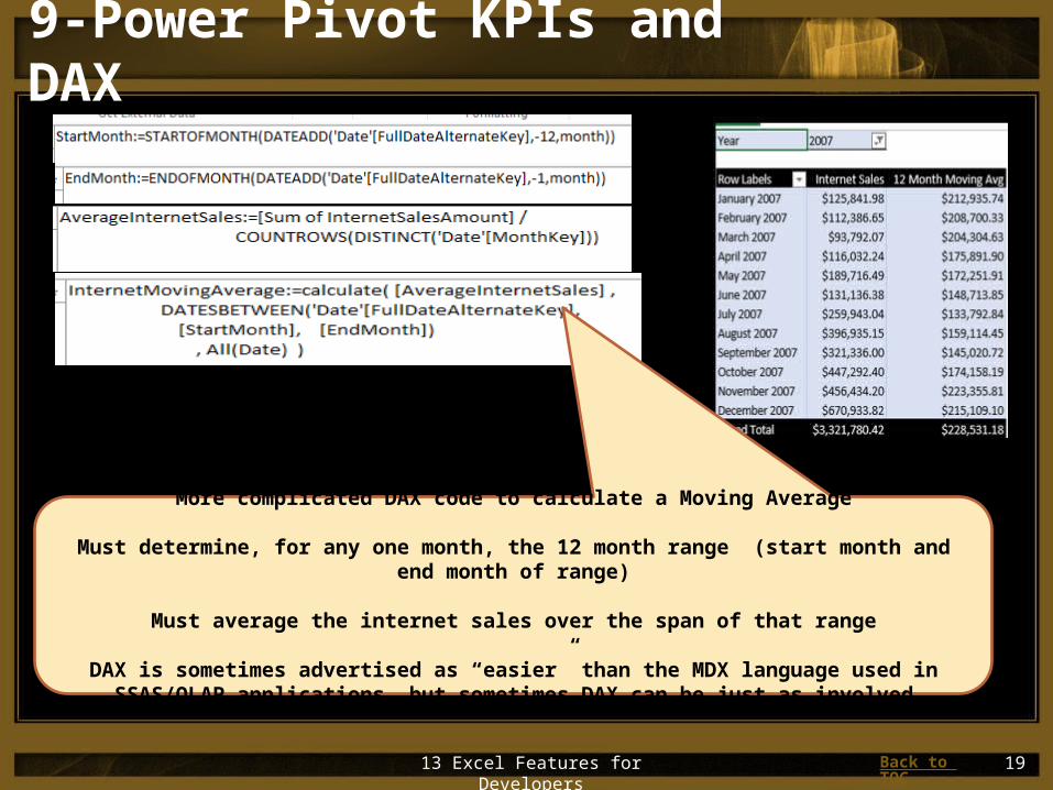
Monthly Sales + 12 month moving average, plotted as a line chart
(Requires a set of DAX formulas)
Back to TOC

13 Excel Features for Developers 18
9-Power Pivot KPIs and DAX
DAX formula to express % of Quota in terms of
one year ago
Calculate a ratio on the fly: not too bad
Express in terms of a year ago: arguably a bit more involved
Back to TOC
13 Excel Features for Developers 19
9-Power Pivot KPIs and DAX
More complicated DAX code to calculate a Moving Average
Must determine, for any one month, the 12 month range (start month and end month of range)
Must average the internet sales over the span of that range
DAX is sometimes advertised as “easier” than the MDX language used in SSAS/OLAP applications, but sometimes DAX can be just as involved
Back to TOC

13 Excel Features for Developers 20
10-Power View
• Report Visualization Tool for Power Users• Great for storyboard-type reporting, “face-
style” reporting where a page or subset of a page tells a story
• Not intended for full blown detail reports• Not as much developer functionality as
Reporting Services
Back to TOC

13 Excel Features for Developers 21
10: Power ViewPower View visualization against the Power Pivot
Data Model
User can filter on Country – State
Province
Scatter chart plotting city
observations of Sales revenue and
# of orders
Can use year as “Play axis” to show that while Beaverton is top city in
Oregon across all years, it wasn’t top city
in 2007
TOC Back to TOC

13 Excel Features for Developers 22
10: Power View
We can even select a single city and plot the progression of
annual sales for a city over time
While this has nice interactive features, advanced users might want to show a linear regression line, and also the correlation coefficient (impact of order count on
sales)
Here is where tools like SSRS or even Excel Pivot Charts are a better option – Power View does not have these
features
TOC Back to TOC

13 Excel Features for Developers 23
10: Power View
Cross filtering – I can click on the pie slice for Australia, and the bar chart above shades the monthly sales just for Australia
TOC Back to TOC

13 Excel Features for Developers 24
11-Custom MDX in OLAP Pivot Tables
When using OLAP cubes and we need to write custom MDX calculations, can use a
free add-in: Excel OLAP PivotTable Extensions
http://olappivottableextend.codeplex.com/
Back to TOC

13 Excel Features for Developers 25
12-A special Pivot Chart
Observation points in a scatter graph: each marker represents a city, their #
of customers (bottom axis) and Internet sales (left axis). Chart shows relationship between the 2 variables
Pearson correlation: measures the correlation or strength of linear dependence.
.85 to 1 = strong correlation.75 to .85 = moderate correlation
< .75 = weak correlation (not very reliable)
Regression trendline: shows slope calculation (every 1 customer results in $1508.7 + $)4640.9 in revenue)
R-squared represents “goodness of fit” of plotted points relative to trendline (closer the line passes
through the points, closer to 1 is the value)
We can create this spreadsheet in Excel against OLAP data,
deploy to SharePoint, and then use in a PPS dashboard, and take advantage of PPS filters
Bottom axis: Customer Count by City
Y-axis: revenue by city
Back to TOC

13 Excel Features for Developers 26
13-Recommended Reading
Back to TOC
• Great blog content for Excel, Power Pivot, DAX, Power BI, etc.• They are great resources for newer features in Power BI (Power
Maps, Power Query, etc)
• Chris Webb's Blog• Alberto Ferrari's Blog• Marco Russo's Blog