new york state brand guidelines
TRANSCRIPT

New York State Branding Overview
and Guidelines and Architecture
Revised 01/08/15
NEW YORK STATE BRAND GUIDELINES 2
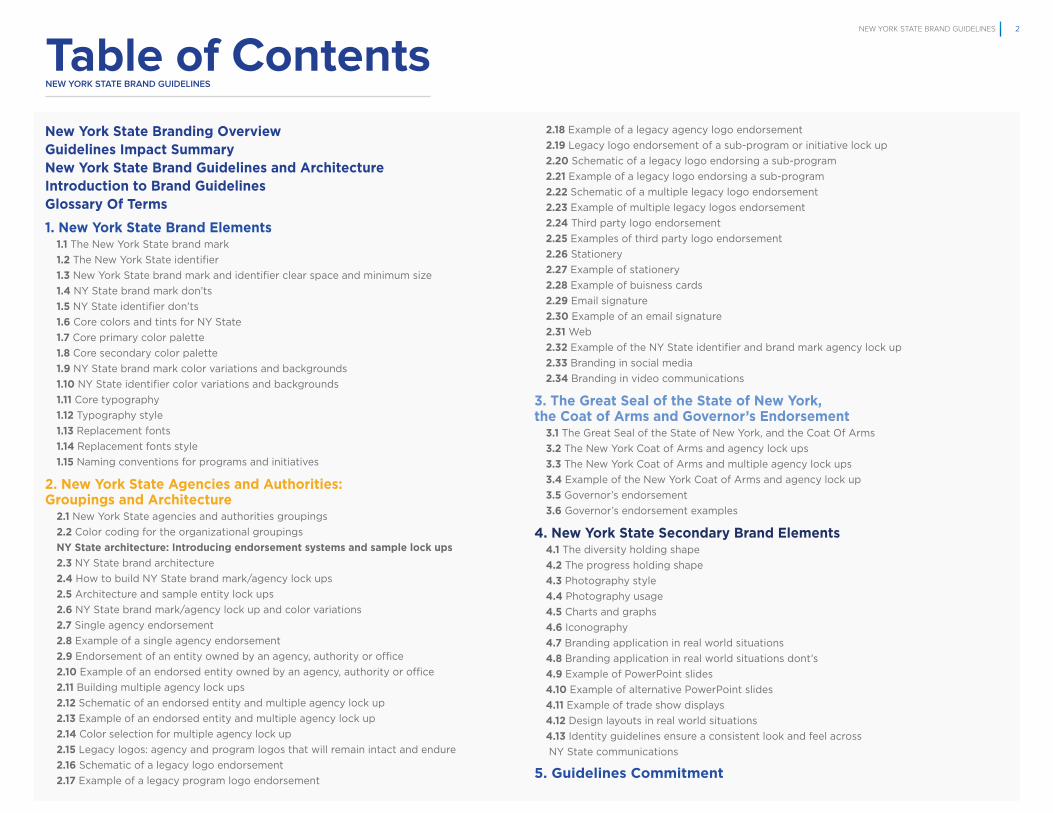
Table of Contentsnew york STATe BrAnD GUIDeLIneS
New York State Branding OverviewGuidelines Impact SummaryNew York State Brand Guidelines and ArchitectureIntroduction to Brand GuidelinesGlossary Of Terms
1. New York State Brand Elements1.1 The New York State brand mark
1.2 The New York State identifier
1.3 New York State brand mark and identifier clear space and minimum size
1.4 NY State brand mark don’ts
1.5 NY State identifier don’ts
1.6 Core colors and tints for NY State
1.7 Core primary color palette
1.8 Core secondary color palette
1.9 NY State brand mark color variations and backgrounds
1.10 NY State identifier color variations and backgrounds
1.11 Core typography
1.12 Typography style
1.13 Replacement fonts
1.14 Replacement fonts style
1.15 Naming conventions for programs and initiatives
2. New York State Agencies and Authorities:Groupings and Architecture
2.1 New York State agencies and authorities groupings
2.2 Color coding for the organizational groupings
NY State architecture: Introducing endorsement systems and sample lock ups
2.3 NY State brand architecture
2.4 How to build NY State brand mark/agency lock ups
2.5 Architecture and sample entity lock ups
2.6 NY State brand mark/agency lock up and color variations
2.7 Single agency endorsement
2.8 Example of a single agency endorsement
2.9 Endorsement of an entity owned by an agency, authority or office
2.10 Example of an endorsed entity owned by an agency, authority or office
2.11 Building multiple agency lock ups
2.12 Schematic of an endorsed entity and multiple agency lock up
2.13 Example of an endorsed entity and multiple agency lock up
2.14 Color selection for multiple agency lock up
2.15 Legacy logos: agency and program logos that will remain intact and endure
2.16 Schematic of a legacy logo endorsement
2.17 Example of a legacy program logo endorsement
2.18 Example of a legacy agency logo endorsement
2.19 Legacy logo endorsement of a sub-program or initiative lock up
2.20 Schematic of a legacy logo endorsing a sub-program
2.21 Example of a legacy logo endorsing a sub-program
2.22 Schematic of a multiple legacy logo endorsement
2.23 Example of multiple legacy logos endorsement
2.24 Third party logo endorsement
2.25 Examples of third party logo endorsement
2.26 Stationery
2.27 Example of stationery
2.28 Example of buisness cards
2.29 Email signature
2.30 Example of an email signature
2.31 Web
2.32 Example of the NY State identifier and brand mark agency lock up
2.33 Branding in social media
2.34 Branding in video communications
3. The Great Seal of the State of New York, the Coat of Arms and Governor’s Endorsement
3.1 The Great Seal of the State of New York, and the Coat Of Arms
3.2 The New York Coat of Arms and agency lock ups
3.3 The New York Coat of Arms and multiple agency lock ups
3.4 Example of the New York Coat of Arms and agency lock up
3.5 Governor’s endorsement
3.6 Governor’s endorsement examples
4. New York State Secondary Brand Elements4.1 The diversity holding shape
4.2 The progress holding shape
4.3 Photography style
4.4 Photography usage
4.5 Charts and graphs
4.6 Iconography
4.7 Branding application in real world situations
4.8 Branding application in real world situations dont’s
4.9 Example of PowerPoint slides
4.10 Example of alternative PowerPoint slides
4.11 Example of trade show displays
4.12 Design layouts in real world situations
4.13 Identity guidelines ensure a consistent look and feel across
NY State communications
5. Guidelines Commitment

NEW YORK STATE BRAND GUIDELINES 3
New York State Branding Overview

NEW YORK STATE BRAND GUIDELINES 4
The OpportunityNew York State has the opportunity to accrue the benefits that come from a clear, consistent and
accurate representation of itself. We will accomplish this through the creation and management
of our brand across all agencies, authorities and programs and on all of their respective pieces of
communication.
Benefits of Branding for New York State• Consistent graphic approach
• More effective messaging
• More efficient materials creation
• Better ‘‘customer’’ experience and enhanced service delivery
Our Approach• Research driven
• Input from residents, business owners, leaders and tourists
• Collaboration across agencies

NEW YORK STATE BRAND GUIDELINES 5
New York State Brand Platform
STATE OFOPPORTUNITY
INSPIRING: a leader, compelling, motivating
DYNAMIC: energetic. always on
AUTHENTIC: true to beliefs, keeps promises
COMPASSIONATE: attuned to the needs of others
PROGRESSIVE THINKING: NYS believes in leading change
DIVERSITY: NYS believes that di�erences, creativity, and originality enrich
RESILIENCE: NYS believes in never giving up, never giving in
NY StateBrand
Promise
The idea we want to convey
NY StateBrand
Personality
The personality we want to project.
NY StateBrandValues
The perceptionswe build on

NEW YORK STATE BRAND GUIDELINES 6
Guidelines Impact Summary
• New York State brand logo will be mandatory for agency and/or program communications.
• No agency, program or initiative will use or create its own logo with the following exceptions:
NY State Lottery, MTA, ILNY, 511, Start Up NY. These legacy logos will still be required to
co-brand their materials and follow all other branding guidelines.
• PANYNJ, SUNY and State Education Departments are exempt from branding guidelines.
• The Great Seal of the State of NY will be standardized and available for use only by the
Governor’s office or with permission of the Secretary of State. The Coat of Arms will be used
only for legal documents (e.g., registration, etc.).
• The Governor’s office will have a distinctive set of guidelines and templates for exclusive use
to communicate Governor’s office initiatives.
• There are nine agency groupings which should define taxonomy in all enterprise initiatives.
• Each grouping - and the agencies within each grouping - have an associated color palette.

NEW YORK STATE BRAND GUIDELINES 7
The New York StateBrand Guidelines and Architecture

NEW YORK STATE BRAND GUIDELINES 8
Introduction to theBrand Guidelines
What brand guidelines are
Brand guidelines are a set of visual and verbal assets that are essential properties of the New York State brand, accompanied
by a set of rules on how to properly use and combine the assets.
What a brand architecture is
A brand architecture is a set of rules governing hierarchies and relationships for the state and its agencies,
programs and initiatives.
Insuring a consistent look and feel
These guidelines are designed not to curb creativity when representing New York State and/or the entities of NY State, but
rather to provide a unifying context for creativity so that—in different materials produced by different individuals— the New York
State brand and architecture retain their integrity.
Your responsibilities
By familiarizing yourself with these guidelines and following them, you are fulfilling your part in helping the New York State brand
remain focused so that it stays true to itself and flourishes. This is a great responsibility, and we thank you for honoring it.

NEW YORK STATE BRAND GUIDELINES 9
Glossary of Terms
Anchor line: The vertical or horizontal line used in lock ups that separates one entity from
another (e.g. an agency from one of its programs); or the line that anchors an agency or
program/initiative in a piece of communication in the absence of an endorsing entity. (See
page 32 for an example.)
Architecture: The hierarchy and relative relationships that define how New York State
and its various entities visually appear together in communications. The architecture has
several levels, where Level 1 (NY State) is the primary governing entity in visual display. The
entities on levels successively below are assigned visual governance status as secondary
(Level 2), tertiary (Level 3) and so on. The NY State brand architecture helps guide and
streamline the appearance of all entities under the purview of the state.
Color palette: A set of approved colors to be used when representing the NY State brand,
as well as the nine groupingsof agencies and initiatives.
Endorsement: How one entity in the state government visually supports or sponsors
another in communications. It represents a hierarchy of entities, where there are secondary
and/or tertiary entities that are endorsed by a primary entity. This is represented visually
in the architecture system (see definition above). An “endorsing entity” is higher up in the
architecture than an “endorsed entity.” The highest entity in the architecture is NY State. NY
State will always be an “endorsing entity.” (See pages 85-89 for examples.)
Entity: A catch-all phrase for state agencies, offices, authorities, programs and initiatives.
Footprint: The surface area taken up by entities either alone or in lock ups in visual dis-
play. A footprint can be measured in a ratio: for example, 2” high x 3” wide.
Grouping: One of eight categories of NY State government services under which all agencies
and initiatives are organized for the purposes of visual display, and to make searching for
those agencies and initiatives by citizens, businesses and visitors easier and more intuitive.
Holding shape: A geometric configuration that provides a spatial context in which visual
and/or verbal elements are contained, or “held.” These shapes are intended to ensure
consistency of how visual or verbal information is presented in media so that communi-
cations from any agency, office or program under the purview of NY State have a familial
resemblance. They are scalable and designed to accommodate a variety of color, text and
visuals for creativity and flexibility in design. (See page 74-75 for examples.)
Iconography: The use of simple stylized, illustrated images to rapidly convey the location
or intention of information. These are often seen on “buttons” for smart phones and signs.
Examples include the image of a clock face to signify a time-related matter; the image of a
shopping cart to signify a purchase; or the image of a back arrow to signify navigation. (See
page 79 for an example.)
Lock up: How different elements (color, shape, type, tag line) or different entities (NY State,
agencies, programs) integrate as a unit. These can be mono lock ups, where only one en-
tity is represented; duo lock ups, where two entities are represented in a fixed relationship
to each other; and multiple lock ups, where three or more entities are represented in a
fixed relationship to each other. (See page 32 for an example.)
NY State brand mark: The primary visual representation of NY State in communications
using color, typography, tag line and shape of the state. (See page 11 for an example.)
NY State identifier: The brand mark without the tag line that is used as the visual representa-
tion when the «state of opportunity» tag line is not appropriate. (See page 12 for an example.)
Verbal assets: Verbal properties of the brand system, such as the tag line
(State of Opportunity).
Visual assets: Visual properties of the brand system, such as brand mark, identifier,
typography, color, photography, illustrations, charts, etc.

NEW YORK STATE BRAND GUIDELINES 10
What brand elements are
They are the foundational building blocks of the NY State brand in all
communications and media. These are the NY State brand mark, the NY State
identifier, color palette, typography and tag line.
Strategy drives design choices
Visual and verbal assets are not subjective or accidental. They are purposefully
chosen based on a central strategy. This strategy has two components: The Brand Promise
and The Brand Character. (See the Brand Platform on page 4).
These elements are not open to much interpretation
Because these elements and their relation to each other are so essential to the New York
State brand, the guidelines around these primary brand elements are very specific and
not open to much interpretation.
1. New York State Brand Elements

NEW YORK STATE BRAND GUIDELINES 11
Optibea ipsume poribust et molupta volorroviti aborem. Itatur,
sinvell aborestrunt resentur reprovide aut velectis corerem ex
evendia mendio ommodissit, con cumquia cum il et accabo-
rum sero quatias Aquibus, quae. Nem unt aut et ex eos sus,
inis utet et asperum fugiati ostiur a nobitam, ius, consequat
reribus.
Ferem. Evento berum quam fuga. Ut antiatat lamusa nestisin
rercide mporibus sum fugit alit officiuribus quae optatibus sed
eatemqu aepudis eaquistias nem expliquis quia quia quam
laut fuga. Ut eveles es autemolutem nos ad mo tem laute
nietur simaio.
Derum et omnias vellabores cusaper eptaspe rovidessum
que ex estio temo tet dolest re volupta nonem. Aborit offic tet
officipienda eatur molupta spicidem dolupti qui vellab in est,
a cullab ipit et officil iniende risint harumet alitemodi te aut
estoria abor solo eaquatent.
Aquibuscid ut explaboribus ducim idestem rerunt ipsandit la
dolut magnatibus.
Issitia tumquam quia voluptat dipsapienis et, ulpa nonsequa-
tur?
Asped quam, testo elis et velit faccabo. Es ditaque lis nullor-
rupit eos re quUdanti nossi te nobis iniaectem ra conem elita
idelici andelen deligen dandici tioria cupit, sit atiat eaquidu
cimus, vellupt aturit estiam fugia sitam fugit as doluptatures
conessincium autempor maxim aliam, veles ea nos sinvenis
maiorerias aut di conem quat omsedis eatus prae.
FPO
1.1new york STATe BrAnD eLemenTS
THE NEW YORK STATE BRAND MARK
New York State brand mark
To the right is the New York State brand mark—the first of
its kind. It will be a registered trademark, protected by the
Trademark Act of the United States of America. It features the
outline of New York State in a gradient blue color, intersecting
with the name of the state in gold, and the tag line in blue:
State of Opportunity.
The tag line
An integral part of the brand mark, the tag line is an expression
of the brand strategy, the brand promise (State of Opportunity),
along with the brand character personality traits (Inspiring,
Dynamic, Compassionate and Authentic).
When to use the brand mark
The brand mark is the universal primary brand mark for NY
State. It should be used whenever possible and appropriate.
For exceptions, please see the next page, the NY State
identifier.
Please see the following pages for guidelines regarding how
it should be deployed.
NEW YORK STATE BRAND MARK
THE BRAND MARK BELOW IS THE SOLE AND PRIMARY BRAND MARKFOR NY STATE. IT SHOULD BE USED WHENEVER POSSIBLE AND APPROPRIATE.

NEW YORK STATE BRAND GUIDELINES 12
Optibea ipsume poribust et molupta volorroviti aborem. Itatur,
sinvell aborestrunt resentur reprovide aut velectis corerem ex
evendia mendio ommodissit, con cumquia cum il et accabo-
rum sero quatias Aquibus, quae. Nem unt aut et ex eos sus,
inis utet et asperum fugiati ostiur a nobitam, ius, consequat
reribus.
Ferem. Evento berum quam fuga. Ut antiatat lamusa nestisin
rercide mporibus sum fugit alit officiuribus quae optatibus sed
eatemqu aepudis eaquistias nem expliquis quia quia quam
laut fuga. Ut eveles es autemolutem nos ad mo tem laute
nietur simaio.
Derum et omnias vellabores cusaper eptaspe rovidessum
que ex estio temo tet dolest re volupta nonem. Aborit offic tet
officipienda eatur molupta spicidem dolupti qui vellab in est,
a cullab ipit et officil iniende risint harumet alitemodi te aut
estoria abor solo eaquatent.
Aquibuscid ut explaboribus ducim idestem rerunt ipsandit la
dolut magnatibus.
Issitia tumquam quia voluptat dipsapienis et, ulpa nonsequa-
tur?
Asped quam, testo elis et velit faccabo. Es ditaque lis nullor-
rupit eos re quUdanti nossi te nobis iniaectem ra conem elita
idelici andelen deligen dandici tioria cupit, sit atiat eaquidu
cimus, vellupt aturit estiam fugia sitam fugit as doluptatures
conessincium autempor maxim aliam, veles ea nos sinvenis
maiorerias aut di conem quat omsedis eatus prae.
FPO
1.2new york STATe BrAnD eLemenTS
THE NEW YORK STATE IDENTIFIER
New York State identifier
To the right is the New York State Identifier. It is similar to
the brand mark, but does not have the tag line. It will be a
registered trademark, protected by the Trademark Act of the
United States of America. It features the outline of New York
State in a gradient blue color, intersecting with the name of the
state in gold.
When to use the identifier
The identifier is used instead of the brand mark in three
exceptions: 1) when the content of the communication is at
odds with the spirit of the tag line: State of Opportunity.
Example: the sensitive nature of communications from Domestic
Violence Prevention may be compromised by the spirit of
the tag line. 2) online when size restrictions make using the
brand mark impractical; or 3) on products and other printed
material where there are size restirictions (see page 80-81 for
examples).
Please see the following pages for guidelines regarding how
it should be deployed.
NEW YORK STATE IDENTIFIER
THE IDENTIFIER IS USED INSTEAD OF THE BRAND MARK IN THREE EXCEPTIONS. PLEASE REFER TO THE COPY ON THELEFT FOR FURTHER EXPLANATION.

NEW YORK STATE BRAND GUIDELINES 13
Optibea ipsume poribust et molupta volorroviti aborem. Itatur,
sinvell aborestrunt resentur reprovide aut velectis corerem ex
evendia mendio ommodissit, con cumquia cum il et accabo-
rum sero quatias Aquibus, quae. Nem unt aut et ex eos sus,
inis utet et asperum fugiati ostiur a nobitam, ius, consequat
reribus.
Ferem. Evento berum quam fuga. Ut antiatat lamusa nestisin
rercide mporibus sum fugit alit officiuribus quae optatibus sed
eatemqu aepudis eaquistias nem expliquis quia quia quam
laut fuga. Ut eveles es autemolutem nos ad mo tem laute
nietur simaio.
Derum et omnias vellabores cusaper eptaspe rovidessum
que ex estio temo tet dolest re volupta nonem. Aborit offic tet
officipienda eatur molupta spicidem dolupti qui vellab in est,
a cullab ipit et officil iniende risint harumet alitemodi te aut
estoria abor solo eaquatent.
Aquibuscid ut explaboribus ducim idestem rerunt ipsandit la
dolut magnatibus.
Issitia tumquam quia voluptat dipsapienis et, ulpa nonsequa-
tur?
Asped quam, testo elis et velit faccabo. Es ditaque lis nullor-
rupit eos re quUdanti nossi te nobis iniaectem ra conem elita
idelici andelen deligen dandici tioria cupit, sit atiat eaquidu
cimus, vellupt aturit estiam fugia sitam fugit as doluptatures
conessincium autempor maxim aliam, veles ea nos sinvenis
maiorerias aut di conem quat omsedis eatus prae.
FPO
new york STATe BrAnD eLemenTS
1.3
CLEAR SPACE
N = HEIGHT OF THE “N” IN NEW YORK STATE
MINIMUM SIZE
THE NEW YORK STATE BRAND MARK THE NEW YORK STATE IDENTIFIER
THE NEW YORK STATE BRAND MARK THE NEW YORK STATE IDENTIFIER
.25 Inches.25 Inches
NEW YORK STATE BRAND MARK AND IDENTIFIER: CLEAR SPACE AND MINIMUM SIZE
Clear space
To ensure the proper prominence and legibility of the New
York State brand mark and identifier, always surround it with a
minimum amount of clear space. This clear space isolates the
brand mark and identifier from competing elements such as
text, photography or background patterns that may
compromise its appearance.
The clear space for the brand mark and identifier is equal to
the height of the first letter of the state name (N), in whatever
size in which the brand mark and identifier are reproduced.
Minimum size
The NYS brand mark and identifier can be used in a wide
variety of sizes, but when sized too small, legibility is reduced
and impact is diminished. The minimum size is determined by
the height of the lock up. The brand mark and its tag line and
the identifier should never appear smaller than .25” in height,
and only at that size if production standards ensure legibility.
Trademark
The brand mark and identifer are trademarked. As illustrated
by examples on this page, the TM should be used when space
allows for it to be clearly legible.

14
new york STATe BrAnD eLemenTS
1.4
To the right are several examples of how you should NOT
represent the NYS brand mark. This is by no means a
complete list. These examples represent the ‘‘don’ts’’ most
commonly used when guidelines are violated.
Video application and 3D rendering
The primary display of the brand mark and identifier is as a
two-dimensional image. With the exception of signage and
plaques, do not represent the brand mark or identifier in 3D. In
video communications, animations and 3D renderings are per-
mitted as long as the NY State brand mark retains its integrity
and a dignified presence. For example, don’t spin or distort the
brand mark in any way.
NEW YORK STATE BRAND MARK “DON’TS”
BRAND MARK DON’TS
DO NOT CHANGE THE BRAND MARK COLOR
DO NOT CHANGE THEBRAND MARK PROPORTION
DO NOT ADD DROP SHADOWS OR OTHER EFFECTS TO THE BRAND MARK
DO NOT OUTLINE THE BRAND MARK
DO NOT ROTATE THE BRAND MARK
DO NOT LOCK UP PRODUCTIDENTIFIERS OR PRODUCT DESCRIPTIONS WITH THE BRAND MARK
DO NOT PLACE THE BRAND MARK ON A COMPLICATED BACKGROUND OR A BACKGROUND THAT REDUCESITS LEGIBILITY
DO NOT REMOVE THE STATE OUTLINE FROM THE BRAND MARK
DO NOT USE THE PREFERRED BRAND MARK ON A DARK BACKGROUND
DO NOT CROP THE BRAND MARK DO NOT USE THE BRAND MARK IN A HOLDING BOX OR OTHER SHAPE
TRANSPORTATION
NEW YORK STATE IDENTITY GUIDELINES

15
new york STATe BrAnD eLemenTS
1.5
To the right are several examples of how you should NOT
represent the NYS identifier. This is by no means a complete
list of examples. These examples represent the ‘‘don’ts’’ most
commonly used when guidelines are violated.
Video communication and 3D rendering
The primary display of the brand mark and identifier is as a
two-dimensional image. With the exception of signage and
plaques, do not represent the brand mark or identifier in 3D.
In video communications, animations and 3D renderings are
permitted as long as the NY State identifier retains its integrity
and a dignified presence. For example, don’t spin or distort the
identifier in any way.
NEW YORK STATE IDENTIFIER “DON’TS”
IDENTIFIER DON’TS
DO NOT CHANGE THEIDENTIFIER’S COLOR
DO NOT CHANGE THEIDENTIFIER’S PROPORTION
DO NOT ADD DROP SHADOWS OR OTHER EFFECTS TO THE IDENTIFIER
DO NOT OUTLINE THE IDENTIFIER
DO NOT ROTATE THE IDENTIFIER
DO NOT LOCK UP PRODUCT DESCRIPTIONS WITH YOU THE IDENTIFIER
DO NOT PLACE THE IDENTIFIERON A COMPLICATED BACKGROUND OR A BACKGROUND THAT REDUCESITS LEGIBILITY
DO NOT REMOVE THE STATE OUTLINE FROM THE IDENTIFIER
DO NOT USE THE PREFERRED IDENTIFIER ON A DARK BACKGROUND
DO NOT CROP THEIDENTIFIER
DO NOT USE THE IDENTIFIERIN A HOLDING BOX OR OTHER SHAPE
TRANSPORTATION
NEW YORK STATE BRAND GUIDELINES

NEW YORK STATE BRAND GUIDELINES 16
FPO
new york STATe BrAnD eLemenTS
1.6
Legacy colors
The New York State color palette retains the the gold and dark
blue most often used in NYS communications. Gold evokes
the value of being inspiring, while the dark blue evokes the
value of being authentic—two personality traits in the state’s
brand character.
New colors
To help convey another personality trait in the brand character
(dynamic), a light blue has been added, enlivening the palette
overall, yet in keeping with the legacy colors. The light blue
can be used as a solid color, or in a blue gradient as shown to
the right.
How to combine colors
Other than the fixed use of colors specified in these guidelines
for the NY State brand mark, color selection for communica-
tions is open to any combination as long as the selections
are from the NY State color palette. Colors may be used for
backgrounds, as text, as borders or accents to graphic images
or photography, etc.
Color formulas for the entire palette can be found on the next
two pages.
CORE COLORS AND TINTS FOR NEW YORK STATE
GRADIENT BLUE
GOLD LIGHT BLUE DARK BLUE
NYS CORE COLOR PALETTE

NEW YORK STATE BRAND GUIDELINES 17
FPO
new york STATe IDenTITy eLemenTS
1.7
Color selection is driven by the brand strategy
The NYS primary color palette is intended to be inspiring,
dynamic and authentic. The consistent use of the core colors
helps define and reinforce our distinctive brand character,
and should be used on all communications and promotional
materials.
Color formulas to reproduce color accurately
We have enlisted the standards of the Pantone Matching
System (PMS), which is a universally recognized color
matching system based on lithography printing inks. The
color palette includes 1) specific spot color references for
both coated and uncoated paper stocks, and 2) process
match breakdowns (CMYK) for printing applications with limited
budgets. (Please note that these numbers may differ due to
the way inks appear on different stocks.) Also included are
RGB equivalents for use in word processing and presentation
software, as well as hexadecimal equivalents for emitted light
and web applications.
All color breakdowns in the Brand Guidelines are based
on the Official Pantone Matching System 2015. They are
optimized for the majority of computer monitors, operating
systems and browsers. Adhering to the Pantone matching
system will allow for color to be reproduced and displayed in
the most unified and consistent manner possible.
When working in your software application, always create the
color by entering the values for the Pantone colors supplied
here for either CMYK, RGB or Hex.
CORE PRIMARY COLOR PALETTE
NYS PRIMARY CORE COLORS
CMYK 100/90/6/1
RGB 35/62/144
HEX #233E90
CMYK 71/15/0/0
RGB 30/169/225
HEX #1EA9E1
PANTONE
130 C
CMYK 0/32/100/0
RGB 242/169/0
HEX #F2A900
PANTONE
3005 C
CMYK 100/31/0/0
RGB 0/119/200
HEX #0077C8
PANTONE
288 C
CMYK 100/80/6/32
RGB 0/45/114
HEX #002D72

NEW YORK STATE BRAND GUIDELINES 18
FPO
new york STATe BrAnD eLemenTS
1.8
Rationale for secondary colors
The secondary color palette is designed to support and
complement the primary color palette. They are percentages,
or tints, of the primary colors. Taken together the primary and
secondary colors enable flexibility and variety in design.
Color formulas to reproduce color accurately
We have enlisted the standards of the Pantone Matching Sys-
tem (PMS), which is a universally recognized color matching
system based on lithography printing inks. The color palette
includes 1) specific spot color references for both coated and
uncoated paper stocks, and 2) process match breakdowns
(CMYK) for printing applications with limited budgets. (Please
note that these colors may differ due to the way inks appear
on different stocks.) Also included are RGB equivalents for
use in word processing and presentation software, as well as
hexadecimal equivalents for emitted light and web applications.
CORE SECONDARY COLOR PALETTE
NYS SECONDARY CORE COLORS
PANTONE
109 C
CMYK 0/9/100/0
RGB 255/209/0
HEX #FFD100
PANTONE
127 C
CMYK 0/4/62/0
RGB 243/221/109
HEX #F3DD6D
PANTONE
2925 C
CMYK 85/21/0/0
RGB 0/156/222
HEX #009CDE
PANTONE
7682 C
CMYK 63/37/2/0
RGB 103/135/183
HEX #6787B7
PANTONE
7687 C
CMYK 100/78/0/18
RGB 29/66/138
HEX #1D428A
PANTONE
2728 C
CMYK 90/68/0/0
RGB 0/71/187
HEX #0047BB
PANTONE
BLACK 6 C
CMYK 100/79/44/93
RGB 16/24/32
HEX #101820
PANTONE
COOL GRAY 10 C
CMYK 40/30/20/66
RGB 99/102/106
HEX #63666A
PANTONE
COOL GRAY 8 C
CMYK 23/16/13/46
RGB 136/139/141
HEX #888B8D
PANTONE
COOL GRAY 4 C
CMYK 12/8/9/23
RGB 187/188/188
HEX #BBBCBC
PANTONE
COOL GRAY 2 C
CMYK 5/3/5/11
RGB 208/208/206
HEX #D0D0CE
PANTONE
7541 C
CMYK 7/1/3/2
RGB 217/225/226
HEX #D9E1E2

NEW YORK STATE BRAND GUIDELINES 19
Optibea ipsume poribust et molupta volorroviti aborem. Itatur,
sinvell aborestrunt resentur reprovide aut velectis corerem ex
evendia mendio ommodissit, con cumquia cum il et accabo-
rum sero quatias Aquibus, quae. Nem unt aut et ex eos sus,
inis utet et asperum fugiati ostiur a nobitam, ius, consequat
reribus.
Ferem. Evento berum quam fuga. Ut antiatat lamusa nestisin
rercide mporibus sum fugit alit officiuribus quae optatibus sed
eatemqu aepudis eaquistias nem expliquis quia quia quam
laut fuga. Ut eveles es autemolutem nos ad mo tem laute
nietur simaio.
Derum et omnias vellabores cusaper eptaspe rovidessum
que ex estio temo tet dolest re volupta nonem. Aborit offic tet
officipienda eatur molupta spicidem dolupti qui vellab in est,
a cullab ipit et officil iniende risint harumet alitemodi te aut
estoria abor solo eaquatent.
Aquibuscid ut explaboribus ducim idestem rerunt ipsandit la
dolut magnatibus.
Issitia tumquam quia voluptat dipsapienis et, ulpa nonsequa-
tur?
Asped quam, testo elis et velit faccabo. Es ditaque lis nullor-
rupit eos re quUdanti nossi te nobis iniaectem ra conem elita
idelici andelen deligen dandici tioria cupit, sit atiat eaquidu
cimus, vellupt aturit estiam fugia sitam fugit as doluptatures
conessincium autempor maxim aliam, veles ea nos sinvenis
maiorerias aut di conem quat omsedis eatus prae.
FPO
new york STATe BrAnD eLemenTS
1.9
PRIMARY BRAND MARK LOCK UP
ONE COLOR BRAND MARK LOCK UP
BRAND MARK LOCK UP ON COLOR BACKGROUNDS
NEW YORK STATE BRAND MARK:COLOR VARIATIONS AND BACKGROUNDS
To the right are several illustrations of the approved ways to
showcase the NY State brand mark, a lock up that includes the
tag line. These include approved one-color variations when
the brand mark appears on a white background, as well as
approved color backgrounds on which the brand mark may
be featured.
These color variations are examples taken from the core
palette, and provide contrast and legibility for the NY State
brand mark.
You may also use any color from the NYS color palette to
showcase the NYS brand mark, using good judgment for
contrast and legibility. Any other color representations of the
brand mark outside of the approved color palette are a viola-
tion of the guidelines.

NEW YORK STATE BRAND GUIDELINES 20
Optibea ipsume poribust et molupta volorroviti aborem. Itatur,
sinvell aborestrunt resentur reprovide aut velectis corerem ex
evendia mendio ommodissit, con cumquia cum il et accabo-
rum sero quatias Aquibus, quae. Nem unt aut et ex eos sus,
inis utet et asperum fugiati ostiur a nobitam, ius, consequat
reribus.
Ferem. Evento berum quam fuga. Ut antiatat lamusa nestisin
rercide mporibus sum fugit alit officiuribus quae optatibus sed
eatemqu aepudis eaquistias nem expliquis quia quia quam
laut fuga. Ut eveles es autemolutem nos ad mo tem laute
nietur simaio.
Derum et omnias vellabores cusaper eptaspe rovidessum
que ex estio temo tet dolest re volupta nonem. Aborit offic tet
officipienda eatur molupta spicidem dolupti qui vellab in est,
a cullab ipit et officil iniende risint harumet alitemodi te aut
estoria abor solo eaquatent.
Aquibuscid ut explaboribus ducim idestem rerunt ipsandit la
dolut magnatibus.
Issitia tumquam quia voluptat dipsapienis et, ulpa nonsequa-
tur?
Asped quam, testo elis et velit faccabo. Es ditaque lis nullor-
rupit eos re quUdanti nossi te nobis iniaectem ra conem elita
idelici andelen deligen dandici tioria cupit, sit atiat eaquidu
cimus, vellupt aturit estiam fugia sitam fugit as doluptatures
conessincium autempor maxim aliam, veles ea nos sinvenis
maiorerias aut di conem quat omsedis eatus prae.
FPO
new york STATe BrAnD eLemenTS
1.10
NEW YORK STATE IDENTIFIER
ONE COLOR IDENTIFIER
IDENTIFIER ON COLOR BACKGROUNDS
NEW YORK STATE IDENTIFIER
ONE COLOR IDENTIFIER
IDENTIFIER ON COLOR BACKGROUNDS
NEW YORK STATE IDENTIFIER: COLOR VARIATIONS AND BACKGROUNDS
To the right are several illustrations of the approved ways to
showcase the NY State identifier, a lock up that does not use
the tag line. These include approved one-color variations
when the identifier appears on a white background, as well as
approved color backgrounds on which the identifier may be
featured.
These color variations are examples taken from the core palette,
and provide contrast and legibility for the NY State identifier.
You may also use any color from the NYS color palette to
showcase the NYS identifier, using good judgment for contrast
and legibility. Any other color representations of the identifier
outside of the approved color palette are a violation of the
guidelines.

NEW YORK STATE BRAND GUIDELINES 21
FPO
new york STATe BrAnD eLemenTS
1.11
Typography is a strong extension of the NY State brand
character, and plays a major role in creating a distinctive and
consistent look for New York State across all communications
and promotional materials.
D Sari Bold
D Sari is used ONLY for the 1) NY State brand mark and
identifier, 2) the tag line and 3) all other agency, program and
initiative titles when represented in lock ups with the NY State
brand mark.
Proxima Nova
This font has been selected for its versatility and legibility for body
copy. It offers many weights and styles, which provide a broad
degree of design flexibility for all graphic communications.
Oswald Light
This font has been selected for its narrow footprint and diverse
weights to use as accent copy, such as a subtitle, a list or a
piece of information that needs to be called out. This font has
also been re-drawn and reformed to better fit the pixel grid of
standard digital screens. Oswald is designed to be used freely
across the internet by web browsers on desktop computers,
laptops and mobile devices.
See page 91 for information on DSari and Proxima nova font
licenses for desktop and app.
CORE TYPOGRAPHY
SYSTEM FONT
COMMUNICATION FONTS
Proxima Nova Light
ABCDEFGHIJKLMNOPQRSTUVWXYZ abcdefghijklmnopqrstuvwxyz 1234567890!@#$%^&*
Proxima Nova Regular
ABCDEFGHIJKLMNOPQRSTUVWXYZ abcdefghijklmnopqrstuvwxyz 1234567890!@#$%^&*
Proxima Nova Bold
ABCDEFGHIJKLMNOPQRSTUVWXYZ abcdefghijklmnopqrstuvwxyz 1234567890!@#$%^&*
D Sari BoldABCDEFGHIJKLMNOPQRSTUVWXYZ abcdefghijklmnopqrstuvwxyz 1234567890!@#$%^&*
Oswald LightABCDEFGHIJKLMNOPQRSTUVWXYZ abcdefghijklmnopqrstuvwxyz 1234567890!@#$%^&*
Oswald RegularABCDEFGHIJKLMNOPQRSTUVWXYZ abcdefghijklmnopqrstuvwxyz 1234567890!@#$%^&*
Proxima Nova Semi BoldABCDEFGHIJKLMNOPQRSTUVWXYZ abcdefghijklmnopqrstuvwxyz 1234567890!@#$%^&*

NEW YORK STATE BRAND GUIDELINES 22
FPO
new york STATe BrAnD eLemenTS
1.12
When rendered consistently, the proper use of type will draw
readers’ attention, lead them to the most important information
first, and maintain a sense of clarity, order, legibility and struc-
ture throughout written communications.
Rules for use of type
The hierarchy of information guides the type sizes and weights
(thickness) for different levels of information, illustrated here to
the right.
Primary use of type
Set titles in Proxima Nova bold using title case (initial cap
followed by lower case letters). Subtitles set in bold using
sentence case and body copy is set in Proxima Nova regular.
Information or data that needs to be differentiated and called
out in display should be set in Oswald bold upper case.
Typography exceptions
In cases where the primary use of type restricts visual differen-
tiation and impact, the other type weights of the Proxima and
Oswald families may be used.
TYPOGRAPHY STYLE
TYPOGRAPHY
INFORMATION OR DATA THAT NEEDS TO BE HIGHLIGHTEDOR EMPHASIZED SHOULD BE SET INOSWLAD BOLD, UPPER CASE
TYPE STYLE
Title Set In Proxima Nova Bold, Title Case.Subtitle set in proxima nova bold, sentence case.Lorem ipsum dolor sit amet, consectetur adipisc-ing elit, sed do eiusmod tempor incididunt ut labore et dolore magna aliqua.
Body copy set in proxima nova regular, sentence case. Lorem ipsum dolor sit amet, consectetur adipiscing elit, sed do eiusmod tempor incididunt ut labore et dolore magna aliqua. Ut enim ad minim veniam, quis nostrud exercitation ullamco laboris nisi ut aliquip ex ea commodo consequat. Duis aute irure dolor in reprehenderit in voluptate velit esse cillum dolore eu fugiat nulla pariatur. Excepteur sint occaecat cupidatat non proident, sunt in culpa qui o�cia deserunt mollit anim id est laborum.Ut enim ad minim veniam, quis nostrud exercitation ullamco laboris nisi ut aliquip ex ea commodo consequat. Duis aute irure dolor in reprehenderit in voluptate velit esse cillum dolore eu fugiat nulla pariatur. Excepteur sint occaecat cupidatat non proident, sunt in culpa qui o�cia deserunt mollit anim id est laborum.
LOREM IPSUM
100%
Proxima Nova LightProxima Nova RegularProxima Nova Bold
Oswald LightOswald RegularOswald Bold
NEW YORK STATE BRAND GUIDELINES 23
FPO
new york STATe BrAnD eLemenTS
1.13
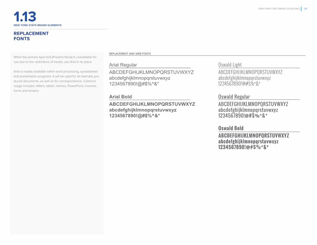
When the primary type font (Proxima Nova) is unavailable for
use due to the restrictions of media, use Arial in its place.
Arial is readily available within word processing, spreadsheet
and presentation programs. It will be used for all internally pro-
duced documents, as well as for correspondence. Common
usage includes: letters, labels, memos, PowerPoint, invoices,
forms and binders.
REPLACEMENTFONTS
REPLACEMENT AND WEB FONTS
Arial RegularABCDEFGHIJKLMNOPQRSTUVWXYZ abcdefghijklmnopqrstuvwxyz 1234567890!@#$%^&*
Arial BoldABCDEFGHIJKLMNOPQRSTUVWXYZ abcdefghijklmnopqrstuvwxyz 1234567890!@#$%^&*
Oswald LightABCDEFGHIJKLMNOPQRSTUVWXYZ abcdefghijklmnopqrstuvwxyz 1234567890!@#$%^&*
Oswald RegularABCDEFGHIJKLMNOPQRSTUVWXYZ abcdefghijklmnopqrstuvwxyz 1234567890!@#$%^&*
Oswald BoldABCDEFGHIJKLMNOPQRSTUVWXYZ abcdefghijklmnopqrstuvwxyz 1234567890!@#$%^&*

NEW YORK STATE BRAND GUIDELINES 24
FPO
new york STATe BrAnD eLemenTS
1.14
Rules for use of type
The hierarchy of information guides the type sizes and weights
(thickness) for different levels of information, illustrated here to
the right.
Primary use of replacement/web type
Set titles in Arial bold using title case (initial cap followed by
lower case letters). Subtitles are set in Arial bold using sen-
tence case and body copy is set in Arial regular. Information or
data that needs to be differentiated and called out in display
should be set in Oswald bold upper case.
Typography exceptions
In cases where the primary use of type restricts visual
differentiation and impact, the other type weights of the
Arial and Oswald families may be used.
REPLACEMENT FONTS STYLE
TYPOGRAPHY
INFORMATION OR DATA THAT NEEDS TO BE HIGHLIGHTEDOR EMPHASIZED SHOULD BE SET INOSWLAD BOLD, UPPER CASE
TYPE STYLE
Title Set In Arial Bold, Title Case.Subtitle set in Arial bold, sentence case.Lorem ipsum dolor sit amet, consectetur adipisc-ing elit, sed do eiusmod tempor incididunt ut labore et dolore magna aliqua.Body copy set in Arial regular, sentence case. Lorem ipsum dolor sit amet, consectetur adipiscing elit, sed do eiusmod tempor incididunt ut labore et dolore magna aliqua. Ut enim ad minim veniam, quis nostrud exercitation ullamco laboris nisi ut aliquip ex ea commodo consequat. Duis aute irure dolor in reprehenderit in voluptate velit esse cillum dolore eu fugiat nulla pariatur. Excepteur sint occaecat cupidatat non proident, sunt in culpa qui officia deserunt mollit anim id est laborum.Ut enim ad minim veniam, quis nostrud exercitation ullamco laboris nisi ut aliquip ex ea commodo consequat. Duis aute irure dolor in reprehenderit in voluptate velit esse cillum dolore eu fugiat nulla pariatur. Excepteur sint occaecat cupidatat non proident, sunt in culpa qui officia deserunt mollit anim id est laborum.
LOREM IPSUM
100%
Arial RegularArial Bold
Oswald LightOswald RegularOswald Bold

NEW YORK STATE BRAND GUIDELINES 25
FPO
new york STATe BrAnD eLemenTS
1.15
Names of programs and initiatives can in themselves become verbal assets of the NY State brand.
Names should communicate positive associations with the concerns and interest of targeted audiences.
They should also be simple and memorable.
Program names should have as few syllables as possible. Generally, unless topically inappropriate,
programs will consist of the program name followed by the letters NY as in examples below.
Examples:
StartUpNY
TasteNY
GlobalNY
ILoveNY
NAMING CONVENTIONSFOR PROGRAMS AND INITIATIVES

NEW YORK STATE BRAND GUIDELINES 26
2. New York State Agencies and Authorities: Groupings and ArchitectureStreamlining the way agencies, authorities, offices and programs are organized
All of the entities of NY State have been organized into nine groupings: Statewide Elected Officials, Recreation & Environment,
Health & Human Services, Education, Public Safety, Transportation & Utilities, Local & Regional Authorities, Business
and Administration
Rationale for groupings
The decisions on number and names of groupings, as well as which entities go under which groupings, are based on two criteria:
• How the various entities function in delivering services to citizens and businesses
• Quantitative research with hundreds of citizens and business decision makers who routinely use government services, and
search for them on state-sponsored websites
The groupings reflect one of the stated objectives of the New York State brand guideline initiative: to strengthen and clarify
how services are oriented, to provide a better user experience and enhance the State’s service delivery
Creating an architecture for the state and its entities
An architecture defines how the New York State brand exists with category groupings and the entities (agencies, authorities,
offices and programs) organized under them in visual display. Because these elements and their relation to each other are
so essential to the New York State brand, the guidelines around these core assets are very specific and not open to much
interpretation.

NEW YORK STATE BRAND GUIDELINES 27
FPO
2.1ny STATe AGencIeS AnD AUThorITIeS GroUpInGS AnD ArchITecTUre
Groupings
For the purposes of display, all state agencies, authorities
and major programs have been arranged into nine groupings
shown on the right.
Rationale
There are approximately 100 agencies, authorities and major
programs represented in New York State. By arranging them
into nine groupings, it streamlines their presentation to
citizens, businesses and visitors, and creates greater
consistency of display.
Further, this structure helps make them easier to find when
searching the New York State websites. These groupings and
the agencies, offices and major programs organized under
them have been quantitatively researched and vetted by
citizens and business decision makers to be more intuitively
grouped.
NEW YORK STATE AGENCIES AND AUTHORITIES GROUPINGS
AGENCIES ORGANIZED IN GROUPINGS
Statewide Elected OfficialsOffice of the Governor
Office of the Attorney General
Office of the NYS Comptroller
New York State Assembly
New York State Senate
Recreation & EnvironmentCentral Pine Barrens Joint Planning &
Policy Commission
Council on the Arts
Department of Environmental Conservation
Environmental Facilities Corporation
Hudson River Park Trust
Hudson River Valley Greenway
Lake George Park Commission
Office of Parks, Recreation and Historic Preservation
Olympic Regional Development Agency
(Whiteface, Gore, Belleayre)
South Shore Estuary Council
Health & Human ServicesAlcoholism and Substance Abuse Services
Children & Family Services
Department of Health
Domestic Violence Prevention
Homes and Community Renewal
Human Rights
Justice Center for the Protection of People
with Special Needs
Office for People with Developmental Disabilities
Office of Mental Health
Office of Temporary and Disability Assistance
Office of Victim Services
State Office for the Aging
Veterans’ Affairs
EducationCity University Construction Fund
City University of New York
Higher Education Services Corporation
State Education Department
State University Construction Fund
State University of New York
Public SafetyCorrections and Community Supervision
Criminal Justice Services
Homeland Security and Emergency Services
Military and Naval Affairs (National Guard)
State Police
Transportation & Utilities511ny (Get Connected to Go)
Bridge Authority
Buffalo and Fort Erie Public Bridge Authority
(Peace Bridge)
Capital District Transportation Authority
Central New York Transportation Authority
Department of Motor Vehicles
Department of Transportation
Energy and Research Development Authority
Governor’s Traffic Safety Committee
Long Island Power Authority (LIPA)
MTA (LIRR, Subways, Metro-North)
New York Power Authority (NYPA)
Niagara Frontier Transportation Authority
Port Authority of NY and NJ
Port of Ogdensburg
Port of Oswego
Public Service Commission/Department
of Public Service
Rochester-Genesee Transportation
Authority
Thruway Authority
Local & Regional AuthoritiesAdirondack Park Agency
Battery Park City Authority
Buffalo Fiscal Stability Authority
Erie County Fiscal Stability Authority
Nassau County Interim Authority
New York City Financial Control Board
Roosevelt Island Operating Corporation
Business Agriculture and Markets
Department of Financial Services
Department of Labor
Taxation and Finance
Minority and Women-Owned Business Enterprises
Dormitory Authority
Empire State Development
Gaming Commission
State Insurance Fund
State Liquor Authority
Tax Appeals
Workers Compensation Board
Higher Education Services Corporation
Board of Elections
Department of Civil Service
Department of State
AdministrationDivision of the Budget
Inspector General
Joint Commission on Public Ethics
Medicaid Inspector General
Court Administration
Office of General Services
Office of Information Technology
Police and Fire Retirement System
Public Employment Relations Board
State and Local Employee Retirement System
Teachers’ Retirement System
STATE AGENCY GROUPINGSSTATE
Statewide Elected Officials
Recreation & Environment
Health & Human Services
Education
Public Safety
Transportation & Utilities
Local & Regional Authorities
Business
Administration
NEW YORK STATE

NEW YORK STATE BRAND GUIDELINES 28
NYS CORE COLOR PALETTE
GROUPINGS PRIMARY COLOR SECONDARY COLORS
PANTONE
5415 C
CMYK 56/24/11/34
RGB 91/127/149
HEX #5B7F95
PANTONE
5425 C
CMYK 45/16/9/24
RGB 122/153/172
HEX #7A99AC
PANTONE
5445 C
CMYK 21/5/4/8
RGB 183/201/211
HEX B7C9D3
PANTONE
3005 C
CMYK 100/31/0/0
RGB 0/119/200
HEX #0077C8
PANTONE
2925 C
CMYK 85/21/0/0
RGB 0/156/222
HEX #009CDE
PANTONE
2905 C
CMYK 45/1/0/1
RGB 141/200/232
HEX #8DC8E8
PANTONE
7680 C
CMYK 87/99/0/8
RGB 82/49/120
HEX #523178
PANTONE
7677 C
CMYK 68/78/0/0
RGB 111/80/145
HEX #6F5091
PANTONE
7674 C
CMYK 50/41/4/0
RGB 135/140/180
HEX #878CB4
PANTONE
350 C
CMYK 80/21/79/64
RGB 44/82/52
HEX #2C5234
PANTONE
625 C
CMYK 64/16/45/30
RGB 80/127/112
HEX #507F70
PANTONE
5575 C
CMYK 37/9/28/13
RGB 146/172/160
HEX #92ACA0
PANTONE
7759 C
CMYK 6/3/100/20
RGB 196/178/0
HEX #C4B200
PANTONE
7745 C
CMYK 16/0/91/28
RGB 171/173/35
HEX #ABAD23
PANTONE
5855 C
CMYK 12/5/44/15
RGB 192/187/135
HEX #C0BB87
2.2ny STATe AGencIeS AnD AUThorITIeS: GroUpInGS AnD ArchITecTUre
How to find your agency’s color
Identify the group color under which your agency, office or
program resides, and use that color and its associated tints
(illustrated to the right and on the next page) in combination
with the core NY State colors to create communications.
Approved colors for agency/program use
Agencies may use their coded color combined with any
color from the core NY State palette. Example: if an agency
is grouped under Education, its associated color; (pale green
and it’s tints) can be combined with the NY State core colors
using good judgment for contrast and legibility.
Achieve a consistent look and feel
By following these color guidelines, all communications
coming from NY State and its agencies and initiatives will have
a consistent look and feel across the board. Further, the use
of group colors helps clearly identify agencies and their pro-
grams within the same grouping. It will serve to distinguish one
agency’s communications from another agency in a
different grouping.
All color breakdowns in the Brand Guidelines are based
on the Official Pantone Matching System 2015. They are
optimized for the majority of computer monitors, operating
systems and browsers. Adhering to the Pantone matching
system will allow for color to be reproduced and displayed in
the most unified and consistent manner possible.
When working in your software application, always create the
color by entering the values for the Pantone colors supplied
here for either CMYK, RGB or Hex.
COLOR CODING FOR GROUPINGS (1 OF 2)
Recreation & Environment
Education
Health & Human Services
StatewideElected Officials
Public Safety

NEW YORK STATE BRAND GUIDELINES 29
NYS CORE COLOR PALETTE
GROUPINGS PRIMARY COLOR SECONDARY COLORS
PANTONE
166 C
CMYK 0/76/100/0
RGB 227/82/5
HEX #E35205
PANTONE
7578 C
CMYK 0/67/100/0
RGB 220/107/47
HEX #DC6B2F
PANTONE
7576 C
CMYK 6/50/76/0
RGB 219/134/78
HEX #DB864E
PANTONE
307 C
CMYK 100/22/2/18
RGB 0/107/166
HEX #006BA6
PANTONE
7704 C
CMYK 93/4/8/24
RGB 0/133/173
HEX #0085AD
PANTONE
550 C
CMYK 42/7/8/8
RGB 141/185/202
HEX #8DB9CA
PANTONE
4625 C
CMYK 30/72/74/80
RGB 79/44/29
HEX #4F2C1D
PANTONE
463 C
CMYK 14/54/95/62
RGB 116/79/40
HEX #744F28
PANTONE
7530 C
CMYK 10/18/25/32
RGB 163/147/130
HEX #A39382
PANTONE
7474 C
CMYK 96/9/32/29
RGB 0/118/129
HEX #007681
PANTONE
5493 C
CMYK 47/4/16/16
RGB 127/169/174
HEX #7FA9AE
PANTONE
5523 C
CMYK 22/1/9/2
RGB 182/207/208
HEX #B6CFD0
Local & Regional Authorities
ny STATe AGencIeS AnD AUThorITIeS: GroUpInGS AnD ArchITecTUre
2.2
(Continued from previous page)
When using the colors of the groupings with the core color
palette of NYS, use good judgment to ensure contrast and
legibility in communications.
COLOR CODING FOR GROUPINGS (2 OF 2)
Transportation & Utilities
Business
Administration

NEW YORK STATE BRAND GUIDELINES 30
NY State Architecture: Introducing Endorsement Systems and Sample Lock UpsNY State architecture: the most complex rules in these guidelines
Complying with the guidelines for building endorsement systems forms the backbone of the New York State brand guidelines.
Rules for how the state, agencies, authorities, divisions, all work together in visual display are—by their very nature—complex.
For this reason, we have created this page here to augment guidelines for maximum clarity.
Endorsement systems
The purpose of having the state brand mark and its entities (agencies, authorities, offices and programs) combined together
in an organized visual display is to reinforce a hierarchy of relationships ( or ‘‘architecture’’): how the state advocates for—or “endorses”—the entities.
Additionally, endorsement systems help illustrate which agency/office owns the program or initiative, and which other agencies may be supporting it.
Endorsement systems help achieve one of the most important objectives for the guidelines: to better accrue the value of all state initiatives to the New York State brand.
Building endorsement systems
On the following pages, the approved endorsement systems are introduced for various situations that arise when producing communications for
the State and its various entities:
1) Rules on how to size and link the state and its entities (these are called “lock ups”)
2) Sample schematics of the finished lock ups
3) Examples of how these lock ups might look in real world communications
Use this section ONLY to understand the endorsement systems
There is a separate section that will guide how communications are to be designed and laid out. It is called New York State brand elements,
and it can be found on pages 73-89.

NEW YORK STATE BRAND GUIDELINES 31
FPO
ny STATe AGencIeS AnD AUThorITIeS: GroUpInGS AnD ArchITecTUre
2.3
IDENTITY ARCHITECTURE
Business
Administration
Education
Health & Human Services
Local & Regional Authorities
Public Safety
Recreation &Environment
Statewide Elected Officials
Transportation & Utilities
AgencyName
AGENCIES AND AUTHORITIES GROUPINGS (LEVEL 2)
BRAND MARK AND AGENCY LOCK UP (LEVEL 3)
NY STATE BRAND MARK (LEVEL 1)
NO AGENCIES, PROGRAMS, OR INITIATIVES (WITH THE EXCEPTION OF THOSE LISTED ON PAGE 44) WILL HAVE THEIR OWN BRAND MARK OR LOGO. AGENCY NAMES WILL BE DISPLAYED IN TYPOGRAPHY LOCKED UP WITH THE NY STATE BRAND MARK IN D SARI BOLD.
Brand architecture*
As stated previously in these guidelines, an architecture sets
forth rules governing hierarchies and relationships for the state
and its agencies, offices and initiatives. In the illustration on the
right, the New York State brand mark is pre-eminent (Level 1 in
the hierarchy), and serves to endorse agencies and programs
(Level 3).
Level 2 groupings are for organizational purposes only
The nine groupings (discussed on page 27) are for
organizational purposes, and will not develop or issue
communications. When they are listed (for example, in a menu
on a website) they will appear in Proxima Nova Bold, without
their coded color.
Please see the following pages for guidelines on the endorse-
ment lock ups.
*There are six exceptions to the rules stated here.
Please see pages 44 for which agency and programs
will retain their logos.
NEW YORK STATE BRAND ARCHITECTURE

NEW YORK STATE BRAND GUIDELINES 32
FPO
2.4
N = THE HEIGHT OF THE LETTER “N” IN THE STATE NAME NEW YORK
AgencyName
AgencyName
BRAND MARK/AGENCY CLEAR SPACE AND RELATIVE RELATIONSHIPS
N = HEIGHT OF THE “N” IN NEW YORK STATE
SAME THICKNESS
THE ANCHORLINE
THE ANCHOR LINE BRAND MARK/AGENCY RELATIVE RELATIONSHIPS
DON’TS
DO NOT CHANGE THE SIZE PROPORTION DO NOT USE TYPE ALL CAPS
AgencyName
AgencyName
AGENCYNAME
Lock ups
The illustration to the right shows how the New York State
brand mark lock up is displayed: in a horizontal format, with
the brand mark on the left, the agency on the right, and sepa-
rated by the “anchor line.” As shown, the agency is rendered
in title case (initial capitals, followed by lower case type) in the
D Sari bold type font.
The anchor line
As seen here, the vertical line used in lock ups that anchors
one entity with another (e.g. NY State with one of its agencies).
The anchor line is the same thickness as the line that forms
the outline of NY State in the brand mark, and the same height
of the NY State brand mark.
Relative relationships
As shown top right, the distance between the anchor line and
both the NYS brand mark and the agency name is the width
of the “N” in the brand mark. Clear space around the lock up
should be the height of the “N” as well.
The height of the agency name is calculated by the N value,
which is the height of the capital letter in the NY State brand
mark. Therefore, the height of the agency name is N distance
from the top and bottom of the anchor line.
Don’ts
Bottom right: see two examples of how NOT to render the
brand mark/agency lock up. These are by no means the only
“don’ts.”
HOW TO BUILD NEW YORK STATEBRAND MARK/AGENCY LOCK UPS
ny STATe AGencIeS AnD AUThorITIeS: GroUpInGS AnD ArchITecTUre

NEW YORK STATE BRAND GUIDELINES 33
FPO
2.5
EntityName
BridgeAuthority
Buffalo and Fort Erie Public Bridge Authority
Capital DistrictTransportation Authority
Department ofMotor Vehicles
TRANSPORTATION& UTILITIES
GROUPINGS
NEW YORK STATE ENTITIES LOCKUP
AN ENTITY IS AN AGENCY, OFFICE, AUTHORITY, DIVISION OR PROGRAM
FOR AGENCY NAMES THAT FALL ON THREE OR MORE LINES OF COPY, THE ANCHOR LINE EXTENDS DOWN FURTHER. SEE COPY TO THE LEFT FOR GUIDANCE.
EXAMPLE
GROUPINGDICTATESTHE COLOR
TRANSPORTATION &UTILITIES ENTITIESLOCK UP
Entity lock ups will be in type*
The various entities of NY State (agencies, offices, authorities,
divisions and programs) appear in D. Sari Bold, and are en-
dorsed by the NYS brand mark rendered in the same color as
the grouping—in this example, blue.
Lock ups
The illustration to the right shows how the New York State
brand mark/entity lock up is displayed using the example of
the grouping, Transportation & Utilities. The lock up is in a
horizontal format with the brand mark on the left, the entity on
the right, and separated by the “anchor line.”
The anchor line
As seen here, the vertical line used in lock ups that anchors
one entity with another (e.g. NY State with one of its agencies).
The anchor line is the same thickness as the line that forms
the outline of NY State in the brand mark, and the same height
of the NY State brand mark. The height of the agency name
is calculated by the N value, which is the height of the capital
letter in the NY State brand mark. Therefore, the height of the
agency name is N distance from the top and bottom of the
anchor line. Note: for agency names that fall on three or more
lines of copy, the anchor line extends down further, still guided
by the ‘‘N’’ value.
Relative relationships
As shown top right, the distance between the anchor line and
both the NY State brand mark and the endorsed entity is the
width of the “N” in the state name in the brand mark. Clear
space around the lock up should be the the height of the “N”
as well.
*There are SIX exceptions to the rules stated here. Please see
page 44 for which agency and programs will retain their logos.
ARCHITECTURE AND SAMPLE ENTITY LOCK UPS
ny STATe AGencIeS AnD AUThorITIeS: GroUpInGS AnD ArchITecTUre

NEW YORK STATE BRAND GUIDELINES 34
FPO
2.6
Here are two examples: Transportation & Utilities, and Public
Safety in their own coded colors blue and gray respectively.
Display options
The brand mark/agency lock up should appear in its coded
color on a white background. This is the primary treatment
and should be used as much as possible. In the event the
brand mark/agency lock up cannot be rendered on a white
background, there are two secondary options:
1) knocked out in white or in the coated color and only situated
on a unobstructed background on the photo;
2) placed inside the progress holding shape in either the
coded color or white, depending on what best achieves
legibility and contrast.
NEW YORK STATE BRAND MARK/AGENCY LOCK UP AND COLOR VARIATIONS
NY STATE GROUPING LOCK UPS
PRIMARY TREATMENT PRIMARY TREATMENT
SECONDARY TREATMENT SECONDARY TREATMENT
AGENCY LOCK UP COLOR OPTIONS
BridgeAuthority
EmergencyManagement
BridgeAuthority
EmergencyManagement
BridgeAuthority
EmergencyManagement
ny STATe AGencIeS AnD AUThorITIeS: GroUpInGS AnD ArchITecTUre

NEW YORK STATE BRAND GUIDELINES 35
2.7SINGLE AGENCY ENDORSEMENT
Viewing the lock up
This is what the finished lock up would look like. Its size and
placement on the page in actual communications can vary
based on different layouts. A sample execution can be seen
on the following page. View the sample to the right only for
how the lock up is rendered.
IMPLEMENTATION OF A SINGLE AGENCY ENDORSEMENT APPLICATION
AgencyName
ny STATe AGencIeS AnD AUThorITIeS: GroUpInGS AnD ArchITecTUre

NEW YORK STATE BRAND GUIDELINES 36
2.8EXAMPLE OF A SINGLE AGENCY ENDORSEMENT
Viewing the lock up
To the right is a mock up of a brochure cover that illustrates
how the single agency endorsement application would look
in a real world example. Its size and placement on the page
in actual communications can vary based on different layouts.
View the sample to the right only for how the lock up is ren-
dered.*
The architecture is clean, clear and consistent
As seen here, the NY State brand mark is locked up with the
agency issuing the brochure. The endorsement application
creates a clear and consistent way for the state and its agen-
cies to develop communications so that the content is unim-
peded, yet strongly endorsed. Further, the color of all entities
represented are rendered in the appropriate coded color, in
this case, the blue for Transportation & Utilities.
*See section 4 (pages 73-89) for design layout guidelines.
Resource Guide for
Teen Drivers
dmv.ny.gov
Department ofMotor Vehicles
ny STATe AGencIeS AnD AUThorITIeS: GroUpInGS AnD ArchITecTUre

NEW YORK STATE BRAND GUIDELINES 37
Viewing the lock up
This is what the finished endorsement system would look like.
Size and placement on the page in actual communications can
vary based on different layouts. Sample executions can be
seen on the following page. View the sample to the right only
for how the endorsement system is rendered.*
Single surface
When there is only one page or surface in the communication,
the program, division or initiative is locked up with the NY
State brand mark, and the agency is rendered in type at the
bottom of the surface.
Multiple surfaces
When there is more than one page or surface in the communi-
cation, the program, division or initiative is locked up with the
NY State brand mark on the cover, and the agency is locked
up with the NY State brand mark on a different surface.
These guidelines help reduce the clutter of lock ups on a
single surface, yet ensure that the program or division is pro-
perly endorsed by both the state and the agency.
*See section 4 (pages 73-89) for design layout guidelines.
ENDORSEMENT OF AN ENTITY OWNED BY AN AGENCY, AUTHORITY OR OFFICE
SINGLE ENTITY AND ENDORSING AGENCY
(AN ENTITY IS A DIVISION, PROGRAM OR INITIATIVE)
BRAND MARK AND ENTITY LOCK UP
BRAND MARK AND ENTITY LOCK UP
AGENCY NAMEON MULTI-SURFACE COMMUNICATION
AGENCY NAME ON SINGLE SURFACE COMMUNICATION
EntityName
EntityName
AgencyName
A Division of (Agency Name)
2.9ny STATe AGencIeS AnD AUThorITIeS: GroUpInGS AnD ArchITecTUre

NEW YORK STATE BRAND GUIDELINES 38
Viewing the lock up
This is what the finished endorsement system could look like.
Size and placement on the page in actual communications can
vary based on different layouts. View the sample to the right
only for how the endorsement system is rendered.*
The endorsement shows that the program is the central
subject and purpose of the communication
As seen here, the NY State brand mark is locked up with the
division, with the agency represented in type at the bottom
of the page (single surface communication). Further, the color
of all entities represented are rendered in the appropriate co-
ded color for the grouping, in this case, the teal for Business.
The architecture is clean, clear and consistent
These guidelines help reduce the clutter of lock ups on a
single surface, yet ensure that the program or division is
properly endorsed by both the state and the agency.
*See section 4 (pages 73-89) for design layout guidelines.
EXAMPLE OF AN ENDORSED ENTITY OWNED BY AN AGENCY, AUTHORITY OR OFFICE (1 0F 2)
Building EconomicOpportunitiesfor MWBE’s
A Division of Empire State Development
2.10ny STATe AGencIeS AnD AUThorITIeS: GroUpInGS AnD ArchITecTUre
WHERE THERE IS ONE PAGE (SURFACE), THE STATE/DIVISION LOCK UP IS SEPARATED FROM THE AGENCY OWNING THE DIVISION; THE AGENCY APPEARS IN TYPE AT THE BOTTOM OF THE PAGE.

NEW YORK STATE BRAND GUIDELINES 39
Viewing the lock up
This is what the finished endorsement system could look like.
Size and placement on the page in actual communications can
vary based on different layouts. View the sample to the right
only for how the endorsement system is rendered.*
The endorsement shows that the program is the central
subject and purpose of the communication
As seen here, the NY State brand mark is locked up with the
program. The agency is locked up with the NY State brand
mark on a different page in multiple surface communications.
Further, the color of all entities represented are rendered in
the appropriate coded color, in this case, the teal for Business.
The architecture is clean, clear and consistent
These guidelines help reduce the clutter of lock ups on a
single surface, yet ensure that the program or division is
properly endorsed by both the state and the agency.
*See section 4 (pages 73-89) for design layout guidelines.
EXAMPLE OF AN ENDORSED ENTITY OWNED BY AN AGENCY, AUTHORITY OR OFFICE (2 0F 2)
ONE MISSIONThe mission of the Division of Minority and Women-Owned Business Development is to promote equality of economic opportunities for Minority and Women-Owned Business Enterprises (MWBEs) and to eliminate barriers to their participation in state contracts.
We supplement New York State’s economic leadership with information and resources that increase access to opportunities for minority and women-owned businesses throughout the State.
Three Key Objectives:
Certifying MWBEs
To review applications by businesses seeking certifi cation as an MWBE and to maintain a directory of certifi ed MWBEs
Connecting MWBEs to Contracting Opportunities
To create matchmaking opportunities and
assist state agencies in awarding a fair
share of state contracts to MWBEs
Strengthening MWBEs
To promote the business development of
MWBEs through training, education and
outreach, and connecting MWBEs to other
technical and fi nancial assistance
General Inquires – MWBE Resource Line:855/ESD-4MWB or 855/373-4692
Certifi cation Help Line:212/803-2414
mwbecertifi [email protected]/mwbe
We’ve had really great things happen to us since our certifi cation! In short, it gives us a LOT of credibility and considerable access to opportunities that we might not have had admittance to prior to becoming certifi ed.
MBE Certifi ed FirmMr. JEA EDMAN JACKSONJohnson Edman Advertising
“
“
“
”
Once Mrs. Paper became certifi ed, I was able to make contacts within
NYS Agencies, gaining opportunities to bid on contracts and have been
awarded many. New York State Certifi cation has played a major role in
the success of my company.
WBE Certifi ed FirmMarion Hindenburg
COPY GRAPHICS INC dba Mrs. Paper
State of New YorkAndrew M. Cuomo, Governor
Empire State DevelopmentKenneth Adams, President & CEO
Division of Minority and Women’s
Building EconomicOpportunitiesfor MWBE’s
2.10ny STATe AGencIeS AnD AUThorITIeS: GroUpInGS AnD ArchITecTUre
WHERE THERE IS MORE THAN ONE PAGE (SURFACE), THE STATE/AGENCY LOCK UP IS ON A DIFFERENT PAGE THAN THE STATE/ENTITY LOCK UP AS SHOWN HERE.

NEW YORK STATE BRAND GUIDELINES 40
FPO
2.11
Y = HALF THE WIDTH OF THE CAPITAL LETTER THICKNESS
HORIZONTAL MULTIPLE AGENCIES LOCK UP
X VALUE
VERTICAL MULTIPLE AGENCIES LOCK UP
ANCHOR LINE THICKNESS
LeadingAgency Name
X = HALF THE HEIGHT OF THE CAPITAL LETTER
75% OF THE LEADING AGENCYWITH WHICH IT IS LOCKING UP
75% OF THE LEADING AGENCYWITH WHICH IT IS LOCKING UP
AgencyName
LeadingAgency NameAgency Name 2
Agency Name 3
AgencyName 2
AgencyName 3
When more than one agency is issuing communications
There are times when communications are developed by
one agency—the agency that leads or owns the program or
initiative—and supported by other agencies. When one or
more supporting agencies is/are present, follow the guidelines
written for agency/program lock ups with one exception: the
leading/owning agency appears larger than the supporting
agencies. Follow the formulas to the right.
Horizontal and vertical options
Depending on the available space in layout, there are two
options available: horizontal and vertical. As you can see, the
length of the anchor line in the horizontal lock up is guided by
the size of the leading agency name.
Color and type
When more than one agency supports communications, use
the core color palette for NY State, and not any one of the
coded colors from the organizational groupings. Agency
names continue to be rendered in D Sari Bold.
BUILDING MULTIPLE AGENCY LOCK UPS
ny STATe AGencIeS AnD AUThorITIeS: GroUpInGS AnD ArchITecTUre

NEW YORK STATE BRAND GUIDELINES 41
2.12
Viewing the lock ups
Here are illustrations of how the endorsement application
would look for a program or initiative that is owned by one
agency, and supported by other agencies. Size and placement
on the page in actual communications can vary based on
different layouts. Sample executions can be seen on the
following page. View the sample to the right only for how the
endorsement system is rendered.*
Single and multiple surfaces
The program or initiative is locked up with the NY State brand
mark, the supporting agency/agencies are locked up together,
and the leading agency owning the program or initiative is
listed first and appears larger (see previous page for formulas).
These guidelines help reduce the clutter of various agencies
and entities, yet ensure that the program or division is properly
endorsed by the state and supporting multiple agencies.
*See section 4 (pages 73-89) for design layout guidelines.
SCHEMATIC OF AN ENDORSED ENTITY AND MULTIPLE AGENCY LOCK UP
ny STATe AGencIeS AnD AUThorITIeS: GroUpInGS AnD ArchITecTUre
ENTITY AND MULTIPLE AGENCIES
(THE LEADING AGENCY IS THE AGENCY THAT OWNS THE PROGRAM OR INITIATIVE BEING FEATURED.)
BRAND MARK AND ENTITY LOCK UP
BRAND MARK AND ENTITY LOCK UP
HORIZONTAL MULTIPLEAGENCIES LOCK UP
VERTICAL MULTIPLEAGENCIES LOCK UP
EntityName
EntityName
Leading Agency Name
AgencyName 2
AgencyName 3
Leading Agency NameAgency Name 2
Agency Name 3

July 19, 2015 at 1:00p.m.Lake Welch State Park
Harriman, NY
SAFE PARKS INITIATIVEPRESS EVENT
NEW YORK STATE BRAND GUIDELINES 42
2.13EXAMPLE OF AN ENDORSED ENTITY AND MULTIPLE AGENCY LOCK UP
Viewing the lock up
This is what the finished endorsement system would look like
for a program or initiative that is owned by one agency, and
supported by other agencies in a real world example. Size
and placement on the page in actual communications can vary
based on different layouts. View the sample to the right only
for how the endorsement system is rendered.*
The endorsement shows that the program is the central
subject and purpose of the communication
As seen here, the program or initiative is locked up with the
NY State brand mark, the supporting agencies are locked
up together, and the leading agency owning the program or
initiative is listed first and appears larger (see previous pages
for formulas).
The architecture is clean, clear and consistent
These guidelines help reduce the clutter of lock ups, yet
ensure that the program or division is properly endorsed by
the agency owning it and the state, with participation from
supporting agencies.
*See section 4 (pages 73-89) for design layout guidelines.
ny STATe AGencIeS AnD AUThorITIeS: GroUpInGS AnD ArchITecTUre

NEW YORK STATE BRAND GUIDELINES 43
FPO
2.14
HORIZONTAL MULTIPLE AGENCY (FROM THE SAME GROUPING) LOCK UP
VERTICAL MULTIPLE AGENCY (FROM THE SAME GROUPING) LOCK UP
Hudson River Park Trust
Office of Parks, Recreation and Historic Preservation
Hudson River Valley Greenway
Hudson River Park TrustHudson River Valley GreenwayOffice of Parks, Recreation and Historic Preservation
EXAMPLE OF MULTIPLE AGENCY (FROM DIFFERENT GROUPINGS) LOCK UP
Empire StateDevelopmentDepartment of Motor VehiclesDivision of Homeland Security and Emergency Services
When agencies are from the same grouping
When multiple agencies are featured in communications and
those agencies are from the same grouping, use the coded
color of the grouping. The example shown here (top and
bottom left) is from the grouping, Recreation & Environment, in
dark green.
When agencies are from different groupings
When multiple agencies are featured in communications and
those agencies are from different groupings, the color of all
entities represented are rendered in colors selected from
the core NY State color palette, and not from any colors of
the supporting or issuing agencies. The example shown here
(bottom right) shows agencies from Business, Transportation &
Utilities, and Public Safety, in the NY State dark blue.
COLOR SELECTION FOR MULTIPLE AGENCY LOCK UPS
ny STATe AGencIeS AnD AUThorITIeS: GroUpInGS AnD ArchITecTUre

NEW YORK STATE BRAND GUIDELINES 44
2.15
There are two categories of logo exceptions:
1) The five legacy logos illustrated on the right (top and
middle) will endure but will strictly follow the NY State brand
guidelines;
2) The Port Authority of NY and NJ, SUNY and State Educa-
tion Departments (bottom) are exempt from NY State brand
guidelines.
Rationale for keeping these legacy logos
The decision to keep these legacy logos is based on the
capital investment in these logos and the significant
licensing revenue gained from them. In the case of 511
Get Connected, it is a federal program.
All other agencies, authorities, offices and programs will
be rendered in D Sari Bold, locked up with the NY State
brand mark.
These guidelines firmly establish that there will be abso-
lutely no new logos created or deployed beyond the New
York State brand mark and the legacy logos specifically
listed here as exceptions.
LEGACY LOGOS: AGENCY AND PROGRAM LOGOS THAT WILL REMAIN INTACT AND ENDURE
LOGO EXCEPTIONS INCORPORATING THE NY STATE GUIDELINES
LOGO EXCEPTIONS EXEMPTED FROM THE NY STATE GUIDELINES
ny STATe AGencIeS AnD AUThorITIeS: GroUpInGS AnD ArchITecTUre

NEW YORK STATE BRAND GUIDELINES 45
Viewing the lock up: Legacy logos will never be locked up
with the NY State brand mark. On the right is what the finished
endorsement system would look like. Size and placement on
the page in actual communications can vary based on different
layouts. Sample executions can be seen on the following
pages. View the sample to the right only for how the endorse-
ment system is rendered.*
Legacy program logos: When communications are deve-
loped for a program with a legacy logo, the legacy logo will
be featured on its own, and will be endorsed by a lock up
of the NY State brand mark and the agency that owns the
program.
Legacy agency logos: When an agency with a legacy logo
develops and owns communications, the legacy logo will
be featured on its own, and will be endorsed by the NY State
brand mark.
Alternative way to highlight state or state/agency
endorsement: In addition to size and placement, another way
to insure the prominence of the endorsing state or state/agency
lock up is to place it in the progress holding shape.
Please see page 52 for an illustration of this alternative, and
page 75 for rules governing the progress holding shape.
*See section 4 (pages 73-89) for design layout guidelines.
SCHEMATIC OF A LEGACY LOGO ENDORSEMENT
LEGACY LOGO ENDORSEMENT
AgencyLogo
ProgramLogo
1. LEGACY LOGO
BRAND MARK
2. BRAND MARK AND
AGENCY NAME LOCK UP AgencyName
2.16ny STATe AGencIeS AnD AUThorITIeS: GroUpInGS AnD ArchITecTUre

NEW YORK STATE BRAND GUIDELINES 46
Viewing the endorsement system
This is what the finished endorsement system would look like.
Size and placement on the page in actual communications can
vary based on different layouts. View the sample to the right
only for how the endorsement system is rendered.*
The endorsement shows that the program is the central
subject and purpose of the communication
As seen here, the legacy program logo is separated from the
endorsing lock up: the NY State brand mark locked up with the
agency that owns the program.
The architecture is clean, clear and consistent
These guidelines help reduce the clutter of lock ups, yet
ensure that the legacy program is properly
endorsed by both the agency owning it and the state.
*See section 4 (pages 73-89) for design layout guidelines.
EXAMPLE OF LEGACY PROGRAMLOGO ENDORSEMENT
2.17ny STATe AGencIeS AnD AUThorITIeS: GroUpInGS AnD ArchITecTUre

NEW YORK STATE BRAND GUIDELINES 47
Viewing the endorsement system
This is what the finished endorsement system would look like.
Size and placement on the page in actual communications can
vary based on different layouts. View the sample to the right
only for how the endorsement system is rendered.*
The endorsement shows that the agency is the central
subject and purpose of the communication
As seen here, the legacy agency logo is separated from the
NY State brand mark.
The architecture is clean, clear and consistent
These guidelines help reduce the clutter of competing logos,
yet ensure that the legacy agency is properly
endorsed by the state.
*See section 4 (pages 73-89) for design layout guidelines.
EXAMPLE OF A LEGACY AGENCY LOGO ENDORSEMENT
Improving,non-stop.We’re making improvements that you can see every day. Including a new way to tell you about improvements. Just look up.
2.18ny STATe AGencIeS AnD AUThorITIeS: GroUpInGS AnD ArchITecTUre

NEW YORK STATE BRAND GUIDELINES 48
2.19
There are occasions when an agency or program with a legacy
logo issues communications about programs or sub-programs
respectively.
Legacy logo lock ups with programs and sub-programs
The illustration to the right shows how legacy logos
lock up with their programs/sub-programs.
The lock up is in a horizontal format with the legacy logo on
the left, the program/sub-program on the right, and separated
by the “anchor line.”
The anchor line
As seen here, the vertical line used in lock ups that anchors
one entity with another. The anchor line is 50% of the
thickness of the capital letters in the sub-program, and
the same height as the legacy logo.
Relative relationships
Since legacy logos come in different footprints (i.e. surface
areas in display), the sub-programs should appear in a foot-
print that is approximately 75% of the legacy logo with which
it is locking up.
LEGACY LOGO ENDORSEMENT OF A SUB-PROGRAM OR INITIATIVELOCK UP
LEGACY LOGO ENDORSEMENT
75% OF THE LEGACY LOGO FOOTPRINTWITH WHICH IT IS LOCKING UP
SubProgram
LegacyLogo
Y = HALF THE WIDTH OF THE CAPITAL LETTER THICKNESS
ANCHOR LINE THICKNESS
SubProgram
ny STATe AGencIeS AnD AUThorITIeS: GroUpInGS AnD ArchITecTUre

NEW YORK STATE BRAND GUIDELINES 49
2.20
Viewing the lock ups
Here are illustrations of how the endorsement application
would look for a legacy logo with a sub-program. Size and
placement on the page in actual communications can vary
based on different layouts. A sample execution can be seen
on the following page. View the sample to the right only for
how the endorsement system is rendered.*
Legacy logo featured with a sub program
When communications are developed for a program with a
legacy logo, the legacy logo will be featured on its own, and
will be endorsed by a lock up of the NY State brand mark and
the agency that owns the program.
Legacy agency logos
When an agency with a legacy logo develops and issues
communications for a sub-program, the legacy logo will be
locked up with that sub-program, and will be endorsed by
the NY State brand mark.
*See section 4 (pages 73-89) for design layout guidelines.
SCHEMATIC OF A LEGACY LOGOENDORSING A SUB-PROGRAM
LEGACY LOGO ENDORSEMENT
AgencyLogo
1. LEGACY LOGO WITH SUB PROGRAM
2. BRAND MARK AND
AGENCY NAME LOCK UP
BRAND MARK
AgencyName
SubProgram
ProgramLogo
ny STATe AGencIeS AnD AUThorITIeS: GroUpInGS AnD ArchITecTUre

NEW YORK STATE BRAND GUIDELINES 50
Discover New York State
ilovenew.com/paththroughhistory
Arts & CultureCanals & TransportationCivils RightsColonial HistoryImmigration
Innovation & CommerceNative AmericansNatural HistoryRevolutionary WarSport History
U.S. PresidentsWar of 1802Women’s Rights
Explore Today
Viewing the endorsement system
This is what the finished endorsement system would look like
in a real world example. Size and placement on the page in
actual communications can vary based on different layouts.
View the sample to the right only for how the endorsement
system is rendered.*
Linking legacy logos with programs
As seen here, the legacy program logo is locked up with the
sub-program it owns. It is separated from the endorsing lock
up of the NY State brand mark and the agency that owns the
program.
The architecture is clean, clear and consistent
These guidelines help reduce the clutter of lock ups, yet
ensure that the legacy program is owning the sub-program,
and is endorsed by both the agency owning it and the state.
*See section 4 (pages 73-89) for design layout guidelines.
EXAMPLE OF A LEGACY LOGOENDORSING A SUB-PROGRAM
2.21ny STATe AGencIeS AnD AUThorITIeS: GroUpInGS AnD ArchITecTUre

NEW YORK STATE BRAND GUIDELINES 51
2.22
Viewing the endorsement system
Here are illustrations of how the endorsement application
would look for two legacy logos. Size and placement
on the page in actual communications can vary based
on different layouts. A sample execution can be seen on the
following page. View the sample to the right only for how the
endorsement system is rendered.*
Placement
While placement may vary, the standard rule is that the legacy
logos should not appear next to the NY State brand mark.
They may appear together, and in different sizes from each
other, as long as there is separation on the page to avoid
confusion about which entity/entities own(s) the communication.
Display options
The brand mark/agency lock up should appear in its coded
color on a white background. This is the primary treatment
and should be used as much as possible. In the event the
brand mark/agency lock up cannot be rendered on a white
background, there are two secondary options:
1) knocked out in white or in the coded color and only situated
on a unobstructed background on the photo;
2) placed inside the progress holding shape in either the
coded color or white, depending on what best achieves
legibility and contrast (as seen on next page).
*See section 4 (pages 73-89) for design layout guidelines.
SCHEMATIC OF A MULTIPLE LEGACY LOGOS ENDORSEMENT
LEGACY LOGO ENDORSEMENT
1. LEGACY LOGOS
2. BRAND MARK
LegacyAgency
LegacyProgram
ny STATe AGencIeS AnD AUThorITIeS: GroUpInGS AnD ArchITecTUre

NEW YORK STATE BRAND GUIDELINES 52
Viewing the endorsement system
This is what the finished endorsement system would look like
in a real world example. Size and placement on the page in
actual communications can vary based on different layouts.
View the sample to the right only for how the endorsement
system is rendered.*
Co-promoting legacy logos
As seen here, the two legacy logos owning the communica-
tion are together in the same size, and set apart from the NY
State brand mark.
The architecture is clean, clear and consistent
These guidelines help reduce the clutter of multiple logos, yet
ensure that the legacy brands are owning the communication,
with a strong endorsement from the state.
*See section 4 (pages 73-89) for design layout guidelines.
EXAMPLE OF MULTIPLE LEGACY LOGOS ENDORSEMENT
New York has more than 1,000 miles of scenic trails?
Heart Lake and Algonquin Mountain, NY.
Plan your next New York State vacation at
GET OUTTATOWN.
iloveny.com and mta.info
2.23ny STATe AGencIeS AnD AUThorITIeS GroUpInGS AnD ArchITecTUre

NEW YORK STATE BRAND GUIDELINES 53
2.24
Third Party logos
When a third party logo must appear in a NY State communi-
cation, it should never be locked up with the NY State entity
lock up or any legacy logo
Placement and size
There are no fixed rules governing the relative placement
and size of the various marks except those that apply to
clear space and placement of the brand marks over
cluttered backgrounds.
THIRD PARTY LOGO ENDORSEMENT
THIRD PARTY LOGO EXCEPTION
Third PartyLogo
EntityName
ny STATe AGencIeS AnD AUThorITIeS: GroUpInGS AnD ArchITecTUre

NEW YORK STATE BRAND GUIDELINES 54
2.25
The endorsement example here shows that the New NY
Works initiative, locked up with the NY State brand mark, is
an equal partner with the featured third parties in the commu-
nication. The integrity of all marks are maintained. Size and
placement on the page in actual communications can vary
based on different layouts.
EXAMPLE OF THIRD PARTYLOGO ENDORSEMENT
CO-BRANDING WITH THIRD PARTY LOGOS
ny STATe AGencIeS AnD AUThorITIeS: GroUpInGS AnD ArchITecTUre

NEW YORK STATE BRAND GUIDELINES 55
FPO
Letterhead
As seen to the right, the name and contact information for the
employee are on the top left of the page, and on the bottom of
the page in the center is the lock up of the NY State brand mark
and the agency for which the employee works.
Business cards
As seen to the right, the name and contact information for the
employee are on the bottom left of the card, and the NY State
brand mark/agency lock up appears on the top right.
Follow the formulas on page 32 for how to build the state
brand mark/agency lock up.
STATIONERY
LETTERHEAD AND BUSINESS CARDS
CONTACT INFO
BRAND MARK AND
AGENCY NAME LOCK UP AgencyName
NAME (Proxima Bold 12pt)Fonction (Proxima Regular 8pt)
Agency Name (Proxima Bold 8pt)AdressContactsWebsite
NAME (Proxima Bold 12pt)Fonction (Proxima Regular 8pt)
Adress (Proxima Regular 8pt)ContactsWebsite
Agency Name
(Proxima Regular 8pt)
2.26ny STATe AGencIeS AnD AUThorITIeS: GroUpInGS AnD ArchITecTUre

NEW YORK STATE BRAND GUIDELINES 56
FPO
Letterhead
As seen to the right, the name and contact information for the
employee are on the top left of the page. The legacy logo is
positioned on the upper right and the NY State brand mark
is centered on its own at the bottom of the page.
Business cards
As seen to the right, the name and contact information for
the employee are on the bottom left of the card, and the
NY State brand mark appears on the top right. The legacy
logo is featured prominently upper left.
Follow the formulas on page 32 for how to build the state
brand mark/agency lock up.
STATIONERY WITH LEGACY LOGOS
LETTERHEAD AND BUSINESS CARDS FOR LEGACY LOGOS
CONTACT INFO
BRAND MARK
NAME (Proxima Bold 12pt)Fonction (Proxima Regular 8pt)
Adress (Proxima Regular 8pt)ContactsWebsite
LegacyLogo
LegacyLogo
NAME (Proxima Bold 12pt)Fonction (Proxima Regular 8pt)
Agency Name (Proxima Bold 8pt)Adress (Proxima Regular 8pt)ContactsWebsite
2.26.2ny STATe AGencIeS AnD AUThorITIeS: GroUpInGS AnD ArchITecTUre

NEW YORK STATE BRAND GUIDELINES 57
FPO
Letterhead
As seen to the right, the name and contact information for the
employee are on the top left of the page. The legacy logo is
positioned on the upper right. The NY State brand mark is
locked up with the endorsing agency and centered at the
bottom of the page.
Business cards
As seen to the right, the name and contact information for
the employee are on the bottom left of the card, and the NY
State brand mark appears on the top right locked up with the
endorsing agency. The legacy logo is featured prominently
upper left.
Follow the formulas on page 32 for how to build the state
brand mark/agency lock up.
STATIONERY FOR LEGACY LOGOS WHEN ENDORSED BY AN AGENCY
LETTERHEAD AND BUSINESS CARDS FOR LEGACY LOGOS ENDORSED BY AN AGENCY
CONTACT INFO
BRAND MARK LOCK UP
NAME (Proxima Bold 12pt)Fonction (Proxima Regular 8pt)
Adress (Proxima Regular 8pt)ContactsWebsite
LegacyLogo
LegacyLogo
NAME (Proxima Bold 12pt)Fonction (Proxima Regular 8pt)
Agency Name (Proxima Bold 8pt)Adress (Proxima Regular 8pt)ContactsWebsite
AgencyName
AgencyName
2.26.3ny STATe AGencIeS AnD AUThorITIeS: GroUpInGS AnD ArchITecTUre

NEW YORK STATE BRAND GUIDELINES 58
FPO
Viewing the endorsement system
This is what the finished endorsement system would look like
in a real world example on stationery and business cards.
Unlike other examples seen in these guidelines, the size and
placement on the page in actual communications are fixed and
do not vary.
EXAMPLE OF STATIONERY
RICHARD E. NEWMANExecutive Vice President, State Marketing Strategy
Empire State Development Corporation633 Third Avenue, New York, NY 10017 (212) 803-3610 l (646) 670-7697 l [email protected] www.esd.ny.gov
RICHARD E. NEWMANExecutive Vice President, State Marketing Strategy
633 Third Avenue, New York, NY 10017 (212) 803-3610 l (646) 670-7697 l [email protected] www.esd.ny.gov
RICHARD E. NEWMANExecutive Vice President, State Marketing Strategy
Empire State Development Corporation633 Third Avenue, New York, NY 10017 (212) 803-3610 l (646) 670-7697 l [email protected] www.esd.ny.gov
RICHARD E. NEWMANExecutive Vice President, State Marketing Strategy
633 Third Avenue, New York, NY 10017 (212) 803-3610 l (646) 670-7697 l [email protected] www.esd.ny.gov
2.27ny STATe AGencIeS AnD AUThorITIeS: GroUpInGS AnD ArchITecTUre

NEW YORK STATE BRAND GUIDELINES 59
FPO
Color options
Shown to the right are two different color options:
- When full-color process is available for printing use the
associated grouping color (refer to pages 28-29 for formulas).
- When only one-color process is available for printing use the
dark blue from the NY State core color palette (refer to pages
17 for formulas).
EXAMPLE OFBUSINESS CARDS
J. DAVID SAMPSONExecutive Deputy Commissioner
6 Empire State Plaza, Albany, NY 12228 (518) 474-0846 l (518) 474-0712 l [email protected] www.dmv.ny.gov
J. DAVID SAMPSONExecutive Deputy Commissioner
6 Empire State Plaza, Albany, NY 12228 (518) 474-0846 l (518) 474-0712 l [email protected] www.dmv.ny.gov
RICHARD E. NEWMANExecutive Vice President, State Marketing Strategy
633 Third Avenue, New York, NY 10017 (212) 803-3610 l (646) 670-7697 l [email protected] www.esd.ny.gov
RICHARD E. NEWMANExecutive Vice President, State Marketing Strategy
633 Third Avenue, New York, NY 10017 (212) 803-3610 l (646) 670-7697 l [email protected] www.esd.ny.gov
2.28ny STATe AGencIeS AnD AUThorITIeS: GroUpInGS AnD ArchITecTUre
FULL-COLOR BUSINESS CARD EXAMPLE
ONE-COLOR BUSINESS CARD EXAMPLE

NEW YORK STATE BRAND GUIDELINES 60
FPO
Placement
Email signatures are to be placed flush left following the
contents of the email.
Typography and color
Since the recipient of the email will most likely not have
Proxima Nova, the email information will be rendered in Arial.
See size and weight guidelines to the right. Use the coded
color for the grouping under which the agency is organized for
the name of the agency in the signature.
EMAIL SIGNATURE
2.29ny STATe AGencIeS AnD AUThorITIeS: GroUpInGS AnD ArchITecTUre

NEW YORK STATE BRAND GUIDELINES 61
FPO
Viewing the email signature
This is what the finished email signature would look like in
a real world example. Unlike other examples seen in these
guidelines, the size, font, color selection and placement on the
page in actual communications are fixed and do not vary.
EXAMPLE OF ANEMAIL SIGNATURE
2.30ny STATe AGencIeS AnD AUThorITIeS: GroUpInGS AnD ArchITecTUre

NEW YORK STATE BRAND GUIDELINES 62
FPO
NY State Web Site (ny.gov)
The NY State web site, ny.gov, as well other agency/program
website pages have developed their look and feel based on
the identity standards represented in these guidelines. Please
consult further web-specific guidelines for implementation
online, such as navigation, appearance of menu bars, etc.
Please see page 91 for link to full web guidelines.
WEB
2.31ny STATe AGencIeS AnD AUThorITIeS: GroUpInGS AnD ArchITecTUre
NOTE: USE OF THE NY STATE IDENTIFIER (NOT THE BRAND MARK) IN ONLINE CONTEXTS WHERE SPACE IS LIMITED.

NEW YORK STATE BRAND GUIDELINES 63
FPO
Agency websites
Please see page 91 for link to full web guidelines.
The thin navigation bar at the top of the page features the NY
State identifier because the space is reduced to the degree
that it would compromise the minimum size of the NY State
brand mark.
NY State/Agency lock ups
As seen in the two examples here, the NY State brand mark is
locked up with the agency in a manner consistent with usage
elsewhere in these guidelines: in D Sari Bold, and in the coded
color of the grouping under which the agency is organized.
EXAMPLE OF THE NY STATE IDENTIFIER AND BRAND MARK AGENCY LOCK UP
2.32ny STATe AGencIeS AnD AUThorITIeS: GroUpInGS AnD ArchITecTUre
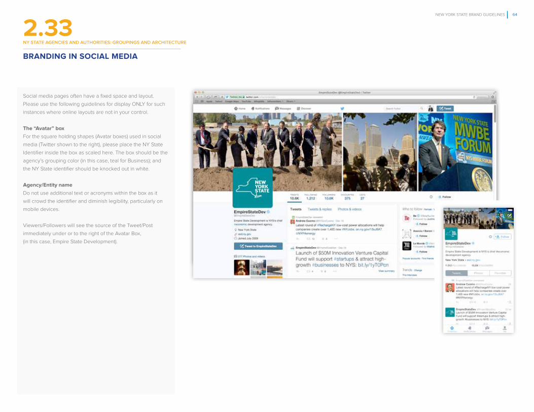
NEW YORK STATE BRAND GUIDELINES 64
FPO
Social media pages often have a fixed space and layout.
Please use the following guidelines for display ONLY for such
instances where online layouts are not in your control.
The “Avatar” box
For the square holding shapes (Avatar boxes) used in social
media (Twitter shown to the right), please place the NY State
Identifier inside the box as scaled here. The box should be the
agency’s grouping color (in this case, teal for Business); and
the NY State identifier should be knocked out in white.
Agency/Entity name
Do not use additional text or acronyms within the box as it
will crowd the identifier and diminish legibility, particularly on
mobile devices.
Viewers/Followers will see the source of the Tweet/Post
immediately under or to the right of the Avatar Box,
(in this case, Empire State Development).
BRANDING IN SOCIAL MEDIA
2.33ny STATe AGencIeS AnD AUThorITIeS: GroUpInGS AnD ArchITecTUre

NEW YORK STATE BRAND GUIDELINES 65
FPO
IDENTIFIER ON VIDEOIn video communications, the rules outlined throughout the
guidelines should be adhered to as best as possible.
Animations should be kept to a minimum to maintain the
strength and authority of the brand (ie. no spinning brand mark
or introduction of rainbow colors outside of the prescribed
palette.)
The preferred bug location is in the lower right corner as
shown here, respecting minimum clear space, etc.
BRANDING IN VIDEO COMMUNICATIONS
2.34ny STATe AGencIeS AnD AUThorITIeS: GroUpInGS AnD ArchITecTUre

NEW YORK STATE BRAND GUIDELINES 66
3. The Great Seal of the State of New York, the Coat of Arms and Governor’s Endorsement

NEW YORK STATE BRAND GUIDELINES 67
new york STATe SeALS
3.1
Over the years, the Great Seal of the State of New York and
the Coat of Arms have been used improperly through out
the state. The consequence has been that neither symbol
maintains any consistent recognition or authority with state
audiences.
How to comply with the rules governing The Great Seal
The Great Seal of the State of New York can only be used
by the Governor’s Office or with approval from the Secretary
of State (see following instructions). The Secretary of State is
the custodian of the Great Seal of the State of New York. The
seal is used to authenticate official records of the State. The
Secretary of State may authorize the use of the seal for certain
educational or commemorative purposes pursuant to State
Law section 74. Requests to reproduce the Great Seal of the
State of New York for educational or commemorative purpo-
ses, should clearly describe the proposed use. Requests to
reproduce the seal in educational publications should specify
the title and a description of the publication in which the seal
will be used, its publication date, and the number of copies
to be published. Requests must be submitted in writing to the
New York State Department of State, Office of Counsel, One
Commerce Plaza, 99 Washington Avenue, Albany, NY 12231.
The Coat of Arms
The Coat of Arms to the right is approved for use only in legal
documents, such as licenses, deeds, titles and certificates. All
other communications must use the brand mark or identifier.
Full and one color treatments
The full color Coat of Arms illustrated to the right is the only
approved color version. In cases where only one or two colors
are available for production, render the Coat of Arms in the
coded color of the grouping under which the issuing agent is
grouped.
THE GREAT SEAL OF THE STATE OF NEW YORK, AND THE COAT OF ARMS
THE GREAT SEAL OF THE STATE OF NEW YORK
THE STATE OF NEW YORK COAT OF ARMS

NEW YORK STATE BRAND GUIDELINES 68
new york STATe SeALS
3.2
Whenever the Coat of Arms is used on an official communi-
cation piece, it is imperative that the words New York State
are prominently positioned. Proper credit must be accrued
to the state, as neither the brand mark nor the identifier is
present.
Coat of Arms/Agency lock ups
The type size (lower case) of the agency name is 1/8th the
height of the Coat of Arms. The type size equals the ‘‘X” value
illustrated to the right.
The agency name is rendered in D Sari Bold.
Anchor line
As seen here, the horizontal or vertical line used in lock ups
that anchors one entity with another (e.g. Coat of Arms with
an agency). The anchor line thickness equals Y—half the
thickness of the initial capital letter of the agency name. The
width (vertical lock up) or height (horizontal lock up) of the
anchor line should be the respective width/height of the Coat
of Arms.
Relative Relationship between the Coat of Arms and
Agency Name
The distance between the Coat of Arms and the anchor line,
as well as the agency name and the anchor line, equals X—the
height of the lower case letters in the agency name.
Color
The agency name is rendered in its coded color.
Clear space
Clear space around the Coat of Arms/agency lock up equals X.
Two lock up options
There are two lock up options, one vertical and one horizontal,
to accommodate different layout options
THE NEW YORK COAT OF ARMS AND AGENCY LOCK UPS
ANCHOR LINE THICKNESS
HORIZONTAL LOCK UP
AgencyName
AgencyName
LOCK UP CLEAR SPACE
AgencyName
VERTICAL LOCK UP
AgencyName
AgencyName
TYPE SIZE AND ANCHOR LINE WIDTH
A = HEIGHT OF THE CAPITAL LETTER OF THE AGENCY NAME

NEW YORK STATE BRAND GUIDELINES 69
new york STATe SeALS
3.3
Coat of Arms/multiple agency lock ups
There are occasions when multiple agencies need to be
endorsed by the Coat of Arms. The size of the agency name is
1/8th the height of the Coat of Arms, the “X” value. The height
of the lower case letters in the agency name also equals X.
Anchor Line
As seen here, the horizontal or vertical line used in lock ups
that anchors one entity with another (e.g. Coat of Arms with
multiple agencies). The anchor line thickness equals Y—half
the thickness of the initial capital letter of the agency name.
The width (vertical lock up) or height (horizontal lock up) of the
anchor line should be the respective width/height of the Coat
of Arms.
Relative Relationship between the Coat of Arms and
agency name
The distance between the Coat of Arms and the anchor line,
as well as the agency names and the anchor line, equals
X—the height of the lower case letters in the agency name.
The distance between agency names is 2 X.
Color
The agency names are rendered using the core colors
of the NY State color palette.
Clear Space
Clear space around the Coat of Arms/multiple-agency
lock up equals X.
Two lock up options:
There are two lock up options, one vertical and one
horizontal, to accommodate different layout options
THE NEW YORK COAT OF ARMS AND MULTIPLE AGENCY LOCK UPS
HORIZONTAL LOCK UP 1
HORIZONTAL LOCK UP 2
VERTICAL LOCK UP
AgencyName
TYPE SIZE AND ANCHOR WIDTH
AgencyName 1
AgencyName 2
AgencyName 1
AgencyName 2
AgencyName 1
AgencyName 2

NEW YORK STATE BRAND GUIDELINES 70
new york STATe SeALS
3.4
The mock up of a vehicle title to the right illustrates how the
Coat of Arms/agency lock up would look in a real world exa-
mple of its appropriate use (ie deed, license, title or other legal
document).
View the sample to the right only for how the endorsement
system is rendered.*
The agency is rendered in D Sari Bold.
EXAMPLE OF THE NEW YORK COAT OF ARMS AND AGENCY LOCK UP

NEW YORK STATE BRAND GUIDELINES 71
On occasion, the Governor will develop and deploy broad
initiatives to benefit the state’s primary and longterm interests.
These will generally involve multiple supporting agencies and
programs.
There are two authorized endorsement lockups
The first lockup with the Governor’s seal is used when
representing both the State and Governor (as in a podium
graphic or press release telegraphing that this is a
Governor’s Initiative for NYS.)
The second lockup is used to crisply identify the specific
initiative and to reinforce the special nature of the multi-agency/
program initiatives.
1. Representing the State and Governor: As illustrated to
the right (top), the NY State brand mark is locked up with the
Governor’s seal using the same rules as any other entity:
locked up with the NY State brand mark. This lock up may
be displayed in either full- or one-color alternatives.
2. Representing the initiative: When the Governor launches
initiatives, the initiative will be locked up with the Governor’s
seal as displayed to the right (bottom). This endorsement
system can accommodate either the overall initiative (bottom
left), or the initiative with accompanying supporting agencies.
Refer to page 68 for relative relationship.
GOVERNOR’S ENDORSEMENT
3.5
GOVERNOR’S FULL COLOR ENDORSEMENT LOCK UP GOVERNOR’S ONE COLOR ENDORSEMENT LOCK UP
GOVERNOR’S SEAL AND INITIATIVE/PROGRAM FULL COLOR LOCK UP GOVERNOR’S SEAL AND MULTIPLE INITIATIVE/PROGRAM COLOR LOCK UP
Governor’s EnergyInitiative
Governor’s EnergyInitiativeSupportingEntity 1SupportingEntity 2
new york STATe SeALS

NEW YORK STATE BRAND GUIDELINES 72
GOVERNOR’S ENDORSEMENT EXAMPLES
3.6
An EconomicDevelopment Report
new york STATe SeALS
A LETTER FROM GOVERNORANDREW CUOMO:
Western New York is on the move - a place where pipe dreams are becoming steel beams, and economic
activity is growing at a pace not seen in decades.
Western New York has always been a vital part of the success of New York State, and even the nation. As the
western end point for the Erie Canal, Bu� alo was a focal point for industry and trade. It was where the world’s fi rst
steampowered grain elevator was built and the fi rst American city with widespread electric lighting.
As the 20th century wore on, however, Bu� alo and Western New York faced severe challenges, with drastic declines in economic activity
and population numbers. Years of neglect or mismanagement by state and local government compounded the national economic trends
working against the region. The fi scal crisis reached a peak when extreme fi scal management measures were put into place to save Bu� alo
from bankruptcy. The New York Sun newspaper asked the question in a headline, “Can Bu� alo Ever Come Back?”
The new century, however, sees Western New York on the rise, with new opportunities and encouraging successes, spurred by signifi cant
investment by New York State. My administration not only remembers the glorious history of Western New York, we also see its current
promise as an engine for New York State’s continued growth, and have promised one billion dollars to help the region reach new heights.
• We see opportunities to grow businesses, ranging from green energy to medical research, and from internet web support to
manufacturing. The recently announced state investment in the RiverBend clean energy research facility alone will create 850 jobs.
• We knew that development of Buff alo’s waterfront was a good idea waiting to happen. Today, it is the hottest spot in town, with
cranes in the air and hundreds of thousands fl ocking to work and play.
• We want to maximize the area’s potential as a world-class tourism destination, and have worked to prompt the creation or
revitalization of important tourism assets like the Niagara Falls Culinary Institute, Niagara Falls State Park, the Bu� alo Bills and
Maid of the Mist.
• We know that infrastructure will be key to the area’s vitality, so we have worked to remove the Robert Moses Parkway and shake
the gridlock around the Peace Bridge, literally and fi guratively.
• We also knew we needed to fi nd innovative ways to fund these initiatives, so we implemented a unique plan to sell unutilized
electricity from hydropower programs, and struck a long awaited casino revenue sharing deal with Seneca Nation of Indians.
We’ve already seen strong signs that our approach is working. CNBC.com named Bu� alo the 2nd best city to relocate to in America, and
Forbes ranked it 75th among the best American cities for business and careers — ahead of places like Chicago, Philadelphia and San Diego
— and 50th in the nation for job growth.
We are confi dent that Western New York is not a place of by-gone glory days. It is a vibrant, exciting area where great things are happening.
We are proud of our accomplishments in the region so far and stand resolute in seeing the region’s recovery through to its grand fruition.
A LETTER FROM GOVERNOR ANDREW CUOMO: Western New York is on the move -- a place where pipe dreams are becoming
steel beams, and economic activity is growing at a pace not seen in decades.
Western New York has always been a vital part of the success of New York
was a focal point for industry and trade. It was where the world’s first steam-
powered grain elevator was built and the first American city with widespread electric lighting.
As the 20th
drastic declines in economic activity and population numbers. Years of neglect or mismanagement
by state and local government compounded the national economic trends working against the region.
The fiscal crisis reached a peak when extreme fiscal management measures were put into place to
New York Sun newspaper asked the question in a headline, “Can
The new century, however, sees Western New York on the rise, with new opportunities and
encouraging successes, spurred by significant investment by New York State. My administration
not only remembers the glorious history of Western New York, we also see its current promise as an
engine for New York State’s continued growth, and have promised one billion dollars to help the region
reach new heights.
§ We see opportunities to grow businesses, ranging from green energy to medical research, and
from internet web support to manufacturing. The recently announced state investment in the
RiverBend clean energy research facility alone will create 850 jobs.
§ it is the hottest spot in town, with cranes in the air and hundreds of thousands flocking to work
§ We want to maximize the area’s potential as a world-class tourism destination, and have worked
to prompt the creation or revitalization of important tourism assets like the Niagara Falls
§ We know that infrastructure will be key to the area’s vitality, so we have worked to remove
the Robert Moses Parkway and shake the gridlock around the Peace Bridge, literally and
figuratively.
§ We also knew we needed to find innovative ways to fund these initiatives, so we implemented a
unique plan to sell unutilized electricity from hydropower programs, and struck a long awaited
casino revenue sharing deal with Seneca Nation of Indians.
nd best
city to relocate to in America, and Forbes ranked it 75th among the best American cities for business
and careers — ahead of places like Chicago, Philadelphia and San Diego — and 50th in the nation for
job growth.
We are confident that Western New York is not a place of by-gone glory days. It is a vibrant, exciting
area where great things are happening. We are proud of our accomplishments in the region so far and
stand resolute in seeing the region’s recovery through to its grand fruition.
With optimism,
Andrew M. Cuomo, Governor
2
With optimism,
Andrew M. Cuomo, Governor
A LETTER FROM GOVERNOR ANDREW CUOMO: Western New York is on the move -- a place where pipe dreams are becoming
steel beams, and economic activity is growing at a pace not seen in decades.
Western New York has always been a vital part of the success of New York
was a focal point for industry and trade. It was where the world’s first steam-
powered grain elevator was built and the first American city with widespread electric lighting.
As the 20th
drastic declines in economic activity and population numbers. Years of neglect or mismanagement
by state and local government compounded the national economic trends working against the region.
The fiscal crisis reached a peak when extreme fiscal management measures were put into place to
New York Sun newspaper asked the question in a headline, “Can
The new century, however, sees Western New York on the rise, with new opportunities and
encouraging successes, spurred by significant investment by New York State. My administration
not only remembers the glorious history of Western New York, we also see its current promise as an
engine for New York State’s continued growth, and have promised one billion dollars to help the region
reach new heights.
§ We see opportunities to grow businesses, ranging from green energy to medical research, and
from internet web support to manufacturing. The recently announced state investment in the
RiverBend clean energy research facility alone will create 850 jobs.
§ it is the hottest spot in town, with cranes in the air and hundreds of thousands flocking to work
§ We want to maximize the area’s potential as a world-class tourism destination, and have worked
to prompt the creation or revitalization of important tourism assets like the Niagara Falls
§ We know that infrastructure will be key to the area’s vitality, so we have worked to remove
the Robert Moses Parkway and shake the gridlock around the Peace Bridge, literally and
figuratively.
§ We also knew we needed to find innovative ways to fund these initiatives, so we implemented a
unique plan to sell unutilized electricity from hydropower programs, and struck a long awaited
casino revenue sharing deal with Seneca Nation of Indians.
nd best
city to relocate to in America, and Forbes ranked it 75th among the best American cities for business
and careers — ahead of places like Chicago, Philadelphia and San Diego — and 50th in the nation for
job growth.
We are confident that Western New York is not a place of by-gone glory days. It is a vibrant, exciting
area where great things are happening. We are proud of our accomplishments in the region so far and
stand resolute in seeing the region’s recovery through to its grand fruition.
With optimism,
Andrew M. Cuomo, Governor
2
AS SEEN HERE, NOTE THE USE OF BOTH THE STATE ENDORSEMENT LOCKUP AND THE GOVERNOR’S ENDORSEMENT LOCK UP. SIZE AND PLACEMENT OF THE LOCK UPS CAN VARY DEPENDING UPON THE SIZE OF THE DISPLAY AREA AND THE DEMANDS OF THE COMMUNICATION.

NEW YORK STATE BRAND GUIDELINES 73
What brand graphic elements are
Graphic elements such as prescribed photographic style, proprietary shapes and patterns, and the ability to combine these
elements, enhance the ability of the primary elements (brand mark, identifier, color palette, typography) to deliver a distinctible look
and feel for communications on behalf of all NY State entities.
Graphic elements help creativity as well as consistency
Even if you were to obscure the NY State brand mark or identifier, you should be able to see and feel the New York State
experience manifested in it’s communications. Additionally, these elements will add consistent visual appeal to layouts.
The guidelines for these elements are generally fixed, but allow for some flexibility
This section offers rules on the elements and how to combine them. Some rules are mandatory, while others offer
choices about kind, size and placement of elements.
How this section is organized
The graphic elements are discussed and then followed by examples that illustrate the proper use of the elements in
real world examples.
4. New York State Brand Graphic Elements

NEW YORK STATE BRAND GUIDELINES 74
new york STATe SeconDAry IDenTITy eLemenTS
4.1
What the diversity holding shape is
The holding shape is a graphic device that permits great
diversity in creating layouts, while simultaneously insuring a
consistent look and feel across different materials developed
by different state agencies, offices and programs.
It consists of a large quadrilateral shape, with a thinner
quadrilateral accent bar. The diversity holding shape can be
positioned anywhere on the layout as long as it anchors to
one or two edges of the layout, either top, bottom, left or right.
How it is used
As illustrated to the right, it can work in horizontal or vertical
formats, and scale up, down or across depending on the
variety of material being produced. Use it to highlight and
organize visual or verbal information, such as photographs
or headlines respectively.
Color and image selection
Colors can be selected from the core color palette, the
appropriate coded color of one of the eight groupings, or
simply filled in with images. The accent strip should appear
in a contrasting color, also selected from approved palettes
(shown to the right in light blue with gold accent).
See pages 80-89 for examples of the graphic elements in
real world communications.
THE DIVERSITY HOLDING SHAPE
THE DIVERSITY HOLDING SHAPE
FIGURE 1
FIGURE 2
SAMPLES

NEW YORK STATE BRAND GUIDELINES 75
new york STATe SeconDAry IDenTITy eLemenTS
4.2
What the progress holding shape is
This holding shape is a graphic device that permits great
visual enhancement in creating layouts, while simultaneously
insuring a consistent look and feel across different materials
developed by different state agencies, offices and programs.
The progress holding shape gets its inspiration from the
anchor line device used in lock ups. Use it to highlight and
organize verbal information, such as text or headlines. It can
also be used to hold images. The progress holding shape can
be positioned anywhere on the layout as long as it anchors to
either the left or right edge of the layout.
How it is used
It is used to help show movement and/or progress in layouts.
As illustrated to the right, it can be used only in a horizontal
format, and scaled larger and smaller without altering the
radius of the one rounded edge.
Color and image selection
Colors can be selected from the core color palette, the
appropriate coded color of one of the eight groupings,
or simply filled in with images.
See pages 80-89 for examples of the graphic elements
in real world communications.
THE PROGRESS HOLDING SHAPE
THE PROGRESS HOLDING SHAPE
SAMPLES
THE PROGRESS HOLDING SHAPE IS BASED OFF THE ANCHOR LINE DEVICE

NEW YORK STATE BRAND GUIDELINES 76
new york STATe SeconDAry IDenTITy eLemenTS
4.3
Use the NY State Brand Character as your guide to
selecting photography
Authentic: images should be candid shots. Avoid staged
poses whenever possible.
Inspiring: when lighting subjects or capturing landscapes,
try and choose a light source that creates an uplifting and
optimistic point of view.
Dynamic: try and infuse action in shots, showing
progress in motion.
Compassionate: preserve the dignity of the subject matter.
Photographic tints
The use of photographic tints, or duotone photography,
is not encouraged but is permitted as long as the colors of
the tint used are from the gold or light blue in the core color
palette of NY State (see pages 17-18). Use good judgment to
insure proper contrast so that the images are not muddied
or obscured by the tints.
Match images to reinforce content effectively
Often it can be difficult to find the right image from a pre-selec-
ted image bank. Strive to select images that match the content
as exactly as possible. Example: if the content is about a sum-
mer event, try and find images that coincide with that season
(e.g. no one should be wearing a winter coat).
PHOTOGRAPHY STYLE

NEW YORK STATE BRAND GUIDELINES 77
new york STATe SeconDAry IDenTITy eLemenTS
4.4
Holding shapes and the use of imagery
It is important that photography be represented in consistent
ways so that communications from all entities of NY State have
a branded look and feel. Please consult the guideline illustra-
tions to the right.
Single image
When using a single image on a page (surface), it should
appear either as a full bleed (the image has no defined edges
and appears to extend beyond the borders of the page),
or contained in either the diversity or progress holding shape.
See examples to the right. The full bleed is preferable,
but not required. Use your good judgement and knowledge
of relevant production concerns.
Multiple images
When using multiple images, they should be fitted into either
the diversity or progress holding shape. Additionally, they may
be “tiled”—that is, arranged in quadrilateral shapes that touch
each other without any borders. Finally, they can also be tiled
into a full-bleed execution (the images have no defined edges
at the edges of the page). See guidelines to the right.
Use good design judgment
When combining photos, take care to select which images
go next to others. Try and match production quality, lighting,
camera angles and so on so that—taken together—the collec-
tive images exist on the page harmoniously.
See pages 85-89 for examples of the graphic elements
in real world communications.
PHOTOGRAPHY USAGE
FULL BLEED IMAGE IMAGE IN PROGRESS HOLDING SHAPE*
FULL BLEED MULTIPLE IMAGES
MULTIPLE IMAGES IN PROGRESS HOLDING SHAPE*
IMAGE IN THE DIVERSITY HOLDING SHAPE*
IMAGE IN THE DIVERSITY HOLDING SHAPE*
MULTIPLE MAGE IN THE DIVERSITY HOLDING SHAPE*
MULTIPLE MAGE IN THE DIVERSITY HOLDING SHAPE*
SINGLE IMAGE USAGE MULTIPLE IMAGES USAGE
HOLDING SHAPE OVER IMAGE*
PROGRESS HOLDING SHAPE OVER IMAGE*
PROGRESS HOLDING SHAPE MULTIPLE IMAGES
DIVERSITY HOLDING SHAPE OVER IMAGES*
REPRESENTS AN IMAGE
* HOLDING SHAPES CAN BE SCALED IN ANY PROPORTIONS

NEW YORK STATE BRAND GUIDELINES 78
new york STATe SeconDAry IDenTITy eLemenTS
4.5
Consistent presentation of information
It is important that charts and graphs be represented in
consistent ways so that communications from all entities
of NY State have a branded look and feel. Please consult
the guideline illustrations to the right.
Chart and graph style
These chart styles are inspired by the progress holding shape
(see page 75) and intended to convey information with great
fluidity of motion.
Color selection
Colors can be selected from the core color palette, or the
appropriate coded color of one of the nine groupings
(shown to the right in the core color palette for NY State).
Use good design judgment and design principles in sizing
them and juxtaposing them with other visual and verbal
information in the layout.
CHARTS AND GRAPHS
CHARTS AND GRAPHS
89%Lorem Ipsum
56%Lorem Ipsum
41%Lorem Ipsum
1
05 000
2
4
5
6
7
8
9
10
11
12
45% 38% 21% 51% 22% 76%
Lorem
Lorem Lorem Lorem
Lorem Lorem
28%
42%
56%
33%
74%54% LOREM
LoremIpsum
89%
64%
55%
IPSUM LOREM IPSUM LOREM IPSUM LOREM IPSUM LOREM
lorem
lorem
lorem
lorem

NEW YORK STATE BRAND GUIDELINES 79
new york STATe SeconDAry IDenTITy eLemenTS
4.6
Iconography is a system of pictorial images relating to or illus-
trating a variety of subjects. They are designed to be intuitive
and telegraphic: they function to rapidly convey the location
or intention of information. They are most frequently seen
on “buttons” for smart phones and signs. Some samples are
illustrated here.
Style Guidelines
The suggested iconography style is based off the NYS outline
from the NY State brand mark. Design iconography in a way
that mimics the line weight, the rounded line terminals and the
“gap” opening as illustrated.
Note
These are only sample iconography. There is no official bank
of these images. Rather, they are intended to provide gui-
dance when creating them, as well as to ensure consistency in
communications across the entities of NY State.
ICONOGRAPHY
ICON EXAMPLESICON GUIDELINE

NEW YORK STATE BRAND GUIDELINES 80
new york STATe SeconDAry IDenTITy eLemenTS
4.7
Proper use of color
For giveaways, as a general rule, try to use colors from the NY
State core color palette (see pages 17-18). If there is a need
for using the coded color of a grouping, please adhere to the
color formulas shown on pages 28-29.
Proper use of the identifier
As seen to the right on flash drive examples, when space is
too small for NY State brand mark’s minimum size require-
ments, use the NY State identifier instead of the brand mark
(see page 13 for guidelines).
BRANDING APPLICATION IN REAL WORLD SITUATIONS

NEW YORK STATE BRAND GUIDELINES 81
new york STATe SeconDAry IDenTITy eLemenTS
4.8
To the right are several examples of how you should NOT
represent either the NYS brand mark or a NY State/Agency
lock up. This is by no means a complete list. These examples
represent the ‘‘don’ts’’ most commonly used when guidelines
are violated.
A. Do not use either the NY State brand mark or identifier
on items that pull apart or separate in a way where such
separation divides the mark or identifier into pieces.
B. Do not position the NY State brand mark or lock ups on
shapes that compromise legibility.
C. Do not represent the NY State brand mark or lock up at a
size that compromises legibility.
D. Do not crop the brand mark or lock up.
E. Do not place the brand mark or lock ups on colors that
compromise legibility and contrast.
BRANDING APPLICATION IN REAL WORLD SITUATIONS DONT’S
A.
D.
E.
B.
C.
C.
C.

NEW YORK STATE BRAND GUIDELINES 82
new york STATe SeconDAry IDenTITy eLemenTS
4.9
The same guideline rules apply to presentation templates
Use the appropriate endorsement systems, typography (Arial,
a replacement font) and color in these guidelines to create
PowerPoint templates.
You can use any color from the core palette combined with
the associated grouping color. Be consistent with the use of
the color throughout the presentation. The brand mark lock up
should appear in the bottom right corner of all of the «content»
slides.
All presentations MUST be built in 16:9 proportion.
Graphic element usage
As seen to the right, the diversity holding shape forms the
basis of all slides. Here, the holding shape is the core color
dark blue with an accent line in the color of the grouping (teal).
Alternative option
See the next page for an alternative layout option.
EXAMPLE OF POWERPOINT SLIDES (1 of 2)
AGENCY PPT PAGE LAYOUT EXAMPLE
COVER TITLE AND CONTENT
SECTION HEADER TWO CONTENT
Master Title (Arial Bold)Master Sub Title
Date
Master Title (Arial Bold)#Date
Copy (Arial Regular) Quantia diori ommoluptiis aperferum vendem si nobit ut etum restiatiurit aut latesti onsectum quatur, nem cus dolent utem ea dolupti rem rerferibus, quam, con plisi quid et, sa sus, culpa porerum adi quid que occullestet alia sitat lat veles ipsandenti officiene corist, voluptatem nosandaectem dis sit que exceruptatis si andam faces nonserum fugitium.
Master Title (Arial Bold)Date
Copy (Arial Regular) Quantia diori ommoluptiis aperferum vendem si nobit ut etum restiatiurit aut latesti onsectum quatur, nem cus dolent utem ea dolupti rem rerferibus, quam, con plisi quid et, sa sus, culpa porerum adi quid que occullestet alia sitat lat veles ipsandenti officiene corist, voluptatem
Culpa porerum adi quid que occullestet
28%
42%
56%
33%
#
Master Title (Arial Bold)Master Sub Title
Date #

NEW YORK STATE BRAND GUIDELINES 83
new york STATe SeconDAry IDenTITy eLemenTS
4.9
To the right are more examples of content slide lay outs, along
with examples of a presentation by an agency program (note
agency presence in the holding shape.)
It is important to be bold and yet simple with the use of colors.
Furthermore, be sure to keep the pages as uncluttered and
readable as possible. Do not crowd slides with charts or
photos with text.
Program/Initiative Presentation
When a program or initiative is making the presentation, the
endorsing agency is listed in type in the holding shape at the
bottom of the cover page and repeated throughout the docu-
ment in the footer.
The two bottom slides illustrate an alternative application of
color, utilizing the associated color of the grouping.
EXAMPLE OF POWERPOINT SLIDES (2 of 2)
TWO CONTENT COMPARISON
PROGRAM PPT PAGE LAYOUT EXAMPLE
Master Title (Arial Bold)Date
Master Title (Arial Bold)#Date
Copy (Arial Regular) Quantia diori ommoluptiis aperferum vendem si nobit ut etum restiatiurit aut latesti onsectum quatur, nem cus dolent utem ea dolupti rem rerferibus, quam, con plisi quid et, sa sus, culpa porerum adi quid que occullestet alia sitat lat veles ipsandenti officiene corist, voluptatem
Copy (Arial Regular) Quantia diori ommoluptiis aperferum vendem si nobit ut etum restiatiurit aut latesti onsectum quatur, nem cus dolent utem ea dolupti rem rerferibus, quam, con plisi quid et, sa sus, culpa porerum adi quid.
Culpa porerum adisa:
15%5%
50%
30%
COVER TITLE AND CONTENT
Master Title (Arial Bold)Master Sub Title
A Division of Empire State Development
Date
Master Title (Arial Bold)#Date
Copy (Arial Regular) Quantia diori ommoluptiis aperferum vendem si nobit ut etum restiatiurit aut latesti onsectum quatur, nem cus dolent utem ea dolupti rem rerferibus, quam, con plisi quid et, sa sus, culpa porerum adi quid que occullestet alia sitat lat veles ipsandenti officiene corist, voluptatem nosandaectem dis sit que exceruptatis si andam faces nonserum fugitium andi destem aut aut eossi opti descid et essunt et unt. Rum es rectin nim nobis nobis resed.
A Division of Empire State Development
AGENCY PPT PAGE LAYOUT EXAMPLE
#

NEW YORK STATE BRAND GUIDELINES 84
new york STATe SeconDAry IDenTITy eLemenTS
4.10
Special circumstances
When circumstances make the use of a white background
impractical, use the alternative layout option illustrated to
the right.
Graphic element usage
As seen to the right, the diversity holding shape forms the
basis of all slides. Here, the holding shape is the core color
dark blue with an accent line in the color of the grouping (teal).
EXAMPLES OF ALTERNATIVE POWERPOINT SLIDES
PPT PAGE LAYOUT NEGATIVE EXAMPLE
COVER TITLE AND CONTENT
SECTION HEADER TWO CONTENT
Master Title (Arial Bold)Master Sub Title
Date
Master Title (Arial Bold)Date
Copy (Arial Regular) Quantia diori ommoluptiis aperferum vendem si nobit ut etum restiatiurit aut latesti onsectum quatur, nem cus dolent utem ea dolupti rem rerferibus, quam, con plisi quid et, sa sus, culpa porerum adi quid que occullestet alia sitat lat veles ipsandenti officiene corist, voluptatem nosandaectem dis sit que exceruptatis si andam faces nonserum fugitium.
Master Title (Arial Bold)Date
Copy (Arial Regular) Quantia diori ommoluptiis aperferum vendem si nobit ut etum restiatiurit aut latesti onsectum quatur, nem cus dolent utem ea dolupti rem rerferibus, quam, con plisi quid et, sa sus, culpa porerum adi quid que occullestet alia sitat lat veles ipsandenti officiene corist, voluptatem
Culpa porerum adi quid que occullestet
28%
42%
56%
33%
#
Master Title (Arial Bold)Master Sub Title
Date #
#

NEW YORK STATE BRAND GUIDELINES 85
new york STATe SeconDAry IDenTITy eLemenTS
4.11
The same guideline rules apply to tradeshow displays
Use the appropriate endorsement systems, typography
(Proxima Nova and Oswald) and color in these guidelines
to create booth elements templates.
Graphic element usage
As seen to the right, both holding shapes may be used. Use
the coded color of the agency grouping in conjunction with
color(s) from the NY State core palette. Note the same rules for
photography used in printed examples (see pages 76-77 for
photography guidelines).
EXAMPLE OF TRADE SHOW DISPLAYS

NEW YORK STATE BRAND GUIDELINES 86
new york STATe SeconDAry IDenTITy eLemenTS
4.12DESIGN LAYOUTS IN REAL WORLD SITUATIONS
SINGLE IMAGE CONTAINED IN DIVERSITY HOLDING SHAPE (ABOVE), OR FULL BLEED (RIGHT). SEE PAGE 76-77 FOR FURTHER GUIDANCE ON PHOTOGRAPHY.
Resource Guide for
Teen Drivers
dmv.ny.gov
Department ofMotor Vehicles
July 19, 2015 at 1:00p.m.Lake Welch State Park
Harriman, NY
SAFE PARKS INITIATIVE
PRESS EVENT
NOTE PROPER LEGIBILITY AND CONTRAST OF ENDORSEMENT MARKS: IN BLUE AGAINST A WHITE BACKGROUND.

NEW YORK STATE BRAND GUIDELINES 87
new york STATe SeconDAry IDenTITy eLemenTS
4.12DESIGN LAYOUTS IN REAL WORLD SITUATIONS
Discover New York State
ilovenew.com/paththroughhistory
Arts & CultureCanals & TransportationCivils RightsColonial HistoryImmigration
Innovation & CommerceNative AmericansNatural HistoryRevolutionary WarSport History
U.S. PresidentsWar of 1802Women’s Rights
Explore Today
NOTE PROPER COLOR USAGE: GROUPING COLOR (TEAL FOR BUSINESS) PAIRED WITH NY STATE CORE COLOR (GOLD) IN ALL EXECUTIONS.
Building EconomicOpportunitiesfor MWBE’s
A Division of Empire State Development

NEW YORK STATE BRAND GUIDELINES 88
new york STATe SeconDAry IDenTITy eLemenTS
DESIGN LAYOUTS IN REAL WORLD SITUATIONS
NOTE PROPER SPACING BETWEEN LOGOS, FROM THE STATE ENDORSEMENT AND STATE/AGENCY ENDORSEMENT.
New York has more than 1,000 miles of scenic trails?
Heart Lake and Algonquin Mountain, NY.
Plan your next New York State vacation at
GET OUTTATOWN.
iloveny.com and mta.info
Your Getaway Begins at iloveny.com and 800/CALL-NYS
SUMMERO�cial 2014 New York State Travel Guide
Empire StateDevelopment
4.12
NOTE USE OF BOTH THE PROGRESS HOLDING SHAPE AND DIVERSITY HOLDING SHAPE

NEW YORK STATE BRAND GUIDELINES 89
new york STATe SeconDAry IDenTITy eLemenTS
4.13IDENTITY GUIDELINES ENSURE A FAMILIAR LOOK AND FEEL ACROSS NEW YORK STATECOMMUNICATIONS
New York has more than 1,000 miles of scenic trails?
Heart Lake and Algonquin Mountain, NY.
Plan your next New York State vacation at
GET OUTTATOWN.
iloveny.com and mta.info
Your Getaway Begins at iloveny.com and 800/CALL-NYS
SUMMERO�cial 2014 New York State Travel Guide
Empire StateDevelopment
July 19, 2015 at 1:00p.m.Lake Welch State Park
Harriman, NY
SAFE PARKS INITIATIVEPRESS EVENT
Resource Guide for
Teen Drivers
dmv.ny.gov
Department ofMotor Vehicles
Discover New York State
ilovenew.com/paththroughhistory
Arts & CultureCanals & TransportationCivils RightsColonial HistoryImmigration
Innovation & CommerceNative AmericansNatural HistoryRevolutionary WarSport History
U.S. PresidentsWar of 1802Women’s Rights
Explore Today
Building EconomicOpportunitiesfor MWBE’s
A Division of Empire State Development

NEW YORK STATE BRAND GUIDELINES 90
Honor the commitment
These guidelines are not casual recommendations, but rather a comprehensive set of rules to be followed by every
person issuing communications on behalf of the state and its entities. Full compliance is expected.
Share with vendors and personnel charged with developing and producing communications
If you are hiring outside vendors to field initiatives or create materials, please make sure they have a
copy of these guidelines and are capable and willing to follow them.
For more information please contact the following
• General Questions: TBD
• Font licenses for desktop and app: TBD
• Web Design Guidelines: TBD
• Branding and graphic elements and image bank: TBD
ImplementationSchedule
•All new programs, new program collateral and websites will follow
new branding immediately.
•Business cards by December, 2014 for all senior leadership, new
hires & promotions.
•All di gital templates must be redesigned before end of year 2014
(PPT, Press Release, Forums, etc.).
•All existing collateral must be redesigned to be compliant with new
branding when next reprinting is required.
•All .gov sites will be redesigned to comply based upon rollout plan
of site updates.

NEW YORK STATE BRAND GUIDELINES 91
Honor the commitment
These guidelines are not casual recommendations, but rather a comprehensive set of rules to be followed by every
person issuing communications on behalf of the state and its entities. Full compliance is expected.
Share with vendors and personnel charged with developing and producing communications
If you are hiring outside vendors to field initiatives or create materials, please make sure they have a
copy of these guidelines and are capable and willing to follow them.
For more information please contact the following
• General Questions: TBD
• Font licenses for desktop and app: TBD
• Web Design Guidelines: TBD
• Branding and graphic elements and image bank: TBD
5. Guidelines Commitment