my n a s a d a ta k -2 : c r e a ti n g b a r g r a p h s ... · my n a s a d a ta : k-2 , c...
TRANSCRIPT

My NASA Data
K-2: Creating Bar Graphs Lesson Plan Purpose: Graphs help to make counting and comparing meaningful, especially for visual learners as their number sense develops. In this lesson, students use authentic temperature data from NASA satellites to practice creating bar graphs, as well as using data as evidence when developing claims. Note: This lesson is not recommended as the first introduction students have to the concept of graphing but recommended in the later stage of instruction on graphing.
Grade Level: K-2 Time: 2-45 minute class periods
Lesson Objectives: ● Students will create a bar graph using temperature data taken
from NYC during 2017 ● Students will make observations and inferences of graphed data ● Students will make claims about what clothing would be most
appropriate to wear considering the evidence provided in the graph.
● Students will cut and paste clothing that would be most suitable for the outside temperatures on the bar graph.
Sphere(s): ● Atmosphere
Phenomena NASA Connection:
In this lesson, students use authentic temperature data from NASA satellites to practice creating bar graphs, as well as using data as evidence. Graphs help to make counting and comparing meaningful, especially for visual learners as their number sense develops. Collecting data and creating a bar graph makes it easier for students to recognize patterns and draw conclusions. While bar graphs are simple ways to display data, mastering this skill can be tricky for many students. Note: This lesson is not meant to be used to introduce students to the concept of graphing but recommended as further development of the concept of graphing once they have an understanding of how to construct a graph. To begin teaching graphing, consider using real objects on a graphing mat or in a pocket chart, as well as picture graphs more concrete experiences like blocks or crayons or personal data like favorite color, birth months, eye color, etc. to increase student engagement before moving to this lesson.
Essential Questions:
1. How does temperature change over the course of a year?
2. How do we use data about the outside temperature to determine the type of clothing we should wear?
NGSS Performance Expectation(s):
● K-ESS3-2. Ask questions to obtain information about the purpose of weather forecasting to prepare for, and respond to, severe weather.*
● 2-ESS1-1. Use information from several sources to provide evidence that Earth events can occur quickly or slowly.
Science & Engineering Practices: Analyzing and Interpreting Data Use observations (first hand or from media) to describe patterns in the natural world in order to answer scientific questions.
Disciplinary Core Ideas: ESS2.D: Weather and Climate Weather is the combination of sunlight, wind, snow or rain, and temperature in a particular region at a particular time. People measure these conditions to describe and record the weather and to notice patterns over time.
Crosscutting Concepts: Cause and Effect Events have causes that generate observable patterns.

My NASA Data: k-2, Creating Bar Graphs
Cross-Curricular Connections: National Geography Standards:
● How to use maps and other geographic representations, tools, and technologies to acquire, process, and report information from a spatial perspective.
Career Connections: o Atmospheric and Space Scientists – Investigate weather and climate related phenomena to prepare weather reports and
forecasts for the public
Multimedia Resources: ● Bar Graph | Peg + Cat Videos | PBS KIDS (http://pbskids.org/video/peg/2365288512) ● Minions Official Movie Clip #1 - New York (2015) - Despicable Me https://youtu.be/nrUDMhI204U
Materials/Resources Needed: Teacher Demonstration Copy: (optional) ● Map of NY ● United States Map ● Seasonal Clothing
Per Student: ● Scissors ● Glue ● Pencil ● Optional: Color Pencils for graphing ● 1 Copy of the following sheets per student
○ Graphing Sheet ○ Student Worksheet ○ NYC Average 2017 Surface Temperature Data Table ○ Student Cut Outs: Seasonal Clothing
Key Vocabulary:
● Data ● Bar Graph ● Observations ● Temperature ● Fahrenheit ● Label ● Seasons ● Data Table
Background Information:
The ability to read, understand, and create graphs is a skill embedded in all content areas and is commonly found in many forms of media. Traditionally, graphing was mostly taught in the contexts of mathematics, science, and social sciences but we are now finding graphs and other math representations; graphs are used every day to communicate trends ranging in real-world topics from online sales to insurance claims. A graph (like a picture) is worth 1,000 words, ripe with potential for creating context and meaning of data in a visual way. It is defined as a collection of points and lines connecting subsets of these points. Points in a graph represent a “datum” or item of information gathered from measurement or research (“data” is a collection of facts). It is usually created as a two-dimensional or three-dimensional plot depending on the type of data you are trying to graph. Graphs provide fertile ground for helping scientists answer questions about variables and drawing conclusions about trends and patterns. Before scientists graph data, they decide what kind of graph is best to answer their research questions. Scientists then organize their data in the form of data tables before conducting an investigation so that they can easily interpret what is observed. Data tables are designed typically with manipulated variables (also referred to as independent variables) in the left column with responding variable (dependent variable) on the right. When visualizing scientific data, scientists generally use either bar graph, pie charts, and line graphs. Pie charts are used to show how some fixed amount/quantity is subdivided out of 100%. Bar and line graphs use two axes: the horizontal line is referred to as the x-axis, and the vertical line is known as the y-axis.The manipulated variable is shown on the X axis and is generally understood or controlled by the scientist. Alternatively, the responding variable is shown on the Y axis and is the variable of interest that the scientist is trying to understand. Bar graphs are used to compare amounts in the vertical direction. Line graphs
2

My NASA Data: k-2, Creating Bar Graphs
are used to show how data changes over time in a continuous manner, with the manipulated variable on the X axis and the responding on the Y axis. For more information on how to teach graphing literacy, check out “Teaching Graph Literacy Across the Curriculum” https://concord.org/wp-content/uploads/2016/12/pdf/teaching-graph-literacy-across-curriculum.pdf
For a primer on how we construct graphs in science, visit the NASA: BEST-Graphing YouTube. https://youtu.be/ssXPrG0PGDY
Prerequisite Student Knowledge/Skills:
● Tactile dexterity to cut paper with scissors and glue ● Familiarity with seasonal changes related to weather ● Familiarity with Map of United States ● Basic ability to read a map ● Basic ability to read bar graph
Possible Misconceptions:
● Often students have problems with the computation, prediction, and extracting information not explicitly included in the graph.
Procedure:
Part 1: Engage Prior Knowledge of Data and Graphing 1. Write the words “Bar Graph” on the board. Ask students to brainstorm what the
term means; students share their thoughts with the class. Ask students to describe the last time they collected information in the form of numbers and graphed those data into a graph.
2. Set the learning intention by explaining to students that they will practice using information about the weather to create a bar graph.
3. If students need additional engagement, visit the PBS Kids link to watch a two minute video (Peg + Cat, Bar Graph). Peg and Cat collect data on a fun kinesthetic game called “cavorping” and use these data to make a bar graph.
a. Before showing the video, instruct students to look for the following information:
1. What is “Cavorping”? A game played by sticking out your tongue and hopping on one foot. 2. Who participated in the Cavorping? Peg, Cat, Big Dog 3. Where do you find this in the graph? Along the bottom of the graph 4. What information did Peg include on the left side of the graph? Number of how many times they were able to do the game before they fell. 5. What does this graph show us? Let’s write it at the top at the Title. Number of times Peg, Cat, and Big Dog Cavorped 6. Who “cavorped” the most times? Cat and Big Dog tied 7. Who “cavorped” the least? Peg
Part 2: Setting The Stage
3

My NASA Data: k-2, Creating Bar Graphs
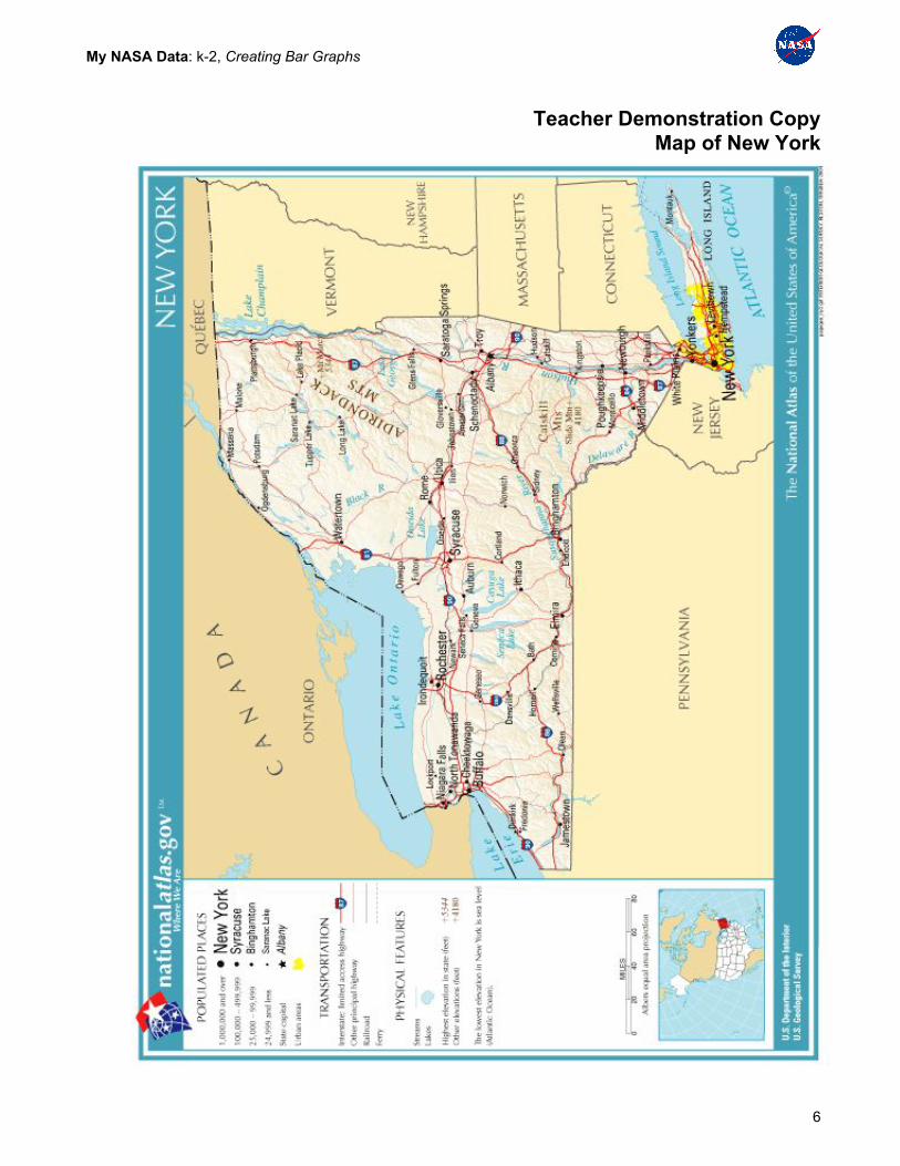
1. Display a map of the United States (see Teacher Demonstration Copy: United States Map). Ask students to find New York (NY).
2. Once NY is located, show students the Teacher Demonstration Copy: Map of New York and ask them to find New York City.
3. Engage students to brainstorm what they may know about NY. To set the stage for the challenge question and build prior knowledge about the setting (NYC), show the ~1min video segment of Despicable Me where the Minions land in NYC. (Stop at 01:00)
4. Write the challenge on the board: “Track temperature changes in New York City so we can help The Minions know what kinds of clothes to wear.”
5. Review the four seasons and the clothes that a Minion may select for each: i.e., Spring - rain boots, umbrellas, long pants, long sleeve shirts; Summer - overalls, short sleeve shirts, shorts, flip flops, bathing suits; Fall - long pants, long sleeve shirts, sweater, covered shoes; Winter - snow boots, long pants, gloves, hats, coats.
6. Explain that the class will explore temperature data (average for how warm or cold the air is at the surface of the Earth) over 12 months during 2017 in New York City. Students will graph these 12 data points into a bar graph, just like scientists do! We will use these data to develop a clothing plan for the Minions.
7. Show the different clothing choices (Teacher Demonstration Copy of Seasonal Clothing) for the Minions and identify which season the different items would most likely be worn.
Part 3: Graphing NYC Temperature Data
1. Project the blank bar graph on the screen at the front of the room. Now, distribute the Graphing Sheet and have students put their name on their copy.
2. Ask students to put their finger on the left side of the graph (beside the numbers). Have students take their pencil or crayon to draw over this left line making it clearer and thicker to show that it is the Y Axis. Ask Students: “What do you think we will be adding along this side?” (Temperature) Have students label the left side Temperature (in units of degrees Fahrenheit)
3. Direct students to find the bottom line of the graph with their finger. Have students take their pencil or crayon to draw over this bottom line making it clearer and thicker to label as the X Axis. Ask them what the line should show. (Months of the Year). Have students label the bottom “Months of the Year” underneath the abbreviated months.
4. Now, distribute the Student Data Table. Model for students how we take the first temperature value for January 2017.
5. Students now work independently to graph the data provided.
Part 4: Attributing Average Temperatures with Appropriate Clothing
6. Distribute scissors, glue, and Student Cut Outs: Seasonal Clothing to each student.
7. Model for students how they are to select the clothing that goes for each month. They will cut the clothing out and glue it at the top of each bar on the graph. Review safety issues for using scissors and glue.
4

My NASA Data: k-2, Creating Bar Graphs
8. Once data is graphed and the clothing selections are glued, have students/class develop a title that fits the graphed data and write it on the Graphing Sheet.
Wrap Up:
1. Distribute the Student Worksheet, have each student write their name on their paper and review the questions together.
2. Students should review the graph to answer the questions.
Extension: Graphing Your Class Data 1. Consider having students collect air temperature measurements
throughout the week, month, or school year in a data table as they make the measurements. Students may graph data and begin making comparisons.
2. For more information on how to join with students, teachers, and scientists from around the world to help all of us learn more about our planet, consider becoming a GLOBE Teacher. The GLOBE Program is a science education collaboration that provides students and the public worldwide with the opportunity to contribute meaningfully to our understanding of the global environment and climate. For more information, see https://www.globe.gov/.
5
My NASA Data: k-2, Creating Bar Graphs
Teacher Demonstration Copy Map of New York
6

My NASA Data: k-2, Creating Bar Graphs
Teacher Demonstration Copy United States Map
7

My NASA Data: k-2, Creating Bar Graphs
Teacher Demonstration Copy Seasonal Clothing
8

My NASA Data: k-2, Creating Bar Graphs
Student Cut Outs: Seasonal Clothing
Student Cut Outs: Seasonal Clothing
9

My NASA Data: k-2, Creating Bar Graphs
Student Data Table
New York City, NY 2017 Average Surface Temperature (℉)
DATE Average Surface Temperature (℉)
15-Jan-2016 39
15-Feb-2016 36
15-Mar-2016 44
15-Apr-2016 49
15-May-2016 58
15-Jun-2016 67
15-Jul-2016 75
15-Aug-2016 77
15-Sep-2016 71
15-Oct-2016 61
15-Nov-2016 51
15-Dec-2016 42
10

My NASA Data: k-2, Creating Bar Graphs
11

My NASA Data: k-2, Creating Bar Graphs
Student Name:________________________ My NASA Data: Creating Bar Graph Student Worksheet 1. Which month has the highest temperature?
2. In that month, what clothing would a person most likely wear? Why?
3. Which month has the lowest temperatures?
4. In that month, what clothing would a person most likely wear? Why?
5. What is the most common clothing item worn over the year in NYC?
6. What clothing, if any, was not worn during the year? Why?
12

My NASA Data: k-2, Creating Bar Graphs
13