music magazine analysis
TRANSCRIPT

Music Magazine AnalysisAnalysis of Genre Specific Magazine Pages

Front Pages Analysis

Most of the font on the front cover is white, contrasting with the coloured background, the juxtaposition of colours emphasizing the white font. This colour of font clearly represents the issue discussed in this issue – “Is hip-hop finally colour blind?” and keeping the cover line articulated clearly for the particular VIBE audience this debate applies to.
Buzz words attracts more readers through the need consumers have for surveillance. The “exclusive” knowledge on T.I and the London riots and the red font in the white text box makes it stand out and shows the importance of the cover line below.
The central image is a large image that takes up the whole front cover, even obstructing a portion of the masthead, of two white rappers who both face the camera face on. This body language and blocking gives an impression and representation of challenge to the onlooker to judge their abilities on their colour, this is also indicative of the attitude associated with the rap industry and emphasizes their success and prominence within the industry despite their colour because their similar attitudes are shown here clearly.

Here the main cover line is at the bottom of the page, emphasizing the importance of the artist in the central image. There is block font used and the colour is both translucent white and just a white outline, again furthering the prominence of the image to the reader. This is significant as it is an image of Lil Wayne on stage and that’s what the article discusses: “Lil Wayne the king of hip-hop live”. The use of the word “king” also explains why the central image is the main focus on this front page, it connotes the significance and success of a “king”, even if its just in one respect of the rap industry.
The smaller cover lines here are on various rappers of smaller status than Lil Wayne, shown very blatantly in the size of font and positioning of them. These are also in white, in keeping with the colour scheme and contrasting with the purple background to bring in the readers focus. The variety of artists discussed within the magazine means that XXL has a very diverse mode of address, ensuring a much wider audience and consumer base they can appeal to.

The colour scheme of this FC clearly represents the topics shown to be discussed in the magazine in the skyline and very few cover lines – money and marijuana. (Dollar bills are green and medical marijuana is legal in the USA.) The association is very reflective of the genre as making money and smoking marijuana are common topics discussed in rap.
The lack of very many cover lines at all highlights the main image, an image of a prominent rapper Busta Rhymes that takes up the whole front cover and has a bleed. The image features the rapper wearing green clothes and diamond jewellery while he lights a cigar with burning money. The connotations here are obvious, that this “recession-proof” rapper is so successful and wealthy that he can burn money to light an expensive cigar even in the economic downturn. The blatant appeal of getting to this financial state in our lives is appeal enough to pick up a magazine with this central image like this, and indeed because of this central image.

The anchorage here is made prominent here through the size, contrasting font (with the masthead it is situated next to) and the colour scheme of yellow on black highlighting the cover lines. This prominence highlights the central image, which isn’t the sole focus of the readers attention given all the rest of the content on the front cover. Therefore this cover line gives the central image the prominence on the front cover it otherwise wouldn’t achieve.
The skyline and other cover lines as well as the plugs show a wide range of articles on various artists and topics that give huge variety to the Hip Hop Connection audience it otherwise get if it focused solely on the front cover interview with Jay-Z. However there smaller size and placement on the page give the central image more focus to draw more audience in.
The free CD plug in the skyline attracts additional consumers and the sizeable amount of the page taken up the CD itself give this element of the front cover significance in the readers focus and attention. The font of the plug also contrasts greatly with the otherwise yellow font on the FC.

The contrast of red on black font of the masthead and the black and white central image and rest of the front cover highlights the masthead and plugs to draw attention to the magazine. In addition the black and white image and cover line font will attract more attention on a magazine rack in comparison to all the colours that most magazines use to gain attention and attract potential consumers to their magazines.
The pull quote used here attracts more consumers given their need for surveillance and knowledge of the people and celebrities they like. It is highlighted through the use of red speech marks and its placement on the front cover – prominent and on its own with no clutter it becomes the focus of the readers attention.
The simple lay out as well as the pull quote work together to show a simple aim the artist has – to make music and that’s it. He isn’t shown to be the biggest thing on the front cover, instead he is shown the same size as the cover lines in a simple pose that connotes humility and modesty. As opposed to the second front cover, where the rapper is presented as the biggest thing there is on the page, this implies ego and arrogance as opposed to modesty and humility.

Contents Page Analysis
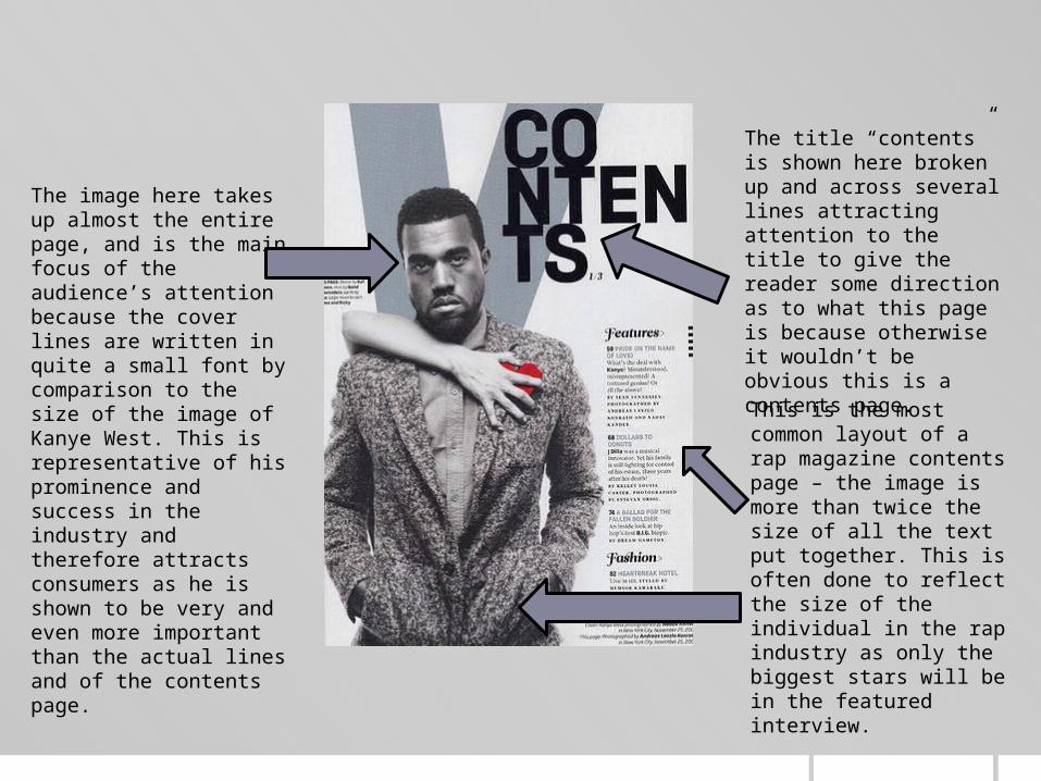
The image here takes up almost the entire page, and is the main focus of the audience’s attention because the cover lines are written in quite a small font by comparison to the size of the image of Kanye West. This is representative of his prominence and success in the industry and therefore attracts consumers as he is shown to be very and even more important than the actual lines and of the contents page.
The title “contents” is shown here broken up and across several lines attracting attention to the title to give the reader some direction as to what this page is because otherwise it wouldn’t be obvious this is a contents page.
This is the most common layout of a rap magazine contents page – the image is more than twice the size of all the text put together. This is often done to reflect the size of the individual in the rap industry as only the biggest stars will be in the featured interview.

This is the less common layout of a contents page in a rap magazine. While it may look very similar and the image is still large, it is smaller than the text which is important as this is rare because often the rappers featured claim to be the biggest etc. whereas this isn’t represented in here. Instead in combination with the pull quote also featured the page reflects the rappers contrast in aims in comparison to almost all the rest of rappers in the industry – here he is represented with the aim to make music because that’s what he loves to do, not because he loves the lifestyle that comes with the success and wealth.
The contents page colour scheme is often far more muted than it is on the front cover , whereas the colour scheme on a front cover is typically very bright and vivid in order to attract consumers the colour scheme on a contents page is subtle and muted in order to reflect the further deeper the magazine gets into the featured persons character: the bright colours, flashes and buzz words aren’t there to mask them. Instead they are bare and unmasked, implying the audience is reading further into the persons life and character.

Here the image is of equal size to the lines of writing on the page and so represents her equal importance to the contents of the entire magazine. This makes her less of a feature, as opposed to the men on contents pages which despite what size their image is on the page are shown to be one of the most important features in the magazine.
The woman in the image is shown only in her underwear, this reinforces the stereotype within the rap industry that woman are there for objectification and not a lot else, she is also shown with her hands behind her back in a position that connotes weakness and a lack of power in comparison to the body language in every other image shown in this document.
The mise en scene in this image also shows the typical muted colour scheme of contents pages in rap magazines, the audience feel an implication of deeper knowledge of her as she is shown, quite literally bare with little to hide behind. This is perhaps less poignant than it was in the previous contents page because of the stereotypical male ego that is flaunted by every man in the rap industry, whether it is authentic of their personality or not and so this could be construed more as a comment on her sexuality and objectifying her, given she is shown with little covering her inn any respect, than showing her personality for what is actually is by comparison to the front cover of this issue.

Here there are velvet curtains in the background that connote a showman aspect of this rappers personality and is representative of his ability as a rapper given that live performance is an integral part of an individual rappers overall ability and skill. This gives the audience the implication of his superior skill and abilities, this is reinforced by his costume.
The suite shown here informs the audience of Eminem’s success given that it simply connotes wealthy and any further deductions are obvious but in addition that only the successful rappers become music moguls, often enough of their own labels that this is almost a convention that the most successful rappers follow . Therefore there is an implication of this specifically, and more than an implication is the reader has background knowledge on this rapper anyway.
The size of this image inn relation to the text of the contents page is quite large, obviously showing his importance within the magazine and therefore connoting his success and prominence by comparison to the other features which he is shown to be superior to here. The mise en scene of the shot is darker than the convention, he almost blends in with the curtains behind him, conveying an individual message of separation and privacy as opposed to the proximity to the reader that is conveyed in the first two contents pages given that he is almost blending in to the background the reader isn’t aware of an obvious statement implied that states “I’m here. Deal with it” instead he is seen studiously looking right at the camera, as if to the reader and a sense of intellect beyond the stereotype of a typical rapper is created in conjunction with the implication he is some form of music mogul

The size of the image here is far bigger than the actual lines on the contents page showing these women as a clear and important feature of the magazine, as opposed to the other contents page featuring a woman shown in this analysis. There is further contrast in the costume and mise en scene of this image, here the women are shown in flattering but comparatively respectable outfits that don’t adhere to the industry stereotype of women, in addition the background is unusually bright,, however their dress is muted and so this convention can be seen here as well, showing them to be of equal stature and similar to the men shown in previous contents pages as the same conventions are applied to them.
This unique way of displaying the title of “contents” attracts the readers attention and identifies the magazine as Vibe Magazine, in addition it is shown smaller here compared to the contents page featuring Kanye West and so the women appear more prominent and remain the focus of the readers attention.
The background here is bright white, and while their dress means the convention of a muted colour scheme on the contents page is maintained this still has an impact on the readers understanding of these women as they observe the page. It implies a positivity to their presence and contrasts with the representations of men in previous contents pages. This is representative of the significant difference in the perceptions of genders within the rap and hip-hop industries.

Double Page Spread Analysis

One of two typical double page spread layouts is used here: one large or two medium sized images displayed next you a lot of text on one artist or band. The amount of content about the artist and the images themselves imply an openness and proximity that is uncommon among celebrities in general and shows something about this particular artists personality as opposed to someone who doesn’t offer the same proximity to readers. This is supported by the costume in both images which is simple and unassuming without implication of luxury and wealth it shows this rapper and vocalists aim to create music instead of money as shown in the shot of him in a recording studio. The amount of content also implies during the interview itself the artist was more forward than others might have been and therefore there is more to discuss, hence the size of the article.
The pull quote here encapsulates what is implied through the layout of this double page spread, he says that “it’s all documented” and therefore the implication is he doesn’t hide because he can’t hide anyway. He also refers to fake personas, another thing noticeably absent from this double page spread , the not so subtle hints of luxury and wealth that boost the persona of someone who claims to just be interested in money and not a lot else.

Here is a second example of a common double page spread layout in a rap magazine, a large image and a large text. Perhaps indicative of what is important in the rap industry – the size of your success. The masthead hear attracts audiences because of its size on the page and the blocked font as well as the intriguing word “cipher” that ensures you will continue reading as you want to know what the cipher, (or encrypted message) from the artist presumably, is. This is in keeping with the personality of the artist featured who fans will already know has misunderstood tattooed on his face and claims nobody can understand him. This is an example of how the layout of a DPS can immediately convey messages to an audience through something as simple as a title. This message is extended through the display of an image of him on stage (where he is known to have superior abilities than a lot of rappers in the industry) implying a difference between what you see on stage and the actual man behind the stage performance and the music, hence the title “the cipher” referring to his music as a cipher.

This is the other common layout of a double page spread in a rap magazine: a very large picture taking up almost the entire DPS and a small article conveying little about the persons character. These types of DPS don’t convey the same proximity or imply much about the persons character. They simply show very clearly how they are and how they want to be perceived by others. For example the image here is of the artist in a luxury suit holding a champagne glass and a champagne bottle in front of a white background and some scattered transparent balloons that altogether connote a wealthy party lifestyle he wants to be associated with. And by extension also connotes his success and popularity through the display of wealth here. The fact that the image here is the largest thing on the page implies this is the most important thing to this rapper – his image and the awareness of his wealth and success. This contrasts with the initial two layouts which perhaps display a side of the rap industry which is much rarer, as layouts that connote the same things this does are very common throughout not only rap magazines themselves but just this analysis too.
The comparatively small amount of text in this article compared to the first two and strengthens the implications already set forth by the image as it shows little about the artist himself and only focuses the audiences attention on the image more because its such a small article by comparison.

This is another example of the first of the two common DPS layouts in rap magazines, it shows a large image of a rapper in simple clothes, however he is covering a part of his face. In addition there is a large amount of text in the article on him showing a lot more about him than the previous DPS did about the rapper featured in that DPS. The body language in the image is defensive doesn’t connote close proximity to the audience however it does also imply intelligence, as stated outright by the title referring to him as “pure genius”. Otherwise it includes simple mise en scene that doesn’t connote success or that he is an established persona (I have no idea who he is) but instead implies he is down to earth and not interested in flaunting success or money instead the title and his body language imply he is interested in being recognised for his intelligence within the industry and by extension talent as well.
The pull quotes and direct look into the camera in the image show this rapper isn’t afraid to show who he is actually and doesn’t hide behind a persona or an image of just wealth and luxury. Instead he gives his views about things directly and isn’t afraid to look the observer in the eye as it were as he does that, even if it is from a magazine DPS and not in person.

This is a good example of how this type of layout can be used to convey more than just a fake persona or image too. This very large image of T.I. close up but wearing sunglasses shows his lack of fear of proximity and of an observer seeing him but also shows the observers incapacity to see him clearly anyway. His confidence is conveyed here with a clear message that he isn’t afraid for the camera to be that up close because we won’t properly see him anyway. This is a good reference to what is stated often in the industry by several rappers, that others won’t be able to understand them because they are that much better than them and this is what is shown here and is another common feature throughout rap magazines, the size of egos in the industry shown more subtly in this case, more often not so subtly.
Again the ratio of the sizes of the article and the image is significant as it is a comment on the importance of the content to the readers focus. This first thing seen is the rapper as this is the first thing that is read into and analysed. After registering all that has been connoted and implied through the image the consumer will then read what little there is to say on the rapper. This is important because the fact that there isn’t a lot said about him, but at the same time he is obviously important ensures the readers understanding of what is implied throughout this DPS