music magazine
TRANSCRIPT
MUSIC MAGAZINEBy Sarah Watson
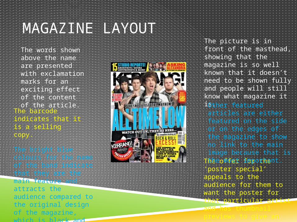
MAGAZINE LAYOUTThe words shown above the name are presented with exclamation marks for an exciting effect of the content of the article.
The bright blue colours for the name of the band indicate that they are the main feature and attracts the audience compared to the original design of the magazine, which is black and white.
The picture is in front of the masthead, showing that the magazine is so well known that it doesn’t need to be shown fully and people will still know what magazine it is.
The offer for the ‘poster special’ appeals to the audience for them to want the poster for that particular artist and has thumbnail previews to give an idea.
Other featured articles are either featured on the side or on the edges of the magazine to show no link to the main image because that is the most important.
The barcode indicates that it is a selling copy.
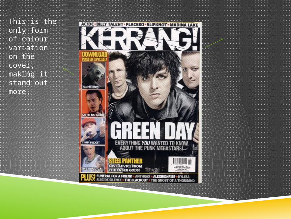
This is the only form of colour variation on the cover, making it stand out more.
VARIATIONS OF COVER EFFECT
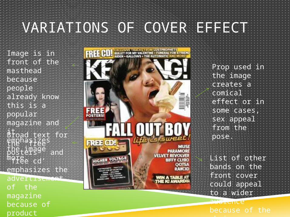
Prop used in the image creates a comical effect or in some cases, sex appeal from the pose.
Broad text for the ‘free posters’ and ‘free cd’ emphasizes the advertisement of the magazine because of product giveaway.
List of other bands on the front cover could appeal to a wider audience because of the choice.
Image is in front of the masthead because people already know this is a popular magazine and it emphasizes the image more.
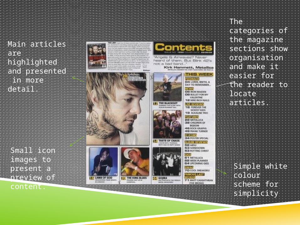
The categories of the magazine sections show organisation and make it easier for the reader to locate articles.
Small icon images to present a preview of content.
Main articles are highlighted and presented in more detail.
Simple white colour scheme for simplicity
CONTENTS
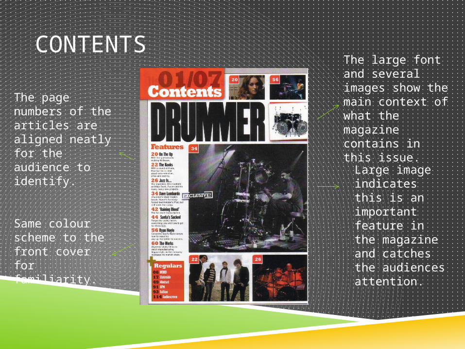
Large image indicates this is an important feature in the magazine and catches the audiences attention.
The large font and several images show the main context of what the magazine contains in this issue.
The page numbers of the articles are aligned neatly for the audience to identify.
Same colour scheme to the front cover for familiarity.

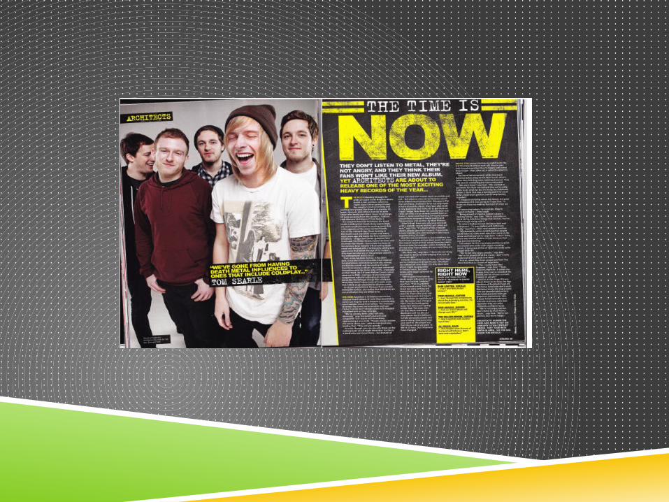
Subtitle for the article is a pun based on the artist’s past work and shows a sense of familiarity. Artwork of the
album identifies what the article is going to be based around.The image of the
main artist draws the audience in visually.
The text is aligned on a tilt to create a scattered approach to the design of the page and make it look more interesting.
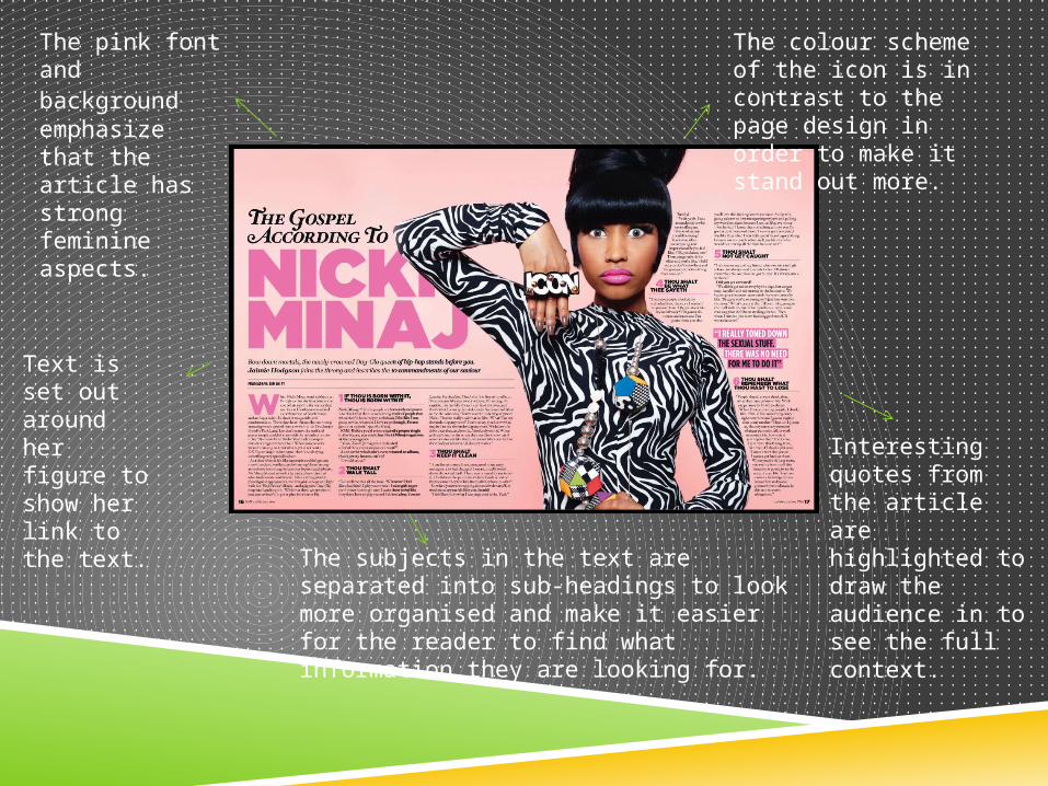
The colour scheme of the icon is in contrast to the page design in order to make it stand out more.
The pink font and background emphasize that the article has strong feminine aspects.
Text is set out around her figure to show her link to the text.
Interesting quotes from the article are highlighted to draw the audience in to see the full context.
The subjects in the text are separated into sub-headings to look more organised and make it easier for the reader to find what information they are looking for.