msi graphics library 3q2016
TRANSCRIPT

1MARKET STRATEGY & INSIGHTS GRAPHICS LIBRARY |
www.equinix.com

2MARKET STRATEGY & INSIGHTS GRAPHICS LIBRARY |
This library was prepared for the use of the Market Strategy and Insights team. It
comprises of multiple examples of charts and graphics than can be replicated using the
tools we currently have access to. The charts and graphics presented in this library can
be created using Microsoft PowerPoint, Microsoft Excel, Think-Cell, Tableau Public
and RAW. An Iconography Bank which includes 400+ scalable vector graphic icons and
14 customizable maps is also included in this library. We will endeavor to add more
content to this library and enhance it based on your feedback and business needs.
Feel free to pull items from this library and if you need any assistance, training or if you
have suggestions on how we can improve this library please contact:
Regards,
Ezekiel “Kyle” Bunda
Sr. Graphics Designer

3MARKET STRATEGY & INSIGHTS GRAPHICS LIBRARY |
Column 4
Marimekko 5
Waterfall 6
Line 7
Area 9
Stock (Box-and-Whisker) 10
Pie 11
Donut 12
Chloropleth 15
Bubble Map 16
Flow Map 18
Chord Diagram 19
Radar 20
Heat Map 22
Bubble Plot 23
Bubble Cluster 24
Nightingale Rose 25
Sunburst 27
Dendograms 28
Alluvial (Fineo-like) 30
Bump 31
Steamgraph 32
Treemap 33
Venn Diagram 34
XY Scatter 35
Speedometer 36
Other Illustrations 37
Iconography Bank 40

4MARKET STRATEGY & INSIGHTS GRAPHICS LIBRARY |
COLUMNPowerPoint Only
1.6 1.61.7
1.2
1.4
2010 2011 2012 2013 2014
Free Cash Flow
(U.S. $ billions)
1.35
1.741.89
1.54
1.85
2010 2011 2012 2013 2014
Adj. Earnings per Common Share
(U.S. $)
0%
5%
3%
2%
1%
2010 2011 2012 2013 2014
Revenue Growth Before Currency
18.7% 19.1%17.7%
15.0%
2010 2011 2012 2013 2014
Underlying Operating Profit Margin
1.60
2.202.40
2.102.30
2010 2011 2012 2013 2014
Cash Operating Income
(U.S. $ billions)
6.0%
6.9%6.5%
5.3%5.8%
2010 2011 2012 2013 2014
ROIC
17.0%18.0% 18.0%
2.40 2.50
1.8 1.81.93
2.00
• The classic bar chart uses
either horizontal or vertical
bars (AKA column chart)
to show discrete,
numerical comparisons
among categories. One
axis of the chart shows
the specific categories
being compared, and the
other axis represents a
discrete value.
• Bars charts are
distinguished from
histograms, as they do not
display continuous
developments over an
interval. Bar chart's
discrete data is
categorical data and
answers the question of
"how many?" in each
category.
DESCRIPTION

5MARKET STRATEGY & INSIGHTS GRAPHICS LIBRARY |
MARIMEKKO CHARTThink-cell to PowerPoint
21.4%
10.7%
19.0%
1Q2016
26.1%
3,664
22.0%
18.9%
3,601
4Q2015
25.1%
10.6%
23.4%
18.8%
25.3%
10.9%
3Q2015
23.6%
3,279
18.0%
11.0%
2Q2015
25.7%
23.8%
22.7%
25.6%
10.9%
21.6%
3,557 3,427
Cloud &
IT Services
Content &
Digital Media
Enterprise
Financial
Services
Network
16.9%
23.4%
21.6%
22.8%
2Q2016
• Marimekko Charts are
used to visualise
categorical data over a
pair of variables. They
work as kind of two-way
100% Stacked Bar Graph,
where all the bars are of
equal length across a
value/scaled axis and are
divided into segments.
Only in a Marimekko
Chart, both axes are a
variable with a scale, that
determine both the width
and height of each
segment. This makes it
possible to detect
relationships between
categories and their
subcategories via the two
variables.
DESCRIPTION

6MARKET STRATEGY & INSIGHTS GRAPHICS LIBRARY |
WATERFALLThink-cell
31
85
57
16
10685
307
8,763
Parent roll-
up audit
M&A
8,884
Acquisition
Net Adds
Churn
3
1Q16
Count
8,797
+121
2Q16
Count
DivestureNovation
7
Timing
bet Asset
& BKGs
ChannelGross New
Logos from
BKGs
1Q
Restated
• The waterfall chart is
normally used for
understanding how an
initial value is affected by
a series of intermediate
positive or negative
values. Usually the initial
and the final values are
represented by whole
columns, while the
intermediate values are
denoted by floating
columns. The columns are
color-coded for
distinguishing between
positive and negative
values.
DESCRIPTION

7MARKET STRATEGY & INSIGHTS GRAPHICS LIBRARY |
LINEPowerPoint Only
0
200
400
600
800
1,000
1Q2015 2Q 3Q 4Q 1Q2016
Digital Realty NTT
Equinix Verizon
CenturyLink
Top 5 Colocation Market Companies
(U.S. $ millions)
0
2,000
4,000
6,000
8,000
10,000
1Q2015 2Q 3Q 4Q 1Q2016
Japan China
United States United Kingdom
Germany
Top 5 Colocation Market Countries
(U.S. $ millions)
• Line graphs are used to
display quantitative value
over a continuous interval
or time span. It is most
frequently used to show
trends and relationships
(when grouped with other
lines). Line graphs help to
give a "big picture" over
an interval, to see how it
has developed over that
period.
• Line graphs are drawn by
first plotting data points on
a cartesian coordinate
grid, then connecting a
line between the points.
Typically, the y-axis has a
quantitative value, while
the x-axis has either a
category or sequenced
scale. Negative values
can be displayed below
the x-axis.
DESCRIPTION
8MARKET STRATEGY & INSIGHTS GRAPHICS LIBRARY |
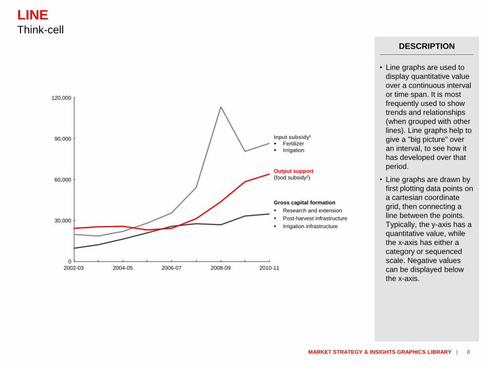
LINEThink-cell
90,000
120,000
60,000
30,000
0
Output support
(food subsidy2)
Input subsidy1
Fertilizer
Irrigation
Gross capital formation
Research and extension
Post-harvest infrastructure
Irrigation infrastructure
2010-112008-092006-072004-052002-03
• Line graphs are used to
display quantitative value
over a continuous interval
or time span. It is most
frequently used to show
trends and relationships
(when grouped with other
lines). Line graphs help to
give a "big picture" over
an interval, to see how it
has developed over that
period.
• Line graphs are drawn by
first plotting data points on
a cartesian coordinate
grid, then connecting a
line between the points.
Typically, the y-axis has a
quantitative value, while
the x-axis has either a
category or sequenced
scale. Negative values
can be displayed below
the x-axis.
DESCRIPTION

9MARKET STRATEGY & INSIGHTS GRAPHICS LIBRARY |
AREAExcel/ Think-cell
100
200
300
400
500
2012 2013 2014 2015 2016
EQIX.O Daily Closing Stock (USD)
50
100
150
2012 2013 2014 2015 2016
DLR Daily Closing Stock (USD)
• Area Graphs are Line
Graphs with the area
below the line filled in with
a certain color or texture.
Area Graphs are drawn by
first plotting data points on
a Cartesian coordinate
grid, then joining a line
between the points and
finally filling in the space
below the completed line.
• Like Line Graphs, Area
Graphs are used to
display the development
of quantitative values over
an interval or time period.
They are most commonly
used to show trends and
relationships, rather then
convey specific values.
DESCRIPTION

10MARKET STRATEGY & INSIGHTS GRAPHICS LIBRARY |
STOCK (BOX-AND-WHISKER PLOT)PowerPoint Only
300
340
380
420
May June July August
EQIX.O Daily Stock (USD)
80
95
110
125
May June July August
DLR Daily Stock (USD)
4,000
4,500
5,000
5,500
May June July August
NTT (9432.T) Daily Stock (JPY)
• A box plot is a convenient
way of visually displaying
groups of numerical data
through their quartiles.
Usually they also have
lines extending parallel
from the boxes (whiskers)
that indicate variability
outside the upper and
lower quartiles. Outliers
are sometimes plotted as
individual dots that are
inline with whiskers. Box
plots can be drawn either
vertically or horizontally.
• Typically used in
descriptive statistics, box
plots are a great way to
quickly examine one or
more data sets
graphically. Although they
may seem primitive in
comparison to a histogram
or density plot, they have
the advantage of taking up
less space, which is
useful when comparing
distributions between
many groups or data sets.
DESCRIPTION

11MARKET STRATEGY & INSIGHTS GRAPHICS LIBRARY |
PIEPowerPoint Only
63%10%
11%
3%
3%
10%
61%14%
6%
2%
2%
15%
2014 Revenues 2015 Expenses
U.S. Dollar British Pound Sterling
Euro Japanese Yen
Canadian Dollar Other
U.S. Dollar British Pound Sterling
Euro Japanese Yen
Canadian Dollar Other
• Extensively used in
presentations and offices,
pie charts help show
proportions and
percentages between
categories, by dividing a
circle into proportional
segments. Each arc
length represents a
proportion of each
category, the full circle
represents the total sum
of all the data, equal to
100%.
• Pie charts are ideal for
giving the reader a quick
idea of the proportional
distribution of the data.
DESCRIPTION

12MARKET STRATEGY & INSIGHTS GRAPHICS LIBRARY |
DONUTPowerPoint Only
2014 Revenues 2015 Expenses
U.S. Dollar British Pound Sterling
Euro Japanese Yen
Canadian Dollar Other
U.S. Dollar British Pound Sterling
Euro Japanese Yen
Canadian Dollar Other
63%10%
11%
3%
3%
10%
61%14%
6%
2%2%
15%
• A donut chart is
essentially a pie chart with
an area of the center cut
out.
• However, Donut Charts
have a slight advantage
over pie charts, which are
sometimes criticized for
focusing on relative sizes
of the pieces to one
another and to the chart
as a whole, giving no
indication of changes as a
whole when compared to
other pie charts.
• A Donut Chart partly
addresses this problem by
de-emphasizing the use of
area, to make the viewer
focus more on the
changes in overall values.
You are focused on
reading the length of the
arcs, rather then
comparing the proportions
between slices.
DESCRIPTION

13MARKET STRATEGY & INSIGHTS GRAPHICS LIBRARY |
DONUT OF DONUTPowerPoint Only
Cloud & IT
Content & Digital Media
Enterprise
Financial Services
Network
AMER
APAC
EMEA
18%
21%
9%
15%
18%
19%
7%
5%
6%
• Extensively used in
presentations and offices,
pie charts help show
proportions and
percentages between
categories, by dividing a
circle into proportional
segments. Each arc
length represents a
proportion of each
category, the full circle
represents the total sum
of all the data, equal to
100%.
• Pie charts are ideal for
giving the reader a quick
idea of the proportional
distribution of the data.
DESCRIPTION

14MARKET STRATEGY & INSIGHTS GRAPHICS LIBRARY |
BAR OF DONUTPowerPoint Only
Cloud & IT
Content & Digital Media
Enterprise
Financial Services
Network
AMER
APAC
EMEA
7%
5%
6%
18%
21%
9%
15%
18%
19%
• Extensively used in
presentations and offices,
pie charts help show
proportions and
percentages between
categories, by dividing a
circle into proportional
segments. Each arc
length represents a
proportion of each
category, the full circle
represents the total sum
of all the data, equal to
100%.
• Pie charts are ideal for
giving the reader a quick
idea of the proportional
distribution of the data.
DESCRIPTION

15MARKET STRATEGY & INSIGHTS GRAPHICS LIBRARY |
CHOROPLETH MAPSTableau to PowerPoint
Colocation Market
Worldwide Revenue for YTD 2016
Revenue (U.S. $ millions) 0 3,000
• Choropleth Maps display
divided geographical
areas or regions that are
coloured, shaded or
patterned in relation to a
data variable. This
provides a way to
visualise values over a
geographical area, which
can show variation or
patterns across the
displayed location.
• The data variable uses
colour progression to
represent itself in each
region of the map.
Typically, this can be a
blending from one colour
to another, a single hue
progression, transparent
to opaque, light to dark or
an entire colour spectrum.
DESCRIPTION

16MARKET STRATEGY & INSIGHTS GRAPHICS LIBRARY |
BUBBLE MAPTableau to PowerPoint
Colocation Market
Worldwide Revenue for YTD 2016
Bubble size: Revenue
• With this data map, circles
are displayed over a
designated geographical
region with the area of the
circle being proportional to
its value in the dataset.
• Bubble Maps are good for
comparing proportions
over geographic regions
without the issues caused
by regional area size, as
seen with Choropleth
Maps. However, the major
flaw with Bubble Maps is
that overly large bubbles
can overlap other bubbles
and regions on the map,
so this needs to be
accounted for.
DESCRIPTION

17MARKET STRATEGY & INSIGHTS GRAPHICS LIBRARY |
BUBBLE MAPTableau to PowerPoint
• With this data map, circles
are displayed over a
designated geographical
region with the area of the
circle being proportional to
its value in the dataset.
• Bubble Maps are good for
comparing proportions
over geographic regions
without the issues caused
by regional area size, as
seen with Choropleth
Maps. However, the major
flaw with Bubble Maps is
that overly large bubbles
can overlap other bubbles
and regions on the map,
so this needs to be
accounted for.
DESCRIPTION

18MARKET STRATEGY & INSIGHTS GRAPHICS LIBRARY |
FLOW MAPPowerPoint Only
NORTH
AMERICA
LATIN
AMERICA
EUROPE
AFRICA
MIDDLE
EAST
ASIA
OCEANIA
Bubble size: Intraregional used bandwidth
• Flow Maps geographically show the movement of information or objects from one location to another and their amount. Typically Flow Maps are used to show the migration data of people, animals and products. The magnitude or amount of migration in a single flow line is represented by its thickness. This helps to show how migration is distributed geographically.
• Flow Maps are drawn from a point of origin and branch out their "flow lines". Arrows can be used to show direction, or if movement is incoming or outgoing. Without arrows can be used to represent trade going back-and-forth. Merging/bundling flow lines together and avoiding crossovers can help to reduce visual clutter on the map.
DESCRIPTION

19MARKET STRATEGY & INSIGHTS GRAPHICS LIBRARY |
CHORD DIAGRAMTableau to PowerPoint
NWK > NWK
50,948 | ▲10%
No. of CCs | Y/Y
CIT > NWK
20,116 | ▲18%
CDM > NWK
17,167 | ▲24%
FIN > FIN
14,106 | ▲22%
FIN > NWK
13,767 | ▲9%
ENT > NWK
8,921 | ▲25%
• This type of diagram
visualises the inter-
relationships between
entities. The connections
between entities displays
that they share something
in common. This makes
Chord Diagrams ideal for
comparing the similarities
within a dataset or
between different groups
of data.
• Nodes are arranged
around a circle, with the
relationships between
points connected to each
other either through the
use of arcs or Bézier
curves. Values are
assigned to each
connection, which is
represented proportionally
by the size of each arc.
Colour can be used to
group the data into
different categories, which
aids in making
comparisons and
distinguishing groups.
DESCRIPTION

20MARKET STRATEGY & INSIGHTS GRAPHICS LIBRARY |
RADARPowerPoint only
$0
$200
$400
$600
$800
1Q 2014
2Q 2014
3Q 2014
4Q 2014
1Q 20152Q 2015
3Q 2015
4Q 2015
1Q 2016
• Radar Charts are a way of
comparing multiple
quantitative variables.
This makes them useful
for seeing which variables
have similar values or if
there are any outliers
amongst each variable.
• Each variable is provided
an axis, that starts from
the centre. All axes are
arranged radially, with
equal distances between
each other, while
maintaining the same
scale between all axes.
Grid lines that connected
from axis-to-axis are often
used as a guide. Each
variable value is plotted
along its individual axis
and all the variables in a
dataset and connected
together to form a
polygon.
DESCRIPTION

21MARKET STRATEGY & INSIGHTS GRAPHICS LIBRARY |
RADARPowerPoint only
Sub-
centres
Primary health
centres
Community
health centres
District
hospitals
Students per
classroom
Pupils per
teacher
Enrolment
Electrification
Modern
Fuel2
Toilet
penetration
Piped
water in the
community
Healthcare
Per capita
Education
Ratio
Energy
Percentage
Water and
sanitation
Percentage
0.0
0.2
0.4
0.6
0.8
1.0
Current levels
Potential levels in 2021-22
(inclusive reforms) • Radar Charts are a way of
comparing multiple
quantitative variables.
This makes them useful
for seeing which variables
have similar values or if
there are any outliers
amongst each variable.
• Each variable is provided
an axis, that starts from
the centre. All axes are
arranged radially, with
equal distances between
each other, while
maintaining the same
scale between all axes.
Grid lines that connected
from axis-to-axis are often
used as a guide. Each
variable value is plotted
along its individual axis
and all the variables in a
dataset and connected
together to form a
polygon.
DESCRIPTION

22MARKET STRATEGY & INSIGHTS GRAPHICS LIBRARY |
HEAT MAPExcel to PowerPoint
2,596▲7%
315▲12%
403▲37%
1,279▲17%
20,116▲18%
754▲37%
491▲54%
87▲26%
493▲27%
17,167▲24%
831▲59%
72▲76%
284▲2%
128▲45%
8,921▲25%
939▲24%
278▲83%
153▲40%
14,106▲22%
13,767▲9%
4,891▲29%
2,218▲24%
1,982▲12%
2,918▲27%
50,948▲10%
NW
KF
INE
NT
CD
MC
IT
A S
ide
CIT CDM ENT FIN NWK
Z Side
Y/Y Growth 0% 100%
• A heat map (or heatmap)
is a graphical
representation of data
where the individual
values contained in a
matrix are represented as
colors. Fractal maps and
tree maps both often use
a similar system of color-
coding to represent the
values taken by a variable
in a hierarchy.
DESCRIPTION

23MARKET STRATEGY & INSIGHTS GRAPHICS LIBRARY |
2,596▲7%
315▲12%
403▲37%
1,279▲17%
20,116▲18%
754▲37%
491▲54%
87▲26%
493▲27%
17,167▲24%
831▲59%
72▲76%
284▲2%
128▲45%
8,921▲25%
939▲24%
278▲83%
153▲40%
14,106▲22%
13,767▲9%
4,891▲29%
2,218▲24%
1,982▲12%
2,918▲27%
50,948▲10%
BUBBLE PLOTPowerPoint only
Y/Y Growth 0% 100%Bubble Size: # of Cross Connects
NW
KF
INE
NT
CD
MC
IT
A S
ide
CIT CDM ENT FIN NWK
Z Side• Great for comparing
values and showing
proportions (in sizes,
quantities etc) to give a
quick, overall view of the
relative sizes of the data,
without the use of scales.
The downside to this is,
that it is difficult to
estimate values using
area charts. This means
they're almost exclusively
used for communication
purposes instead of
analytical ones.
• Typically displayed as
squares or circles,
however any shape can
be used, so long as you
use the shape's area to
represent the data. A
common technical error
with area charts is to use
one length to determine
the shape's size, when in
fact you need to calculate
the space inside the
shape to determine its
size.
DESCRIPTION

24MARKET STRATEGY & INSIGHTS GRAPHICS LIBRARY |
Infrastructure
Services
Software
Advertising
Content Media
CDS
eComm
Gaming
Other
Business &
Prof. Services
Edu Energy
GovHealth
Legal
Manufacturing
Other
Travel
WRT
EPS
Sell-Side
Exchange
Ins
Multi
Other
Buy-Side
Service Provider
Enabler
Mobile
Other
Ven
Wireline
BUBBLE CLUSTERRAW to PowerPoint
• Great for comparing
values and showing
proportions (in sizes,
quantities etc) to give a
quick, overall view of the
relative sizes of the data,
without the use of scales.
The downside to this is,
that it is difficult to
estimate values using
area charts. This means
they're almost exclusively
used for communication
purposes instead of
analytical ones.
• Typically displayed as
squares or circles,
however any shape can
be used, so long as you
use the shape's area to
represent the data. A
common technical error
with area charts is to use
one length to determine
the shape's size, when in
fact you need to calculate
the space inside the
shape to determine its
size.
DESCRIPTION

25MARKET STRATEGY & INSIGHTS GRAPHICS LIBRARY |
NIGHTINGALE ROSE CHARTPowerPoint only
• Nightingale Rose Charts
are drawn on a polar
coordinate system. Each
category or interval in data
is divided into equal
segments on the radial
chart. How far each
segment extends from the
centre, in proportion to the
value it represents,
depends on a polar axis.
So each ring from the
centre of the polar grid
can be used as a scale to
plot the segment size and
represent a higher value.
Therefore, it's important to
notice with Nightingale
Rose Chart that it's the
radius, rather than the
radius of a segment that
represents its value.
DESCRIPTION

26MARKET STRATEGY & INSIGHTS GRAPHICS LIBRARY |
NIGHTINGALE ROSE CHARTPowerPoint only
2012 2013 2014 2015 2016
2Q15 3Q 4Q 1Q 2Q16
• Nightingale Rose Charts
are drawn on a polar
coordinate system. Each
category or interval in data
is divided into equal
segments on the radial
chart. How far each
segment extends from the
centre, in proportion to the
value it represents,
depends on a polar axis.
So each ring from the
centre of the polar grid
can be used as a scale to
plot the segment size and
represent a higher value.
Therefore, it's important to
notice with Nightingale
Rose Chart that it's the
radius, rather than the
radius of a segment that
represents its value.
DESCRIPTION

27MARKET STRATEGY & INSIGHTS GRAPHICS LIBRARY |
SUNBURSTPowerPoint only
Segmentation
Complexity
• As known as Sunburst
Chart, Ring Chart, Multi-
level Pie Chart, Belt Chart,
Radial Treemap.
• This type of visualisation
shows hierarchy through a
series of rings, that are
sliced for each category
node. Each ring
corresponds to a level in
the hierarchy, with the
central circle representing
the root node and the
hierarchy moving
outwards from it.
• Rings are sliced up and
divided based on their
hierarchical relationship to
the parent slice. The angle
of each slice is either
divided equally under its
parent node or can be
made proportional to a
value.
• Colour can be used to
highlight hierarchal
groupings or specific
categories.
DESCRIPTION

28MARKET STRATEGY & INSIGHTS GRAPHICS LIBRARY |
CLUSTER DENDROGRAMRAW to PowerPoint
Cloud IT Services
Content Digital Media
Enterprise
Financial Services
Network
Infrastructure
Services
Software
Gaming
Other Content
Advertising
Content Media
Content Delivery Systems
eCommerce
Healthcare Life Sciences
Business Prof Services
Government
Legal
Manufacturing
Other
Travel, Transport Logistics
Wholesale Retail Trade
Education
Energy Utility
Buy-Side
Electronic Payment Systems
Exchange
Insurance
Multi
Other
Sell-Side
Service Provider
Enabler
Wireline
Mobile
Network - Other
Vendor
Segmentation
Complexity
• Dendrograms are tree-like
diagrams used to
represent the distribution
of a hierarchical
clustering. The different
depth levels represented
by each node are
visualized on the
horizontal axes and it is
useful to visualize a non-
weighted hierarchy.
DESCRIPTION

29MARKET STRATEGY & INSIGHTS GRAPHICS LIBRARY |
CIRCULAR DENDROGRAMRAW to PowerPoint
Mobile Telemedicine
Segmentation
Complexity
• Dendrograms are tree-like
diagrams used to
represent the distribution
of a hierarchical
clustering. The different
depth levels represented
by each node are
visualized on the
horizontal axes and it is
useful to visualize a non-
weighted hierarchy.
DESCRIPTION

30MARKET STRATEGY & INSIGHTS GRAPHICS LIBRARY |
ALLUVIAL DIAGRAM (FINEO-LIKE)RAW to PowerPoint
Advertising
Business Prof Services
Buy-Side
Content Media
Content Delivery Systems
eCommerce
Education
Electronic Payment Systems
Enabler
Energy Utility
Exchange
Gaming
Government
Healthcare Life Sciences
Infrastructure
Insurance
Legal
Manufacturing
Mobile
Mobile
Multi
Network - Other
Other
Other Content
Sell-Side
Service Provider
Services
Software
Travel, Transport Logistics
Vendor
Wholesale Retail Trade
Wireline
Cloud IT Services
Content Digital Media
Enterprise
Financial Services
Network
• Alluvial diagrams allow to
represent flows and to see
correlations between
categorical dimensions,
visually linking to the
number of elements
sharing the same
categories. It is useful to
see the evolution of
cluster (such as the
number of people
belonging to a specific
group). It can also be
used to represent bipartite
graphs, using each node
group as dimensions.
DESCRIPTION

31MARKET STRATEGY & INSIGHTS GRAPHICS LIBRARY |
1Q2014 2Q 3Q 4Q 1Q2015 2Q 3Q 4Q 1Q2016
Equinix
Digital Realty
NTT
Verizon
CenturyLink
China Telecom
Global Switch
KDDI - TELEHOUSE
DuPont FabrosAT&T
Interxion
CyrusOneSunGard
BUMP CHARTRAW to PowerPoint
• The criss-crossing of lines
is key to reading these
charts. A crossing
("bump") necessarily
means one entity has
surpassed the other entity
in absolute terms, even
though we are looking at
the relative rank.
DESCRIPTION

32MARKET STRATEGY & INSIGHTS GRAPHICS LIBRARY |
STEAMGRAPHRAW to PowerPoint
8-track
Subscription
Music Video
Mobile
LP/EP
DL Single
DL Music Video
DL Album
CD single
CD
Cassete single
Cassete
Vinyl single
1980 1985 1990 1995 2000 2005 2010
• This type of visualisation
is a variation of a Stacked
Area Graph, which instead
of plotting values against
a fixed, straight axis, has
values displaced around a
varying central baseline.
Stream Graphs display
the changes in data over
time of different categories
through the use of flowing,
organic shapes that
somewhat resemble a
river-like stream. This
makes Stream Graphs
aesthetically pleasing and.
• Stream Graphs are ideal
for displaying high-volume
datasets, in-order to
discover trends and
patterns over time across
a wide range of
categories.
DESCRIPTION

33MARKET STRATEGY & INSIGHTS GRAPHICS LIBRARY |
TREEMAPSRAW to PowerPoint
Equinix
$5,410.03
Digital Realty
$3,628.57
NTT
$2,739.41
Verizon
$1,565.22
CenturyLink
$1,420.00
China Telecom
$1,156.58
Global Switch
$1,332.68
KDDI –
TELEHOUSE
$1,033.00
DuPont Fabros
$1,005.35
AT&T
$994.14
• A space filling
visualization of data
hierarchies and proportion
between elements. The
different hierarchical
levels create visual
clusters through the
subdivision into rectangles
proportionally to each
element's value.
Treemaps are useful to
represent the different
proportion of nested
hierarchical data
structures.
DESCRIPTION

34MARKET STRATEGY & INSIGHTS GRAPHICS LIBRARY |
VENN DIAGRAMPowerPoint Only
Khan Academy
(Global)
Chunampet
Diabetes
Program (India)
SughaVazhvu
(India)
MediCall
(Mexico)
HMRI
(India)
Bridge Academy
(Africa)
opAsha
(India)
Charter Schools
(USA)
Ignition Process
(Bangladesh)
Pratham
(India)
Living Goods
(Uganda)
YMCA Diabetes Prevention
Program (USA)
Arogya Ghar
(India)
Health Services Point
(India)
BRAC schools
(Bangladesh)Satya Bharti schools
(India) Escuela Nueva Project
(Vietnam)
Minas Geiras
Assessment System
(Brazil)
Swastha Slate
(India)
Jordan Educational
Initiative (Jordan)
Eklavya Foundation
(India)
Presbyterian healthcare
services (USA)
Smile on wheels
(India)
Home-based care for
HIV/AIDS and TB
(Zambia)
Greenstar
(Pakistan)Rapid SMS
(Malawi)CARE Rural Health
Mission (India)
Kriti Clinics
(India)Healthkeepers
(Ghana)
Government
Private
• A Venn Diagram (AKA Set
Diagram) is a diagram that
visually displays all
possible logical relations
between a collection of
sets, each typically
represented as a circle.
Each set is a collection of
objects or array of data
that all have something in
common. When multiple
circles (sets) overlap, it is
known as the intersection
- this is where data that
has all the qualities that
the overlapping sets have.
DESCRIPTION

35MARKET STRATEGY & INSIGHTS GRAPHICS LIBRARY |
XY (SCATTER)Think-cell
80
70
60
50
40
30
20
10
1,00000
5,0004,0003,0002,000
Household services Deprivation Score1
Percent
Monthly per capita expenditure(average for district)
INR
60
50
40
30
20
10
1,00000
5,0004,0003,0002,000
80
70
Monthly per capita expenditure(average for district)
INR
Community services Deprivation Score2
Percent
• A scatter plot, scatterplot,
or scattergraph is a type
of mathematical diagram
using Cartesian
coordinates to display
values for two variables
for a set of data. The data
is displayed as a
collection of points, each
having the value of one
variable determining the
position on the horizontal
axis and the value of the
other variable determining
the position on the vertical
axis. This kind of plot is
also called a scatter chart,
scattergram, scatter
diagram, or scatter graph.
DESCRIPTION

36MARKET STRATEGY & INSIGHTS GRAPHICS LIBRARY |
SPEEDOMETERPowerPoint only
82%
10073
9480
87
London
80%
10073
9480
87
DC
77%
10073
9480
87
New York
75%
10073
9480
87
Tokyo
83%
10073
9480
87
Frankfurt
82%
10073
9480
87
Hong Kong
81%
10073
9480
87
Chicago
83%
10073
9480
87
Singapore
• Speedometer (Speedo)
Charts can add visual
appeal to an existing
dashboard or be used as
a stand-alone graph.
DESCRIPTION

37MARKET STRATEGY & INSIGHTS GRAPHICS LIBRARY |
Mobile
Phone Users Among Consumers
Ages 16+
CIRCULAR BAR GRAPHPowerPoint only
• A Radial/Circular Bar
Chart is simply a Bar
Chart plotted on a polar
coordinate system, rather
than on a cartesian one.
• The problem with Radial
Bar Charts is that lengths
can be misinterpreted.
Each bar on the outside
gets relatively longer to
the last, even if they
represent the same value.
This is because each bar
has to be at a different
radii, so each bar is
judged by its angle. Our
visual systems are better
at interpreting straight
lines, so the cartesian bar
chart is better for
comparing values.
Therefore, Radial Bar
Charts are used primarily
for aesthetic reasons.
DESCRIPTION

38MARKET STRATEGY & INSIGHTS GRAPHICS LIBRARY |
RADIAL PICTOGRAMPowerPoint Only
Gay rights
by type
Marriage
Hospital visits
Adoption
Employment
Housing
Prohibited or banned
No law or unclear
Southwest
VT
RI
PA
NY
NJ
WV
VA
TN
SC
NC
NM
NVAZ
UT
CA
WA
OR
MT
AK
ID
NE
ND
KS
WI
MO

39MARKET STRATEGY & INSIGHTS GRAPHICS LIBRARY |
MODIFIED PIE CHARTPowerPoint Only
0
+1
-1
0
0
0
-1
0
-2
0
0
0
+1
0
-1
+2
0
+1
0
+1
EQIX Market
Ranking by
Geography
increase
no change
decrease

40MARKET STRATEGY & INSIGHTS GRAPHICS LIBRARY |
www.equinix.com

41MARKET STRATEGY & INSIGHTS GRAPHICS LIBRARY |
ICONOGRAPHY BANKScalable Vector Graphics

42MARKET STRATEGY & INSIGHTS GRAPHICS LIBRARY |
ICONOGRAPHY BANKScalable Vector Graphics

43MARKET STRATEGY & INSIGHTS GRAPHICS LIBRARY |
ICONOGRAPHY BANKScalable Vector Graphics

44MARKET STRATEGY & INSIGHTS GRAPHICS LIBRARY |
ICONOGRAPHY BANKScalable Vector Graphics

45MARKET STRATEGY & INSIGHTS GRAPHICS LIBRARY |
ICONOGRAPHY BANKWorld Map

46MARKET STRATEGY & INSIGHTS GRAPHICS LIBRARY |
ICONOGRAPHY BANKWorld Map

47MARKET STRATEGY & INSIGHTS GRAPHICS LIBRARY |
ICONOGRAPHY BANKUnited States
TX
WA
OR
ID
MT ND MN
WIMI
NY
VTME
NH
CA
NVUT
WYSD
IA
IL INOH
PA
CO
NE
AZ NM
KS
OK
MO
AR
KY
WVVA
TN
NC
MS
LA
AL GA
SC
FL
AK
HI
MA
RI
CTNJ
DE
MD
DC
PR

48MARKET STRATEGY & INSIGHTS GRAPHICS LIBRARY |
ICONOGRAPHY BANKUnited States

49MARKET STRATEGY & INSIGHTS GRAPHICS LIBRARY |
ICONOGRAPHY BANKUnited States

50MARKET STRATEGY & INSIGHTS GRAPHICS LIBRARY |
ICONOGRAPHY BANKCanada

51MARKET STRATEGY & INSIGHTS GRAPHICS LIBRARY |
ICONOGRAPHY BANKNorth America

52MARKET STRATEGY & INSIGHTS GRAPHICS LIBRARY |
ICONOGRAPHY BANKUS and Canada

53MARKET STRATEGY & INSIGHTS GRAPHICS LIBRARY |
ICONOGRAPHY BANKAmericas

54MARKET STRATEGY & INSIGHTS GRAPHICS LIBRARY |
ICONOGRAPHY BANKSouth America

55MARKET STRATEGY & INSIGHTS GRAPHICS LIBRARY |
ICONOGRAPHY BANKAPAC

56MARKET STRATEGY & INSIGHTS GRAPHICS LIBRARY |
ICONOGRAPHY BANKEurope and Middle East

57MARKET STRATEGY & INSIGHTS GRAPHICS LIBRARY |
ICONOGRAPHY BANKEMEA

58MARKET STRATEGY & INSIGHTS GRAPHICS LIBRARY |
ICONOGRAPHY BANKUK and Ireland