module 4: using geographic information systems for...
TRANSCRIPT

Instructors Manual
Train-Sea-Coast Benguela Programme
Marine Pollution Control
Module 4: using geographic Information Systems for Managing Marine Pollution
DETAILED MODULE PLAN.
This module will run for one day in the marine pollution course. In this module the trainees will be introduced to the scope of using a Geographical Information System GIS in assessing the risks attached to a marine pollution event and help develop a contingency plan. This module first examines the well-known Exxon Valdez oil spill of 1989 and its impact on Prince William Sound and Copper River. The reason to use this case study is that an immense amount of GIS information was collected in the aftermath of the tragedy and this information is freely available. Once an understanding of the nature of the oil spill is discussed a more detailed lecture on GIS will be presented. The third section of this course will examine how a trainee will use the South African Coastal Information Centre online maps for evaluating an oil spill in the mouth of Saldanha Bay. The reasoning for this is that CSIR has done a modelling exercise in the bay which can be used as a simulation for a real life oil spill. The mastery test will be undertaken using a multiple-choice question that is self marked and undertaken by the trainees.
Objectives
To understand what information can be obtained from maps, orthophotographs and aerial photographs and how it can be usefully applied. Familiarize yourself with computer-based techniques to mapping and define what a
Geographical Information System (GIS) is and how it can be used for zonation of activities and identification of potential problems relating to the coastal environment using St Helena and Saldanha Bays on the West Coast as case studies.
Be able to define the differences between a vector and a raster-based GIS and know where the strength and weakness of each system is.
Discuss how GIS can be used as a management tool and be developed for modeling and prediction.
Discuss how a GIS can be implemented on an Internet.
This course will provide four PowerPoint lecture material with annotated notes.
Time Frame
09h00 – 09h30 Power Point 1 and Discussion09h30 – 10h00 Power Point 210h00 – 10h30 First assessment (Mastery Test)10h30 – 10h45 Tea break10h45 – 12h30 Power Point 3 and Discussion12h30 – 13h30 Lunch 13h30 – 15h00 Power Point 4 and Discussion15h00 – 15h15 Tea break15h15 – 16h30 Second Assessment (Mastery Test)
Materials and equipment needed
1

FOR THE INSTRUCTOR
1. A computer running PowerPoint connected to a data projector2. Above computer connected to the Internet (When CSIR re-licenses its Pollution Model)3. A whiteboard and pens4. Trainee Manual5. Instructors Manual
FOR THE PARTICIPANT
1. Pens2. Trainee Manual3. Word document Template to fill in electronically M4_Mastery_test_answersheet_1 & 24. Computers with Microsoft Word
Reference Material
Web Reference
The Exxon Valdez Oil Spillhttp://response.restoration.noaa.gov/spotlight/spotlight.html
Books for an Introduction to GIS
Clarke, Keith C. 2001. Getting Started with Geographic Information Systems, 3rd ed., Prentice Hall Series in Geographic Information Science, Prentice-Hall Inc., Upper Saddle River, New Jersey.
Delaney, Julie. 1999. Geographical Information Systems, An Introduction, Oxford University Press, New York.
DeMers, Michael N. 2003. Fundamentals of Geographic Information Systems, 2nd. ed. (update edition), John Wiley and Sons, Toronto.
Longley, Paul A., Goodchild, Michael F., Maguire, David J., and David W. Rhind. 2001. Geographic Information Systems and Science, John Wiley and Sons, Toronto
Books on South African Coast Sensitivity
Jackson and Lipschitz 1984 “Coastal Sensitivity Atlas of southern Africa”, Published by the Government Printer
Report on Saldanha Bay
Taljaard, S and Monteiro, P.M.S. (2002) Saldanha Bay marine water quality management plan. Phase I:Situation Assessment. Report to the Saldanha Bay Water Quality Forum Trust. CSIR Report ENV-S-C, Stellenbosch.
MODULE CONTENT
Main Points of Module 4
The formal lectures will consist of four PowerPoint presentations entitled
2

PowerPoint one Exxon Valdez oil spill 1989 in impact on Prince William Sound and Copper River. (27 slides - no annotation is necessary and is self explanatory)Lecture1_Exxon_Valdez_Impacts.pptTime required 30 minutes
Slide number Summarised content1 Title Page2 Map showing the state of Alaska and the site of the Exxon Valdez oil spill3 Detailed map site of the Exxon Valdez oil spill using an enhanced and
processed satellite image4 Photo of the Valdez oil terminal showing the loading peers where the oil is
transferred from mainland to tankers5 Photo showing the Exxon Valdez stranded on Bligh Reef6 Photo showing transferrance of oil from the Exxon Valdez on two another
tanker7 Photo showing a boom being deployed to contain any further leakage from the
Exxon Valdez8 Photo showing spilt oil on the surface of the sea. Despite the measures taken
about 1/5 of the Exxon Valdez cargo was spilt9 Photo showing sensitive sites that were being protected from the oil spill using
booms such as around this salmon hatchery10 Photo showing oil washed up on the pebble Beach as a result of the storm that
followed the grounding of the Exxon Valdez 11 Photo showing oil impacting on a rock pool12 Photo showing the use of the boom by barge and this skimmer to collect
surface oil13 Photo showing the use of two boats and the boom and skimmer to concentrate
the surface oil14 Photo showing NOAA scientists at work at the spill response command centre
pool15 Photo showing the combined action of times and currents and the impact of
the oil on the intertidal zone16 Photo showing how many of the beaches were heavily oil during the spill17 Photo showing captured oil wildlife being moved to a rehabilitation centre for
cleansing18 slide discussing methods of cleaning oil on the shoreline19 Photo showing the use of high-pressure hot water washing of the rocky shore20 Photo use of the boom to prevent oil that is being cleaned from refloating into
the ocean21 Photo showing how sediment and some oil gets refloated into the ocean during
the cleanup22 Photo showing case study of pre-high-pressure hot water washing at Block
Island23 Photo showing the cleansing operation at Block Island24 Photo showing an assessment of how deep the oil penetration has gone in to
the beaches surface25 Photo showing the changing method to determine oil penetration26 Photo showing debris that was collected and has been backed during the oil
spill. This will be deposited in a landfill site27 Photo credits and reference material used
PowerPoint 2 Exxon Valdez oil spill 1989 showing file GIS is the use in the contingency plan.Lecture2_Exxon_Valdez_GIS.ppt (9 slides-annotation is provided in the PowerPoint presentation)Time required 30 minutes
3

Slide Number Summarised Content1 Title Page – GIS coverages used for evaluating the Exxon Valdez 1989 Oil
spill2 A brief list of coverages useful for assessing the impact of the Exxon Valdez
Impact divided into Satellite Images, Digital Elevation Models and actual coverages
3 A map showing the trajectory of the oils spill (animated GIF) 4 A map showing the impacts of the oil spill categorised into high, medium, light
and very light. 5 A map showing the impact of the oil spill on recreational sites 6 A map showing the impact of the oil spill on marine bird colonies 7 A map showing the impact of the oil spill on Eagle nest sites 8 A map showing the ranking of the sites based on integrating the previously
shown coverages9 References
PowerPoint 3 Basics of GISLecture3_GIS_principles.ppt (25 slides-annotation is provided in the PowerPoint presentation)Time required 105 minutes
Slide Number Summarised Content1 Definitions of GIS2 Types of data that can be included in a GIS3 History of GIS4 How does GIS vary from other Graphics Programs ?5 Difference between a GIS and Maps/Atlases6 GIS Maps are Customizable7 GIS Maps are Searchable8 GIS Maps are Updatable9 What Computers would you need to run a GIS?10 Where can you get GIS data?11 Getting Maps and Data into a GIS12 Who produces Digital Maps?13 Obtaining New Data14 Types of GIS15 Raster GIS - Gridded Data16 Vector GIS - Points, Lines and Polygons17 Using a GIS for an Environmental Sensitivity Atlas18 Thematic Mapping for Sensitivity-NOAA19 List of sensitive Marine Environment-NOAAs20 Sensitive Biological Features-NOAA21 Symbolization of Sensitive Biological Features-NOAA22 Sensitive Human Resources - General description-NOAA23 Sensitive Human Resources - General description continued24 Symbolization of Sensitive Human Resources - NOAA25 Final Sensitivity Atlas-NOAA
PowerPoint 4 case study is simulated oil spill in Saldanha Bay South Africa.Lecture4_Contingency_Plan.ppt (21 slides-annotation is provided in the PowerPoint presentation)Time required 90 minutes
Slide Number Summarised Content1 Title Page2 Why Saldanha Bay is Ecologically is sensitive?3 A Sensitivity Atlas for Saldanha Bay
4
4 Details of the simulation model and the URL from where it came from. This site is currently down, however, you can preview previous simulations that had been run and investigate the variables that we used to run the simulation.
5 Variables used for this study which is used to determine the impact of the oil spill at the entrance to the Harbour and assess whether Malgas Island will need a evacuation of its breeding Gannet population.
6 Start of the simulation showing the first hours of the trajectory of the oil spill. 7 A map showing how the oil spill is approaching Malgas Island8 A map showing the progress of the oil spill trajectory9 A map showing further progress of the oil spill trajectory10 A map showing the oil spill almost on Malgas Island11 A map showing how the oil spill virtually leaves Malgas Island unaffected.12 A map confirming that the oil spill did not have a major predicted impact on
Malgas Island.13 A map showing the area of interest that needs to be assessed in order to
develop a contingency plan14 Use of the results of the simulation within a coastal sensitivity GIS15 A screenshot showing the old South African coastal information Centre
interactive web-based GIS16 A screenshot showing the above site with the satellite image selected and
zoomed in on Saldanha Bay.17 A screenshot showing all coastal sensitivity layers being selected and the
various menus for operation.18 A screenshot showing how the area of interested drawn as a line and has
been defined on the Web-based GIS19 A screenshot showing an alternative way of defining an area of interest using a
box 20 A generic report that is generated based on 1:250 000 map sheets.21 A screen shot showing how a user can define various reports for each 1:250
000 map sheets
JOB AID
INSTRUCTOR NOTES FOR LECTURE1_EXXON_VALDEZ_IMPACTS.PPT
The Exxon Valdez represents the largest marine oil spill in the history of maritime shipping and occurred in 1989. Despite this statistic it could have been even more severe and its severity was not so much how much oil was spilt but the incredibly sensitive environment in which it was spilt in. This slide show was extracted from the NOAA website and serves to illustrate what needs to be considered when trying to contain and clean up following a major oil spill. The slide show progresses from the point of departure of the Exxon Valdez tanker from the Port of Valdez through to the clean-up following the aftermath of the spill.
The state of California gets a significant proportion of its oil from the trans-Alaska pipeline and is shipped via large oil tankers such as the Exxon Valdez. The story of the Exxon Valdez is that shortly after leaving the Port of Valdez, the Exxon Valdez tanker ran aground on Bligh Reef not far off the port of Valdez. The site of the spill was extremely sensitive from a marine ecosystem perspective. When the tanker ran aground as a first step to control the potential pollution oil was transferred from the stricken Exxon Valdez to the sister tanker the Exxon Baton Rouge. About one-fifth of the oil carried by the Exxon Valdez was spilled during this process, but the balance of 42 million gallons of oil was safely transferred to the Baton Rouge. Now all efforts we needed to prevent what oil that did spill from impacting on Prince William Sound. Following the offloading of the oil from the Exxon Valdez it was refloated and moved away from Prince William Sound to affect temporary repairs to the vessel.
5

Despite these efforts within a couple of days of the spill, heavy sheens of oil covered large areas of Prince William Sound. As the spilled oil moved across the waters of Prince William Sound, it become necessary to try and protect especially sensitive locations, such as this salmon hatchery in the eastern Sound. Protection was effected through deploying physical booms at the entrance to inlets and bays. Such booms form a physical barrier to oil to prevent it from entering into such sensitive areas.
Three days after Exxon Valdez grounded, a storm pushed large quantities of fresh oil onto the rocky shores of many of the beaches in the Knight Island chain and this represented the most significant ecological impacts.
Even before the oil reach various sensitive coasts attempts were made to contain the spill by towing various booms. Once the oil is collected within the two towed boom a small skimmer at the apex of the booms removes the oil from the water surface. The skimmed oil is then pumped through a hose into one of the barges.
Within hours of the Exxon Valdez grounding NOAA scientists at the Port of Valdez initiated steps to forecast the movement and fate of floating oil, to identify sensitive environments, and to evaluate various coastlines based on the prediction of oil spill movement to assess their sensitivity to oiling, and finally to review various methods of coastline cleanup and ensure that all these steps are coordinated. Unfortunately in many locations in Prince William Sound, the action of tides and currents distributed oil throughout the entire intertidal zone. Especially badly effected was Northwest Bay on Knight Island where the tides had deposited oil on this rocky beach face right up to the top of the intertidal zone. The backs of many bays were heavily impacted with thick oil deposits such as Herring Bay.
The extend of the oil spillage and its trajectories made it clear that much effort needed to be deployed into transporting captured, oiled wildlife to a rehabilitation center for cleaning and later rehabilitation. Although researchers often debate the effectiveness of wildlife rehabilitation, in case of South African oil spills notable success has been achieved such as the evacuation of birds during the treasure oil spill off Dassen Island . The rehabilitation following the Exxon Valdez could only be considered partly successful.
Following an oil spill on to the coastline, cleansing is undertaken using high-pressure, hot-water washing. This treatment was used on many Prince William Sound beaches. In this process oil is hosed from beaches and collected within floating booms located close to the coastline and the oil skimmed from the water surface. Other common treatment methods included cold-water flushing of beaches, manual beach cleaning (by hand or with absorbent pom-poms), bioremediation (application of fertilizers to stimulate growth of local bacteria, which degrade oil), and the mechanical relocation of oiled sediments to places where they could be cleaned by wave and/or tide action. Although the booms contain the oil that is flushed from the shoreline a risk always exits of this getting back into the sea to re-infect somewhere else. All of these processes of oil cleansing often causes a release of sediment plumes into the sea that can cause additional environmental harm.
During the clean up it is important to appreciate that the amount of visible oil on the surface of a beach doesn't necessarily indicate the amount of oil that is on the beach, since oil can penetrate into beach sediments. During the initial response to the spill, scientists should also assess the depth of oil penetration and trenches may be dug to determine the depth of oil penetration.
During the cleanup really bad sediments and debris materials need to be contained with plastic bags eventually deposited in a landfill site. In the case of the Exxon Valdez this material was transferred out of the State of Alaska to landfill site in Oregon State, the closest facility certified to properly handle this type of waste.
6

INSTRUCTOR NOTES FOR LECTURE2_EXXON_VALDEZ_GIS.PPT
In the slideshow we used a Geographical Information System based on information supplied by the National Biological Services, Alaska Science Centre and Pacific GIS (Contact Pacific GIS [email protected]) to demonstrate how a GIS can be used in a marine pollution such as the Exxon Valdez oil spill of 1989 which is considered to have been the largest marine oil spill in the history of ship-base oil transportation. It had a devastating impact on marine life, but without scientific services and good information the disaster would have been many orders of magnitude larger. In the slide show we demonstrate the deployment of a GIS in developing and oil spill contingency plan.
The first step to deploying a GIS is to identify and source different layers of information. In the case of this example a satellite image is used as a backdrop for the study. On their own and without processing satellite images are not very useful. This image has been processed into different land-feature categories and an arbitrary palette of colours applied. The mid-blue areas shows the Pacific ocean, the green areas represent the landmass and is categorised from darkest green being the lowest lying to light green being higher lying areas. The highest areas are mapped in white and represent the snow-covered mountains. The satellite image is used in combination with a digital elevation model. The digital elevation model is reconstructed from contours (lines of equal elevation) that can be extracted from normal topographic map sheets. These contour lines are converted into discrete point information and points aggregated (usually averaged). From this point data an image is interpolated using various geostatistical methods. Essentially a continuous surface model is generated from the discreet point data. This allows a user to determine fairly precisely the height at any point on the map surface. This also allows the user to categorise areas of height at any level of categorising they wish to use. In this case the use of the digital elevation model (DEM) is used to refine the satellite image to produce the enhanced images that are used in the backdrop to these maps. These images are only used for display purposes.
Before we get too far with the mapping, it would be best to reconstruct the trajectory of the oil spill which started a short distance offshore. The oil spill was made worse due to a storm that developed during the incident. Wind and tides were largely responsible for driving the oil spill onto sensitive parts off the Alaskan coastline. By clicking on the map in the Power Point you will advance the oil spill and see which parts of the coastline were most impacted as the oil spill spread. It is recommended that this animation is repeated to familiarized learners with the pattern of spread. This will make the next slides more meaningful.
During the actually event aerial reconnaissance and ground surveys the coastline were undertaken and the results of these were mapped. Ideally a sensitivity atlas identifying all features should have been developed as a pre-requisite for coastal management and certainly sensitive issues such as eagle nests and diving bird colonies. Consistent with normal environmental sensitivity mapping areas most sensitive or highest risk areas are mapped in red, the next most sensitive areas are mapped in orange and the light areas are mapped in blue. Red and other warm colours are usually used as a warnings and cool colours such as green indicate safety or relative states of assurance. In this case site with just a slight impact were mapped in light green. From this map you can see that areas that were identified as being most impacted were largely east-facing coastlines whereas with one exception west or south- facing coastline were only relatively lightly impacted by the spill.
Due to economics and taking into account public concerns recreational areas are first mapped as black huts and the effects of the oil spill are superimposed onto this. In Cape Town a very high priority is placed on cleaning the more popular beaches. A mouse click will add a red arrow which identifies the sites most sensitive in sequence of priority.
7

Marine birds are always considered to be a high priority in the case of an oil spill, since they have to dive into the water to obtain their food (fish). Where these coincide with breeding sites they become especially sensitive. In this map we used a black dot in a yellow circle as a symbol. Like for the recreation sites these are prioritized using red arrows.
Finally in Alaska the Bald Eagles are top predators in the ecological food chain and therefore are especially sensitive to the effects of changes in the food chain below them. Consequently contaminated marine resources will have a major impact on them. Since they are the top predators (carnivores) they have large feeding territories in which they may encounter contaminated prey items. All breeding nest site of Bald Eagle where identified (purple hexagon) since they will return regularly to the nest to feed their young and such sites need to be also documented and assessed with respect to the impacts of the oil spill. Again the overlaying of the oil spill intensity onto the eagle nests identifies various sites of sensitivity (this time six sites).
By integrating these different layers of sensitivity a ranking system for the contingency analysis is undertaken. From the integration four sites were prioritised for rescue operations and post-spill cleansing.
This operation can only really be undertaken through implementing a Geographical Information System. This speeds up the ability to track changes in the dynamics of the oil spill so priorities can be changed (adapted) during the clean up operation. As new data is collected it can be instantly added to the information already existing and improved decision making undertaken.
Hopefully this exercise will show how a GIS is an indispensable tool for managing a marine pollution event such as the Exxon Valdez or the Treasure which effected the coastline of the Cape Peninsula some five years ago and threatened to contaminated the largest African Penguin Breeding colony in the world.
INSTRUCTOR NOTES FOR LECTURE3_GIS_PRINCIPLES.PPT
In this slideshow we review the essential definitions, ingredients and applications of a GIS.
Possibly the simplest definition of a GIS is “a System of computer software, hardware and data, and personnel to help manipulate, analyze and present information that is tied to a spatial location”Consequently four components are usually identified these being
1. spatial location – usually a geographic location2. information – visualization of analysis of data3. system – linking software, hardware, data4. personnel – the most critical key to the successful use of a GIS
Spatial location is the most essential ingredient in the above list since almost 80% of all data has some special reference … be it a postal code, a street address, or province locality.
Since we are increasingly connecting databases into “Relational Information Systems” where data is linked to each other virtually all data can now be analyzed for spatial trends using a GIS. To illustrate this a persons identity number is linked to both their credit card details and the house ownership and as a consequence of this you can map age of occupants in any suburb using the ID number to determine ages and tying this to the ownership of individual erf (plot) numbers. Possibly even more revealing is as people spend at various shops using their credit card for effecting payment it can be plotted in real space (since each shop in South Africa has a captured locality in a GIS). Similarly use of a cell phone can also track a person’s whereabouts since each cell call is sent to a reception tower for call delivery and these are distributed in a fairly tightly managed spatial configuration that covers some 65% of South Africa, this latter feature has been
8

used by South African Police to track criminal activities. This shows why information and system are critical components of a GIS.
Finally the most critical issue is that people are trained to use a GIS. Use of a GIS occurs at many levels of skill ranging from simply making a enquiry (spatial or non-spatial), to actually preparing information for GIS, through to importing and exporting information between GIS applications and different databases to actually developing various analytical techniques for inclusion with a GIS as an application. All too often business and government agencies purchase sophisticated GIS software (computer programs) and hardware (physical computer systems) but do not factor in costs of training their workforces to use and develop systems so the full capacity of their investments are not optimized.
Some other definitions…
A system for capturing, storing, checking, manipulating, analysing and displaying data which are spatially referenced to the Earth (DoE 1987)any manual or computer based set of procedures used to store and manipulate geographically referenced data (Aronoff 1989)
An institutional entity, reflecting an organizational structure that integrates technology with a database, expertise and continuing financial support over time (Carter 1989)
An information technology which stores, analyses, and displays both spatial and non-spatial data (Parker 1988)a special case of information systems where the database consists of observations on spatially distributed features, activities, or events, which are definable in space as points, lines or areas. A GIS manipulates data about these points, lines and areas to retrieve data for ad hoc queries and analyses (Dueker 1979)
A database system in which most of the data are spatially indexed, and upon which a set of procedures operated in order to answer queries about spatial entities in the database (Smith et al. 1987)
An automated set of functions that provides professionals with advanced capabilities for the storage, retrieval, manipulation, and display of geographically located data (Ozemoy, Smith and Sicherman 1981)
A powerful set of tools for collecting, storing, retrieving at will, transforming and displaying spatial data from the real world (Burrough 1986)
A decision support system involving the integration of spatially referenced data in a problem solving environment (Cowen 1988)
A system with advanced geo-modelling capabilities (Koshkariov, Tikunov and Trofimov 1989)
A form of MIS (Management Information System) that allows map display of the general information (Devine and Field 1986)
Analysing these definitions you can see that they range from a narrow technical (DoE 1987; Koshkariov, Tikunov and Trofimov 1989) to the broad institutional perspective (Carter 1989).
As you can see these definitions generally confirm that a GIS comprises technology (software and hardware), a spatially referenced database (non-spatial data is linked to spatial objects) and infrastructure which includes staff and facilities.
9
Type of data and application that a GIS can be used for include
1. Cadastral information: this is parcel data that includes geographical areas such as suburb, farm or plot boundaries. These are stored as vector files (see slide 15 of this show).
2. Images: are usually used to help orientate users or to provide the most up-to-date “view” of land features or a more “realistic” view of what is on the ground. Images are always stored digitally as pixels (a rater based system see slide 14 of this slide show) and at a particular resolution and generally are not used for manipulation. Images can be acquired from satellites which either fairly course in their resolution (example LANDSAT tm with 30 m ) but are fairly “inexpensive” to acquire (600 US$ for 185 x 185 km scenes) through to high resolution commercial satellite images from IKONIS and THUNDERBIRD which are 1-4 m resolution but very expensive to acquire (about 100~1000 times more for the same size foot print as a LANDSAT image. Between these two extremes are SPOT imagery which is 20 m resolution for colour and 10 m resolution for panchromatic (black and white) and cost about 30 times more than the equivalent LANDSAT footprint. It should be realized that these higher resolution image contain vastly more data since if you increase the resolution by three times (viz what you get by using a SPOT panchromatic versus a LANDSAT tm image) your increase you data amount by nine-old ( three times three). Other images can included scanned orthophotos (geo-referenced black and white photos that include data such as contour) and even geo-referenced colour aerial photos such as the City of Cape Town has for 1998 and 2002 which is 30 cm resolution for the entire Unicity but cost several hundred thousand US$ to acquire.
3. Land Uses – These can include different crops on a farm to different land use zoning in a city (such as Industrial, multi-residential or single residential use). This type of data is useful in our application for Marine Pollution since it could help with identify areas that are potentially effected by an oil spill and have a high economic value (e.g. a commercial oyster farm in a lagoon).
4. Inventory of Natural Resources - This would include may natural features that are especially sensitive to the effects of an oil spill such as a Marine Bird Breeding colony or a Bald Eagle nest site.
5. Market Analysis and Trends – Many companies use GIS to help do market analyses such as introduction of a new product in a local area and use the Census data to determine what the potential acceptance of a product and its projected sales would be.
6. Planning Schemes - This is the real domain of a GIS- since as we have seen in the Exxon Valdez oils pill you pull data that is image based, with land use (recreation sites) and an inventory of natural resources (bird colonies and eagle nest sites) into a contingency planning for doing environmental clean up and to take precautionary steps to minimize effects of a disaster such as relocation of populations of seabirds.
7. Risk Analyses – By collecting information and maintaining it (through updates) we can a make situation analysis without the events actually taking place and identify areas most vulnerable and effective “plan for an event” – this is the essence of a risk analysis and again the dynamic nature of a GIS allow different “what if” scenarios to be generated and vulnerability or risk of particular human activities (high valuation recreation sites) or ecologically sensitive sites (e.g. eagle nest sites) be assessed. Using Risk analyses we can modify certain activities so that they can reduce the risks to wildlife and the environment such as the route of entry into a harbour of an oil vessel based on different prevailing climate and tide conditions.
10

8. Analytical Models and Simulations – these applications take the risk assessment one step further with developing quantifiable models that simulation a particular scenario. In South Africa the Council for Scientific and industrial Research (CSIR) has developed models to assess an oil spill from a tanker entering a sensitive Bay/Lagoon system and this will be explored in the fourth Power Point presentation.
So how does a GIS vary from other Graphics Programs?
Computer-aid design (CAD), computer cartography, database management and remote-sensing were all important in the development of GIS as we know it today. Most current GIS packages can trace their roots to a CAD, which automated the process of technical drawing. Considering that maps are also no more than technical drawings – this is not a surprising fact. A feature that came through fairly early on with GIS and other graphically orientated software was the ability to store information in layers and that these layers can be switched on and off. Such a feature is important with respect to annotation, so for example you do not always want to always have lettering and this you might want to switch off or on depending on the scale of presentation (drawings can be customized so that if they a printed at a small scale they will carry less detail than if they are printed at a large scale they will carry more detail). This feature is also important for visualizations were a simple 3-D framework can be enhanced by adding a texture over it – rather like adding skin and flesh to a bony skeleton. This allows for significantly improved visualization of objects or of environments.
Although almost all graphics-based software have improved with respect to rendering more realistic images, a GIS is fundamentally different in that it links specific objects (e.g. a coastline) to other (non-derived) information and allows information to be directly customize in its final representation and so the coastline sensitivity can be attached to any coastline object.
Information linked to an object can either be derived through inherent object calculations whereby in a CAD drawing you can determine length, size and area parameters of technical drawing if prepared to a certain scale and that scale calibrated in some way – these are inherent object variables and do not need to be stored in a table that is attached to the object. Simply re-scaling of any feature drawn will automatically recalculate such parameters.
In contrast to these inherited object features that are calculated from the drawing itself information can be attached to the object and stored in a separate table. A simple example could be the hyperlink function we commonly encounter in our Internet page, where we click on parts of an image and this opens different documents which are dependent and which parts of the image was selected. Modern GIS take this simple link between object and data a good few steps further. For example we might have categorized the coastline into rocky shoreline, cliffs, estuary mouths (open and closed), sandy beaches or pebble/boulder beaches. If this coastline were to be impacted by a large offshore oil spill, even before the spill has reached our shores we could start planning the clean-up, allocate resources and estimate the financial costs of the disaster. All previous information and experiences could also be quantified into spreadsheets or accessed from various databases and then linked to a GIS. This is easier than you might think since it has been estimated that more than 80% of all data has spatial dimensions.
A really powerful tool is the concept of thematic mapping where a variable in the database is used to shade various land parcels (districts) and dynamic maps are thus generated. This makes identification of spatial relations within the data set very easy to identify and represent through different renderings – the impact of the oils spill is an example where we have mapped the highest impacts in red to lowest impacts in green.
Difference between a GIS and maps/atlases
Maps for a long time have served as a guidance for navigation and to display and extract information about features on the earth’s surface. It is this latter role that maps have been used
11

as an aid to decision making, whether it is where to locate a development? or which parts of a coastline is especially sensitive to development and risks of pollution? Accessibility of maps has generally been good and the information is relatively easily extracted from them, but they do have certain drawbacks. Possibly the most frustrating problem is that they have to be printed in a relatively large publication format and invariable there are problems with features that are situated on the edge of map sheets. This is made worse if the maps are compiled into an Atlas and you have to compare one page of the atlas with another which is some pages on in the publication. Imagine if you did not have all of these seams and you can more your “area of interest” to the centre of the screen. Arising from this is that maps have to be printed at fixed scales which are often not suitable for your particular query with it being either too small or too big. Now image further that you can change the scale of the map. Printed maps invariable cannot provide all the annotation you might require with respect to shading and place names. With printed maps different features are not easily compared, and while a scale bar is always provided it is still not easy to calculate the lengths of features represented on the map and is virtually almost impossible to determine areas of features (e.g. with any degree of accuracy).
GIS Maps are Customizable
With a GIS you can combine information that you wish to use and ignore information that is redundant to your needs. Each feature of a Map is stored in a GIS in a series of files that are collectively referred to as a “layer” or “coverage”. Usually features are collected around themes and stored within separate layers, for example estuaries would be one layer, coastline features a second layer, and bathymetric contours a third layer etc. Consequently you can concentrate on the information that is relevant to your inquiry, this is facilitated by the ability to work at any scale you choose and that you can add or leave out labels of features at will.
Further you can change the colour and style of lines, the colour and shading properties of polygons representing areas, the colour, font, size and orientation of labels and even symbol, including making your own. Although we have said that you can add layers to one another an important aspect is that the layers should use the same projection, datum and units of measurement, in other words are drawn using the same basic ways of representing the Earth.
These elements are further defined as follows
Projection – this is the way in which a curved surface of the earth is essentially flattened for presentation on a map sheet or a computer screen.
Since a spherical object cannot be flattened without distortion, no map projection can do more than approximate the region it attempts to represent. Lengths, areas, shapes and angles are distorted to varying degrees for different map projections. Projections can be divided into the following categories and properties:-
Area: Many map projections are developed to be an equal area representation of the real world. distort spatial information in some what or another. Shape, direction or scale are distorted in order to achieve the equal area criteria. Albers and Azimuthal Lambert and are equal area conic projections.
Shape: Projections which represent the shape of features are referred to as conformal. Conformal projections usually maintain the accuracy of relative directions. Most large-scale maps are prepared using conformal projections. Lambert conformal conic is a good example of this projection.
Distance: Projections which correctly represent the lengths between two points are referred to as equidistant. Equidistant projections are useful for calculating and summarizing lengths and perimeter measurements of features
12

Direction: Projections which correctly depict directions (azimuths) between points on the map and its centre rare referred to as azimuthal. These projections will distort one of the other maps parameters, but will represent all routes from the centre to other points as straight lines. Mercators projection work on these assumptions are derived from estimates based on cylindrical estimates.
Equal Area Projections Area relationships are maintained. Linear or distance distortion often occurs. Shape is often skewed. Intersections of meridians and parallels are not at right angles. The map is most distorted at the edges. Used when you want to see the distribution of a variable by land area (e.g. population
density).
Conformal Projections Angles are preserved around points and the shapes of small areas are maintained. Meridians intersect parallels at right angles. Scale is the same in all directions about a point (but the scale may change from point to
point). Shapes that cover large areas are distorted. Area is distorted. Used for navigation (want to maintain a set angle) and mapping phenomena with radial
patterns (e.g. radio broadcast areas, wind directions, etc.).
Equidistance Projections Great circle distances are preserved. Distance can be held true from one point to all other points or from a few points to others
but not from all points to all other points. Scale is uniform along the lines where distances are held true. Used in airplane navigation.
Azimuthal Projections True directions are preserved from one central point to all other points. Directions (or azimuths) from points other than the central point are not true. Azimuthality can occur along with equivalency, conformality, and equidistance. Used in navigation and large scale map series (USGS).
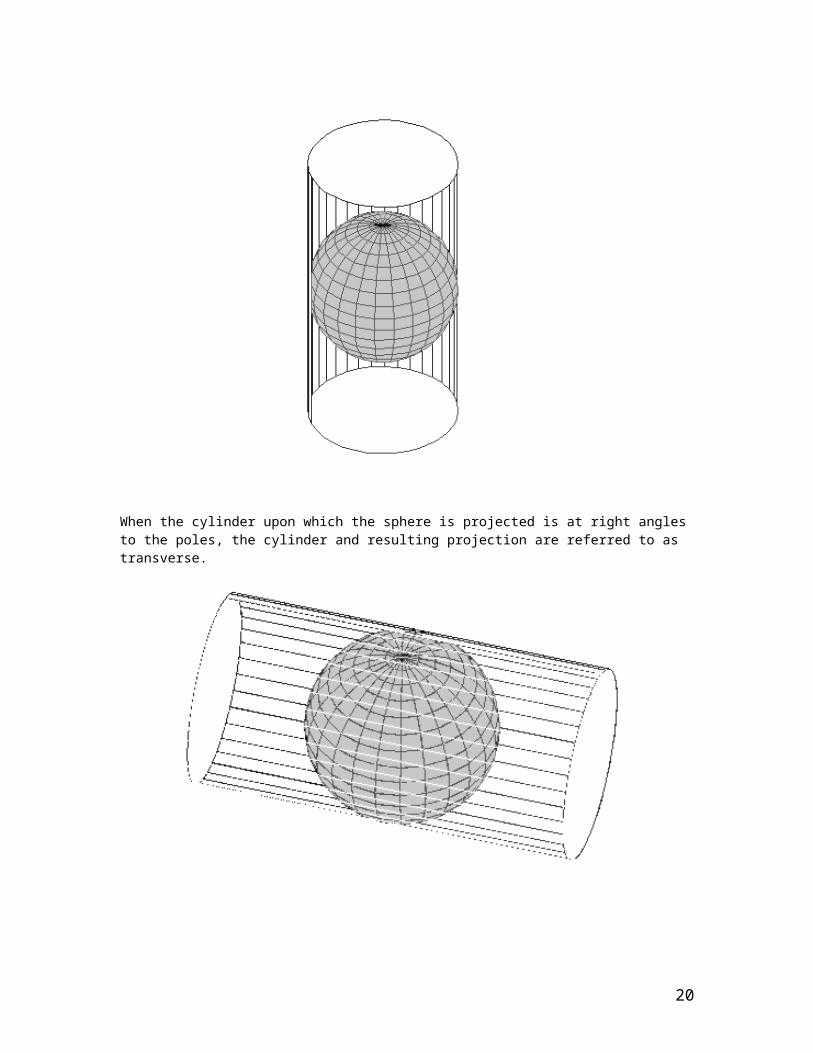
The simplest map projections use geometric shapes, which can be flattened without stretching their surfaces. These shapes include cylinders, cones and planes. These shapes can either be a tangent or a secant to the sphere of the Earth. In a tangent projection, the shape just touches the surface at either a line or a point. In the secant case, the shape intersects as two circles (or as one circle in the case of a plane). The place of intersection is the area of least distortion in portraying features on the earth’s surface. Map projections fall into the following general classes.
Cylindrical projections are derived from projecting a spherical surface onto a cylinder. For example if you took you’re orange and wrapped an A4 sheet of paper around it. The paper can be arranged around the orange in a variety of arrangements
A Tangent Projection would result if you wrapped your paper vertically so that the cylinder was parallel to the meridians (lines of longitude).
13

When the cylinder upon which the sphere is projected is at right angles to the poles, the cylinder and resulting projection are referred to as transverse.
Cylindrical projections that have equal area properties will have straight meridians and parallels with the meridians being equally spaced but the parallels will not be unequally spaced. There are normal, transverse, and oblique cylindrical equal-area projections. Scale is true along the central line (the equator for normal, the central meridian for transverse, and a selected line for oblique)
14

and along two lines equidistant from the central line. Shape and scale distortions increase near points 90 degrees from the central line.
The Mercator projection is one of the best known and has straight meridians and parallels that intersect at right angles. Scale is true at the equator or at two standard parallels equidistant from the equator. This projection seriously distorts distances and areas. The Universal Transverse Mercator (UTM) is probably the best known projection system for displaying large surfaces of the earth since it provides high levels of precision. To minimize the distortion the cylinder is wrapped around the earth transversely and is place at 60 of rotation East and West of 1800 meridian for each hemisphere. Consequently 60 zones north and 60 zones south are generated and are numbered eastward from the 1800 meridian. Cape Town is the 34 th Zone and is referred to as UTM 34S. The UTM system is only applied from 840 North to 800 South Latitude.
Conic projections which result from projecting a spherical surface onto a cone. When the cone is tangent to the sphere contact is along a small circle such as a latitude. You can view this by twisting your A4 sheet into a cone and placing over the orange.
15
Albers Equal Area Conic projection allows areas to be proportional and directions true in limited areas but distorts scale and distance except along standard parallels. This is one of the most common projection used to map large countries where the east-west distances are greater than the north-south extent (e.g. USA and Russia). It is often used to represent South Africa.
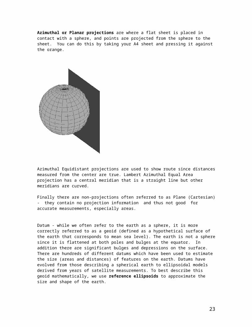
Azimuthal or Planar projections are where a flat sheet is placed in contact with a sphere, and points are projected from the sphere to the sheet. You can do this by taking your A4 sheet and pressing it against the orange.
16

Azimuthal Equidistant projections are used to show route since distances measured from the center are true. Lambert Azimuthal Equal Area projection has a central meridian that is a straight line but other meridians are curved.
Finally there are non-projections often referred to as Plane (Cartesian) - they contain no projection information and thus not good for accurate measurements, especially areas.
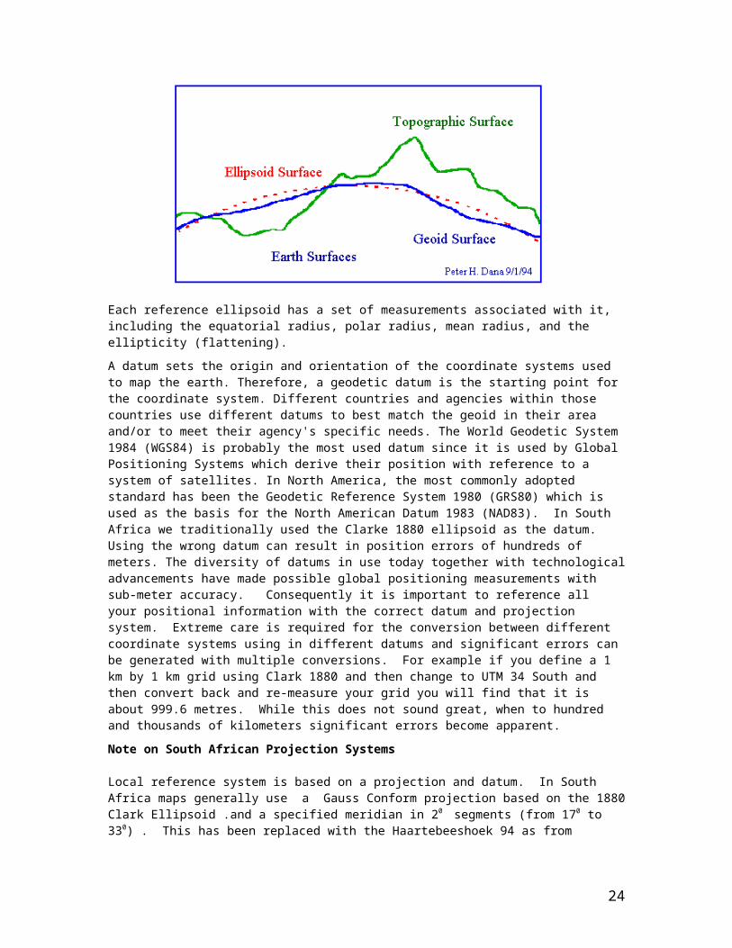
Datum - while we often refer to the earth as a sphere, it is more correctly referred to as a geoid (defined as a hypothetical surface of the earth that corresponds to mean sea level). The earth is not a sphere since it is flattened at both poles and bulges at the equator. In addition there are significant bulges and depressions on the surface. There are hundreds of different datums which have been used to estimate the size (areas and distances) of features on the earth. Datums have evolved from those describing a spherical earth to ellipsoidal models derived from years of satellite measurements. To best describe this geoid mathematically, we use reference ellipsoids to approximate the size and shape of the earth.
Each reference ellipsoid has a set of measurements associated with it, including the equatorial radius, polar radius, mean radius, and the ellipticity (flattening).
A datum sets the origin and orientation of the coordinate systems used to map the earth. Therefore, a geodetic datum is the starting point for the coordinate system. Different countries and agencies within those countries use different datums to best match the geoid in their area and/or to meet their agency's specific needs. The World Geodetic System 1984 (WGS84) is probably the most used datum since it is used by Global Positioning Systems which derive their position with reference to a system of satellites. In North America, the most commonly adopted standard has been the Geodetic Reference System 1980 (GRS80) which is used as the basis for the North American Datum 1983 (NAD83). In South Africa we traditionally used the Clarke 1880 ellipsoid as the datum. Using the wrong datum can result in position errors of hundreds of meters. The diversity of datums in use today together with technological advancements have made possible global positioning measurements with sub-meter accuracy. Consequently it is important to reference all your positional information with the correct datum and projection system. Extreme care is required for the conversion between different coordinate systems using in different datums and significant errors can be generated with multiple conversions. For example if you define a 1 km by 1 km grid using Clark 1880 and then change to UTM 34 South and then convert back and re-measure your grid you will find that it is about 999.6 metres. While this does not sound great, when to hundred and thousands of kilometers significant errors become apparent.
17

Note on South African Projection Systems
Local reference system is based on a projection and datum. In South Africa maps generally use a Gauss Conform projection based on the 1880 Clark Ellipsoid .and a specified meridian in 20 segments (from 170 to 330) . This has been replaced with the Haartebeeshoek 94 as from January 1999. For Namibia the projection system is based on the Bessel. These reference systems are based on metres as the unit of measurement.
Units of Measure - these can be either units of distance such as metres, kilometers, feet, miles etc or expressed as degrees.
Considerations of projection, datum and nits of measurement are important since the most used and older GIS software (e.g ESRI ArcView 3 series) does not allow multiple projections to be displayed simultaneously, and even those that multiple projections do so providing you have all the projection information stored for access by the software. Working with multiple projection should only be used for viewing information and never used to edit information or prepare new coverages, failure to observe this rule will result in serious data errors.
As you can see many problems for professional GIS users arises from confusion over projections and datums. Consequently many organizations store their data in Latitudes and Longitudes that are based on the WGS 84 datum. This is a convenient form for storage of spatial information by institutions since it allows information from different sources to be directly used with each other and for the information to be re-projected to different datum’s, projections and measurements on a case by case basis. It does, however, have the disadvantage that calculations of distances and areas are not truly accurate, and this can be very critical under certain conditions hence surveyors and other high accuracy requirements should never use it as a system.
GIS Maps are Searchable
Each feature in a map can be considered to be an object which has its own identification, as well as other associated information such as numerial values, categories, string texts and these are all stored within a database as well as information on the object itself such as geographical position, area, perimeter, centroid co-ordinates etc. Any of the data, whether it be within the database itself, or a measurement of the object, and whether it’s numerical or text can be searched and identified.
Searches can be simple such as finding all estuaries which are always open (and therefore especially sensitive to an oil spill) through to compound searches such as find all estuaries that are always open and have a mangrove population (mangrove are especially productive ecosystems and and oil spill that impacts on these systems will be especially significant).
Sophisticated GIS functionality can also allow you to search for all features which possess certain inherent object parameters such as all line segments of the coastline that are longer than 5km and are characterized as coarse-grained sandy beaches without having this data duplicated within the database (in other words the search uses both the object’s inherent characteristics and data that is attached as table to that particular feature). This allows you to identify both individual features that meet specified criteria or groups of features with shared parameters and features.
You can also search all features that are within a certain a distance from a specified point e.g. all estuaries that are within 5 kms of a certain point located on the map, or you can select within a drawn rectangles, circle/ellipse or evening an irregular user-defined polygon.
The results of such searches are identification of specific rows of information from within the database together with highlighting the features on the map in a contrasting colour (often yellow or red or even definable by the user). Sometimes you simply want to group certain features
18

according to some grouping criteria and to shade each category in a different colour. Height data is often represented as isolines or contours which each contour representing a specified value. Using a thematic classification, each contour can be mapped depending on its values and often represented as a gradient of colours (increasing height is often represented using the following colours - green, yellow, orange, brown, purple and white). This allows much easier interpretation of information and the quick production of a map that defines your specific search criteria.
GIS Maps are Updatable
Since the information is stored electronically and the user defines their requirements via a software interface - information is more quickly updateable and information collected only hours before can be used by an entire networked office within hours. Alternatively by simply writing the information to CD the latest information can dispatched to offices outside the network and this is also far quicker than waiting for the information to be published and distributed as a book. More recently advance in GIS applications allow information to be updated and available to the entire World Wide Web user community. Consequently information can be maintained in its most current form for optimised decision-making.
The definitions of the GIS refer to it having a data storage, retrieval and presentation role and requires having both software and hardware components together with human resources that are usually divided into developers of the information and users of the information. A typical GIS is fairly complex and are developed in a climate of strong competition therefore they tend to be fairly demanding on the hardware used to run them. Since GIS databases are usually large and getting larger and more complex they take up considerable disk space with their drawings and tables they need considerable quantities of both disk space and memory for processing the information. These data sets can run into hundreds and even thousands of megabytes. Backups of data can be undertaken using re-writable CDs, although data sets larger than 640 Mbytes are getting commonplace and alternative storage mechanisms are required.
GIS data needs to be accessed via software programs such as ARC INFO/VIEW (now called ARC GIS) and MAPINFO. Often GIS software is graded into being able to view data, customize and do minor alterations to both features and their tabulated data, to full authoring tools and the ability to customise functions within the GIS package using BASIC computer language through to centrally managing large “corporate” data sets and distributing it to users via networks and the World Wide Web. Each of these grades requires different hardware and software configurations.
In computer jargon we often speak about fat and thin applications and this is usually related to whether you are a client (receiving information or called the host computer) or a server (distributing information via a network). Consequently we might have a thin client which simply means a computer that is light on resources (memory, processor or hard disk capacity) and this would typically receive information via Intra/Internet and a fat server (a high capacitor computer). The lightest and most inexpensive GIS application would be to access the World Wide Web and use one of the map services that are provided. This allows you to do many of the viewing and customizing of coverages (including selection of coverages and specific features within coverages that meet certain selection criteria) locating geographical position and scale on the maps as well as zoom and pan functions. This functionality is complemented by searches for information and reporting it in both tabular and mapped renderings and the printing out the final results as tables and maps. In such situations the servers do all of the GIS processing and renders a snapshot of the results as a graphics file (JPEG) which is sent to the client for viewing- and this is termed server-side applications. With increasingly more powerful personal computers and higher bandwidth (or working within an Intranet) allows users to migrate to more client-side processing (processing on the host computer) where information is sent via the network and the client machine interprets the information and renders the results. Under these circumstances a computer with at least 128 Mbytes of RAM is necessary, but otherwise this approach puts little demand on the client computer’s disk space resources but still needs a fat server to deliver the information and store all of the data. Until fairly recently most Desktop GIS systems would have
19
needed a similar amount of memory together with adequate disk space to store the data and would normally have used either Window-based or Unix operating software. Recent releases of some products have increased the specifications to 256 Mbytes of RAM and Windows NT/2000/XP plus at least one large capacity hard-disk (30 Gigabytes plus). Most GIS applications that are distributed via a network would required a high-end server and are migrating to Windows NT or Window 2000 platforms. The web-based servers at the Biodiversity and Conservation Biology Department, UWC use ARC GIS Internet Map Server software and Windows 2000 platform. In this case the hardware are a couple of IBM Netfinity Server with 4.3 Gbytes of RAM and about 400 Gbytes of hard space which uses a Storage Area Network – a dedicated hardware application that links a series of hard drives together and creates virtual hard drives that are several times larger than the largest physical hard drives you can purchase. This setup also allows any one of the hard disks to crash and for the data to be recovered and since the data is spread across more than one hard disk faster disk access time is achieved.
Getting data and maps into a GIS
One of the biggest breakthroughs has been the ability to link existing data to various spatial features through geocoding. It has been estimated that more than 80% of data contains spatial elements, a postal code, street address, region, country etc. This allow data to be more easily accessed spatially and for patterns in the data to be explored with more insight. Geocoding is consequently linking data sets that where not spatial explicit with GIS data that does contact spatially distributed features. To illustrate this imagine having a table of population summaries such as income, education level, gender, age demographics and occupation for each magisterial district in South Africa. It is impossible to comprehend such a large table of information, however if each parameter describing the population can be colour-coded within thematic ranges for each magisterial district and displayed on a map a much clearer interpretation of the data can be presented. Geocoding involves capturing information that has some ID and spatial description and character, e.g. a road or lake and address matching via a column in the table with other data such as traffic flow and water quality.
The method of geocoding has large implications for the structure of a GIS database. In South Africa address mapping to our Postal Code system should be virtually error free, since each postal code is unique, however address map to street name alone would not work, since the same street name may be found in several suburbs of even the same city. To address map using street information would require complementary information of suburb name to get a reasonably accurate linking between the tble and the geographical objectives.
Other issues in geocoding are whether the map features are based on scanned images which would have required manual post-processing and are very scale sensitive or data that was obtained by digitizing through a digitizer tablet and storing the information as vectors. To scan map features required for a GIS would require the use of a high-quality scanner which is simply like a photostat machine. The resolution at which something is scanned equates with the number of raster cells or grids and dictates the final quality and accuracy of the information (see slide 14 of this presentation) . Raster images are simply a grids that are coded with a number that indicates some degree of reflectance/absorption and consequently has little intelligence. If fairly coarse resolution is used features may drop out or be inaccurately rendered. Scanning a one in 50 000 topographical sheet at different resolutions will show this with text labels being especially sensitive to "drop out" or become indecipherable. Trying to ascribe intelligence and management operations to a raster image is fairly slow. Often raster images are converted to vector features and these are edited and unique IDs ascribed to each unique object generated and this is fairly slow process.
In contrast to scanning features into a GIS you can use a digitizing tablet to manually draw features, this is also a slow process, but is generally more accurate, since it is scale independent.
20

A digitizing tablet consists of a board with a very fine network of wires embedded within it. By using a pukker (like a mouse) it can detect very fine movements of position and record these.
With the advent of the GPS real time positions can be collected for very detailed field mapping and relatively fast production of maps to about 4 m accuracy. Differential GPS will allow positional accuracy of up to 10cm with post-processing and real time differential collection of information of less than a meter is the normal accuracy. The University of California Santa Barbara has been developing a system where your GPS is attached to your clothing, a small screen is attached to set of glasses and a small hand set allows you to select and register an ID against a particular feature you wish to map and you can start and stop collecting information as you move around. A small-sized computer allows the information to be processed in real time and you can see what data you have collected and even interrogate this data in relation to other data sets pre-installed on you’re the computer to assess how much more and what type of information is still required to be collected. This allows for progressive sampling and based on existing partial datasets will determined how much more information is required to obtain a complete and accurate map representation.
INSTRUCTOR NOTES FOR LECTURE4_CONTINGENCY_PLAN.PPT
In this PowerPoint slide show we demonstrate how you can use an Internet-based GIS for a hypothetical analysis of an oil spill. In this case, we use modelling derived from a study that CSIR undertook in the Saldanha Bay. This study was undertaken due to the very real threats of pollution in this sensitive bay. Since it is the exit point of almost all iron ore produced in South Africa. In the late 1970s the Harbour and entry routes were deepened to accommodate massive iron-ore carrying vessels. Since these vessels are extremely large they carry large reserves of fuel.
Description of the Saldanha Bay Area
While the north-eastern part of Saldanha Bay is extremely built up, the rest of the bay area is extremely ecologically sensitive and is a Rock Lobster sanctuary. The southern end is a Lagoon (referred to as Langebaan Lagoon). The lagoon is a marine reserve with the very southern end having no access for fishing and netting nor for any motorboat use. The lagoon is extremely rich in bait organisms, birdlife and fish and is the main stop over for migrant waders. Since most of the southern section is relatively unspoiled, it represents one of the few places along the South African coast that has not had considerable development and therefore warrants protection. Unique for the South African coast are several offshore islands which are protected in terms of the Seabirds and Seals Protection Act 46 of 1973. The lagoon has 29 species of fish with the southern end used as a nursery area by juveniles fish species and considered to be very important for re-stocking of marine reserves.
21

For illustration a satellite image of the northern part of Saldanha bay is shown with the position of a hypothetical oil spill at the entrance to the deep water harbour.
Close to where we have hypothetically positioned the oil spill for a vessel entering the Harbour is Marcus Island which has now been connected to the mainland by a causeway. This causeway was built to provide extra protection within the Harbour itself. Marcus Island was once one of the largest African Penguin colonies of this Southern African endemic bird species. It still has significant marine bird colonies which include the African Penguin (3000) and the relatively rare Bank Cormorant (50) and African Black Oyster Catchers (120) and in many years is the site for breeding for the Swift Tern.
Other island in Saldanha bay include Malgaseiland which has the largest breeding colony of Cape Gannets in the world (27 000) and has African Penguins (4 500), Bank Cormorants (300), African Black Oystercatchers (70) as well as well as Crowned and Cape Cormorants and Black-headed Gulls). The Penguins and Crowned Cormorants breed throughout the year, Cape Cormorants and Cape Gannets bread from September to February, Bank Cormorants in Winter and the Gulls and Oystercatchers in summer and autumn (October to March).
Jutteneiland has a population of 48 000 Cape Cormorants, together with White-breasted and the rare Bank Cormorant (100), 180 Oystercatchers, two species of gull (Haurtlaub’s and Black-backed) and swift terns and also has some 4000 African Penguins.
Vondelingeiland in some years has significant breeding of the Swift Tern (3000), 15 000 Cape Cormorant and 60 Bank Cormorant and Crowned Cormorants as well as some African Penguins (300) two species of gull (Haurtlaub’s and Black-backed), 80 African Black Oystercatchers and Sacred Ibis.
Schaapeneiland and are also important breeding sites for Cape Cormorants (300) and Black-backed Gullsand Sacred Ibis as well as occasionally the rare Caspian Tern during mid-summer (December-January).
The entire southern end of the lagoon referred to as Langebaan Lagoon is a salt marsh community and extremely sensitive. This is the largest salt marsh in South Africa. Although referred to as a lagoon, it is geomorphologically a coastal Bay since there is no river entering the lagoon. The lagoon is a very important site for wading birds especially those that migrate from the northern hemisphere during the boreal winter periods. Common visitors include Ringed Plovers
22
(280); Turnstones (2000); Greater Flamingos (up 10 000 in winter);) Grey Plovers (5 500 of which 800 overwinter). Curlew Sandpipers (19 000-25 000) of which c 4000 overwinter) Knots (2 100-3 900 of which 750 overwinter); Bartailed Godwits (550) and Whimbrels (650). The main residents are White-fronted Sandplovers, Black-backed Gulls which breed on an island in the south of the lagoon - and African Black oyster-catchers. The population of the latter constitutes 12 % of the total world population.
Within the Saldanha Bay/Langebaan area there are cottages and/or camping and caravan sites at Hoedjiesbaai, Langebaan, Oupos and Churchhaven, and hotels in Saldanha Bay and Langebaan. The main recreational activities are angling, sailing, power-boating and swimming. There are a number of yachts anchored off Langebaan, and some in Saldanha Bay. There are also a few yachts and house-boats in Kraal Bay.
On the coast there are cottages at Kreeftebaai, a fishing and diving locality. Further south, Yzerfontein is a popular surfing, diving and angling spot. There are a number of holiday cottages and a caravan park.
Access to the 15-mile beach at Yzerfontein. Commercial use of the area include about 15% of the annual catch of pelagic fish by commercial purse-seiners. Langebaan and Saldanha Bay support a commercial haarder fishery which constitutes about 12% of the haarder catch for the whole coast.
Extensive catches of squid are made and kelp gathering operations on both the North and South Heads of Saldanha Bay operate and yield about 300 tonnes (dry weight) per annum. In addition castings of Gracilaria verrucosa are collected from Saldanha Bay beaches. A total annual catch of the demersal fishery is about 165000 tonnes. The predominant species are hake, kingklip, monk, snoek and squid. Extensive cultivated Mussel farms (reared from off shore rafts) exist in the bay itself and some cultivation of seaweed (Gracilaria) has been done.
What will Sensitivity Map look like?
23
This is a scanned map of Saldanha Bay showing the coastal sensitivity as a developed by Jackson and Lipschitz 1984 “Coastal Sensitivity Atlas of southern Africa” ISBN 0908381263.
The highly sensitive areas are shaded in red and include the entire Langebaan Lagoon. Less sensitive areas include sandy beaches which are in yellow and exposed rocky headlands which are shaded in green and are the least sensitive to the effects of an oil spill. Various icons indicate different specific sensitivities. The fish icon indicates fish spawning area, the penguin refers to diving seabirds, the flying bird icon reflects general seabirds and the black triangles referred to recreational sites. The dots around each icon reflect the sensitive season, but in this case all four dots are present showing all year round sensitivity. This information is now available as a GIS system but reflects the state of art for oil spill contingency planning some 20 years ago. Subsequent to this map many other sensitivities have occurred such as commercial oyster, mussel and seaweed mariculture.
Modelling the effects of an oil spill
The CSIR investigated the use of models to predict the effects of oil spill in Sandanha Bay. This is part of a report prepared for the Saldanha Bay Water Quality Forum Trust and the report is
24

entitled “Saldanha Bay Marine Water Quality Management Plan – Phase 1: Situation Assessment.
The following URL http://coastalmodels.csir.co.za will take you to a web page that allows users to “perform online simulations using state-of-the-art hydrodynamic and water quality models”. The models have been built by experienced research modellers at CSIR, Stellenboschand, South Africa using the DELFT3D modelling system developed by WL|Delft Hydraulics in the Netherlands.
This demonstration provides users with an on-line simulation models that can provide valuable information to a wide range of users via the internet and users can develop their own scenarios and then use another Internet GIS-based resource to develop a sensitivity analysis.
The Delft3D hydrodynamic and water quality model is used to simulate the following processes in seas, estuaries, rivers and lakes and takes in the following potential variables.
1) currents 2) water temperature 3) salinity 4) dispersion of pollutants, e.g. oil, chemicals, bacteria, heavy metals, etc 5) eutrophication/dissolved oxygen 6) wave generation and transformation 7) sediment erosion-deposition
To develop our simulation for oil spill in Saldana Bay we have used the following six inputs, the coordinates start duration and amount of spill together with a time period and interval report for running the simulation. Please note that the X and Y coordinates reflect a projected coordinate system and not degrees of latitude and longitude.
Coordinates of spill: x = 405124 y = 342433
Start of Spill: 06h00 9th June 2001
Duration of Spill: 1 hour
Total Mass of Oil Spilt: 25 ton
End of the Simulation: 06h00 12th June 2001
Time Intervals for Simulation: 8 hours
Average Wind Conditions: 50 km/h SE direction
When this model is run it will produce an animated gif showing the trajectory of the oil spill. Remebering that we started the oil spill just off the penguin colony at Marcus Island you will note in the bottom left corner a calendar showing the time period. Both the amount of oil floating on the surface and the water depth are represented thematically (viz different shades from dark brown to light yellow and representing the heaviest to the least heavy impacts).
Note that the oil spill is moving along the coast and is approaching the Cape Gannet breeding colony at Malgas Island.The oil spill is sticking close to the coastline, however, in these circumstances it might be wise to start an evacuation of Gannets from Malgas Island. It would appear that the coast facing landwards should be prioritised for the evacuation of the birds. As the oil spill continues to advance onto Malgas Island serious worries start to emerge. However, in
25

this case it is fortunate that the oil spill remains close to the mainland coastline and just a small amount of oil seems to be set to pollute Malgas Island
In this simulation you can see that the oil spill largely missed the critical marine seabird colony at Malgas Island. By running the simulation we have defined an area of interest in which the effects of the oil spill will be most intense. You can then use this area interest in an online GIS system to develop a contingency plan similar to the one demonstrated in the case of the Exxon Valdez oil spill.
Now it is time to start using the results from the simulation analysis in a GIS system to develop a contingency analysis.
The Power Point includes screen captures of the old SAcoast website (a new one is being developed and more specially will address an oil spill contingency plan) – and represents one of the first online GIS systems deployed in South Africa and used by the management of the South African coastal environment. This is part of the South African Coastal Information Centre, which is currently being re-developed for Launching in Late 2004 In the second screen capture of the SAcoast site your will note a toolbox the left hand side (in the new application this will run along the top and about the same icons will be used. Along the top are the various icons for environmental sensitivity – this will remain largely similar in the new application. On the right-hand side is the layers/legend table of contents. This will be moved to the lefthand side of the screen. At the bottom of the screen is a help menu. A more comprehensive help systems will be developed and will use the same frame window as the layers/legend table of contents.
In the next screen capture we have ensured that the layer reflecting the satellite image is selected in the layers list and the map is refreshed using the refresh map button. The overview map will also use the same frame as the legend/layers table of contents frame. This ensures that the overview map is larger and please note that this is also clickable and offers users and easy way to navigate the entire South African coast. Once the layers are selected and refreshed we will then select the Legend to provide the map with an interpretation of all of the features that could be of significance in the event of an oil spill.
In the fourth of the SAcoast screen captures we have drawn in an area of interest and have ensured that all layers reflecting sensitivity to the oil spill are selected and the map has been refreshed. You will note that the icons are broadly similar to those used in the 1984 Atlas of coastal sensitivity shown previously. You can now use a square box to highlight the area of sensitivity to the oil spill. In the new application a dedicated line tool will be developed. Once the area of interest has been defined interactively on the map you can submit this to the GIS Web portal and the results of all issues of sensitivity will be identified. In the new application results will be reflected in the legend/layer table of contents frame.
Not only can detailed reports be generated based on users defining their areas of interest, but also generic reports can be generated for each 1:250 000 map sheet of the South African coast. In the above case it is map sheet number 10 and provides much of the detailed that we presented at the start of this exercise.
In the final series of the SA coast screen captures we have highlighted two reports which might help with developing the contingency plan for our simulated oil spill.
26
MASTERY TESTS.
Master TEST 1 – Revision (30 minutes)
1) Define what a DEM is and how it could be used together with a Satellite image in undertaking a contingency oil spill analysis?
2) What were the most sensitive biological parameters in the Exxon Valdez oil spill and provide reasons for your choice.
3) Describe events that could have made the Exxon Valdez oil spill even more environmentally damaging.
An Answer Sheet in table format is provided. At the end of the document
27

Master TEST 2 – Putting a Contingency Plan into Action (75 minutes)
You have been asked to take responsibility for revising an oil spill contingency plans for your National coast. As the first step you will need to define and describe the spatial data you wish to use in developing these plans. You will need to organize your data under major headings and codes (e.g. Recreation = R) and using a number rank each dataset from 1 equalling the highest rank (=most significant). You can tie scores if you thing they equally important. You will also need to work out whether it is seasonally sensitive or not. You will now need to invert these scores and to do this you will add up the total number of dataset within each major heading and then add 1 and now taking this score you subtract its ranking score – in other words you reverse the ranks
To illustrate this we have identified four recreational datasets, namely bathing beaches R1, general recreational beaches R2, angling sites (R3) and motorboat launch sites (R4). You have a total of four site data sets so the highest bathing beaches will get (4+1)-1 = 4, recreational beaches get (4+1)-2 =3, angling sites (4+1)-3 = 2 and finally motorboat launch sites (4+1)-4 = 1.
You will now need to work out rules that can be used to combine this new scores into an overall prioritization score based on intersections as well. To do this you will need to identify whether the data is highly localized (<100 m coastline) or fairly wide-spread. When combining highly localized data you will use the summation function so where two of these data sets intersect you will sum them in the intersection area. In contrast very wide-spread data you will use the overlay ensuring the highest value is on top. The example below shows the combining rules in graphical form.
The combining rule sets using summation where they are localized and overlap where they are widespread and seasonality. Note some features can be widespread or localized like sandy beaches
Group Layer Code InverseScore
Distribution SeasonalJ F M A M J J A S O N D
Summer/Autumn/Winter/SpringRecreation Beach bathing R1 4 Widespread/Localized Summer/Autumn/SpringRecreation Beach General R2 3 Widespread All YearRecreation Angling R3 2 Widespread All YearRecreation Motor-boat
launchR4 1 Localized All Year
Beach Bathing=R1 Beach Bathing=R1 Score = 4 Widespread use Cover RuleScore = 4 Widespread use Cover RuleBeach General=R2 Beach General=R2 Score = 3 Widespread use Cover RuleScore = 3 Widespread use Cover RuleAngling=R3 Angling=R3 Score = 2 Widespread use Cover RuleScore = 2 Widespread use Cover RuleMotor-boat Launch=R4Motor-boat Launch=R4 Score = 1 Localized use Intersection RuleScore = 1 Localized use Intersection Rule
22 3 4
3
4
4
Final score for Recreation
R3 R
1
R2
R4
28

Mastery Test 1 ANSWER SHEET–Revision of the first two lectures Name
Time 30 mins Question 1 Define what a DEM is and how it could be used together with a Satellite image in undertaking a contingency oil spill analysis?
Question 2 What were the most sensitive biological parameters in the Exxon Valdez oil spill and provide reasons for your choice
Question 3 Describe events that could have made the Exxon Valdez oil spill even more environmentally damaging
29

Mastery Test 2 ANSWER SHEET– Developing the Layers and Rule sets
NameTime 75 mins
Group Layer Code InverseScore
Distribution SeasonalJ F M A M J J A S O N D
Summer/Autumn/Winter/Spring
30

Worked Example
Mastery Test 1 ANSWER SHEET–Revision of the first two lectures Name
Time 30 mins Question 1 Define what a DEM is and how it could be used together with a Satellite image in undertaking a contingency oil spill analysis?DEM stands for Digital Elevation Model.A Satellite Image is obtained from space and effectively is a large-scale photograph of the earth and can be processed in a variety of ways but essential will show the current status of rock shores, estuaries, coastal vegetation and recent economic development. Used in combination with an accurate DEM you can work out the lower lying and more susceptible areas in the event of an oil spill. Also the satellite image is useful to identify shallow from deep water and just for general referencing and interpretation of where the oil spill is likely to have the greatest impact.
Question 2 What were the most sensitive biological parameters in the Exxon Valdez oil spill and provide reasons for your choiceProbably the most sensitive biological indicator was the Bald Eagle nests – namely because it is a top predator in the ecosystem and therefore generally represented by fewer numbers (and is in fact on the endangered list along most of the Pacific West Coast) and because it s home range to secure food for its offspring is very large it therefore has a high frequency of encountering an oiled sea surface. It is most especially vulnerable due to its long age and, like other raptors, usually rears only a maximum of two chicks per season and it is slow to maturing taking about 5 years to reaching reproductive state. It is an iconic species, the national bird of the USA and in Alaska there is the Bald Eagle Festive so it has economic benefits to the local community through nature-based tourism.
Question 3 Describe events that could have made the Exxon Valdez oil spill even more environmentally damaging
1) If the Exxon Valdex had been further along Prince William Sound more biologically sensitive environments would have been affected.
2) Eighty percent of the oil was actually offloaded to the Exxon Baton Rouge – so significantly more oil was present to pose even more of an environmental threat.
3) The storm could have started earlier and made conditions impossible to both offload and to contain the oil using skimming techniques and booms.
31

Worked ExampleMastery Test 2 ANSWER SHEET– Developing the Layers and Rule sets
NameTime 75 mins
Group Layer Code InverseScore
Distribution SeasonalJ F M A M J J A S O N D
Summer/Autumn/Winter/SpringRecreation Beach bathing R1 4 Widespread/Localized Spring/Summer/AtumnRecreation Beach General R2 3 Widespread All YearRecreation Angling R3 2 Widespread All YearRecreation Motor-boat
launchR4 1 Localized Spring/Summer/Atumn
Physical Estuary open P1 9 Widespread All YearPhysical Estuary closed P2 8 Widespread J A S O NPhysical River Mouths P3 7 Localized Winter/SpringPhysical Sandy Beach P4 6 Widespread/Localized All YearPhysical Tombola P5 5 Localized All YearPhysical Coarse-grain
BeachesP6 4 Widespread/Localized All Year
Physical Gravel/Pebble Beaches
P7 3 Widespread/Localized All Year
Physical Wave-cut rocky platforms
P8 2 Widespread All Year
Physical Rocky Headlands P9 1 Widespread All YearEconomic Natural Resource
Marine Fish Stocks
E1 1 Widespread All Year
Economic Natural Resource
Oyster Farms E2 3 Localized All Year
Economic Natural Resource
Mussel Collecting E3 3 Widespread All Year
Economic Natural Resource
Seaweed Mariculture
E4 3 Localized All Year
Biological Raptor nest sites B1 11 Localized Winter/SpringBiological Turtle Breeding
sitesB2 10 Localized Spring/Summer
Biological Juvenile fish stocks
B3 5 Widespread All Year
Biological Marine sea bird colonies
B4 5 Widespread/Localized All Year
Biological Salt Marsh with eelgrass Zostera
B5 5 Widespread All Year
Biological Salt Marsh B6 5 Widespread All YearBiological Marine Mammal
Breeding sitesB7 5 Widespread/Localized All Year
Biological Significant Intertidal Community
B8 5 Widespread/Localized All Year
Biological General Marine B9 3 Widespread/Localized All Year
32

BirdsBiological Terrestrial
Carnivores e.g. Hyena
B10 1 Localized All Year
Biological Terrestrial omnivores e.g. Baboon Intertidal foraging
B11 1 Localized All Year
Strategic Economic
Nuclear Power Plants
S1 6 Localized All Year
Strategic Economic
Harbours S2 5 Localized All Year
Strategic Economic
Marinas S3 4 Localized All Year
Strategic Economic
Out falls S4 3 Localized All Year
Strategic Economic
Water Intake S5 2 Localized All Year
Strategic Economic
Pay Beach sites S6 1 Localized All Year
33