modelling the benefit-risk of medicinal products using hiview3 · modelling the benefit-risk of...
TRANSCRIPT

Pharmacoepidemiological Research on Outcomes of Therapeutics by a European ConsorTium
Modelling the benefit-risk
of medicinal products
using Hiview 3
Dr Lawrence D Phillips
On behalf of PROTECT Benefit-Risk Group
5th May 2015
Disclaimer: The processes described and conclusions drawn from the work presented herein relate
solely to the testing of methodologies and representations for the evaluation of benefit and risk of
medicines. This report neither replaces nor is intended to replace or comment on any regulatory
decisions made by national regulatory agencies, nor the European Medicines Agency.
Acknowledgements: The research leading to these results was conducted as part of the PROTECT
consortium (Pharmacoepidemiological Research on Outcomes of Therapeutics by a European
ConsorTium, www.imi-protect.eu) which is a public-private partnership coordinated by the European
Medicines Agency.
The PROTECT project has received support from the Innovative Medicines Initiative Joint Undertaking
(www.imi.europa.eu) under Grant Agreement n° 115004, resources of which are composed of financial
contribution from the European Union's Seventh Framework Programme (FP7/2007-2013) and EFPIA
companies’ in kind contribution.

Pharmacoepidemiological Research on Outcomes of Therapeutics by a European ConsorTium
1
Modelling the benefit-risk of medicinal products using Hiview3 The PrOACT-URL steps in creating a multi-criteria decision analysis (MCDA) model are elaborated below to show how Hiview3 can be applied to model the benefit-risk balance of a medicinal product. Throughout these steps, if you run into trouble or have questions, press F1 to obtain context-sensitive help, or consult the Help screens. Also, the Starter Guide that came with the file that you downloaded to get Hiview3 is a good reference. Hiview3 has more capabilities than are covered in these steps.
PrOBLEM
1. Determine the nature of the problem and its context. Consider what is to be decided and
by whom, the medicinal product and its indications, the therapeutic area and unmet medical
need, the severity and morbidity of the condition, the affected population, patients’ and
physicians’ concerns, and the time frame for health outcomes. All these considerations could
be relevant in carrying out the subsequent steps.
2. Frame the problem. If this is mainly a problem of balancing multiple favourable and
unfavourable effects, then a multi-criteria model with Hiview3 is appropriate. If uncertainty
about the effects is the main concern, then a decision tree or influence diagram may be more
appropriate. Either of these, or elements of both, might be supplemented with a Markov model
if changes in health states over time are considered to be the driver. Usually, time frames can
be adequately accommodated in a multi-criteria model by adopting different time horizons in
separate criteria.
Double click on the icon on your Desktop to open Hiview3.
Select Create New Model. Click on “OK”.
Single click on “Root Node”, pause, then single click again.
Overtype with “Benefit-Risk Balance” or any appropriate high-level descriptor, and
then press Enter.
Right click on the node and overtype the text in the new window with any of the
material covered in steps 1 and 2, above, that you wish to record. Close the window.
OBJECTIVES
3. Establish objectives. Usually this will be to evaluate the overall favourable effects and the
overall unfavourable effects in order to determine the benefit-risk balance, or to evaluate a
change in the balance in light of new information.
Click on the Insert Criterion tool and click below and to the left of the top node.
Type FEs (for Favourable Effects), then press Enter.
Repeat to place UFEs (for Unfavourable Effects) below and to the right of the top node.
Single click on FEs and drag it to the top node; a dashed line appears between the two.
Repeat for the UFEs node.
Tip: Right clicking on any node opens a text box for recording information relevant to
the node. Right-clicking anywhere else opens a context-sensitive menu.

Pharmacoepidemiological Research on Outcomes of Therapeutics by a European ConsorTium
2
The screen should now look something like this:
4. Identify criteria. Criteria are specific realisations of the objectives. What favourable effects
are expected and what unfavourable effects are of concern? These could include endpoints,
relevant health states and clinical outcomes. In general, include only criteria that are clinically
relevant (sometimes it is useful to include a criterion to demonstrate whether or not it is
clinically relevant).
The simplest tree shows one favourable effect, the primary endpoint, and several unfavourable
effects, as is shown in this tree for the weight-loss drug Acomplia (now withdrawn in Europe),
that was created using the above drag-and-drop procedure:
Note that node and criteria names are limited to 20 characters, so it may be necessary to
abbreviate longer names. Leaving out some of the vowels usually leaves a readable name;
‘Deprssn’ clearly means ‘Depression’.
Tip: To add several criteria, click on the Tool Lock icon to reduce extra mouse clicks,
but remember to click again on the tool to unlock the pointer. Inadvertent clicks create
unwanted criteria; eliminate them by deleting the box around the criterion’s name.
Tip: Throughout the steps to follow, periodically save the model. Like all other computer
programs, Hiview3 is not wholly bug free!

Pharmacoepidemiological Research on Outcomes of Therapeutics by a European ConsorTium
3
Trees with very many criteria become messy, so it’s helpful to tip the tree sideways and tidy it
up, which the computer will do if you click on the “Redraw Tree Horizontally” tool. You
can drag and drop the criteria to other locations to change their order.
The dashed lines signal that no weights have as yet been assigned. The grey text for criteria
shows that no data have been entered.
Clustering of criteria under nodes is typical of most trees, as in this tree for Benlysta, a drug
approved by the EMA in 2011 for the reduction of disease activity in adult patients with active,
autoantibody-positive systemic lupus erythematosus (SLE).

Pharmacoepidemiological Research on Outcomes of Therapeutics by a European ConsorTium
4
The primary endpoint was a novel composite endpoint, the SLE responder Index (SRI), which
evaluated the response rate at Week 52. It, in turn, was made up of two SLEDAI scores, two
PGA scores and the BILAG A/B score. (For the purposes of this document, defining these
scores won’t add anything.)
There is no ‘correct’ Effects Tree. It’s best to ask the assessors how they think about the criteria
and express their mental model in this diagrammatic form. In general, criteria within a cluster
should be in some way more similar to each other than criteria between clusters.
Go back over the effects and create an operational definition for each criterion.
Right click on a criterion.
Type the definition into the text box.
Ideally, the criteria should be:
Complete: Have all the effects that are clinically relevant to the benefit-risk balance
been included?
Non-redundant: Does each effect capture an aspect of clinical relevance that isn’t
included in any other criterion? Criteria should not double-count, and each criterion
should discriminate between the options.
Operational: Is each criterion clearly defined so that it can be assessed and judged for
the degree to which an option achieves the objective?
Mutually preference independent: Does the clinical relevance of performance on one
criterion be assessed without without regard for the clinical relevance of performance
on another criterion? If the answer is ‘no’, then it may be possible to combine the two
effects into one effect that satisfies this feature. If that can’t be done, then ignoring the
violation and adjusting the criterion weights may be a good-enough solution. There are
other solutions, but help from an MCDA expert will be required.
Requisite in number: Is the number of criteria sufficient to capture the full benefit-
risk balance, but no more. The initial effects tree is often over-elaborated; delete criteria
that are judged to be irrelevant to the benefit-risk balance, or include them and delete
them later when sensitivity analyses show they don’t matter (unless there are good
reasons to show others that these criteria, which turned out to be irrelevant, were
considered)..
The criteria considered by assessors may not satisfy all these criteria. For example, the two
SLEDAI scores are overlapping; a patient who scored a 6 has also scored a 4, so they partly
double-count. Ideally, the criteria should then be redefined so they don’t overlap, e.g., “%
scoring more than 4 but less than 6”, and “% scoring more than 6”. More complex MCDA
models can handle violations of mutual preference independence, but that is a topic beyond the
scope of this document.
Define a measurement scale for each criterion. Two judgements are required: deciding the unit
of measurement, and two reference points on the scale.
Click on the Criteria Details tool. Type the name of the measurement units in the
‘Units’ Field (e.g., %, number, difference, change score, measured value).
Change the default ‘Relative’ scale to ‘Fixed’.
Type in ‘High’ and ‘Low’ values, recognising that whatever numbers you type in, the
high number will be converted to a preference value of 100, indicating a most-preferred
Pharmacoepidemiological Research on Outcomes of Therapeutics by a European ConsorTium
5
point on the scale, and the low number will become a 0, the least-preferred position
(though zero doesn’t necessarily mean no value just as zero degrees Celsius doesn't
mean no temperature). These two points establish a plausible range for the measured
data, as judged by the assessors; not so large as to include data that would be very
unlikely to be observed, nor so small that data might fall outside the range. Subsequent
judgements of weights will be based on these scale ranges.
If data are given with decimal places, then select the appropriate number of places under
the Format options.
Defining the scales as described above assumes that the relationship between a measured value
and a preference value is linear, either direct or inverse. But sometimes the relationship is non-
linear. QTc prolongation is an example: small values are acceptable and receive preference
values of 100, but as the prolongation increases the function declines at a rapid rate, resulting
in a concave (looking upward) function. Such functions can be easily assessed in Hiview3 by
changing the Criterion Value Function from its default ‘Linear’ to ‘Piecewise’. Read the
Starter Guide that can be found in the folder where Hiview 3 is located (usually in C:\Program
Files\Catalyze\Hiview3) to see how non-linear value functions are assessed.
Occasionally, it may be desirable for assessors to summarise a collection of criteria, such as
quality of life features that are not covered by any of the measured criteria. A summary relative
scale can be used for this purpose. Assessors should discuss how the options perform for these
various features, and then intuitively summarise those effects to evaluate the options on a single
summary criterion, e.g., Quality of Life (QoL). This can be included in the model as a relative
scale.
Click on the Insert Criterion tool , move the pointer to the position on the Effects Tree
where the new criterion is to be located and click.
Single click on ‘Criterion’ and overtype with the name of the new criterion, e.g., QoL.
Drag and drop the criterion to the appropriate node (usually FE or UFE) to attach the
criterion to the node.
Right click the new criterion and enter a definition (e.g., for QoL, the features taken
into account).
Click on the Criteria Details tool. Click on the name of the new criterion.
Type ‘Judgement’ in the ‘Units’ field.
Ensure that the default ‘Relative’ scale is chosen in the ‘Type’ field.
Note that now the least preferred option will be scored at zero and the most preferred at 100.
In other words, the options themselves define two points on the scale.
At this point, you have created a hierarchical ‘value tree’, as it is known in MCDA. If
necessary, resize the window by dragging up and to the left from the lower right corner of the
window, making the value tree shorter, or by using the “Fit Tree Window to Screen” tool .
Tip: Generally, high numbers will be more preferred for favourable effects. But watch
out for exceptions (e.g., low worsening scores are more preferred than large ones for drugs
that halt the progression of fatal diseases). In these cases, tick the ‘Inverse’ box so that a
low score becomes most preferred, and a high score least preferred. Usually low scores
for unfavourable effects are preferred to high scores, so tick the ‘Inverse’ box.

Pharmacoepidemiological Research on Outcomes of Therapeutics by a European ConsorTium
6
You might also experiment with changing the font, font size and zoom to achieve a display that
looks good and will be easily visible if you are working with a group.
ALTERNATIVES
5. Identify the options. If the model is at the pre-approval stage there may be several options,
e.g., leads for a promising product at the start of Phase II development. When a product profile
emerges, that would be included in the description of the option, and it would be modified as
more is learned about the option. New data would allow for updating the model, thus providing
a monitoring of the benefit-risk balance during development. If the model is at the post-
approval stage, it could continue to be updated as further data are obtained from Phase IV trials
or from adverse reaction reports. Sometimes it is useful to cluster new post-marketing side
effects under a new node, e.g., “P-M side effects”. That will facilitate subsequent exploration
in sensitivity analysis of the weight on that node, which takes into account unreliability of post-
marketing reports.
In the Edit menu, select Options, or click on the “Options” icon .
Enter the options using the Add button. Use very short names, preferable of 10
characters or less, so that subsequent matrix displays remain compact. A long name
can also be provided, along with a description of the option.
Press Enter after the last option, then OK.
CONSEQUENCES
6. Describe how the alternatives perform. This is the process of entering measured data for
the fixed scales and judgements for the relative scales. If an Effects Table (see EMA document
EMA/862470/2011 Work Package 4: Effects Table) has already been created, the data can
copied from it into Hiview.
Double click (quickly; a slow double-click initiates the edit capability) on a criterion to
open the thermometer display.
Enter the data into the white fields, followed by Tab or Enter.
For a relative scale, the most- and least-preferred options have already been assigned
preference values of 100 and 0. For other options, ask assessors to score them at values
between 0 and 100, inclusive, such that the differences between scores represent the
assessors’ relative strength of preference. When finished, click OK.
Repeat for each criterion.
For fixed scales, Hiview will automatically convert the input data into preference scores. To
see the preference values, click on ‘Preference Values’. To return to input data, click again on
the data units. As data are entered for each criterion, the name of the criterion changes from
grey to black,
TRADE-OFFS
7. Assess the balance between favourable and unfavourable effects. This is a three-step
process, assessing criteria weights for their relative importance, examining the results to see if

Pharmacoepidemiological Research on Outcomes of Therapeutics by a European ConsorTium
7
they make sense, and iterating, that is, going back as necessary to previous steps adjusting any
obvious errors or inconsistencies.
Assess weights. Weights are assessed by asking assessors to judge the swing in value between
the two reference points on each criterion. Start with a lower-level node (one at the extreme
right of a horizontal tree) that is the ‘parent’ of two or more criteria, or ‘children’.
Select a parent node.
Click on the ‘Weight Criteria Swings Below Selected Node’ icon .
Ask your client to imagine an option that scores as poorly as the bottom position on
each of the criteria associated with that node. Tell them that if the imagined option
could be improved from the bottom to the top of the scale on just one of the criteria,
which one would it be? Help them by explaining they should consider how big that
difference is between the bottom and top of the scale for each criterion, and how much
those differences matter to them, i.e., the clinical relevance of the swings. Give a swing
weight of 100 to the criterion with the biggest difference that matters. That becomes
your client’s standard for comparing other criteria swings under this node.
Look at each of the other criteria under that node in turn and compare its swing in value
with the value swing on the standard. Assign a number equal to or less than 100 such
that the ratio of that number to 100 represents the ratio of the value swings.
Repeat this process for the remaining lower-level nodes, always giving the criterion
with the biggest difference that matters under a node a weight of 100. Remind your
client that 100 under one node may not represent the same magnitude of value swing
as 100 under a different value node. Equating those 100s is a subsequent step, to be
described below. Don’t worry if some nodes are themselves bottom-level criteria that
at this step have no weights associated with them.
For example, in the case of Benlysta, first the SLEDAI node was chosen, and clicking on the
‘Weight Criteria Swings Below Selected Node’ icon opened this window:
The client clearly preferred the swing from 0 to 100% on the right scale because it was the
larger clinically relevant improvement, so that criterion was assigned a weight of 100.

Pharmacoepidemiological Research on Outcomes of Therapeutics by a European ConsorTium
8
Compared to that the left scale was given a weight of 80, even though the lower improvement
of 4 points is two-thirds of 6, because and improvement of 4 points was the primary endpoint.
Assessors then looked at the parent of the two PGA children and assigned weights to those
scales:
Moving from right to left, look for the next parent node and repeat this scaling process. That
will provide a comparison of the 100-weighted scales from the two parent nodes with each
other, and with any children of the selected node.
Move one level to the left and select the corresponding node.
Click on the ‘Weight Most Important Criteria Swings’ icon .
Compare those swings, giving a weight of 100 to the criterion with the largest swing
in preference (possibly overwriting the weight shown below the criterion scale) and
weighting the others as appropriate.
As applied to the Benlysta case, the first two steps above resulted in this display:

Pharmacoepidemiological Research on Outcomes of Therapeutics by a European ConsorTium
9
The computer chooses the 100-weighted scale from each node to the right along with the
BILAG A/B scale, which hasn’t yet been weighted. After the assessors compared the swings
on these three scales, the display looked like this:
Thus, the swing on the ‘PGA % no worse’ criterion was judged to be one fifth the swing in
preference as the ‘SLEDAI % Improved 6’ criterion, and the swing on the ‘BILAG A/B’
criterion was judged to be 60% as great as the ‘% Improved 6’ scale.
This process of working from right to left, repeated throughout the tree, is basically a process
of comparing the units of preference on all the scales with one another, thereby making it
possible to compare any scale or node with any other. It’s not a process of comparing apples
with oranges, rather one of comparing preference for apples with preference for oranges.
With the scoring and weighting now complete, the tree should show all solid connecting lines,
and all criteria names should be black. The next step is to examine the results.

Pharmacoepidemiological Research on Outcomes of Therapeutics by a European ConsorTium
10
Examine results. Hiview calculates the results automatically. It first calculates the cumulative
weight for each criterion by multiplying its originally-assessed weight by the weights at the
parent nodes, then normalises the cumulative weights so they sum to 100 (i.e., each weight is
divided by the sum of all the weights). Second, it calculates for each option i the following
weighted sum across the j criteria:
Overall value of option i = j wjvij
The term vij is the preference value of option i on criterion j, and wj is the normalised weight
of criterion j.
Three ways of displaying results are particularly useful for showing the benefit-risk balance:
added-value bar graphs, difference displays and benefit-risk maps.
Added-value bar-graphs
Select the extreme left node, Benefit-Risk Balance.
Click on the ‘Node Contribution’ icon, . Drag its lower border down.
The stacked bar graphs show the relative contributions of the favourable effects (green) and
unfavourable effects (red). Note that since preferences are being displayed, longer green bars
indicate more benefit, while longer red bars show more safety. The total preference scores for
Benlysta 10mg, 1mg and placebo are shown in the total row. The 10mg dose is 7 points greater
than the placebo. The weighting process resulted in a weight of about 77 for favourable effects
and 23 for unfavourable effects (the Cumulative Weight column).
Pharmacoepidemiological Research on Outcomes of Therapeutics by a European ConsorTium
11
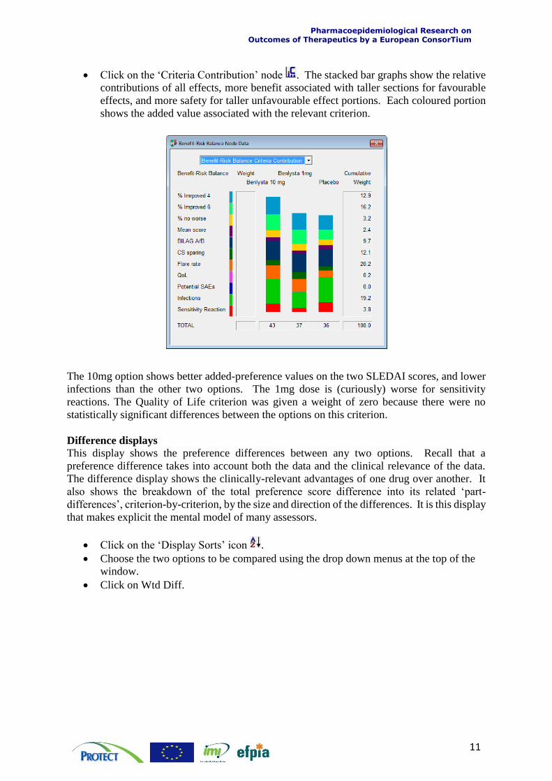
Click on the ‘Criteria Contribution’ node . The stacked bar graphs show the relative
contributions of all effects, more benefit associated with taller sections for favourable
effects, and more safety for taller unfavourable effect portions. Each coloured portion
shows the added value associated with the relevant criterion.
The 10mg option shows better added-preference values on the two SLEDAI scores, and lower
infections than the other two options. The 1mg dose is (curiously) worse for sensitivity
reactions. The Quality of Life criterion was given a weight of zero because there were no
statistically significant differences between the options on this criterion.
Difference displays
This display shows the preference differences between any two options. Recall that a
preference difference takes into account both the data and the clinical relevance of the data.
The difference display shows the clinically-relevant advantages of one drug over another. It
also shows the breakdown of the total preference score difference into its related ‘part-
differences’, criterion-by-criterion, by the size and direction of the differences. It is this display
that makes explicit the mental model of many assessors.
Click on the ‘Display Sorts’ icon .
Choose the two options to be compared using the drop down menus at the top of the
window.
Click on Wtd Diff.

Pharmacoepidemiological Research on Outcomes of Therapeutics by a European ConsorTium
12
This was the result for an early exploration of Benlysta:
The display shows the weighted difference between the 10mg dose and the placebo, with the
criteria shown in the order of the magnitude of the difference. Each criterion’s cumulative
weight is given in the Cum Wt column, the difference in preference scores (not the input data)
in the Diff column, and the product of the difference by the weight in the Wtd Diff column.
The lengths of the bars are proportional to the weighted differences; green bars show the
advantages of the 10mg drug, and red bars the advantages of the placebo. The cumulative sum
of the weighted difference is in the Sum column. Note that the sum is 7.2, so it is now possible
to see how each criterion contributed to the difference seen in the added-value bar graph
displays.
Benefit-risk maps
When the model compares more than two options, it can be instructive to plot weighted
preferences for the favourable effects versus those for the unfavourable effects.
Click on the Map icon .
Move the pointer over the effects tree; it changes to a horizontal axis.
Click on UFE. The pointer changes to a vertical axis; click on FE. This was an early
display for Benlysta.

Pharmacoepidemiological Research on Outcomes of Therapeutics by a European ConsorTium
13
The ideal position is at the upper right, high in preference on both axes, i.e., high benefit versus
better safety. Here, the placebo is safest and lowest in benefit, as expected. By accepting just
a little more risk, i.e. moving horizontally to the left from option 3, a substantial gain in benefit,
shown by the position of the 10mg dose, is obtained. The 1mg dose poses more risk and less
benefit.
Iterate:
At any stage in displaying these results an assessor may challenge the finding. Explore with
him or her why the result doesn’t feel right. Intuitions should be explored because the
experience of assessors is a valuable source of data. When model results and intuitions are not
aligned it may be because a mistake has been made in the modelling, data have been incorrectly
entered, judgements might be inconsistent, assessors may disagree, or any other reason.
Experience of decision analysts suggests that changes are almost always required to initial
models. Remember that the point of modelling is to provide a structured way of thinking about
a problem, so changes are often necessary, sometimes to the model, but also to assessors’
judgments. The model is like another participant, but one that doesn’t argue. Rather, it simply
reflects back to participants the logical consequences of the data and their own judgements.
The whole process is intended to help a group of assessors develop a shared understanding of
the issues, create a sense of common purpose and gain commitment to an agreed
recommendation. There is no ‘right answer’.
Tip: You can display anything versus anything, which can be useful to discover why the
above display was obtained. Node versus node, as above, or node versus criterion, or
criterion versus criterion, can be chosen to plot the preference data on one against the
other. Try various pairs of nodes or criteria to explore the model.

Pharmacoepidemiological Research on Outcomes of Therapeutics by a European ConsorTium
14
UNCERTAINTY
8. Assess uncertainty and examine its impact on the effects balance. In quantitative
modelling two approaches are commonly used: sensitivity analysis and scenario analysis. In
both approaches, input data and judgements are changed to see the effects of the changes on
the overall benefit-risk balance. However, the purposes are different. In sensitivity analysis
the purpose is to explore the effects of imprecision in the data and in judgements, and of
differences in opinion among assessors. In scenario analysis, the effects of new data or possible
future changed conditions or states are explored. Scenario analysis is also useful to change
several inputs in combination to simulate different perspectives of stakeholder groups.
Examining the effects of uncertainty is crucial in helping participants gain confidence in the
model, and to help them develop new insights about the problem.
Two features of Hiview3 can assist in exploring the effects of uncertainty: Sensitivity Up and
Sensitivity Down.
Sensitivity Up
This feature shows the effect on the overall benefit-risk balance of changing the weight at any
node or criterion.
Click on the Sensitivity Up icon.
Move the pointer to the node or criterion whose weight you wish to change, and click.
This example for Benlysta shows the result of
choosing the UFE node. The node’s current
cumulative weight of 23 (see the first added-
value bar graph at the top of page 8) is shown
by the vertical red line, which intersects the
uppermost line at the weighted preference
score for the 10mg dose, 43. That score
would change with more or less weight on the
UFE node. A transition to a different overall
most preferred option is marked by the
change from the green (shaded) colour to the
background colour. The 1mg dose would
never be preferred, and four times as much
weight on UFE would be required for the
placebo to be most preferred.

Pharmacoepidemiological Research on Outcomes of Therapeutics by a European ConsorTium
15
Sensitivity Down
Sensitivity Up analyses on individual criteria that assessors are particularly concerned about
are helpful to show the effects of a change of weight on an individual criterion or node.
Sensitivity Down can show in one display the results of changing all the individual criterion
weights.
Click on the Sensitivity Down icon.
Click on the left-most node, here the Benefit-Risk Balance.
Hiview conducts a sensitivity analysis on all the bottom-level criteria (individually) and uses
green, yellow and red bars in the Sensitivity Down window to show how changing weights on
the criteria affect the overall results. A red bar indicates that a cumulative weight change of
less than 5 points will change the overall best result, while a yellow bar requires a change of
between 5 and 15 points, and a green bar greater than 15 points. No bar at all means that the
most preferred option remains the same as that criterion’s weight is changed over the entire
range from 0 to 100; thus, that criterion’s weight has no effect on the overall result. A robust
model shows mainly white and green bars, some yellow and no red ones. Some red ones, if
they appear on relatively unimportant criteria, may be ignored. Note that to change a
cumulative weight by x points, it will be necessary to change the originally-assessed weight by
more than x points.
The following example is for the analysis of Benlysta at a point when assessors placed some
weight on the ‘Potential SAEs’ criterion, even though none had so far been observed, to see
what effect it could have.
This shows that including ‘Potential SAEs’ puts the model in a sensitive position, for although
the 10mg dose is most preferred, the red bar signals that it takes only a slight further increase

Pharmacoepidemiological Research on Outcomes of Therapeutics by a European ConsorTium
16
in that weight for the 1mg dose to be preferred. Interestingly, the yellow bar shows that a
modest decrease in the weight on ‘Sensitivity Reaction’ would also tip the balance in favour of
the 1mg dose. Only a substantial increase in any of the green-bar effects on Infections or
Sensitivity Reaction would favour the placebo. This analysis suggests that a watching brief on
the side effects following market approval would be wise.
This kind of analysis can be helpful in identifying weaknesses in a drug, and in developing
risk-management schemes. Indeed, the effects of a proposed risk-management plan can be
simulated in the model, by changing scores and weights, to determine how effective it would
be.
The Uncertainty phase of the PrOACT-URL framework is the most important phase for
quantitative modelling, particularly when the model is created in a decision conference or other
facilitated workshop. It is at this stage that many ‘what-if?’ analyses are conducted, seeing
how model results change under different assumption.
For example, entering scores obtained from the pessimistic limits of confidence intervals, or
the optimistic limits, will show whether or not uncertainty in the data matters to a final benefit-
risk judgment. Trying out different assessors’ judgements when they can’t agree will show
whether or not their disagreement should be explored. Many differences are the result of
different backgrounds, medical settings and clinical experiences, so sharing these may enable
a common viewpoint to emerge. Patients’ views on the relative weights to be assigned to the
criteria could be elicited. The perspectives of different constituencies can be simulated by
changing scores, value functions and criterion weights.
This document was written by Dr Lawrence D Phillips for Work Package 5 of the European Medicine Agency’s PROTECT Project. Permission is granted to reproduce this document provided an acknowledgement of the PROTECT Project is stated.