mixing, blending, merging or scrambling topo- …...compare topographic map designs using orthoimage...
TRANSCRIPT

1
Mixing, Blending, Merging or Scrambling Topo-graphic Maps and Orthoimagery in Geovisuali-zation?
Charlotte Hoarau*, Sidonie Christophe*, Sébastien Mustière*
* COGIT Laboratory, IGN, 73 Avenue de Paris, Saint-Mandé, France. Paris Est University
Abstract. Topographic maps, orthoimagery, vector thematic data convey various views of the real world. Geovisualization tools and geoportals wide-ly provide these heterogeneous data to users. They bring users to co-visualize them in order to make suitable visualizations adapted to a task, a purpose or an application. Nevertheless, existing tools do not help to make satisfactory, elaborated and efficient visualizations. This paper presents a part of a PhD work in progress: conceptual and technical issues about pro-posing raster and vector co-visualization methods are detailed. The authors aim at proposing tools to explore a continuum of possible visualizations, between the photorealism of an orthoimage and the abstraction of a topo-graphic map. Three methods to reach this objective are presented and dis-cussed: patchwork between a map and an ortho-image, adaptive symboliza-tion when overlaying data and fluid camouflage of a map in an ortho-image.
Keywords: mixed cartographic representations, map design, orthoimage-ry, topographic map
1. Introduction Successive digital revolutions of these last fifty years have revolutionized the cartography realm. (Robinson et al., 1995) point that the double func-tion of paper maps (storing information as a knowledge reference and providing a view of the world and its complexity) has lead to two distinct cartographic products in our digital era: geographic databases and carto-graphic visualizations. This deeply reforms the traditional role of the map and the historical job of the cartographer. Maps are relieved of their func-tion of storing historic or geographic knowledge, since digital databases allow storing it.
2
At the same time, the historical objective of designing once and for all an ideal map for a given purpose is questioned. Maps can now portray less information but more useful one. (MacEachren, 2011) already asserts that depending on the function of the map (among the exploration, the confir-mation, the synthesis or the presentation of a scientific topic), designing one unique map expected to be the best map ever, could be useless.
The availability of various heterogeneous geographic data and geovisualiza-tion tools in current geoportals and online cartographic applications cor-roborates the foretold end of the ideal of the best map conception. Carto-graphic representations become even more customizable and thus even more customized. This modifies relationships between users and cartogra-phers: users are increasingly involved in the conception of cartographic visualizations. They are also more and more tempted to visualize available data together. It is originally the duty of cartographers to take up the chal-lenge of visually mixing very heterogeneous geographic data. This challenge were taken up in the seventies with the conception of (ortho)photo-maps when satellite images became more and more available. Nowadays, geopor-tals and online cartographic applications offer again the opportunity of easily mixing maps, orthoimages or vector data, and this opportunity is now directly offered to users, renewing then the related issues of designing effi-cient rules for co-visualization of these data.
In this paper, we first analyze existing mixed cartographic representations and compare topographic maps and orthoimagery strengths and weakness-es. We then look for methods to design in-between representations mixing, blending or merging them. We assume that it is possible to learn from these widespread representations in order to merge their strengths. This article outlines why it is a great opportunity to use topographic maps and orthoim-agery together and how to design in-between representations without scrambling initial information.
2. Existing Mixed Representations
2.1. In digital cartography Mixed representations appear in the seventies, with the emergence of satel-lite imagery and available vector data. At this time, maps were expensive and long to produce because of the weak automation of the cartographic process. New cartographic products, called here photomaps as in (Robinson 1995, p218-220), were designed by overlaying vector layers on an orthopho-to background layer. We identify different reasons that motivated cartogra-phers to use orthoimagery backgrounds layers:

3
• Cartographers used orthoimagery background layers to portray territo-ries where they struggle to find data because of the increasing availabil-ity of satellite images and aerial orthoimages (Figure 1a)
• Cartographers used satellite imagery in crisis mapping because of the fastness of data acquisition. This has recently be reinforced by the emergence of collaborative cartographic community (Figure 1b)
• Cartographers directly use up-to-date images in order to speed up map production and then easily creating up-to-date representations
• Cartographers also used satellite images as raw background layers in order to depict the various results of remote sensing methods (Donnay 2000) (Figure 1c).
• Cartographers finally used orthoimagery data sets combined with other digital datasets in order to create new cartographic visualizations (Fig-ure 1d)
1 2
3
1 http://sertit.u-strasbg.fr/SITE_RMS/2005/10_senegal_2005/senegal_2005.html
2 http://sertit.u-strasbg.fr/SITE_RMS/2008/06_charte_haiti_2008/06_charte_haiti_ 2008 .html
3 http://www.pc.gc.ca/fra/pn-np/mb/riding/visit/visit19.aspx

4
Figure 1. a) Photomap 1 of Dakar, Senegal; b) Photomap 2 of Haiti, before Hanna Hurricane in 2008; c) Photomap 3 of classified vegetation of the Mont-Riding in Canada; d) Cover of (Robinson et al. 1995) combining “a black and white digital orthophotograph, a digital elevation model and a digital raster image of a topo-graphic map”.
The conception of such cartographic visualizations opens new semiologic issues. (Donnay 2000) exhorts cartographers to apply graphic semiology principles when designing photomaps. In order to fit the readability com-pliance, he recommends using additional vector layers called “exogenous data”. However, this overlaid cannot be done so easily considering the dif-ferences between orthoimagery layers and topographic base maps: por-trayed information nature is very different and resulting visual impact di-verges also in visual complexity and in color distribution. The symbol speci-fication of overlaid vector layers should be adapted to these characteristics.
2.2. In Geovisualization More recently, the advent of Google Hybrid representation in July 2005 popularized the use of orthoimagery background layers overlaid by road and toponym vector layers. Increasingly, geovisualization applications pro-vide orthoimagery layers and vector topographic or thematic layers associ-ated with navigation and layer manipulation tools. (Raposo, Brewer 2011) compare different topographic map designs for overlay on orthoimage backgrounds. They combine different digital datasets (orthoimagery in col-or or in black and white, shaded relief and topographic vector layers with different symbol specifications) on different landscapes. They conclude that the legibility depends more on the type of landscape than on the design. Therefore, they did not identify one ideal map design among all compared solutions. Similarly, in (Hoarau 2012), we studied different geovisualization applications built with the French geoportal framework. This survey reveals a high diversity of representations (Figure 2). Most of all, our survey identi-fies the lack of consensus when designing mixed representations combining orthoimagery and topographic maps.

5
4
5
Figure 2. Different visualizations built from the same framework.
More generally, a quick overview of existing online cartographic applica-tions shows the diversity in symbol specifications of vector layers overlaid to orthoimagery background layers. Particularly, graphic representations of toponyms are very different from one cartographic application to another (Figure 3).
Figure 3. Toponym graphic representations of geoportals: the French6 geoportal on the left, Bing maps7 on the center and Google Maps8 on the right.
Moreover, online cartographic applications also provide very different methods to visualize different data simultaneously: superposition (Figure
4 http://www.vinogeo.fr/
5 http://lyontoposvtt.free.fr/Geoportail/ign-grezieu-topo.htm
6 http://www.geoportail.gouv.fr/
7 http://www.bing.com/maps/
8 https://maps.google.com/

6
3), co-visualization (Figure 4a), collage (Figure 4c), transparency (Figure 2), swipe9 tool (Figure 4b), magnifier tool (Figure 4d), etc.
Figure 4. a) Synchronized co-visualization10 of historical imagery and mixed car-tographic representation overlaying road vector layer on an orthoimagery back-ground; b) Swipe11 between topographic map and orthoimagery; c) Collage12 of topographic map and orthoimages depending on the level of surging sea; d) Or-thoimagery magnifier tool13 on a city map.
9 The swipe tool hide and reveal two different visualizations depending on the position of the barrier between them
10 http://geobretagne.fr/sviewer/dual.html
11 http://storymaps.geo.admin.ch/storymaps/storymap1/
12 http://sealevel.climatecentral.org/
13 http://www.pc.gc.ca/fra/pn-np/mb/riding/visit/visit19.aspx

7
The diversity in mixed cartographic representations (in symbol specifica-tion and geovisualization methods) shows that there are many and very different rendering visualization options. Some options suffer some infor-mation lost - particularly layer superposition - or some efficiency weakness - particularly synchronized co-visualization, as illustrated by the need of pointing out common features (Figure 4a). But the potential of such repre-sentations seems promising and needs to be theorized.
Two issues of theoretical geovisualization are thus the conception of effi-cient methods to design mixed cartographic representations and the evalua-tion of the efficiency of such visualizations. On the one hand, current re-searches in cartography provide new cartographic representation methods: (Patterson 2002) suggests texturing empty areas of topographic maps in order to make maps more expressive; (Jenny 2012) uses graphic rendering tools in order to make maps more natural. On the other hand, others re-searches aims at evaluating such visualizations: (Raposo, Brewer 2011) compare topographic map designs using orthoimage backgrounds in order to identify preferred design methods; (Zanola et al. 2009) study the impact of the realism level of the visualization on the confidence in portrayed data.
New geovisualization applications invite us to modify the traditional map design process reinjecting topographic maps as input data, as illustrated by Figure 5, in order to create mixed cartographic representations. We here assume that mixing different data types, and especially orthoimagery with topographic data, is promising. We intend to use the characteristics of the different cartographic visualizations described in section 2 in order to build mixed cartographic representations. Section 3 details our different proposi-tions to achieve this objective.
Figure 5. Reinjection of topographic maps as input data in mixed cartographic representation conception.
8
Next section compares input data of Figure 5 regarding the nature of their information and the perception of the world they convey. This comparison guides us to propose rendering method propositions taking advantage of the respective strengths of compared cartographic visualizations, in the last part of the paper.
2.3. Comparing topographic maps and orthoimagery Different geographic data portray different types of geographic features and thus convey very different views of the real world. (Bianchin, 2007) identi-fies four different types of cartographic representations: graphic maps, aer-ial photo-maps, satellite maps and GISs14. They correspond to our three input data types described in Figure 5. We aim here at comparing these different visualizations in order to better understand their potential and the consistency of using them in designing mixed cartographic representations.
2.1.1. How is the world described by different geovisualizations? Topographic maps, orthoimages and geographic vector data share some characteristics as representations of the Earth; they convey spatial infor-mation referring to the real world. But, they fundamentally differ in nature of the conveyed information.
Maps and geographic vector data respectively portray and contain vector geographic features whereas orthoimages are form by radiometric infor-mation pixels. Maps and vector data thus provide structured and selected information associated with semantic classifications and relationships. The fact “that the map has the quality of structure” is one of the “attributes [making a map] unique among other scientific documents”, according to (Robinson 1978). In such a representation, geographic features have been identified, their nature has been interpreted and their geometric implanta-tion has been delimited by located points, lines or surfaces. Moreover, topographic maps portray geographic features by hierarchical and artificial symbols.
Orthoimages provide radiometric information recorded by spectral sensors and that has not been modified or interpreted by humans. (Barthes, 1961) describes the special status of the photographic message as non encoded and continuous. This continuous characteristic is implied by the twofold nature of orthoimages: they are raster representations and come from an
14 She differentiates aerial photo from satellite images because of their different acquisition processes, analogue for the aerial one and digital for the satellite one. We here group them together considering the common use of digital camera in current aerial imagery.
9
automated and homogeneous acquisition process. Besides, (Donnay 2000) lists products that can be derived from orthoimages by remote sensing tools aiming at extracting sense, knowledge and meaning from non interpreted orthoimages. “Raw” orthoimages thus portray all features that can be seen from the sky, with realistic or natural colors and textures, but without prior categorization, which may lead to misinterpretations.
In consequences, different geovisualizations provide views of the world with different visual impacts, which make them unequally adapted to be used as background layer. Structuring maps intends to make them more quickly readable and comprehensible but it leads to high colored graphic represen-tations. At the contrary, orthoimages provide visually complex information generally by dark and tern colors. This difference increases the challenge to mix them together or with others vector data in the same graphic visualiza-tion.
2.1.2. How is the world perceived through different geovisualizations? Differences between the different representations give evidence that they convey different views of the world. We wonder if one or another is more realistic or more abstract than the others. We define the realism as the faithfulness to the user direct perception, i.e. a raw and human perception of the real world. We define the abstraction as a simplification of the per-ception of the concrete world, according to (Mustière et al. 2008). But we also distinguish two types of abstraction according to (McCloud 1994): the simplification of the visual properties (shape, color, etc.) ranging from the photographic reality to the picture plane just keeping form information, and the reduction of significant details from the photographic reality to iconic of symbolic notations just keeping meaning information.
On the one hand, (Robinson et al., 1995) say that “All maps are abstractions of reality.” We wonder here what makes a map an abstract representation of the reality. What are the abstraction steps in the cartographic design pro-cess?
Maps and orthoimages portray scaled reductions of the earth surface; thus they provide a simplified view of the geographic space (Donnay 2000). Moreover, they share the same geometric alteration of the raw perception of the world through human vision as 2D representations of a 3D world through projected deformations. Cartographic scale and projection could thus be considered as shared abstraction of the representation of the world. Then, we can identify three main steps of abstraction in the cartographic design process:
10
• Data selection aims at filtering recorded features and thus reducing per-ceived information. (Donnay 2000) warns that the very definition of the specifications of a map or a geographic vector data is neither neutral nor impartial and could be very different depending on the initial purpose of the cartographer. Therefore, he assumes that geographic databases and then maps are alterations and simplifications of the initial perception of the concrete world. He also points out that orthoimages information recorded by spectral sensors reduce the perception depending on the sensor characteristics (resolution, spectral capacity, etc.), the acquisi-tion time and the environmental context.
• Data generalization is an important part of the production of topo-graphic maps. (Mustière et Al., 2008) distinguishes two different pro-cesses in theoretical cartographic generalization: the abstraction of the knowledge and the representation of this knowledge.
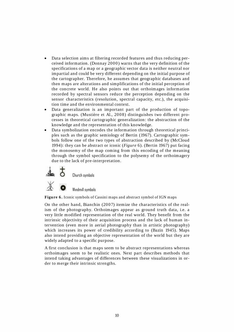
• Data symbolization encodes the information through theoretical princi-ples such as the graphic semiology of Bertin (1967). Cartographic sym-bols follow one of the two types of abstraction described by (McCloud 1994): they can be abstract or iconic (Figure 6). (Bertin 1967) put facing the monosemy of the map coming from this encoding of the meaning through the symbol specification to the polysemy of the orthoimagery due to the lack of pre-interpretation.
Church symbols
Windmill symbols
Figure 6. Iconic symbols of Cassini maps and abstract symbol of IGN maps
On the other hand, Bianchin (2007) itemize the characteristics of the real-ism of the photography. Orthoimages appear as ground truth data, i.e. a very little modified representation of the real world. They benefit from the intrinsic objectivity of their acquisition process and the lack of human in-tervention (even more in aerial photography than in artistic photography) which increases its power of credibility according to (Bazin 1945). Maps also intend providing an objective representation of the world but they are widely adapted to a specific purpose.
A first conclusion is that maps seem to be abstract representations whereas orthoimages seem to be realistic ones. Next part describes methods that intend taking advantages of differences between these visualizations in or-der to merge their intrinsic strengths.

11
3. Back and Forth between map and orthoimagery
3.1. Global approach We aim at building a continuum of mixed cartographic representations from a topographic map to an orthoimage. Our global approach to build in-between representations consists in the reinjection of orthoimage charac-teristics in the map design process and vice versa. We intend to browse dif-ferent graphic representations between the map and the orthoimagery, be-ing aware that different ways exist between these two extremes of visualiza-tions (Figure 7). We describe hereafter some thoughts on different ways to explore.
Various uses have been planned for such visualizations:
• Landed property digitalization application for farmers in the context of the European common agricultural policy;
• On-demand map application allowing users to design personalized vis-ualizations;
• Interactive application for the consultation and the exploration of het-erogeneous data;
• Emergency application for data updating, using real time imagery in order to speed up decision making;
• Sustainable development, biodiversity, land settlement applications for whom imagery visualization are more useful and more employed.
Figure 7. “Continuum” of mixed cartographic representations between orthoim-agery and a topographic map.

12
One issue when designing mixed cartographic representations is the con-stant preservation of the readability of each proposition. It is essential for us to not scramble the initial information in each original cartographic rep-resentation. How to merge, blend or mix data together?
3.2.1. “Patchwork” method This method consists in merging patches of several cartographic represen-tations. It aims at taking advantage of the “best” part of these cartographic representations, considering their efficiency in regarding a given need, user profile or purpose. Figure 8 shows an example where vegetation areas have been cut out in order to make the orthoimagery appear instead of the green tint area of the initial topographic map.
Figure 8. Patchwork method applied on the vegetation theme.
Resulting visualization shows realistic textures coming from the orthoim-agery. It aims at helping the user to be connected with the field by taking advantage of the realism properties of the orthoimage and providing more information.
3.2.2. Adaptive symbolization This method aims at highlighting relevant geographic features overlaid to an imagery background layer. Our proposition consists in adapting locally the color of symbols of these relevant features depending on the radiometry of the orthoimagery. It aims at enhancing the visual saliency of identified relevant information. Figures 9 and 10 show examples of this method ap-plied to the visualization of the road network and the city toponym layer.

13
Figure 9. Adaptive symbolizations of the road network depending on the orthoim-agery radiometry
Figure 9a) shows a symbolization of the road network where each section is symbolized by a color with the same hue but a lighter lightness than the color of the pixel overlaid by the centroïde of the road section. Figure 9b) shows two different symbolizations of the road network: the bottom-left corner shows black roads whereas the top-right corner shows white roads; but they both have an adaptive black and white contour which lightness is the complementary of the lightness of the pixel overlaid by the centroïde of each road section.
Both examples of Figure 9 aim at enhancing the visual saliency of the roads on an orthoimagery background. Indeed, roads are traditionally symbolized with a light or bright color and with a black contour allowing roads to be visible in each part of the map. Our method aims at reproducing and invers-ing this principle on an orthoimagery background and at inversing it in comparison with light map backgrounds. Figure 9a) makes it by using the low-key contrast. Figure 9b) revisits the close-cutting cartographic tech-nique: here, the road network is symbolized by a unique color but its main stroke is associated with a contour which is always visible thanks to the ad-aptation of the lightness of its color.
Figure 10 shows another example where city toponyms are symbolized with the reverse color of the mean color of the area surrounding each label. Overlaid toponym representation aims at increasing the efficiency of the resulting representation adding abstract information (toponyms are not real geographic features) to the orthoimagery background. Toponyms are highlighted by a symbolization adapted to the very special orthoimagery background.

14
Figure 10. Adaptive symbolizations of the toponym of cities depending on the orthoimagery radiometry
3.2.3. The “camouflage” method The « camouflage » method consists in using the main colors of the or-thoimage in the symbol specification. It aims at providing smooth transi-tions between the map and its corresponding orthoimage. Thus, the map could progressively and softly surge from the orthoimage. Moreover, like the patchwork method, the camouflage method takes advantage of the real-istic colors of the orthoimagery in order to make maps more realist.
Figure 11. Progressive camouflage of the map on the orthoimagery
15
Figure 11 shows progressive camouflages of the map. Majority colors have been extracted from the orthoimagery using tools described in (Christophe et al. 2013). Then, they have been inserted in the symbol specification; first keeping the road network initial symbolization in Figure 11a) and for all the themes of the symbol specification in Figure 11b).
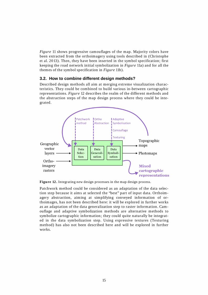
3.2. How to combine different design methods? Described design methods all aim at merging extreme visualization charac-teristics. They could be combined to build various in-between cartographic representations. Figure 12 describes the realm of the different methods and the abstraction steps of the map design process where they could be inte-grated.
Figure 12. Integrating new design processes in the map design process.
Patchwork method could be considered as an adaptation of the data selec-tion step because it aims at selected the “best” part of input data. Orthoim-agery abstraction, aiming at simplifying conveyed information of or-thoimages, has not been described here: it will be explored in further works as an adaptation of the data generalization step to raster information. Cam-ouflage and adaptive symbolization methods are alternative methods to symbolize cartographic information; they could quite naturally be integrat-ed in the data symbolization step. Using expressive textures (Texturing method) has also not been described here and will be explored in further works.

16
4. Conclusion and Perspectives In conclusion, in this paper, existing cartographic representations (mixed or raw) have been compared identifying their intrinsic characteristics in order to better understand how they describe the world and which percep-tion of the world they convey. Guided by the analysis of respective levels of abstraction, new design methods have been proposed to build mixed carto-graphic representations.
Further works will refine proposed methods. Possible sophistications of the symbol adaptation method would concern the color characterization of the local context of features to highlight, or the choice of the resulting color of the feature to highlight. The camouflage method will also be further im-proved by a smarter re-affectation of the colors by spatial association. Fur-ther works could also explore others methods implied by Figure 12: the information conveyed by orthoimagery backgrounds could be simplified by reducing the number of colors to render it, and plain tint area of the map could be textured by using computer graphic tools.
Finally, we identify two persistent stakes in this approach. First, mixing heterogeneous data could cause geometric, temporal, and graphic incon-sistencies. It is imperative to identify all different sources of inconsistency in order to take them into account. Secondly, resulting new cartographic representations should be tested by users in order to measure their efficien-cy, their utilisability, and their impact on the user confidence in depicted data.
Acknowledgment This work is granted by the French National Research Agency, with the ref-erence ANR-12-CORD-0025.
References Barthes R (1961) Le message photographique. Communications n.1, Paris.
Bazin A (1945) Ontologie de l'image photographique. In Qu’est-ce que le cinéma, Paris: éd. du Cerf, 1985.
Bertin J (1967) Sémiologie graphique: Les diagrammes, Les réseaux, Les cartes. Paris: Mouton, Gauthier-Villars.
Bianchin A (2007) Theoretical cartography issues in the face of new representa-tions. In Proceedings of the 23th International Cartographic Conference (ICC 2007), Moscow, Russia.

17
Christophe S, Perret J, Hoarau C (2013) Extraction de palettes de couleurs pour l’aide à la conception cartographique, Revue des Sciences et Technologies de l’Information (RSTI), Revue spéciale "Art et Informatique", Vol. 32, 2013.
Donnay J-P (2000) Nature et Qualités de la Spatiocartographie, Bulletin de la So-ciété Géographique de Liège In La Spatiocartographie, Vol. 38, pp. 11-23.
Hoarau C (2012) Orthoimage or map visualization in use in geoportals, case study on the French geoportal. In Proceedings of the AutoCarto Conference 2012, 16-18 September, Columbus, Ohio, USA.
Jenny B (2012) Pseudo‐natural Maps Research Project Website. http://cartography.oregonstate.edu/pseudo‐natural/ Last visited 1/04/13.
MacEachren A M (2011) The Roles of Maps, from Some Truth with Maps: A Primer on Symbolization and Design., Chapter 3.6, pp. 244-251. Wiley-Blackwell.
McCloud S (1994) Understanding Comics : The Invisible Art. Harper Paperbacks.
Patterson T (2002) Getting Real: Reflecting on the New Look of National Park Ser-vice Maps. Cartographic perspectives, vol. 43.
Mustière S, L Saitta, and J-D Zucker (2008) Abstraction in cartographic generaliza-tion. Foundations of Intelligent Systems. pp. 441-450.
Raposo P and Brewer C A (2011) Comparison of topographic map designs for over-lay on orthoimage backgrounds. In Proceedings of the 25th International Carto-graphic Conference (ICC 2011), Paris, France, July 3-8.
Robinson A H (1978) The uniqueness of the map. The American Cartographer 5 (1), 5-7.
Robinson A H, Morrison J L, Muehrcke P C, Guptill S C, Kimerling A J (1995) Ele-ments of cartography, Sixth Edition. John Wiley & Sons, Inc.
Zanola S, Fabrikant S I, Çöltekin A (2009) The Effect of Realism on the Confidence in Spatial Data Quality. In Proceedings of the 24th International Cartography Conference (ICC 2009), Santiago, Chile, Nov. 15-21. (refereed abstract).