missed opportunity: a study of leading consulting firm websites
TRANSCRIPT
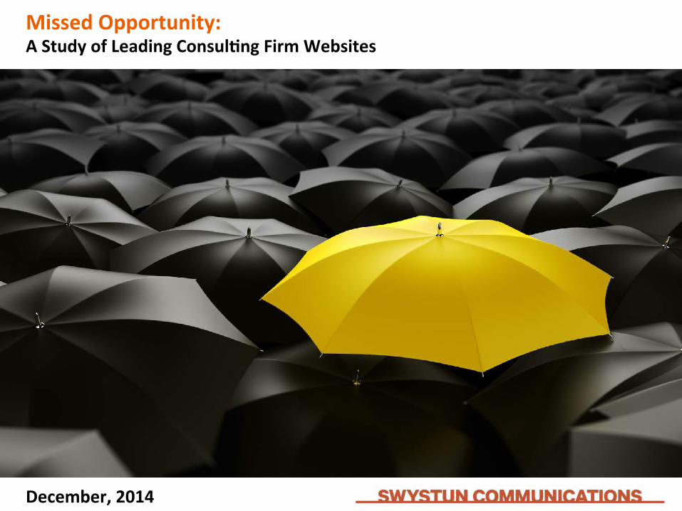
Missed Opportunity: A Study of Leading Consul8ng Firm Websites
December, 2014
Let’s First Talk Differen8a8on Branding is incredibly fun and equally challenging. One industry where it is especially challenging is professional services. These are advice-‐based businesses where so much of what is delivered is intangible. Claims of differen?a?on are short-‐lived (and oAen suspect). Everyone sounds and looks the same. For these reasons and more, firms within the category are lucky to achieve incremental gains against compe?tors. Sadly, parity is the norm in professional services. Can anyone describe the difference between two law firms? Aren’t all adver?sing agencies crea?ve? Accoun?ng firms are assumed to be good with numbers. How can one firm sustain clear differen?a?on and relevance? This is a broader strategy discussion for another ?me as this report deals with one facet of professional services branding. A website is one of the most visible manifesta?ons of a brand. A poten?al client’s or prospec?ve employee’s first encounter with your firm is likely to be online. Clearly, clients don’t engage professional services firms based on the website alone but there are significant benefits by trea?ng your site as a cri?cal part of the brand and business development strategies. I know this in?mately having held responsibility for the websites of Interbrand, the leading brand consultancy, and DDB, the revered adver?sing agency, for a combined eleven years. I have also consulted to over twenty-‐five professional service firms on their brand, marke?ng and adver?sing. The vast majority of these engagements involved their digital brand presence.
Welcome. We are glad you are here.
1
Most professional service websites are built and invested in with the vague purpose of establishing creden?als. They become robust digital calling cards. This narrow focus minimizes their poten?al. At the same ?me these businesses struggle with communica?ng and demonstra?ng the complex services they offer. An added challenge is doing this across mul?ple geographies in different languages and cultures. I have wrestled with all of this so have empathy for professional services marketers and their agencies. It is tough to do it well and sustain any advantage. Our study of the top ten consul?ng firm websites reveals an all too obvious finding: there is liUle differen?a?on among them. More alarming is the glaring lack of quality and relevance. For strategic thinkers, leading technologists and complex problem solvers, it appears to be a challenge for these professionals to apply their talents to their own branding and specifically to their websites. Our survey of over 1,200 marke?ng professionals is revealing. It results in a ranking that shows who is doing it best. More importantly, it provides fresh ideas for any professional services brand to employ. We hope you enjoy and find value in the following pages. The content here is a subset of our overall study. If you wish to learn more, we kindly invite you to get in touch to discuss your business and brand. Cheers! Jeff Swystun
2
What’s Inside
Survey Background Insights Ranking and Ra?ngs
3
Survey Background
4
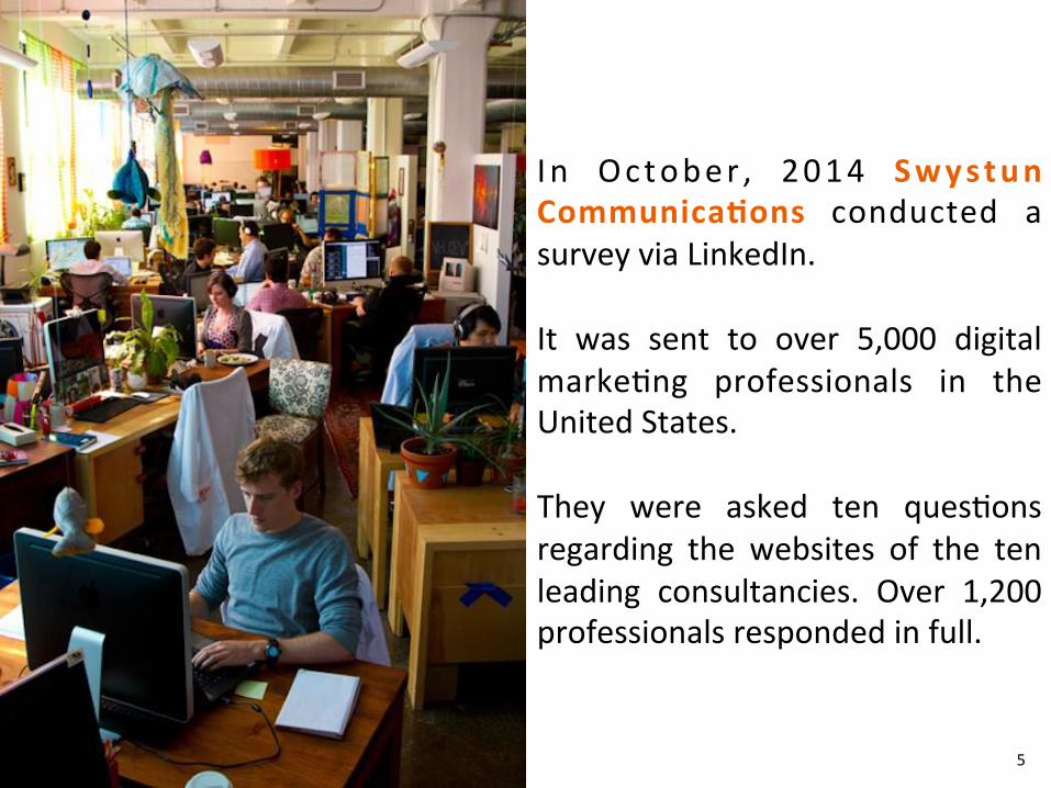
I n October , 2014 Swystun Communica8ons conducted a survey via LinkedIn. It was sent to over 5,000 digital marke?ng professionals in the United States. They were asked ten ques?ons regarding the websites of the ten leading consultancies. Over 1,200 professionals responded in full.
5
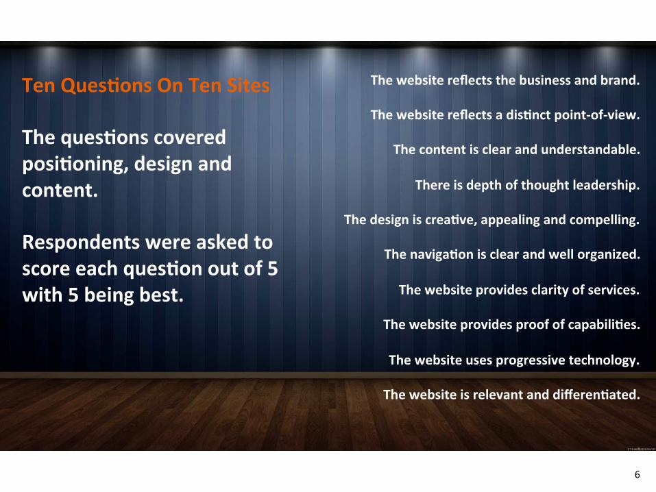
The website reflects the business and brand.
The website reflects a dis8nct point-‐of-‐view.
The content is clear and understandable.
There is depth of thought leadership.
The design is crea8ve, appealing and compelling.
The naviga8on is clear and well organized.
The website provides clarity of services.
The website provides proof of capabili8es.
The website uses progressive technology.
The website is relevant and differen8ated.
Ten Ques8ons On Ten Sites The ques8ons covered posi8oning, design and content. Respondents were asked to score each ques8on out of 5 with 5 being best.
6
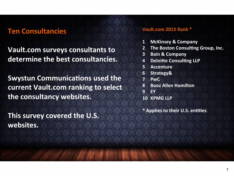
Ten Consultancies Vault.com surveys consultants to determine the best consultancies. Swystun Communica8ons used the current Vault.com ranking to select the consultancy websites. This survey covered the U.S. websites.
Vault.com 2015 Rank * 1 McKinsey & Company 2 The Boston Consul8ng Group, Inc. 3 Bain & Company 4 Deloi^e Consul8ng LLP 5 Accenture 6 Strategy& 7 PwC 8 Booz Allen Hamilton 9 EY 10 KPMG LLP * Applies to their U.S. en88es
7
Insights
8
The survey produced amazing insights. The respondents were diligent, thoughgul and sharp. Their qualita8ve comments were highly instruc8ve. In short, they did not hold back. The following are a number of observa8ons, insights and ideas to help you build or redo your site for greater impact. State Your Purpose What is the purpose of your website? If you cannot answer clearly, you may be squandering your most important online asset. And even if you can answer, there is a good chance your site is not fulfilling that purpose. The fact is, the vast majority of websites underperform or far worse, they are counterproduc8ve. Even established, successful companies with enviable brands give liUle strategic thought to their website. These sites have been tweaked so many ?mes that they have lost their coherence and purpose. Most are a result of patch work and too many cooks in the kitchen. New sites struggle too with their purpose but for the opposite reason. They tend to overthink it. These businesses make their sites densely complex so the content overwhelms and confuses. Not to demean their poten?al impact and power but a website is basically a turbo-‐charged brochure and there are three primary purposes of a brochure. They exist to establish creden?als, generate leads, and sell products and services. A website can accomplish all three if done right. Just make sure to state a clear and ambi?ous purpose and make it yours.
9
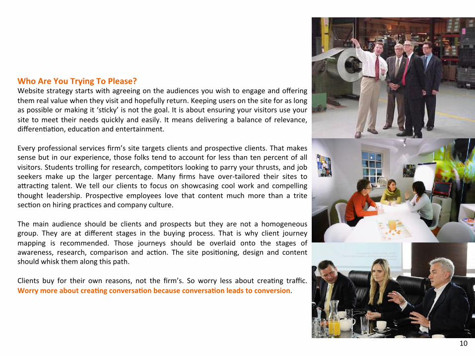
Who Are You Trying To Please? Website strategy starts with agreeing on the audiences you wish to engage and offering them real value when they visit and hopefully return. Keeping users on the site for as long as possible or making it ‘s?cky’ is not the goal. It is about ensuring your visitors use your site to meet their needs quickly and easily. It means delivering a balance of relevance, differen?a?on, educa?on and entertainment. Every professional services firm’s site targets clients and prospec?ve clients. That makes sense but in our experience, those folks tend to account for less than ten percent of all visitors. Students trolling for research, compe?tors looking to parry your thrusts, and job seekers make up the larger percentage. Many firms have over-‐tailored their sites to aUrac?ng talent. We tell our clients to focus on showcasing cool work and compelling thought leadership. Prospec?ve employees love that content much more than a trite sec?on on hiring prac?ces and company culture. The main audience should be clients and prospects but they are not a homogeneous group. They are at different stages in the buying process. That is why client journey mapping is recommended. Those journeys should be overlaid onto the stages of awareness, research, comparison and ac?on. The site posi?oning, design and content should whisk them along this path. Clients buy for their own reasons, not the firm’s. So worry less about crea?ng traffic. Worry more about crea8ng conversa8on because conversa8on leads to conversion.
10
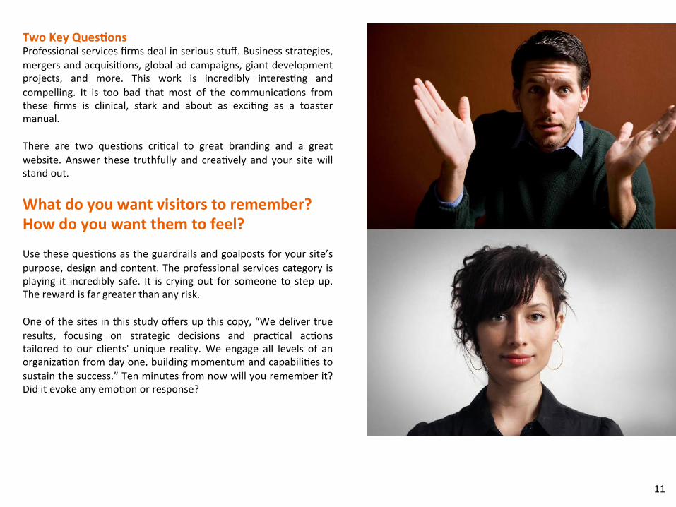
Two Key Ques8ons Professional services firms deal in serious stuff. Business strategies, mergers and acquisi?ons, global ad campaigns, giant development projects, and more. This work is incredibly interes?ng and compelling. It is too bad that most of the communica?ons from these firms is clinical, stark and about as exci?ng as a toaster manual. There are two ques?ons cri?cal to great branding and a great website. Answer these truthfully and crea?vely and your site will stand out.
What do you want visitors to remember? How do you want them to feel? Use these ques?ons as the guardrails and goalposts for your site’s purpose, design and content. The professional services category is playing it incredibly safe. It is crying out for someone to step up. The reward is far greater than any risk. One of the sites in this study offers up this copy, “We deliver true results, focusing on strategic decisions and prac?cal ac?ons tailored to our clients' unique reality. We engage all levels of an organiza?on from day one, building momentum and capabili?es to sustain the success.” Ten minutes from now will you remember it? Did it evoke any emo?on or response?
11
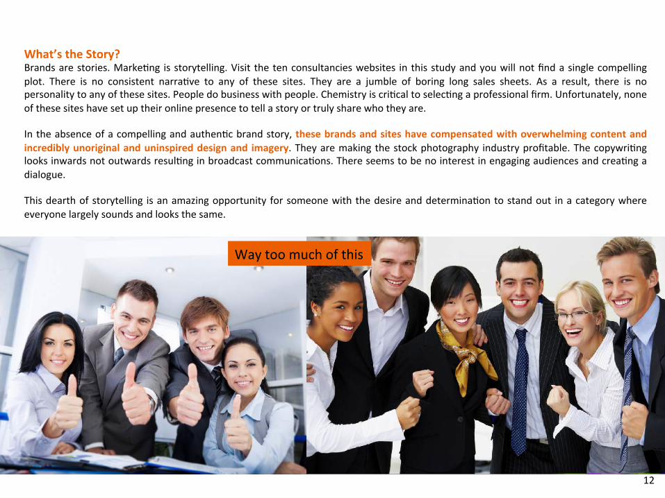
What’s the Story? Brands are stories. Marke?ng is storytelling. Visit the ten consultancies websites in this study and you will not find a single compelling plot. There is no consistent narra?ve to any of these sites. They are a jumble of boring long sales sheets. As a result, there is no personality to any of these sites. People do business with people. Chemistry is cri?cal to selec?ng a professional firm. Unfortunately, none of these sites have set up their online presence to tell a story or truly share who they are. In the absence of a compelling and authen?c brand story, these brands and sites have compensated with overwhelming content and incredibly unoriginal and uninspired design and imagery. They are making the stock photography industry profitable. The copywri?ng looks inwards not outwards resul?ng in broadcast communica?ons. There seems to be no interest in engaging audiences and crea?ng a dialogue. This dearth of storytelling is an amazing opportunity for someone with the desire and determina?on to stand out in a category where everyone largely sounds and looks the same.
Way too much of this
12
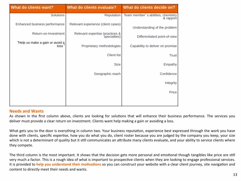
Needs and Wants As shown in the first column above, clients are looking for solu?ons that will enhance their business performance. The services you deliver must provide a clear return on investment. Clients want help making a gain or avoiding a loss. What gets you to the door is everything in column two. Your business reputa?on, experience best expressed through the work you have done with clients, specific exper?se, how you do what you do, client roster because you are judged by the company you keep, your size which is not a determinant of quality but it s?ll communicates an aUribute many clients evaluate, and your ability to service clients where they compete. The third column is the most important. It shows that the decision gets more personal and emo?onal though tangibles like price are s?ll very much a factor. This is a rough idea of what is important to prospec?ve clients when they are looking to engage professional services. It is provided to help you understand their mo8va8ons so you can construct your website with a clear client journey, site naviga?on and content to directly meet their needs and wants.
What do clients want? What do clients evaluate? What do clients decide on?
Solutions
Enhanced business performance
Return-on-Investment
“Help us make a gain or avoid a loss”
Reputation
Relevant experience (client cases)
Relevant expertise (practices & specialties)
Proprietary methodologies
Client list
Size
Geographic reach
Team member’s abilities, chemistry & rapport
Understanding of the problem
Differentiated point-of-view
Capability to deliver on promise
Trust
Empathy
Confidence
Integrity
Price
13
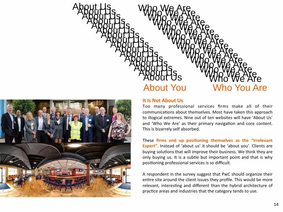
It Is Not About Us Too many professional services firms make all of their communica?ons about themselves. Most have taken this approach to illogical extremes. Nine out of ten websites will have ‘About Us’ and ‘Who We Are’ as their primary naviga?on and core content. This is bizarrely self absorbed. These firms end up posi8oning themselves as the “Irrelevant Expert”. Instead of ‘about us’ it should be ‘about you’. Clients are buying solu?ons that will improve their business. We think they are only buying us. It is a subtle but important point and that is why posi?oning professional services is so difficult. A respondent in the survey suggest that PwC should organize their en?re site around the client issues they profile. This would be more relevant, interes?ng and different than the hybrid architecture of prac?ce areas and industries that the category tends to use.
About Us About Us About Us About Us About Us About Us About Us About Us About Us About Us About Us About Us About Us About Us About Us About Us
Who We Are Who We Are Who We Are Who We Are Who We Are Who We Are Who We Are Who We Are Who We Are Who We Are Who We Are Who We Are Who We Are Who We Are Who We Are Who We Are About You Who You Are
14
Much More The study revealed much more. The rankings, trends and comments point to a broader set of prac?ces that professional service firms cannot ignore. We would be happy to share more on these and apply them more directly to your situa?on. Among them are:
Seong a clear and consistent structure CraAing compelling content Establishing valuable calls to ac?on Ensuring dynamic ac?vity Providing personal reasons to come back
We also have insights related to mobile applica?ons and the use of interac?ve technologies for greater engagement. A website should inform, inspire and reassure its audience about their purchase decisions or poten?al decision. It needs to draw them in and make them feel something. The site is oAen the first opportunity to make them remember what makes you different. A firm’s website is far too important to be squandered. We encourage you to spend ?me going through the detailed rankings and ra?ngs that follow and invite you to get in touch to discuss your business and brand.
15

Rankings & Ra8ngs
16
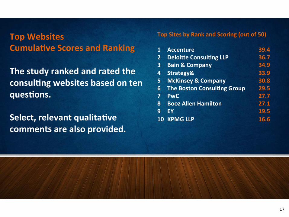
Top Websites Cumula8ve Scores and Ranking The study ranked and rated the consul8ng websites based on ten ques8ons. Select, relevant qualita8ve comments are also provided.
Top Sites by Rank and Scoring (out of 50) 1 Accenture 39.4 2 Deloi^e Consul8ng LLP 36.7 3 Bain & Company 34.9 4 Strategy& 33.9 5 McKinsey & Company 30.8 6 The Boston Consul8ng Group 29.5 7 PwC 27.7 8 Booz Allen Hamilton 27.1 9 EY 19.5 10 KPMG LLP 16.6
17
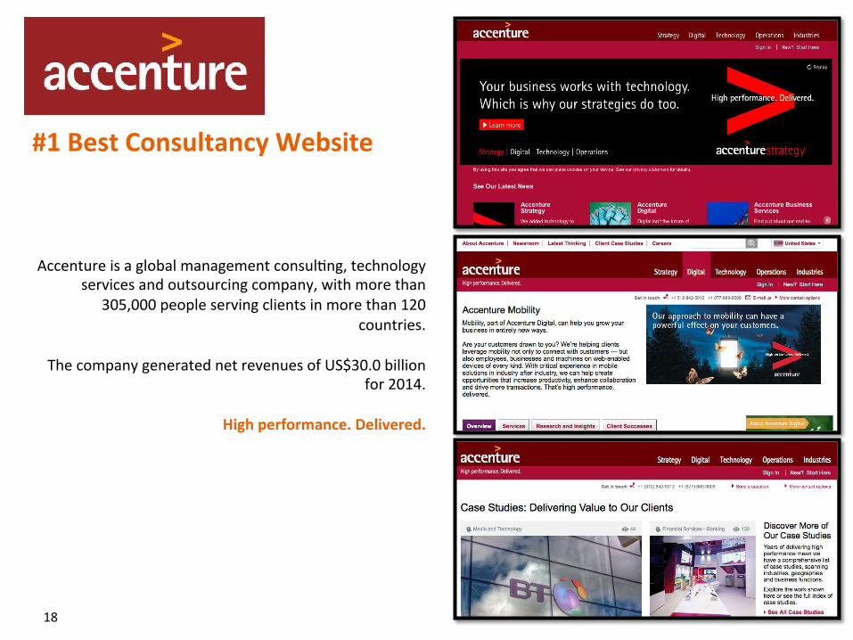
Accenture is a global management consul?ng, technology services and outsourcing company, with more than
305,000 people serving clients in more than 120 countries.
The company generated net revenues of US$30.0 billion
for 2014.
High performance. Delivered.
#1 Best Consultancy Website
18
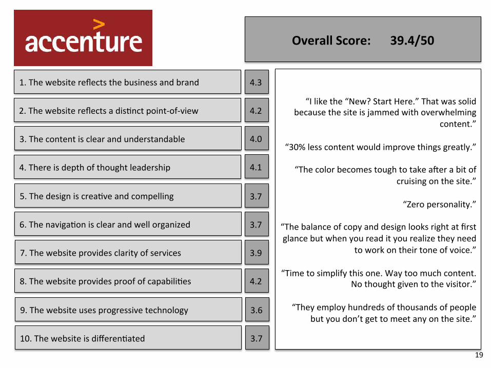
1. The website reflects the business and brand
2. The website reflects a dis?nct point-‐of-‐view
3. The content is clear and understandable
4. There is depth of thought leadership
5. The design is crea?ve and compelling
6. The naviga?on is clear and well organized
7. The website provides clarity of services
8. The website provides proof of capabili?es
9. The website uses progressive technology
10. The website is differen?ated
4.3
4.2
4.0
4.1
3.7
3.7
3.9
4.2
3.6
3.7
Overall Score: 39.4/50
“I like the “New? Start Here.” That was solid because the site is jammed with overwhelming
content.”
“30% less content would improve things greatly.”
“The color becomes tough to take aAer a bit of cruising on the site.”
“Zero personality.”
“The balance of copy and design looks right at first glance but when you read it you realize they need
to work on their tone of voice.”
“Time to simplify this one. Way too much content. No thought given to the visitor.”
“They employ hundreds of thousands of people
but you don’t get to meet any on the site.”
19
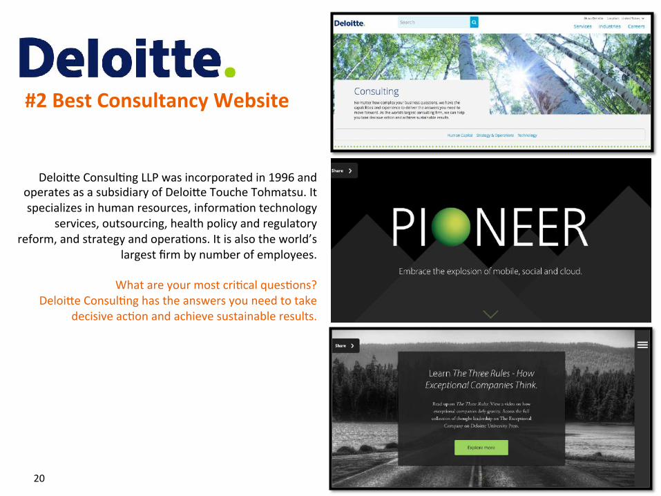
DeloiUe Consul?ng LLP was incorporated in 1996 and operates as a subsidiary of DeloiUe Touche Tohmatsu. It specializes in human resources, informa?on technology
services, outsourcing, health policy and regulatory reform, and strategy and opera?ons. It is also the world’s
largest firm by number of employees.
What are your most cri?cal ques?ons? DeloiUe Consul?ng has the answers you need to take
decisive ac?on and achieve sustainable results.
#2 Best Consultancy Website
20
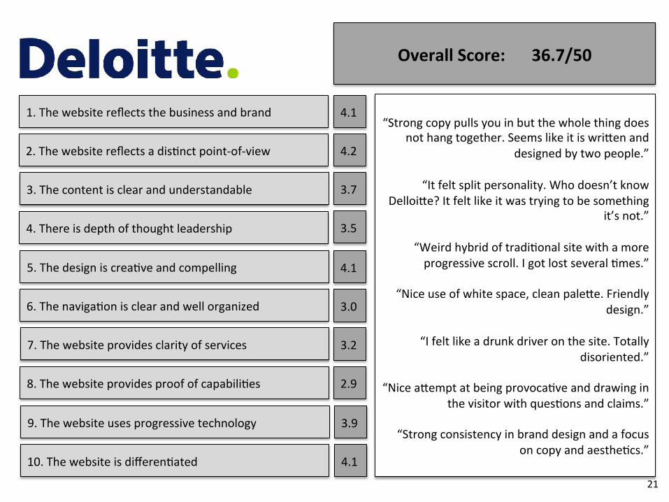
1. The website reflects the business and brand
2. The website reflects a dis?nct point-‐of-‐view
3. The content is clear and understandable
4. There is depth of thought leadership
5. The design is crea?ve and compelling
6. The naviga?on is clear and well organized
7. The website provides clarity of services
8. The website provides proof of capabili?es
9. The website uses progressive technology
10. The website is differen?ated
4.1
4.2
3.7
3.5
4.1
3.0
3.2
2.9
3.9
4.1
Overall Score: 36.7/50
“Strong copy pulls you in but the whole thing does not hang together. Seems like it is wriUen and
designed by two people.”
“It felt split personality. Who doesn’t know DelloiUe? It felt like it was trying to be something
it’s not.”
“Weird hybrid of tradi?onal site with a more progressive scroll. I got lost several ?mes.”
“Nice use of white space, clean paleUe. Friendly
design.”
“I felt like a drunk driver on the site. Totally disoriented.”
“Nice aUempt at being provoca?ve and drawing in
the visitor with ques?ons and claims.”
“Strong consistency in brand design and a focus on copy and aesthe?cs.”
21
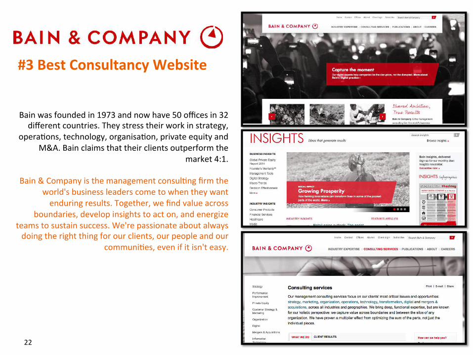
Bain was founded in 1973 and now have 50 offices in 32 different countries. They stress their work in strategy,
opera?ons, technology, organisa?on, private equity and M&A. Bain claims that their clients outperform the
market 4:1.
Bain & Company is the management consul?ng firm the world's business leaders come to when they want enduring results. Together, we find value across
boundaries, develop insights to act on, and energize teams to sustain success. We're passionate about always doing the right thing for our clients, our people and our
communi?es, even if it isn't easy.
#3 Best Consultancy Website
22
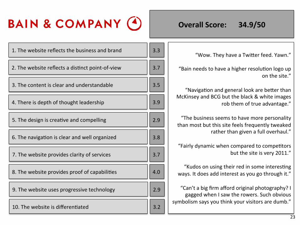
1. The website reflects the business and brand
2. The website reflects a dis?nct point-‐of-‐view
3. The content is clear and understandable
4. There is depth of thought leadership
5. The design is crea?ve and compelling
6. The naviga?on is clear and well organized
7. The website provides clarity of services
8. The website provides proof of capabili?es
9. The website uses progressive technology
10. The website is differen?ated
3.3
3.7
3.5
3.9
2.9
3.8
3.7
4.0
2.9
3.2
Overall Score: 34.9/50
“Wow. They have a TwiUer feed. Yawn.”
“Bain needs to have a higher resolu?on logo up on the site.”
“Naviga?on and general look are beUer than
McKinsey and BCG but the black & white images rob them of true advantage.”
“The business seems to have more personality
than most but this site feels frequently tweaked rather than given a full overhaul.”
“Fairly dynamic when compared to compe?tors
but the site is very 2011.”
“Kudos on using their red in some interes?ng ways. It does add interest as you go through it.”
“Can’t a big firm afford original photography? I gagged when I saw the rowers. Such obvious
symbolism says you think your visitors are dumb.”
23
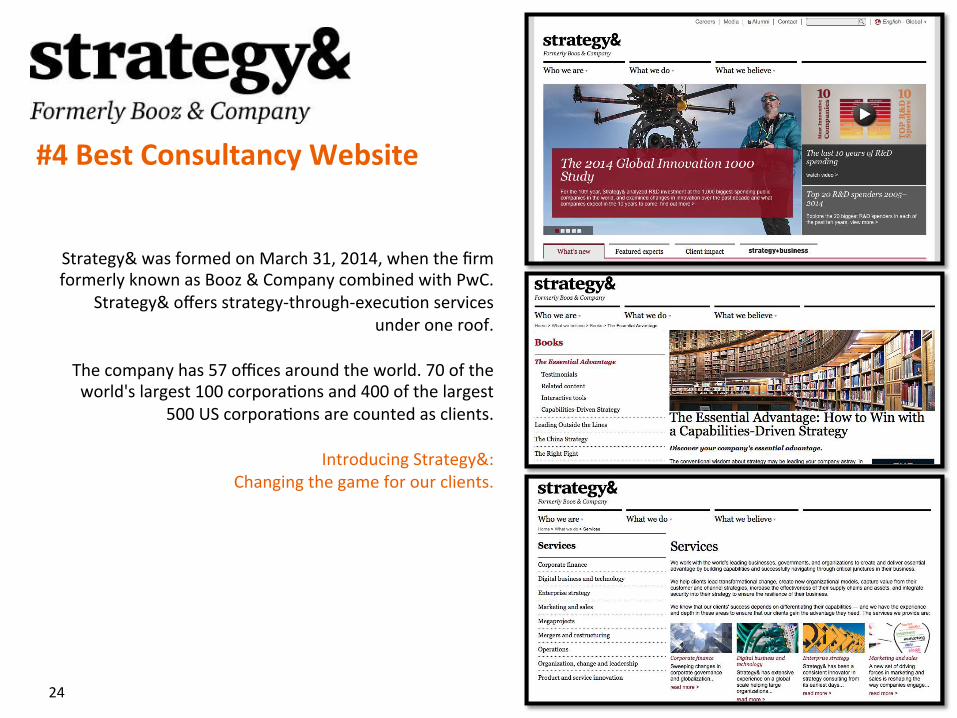
Strategy& was formed on March 31, 2014, when the firm formerly known as Booz & Company combined with PwC.
Strategy& offers strategy-‐through-‐execu?on services under one roof.
The company has 57 offices around the world. 70 of the world's largest 100 corpora?ons and 400 of the largest
500 US corpora?ons are counted as clients.
Introducing Strategy&: Changing the game for our clients.
#4 Best Consultancy Website
24
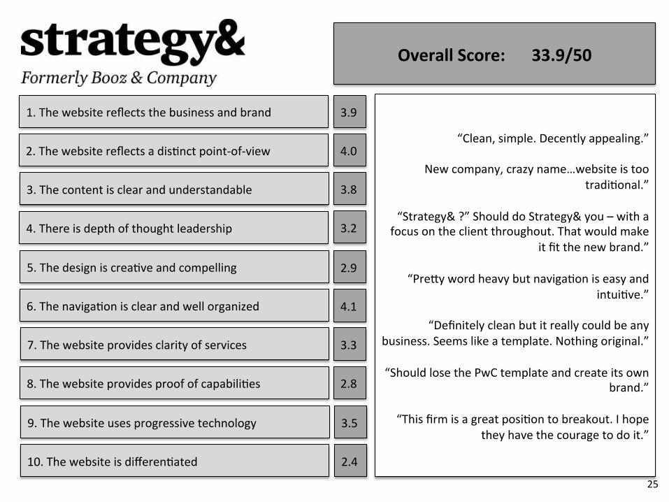
1. The website reflects the business and brand
2. The website reflects a dis?nct point-‐of-‐view
3. The content is clear and understandable
4. There is depth of thought leadership
5. The design is crea?ve and compelling
6. The naviga?on is clear and well organized
7. The website provides clarity of services
8. The website provides proof of capabili?es
9. The website uses progressive technology
10. The website is differen?ated
3.9
4.0
3.8
3.2
2.9
4.1
3.3
2.8
3.5
2.4
Overall Score: 33.9/50
“Clean, simple. Decently appealing.”
New company, crazy name…website is too tradi?onal.”
“Strategy& ?” Should do Strategy& you – with a
focus on the client throughout. That would make it fit the new brand.”
“PreUy word heavy but naviga?on is easy and
intui?ve.”
“Definitely clean but it really could be any business. Seems like a template. Nothing original.”
“Should lose the PwC template and create its own
brand.”
“This firm is a great posi?on to breakout. I hope they have the courage to do it.”
25
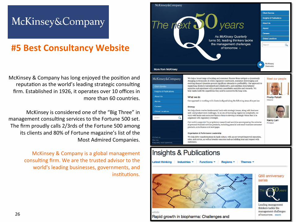
McKinsey & Company has long enjoyed the posi?on and reputa?on as the world’s leading strategic consul?ng firm. Established in 1926, it operates over 10 offices in
more than 60 countries.
McKinsey is considered one of the “Big Three” in management consul?ng services to the Fortune 500 set. The firm proudly calls 2/3rds of the Fortune 500 among
its clients and 80% of Fortune magazine’s list of the Most Admired Companies.
McKinsey & Company is a global management
consul?ng firm. We are the trusted advisor to the world's leading businesses, governments, and
ins?tu?ons.
#5 Best Consultancy Website
26
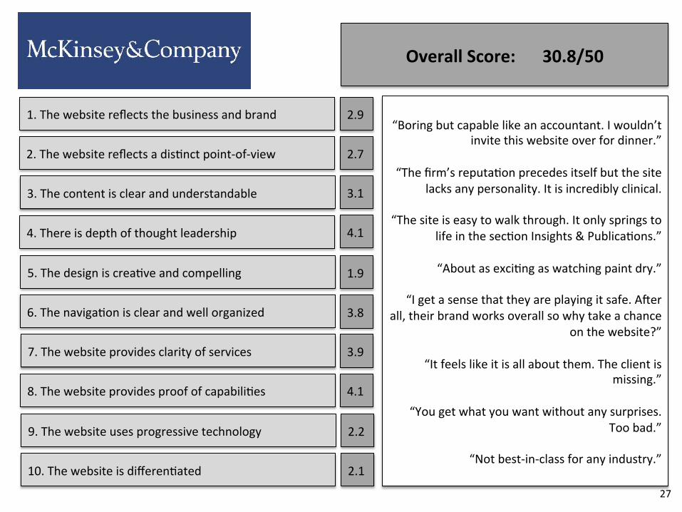
1. The website reflects the business and brand
2. The website reflects a dis?nct point-‐of-‐view
3. The content is clear and understandable
4. There is depth of thought leadership
5. The design is crea?ve and compelling
6. The naviga?on is clear and well organized
7. The website provides clarity of services
8. The website provides proof of capabili?es
9. The website uses progressive technology
10. The website is differen?ated
2.9
2.7
3.1
4.1
1.9
3.8
3.9
4.1
2.2
2.1
Overall Score: 30.8/50
“Boring but capable like an accountant. I wouldn’t invite this website over for dinner.”
“The firm’s reputa?on precedes itself but the site
lacks any personality. It is incredibly clinical.
“The site is easy to walk through. It only springs to life in the sec?on Insights & Publica?ons.”
“About as exci?ng as watching paint dry.”
“I get a sense that they are playing it safe. AAer
all, their brand works overall so why take a chance on the website?”
“It feels like it is all about them. The client is
missing.”
“You get what you want without any surprises. Too bad.”
“Not best-‐in-‐class for any industry.”
27
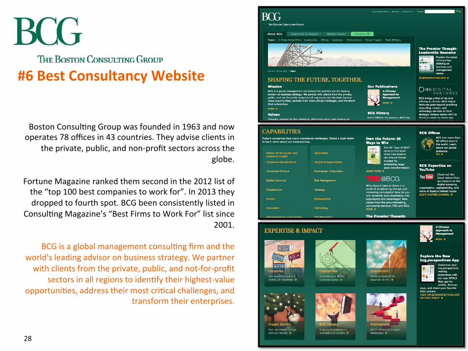
Boston Consul?ng Group was founded in 1963 and now operates 78 offices in 43 countries. They advise clients in
the private, public, and non-‐profit sectors across the globe.
Fortune Magazine ranked them second in the 2012 list of the “top 100 best companies to work for”. In 2013 they dropped to fourth spot. BCG been consistently listed in
Consul?ng Magazine’s “Best Firms to Work For” list since 2001.
BCG is a global management consul?ng firm and the
world's leading advisor on business strategy. We partner with clients from the private, public, and not-‐for-‐profit
sectors in all regions to iden?fy their highest-‐value opportuni?es, address their most cri?cal challenges, and
transform their enterprises.
#6 Best Consultancy Website
28
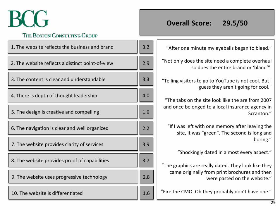
1. The website reflects the business and brand
2. The website reflects a dis?nct point-‐of-‐view
3. The content is clear and understandable
4. There is depth of thought leadership
5. The design is crea?ve and compelling
6. The naviga?on is clear and well organized
7. The website provides clarity of services
8. The website provides proof of capabili?es
9. The website uses progressive technology
10. The website is differen?ated
3.2
2.9
3.3
4.0
1.9
2.2
3.9
3.7
2.8
1.6
Overall Score: 29.5/50
“AAer one minute my eyeballs began to bleed.”
“Not only does the site need a complete overhaul so does the en?re brand or ‘bland’”.
“Telling visitors to go to YouTube is not cool. But I
guess they aren’t going for cool.”
“The tabs on the site look like the are from 2007 and once belonged to a local insurance agency in
Scranton.”
“If I was leA with one memory aAer leaving the site, it was “green”. The second is long and
boring.”
“Shockingly dated in almost every aspect.”
“The graphics are really dated. They look like they came originally from print brochures and then
were pasted on the website.”
“Fire the CMO. Oh they probably don’t have one.”
29
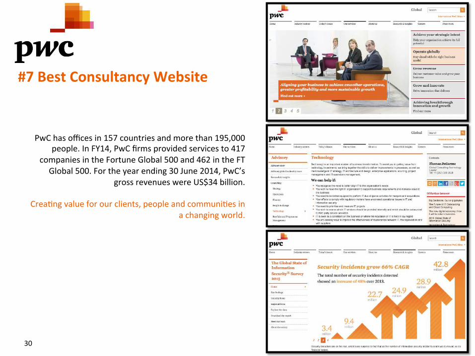
PwC has offices in 157 countries and more than 195,000 people. In FY14, PwC firms provided services to 417
companies in the Fortune Global 500 and 462 in the FT Global 500. For the year ending 30 June 2014, PwC’s
gross revenues were US$34 billion.
Crea?ng value for our clients, people and communi?es in a changing world.
#7 Best Consultancy Website
30
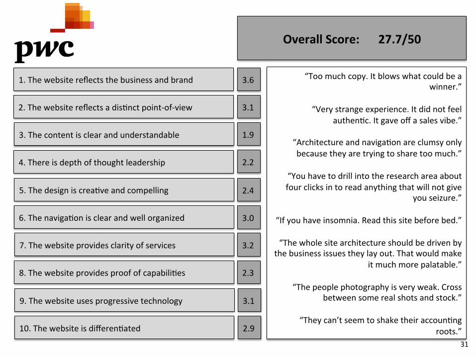
1. The website reflects the business and brand
2. The website reflects a dis?nct point-‐of-‐view
3. The content is clear and understandable
4. There is depth of thought leadership
5. The design is crea?ve and compelling
6. The naviga?on is clear and well organized
7. The website provides clarity of services
8. The website provides proof of capabili?es
9. The website uses progressive technology
10. The website is differen?ated
3.6
3.1
1.9
2.2
2.4
3.0
3.2
2.3
3.1
2.9
Overall Score: 27.7/50
“Too much copy. It blows what could be a winner.”
“Very strange experience. It did not feel
authen?c. It gave off a sales vibe.”
“Architecture and naviga?on are clumsy only because they are trying to share too much.”
“You have to drill into the research area about four clicks in to read anything that will not give
you seizure.”
“If you have insomnia. Read this site before bed.”
“The whole site architecture should be driven by the business issues they lay out. That would make
it much more palatable.”
“The people photography is very weak. Cross between some real shots and stock.”
“They can’t seem to shake their accoun?ng
roots.” 31
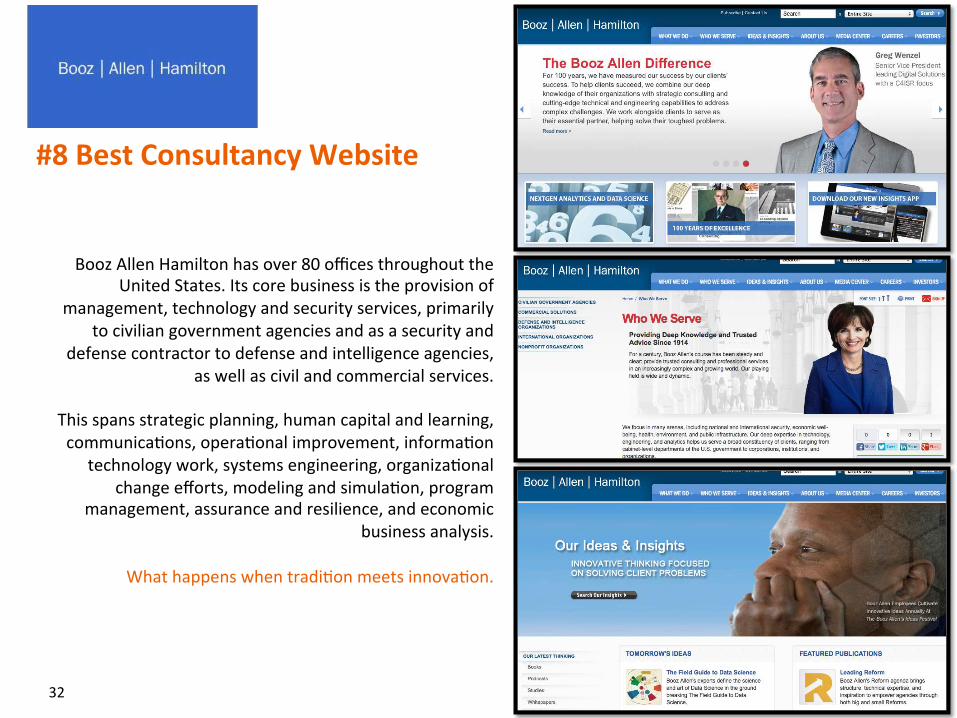
Booz Allen Hamilton has over 80 offices throughout the United States. Its core business is the provision of
management, technology and security services, primarily to civilian government agencies and as a security and
defense contractor to defense and intelligence agencies, as well as civil and commercial services.
This spans strategic planning, human capital and learning, communica?ons, opera?onal improvement, informa?on
technology work, systems engineering, organiza?onal change efforts, modeling and simula?on, program
management, assurance and resilience, and economic business analysis.
What happens when tradi?on meets innova?on.
#8 Best Consultancy Website
32
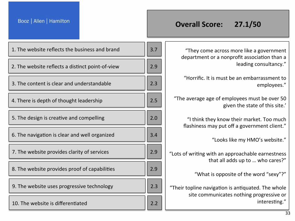
1. The website reflects the business and brand
2. The website reflects a dis?nct point-‐of-‐view
3. The content is clear and understandable
4. There is depth of thought leadership
5. The design is crea?ve and compelling
6. The naviga?on is clear and well organized
7. The website provides clarity of services
8. The website provides proof of capabili?es
9. The website uses progressive technology
10. The website is differen?ated
3.7
2.9
2.3
2.5
2.0
3.4
2.9
2.9
2.3
2.2
Overall Score: 27.1/50
“They come across more like a government department or a nonprofit associa?on than a
leading consultancy.”
“Horrific. It is must be an embarrassment to employees.”
“The average age of employees must be over 50
given the state of this site.’
“I think they know their market. Too much flashiness may put off a government client.”
“Looks like my HMO’s website.”
“Lots of wri?ng with an approachable earnestness
that all adds up to … who cares?”
“What is opposite of the word “sexy”?”
“Their topline naviga?on is an?quated. The whole site communicates nothing progressive or
interes?ng.”
33
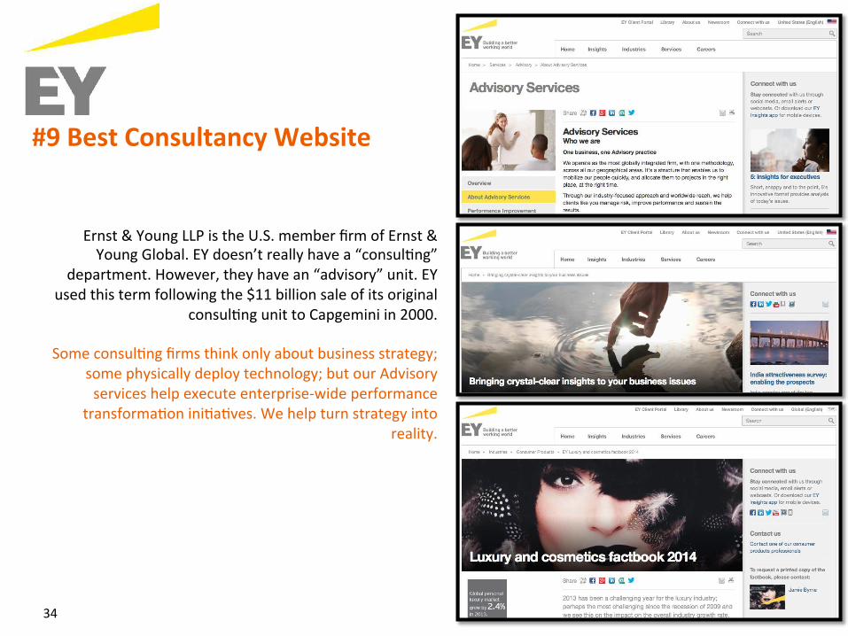
Ernst & Young LLP is the U.S. member firm of Ernst & Young Global. EY doesn’t really have a “consul?ng”
department. However, they have an “advisory” unit. EY used this term following the $11 billion sale of its original
consul?ng unit to Capgemini in 2000.
Some consul?ng firms think only about business strategy; some physically deploy technology; but our Advisory services help execute enterprise-‐wide performance
transforma?on ini?a?ves. We help turn strategy into reality.
#9 Best Consultancy Website
34
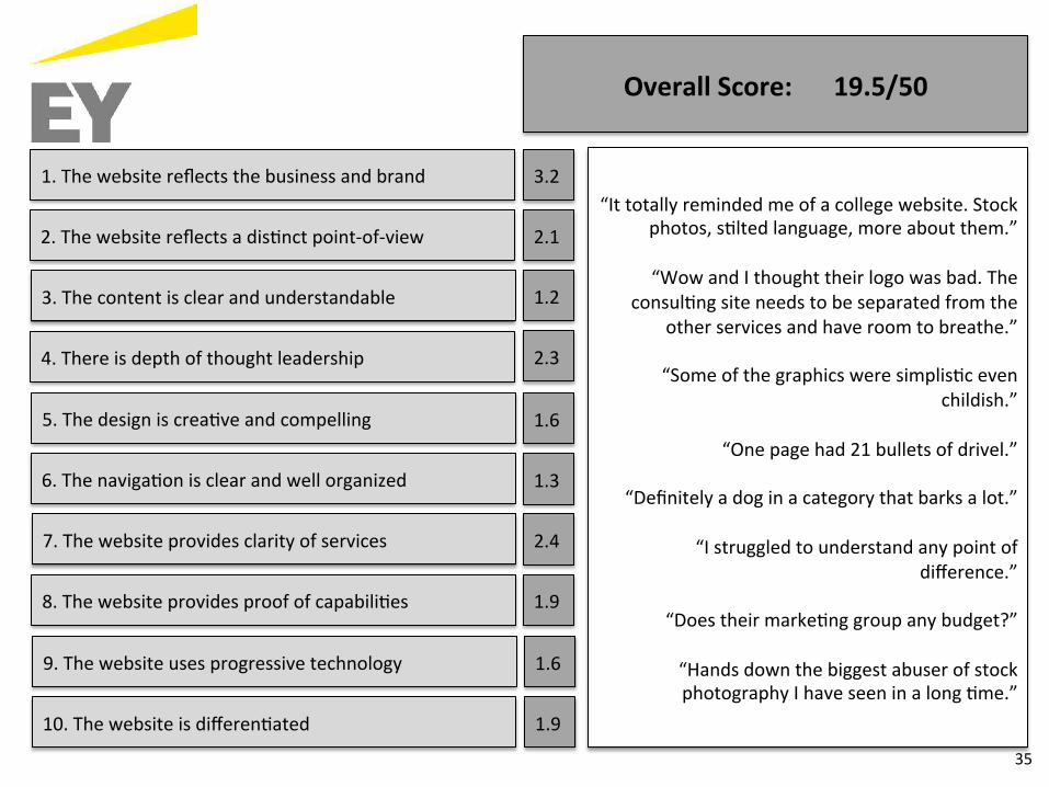
1. The website reflects the business and brand
2. The website reflects a dis?nct point-‐of-‐view
3. The content is clear and understandable
4. There is depth of thought leadership
5. The design is crea?ve and compelling
6. The naviga?on is clear and well organized
7. The website provides clarity of services
8. The website provides proof of capabili?es
9. The website uses progressive technology
10. The website is differen?ated
3.2
2.1
1.2
2.3
1.6
1.3
2.4
1.9
1.6
1.9
Overall Score: 19.5/50
“It totally reminded me of a college website. Stock photos, s?lted language, more about them.”
“Wow and I thought their logo was bad. The
consul?ng site needs to be separated from the other services and have room to breathe.”
“Some of the graphics were simplis?c even
childish.”
“One page had 21 bullets of drivel.”
“Definitely a dog in a category that barks a lot.”
“I struggled to understand any point of difference.”
“Does their marke?ng group any budget?”
“Hands down the biggest abuser of stock photography I have seen in a long ?me.”
35
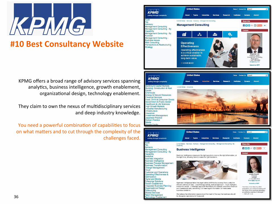
KPMG offers a broad range of advisory services spanning analy?cs, business intelligence, growth enablement,
organiza?onal design, technology enablement.
They claim to own the nexus of mul?disciplinary services and deep industry knowledge.
You need a powerful combina?on of capabili?es to focus on what maUers and to cut through the complexity of the
challenges faced.
#10 Best Consultancy Website
36
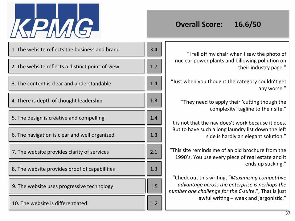
1. The website reflects the business and brand
2. The website reflects a dis?nct point-‐of-‐view
3. The content is clear and understandable
4. There is depth of thought leadership
5. The design is crea?ve and compelling
6. The naviga?on is clear and well organized
7. The website provides clarity of services
8. The website provides proof of capabili?es
9. The website uses progressive technology
10. The website is differen?ated
3.4
1.7
1.4
1.3
1.4
1.3
2.1
1.3
1.5
1.2
Overall Score: 16.6/50
“I fell off my chair when I saw the photo of nuclear power plants and billowing pollu?on on
their industry page.”
“Just when you thought the category couldn’t get any worse.”
“They need to apply their ‘cuong though the
complexity’ tagline to their site.”
It is not that the nav does’t work because it does. But to have such a long laundry list down the leA
side is hardly an elegant solu?on.”
“This site reminds me of an old brochure from the 1990’s. You use every piece of real estate and it
ends up sucking.”
“Check out this wri?ng, “Maximizing compe..ve advantage across the enterprise is perhaps the
number one challenge for the C-‐suite.”, That is just awful wri?ng – weak and jargonis?c.”
37
Thanks for taking ?me to review our study. We encourage you to look at your brand and website with a fresh lens and reinvigorated purpose. And we welcome the opportunity to learn more about your business goals and brand ambi?ons. Get In Touch 416.471.4655 www.swystuncommunica?ons.com
38
Every brand is a story. Make yours a bestseller.
Missed Opportunity: A Study of Leading Consul8ng Firm Websites