mid -month email menagerie october 2012 - bronto...
TRANSCRIPT
Prepared by:
Jim Davidson Manager of Marketing Research @JimSaidIt Bronto Software 324 Blackwell Street Suite 410 Durham, NC 27701
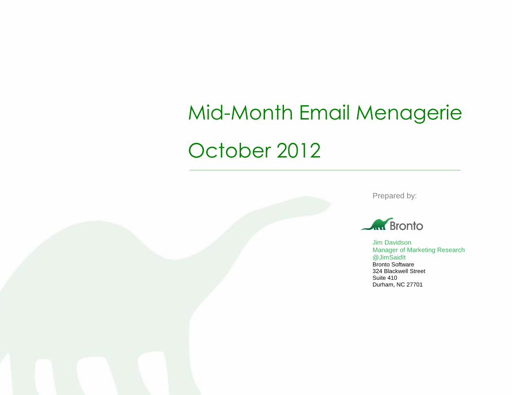
Mid-Month Email Menagerie
October 2012
Contents
What is the Mid-Month Email Menagerie? ............................................................................................................................................. 3
Behold the Fold ........................................................................................................................................................................................ 4
Promotions, Processes and Peeves ...................................................................................................................................................... 7
Composition Exhibition ......................................................................................................................................................................... 16
Animation Station .................................................................................................................................................................................. 22
Confidential. Do not distribute. Page 3 of 28
What is the Mid-Month Email Menagerie? I open nearly 5,000 emails each month. I also click in each one of them. Open…Scan…Click…Repeat…
This carpal-tunnel inducing activity results in the data I use for various reports including my monthly Email Marketing Trend reports. While I can never get enough data, I realized I view and interact with a lot of friggin’ emails every month, so perhaps I should write something about them. In the slurry of “Free Shipping,” “20% Off,” “Last Day,” and “Hours Left!!!” it takes a lot to earn my double-take and get labeled for this report.
The purpose of this menagerie, a collection of clever, curious or catastrophic emails from the past 30 days, is to serve as a reference of the best emails in the industry and those that could be improved. Read about new tactics that you should test in your own programs and others that you should avoid.
Behold the Fold: Eye-catching use of the above-the-fold area of an email
Promotions, Processes, and Peeves: Interesting promotions, various subscriber experiences, and personal annoyances
Composition Exhibition: Designs that standout not always for the right reasons
Animation Station: Various uses of animated gifs in emails
Compliments and critiques represent my opinion only.
Mid-Month Menageries Archives:
September 2012
August 2012
July 2012
Confidential. Do not distribute. Page 4 of 28
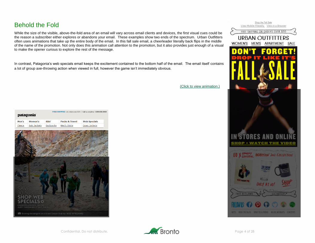
Behold the Fold While the size of the visible, above-the-fold area of an email will vary across email clients and devices, the first visual cues could be the reason a subscriber either explores or abandons your email. These examples show two ends of the spectrum. Urban Outfitters often uses animations that take up the entire body of the email. In this fall sale email, a cheerleader literally back flips in the middle of the name of the promotion. Not only does this animation call attention to the promotion, but it also provides just enough of a visual to make the opener curious to explore the rest of the message.
In contrast, Patagonia’s web specials email keeps the excitement contained to the bottom half of the email. The email itself contains
a lot of group axe-throwing action when viewed in full, however the game isn’t immediately obvious.
(Click to view animation.)
Confidential. Do not distribute. Page 5 of 28
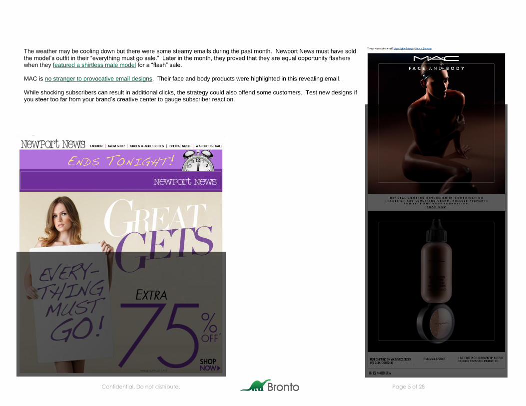
The weather may be cooling down but there were some steamy emails during the past month. Newport News must have sold the model’s outfit in their “everything must go sale.” Later in the month, they proved that they are equal opportunity flashers when they featured a shirtless male model for a “flash” sale. MAC is no stranger to provocative email designs. Their face and body products were highlighted in this revealing email. While shocking subscribers can result in additional clicks, the strategy could also offend some customers. Test new designs if you steer too far from your brand’s creative center to gauge subscriber reaction.
Confidential. Do not distribute. Page 6 of 28
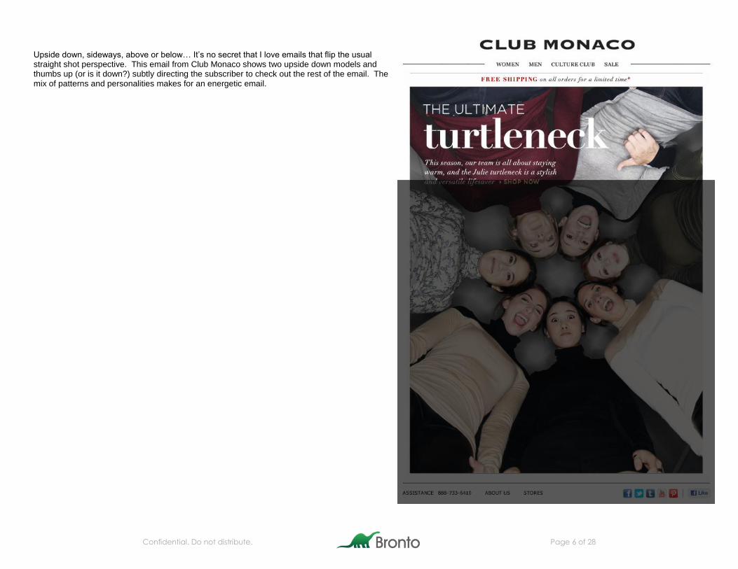
Upside down, sideways, above or below… It’s no secret that I love emails that flip the usual straight shot perspective. This email from Club Monaco shows two upside down models and thumbs up (or is it down?) subtly directing the subscriber to check out the rest of the email. The mix of patterns and personalities makes for an energetic email.
Confidential. Do not distribute. Page 7 of 28
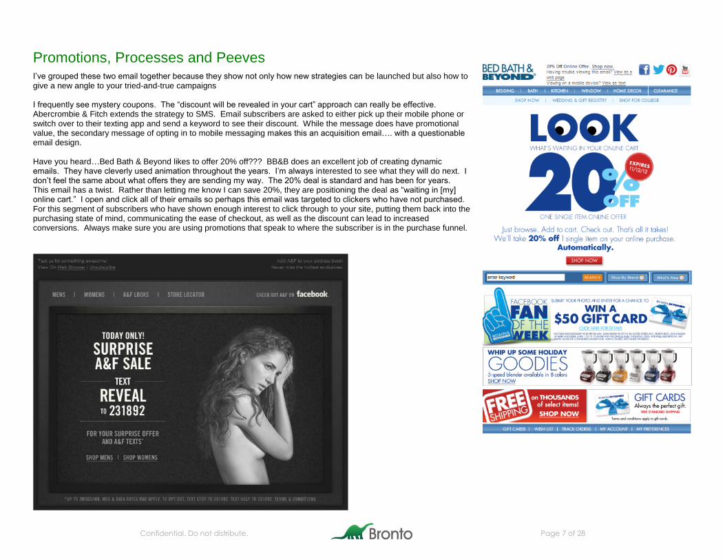
Promotions, Processes and Peeves I’ve grouped these two email together because they show not only how new strategies can be launched but also how to give a new angle to your tried-and-true campaigns I frequently see mystery coupons. The “discount will be revealed in your cart” approach can really be effective. Abercrombie & Fitch extends the strategy to SMS. Email subscribers are asked to either pick up their mobile phone or switch over to their texting app and send a keyword to see their discount. While the message does have promotional value, the secondary message of opting in to mobile messaging makes this an acquisition email…. with a questionable email design. Have you heard…Bed Bath & Beyond likes to offer 20% off??? BB&B does an excellent job of creating dynamic emails. They have cleverly used animation throughout the years. I’m always interested to see what they will do next. I don’t feel the same about what offers they are sending my way. The 20% deal is standard and has been for years. This email has a twist. Rather than letting me know I can save 20%, they are positioning the deal as “waiting in [my] online cart.” I open and click all of their emails so perhaps this email was targeted to clickers who have not purchased. For this segment of subscribers who have shown enough interest to click through to your site, putting them back into the purchasing state of mind, communicating the ease of checkout, as well as the discount can lead to increased conversions. Always make sure you are using promotions that speak to where the subscriber is in the purchase funnel.
Confidential. Do not distribute. Page 8 of 28
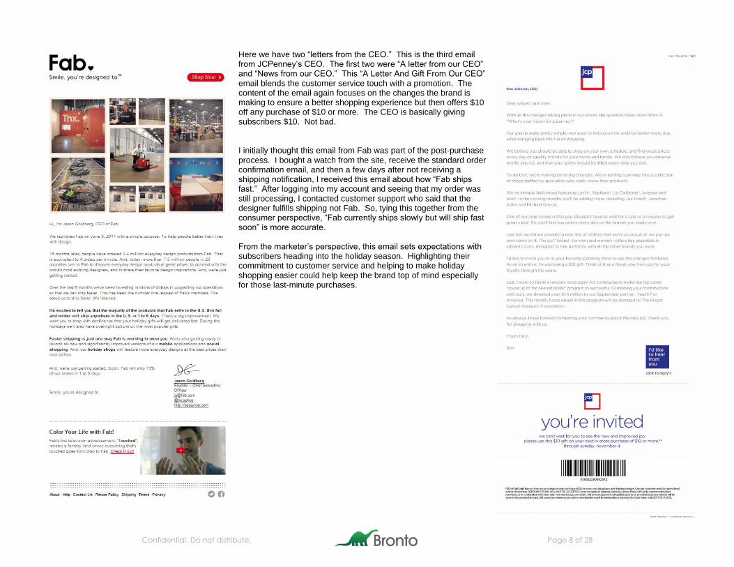
Here we have two “letters from the CEO.” This is the third email from JCPenney’s CEO. The first two were “A letter from our CEO” and “News from our CEO.” This “A Letter And Gift From Our CEO” email blends the customer service touch with a promotion. The content of the email again focuses on the changes the brand is making to ensure a better shopping experience but then offers $10 off any purchase of $10 or more. The CEO is basically giving subscribers $10. Not bad. I initially thought this email from Fab was part of the post-purchase process. I bought a watch from the site, receive the standard order confirmation email, and then a few days after not receiving a shipping notification, I received this email about how “Fab ships fast.” After logging into my account and seeing that my order was still processing, I contacted customer support who said that the designer fulfills shipping not Fab. So, tying this together from the consumer perspective, “Fab currently ships slowly but will ship fast soon” is more accurate. From the marketer’s perspective, this email sets expectations with subscribers heading into the holiday season. Highlighting their commitment to customer service and helping to make holiday shopping easier could help keep the brand top of mind especially for those last-minute purchases.
Confidential. Do not distribute. Page 9 of 28
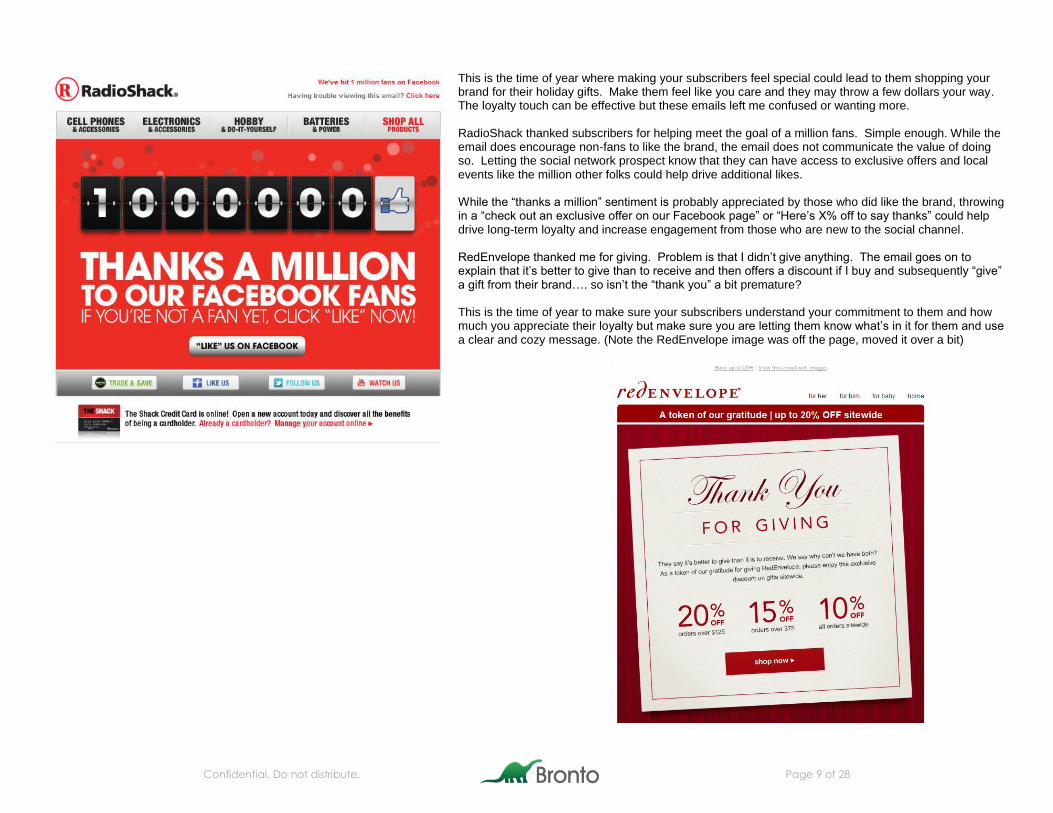
This is the time of year where making your subscribers feel special could lead to them shopping your brand for their holiday gifts. Make them feel like you care and they may throw a few dollars your way. The loyalty touch can be effective but these emails left me confused or wanting more. RadioShack thanked subscribers for helping meet the goal of a million fans. Simple enough. While the email does encourage non-fans to like the brand, the email does not communicate the value of doing so. Letting the social network prospect know that they can have access to exclusive offers and local events like the million other folks could help drive additional likes. While the “thanks a million” sentiment is probably appreciated by those who did like the brand, throwing in a “check out an exclusive offer on our Facebook page” or “Here’s X% off to say thanks” could help drive long-term loyalty and increase engagement from those who are new to the social channel. RedEnvelope thanked me for giving. Problem is that I didn’t give anything. The email goes on to explain that it’s better to give than to receive and then offers a discount if I buy and subsequently “give” a gift from their brand…. so isn’t the “thank you” a bit premature? This is the time of year to make sure your subscribers understand your commitment to them and how much you appreciate their loyalty but make sure you are letting them know what’s in it for them and use a clear and cozy message. (Note the RedEnvelope image was off the page, moved it over a bit)
Confidential. Do not distribute. Page 10 of 28
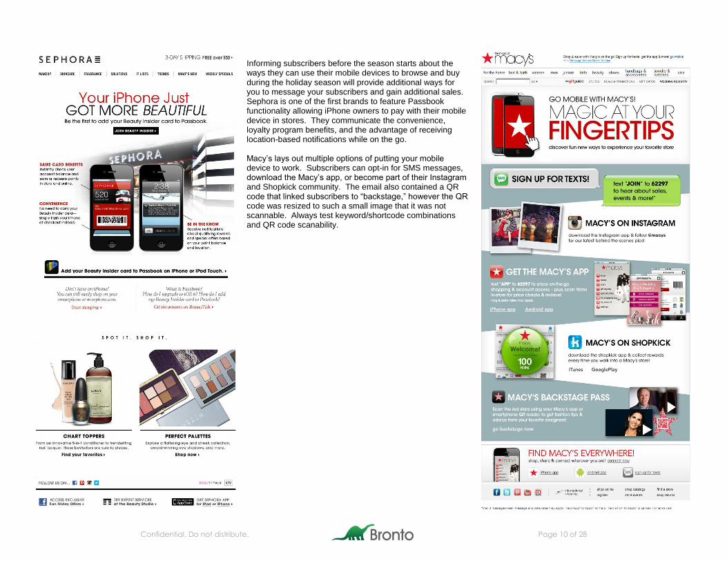
Informing subscribers before the season starts about the ways they can use their mobile devices to browse and buy during the holiday season will provide additional ways for you to message your subscribers and gain additional sales. Sephora is one of the first brands to feature Passbook functionality allowing iPhone owners to pay with their mobile device in stores. They communicate the convenience, loyalty program benefits, and the advantage of receiving location-based notifications while on the go. Macy’s lays out multiple options of putting your mobile device to work. Subscribers can opt-in for SMS messages, download the Macy’s app, or become part of their Instagram and Shopkick community. The email also contained a QR code that linked subscribers to “backstage,” however the QR code was resized to such a small image that it was not scannable. Always test keyword/shortcode combinations and QR code scanability.
Confidential. Do not distribute. Page 11 of 28
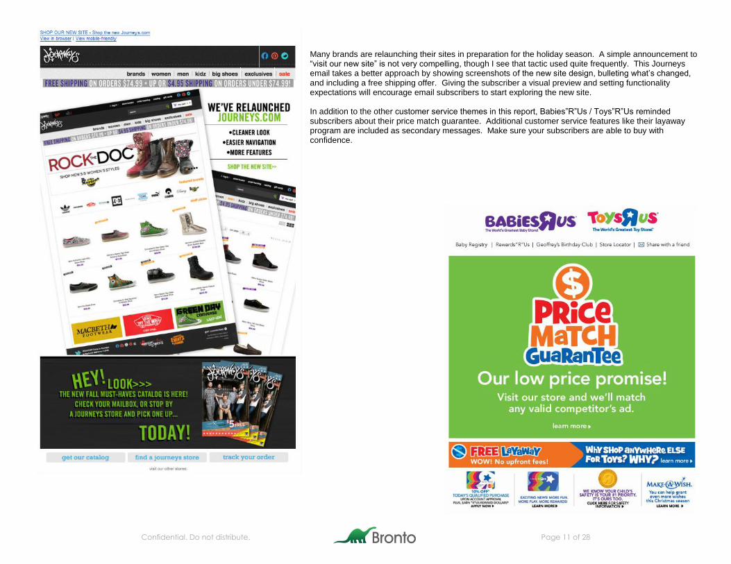
Many brands are relaunching their sites in preparation for the holiday season. A simple announcement to “visit our new site” is not very compelling, though I see that tactic used quite frequently. This Journeys email takes a better approach by showing screenshots of the new site design, bulleting what’s changed, and including a free shipping offer. Giving the subscriber a visual preview and setting functionality expectations will encourage email subscribers to start exploring the new site. In addition to the other customer service themes in this report, Babies”R”Us / Toys”R”Us reminded subscribers about their price match guarantee. Additional customer service features like their layaway program are included as secondary messages. Make sure your subscribers are able to buy with confidence.
Confidential. Do not distribute. Page 12 of 28
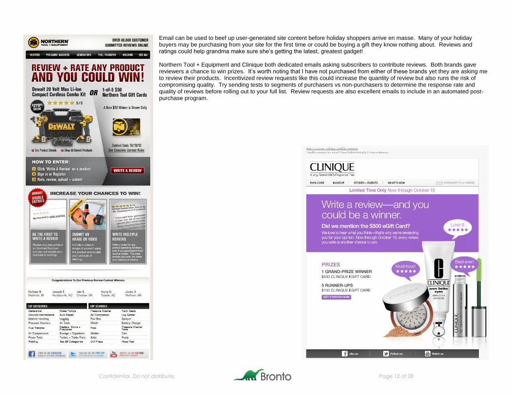
Email can be used to beef up user-generated site content before holiday shoppers arrive en masse. Many of your holiday buyers may be purchasing from your site for the first time or could be buying a gift they know nothing about. Reviews and ratings could help grandma make sure she’s getting the latest, greatest gadget! Northern Tool + Equipment and Clinique both dedicated emails asking subscribers to contribute reviews. Both brands gave reviewers a chance to win prizes. It’s worth noting that I have not purchased from either of these brands yet they are asking me to review their products. Incentivized review requests like this could increase the quantity of review but also runs the risk of compromising quality. Try sending tests to segments of purchasers vs non-purchasers to determine the response rate and quality of reviews before rolling out to your full list. Review requests are also excellent emails to include in an automated post-purchase program.
Confidential. Do not distribute. Page 13 of 28
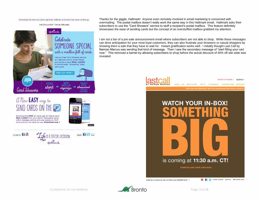
Thanks for the giggle, Hallmark! Anyone even remotely involved in email marketing is concerned with overmailing. The postal mailbox doesn’t really work the same way in this Hallmark email. Hallmark asks their subscribers to use the “Card Showers” service to stuff a recipient’s postal mailbox. This feature definitely showcases the ease of sending cards but the concept of an overstuffed mailbox grabbed my attention. I am not a fan of a pre-sale announcement email where subscribers are not able to shop. While these messages can drive anticipation for your most loyal customers, they can also frustrate your browsers or casual shoppers by showing them a sale that they have to wait for. Instant gratification works well. I initially thought Last Call by Neiman Marcus was sending that kind of message. Then I saw the secondary message of “start filling your cart now.” This removed a barrier by allowing subscribers to shop before the actual discount of 40% off site-wide was revealed.
Confidential. Do not distribute. Page 14 of 28
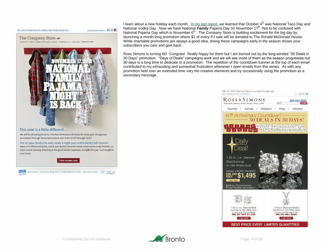
I learn about a new holiday each month. In my last report, we learned that October 4th was National Taco Day and
National Vodka Day. Now we have National Family Pajama Day on November 17th. Not to be confused with
National Pajama Day which is November 6th
. The Company Store is building excitement for the big day by launching a month-long promotion where $1 of every PJ sale will be donated to The Ronald McDonald House. While charitable promotions are always a good idea, timing these campaigns early in the season shows your subscribers you care and give back. Ross Simons is turning 60! Congrats! Really happy for them but I am burned out by the long-winded “30 Deals in 30 Days” promotion. “Days of Deals” campaigns work and we will see more of them as the season progresses but 30 days is a long time to dedicate to a promotion. The repetition of the countdown banner at the top of each email contributed to my exhausting and somewhat frustration whenever I open emails from this series. As with any promotion held over an extended time vary the creative elements and try occasionally using the promotion as a secondary message.
Confidential. Do not distribute. Page 15 of 28
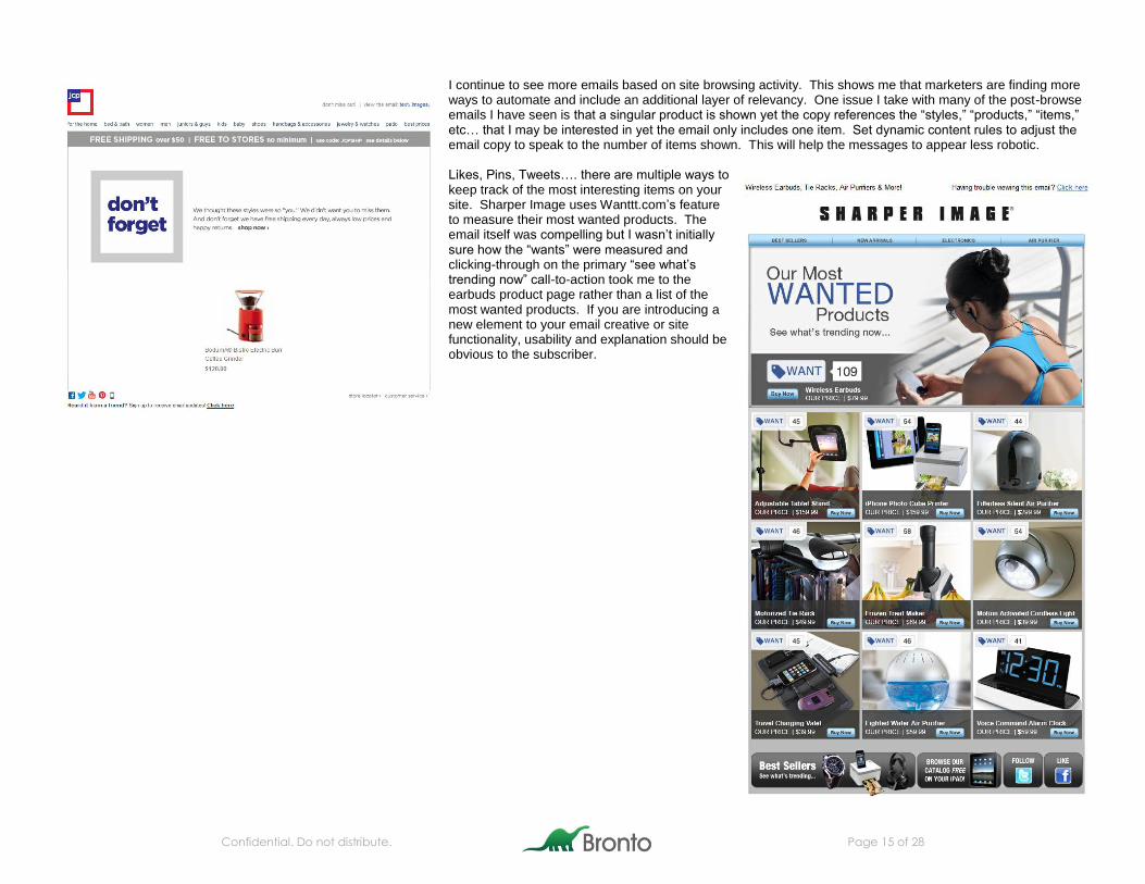
I continue to see more emails based on site browsing activity. This shows me that marketers are finding more ways to automate and include an additional layer of relevancy. One issue I take with many of the post-browse emails I have seen is that a singular product is shown yet the copy references the “styles,” “products,” “items,” etc… that I may be interested in yet the email only includes one item. Set dynamic content rules to adjust the email copy to speak to the number of items shown. This will help the messages to appear less robotic. Likes, Pins, Tweets…. there are multiple ways to keep track of the most interesting items on your site. Sharper Image uses Wanttt.com’s feature to measure their most wanted products. The email itself was compelling but I wasn’t initially sure how the “wants” were measured and clicking-through on the primary “see what’s trending now” call-to-action took me to the earbuds product page rather than a list of the most wanted products. If you are introducing a new element to your email creative or site functionality, usability and explanation should be obvious to the subscriber.
Confidential. Do not distribute. Page 16 of 28
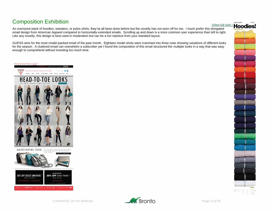
Composition Exhibition An oversized stack of hoodies, sweaters, or polos shirts, they’ve all been done before but the novelty has not worn off for me. I much prefer this elongated email design from American Apparel compared to horizontally-extended emails. Scrolling up and down is a more common user experience than left to right. Like any novelty, this design is best used in moderation but can be a fun reprieve from your standard layout. GUESS wins for the most model-packed email of the past month. Eighteen model shots were crammed into three rows showing variations of different looks for the season. A cluttered email can overwhelm a subscriber yet I found the composition of this email structured the multiple looks in a way that was easy enough to comprehend without investing too much time.
(View full size.)
Confidential. Do not distribute. Page 17 of 28
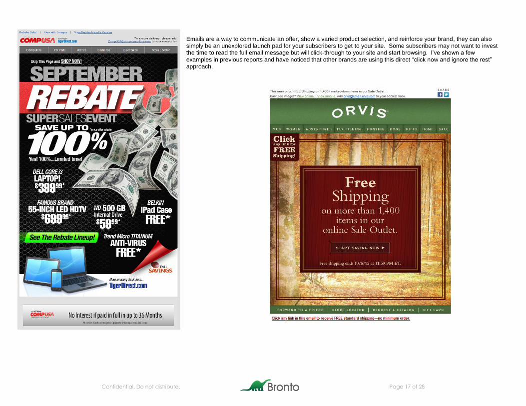
Emails are a way to communicate an offer, show a varied product selection, and reinforce your brand, they can also simply be an unexplored launch pad for your subscribers to get to your site. Some subscribers may not want to invest the time to read the full email message but will click-through to your site and start browsing. I’ve shown a few examples in previous reports and have noticed that other brands are using this direct “click now and ignore the rest” approach.
Confidential. Do not distribute. Page 18 of 28
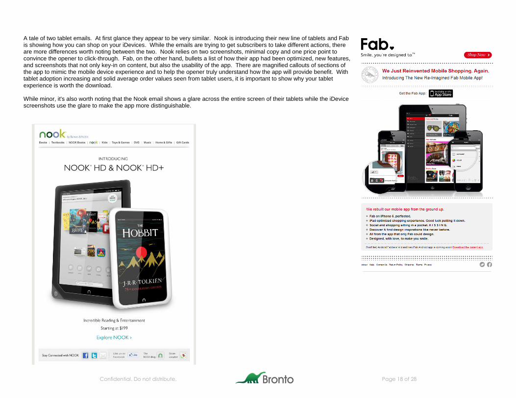
A tale of two tablet emails. At first glance they appear to be very similar. Nook is introducing their new line of tablets and Fab is showing how you can shop on your iDevices. While the emails are trying to get subscribers to take different actions, there are more differences worth noting between the two. Nook relies on two screenshots, minimal copy and one price point to convince the opener to click-through. Fab, on the other hand, bullets a list of how their app had been optimized, new features, and screenshots that not only key-in on content, but also the usability of the app. There are magnified callouts of sections of the app to mimic the mobile device experience and to help the opener truly understand how the app will provide benefit. With tablet adoption increasing and solid average order values seen from tablet users, it is important to show why your tablet experience is worth the download. While minor, it's also worth noting that the Nook email shows a glare across the entire screen of their tablets while the iDevice screenshots use the glare to make the app more distinguishable.
Confidential. Do not distribute. Page 19 of 28
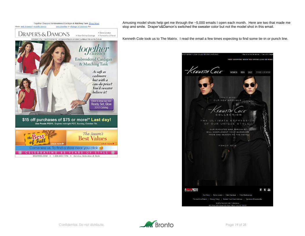
Amusing model shots help get me through the ~5,000 emails I open each month. Here are two that made me stop and smile. Draper’s&Damon’s switched the sweater color but not the model shot in this email. Kenneth Cole took us to The Matrix. I read the email a few times expecting to find some tie-in or punch line.
Confidential. Do not distribute. Page 20 of 28
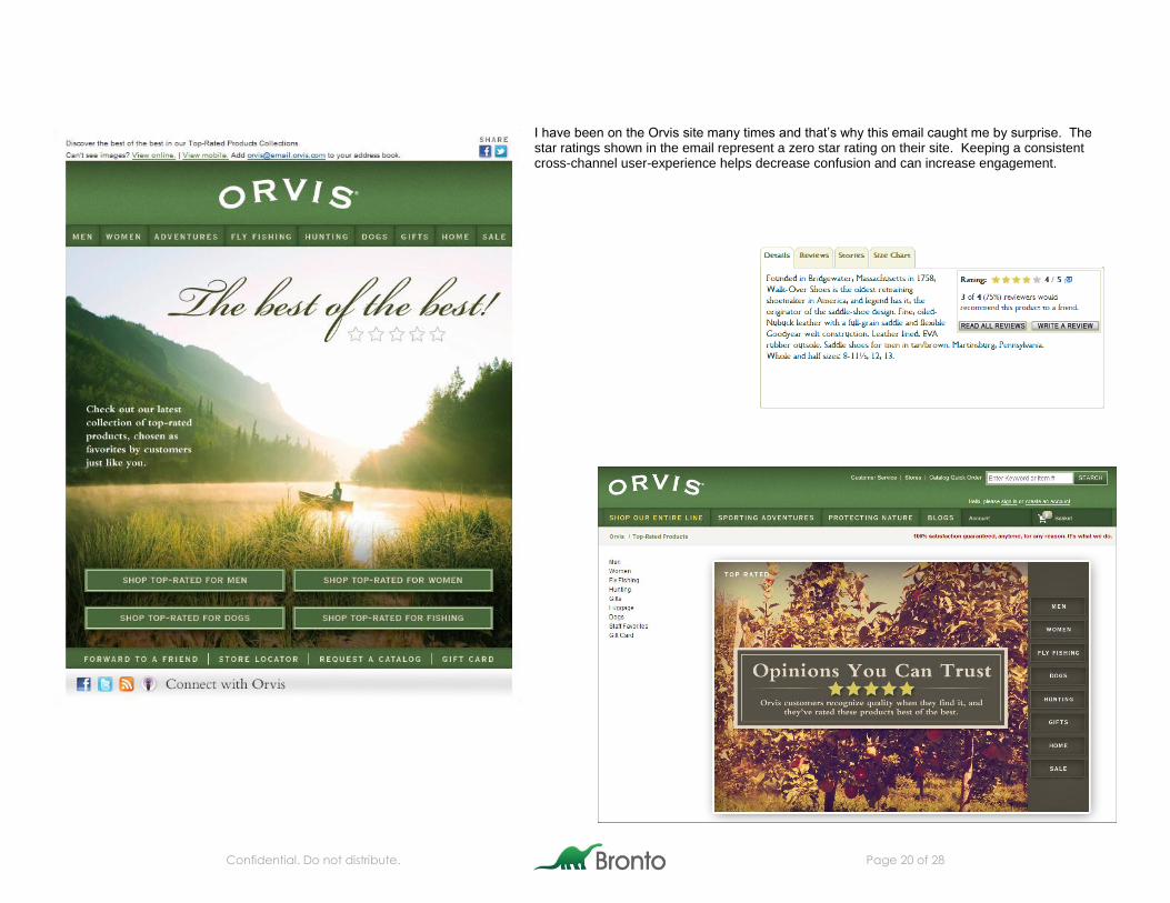
I have been on the Orvis site many times and that’s why this email caught me by surprise. The star ratings shown in the email represent a zero star rating on their site. Keeping a consistent cross-channel user-experience helps decrease confusion and can increase engagement.
Confidential. Do not distribute. Page 21 of 28
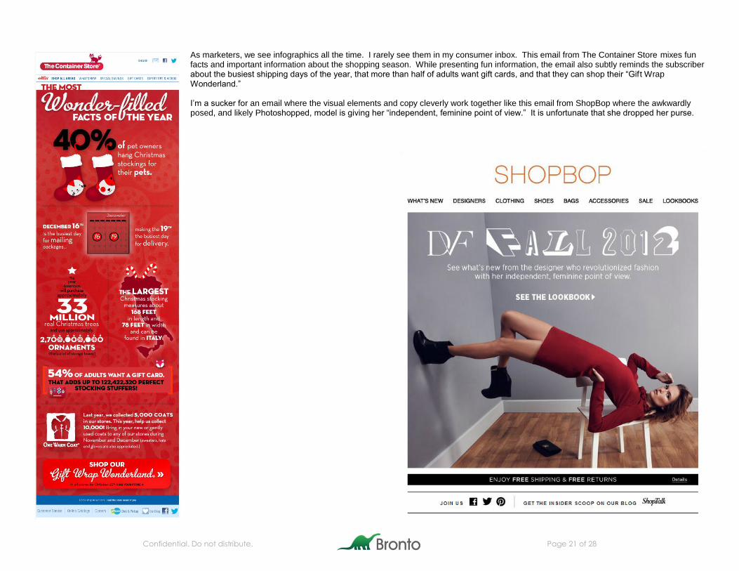
As marketers, we see infographics all the time. I rarely see them in my consumer inbox. This email from The Container Store mixes fun facts and important information about the shopping season. While presenting fun information, the email also subtly reminds the subscriber about the busiest shipping days of the year, that more than half of adults want gift cards, and that they can shop their “Gift Wrap Wonderland.” I’m a sucker for an email where the visual elements and copy cleverly work together like this email from ShopBop where the awkwardly posed, and likely Photoshopped, model is giving her “independent, feminine point of view.” It is unfortunate that she dropped her purse.
Confidential. Do not distribute. Page 22 of 28
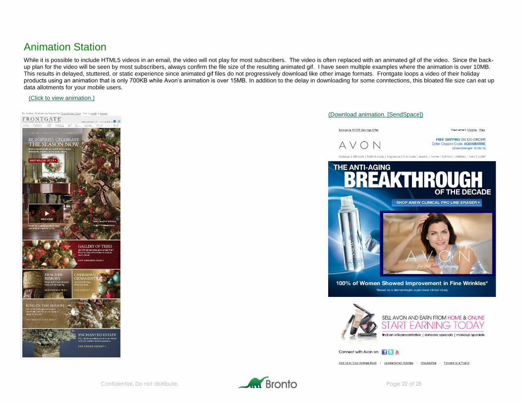
Animation Station While it is possible to include HTML5 videos in an email, the video will not play for most subscribers. The video is often replaced with an animated gif of the video. Since the back-up plan for the video will be seen by most subscribers, always confirm the file size of the resulting animated gif. I have seen multiple examples where the animation is over 10MB. This results in delayed, stuttered, or static experience since animated gif files do not progressively download like other image formats. Frontgate loops a video of their holiday products using an animation that is only 700KB while Avon’s animation is over 15MB. In addition to the delay in downloading for some conntections, this bloated file size can eat up data allotments for your mobile users.
(Click to view animation.)
(Download animation. [SendSpace])

Confidential. Do not distribute. Page 23 of 28
Columbus Day brought out the ships. While the concept is similar for these two emails, I think they both have stand-out elements. West Elm takes the pun route with a “Ship for Free” promotion and I think the Old Pueblo Traders animation is more sophisticated.
(Click to view animation.) (Click to view animation.)

Confidential. Do not distribute. Page 24 of 28
I saw double again with these emails from Rainbow Stores and RootsUSA. Both showed subscribers how their fall boots could be worn in different styles. Animation is often used to mimic video, highten a sense of urgency or make a call-to-action really pop but I think that showing how a product can be used or worn is one of the most effective and informative uses of the medium.
(Click to view animation.) (Click to view animation.)
Confidential. Do not distribute. Page 25 of 28
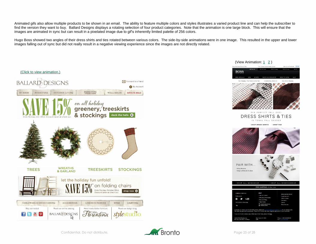
Animated gifs also allow multiple products to be shown in an email. The ability to feature multiple colors and styles illustrates a varied product line and can help the subscriber to find the version they want to buy. Ballard Designs displays a rotating selection of four product categories. Note that the animation is one large block. This will ensure that the images are animated in sync but can result in a pixelated image due to gif’s inherently limited palette of 256 colors. Hugo Boss showed two angles of their dress shirts and ties rotated between various colors. The side-by-side animations were in one image. This resulted in the upper and lower images falling out of sync but did not really result in a negative viewing experience since the images are not directly related.
(Click to view animation.)
(View Animation: 1 2 )
Confidential. Do not distribute. Page 26 of 28
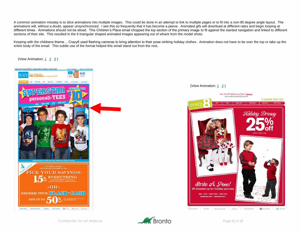
A common animation misstep is to slice animations into multiple images. This could be done in an attempt to link to mutliple pages or to fit into a non-90 degree angle layout. The animations will, without a doubt, appear unsynchronized. I see this so frequently that it has become a peeve. Animated gifs will download at different rates and begin looping at different times. Animations should not be sliced. This Children’s Place email chopped the top section of the primary image to fit against the slanted navigation and linked to different sections of their site. This resulted in the 6 triangular shaped animated images appearing out of whack from the model shots. Keeping with the childrens theme… Crazy8 used flashing cameras to bring attention to their pose-striking holiday clothes. Animation does not have to be over the top or take up the entire body of the email. This subtle use of the format helped this email stand out from the rest.
(View Animation: 1 2 3 )
(View Animation: 1 2 )
Confidential. Do not distribute. Page 27 of 28
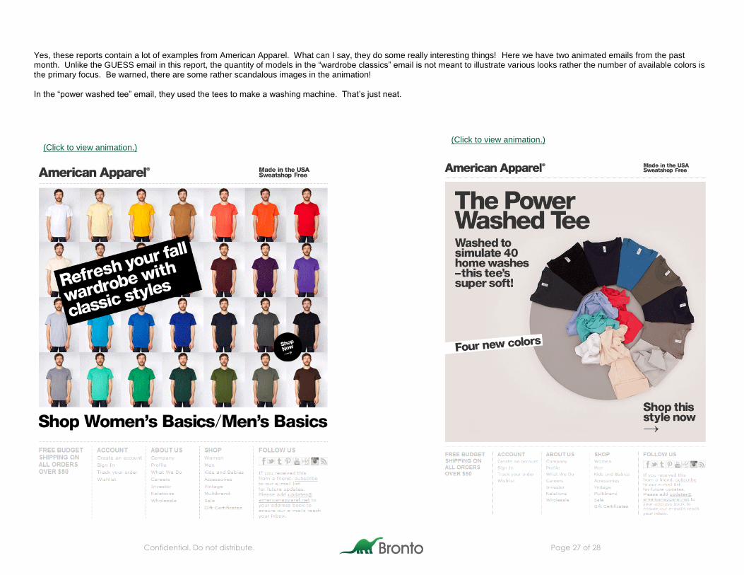
Yes, these reports contain a lot of examples from American Apparel. What can I say, they do some really interesting things! Here we have two animated emails from the past month. Unlike the GUESS email in this report, the quantity of models in the “wardrobe classics” email is not meant to illustrate various looks rather the number of available colors is the primary focus. Be warned, there are some rather scandalous images in the animation! In the “power washed tee” email, they used the tees to make a washing machine. That’s just neat.
(Click to view animation.) (Click to view animation.)
Confidential. Do not distribute. Page 28 of 28
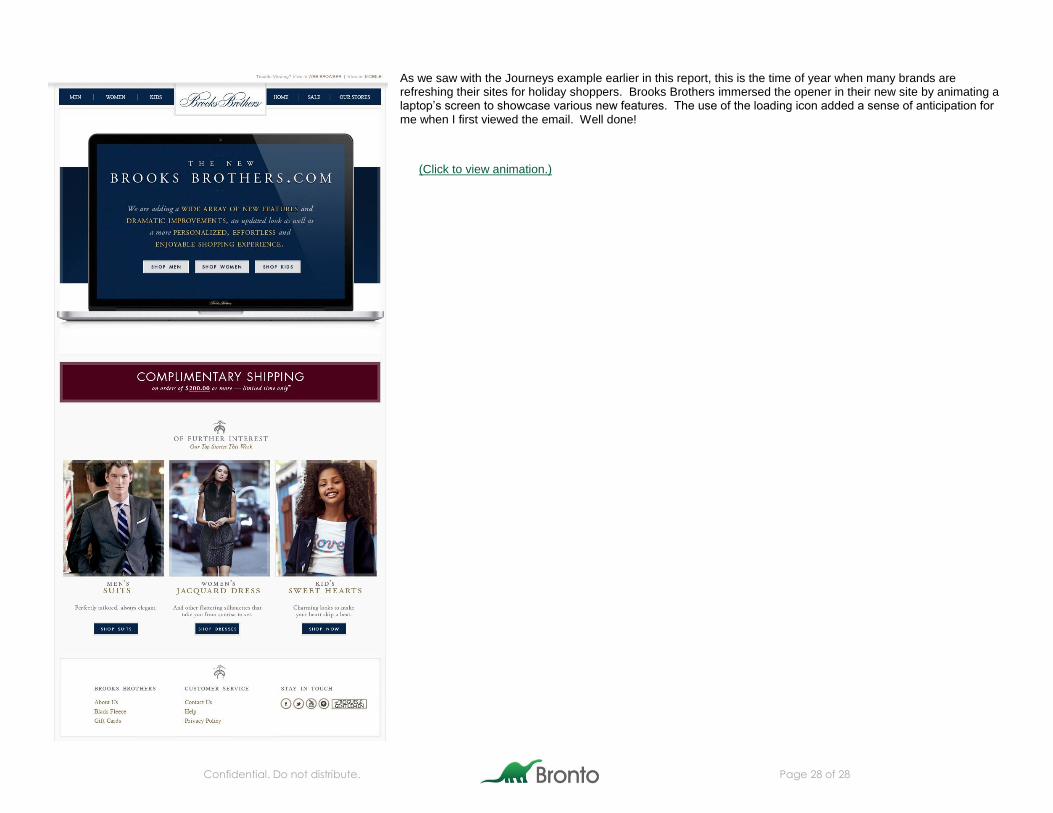
As we saw with the Journeys example earlier in this report, this is the time of year when many brands are refreshing their sites for holiday shoppers. Brooks Brothers immersed the opener in their new site by animating a laptop’s screen to showcase various new features. The use of the loading icon added a sense of anticipation for me when I first viewed the email. Well done!
(Click to view animation.)