michael m mag_media presentation final
DESCRIPTION
Media AS Magazine PresentationTRANSCRIPT

AS MEDIA STUDIES
FOUNDATION PORTFOLIO
RESEARCH & PLANNING
CENTRE NO: 11049
ST FRANCIS XAVIER COLLEGE

My name is: Michael Ogunbayo
Candidate No: 9418

Preliminary Project – Research & Planning
How did you think about target audience?I thought about my target audience through analyzing myself and deciding to target a market which I was
most familiar with because I would understand them better so I chose to go with people within an age range closer to that of my own in order to fully give them what they would want because I understood them better. I aimed to aim for both male and female as I was familiar with both genders.
How did awareness of that audience impact upon your visual design and choice of language?
By knowing my audience I understood the kind of colours that would attract them based on stereotypical ideology. I also understood the genre of language in which they engaged in through mixing with different social groups in order to get to grips with the terms and vocabulary in which they use.
I aimed to go for a slightly informal appraoch regarding language in order to fully engage them and mentally interact with the magazine.
What key points did you learn about Adobe Photoshop and InDesign in constructing your artefacts?
In adobe Photoshop I learnt how to edit photos efficiently and edit visual images to use them in any way I see fit. I also learnt how to create and apply many different effects to various images.
With In design I have not learnt how to use it to its full potential yet but over time I aim to increase in my knowledge of the software.

Preliminary ProjectCollege Cover College Contents
Reflections & Feedback
What would you do differently next time?I would try and get more research from a variety of different people to gain a deeper knowledge and
understanding of my target market. I would take more time into the research and development stages of my magazine.
What kind of feedback did you get that might influence you?
I was influenced on my choice of colours from the people I surveyed. They gave me a list of the stereotypical colours most associated with each gender.
What aspects of your understanding of Adobe Photoshop & InDesign do you need to improve?
In Photoshop I need to improve my understanding of the different types of effect and how to use them efficiently. With InDesign I need to understand my basic knowledge of the software.

The music genre of my music magazine is:
Jazz
My chosen title is Bop To The Rhythm because it is less formal than you would expect which indicates that Jazz is a playful fun genre. It also indicates that jazz has an element of music incorporated within it that will draw its listeners in and cause them to react. Or to “Bop To The Rhythm”
I decided to create a Jazz Style instrumental in order to experiment and explore the genre fully

So I researched this genre of music publication and studied:
Model 1I researched the magazine titled “Downbeat”. I
couldn’t find any information concerning how many copies they had sold etc but through researching one of the issues I was able to gain an idea behind the whole manufacturing of the magazine itself. They used a series of dark colours that blended in with each other and had medium close up shots as the main image used for the front cover of the magazine. It is a weekly magazine that appeals to its readers because of the features it includes in the magazine. They also enticed people in with free CD’s in some of the issues and special features from top jazz icons in order to really appeal to the
target market.
Model 2

What I learned from this was…..
Cover DesignThe main image is usually of a
medium close up shot of one instrumentalist or singer and their instrument. This image usually blends into the background colour of the magazine itself.the mast head uses the normal convention of putting the mast head at the top and making it the biggest font on the page. The price is very visible on the page and shows the themes of the magazine and what to expect inside it on the side of the image.
Cover LinesCover lines were kept short so as not to give too much away but at the same time giving the key points of the story in order to make the buyer want to read more. It was in a different colour to the main background/image of the magazine which allowed it to contrast against it, which drew attention to the stories.
For my music magazine….
Target Audience: readers age 25+
Frequency: weekly
Cover price: 2 Pounds
Publisher: EMAP
Unique Selling Point: free cd giveaways from top jazz icons at regular intervals.

This is the face of the magazine
Front cover This is how it works
It has a clear structure and an eye catching mast head which draws the readers attention through the use of its unique style and vibrant colour scheme. The colours present contrast against the main image in the background which makes the main image stand out as it juxtaposes the main colour scheme.The barcode gives a sense of realism and anchorage as it ties down the fact that this is a magazine.

Here are the original photographs I shot for the project……

I modified each photograph; here is the original next to the final version:
Raw 1 Final 1
Here is how I changed the photograph and why
I changed the colour to make the black and white compliment each other and I added a shade of black to give it a jazzy feel as it makes it look mysterious.

And the second one:
Raw 2 Final 2
I did not edit this photo as the main character fir the image was already represented in a good way. But when I placed it on my magazine I made sure to cover up some of the uneeded background items so as to fix up the mise-en-scene of the shot as I did not take it into account when I first took the photo.
Here is how I changed the photograph and why

And the third one:
Raw 3 Final 3I didn’t edit this photo either as I liked
it just the way that it was. The colours present in the image worked well with each other and the mise-en-scene is nice as it compliments the ideology of my model being a drummer.
Here is how I changed the photograph and why

And the fourth one:
Raw 4 Final 4I didn’t edit this one either because
the colours present really stand out and I did not want to disrupt the image by editing anything that may work against me regarding my magazine.
Here is how I changed the photograph and why
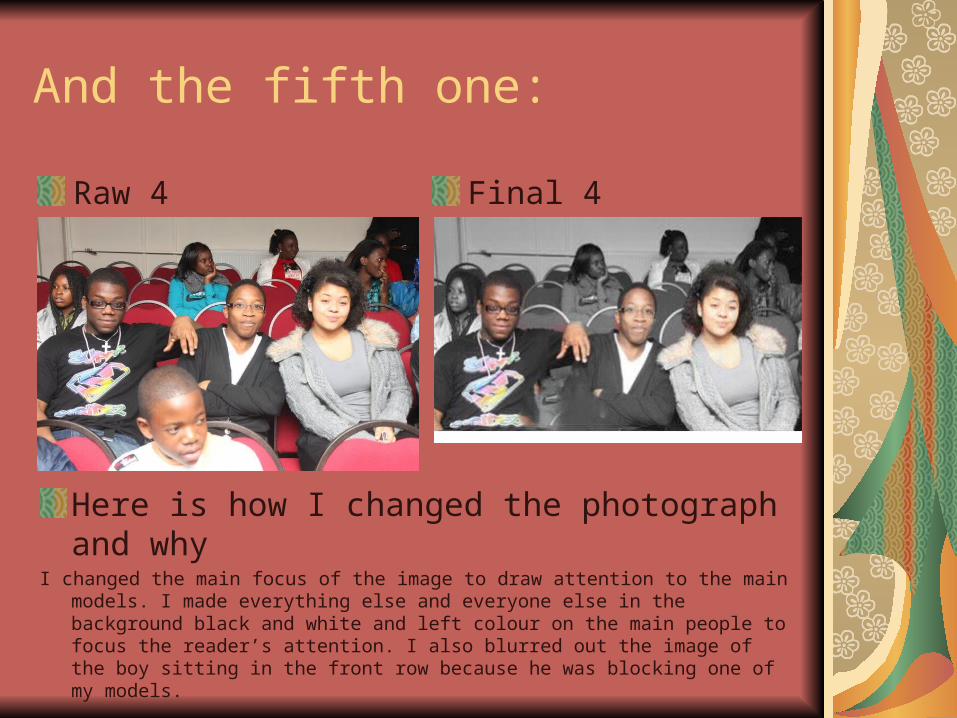
And the fifth one:
Raw 4 Final 4
Here is how I changed the photograph and why
I changed the main focus of the image to draw attention to the main models. I made everything else and everyone else in the background black and white and left colour on the main people to focus the reader’s attention. I also blurred out the image of the boy sitting in the front row because he was blocking one of my models.

And the final one:
Raw 4 Final 4
Here is how I changed the photograph and why I made the photo black and white and highlighted my
hands and the piano as those where the most important parts of the image. By doing this I drew the readers attention to that specific area.
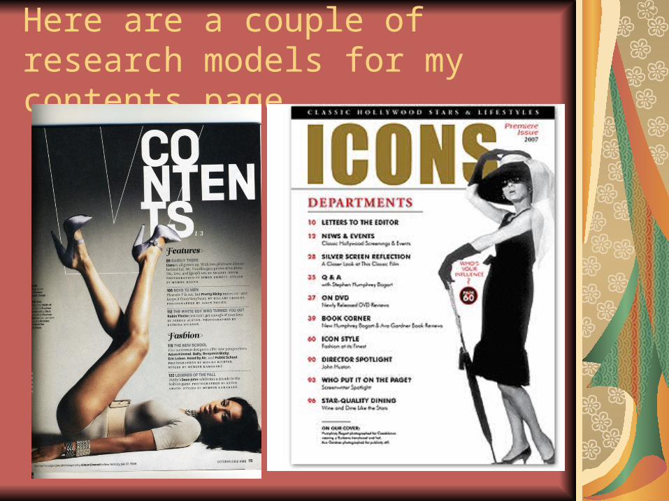
Here are a couple of research models for my contents page…

This is my contents page
Contents Page These are key features…
It uses a similar structure to the front cover which links it in well. It states that it is the contents page. It gives a list to the different things to expect within the magazine and lets you know where to find them. It uses the same colour schemes as the front cover.

How does the contents page link back to the cover page?
It links back to the cover page through its consistent use of colour and the same style of structure. it also links back through the style in which the main image is used. They are both black and white which contrasts against the colour of the font which makes it stand out against each other.It also links because the key cover lines on the front page are also present in the contents page. “Exclusive interview with Dynasty” is shown as promised on the contents page and also the “Meaning of jazz” feature is also highlighted in the contents which is promised on the front cover . “Find out what Michael Ogunbayo has to say about the true meaning of jazz”.

Key points of contents page How have you made the reader want to read on?
By giving them only a little bit of information to entice them in and then offering more information within the actual magazine itself.
What are the links between images and words?
On the front it says “find out what Michael Ogunbayo has to say about the true meaning of jazz” with an image next to it which gives the image anchorage because the writing ties down the meaning of the image.
What determines the dominant stories?How extravagant it may sound and how extraordinary it may be. E.G one of my dominant stories on the front
says “Homeless keyboardist to pianist of top jazz band” the ideas behind this story sound rather unbelievable and exciting which makes it a dominant story because it sounds so unreal that people would want to find out more regarding the issue. Another point on the contents is it says “Dynasty Interview” who are supposed to be an upcoming Jazz band who have recently taken the scene by storm. Through highlighting this after highlighting it on the front cover it shows the importance of the issue.

How have you gone about ordering the information on the page?
At first I was going to order the information in a way that would mean I put the main stories first to create excitement but then I decided not to because by doing this it means that the magazine will get boring towards the end and may be a turn off for readers.I didn’t want to order the items in a way which would make the less important features first because then it would make the readers less interested and will make them less likely to want to read on.So I decided to mix it up so as to take the reader on a type of “Roller Coaster” ride. By this I mean I mixed the flow of the items, making some of the more important stories first and some towards the end and putting some of the less important things n between to keep the reader alert and excited whilst at the same time feeding in some of the lower profile stories.

How does the contents page flag up your double page spread?
It flags up my double page spread by showing the Dynasty Music interview in the centre of the listed items. And following the normal codes and conventions of magazines y double page spread was supposed to be in the centre of the actual magazine itself which hinted where the double page spread would be.It also flags it up by using the same colour schemes as the ones presented in the front cover which allows the reader to be familiar with it and expect the same use of colours. This meant that went the double page spread came up the readers would not feel shocked or feel as thought it is a page out of a complete different magazine because they would have had a feel for the uses of colour already.
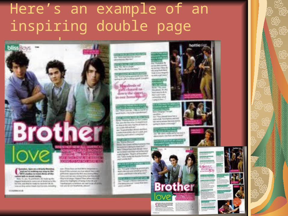
Here’s an example of an inspiring double page spread…

This is why I think that double spread worksI think it works because the colour co-ordination helps people to find information more easier by highlighting specific points. Also the main image for the double page spread is clear and ties down the meaning (anchorage) of the article. The colours used link in with the title itself “Brother Love” one of the colours used is pink which incorporates itself with the word love. The colour schemes make it look more friendly and warming and impacts the image of the Jonas Brothers. It makes them look more user friendly and appeals to their targeted audience. The use of images are very effective aswell, it shows the group in different poses and scenarios which represents how close they are and the “Brotherly Love” which they have.

This is my double-page spread

This is how my double page spread works
I differentiated between the Interviewer and the group being interviewed by my different use of colours when each of them spoke. The colour for the Interviewer was white which made it stand out on the dark background and the answers are shown in orange to show a contrast.I also used 3 images and placed them next to specific parts of the interview. E.g. in the part of the interview where the drummer was being questioned I placed the picture of him in order to allow the readers to identify who exactly he was.

This is how all three components are linked together….
The components link together in a number of ways. The consistent colour schemes work very well. I have a strong use of imagery throughout the pages, and they display the genre of the magazine. The instruments being included in some of the images re-enforces the fact that it is a music magazine.The Same image technique of the black and white being contrasted against the colours works well as it is consistent.

This is my re-drafted cover pageCover Page Key modifications
from feedbackThe use of the other jazz artists should not have been there as it was not my own work. I removed it which meant I had nothing else on the page other than my main image to draw readers in so I decided to add some interesting cover lines. I also added that there would be a “Free Disc” inside which would entice buyers as they would feel they are getting more for less. I also changed spelling errors and made the size of the barcode smaller so it would look more professional.

This is my re-drafted contents page
Cover Page Key modifications from feedback
I was told my contents page was too similar to my front cover so I removed the mast head and style lines and made it more obvious that it was my contents page by making the word “Contents” stand out more and centered it at the top where it could be seen easily.I also changed the way in which the numbered pages were placed in order to make it look more spontaneous and incorporate it with the groovy type of vibes associated with jazz.

This is my re-drafted double spreadDouble spread

Key modifications to double spread from feedbackI was told that my double page spread looked to informal due to the
type of font I had used. So I did more research into the types of fonts mostly associated with magazines. This Picture is the one that inspired my double page spread and its font style. It was not too bold and looked like a normal usual font so I changed my font to “Footlight” which made it look a bit more formal. I also differentiated between the interviewee and the interviewer through the use of colours. I also changed the font size as I was told that the pages looked clustered and congested.
This really changed the look of my double page spread but it is also what makes me feel brought it up from looking like a children’s magazine with the “comic sans” type of font to a proper music magazine.

Evaluation
You can find my blog here: http://www.michael-ogunbayo.blogspot.com/
(URL)And You can find my evaluation with responses to the 7
questions here: Media Evaluation(URL)
Media Evaluation Audio Intro