messages and means: muriel cooper at mit
TRANSCRIPT

Messages and Means: Muriel Cooper at MIT

I. DESIGN SERVICES / MIT PRESS (1952 – 1974)
01
Selected pamphlets for MIT Office of Publications / Design Services, 1954 – 7
Soon after graduating from the Massachusetts College of Art and Design (then known as the Massachusetts School of Art), Muriel Cooper began as a freelance designer in MIT’s Office of Publications. Posters, pamphlets, and other printed matter at MIT had been diverse in format and poor in quality, prompting the Hungarian émigré György Kepes — a former colleague of László Moholy-Nagy, and since 1947 a professor of visual design at MIT — to recommend that the school hire a dedicated designer.
Kepes and Cooper collaborated on several projects, and Cooper soon headed the office. Renamed “Design Services,” it was among the first university design programs in America. Cooper developed a standardized system for these summer pamphlets, which sought to
make more intelligible the highly complex language of science... and articulate in symbolic, graphic form the order and beauty inherent in the scientist’s abstract vision.
Cooper’s college classmate Jacqueline Casey joined Design Services, which she would later direct until her retirement in 1989. Casey, with Ralph Coburn and Dietmar Winkler, and visiting talent from Europe, was instrumental in introducing modern, “Swiss-style” typography to America. Cooper was at the forefront of both adopting, and reworking, these conventions.
I was a modernist, but I was an uneasy Swiss, if you know what I mean.
02
Photographs from Milan, 1958
Cooper left Design Services to study exhibition design on a Fulbright Fellowship in Milan, where she photographed extensively. Her developing interests in abstraction, transparency, layering,
and mobile viewpoints are already visible in these pictures.
Appleyard, Donald, Kevin Lynch, and John R. Myer, The View from the Road. Cambridge: MIT Press, 1964
Cooper’s first book for the MIT Press, as the authors put it, considered highway planning as “a problem of designing visual sequences for the observer in motion.” For her part, Cooper used visual cues like arrows, and a flip book in the outer margins of the page, to manipulate the directionality and temporality of reading, and to create a “non-narrative... experience of simultaneity.”
The author[s] hated it -- It was out of the reach of the engineers. Too big, arty.
03
Presentation boards, sketch, and mechanical artwork for the MIT Press colophon, 1963 – 4
When MIT reorganized its “Technology Press” as “the MIT Press,” director Carroll Bowen consulted America’s preeminent graphic designer, Paul Rand. Rand recommended Cooper, who had already worked at MIT Design Services.
After many iterations, Cooper’s now-iconic, seven-bar logotype, or colophon, emerged, representing the vertical strokes of the letters “mitp” as a set of abstracted books on a shelf. The serialized products of mass production sit here in a neat row, dematerialized into the pure information of what looks like a machine- readable graphic.
The mark fit the spirit of MIT and the Press, Bowen recalled: “The basic materials were supplied, but intelligence and imagination… produced the end result, information with elegance.” Cooper became the Press’s first Design Director in 1967.
04
Posters to promote The Bauhaus, 1969
The Bauhaus (1969) assembles nearly 200 archival documents and 800 illustrations, many never


before published. Cooper spent two years on this book alone — an enlarged, revised, and completely redesigned version of an earlier German edition.
To promote the book, Cooper and her staff made posters that restaged The Bauhaus as a mosaic of more than 200 arbitrarily arranged page spreads. The result is a simultaneous, non-linear presentation of the book’s content.
For a series featuring key plates from the book, Bauhaus master László Moholy-Nagy is enlarged to heroic scale, dissolving into halftone grain. Moholy-Nagy’s media experiments were exemplary for Cooper, who noted in 1989,
It is not hard to imagine Moholy using a computer.
05
The Bauhaus book film (video based on a video by David Small, based on the original film), c.1970
Soon after completing The Bauhaus, Cooper restaged the book as a film, mounting a 16 mm camera to shoot three frames for every page spread. Later used as a teaching tool, the film demonstrates the logic of page flow, and how much can in fact be “read,” at high speed, of the book’s form and content.
All of my books explored implicit motion. The Bauhaus was designed both statically and filmically with a mental model of slow motion animation of the page elements.
Manuscript of The Bauhaus as shown in the exhibition Book 2000, 1979
Exhibiting two colossal stacks of paper was yet another restaging of The Bauhaus, this time as raw, archival data to be sorted, sifted and selectively surfaced by the design process. Speaking in 1994, Cooper observed:
Our goal is to make information into some form of communication, which information alone is not. Information by itself does not have the level of “filtering” that design brings to it.
The Bauhaus book remained a prototype for years to come, as Cooper thought beyond print:
Hypertext and hypermedia principles would extend the editing and authorship of such an archival database so that a reader interested in the political and social influences of the Bauhaus would be able directly to pursue multimedia bibliographic information in depth, rather than referencing footnotes.
Announcements for The Bauhaus, 1969
Published on the 50th anniversary of the school’s founding, The Bauhaus was a major event for English-language scholarship on the legendary school. Dominant as the Bauhaus was for arts pedagogy in the postwar, American and British audiences seeking primary materials had been forced to subsist on the compact and tendentious catalogue for the Museum of Modern Art’s 1938 retrospective, edited by Herbert Bayer and Walter and Ise Gropius. Cooper’s monument to the Bauhaus remains in print as a standard reference.
Wingler, Hans Maria, ed. The Bauhaus: Weimar, Dessau, Berlin, Chicago, Cambridge: MIT Press, 1969 (hardcover) and 1978 (softcover)
The Bauhaus was an idea of undiminished relevance for Cooper, as much for its pedagogy and emphasis on process as any particular style. And in 1969, the school was hardly ancient history: Many Bauhäusler were still teaching in America (especially in Cambridge), and the book’s documents chronicle the school’s successor institution in Chicago as late as 1967. Cooper set The Bauhaus in Helvetica — a Swiss typeface only just released in America, rather than a period font — giving the book a strikingly contemporary appearance.
The people and works of the Bauhaus were my conceptual and spiritual ancestors, so I felt a particular bond with the material.... My approach always emphasized process over product, and what better place to express this.
For the cover of the book’s smaller, paperback edition of 1978, Press designer Wendy Richmond,

a student of Cooper’s before joining the Press, rendered the title in offset-printed color, shifting and overprinting each plate (cyan, magenta, yellow). This treatment recalls the earlier posters, emulating the layered effect and index of process present in much of Cooper’s work.
06
Preliminary mock-ups for Part 1 of Learning from Las Vegas, boards 1 – 1A, 3 – 3A, Office of Venturi and Rauch, 1971
These mock-ups reflect the authors’ early interest, as they specified, in “a large book.” The placement of the so-called “‘Edward Ruscha’ elevation of the Strip” is a striking inversion of the figure-ground relationship that provoked debate throughout the design process, and a more inventive approach than they would adopt in their “dead-pan” revised edition.
Venturi, Robert, Denise Scott Brown, and Steven Izenour, A Significance for A&P Parking Lots, or Learning from Las Vegas. Cambridge: MIT Press, 1972
Immediately received as a manifesto of Post-modernism, Learning from Las Vegas collects presentation materials from the authors’ 1968 studio at the Yale School of Architecture. Students visited Las Vegas to make an “open-minded and nonjudgmental investigation” of urban sprawl as a new typology, and to study “the symbolism of architectural form.” Cooper recalled:
The visual materials were not only graphically rich but as content-laden as the text, so the interdependent rhythms of those relationships were important. I wanted to arrange visual and verbal materials spatially in a nonlinear way to enhance the reader’s comprehension. Creating virtual time and space in two dimensions has always intrigued me.
The authors were less intrigued, and published a redesigned and now-standard paperback edition in 1977 to “de-sex” the original. Their preface pans the first edition’s “‘interesting’ Modern styling,” citing “the conflict between our critique of Bauhaus design and the latter-day Bauhaus design
of the book.” A misguided reference to Cooper’s earlier work, the comment also fails to recognize her layout as a subversive departure from, and reworking of, Modernist tenets in its own right.
Cooper set the book’s type on an IBM Selectric Composer typewriter; developed — and frequently broke — a sequential grid system, with one column of text for the first part of the book, two columns for the second, and three for the third; and placed numbers referencing figures over lines of text, channeling the signage of the Vegas strip. She proposed a bubble wrap book jacket with fluorescent dots underneath, “in homage to Las Vegas glitz.” Instead, the final, glassine dust jacket superimposed the book’s section headings on the cover beneath.
07
Poster for “Teaching Children Thinking,” MIT Design Services, 1970
In the 1960s, MIT became a hub for research into artificial intelligence (AI), as it had been for Norbert Wiener’s elaboration of cybernetics in the immediate postwar. Mathematicians Marvin Minsky and Seymour Papert, active in MIT’s Artificial Intelligence Laboratory, convened this conference, at which the LOGO “turtle” was discussed: a robot children could control via a simple programming language designed to teach problem-solving.
Minsky and Papert would become founding members, with Cooper, of the MIT Media Lab a decade later, where their interests in automation, machine-learning and pedagogy converged.
Minsky, Marvin and Seymour Papert. Perceptrons: An Introduction to Computational Geometry, Cambridge: MIT Press, 1969
The authors’ major text on AI discusses artificial neural networks, or computational models that imitate the animal nervous system. The awkward, purple-on-red color palette of the cover is a demonstration, referred to in the book, of human perceptual constraints.
Photograph of Muriel Cooper in conversation with unidentified males, c.1972

Cooper worked in an overwhelmingly male environment, and made an effort throughout to mentor young female designers. Larry Cohen and Roger Conover, young Press editors at the time, recall:
She often wandered around barefoot... and climbed up on tables when she was excited about a project... Muriel was clearly in her element, making trouble.
Oppenheim, Alan V., ed. Papers on Digital Signal Processing. Cambridge: MIT Press, 1969
MIT Press’s program included collections of technical papers as well as more involved books. The cover of this volume reduces its subject, digital communication, to an essence — a simple binary depicted with supreme graphic economy.
Negroponte, Nicholas. The Architecture Machine: Toward a More Human Environment. Cambridge: MIT Press, 1970. Designed with Negroponte
Negroponte founded MIT’s Architecture Machine Group (Arch Mach) in 1968 to explore human-computer interactions. He proposes here that architects reject a master-slave relationship with computer-aided design systems, working instead as collaborators, and learning from one another:
Machines that don’t learn and merely reflect the in-built prejudices and “default options” of their creators would be unethical robots. But most research is heading in that direction.
Years later, Cooper reflected a similar sentiment:
Some people believe that the computer eventually will think for itself. If so, it is crucial that designers and others with humane intentions be involved in the way it develops.
Cooper enrolled in Negroponte’s computer programming class in 1967. While she never learned to code, she immediately grasped the computer’s enormous potential for design:
I was convinced that the line between reproduction tools and design would
blur when information became electronic and that the lines between designer and artist, author and designer, professional and amateur would also dissolve.
Negroponte introduced computers to the MIT Press, helping Cooper form a research and development unit for new media:
We were actually inventing a primitive form of desktop publishing.
Piene, Otto. More Sky. Cambridge: MIT Press, 1973
Otto Piene’s alphabetical list of “things to do,” set on an electric typewriter and animated by his own illustrations, is a cry for the artist-planner to widen the scope of art practice, liberating it from its economic bonds, and returning it to the public once again. Piene became director of the Center for Advanced Visual Studies in 1974, where he would collaborate with Cooper and her students.
08
MIT Press catalog, spring supplement, 1967
Cooper devoted attention to all Press communications, and to catalogs in particular. Almost a parody of the Press’s standardized design system, this issue treats each book as an equivalent unit within a fully rational program.
Davis, Douglas and Allison Simmons, eds. The New Television: A Public / Private Art. Cambridge: MIT Press, 1977. Designed with Sylvia Steiner
This book was based on a 1974 conference at the Museum of Modern Art called “Open Circuits: An International Conference on the Future of Television.” Its high-contrast cover photography of a television screen displaying the book’s title encodes the inverse relationship described in the Bauhaus film: If a book can be a kind of moving image, then a moving image can become a book. Dondis, Donis A. A Primer of Visual Literacy. Cambridge: MIT Press, 1973
Designed with Dondis, a college classmate then teaching graphic design at Boston University, this book evolved from a shared set of references and
pedagogical concerns, and remains in print as a classic, introductory text. Cooper typeset the book on an IBM Composer, yet the result is not immediately recognizable as typewriting. It uses a proportionally-spaced version of Univers, a sans serif typeface designed by Adrian Frutiger, who also designed the Courier typewriter font.
09
MIT Press catalog, 1972
This Press catalog channels Stewart Brand’s influential Whole Earth Catalog, with whose “access to tools” mantra Cooper sympathized. (Brand later wrote the most extensive account of the MIT Media Lab, though Cooper’s work is strikingly underrepresented.) Cooper recalled:
The 70s was the period of alternative book art -- Xerox machines and corner copy shops were beginning to spread out, becoming more available. I was at MIT Press. I got support from the director to look into other media, electronic media. I pushed to get computer typesetting in house, which would give me an opportunity to explore the medium. I pushed for an experimental arm of the press that would do smaller edition experimental books. I sat in on a seminar session taught by Nick Negroponte on “Computers in Design.” The course attracted a lot of architects and engineers. It was the early 70s. So I had a little support for this R&D unit at MIT Press. It was eventually shut down for financial reasons. We did some stuff with rubber stamping, cut and paste -- it was the Whole Earth Catalog era.
10
MIT Press production schedules, c.1975
Describing the oversight of one of the largest academic publishing programs in America, Cooper recalled:
The bulk of the work was standard and repetitious, and required a set of systematic but variable design solutions for limited budgets. Developing systems
that would accommodate a wide range of variable elements was very much like designing processes.
These processes are captured in Cooper’s production schedules, drawn first by hand, then typeset and coded to be processed by computer.
Muschamp, Herbert. File Under Architecture. Cambridge: MIT Press, 1974
Cooper acted as both designer and typographer of Muschamp’s book, achieving quicker feedback and greater control while also cutting costs. Setting type on an IBM Composer enabled her to make quick changes, saving the time and expense of sending corrections back to the type house. Switching out the Composer’s various type balls also allowed for this book’s eclectic marginalia.
The book is printed on brown kraft paper and bound in corrugated cardboard. It was one of Cooper’s personal favorites, and the author saw it as a better argument for the relationship between ephemerality and architecture than he had made in his own writing.
Allen, Edward, ed. The Responsive House. Cambridge: MIT Press, 1974
More economical still than Muschamp’s book, the production of this one simply entailed photographing contributors’ typewritten notes directly, in all their heterogeneity and roughness, and compiling them with minimal design intervention. The format reflects the informality of the subject: the so-called “Shirt-Sleeve Session” in Responsive Housebuilding, held in MIT’s Department of Architecture in 1972. The last paper is a succinct account of Negroponte’s architecture machine.
The cover declares “Do Your Own Thing,” a slogan that suggests the agency of the new, designer-programmer, and also appears in Piene’s book.
11 / 12
MIT Press book flats and dust jackets, 1967 – 74
Cooper oversaw the production of nearly 500 books, in all areas of the arts and sciences.

Except for her pet projects, cover designs were regularly outsourced to local designers, with some going to now-established figures like a young Katherine McCoy. By standardizing the books’ typography, developing grid systems that structured their covers, and designing the process for their production, in an important sense, Cooper authored the design of all of these books, whether or not her graphics appear on the cover. In addition to occasional conflicts with authors, who had their own preconceived notions of how their books should appear, Cooper also bumped consistently against the limits of the print medium. Years later she recalled a litany of concerns:
The inequitable constraints placed on verbal and visual information by the double page; the early closure demanded by the mass production cycle; and the crush of deadlines that prevented research into new solutions for communication problems all contributed to my growing frustration with the print medium. It was clear that the computer would soon have a profound impact on these limitations.
It was this growing frustration that encouraged Cooper to establish the Visible Language Workshop.
*
II. VISIBLE LANGUAGE WORKSHOP (1974 – 1985)
13
Messages and Means course poster, c.1974
Messages and Means was the first class Cooper taught at MIT, begun while she was still at the Press. A friend introduced her to Ron MacNeil, a physicist working for the photographer Minor White. MacNeil had convinced his department to purchase a sheet-fed offset printer and found space to house it in the Department of Architecture. A mutual interest in experimental printing, and the possibility of using this press, inspired Messages and Means, a kind of foundation course in graphic design and hands- on production for students across MIT.
Messages and Means was design and communication for print that integrated the reproduction tools as part of the thinking process and reduced the gap between process and product.
This poster uses the “rotation” technique central to the course — a design constraint intended to produce quick, collaborative, and often unexpected results. Four students applied press type to acetate, exposing the printing plate directly from the mechanical artwork. A square sheet of paper was then passed at least four times through the press, changing ink color with each run. The product was known as a “one-night print,” initiating students quickly in an otherwise intimidating technology.
They used the offset printing pressas an artist’s tool: they collaborated on platemaking and they altered the application of inks -- they rotated the paper to make printing an interactive medium.
Cooper’s interests in making and modifying tools, rapid feedback, interactivity, and responsive means of production are met in these prints by her formal interests in transparency and the layering of information, which became even more pronounced in her later work.
Photographs of Messages and Means students in Building 5 workshop, Department of Architecture, c.1975
Messages and Means students learned in a hands-on, workshop environment, working directly with, and in, the means of reproduction. The course was consistently oversubscribed, drawing students from architecture and the visual arts as well as the humanities and sciences.
14
Visible Language Workshop diazotype, c.1976
Co-founded in 1974 by Cooper and MacNeil, the Visible Language Workshop evolved directly from Messages and Means. It was housed within the Department of Architecture, located in MIT’s central campus structure, Building 5.


The Visible Language Workshop, a unique interdisciplinary graphics laboratory, was founded to explore verbal and visual communication as information and as art on both personal and public levels. The synthesis of concept and production processes is informed by tradition and technology.
The diazotype shown is a photographic process where light-sensitive paper is exposed directly as a one-to-one contact print — reproduction at its most direct, efficient, and immediate.
Floorplan of Visible Language Workshop in Building 5, 1976
The Workshop offered a host of tools for graphic production including photographic chemistry, offset printing, thermography, color xerography, metal, photo-, and digital-typesetting.
In three adjacent classrooms in Building 5, VLW students circulated constantly between the offset printing press and the adjacent photographic pre-press rooms. The trip required leaving one, walking twenty feet down the hall, and entering the other, only to arrive on the far side of a shared wall. In January of 1976, a group of students took matters into their own hands to re-model this unfortunate architecture, demolishing a wall that stood between the two rooms, and fusing the two spaces into one. The combined workshop mixed the inks, noise, and paper of offset printing with photographic enlargers, typesetting machines, chemicals, and, soon, elaborate computers and electronics.
Visible Language Workshop course catalog, 1980
VLW courses focused on specific tools of reproduction, split into three categories: typo-graphics, photographics, and electrographics. Typographics dealt with offset printing, or ink on paper. Photographics involved the light-based chemical processes of photography. And electrographics broadly included “processes and processors that handle images by electronic phenomena.” It incorporated video imaging, digital hardcopy output, and color and black and white xerography.
This course catalog, produced on a black and white photocopier, revels in the machine’s low-resolution grain and muted contrast. A VLW assignment, “Turning a Copy Machine into a Medium,” reminded students:
Every machine has its own idiosyncrasies. Each has its own characteristic image, marks, and controls.... Look carefully; listen to it. Find out what makes it work, even in a very general way. What does it do? How does it interact with you and your thoughts? Can you make corrections?
Visible Language Workshop description, 1979
This one-page photocopied document declares:
The electronic revolution has broken traditional definitions of disciplines of photography, printmaking, graphic design, and graphic arts.
While students at the VLW had different backgrounds, and pursued different interests, the program encouraged a generalist approach. Students acted simultaneously as editors, platemakers, printers, typesetters, and designers.
The shift from a mechanical to an information society demands new communication processes, new visual and verbal languages, and new relationships of education, practice and production.
Visible Language Workshop mechanical artwork, c.1980
The name “Visible Language Workshop” self-consciously connects two trajectories, one past and one present: “Workshop” invokes the basic teaching unit of the Bauhaus, a collaborative and non-hierarchical site for the integration of design, production and teaching; “Visible Language” chimes with György Kepes’s Language of Vision (1944) and echoes the name of a graphic design journal published by the Rhode Island School of Design since 1967. In its pages, a discourse around graphics, typography, and reproduction technologies offered a conceptual spine for the Workshop’s research.

15
Visible Language Workshop letterhead with paste-up dummy, c.1979
Mechanically reproducing a bold, gestural brushstroke for its letterhead, the VLW signaled its simultaneously technical and artistic ambitions. The various color gradients here result from a split-fountain technique on the offset printer.
Annotated draft and printed copy of VLW article for Plan journal, 1980
When asked to submit an article about the Visible Language Workshop for the Department of Architecture’s Plan journal, Cooper responded with a 12-page visual essay produced together with students in the Workshop, and using its tools. The first page reproduces a cover letter addressed to the journal’s editor, which describes the submission, and serves as a de-facto manifesto.
A draft of the letter shows Cooper’s felicitous phrasing taking shape in the margin, including her apt closing line:
This stands as a sketch for the future.
16
Messages and Means rotation prints, 1975 – 84
Reflecting on the pedagogy of the rotation technique, Cooper wrote:
The process of learning the mechanics of a machine as potentially threatening as an offset press while simultaneously producing your own images on it becomes an interdependent and independent microcosm of larger relationships. It would be difficult to imagine any activity which would not benefit from an interdependence which was respectful of varying competencies. Professionalism sometimes is exclusive of dialogue.
17
Posters announcing the exhibition “Experimental Graphics” at the AIGA, New York, designed by
Wendy Richmond and Joel Slayton, 1978
Wendy Richmond studied at the VLW, and later designed book covers for the MIT Press. Cooper taught her how to use printing equipment properly, but also how to subvert it, echoing Moholy-Nagy’s admonition to use reproductive tools to productive ends. Here, Richmond and her classmate Joel Slayton thwart the exact reproduction of the offset press by progressively introducing pieces of tape and torn paper. The posters advertise the VLW’s first major exhibition at the American Institute of Graphic Arts in New York.
18
Inventory print portfolio, designed by Nathan Felde and Francis Olschafskie at the VLW, 1980
This large pamphlet pictures each of the principal members of the VLW. Cooper appears seated at a terminal, “pounding away at the keyboard of a fifth-generation, electrostatic, computer-driven, digitized phototypesetter.” MacNeil is pictured in front of his large-format inkjet printer, “The Airbrush Plotter.”
The portfolio was typeset on a Mergenthaler Omnitech 2000 laser phototypesetter in the Workshop, on loan from the German print technology company and VLW sponsor, Hell. A mixed electronic-photographic set-up, the system produced camera-ready type direct from digital data.
Visible Language Workshop Course catalog, 1981
The 3M Color-in-Color machine, an early color photocopier, was a vital tool for Cooper at the MIT Press, and remained so at the VLW.
The electrographic printer presents inexpensive, instant graphic gratification through which thoughts can be translated to paper as fast as the designer can think of them. 19
Poster for “Music in Public Places,” MIT Design Services, printed at the VLW, c.1980


Posters for campus-wide events, designed by Jacqueline Casey, Ralph Coburn and the members of MIT Design Services, were often produced at the Visible Language Workshop, where students output film, made printing plates, and ran the offset press. This poster is produced as an overprinted, double split-fountain print. Typically printed the night before the event, posters’ success was gauged by how many were left in the hallways the day after.
Practical production... will be the cornerstone against which course work will be sharpened and from which it will gain its edge.
Polaroid hand print, Ron MacNeil, c.1976
MacNeil and Cooper established Messages and Means out of a shared frustration at the limitations imposed on their respective media: For MacNeil, a young photographer, it was existing film formats that dictated the look of his final product, while for Cooper it was the physical constraints and mass production cycles of the book.
Pursuing his interest in experimental printing, MacNeil made this project while studying for an MFA at the Rhode Island School of Design. MacNeil photographed his hand, offset printed the image onto a thin sheet of PVC plastic, and heat- formed this over a plaster cast of his other hand, producing the trompe l’oeil photo-sculpture documented in this large Polaroid. MIT’s motto, “Mens et Manus” (mind and hand) echoes not only the Messages and Means course title, but also the multiply mediated manual trace of the artist in MacNeil’s photograph.
MacNeil’s elaborate photographic work at the time required days in the darkroom to produce a single image. Down the hall at the Architecture Machine Group, Negroponte and others were experimenting with early color frame buffers and producing similar effects in a matter of minutes. MacNeil apprenticed himself to Arch Mach, spending six months learning the rudiments of computer programming and electrical engineering. He left with a teletype interface board, a 16-line machine language program, and cast-off computers to run his later electronic experiments.
20
Photographs of the Visible Language Workshop in Building N51, c.1980
In 1980, the VLW moved to a larger, more polished space in MIT’s Building N51 on Massachusetts Avenue, co-located with the Center for Advanced Visual Studies. The new VLW facility provided ample room not only for its offset printers and photographic darkroom, but also for the various electronic equipment (computers, typesetters, printers) that became central to the Workshop.
After initial forays into computer programming and imaging, MacNeil approached the head of the Outdoor Advertising Association and offered to apply computer imaging to the task of painting billboards. The group enthusiastically supported MacNeil and the VLW to develop an architecturally-scaled inkjet printer. An initial $50,000 investment led to nearly $500,000 in project funding — a substantial enough sum to be the VLW’s principle source of funding over the coming years. Significant investment in computers and electronics, otherwise prohibitively expensive, was now possible.
21
Self-portrait with Polaroid SX-70, video imaged and printed at the VLW, c.1982
This composite picture registers at least three different photographic times and as many imaging feedback loops. The finished print was made on the large-format Polaroid printer which appeared in the Workshop around 1982. Workshop coordinator Rob Haimes suggests that it may have been part of the Slow-scan image transmission experiments at the VLW; curved monitor faces and video scan lines confirm this. The stacked pictures are from around 1972, when the Polaroid SX-70 instant camera Cooper holds was released. MacNeil suspects these images were frames captured by a Portapak black-and-white video camera system, also a brand-new technology in 1972. Around ten years later, frames from the video would have been transmitted as audio tones, displayed on a video monitor, and captured by a large-format Polaroid camera. While all of this imaging proceeded, Cooper is shown
taking a picture. What would soon appear on the photograph emerging from her camera remained outside of this image’s frame.
From approximately the same period as this portrait, Cooper wrote a bio for herself. Allowed 250 words, she used 65:
Muriel Cooper/first designer/art director MIT Office of Publications | Fulbright Scholarship, Milan, Italy/ Consulting firm Muriel Cooper Media Design | Media Director MIT Press/ currently Director Visible Language Workshop | Associate Professor Department of Architecture/ Special Projects Director MIT Press.
Her concerns have always been with beginnings and process. | More with change and technology and their meanings to human communication than with rigorous graphic design theory and style.
Photograph of Ron MacNeil at computer with Airbrush Plotter, c.1981
“The Airbrush Plotter” was a perpetual work-in-progress at the VLW. Funded by the Outdoor Advertising Association, it was cobbled together using rejected computer chips from Fairchild and National Semiconductor. The Airbrush Plotter combined digital image capture, image processing software, and large-format digital output. Capture was handled by a line-scanning chip bolted to the film-plane of a Nikon camera and moved via a stepping motor. A hacked one-color print head produced the output using airbrush inks. A homemade proto-Photoshop “paintbox” application called SYS — developed by MacNeil, Rob Faught, and other VLW students over several years — handled image processing.
Here, MacNeil sits at the terminal, running an early version of the software, which shows a frame-buffered image of what is being output on the plotter behind. He recalls the setup:
The pieces of SYS were a 32 bit Super Mini (128K of core memory, but cost of $125K), a 300MB hard drive as big as a refrigerator on its back, a full color frame buffer with real time frame grabber
(640 x 480) and a virtual disk image management system that let us zoom in and out of a 2K by 7K image sliced as many ways as you wanted.
22
Exhibition poster and mechanical artwork for *Asterisk, designed by Otto Piene, printed at the Visible Language Workshop, 1974
Otto Piene became director of MIT’s Center for Advanced Visual Studies in 1974, the same year that Cooper and MacNeil founded the VLW. Piene succeeded CAVS founder György Kepes, and proposed a distinctly less technophilic vision of the arts. The VLW produced the posters that Piene designed for his large, happening-like projects and group exhibitions. CAVS hosted a range of contemporary artists, especially those working in new media, as this poster reflects.
For the poster, a small sketch by Piene was photostatically enlarged, output to film, masked, burned onto printing plates, and offset printed at the VLW. The resulting poster synthesizes what is said, how it is being said, and how it is produced.
Alcove south
Research Topics at the Visible Language Workshop video, 1986 This summary of current VLW projects shows rules-based, artificial intelligence software tools developed to improve both on-screen graphics and the computer interface, effectively designing new design tools. As Cooper put it, recalling her hands-on approach to print production: We hope to make the tools and to use them.
Describing the status quo, she lamented: You have to drag yourself through this hideous wilderness of alphanumeric data that has never been filtered, graphically, in any sense. And it’s tedious, and it’s ugly and it’s counterproductive -- it’s very hard to find things. Design has functioned in the print world as a graphic, editorial filter.
An “intelligent page program,” for example, takes raw, unfiltered data and formats it based on a user-established “style guide.” Another program can design typefaces by extrapolating from user-input letters. And a voice-activated business card design system inputs data into templates and “gets creative” with a preferred style. Design tools, Cooper believed, should be configurable by, and learn from, their users. If you look at the computer as an environment in which you do multiple tasks, and which is ubiquitous in your life, then it’s even more important that this personalization and configuarability take place. Because today I may want to work on music and then go to my cookbook. And then read my newspaper -- or design my newspaper!
Alcove west
Slides with variable layouts for the cover of Design Quarterly no. 142 “Computers and Design,” 1989
The Walker Art Center devoted an issue of its journal Design Quarterly to Cooper, the VLW and the Media Lab. It begins with one of Cooper’s only published essays, entitled “The New Graphics,” in which she discusses the VLW’s recent work and the role of artificial intelligence in design.
For the issue’s cover, nine of the images here were tiled to show variable layouts of the same visual and verbal elements. Cooper used software by VLW student Suguru Ishizaki to demonstrate how the elements on an electronic page could change size, position, color and translucency:
Each frame will change as the “reader” browses in real time with text and image cues dependent on the linkages that have been designed for browsing. On one level this series is analogous to a book printed on transparent paper, but it takes advantage of the potential for change inherent in the computer.
Alcove north
Presentation at TED conference video, 1994
To demonstrate recent research at the Visible Language Workshop, Cooper and her student David Small frantically prepared Information Landscapes in the three nights leading up to the 5th Technology Entertainment and Design conference in Monterey, California. This TED talk, decidedly casual in its format, started with Cooper removing her shoes and getting comfortable.
* III. THE MEDIA LAB (1985 – 1994)
23
Large-format Polaroid digital print, 1983
Polaroid Corporation was based around the corner from the VLW, and equipped them with its latest technologies. One such apparatus was a 20 × 24" experimental camera that printed direct from a computer file to instant photographic paper. MacNeil recalls:
You would send a color signal to this amazingly sharp flat screen full tone scope and it would do the rotating filter-wheel dance to get all the colors.
In this inside-out camera, the screen displays a digital image and provides the light source used to expose a sheet of instant photographic paper. The large, high resolution digital print was ready in a matter of minutes. Digital Polaroid quickly became a primary output tool at the VLW.
Anti-Aliasing Tests, c.1983
The VLW’s graphic paintbox application, SYS, used a crude typewriter font in its interface suited to the task of limited graphic display but lacking the nuance of printed typography. Meanwhile, beginning in 1973, Nicholas Negroponte, William Donelson, and others in the Architecture Machine Group had developed an “anti-aliasing” technique for displaying the fine curves of letterforms on the coarse mesh of a computer screen. Their solution required digitized bitmaps of each letter to be detailed pixel by pixel, their edges painted as a range of greyscale pixels brokering the contrast between white letters and a black screen.


By 1982, the remaining crudeness of onscreen typography “drove Muriel nuts,” as MacNeil recalls, and the VLW initiated experiments to digitize serif typefaces for onscreen use. One of these legibility exercises uses an excerpt from Lewis Carrol’s Through the Looking Glass. These 8 × 10" digital prints were produced on a second, smaller Polaroid instant printer in the Workshop. In a memo from 1979 to Cooper and others, Negroponte outlined new possibilities for type on the screen which the VLW would soon take up:
Fonts should not be fixed sizes, their greytones should not be hand edited, and most importantly, they should not be forced to fall on pixel boundaries. New opportunities include: transparent fonts, colored fonts, and TV-specific fonts.
24
Books without Pages, Proposal to the National Science Foundation by Nicholas Negroponte, Richard Bolt, and Muriel Cooper, 1978 The Architecture Machine Group, founded in 1968 to explore the human-computer interface, was a vital forerunner to the MIT Media Lab, and its collaboration with the VLW on this project set the tone for the Media Lab’s interdisciplinary research. Books without Pages proposes a series of studies to understand both how “soft copy” text, on-screen, can become more legible, and what a personal computer interface should look like. The printed book, which Cooper described as “the best random access tool yet available,” offers a productive model for on-screen reading. The discrete, “syntactic chunks” of a book page — as opposed to the status quo of endlessly scrolling, unformatted text — help orient the reader, giving her a “sense of place” within the text. The authors simulated this with a crude, on-screen page-flipping animation that was the first of its kind. At the heart of the project was the Spatial Data Management System (SDMS), an information environment conceived for the home or office. In this “media room,” users sat in a customized Eames lounge chair, with integrated controls, facing a rear-projection screen. The premise
was that real space provides a straightforward mnemonic device for storage, and that natural gestures should enable navigation through this space.
Data were stored on Videodisc, an optical storage format which allowed users to jump to any point (random-access), and to move forward or back at variable speed. Multi-modal inputs, of both voice command and touch, guaranteed redundancy, aiming to approximate human interaction. Thirty years before the first iPhone, the authors wrote:
When the reader indicates that he wants to turn the page, he indicates by a simple finger-gesture captured on a small touch-sensitive pad located on the arm of the chair in which he is sitting. The National Science Foundation did not see the proposal’s merit, but Books without Pages won funding instead from the Office of Naval Research and the Defense Advanced Research Projects Agency (DARPA), inaugurating the corporate and government defense sponsorship model on which the Media Lab would depend.
Of the Media Lab’s broader interest in artificial intelligence research, Cooper later noted:
The thrust of this long-term research has intellectual underpinnings that are supported by government and industry, and one must be alert to the intentions that drive such support. There is an inevitable Jekyll-Hyde syndrome that must be recognized and managed by us all. The legacy of Books without Pages is in its early understanding, well before the personal computer or graphical user interface, that computers will play a role in the average home, and that they will be judged by the quality of their interfaces. The authors predicted, accurately: Such startling advances and cost reductions are occurring in microelectronics that we believe future systems will not be characterized by their memory size or processing speed. Instead, the human interface will become the major measure,
calibrated in very subjective units, so sensory and personalized that it will be evaluated by feelings and perceptions. Is it easy to use? Does it feel good? Is it pleasurable?
25
Large-format Polaroid digital prints, Slow-scan transmission, c.1982
In 1982 the Visible Language Workshop began experimenting with a low-bandwidth image transmission system called Slow-scan. It was a 25-year-old technology, earlier used to transmit images from space. Slow-scan encodes video images as a sequence of audio tones, broadcast over standard shortwave radio frequencies, received, and decoded back into picture data.
Slow-scan was first used at the VLW to transmit images back and forth with CAVS, located in the same building. For example, a black and white image was sent from CAVS, computer processed at the VLW, and a color image was returned. MIT architecture students used Slow-scan to transmit site photographs back to the VLW, where they were annotated and returned, and arts students transmitted images across larger distances for exhibitions around the world. Many of these transmitted images were output on a Polaroid digital printer. MacNeil observes:
In time, images stay on the screen. And now they travel through networks. I think what Muriel finally discovered was the act of communication design in the process of radical change away from creating single artifacts to creating design processes that need to have a life of their own over these networks.
26
Muriel Cooper at three-screen workstation, 1989
Graphic artists’ workstations capable of intelligent image processing, design assistance, and real-time feedback were a persistent research focus at the VLW from the early 1980s, inspiring a series of projects around “The Ultimate Designer Workstation.” Here, Cooper uses software
developed by Alka Badshah for IBM intended to help the designer evaluate plausible choices and iterate quickly through alternatives. MacNeil recalls that the frame rate was agonizingly slow, never approaching the responsive graphic tool that Cooper had in mind:
You can just hear Muriel cursing as something goes wrong and it will take her much too long to fix it.
Responsive Typography, c.1989
Cooper described the shifting stakes for design given changes in technology:
You’re not just talking about how the information appears on the screen, you’re talking about how it’s designed into the architecture of the machine, and of the language. You have different capabilities, different constraints and variables than you have in any other medium, and nobody even knows what they are yet.
Consistent digital experiments at the VLW interrogated the screen as typography’s new, native environment. This still output from an animated demonstration imagined typography that communicates not only through the static forms of the letters but also through their behavior. Dynamic typography would respond instantly to the changing conditions of its digital context using movement, color, and transparency to inflect meaning.
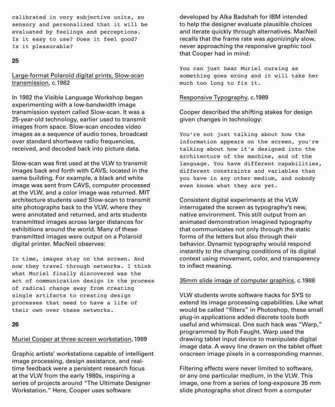
35mm slide image of computer graphics, c.1988
VLW students wrote software hacks for SYS to extend its image processing capabilities. Like what would be called “filters” in Photoshop, these small plug-in applications added discrete tools both useful and whimsical. One such hack was “Warp,” programmed by Rob Faught. Warp used the drawing tablet input device to manipulate digital image data. A wavy line drawn on the tablet offset onscreen image pixels in a corresponding manner.
Filtering effects were never limited to software, or any one particular medium, in the VLW. This image, one from a series of long-exposure 35 mm slide photographs shot direct from a computer


screen, is typical. It captures illuminated pixels on film, blurred by the movement of the camera.
3D Program Representation, Henry Lieberman, c.1991
Media Lab researcher Henry Lieberman developed these “cereal boxes” for Cooper as an abstract, three-dimensional, and animated representation of computer programs:
Muriel was a non-technical person, and made attempts from time to time to learn to program, but without success. However, she had extremely good intuitions about programming and had a programmer’s way of thinking about design problems (hence “Visible Language”). Because she was such a visual thinker, she was flabbergasted to the point of being offended that programming wasn’t as visual as it had the potential to be. It was my small attempt to render programming a little bit more visible for her.
27
MIT Media Lab promotional Laser Disc, dual-channel audio (English and Japanese), Jacket by Betsy Hacker, MIT Design Services; Video text produced at the Visible Language Workshop, 1986
The Media Laboratory, as Cooper described it
is a pioneering interdisciplinary center that is a response to the information revolution, much as the Bauhaus was a response to the industrial revolution.
Already taking shape by 1980, the Media Lab officially opened its doors in the I.M. Pei-designed Jerome Wiesner Building in 1985. This promotional Laser Disc, with an introduction by Walter Cronkite, describes the Lab’s aims and research divisions, which included tools for early-childhood education (based on Minsky and Papert’s earlier work), news delivery services, natural voice-user interfaces, synthetic holography, research into new approaches to television and movies, and full media environments. Cooper’s VLW was a founding division of the Lab, and is the subject of the chapter “Graphic and Typographic Interfaces.”
Given her long-held concerns, Cooper was in good company in an environment wholly focused on humanizing the man-machine interface.
The disc lists Media Lab sponsors around its hub. Its sleeve shows the atrium of the new Wiesner Building and Kenneth Noland’s striped supergraphic, which inspired the Lab’s visual identity. MIT Media Lab 5th anniversary booklet, 1990
The three overlapping circles shown in this booklet are a stylized version of what Cooper called the Lab’s “teething rings.” Negroponte used this diagram of predicted media convergence to convince MIT and prospective sponsors of the Media Lab’s urgency. Each circle represents a major media industry: computing; the broadcast and motion picture industry; and print and publishing. During the Lab’s gestation in the late 1970s, these entities barely overlapped in either business practices or technology standards. Yet the Lab was founded on the assumption that “Being Digital,” in Negroponte’s 1984 phrase, would mean convergence.
VLW student David Small and Jacqueline Casey of MIT’s Design Services produced the booklet’s cover graphic using a Connection Machine, the Lab’s massively parallel supercomputer. It simulates the behavior of pigment and water on paper fibers, with the varnish layer on top indicating the areas where the paper would be most wet. The Lab’s sponsorship model is also reflected in the long list of funders at the end of the booklet.
Opposite entry
Spatial Data Management System demonstration video, William Donelson, 1980
The “Media Room” of the Spatial Data Manage-ment System (SDMS) is given a demonstration here as a user reclines in the customized Eames Lounge Chair, surrounded by an interface comprising trackpads, a touchscreen, and a large rear-projection screen. The SDMS was Donelson’s Master Thesis, completed in 1978, and evolved to form the core of Negroponte, Bolt and Cooper’s Books without Pages project.

Information Landscapes, Muriel Cooper, David Small, Suguru Ishizaki, Lisa Strausfeld, 1994
This series of demos presents “intelligent type” in deep, three-dimensional space. Words advance or recede, and can spin, blur and adapt by changing color or transparency. Formally, the effect might recall film title sequences, but Information Landscapes is an interactive user interface. Here the “viewer” is a “user.”
Information Landscapes creates a space that allows the user to orient herself within it, seeing where she is going and where she has been. As Cooper said, “Information is of absolutely no use if you can’t find your way through it.” While hyperlinks organize information based on sequencing and branching structures, this environment, Cooper believed, would release one from such constraints. The effect of 3D motion would not have been possible without the processing power of the Media Lab’s newly acquired Silicon Graphics Reality Engine, a quarter-million dollar computer:
3D has always interested us, but only recently have we had the power to explore the boundaries between two-dimensional and three-dimensional design information. We are looking for new design principles and we’re not at all sure what they are. Presented publicly at the 5th TED conference, designers and technologists received Information Landscapes as an epiphany. It is difficult not to consider it Cooper’s culminating work, as she died of a heart attack just a few months later. TED founder Richard Saul Wurman dedicated his book Information Architects (1996) to her, and her “real-time display of heavenly navigation.” Negroponte eulogized Cooper by saying: She has broken the flatland of overlapping opaque rectangles with the idea of a galactic universe.
Information Landscapes represents both a path not taken in interface design, and one we are only now beginning to travel.
*
We are extremely grateful to the following lenders for providing materials on the panel numbers below:
Architectural Archives, University of Pennsylvania: 06Avery Architectural and Fine Arts Library, Columbia University: 06 (book)Center for Advanced Visual Studies Special Collection, Massachusetts Institute of Technology: 22 (top), 26 (top, middle), Alcove southHenry Lieberman: 26 (bottom)MIT Museum: 13 (bottom), 14 (top), 16 (top), 18 (top, middle), 22, 23 (top), 25 (middle, bottom) Morton R. Godine Library at the Massachusetts College of Art and Design: 01, 02, 03, 04, 05 (bottom), 07, 08, 09, 10, 11, 12, 13, 14 (middle, bottom left, bottom right), 15, 16 (top and middle), 18 (bottom), 19, 20, 21, Alcove east, 23 (bottom), 24, 25 (top), 27 (top)Nicholas Negroponte: 27 (bottom)Wendy Richmond: 17Richard Saul Wurman: Alcove north
Special thanks are due to the Morton R. Godine Library at the Massachusetts College of Art and Design, from which the bulk of our loans come. This project would not have been possible without the generosity of librarians Paul Dobbs and Sally Barkan and their staff, as well as the foresight of Cooper’s friend and colleague Tom Wong (1930 – 2000), who consolidated her archives at MassArt.
We are grateful for the generosity of those students, friends and colleagues of Cooper’s with whom we spoke, including Ralph Coburn, Roger Conover, Helen Curley, Gloriana Davenport, Karen Donoghue, Nathan Felde, Mario Furtado, Rob Haimes, Michael Hawley, Henry Lieberman, Charlotte Lopoten, Donlyn Lyndon, Ron MacNeil, Katherine McCoy, Nicholas Negroponte, Wendy Richmond, Joan Shafran, David Small, Sylvia Steiner, Lisa Strausfeld, Richard Saul Wurman, Gary van Zante, and for interviews with Cooper, including those by Janet Abrams, Steven Heller, and Ellen Lupton, some of which are quoted here. Thank you to Deborah Z. Porter and Nicholas Negroponte for supporting preliminary research, and to the Graham Foundation for Advanced Studies in the Fine Arts for supporting a forthcoming publication from MIT Press.
The galvanizing effect Cooper had on those who knew her is evidence not just of her quality as a designer, but as a human being. Our thanks to those who shared this with us.

Messages and Means: Muriel Cooper at MIT
February 25 – March 28, 2014Arthur Ross Architecture Gallery Columbia UniversityTuesday – Saturday, 12 – 6 pmwww.arthurrossarchitecturegallery.org
Muriel Cooper worked across four decades at the Massachusetts Institute of Technology in over-lapping roles as a graphic designer, teacher, and researcher. Spanning the transition from print, to early explorations of digital typography, to fully evolved information environments, Cooper’s tenure at MIT maps onto one of the most dynamic periods of the school’s technical, conceptual and theoretical development.
As the first Design Director of the MIT Press, Cooper established a comprehensive publishing program and designed books like The Bauhaus (1969) and Learning from Las Vegas (1972). As co-founder of the Visible Language Workshop, she taught experimental printing, tested large-format Polaroid photography, and integrated video systems in MIT’s Department of Architecture. And at the MIT Media Lab, she developed some of the earliest computer interfaces and educated a generation of designers. Throughout, her approach remained consistent: creating tools and systems for rapid feedback, dissolving boundaries between design and production, and restlessly seeking out new problems. There is still no magic way -- but we propose to keep working at it.
*
Curators: David Reinfurt and Robert WiesenbergerAssociate Curator: Mark WasiutaExhibition Design: Adam M. Bandler and Mark WasiutaGraphic Design: David ReinfurtDirector of Exhibitions: Mark WasiutaExhibitions Coordinator: Adam M. BandlerAssistant Coordinator: Nina KolowratnikExhibitions Assistants: Michelle Mortensen, Katie ZaehCCCP Assistants: Katia Davidson, Elis MendozaExhibitions Crew: Melissa Loyola Agosto, Shalini Amin, Rebecca Book, Dichen Ding, Albert Franco, Nile Greenberg, John Lee, Emily Elizabeth Mohr, Megan Murdock, Sareeta Patel, Brittany Roy, Edward Yim
Muriel Ruth Cooper
1925 Born, Brookline, Mass.1943 – 44 Attended Ohio State University1944 – 48 Transferred to Mass. School of Art degree in General Design1948 – 49 Worked in New York ad agencies 1949 – 51 Returned to Mass. School of Art to earn B.F.A. and B.S. in Teacher Education1951 Designer, Institute of Contemporary Art, Boston1952 – 58 Art Director and Designer, MIT Office of Publications / Design Services1958 Fulbright Scholarship in Milan1958 Established Muriel Cooper Media Design1960 – 62 Freelance design for the MIT Press1962 Teaching at Mass. School of Art, Appointed staff at the MIT Press1967 Named first Design Director / Media Director at the MIT Press1973 Appointed Lecturer in the Department of Architecture at MIT1974 Established Visible Language Workshop in the Dept. of Architecture (Building 5)1977 Appointed Assistant Professor1980 VLW moved to building N51 on Mass Ave.1981 Appointed Associate Professor1985 VLW moved to E15, the MIT Media Lab’s Wiesner Building1988 First woman tenured at the MIT Media Lab1994 Died, age 68