memoria portfolio
DESCRIPTION
Proces resumeTRANSCRIPT

iris poch
[email protected]/irislpoch
Usos acadèmics en terminologia específica en anglès II
SCKETCHBOOK

IRIS POCHIIIRIS POCH
I
Visual Identity
I think that the visual identity has to be the most representative as possible.
One of mi best skills is de handmade work, en that’s why I have made a handmade logo at fisrt, but this logo has been developed i a diferent way but without losing its esencial.
The concept of my visual identity comes from the game with the initials of my name and my surname and with the my middle bar of the power button, this button represents to me the strength and the beginning.
Evolution and result
ABCÇDEFGHIJKLMNÑOPQRSTUVWXYZabcçdefghijklmnñopqrstuvwxyz0123456789
ABCÇDEFGHIJKLMNÑOPQRSTUVWXYZabcçdefghijklmnñopqrstuvwxyz0123456789
AvantGarde Bk BT
HelveticaRounded LT Bold
Black C
Black and White
C 0%M 0%Y 0%K 100%
R 0G 0B 0

References Result
Promotional materialTo talk about myself promotional material I have used diferent visual references.
On the first image we can see a portfolio pack off one CD, personal cards, stickers, and others.This example helped me to know what I want to show. I have done the same more or less.
Inside of my portfolio appears the next list of material:
- My personal cards (two types): - Rectangular card: 87.7 x 53.7 mm. - Rounded card: 53.7 mm diameter.- The portfolio book- My cv- A cover letter
CARACTERISTICS:
MATERIAL:- Different types of natural cardboard, kraft and beige matt paper of 120g.
BINDING SYSTEM:- Japanese bindingThis system allows me to use and insert various materials, weights and sizes of paper.
PACKAGING:- Make an individual packaging whit cardboard and adapted for all the things that belongs to the portfolio. I have used a gum too.
FINISH:- Digital printed on kraft paper.

Printed protfolio
CARACTERISTICS:
- Digital Printing.Thick kraft paper.Open size 540 x 150 mm.Closed Size 270 x 150 mm.
- Typology of paper, 120g and gently tone beige becaus fits best with the kraft colours.
- Reprints kraft paper. A thin kraft paper.Size 210 x 150 mm.
- Japanese Binding because is a hand-made binding and I can unpack it when I want to add more projects.
Evolution and result
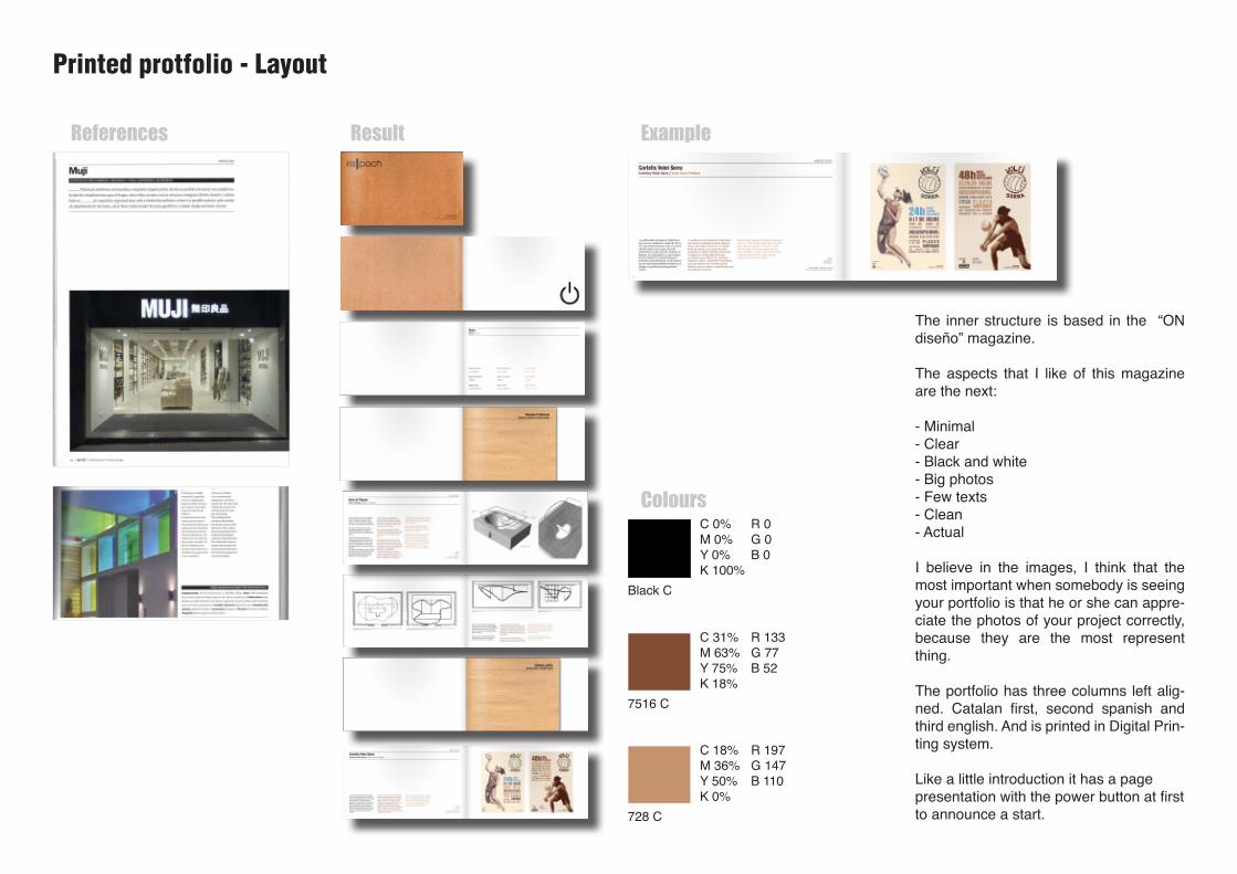
Printed protfolio - Layout
The inner structure is based in the “ON diseño” magazine.
The aspects that I like of this magazine are the next:
- Minimal- Clear- Black and white- Big photos- Few texts- Clean- Actual
I believe in the images, I think that the most important when somebody is seeing your portfolio is that he or she can appre-ciate the photos of your project correctly, because they are the most represent thing.
The portfolio has three columns left alig-ned. Catalan first, second spanish and third english. And is printed in Digital Prin-ting system.
Like a little introduction it has a page presentation with the power button at first to announce a start.
References Result Example
Colours
Black C
7516 C
728 C
C 0%M 0%Y 0%K 100%
C 31%M 63%Y 75%K 18%
C 18%M 36%Y 50%K 0%
R 0G 0B 0
R 133G 77B 52
R 197G 147B 110

Digital protfolio
The platform that I have selected for my digital portfolio is a free responsive cargo collective theme called Counterform.
This type of web allow me to concentrate the visitant only at the photos, then when he or she would want to know more about the project, they only have to click over the photo and automatically the page would guide the user to the project explanation. The homepage contents the most important projects whit visual structure that separates the different categories of designs.
At the header we have the logos and the links which are in a second term in a smaller way. The navigation system consist on cliking in the own projects.
References and model

Digital protfolio
Evolution and result