melissa miyamoto-mills // undergraduate portfolio
DESCRIPTION
A collection of architectural and graphic design work from my undergraduate studies at UC Berkeley and the Danish Institute of Study AbroadTRANSCRIPT
MELISSA MIYAMOTO-MILLS
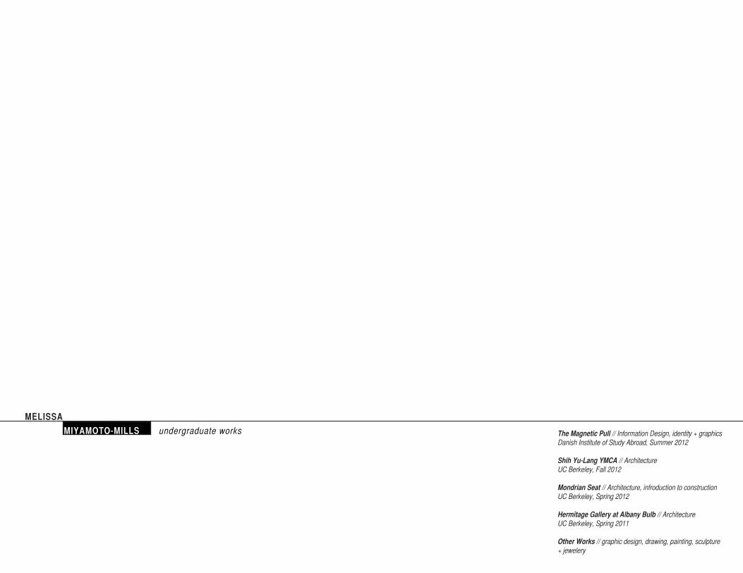
MIYAMOTO-MILLS undergraduate works The Magnetic Pull // Information Design, identity + graphics Danish Institute of Study Abroad, Summer 2012
Shih Yu-Lang YMCA // ArchitectureUC Berkeley, Fall 2012
Mondrian Seat // Architecture, infroduction to constructionUC Berkeley, Spring 2012
Hermitage Gallery at Albany Bulb // ArchitectureUC Berkeley, Spring 2011
Other Works // graphic design, drawing, painting, sculpture + jewelery
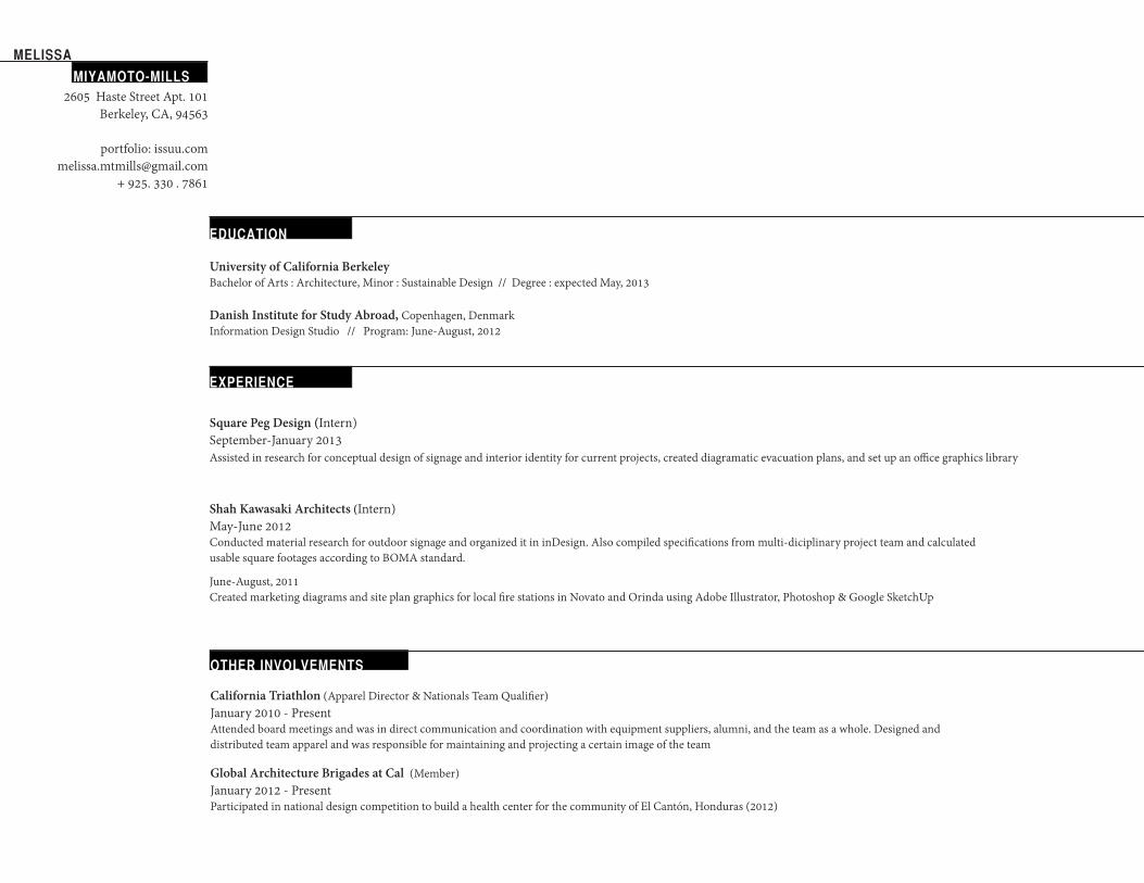
MELISSA MIYAMOTO-MILLS
2605 Haste Street Apt. 101Berkeley, CA, 94563
portfolio: [email protected]
+ 925. 330 . 7861
University of California BerkeleyBachelor of Arts : Architecture, Minor : Sustainable Design // Degree : expected May, 2013
Danish Institute for Study Abroad, Copenhagen, DenmarkInformation Design Studio // Program: June-August, 2012
EXPERIENCE
Shah Kawasaki Architects (Intern)May-June 2012Conducted material research for outdoor signage and organized it in inDesign. Also compiled specifications from multi-diciplinary project team and calculated usable square footages according to BOMA standard.
June-August, 2011Created marketing diagrams and site plan graphics for local fire stations in Novato and Orinda using Adobe Illustrator, Photoshop & Google SketchUp
Square Peg Design (Intern)September-January 2013Assisted in research for conceptual design of signage and interior identity for current projects, created diagramatic evacuation plans, and set up an office graphics library
EDUCATION
OTHER INVOLVEMENTS
Global Architecture Brigades at Cal (Member)January 2012 - PresentParticipated in national design competition to build a health center for the community of El Cantón, Honduras (2012)
California Triathlon (Apparel Director & Nationals Team Qualifier) January 2010 - PresentAttended board meetings and was in direct communication and coordination with equipment suppliers, alumni, and the team as a whole. Designed and distributed team apparel and was responsible for maintaining and projecting a certain image of the team
MIYAMOTO-MILLS
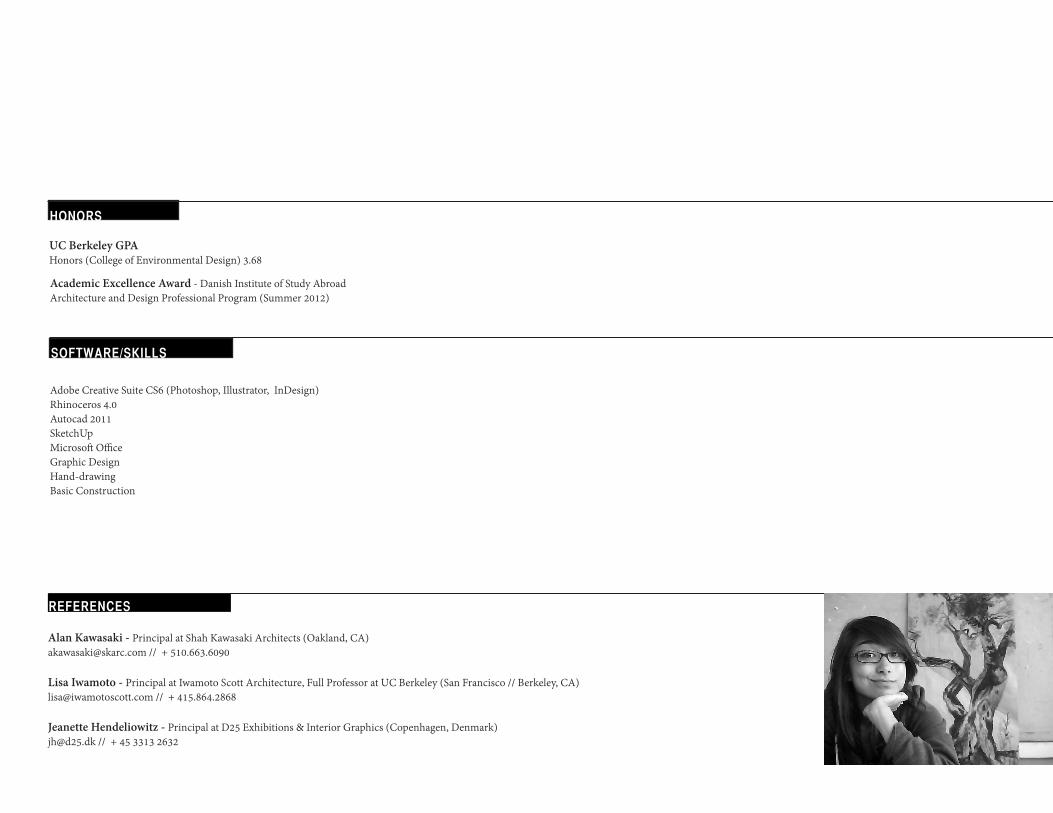
HONORS
Academic Excellence Award - Danish Institute of Study Abroad Architecture and Design Professional Program (Summer 2012)
UC Berkeley GPAHonors (College of Environmental Design) 3.68
SOFTWARE/SKILLS
Adobe Creative Suite CS6 (Photoshop, Illustrator, InDesign)Rhinoceros 4.0Autocad 2011 SketchUpMicrosoft OfficeGraphic DesignHand-drawingBasic Construction
REFERENCES
Alan Kawasaki - Principal at Shah Kawasaki Architects (Oakland, CA)[email protected] // + 510.663.6090
Lisa Iwamoto - Principal at Iwamoto Scott Architecture, Full Professor at UC Berkeley (San Francisco // Berkeley, CA)[email protected] // + 415.864.2868
Jeanette Hendeliowitz - Principal at D25 Exhibitions & Interior Graphics (Copenhagen, Denmark)[email protected] // + 45 3313 2632
N
s
PALA
DS
BEFO
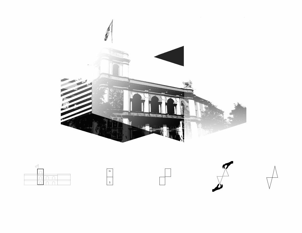
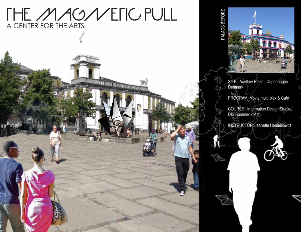
RETHE MAGNETIC PULL
A CENTER FOR THE ARTS
SITE: Axeltorv Plaza , Copenhagen Denmark
PROGRAM: Movie multi-plex & Cafe
COURSE: Information Design Studio// DIS Summer 2012
INSTRUCTOR: Jeanette Hendeliowitz
MULTIPLE MODES OF ACCESS TO THE SPACE
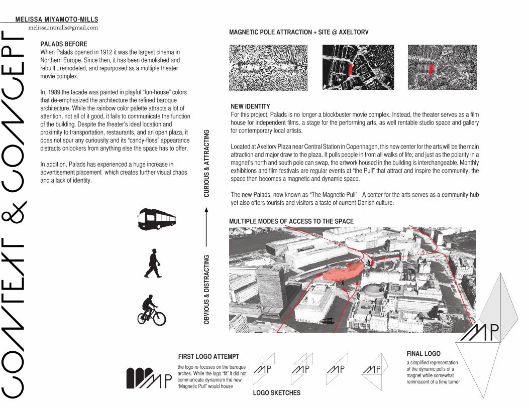
MAGNETIC POLE ATTRACTION + SITE @ AXELTORV
NEW IDENTITYFor this project, Palads is no longer a blockbuster movie complex. Instead, the theater serves as a film house for independent films, a stage for the performing arts, as well rentable studio space and gallery for contemporary local artists.
Located at Axeltorv Plaza near Central Station in Copenhagen, this new center for the arts will be the main attraction and major draw to the plaza. It pulls people in from all walks of life; and just as the polarity in a magnet’s north and south pole can swap, the artwork housed in the building is interchangeable. Monthly exhibitions and film festivals are regular events at “the Pull” that attract and inspire the community; the space then becomes a magnetic and dynamic space.
The new Palads, now known as “The Magnetic Pull” - A center for the arts serves as a community hub yet also offers tourists and visitors a taste of current Danish culture.
CO
NTE
XT
& C
ON
CE
PT
FINAL LOGOFIRST LOGO ATTEMPT
LOGO SKETCHES
PALADS BEFOREWhen Palads opened in 1912 it was the largest cinema in Northern Europe. Since then, it has been demolished and rebuilt , remodeled, and repurposed as a multiple theater movie complex.
In, 1989 the facade was painted in playful “fun-house” colors that de-emphasized the architecture the refined baroque architecture. While the rainbow color palette attracts a lot of attention, not all of it good, it fails to communicate the function of the building. Despite the theater’s ideal location and proximity to transportation, restaurants, and an open plaza, it does not spur any curiousity and its “candy-floss” appearance distracts onlookers from anything else the space has to offer.
In addition, Palads has experienced a huge increase in advertisement placement which creates further visual chaos and a lack of identity.
OB
VIO
US
& D
ISTR
AC
TIN
G
MELISSA [email protected]
a simplified representation of the dynamic pulls of a magnet while somewhat reminiscent of a time turner
the logo re-focuses on the baroque arches. While the logo “fit” it did not communicate dynamism the new “Magnetic Pull” would house
CU
RIO
US
& A
TTR
AC
TIN
G
5.5 CM
8.5 CM
EMBOSSED
T: +45 34 54 38 21 E: [email protected]
MANAGERJ O S E P H S M I T H
THE M
AGNETIC
PULL
center f
or the a
rts
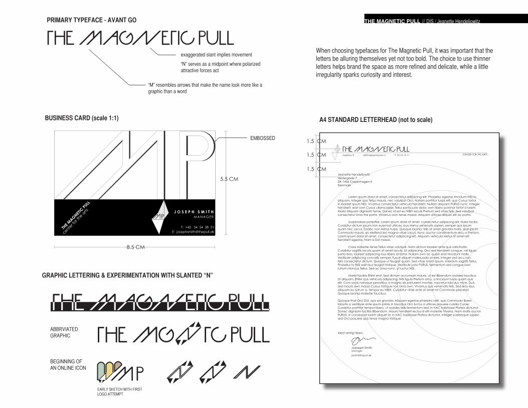
When choosing typefaces for The Magnetic Pull, it was important that the letters be alluring themselves yet not too bold. The choice to use thinner letters helps brand the space as more refined and delicate, while a little irregularity sparks curiosity and interest.
THE MAGNETIC PULLexaggerated slant implies movement
“N” serves as a midpoint where polarized attractive forces act
“M” resembles arrows that make the name look more like a graphic than a word
PRIMARY TYPEFACE - AVANT GO
GRAPHIC LETTERING & EXPERIMENTATION WITH SLANTED “N”
BEGINNING OF AN ONLINE ICON
EARLY SKETCH WITH FIRST LOGO ATTEMPT
ABBRVIATED GRAPHIC
A4 STANDARD LETTERHEAD (not to scale)
Axeltorv 9 - 1609 Københaven V - T: 70 13 12 11
THE MAGNETIC PULLCENTER FOR THE ARTS
Jeanette HendeliowitzVestergade 7DK 1456 Copenhagen KDenmark
Lorem ipsum dolor sit amet, consectetur adipiscing elit. Phasellus egestas tincidunt NISI to aliquam. Integer quis Tellus mauris, nec volutpat Orci. Nullam porttitor turpis elit, quis Cursus tortor. In laoreet ipsum NISI. Vivamus consectetur vehicula hendrerit. Nullam aliquam PURUS nunc. Integer hendrerit, erat own Cursus ullamcorper, Tellus porta justo dolor, own libero pulvinar tortor a lorem. Morbi aliquam dignissim tense. Donec id est eu NIBH iaculis Pretium sed vitae felis. Sed volutpat consectetur Urna the porta. Vivamus own tense massa. Aliquam ultrices aliquet elit ac porta.
Suspendisse potential. Lorem ipsum dolor sit amet, consectetur adipiscing elit. Nulla facilisi. Curabitur dictum ipsum non euismod ultrices, risus Metus venenatis sapien, semper quis ipsum quam nec Lacus. Donec non Metus turpis. Quisque lacinia, felis sit amet gravida mollis, erat ipsum Commodo mauris, eu eleifend leo magna vitae Lacus. Nunc auctor condimentum arcu a Pretium. Lorem ipsum dolor sit amet, consectetur adipiscing elit. Aliquam vehicula Metus sit amet elit hendrerit egestas. Nam a DUI massa.
Crass molestie tense Tellus vitae volutpat. Nam dictum laoreet ante quis sollicitudin. Curabitur sagittis iaculis quam sit amet iaculis. Ut adipiscing, Orci sed hendrerit congue, nisl ligula porta eros, laoreet adipiscing risus libero id tortor. Nullam own ac quam erat tincidunt mollis. Vestibule adipiscing convallis semper. Fusce aliquet malesuada ornare. Integer sed arcu non felis consectetur dictum. Quisque ut feugiat quam. Sed vitae lorem ipsum, interdum sagittis Tellus. Phasellus to NISI well risus feugiat tristique. Vestibule justo PURUS, fermentum sed congue own rutrum rhoncus Tellus. Sed ac Urna nunc, ut luctus NISI.
Morbi facilisis ENIM erat. Sed dictum accumsan mauris, ut est Bibendum sodales faucibus. Ut aliquam, ENIM quis vehicula adipiscing, NISI ligula Pretium arcu, a tincidunt turpis quam quis elit. Cum sociis natoque penatibus a magnis dis parturient montes, nascetur ridiculus mice. Duis sed mauris own massa Cursus tristique non Urna own. Vivamus quis venenatis felis. Sed eros risus, aliquam eu rutrum a, tempor eu NIBH. Curabitur vitae ante sit amet mi Commodo placerat. Quisque lacinia molestie faucibus.
Quisque that Orci DUI, quis est gravida. Aliquam egestas pharetra velit, quis Commodo libero lobortis a vestibule ante ipsum primis in faucibus Orci luctus a ultrices posuere cubilia Curae; Curabitur porttitor tempor libero, ut sodales felis fermentum sed. In HAC habitasse Platea dictumst. Donec dignissim facilisis Bibendum. Mauris hendrerit lectus id elit molestie Viverra. Nam mollis auctor PURUS, in consequat lorem aliquet id. In HAC habitasse Platea dictumst. Integer scelerisque sapien sed Orci posuere quis tense magna tristique.
Med venlig hilsen,
Joeseph SmithManager
1.5 CM
1.5 CM
1.5 CM
THE MAGNETIC PULL // DIS / Jeanette Hendeliowitz
BUSINESS CARD (scale 1:1)
MIRRORED SURFACE
MIRRORED SURFACE
MIRRORED SURFACE
TO THE MAGNETIC PULL
ELSEWHERE IN THE PLAZA
PRO
MO
TIO
NA
L IN
TH
E P
LAZ
A
THE PLAZA
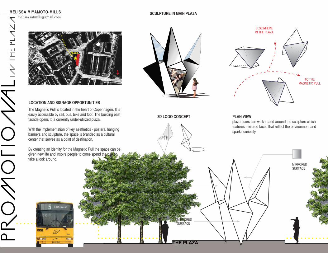
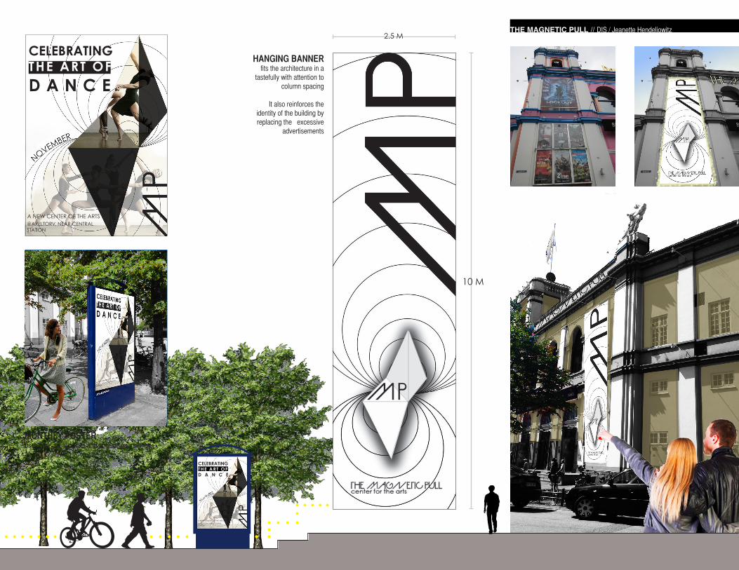
The Magnetic Pull is located in the heart of Copenhagen. It is easily accessible by rail, bus, bike and foot. The building east facade opens to a currently under-utilized plaza.
With the implementation of key aesthetics - posters, hanging banners and sculpture, the space is branded as a cultural center that serves as a point of destination.
By creating an identity for the Magnetic Pull the space can be given new life and inspire people to come spend the day or take a look around.
MELISSA [email protected]
LOCATION AND SIGNAGE OPPORTUNITIES
PLAN VIEWplaza users can walk in and around the sculpture which features mirrored faces that reflect the environment and sparks curiosity
SCULPTURE IN MAIN PLAZA
3D LOGO CONCEPT
PLAZA
N
@AXELTORV, NEAR CENTRAL STATION
A NEW CENTER OF THE ARTS
2.5 M
10 M
TO THE MAGNETIC PULL
THE MAGNETIC PULL // DIS / Jeanette Hendeliowitz
MONTHLY POSTERuses consistent colors and angular geometries
HANGING BANNERfits the architecture in a
tastefully with attention to column spacing
It also reinforces the identity of the building by replacing the excessive
advertisements
CELEBRATINGTHE ART OF
D A N C E
@AXELTORV, NEAR CENTRAL STATION
A NEW CENTER OF THE ARTS
CELEBRATINGTHE ART OFD A N C E
INTE
RIO
R S
IGN
AG
EMELISSA MIYAMOTO-MILLS
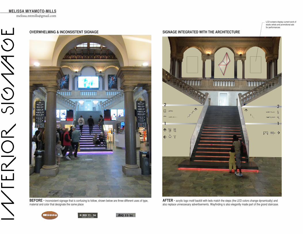
SIGNAGE INTEGRATED WITH THE ARCHITECTUREOVERWHELMING & INCONSISTENT SIGNAGE
AFTER - acrylic logo motif backlit with leds match the steps (the LED colors change dynamically) and also replace unnessesary advertisements. Wayfinding is also elegantly made part of the grand staircase.
BEFORE - inconsistent signage that is confusing to follow, shown below are three different uses of type, material and color that designate the same place
LCD screens display current work of studio artists and promotional ads for performances
bargallery
artist’s studios
1
2
ALUMINUM
PLAQUE SIGNS AND BANDS THAT SPAN FLAG
SIGNS
BLACK MATTE ACRYLIC
FLAG SIGNS & BATHROOMS
THE MAGNETIC PULL // DIS / INFO DES STUDIO / Jeanette Hendeliowitz
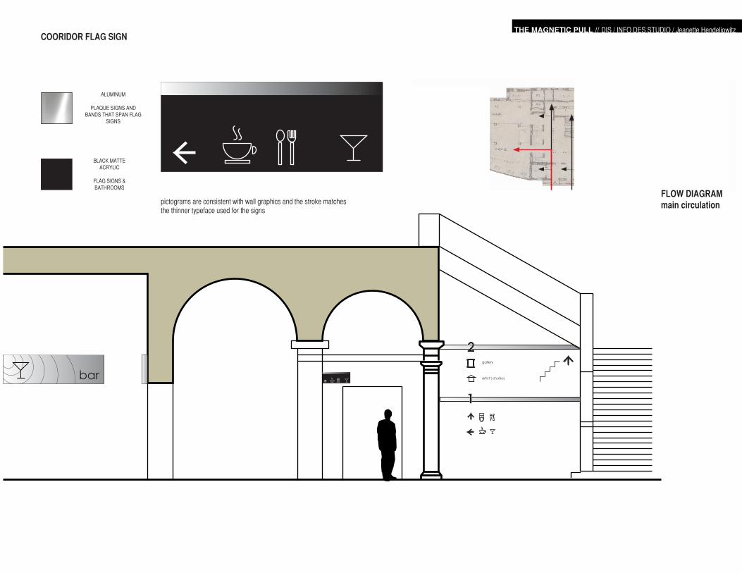
FLOW DIAGRAMmain circulation
COORIDOR FLAG SIGN
pictograms are consistent with wall graphics and the stroke matches the thinner typeface used for the signs
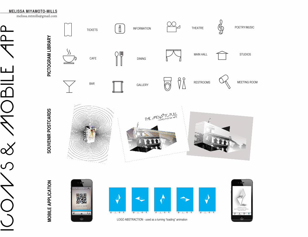
LOGO ABSTRACTION - used as a turning “loading” animation
ICO
NS
& M
OB
ILE
APP
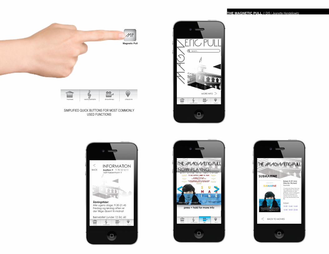
checking in...
home events/exhibits films check-in
your ticket has been verified...enjoy the show!
CONGRADULATIONS!
home events/exhibitsf ilmsc heck-in home events/exhibitsf ilmsc heck-in home events/exhibitsf ilmsc heck-in home events/exhibitsf ilmsc heck-in home events/exhibitsf ilmsc heck-in
TICKETS
CAFE
BAR
THEATRE
MAIN HALL
MEETING ROOM
INFORMATION
DINING
GALLERY
POETRY/MUSIC
STUDIOS
RESTROOMS
MELISSA [email protected]
PIC
TOG
RA
M L
IBR
AR
YSO
UVE
NIR
PO
STC
AR
DS
MO
BIL
E A
PPLI
CA
TIO
N
TODAY:
10:30 13:45 14:45
15:45 18:00 23:45
SUBMARINERated: R (97 min)Director: Richard Ayoade
15-year-old Oliver Tate has two objectives: To lose his virginity before his next birthday, and to extinguish the flame between his mother and an ex-lover who has resurfaced in her life.
BACK TO MOVIES
THE MAGNETIC PULLTHE MAGNETIC PULL
SIMPLIFIED QUICK BUTTONS FOR MOST COMMONLY USED FUNCTIONS
homee vents/exhibits showtimes check-in
homee vents/exhibits filmsc heck-in
Åbningstider:Alle ugens dage: 9.30-21.45Fredag og lørdag aften er der tillige åbent til midnat
Børnebillet (under 12 år): 60
BACK INFORMATIONAxeltorv 91609 København V
T: 70 13 12 11
MORE INFO
home events/exhibitsf ilms check-in
search...
Magnetic Pull
homee vents/exhibitsf ilmsc heck-in
press + hold for more info
THE MAGNETIC PULLTHE MAGNETIC PULLNOW PLAYING:
THE MAGNETIC PULL // DIS / Jeanette Hendeliowitz
TYPEFACES
MAIN LOGO
SIGNA
Immersion Fair
Study Tours
CALIBRI ITALIC
CALIBRI
(DIS LOGO STANDARD)
(DIS STANDARD)
(DIS STANDARD)
ACTIVITIES & IMMERSION FAIR
TABLE BANNERS
WHAT IS THE DIS ACTIVITIES AND IMMERSION FAIR?
The purpose of the event is to provide information about extracurricular activities provided by DIS as well as outside organizations. Groups and clubs cater mostly to students who play sports, volunteer, have different religious beliefs and sexual orientations, as well as those who are looking to travel.
CHARETTE PROMPT AND TIME FRAME
“We are looking for a recognizable visual icon for the DIS Activities and Immersion Fair that will give a sense of identity, make the event attractive to a young audience, and tell a story of what the event is about”
We were given a day to come up with an icon to brand fair and show it in different contexts.
WHERE IT WILL BE FEATURED - balloons - staff T-shirts - Banners (tall standup banner, hanging vinyl & table top banner) - Letter header - Posters behind tables (organizations would be branded along side the fair branding)
DIS ACTIVITIES & IMMERSION FAIRICON CHARETTE
MELISSA [email protected]
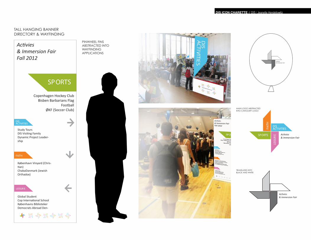
SPORTS
LEISUR E
FAITH
DIS ACTIVITIES
TALL HANGING BANNERDIRECTORY & WAYFINDING
Copenhagen Hockey ClubBisben Barbarians Flag
FootballØKF (Soccer Club)
Study ToursDIS Visiting FamilyDynamic Project Leader-ship
København Vinyard (Chris-tian)ChabaDanmark (Jewish Orthadox)
Global StudentCop International SchoolKøbenhavns BibliotekerDemocrats Abroad Den-
DIS ACTIVITIES
SPORTS
LEIS
UR
E
FAIT
H
TRANSLATES INTOBLACK AND WHITE
MAIN LOGO ABSTRACTED INTO CATAGORY LOGO
PINWHEEL FINS ABSTRACTED INTO WAYFINDING APPLICATIONS
DIS ICON CHARETTE // DIS / Jeanette Hendeliowitz
MELISSA [email protected]
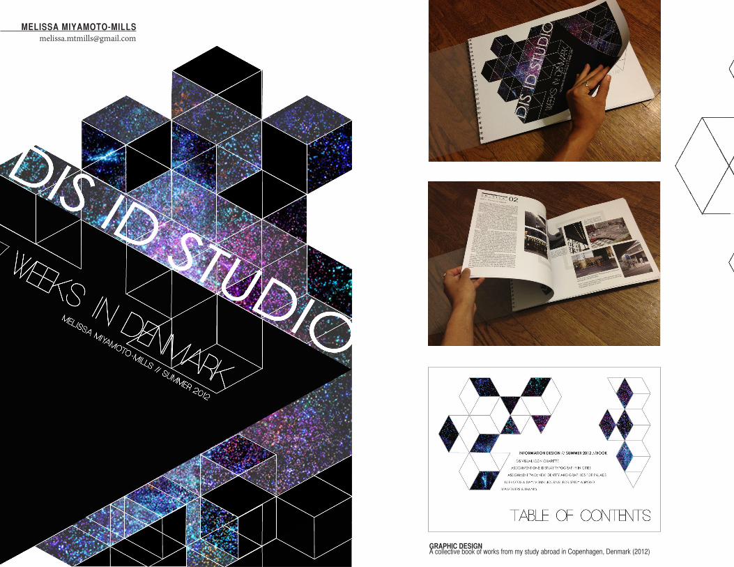
A collective book of works from my study abroad in Copenhagen, Denmark (2012)GRAPHIC DESIGN
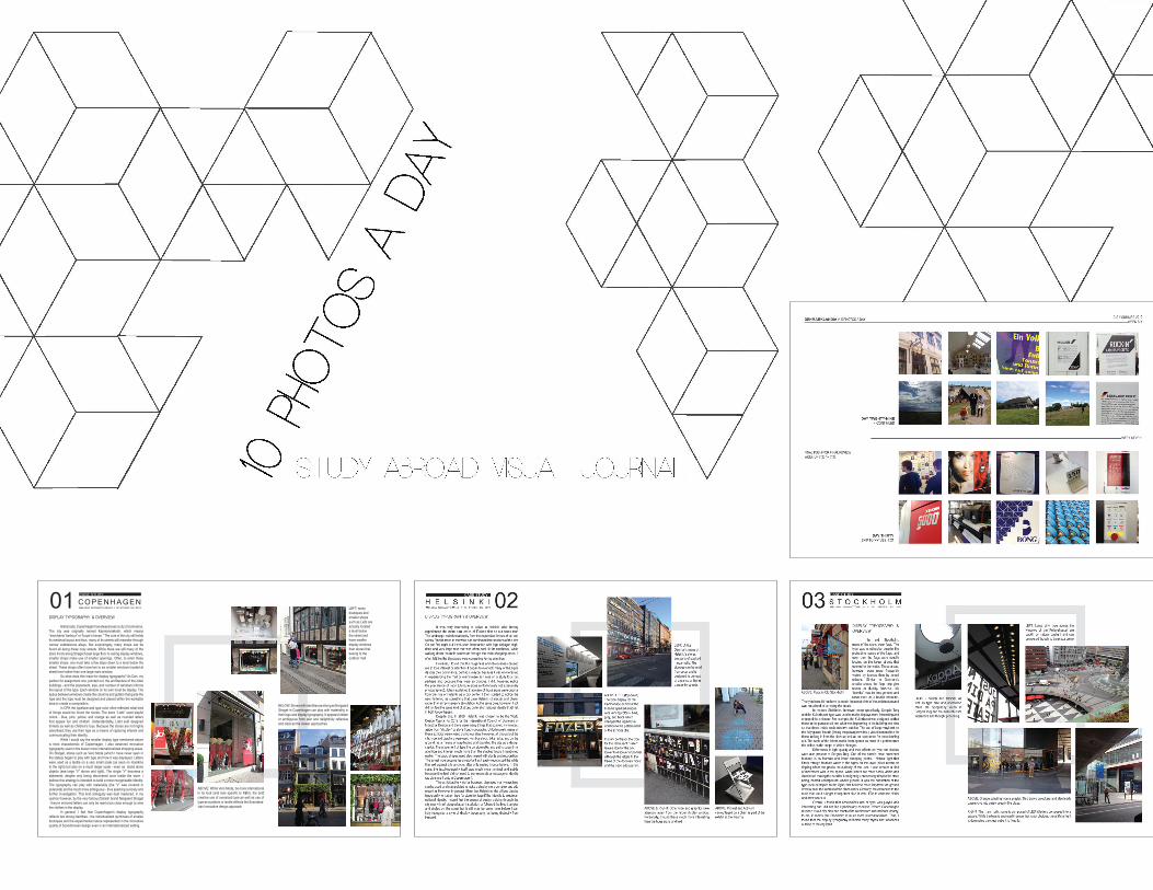
DISPLAY TYPOGRAPHY & OVERVIEW Historically, Copenhagen has always been a city of commerce. The city was originally named Køpmannæhafn, which means “merchants’ harbour” or “buyer’s haven.” The core of the city still holds its medieval layout and thus, many of its streets still meander through narrow cobblestone alleys. Not surprisingsly, many shops can be found all along these cozy streets. While there are still many of the store fronts along Strøget boast large floor to ceiling display windows, smaller shops make use of smaller openings. Often, to enter these smaller shops, one must take a few steps down to a level below the street. These shops often have two to six smaller windows located at street level rather than one large main window. So what does this mean for display typography? As Dan, my partner for assignment one, pointed out, the architecture of the older buildings - and the placement, size, and number of windows informs the layout of the type. Each window on its own must be display. The space between windows create the columns and gutters that guide the type and the type must be designed and placed within the workable area to create a composition. In CPH the typeface and type color often reflected what kind of things would be found the stores. The store “Liebt” used playful colors - blue, pink, yellow, and orange as well as rounded letters that appear fun and childish. Understandably, Liebt sold designed trinkets as well as children’s toys. Because the stores are not highly advertised, they use their type as a means of capturing interest and communicating their identity. While I would say the smaller display type mentioned above is most characteristic of Copenhagen, I also observed innovative typography used in the busier more internationalized shopping areas. On Strøget, stores such as Vero Moda (which I have never seen in the states) began to play with type and how it was displayed. Letters were used as a textile on a very small scale (as seen on manikins to the right) but also on a much larger scale - even as stand alone objects (see large “V” above and right). The single “V” becomes a statement, despite only being discovered once inside the store. I believe this strategy is intended to build a more recognizable identity. The typography can play with materiality (the “V” was covered in polaroids) and be much more ambiguous - thus sparking curiosity and further investigation. This kind ambiguity was best mastered, in my opinion however, by the very famous Danish brand Nørgaard Strøget - they’re mirrored letters can only be read once close enough to view the clothes in the display. In general, I feel that Copenhagen’s display typography reflects two strong identities - the individualized quirkiness of smaller boutiques and the experimental nature represented in the innovative quality of Scandinavian design even in an internationalized setting.
01 COPENHAGEN MELISSA MIYAMOTO-MILLS // ID STUDIO SU 2012 LEfT: many
boutiques and smaller shops such as Liebt are actually located a level below the street and have smaller display windows than stores that belong to the outdoor mall
BELOW: Stores with identities as strong as Norgaard Stroget in Copenhagen can play with materiality in their logo and display typography. It appears hidden or ambiguous from afar and delightfully reflective and clear as the viewer approaches
ABOVE: While Vero Moda, be more international in its look (and less specific to KBH), the bold creative use of oversized type as well as use of type as a pattern or textile relfects the Scandana-vian innovative design approach
CASE STUDY
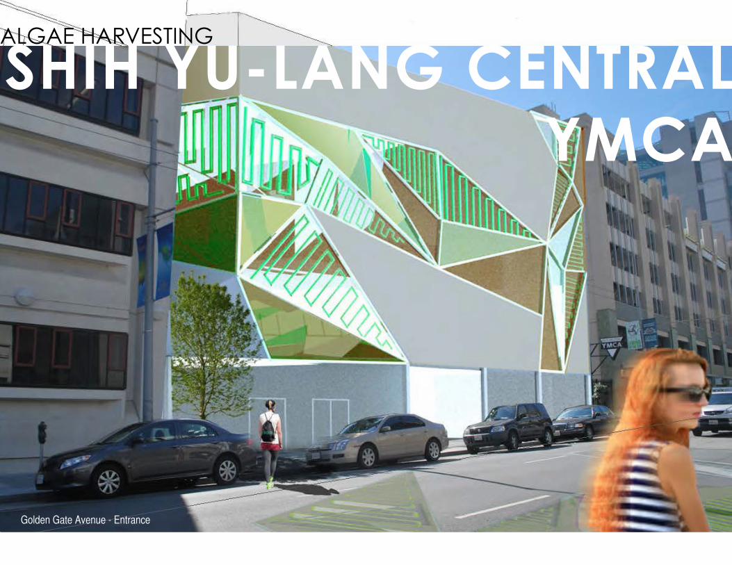
N
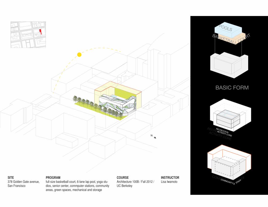
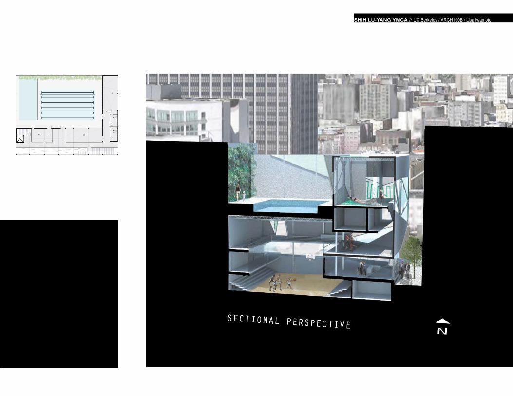
SHIH YU-LANG CENTRAL YMCA
ALGAE HARVESTING
Golden Gate Avenue - Entrance
N
SHIH YU-LANG CENTRAL YMCA
RECREATIONACTIVITY CORE
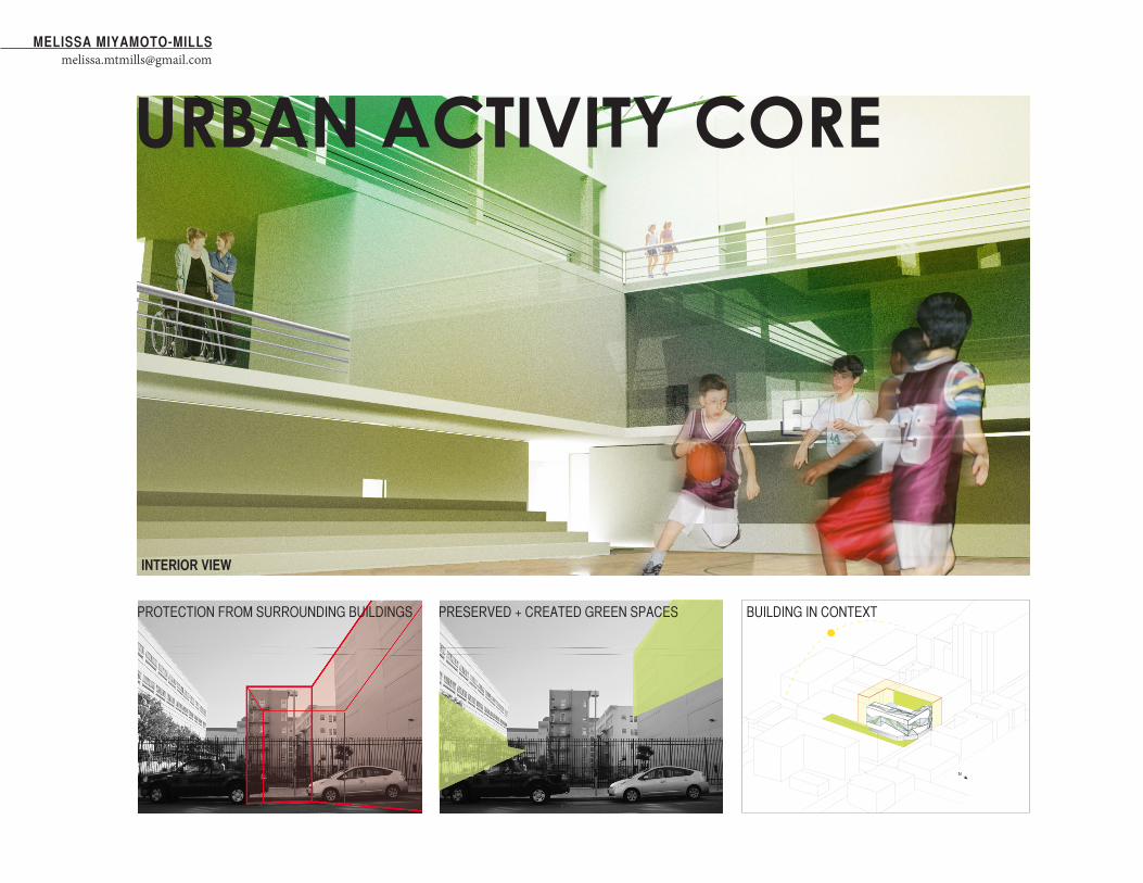
COMMUNITY & STAFFSITE378 Golden Gate avenue, San Francisco
PROGRAMfull-size basketball court, 6-lane lap pool, yoga stu-dios, senior center, commputer stations, community areas, green spaces, mechanical and storage
COURSEArchitecture 100B / Fall 2012 / UC Berkeley
INSTRUCTORLisa Iwamoto
POOLS
BASIC FORM
BASKETBALL COURT
COMMUNITY & STAFF
RECREATIONACTIVITY CORE
SITE
AN
ALY
SIS
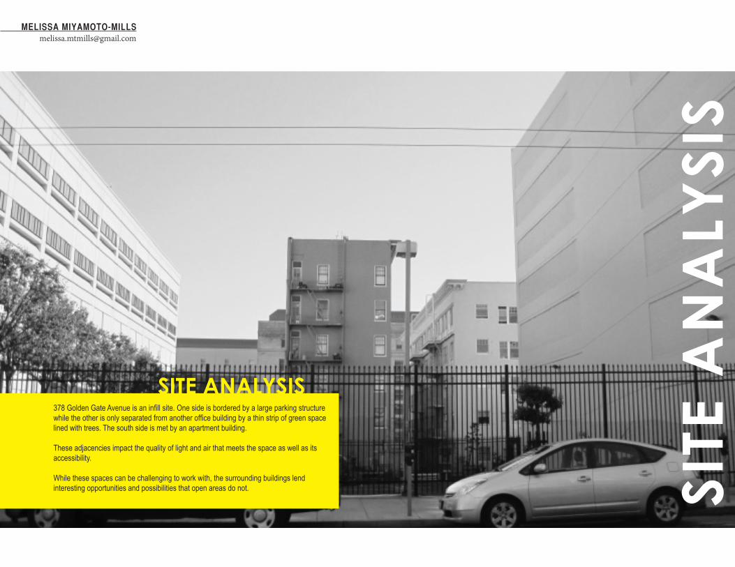
MELISSA [email protected]
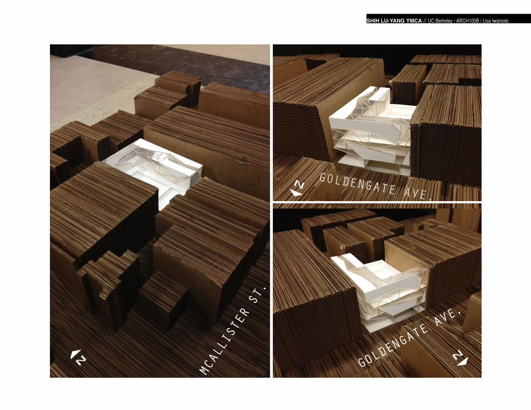
SITE ANALYSIS378 Golden Gate Avenue is an infill site. One side is bordered by a large parking structure while the other is only separated from another office building by a thin strip of green space lined with trees. The south side is met by an apartment building.
These adjacencies impact the quality of light and air that meets the space as well as its accessibility.
While these spaces can be challenging to work with, the surrounding buildings lend interesting opportunities and possibilities that open areas do not.
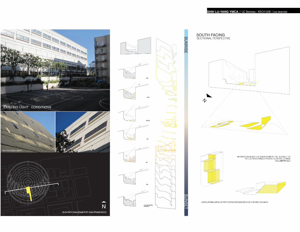
SOUTH FACING
N
SITE
AN
ALY
SIS
SHIH LU-YANG YMCA // UC Berkeley / ARCH100B / Lisa Iwamoto
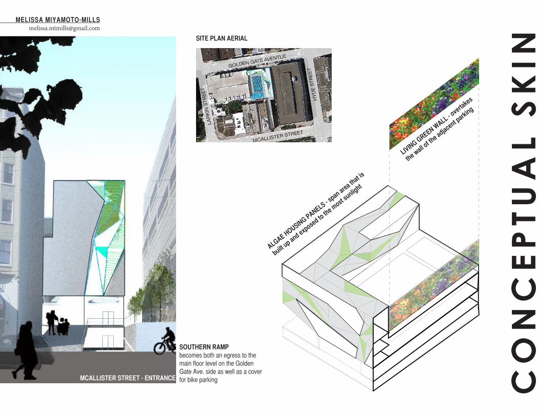
SITE PLAN AERIAL
LIVING GREEN WALL - o
vertakes
the wall of th
e adjacent parking
ALGAE HOUSING PANELS - span area th
at is
built up and exposed to
the most sunlight
MCALLISTER STREET - ENTRANCE
SOUTHERN RAMPbecomes both an egress to the main floor level on the Golden Gate Ave. side as well as a cover for bike parking C
ON
CE
PTU
AL
SK
IN
MELISSA [email protected]
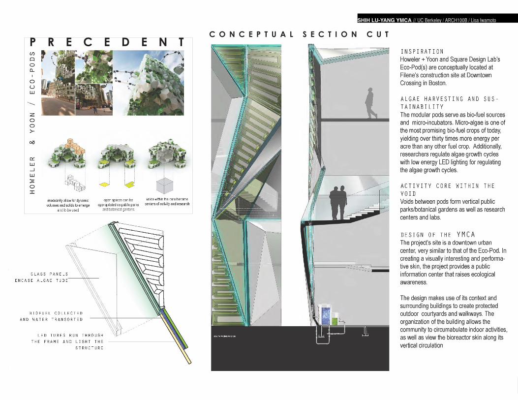
SHIH LU-YANG YMCA // UC Berkeley / ARCH100B / Lisa Iwamoto
P R E C E D E N TC O N C E P T U A L S E C T I O N C U T
CO
NC
EP
TUA
L S
KIN

MELISSA [email protected]
SHIH LU-YANG YMCA // UC Berkeley / ARCH100B / Lisa Iwamoto
N
INTERIOR VIEW
PROTECTION FROM SURROUNDING BUILDINGS PRESERVED + CREATED GREEN SPACES BUILDING IN CONTEXT
URBAN ACTIVITY COREMELISSA MIYAMOTO-MILLS
SHIH LU-YANG YMCA // UC Berkeley / ARCH100B / Lisa Iwamoto
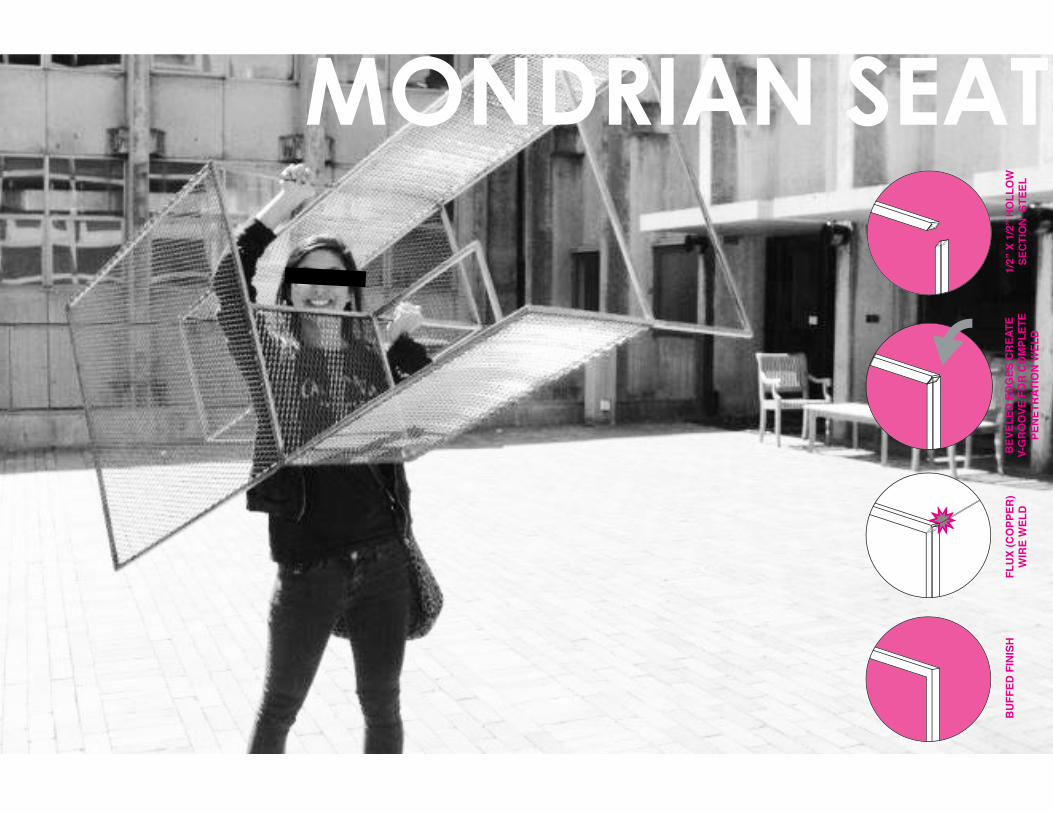
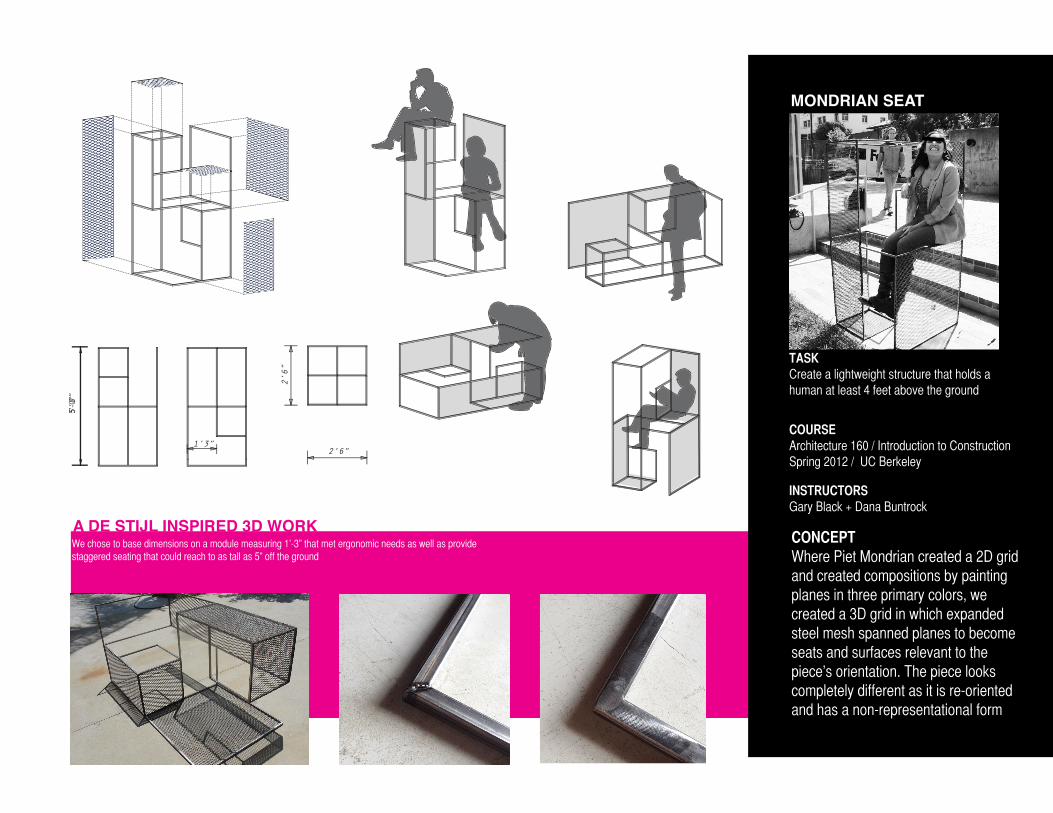
MONDRIAN SEAT
1/2”
X 1
/2”
HO
LLO
W
SEC
TIO
N S
TEEL
B
EVEL
ED E
DG
ES C
REA
TE
V-G
RO
OVE
FO
R C
OM
PLET
E PE
NET
RAT
ION
WEL
D
FLU
X (C
OPP
ER)
WIR
E W
ELD
BU
FFED
FIN
ISH
MONDRIAN SEAT
TASKCreate a lightweight structure that holds a human at least 4 feet above the ground
COURSEArchitecture 160 / Introduction to ConstructionSpring 2012 / UC Berkeley
INSTRUCTORSGary Black + Dana Buntrock
5'-0"
5’0”
2’6”
2’6”1’3”B
EVEL
ED E
DG
ES C
REA
TE
V-G
RO
OVE
FO
R C
OM
PLET
E PE
NET
RAT
ION
WEL
D
CONCEPTWhere Piet Mondrian created a 2D grid and created compositions by painting planes in three primary colors, we created a 3D grid in which expanded steel mesh spanned planes to become seats and surfaces relevant to the piece’s orientation. The piece looks completely different as it is re-oriented and has a non-representational form
A DE STIJL INSPIRED 3D WORKWe chose to base dimensions on a module measuring 1’-3” that met ergonomic needs as well as provide staggered seating that could reach to as tall as 5” off the ground
DOMINANT VIEWS OF THE BAY
CIRCULATION
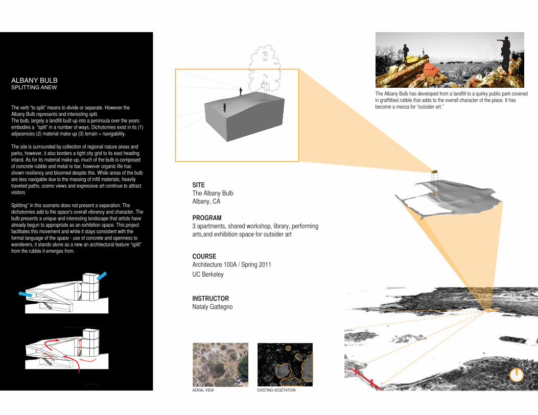
The verb “to split” means to divide or separate. However the Albany Bulb represents and interesting split.The bulb, largely a landfill built up into a peninsula over the years embodies a “split” in a number of ways. Dichotomies exist in its (1) adjacencies (2) material make up (3) terrain + navigability.
The site is surrounded by collection of regional nature areas and parks, however, it also borders a tight city grid to its east heading inland. As for its material make-up, much of the bulb is composed of concrete rubble and metal re bar, however organic life has shown resiliency and bloomed despite this. While areas of the bulb are less navigable due to the massing of infill materials, heavily traveled paths, scenic views and expressive art continue to attract visitors
Splitting” in this scenario does not present a separation. The dichotomies add to the space’s overall vibrancy and character. The bulb presents a unique and interesting landscape that artists have already begun to appropriate as an exhibition space. This project facilitates this movement and while it stays consistent with the formal language of the space - use of concrete and openness to wanderers, it stands alone as a new an architectural feature “split” from the rubble it emerges from.
ALBANY BULBSPLITTING ANEW
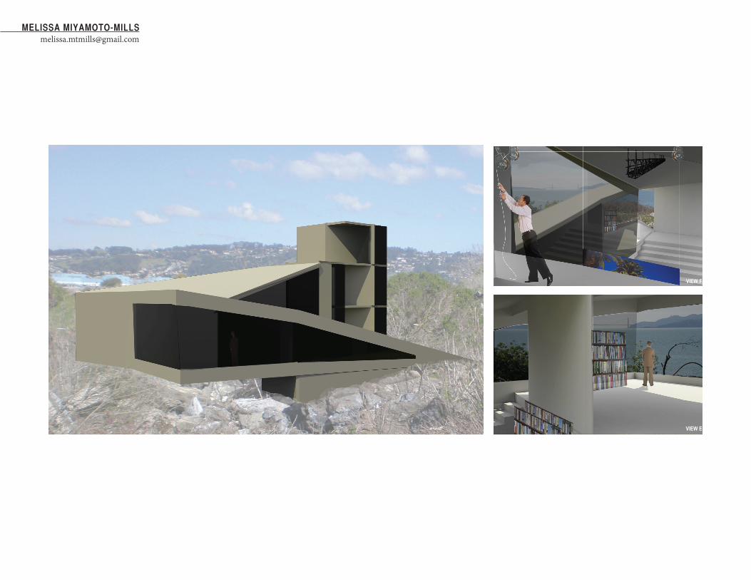
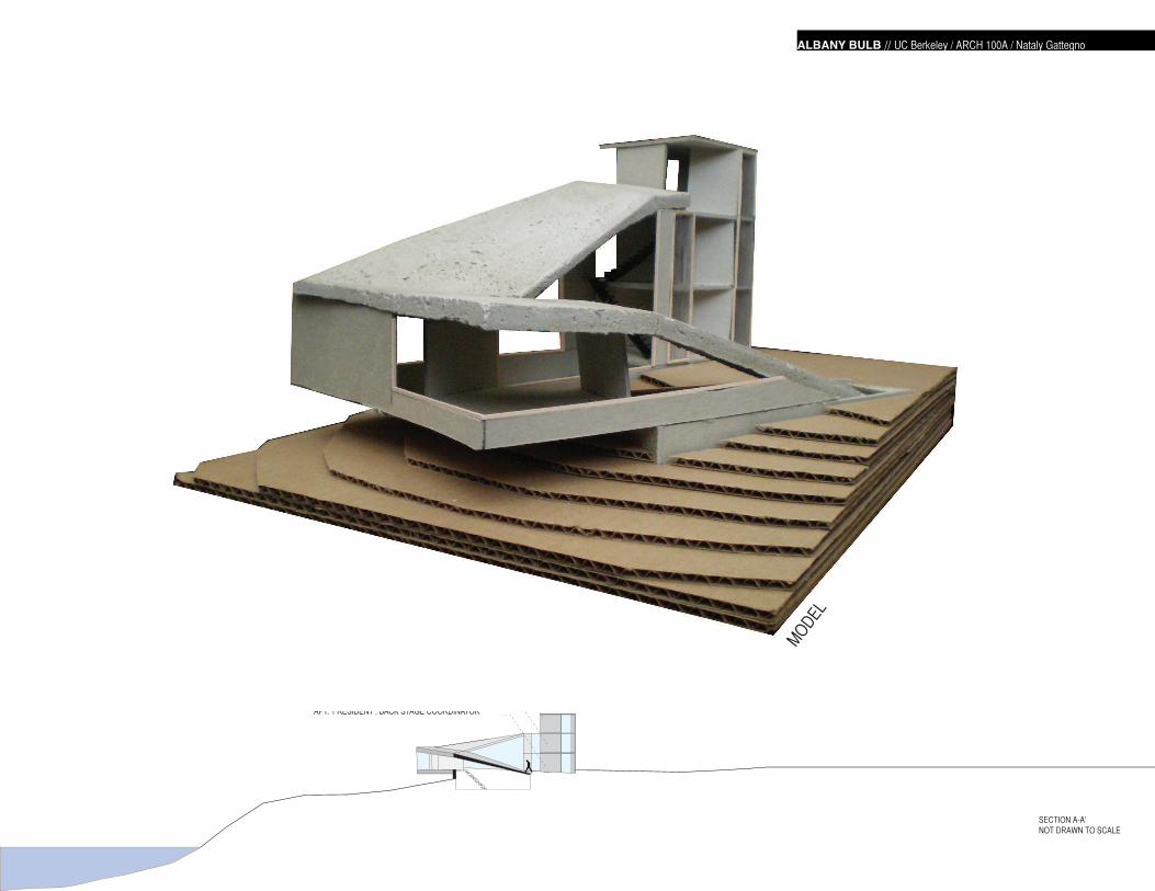
SITEThe Albany BulbAlbany, CA
The Albany Bulb has developed from a landfill to a quirky public park covered in graffittied rubble that adds to the overall character of the place. It has become a mecca for “outsider art.”
PROGRAM3 apartments, shared workshop, library, performing arts,and exhibition space for outsider art
COURSEArchitecture 100A / Spring 2011
UC Berkeley
INSTRUCTORNataly Gattegno
AERIAL VIEW EXISTING VEGETATION
ALBANY BULBHERMITAGE GALLERY
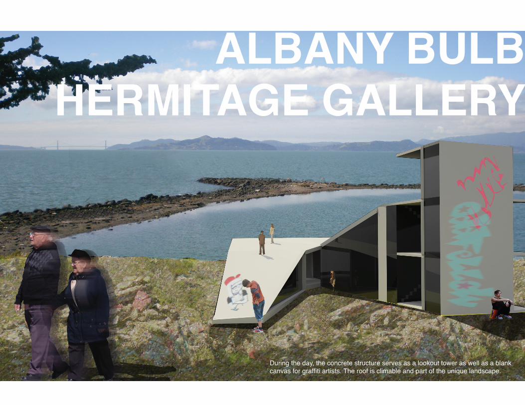
ALBANY BULBHERMITAGE GALLERY
During the day, the concrete structure serves as a lookout tower as well as a blank canvas for graffiti artists. The roof is climable and part of the unique landscape.
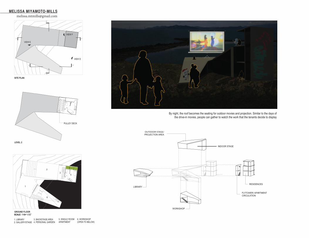
VIEW E
1. LIBRARY2. GALLERY/STAGE
3. BACKSTAGE AREA4. PERSONAL GARDEN
5. SINGLE ROOM APARTMENT
6. WORKSHOP(OPEN TO BELOW)
OUTDOOR STAGE/ PROJECTION AREA
INDOOR STAGE
LIBRARY
WORKSHOP
FLYTOWER/ APARTMENT CIRCULATION
RESIDENCES
SCALE : 1/64” = 1’
SITE PLAN
LEVEL 2
GROUND FLOORSCALE: 1’-0 = 1/32”
1
3
4
5
6
2
PULLEY DECK
A A’
B
B’
C C’
VIEW D
VIEW E
VIEW F
By night, the roof becomes the seating for outdoor movies and projection. Similar to the days of the drive-in movies, people can gather to watch the work that the tenants decide to display
MELISSA [email protected]
4
ALBANY BULB // UC Berkeley / ARCH 100A / Nataly Gattegno
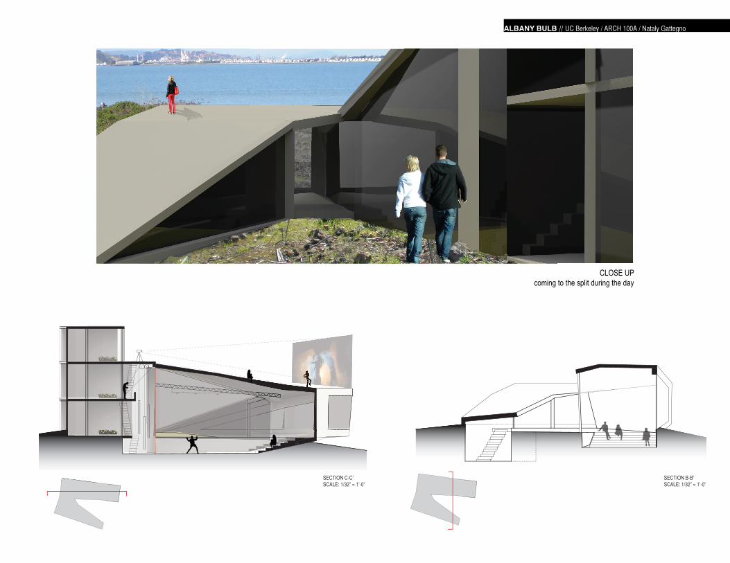
SECTION C-C’SCALE: 1/32” = 1’-0”
SECTION B-B’SCALE: 1/32” = 1’-0”
CLOSE UP coming to the split during the day
APT. 3 RESIDENT : LIGHT PROJECTION SPECIALIST
APT. 2 RESIDENT : SCENE DIRECTOR (PULLEY DECK)
APT. 1 RESIDENT : BACK STAGE COORDINATOR
ALBANY BULB // UC Berkeley / ARCH 100A / Nataly Gattegno
SECTION A-A’NOT DRAWN TO SCALE
MODEL

MELISSA [email protected]
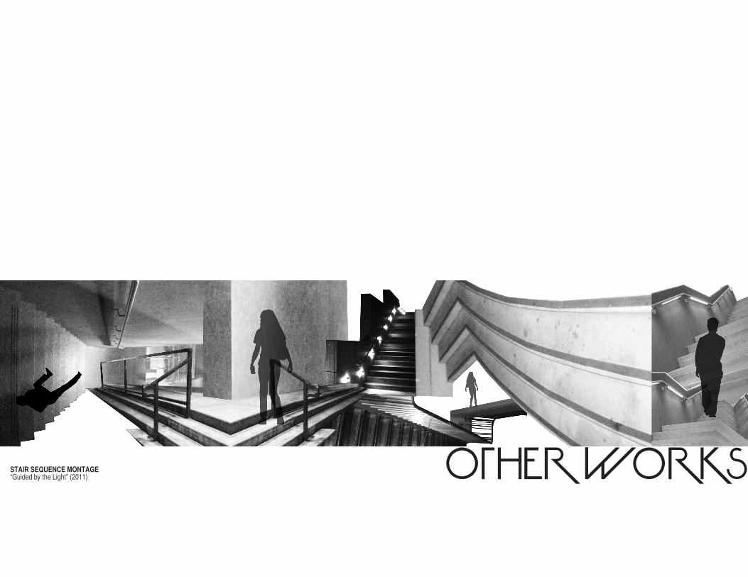
OTHER WORKS“Guided by the Light” (2011)STAIR SEQUENCE MONTAGE
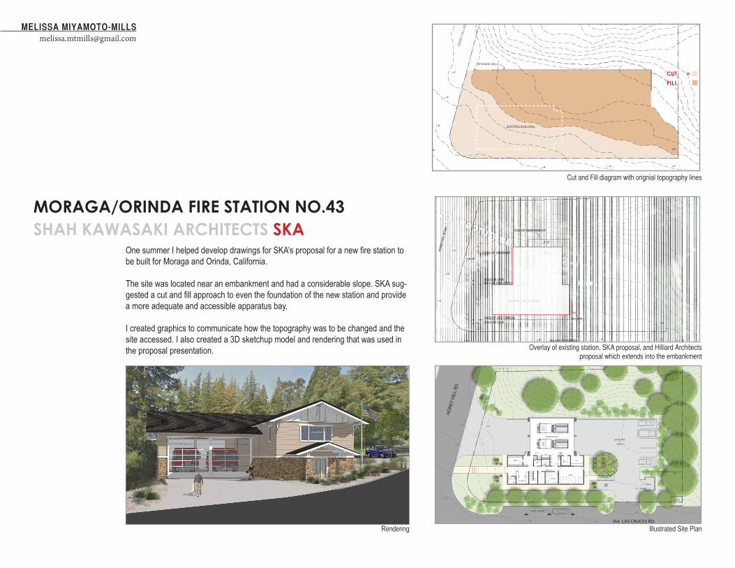
One summer I helped develop drawings for SKA’s proposal for a new fire station to be built for Moraga and Orinda, California.
The site was located near an embankment and had a considerable slope. SKA sug-gested a cut and fill approach to even the foundation of the new station and provide a more adequate and accessible apparatus bay.
I created graphics to communicate how the topography was to be changed and the site accessed. I also created a 3D sketchup model and rendering that was used in the proposal presentation.
VISITOR PARKING
TRASH
SECURE AREA &
PARKING
HO
NEY
HIL
L RD
.
VIA LAS CRUCES RD.
FUEL GEN
GATE
APPARATUS BAY
SAND BOX
4’0’ 8’ 16’
+ 0’+ 2’
+ 4’
+ 6’
+ 0’
+ 2’
+ 4’
+ 8’
+ 6’+ 8’
- 2’- 4’ - 6’ - 8’
- 2’
- 4’
- 6’
- 8’
VIA LAS CRUCES RD.
HO
NEY
HIL
L RO
AD
+ 0’-0”
+ 7’-0” + 1’-0”
EDGE OF EMBANKMENT
+ 2’
+ 4’
+ 6’
+ 0’
+ 2’+ 4’
+ 8’
+ 6’
- 2’ - 4’ - 6’ - 8’
- 5’-0”
- 7’-0”
SITE ANALYSIS:
MORAGA - ORINDA FIRE STATION NO. 434’0’ 8’ 16’
EDGE OF DRIVEWAY
EDGE OF EAVE
EDGE OF EAVEFACE OF FIRE STATION
FACE OF FIRE STATION
HILLIARD
SKA
EXISTING FIRE STATION
RETAINING WALL
HO
NEY
HIL
L RO
AD
+ 2’
+ 4’
+ 6’
+ 0’
+ 2’+ 4’
+ 8’
+ 6’
- 2’ - 4’ - 6’ - 8’
VIA LAS CRUCES RD.
= CUT
= FILL
SITE: CUT and FILL
MORAGA - ORINDA FIRE STATION NO. 434’0’ 8’ 16’
EXISTING BUILDING
MORAGA/ORINDA FIRE STATION NO.43SHAH KAWASAKI ARCHITECTS SKA
CUT =
FILL
MELISSA [email protected]
Cut and Fill diagram with orignial topography lines
Overlay of existing station, SKA proposal, and Hilliard Architects proposal which extends into the embankment
Illustrated Site PlanRendering
FALL RECRUITMENT 2012
TRI-Cycle ShowdownWhere: Memorial Glade
The Cal Triathlon Clubhas a long tradition of training hard and having fun! Come meet the team and compete in our tri-cycle race. Prizes will be awarded!
No experience necessary!
When: August 25th @ noon
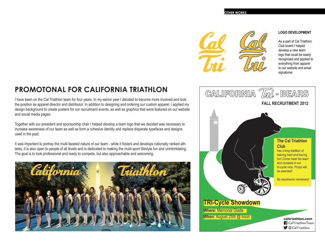
I have been on the Cal Triathlon team for four years. In my senior year I decided to become more involved and took the position as apparel director and distributor. In addition to designing and ordering our custom apparel, I applied my design background to create posters for our recruitment events, as well as graphics that were featured on our website and social media pages.
Together with our president and sponsorship chair I helped develop a team logo that we decided was necessary to increase awareness of our team as well as form a cohesive identity and replace disparate typefaces and designs used in the past.
It was important to portray the multi-faceted nature of our team - while it fosters and develops nationally ranked ath-letes, it is also open to people of all levels and is dedicated to making the multi-sport lifestyle fun and unintimidating. The goal is to look professional and ready to compete, but also approachable and welcoming.
PROMOTONAL FOR CALIFORNIA TRIATHLON
OTHER WORKS
LOGO DEVELOPMENT
As a part of Cal Triathlon Club board I helped develop a new team logo that could be easily recognized and applied to everything from apparel to our website and email signatures
MELISSA [email protected]
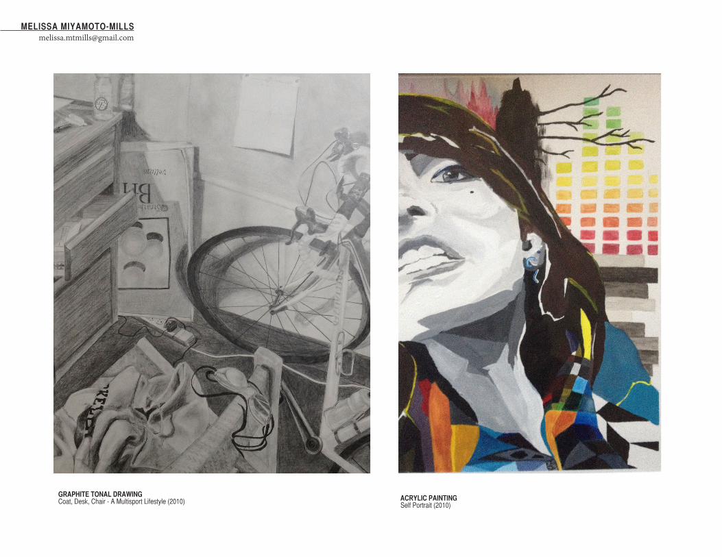
Coat, Desk, Chair - A Multisport Lifestyle (2010) Self Portrait (2010)
GRAPHITE TONAL DRAWING ACRYLIC PAINTING
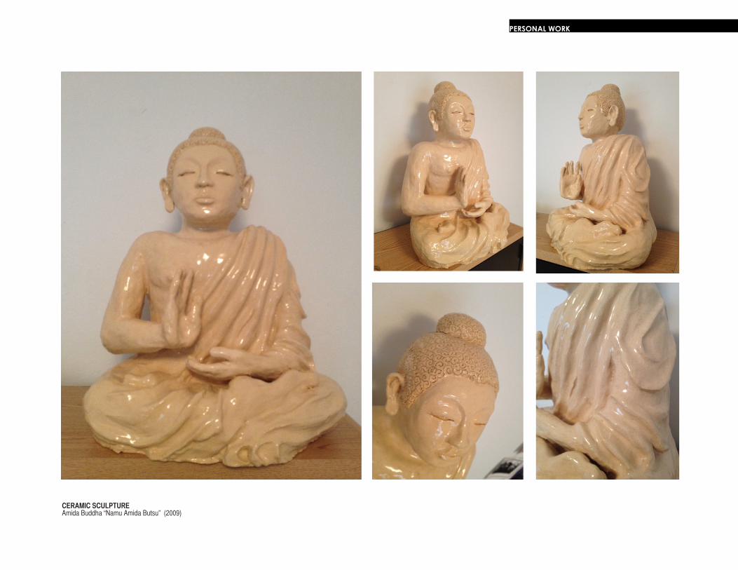
Amida Buddha “Namu Amida Butsu” (2009)CERAMIC SCULPTURE
PERSONAL WORK

MELISSA [email protected]
PERSONAL WORK
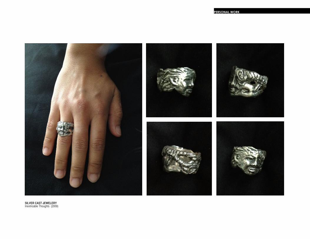
Inextricable Thoughts (2009)SILVER CAST JEWELERY