meggs’ - cigd.files.wordpress.com was a designer, educator, and author. he was school of the arts...
TRANSCRIPT

Meggs’History ofGraphicDesign
Meggs’History ofGraphicDesign
Fifth Edition
Philip B. MeggsAlston W. Purvis
Fifth Edition
Philip B. MeggsAlston W. Purvis
The classic “bible” of graphic design history—now fully revised and updated!
This is the unrivaled, comprehensive, and award-winning reference tool on graphic design recognized for publishing excellence by the Association of American Publishers. Now, this Fifth Edition of Meggs’ History of Graphic Design offers even more detail and breadth of content than its heralded predeces-sors, revealing a saga of creative innovators, breakthrough technologies, and important de-velopments responsible for paving the historic paths that define the graphic design experi-ence. In addition to classic topics such as the invention of writing and alphabets, the origins of printing and typography, and postmodern design, this new Fifth Edition presents new in-formation on current trends and technologies sweeping the graphic design landscape—such as the web, multimedia, interactive design, and private presses, thus adding new layers of depth to an already rich resource.
With more than 1,400 high-quality images throughout—many new or newly updated—Meggs’ History of Graphic Design, Fifth Edition provides a wealth of visual markers for inspiration and emulation. For profession-als, students, and everyone who works with or loves the world of graphic design, this land-mark text will quickly become an invaluable guide that they will turn to again and again.
The late PHILIP B. MEGGS was a designer, educator, and author. He was School of the Arts Research Professor, Communication Arts and Design Department, at Virginia Common-wealth University; visiting faculty at Syracuse University and the National College of Art and Design in Dublin, Ireland; and contribut-ing editor to Print magazine. He authored more than a dozen books and 150 articles and papers on design and typography, including a section on graphic design in Encyclopedia Britannica. He was inducted into the Art Directors Hall of Fame and received its Educator’s Award for lifetime achievement and significantly shaping the future of the fields of graphic design education and writing.
ALSTON W. PURVIS is Professor of Graphic Design at the Boston University College of Fine Arts. During his career, he has worked as an instructor at The Cooper Union and the Royal Academy of Fine Arts at The Hague. His photographs have been exhibited in Amsterdam, London, New York, and Paris. He is the author of Dutch Graphic Design: 1918–1945 and H. N. Werkman; and coauthor of Graphic Design 20th Century; A Century of Posters; Wendingen: A Journal for the Arts 1918–1932; Creative Type; Dutch Graphic Design: A Century of Innovation; Jan Tsch-ichold: Posters of the Avant Garde; Posters NL; Jan Tschichold, Master Typographer: His Life, Work and Legacy; The Ballets Russes and the Art of Design; and Type: A Visual History of Typefaces and Graphic Styles.
Jacket Design: Cees de Jong
Front cover clockwise from top left: Victor Moscoso, NeonRose #12, 1967. Krebs Lithographic Company, poster for the Cincinnati Industrial Exposition, 1883. Jean-Benoit Lévy, poster for AIGA, 2002. Fremont rock painting, Utah, c. 2000–1000 BCE.
Back cover clockwise from top left: Jules Chéret, poster, L’aurelole du midi, Pétrole de Sureté, 1893. Stefan Sagmeister, Lou Reed Poster, 1996. Johann Gutenberg, page from the Gutenberg Bible, 1450–1455. Herbert Matter, catalog cover for Alexander Calder exhibit, 1964.
Experience the history of graphic design in a variety of interactive formats and study tools.
978-1-118-01718-0 4-COLOR

Meggs’History ofGraphicDesign
01_9780470168738-ffirs.indd i01_9780470168738-ffirs.indd i 9/9/11 7:38 PM9/9/11 7:38 PM

01_9780470168738-ffirs.indd ii01_9780470168738-ffirs.indd ii 9/9/11 7:38 PM9/9/11 7:38 PM
John Wiley & Sons, Inc.
Meggs’History ofGraphicDesign
Fifth Edition
Philip B. MeggsAlston W. Purvis
01_9780470168738-ffirs.indd iii01_9780470168738-ffirs.indd iii 9/9/11 7:38 PM9/9/11 7:38 PM

This book is printed on acid-free paper. ∞Copyright © 2012 by John Wiley & Sons, Inc. All rights reserved
Published by John Wiley & Sons, Inc., Hoboken, New Jersey
Published simultaneously in Canada
No part of this publication may be reproduced, stored in a retrieval system, or
transmitted in any form or by any means, electronic, mechanical, photocopying,
recording, scanning, or otherwise, except as permitted under Section 107 or 108
of the 1976 United States Copyright Act, without either the prior written permis-
sion of the Publisher, or authorization through payment of the appropriate per-
copy fee to the Copyright Clearance Center, 222 Rosewood Drive, Danvers, MA
01923, (978) 750-8400, fax (978) 646-8600, or on the web at www.copyright.com.
Requests to the Publisher for permission should be addressed to the Permissions
Department, John Wiley & Sons, Inc., 111 River Street, Hoboken, NJ 07030,
(201) 748-6011, fax (201) 748-6008, or online at www.wiley.com/go/permissions.
Limit of Liability/Disclaimer of Warranty: While the publisher and the author have
used their best efforts in preparing this book, they make no representations or
warranties with respect to the accuracy or completeness of the contents of this
book and specifi cally disclaim any implied warranties of merchantability or fi t-
ness for a particular purpose. No warranty may be created or extended by sales
representatives or written sales materials. The advice and strategies contained
herein may not be suitable for your situation. You should consult with a profes-
sional where appropriate. Neither the publisher nor the author shall be liable for
any loss of profi t or any other commercial damages, including but not limited to
special, incidental, consequential, or other damages.
For general information about our other products and services, please contact
our Customer Care Department within the United States at (800) 762-2974,
outside the United States at (317) 572-3993 or fax (317) 572-4002.
Wiley also publishes its books in a variety of electronic formats. Some content
that appears in print may not be available in electronic books. For more informa-
tion about Wiley products, visit our web site at www.wiley.com.
Library of Congress Cataloging-in-Publication Data:
Meggs, Philip B.
Meggs’ history of graphic design / Philip B. Meggs, Alston W. Purvis. -- 5th ed.
p. cm.
Rev. ed. of: A history of graphic design. c1998.
Includes bibliographical references and index.
ISBN 978-0-470-16873-8 (cloth/website); ISBN 978-1-118-01718-0 (ebk.); ISBN
978-1-118-01719-7 (ebk.); ISBN 978-1-118-01774-6 (ebk.); ISBN 978-1-118-
01775-3 (ebk.); ISBN 978-1-118-01776-0 (ebk.)
1. Graphic design (Typography)--History. 2. Book design--History. I. Purvis,
Alston W., 1943- II. Meggs, Philip B. History of graphic design. III. Title. IV. Title:
History of graphic design.
Z246.M43 2012
686.2’209--dc22
2010053089
Printed in the United States of America
10 9 8 7 6 5 4 3 2 1
01_9780470168738-ffirs.indd iv01_9780470168738-ffirs.indd iv 9/9/11 7:38 PM9/9/11 7:38 PM

VI Preface VIII Preface to the First Edition X Acknowledgments
Part I The Prologue to Graphic DesignThe visual message from prehistory through the medieval era
01 6 The Invention of Writing
02 22 Alphabets
03 34 The Asian Contribution
04 46 Illuminated Manuscripts
Part II A Graphic RenaissanceThe origins of European typography and design for printing
05 68 Printing Comes to Europe
06 80 The German Illustrated Book
07 98 Renaissance Graphic Design
08 122 An Epoch of Typographic Genius
Part III The Bridge to the Twentieth CenturyThe Industrial Revolution: The impact of industrial technologyupon visual communications
09 144 Graphic Design and the Industrial Revolution
10 176 The Arts and Crafts Movement and Its Heritage
11 196 Art Nouveau
12 232 The Genesis of Twentieth-Century Design
Part IV The Modernist EraGraphic design in the first half of the twentieth century
13 256 The Influence of Modern Art
14 276 Pictorial Modernism
15 298 A New Language of Form
16 326 The Bauhaus and the New Typography
17 350 The Modern Movement in America
Part V The Age of InformationGraphic design in the global village
18 372 The International Typographic Style
19 390 The New York School
20 412 Corporate Identity and Visual Systems
21 436 The Conceptual Image
22 460 Postmodern Design
23 482 National Visions within a Global Dialogue
24 530 The Digital Revolution—and Beyond
572 Epilogue 574 Bibliography 582 Image Credits 586 Index
Contents
01_9780470168738-ffirs.indd v01_9780470168738-ffirs.indd v 9/9/11 7:38 PM9/9/11 7:38 PM
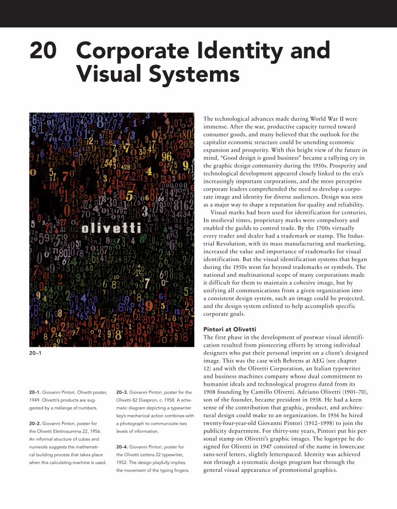
The technological advances made during World War II were immense. After the war, productive capacity turned toward consumer goods, and many believed that the outlook for the capitalist economic structure could be unending economic expansion and prosperity. With this bright view of the future in mind, “Good design is good business” became a rallying cry in the graphic design community during the 1950s. Prosperity and technological development appeared closely linked to the era’s increasingly important corporations, and the more perceptive corporate leaders comprehended the need to develop a corpo-rate image and identity for diverse audiences. Design was seen as a major way to shape a reputation for quality and reliability. Visual marks had been used for identification for centuries. In medieval times, proprietary marks were compulsory and enabled the guilds to control trade. By the 1700s virtually every trader and dealer had a trademark or stamp. The Indus-trial Revolution, with its mass manufacturing and marketing, increased the value and importance of trademarks for visual identification. But the visual identification systems that began during the 1950s went far beyond trademarks or symbols. The national and multinational scope of many corporations made it difficult for them to maintain a cohesive image, but by unifying all communications from a given organization into a consistent design system, such an image could be projected, and the design system enlisted to help accomplish specific corporate goals.
Pintori at OlivettiThe first phase in the development of postwar visual identifi-cation resulted from pioneering efforts by strong individual designers who put their personal imprint on a client’s designed image. This was the case with Behrens at AEG (see chapter 12) and with the Olivetti Corporation, an Italian typewriter and business machines company whose dual commitment to humanist ideals and technological progress dated from its 1908 founding by Camillo Olivetti. Adriano Olivetti (1901–70), son of the founder, became president in 1938. He had a keen sense of the contribution that graphic, product, and architec-tural design could make to an organization. In 1936 he hired twenty-four-year-old Giovanni Pintori (1912–1998) to join the publicity department. For thirty-one years, Pintori put his per-sonal stamp on Olivetti’s graphic images. The logotype he de-signed for Olivetti in 1947 consisted of the name in lowercase sans-serif letters, slightly letterspaced. Identity was achieved not through a systematic design program but through the general visual appearance of promotional graphics.
20 Corporate Identity and Visual Systems
20–1
20–1. Giovanni Pintori, Olivetti poster,
1949. Olivetti’s products are sug-
gested by a mélange of numbers.
20–2. Giovanni Pintori, poster for
the Olivetti Elettrosumma 22, 1956.
An informal structure of cubes and
numerals suggests the mathemati-
cal building process that takes place
when this calculating machine is used.
20–3. Giovanni Pintori, poster for the
Olivetti 82 Diaspron, c. 1958. A sche-
matic diagram depicting a typewriter
key’s mechanical action combines with
a photograph to communicate two
levels of information.
20–4. Giovanni Pintori, poster for
the Olivetti Lettera 22 typewriter,
1952. The design playfully implies
the movement of the typing fi ngers.
21_9780470168738-ch20.indd 41221_9780470168738-ch20.indd 412 9/9/11 8:50 PM9/9/11 8:50 PM

413Design at CBS
In one of Pintori’s most celebrated posters (Fig. 20–1) Olivetti’s mission is subtly implied by a collage created solely from numbers and the company logo. Pintori’s ability to generate graphic metaphors for technological processes is shown in a 1956 poster for the Olivetti Elettrosumma 22 (Fig. 20–2). There is a casual and almost relaxed quality to Pintori’s organization of space. Even his most complex designs have a feeling of simplicity, because he is able to combine small elements into unified structures through a repetition of size and visual rhythms. This complexity of form was well suited to Olivetti’s publicity needs during the 1940s and 1950s, for the firm sought a high-technology image to promote advanced industrial design and engineering. Pintori was particularly adept at using simplified graphic shapes to visualize mecha-nisms and processes (Fig. 20–3). His abstract configurations often playfully suggest the function or purpose of the product being advertised (Fig. 20–4). Olivetti received international recognition for its commitment to design excellence.
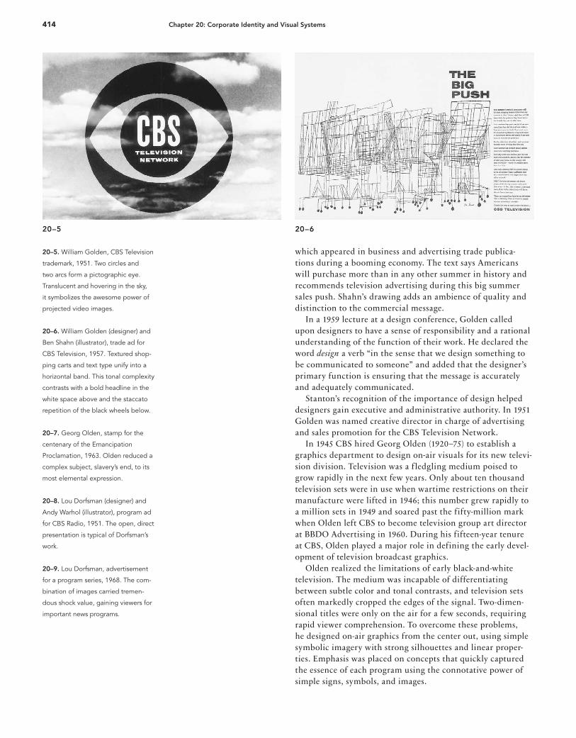
Design at CBS The Columbia Broadcasting System (CBS) of New York City moved to the forefront of corporate identity design as a result of two vital assets: CBS president Frank Stanton (1908–2006), who understood art and design and their potential in corpo-rate affairs, and William Golden (1911–59), the CBS art direc-tor for almost two decades. Golden brought uncompromising visual standards and keen insight into the communications process. The effectiveness of the CBS corporate identity did not depend on a regimented design program or application of specific graphic elements, such as a single corporate typeface, to all corporate communications. Rather, the quality and intelligence of each successive design solution enabled CBS to establish an ongoing and successful corporate identity.
Golden designed one of the most successful trademarks of the twentieth century for CBS (Fig. 20–5). When the pictographic CBS eye first appeared as an on-air logo on 16 November 1951, it was superimposed over a cloud-filled sky and projected an almost surreal sense of an eye in the sky. After one year, Golden suggested to Frank Stanton that they might abandon the eye and seek another logo. Stanton re-minded Golden of the old advertising adage, “Just when you’re beginning to get bored with what you have done is probably the time it is beginning to be noticed by your audience.” The eye remained. In applying this trademark to the corporation’s printed material, from shipping labels to press releases, care and concern were used in even the most modest graphic designs. Dogmatic consistency in how the CBS trademark was used was not considered necessary. It was used in print with a variety of different company signatures, and Golden and his staff avoided forcing it where it did not belong. Even in printed advertising, it was sometimes omitted if it conflicted with the rest of the design. The effectiveness of the CBS symbol demonstrated to the larger management community that a contemporary graphic mark could compete successfully with more traditional illustrative or alphabetic trademarks. A corporate philosophy and approach to advertising emerged in the late 1940s and early 1950s. Advertising was created not by an outside agency but by internal staff; this permitted CBS to maintain a unified approach to advertising and other graphics. Fine artists including Feliks Topolski, René Bouche, and Ben Shahn were commissioned to create illustrations for CBS advertisements. The climate of creative freedom encouraged them to accept these commissions and resulted in a high level of artistry compared to typical news-paper and trade publication advertisements of the period. A classic example of this approach is “The Big Push” (Fig. 20–6),
20–2 20–3 20–4
21_9780470168738-ch20.indd 41321_9780470168738-ch20.indd 413 9/9/11 8:50 PM9/9/11 8:50 PM
414 Chapter 20: Corporate Identity and Visual Systems
which appeared in business and advertising trade publica-tions during a booming economy. The text says Americans will purchase more than in any other summer in history and recommends television advertising during this big summer sales push. Shahn’s drawing adds an ambience of quality and distinction to the commercial message. In a 1959 lecture at a design conference, Golden called upon designers to have a sense of responsibility and a rational understanding of the function of their work. He declared the word design a verb “in the sense that we design something to be communicated to someone” and added that the designer’s primary function is ensuring that the message is accurately and adequately communicated. Stanton’s recognition of the importance of design helped designers gain executive and administrative authority. In 1951 Golden was named creative director in charge of advertising and sales promotion for the CBS Television Network. In 1945 CBS hired Georg Olden (1920–75) to establish a graphics department to design on-air visuals for its new televi-sion division. Television was a f ledgling medium poised to grow rapidly in the next few years. Only about ten thousand television sets were in use when wartime restrictions on their manufacture were lifted in 1946; this number grew rapidly to a million sets in 1949 and soared past the fifty-million mark when Olden left CBS to become television group art director at BBDO Advertising in 1960. During his fifteen-year tenure at CBS, Olden played a major role in defining the early devel-opment of television broadcast graphics. Olden realized the limitations of early black-and-white television. The medium was incapable of differentiating between subtle color and tonal contrasts, and television sets often markedly cropped the edges of the signal. Two-dimen-sional titles were only on the air for a few seconds, requiring rapid viewer comprehension. To overcome these problems, he designed on-air graphics from the center out, using simple symbolic imagery with strong silhouettes and linear proper-ties. Emphasis was placed on concepts that quickly captured the essence of each program using the connotative power of simple signs, symbols, and images.
20–5 20–6
20–5. William Golden, CBS Television
trademark, 1951. Two circles and
two arcs form a pictographic eye.
Translucent and hovering in the sky,
it symbolizes the awesome power of
projected video images.
20–6. William Golden (designer) and
Ben Shahn (illustrator), trade ad for
CBS Television, 1957. Textured shop-
ping carts and text type unify into a
horizontal band. This tonal complexity
contrasts with a bold headline in the
white space above and the staccato
repetition of the black wheels below.
20–7. Georg Olden, stamp for the
centenary of the Emancipation
Proclamation, 1963. Olden reduced a
complex subject, slavery’s end, to its
most elemental expression.
20–8. Lou Dorfsman (designer) and
Andy Warhol (illustrator), program ad
for CBS Radio, 1951. The open, direct
presentation is typical of Dorfsman’s
work.
20–9. Lou Dorfsman, advertisement
for a program series, 1968. The com-
bination of images carried tremen-
dous shock value, gaining viewers for
important news programs.
21_9780470168738-ch20.indd 41421_9780470168738-ch20.indd 414 9/9/11 8:50 PM9/9/11 8:50 PM

415Design at CBS
Olden, the grandson of a slave from a northern Kentucky plantation who escaped to the north as the Civil War broke out and eventually joined the Union army, was the first Afri-can American to achieve prominence as a graphic designer. He accomplished this in the era before the civil rights movement, when few blacks held professional positions in America. Reyn-olds Ruffins (b. 1930), another African American to achieve early prominence in graphic design, was a founding partner of Push Pin Studios (see Fig. 21–17).
The United States Postal Service commissioned Olden to de-sign a postage stamp for the one hundredth anniversary of the Emancipation Proclamation (Fig. 20–7), making him the fi rst African American designer accorded the honor of designing a United States postage stamp. Olden’s stamp design possesses the economy and directness of his television graphics. Lou Dorfsman (1918–2008) became art director for CBS Radio in 1946. He combined conceptual clarity with a straightforward and provocative visual presentation (Fig. 20–8). Typography and image were arranged in well-ordered relationships using blank space as a design element. In 1954, he was named director of advertising and promotion for the CBS Radio Network. As its art director during the 1950s, Dorfsman forged a design approach that combined a pragmatic sense of effective communication with imaginative problem solving. He did not advocate continuity in typefaces, spatial layouts, or imagery; rather, the high quality of his so-lutions to communications problems during his four decades with CBS enabled him to project an exemplary image for the corporation. After Golden’s sudden death at age forty-eight, Dorfsman became the creative director of CBS Television (Fig. 20–9). He was named director of design for the entire CBS Corpora-tion in 1964 and vice president in 1968, which kept with
20–7
20–8
20–9
21_9780470168738-ch20.indd 41521_9780470168738-ch20.indd 415 9/9/11 8:50 PM9/9/11 8:50 PM
416 Chapter 20: Corporate Identity and Visual Systems
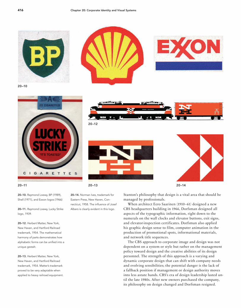
Stanton’s philosophy that design is a vital area that should be managed by professionals. When architect Eero Saarinen (1910–61) designed a new CBS headquarters building in 1966, Dorfsman designed all aspects of the typographic information, right down to the numerals on the wall clocks and elevator buttons, exit signs, and elevator-inspection certificates. Dorfsman also applied his graphic design sense to film, computer animation in the production of promotional spots, informational materials, and network title sequences. The CBS approach to corporate image and design was not dependent on a system or style but rather on the management policy toward design and the creative abilities of its design personnel. The strength of this approach is a varying and dynamic corporate design that can shift with company needs and evolving sensibilities; the potential danger is the lack of a fallback position if management or design authority moves into less astute hands. CBS’s era of design leadership lasted un-til the late 1980s. After new owners purchased the company, its philosophy on design changed and Dorfsman resigned.
20–10
20–11 20–1420–13
20–12
20–10. Raymond Loewy, BP (1989),
Shell (1971), and Exxon logos (1966)
20–11. Raymond Loewy, Lucky Strike
logo, 1939.
20–12. Herbert Matter, New York,
New Haven, and Hartford Railroad
trademark, 1954. The mathematical
harmony of parts demonstrates how
alphabetic forms can be unifi ed into a
unique gestalt.
20–13. Herbert Matter, New York,
New Haven, and Hartford Railroad
trademark, 1954. Matter’s trademark
proved to be very adaptable when
applied to heavy railroad equipment.
20–14. Norman Ives, trademark for
Eastern Press, New Haven, Con-
necticut, 1958. The infl uence of Josef
Albers is clearly evident in this logo.
21_9780470168738-ch20.indd 41621_9780470168738-ch20.indd 416 9/9/11 8:50 PM9/9/11 8:50 PM
417Corporate identifi cation comes of age
Like Stanton, Raymond Loewy (1893–1986) recognized the signifi cance of comprehensive design systems, and he left an indelible mark on America’s history of visual styling. His streamlined and moderne aesthetic can be seen across a range of industrial products, packaging, architecture, interiors, and corporate identities. He fi rst gained attention through his industrial product design with a commission for British manu-facturer Sigmund Gestetner. Loewy’s Gestetner mimeograph machine emphasized the form by hiding the device’s messy inner mechanics inside a smooth paneled exterior. The look and concept became the genesis of a new streamlined aesthetic. Future industrial designs emphasized this smoothness and sensuousness of form. Loewy’s forms followed function, if only symbolically, as his streamlined aesthetic suggested speed, economy, and modernity. Loewy specialized in design for the locomotive and automotive industries, where speed and innovation defined success, and he reimagined how trains, planes, buses, and cars looked and performed. Loewy’s f lashy personality preceded his brilliant design work. Sophisticated and charismatic, he considered himself a visionary and an impresario of good design across a number of mediums. His persona remained an ongoing design project, as he tailored his appearance and refined his artistic vision, mak-ing his voice heard across a broad design spectrum. Through this effort, he changed the way industrial designers engaged with corporate design culture by assuming more control over entire industrial and visual campaigns. Product designs for blue chip companies—BP, Shell, Exxon, (Fig. 20–10) Nabisco, US Mail, Studebaker, Lucky Strike (Fig. 20–11), Canada Dry, and TWA—were not limited to packaging or industrial objects but also included complete identity designs. When New York Railroad hired Loewy to redesign one if its locomotives, he also designed the interiors, menus for table service, and matchbooks. Loewy defined and pursued areas of growth in even more comprehensive systems and processes via his industrial design work. Loewy initiated a study of his audience—the public—as he aimed to define their needs and wants. This analysis affected the way he introduced designs into consumer culture. Loewy expertly negotiated the balance between familiarity and innovation, as he developed his Most Advanced Yet Accept-able (MAYA) credo. While he endeavored to deliver the most advanced product, he recognized the point at which unfa-miliarity bred undesirability. With respect to his corporate identity work he said: “I’m looking for a very high index of visual retention. We want anyone who has seen the logotype, even f leetingly, to never forget it.” Loewy’s work of the twentieth century is hard to forget; he succeeded in leaving a lasting impression. His designs not only are recognizable at a f leeting glance but also have endured the test of time.
The New Haven Railroad design program A short-lived but highly visible corporate identity effort occurred in 1954, when Patrick McGinnis, president of the New York, New Haven, and Hartford Railroad, launched a
corporate design program. The New Haven Railroad was in the midst of a technological updating, with new engines, cars, and signal systems. McGinnis believed a contemporary logo and design program, replacing the old logotype and olive-green and Tuscan-red color scheme, would enable the firm to project a modern and progressive image to industry and passengers. Herbert Matter was commissioned to design the new trademark. He developed a geometric capital N above an H and a red, black, and white color scheme (Figs. 20–12 and 20–13). The traditional industrial feeling of slab-serif type, long associated with the railroad industry, was updated for a more modern look, based on the mathematical harmony of parts. Marcel Breuer was commissioned to design the interiors and exteriors of the new trains. Using Matter’s color scheme and logo, Breuer designed a passenger train that looked like a Russian constructivist painting roaring along the New Haven’s 2,700 kilometers (1,700 miles) of track. The dingy gray and earth tones previously used for freight cars were replaced by solid red or black. Plans called for implementation of a com-prehensive corporate-identity program encompassing every-thing from stations to matchbooks, but the commuter railroad developed financial problems and suffered from a consumer uprising against its late trains, poor scheduling, and rising fares. On 20 January 1956, McGinnis resigned as president, and the corporate-identity program came to an abrupt halt. However, the new management continued to apply the logo and color scheme whenever possible. Printed pieces designed by Matter offered a degree of guidance, and the strength of the logo and color scheme provided some semblance of continuity. Norman Ives (1923–1978) is one of the long-neglected masters of corporate image design (Fig. 20–14). His carefully constructed logos clearly reflect the teachings of one of his principal mentors, Josef Albers. In 1960, Ives described the designer’s mission in logo design:
A symbol is an image of a company, an institution or an idea that should convey with a clear statement or by sug-gestion the activity it represents. . . . The symbol, besides being memorable and legible, must be designed so that it can be used in many sizes and situations without losing its identity. The designer must distort, unify, and create a new form for the letter, so that it is unique and yet has the necessary attributes of the letter for recognition. There is no part of a symbol that can be eliminated with-out destroying the image it creates. It is a true gestalt, in which the psychological effect of the total image is greater than the sum of its parts would indicate.
Corporate identification comes of age While World War II left most industrial countries devastated, the manufacturing capacity of the United States escaped undamaged. An era of unprecedented industrial expansion began, with large corporations playing an important role in developing and marketing products and services. During the 1950s and 1960s many American designers—including Rand,
21_9780470168738-ch20.indd 41721_9780470168738-ch20.indd 417 9/9/11 8:50 PM9/9/11 8:50 PM

418 Chapter 20: Corporate Identity and Visual Systems
Beall, Bass, and design firms such as Lippincott & Margules and Chermayeff & Geismar—embraced corporate visual identification as a major design activity. After playing a pivotal role in the evolution of American graphic and advertising design during the 1940s and early 1950s, Rand became more involved in trademark design and visual identification systems in the mid-1950s. He realized that to be functional over a long period of time, a trademark should be reduced to elementary shapes that are universal, visually unique, and stylistically timeless. Rand’s trademark for International Business Machines (Fig. 20–15) was developed from an infrequently used typeface called City Medium, designed by Georg Trump (1896–1985) in 1930. This geometric slab-serif typeface was designed along lines similar to Futura. Redesigned into the IBM corporate logo, it was transformed into a powerful and unique alphabet image, for the slab serifs and square negative spaces in the B lent the trademark unity and distinction. In the 1970s Rand updated the logo by introducing stripes to unify the three letterforms and evoke scan lines on video terminals. Package designs by Rand
20–15 20–16 20–17
20–18 20–19
20–15. Paul Rand, IBM trademark,
1956. The original design is shown
with outline versions and the eight-
and thirteen-stripe versions currently
used.
20–16. Paul Rand, IBM package de-
signs, late 1950s. A strong corporate
identifi cation was achieved through
a repeating pattern of blue, green,
and magenta capital letters on black
package fronts, white handwritten
product names, and blue package
tops and sides.
20–17. Paul Rand, IBM package
design, 1975. After two decades, the
original packaging design program
was replaced by an updated design
using the eight-stripe logo.
20–18. Paul Rand, “Eye Bee M”
poster, 1981. Using the rebus prin-
ciple, Rand designed this poster for
the presentation of the Golden Circle
award, an in-house IBM occasion.
Although Rand eventually prevailed,
it was temporarily banned, as it was
felt that it would encourage IBM staff
designers to take liberties with the
IBM logo.
20–19. Paul Rand, The IBM Logo: Its
Use in Company Identifi cation, 1996.
In this exuberant cover the IBM logo
resembles exploding fi reworks.
21_9780470168738-ch20.indd 41821_9780470168738-ch20.indd 418 9/9/11 8:50 PM9/9/11 8:50 PM

419Corporate identifi cation comes of age
show the application of the logo in the 1950s (Fig. 20–16) and after its redesign in the 1970s (Fig. 20–17). Rand’s 1981 “Eye Bee M” poster (Fig. 20–18) and the playful cover for the 1996 booklet The IBM Logo: Its Use in Company Identifi cation (Fig. 20–19) demonstrates that he was prepared to divert from the original logo when a design concept called for it. Eliot Noyes (1910–77), IBM’s consulting design director during the late 1950s, wrote that the IBM design program sought “to express the extremely advanced and up-to-date nature of its products. To this end we are not looking for a theme but for a consistency of design quality which will in effect become a kind of theme, but a very f lexible one.” The IBM design program was f lexible enough to avoid stif ling the creativity of designers working within the guidelines of the program. The model developed by IBM, with design con-sultants such as Rand and internal staff design departments whose managers have the authority to maintain the corporate visual identity, produced an evolving design program of consistently high quality. Jon Craine (b. 1940) was one of the two lead graphic designers in the White Plains, New York, office from 1979 through 1988. Among other assignments, this office was responsible for product announcements for the Data Products Division (DPD), IBM’s largest product sector. Craine’s “Buy U.S. Savings Bonds” poster from 1979 was designed while he was working for the White Plains office on a freelance basis before joining its staff (Fig. 20–20), and his poster for the IBM “Selectric” III typewriter was designed when he was employed by IBM (Fig. 20–21). After a 1959 study of the “public faces” of the Westinghouse Corporation, a decision was made to redesign its “Circle-W” trademark. Rand was commissioned to symbolically incor-porate the nature of the company’s business in a new mark that would be simple, memorable, and distinct (Fig. 20–22). General graphic forms, rather than specific signs or symbols, suggest Westinghouse products by evoking wires and plugs, electronic diagrams and circuitry, and molecular structures. Rand, who also developed a typeface for Westinghouse, applied these new elements to packaging, signage, and advertising.
20–20
20–21
20–20. Jon Craine, companywide
poster to promote IBM’s annual U.S.
Savings Bond initiative for employees.
“Save for a Sunny Day” (also written
by Craine) was the theme, and the
graphic landscape was inspired by the
IBM stripes.
20–21. Jon Craine, Offi ce Products
Division poster to announce IBM’s
latest “Selectric” III typewriter, 1982.
This was designed for the Noyes of-
fi ce, and the arrows playfully echo the
vertical stress of the document rest on
the typewriter.
21_9780470168738-ch20.indd 41921_9780470168738-ch20.indd 419 9/9/11 8:50 PM9/9/11 8:50 PM

20–22 20–23 20–24
20–25
20–22. Paul Rand, Westinghouse
trademark, 1960. This mark is shown
as it might be constructed in an
animated fi lm sequence.
20–23. Paul Rand, American Broad-
casting Company trademark, 1965.
The continuing legacy of the Bauhaus
and Herbert Bayer’s universal alpha-
bet informs this trademark, in which
each letterform is reduced to its most
elemental confi guration.
20–24. Paul Rand, NeXT trade-
mark, 1986. The four-letter name is
separated into two lines to startle the
viewer by giving a common word an
uncommon image.
20–25. Paul Rand, IBM annual report,
1958. Advanced technology and or-
ganizational effi ciency were expressed
through design.
420 Chapter 20: Corporate Identity and Visual Systems
21_9780470168738-ch20.indd 42021_9780470168738-ch20.indd 420 9/9/11 8:50 PM9/9/11 8:50 PM

421Corporate identifi cation comes of age
Rand’s 1965 redesign of the trademark for the American Broadcasting Company (Fig. 20–23) reduced the information to its essence while achieving a memorable and unique image. The NeXT computer logo (Fig. 20–24) was designed in 1986 after IBM agreed to loan its longtime design consultant to a competitive computer company. The black box at a twenty-eight-degree angle signified the NeXT computer, which itself looked like a black box. The annual report to stockholders, a legal publication required by federal law, evolved from a dry financial report into a major communications instrument during the postwar period. Landmarks in this evolution include the IBM annual reports designed by Rand during the late 1950s. The 1958 IBM annual report (Fig. 20–25) established a standard for corporate literature. Imagery included close-up photography of elec-tronic components that almost became abstract patterns, and simple dramatic photographs of products and people. Lester Beall helped launch the modern movement in American design during the late 1920s and early 1930s. Dur-ing the last two decades of his career, he created pioneering corporate-identity programs for many companies, including Martin Marietta, Connecticut General Life Insurance, and International Paper Company. He also contributed to the development of the corporate-identity manual, a firm’s book
of guidelines and standards for implementing its program. Beall’s manuals specifically prescribed the permissible uses and forbidden abuses of the trademark. If a plant manager in a small town retained a sign painter to paint the trademark and name on a sign, for example, the corporate design manual specified their exact proportions and placement. In discussing his mark designed with Richard Rogers for the International Paper Company, one of the largest paper manufacturers in the world, Beall wrote:
Our assignment was to provide management with a strong mark that could be readily adapted to an immense variety of applications. This ranged from its bold use on the barks of trees to its intricate involvement in repeat patterns, carton designs, labels, and trucks. In addition to its functional strength, the new mark is a powerful force in stimulating and integrating divisional and corporate identity with positive psychological effects on human relations. (Figs. 20–26 and 20–27)
The International Paper Company trademark was initially controversial: the letters I and P are distorted to make a tree symbol, and critics questioned whether letterforms should be altered to this extreme. The continuing viability of this mark since its inception indicates that Beall’s critics were overly cautious. Chermayeff & Geismar Associates moved to the forefront of the corporate-identity movement in 1960 with a compre-hensive visual image program for the Chase Manhattan Bank of New York. Chase Manhattan’s new logo was composed of four geometric wedges rotating around a central square to form an external octagon (Fig. 20–28). It was an abstract form unto itself, free from alphabetic, pictographic, or figurative connotations. Although it had overtones of security or protec-tion because four elements confined the square, it proved a completely abstract form could successfully function as a large organization’s visual identifier. A distinctive sans-serif typeface was designed for use with the logo. The selection of an expanded letter grew out of the firm’s study of the bank’s design and communications needs. Urban signage, for instance, is often seen by pedestrians at extreme angles, but an extended letterform retains its character
20–26 20–27 20–28
20–26. Lester Beall and Richard
Rogers, International Paper Company
trademark, 1960. Initials, tree, and up-
ward arrow combine in a mark whose
fundamental simplicity—an isometric
triangle in a circle—assures a timeless
harmony.
20–27. Lester Beall and Richard
Rogers, International Paper Company
trademark, 1960. For a forest prod-
ucts company, stenciling trees is one
of numerous applications that must
be considered.
20–28. Chermayeff & Geismar
Associates, Chase Manhattan Bank
corporate identity program, 1960.
Consistent use of the mark, color,
and typeface built recognition value
through visual redundancy.
21_9780470168738-ch20.indd 42121_9780470168738-ch20.indd 421 9/9/11 8:50 PM9/9/11 8:50 PM
422 Chapter 20: Corporate Identity and Visual Systems
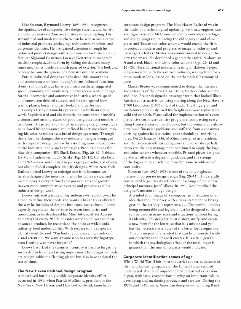
recognition even when viewed under these conditions. The uncommon presence of the expanded sans-serif type in this design system launched a fashion for this kind of letterform during the first half of the 1960s. Consistency and uniformity in the application of both logo and letterform enabled redun-dancy, in a sense, to become a third identifying element. The Chase Manhattan Bank corporate identification system became a prototype for the genre. Other financial institutions seriously evaluated their corporate image and the need for an effective visual identifier. The recognition value gained by the Chase Manhattan mark indicated that a successful logo could, in effect, become an additional character in the inventory of symbolic forms carried in each person’s mind. Tom Geismar observed that a symbol must be memorable and have “some
barb to it that will make it stick in your mind.” At the same time it must be “attractive, pleasant, and appropriate. The chal-lenge is to combine all those things into something simple.” One of Chermayeff & Geismar’s most far-reaching cor-porate design programs was for Mobil Oil, a corporation operating in more than one hundred countries. Executed in an elemental geometric sans-serif typeface, the Mobil Oil trademark is the ultimate in simplicity (Fig. 20–29). The name Mobil is executed in five vertical strokes, the diagonals of the M, and two circles. The name became the trademark, with the round, red O separating it from the visual presentation of other words. Chermayeff & Geismar has produced more than one hundred corporate design programs, including the trademarks illustrated in Figure 20–30. The firm continues to accept a steady stream of smaller projects, such as posters, requiring immediate, innovative solutions. Rather than maintaining de-sign consistency from project to project, the company allows each solution to evolve from its problem. Saul Bass’s mastery of elemental form can be seen in the iconic and widely imitated trademarks produced by his fi rm Saul Bass & Associates, later renamed Saul Bass/Herb Yeager & Associates. Bass believed a trademark must be readily under-stood yet possess elements of metaphor and ambiguity that will attract the viewer again and again. Many Bass trademarks, such as the mark for Minolta, became important cultural icons (Fig. 20–31). Within two years after Bass redesigned the Bell Telephone System trademark, public recognition of the symbol rose from 71 percent to more than 90 percent. After the AT&T long-distance telephone network was split from the local Bell system telephone companies in 1984, Bass designed a new mark to reposition the fi rm as “a global communications company” rather than “the national telephone system,” with information bits circling the globe. This concept was expressed by making computer-graphics animation the identifi cation tag for AT&T television commercials (Fig. 20–32). Muriel Cooper (1925–94) had two careers—the first as a print designer for MIT publications and books, and the second as founder and director of the Visible Language Workshop (VLW). From her student years at Massachusetts College of
20–29
20–30
20–31
20–29. Chermayeff & Geismar Associ-
ates, Mobil Oil trademark, 1964.
20–30. Chermayeff & Geismar As-
sociates, trademarks for (left to right,
top to bottom) the American Film
Institute, 1964; Time Warner, 1990;
the American Revolution Bicentennial,
1971; Screen Gems, 1966; Burling-
ton Industries, 1965; the National
Broadcasting Company, 1986; Rock-
efeller Center, 1985; and the National
Aquarium in Baltimore, 1979.
20–31. Saul Bass & Associates, trade-
mark for Minolta, 1980.
21_9780470168738-ch20.indd 42221_9780470168738-ch20.indd 422 9/9/11 8:50 PM9/9/11 8:50 PM

423Programmed visual identifi cation systems
Art, she was fascinated with animation and pushing the bor-der between the static medium of print and the x, y, and z axes of the computer screen. In 1963 she designed the MIT Press logo, a series of vertical lines suggesting half a dozen books on a shelf, and spelling out a gestalt M I T (Fig. 20–33). Cooper designed more than five hundred books, includ-ing the seminal 1969 Bauhaus, by Hans Wingler, perhaps her best-known design (Fig. 20–34). This was the first complete Bauhaus book in English. After the enthusiastic reception the authoritative text received, Cooper made a film version of the thick Bauhaus, a speed-reading version of what one design historian has dubbed the King James Version. It was Cooper’s pursuit of dynamic media that led to the 1978 founding of the VLW at MIT, which she said was an attempt to re-create the atmosphere of Paris in the 1920s. In the VLW, where workstations were in the open, Cooper encouraged
her interdisciplinary graduate students to formulate good questions rather than pat answers. While most graphic designers were limited to off-the-shelf software, Cooper’s work was accelerated by powerful comput-ers at MIT that allowed her to create almost anything she could imagine. She was the first graphic designer to employ such new electronic media as 3-D text, which allowed vast amounts of complex data to be read in context, the top layer sharp, the layers below successively lighter. In this way, she was able to combine the traditional x and y axes of the f lat screen with the z axes of depth, but she did not stop there. Trusting her designer’s eye, she pushed her programmers for additional tools—color, transparency, and eventually type that could pulse and move. Her goal, until her untimely death in 1994, was to move graphic design from form to content; to create clear, compelling communication that could be plucked and digested from an ocean of print and the electronic sea of the World Wide Web. Cooper was also a founding member of the MIT Media Lab (1985), perhaps the most advanced gradu-ate research program on new media in the world.
Programmed visual identification systemsDuring the 1960s, the impetus of the International Typo-graphic Style and the visual-identity movement joined with the development of highly systematic design programs to combine complex and diverse parts into a unified whole. The 1962 Lufthansa German Airlines identification system was conceived and produced at the Ulm Institute of Design. The principles of the International Typographic Style were extended into a design program addressing all visual-commu-nication and product-design needs of a large corporation. Otl Aicher designed this program in collaboration with Tomás Gonda (1926–88), Fritz Querengässer (1906–79), and
20–32
20–32. Saul Bass & Associates, AT&T
computer graphics animation identi-
fi cation tag, 1984. A spinning globe
gathers electronic bits of informa-
tion, then transforms into the AT&T
trademark.
20–33. Muriel Cooper, MIT Press
logo, 1963. Vertical lines imply books
and can be read as mitp.
20–33
21_9780470168738-ch20.indd 42321_9780470168738-ch20.indd 423 9/9/11 8:50 PM9/9/11 8:50 PM

424 Chapter 20: Corporate Identity and Visual Systems
Nick Roericht (b. 1932). Aicher believed a large organization could achieve a uniform, and thus significant, corporate image by systematically controlling the use of constant elements. A f lying crane trademark used since the 1930s was retained but enclosed in a circle and subordinated to the name Lufthansa in a consistent letterspacing arrangement (Fig. 20–35). The company’s air-freight service combined the crane icon with an isometric package and bold lines to create an arrow configuration (Fig. 20–36). Grid systems and detailed typographic specifications were worked out to take into account every visual communications need, from food service packaging to timetables and aircraft identification. The Lufthansa corporate-identity program became an inter-national prototype for the closed identity system, with every detail and specification addressed for absolute uniformity. The Container Corporation of America (CCA) became an early advocate of systematic corporate identity in the 1960s. A new corporate logo (Fig. 20–37) was created by design director Ralph Eckerstrom (c. 1920–96) and his staff. The corporate ini-tials were packaged in a rectangle with two corners shaved at a forty-five-degree angle to imply an isometric box. Eckerstrom stated the requirements of a corporate identification program:
As a function of management, design must be an integrated part of overall company operation and directly related to the company’s business and sales activities. It must have continuity as a creative force. It must refl ect total corporate character. Unless it meets these requirements, the company
20–34
20–35 20–36
20–37
20–34. Muriel Cooper, cover for Bau-
haus, by Hans Wingler, 1969.
20–35. Otl Aicher in collaboration
with Tomás Gonda, Fritz Queren-
gässer, and Nick Roericht, pages from
the Lufthansa identity manual, 1962.
All typographic details were rigorously
specifi ed.
20–36. Otl Aicher in collaboration
with Tomás Gonda, Fritz Querengäss-
er, and Nick Roericht, page from the
Lufthansa identity manual, 1962. The
supercargo double trademark gains
unity through consistent line weight.
20–37. Ralph Eckerstrom, trademark
for Container Corporation of America,
1957. A fl at image becomes an
isometric optical illusion, signifying
packaging while provoking visual
interest.
21_9780470168738-ch20.indd 42421_9780470168738-ch20.indd 424 9/9/11 8:50 PM9/9/11 8:50 PM

425The Federal Design Improvement Program
image it seeks to create will never coalesce into a unifi ed whole, but will remain a mosaic of unrelated fragments.
The “Great Ideas of Western Man” advertising campaign had varied widely in its typographic approaches during the 1950s; now it entered a two-decade period of typographic continuity. In 1964 CCA established the Center for Advanced Research in Design, an independent design studio that worked on advanced and experimental projects and received com-missions from other organizations. The center developed a comprehensive visual identification system for Atlantic Richfield, a major petroleum products company whose name later changed to Arco. CCA was purchased by Mobil Oil in 1976 and sold to the Jefferson Smurfit company in 1986. Decentralized and lacking an autonomous identity, CCA’s era as a design patron drifted to a close. Unimark, an international design firm that grew to 402 employees in forty-eight design offices around the world, was founded in Chicago in 1965 by a group of partners including Ralph Eckerstrom (1922-1996), James K. Fogleman (b. 1919), and Massimo Vignelli (b. 1931). Unimark rejected individual-istic design and believed that design could be a system, a basic structure set up so that other people could implement it ef-fectively. The basic tool for this effort was the grid, standard-izing all graphic communications for dozens of large Unimark clients, including Alcoa, Ford Motor Company, JCPenney, Memorex, Panasonic, Steelcase, and Xerox. Helvetica was the preferred typeface for all Unimark visual identity systems, as it was considered the most legible type family. Objectivity was Unimark’s goal as it spread a generic conformity across the face of multinational corporate communications. The design programs it created were rational and so rigorously systematized that they became virtually foolproof as long as the standards were maintained.
The graphic excellence of Unimark design programs can be seen in the Knoll program (Fig. 20–38), directed by Massimo Vignelli, who was Unimark’s director of design and head of the New York office. This program set the standard for furniture-industry graphics for years to come. But Unimark’s far-f lung design empire—with offices in major North Ameri-can cities, England, Australia, Italy, and South Africa—proved vulnerable to the effects of recession in the early 1970s, and a retrenchment process began. The Unimark philosophy continued as its founders and the legion of designers they trained continued to implement its ideals. When the New York office closed, Massimo and Leila Vignelli founded Vignelli Associates in 1971. Their typograph-ic range expanded beyond Helvetica to include such classical faces as Bodoni, Century, Garamond, and Times Roman, but the rational order of grid systems and emphasis on lucid and objective communication remained a constant. Vignelli continues to put his imprint on the evolution of information design.
The Federal Design Improvement Program In May 1974, the United States government initiated the Fed-eral Design Improvement Program in response to a growing awareness that design could be an effective tool for achieving objectives. This initiative was coordinated by the Architectural and Environmental Arts Program (later renamed the Design Arts Program) of the National Endowment for the Arts. All aspects of federal design, including architecture, interior space planning, landscaping, and graphic design, were upgraded under the program. The Graphics Improvement Program, un-der the direction of Jerome Perlmutter, set out to improve the quality of visual communications and the ability of govern-ment agencies to communicate effectively to citizens.
20–38
20–38. Massimo Vignelli and the
Unimark New York offi ce staff, Knoll
Graphics, 1966–1970s. Knoll is
renowned for furniture design, so the
graphic program signifi ed a strong
design orientation.
21_9780470168738-ch20.indd 42521_9780470168738-ch20.indd 425 9/9/11 8:50 PM9/9/11 8:50 PM

426 Chapter 20: Corporate Identity and Visual Systems
The prototype federal graphic standards system was de-signed by John Massey for the Department of Labor. Problems identified by this case study included outmoded, unrespon-sive, and impersonal images, a lack of uniform and effective communications policies, and insufficient image continuity. Massey’s goals for the new design program were “uniformity of identification; a standard of quality; a more systematic and economic template for publication design; a closer relationship between graphic design (as a means) and program development (as an end) so that the proposed graphics system will become an effective tool in assisting the department to achieve program objectives.”
A graphic standards manual established a cohesive system for visual identification and publication formats. Standards for format sizes, typography, grid systems, paper specifica-tions, and colors realized tremendous economies in material and time. These standards, however, were carefully structured so that the creativity and responsiveness to each communica-tions project would not be seriously hampered. With the mechanics of the printing and format predetermined, Depart-ment of Labor staff designers were able to devote their time to the creative aspects of the problem at hand. The Department of Labor communications mark (Fig. 20–39) is composed of two interlocking Ls that form a dia-mond configuration around a star. A set of publication format sizes provided economy of production and minimized paper waste, while a series of grid systems and uniform typographic specifications ensured consistency. Routine printed materi-als, including stationery, envelopes, and forms, were given standardized formats. Over forty federal departments and agencies initiated visual identification programs, and many of the leading designers in America were called upon to develop them. One of the most successful is the Unigrid system, developed in 1977 for the United States National Park Service by Vignelli Associates in collaboration with the Park Service Division of Publications, headed by Vincent Gleason. The Unigrid (Fig. 20–40) unified the hundreds of informa-tional folders used at about 350 national park locations. It is based on simple basic elements: ten format sizes, all derived from the Unigrid; broadside or full-sheet presentation of the folders, instead of layouts structured on folded panels; black title bands with park names serving as logotypes; horizontal organization of illustrations, maps, and text; standardized typographic specifications; and a master grid coordinating design in the studio with production at the printing plant.
20–39. John Massey, trademark for
the U.S. Department of Labor, 1974.
Stripes on the L forms suggest the
American fl ag’s stars and stripes.
20–40. Massimo Vignelli (consulting
designer), Vincent Gleason (art direc-
tor), and Dennis McLaughlin (graphic
designer), Unigrid system for the
National Park Service, 1977.
20–41. National Park Service publica-
tions staff, including Vincent Gleason
(chief) and designers Melissa Cronyn,
Nicholas Kirilloff, Dennis McLaughlin,
Linda Meyers, Phillip Musselwhite,
and Mitchell Zetlin, publication cre-
ated with the Unigrid, 1977–90.
20–39 20–40 20–41
20–42. Various artists/designers,
nineteen fi rst aid symbols from vari-
ous systems throughout the world.
Semantic, syntactic, and pragmatic
values of existing programs were
evaluated.
20–43. Roger Cook and Don
Shanosky, signage symbol system
for the U.S. Department of Transpor-
tation, 1974. This poster introduced
the thirty-four symbols to a wide
audience.
21_9780470168738-ch20.indd 42621_9780470168738-ch20.indd 426 9/9/11 8:50 PM9/9/11 8:50 PM

427Transportation signage symbols
Typography is restricted to Helvetica and Times Roman in a limited number of sizes and weights. The standardized format of the Unigrid enables the Park Service publications staff to focus on achieving excellence in the development and presentation of pictorial and typographic information (Fig. 20–41). The program proved so successful that a format was also developed for the Park Service’s series of 150 handbooks. To attract outstanding architects and designers to gov-ernment service, traditional civil service procedures were supplemented by portfolio reviews conducted by professionals. Designers were recruited by a publicity campaign with the theme “Excellence attracts excellence.” However, by 1980 momentum for federal design excellence became a casualty of tax cuts and huge federal deficits. Many established design programs for such agencies as the Park Service were main-tained, while others sank back toward mediocrity.
Transportation signage symbols Major international events, large airports, and other trans-portation facilities handling international travelers have commissioned graphic designers to create pictographic signage programs to communicate important information and direc-tions quickly and simply. The development of these sign-and-symbol systems involved considerable time and expense, and near duplication of effort often occurred. In 1974, the United States Department of Transportation commissioned the American Institute of Graphic Arts (AIGA), the nation’s oldest professional graphic design organization, to create a master set of thirty-four passenger and pedestrian-oriented symbols for use in transportation facilities. The goal was a consistent and interrelated group of symbols for worldwide transportation facilities meant to bridge language barriers and simplify basic messages.
The first step was the compilation and inventory of symbol systems developed for individual transportation facilities and international events (Fig. 20–42). A committee of five promi-nent graphic designers, headed by Thomas H. Geismar, acted as evaluators and advisers on the project. The Department of Transportation provided the AIGA with a list of message areas. Prior solutions to the thirty-four subject areas were evaluated by each member of the advisory committee, and a summary recommendation was prepared to guide the design of the symbol system. Some existing symbols were retained, while in other categories totally new glyphs were developed, with clarity of image their overriding goal. The final set of symbols (Fig. 20–43) was designed and drawn by Roger Cook (b. 1930) and Don Shanosky (b. 1937) of Cook and Shanosky Associates in Princeton, New Jersey. These signs combined overall harmony with a visual consistency of line, shape, weight, and form. This effort represented an important first step toward the goal of unified and effective graphic com-munications transcending cultural and language barriers in a shrinking world. A 288-page book published by the Depart-ment of Transportation provided invaluable information about the design and evaluation process used to arrive at the system.
20–42
20–43
21_9780470168738-ch20.indd 42721_9780470168738-ch20.indd 427 9/9/11 8:51 PM9/9/11 8:51 PM

428 Chapter 20: Corporate Identity and Visual Systems
Design systems for the Olympic Games By the early 1960s, the concept of comprehensive design systems was becoming a reality. Planners realized that com-prehensive planning for large organizations and events was not only functional and desirable but also necessary. This was particularly true in the case of international events, includ-ing world’s fairs and Olympic Games, where an international and multilingual audience had to be directed and informed. Among many outstanding efforts, the design programs for the 1964 Tokyo Eighteenth Olympiad, 1968 Mexico City Nineteenth Olympiad, the 1972 Munich Twentieth Olympiad, the 1984 Los Angeles Twenty-Third Olympiad, and the 2008 Beijing Twenty-Ninth Olympiad were milestones in the evolu-tion of graphic systems. In the summer of 1964, Tokyo hosted the eighteenth Olympic Games. The 1964 Summer Games was the first use of a comprehensive identity program, setting a standard for all subsequent games. Masaru Katzumie (art director) and Yusaku Kamekura (graphic designer) were the creative visionaries and team leaders behind this remarkable project. The focus of their research efforts was on an internationally standardized signage system based on their concern with
20–44. Masaru Katzumie (art director),
Yusaku Kamekura (designer), and their
staff, twenty comprehensive multi-
sport symbols for the Tokyo Olym-
piad, 1964. The complete pictogram
system, comprising twenty multisport
symbols and thirty-nine general infor-
mation pictograms, were drawn using
a square fi eld with a grid.
20–45. Masaru Katzumie (art director),
Yusaku Kamekura (designer), and their
staff, thirty-nine general information
pictograms for the Tokyo Olympiad,
1964. The pictograms were designed
for instant identifi cation by a multilin-
gual audience.
20–46. Masaru Katzumie (art director),
Yusaku Kamekura (designer), and their
staff, identifi cation signage for the
Tokyo Olympiad, 1964.
20–44
20–45
20–46
20–47. Lance Wyman, logo poster for
the Nineteenth Olympiad, 1966.
20–48. Lance Wyman, logotype and
alphabet for the Nineteenth Olym-
piad, 1967. Composed of fi ve bands
or ribbons, the logotype and alphabet
echo design motifs from early Mexi-
can folk arts.
21_9780470168738-ch20.indd 42821_9780470168738-ch20.indd 428 9/9/11 8:51 PM9/9/11 8:51 PM

429Design systems for the Olympic Games
the social significance of graphic design. They identified that simple pictographs were the most efficient method of communicating to an international audience. Using a square field with a grid, the team created an extensive range of geo-metrically stylized pictograms. This comprehensive identity program, which included twenty multisport symbols (Fig. 20–44) and thirty-nine general information pictograms (Fig. 20–45) emphasized the athletes’ physical movements and were designed for immediate identification by a multilingual audience (Fig. 20–46). This pictogram system served as a standard that inf luenced Lance Wyman for the 1968 Mexico City Olympics, Otl Aicher for the 1972 Munich Olympics, and Min Wang and his team for the 2008 Beijing Olympics and has become a guide for universal public visual design systems and worldwide events. A theme—“The young of the world united in friendship through understanding”—was adopted by the organizing com-mittee of the Nineteenth Olympiad in Mexico City, chaired by Mexican architect Pedro Ramírez Vázquez (b. 1919). Realizing that an effective information system encompassing environmental directions, visual identification, and publicity was needed, Vázquez assembled an international design team, with American Lance Wyman (b. 1937) as director of graphic design and British industrial designer Peter Murdoch (b. 1940) as director of special products. Because the Nineteenth Olympiad took place in and around Mexico City itself, rather than in a special location built for the purpose, the design system had to be deployed throughout one of the world’s largest cities. Traffic control, urban logis-tics, and a multilingual audience compounded the challenge. Wyman’s initial analysis of the problem determined that the solution should reflect the cultural heritage of Mexico.
An exhaustive study of ancient Aztec artifacts and Mexican folk art led him to employ two design ideas: the use of repeated multiple lines to form patterns and the use of bright, pure hues. Throughout the country, arts and crafts, adobe homes, paper f lowers, marketplaces, and clothing sang with joyous, pure color, and this exuberant color spirit figured prominently in Wyman’s planning. Designing a logotype for the Olympiad (Fig. 20–47) formed a basis for the further evolution of the design program. The five rings of the Olympiad symbol were overlapped and merged with the numeral 68 and then combined with the word Mexico. The repeated-stripe pattern observed in tradi-tional Mexican art was used to form the letters. Following development of the logotype, Wyman extended it into a dis-play typeface (Fig. 20–48) that could be applied to a range of graphics, from tickets to billboards and from uniform patches to giant color-coded balloons hovering over the arenas. The system encompassed pictographic symbols for athletic (Fig. 20–49) and cultural events, formats for the Department of Publications, site identification, directional signs for imple-mentation by the Department of Urban Design throughout the city, informational posters, maps, postage stamps (Fig. 20–50), film titles, and television spots. For the exterior environmental signage, Wyman and Mur-doch collaborated on the development of a complete system of modular functional components with interchangeable parts (Fig. 20–51). These combined directional and identification signage with pictures of objects such as mailboxes, telephones, and water fountains. This design system was so effective that the New York Times proclaimed, “You can be illiterate in all languages and still navigate the surroundings successfully, so long as you are not color-blind.”
20–47 20–48
21_9780470168738-ch20.indd 42921_9780470168738-ch20.indd 429 9/9/11 8:51 PM9/9/11 8:51 PM

430 Chapter 20: Corporate Identity and Visual Systems
Wyman’s goal was to create a completely unified design sys-tem easily understood by people of all language backgrounds and flexible enough to meet a vast range of applications. Measured in terms of graphic originality, innovative func-tional application, and its value to thousands of visitors to the Mexican Olympiad, the graphic design system developed by Wyman and his associates in Mexico was one of the most suc-cessful in the evolution of visual identification. After complet-ing the two-year Olympiad project, Wyman returned to New York City and reestablished his design firm, where he applied the expertise gained on the Mexican project to comprehensive design programs for shopping plazas and zoos. For the 1972 Twentieth Olympiad in Munich, Germany, Otl Aicher directed a design team in the development and implementation of a more formal and systematized design program. An identification manual (Fig. 20–52) established standards for use of the event’s symbol, a radiant sunburst/spiral configuration centered beneath the Olympic rings and bracketed by two vertical lines. Univers was selected as the typeface, and a system of publication grids was established. The color palette consisted of a partial spectrum composed of two blues, two greens, yellow, orange, and three neutral tones (black, white, and a middle-value gray). Excluding one segment of the spectrum in this way created harmony and projected a festive air. An extensive series of pictographs were drawn on a modular square grid divided by horizontal, vertical, and diagonal lines (Fig. 20–53). For each Olympic sport a pictograph was designed (Fig. 20–54) that emphasized the motion of the athletes and their equipment. Immediate identification was achieved in spite of language barriers. These pictographs were widely used in printed graphics (Fig. 20–55) and identification signs. The geometry of the pictographs served as a counter-point to another level of imagery: high-contrast photographs used on publications (Fig. 20–56) and a series of twenty-two
20–49
20–50
20–51
20–49. Lance Wyman, Eduardo
Terrazas, and Manuel Villazón, sports
symbols for the Nineteenth Olympiad,
1967. Sports equipment pictographs
permitted immediate identifi cation
by an international audience. The
pictograph sports icon designs were
infl uenced by early Mexican glyph
systems.
20–50. Lance Wyman, Mexican
Olympiad postage stamps, 1967–68.
Silhouetted athletes are printed over
brilliant color backgrounds. The imag-
es were designed to fl ow from stamp
to stamp in a continuous design.
20–51. Peter Murdoch, preliminary
studies for the Mexican Olympiad
signage and facilities, 1968. Modular
components were assembled into
units throughout the city.
21_9780470168738-ch20.indd 43021_9780470168738-ch20.indd 430 9/9/11 8:51 PM9/9/11 8:51 PM

20–52
20–53
20–54
20–52. Otl Aicher and his staff, Munich
Olympiad graphics standards manual
pages, c. 1970. Every detail of the
graphics program was determined.
20–53. Otl Aicher, grid for the Munich
Olympiad pictographs, c. 1972. The
complexity of the grid permitted an
infi nite range of permutations.
20–54. Otl Aicher and his staff, sports
pictographs for the Munich Olympiad,
c. 1970.
431Design systems for the Olympic Games
21_9780470168738-ch20.indd 43121_9780470168738-ch20.indd 431 9/9/11 8:51 PM9/9/11 8:51 PM

432 Chapter 20: Corporate Identity and Visual Systems
20–55
20–56
20–58
20–59
20–57
20–55. Otl Aicher and his staff,
informational graphics for the Munich
Olympiad, 1972. Pictographs function
as signifi ers and illustrations.
20–56. Otl Aicher and his staff, covers
for the Munich Olympiad Bulletin,
1971. An inventive variety is achieved
with a consistent format. In no. 6, the
grid becomes part of the illustration.
20–57. Otl Aicher and his staff, poster
for the Munich Olympiad, 1972.
Each poster had a wide expanse of
one dominant color as a ground for
a posterized photograph of athletic
competition.
20–58. Jim Berté (designer) and Rob-
ert Miles Runyan (art director), symbol
for the games of the Los Angeles
Olympiad, 1980. The “star in motion”
is generated by three weights of
horizontal lines.
20–59. Debra Valencia (designer)
and Deborah Sussman (art director),
design guide for the Los Angeles
Olympiad, 1983. The design param-
eters allow diversity within a fi xed
range of possibilities.
21_9780470168738-ch20.indd 43221_9780470168738-ch20.indd 432 9/9/11 8:51 PM9/9/11 8:51 PM

433Design systems for the Olympic Games
commemorative posters depicting major Olympic sports. These used the modified-spectrum palette of four cool and two warm colors. The track events poster (Fig. 20–57), for example, defines the track and runners in the lighter green and two shades of blue against a dark-green field. The 1984 Los Angeles Twenty-Third Olympiad saw a sprawling city transformed into a joyous environment of color and shape that unified twenty-eight athletic sites, forty-two cultural locations, and three Olympic Villages for housing athletes. Hundreds of designers and architects working for more than sixty design firms were involved. Continuing the practice of combining a symbol specifically designed for each edition of the Olympics with the traditional linked rings, the Los Angeles Olympic Organizing Committee selected a dynamic star-in-motion configuration (Fig. 20–58) in a 1980 competition among leading Los Angeles design firms. The design problem was well defined: how to temporar-ily transform these far-f lung facilities to create a unified celebratory feeling, express the international character of the games, and invent a designed environment that would work effectively both on-site and for the global television audi-ence. For help in addressing these challenges, the organizing committee called on two design firms to spearhead the effort. An architectural firm, the Jerde Partnership, directed by Jon Jerde (b. 1940) and David Meckel, collaborated with an environmental and graphic design firm, Sussman/Prejza & Co., headed by Deborah Sussman (b. 1931) and Paul Prejza, in planning the visual vocabulary—architecture, color, graphics, and signage—for this massive event. A “parts kit” was assembled to provide a uniform idiom for designing components and environments. Forms were simple and basic. Sonotube columns, normally used as molds for cast-ing concrete columns but used here as columns themselves, were decorated with colorful painted stripes. The sonotubes
were lined up to make colonnades, combined with rented tents to make colorful pavilions, or topped with f lat graphic pediments echoing the forms of earlier Olympiads. A poster-size design guide (Fig. 20–59) was produced to provide all participants with consistent parameters for using the parts kit. Sussman selected a bright, vibrant palette with hot magenta as the basic color. Its primary supporting palette consisted of vivid aqua, chrome yellow, and vermilion. A secondary palette included yellow, green, lavender, and light blue, with violet, blue, and pink accents. Graphic forms were derived from the stars and stripes of the American f lag combined with the stripes of the star-in-motion logo. The program was infinitely adaptable, while adherence to the color palette, stripe-and-star motif, and approach to spatial organization permitted diverse materials (Fig. 20–60) to evoke the Los Angeles Olympics. Each sports arena was transformed with its own color combinations and visual motifs developed from the design guidelines. Entryways to the sporting events became festive colonnades (Fig. 20–61). The graphic design program of the 2008 Beijing Twenty-Ninth Olympiad was produced by diverse teams of graphic and product designers led by designer Min Wang (b. 1956), the creative force behind the extraordinary undertaking begun in 2005 in a country that just thirty years earlier had no word for graphic design. Since 2003, Min Wang has also been dean of the School of Design, at the Central Academy of Fine Arts (CAFA) in Beijing. He was appointed design director for the 2008 Olympic Games in 2006. At that time, he created a unique working group in the Art Research Center for the Olympic Games (ARCOG) at CAFA. Under his leadership, the center’s design teams, including CAFA students, developed an elegant and compre-hensive design system for the 2008 Olympic Games. Their work included the athletic pictographic symbols, the Beijing
20–60 20–61
20–60. Deborah Sussman, Design
Quarterly cover, 1985. This periodical
cover captures the graphic reso-
nance created for the Los Angeles
Olympiad.
20–61. The Jerde Partnership,
Sussman/Prejza & Co., and Daniel
Benjamin, entrance to the Los Ange-
les Olympiad swimming competition
venue, 1984.
21_9780470168738-ch20.indd 43321_9780470168738-ch20.indd 433 9/9/11 8:51 PM9/9/11 8:51 PM

434 Chapter 20: Corporate Identity and Visual Systems
Games emblem (Fig. 20–62) and its applications, the design of the medals for the Games, the Olympic torch graphics, and extensive promotional and advertising graphic designs. The design group addressed design planning through the develop-ment of extensive design standards manuals and reaffirmed the Olympic spirit and significance of this international multisporting event. The presentation of the games in Beijing put the fastest growing nation in the world on center stage with a design program developed in a relatively new design education and business environment. Min Wang’s eff orts and those of his design teams at the Art Research Center followed in the tradi-tions of the Olympic pictogram designs developed by Katzumie, Wyman, and Aicher. The design process, to create symbols for a vast multilingual audience, was based on what Wang called “an eff ort that combines the Olympic spirit and Chinese values.” The teams sought inspiration for the pictograms (Fig. 20–63) in ancient Chinese writing systems, some more than two thousand years old, that revealed Chinese messages and joined them with a modern Western-style visual language that would communi-cate visually to people of many cultures. The designs of the Olympic emblem and its applications, athletic pictograms, and Olympic color scheme standards were elegantly presented in three large-format design standard manuals: Beijing 2008 Olympic Games Emblem Usage Manual, Pictograms of the Beijing 2008 Olympic Games, and Dancing Colours: Beijing 2008 Olympic Games: The Colours. The color systems of the Games, as shown in Dancing Colours (Fig. 20–64), was derived from traditional Chinese cultural sources and organized on a Western design model, bringing China to the world and the world to China. In a sense, graphics helped restore the Olympics as an international celebration after terrorist activities (1972) and political boycotts (1980, 1984) had tainted the games. Simi-larly, the memory of protests that had unfolded in Tiananmen Square in June 1989 was redeemed by the modern graphic design, architecture, and, of course, the fraternity of sports presented in the Olympic Games in Beijing.
20–62 20–63
20–64
20–62. AICA (Armstrong International)
Design. The Beijing 2008 Olympic
Games emblem is also the offi cial
emblem for the Beijing Organizing
Committee for the Games of the XXIX
Olympiad (BOCOG). The emblem
consists of three parts: the Beijing
Games symbol, the logotype, and the
Olympic symbol.
20–63. Min Wang (art director), Hang
Hai, Wang Jie (design), and ARCOG
team and CAFA team (design), pic-
tograms of the Beijing 2008 Olympic
Games, with borders. The designs
were inspired by calligraphic inscrip-
tions of ancient Chinese seal script
(hsiao chuan), oracle bone writing
(chiaku-wen), and bronzeware script
(chin-wen). These scripts were adapt-
ed to create symbols for the Olympic
sport that could be recognized by a
vast and diverse audience.
20–64. Cover and sample spreads
from Dancing Colours: Beijing
Olympic Games: The Colours, a visual
identity manual specifying color usage
for the 2008 Olympic Games advertis-
ing and promotional materials.
21_9780470168738-ch20.indd 43421_9780470168738-ch20.indd 434 9/9/11 8:51 PM9/9/11 8:51 PM

435The Music Television logo
The Music Television logo Music Television (MTV) first went on the air in 1981. Media visionary Bob Pittman initiated the idea of a round-the-clock music television station at a time when music videos had not yet reached full f lower as a creative medium and only eighteen million American households subscribed to cable television. The f ledgling network commissioned a logo design from Manhattan Design, a New York City studio noted for its independent, risk-taking experimentation, especially for music-industry clients. Partners Pat Gorman (b. 1947), Frank Olinsky (b. 1950), and Patti Rogoff (b. 1945) all had fine-arts backgrounds; in addition, each had a bold, iconoclastic approach gained from an interest in comic-book art. Olinsky’s father was an animator and illustrator, while Gorman’s father was an actor. While growing up, Gorman had spent many hours in studios and playing with equipment, so television became her native language. During the design process, Gorman felt Olinsky’s sketch of a bold, three-dimensional sans-serif M needed further devel-opment, so she scrawled a large, graffiti-like TV on its face, creating a memorable and influential trademark (Fig. 20–65). A moment of insight occurred when the designers real-ized the potential of varying the color, decoration, material, dimensionality, viewing angle, and motion of the logo (Figs. 20–66 through 20–68), with its broad f lat M and vigorous TV. With these variations, the logo could assume different per-sonalities, participate in animated events, and be demolished. The concept of a logo with a constantly changing persona runs contrary to the widely held belief that trademarks and visual identifiers should be absolutely fixed and used in a consistent manner. Once this concept was decided upon, Manhattan Design produced hundreds of sketches to show possible variations. During the network’s early years, the MTV logo appeared as a ten-second network identification spot at the top of each hour. Manhattan Design, MTV internal staff, and several animation studios storyboarded an unending stream of ten-second identification spots and quick station tags. The constant creation of new identification sequences led to an ongoing collaboration involving animation, illustration, photography, and direct manipulation of the video medium. Gorman observed that the MTV logo “changed the face, the idea, and the speed of graphic design”; it played a major role in redefining visual identity in the electronic age. During the 1980s print graphics began to reflect the influence of televi-sion in the use of color, texture, decorative graphic elements, and sequence. The MTV logo was a harbinger of the world of motion graphics that would soon open up as cable television, video games, and computer graphics expanded the variety and range of kinetic graphic messages. On 8 September 1996, the New York Times observed, “The move of information from the printed page to other media has changed the nature of graphic identity. The MTV logo, which emerges from an unexpected metamorphosis, is probably the ultimate in animated iden-tity.” By 1995 MTV was reaching more than 250 million homes
in fifty-eight countries, and it had the second most recognized logo in the world, trailing only that of Coca-Cola. In the second half of the twentieth century, visual identity gained increased importance as the world entered the infor-mation age. Multipart international events, large governmen-tal entities, and multinational corporations required complex design systems developed by graphic designers to manage information f low and visual identity. While accomplishing these pragmatic goals, design systems can also create reso-nance, helping express and define the very nature of the large organization or event. The identity of a large organization can be created or redefined by design.
20–6820–67
20–6620–65
20–65. Manhattan Design, MTV logo,
1981.
20–66. Pat Gorman and Frank Olinsky
of Manhattan Design (design) and
Broadcast Arts (fabrication), MTV
“taxi” logo, 1981. As a dimensional
object, the logo appears in limitless
guises and environments.
20–67. Pat Gorman and Frank Olinsky
of Manhattan Design, MTV “Color-
forms” logo, 1985. Random patterns
of geometric shapes convey a playful
resonance.
20–68. Pat Gorman and Frank Olinsky
of Manhattan Design, MTV “puzzle”
logo, 1985. The logo is assembled,
dismantled, melted, and shattered
without losing its ability to establish
identity.
21_9780470168738-ch20.indd 43521_9780470168738-ch20.indd 435 9/9/11 8:51 PM9/9/11 8:51 PM