media evaluation question 2
TRANSCRIPT
2. How effective is the combination of your main
product and ancillary texts
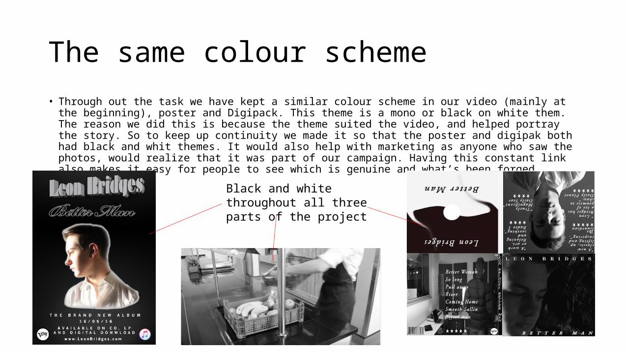
The same colour scheme• Through out the task we have kept a similar colour scheme in our video (mainly at the beginning), poster and
Digipack. This theme is a mono or black on white them. The reason we did this is because the theme suited the video, and helped portray the story. So to keep up continuity we made it so that the poster and digipak both had black and whit themes. It would also help with marketing as anyone who saw the photos, would realize that it was part of our campaign. Having this constant link also makes it easy for people to see which is genuine and what’s been forged.
Black and white throughout all three parts of the project
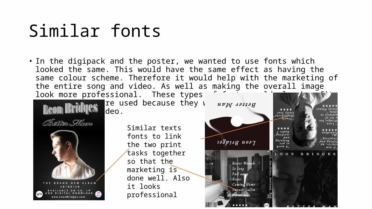
Similar fonts• In the digipack and the poster, we wanted to use fonts which looked the same. This would have
the same effect as having the same colour scheme. Therefore it would help with the marketing of the entire song and video. As well as making the overall image look more professional. These types of fonts would also benefit because they were used because they went very well with the genre of our music video.
Similar texts fonts to link the two print tasks together so that the marketing is done well. Also it looks professional
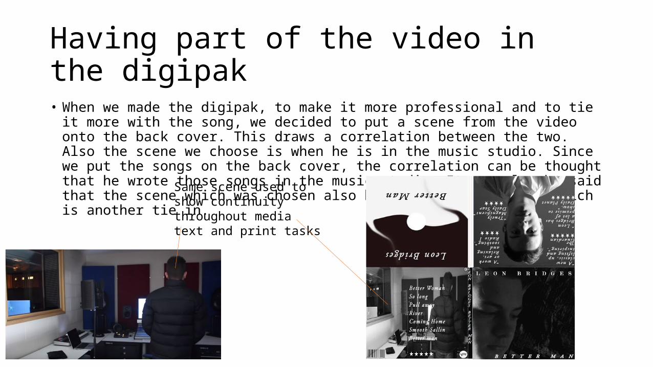
Having part of the video in the digipak • When we made the digipak, to make it more professional and to tie it more with the song, we
decided to put a scene from the video onto the back cover. This draws a correlation between the two. Also the scene we choose is when he is in the music studio. Since we put the songs on the back cover, the correlation can be thought that he wrote those songs in the music studio. It can also be said that the scene which was chosen also had the artist present which is another tie in.
Same scene used to show continuity throughout media text and print tasks

Artist appears in every print task and video.• In all of our tasks for this project (Digipack, video and poster), the artist appears
in every thing. This is to promote the image of the artist himself, so people know who the person is. It also helps with continuity throughout the whole project. Seeing the artist himself in every scene also helps build a connection him and the audience watching.
Artist appears in all three tasks, (video, poster and digipak

Lighting • The lighting between my poster and digipack is very similar. This is saying that the
light is only hitting half the artist face at any one time. This shows more consistency and allows people to associate one of the print tasks to the others. It is also a representation of the artist. It goes along with the theme and genre of the video as well as going with the overall tone of all three tasks. Finally it also helps make the overall performance look more professional.
Light only hitting one side of the artist face