media evaluation finished
TRANSCRIPT


Central dominant image linking back to the headline ‘The pathway to success’ walking through the corridor, suggesting how ABI is the place where you can succeed, suggesting the need of self actualization these pupils acts as inspiration for the consumer of the magazine.
The master head for my magazine the font used I gained from website where you can create your own font style. I used this particular style as it looks different, therefore making it stand out to the target audience.
I have used different font styles throughout my magazine in order to give the audience a sense of creativity.
The Colour scheme I have used matches the brand indent of the magazine, thus giving the audience a sense of identity that they belong to something

The use of the Facebook and Twitter logos and web addresses is to keep the audience engaged. The majority of young people have Facebook or twitter or both, therefore appealing to the nature of the audience and they would be more inclined to buy the magazine
Images showing teamwork, giving the audience a perspective on the sort of people who go to the 6th form and an idea of what content to expect in the magazine.
The use of the ABI logo shows the brand indent of the magazine.

This shows one of the images I have used as part of my contents page.
The firework programme allowed me to crop the image from its original state to be left with just the one person.
I used certain parts of the programme to crop out the image and the colour of the blazer to remove parts I did not want.
Original image

This shows the website I have used to edit the fonts on my magazine a website off the internet. This allowed me to get the fonts ‘The Ilsley Way’ and ‘Teamwork.’
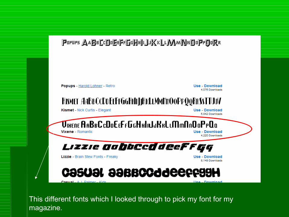
This different fonts which I looked through to pick my font for my magazine.

My college magazine looks at the current conventions already established conventions within existing college magazines which I have established through my primary research analysis of college magazines already open to the mass public.
The convention from the perspective of the audience reading from left to right I have developed throughout the product of my main product as this is the coming way in which my target audience and audience segments alike expect magazines to look and read when they read the front cover. I used this convention in order to instantly grab the eye of the audience as if I did not reinforce it then my product may have not appealed to the target audience as first glance.
I used the typical medium close up camera shot as the dominant image for my magazine, I have developed this convention as one dominant image is what catches the eye of the audience; the use of a medium close up is reinforcing the ideas of a college magazine as gives the audience a feel for the magazine and an perception for what to expect in the magazine with relevant content to them, as first impressions matter to everything.
Rather than the normal convention on the front covers of magazines of everything straight forward, I decided through the structure and layout of the front cover to move things around in attempt to give the magazine a move creative feel to, in order to try and challenge other college magazines to make mine seem more individual in design; in order to make the audience think twice when they just happen to see the magazine and instead of just picking it up then dropping taking a second look, thus appealing to the needs of the target audience as most young people are ambitious and a magazine with an ambitious design appeals to their youthful side.
My media product represents a range of social groups as it a college magazine; students come from different social groups and different dress styles etc, thus my magazine would contain content which would be tailored to a variety of primary and secondary audience but mostly content which is tailored towards the studies of the students.

In an attempt to appeal represent a variety of social groups I have used language which would be considered to be informal in order to represent the younger generation as college student are going to speak and act a certain way compared to younger and older people, thus the language is tailored to match the needs of the target audience.
The way in which my magazine appeals to the target audience would be through the mode of address which I have used; in this case I have used direct address in certain parts of the wording I have used. With words such as ‘you’ in order to make the audience feel socially accepted and fulfil the need for affiliation.

The colour schemes of my college magazine matches the house style of the colour in the logo for the school, this also attracts the audience as it gives them a sense of the college, I have used bright colours which connote a positive feeling thus giving the audience a sense of trust in the magazine and college. Also giving them an identity as the will feel part of the college in a more active and immersed way as they are marketing the brand indent of the college.
Since this has been my preliminary task I have been limited in terms of design through the technology I have had access to. For the preliminary task I have to use Microsoft Publisher which yes enabled me to make a magazine, however it is limiting in what I can manipulate it to industry standard, thus when I eventually make my main magazine I will be able to industry standard technology such as adobe in design etc. Within publisher I used word art, wide variety fonts in order to make it look creative and different colours, however it is very limiting in terms of manipulation of imagery could only really move it and not change much of it.
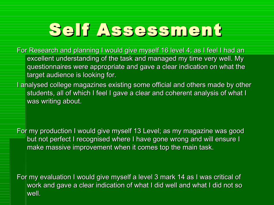
Self Assessment Self Assessment For Research and planning I would give myself 16 level 4; as I feel I had an For Research and planning I would give myself 16 level 4; as I feel I had an
excellent understanding of the task and managed my time very well. My excellent understanding of the task and managed my time very well. My questionnaires were appropriate and gave a clear indication on what the questionnaires were appropriate and gave a clear indication on what the target audience is looking for. target audience is looking for.
I analysed college magazines existing some official and others made by other I analysed college magazines existing some official and others made by other students, all of which I feel I gave a clear and coherent analysis of what I students, all of which I feel I gave a clear and coherent analysis of what I was writing about. was writing about.
For my production I would give myself 13 Level; as my magazine was good For my production I would give myself 13 Level; as my magazine was good but not perfect I recognised where I have gone wrong and will ensure I but not perfect I recognised where I have gone wrong and will ensure I make massive improvement when it comes top the main task.make massive improvement when it comes top the main task.
For my evaluation I would give myself a level 3 mark 14 as I was critical of For my evaluation I would give myself a level 3 mark 14 as I was critical of work and gave a clear indication of what I did well and what I did not so work and gave a clear indication of what I did well and what I did not so well.well.