media cover and contents analysis
TRANSCRIPT
Media cover and contents analysis

Taglines to give a short overview of the important information
Masthead with custom copyrighted font to draw attention to the name
Cover lines on the side do not cover the face. (Bold) Subject is clear and stands out
Main cover line
Barcode to scan and inform readers of the price at the side
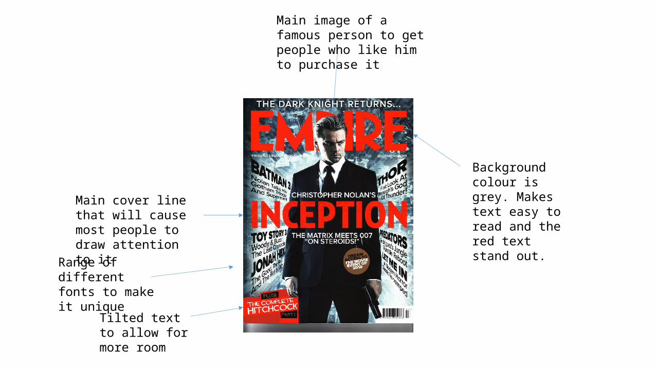
Background colour is grey. Makes text easy to read and the red text stand out.
Tilted text to allow for more room
Range of different fonts to make it unique
Main cover line that will cause most people to draw attention to it
Main image of a famous person to get people who like him to purchase it
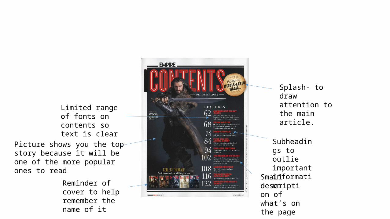
Splash- to draw attention to the main article.
Reminder of cover to help remember the name of it
Subheadings to outlie important information
Small description of what’s on the page
Picture shows you the top story because it will be one of the more popular ones to read
Limited range of fonts on contents so text is clear
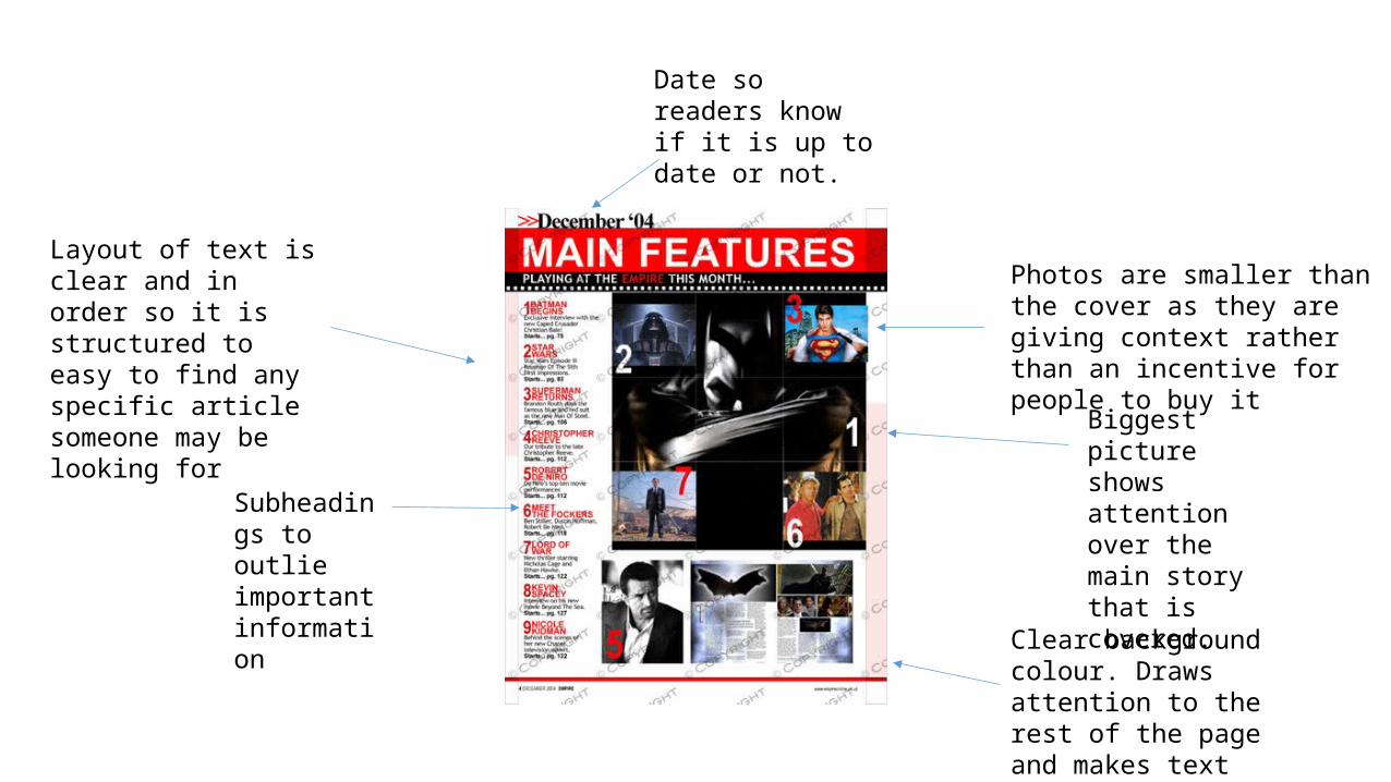
Biggest picture shows attention over the main story that is covered.
Date so readers know if it is up to date or not.
Clear background colour. Draws attention to the rest of the page and makes text easier to read
Subheadings to outlie important information
Layout of text is clear and in order so it is structured to easy to find any specific article someone may be looking for
Photos are smaller than the cover as they are giving context rather than an incentive for people to buy it