media coursework evaluation
TRANSCRIPT
Media Coursework Evaluation

Question 1: In what ways does your media product use, develop or challenge forms and
conventions of real media products?

Digipack:• The first way in which our digipack uses a media
convention is that it has a title on the front in the largest, boldest text, which is important as this is the most vital information which purchasers need to see before buying the digipack. The title clearly states this is the digipack for Foo Fighters Greatest Hits. Compare our digipack, to one I analysed in my research which is to the right. Both follow the same convention as they have a title on the front.
• Not only is the text the large/bold, but it also has an extremely clear contrast of white on black so that the most important text on the digipack is clear for potential purchasers to see. The font for the large titles is sharp which is essential for a digipack consisting of Rock music as it has connotations of aggression . The font for the track listing is in a modern, sci-fi text which relates to the theme of our digipack which the next slide goes into more detail about.
• It is also mandatory that on the front cover of a Rock genre digipack there is either a photo of the band, or the band’s logo is placed prominantly so as well as having the title, the logo makes the digipack instantly recognisable.
• On a digipack it is also vital that down the spine it has the title too, therefore when the digipack is stacked sideways on a shelf the digipack is still identifyable. As you can see on the Nickelback digipack their title is placed down the spine, similarly to how we have placed ours. This shows how I found conventions that I had to follow in my research.
• Another convention that our digipack uses is that it has the track listings on the back, informing the audience which songs are on the CD, and what other content is within the digipack.
• Like all digipacks, ours followed the convention of having all the essential elements, such as the barcode (bottom right corner of the screenshot below) which obviously makes the digipackpurchasable in shops. There is also the logo of the company (RCA) who produce the actual Foo Fighters CD’s/digpacks (in bottom left corner.) Last of all there is the copyright credentials which simply state all of the rules and regulations regarding copying the content from within the digipack etc.
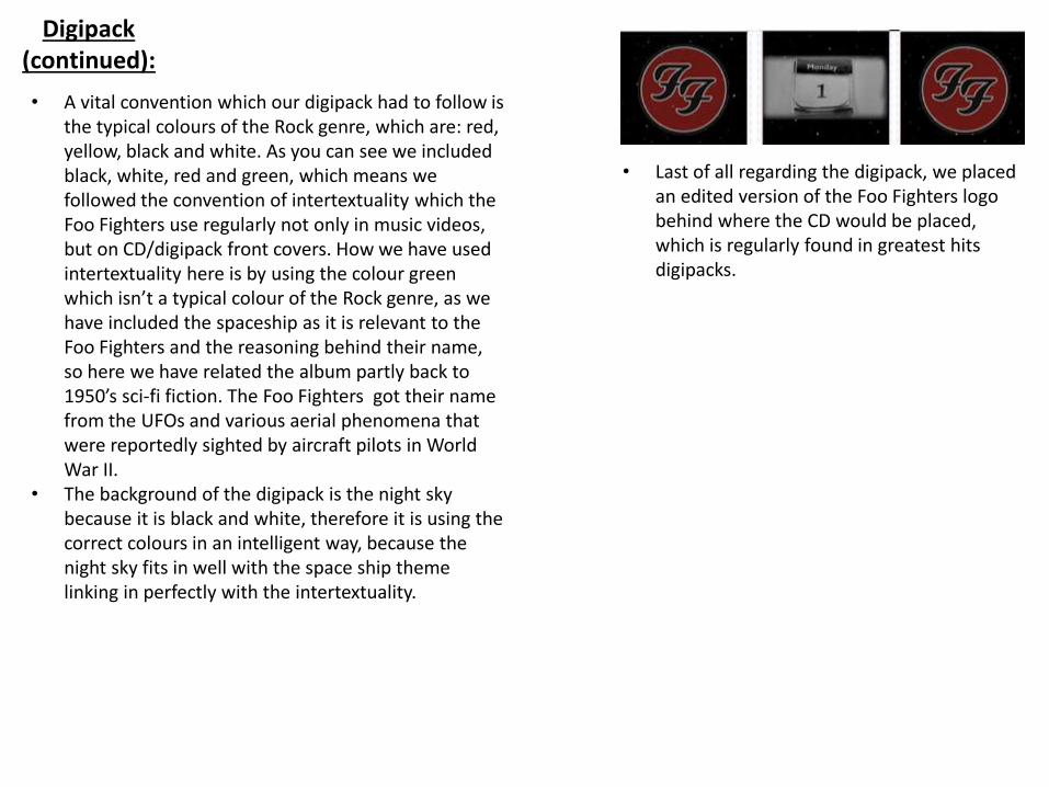
Digipack(continued):
• Last of all regarding the digipack, we placed an edited version of the Foo Fighters logo behind where the CD would be placed, which is regularly found in greatest hits digipacks.
• A vital convention which our digipack had to follow is the typical colours of the Rock genre, which are: red, yellow, black and white. As you can see we included black, white, red and green, which means we followed the convention of intertextuality which the Foo Fighters use regularly not only in music videos, but on CD/digipack front covers. How we have used intertextuality here is by using the colour green which isn’t a typical colour of the Rock genre, as we have included the spaceship as it is relevant to the Foo Fighters and the reasoning behind their name, so here we have related the album partly back to 1950’s sci-fi fiction. The Foo Fighters got their name from the UFOs and various aerial phenomena that were reportedly sighted by aircraft pilots in World War II.
• The background of the digipack is the night sky because it is black and white, therefore it is using the correct colours in an intelligent way, because the night sky fits in well with the space ship theme linking in perfectly with the intertextuality.

Magazine Advertisement:
• A vital convention which our magazine advertisement had to follow is the typical colours of the Rock genre, which are: red, yellow, black and white. As you can see we included black, white, red and green, which means we followed the convention of intertextuality which the Foo Fighters use regularly not only in music videos, but on CD/digipack front covers. How we have used intertextuality here is by using the colour green which isn’t a typical colour of the Rock genre, as we have included the spaceship as it is relevant to the Foo Fighters and the reasoning behind their name, so here we have related the magazine advertisement partly back to 1950’s sci-fi fiction.
• The background of the magazine advertisement is the night sky because it is black and white, therefore it is using the correct colours in an intelligent way, because the night sky fits in well with the space ship theme linking in perfectly with the intertextuality.
• Our magazine advertisement at the bottom has digipack ratings from other recognised Rock based genre magazines, which is mandatory that our advertisement had to include as the audience want to know what specialists think of the digipack.
• The magazine advertisement also shows what the digipackincludes, which obviously the audience of the magazine are going to want to know before they make the purchase.
• The first way in which our magazine advertisement uses a media convention is that it has a title on the front in the largest, boldest text, which is important as this is the most vital information which purchasers need to see/know before buying the digipack. The title clearly states that the digipackis for Foo Fighters Greatest Hits.
• Not only is the text the largest/boldest, but it also has an extremely clear contrast of white on black so that the most important text on the digipack is clear for potential purchasers to see. The font for the large titles is sharp which is essential for a digipack consisting of Rock music.
• The Foo Fighters logo is placed perfectly in the centre of the magazine advertisement so that as soon as the audience look at this advertisement they either see the Foo Fighters title or logo.

Music Video:• In our video we used a range of camera
shots which is the most obvious convention we had to follow. One of the key shots that we used was a close up, which effectively shows the emotion on the face of the main character which is an essential convention of a narrative music video. In the shot to the right, the main character here is looking troubled, as this is where his journey begins to head out away from the city, into the country.
• Another convention that we used in our music video was that the genre of our video was specifically chosen to be narrative, because it is a common convention of Rock music videos, as well has homage, comedy and live performance videos. Here we followed Andrew Goodwin’s theory of a narrative performance of a song.
• In terms of mise-en-scene, we dressed our main character in order that he looked like somebody you would find in a typical Rock video. This is because first of all he is wearing a brown, waxy jacket which is further supported by the long, messy hair. Not only does the style of dress/appearance typify somebody of a Rock video, but it is also a specific outfit for who the character is intended to be – somebody who is past caring, and on a journey to get away. The
• The main character was in virtually every shot in the video to make the narrative of the video clear, as we didn’t want to confuse the audience, as from the music videos we analysed in our research, the narrative was always fairly clear, which made us think we had to keep our narrative clear to follow the convention.
• On a number of occasions throughout the video the cutting is synchronised with the backbeat of the song. Similarly there is a visual cue which is paired with the opening section of the song, when all the instruments start to play.
main character is actually dressed similarly to how a lot of the characters in some Foo Fighters video actually dress. Proof of this is above, so that you can compare who similar the appearance of our main character is in comparison to the Foo Fighter’s front man, Dave Grohl, who is also often the main character in a lot of Foo Fighters videos.

Question 2: How effective is the combination of your main product and ancillary texts?
The combination of our 3 media products (digipack, magazine advertisement and music video) work effectively together in order to promote the album.
First of all, there is clearly synergy between the products. For example, the style of the magazine advertisement is virtually exactly the same as the style of the digipack cover, therefore the magazine advertisement does it’s job more effectively. The audience will obviously find out all the information they require from the advertisement if they read all the information, or by just glancing at the magazine advertisement, they will then instantly recognise the digipack. This shows how the products can work together effectively as a promotional package, as they all help promote each other – this is synergistic.
As well as the promotional package being synergistic, it also shows cross media convergence, as we are in theory working as a company, who are producing different forms of media products that work together to promote each other and have to contain consistencies – for example we have our logo placed on the magazine advertisement and digipack, similarly to how Kerrang use the same font style on their magazine front cover and music channel.
By following the specific Rock genre conventions for each product, this massively helps promote the whole package, because if people can see there is a strong consistency in the certain conventions they’re looking for, then they will be interested in purchasing the package. This shows how we had to tailor our package to stand out to our target audience (Rock/Foo Fighters fans).
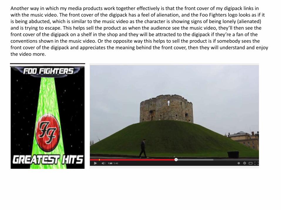
Another way in which my media products work together effectively is that the front cover of my digipack links in with the music video. The front cover of the digipack has a feel of alienation, and the Foo Fighters logo looks as if it is being abducted, which is similar to the music video as the character is showing signs of being lonely (alienated) and is trying to escape. This helps sell the product as when the audience see the music video, they’ll then see the front cover of the digipack on a shelf in the shop and they will be attracted to the digipack if they’re a fan of the conventions shown in the music video. Or the opposite way this helps to sell the product is if somebody sees the front cover of the digipack and appreciates the meaning behind the front cover, then they will understand and enjoy the video more.

Question 3: What have you learned from your audience feedback?
Audience feedback for our coursework covers a wide range of areas. The first type of feedback that we used was our audience research before we began to make the promotional package, in order to find out what we needed to include to make the promotional package effective. An example of this was using remote feedback, where by for example, posting a survey that we produced on Survey Monkey onto the internet and sharing it on social media websites such as Facebook and Twitter, we received the information that best suited our target audience. By doing this you can receive a lot of information, however you can have a severe lack of control as to who is answering your survey, as they might not be exactly relevant (such as if lots of young children participate in the survey, as they are not the target audience), and also the people who do complete the survey can put silly answers – therefore we tried to eliminate the amount of ‘silly’ answers that could be placed by only leaving a few reasonable choices for each question.

We also received feedback from our peers in class, as we screened our music video in order to receive feedback from other students who carried out the same tasks as us. From this, we received a fair balance of positives and negatives. First of all the bus shot in our music video went down well, as there was a transition of setting from the main actor getting on the bus and getting off it.The mise-en-scene was perceived to be consistently relevant. The outfit that the main actor was wearing included brown and black which are typical colours of actors/performers of the Rock genre, and also the settings that we used were iconic. For some the use of settings clearly portrayed the narrative of the video, which was that the actor was on a journey, trying to escape the urban life, and migrating rurally – however on this journey he came across numerous boundaries. However part of the negative feedback was that some peers found this narrative wasn’t always clear. Another criticism we received was that a lot of Foo Fighters videos are often contain a lot of intertextuality such as the video for the song Walk references … and in our video we didn’t use any intertextuality – therefore we challenged a convention that the band’s song we used normally do.Last of all the scene in the woods at the end was extremely popular where the main actor thought he finally reached his destination to bring him happiness so the camera in a circular form panned around the main actor who was spinning round and looking to the sky to express his freedom/relief, when suddenly the shot changes to the main actor noticing he’s still not completely free, as he notices that yet again, he is still trapped behind a fence. Here the use of focus pull was noticed too which had a good effect on our audience as they noticed/informed us that the use of special effects in our video was apt.
As you can see from the screenshot to the right, I also received feedback in the comments section of my Youtube account for our music video. This comment specifically refers to the narrative of our video in a positive way, as the user has stated that he/she can relate to the video’s narrative. This shows that our narrative is first of all clear in most people’s opinion but also that the meaning behind it is extremely relatable.
Question 4: How did you use media technologies in the construction, research,
planning and evaluation stages?
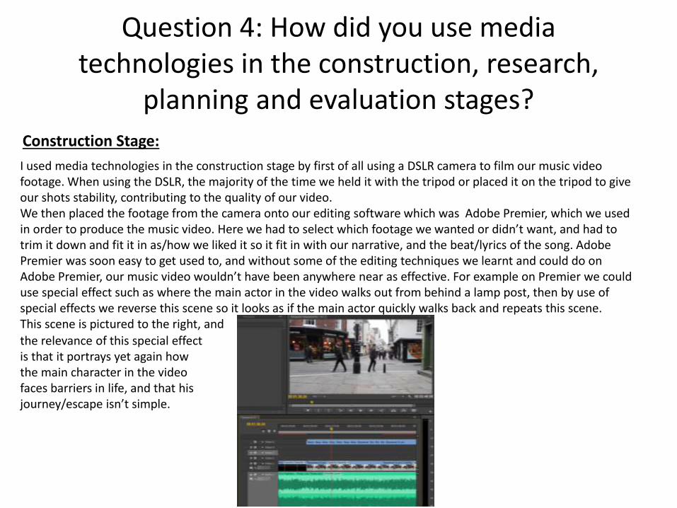
I used media technologies in the construction stage by first of all using a DSLR camera to film our music video footage. When using the DSLR, the majority of the time we held it with the tripod or placed it on the tripod to give our shots stability, contributing to the quality of our video.We then placed the footage from the camera onto our editing software which was Adobe Premier, which we used in order to produce the music video. Here we had to select which footage we wanted or didn’t want, and had to trim it down and fit it in as/how we liked it so it fit in with our narrative, and the beat/lyrics of the song. Adobe Premier was soon easy to get used to, and without some of the editing techniques we learnt and could do on Adobe Premier, our music video wouldn’t have been anywhere near as effective. For example on Premier we could use special effect such as where the main actor in the video walks out from behind a lamp post, then by use of special effects we reverse this scene so it looks as if the main actor quickly walks back and repeats this scene. This scene is pictured to the right, and
Construction Stage:
the relevance of this special effect is that it portrays yet again how the main character in the video faces barriers in life, and that his journey/escape isn’t simple.

Another technology we used was Adobe Photoshop to produce our magazine advertisement and digipack. Adobe Photoshop was extremely useful in the production of these products, due to it’s simplicity once you learn how to use it. For example, Photoshop exclusively has the use of layers, therefore instead of cramming all the text or images onto one layer of the product (e.g: digipack front cover), you can spread out the amount of items on each layer. This makes producing for example the digipack a lot easier as it is much simpler to move each item around or hide it for periods. The use of layers also made it possible to have the tin foil effect on the tractor beam on our front cover. This was possible by placing the foil effect behind the tractor beam.One last point about Photoshop is that in our group’s opinion, there was no appropriate font for our genre of music, therefore we had to download and install certain fonts from a website called Dafont.
Another way in which media technologies were used in construction, but also throughout all of the stages, was mobile phones for communication – whether that be via a phone call, text message or social networking sites whilst we were on the go such as Facebook, Twitter, Snapchat etc…
As you can see from the screenshot to the left, some of the many layers of our digipack are listed down the
right hand side of Photoshop.
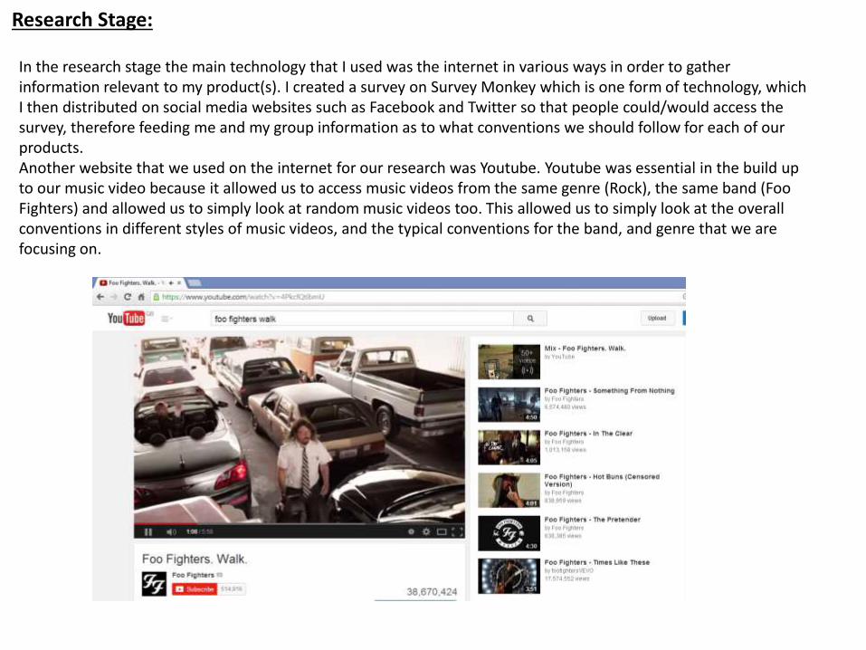
In the research stage the main technology that I used was the internet in various ways in order to gather information relevant to my product(s). I created a survey on Survey Monkey which is one form of technology, which I then distributed on social media websites such as Facebook and Twitter so that people could/would access the survey, therefore feeding me and my group information as to what conventions we should follow for each of our products.Another website that we used on the internet for our research was Youtube. Youtube was essential in the build up to our music video because it allowed us to access music videos from the same genre (Rock), the same band (Foo Fighters) and allowed us to simply look at random music videos too. This allowed us to simply look at the overall conventions in different styles of music videos, and the typical conventions for the band, and genre that we are focusing on.
Research Stage:
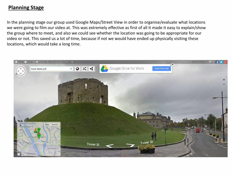
Planning Stage
In the planning stage our group used Google Maps/Street View in order to organise/evaluate what locations we were going to film our video at. This was extremely effective as first of all it made it easy to explain/show the group where to meet, and also we could see whether the location was going to be appropriate for our video or not. This saved us a lot of time, because if not we would have ended up physically visiting these locations, which would take a long time.
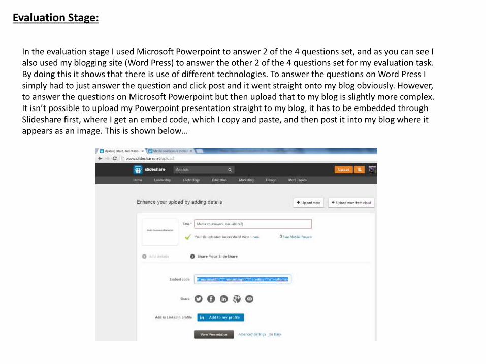
Evaluation Stage:
In the evaluation stage I used Microsoft Powerpoint to answer 2 of the 4 questions set, and as you can see I also used my blogging site (Word Press) to answer the other 2 of the 4 questions set for my evaluation task. By doing this it shows that there is use of different technologies. To answer the questions on Word Press I simply had to just answer the question and click post and it went straight onto my blog obviously. However, to answer the questions on Microsoft Powerpoint but then upload that to my blog is slightly more complex. It isn’t possible to upload my Powerpoint presentation straight to my blog, it has to be embedded through Slideshare first, where I get an embed code, which I copy and paste, and then post it into my blog where it appears as an image. This is shown below…